[Project 3: Ego] Fangirling 2k17

I’m here to do what I do best, which is fangirling over my favourite artists! And it’s even relevant to the project at hand! (Note: I use “they” to refer to those whom I don’t know their genders because I’ve been in enough non-binary gender debates)

I only chose to talk about artists with colouring styles I adore, as opposed to any artists, so. And since we have to have active colour choices, I’m going to (try to) identify and state what type of colouring style they use.

  • Monochromatic Harmony = same hue, different lightness & saturation levels (e.g. greyscale)
  • Analogous Harmony = colours adjacent to each other on colour wheel (e.g. yellow & green)
  • Analogous Harmony (Warm & Cool) = basically same as above, but active choice of warm (orangy) colours or cool (bluish) colours (e.g. orange & red, blue & green)
  • Complementary = Opposite each other on the colour wheel (e.g. blue & yellow)
  • Split Complementary = well, I don’t know how to explain this except “imagine an isoceles triangle on the colour wheel” (e.g. yellow, orange and purple)
  • Double Complementary = Complementary x2
  • Triad = 3 hues equally spaced apart
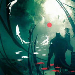
夜と炉 (@yorutoro)

This was one of those random artists I followed. What attracted me to them was mostly the soft, girlish colours. Something else interesting is also how they tend to attach jewellery to their works!

Very high lightness overall, though with lower lightness for certain decorations. I would say they use analogous harmony for blending and colouring of the person, and an extended analogous (it’s not far enough to be complementary so idek) in terms of decor (clothes, accessories, etc). An earth tone frame too, to draw focus.

Nano (@NanoMortis)

I’ve been stalking Nano since before they changed their username on deviantart, and what I adore is mostly how it’s a very limited palette mixed with an angular style to create something rather unique.

It varies, but I’d say they typically use monochromatic harmony with complementary hues? Other than black and white contrasts, there’s a lot of shades of green against shades of red.

Fish (@salmonella_fish)

I accidentally came across Fish during that one Yuri on Ice craze (I’m not into it but Instagram thought I was), and I mostly enjoy how there’s always an overarching dominant colour defining each piece, most likely because she tends to do a large wash before layering on the actual colours.

Clear

A post shared by Fish (@salmonella_fish) on

And the weeping willow's branches fall

A post shared by Fish (@salmonella_fish) on

This one’s pretty easy: it’s an analogous harmony (almost made to look monochrome since it’s so subtle) with a dominant colour for each, which gives off quite a good sense of warm and cool as well. As seen by the last picture, though, some blue-yellow complements happen.

ユエ (@y_u_e)

What I love about Yue is their mixed medium and how the colours come together beautifully, regardless. They usually do a rough sketch with pencil, then refine the sketch, then watercolour to create a basic wash, then adding tone and hue with copic markers before defining edges with colour pencils. (If you see their commissioned works you will know that this is a stylistic choice and they can actually do other styles as well)

copic

A post shared by ユエ (@y_u_e) on

鉛筆とコピック

A post shared by ユエ (@y_u_e) on

Also, they’re the one who taught me how to make my own paints!

This is really hard for me to identify though, because they blend a LOT of colours together. If I ignore the analogous blending I guess it’d overall be some double complementary? Like the blue green yellow purple of the 2nd work.

Mall Licudine (@shardula)

Her style is also rather unique to me, especially because she liberally uses resin on wood to create 3 dimensional works. On top of that, she combines acrylic paints and washi tapes, and uses a lot of polka dots and positive/negative spaces to add detail!

This is another difficult one to figure out, probably because her work is really complex such that different elements have different colour harmonies in themselves. For example the 3rd one has the green and blue (analogous) plants, but the 2nd one has the girl herself mostly being analogous (pink and purple) with some complements of yellow and green.

Koyamori (@maruti_bitamin)

Again, another person I admire for more linework, but I do admire how they maximise their limited palette by using watercolour to vary the exact shade (and blending to create different hues). There’s also always obviously dominating colours!

I thought it was analogous, but I was woefully mistaken for the first one (as Joy pointed out) because of the blues, such that it’s actually complementary.

Nina (@sirpangur)

While she dabbles in colour, she’s more oriented towards black and white (and grey), but I think what’s impressive is how her black and white (and grey) shows a pretty good understanding of highlights and shadows and contours and all!

Definitely monochromatic harmony, no arguments. Joy mentioned to avoid, though, so I suppose I might work with blue/purple instead, which will make a pretty nice overall kind-of-square.

Norin (@mahoukarp)

They mostly draw Pokemon fanart. It’s not even vector art, but the simple colour choices and

I needed an even number so I made a blossom leafeon for a charm

A post shared by Norin N. (@mahoukarp) on

Could it be any less obvious? Monochromatic! (and well okay a bit of analogous)

Edit 26/10/17: I’m adding in Mayumi Konno, more for style than colour. My work is looking to tend towards body parts, and I feel she’s quite good at using the body to express things (although the expression and facial features are virtually identical for every single work, so).

In Conclusion,

I have a fervent admiration for complex works where colour harmony tends to be suggested than absolutely clear. It seems that many artists I admire tend to use analogous harmony as a dominant rather than a single hue as a dominating colour, but also add a level of delicacy by having 1 to 2 complementary hues.

I am also, however, about 89% certain I need to have clear colour harmonies, and if that’s the case I would look more at Nano, Fish, Koyamori and Norin. Of course, I haven’t quite talked about chroma and value as opposed to just hue, and I am also severely lacking in artists who actively use complementary colours, but hey. Gotta start somewhere right?

Analysing SHAFT surrealness & Quote exploration

Alternative title: Excerpt of me brainstorming on Sept 23 at 01:03:29 because I couldn’t think of anything.

The fact that I myself, at the moment of painting, do not understand my own pictures, does not mean that these pictures have no meaning; on the contrary, their meaning is so profound, complex, coherent, and involuntary that it escapes the most simple analysis of logical intuition.

I always feel like I have problems conceptualising “surreality”, probably because my opinion on it is very close to Salvador Dali’s, that true surrealism is when I create something that even I can’t understand. But I don’t think that’s something I can do, to let go of all rationality and be able to confidently say that’s what I’m presenting, and yet, I can’t feel comfortable creating something that was purposeful, imbued with meaning, and call it “surrealism”. And that’s problematic for me, because it really affected my ability to complete Project 1, and, as evidently shown by my lack of progress even by this date and time, Project 2.

So I’m writing to make sense of things. When I try to narrow down the scope to something more tangible, then, I think more of SHAFT. They’re a Japanese company renown for their unique style, which often treads the line of symbolic surrealism.

SOME SHAFT ANALYSES

I think the best examples are their portrayals of witches, otherworldly beings of despair (sample 1 and sample 2). In both examples, the witches and their domains are seen in juxtaposition to the “real world”, where they create a world which is nonsensical, filled with extended imagery, repetition, etc.

(Some background knowledge, first. The “witch” is an otherworldly monster, which has her own domain, a world separate from the real world and shaped by her warped consciousness. She also has minions, servants which act as her proxies. Also, Madoka is the pink-haired girl.)

Sample 1 shows the domain of the witch Elly, who is described as the “box witch with a covetous nature. She is a staunchly reclusive witch. Anything she covets she locks away within glass. The thoughts of her prisoners are laid bare, but one can strike her without thought without problems.

The video presents this nature in a surreal way which I will now attempt to analyse.

The witch herself takes the form of a girl. Her torso is like that of a ball jointed doll’s, and her bottom half is a mess of colours (a skirt?) resembling some kind of haphazard oil painting. Everything about her looks like a messy painting, but when presented on screens she is shown to have a clear form, though she is but a silhouette. Perhaps this pays homage to her nature as a recluse, as she appears only through screens, only appearing as her true form when dead. That her body is like that of paint (and of a doll) is also suggestive of how she is easily struck, like paint which can be melded easily (or a doll which can be fragile).

Her servants are humanoid, but anti-naturalistic, and with one wing and a halo. “The box witch’s minions with the duty of transportation. Anything they touch becomes easy to carry.” Again, the bizarre form ties in with the crazed mind of the witch, and the wing and halo likely represents how they are like angels, which “carry” precious things to “paradise”. Their purpose also likely ties in with her coveting nature, in wanting to take precious things. This is shown thoroughly in the video, where they carry Madoka, defying the laws of physics (she’s probably heavy!)

http://wiki.puella-magi.net/File:Card_Daniyyel_Jennifer.png

SHAFT also uses a lot of imagery, and for conciseness I’ll just summarise:

  • Entering the domain: I’m classifying this together because it’s a mess of fast-paced “blink and miss” patterned images. Doors opening, windows with people behind curtains, a screen with illegible green digital text, headless women dressed in different colours, flipcard-worthy girl-walking animation, then the “eye” opening. I think the door is pretty obvious, the curtain not so much (the idea of a guest being anticipated?) The screen, perhaps the witch setting up; the headless women, possibly previous prisoners, all similar looking with only minute differences, and the flipcards, possibly showing the witch preparing herself? The eye opening is rather clear, too, that it’s about entering the soul.
  • Carousel horses: Gaiety? Naivety? I’m not too sure on this, but it’s probably safe to say it shows a certain carefree festivity. The horses are also shown to carry the screens, and line the domain in a cylindrical shape, so they possibly act as the “bars” as well.
  • Screens: Likely the “box” that she is mentioned to be the witch of. The screen likely represents her nature as reclusive, in that she appears only through a proxy. It also shows the ability to lay bare the thoughts of prisoners, where the screens show things about Madoka which the witch should not know
  • Water: Or is it? It appears to be, but there’s no oxygen deficiency, and the water doesn’t seem to adhere to physics. Nevertheless, this probably corresponds to the idea of being trapped within “glass”, where both are clear.
  • When Madoka is saved, au contraire, things shift back to “reality”, the original art style, and proper “real” forms fighting against the surreal witch’s world.
  • Even at the end, “blood” is presented as a colourful rainbow, or black ink spurting out and splattering onto the domain’s borders (the real screen)

I won’t talk about Sample 2, which involves a main character and will definitely have a lot of things which can be mentioned.

Some of their backgrounds too, especially when the background doesn’t represent the physical space as opposed to a character’s feelings, or a certain overarching theme/aesthetic. I mostly like the random/alternating/whatever rhythms, especially geometric shapes with a chaos of intersecting lines at random angles. (1 2 3 4)

HOW THAT APPLIES TO ME

For me, what I find most admirable is the beauty of extended imagery. I really like having consistent ideas running throughout and reminding you of their existence. I also like contrasts, so the whole surreal versus reality/single person vs repeated background/etc is really appealing to me too.

I initially wanted to do some other “real people” films, like the charming (but also non-international release and obscure) Tetsu no Ko and Kingsglaive (just because I’m FFXV trash). For the sake of actually having a linking theme, though, I decided to just go with animated Japanese youth drama films, i.e. over the top drama, some existential crises, social anxiety, etc.

The problem I previously had was lack of personal input. So I’m going to do what I do (almost somewhat) best, which is writing prose about my feelings, then taking the key points and associating it with images.

どうすれば良かったの?(What should I do?)

I’m at a loss as to what to do, with too many burdens pulling me down. Somewhere out there must be some form of salvation, I wish that I could purge it all, throw away everything, but vines hold me down, they ensnare me and whisper to me that there is no hope beyond this mundane existence. Please let me be free. I want to be free from all of this.

  • At a loss (human figure background)
  • Burdens (a mess of stuff)
  • Salvation (water, heavenly and clear)
  • Ensnarement (snakes, holding you down)

I’m feeling somewhat dissatisfied at my current composition, because I did it separately before the others so I don’t feel like I’ve put enough linking qualities to the other compositions (e.g. border shape, repeated/similar imagery), and it feels very different from the rest in terms of overcongestion. I do want to include koi fish and “no solution” math, but it seems somewhat irrelevant…

それが結び。それが時間。(This is connection. This is time.)

Even though my body is torn to shreds and I am wrecked beyond repair, but my existence still remains. As long as my influence on this world remains, even in the smallest shard, I still remain, for all my ephemerality, for all time and space. Even my cough can change the world, or perhaps not, but somewhere, somehow, I changed something in this world, and that binds me eternally to this space.

  • Destroyed body (cracked sculpture)
  • Ephemerality (sand)
  • Influence on world, even smallest (butterflies)
  • Time and space (ancient architecture)
  • Eternal binding (??

私の声消えたことみんな喜んだ (Everyone is happy that my voice has disappeared)

No more, I am afraid, don’t listen to me. How audacious, how filthy the sound, and when even I can see the entrails of these soiled words, no matter how innocent they seemed to be when they came out. I can’t breathe knowing that someone possibly holds disdain for me, by what I said, I can’t breathe thinking their eyes tear me apart and my words which I didn’t think of prior have were always monsters which would create a rift between me and everyone else.

  • Disgusting words (bleeding ink)
  • Twisted words (scrabble tiles, THEA or HATE)
  • Disdain for me
  • Rift creation

もう一回。 (Just once more.)

Just once more, I’d like to remember what it was like. To be able to careen in fields of green with bare feet, sing unabashedly into the night sky, forget the passing of time with fine lines. If I am to spend eternity as a cog in society, doomed to tedium and normality, then please let me remember once again, what it was like, freedom and serenity without the scorns of time, and all of humanity’s business and productivity which I cannot bear.

  • Insignificant piece of society (cog)
  • Tedium (also cog)
  • Freedom and serenity (??)
  • Cannot bear it (??)

[To be continued. Or edited. Maybe]

[Edit: Now my problem is conciseness. Why am I so weak]

W4 Project 1: My Line is Emo

I’m unfortunately a very trigger happy person (this always, inevitably works against my favour), so all emotions focused a lot on natural forms, where I didn’t control much as opposed to trying to aim for a certain state while making, and letting the marks turn out as is (as long as it generally looked ok).

The key ideas were both of these:

  • Emotion quality

For me, emotions are often not clearly separable. To avoid too many visual similarities, I narrowed the quality of each emotion down based on 3 overarching criteria: intensity, protractedness and frequency. Intensity is associated with the strength of the emotion (typically once-off and large), protractedness, with the duration of the emotion (typically underlying and mild), frequency, with the occurrence rates of the emotion (typically short-lived and mundane).

  • Binary opposition

With three defining criteria, I decided to try to represent feelings sharing similarities, and work on using the contrast between both to bring out each other. Also just that 3 criteria and 6 emotions meant 2 emotions would have to share the same spectrum anyway. The linking quality is typically the paper, and the general shape of each mark.

Consequently, the final emotions were as follows:

From left to right, up to down: Love, Anger, Shock (Fear), Shock (Surprise), Bliss, Melancholy

Love & Anger

Both are on tracing paper. I wanted to try gouache/cold-pressed watercolour paper for the texture and whiteness, but it worked really badly with crushed paper (what I presume is named froissage). Seeing ink seep through the tracing paper, I decided to go with that instead, firstly because aforementioned would actually worked, and because the idea of anger literally overflowing and staining was kind of interesting to me.

The key term is intensity, where these feelings are immense and overpowering. (As a byproduct, neither were renamed, since I couldn’t find a better word to describe this all-encompassing emotion.)

  • Intensity: Only one point of focus. Centralised to reiterate the idea of singularity
  • Immensity: Reflected in large concentration of positive/negative space
  • Overpowering: Overflowing from the focus, spreading out

Differences:

  • Both were pressed onto linoleum, but anger was pressed while there was a lot of ink, as opposed to love, which was pressed after I had dabbed off the ink (to have a much lighter imprint)
  • The focus is white for love, as opposed to black for anger (colour association). By extension, love features lighter colours (made by diluted Chinese ink) as opposed to anger, which used normal ink
  • Love features swirly, smooth lines (automatic drawing with fingertips and diluted Chinese ink/leaf on linoleum), as opposed to jagged lines for anger (froissage/automatic slashing on ink with brush held with a fist)
  • Paper for anger is crushed, as opposed to paper for love. Also, ink face is facing outwards for anger, as opposed to for love (smooth surface), and love actually has a 2nd layering of white paper underneath as opposed to anger

Shock (Fear) & Shock (Surprise)

Both are on cartridge paper. I wanted to emphasise the intensity and shortlivedness by having very white paper to show the contrast between feeling and unfeeling. (The paper scrunched up and made it difficult to paste the lines though, especially where if I bent it excessively rice would fall off.)

The key term is frequency, where they’re of a relatively strong but short-lived nature, e.g. a jumpscare. (I opted to use shock for both purely because I have literally never felt surprise without some form of fear.)

  • Frequency: Unlike Anger & Love, multiple points of focus
  • Strength: Not as powerful, but still relatively strong emotions, hence still featuring foci
  • Short-lived: Small splatters, lack of grey as opposed to absolute black and white

Differences:

  • Both used rice to have the graininess reflect the antsy, fuzzy feeling of shock. However, fear has the rice mostly at the edges of the foci to reflect the sense of defensiveness of encircling oneself that arises with fear (protecting), while surprise has the rice centralised to reflect the sense of tenseness of recoiling (contracting)
  • For both, I soaked the rice in ink, and slabbed on ink perpendicular to the paper itself. For fear shock, however, I slapped the rice on from a “me kneeling on the floor” height, versus surprise shock which was from a “me standing on my bed” height. Again, to reflect the different between containment and outward spreading.

Bliss & Melancholy

Both are on newsprint paper. This paper was vaguely not-white, which I wanted for the dullness of the feelings.

The key term is prolongation, where emotions are mostly dull and weak (i.e. the after-effects of a trigger event, or unconsciously occurring feelings).

  • Prolongation: Reflected in consistency of repeated patterns. Underneath is a bordering layer of brayer rolls, on top, pressed shapes with linoleum, even more on top, hand-pressed flowers
  • Dullness: There is no focal point, with multiple layers of unrecognisable and indistinguishable marks
  • Weak: Colours are generally in the grey zone, than absolute black or white (also assisted by paper colour)

Differences:

  • Both used brayers as the base layer, but bliss used a lighter-coloured, wiped brayer as opposed to melancholy’s darker (but also wiped to prevent too dark) brayer rolls
  • Both used pressed shapes, but bliss used linoleum pressed with objects still present (i.e. creating white areas) as opposed to linoleum pressed WITHOUT (i.e. creating grey areas).
  • Objects were pressed onto white areas of bliss to avoid too much lightness, but pressed onto melancholy to result in darker colours

Overall, I think Joy was perfectly right in talking about craftsmanship when it comes to me. On a physical level, I never quite figured out how to flatten the paper while keeping the rice still stuck in place, and on an intangible level, I still feel like I couldn’t express what I wanted. Partially because my definition of abstract involves the absence of recognisable forms, or of representative qualities, as opposed to absolutely indiscernible forms, partially because I probably didn’t study or experiment enough, partially because my technical skills are w e a k. I suppose for the next project I should set my standards lower considering I don’t have enough technical expertise to actually meet whatever unreachable definitions I will set, and get over my general skepticism for copying artists.

(A bunch of photos and 1 video from throughout Week 3 while working on this)

W2 Mark Making~

For Lesson 2, we engaged in mark making, also known as “use whatever you have with ink to create random things”. For convenience’s sake, I mention the material, methodology and conclusion for most of the results. Hopefully that will help if you’re reading this to gain inspiration. (Unless otherwise stated, all of the things I tried were unconscious decisions, where I randomly did whatever I felt like doing.)

Opting to work in a logical order, I began with my plant-related items, branches and leaves. These were picked up around school, mostly. (A humorous anecdote involves me holding my freshly-picked branches at the CCA fair, and a girl complimenting me on my “nice accessorising!”)

Initially, I attempted to mark by having the paper pressed from above onto the linoleum with branches and leaves. Sadly, I may have overzealously placed too many items, resulting in a tragic lack of… Anything.

I tried.

I quickly surmised that this style does not work well with my leaves, because it’s good for emphasising positive and negative spaces, and the unique edges, but not so much on the textures. Consequently, I attempted using the inked leaves directly, like a stamp of sorts. (After the initial tameness, I went more into trigger-happy leaf actions)

Material: Leaf

Methodology: Painting leaf with ink, pressing onto paper, piak-ing onto paper, circular wiping with leaf on paper

Conclusion: I like how the leaf has a certain symmetry, with the veins being the most prominent and forming a sort of skeletal shape. But I think it’s even more intriguing that, with sufficient pressure while circular wiping, the leaf loses most of its unique qualities (possibly because the ink dried too) while making nice arcs (when properly turned).

I had brought my own drawing ink as well, so I attempted to use a twig with it, like some sort of dip nib. Surprisingly, it became weirdly effective as a makeshift calligraphy pen when placed almost parallel to the paper.

Material: Twig

Methodology: Dipping twig in drawing ink, then grazing surface of paper with tip and side of twig

Conclusion: It’s difficult to control, but the variation in line quality is superb. The more it’s laid parallel to the paper, the thicker the stroke, and when filed to a point, a thin line. Sort of like what we learn in Foundation Drawing about hard and soft edges.

I tried this again with a different twig, and folded the paper to make space, while dumbly forgetting that wet ink would definitely transfer.

At least it looks kind of nice.

To my horror, the linoleum had bits and pieces of wood and natural sediments on it, and so I attempted, vainly, to lightly scratch it off the ink with a leaf. Note that “lightly” should never co-exist in a sentence with “I” in it, because I’m a “go big or go home” type, and my self-restraint is very low. I gave up trying to maintain an even spread, and opted to just use that to make more marks.

Yeah, I don’t really think that’s how it’s meant to be done, but it works.

It turned out pretty nice in my opinion.

Material: Another leaf

Methodology: Scratching linoleum mindlessly, then pressing linoleum onto paper

Conclusion: The scratching pattern was very random, but I guess I tend towards circular motions. I like the mess of scribbly lines, especially against the unwashed linoleum with pre-existing textures. Especially because I was messing around doing it, this pattern gives me a vibe of energy.


Next, I tried using the texture of the tree bark (?). This didn’t work out particularly well since it was difficult to apply sufficient pressure to make interesting marks without breaking the bark, but there was an attempt.

Material: Bark

Methodology: Painting bark with ink, then rolling bark on paper

Conclusion: I mean… It was an underwhelming result. I’m mostly disappointed. Maybe I should have tried pressing the paper onto the bark than the bark on the paper for more effect. Or slabbing on more paint.

After all the plant-related items, I went into the more outrageous items (this next item is going to be awkward). For this, I did it the typical way, i.e. putting the material onto the linoleum, then pressing onto paper, then separating the linoleum and material and pressing both onto the paper separately.

Material: ……………. Girls will know

Methodology: Pressing linoleum + materials on paper, pressing linoleum (without materials), pressing materials (without linoleum)

Conclusion: After the initial disgust, this actually has a fairly interesting texture, and shapes. You can see the vaguely porous surface, and the patterns on it. While it’s absorbent, when pressed sufficiently the ink comes out only lightly, so it’s not as high contrast as the rest.

Other things I quickly tried before time was up was bubble wrap, various papers (tissues, toilet paper, Scotch Brite paper), and hair (acquisition of this material involved vaguely repulsive cleaning of a communal bathroom).

Material: Bubble wrap

Methodology: Wearing the bubble wrap like a glove and slapping it around the paper

Conclusion: I personally think the most interesting part is how the bubbles aren’t of even surface texture (I don’t know why I expected perfect circles, actually), and it provides a nice consistent pattern of evenly-shaped circles.

Again, I tried traditional pressing!

The tissue after being used
Result of aforementioned

Material: Scotch Brite paper, tissue paper, toilet paper, hair

Methodology: Pressing

Conclusion: Again, I don’t find this technique particularly interesting, especially since all of these items don’t have particularly interesting outlines. Perhaps if I used something which was bad at holding ink, so it’d leak through?

(Look, I went through a lot of internal turmoil to get this hairball, so I might as well maximise it.)

Material: Hair

Methodology: Soaking in ink, pressing and rolling it around

Conclusion: I liked how the density of hair showed clearly, with black splotches where there was a lot of hair, and stringy lines for stray hairs. Also how… Centralised it is, in having a core and then the hairs coming out

Somewhere at the start, I also decided to line the table with newsprint paper to avoid excessive staining. I also later discovered this also served as a bizarre way of mark making, and a convenient way of wrapping everything up when it’s time to go.

Hence, while clearing up, I took the opportunity to do some final marks:

(Had more fun than I probably should have…)

I tried to not waste ink by making more marks with it. I wasn’t too interested in yet another normal print, so I tried crumpling the paper.
Close up

I really adore how it looks like branching veins. And on closer inspection, like a landscape, especially when combined with the 3D aspect of crumpled paper. Next time I might want to consider varying the level of crumple, since for this I was really extremely thorough in crumpling it to tiny bits.

Here’s where I accidentally touched my linoleum with newsprint…

Me, wiping down my hands as best as I could. I like how it’s still textured, rather than smooth like if you were to wipe down a brush.

Where I tried to wipe down my used linoleum again. You can really see the straight edge of the linoleum.

Finally, a threnody for an abandoned item, my uneaten vegetables. As a person of dubious morals, I attempted a zero waste lifestyle by saving them for class. Unfortunately, they rotted. May they rest in peace.

RIP.

It was a very fun experience, but I still haven’t really analysed what these marks make me feel, and how, meaning I’m no closer to completing Project 1 than last week. Will probably try to do that in a separate post later, when I get back the physical papers.