Creative Industry Report: Evi O.

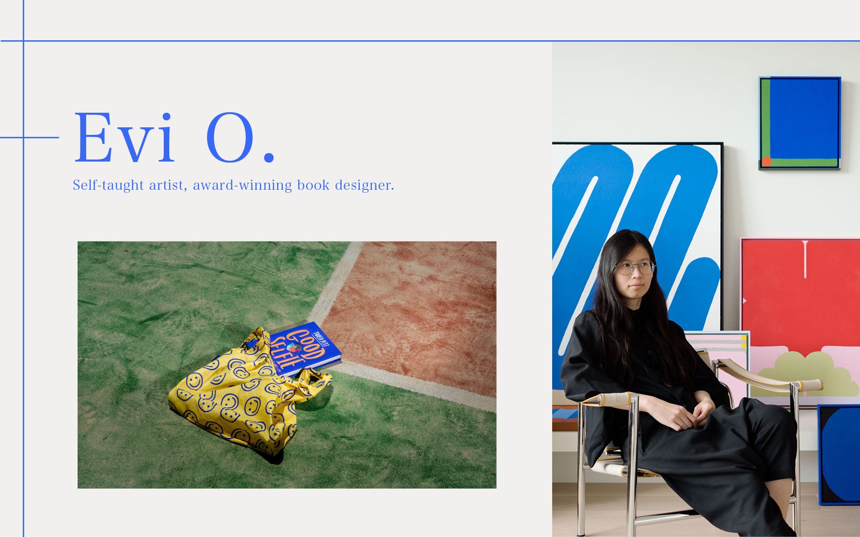
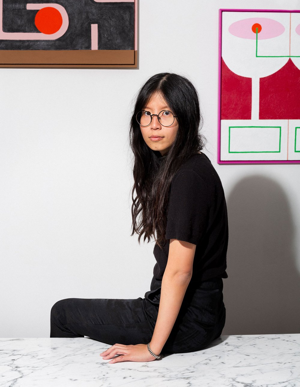
self-taught artist and award winning designer

Evi O. is a designer based in Sydney but grew up in Surabaya, Indonesia. A curious learner and someone who finds joy in both playing and working, she never lets her days get boring. Starting small as a junior designer at Penguin Books, she slowly became sought after for her well designed books and illustrations. Her hard work and determination paid off as she started to win awards with her first in 2012, when a book she had designed at Penguin won  book of the year and best general illustrated book.

Evi O. is someone who is usually restless and functions better when juggling many different projects at once, she feels that different design tasks and processes stimulate her. However, she also believes in work life balance and thus, believes that all creatives should have their own creative outlet. Perhaps, that is one of the reasons why she founded her own studio, Evi O. Studio after spending almost a decade at Penguin.
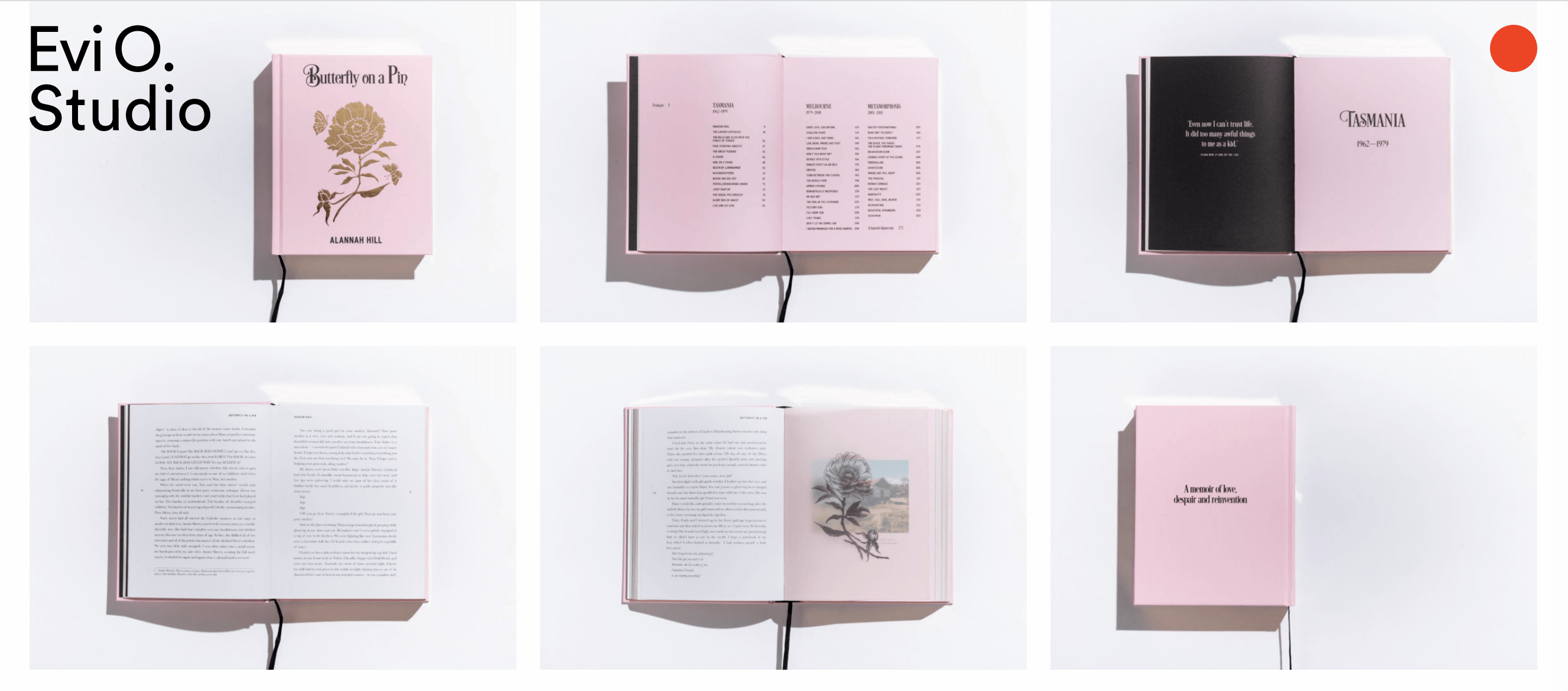
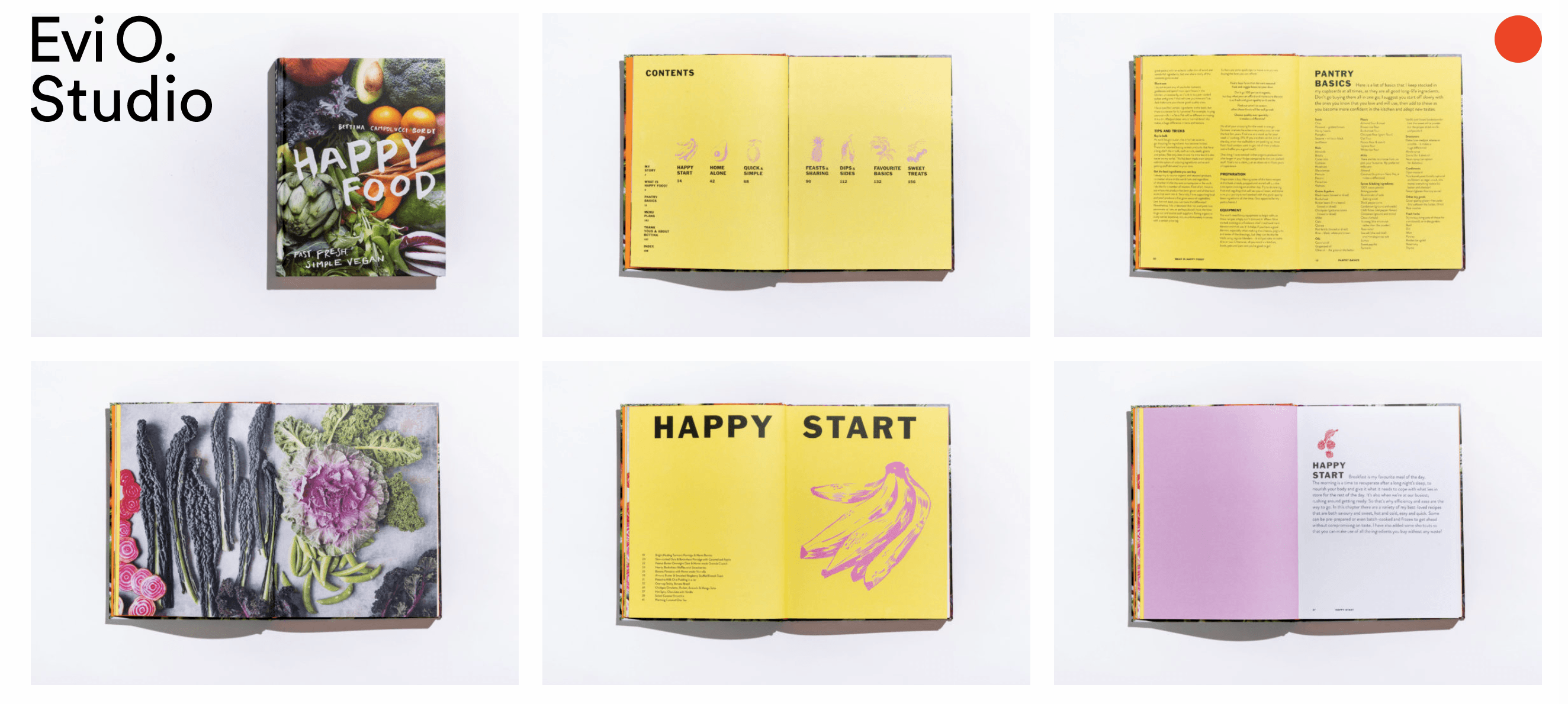
Evi o. studio

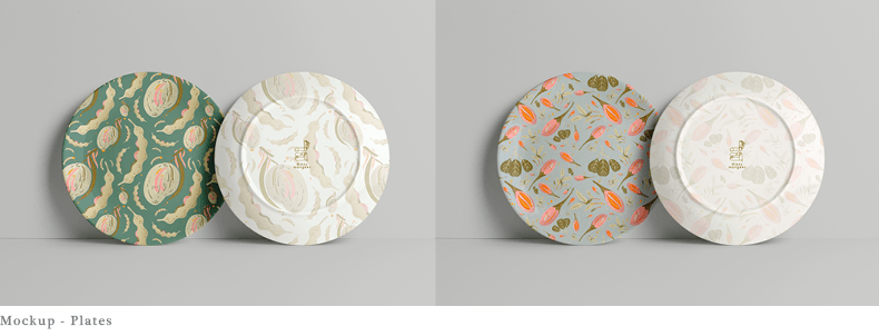
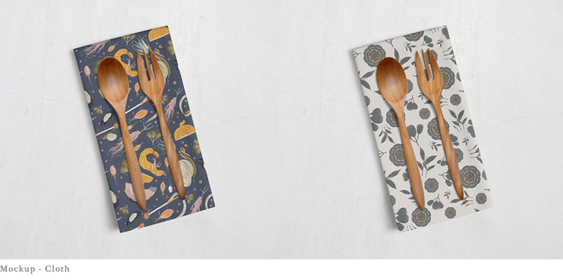
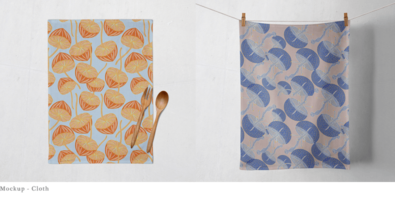
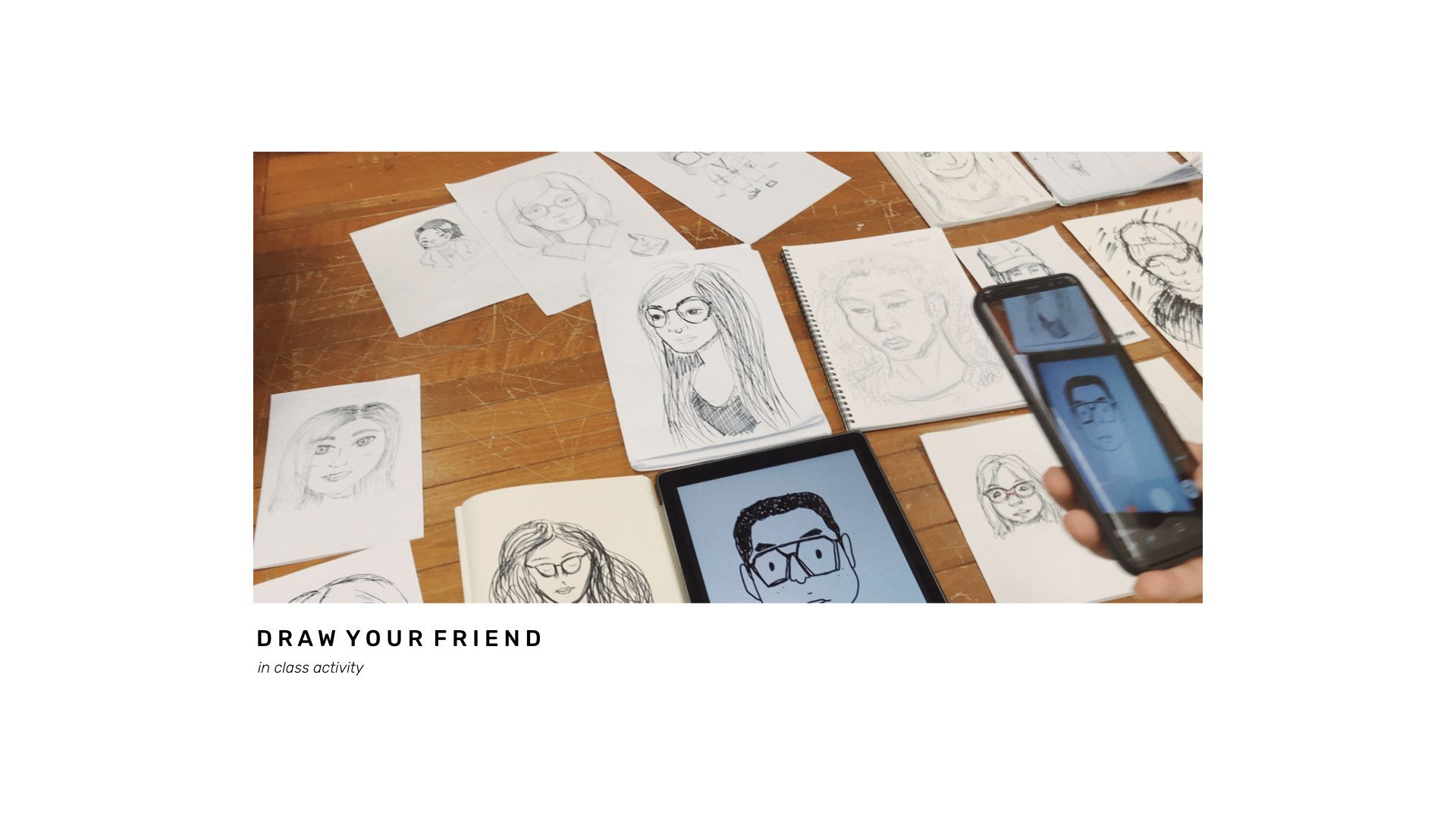
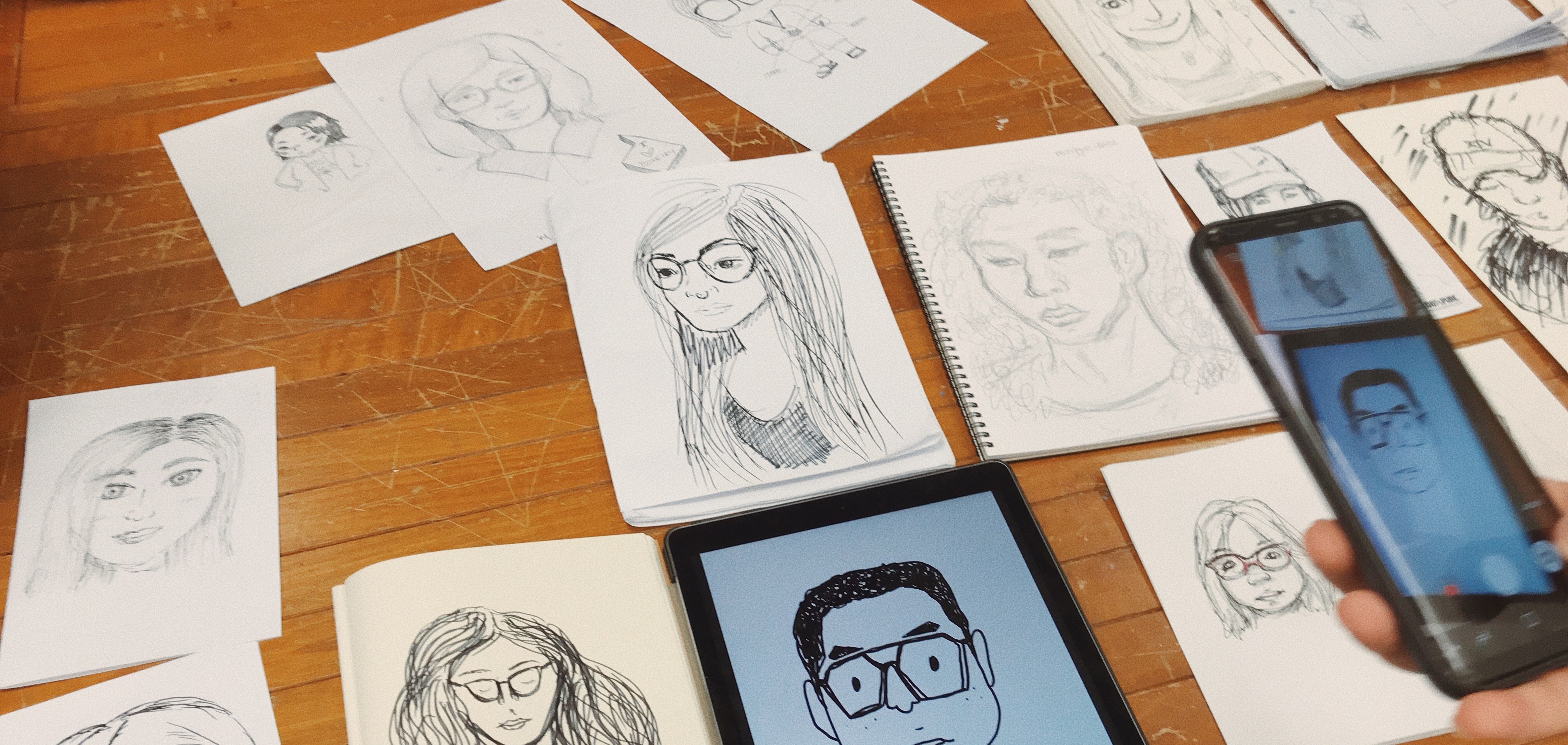
Evi O. Studio was founded in 2017 and the studio specialises in designing publications and branding identities. Her team and she can be found illustrating vegetables, gin bottles, portraits and much more. Her projects and music are what makes her studio always vibrant and never boring. Her studio is known for it’s hand-drawn approach to design where projects usually start with black ink and a brush on paper before manipulating the typefaces digitally. This is something I hope to practice more as a designer as I believe this traditional approach has its benefits and can help elevate my works plus start my projects with a different perspective.

what i have learnt from her

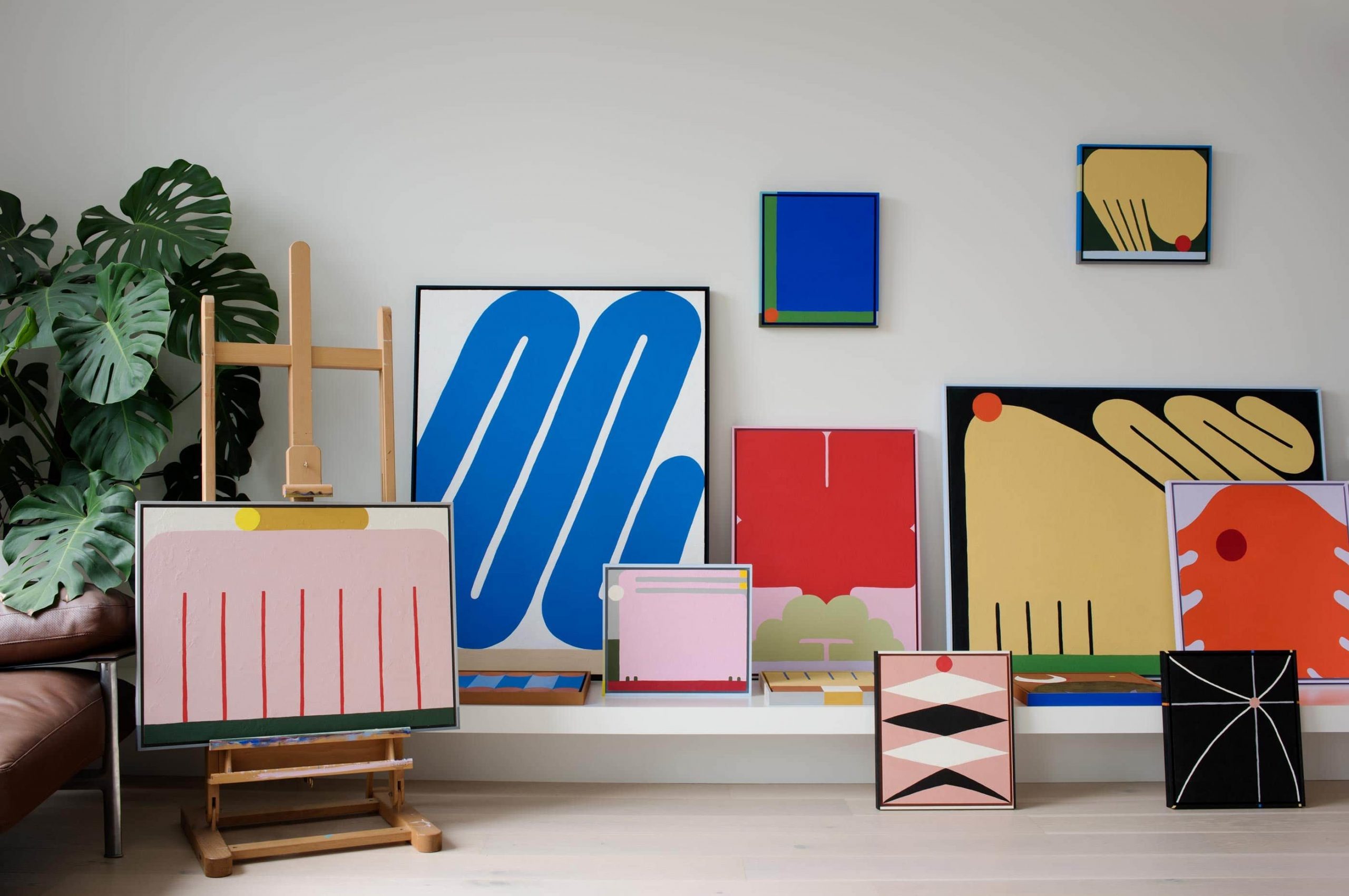
There is a Chinese proverb that says, “learn till old, live till old” and I felt like I understood this better through Evi. Although she is not old yet, the fact that she is still young and is still experimenting with new art forms such as her recent venture into abstract painting. She started with a visual communications degree, became an established book designer, opened her own design studio and now exhibits paintings in galleries. It surely came with lots of commitment and long days/nights. I hope to approach life with her advice for aspiring artists and designers, “make sure work feels like play”!

References

Book designer spotlight: Evi O. (2019, August 7). Retrieved September 23, 2020, from https://www.booksandpublishing.com.au/articles/2019/08/07/137243/book-designer-spotlight-evi-o/

Sadokierski Lecturer, Z. (2016, June 22). Designers on collaboration: Evi O. Retrieved September 23, 2020, from https://theconversation.com/designers-on-collaboration-evi-o-29785

Rets, J. (2017, April 10). The long and winding creative journey of Australian artist Evi O. Retrieved September 23, 2020, from https://happymag.tv/from-books-to-art-to-graphic-design-no-medium-escapes-the-creative-clutches-of-evi-o/

Home. (n.d.). Retrieved September 23, 2020, from https://evi-o.studio/

About. (n.d.). Retrieved September 23, 2020, from https://evi-o.art/about/

News. (2018, August 8). Retrieved September 23, 2020, from https://www.telegramco.com/meet-evi-o-award-winning-artist-and-designer/

Walton, N. (2015, January 27). DESIGNER + ILLUSTRATOR EVI OETOMO. Retrieved September 23, 2020, from http://www.dailyimprint.net/2015/01/designer-illustrator-evi-oetomo.html

Koskela, R. (2018, October 02). 5 questions with Evi O. Retrieved September 23, 2020, from https://koskela.com.au/blogs/news/5-questions-with-evi-o

Foraged Earth

Foraged Earth – Whether by animals or humans, we source for food from Mother Earth. It could have been plucked from the grounds, hunted in the woods or fished from the sea. The natural food our Earth produces is intriguing, unique and so important to us. Thus through this, I hope to highlight some food ingredients together with important organisms that are essential in our food chain. May we learn to be more aware of our surroundings and learn to slow down to appreciate our natural ingredients every now and then.

Process of Making Toast

This particular week, we learned the importance of processes and how listing out our problems step by step might help us to reveal unexpected truths. This method is known as system thinking and all we require are some post its and a pen/pencil.

Before starting the exercise, we first watched a video by Tom Wujec, in which it explained the steps to begin!

“Without writing down any words or explaining the steps, draw out how to make toast on a piece of paper” 

“Together in groups, separate the job or do it individually and piece them together, you’ll be surprised at the result” 

It was a really interesting exercise that is simple yet so helpful!

Week 3: Squiggly Birds

In-class activity: squiggly bird

Squiggly Bird exercise!!! Squiggle bird exercise basically helps warm up your hands and brain, plus helps stretch those muscles alittle before starting work proper. This exercise is so fun and easy to do because it only takes 5 minutes or less?

You start by drawing random squiggly lines. After that, you just need to insert the birds’ eyes and legs somewhere (anywhere really) and you get your own unique squiggle bird. We also characterised them in class. In a span of a few mins, we already came up with a variety of them. This exercise was indeed fun and relaxing 🙂

my little squiggly birdies! One of them is a gangster!

Week 2: Draw your friend

In-class activity: Draw your friend

Woohoo! This particular week of exercise was fun. We watched several videos of portrait drawing and how you didn’t have to be an artist to be able to draw one another. In fact many always say, “I can’t draw for nuts” but their drawing turns out to look great! Moral of story: Don’t be afraid to draw! It doesn’t have to be realistic, it could be a abstract or cartoon version on your friend.

To be honest, I was like oh no, I really am no good with human faces, and I don’t want to make my friend look ugly. Well, the result wasn’t that great anyway but it was fun observing Sabrina’s face and just laughing while we were drawing each other

Drawn by me. Model: Sabrina (sorry you are very pretty, this does not look like you)
The rest of the portraits done by my classmates

Week 1: Entopic Graphomania

In-class activity: entopic graphomania

For our first in-class exercise, we took some paper and drew dots on any ‘imperfections” there may be on the paper. This is a surrealist technique called Entopic Graphomania. After we drew the dots, we connected them in any possible and creative way. The outcome was interesting :)))))

After which, we took it a step further and added edits on each other’s work!

I think this helped us to just fun and create art in a different way that definitely does not limit our creativity!

I drew the curvy lines and a classmate added on the straight lines. It was a fun exercise 🙂

Applied Illustration – A Gooey Gooed Time (research and process)

For this final project, we were given the freedom to decide on any event we want and it can be as bizarre or as simple as possible, entirely up to us! The deliverables required are 5 items related to our event and at least one of them has to be 3D. 

ideation

Since there are endless of possibilities, I had a hard time narrowing it down to just one idea. However, after much consideration and feeling hungry while brainstorming, I decided to go with a product launch event for cookie fillings. 

WHAT ARE COOKIE FILLINGS? 

I’m sure once in your life you’ve had a gooey dessert, whether it’s a cookie or not, I really hope you have tried them because they are AMAZING (at least I think so) !!!! Recently, I chanced upon a local cookie shop called, “Nasty Cookie”.  Nasty cookie’s best selling point is basically they’re nasty gooey fillings in their fat cookies!

A little treat for your eyes

But the thing that intrigued me the most was how they inserted these gooey fillings. I always thought the bakers inserted a solidified chunk in the middle of the dough and then the chunk melts and becomes goo.

BUT actually! They insert the goo via a syringe and what makes it satisfying is it has a crispy ASMR of the cookie crack.

Inserting the goo
what if these bakers sold their fillings?

I decided to recreate a brand and have this brand market and sell their fillings. Thus, the event that I have decided on is  Gooeyooey’s first ever event and product launch that will also help people to destress by “stabbing” the cookie.

Thus the name of my event is, “A Gooey Gooed Time”

A GOOEY GOOED TIME

Initially, I named the event, Oh Gooedness! Here is my initial research and inspiration,

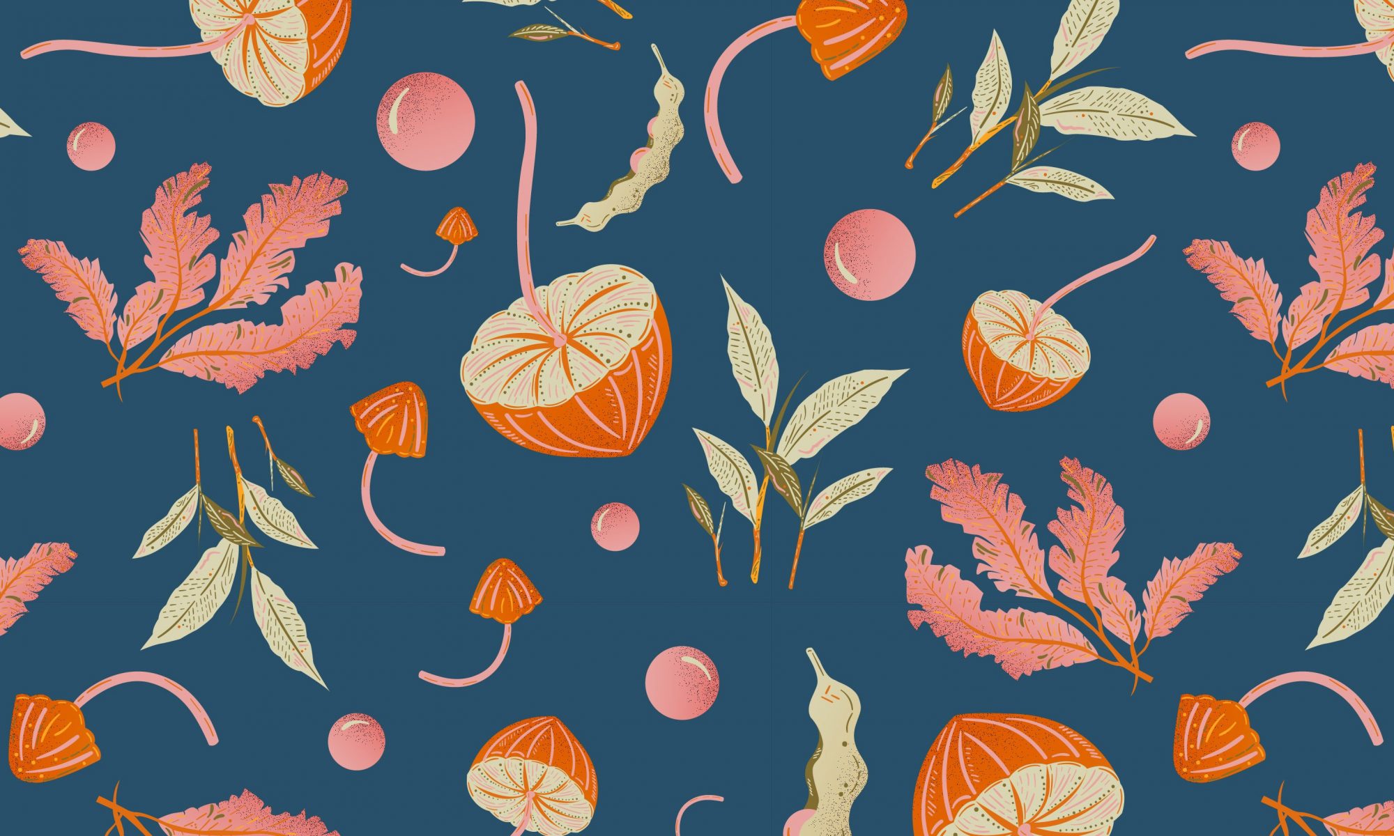
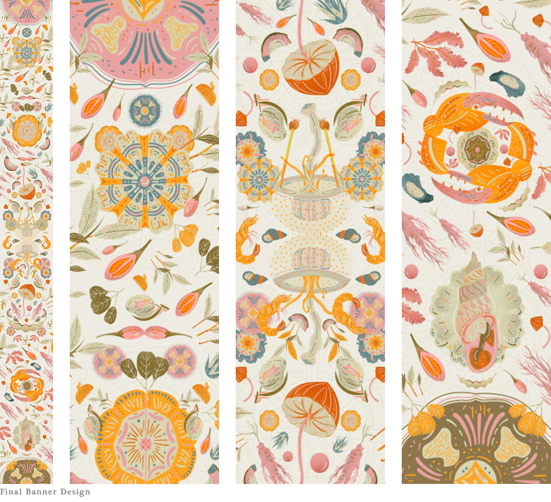
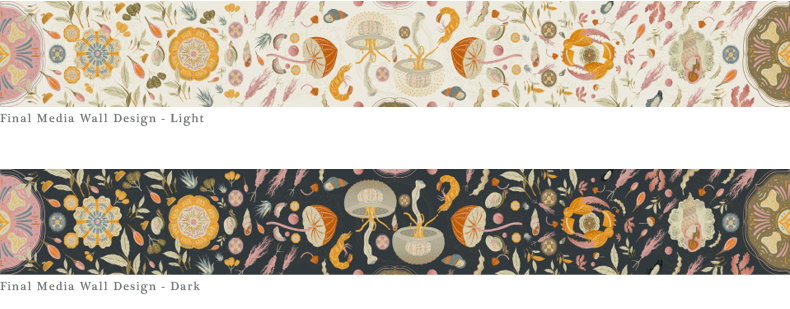
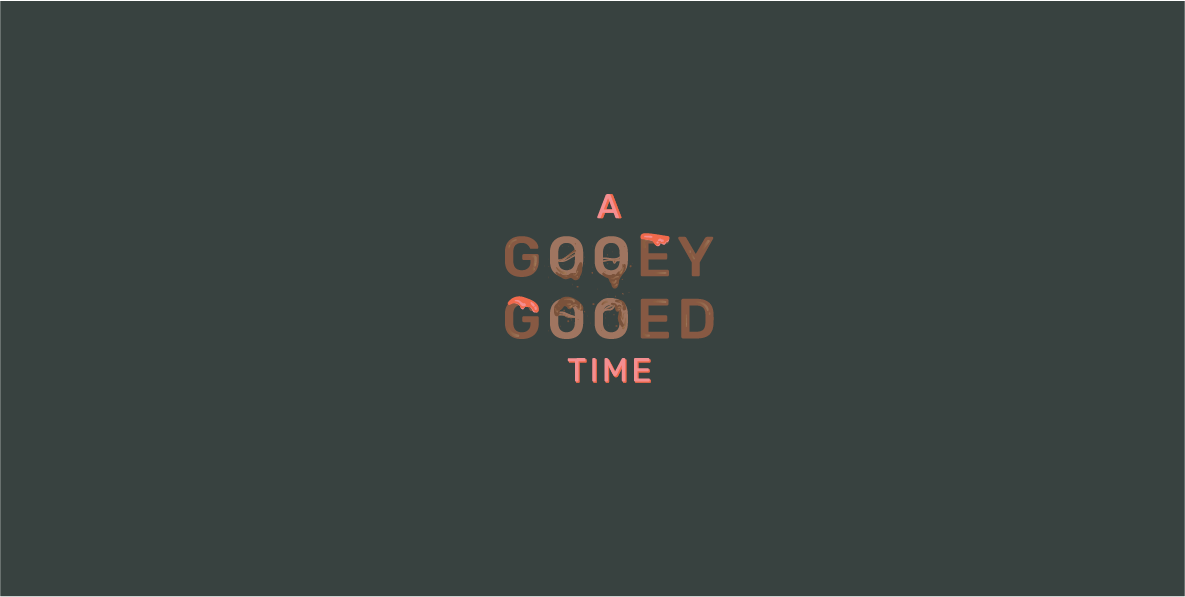
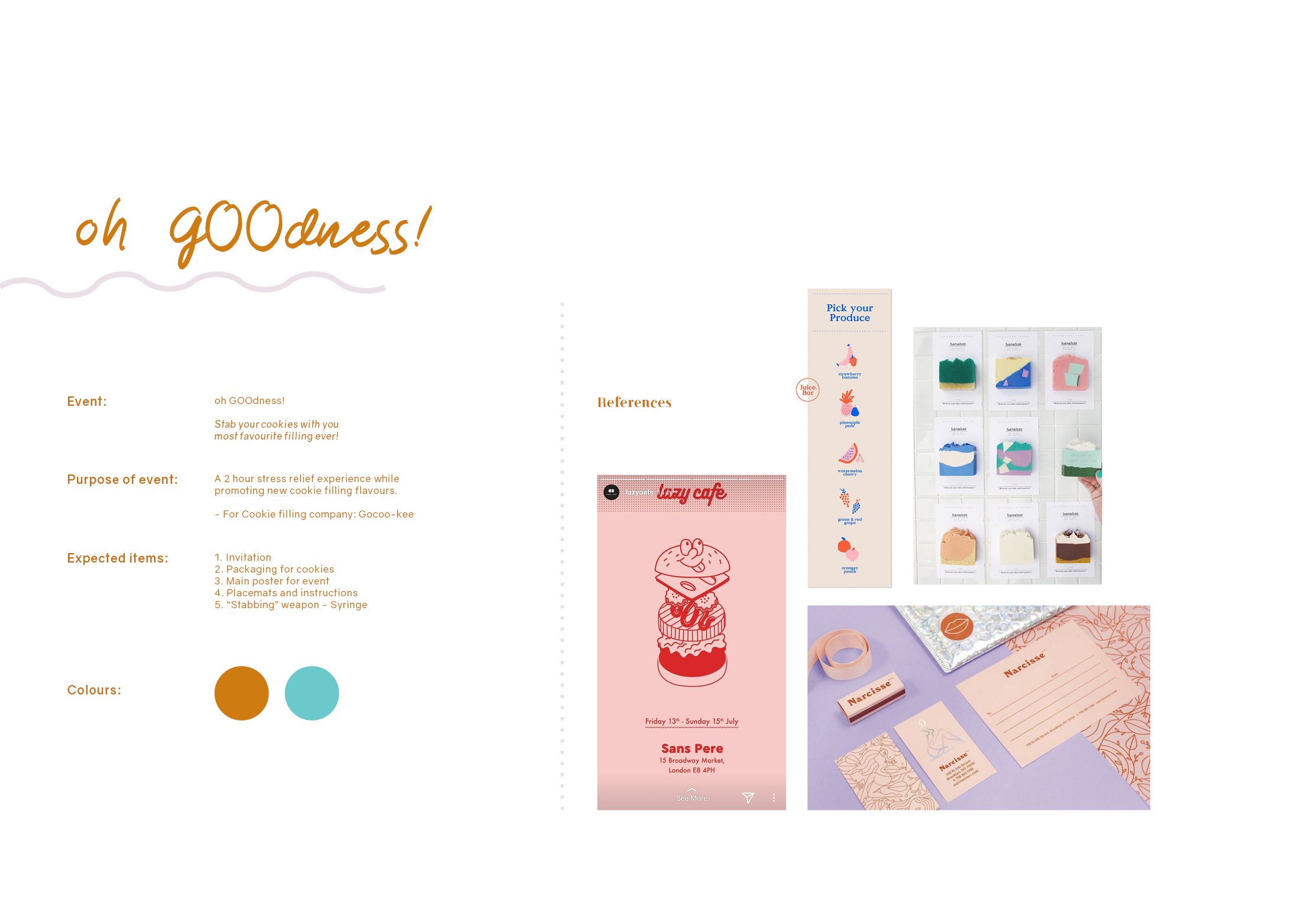
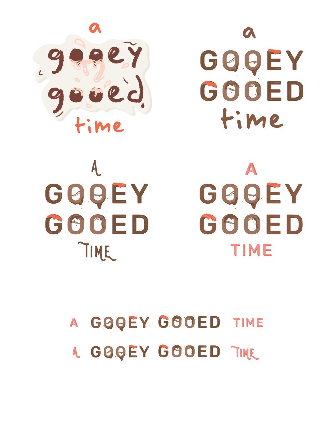
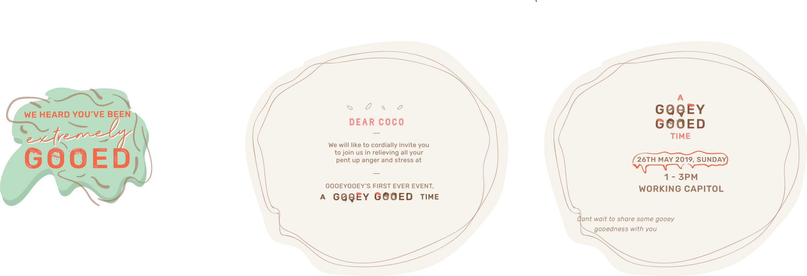
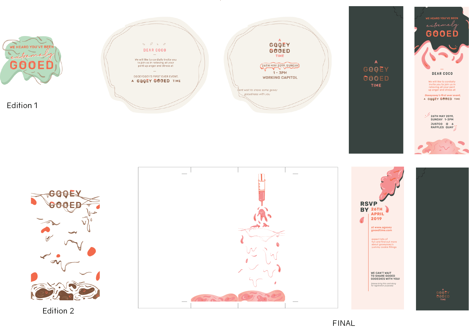
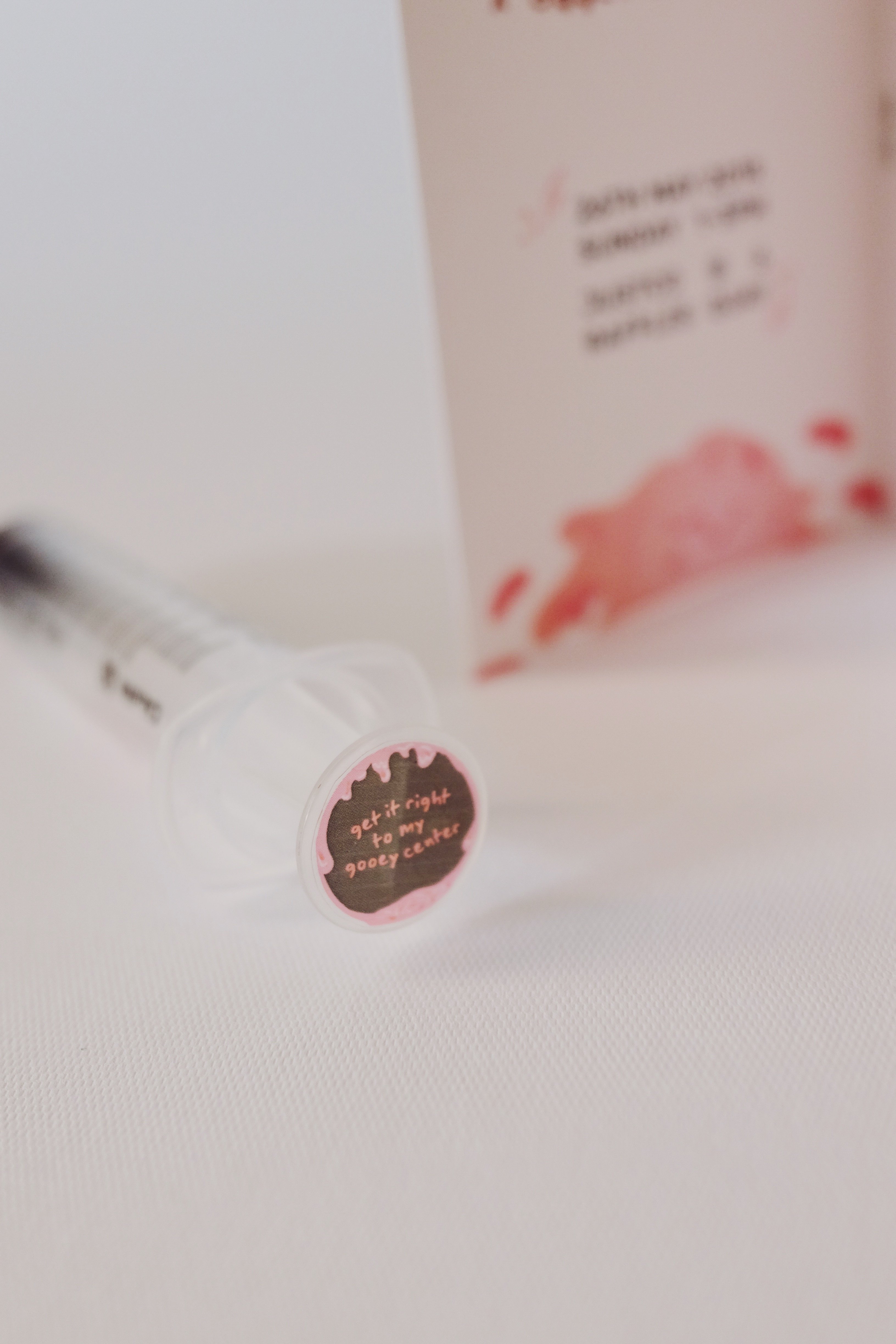
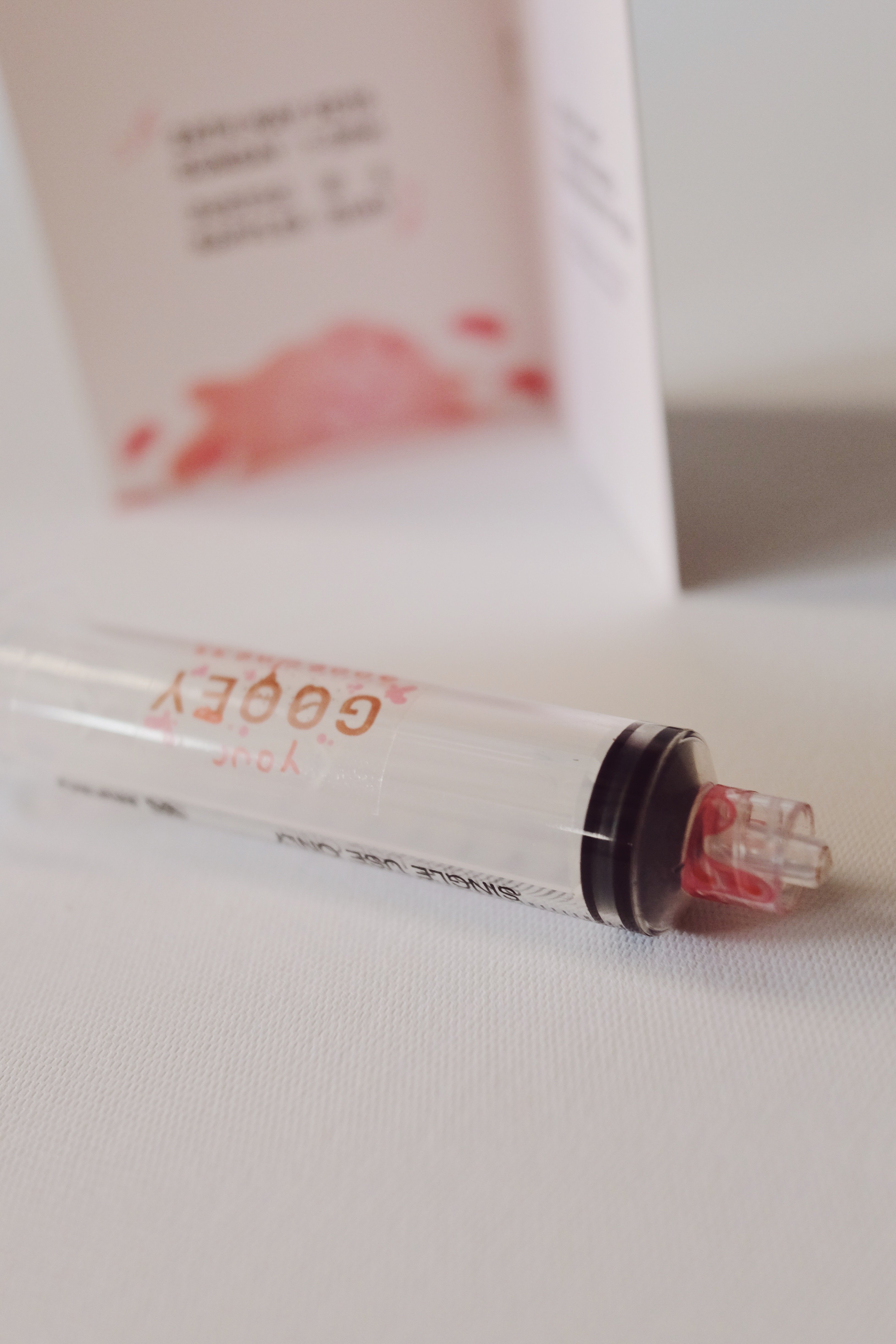
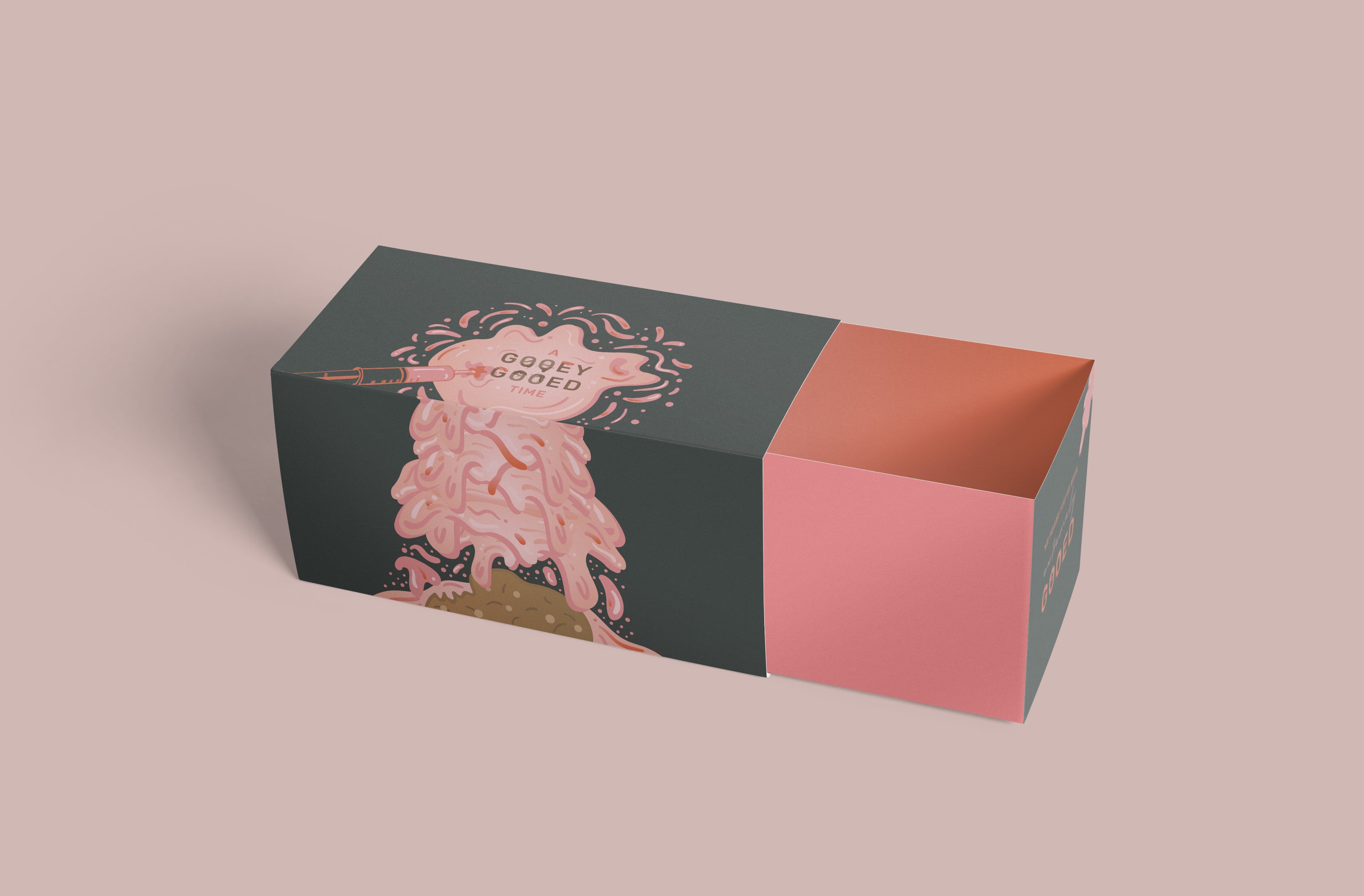
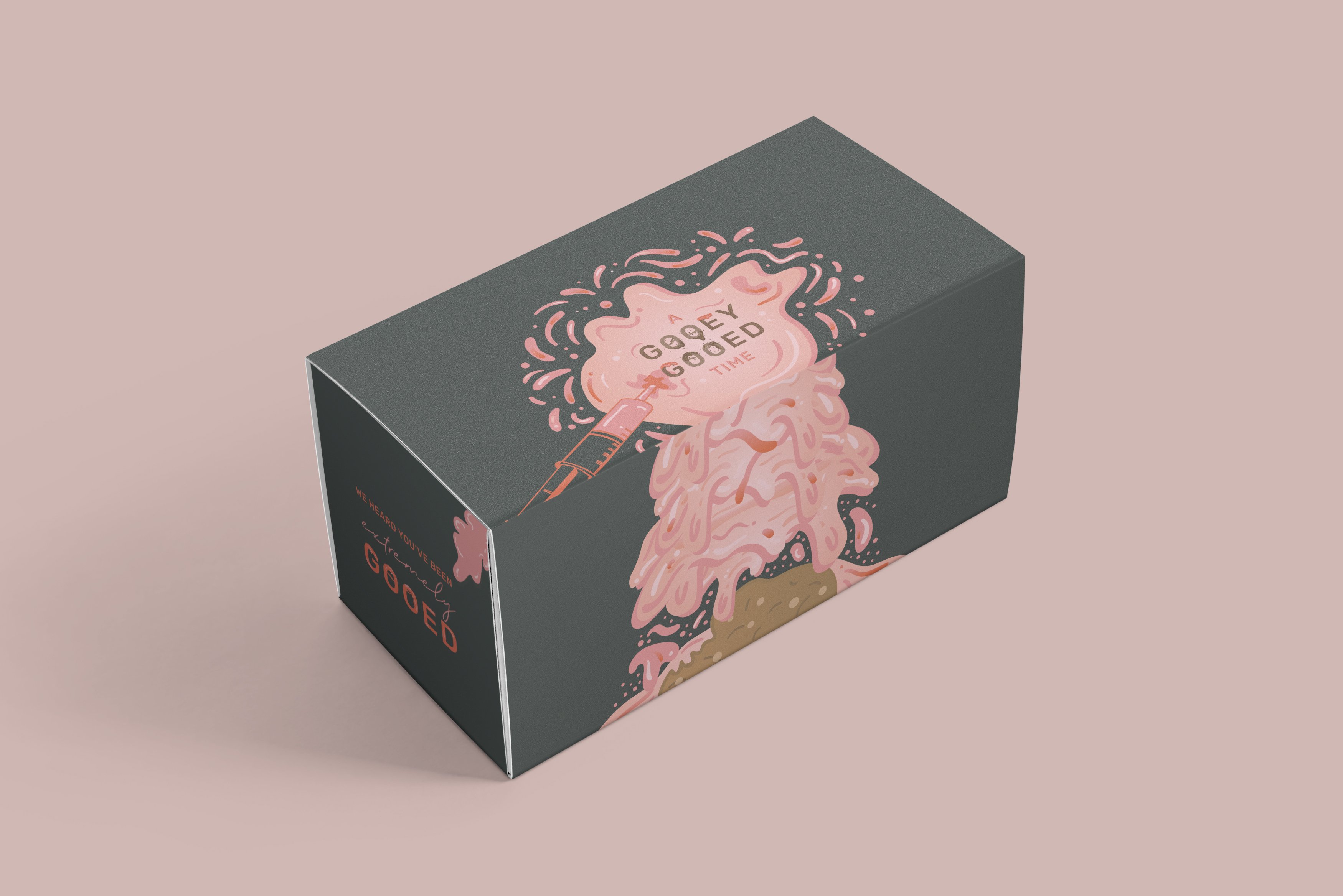
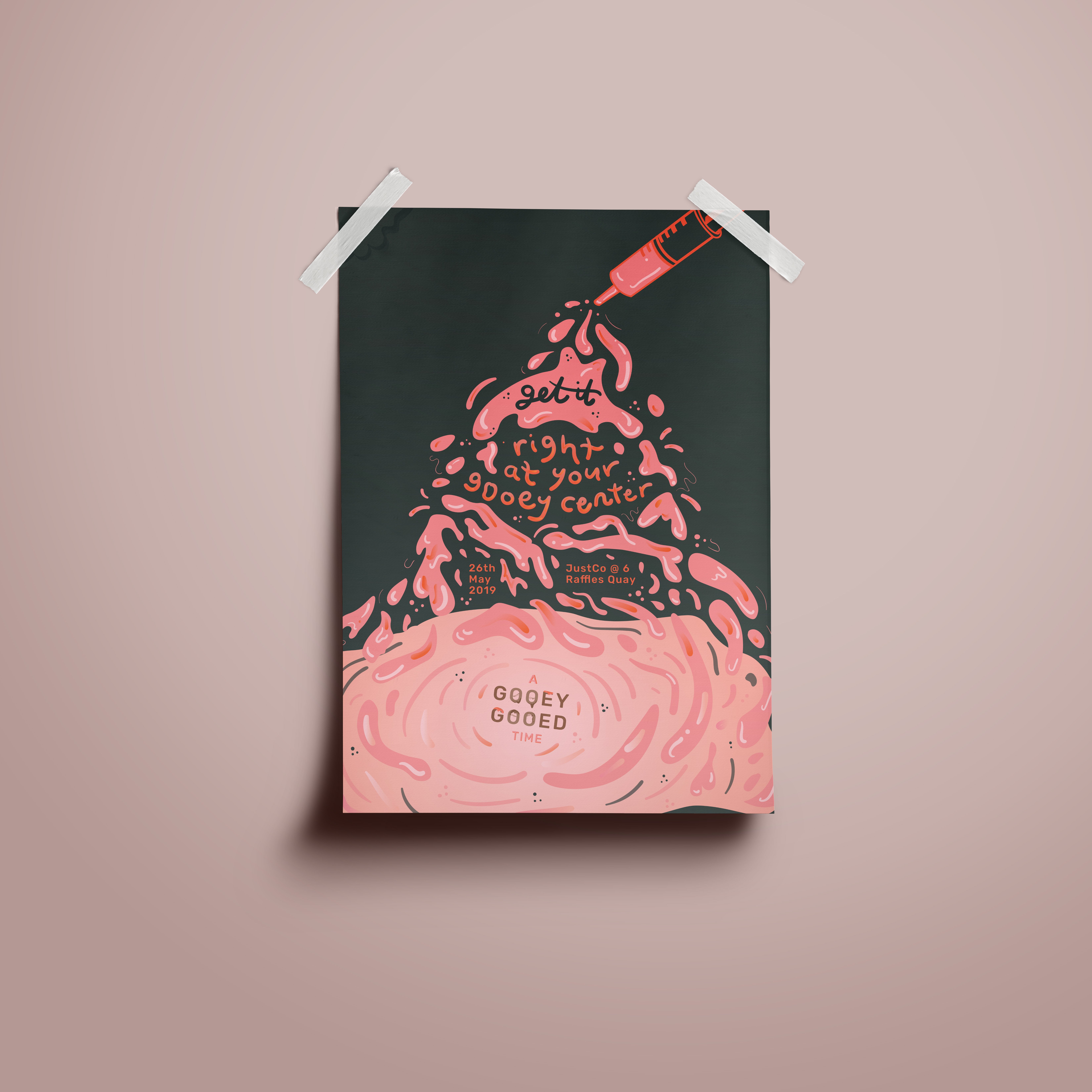
While thinking about my colour scheme, I thought that I wanted to do something more fun and not so related to typical dessert colours like brown.

My initial five items are:
  1. Poster
  2. Invitation
  3. Table placemat (later taken out as only 4 items are required)
  4. Packaging
  5. Syringe (for goo)
creative process

LOGO

Initially, I designed the logo to look more playful and fun. However, I did not want the entire event to look too childish as my intended target audience are working adults. Thus, I decided to go with this.

INVITATION

first draft

I was thinking of an odd shaped invitation at first. But later i realised it doesnt will make sense or look good, so I changed it to a more simple design. However, I received feedback that it looked to corporate and does not go with the other deliverables.

For the other 3 deliverables I adapted the same style throughout but do not have huge changes from edition to edition and so I will talk about them more in my next post.

Read more about my final deliverables here.


Applied Illustration – A Gooey Gooed Time (Final)

After many rounds of editions, I finally found the colour scheme that fit my theme and event.

Colour scheme

A mix of complementary colours and some brown to have some link to the cookie fillings.

confirmed deliverables
  1. Poster
  2. Invitation
  3. Syringe
  4. Cookie Packaging

POSTER

INVITATION

SYRINGE

PACKAGING


ALL DELIVERABLES

REFLECTIONS

Overall, this project was very fun to work on and although there were difficulties along the way. It was interesting applying an entire concept to different deliverables and finding different ways to fit them in and for different context as well. I learnt a lot through this project and if given more time, I would have been able to experiment with alot more and improve the illustrations. This idea is simple and does not involve complicated illustrations or fine details but it is something that I’ve always wanted to try (filling a whole poster with goo) and i’m glad I got to try that out!

Varoom Illustration: Process & Final

Continuing from previous post, here is the process towards 
my final layout.
PROCESS OF ILLUSTRATION
DRAFT

FINAL

Final Varoom Illustration Magazine cover

The lack of self-empathy and the inability to stay away from caring for others – represented through a bathroom scene where the water expands to a ocean scene. The human is submerged in the water, her hair entangled with the anchor which represents the heart and in this context empathy. The ocean represents the scary world and how being stuck in the empathy trap can be dangerous. This is represented through the angular fish, using its light to make the empathy alluring and attractive. The girl reaches her hand out to a lifebuoy which signifies the help he needs.