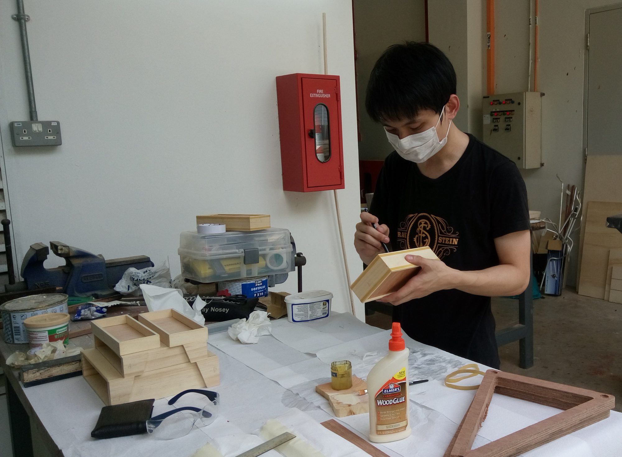
Week 2 – 21 Jan 2016
Hey there!
Thank you for paying attention during my presentation, I greatly appreciated it. ✌
I am so thankful for the amazing Slideshow/PowerPoint that was shared during the presentation; such as our takes on ‘Typography’. I’ve learnt and acquired meaningful information that can be apply for Project 1.
Thank you Miss Joy for guiding us through the Lectures! Appreciated! ?
As Miss Joy mention during her lecture, setting-the-scene is important,
see below for example.

‘Setting’
– The ‘Setting’ act as an important role in Typography too!
– What happen if I add an image of a Typical Singaporean Son in the original picture?
– Did the meaning changed?
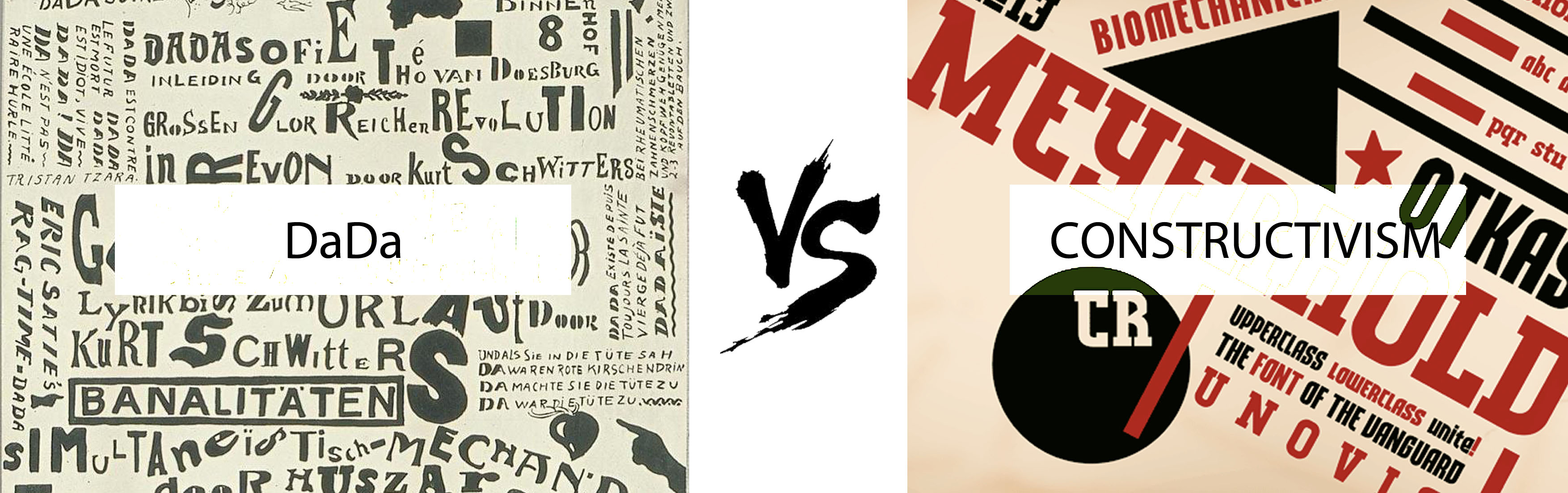
With regards to the Dada & Russian Constructivism, I’m glad that most of us gave our opinion on it – whether it is applicable or not, and how it could be useful for our Project.
To reiterate my points during my presentation, I mention that Typography used in the Dada Art Movement can be categorise into two different categories – 1) Strict, 2) Mix. In my opinion, the fact that Typography used in the Dada Art Movement seems to be randomly placed, it seems to be somewhat controlled. Because most Dada Artist do not want their viewer to focus more on the text, they placed typography in a way that it looks random but it still follows a set of imaginary rules.
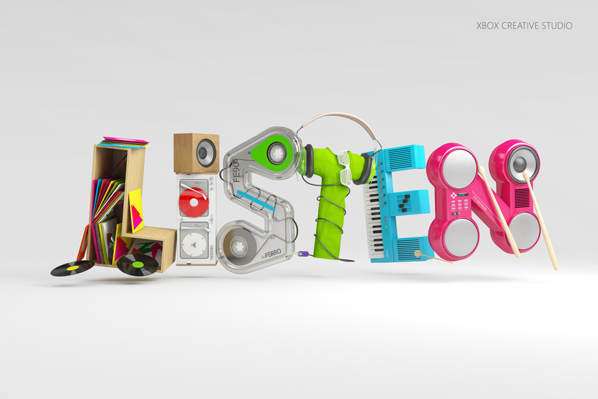
The other stuffs that we looked at were the unusual or rather different types of techniques that can be used to express Typography. Some of the design goes very well with the meaning of the word itself. With reference to Chris LaBrooy award-winning typography, he uses the idea of ‘Visual Perception’ that incorporate musical instruments/equipment’s into the word; ‘Listen’.
He amazingly combine these two elements together, Form and Context, to create the ‘Content’ that we can easily understood and interpret. This led us to the point that Typography comprise of wordings with an Attitude – An expressional tool that emphasis on effective communication.
Typography are amazing!
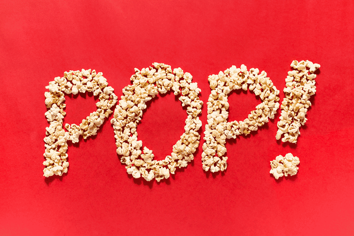
As mentioned and shared with the class, Typography can be designed in an attractive manner by ‘decorating it more creatively and more beautifully’. In this way, typography is more than just being words, it can be a very inspiring form of art too! Below are some examples where Typography were made creative.

– Gun by Mou5e

– Addition by Tokarnia
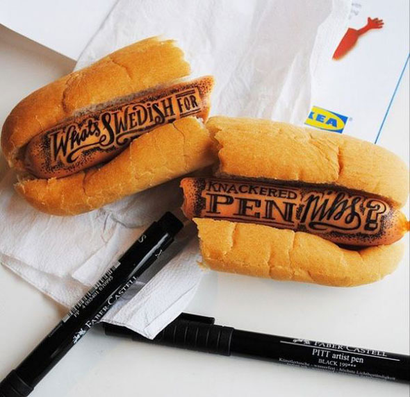
Hand drawn typography by IKEA
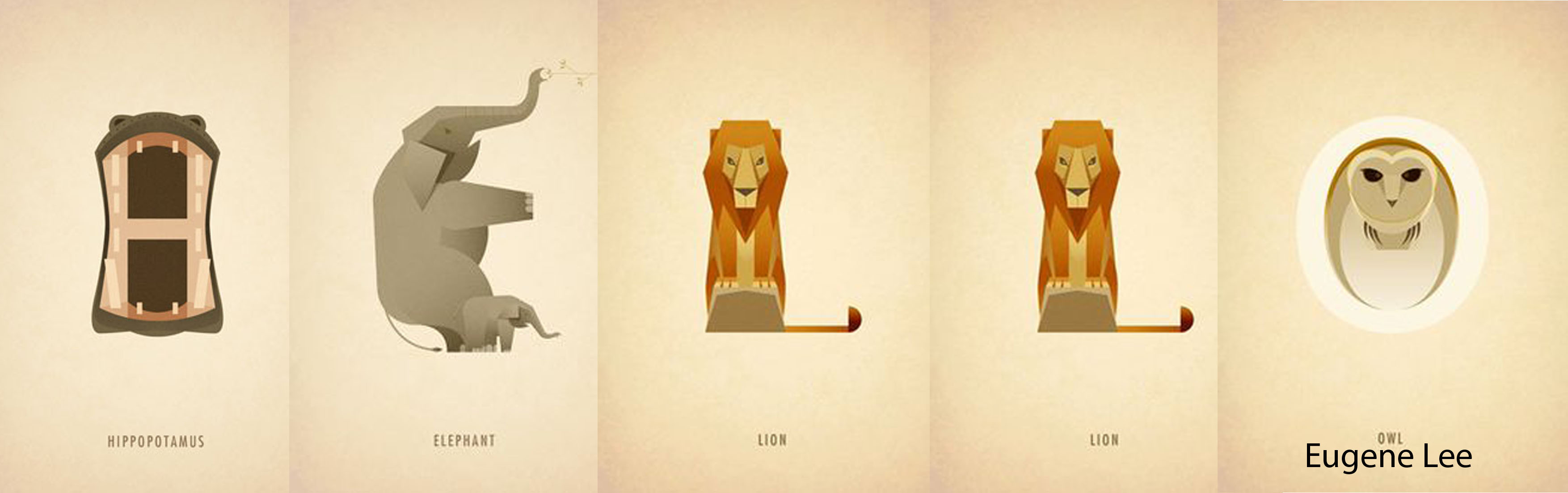
Dan Fleming
Dan Fleming Creative Animal Typography
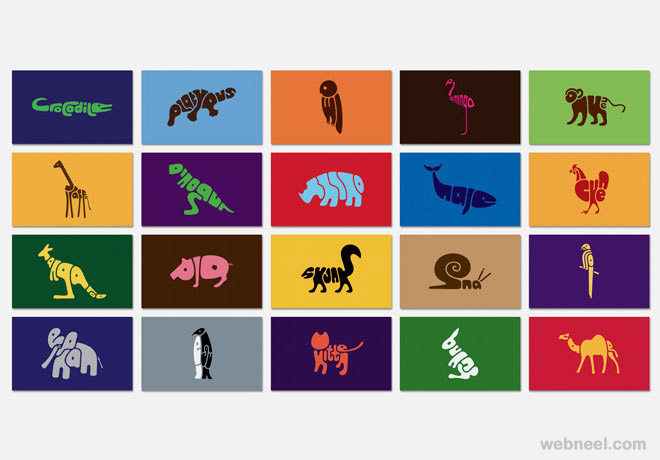
Dan Fleming animal typography was a perfect example that combine the outline of an animal with its name. Similar to Chris Labrooy, both play with the idea of ‘Visual Perception’ that allow us to interpret the context by its form. Amazing! ?
Takes from presentation
There are various Artists that were mention during the presentation.
The followings are the lists of Artists that were mentioned, Check them out! ?
1) John Lee
2) Magen Lee
3) Yellena James
4) Danger Dust
5) Danielle Evans
6) Red Hong Yi
7) Stefan Sagmeister
The End of Part 2. (=