Foundation 2D II Project 1 – Typographic Portrait – Research Pt1
Typography
What is it?
– The term ‘Typography’ refer to Letters with an Attitude.
Check out this video~! ^^
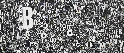
More Examples

Identifying Type of Typeface

Hannah Hoch Left to Right: Cut with the Kitchen Knife, Proverbs to Live By, Quiet Girl
In the examples above, Hannah Hoch approach to typography together with the Dada Art Movement carried a strong message across which was stunning and amazing. Her use of substances such as the Negative White Space, Arrangement, Width, Spacing and Photo Montage work hand-in-hand to develop a form of communication which was significant.
Many aspects of her signature style and techniques were mainly use for manifestos and posters which carries strong messages, for example; Women Rights etc. The artworks thus creates a sense of visual identity accompanied with the strong design layout.
As I browse through the list of typography artworks by Hannah Hoch, I realised that the artworks can be categorised into 2 sections. 1) Strict Order, 2) Mix.
- Strict
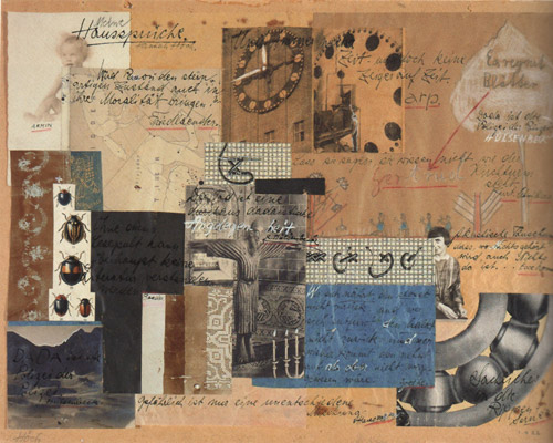
An example would be ‘Proverbs to Live by – Hannah Hoch’. In the artwork, her use of mix media such as Graphite, Crayon, Colour Pencil, Photo-Montage etc. interacts with the typeface. There seems to be a strict order of top to bottom with no type changes. The overall arrangement and the choice of text made the artwork clean, neat and tidy.
- Mix
Hannah Hoch choice of typeface can differ as well. An example would be The ‘Quiet Girl’ – Hannah Hoch. In the composition, we can infer from the choice of different typeface used which range from BIG HEAVY fonts to small neat fonts. In addition, the typography involve playing around with fonts which are position horizontally and vertically on a single sheet. However, despite the use of different typeface used, the overall feel of the artworks seems to be in sync.
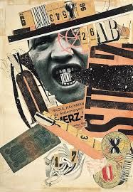
Dada’s Art Movement with relation to Typography.
Dada approach to typography was more experimental in my opinion. Because it varies from the arrangements and the choice of typeface, typography was used to convey a message of its own. For example, the use of Size & Fonts. In the example of Hannah Hoch artwork above, how people make assumptions/interpretation of the text depends directly on how the typography was presented. In the case of ‘LOUD, BOLD, STRONG’ letters, an individual may derive that ‘Annoyed, Turbulent kind of feel.
Typography was used as a medium in the Dada artworks. It was used to create hidden meaning/strong message. Dada artists were experts in visual communication, they are able to translate their visually amazing artworks into textual message with the addition of typography. They play around with typography such as the style, size, weight, the use of upper and lower case characters to highlight the importance of the subject. – Decipher meaning.
(Unconventional Typographic Design), (Explosive Arrangement), (Mixing of Fonts)
Russian Constructivism with relation to Typography.
The constructivists approach with typography focus on ‘Construction’. Constructivist pay emphasis on the message and the fundamental analysis of the materials, forms and art rather than what’s on the surface. An example would be El Lissitzky whose artwork pay more emphasis on the message and ideas rather than to express beauty.
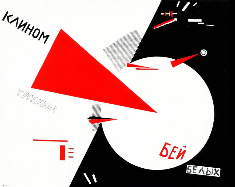
El Lissitzky; Beat The Whites With The Red Wedge, 1920
Check out this link on the “Most Iconic Typefaces made in Soviet Russia”
http://www.dafont.com/theme.php?cat=205
With reference to the website above, most of the fonts are Bold, Strong and Impactful.
That was probably due to how the Russian Movement gave rise.
In the example of El Lissitzky, most of his artworks turn out to be a propaganda effort in support of the revolutionaries and while paying attention to the font used, I can relate why the font must be big – To deliver an important, urgent and strong message.
Comparing both typography of Dada Art Movement & the Russian Constructivism
I find Dada Art Movement the ability to offer more variety as compare to the typography of Russian Constructivism. As mention earlier, I see the typography used in Dada in two different categories. 1) Strict, 2) Mix, whereas Russian Constructivism offers mostly ‘Bold, Strong and Impactful’ fonts.
I find both Art Movements as interesting and are equally useful depending on my project theme. Such as how the typography was being positioned, the size, style and the message it bring across.
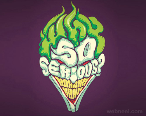
Keep Exploring~!
DIY Movement [Digital]
Very different from the previous Dada & Constructivism Art Movement, DIY Movement channel us to the modern ‘State-Of-The-Arts’ style of art. With reference to the website above by 8faces, it support the idea of modern art because of the style used. This includes the illustrations, colours, 3D typography that work hand-in-hand to create an amazing artwork.
.png)
.png)
http://www.punkprojects.com/2013/01/easy-typography-art-diy.html
Similar to the modern typography style used in another source suggests the importance of illustrations and simplicity. Unlike the previous Art Movement, the modern DIY Movement removed all unnecessary media to deliver a message short and sweet, big and strong etc.
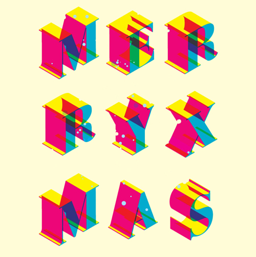
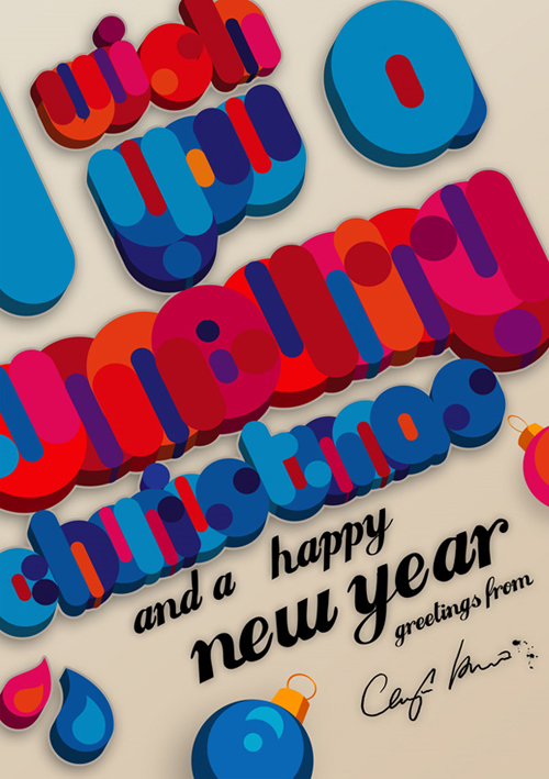
3D Typography [Digital]
I googled on a list of ‘3D Typography’ images and I was amazed by the incredible designs! I really like it! ?

I researched on Chris LaBrooy – A freelance designer/Illustrator, who draws and create impressive 3D Typography.
Check out his portfolio here – https://www.behance.net/chrislabrooy
In my opinion, I find the use of 3D incorporated in typography interesting as it bring out a sense of playfulness. Unlike Dada and Constructivism Art Movement, 3D typography manage to breathe in an attitude of playfulness, freshness together with a lively expression.
In addition, the use of 3D creates a sense of depth which brings out the emotion of the typography and because it wasn’t restricted and confined as compared to the previous two art movements, 3D typography encourages the idea of ‘Being Free’.
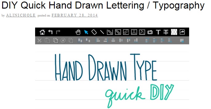
Hand-Made Typography [Digital]
http://www.designandpaper.com/?p=6104
Since Hand-Made Typography can be made digitally via designer software’s such as Adobe Photoshop, Adobe Illustrator etc, it suggest an essential part of the creative or presentation process. With reference to the website by DESIGN&PAPER, the typography involve a combination of various elements such as 3D Typography and the importance of colour theories used on a flat surface.
Similar to the Dada & Constructivism Art Movement, typography contribute to the overall finishing of the composition. Depending on the situation, the typeface correspond to the composition directly. For example, the typography used by DESIGN&PAPER for Christmas suggest using mediums that matches the seasonal trends.
http://blog.ninethousandthings.com/
In the link above, Alinichole teaches us a method she used to create her Hand-Drawn Typography.
Check it out~^^
Hand-Made Typography [Physical]
Hand-Made Typography could suggest a physical form too!
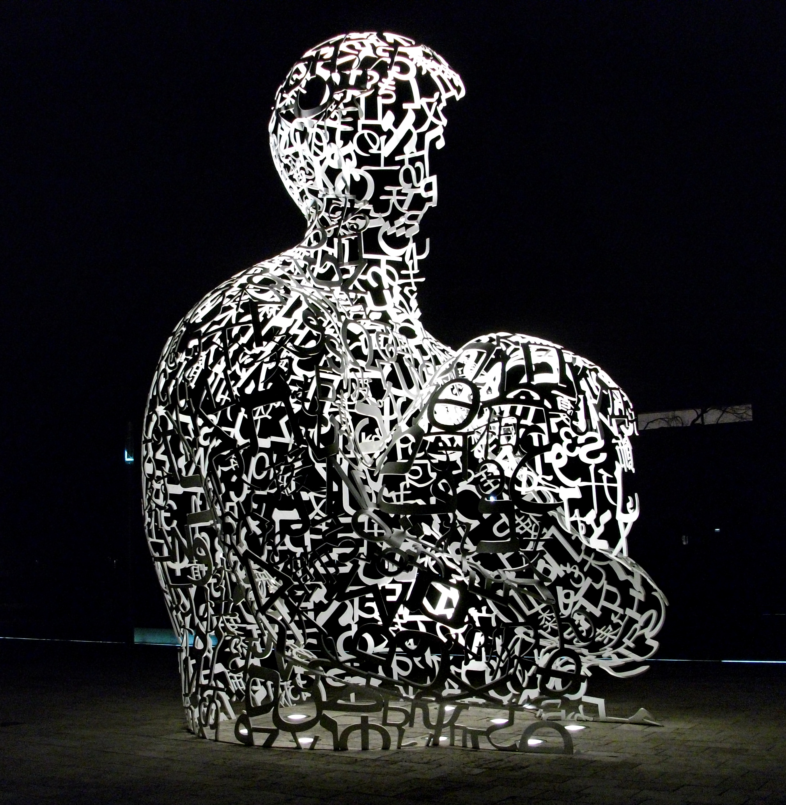
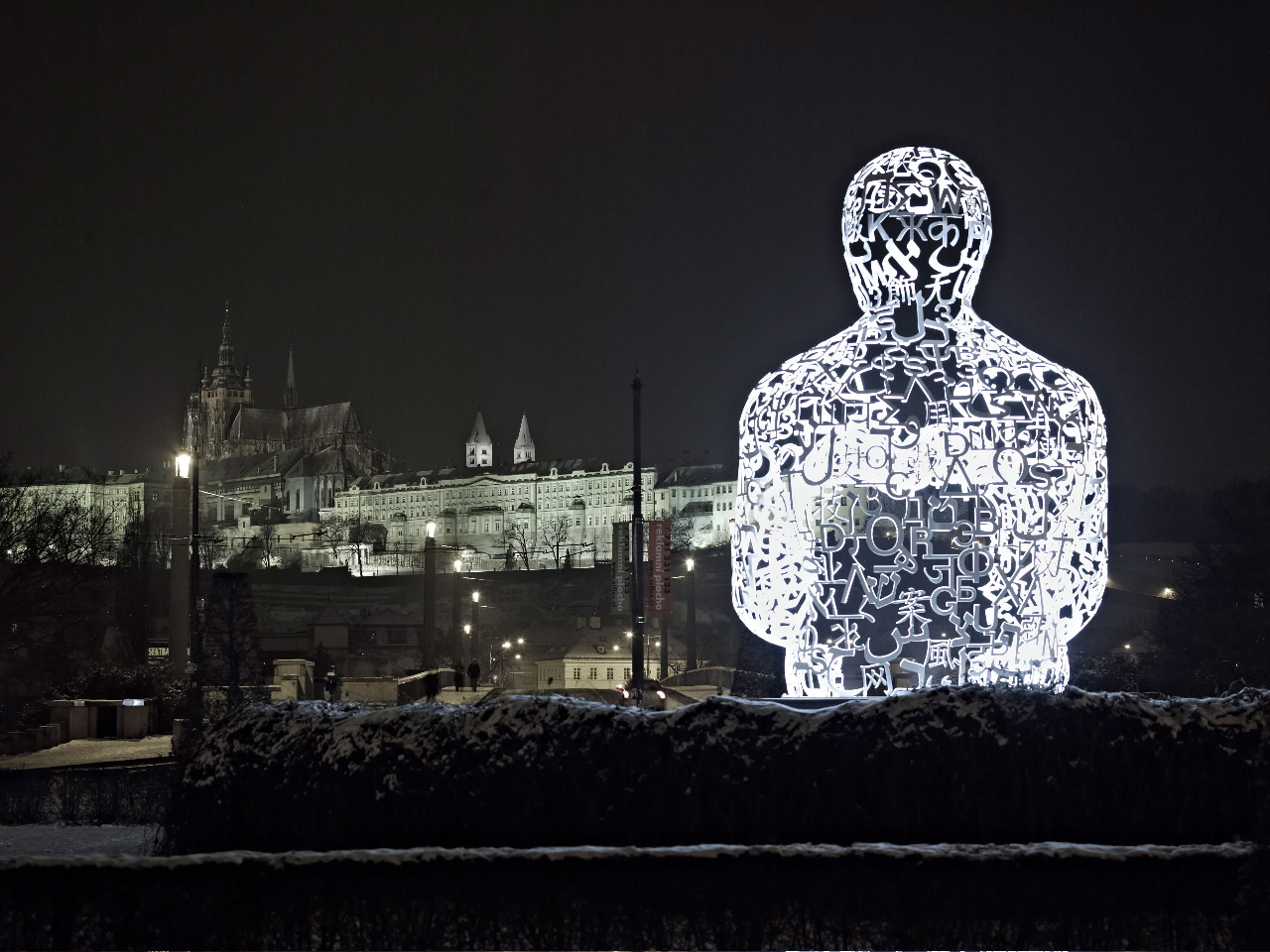
In this research, I explored the arts by Jaume Plensa who was famous for his use of typography in sculptural design. The sculptures were done by piecing many 2D letters together to form the shape. In addition, the typeface used for the typography remain constant.
Amazing isn’t?! 😀


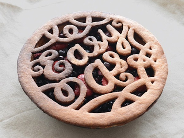
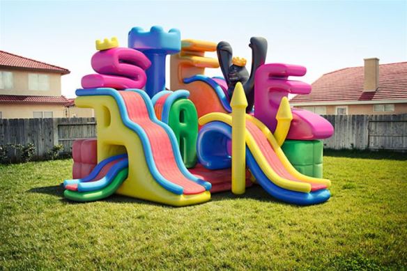
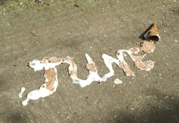
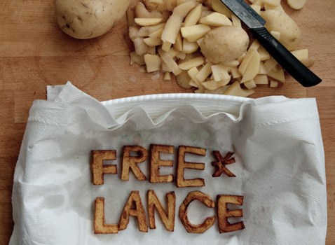
In addition, ‘Hand-Made’ suggest the possibility to create typography with different mediums such as Potato’s, Balloons, Pencils etc. Above are some examples,
Once again, it suggest the attitude of playfulness and the ‘Beyond Boundaries’ in design. ?
Miscellaneous [Useful Stuffs)
More Readings
http://textarthistory.com/tag/modern-art/
http://www.creativebloq.com/typography/design-your-own-typeface-8133919
http://archive.notpaper.net/2008/12/hugo-werner.html
http://www.trickhouse.org/vol15/door_02_annewaldman/lewiswarsh.html
The End of Part 1. (=