YIN

YANG

YIN
YANG
DESIGN 1

DESIGN 2

DESIGN 3

DESIGN 4

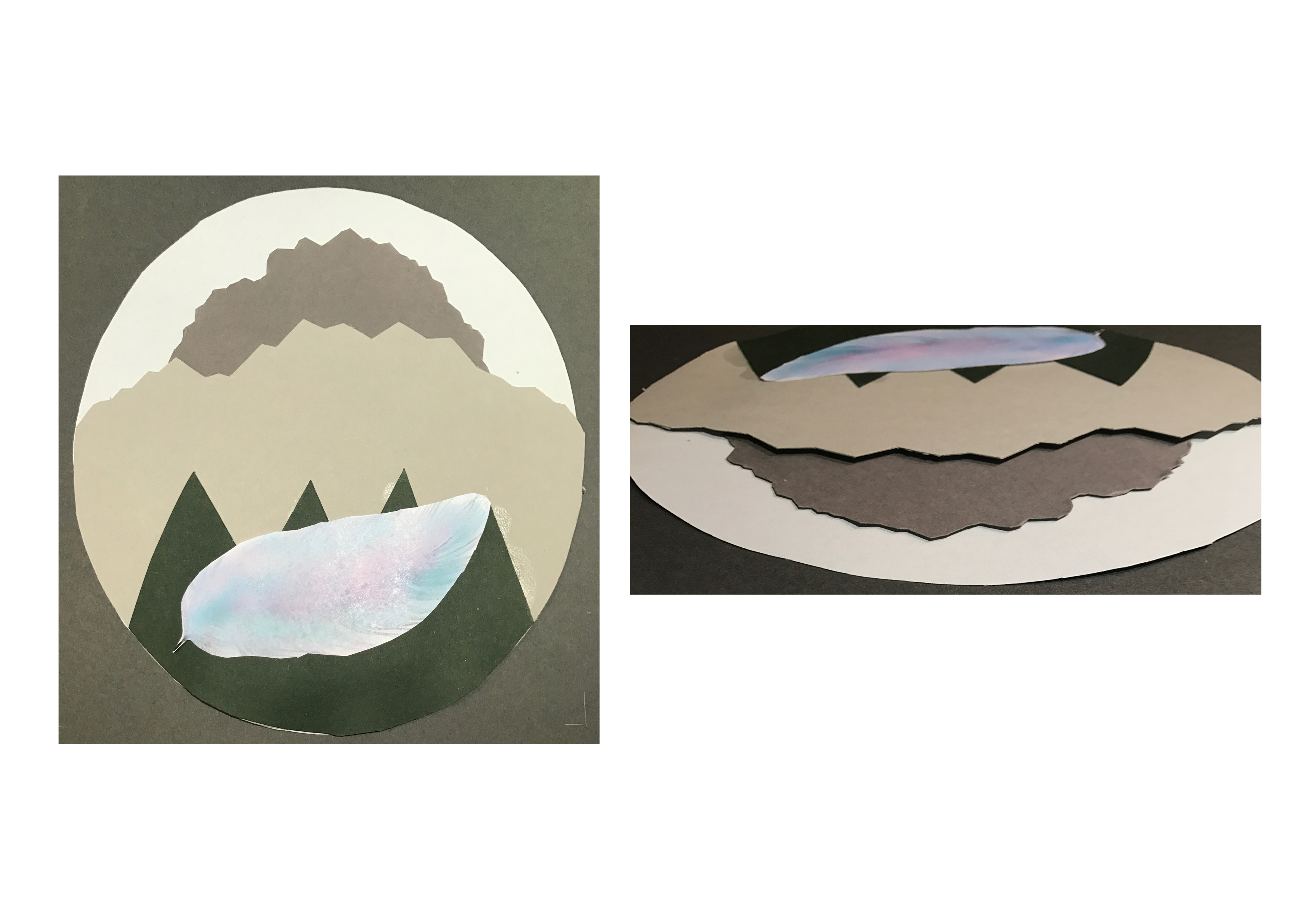
TRUTH
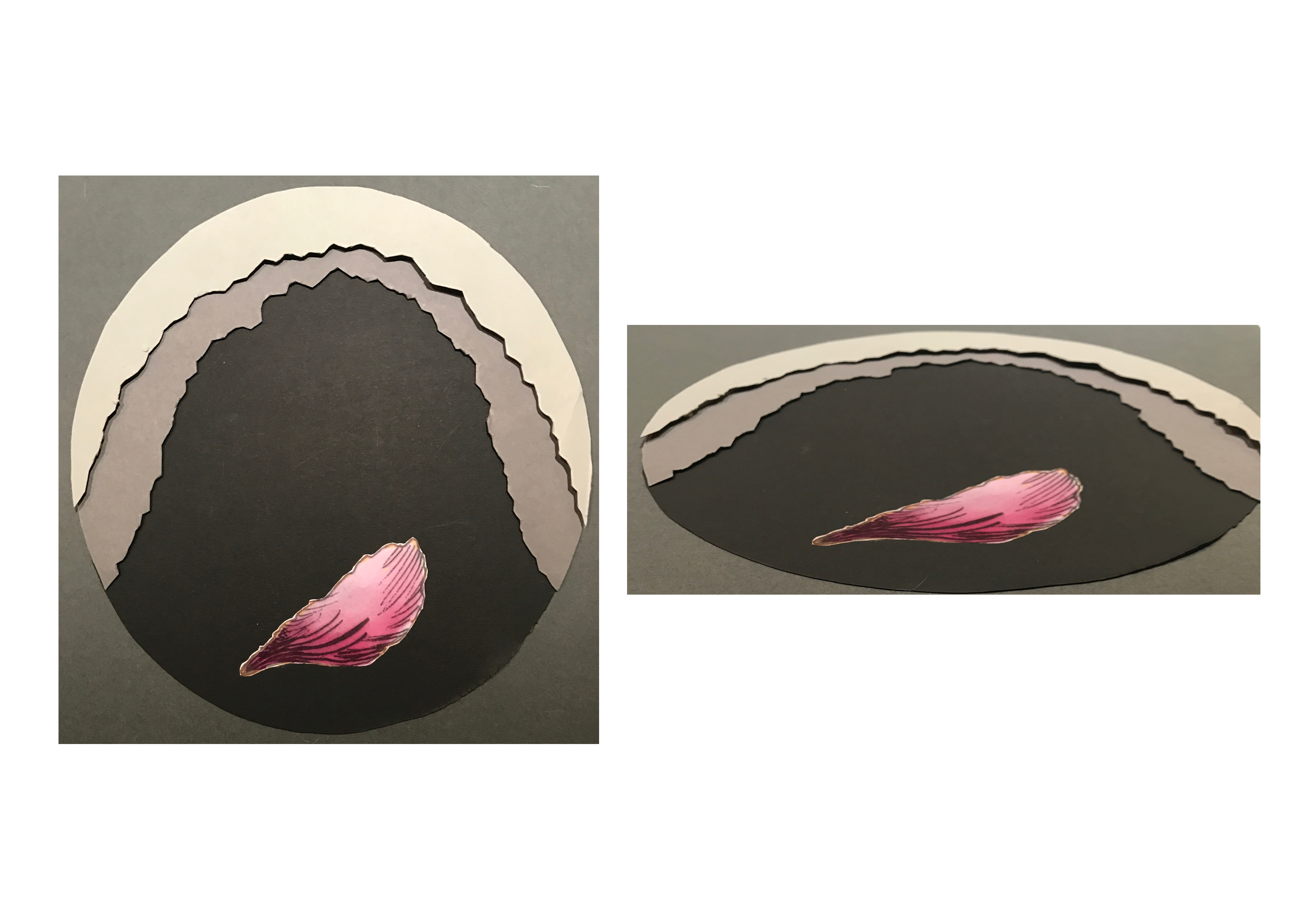
LOVE
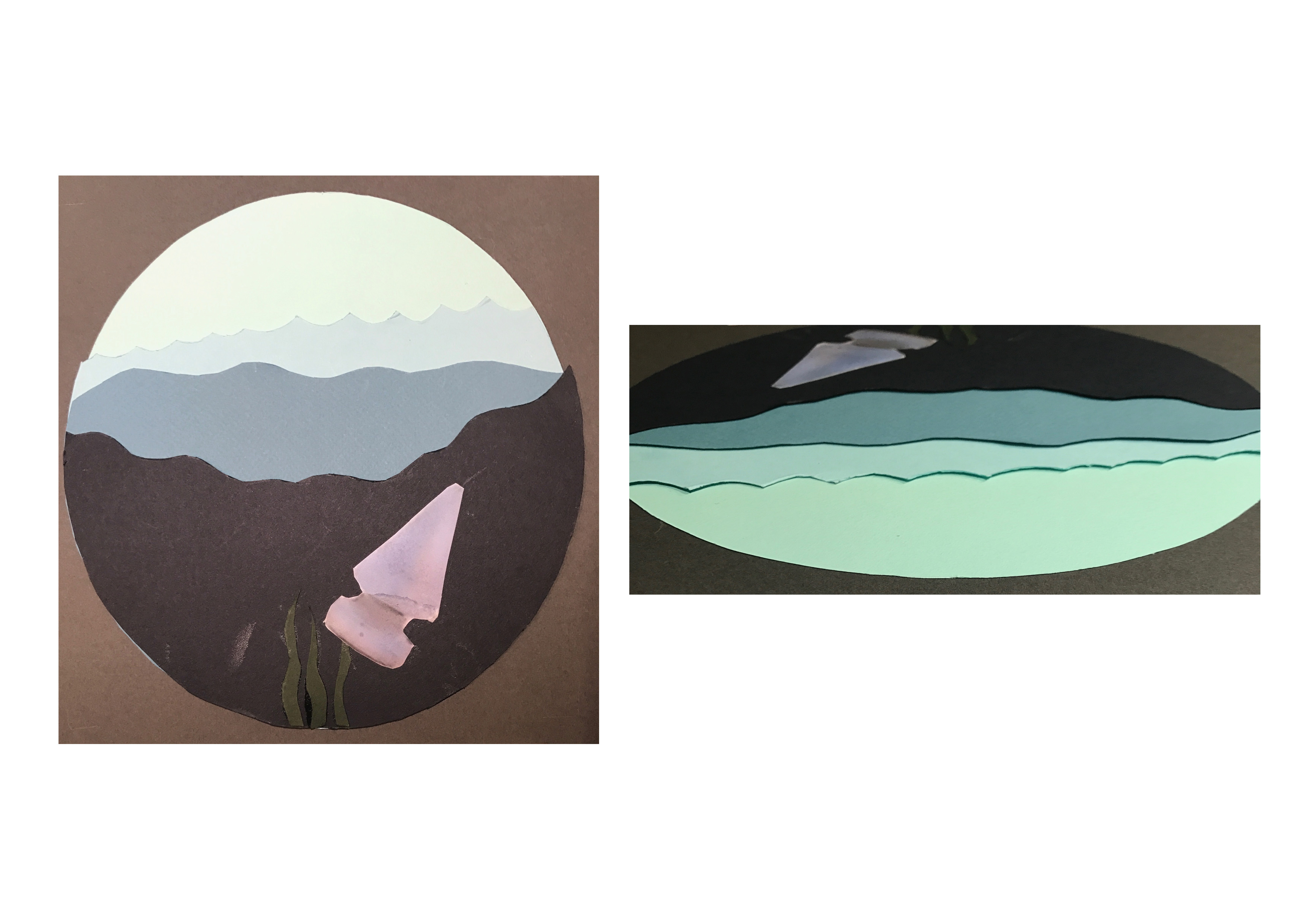
STUBBORN
COMPASSION
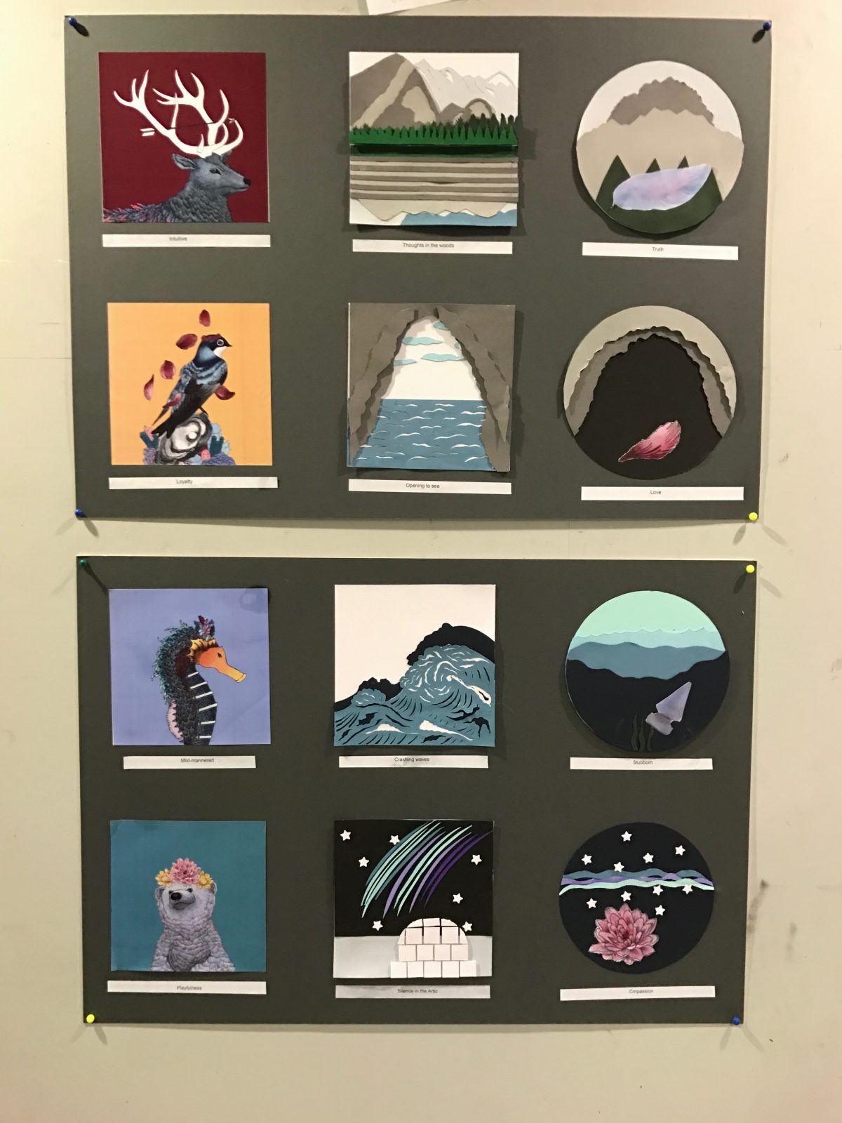
Who am I?
That was the main question I had in my mind while doing this project. It had a similar self-discovery journey like the Emo project but I enjoyed this creative process even more because of the use of – COLOURS and of course, my own imagination.
INSPIRATION
I’m quite a colourful person. I LOVE LOVE LOVE colours in artworks so when we were allowed to use colours for this project, I L.I.T.E.R.A.L.L.Y SQUEALED.
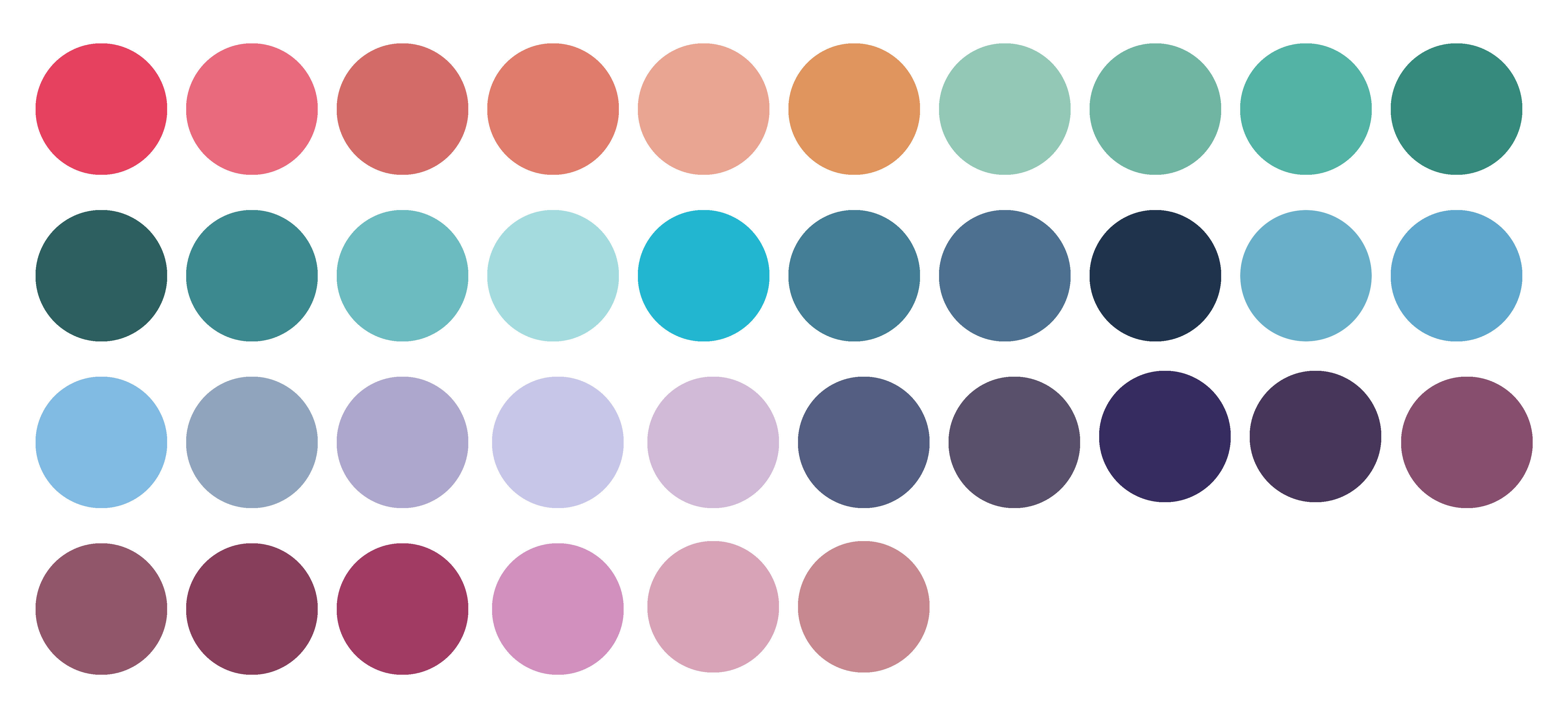
My Colour Theory
MATT MILLER
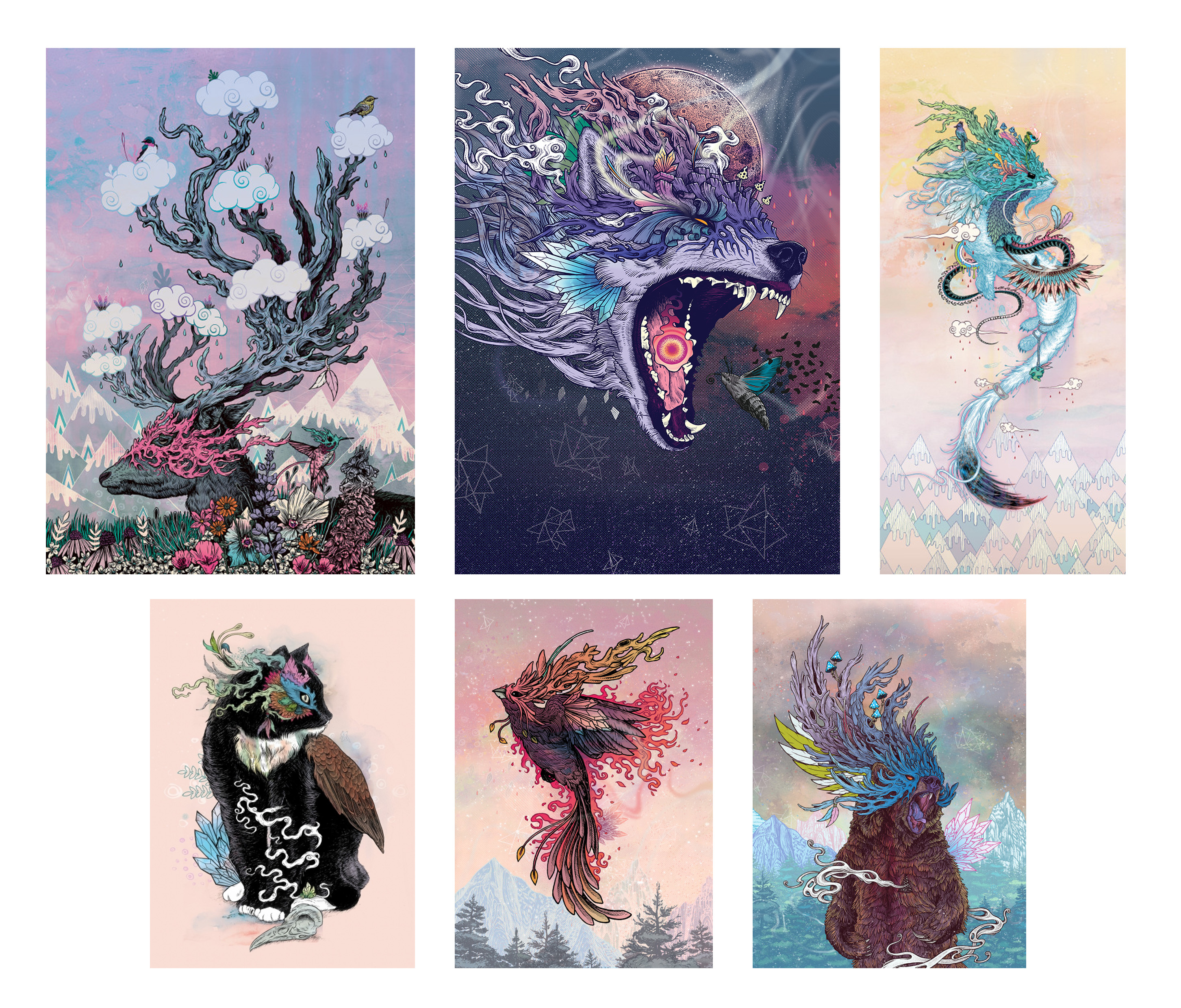
I love his colour scheme because of the fantasy, whimsical feel it has to it and even though there is a lot of colours, they somehow complement each other to create one piece that flows together. The use of pastel and neon colours allows the focal piece of his work to stand out and brings life to it due to the vibrancy.
Colours I have identified and used
PROCESS + RESEARCH
Me
Since I’ve taken the mbti personality test, I’m an INFP but recently it’s been swinging to ENFP although I still feel that I’m mostly and INFP. From that, I used it as a basis to further discover what morals and characteristics I have. Listed them down and chose the four that currently represented my emotional state this year.
(To read up about INFP https://www.16personalities.com/infp-strengths-and-weaknesses or ENFP https://www.16personalities.com/enfp-strengths-and-weaknesses)
The reason for choosing animals to represent me symbolically as these are some of my favorite animals and upon researching, animals have their symbolic meanings too.
I had no idea how to use illustrator so I did it the traditional way by first getting the base outline of my image followed by tracing my idea onto tracing paper with details then scanning it onto photoshop to colour.
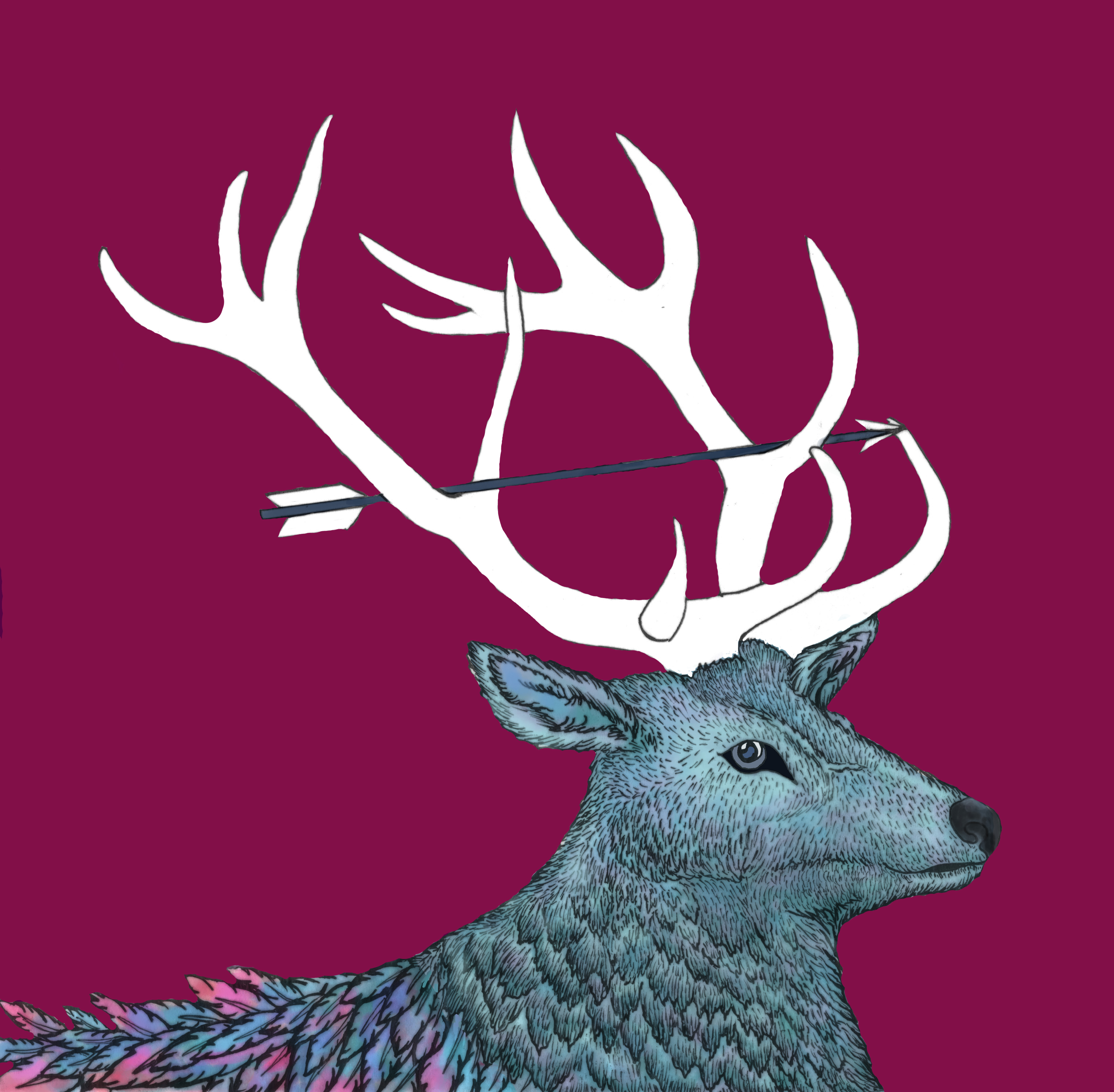
Stag – It’s senses are very acute and they see extremely well in low light, giving them the ability to understand the deeper symbolic meanings of things. They can hear a twig snap a very long way off. They are intuitive, often seeming to possess well developed, even extrasensory perceptions. Sometimes their thoughts seem to race ahead, and they appear not to be listening, to be somewhere else.
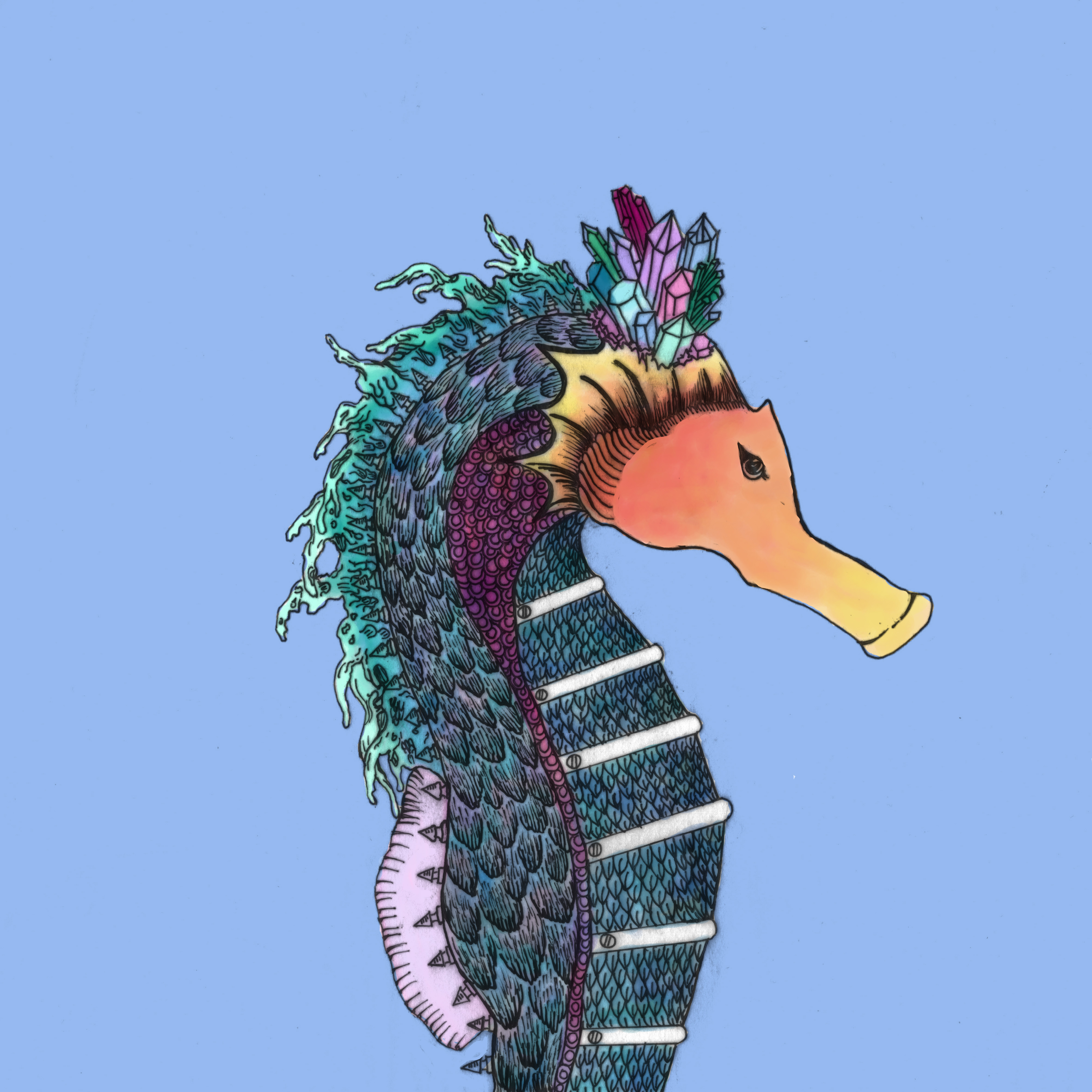
Seahorse – A relatively calm, and mild-mannered creature, the seahorse is seemingly content to roam the seas. Content to be who they are, and not feeling the need to change, the seahorse can be a symbol of inflexibility or stubbornness by wrapping its tail around the nearest object in order to anchor itself in turbulent waters.
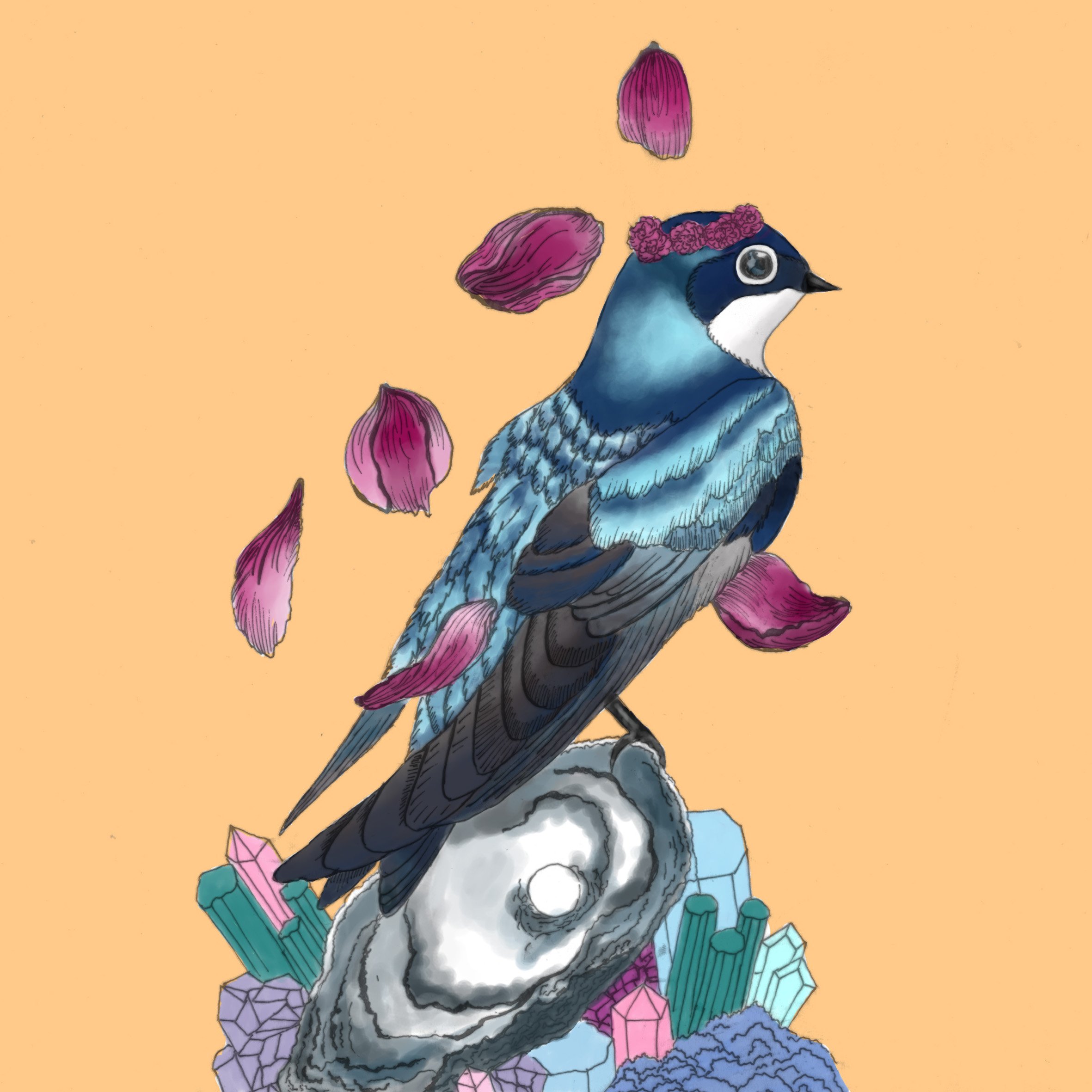
Swallow – Everlasting love and loyalty, related to the fact that swallows mate for life
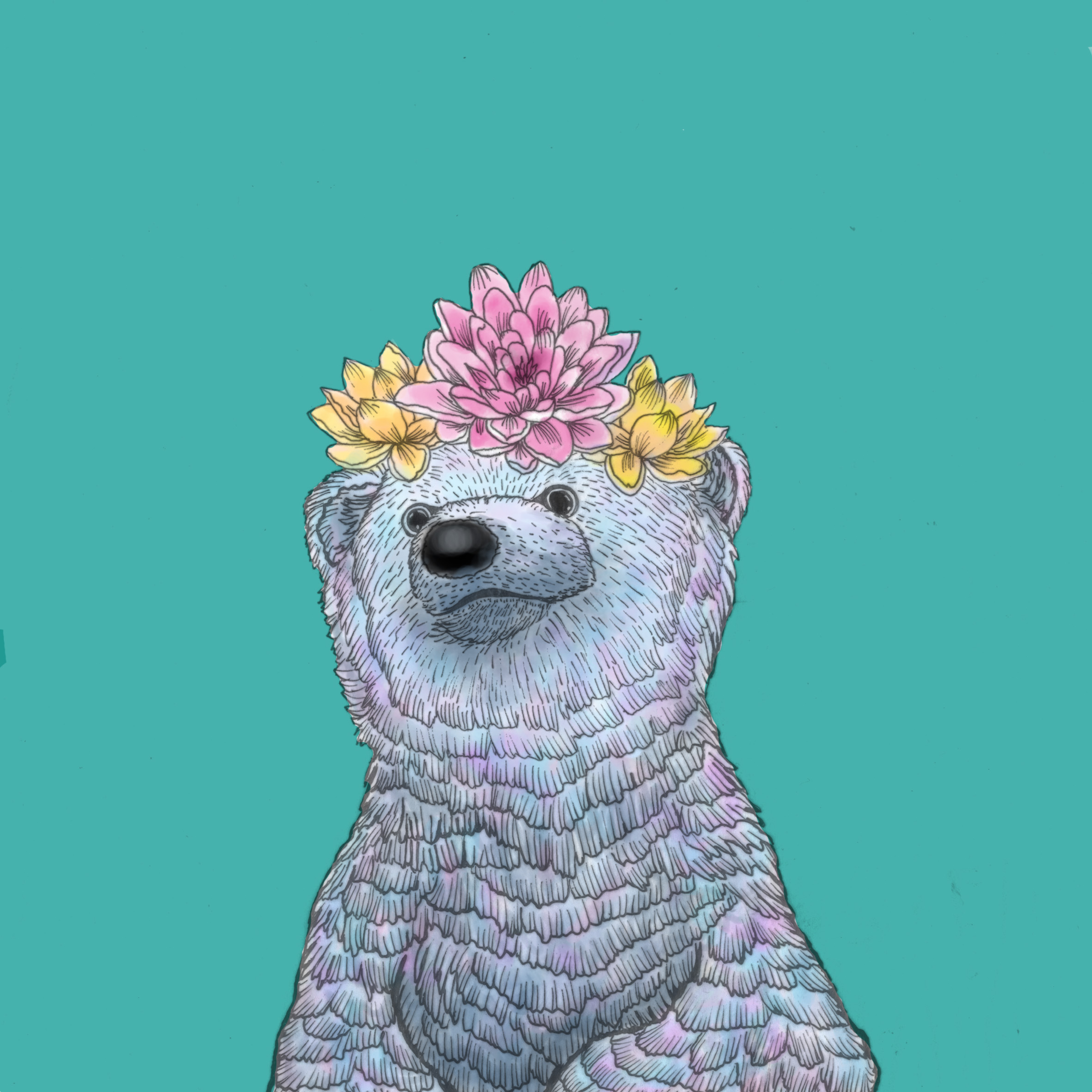
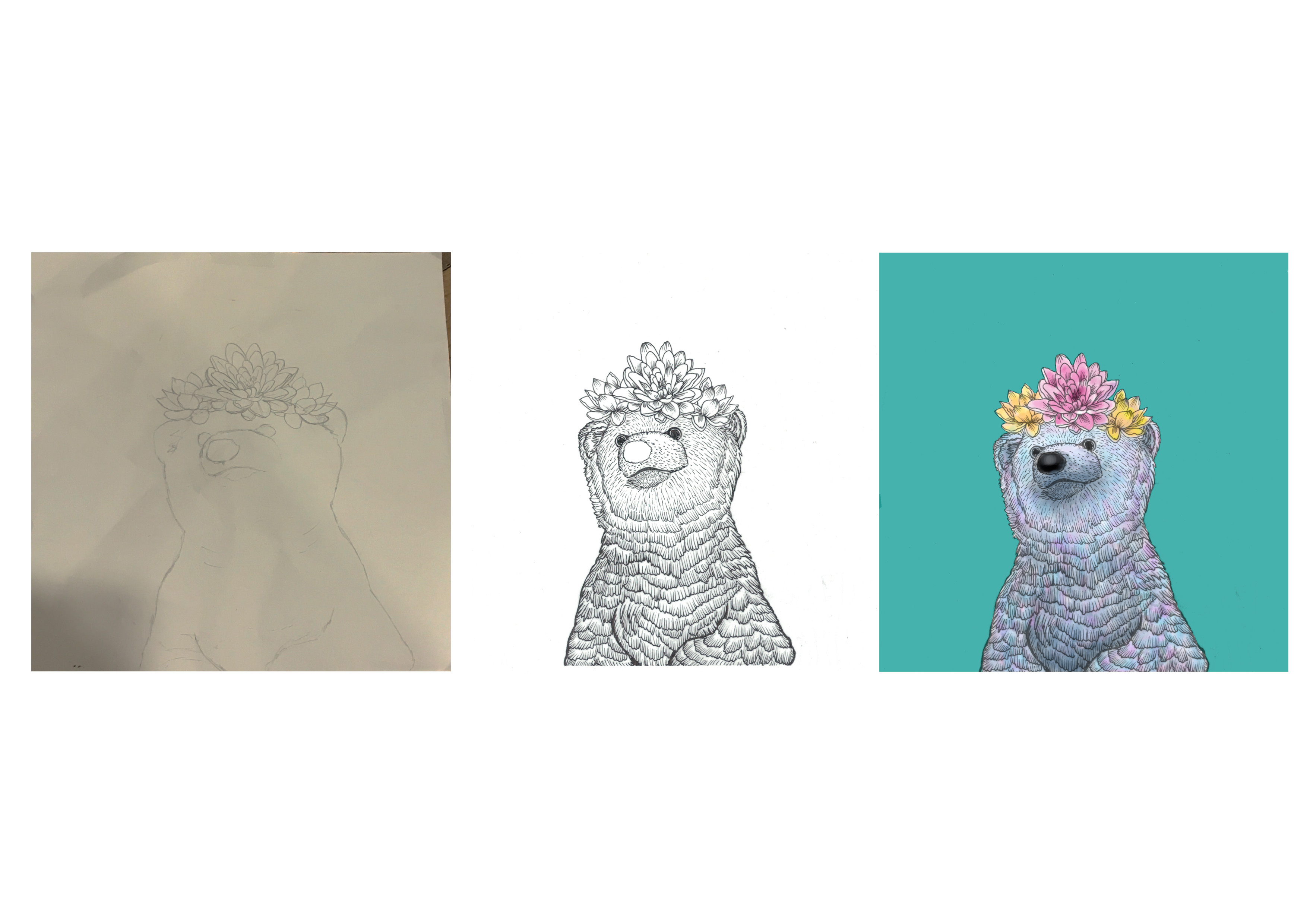
Polar bear – Fierce and strong yet playful at the same time. They pursue what they want deliberately and powerfully and are not afraid to show aggressive behavior for defensive purposes.
Furthermore, I included symbolic objects such as lotus, oyster shell, studs and feathers, each representing a feeling/ characteristic.
Feathers (stag) – Truth
Spikes (seahorse) – Defense
Oyster shell (swallow) – Protectiveness of love
Lotus (polar bear) – Enlightenment
Settings
Next, my settings is all done using paper cut and slightly pop art style. Also, with such intricate illustrations, I did not want it to clash with another intricate setting. Thus the paper cut style allowed me to retain a clear perspective. Although my settings represents the habitats of these animals, they also reflect my natural state of emotions – I’m only myself when I’m in my own surroundings that I belong in. This is the part where the I in INFP represents my introverted self because I tend to be quiet and shy in a strange environment. Furthermore, it’s all about nature as I find peace and beauty in it as nature is something that is beyond our control.
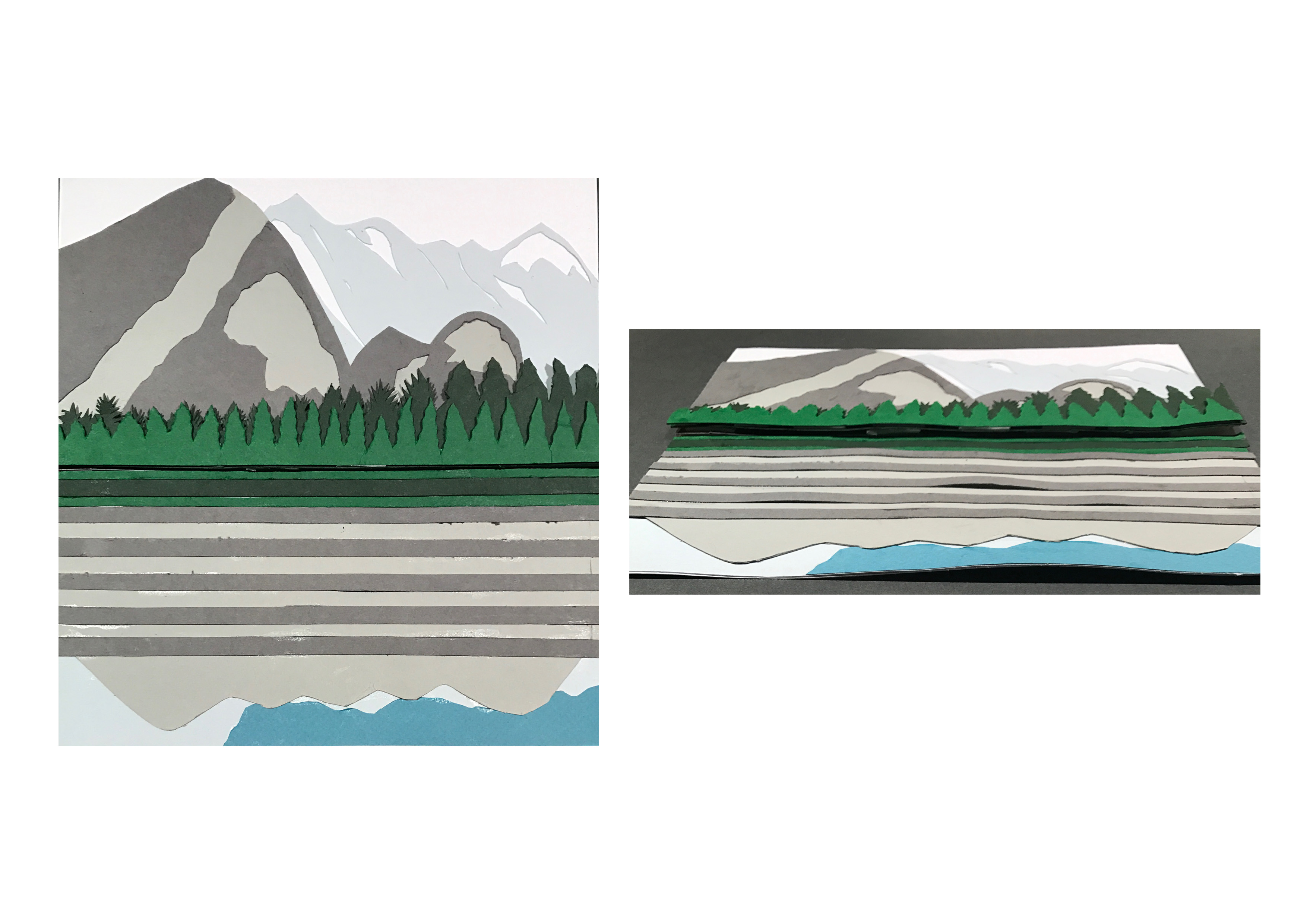
Forest – somewhere I can be alone with my thoughts because it is so quiet and peaceful that you can hear the cicada’s mating call and leaves crackling underneath your feet
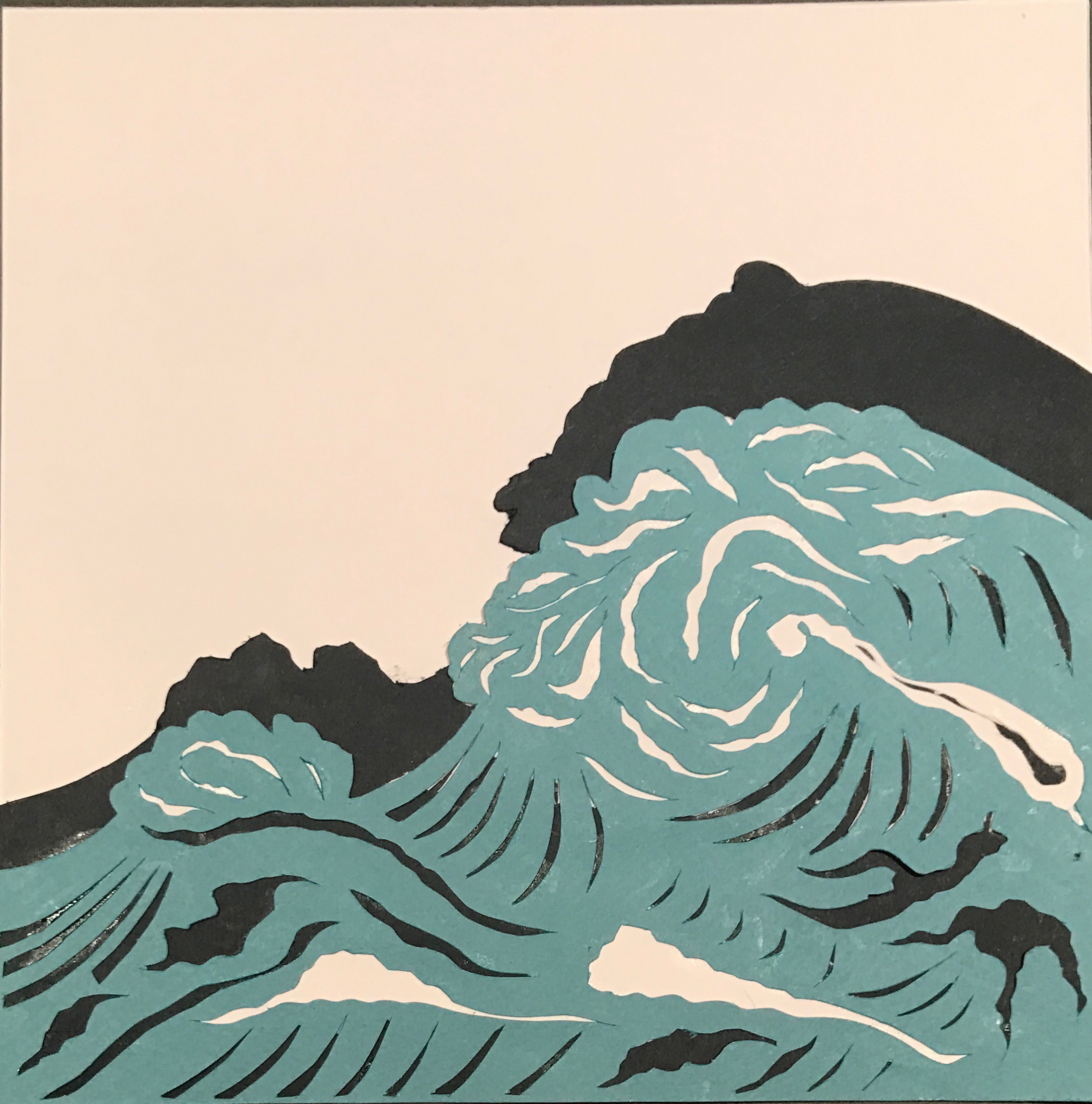
Waves – beautiful when calm but challenging and deadly when stormy as the saying goes “a calm sea never made a skillful sailor” thus acts as an obstacle
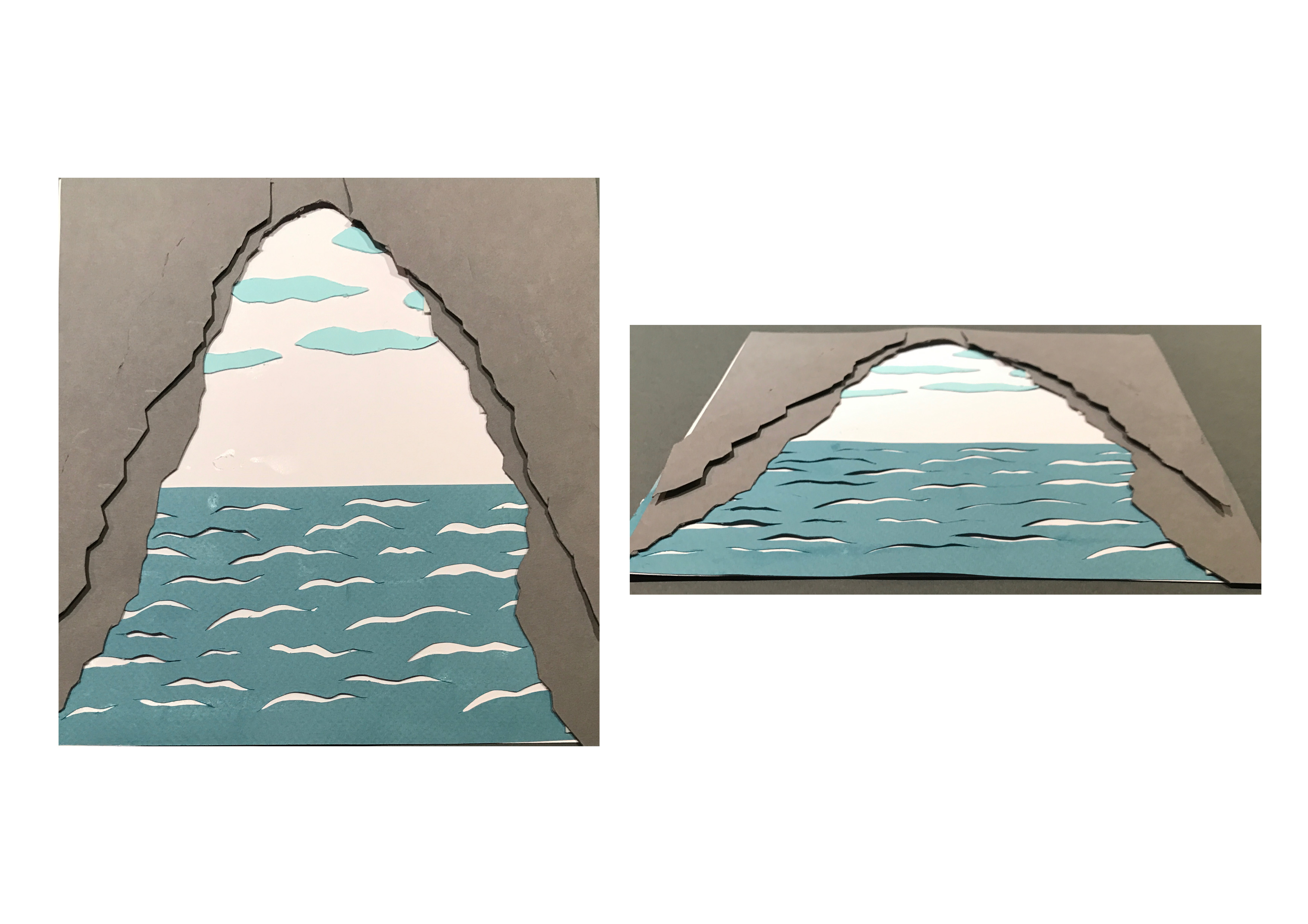
Caves – I’ve been to a cave before during a school field trip and it was not only peaceful but it can be claustrophobic in the darkness so opening it out to see represented freedom
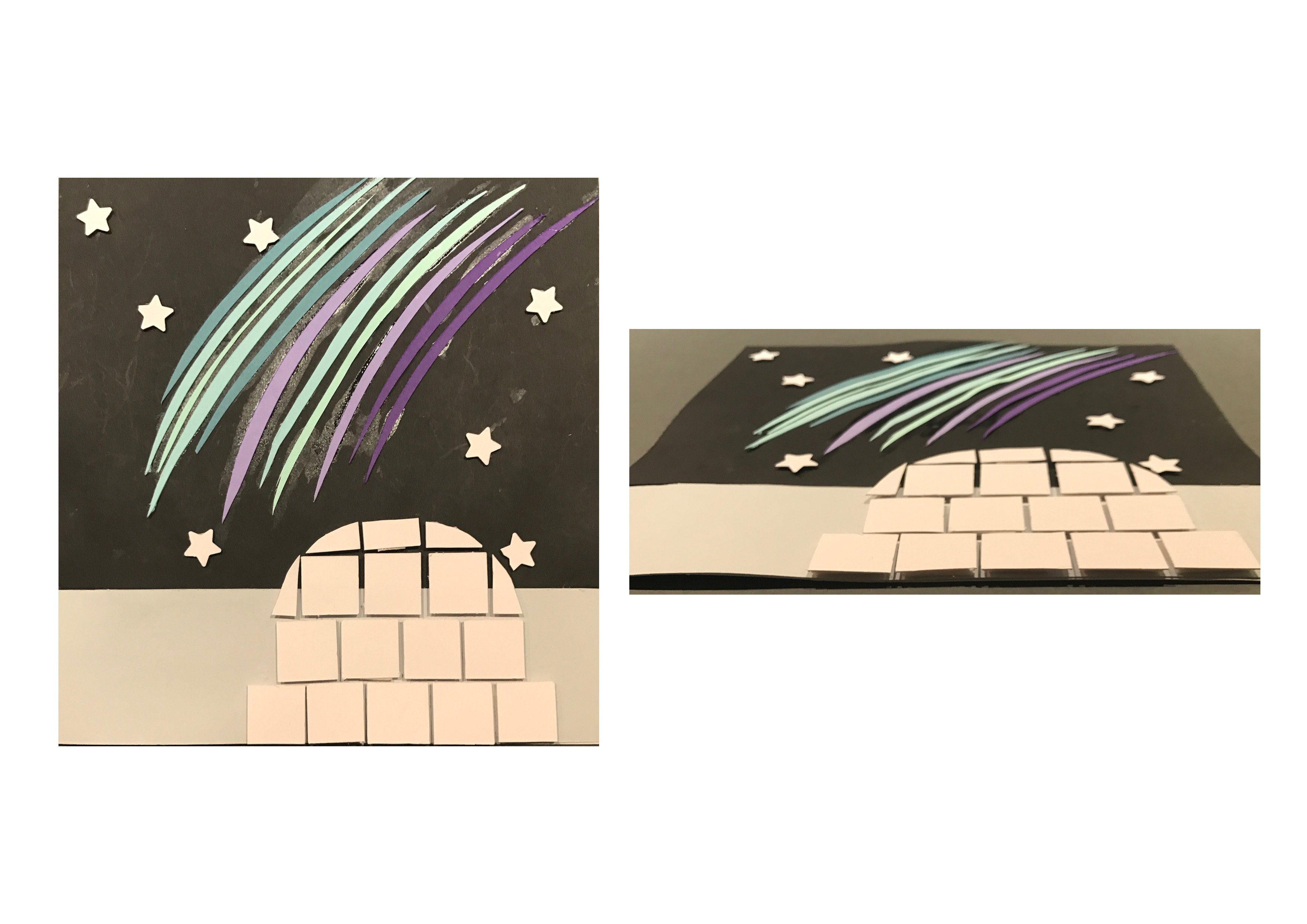
Arctic – the coldness and harsh silence takes a toll on your body but seeing the beautiful northern lights is relaxing and calming and is an out-of-body experience and makes me reflect about my life as something so beautiful is also natural yet we all have doubts about ourselves
Me/ Reaction
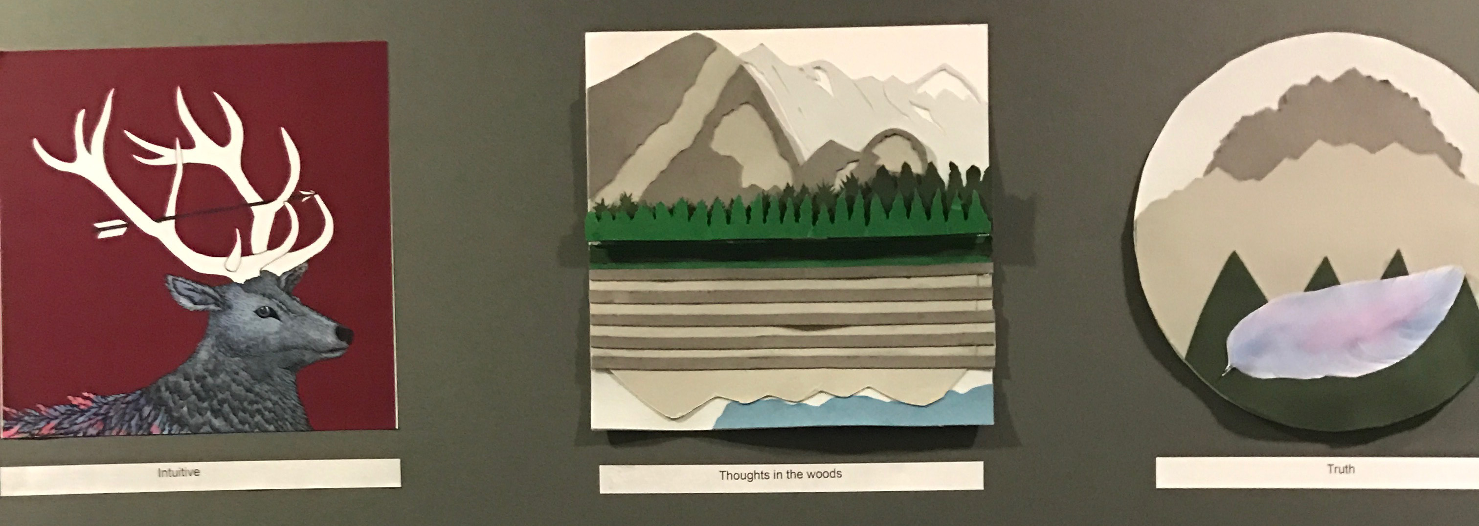
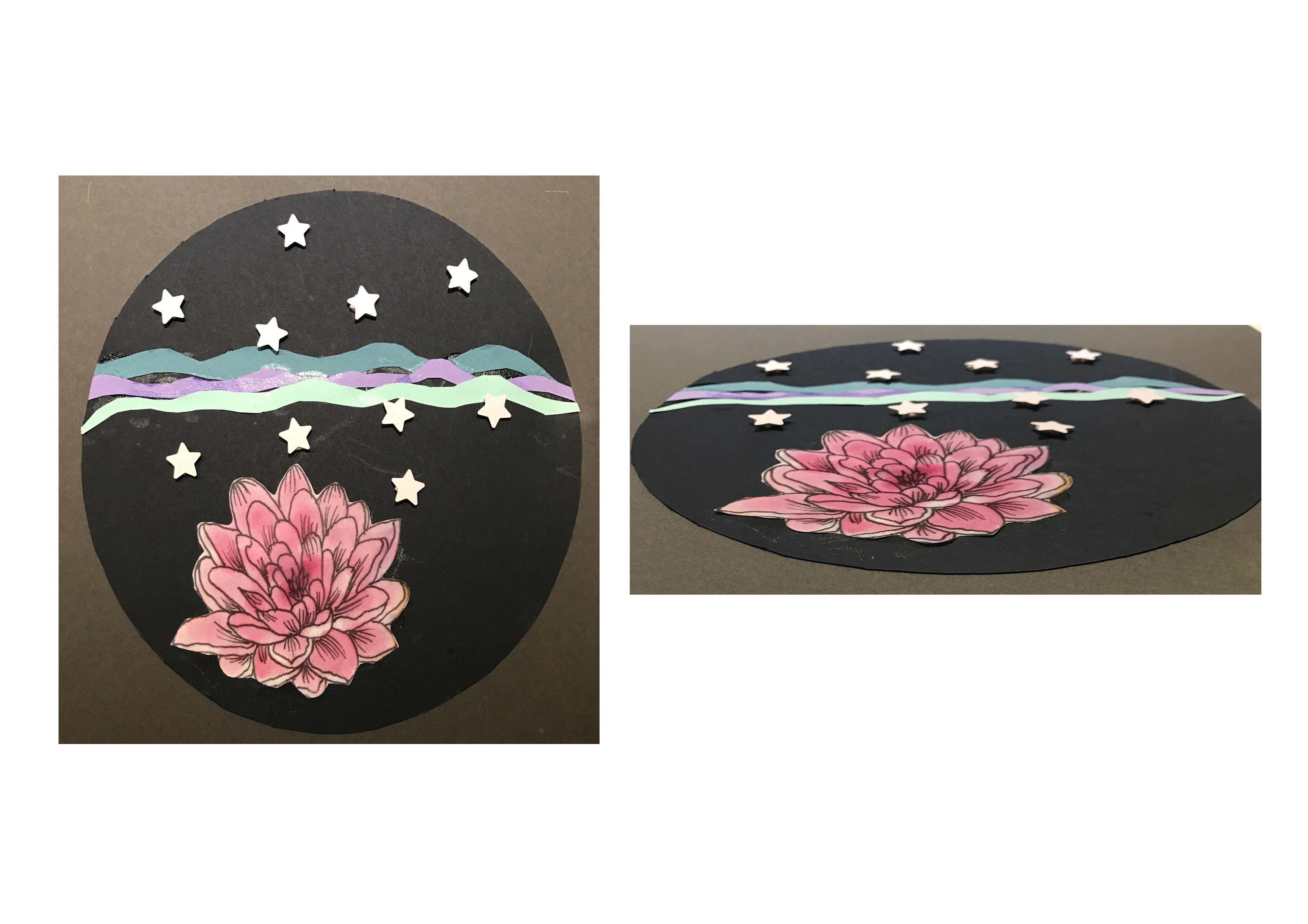
Truth – a feather from the stag is floating down the sky into the woods to reflect honesty to my own self during reflection in the woods
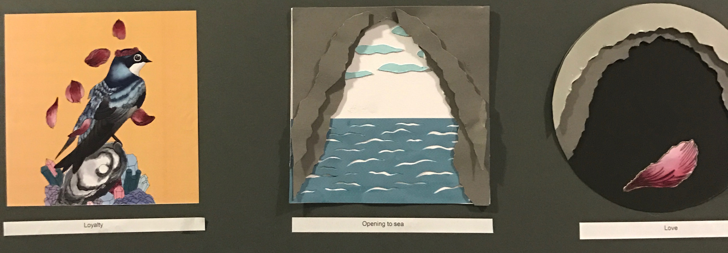
Love – a rose petal also symbolising love from the swallow is drifting down from outside a dark cave because to me as long I’m loyal and have freedom in my relationship, this love is strong enough to make bring me happiness during dark times
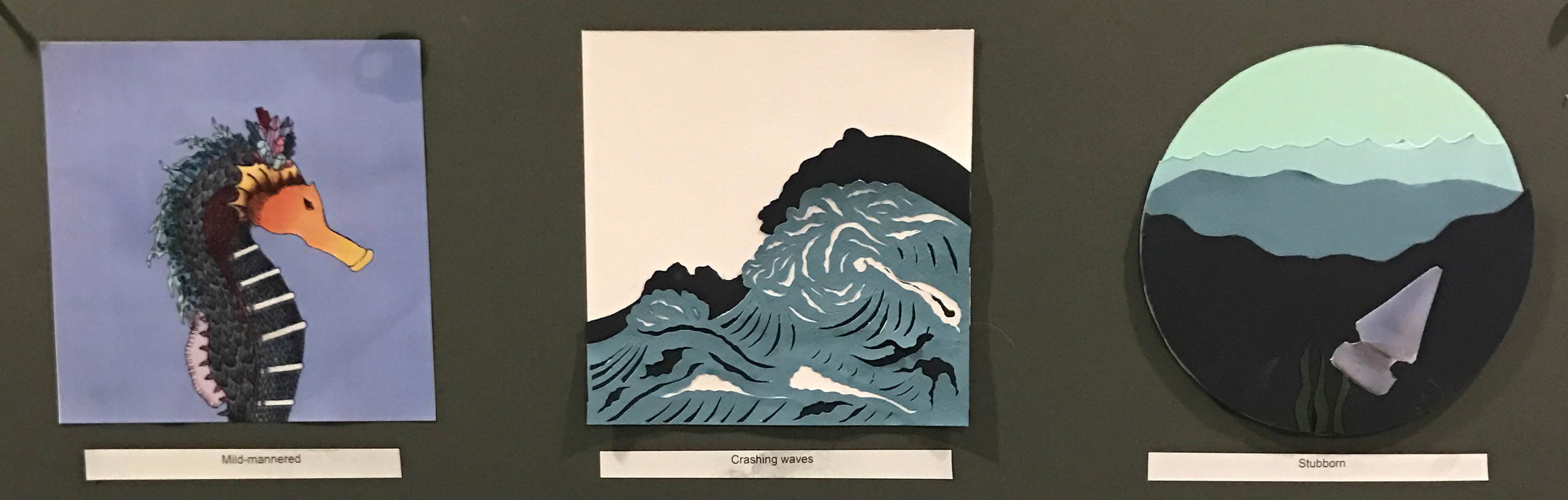
Stubborn – although I may appear to me mild-mannered, but when faced with obstacles or force, I’ll fight for who I am and thus represented by a spike to defend my own individuality during challenging times. This can be also seen as defiance to change as my mum calls it
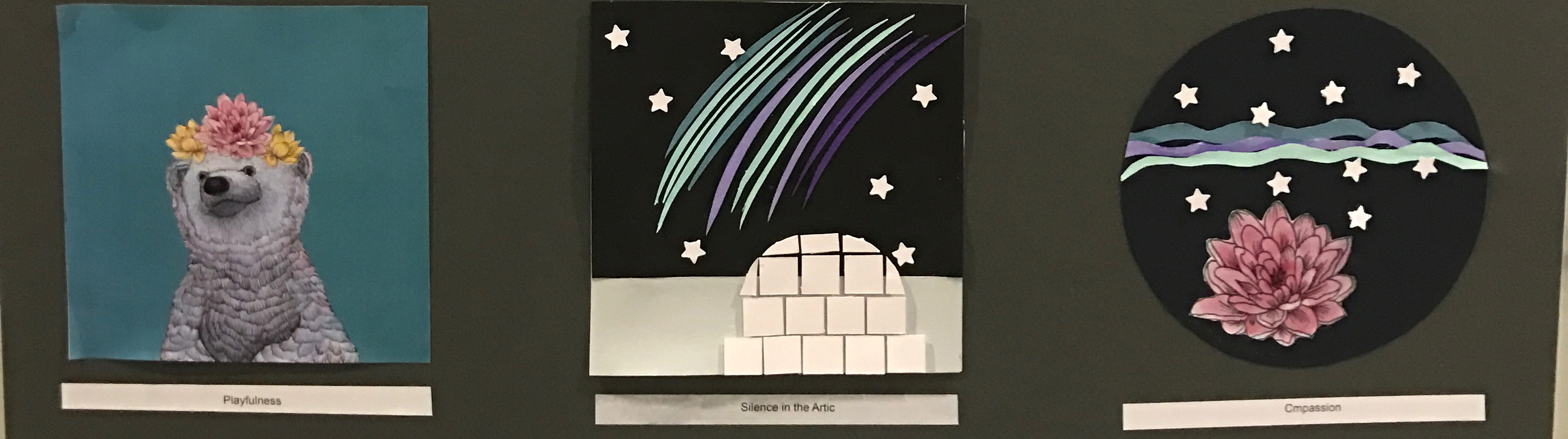
Compassion – represented by the lotus underneath the northern lights as I’m carefree and playful most of the time but when things are brought into perspective when I’m relaxed, I’ll start to see how privileged I am and start being more understanding to others
CONCLUSION
I REALLY REALLY REALLY ENOJED THIS PROJECT because I could finally express myself in my own way and style and it pushed me to do my best in a short time span to create works that I never thought I could pull off. I really loved how everything turned out.

While developing my ideas and designs for this project, I realised that I favoured a nautical theme to my works. Thus, let’s DIVE into the process!
……
Artist References
Otto D’ambra I was mostly inspired by Italian tattoo artist, Otto D’ambra whose works are surrealistic. He uses ink on paper to create his works and the fine details create a vintage woodcut feel to his works. I like his works due to the intricacy of it and its whimsical nature.


Katie Mccann She creates collages of strange hybrid creatures made up of insects, birds, shells, human bones, plants and fashion couture. They are part science fiction and part fairytale. Similar to D’ambra, her works are surrealistic and uses illustration to depict her pieces.


……
Pirates of the Caribbean: On Stranger Tides Why is the Black Pearl in the bottle?
Although having narrowly escaped Blackbeard’s attack on the Black Pearl, Barbossa had no knowledge of the fate of his ship, having only believed that it was sunk in battle. Though in reality, Blackbeard magically shrunk the Pearl into a glass bottle, where it would sail on a shrunken, churning ocean. The Pearl in a bottle would be placed in a cabinet, filled with Blackbeard’s collection of other shrunken ships in bottles, which was found in the captain’s cabin aboard the Queen Anne’s Revenge.

Design 1
As I was researching on this quote, I stumbled across nautical themed vintage crest and I wanted my design to emulate a similar aesthetic too partially because the film itself was set in the 1800s whereby crests were mostly used then. The compass in the background of the bottle symbolizes the quest of the whole movie which was to find Captain Sparrow’s ship, the Black Pearl and to get it out of the bottle.

Design 2
For this design, the ship is trapped in a hourglass instead of a bottle as upon further research on the film, the main ingredients required to transform the Black Pearl to its original size were an hourglass, 3 goats and a magical tune. However, I wanted a pen illustration/ woodcut engraving design and the chunkiness of the hourglass’ lines did not follow my preference, thus I went to format my design again.
Design 3 (Final)
This is the final design I made and received inspiration from the film series itself as the quote I used was what sparked off the entire sequence in the film series and the characters’ adventures to get the ship out of the bottle. The insertion of the octopus was because in one of the films, their journey was almost destroyed by a huge octopus that almost drowned the entire crew. Thus this depicts that scene. I retained the crest theme as I felt it best suited the timeline of the film which was in the 1800s.
Atlantis: The Lost Empire This is an illustration of the Leviathan, the creature guarding the entrance to Atlantis.
During the crew’s journey and search underwater for the lost city of Atlantis, Milo, the protagonist and head explorer of the team realises from legends that there might be an Atlantean monster guarding the entrance to the cave that leads to Atlantis. Just then, their submarine was struck by an unknown force and upon closer inspection of the monster, the team realises it is not just a monster but a machine and virtually indestructible.

Design 1
I wanted to depict this quote in a way where the Atlantean monster overlooks and guards the cave. The main focus of this design is in a crystal ball as from the film, Atlantis is vulnerable to outsiders and I feel that a crystal best depicts this idea as the person holding the crystal ball can shake it violently and that affects the water movements in the ball.

Design 2
From the 1st design, I felt that monster looked liked it was slightly floating on the surface of the crystal ball so I tweaked the idea. This design shows an underwater castle resting atop a giant octopus which represents the monster. Thus, it is as if the castle is growing on top of the monster. Also, I used an octopus because it can be menacing with its tentacles and most sea legends depicts a giant octopus sinking a ship. I places fishes around the octopus and castle to show the relative size of the octopus and it’s surrounding, that the octopus is huge and should be feared which is conveyed in the quote.
Design 3 (Final)
After re-evaluating the quote and the film, I decided to change the design but keeping the fishes surrounding the monster again to show the difference in size. Since the film was set in the 1920s, I wanted a vintage scuba-diving mask to portray that time and I set it on top of the octopus’ tentacles to create this hybrid machine look was shown in the film. I placed a city inside the mask to depict the scene whereby the team had to travel through a cave to reach Atlantis but first they had to get through the monster/machine. Moreover, I really think that this design best suited the quote thus I chose it for my silkscreen printing due to the unique hybrid look that was also partially inspired by my artist references.
The Little Mermaid Ariel, please! Will you get your head out of the clouds and back in the water where it belongs?
Sebastian, a red crab and servant of King Triton, is ordered to look after his daughters – the princess of the sea. After the youngest mermaid princess, Ariel, saves a human prince from drowning, she falls in love with him and starts daydreaming about being a human. Being headstrong, she wants her way and is determined to find a way to make her wish come true. Sebastian discovers her plan and tries to dissuade her due to the danger of being killed by humans and the anger of Triton in failing to educate his daughters properly.

Design 1
For this quote, I wanted a mermaid coming out of the water and into the sky to represent the clouds. I found this image of a girl’s head with sea life in her hair and even though it might not be a mermaid her hair disputes that. Also, the expression on her face has a determined look and seems to be looking at something from afar which is like Ariel in the film who longed to go on dry land. The circular shape behind her hair represents the moon as the sky and the crashing waves symbolizes her true nature/her home which is the sea. Moreover, the contrasting images of the moon and waves shows Ariel’s conflicting nature of wanting to explore land but being loyal and obedient to her father. Although the quote states clouds, I did not want to do a literal meaning of the quote, hence the absence of clouds but the moon represents the sky where clouds are found in.
Design 2 (Final)
Sticking to the non-literal translation of the quote, I continued with the theme of the moon and space as the sky/clouds part. As mermaids are always portrayed sitting on a rock, I used the moon to represent that and it also makes the design unique and people would question why a rock. Furthermore, the use of a rock is very different from what people would perceive in a mermaid design and I feel that this is similar to Ariel’s personality as she challenges authority. I chose this mermaid as her expression is very similar to Ariel’s daydreaming look and creates this soft, ethereal look to this design. The waves at the bottom is representative of the core being of Ariel’s soul, a mermaid yet the crashing nature of it represents her father’s anger/desire to prevent his daughters from interacting with humans who poses a risk to their lives. Thus, calling her back to the ocean.
Kingsman: The Secret Service A suit is the modern gentleman’s armour. And the Kingsman agents are the new knights.
International superspy Harry Hart and mentor to his latest recruit, Eggsy Unwin are, standing in a Savile Row dressing room teaching a lesson in sartorial wisdom. He introduces Eggsy to the secrets of a tailored gentlemen suit and has one made for Eggsy. This bespoke outfit includes oxford shoes that hides a poison-tipped knife and a gold lighter that doubles as a hand grenade. With these, he will save the world as a modern gentlemen spy.

Design 1
My only quote that is not nautical and disney themed because it was my first quote and design. While watching the film, the Kingsman logo was shown and this is what is seen in the background of this design, the horizontal K. I decided to add a crest around the logo due to the spies’ origins that are linked with nobility. The tiny crown pays homage to kings which is in the title of the film, Kingsman. I used a medieval helmet as a representation of knights but added in a suit which was what all the spies wore.

Design 2
I felt that the previous design was rather modern and not vintage looking so I changed it to create a more illustrative design. I still kept the crest themed and logo to try and adhere to the essence of the quote and film. Instead of a suit, I used a bowtie to represent a suit and also because it suited this design better.
Design 3 (Final)
In design 2, I felt that too much has been removed and I lost the essence of the quote especially the modern suit part thus I brought back the helmet but this time placing a bowtie at the bottom of the mask to represent the quote. In a way, this design is similar to the first but I think it is best suited to represent the quote. Also, the lions holding the hourglass eludes to how the characters have a limited time to save the world before chaos engulfs everyone.
……
Conclusion
I really enjoyed this project due to the process of printing it and the excitement of seeing your design materializing. However, I admit it was difficult to find images that was best suited for the quote and I had to change my quotes a couple of times so that my idea would be best suited for it. Overall, it was fun and a great experience trying to interpret the quotes and to see a certain style developing overtime.


My pieces were divided into 2 boards based on their background colour – whites on one board, same goes for the black. By dividing them in this way, I created a yin and yang energy in my artwork. It is to convey that contrary emotions are interconnected with each other and that there is always a good in the bad and vice versa. Thus there is balance and this symbolizes that I am emotionally balanced.
To convey my emotions, I focused mostly on the use of texture to emphasize how I felt and to stimulate one’s tactile senses so that they would be able to understand my feelings.
We had a mark making session a few sessions back and we had to bring items from home that could be used to stamp a certain pattern onto the paper.
Newsprint, black block printing paint, chinese ink, rollers and palette knives were given to us to experiment on different techniques to create our monoprints.

I used a roller for all the patterns on this paper but experimented on different pressure and angles to roll on the paint. For the leftmost pattern, I used a snowflake cut out and placed it underneath the paper. I dripped splotches of paint onto the roller itself and rolled it out to create a repeated splotches effect with a snowflake pattern. For the other patterns, I simply experimented with the ways and amount of pressure to roll the roller and it created a layered, textured look.

This time I used more items to create a distinctive pattern and layered them for a unique look. Through this, I realised that certain objects I brought such as imprinted pennies were unsuitable to create patterns as the grooves were too shallow hence paint became stuck in it.

My last attempt consisted of using both the rollers and items and it turned out unexpectedly nice because initially, I did struggle with the rollers to give it an even coating of paint. However, I preferred the faded look of the paint as each roll created a unique look whereby it was lighter on the eyes and had a rather whimsical look to it.
I quite enjoyed the process even though it was rather messy but it did teach me to work with a monotone medium as I normally preferred colourful mediums.
Enthusiasm. Confusion. Hysteria. Affectionate. Euphoria. Revulsion. Melancholy. Longing. Infatuation. Hopeful. Exhilaration. Enthrallment. Ferocity. Serenity. Apprehension. Bitter. Elation. Pleasure.