

For this project, we are to create a zine that responds to a specific location in Singapore through abstract or highly stylized graphic form and colour.
Concept
The concept behind this zine is really simple where I wanted to focus on how the three main demographics (children, adults and elderlies) in Dakota Crescent come together to form a bond that ties the entire estate together.
Art Direction
For my zine, I chose to use lines as the main element of design. This is because I wanted to focus on the residents living in Dakota Crescent. The lines are representative of the bonds between the residents where these lines can go on forever.
ZINE
This an overview of my zine.


FRONT COVER
The front cover of my zine consists of multiple horizontal lines with a string of numbers reading ‘399936_’ printed at the end of the lines. This string of numbers represents the ZIP code of Dakota Crescent.

Besides, the design itself was created to resemble a barcode. A barcode is an optical, machine readable representation of data. With the barcode look-alike imprinted on the front cover, it signifies the discovery of a rich history to Dakota Crescent upon opening the zine.
FIRST SPREAD
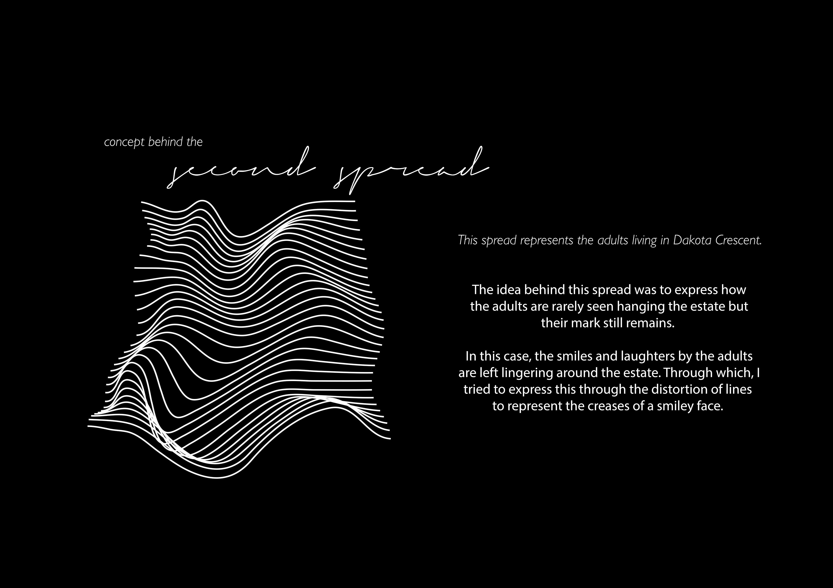
The first spread upon opening the zine would feature an abstract form of lines in continuation to the front cover. The lines are distorted to form the crease of a facial expression. More specifically, the crease of an adult smiling.

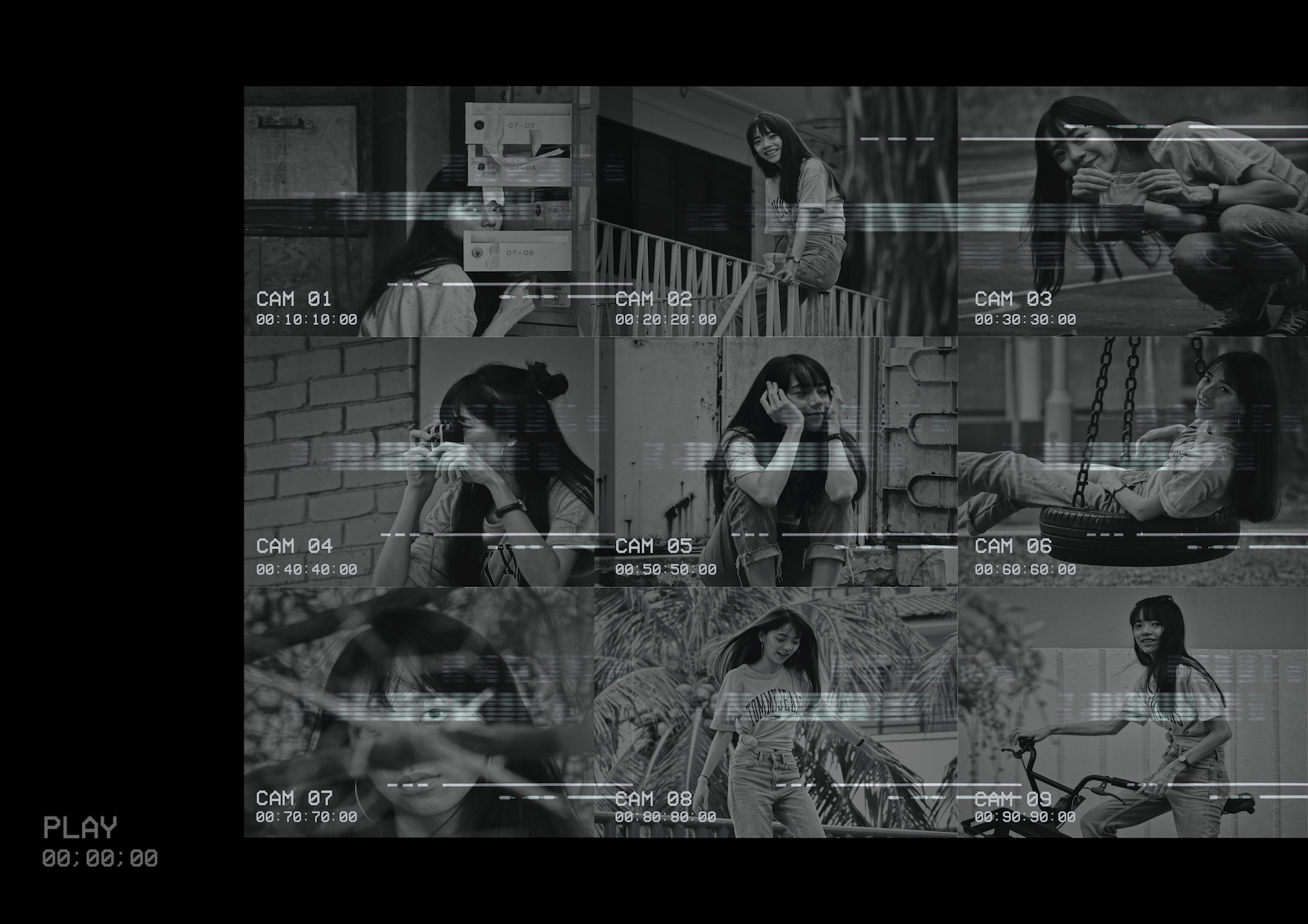
MIDDLE SPREAD
The middle spread is slightly different from the other spreads where it is the only spread that has photos included in it.
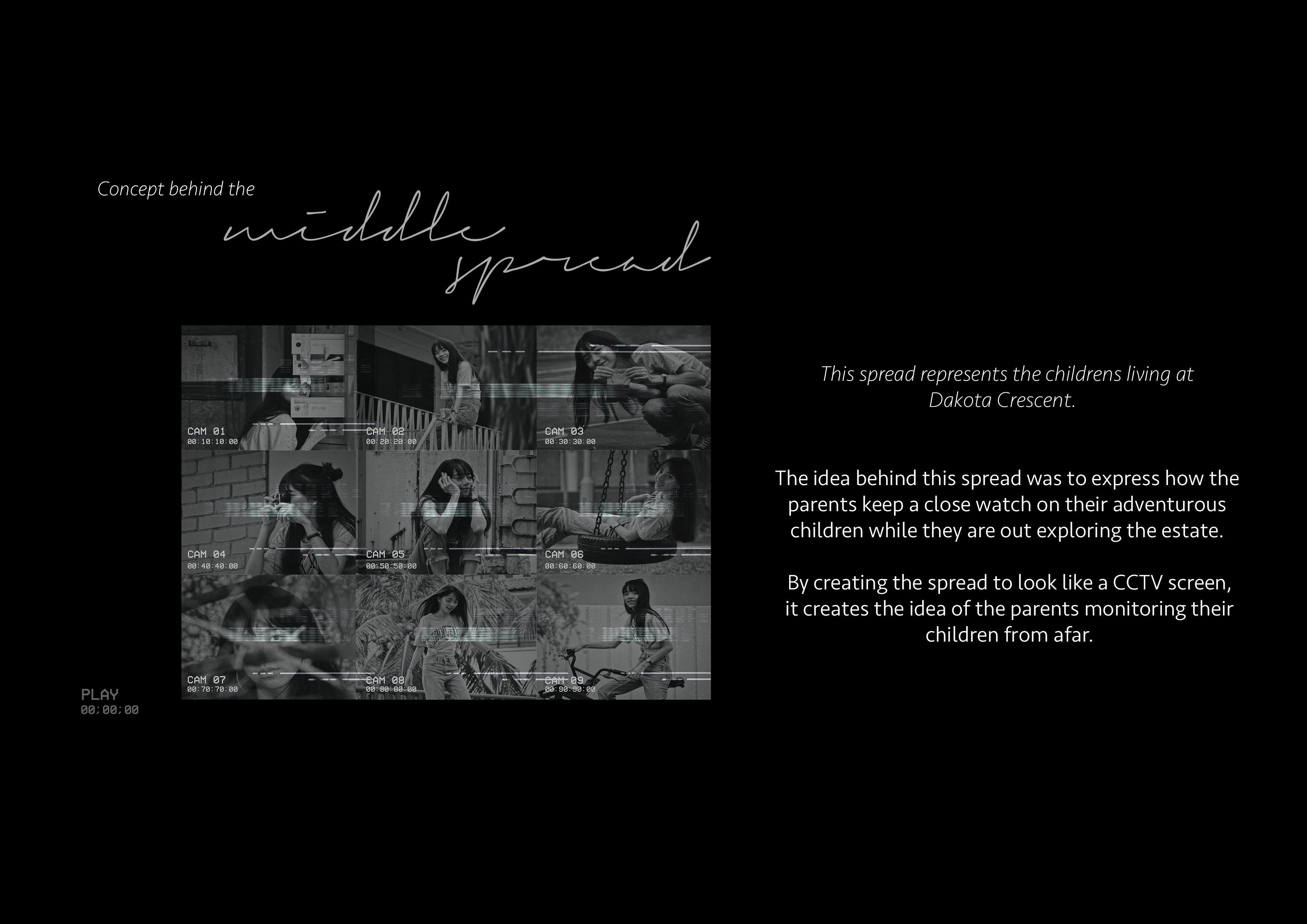

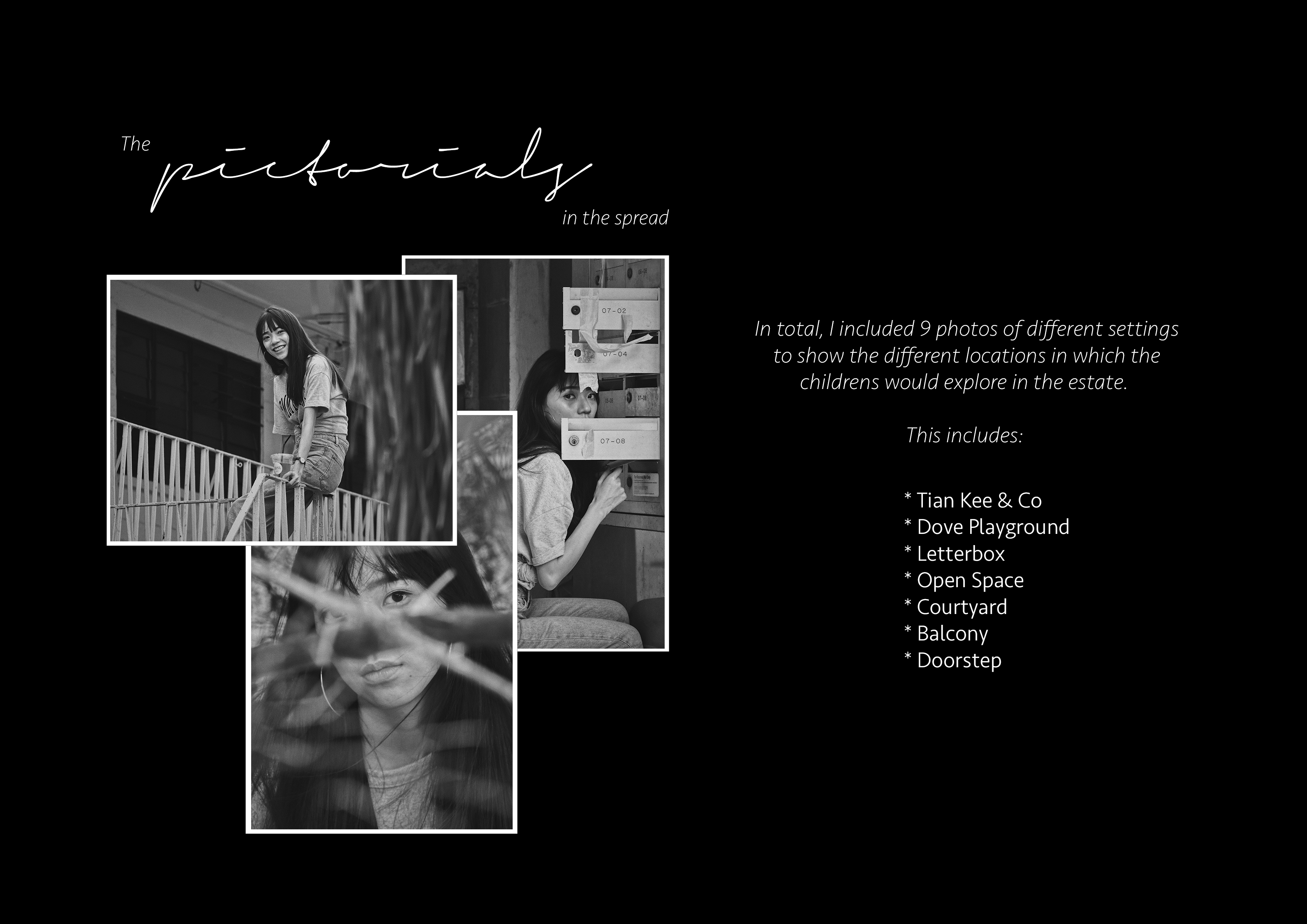
In the below, are the photos included in the spread:


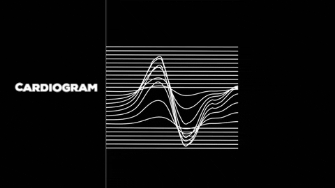
LAST SPREAD
The last spread is a continuation from the first spread where lines are used to express the idea.
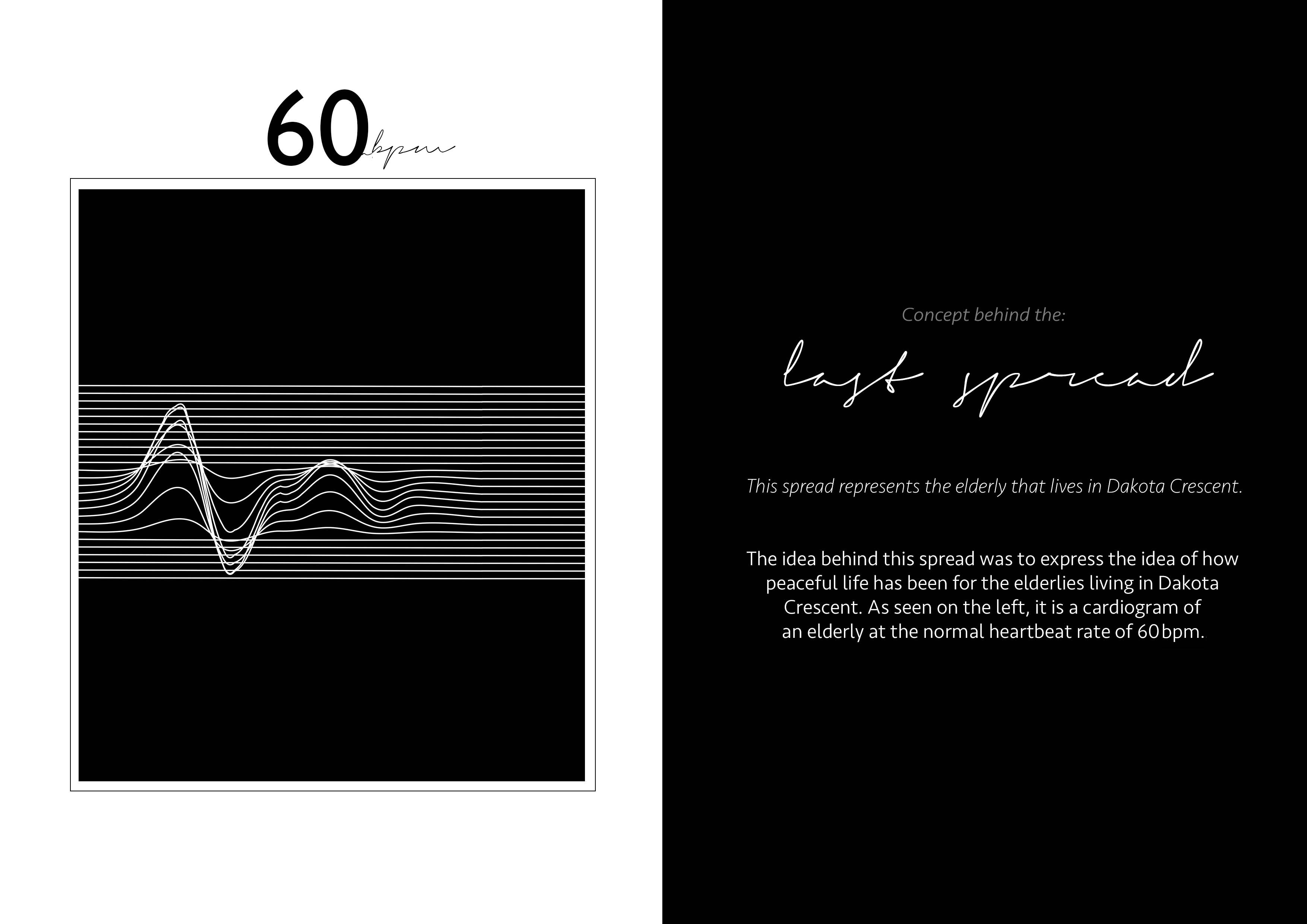
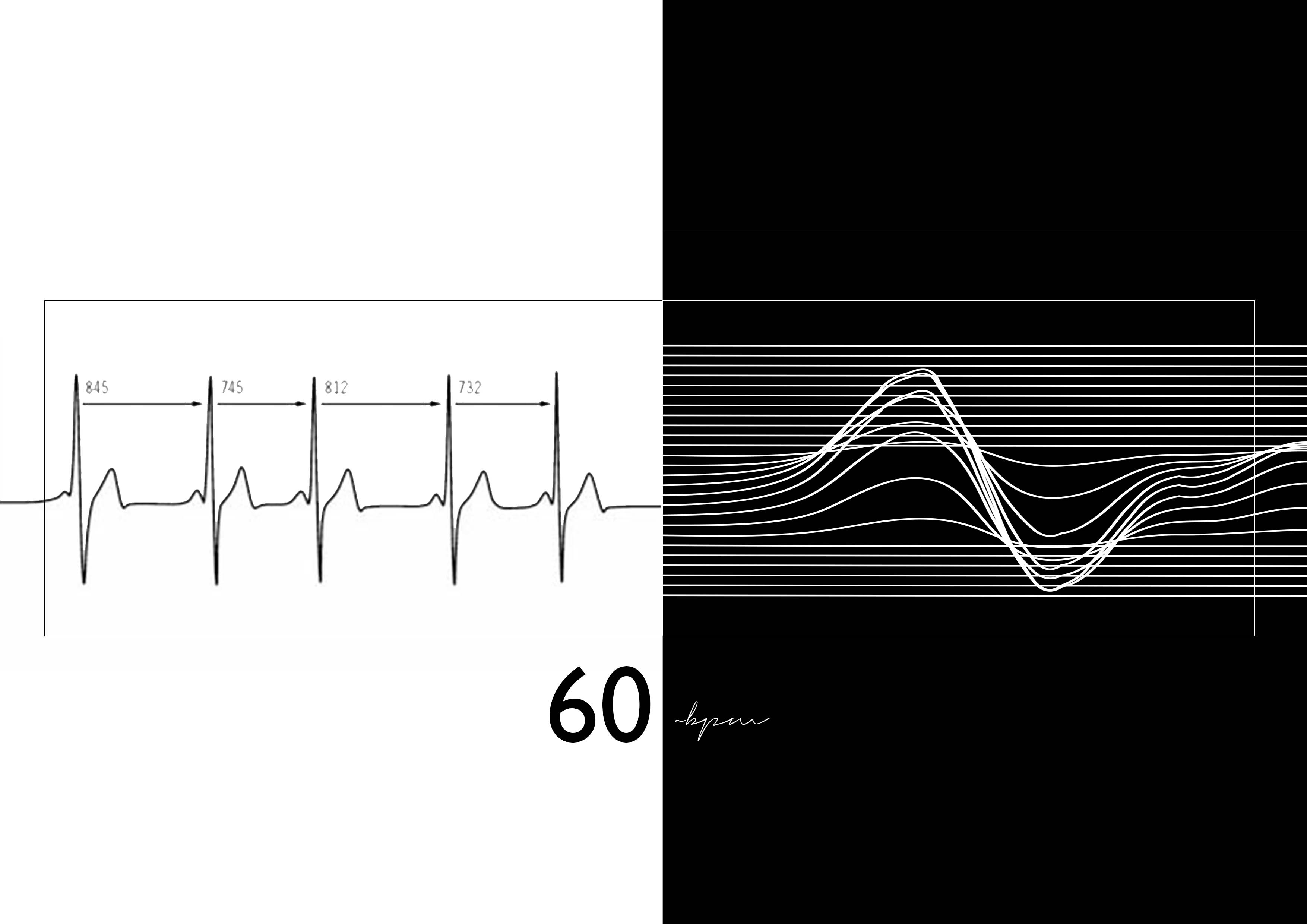
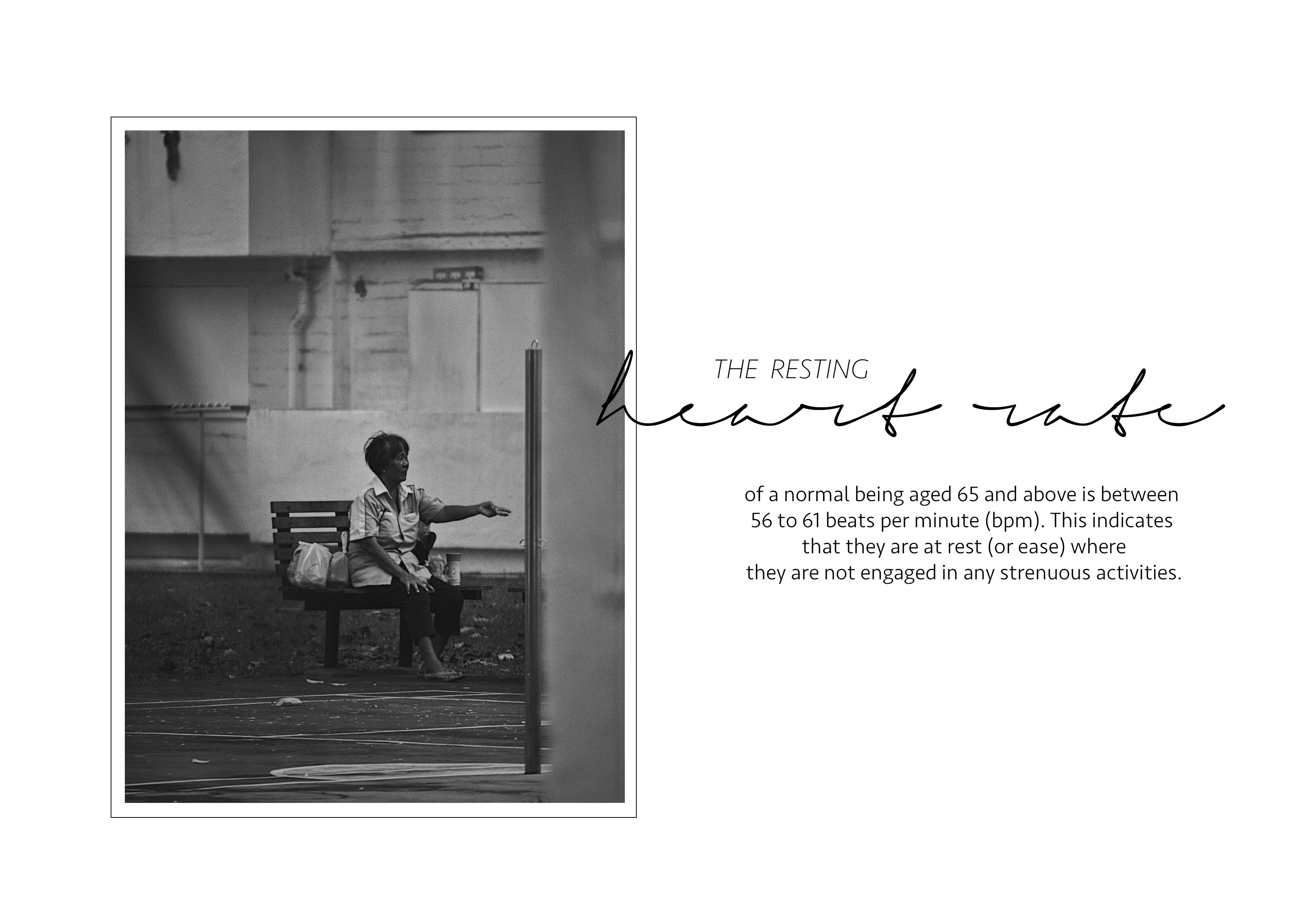
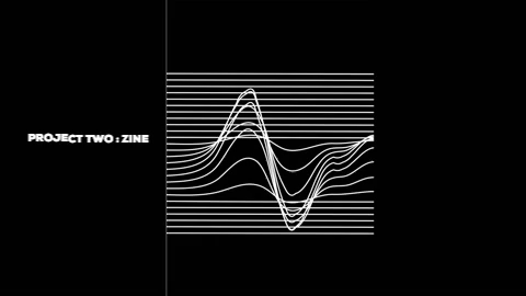
Using the cardiogram as a representation, the first frame represents how peaceful life has been for the residents, in specific, the elderlies. However, with Dakota Crescent being slated for redevelopment, more than 70% of the residents have been relocated to Cassia Crescent while the remaining 30% to other estates. Having relocated, Dakota Crescent is now a ghost town waiting for further developments where the second frame shows how the heartbeat gradually dying down with the residents leaving.
Back Cover
In continuation to the previous spread, instead of ending the lines (to the cardiogram), the lines goes on forever, just like the bond that holds the residents of this old estate together.
This brings me back to my cover page where the lines continue to flow but ends with the ZIP code of Dakota Crescent.
Regardless of the redevelopment, the bond formed amongst the residents in will always bring them back to their roots, that is Dakota Crescent.

Lastly, I would like to thank the class for their kind words.