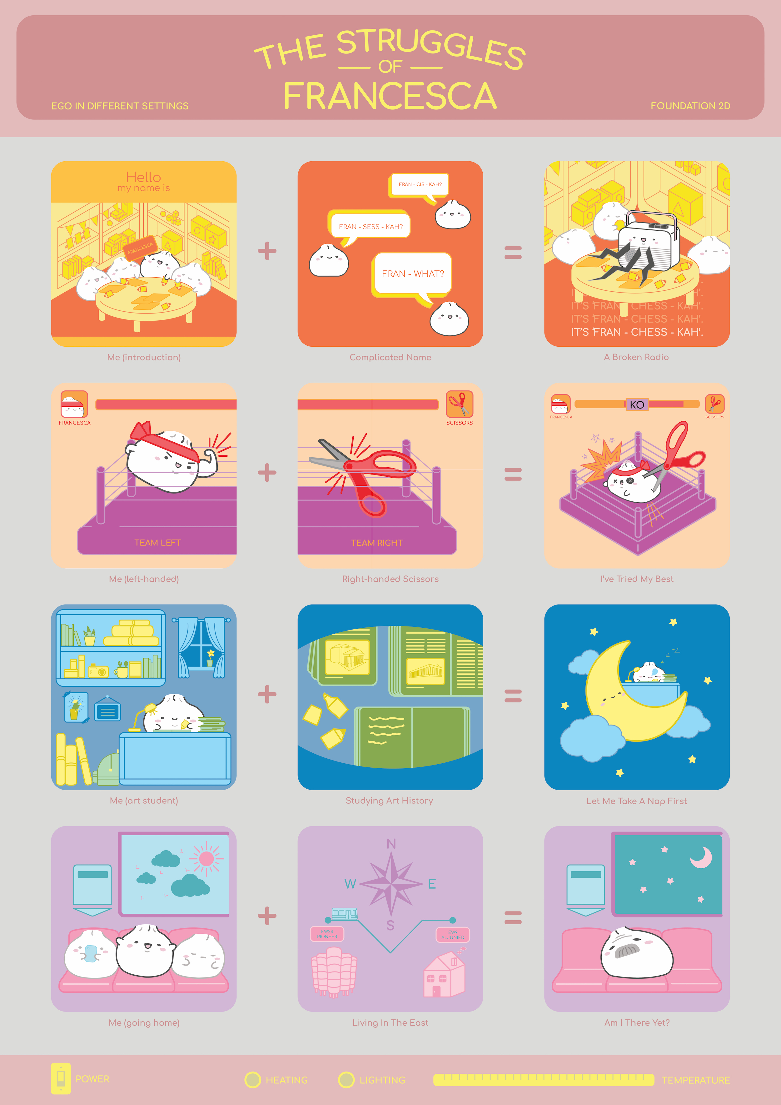
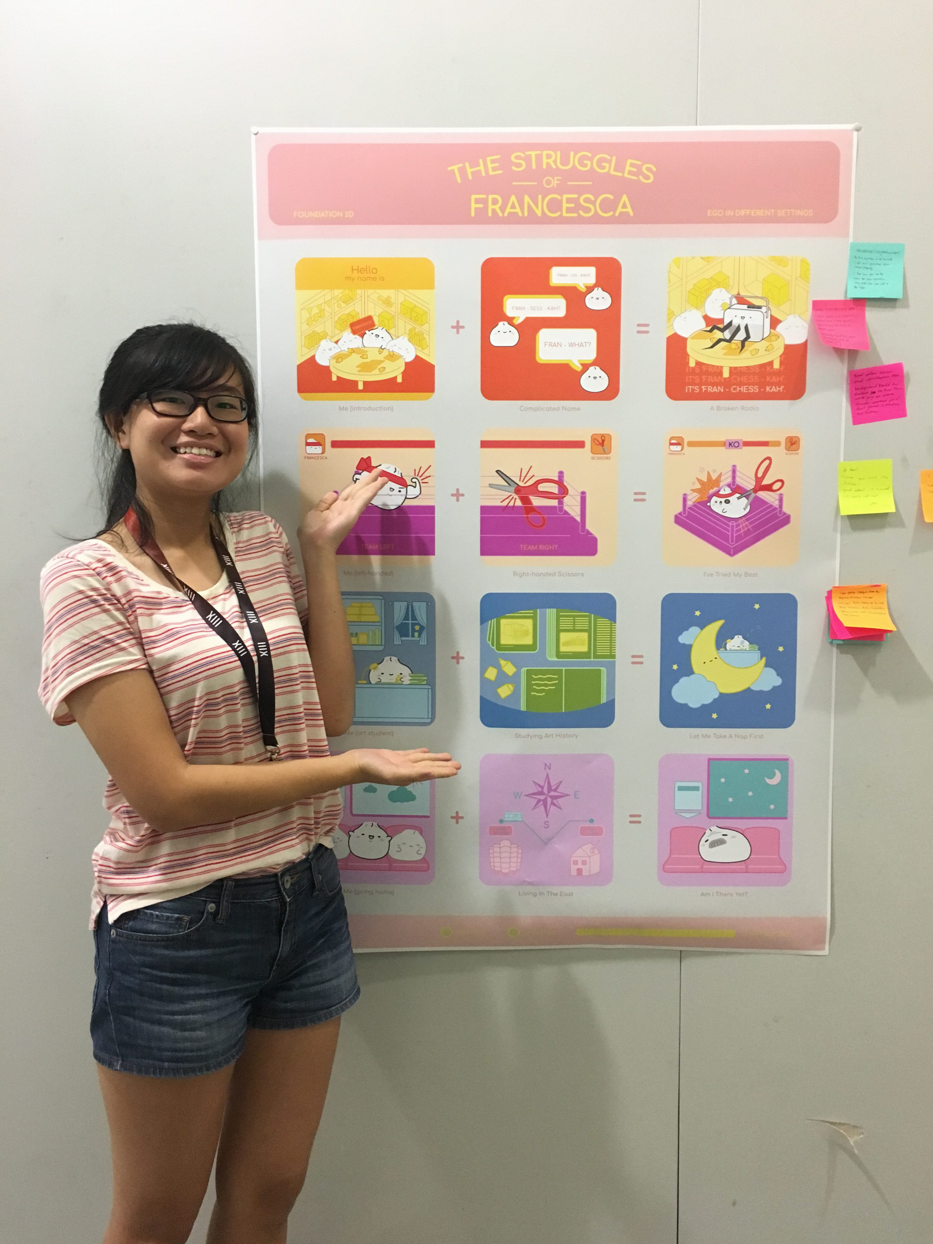
The Struggles of Francesca
The overarching theme of my Ego are the struggles that I face! As these struggles are small and no big deal, I depict them in a humorous and light-hearted way.
I chose to use a steamed bun to represent myself because I am a simple and plain person on the outside. I don’t adorn myself with any jewelry or put on make-up. But! You’ll find that I’m actually filled with ‘fillings’ on the inside once you get to know me!
The board is a means to tie the entire concept together, that’s why I designed it in such a way that it resembles a bun steamer that you’ll commonly find in coffee shops.
Me (introduction) + Complicated name = A broken radio
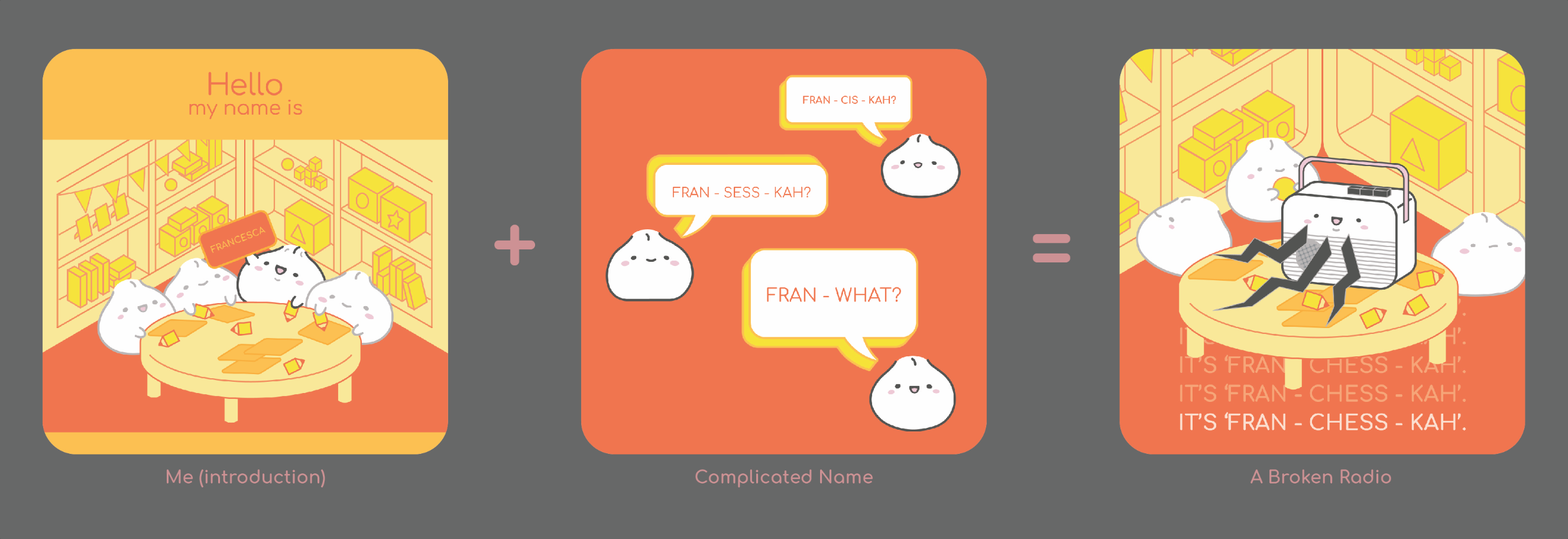
- Yellow: Represents self-esteem. Like what I’ve mentioned previously, names do affect self-esteem!
- Orange: Represents frustration. How I feel whenever I have to keep repeating myself.
- Red: Represents stimulation. Very similar to the frustration that I feel. It’s pretty annoying when people can’t pronounce my name right, but at the same time it’s not their fault. So I’ll just patiently correct them over and over again!
It’s common for people to mispronounce my name and I’m used to it already. This equation dates back to when I was still in kindergarten, when all my friends couldn’t pronounce my name properly because it’s just too difficult! I felt like a broken radio repeating myself over and over again. The thing is, nobody listened whenever I repeat! And hence I would have to repeat myself again the next time they got it wrong…
Me (left-handed) + Right-handed scissors = I can do things right too!
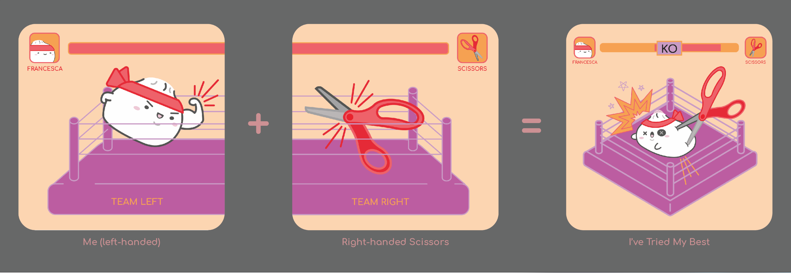
- Red: Represents strength and revival. Apt in representing how left-handers have to adapt in a right-handed world!
- Orange: Represents frustration because it’s not easy trying to do things the right way (get it? the RIGHT way)
- Purple: Represents inferiority because left-handers are the minorities and it is as if the world works against us.
Let’s face it, this world isn’t made for left-handed people! I’ve learned to adapt to this right-handed world already, but there’s one thing that I still can’t use right – the scissors. Scissors are usually made for right-handed people and it’s unrealistic for me to carry a pair of left-handed scissors everywhere I go right?! Therefore, I always feel that I’m fighting against the scissors whenever I use it. It’s so difficult to cut things nicely and I never fail to be kicked in the butt by scissors.
Me (art student) + Studying for art history = Let me take a nap first
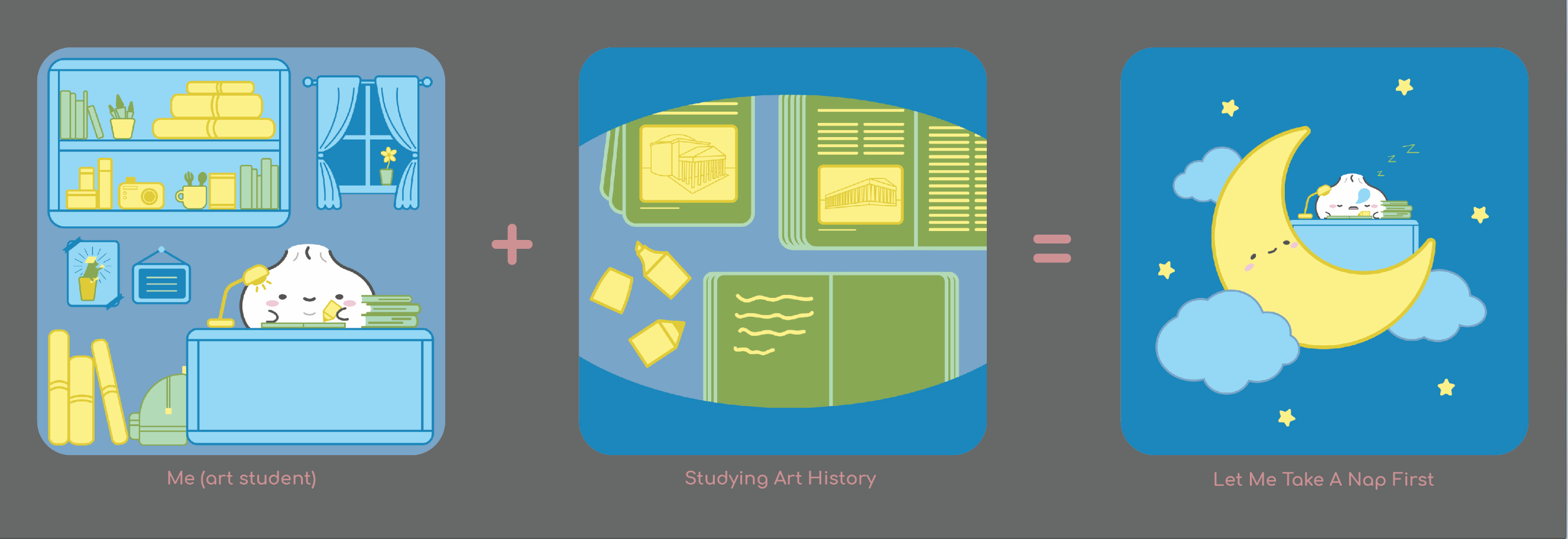
- Blue: Represents serenity and calmness. Because night time is usually quiet and peaceful, it helps me to be concentrate better and hence be more productive.
- Green: Represents boredom. I think that this is self-explanatory for this context.
- Yellow: Represents fear and anxiety. These are how I feel towards exams! I would much rather do projects than take exams, that’s why I’m in art school. Till I realised that there’s art history exam!
Exams are one thing that I detest with all the fibres of my being. Everything instantly becomes boring when I have to study it for an exam. That’s why if I were to study, I would do it at night when it’s peaceful and quiet and when I’m calm. Needless to say, I was pretty upset when I found out that there was an exam for art history. This equation is 100% accurate because I felt so sleepy that gave up studying and went to take a nap instead. Not to mention that my 45-minute nap turned into a 1.5-hour nap… I transport myself to the moon to represent sleep as a nod to children’s illustrations, where sleeping characters are usually on a crescent moon.
Me (going home) + Living in the east = Am I there yet?
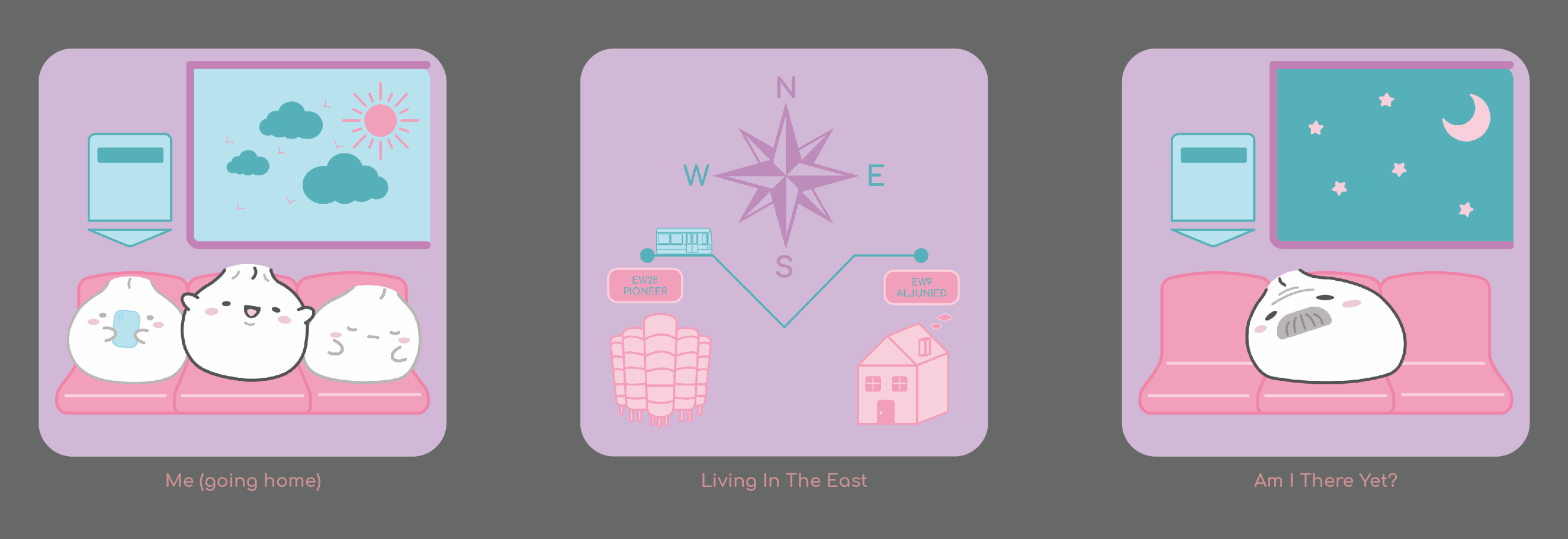
- Purple: Represents luxury. To me, going back home once a week is a luxury and I really cherish my time back home!
- Pink: Represents warmth. The feeling that I get knowing that I’m home.
- Blue: Represents coldness. The dread that I feel knowing that the journey is pretty long.
As I stay in hall, I usually go home on Friday evenings and return on Sunday evenings. I really cherish the limited amount of time I get to spend at home and hence I really look forward to going home every week! The only dreadful part is the long journey… As I live in the east, my journey lasts for 1.5 hours on a good day, and 2 hours on a bad day. The fact that that’s so many train fault nowadays doesn’t make this dread go away! To exaggerate the amount of time that has passed, I depicted my bun aging into a grandbun (term coined by Fendi)! While I do miss home, I’m still extremely thankful for hall because I can’t imagine having to spend 3 hours travelling back and forth everyday!
Critique
Comment given by Mimi:
Good colour scheme and illustration style. Background could be darker so that the work pop up more. Stronger contrast for the last panel and ‘studying art history’.
Comments given by my peers:
- Your entire layout is well-curated! Well done 🙂 The ‘going home’ frame took me a while, perhaps becuz I’m slow. Can see you are a very VC person. Love the way u handle your narration! Well done A** – Hui En
- HAHAHA!! Very humorous! The first equation is me because I still can’t pronounce your name properly. I like how you use the colour for each equation. Very pastel-like and soft to the eyes.
- WHERE IS MY ANG MOH BAO 🙁 I love how you made it really fun + whole game-ish concept is super cute! Especially love the colour scheme of the 1st series! 🙂
- Hi fran! I love your work it’s so cute! Good effort, it turned out really well 🙂 – Miles
- I see you’ve changed from the original oriental concept. Cute bao! Love the humour in the last strip. Hahaha. Love the illustration. Colours work well. Good choice. Well-done!
- Naisely done! But the first row could be done better? But the colour wise, I think it can be explored further.
- TRASH PANDA!! Really love the ‘you’-ness in your frames! I like how you characterised yourself as a bao and kept it consistent! Maybe if you exaggerated the line longer it’ll covey it more humorously?
- I love yours!!! I think the compass can be more cartoon! But damn good! 🙂
- Are these xiao long bao? Super cute! Very humourous as well! Love the style! 🙂
- I associate the second box with texting bc of the text bubbles and different sides. Still love your work 🙂 Good job Fran!
Reflection
Everything needs to have a meaning in design! This has been drilled in me while I was studying in polytechnic and I’m glad that it’s being emphasised here too. The biggest challenge is ensuring that the colours featured in the equations are meaningful and aesthetically pleasing at the same time. What works for one frame may not work for another, so it was challenging to ensure that the colour scheme work harmoniously throughout all the frames. Colours aside, the other challenge that I faced was executing my illustrations. I dreaded illustrating in Illustrator initially because I was more comfortable with Photoshop. But I’m glad that I still pushed through with Illustrator because the results were much better! Illustrating with Illustrator helped in making my compositions better because I am able to draw perfectly straight lines and draw the perspectives properly as well.
All in all, I enjoyed my 2D journey because it has trained me to be even more sensitive to composition, colours, symbolism, etc. I’ve definitely learned a lot from my classmates’ weekly presentations and will definitely apply what I’ve learned in my future projects!
1 comment for “[2D] Ego: Final Works and Reflection”