


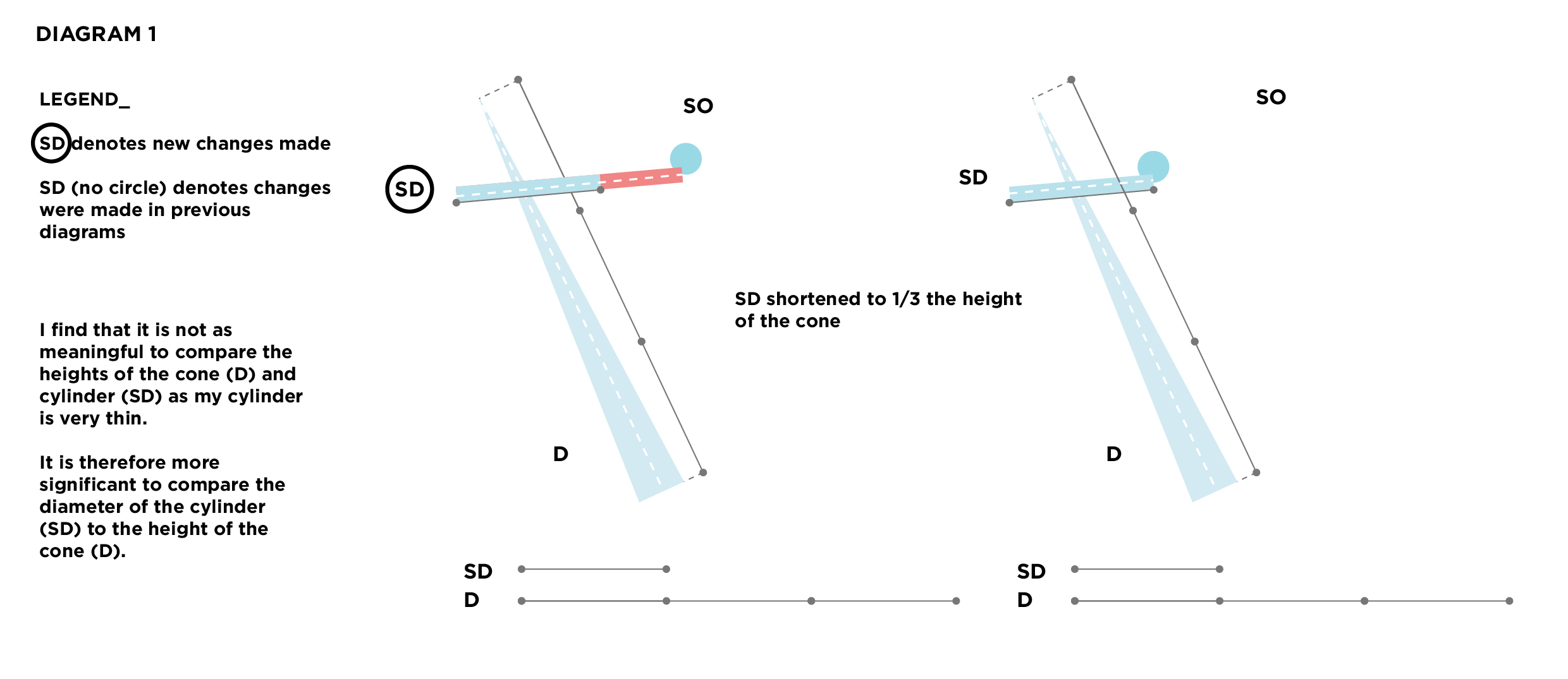
Category: Foundation 3D 1 – G2
(Still a) Slave to the Foam: Model 3: Ascension
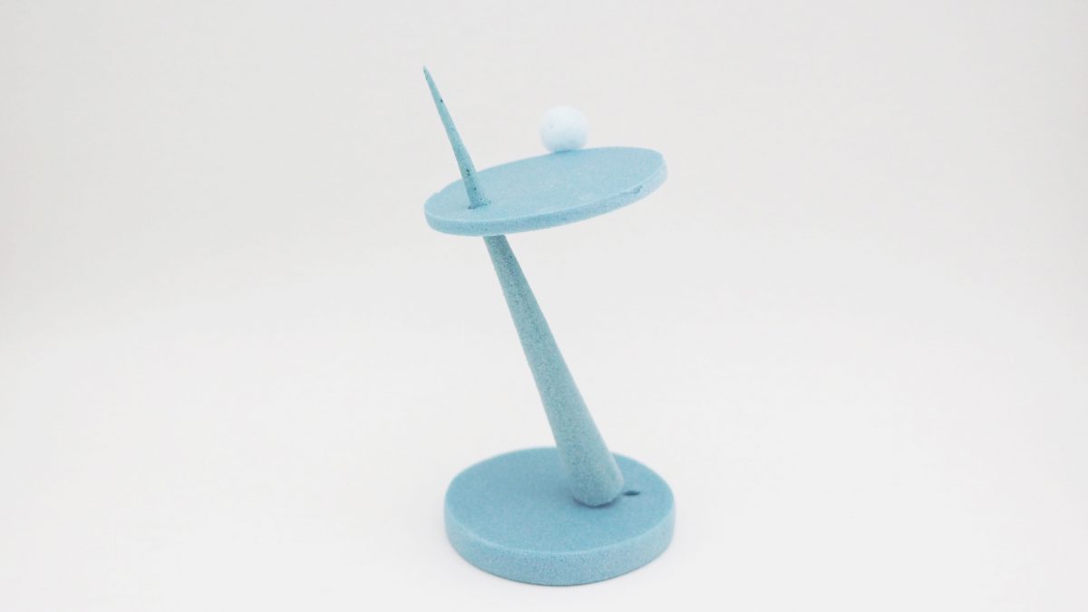
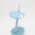
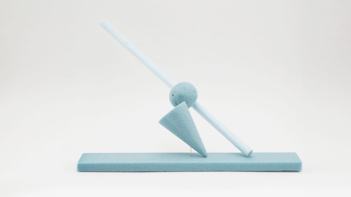
Ascension plays with with fragility. In this piece, the slender domi- nant pierces sharply through the subdominant and ascends strongly towards the sky. e brtittle disc that is the subdominant rests, slightly tilted on the dominant, and nestles the miniscule subordinate that balances in static equilibrium, yet implies a sort of precariousness, that it could roll away any moment.
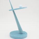

Profile view
Bottom view
Profile again
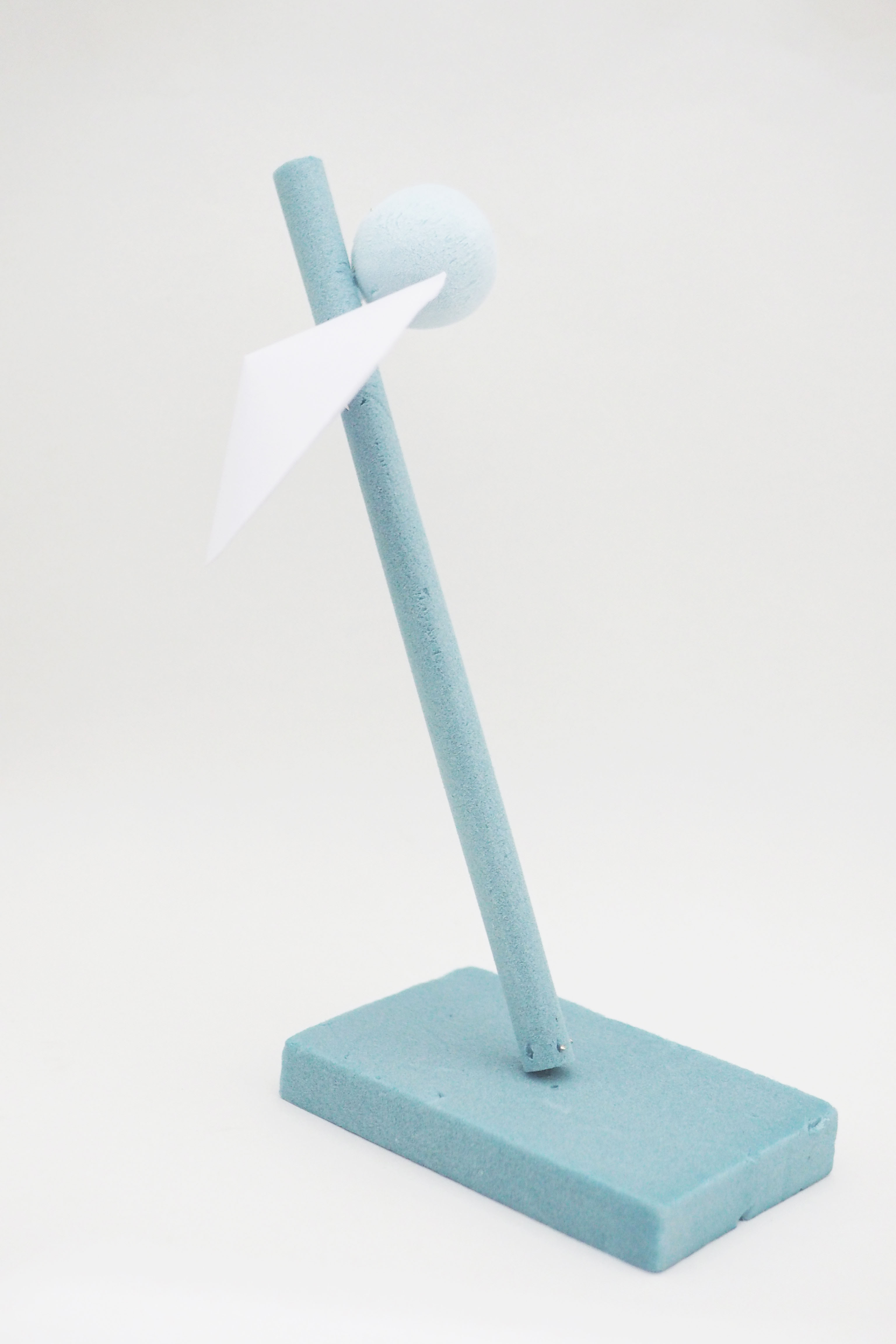
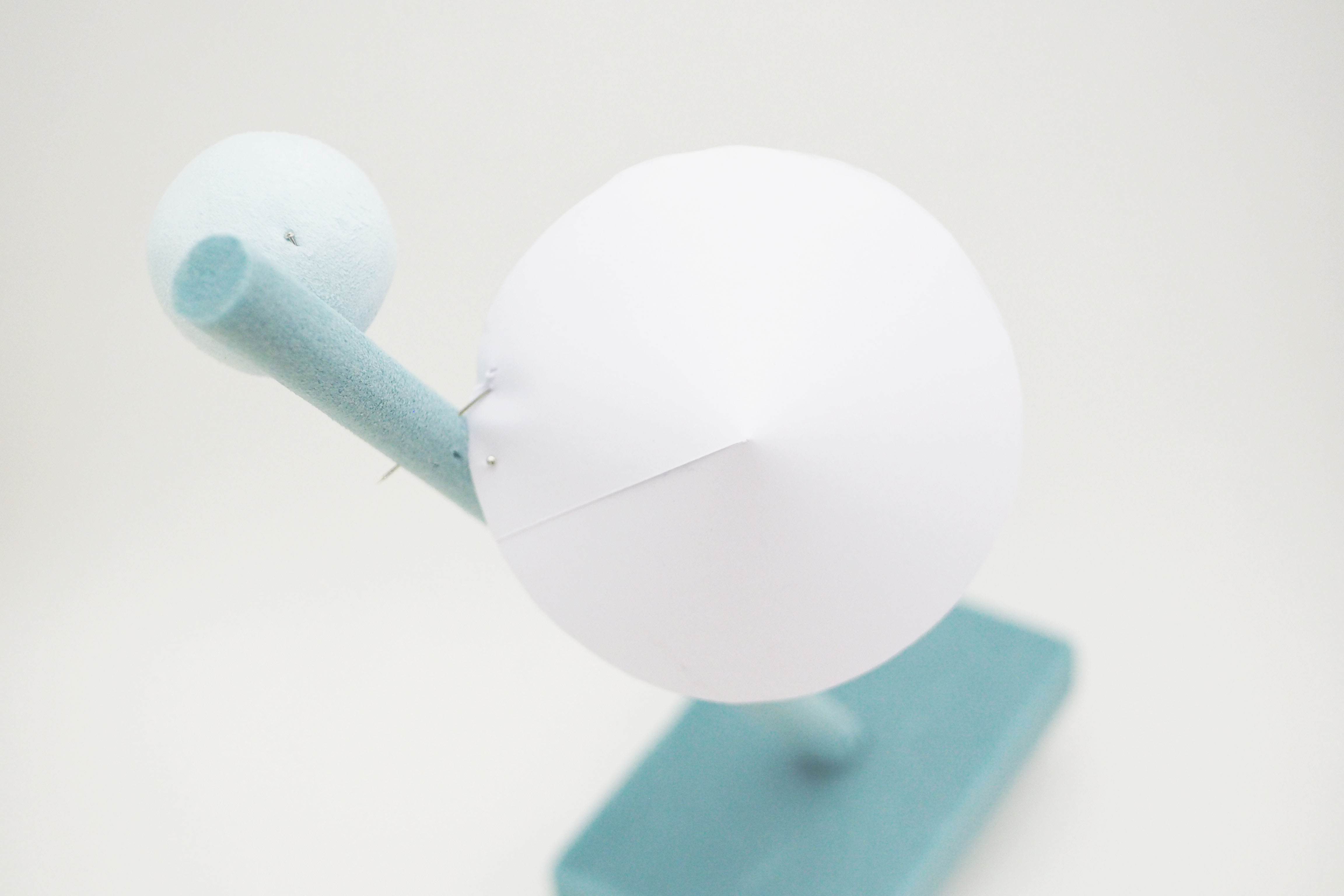
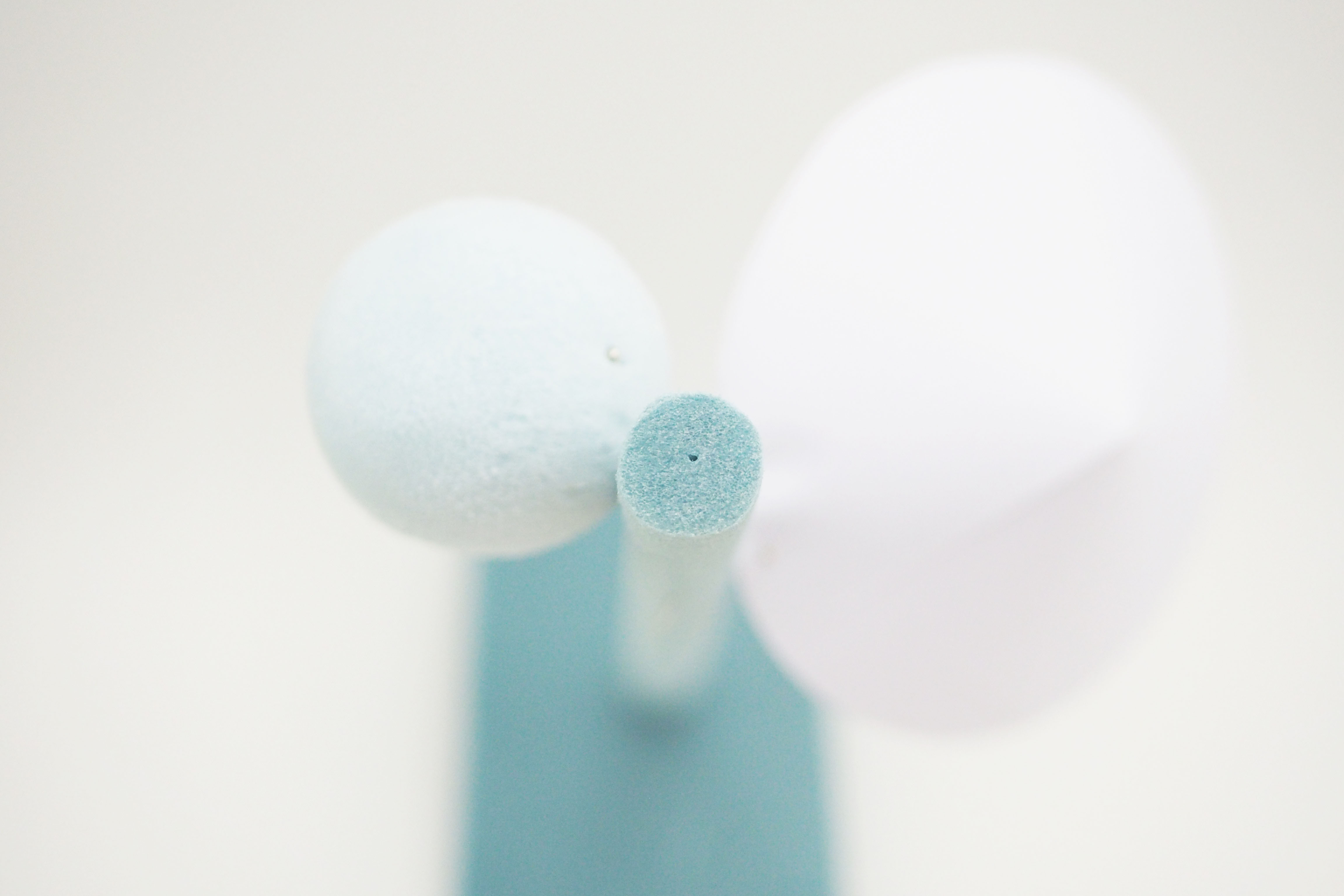
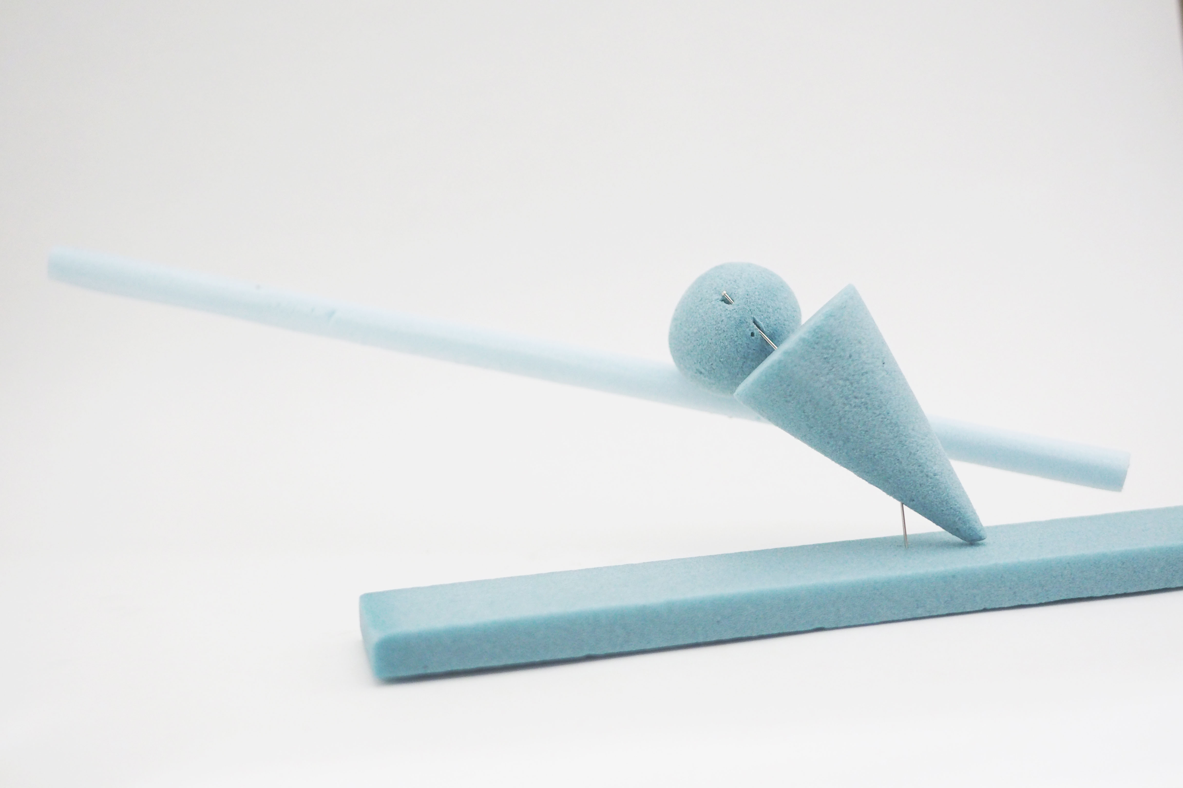
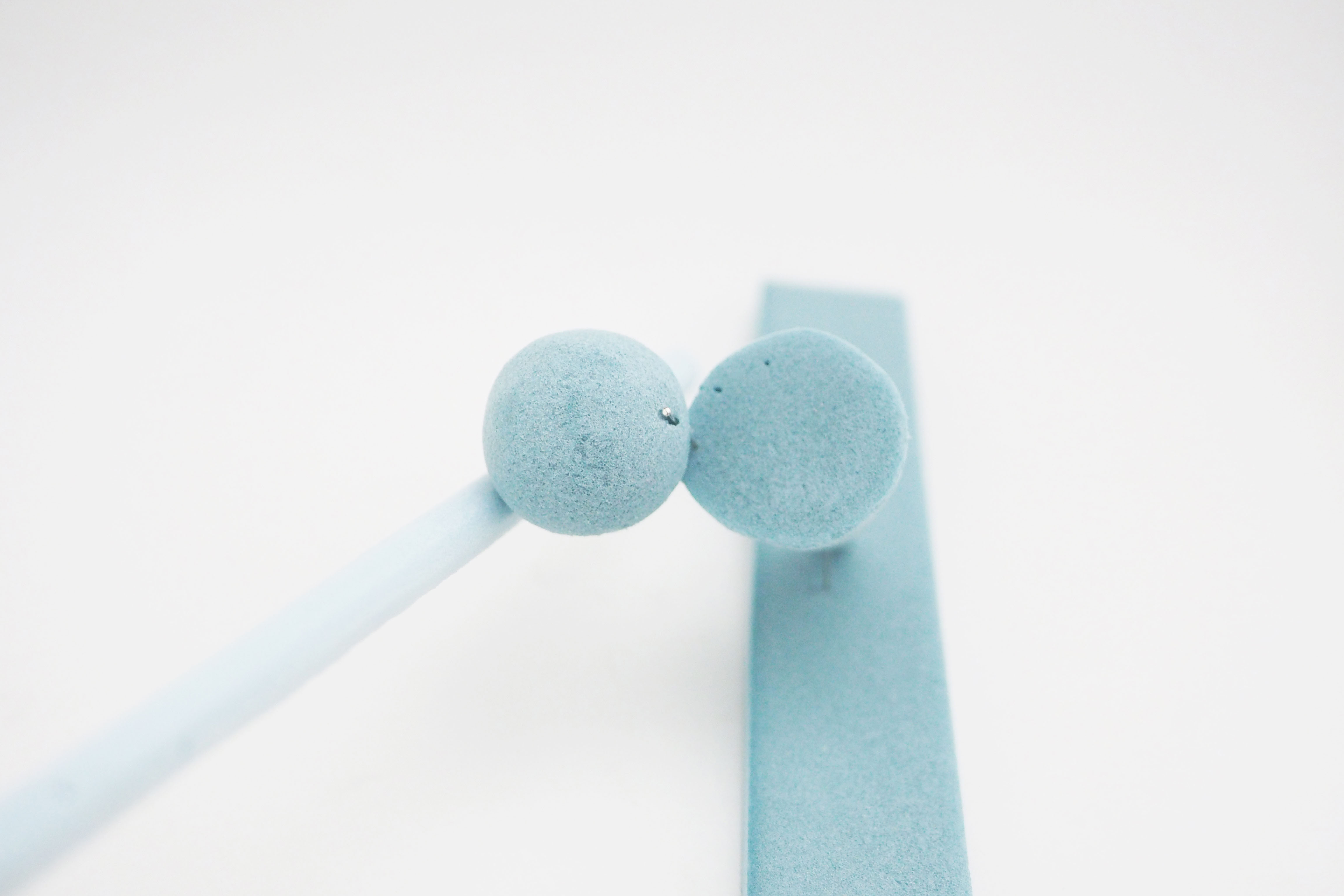
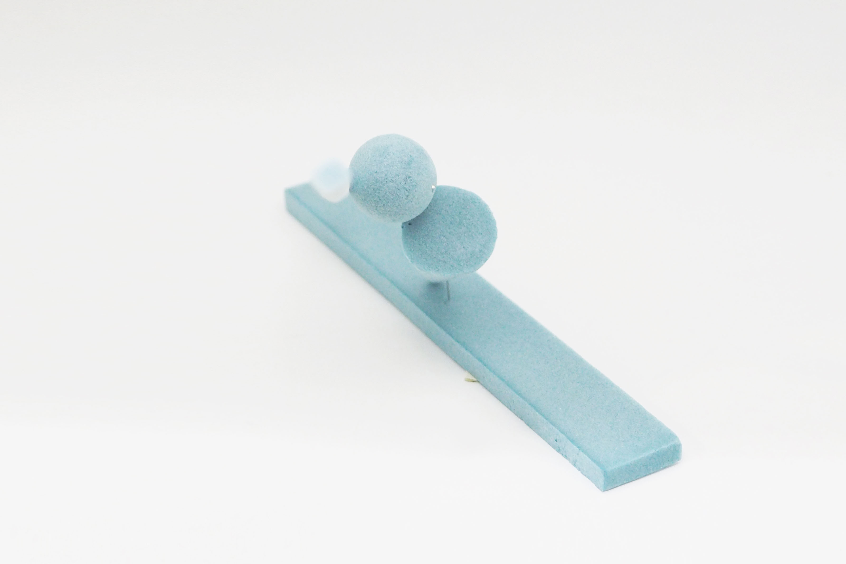
(Still a) Slave to the Foam: Sex on the Beach
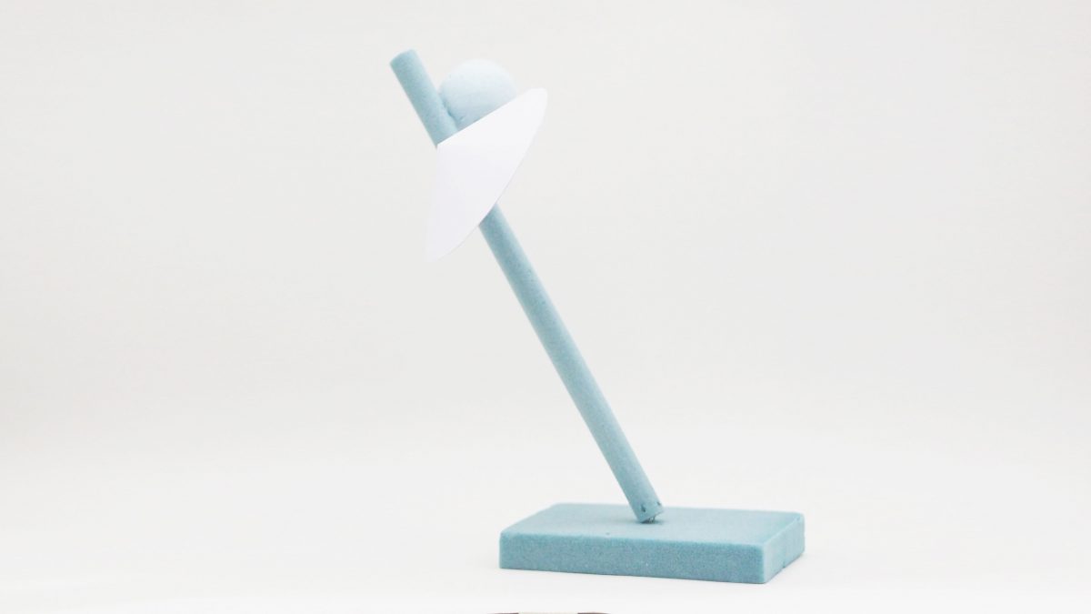
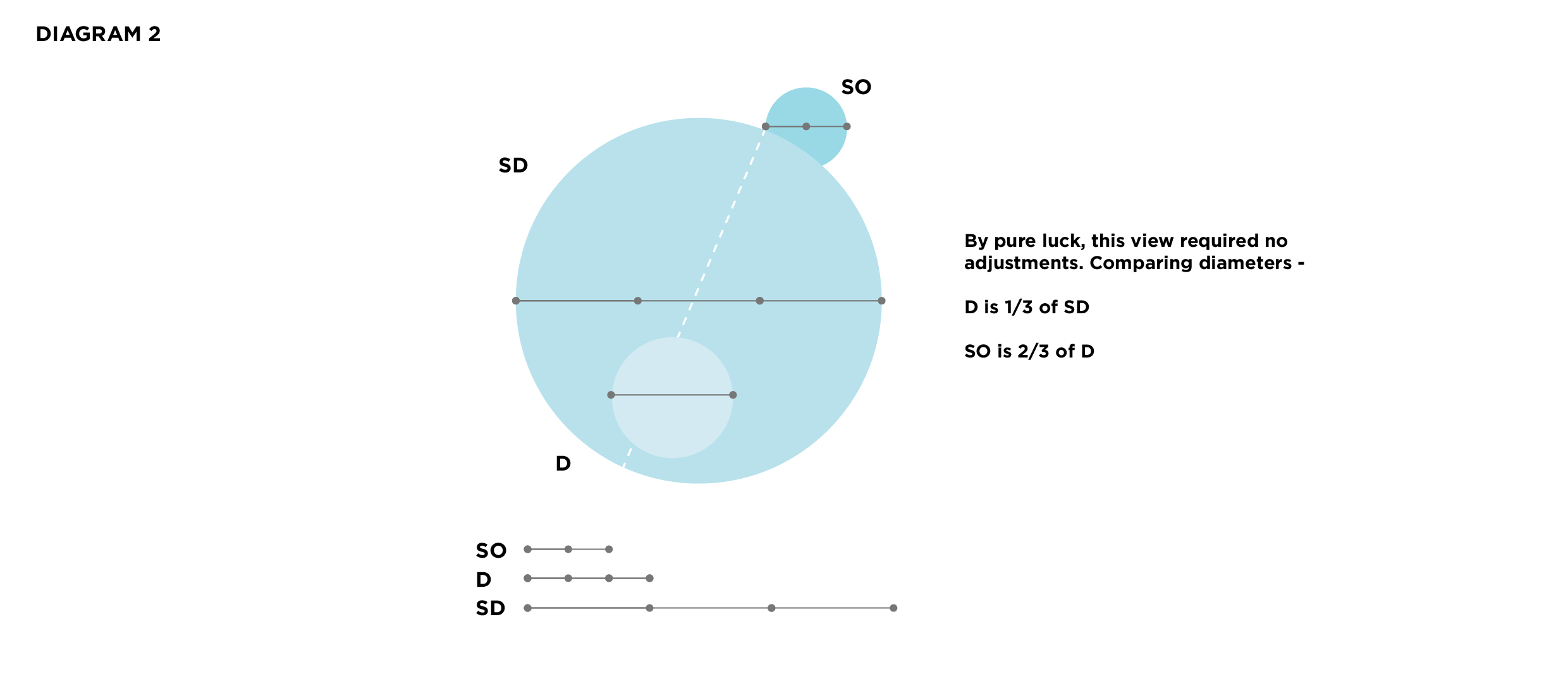
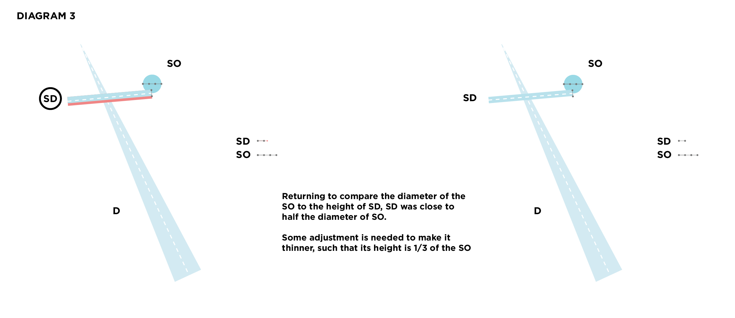
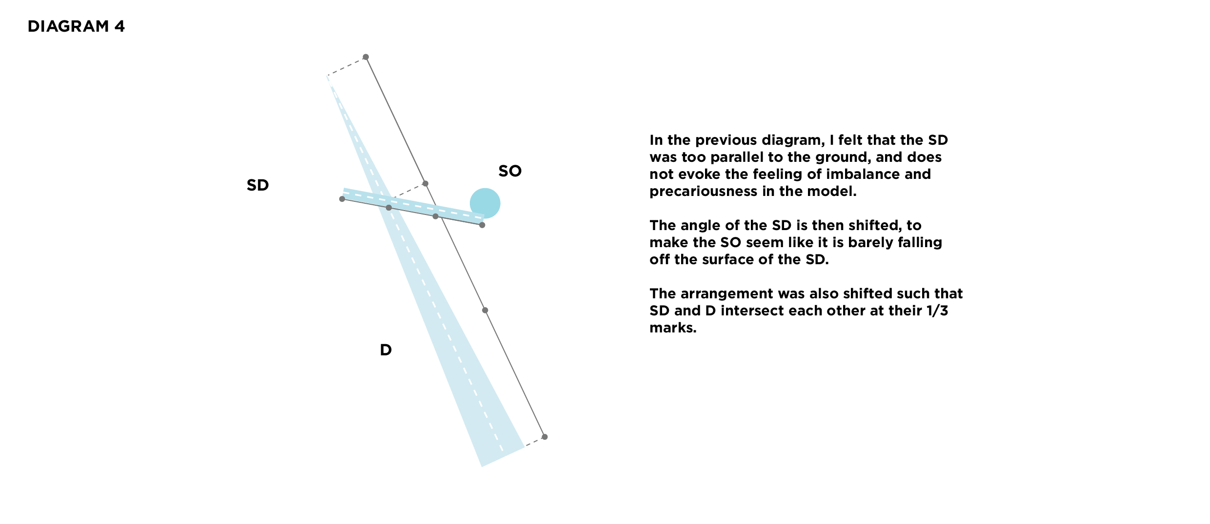
Sex on the Beach features a long cylinder, an off-centre, slanted cone complemented by a sphere. The overall model resembles an assemblage of a cocktail, with the cylinder being a straw, the cone being a cocktail umbrella and the sphere being a cherry on the top.
Profile view
Top view
Profile view
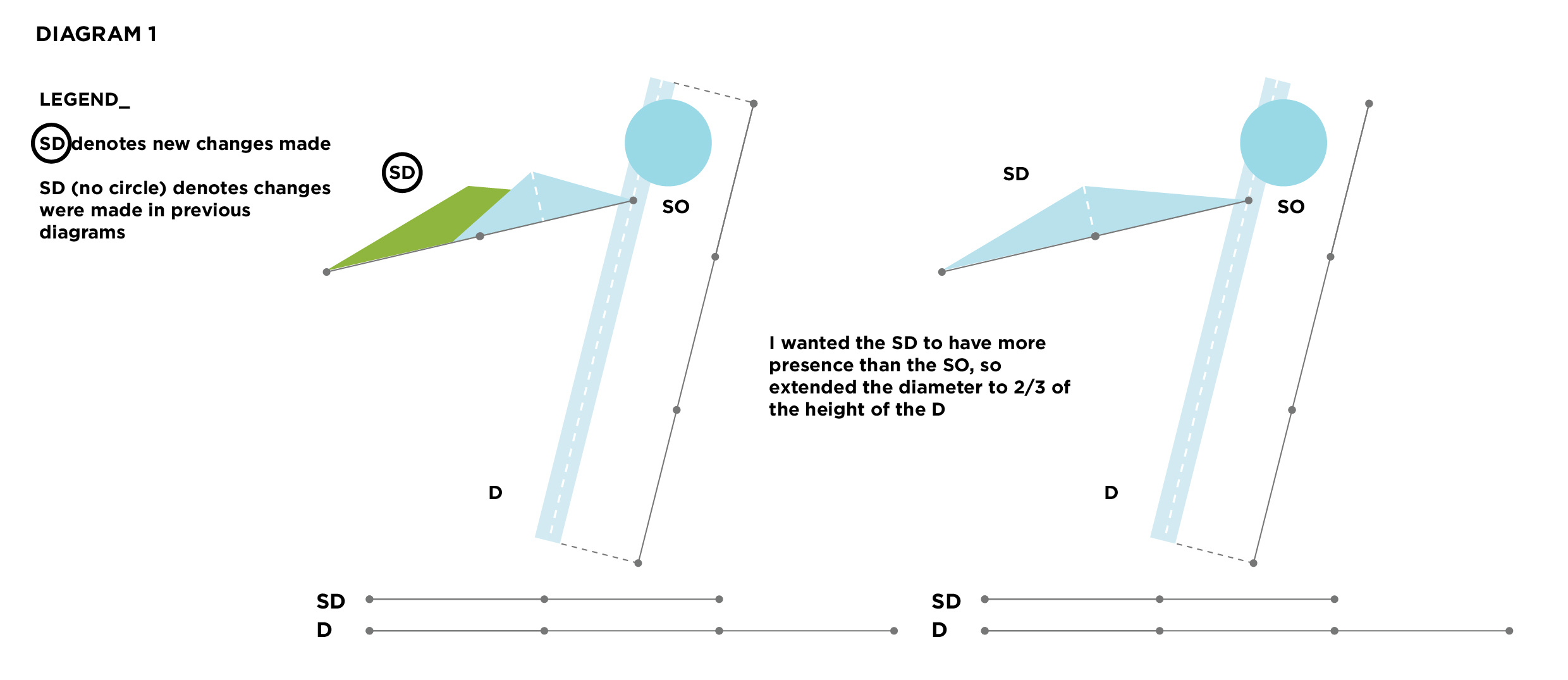
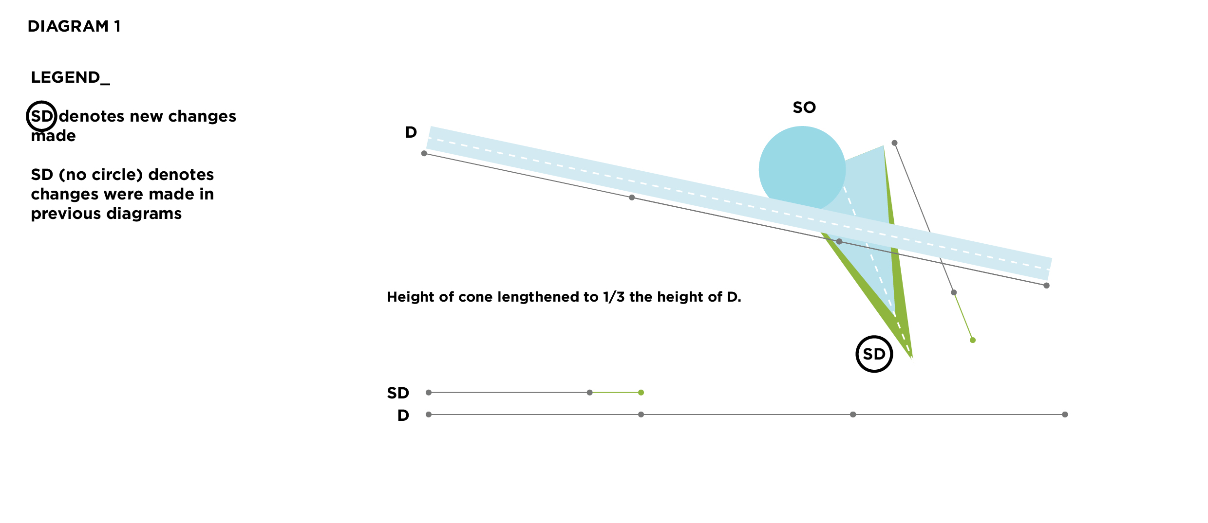
Other possible changes
(Still a) Slave to the Foam: Galaxy
The general principal axis of the whole model implies an upward, diagonal motion, almost as if the structure is reaching for the stars the moon. The long cylinder somewhat resembles the tail of a comet surging through the sky.
Profile view
Top view
Bottom-ish view
Cannot unsee

I was perplexed when I first encountered the concept of dominance within 3-dimensional objects. More specifically, I was skeptical that common day objects possessed elements that neatly fall under the categories of Dominant, Subdominant, and Subordinate.
The biggest question that hung in the air was “Why is this important?” and “Why am I even learning about this?” The answer only came to me several weeks later. As I became more comfortable with the idea of dominance, I began to see them more often in everyday objects. More importantly, I realized its visual impact on these objects. Those exhibiting clear D, SD, and SO stood out better and were more aesthetically appealing than those that did not. Everyday objects are designed by people after all, so it would help knowing and differentiating good design and (bad) design.


After understanding the concept more clearly, I realized that the ink bottle that I had brought to class on the first lesson is rather subpar if we were to judge its aesthetic value based only on the dominance of its elements.

To make this more visually striking, perhaps the bottle cap could be altered such that it is of uniform texture – a uniform matte black of the rubber squeezer + matte black plastic for the screw cap (as opposed to the speckled, heavily textured plastic it is now). Disregarding marketing and consumer information purposes, we could reduce the label to just the Bombay logo, perhaps engraved into the glass body to add a third nuance of black into the whole piece.
Once you’ve seen it, you can’t unsee it.
Slave to the Foam: Model 3

Front view

Side views


Tentatively final model

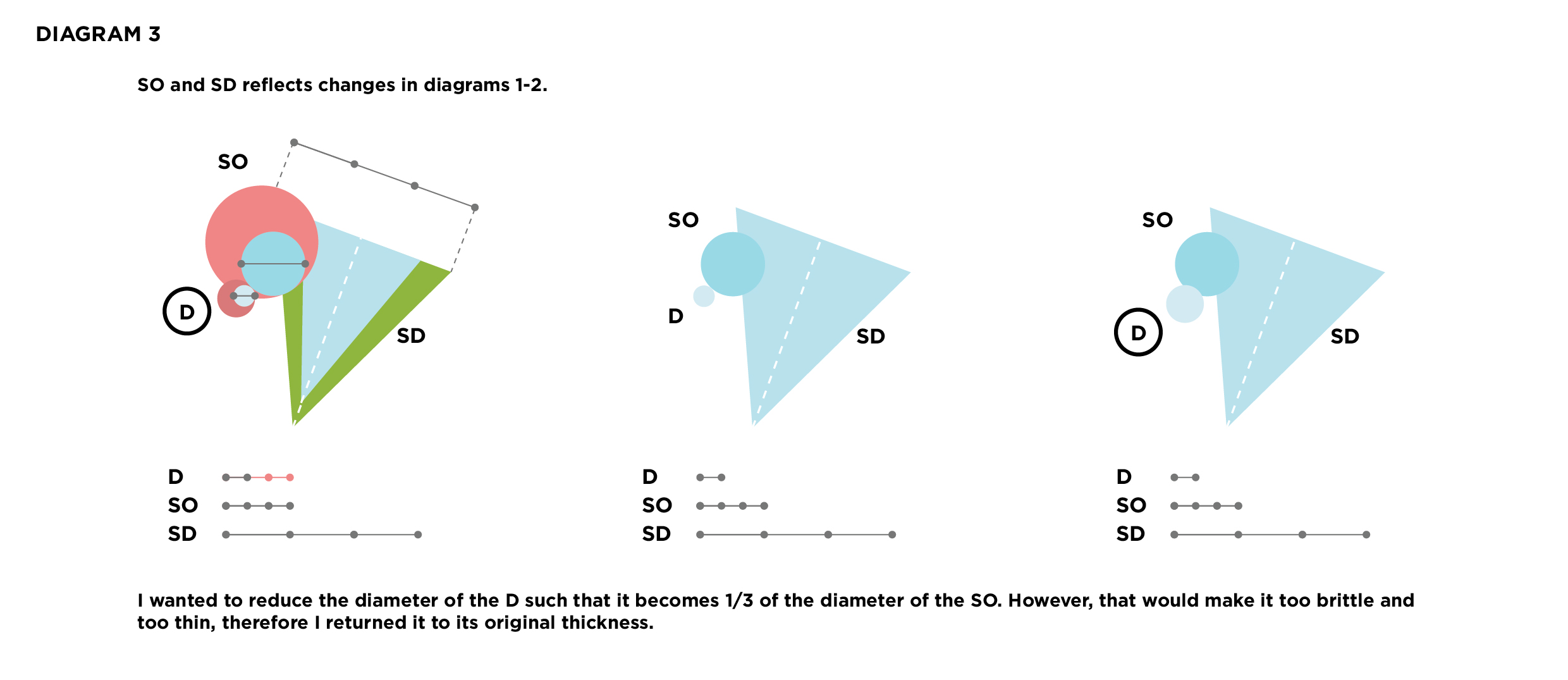
I am very pleased with this model and will work on this for my final piece. Overall, I really love the long elegant lines created along the 3 axes and the subtly hidden SO. There are a few spots that still need ironing out before the submission i.e.
- D is a little too long, will shorten in due time.
- SO is still too tiny, will enlarge in due time.
Very excited to work on incorporating other materials in this piece.
Slave to the Foam: Model 2

Front view

Side view


Top view

Improved 3D sketch model

So far, I am not quite pleased with this model mainly because of its simple silhouette. The only striking feature, perhaps, is the subtle SO. I really liked how the SO was treated in this piece, and so am exploring other ways of making it hidden yet seen (Model 3, post will be up tomorrow).
Slave to the Foam: Model 1

HD photos for HQ model ✮
Front view


Top view

Side view

Improved 3D sketch model
 Generally, I find the overall composition to be quite beautifully asymmetrical and well-balanced. Consistency is true for 4/6 views (front/back and top/bottom) as B‘s length and implied volume (due to the creation of large voids) has a consistently prominent presence. When looking at the model from the sides, however, B‘s thinness works to its disadvantage. C remains a constant SO throughout all 6 views due to its comparatively small size.
Model 1: Complete