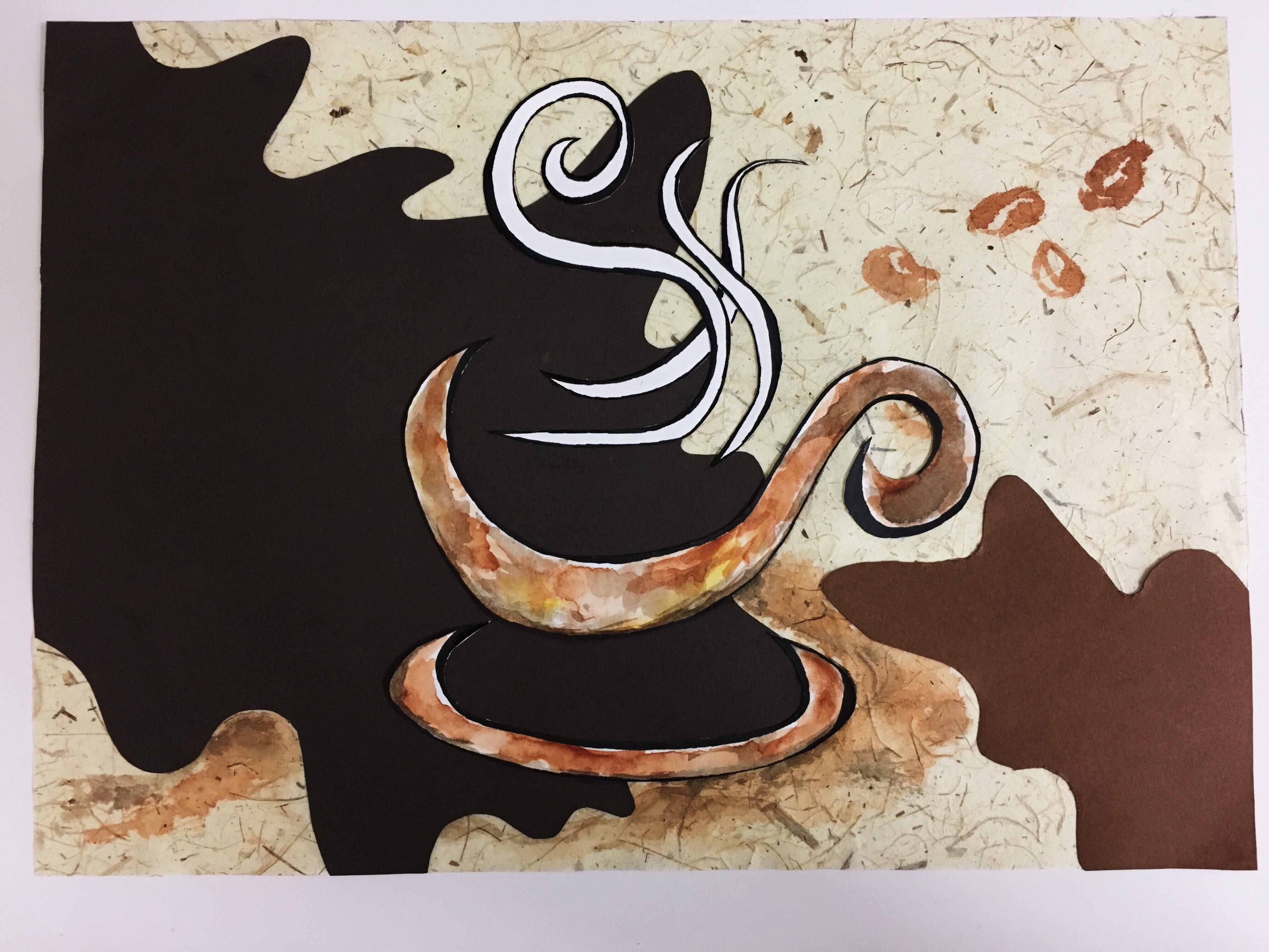
Group members: Rochele & Ling Ern
From the site research, we have come out with some ideas for the site-specific installation, mainly based on people’s perception of the library as well as feedbacks received from the interviews.
3 Proposed Ideas:
- Idea One – Lost Age

Project Synopsis
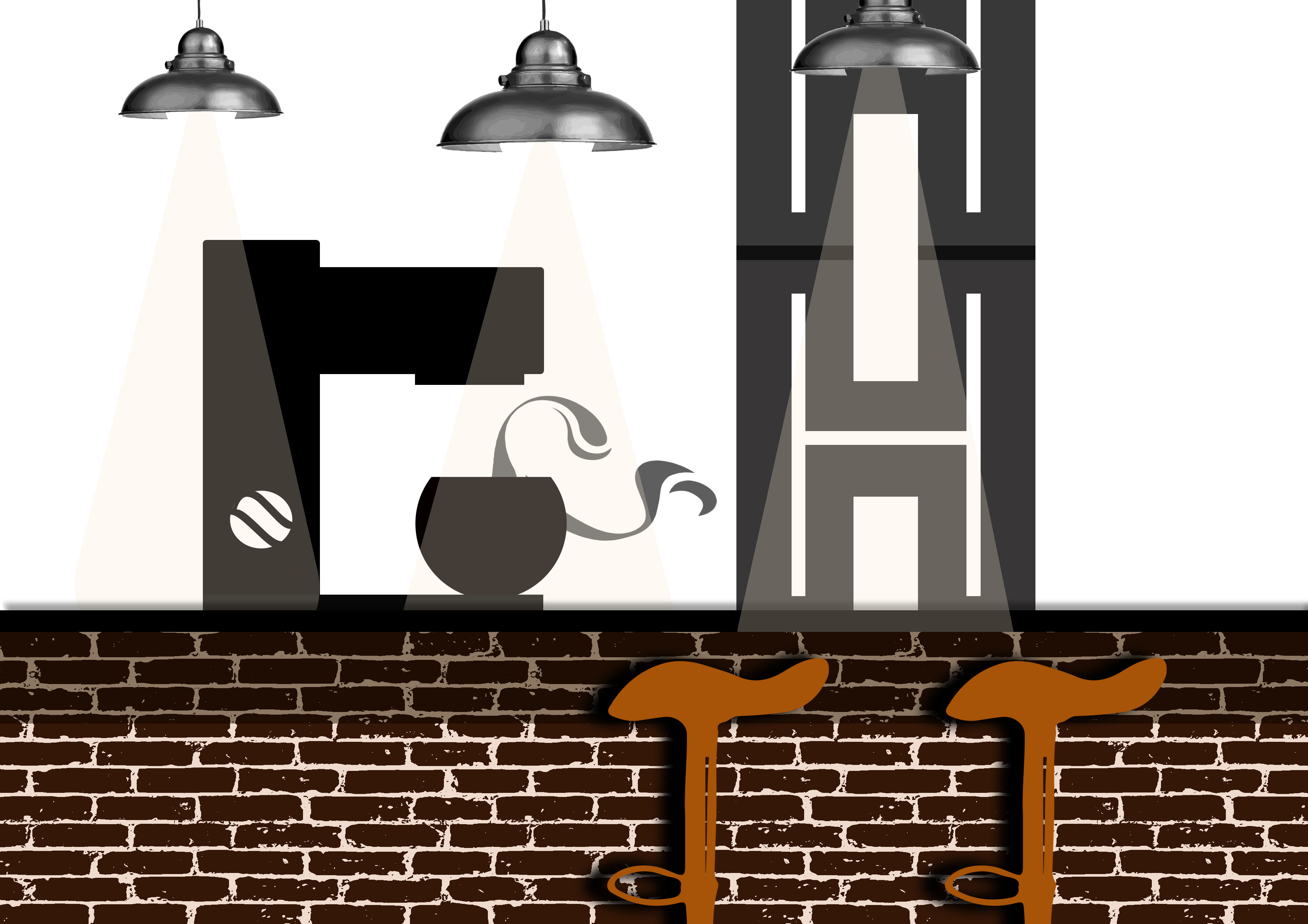
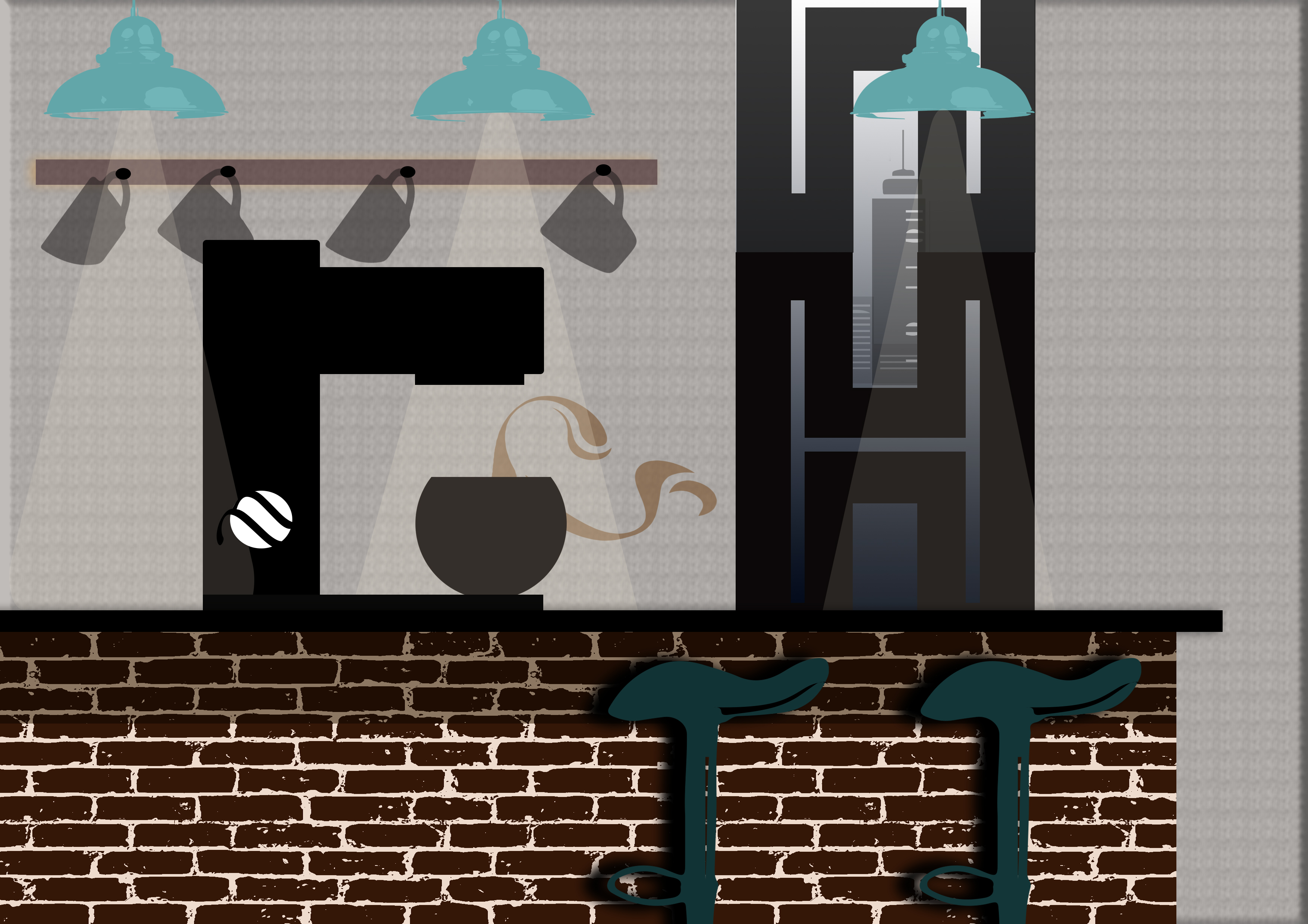
Technology has greatly improved people’s reading experience these days, and it is proven that there has been a diminishing use of the library. Libraries these days are considered merely a “warehouse” for the prints with unused content. There wasn’t any people browsing the books whenever I drop by the library. The books are arranged almost too neatly as if they have never pulled off the shelves. One possible reason may be when there are too many books, people don’t know where to begin with. “The Paradox of Choice”, where excessive choice can produce choice paralysis. When there is a large display, people are less likely to make a choice as they feel overwhelmed. Hence, a small number of books on display allows viewers to do a quick browsing and thus enhance the perceived value of the books. Also, there is a sense of discovery when people come across books they never knew they wanted to read.
Description of Installation

Clear up an area of the shelves or it can be on table. Place a number of “unborrowed” books (approx 50). The books can be wrapped up with brown paper and interesting quote is written on each of the book or arrange them according to book jacket colours/alphabetise them.
- Idea Two – I Chope Like That

Project Synopsis
We realised that a lot of people often leave their stuff on the table to reserve the seat at the study table. By observation, there are times where the person has not come back/ reappear after more than 45 minutes to an hour. To maximise the usage of the study area, “I Chope Like That!” helps one another to be more aware and mindful of their behaviour.
Description of Installation
A deck of cards will be produced and placed at each study table, enclosed with a stopwatch at the front. The user has to press and activate the stopwatch before being able to open the box to retrieve the cards. Each card contains words like “I am off to the toilet! Will be back in 5 minutes!” / “Please wait, I will be back in 10 minutes” / “I am printing my stuff, be back in 5 minutes” / “20 minutes break time!” etc. The maximum chope-ing time for a person will be capped at 20 minutes. Once the 20 minutes is up, the stopwatch will beep and the librarian on duty has the right to remove any belongings on the table.
- Idea Three – Hall of Fame

Project Synopsis
How can a library transform itself into a hub where people and ideas are connected? One of the major issue we found is that library can be too quiet for some people and it becomes uninviting somehow. Besides, the level of interaction between people in the library is extremely low. In order to tackle this problem, mini entertainment is necessary while not causing too much noise and chaos to the quiet space. Through this installation, it helps to create a livelier environment where library users are able to see themselves mirrored in their surroundings. This enriches the library space and reflects the diversity of our users.
“People are always drawn to words and words fragment themselves into graphics and photos which tell a story.”
Description of Installation


A set of stamps with basic shapes are provided on the wooden table with stack of A5 white cards and pens. Viewers are free to create the image they like using the stamps provided or even include messages on his or her artwork. After which he or she needs to hang their art piece on the blank black wall together with others’ artwork. //OR the metal panels in front of the photocopy area where we will loop the strings through the panel together with fairy lights for people to hang their artwork.
Mini Ideas –
People’s Library – Users can bring their books to the library and place on a specific area to share it with people.
Silent Disco – A pair of wireless headsets provided at the grey seating area where two people can have their own “party”.
Stickers – Paste stickers on the floor starting from the entrance to guide people to specific shelves; stickers may contain sentences like “When in doubt, walk five steps and turn to your left”
After consultation, we decided to pick #Idea Three for further development.
Some of the questions/issues we are left to ponder upon are –
- Is there a need to display people’s art publicly on the wall?
Instead of putting up their artwork on the wall, shall we explore other ways of art display? For example, on the table. Will it become more inviting for users if they could just “submit” their artwork instantly after they have completed or better to walk to the wall? Therefore, it is important to take note of certain issues such as “stage fright” and eliminate it for better outcome – People may not want to publicly display their art as some may feel a degree of nervous apprehension in such situation when they are in the center of attention. Even though the art is anonymous, the sense of being watched may put people off.
- Incorporating moving sequence/still image or sound.
How do we add in the elements required in the brief instead of pure interactive installation? By providing a theme as a guide for the users, we can create cards with found imagery. This helps to limit the possibilities (because too much freedom can be tough too!) yet there is room for people to use their imagination.
- Proximity issue between the working station and display area.
There has to be a link between the making of the work and where it displays. Due to it being a non-gallery installation, we don’t have a large space dedicated for it. Hence, placing the work station (where people make their art) further away from the display area may break the connection and causes confusion.
- Will people interact with the installation/Is it inviting enough?
How do we make the installation stand out in a space so crowded or do we want it to be blended into the environment so much that people will not think that it’s an art installation? We definitely want it to be an interesting project which people get to involve and together we make the library a better space. However, we are going to test out the installation work after setting up in the space.
UPDATED PROPOSAL
Title: What we SEA in You
Synopsis:
How can a library transform itself into a hub where people and ideas are connected? One of the major issue we found is that library can be too quiet for some people and it becomes uninviting somehow. Besides, the level of interaction between people in the library is extremely low. Through this installation, it helps to create a livelier environment where library users are able to see themselves mirrored in their surroundings through the exchange of art. This enriches the library space and reflects the diversity of our users.
Description:
A collection of stamps with basic shapes are provided on the brown table with stack of A7 vanguard sheets and markers/pens. Library go‐ers are free to create the image they like based on the theme, using the stamps provided or they can include messages on his or her artwork. After which he or she will display their art piece on the slitted foam platform on the table. With every piece of artwork contributed, participants are free to take one of the art piece done by another participant.
Sketch:
*This installation idea is inspired by my visits to Art Science Museum and Capitol Piazza.