Category: Research
History of Design – Plakatstil

Plakatstil, also known as Sachplakat, is German for Poster style, originating from Germany in 1900s. It was started by Lucien Bernhard, who was also the director of Das Plakat, a monthly German art magazine. Plakatstil turned away from the complexities of Art Nouveau, into a more modern outlook on poster design. Since it was a style, there were certain distinct characteristics found in all Plakatstil posters, such shapes and objects being simplified as plenty of negative space to guide the viewer to focus solely on the subject matter. The posters were usually accompanied by bold lettering that grabs the attention of the viewers. Lucien Bernhard believed in minimalism, in the ‘less is more’ approach. Plakatstil became universal style that did not have any association to any specific school or art movement.
The colours used were usually reductive flat and distinctive, eye catching colours. Bernhard was 15 when he attended the exhibit in Munich of work and walked away ‘drunk with colours’. He attention was caught by the flat, eye catching colours he had seen, which jumped at him. This was when he came to the revelation that design could be minimalistic and clear; clutter and intricacies of design was not necessarily vital to bring forth a message. In Bernhard’s poster for Priester’s matches of 1905, his original idea consists of cigar, dancing girls and a table; which he felt reflected Victorian style, something he did not want to achieve. After reduction and compositional tests, he removed the elements one by one and was left with a the matchbox and matchsticks. This gave the poster a minimalistic approach and the message was straight to the point. In this new era, shapes and objects were used, rather than full-on illustrations.

Poster for Priester matches, Lucien Bernhard, 1905.
Typography was usually created by hand as part of the illustrations. Although Bernhard preferred using classic book typefaces for setting text, he designed a number of display typefaces, including Bernhard Gothic, Bernhard Fashion, Lucian, Bernhard Tango, and Bernhard Brushscript. There was no limitations to what kind of typefaces could be used in Plakatstil.

Poster for Stiller shoes, Lucien Bernhard, 1912
Plakatstil was a style that was not art for art sake, rather it had a function, a purpose. The purpose was to capture the audience and entice them to desire, and therefore purchase what was reflected in the posters.

Poster for men’s ready made clothing, Ludwig Hohlwein, 1908
Minimalism, less is more concept of Plakatstil was unfortunately derailed in 1914 by WWI.
As artists, we are constantly being in the loop of trial and error, finding the best way to communicate our messages on advertisements to the viewer without distracting or distortion from the original message. The Eureka moment struck Bernhard as he developed the idea of using a minimalistic approach to his design, influencing many others such as Ludwig Hohlwein and Hans Rudi Erdt. Although there wasn’t a definitive style that followed in Plakatstil’s footsteps, artists such as Nancy Stahl, who designed the 37-cent Snowy Egret definite stamp in 2003 drew inspiration from the style and evolved it to integrate into her own art style. The bold and graphic stamp was made in a reductive, flat-colour style, drawing resemblence in colour to that of Hans Rudi Erdt’s ‘Opel poster’.
History of Design Lecture 2 – Spook School

Outline:
- Who were they?
- What did they advocate?
- Summary and reflection
Who were they?
Spook School was another name to describe the Glasgow four – which consisted of Charles Rennie Mackintosh, Margaret Macdonald, James Herbert MacNair and Frances Macdonald. The four of them were famous for being pioneers of the Art Nouveau movement. Art Nouveau translates into New Art, an international movement dictated by an reaction against academic art, eclecticism and historicism of 19th century architecture and decoration. It was inspired by natural forms such as the sinuous curves of plants and flowers. The Glasgow four were painters as well as designers, and had drawn influence from Celtic Art and Symbolism. They developed the Glasgow Style, which was a fusion of influence of Arts & Craft movement, Celtic Revival and Japonisme. They were named Spook School, or in other words Ghoul School as their artwork was termed ‘derisive epithet’ which distorted and conventionalized human form.
The four met at the Glasgow School of Arts. MacNair and Mackintosh were fellow architect students and close friends, while the Macdonalds were day students at the school. They formed an informal creative alliance which produced innovative and at times controversial artworks which were essential to the development and recognition of the ‘Glasgow Style’.
The controversial artworks were considered to be breaking the norms of society – it was uncommon for female painters to paint nude woman in the 1890s.

The sexual tension that arose from the collaboration of the four was undeniable.
The Vienna Secession was the epitome of Glasgow four’s impact on the Art Nouveau movement. They had sold most, if not all of their works there and despite having parted ways after that, their exhibition remained important to the movement in its entirety. However, they had little to no influence on Art Nouveau post – Vienna. Mackintosh continued with his architectural works and went on to become the most famous of the four and was renowned all over the world.

Reflection:
Their detachment from academic art gained recognition from the masses and other artists, they challenged the norms and shied away from the curvilinear art forms that dominated the art scene at that period. Their use of structural, rectilinear shapes influenced big time artists such as Gustav Klimt and Koloman Moser. Despite discontinuation of their alliance post secession, their influence was widespread and they were even coined as Glasgow Boys and Glasgow Girls for their distinct styles and representation. They were one of the most influential groups in Art Nouveau, which championed the use of linear, plant-like forms and drew from science, mythical history and modernity for inspiration.
History of Design: Reflection – Diamond Sutra
Outline:
- Origins
- Content
- Summary and reflection
Origins:
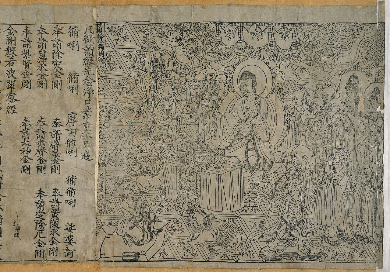
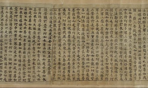
The Diamond Sutra is acknowledged as the oldest dated printed book,which was approximately 5.3 metres in length. Commissioned by a person named Wang Jie on behalf of his two parents, the Diamond Sutra has been translated, reproduced and its content has been spread throughout the Buddhist world. Dated in the year 868A.D., the text had been discovered in 1900 by a monk in Dunhuang, China, on an old outpost of the Silk Road on the edge of the Gobi Desert. The Diamond Sutra, a Sanskrit text translated into Chinese, was one of 40,000 scrolls and documents hidden in “The Cave of a Thousand Buddhas,” a secret library sealed up around the year 1,000 when the area was threatened by a neighboring kingdom.
In 1907, a British-Hungarian archaeologist by the name of Marc Aurel Stein was on an expedition mapping the ancient Silk Road when he heard about the secret library. He then bribed the abbot of the monastic group in charge of the cave and smuggled away thousands of documents, including the Diamond Sutra.
Content:
The book was named Diamond Sutra – The Diamond That Cuts Through Illusion. Its intent was to help cut through the perception of the world and its illusion. It talks about emptiness(of the world) – among many things discussed as the Diamond Sutra takes the form of a conversation between Buddha’s pupil Subhati and his master.
Reflection:
It is interesting to see the first ever printed book had been poised for reproduction with a religious purpose – Wang Jie added a inscription on the lower right hand side of the scroll reading: ”Reverently made for universal free distribution by Wang Jie on behalf of his two parents”. In Buddhist belief, spreading the image or words of the Buddha was a good deed and way of gaining merit. The Diamond Sutra was the only dated document amongst the thousands of scrolls hidden in the cave, meaning that there could have been an older scroll or book that was kept within the same library. The emergence of printing so many years before the movable type was invented – was proof that technology had been advancing at phenomenal speeds in China. Woodblock print as a method of printing on cloth, dates back to as early as 220A.D. However, the Diamond Sutra is the first completed book to be produced via this method. Moreover, the sealing of the Mogao caves, which prevented neighbouring kingdoms from ransacking and looting the sacred scrolls was proof that the religious documents kept within the caves had more than historic importance. The intricacies of the illustration elevated the beauty of the text – it was well contextualized by the painting, bringing to life the text and its meaning.