
Category: Final Project
[Drawing] Final Assignment

Brief:
Combining many of the lessons and concepts of drawing we have covered so far, your assignment is to design a composition that depicts at least 6 people in a queue that you feel would be interesting to record. The space you choose should have opportunities for you to draw interesting perspectives, objects, textures, etc.
The drawing must be done on location and from observation.
I had drawn this at the Canteen 1 drink stall. The main goal I had set out for was to create a naturalistic drawing of the location, making it convincing and clear the foreground, mid-ground and background. The figures were rather hard to capture in real time, so I had to do a lot of figuring out, especially for the shirt folds and shades. I had focused greatly on the use of different tones to create a hierarchy. I felt that it was important to emphasis the lightest light and the darkest dark in the drawing. The solution that I came up with was tied together by the positioning of the light source for the character.

Feedback that I received:
Tables could have been drawn in a more convincing spherical shape;
and toned according to the drawing.
The shadings on the middle character, especially below the pants, was inconsistent with the rest of the characters.
The shading on all the characters should have been consistent.
Project 8 – In class assignment


Project 7 – Composition Design

Project 4 – Composition Apartment Design
 Draw 3 compositions of the interior of your apartment on A2 paper. Set a timer to 35 minutes for all 3 drawings. Focus on the tightness and looseness of the space, ensure lines are not floating at the edge of the paper, difference between positive and negative space, cropping of objects, and the objects do not have to be detailed or rendered.

Critique by classmates Don and Celia:
• Frame is unique
• Ceremonial sword has the darkest tones
• It is unsettling with regards to the midtones and rough texturing
• Weird shadows
• Lack of items
• Feels like night time for the walls are rendered dark, but window is bright
• Rendering is rushed
• Seems naturalistic
• The objects lack in key details, can’t make out what they are
• Looks honest, area looks lived in
• Computer is turned on but no details on screen
• Ceremonial sword seems heavily invested in for it has the most amount of details
• Table is not complete, the wire as well
• Try adding more details, define the areas where they overlap
• Define separation of areas more
• Chose to put focal points on the left
• Not a lot of heavy cropping at the top, making the scene feel slightly distant
• Challenge himself by choosing to leave the window and computer blank, giving some sort of relationship of where the light is coming from
• He could try adding more light sources which can work as motifs with regards to the window and computer screen
COLES PHILLIPS
– Creative use of negative space to show form
Project 5 – Midterm Assignment

Foundation Drawing – 30 Compositions (Photo) Week Three Homework Assignment
 No. 1
No. 1
This composition is my favourite because it has really good balance. The arrangement, though not symmetric, feels about right when balanced from the char at this angle. The focal point of the viewer is drawn to the objects in a clear manner.
No. 2
This composition is second because although there is good ontrast, the focal point and rhythm are slightly affected by the presence of the chair legs. It still has really good balance.
No. 3
This composition has good balance and unity. However, it is third because there is a lack of contrast by the shadows to provide good rhythm to the composition.
No. 4
Good unity, but perhaps lacking in contrast. Focus is affected by the chair. Overall, decent composition but it will not be ideal.
No. 5
Compared to No. 4, it lacks balance but has decent contrast. It is more dynamic than No. 4 and still provides good proportions
No. 6
Balanced composition, good contrast and focal point is clear due to the contrast. However, there is a lack of good proportion, thus it is placed no. 6 instead of no. 5
No. 7
Lovely contrast, good proportions. The chair is taken at the angle such that it does not interfere with the rhythm of the composition. It can have a better balance, thus it is placed no. 7.
No. 8
Good contrast, focal point is clear. Proportions are slightly distorted, can definitely have better balance. Good sense of unity.
No. 9
As compared to No. 8, poorer focus, contrast is still present, but proportions are poor such that it affects the rhythm of the composition.
No. 10
Distinctively lacking in focus, decent contrast helps the overall composition. The chair fights for attention in this composition. Rhythm is still good but overall an average composition.
Other decent compositions
No. 21
Decent balance in the composition. However, chair affected the focus and rhythm of the photo. Contrast could be better.
No. 22
Nice balance, good unity but lacking in contrast. Difficult to gauge the proper proportions. Focal point is not clear.
No. 23
Little contrast, especially between the two objects on the right. Balance can be better, rhythm can be improved by better framing.
No. 24
Chair helps with the focus of the subject matter (pulling out contrast to substantiate the focus). It can improve on unity as the subject matter is slightly out of frame.
No. 25
Contrast is ample, but chair is distracting and there is poor unity. Rhythm affected by the placement.
No. 26
Table occupies too much space in the photo, affecting the balance and focus of the picture. Contrast is lacking.
No. 27
Balance of the image is poor. Contrasts are vague, however rhythm is not affected as much.
No. 28
Contrast is ok, but the composition lacks clarity. Focal point is affected by the presence of majority of the chair.
No. 29
Poor angle. Despite subject matter occupying most of the space, contrast is unclear and there is poor balance.
No. 30
Poor balance. Lack of contrast. Unity is lacking, and focus is distorted by distracting objects such as the chair.
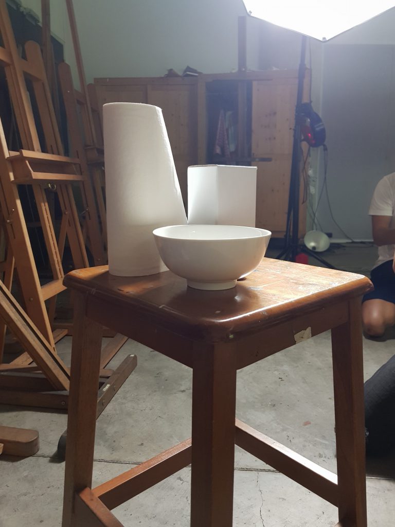
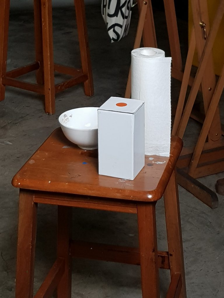
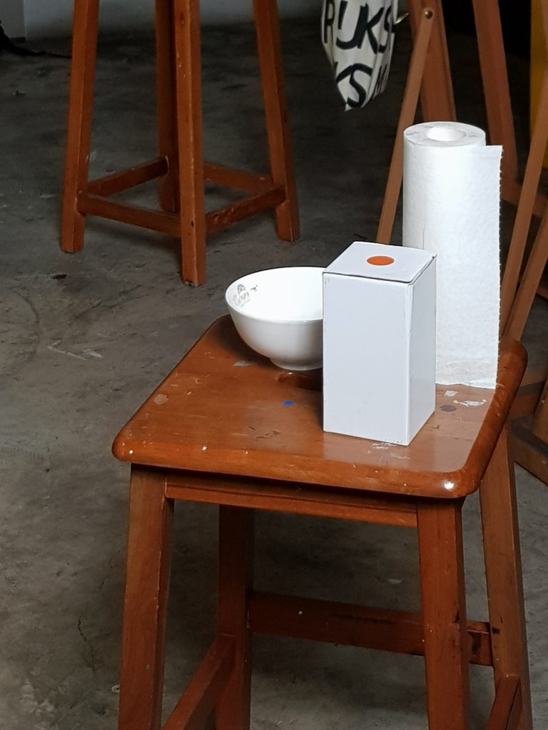
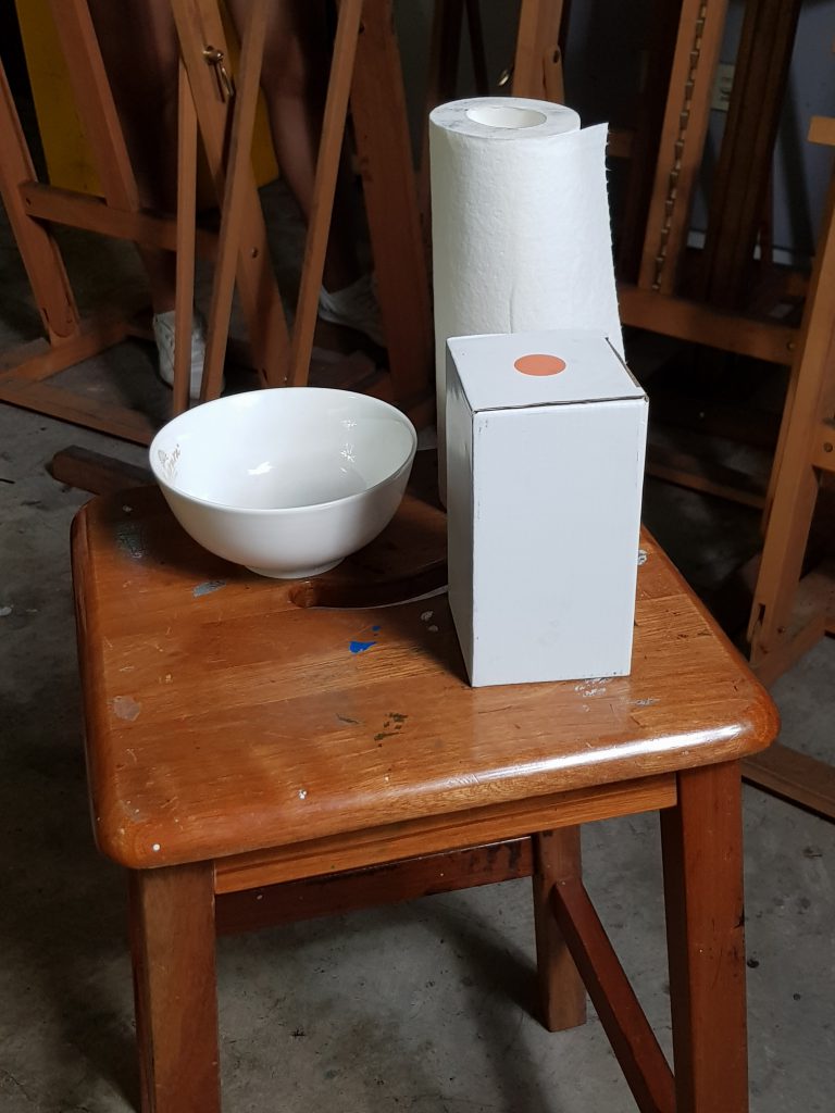
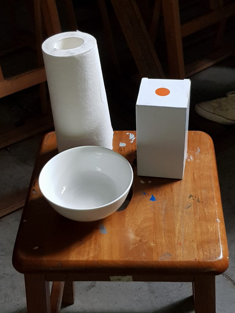
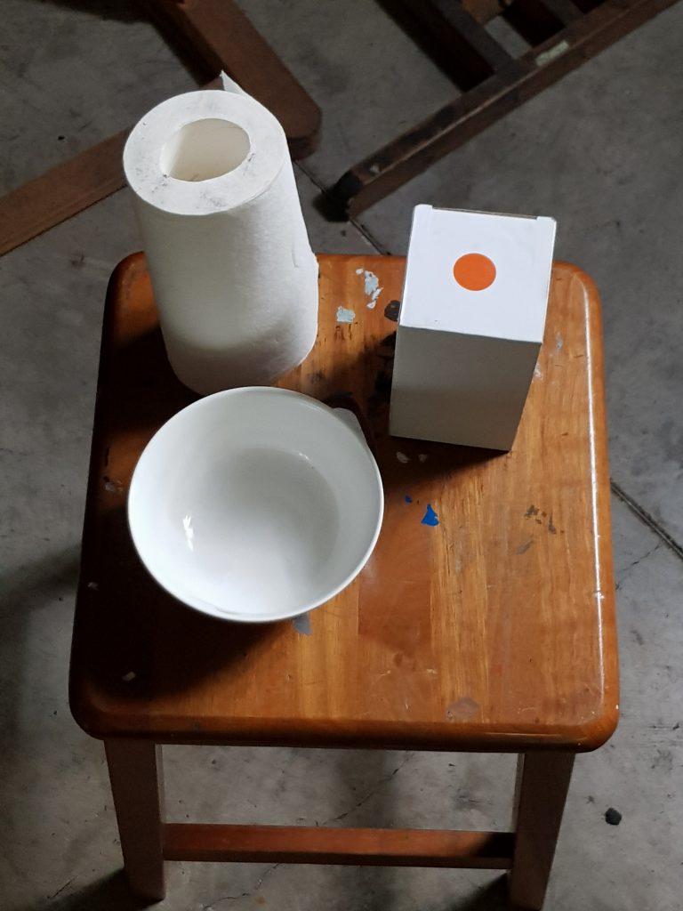
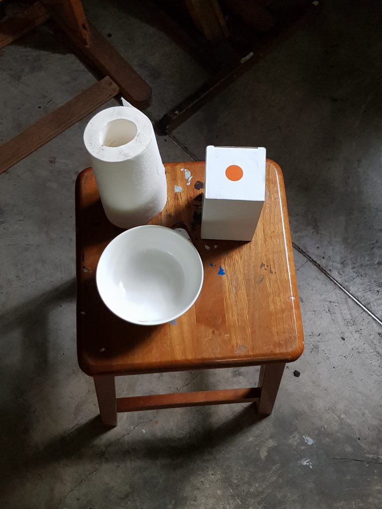
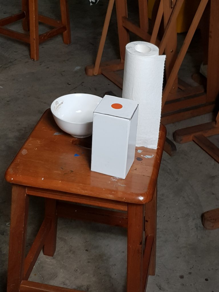
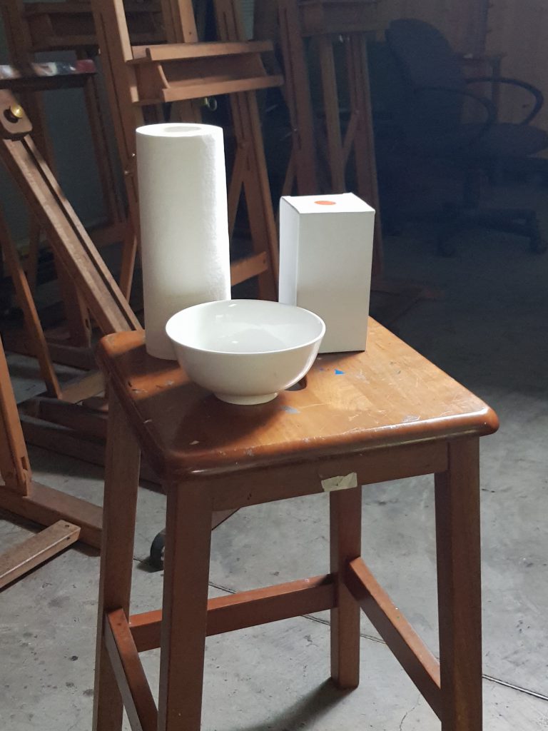
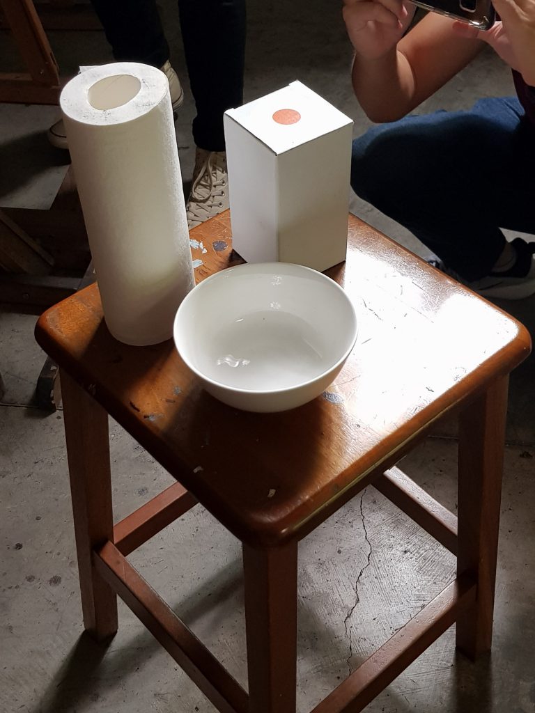
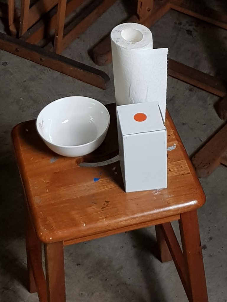
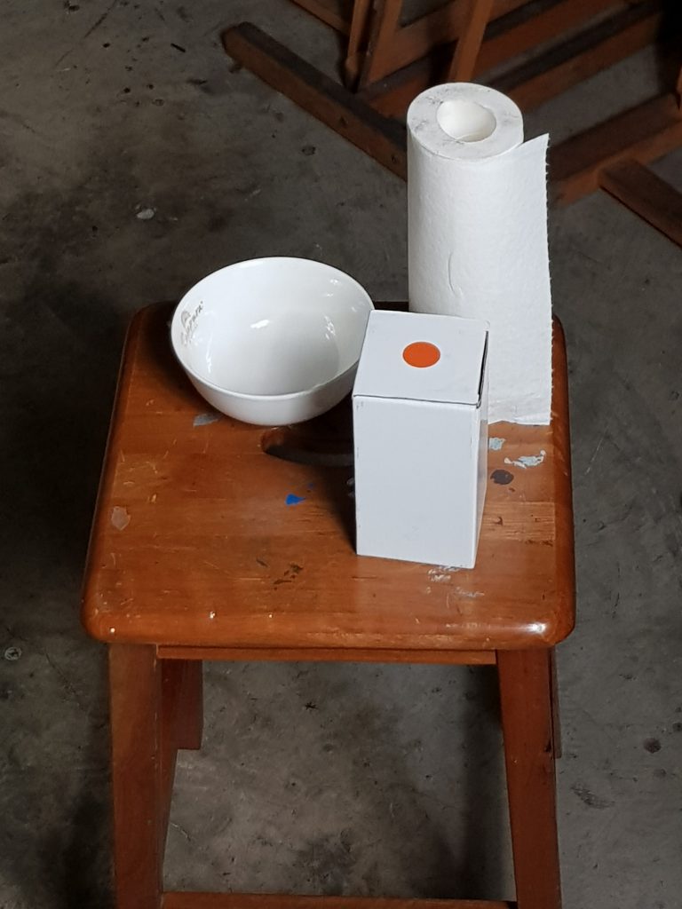
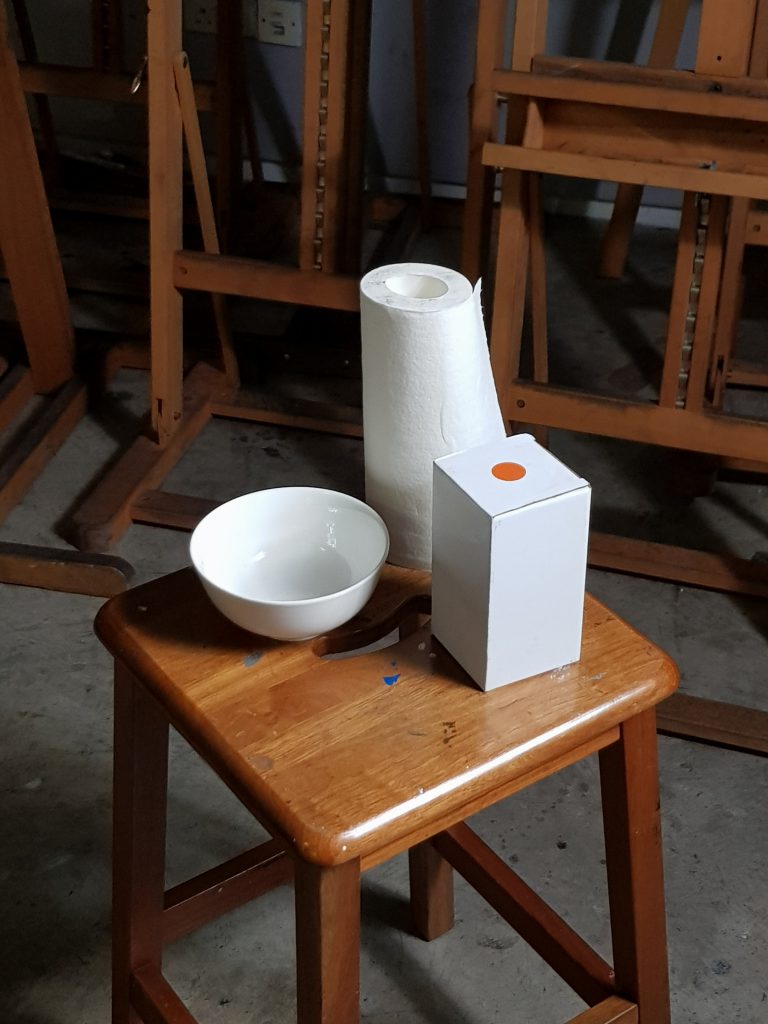
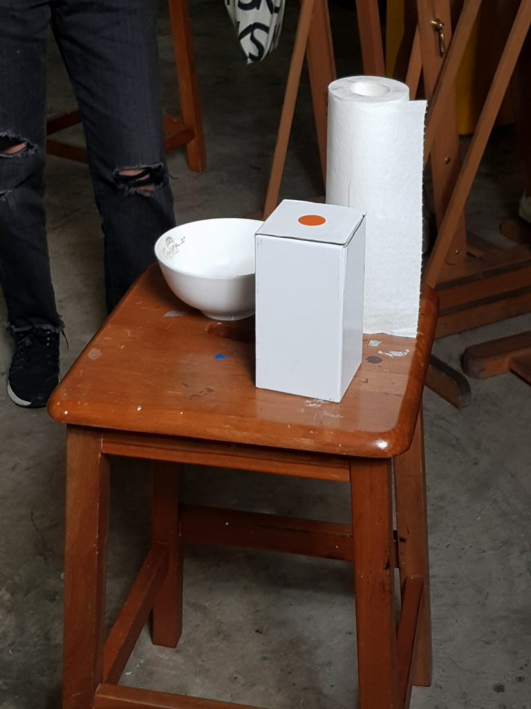
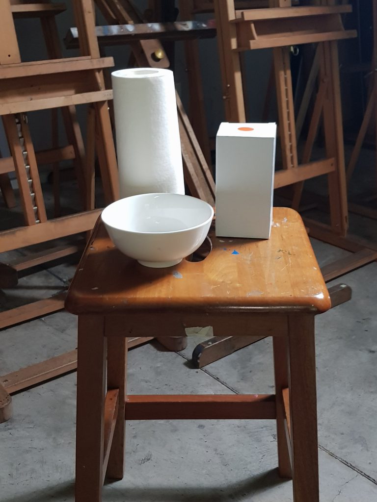
Foundation Drawing – Homework Assignment Week One (Still Life)

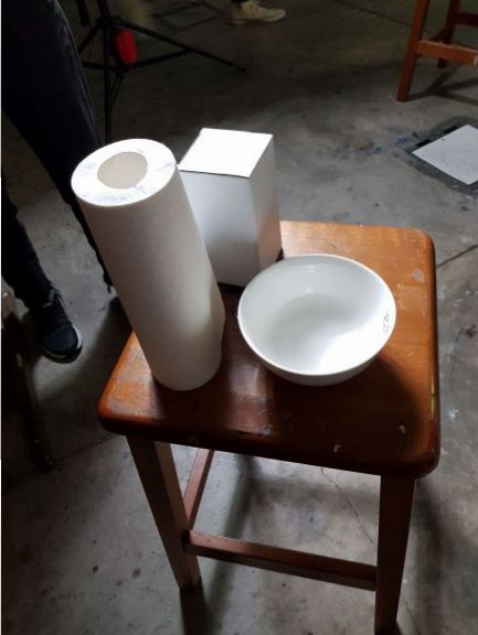
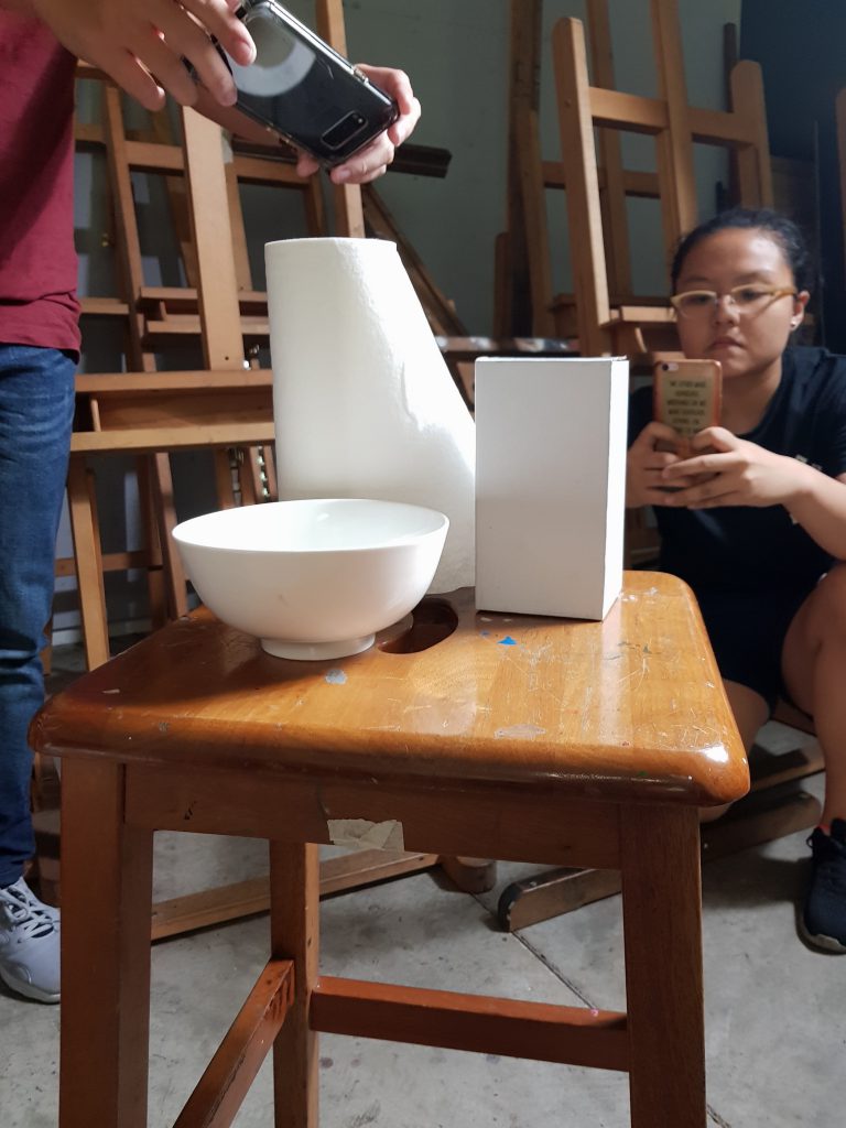
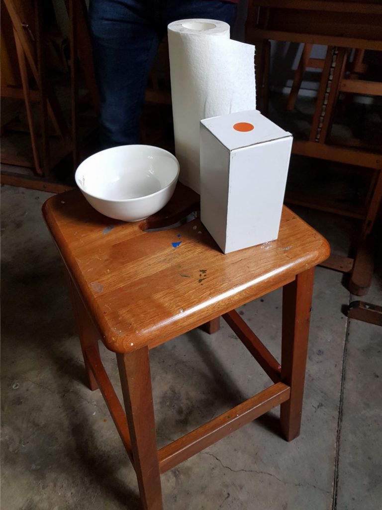
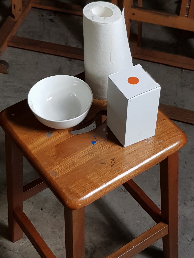
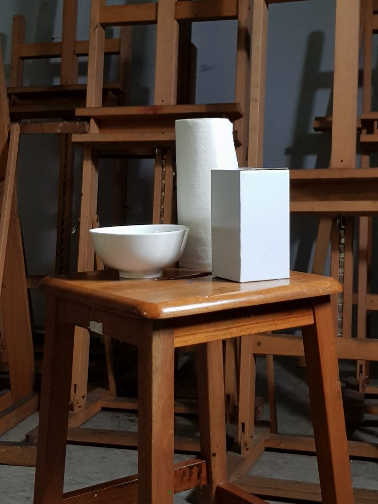
Our first homework assignment was to create a still life of white objects by using charcoal on newsprint. The challenge was to finish the drawing without using outlines. Even though I am relatively familiar with charcoal medium, I found it challenging to produce a drawing that emulated the objects to seem as real as possible. Although difficult, I found that it trained me to see the objects differently, and encouraged me to follow the 10 values I’ve marked out.
These were my initial objects for the drawing.

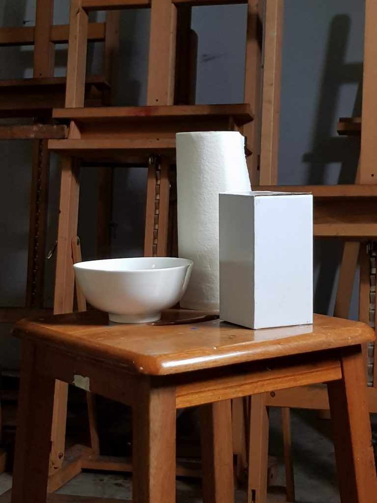
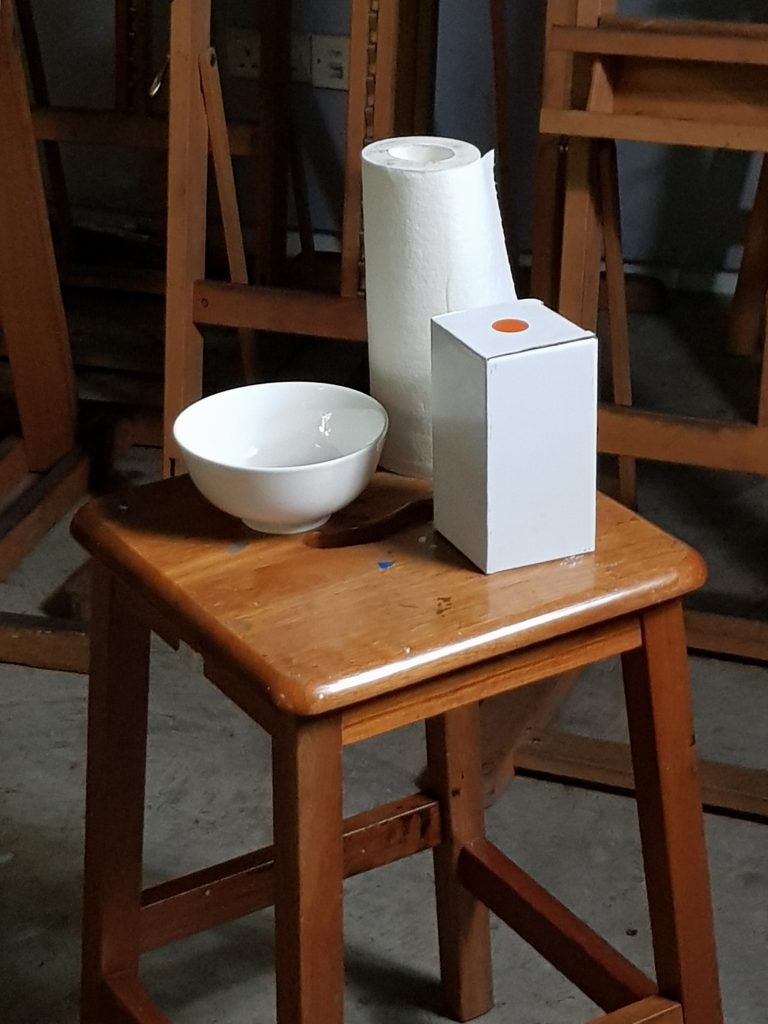
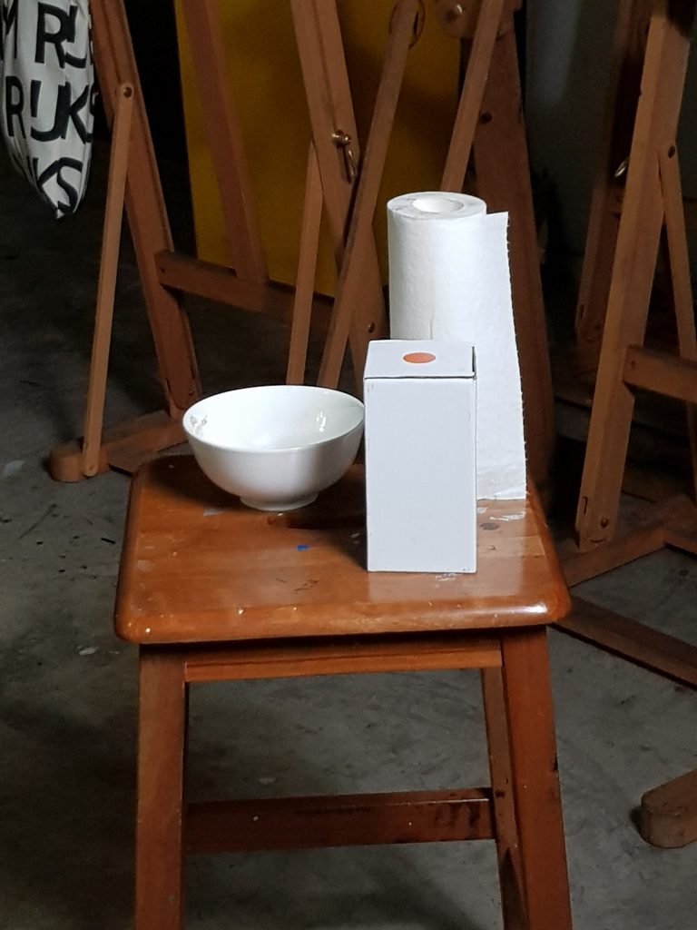
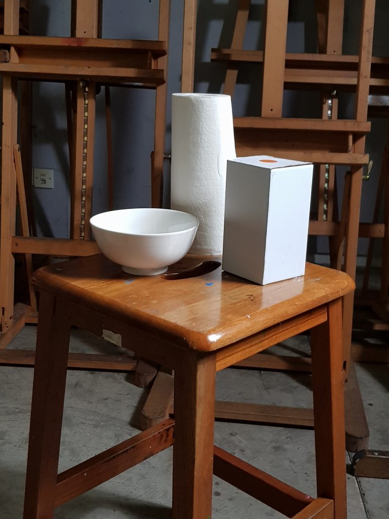
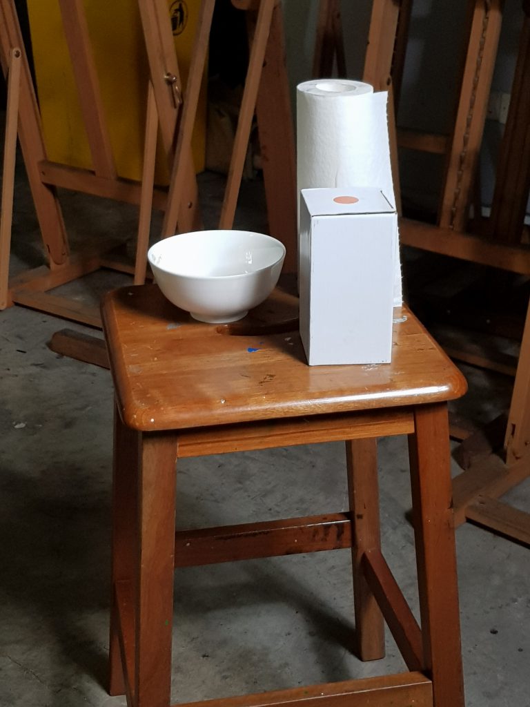
While finding my composition, I had decided to add in a fifth object. This was my final piece. I had to carefully erase out the highlights to give a more convincing range of values in my drawing.
