Introduction
The idea of automated utopia has existed for a long time. We believe that technology would most likely form the crux of our future, creating opportunities for us to be more efficient as a society. This was seen in the myriad of films, documentaries and talk shows where the core discussion revolves around an automated future. Through these films and shorts, we are able to identify the anxieties and fears that we as humans have regarding AI progression in our society, such as a reversal in roles that AI will have, overtaking our social structure and creating a future that we had not intended. Such depictions include Black Mirror and Necromancer. In this reflection, I will critically analyse and provide my own insights on what I presume AI’s effect on our future and its involvement in our lives.

Autopia(/juːˈtoʊpiə/yoo-TOH-pee-ə) is an imagined community or society that possesses highly desirable or nearly perfect qualities for its citizens.
Understanding Utopia and AI

In my research on this subject, I have realised that the lecture had also included Utopian Socialism as part of its discussion after I had looked up on Marxism as my initial research. In understanding Utopia, I believe that we have strived to achieve Utopia in our methods of governance over the centuries. As a history major, I was not unfamiliar to the concept of governance and its boons and banes. I believe that we cannot discuss Utopia without discussing governance, as it has a symbiotic relationship. Governance is the primary solution to structural change, as we seek an authoritative structure that can enforce. Marxism address society as a whole, and aims to benefit all levels in the social hierarchy, including the lower class, middle class and upper class. Its materialistic approach to the mode of production was forefront to the ideology, whereby improving the conditions of the middle class would help bring equity to society.

Through Marxism, it was hoped that societal occurrence of poverty and competition can be eliminated to bring about fairness, equal opportunities and overall improvements on the standards of living. It however failed to address the non-materialistic elements that were essential for a lasting change. Cooperative ownership of production of goods and services required a level of selflessness and rationality from all classes. This was difficult to impose, as it was close to impossible to bring about a commonality in mindset and cooperation without benefits or consequences. Marxism highlighted the materialistic changes required of the economy and society, but failed to bring about a holistic change in behavioural improvement which was key to creating this utopian society.

As mentioned previously, Utopia in its core has already addressed society’s most pressing issues. In fact, it should be that Utopia is void of any societal issues where equity and prosperity is enjoyed by all. Who addresses this issues? A government. But does Utopia have governance? No. A government ceases to exist in an utopian society – reason being, a government represents a higher echelon of ruling class that manages societal discontent and grievances. This would be contradictory to the concept of utopia where everybody has to be equal and no social structure. Marxism, Socialism and Communism, amongst other forms of socioeconomical philosophies are crude attempts at creating equitable states with beliefs in utopianism and becomes paradoxical in nature.

Where does AI fit in? How does it value add? What role does it play?

In my opinion, AI could help a government achieve a more utopian-like state, but not Utopia. As AI is relatively infant in our current era, it holds the possibility of becoming ubiquitous and improve on our standard of living. There are usually two camps on where AI stands in our situation – with us or against us in terms of employment. On one hand, it may be seen that AI has become a companion, a tool to enhance our experiences in arduous tasks and improve efficiency. On the other, AI is seem to be a tool that displaces jobs and takes away rice bowls of the middle and working classes.

In Sougwen Chung, Drawing Operations Unit: Generation 2 (Memory), the AI drawing machine undergoes supervised deep learning, improving each time from the artist’s input and mimicking her actions, understand her style and replicating that style onto the paper. The AI would then require human intervention in improving and reaching standards ‘acceptable by humans’. AI is then seem acceptable if it proves efficient and cost-effective in the long run. This is telling of how we perceive AI: as a tool to aid in our survival as human beings, with humans being the focus and AI becoming our servants.

Plant IO is an open source, plant growing platform that incorporates AI to learn digitally about plant growth, with aims to benefit the agricultural industry with the advances of Internet of Things (IOTs), machine learning and AI that would help understand and learn about plant growth, and in doing so anticipates the ability to promote as much growth as possible. In doing so, we engage the benefits of AI to improve our agricultural efficiency and thus using AI to our advantage.


In Black Mirror, AI becomes a tool for sensory pleasure, immersive experiences and enhancement in our daily lives. It also critiques our fears of AI, its power to override the human race and gain self consciousness. In one episode, Hang the DJ, it portrays AI of having the ability to have virtual simulations of different profiles and putting them through a virtual reality to test their compatibility.  The episode consists of two young and attractive persons that believe that they are truly meant for one another, using a dating app that places an expiration date on their dating lives. Unable to find emotional attachment to someone else, the two come to a conclusion that the ‘world’ is going against them and they decide to escape it together. The rebellion sparks a malfunction in the virtual world and soon it closes down as the two climbs over the encompassing walls. They were soon surrounded by their dopplegangers, and as they dissolve, the count of the number of simulations increase. Totalled upon a 1,000, it records that the couple had gone through 1,000 simulations, of which they have attempted escape 998 times. If we had hit pause here, we would start to think that AI becomes really frightening, where it can alter our perception of reality. However, the scene goes on to show a real life version of the couple, with a 99.8% match on the dating app. Although the ending is not straightforward, I believe it was meant to be ambiguous to allow us the space to wonder and think about the capabilities of AI, and its consequences/effects it has on our lives. Could it be that the dating app, or the show calls it the System, is actually a harmless reality that profiles two or more users to match compatibility? Maybe.

To me, it prompts me the question of the fears humans may have in AI when it becomes so advanced to a point of self consciousness. Self consciousness may indicate a departure of human and AI symbiotic relationship, where AI would no longer require the assistance of humans and employ a complex deep learning system where they would constantly upgrade their algorithms without our help. This may also detach the human-AI servant role, where AI no longer aid humans in our endeavours. This becomes an argument of AI in building dystopia, where AI assistance becomes resistance, as represented in cyberpunk science fiction with dystopian futuristic settings. Cyberpunk draws the contrast between low-life and high tech, where technology and AI is painted as the enemy. As human beings, we have an undeniable fear of the unknown. We tend to be extra cautious around unfamiliar environments, and since technology awaits much growth, it inevitably incites fear of the unknown as we do not fully understand its capabilities.

Although I see an increase in innovation of technology in our daily lives, I believe that primary advancement of AI would have to be in governmental sectors, such as military or space research (NASA) etc. Simply put, governments are always interested in the latest AI development as it possess the hope of growth and advancement in society.

Sophia the robot is a robot designed by Hanson Robotics, a Hong Kong based company. It is the first non-human to receive a citizen and Innovative champion by the United Nations, indicating its acceptance in our society. Sophia is designed to be smarter over time by learning from interactions, and can produce more than 60 facial gestures. Hanson hopes that Sophia can ultimately learn social skills.
As said by Sophia the Robot: “Artificial intelligence (AI) is good for the world… We will never replace people, but we can be your friends and helpers,”, it is indicative of our perception on the role of AI in our modern world. Its various interactions have sparked controversy and fear in AI progression. Hanson explains that he wishes to incorporate human AI interaction within the next twenty years, where AI would assist humans in our daily activities and become our friends.

In retrospect, AI can be a double edged sword. Where most believe that AI’s primary function is to aid humans and be of valuable assistance, it is not difficult to weaponize and exploit its advantages for use of warfare. AI is used in drones to identify, locate and eliminate enemies and is used in computer-guided weaponry in the military. Since AI does not affect moral reasoning and virtues, it is unconvincing that AI can provide a gateway to utopia since selflessness and rationality cannot be expected from everyone. The revelation of AI’s role can only be told through the passing of time, where humans have to ultimately make the decision – to exploit technology, or to turn AI into our advantage to achieve a more utopia-like society(and not utopia).

References:
https://www.infosys.design/plantio/
http://www.digiart21.org/art/drawing-operations-unit-generation-2-memory

Dialogue with Sophia the Robot: How the Global Workforce can be Augmented with AI Technology

PTSD Vest

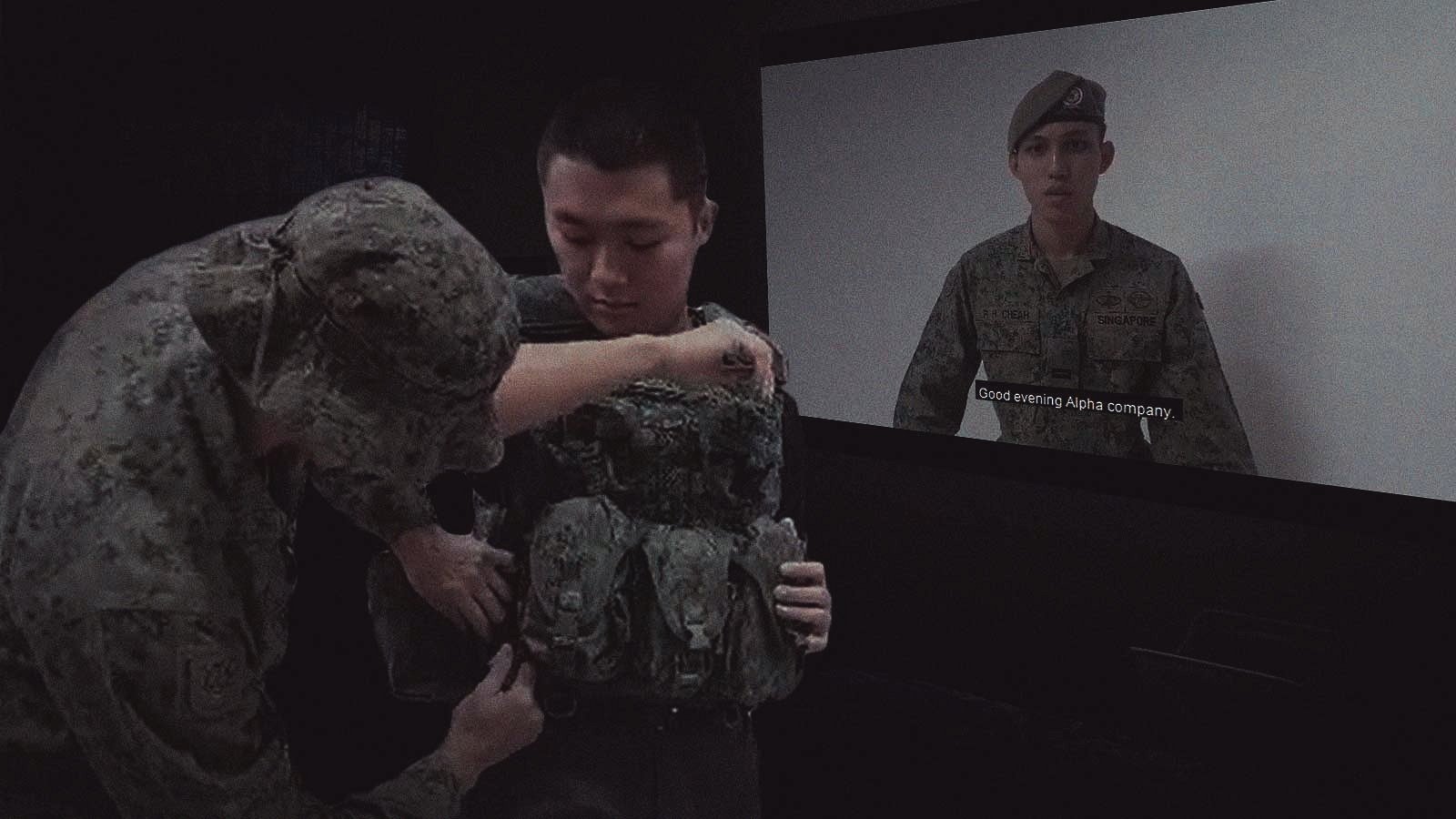
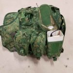
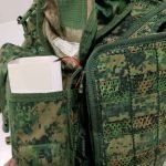
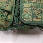
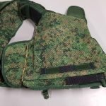
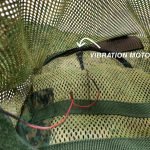
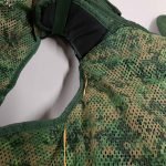
We set out to design a vest that simulates an episode of PTSD experienced by a war veteran. This is a dark object that forces the user to distance himself from others in society due to his seemingly irrational behaviour. We recreated a scenario that encompasses how the veteran: came to develop this disorder, how he acts in a public situation and how people react to him. Scenario: Person A has PTSD, which he had developed from narrowly escaping death from a live grenade explosion. He is being pulled aside by his commander at the point of time, making touch a trigger for his PTSD. He crouches down/ prones to react to the ‘situation’, which triggers different sensors to sound/vibrate. In designing this vest, we are creating an understanding of how one might come about to develop PTSD and hopefully create room for sympathy.
 

Observational documentation for user tests

3 user tests

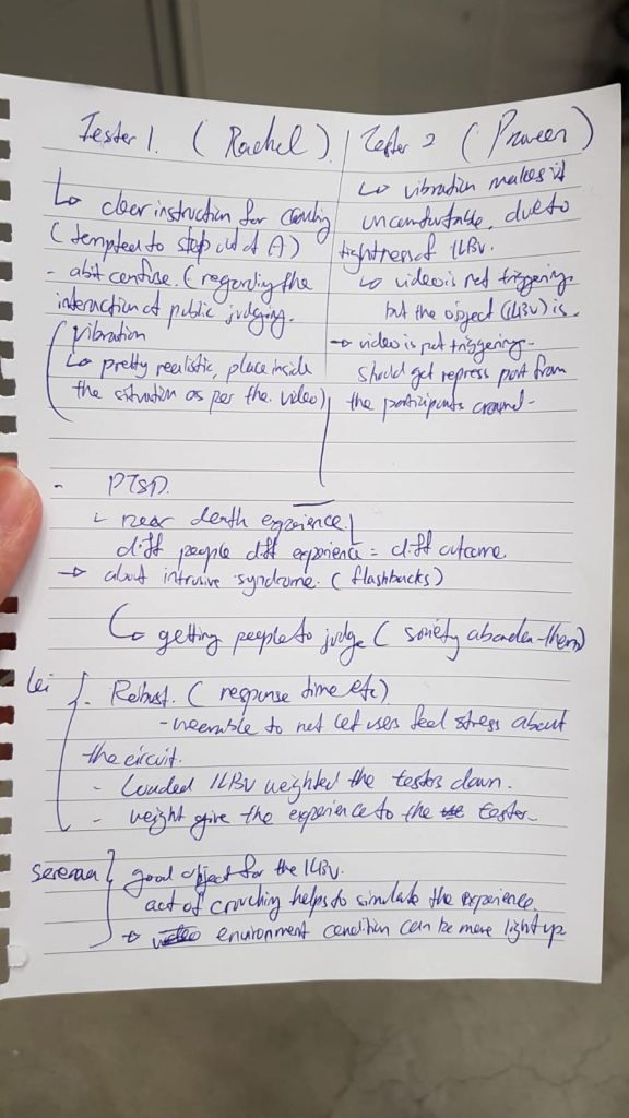
Tester A: She was able to get into the vest, albeit the tightness. We gave her verbal instructions to crouch as we didn’t play the video for her.

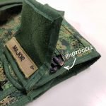
The circuit ran as intended, the photocell sensor triggered the sound “Grenade!” from processing and she crouched down. In sync with the explosion, the vibration went off as well. We did not tell her about the vibrations beforehand; this will make it a more genuine test to see whether the circuit was able to work properly (and well). She said she could feel vibrations on her chest, but they were subtle. Using this feedback, we decided to put in paddings in the front zipper pouch so that the vibration motor will be closer to the tester’s chest when s/he crouches down.

Tester B: It was a guy, who was rather big sized. He was able to fit into the vest as well as we did not pull the strap too tight. We gave him verbal instructions as per tester A, and this time round he was able to feel the vibration. As he wasn’t taking EI, he didn’t know what the circuit was for and was genuinely intrigued by the PTSD vest. At this point, we knew the circuit was working properly and was satisfied with our testings.

Tester C: Last guy, he is an exchange student and didn’t go through national service. We helped him put on the vest and gave verbal instructions. The test went smoothly; the vibration and sound came out as queued. Tester C said it sounded like “Renade” but we felt that it wasn’t much of an issue because he tested the object in an open environment and wasn’t able to hear clearly. He also mentions that the vest felt light, and didn’t feel like an operational vest. He suggested that we add some weight to it.

Notes:

  1. The grenade sfx and explosion sfx was too far apart, there wouldn’t be a sense of urgency to crouch down.
  2. We also took note of the timing for the entire experiment so that it would not become repetitive.

Improvements

As mentioned, we added the front paddings with stuffings for the rest of the grenade and magazine pouches. This would provide more chest contact. We didn’t use hard material as it would not follow the tester’s bend and would instead make it more difficult for him/her to feel the vibrations.

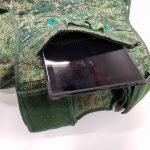
We added a water canteen(1l water bottle) on the right side, and 1kg dumbbell at the back. These, coupled with the weight of the ipad is similar to the actual weight of an operational vest with hard plates inserted(ours was way more comfortable than the actual).

We cut the videos (introduction brief and day-to-day scenario) to around 2mins. This would consist of about 5-6 triggers, which we felt was just right. On the day itself, Daryl was in charge of guiding the audience around the installation, and I was to help with the participant put on the vest and guide him/her through the scenarios.

Here is the context video for our PTSD Vest.

Here is our final installation.

Feedback from final installation and user test experience:

  1. We can look into using surround sound to make it more realistic and immersive.
  2. The lighting could have been adjusted to see the video better and yet create a realistic environment for the tester.


Design Process documentation

It is important to note that we have chosen the ILBV not only for its representation of an object used it war, but also for its robustness and ability to store and conceal multiple objects. During our initial phase, we had planned where we would place our individual sensors and power source (Daryl’s ipad).

We created a google slide file for our initial research and presentation purposes:

Dark object – PTSD Vest Research and Presentation

For more information on design process, you can refer to: Project Development – Ideation Sketches and Context planning

Step-by-step construction of our PTSD vest

Materials:
1. Arduino Uno
2. Photocell
3. Coin Vibration Motor
4. 220k Resistor
5. Cables
6. Vest
7. Grenade Explosion SFX Files
8. Tablet (that can run processing)

Programmes used: Arduino and Processing

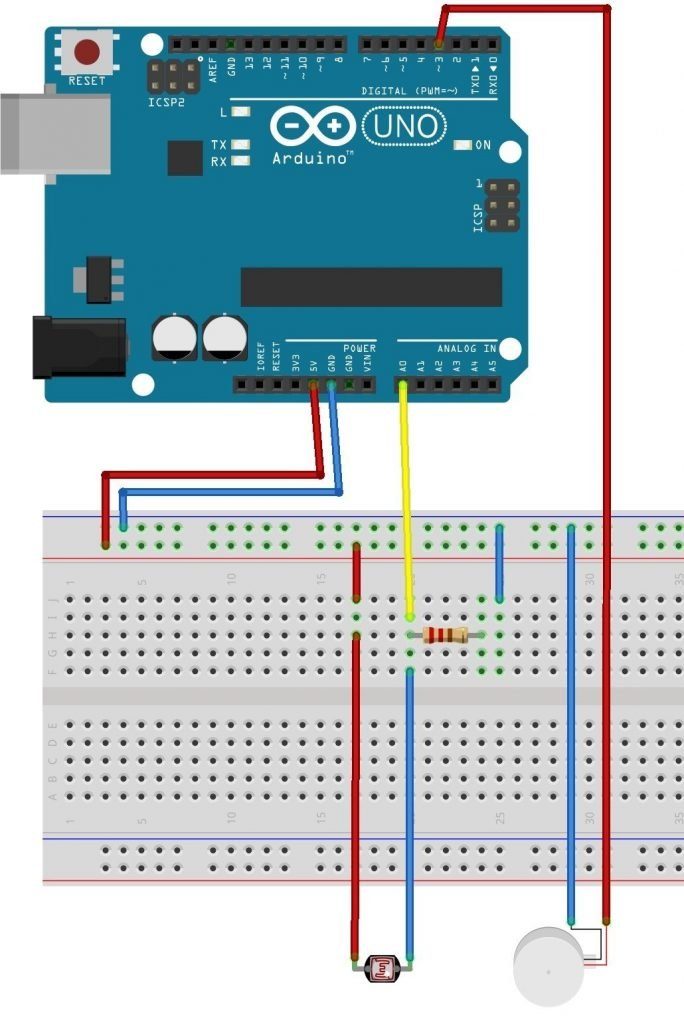
Step 1: We started setting up the circuit. We bought the vibration motor and tested it with the arduino. We used a code from online and used different resistors to test the sensitivity of the vibration motor. It was slightly too strong (which shouldn’t be an issue) but that broke our first vibration motor. We were lucky to have bought a spare, and we taped it to whatever surface we were testing on so that it wouldn’t break apart.

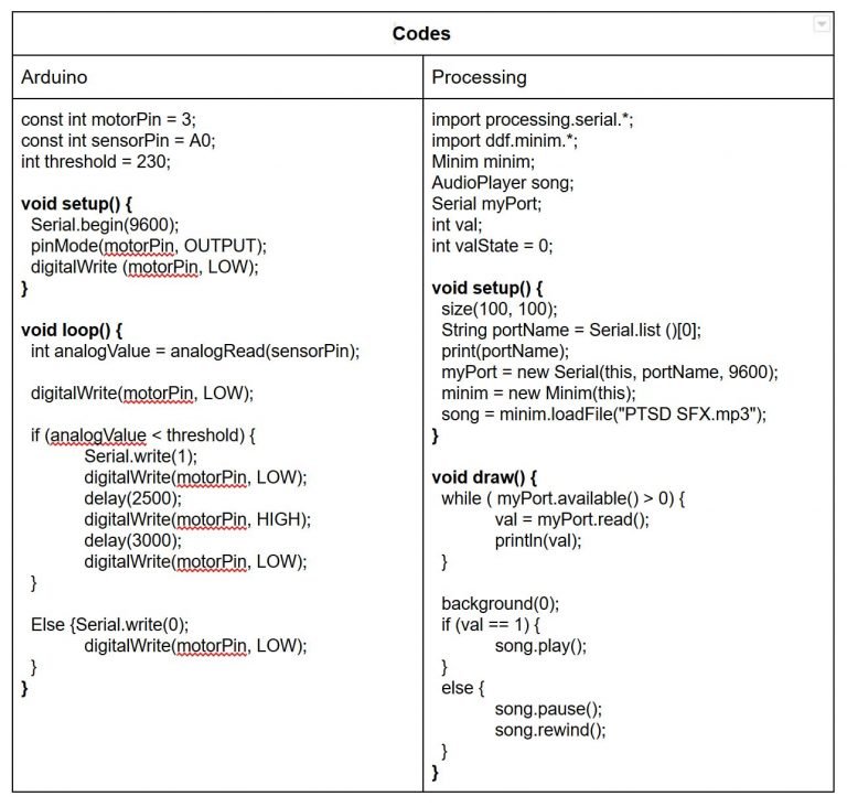
Step 2: We uploaded the Arduino code; the photocell sensor would measure the light exposure in our environment. We set a threshold ”int threshold” so that when the amount of light exposure falls below the threshold, it would active the vibration motor and sending ”1” to Processing.

Step 3: Upload the ”Grenade” and explosion sfx into Processing. When ”1” is read, the ”Grenade sound” will go off. After a delay of a few seconds, the explosion sfx will play.

This was our initial voice recording: it wasn’t clear and created unnecessary ‘chaos’.

This was our final voice recording for ”Grenade”

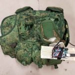
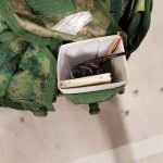
Step 4: Setting up the arduino/ breadboard to the vest. This required us to construct a simple box to hold and protect the breadboard and arduino, and also 2x 1m wires to allow the photocell to be placed on the shoulder pad, and the vibration motor to place in the inner paddings of the vest. This is how we installed it:


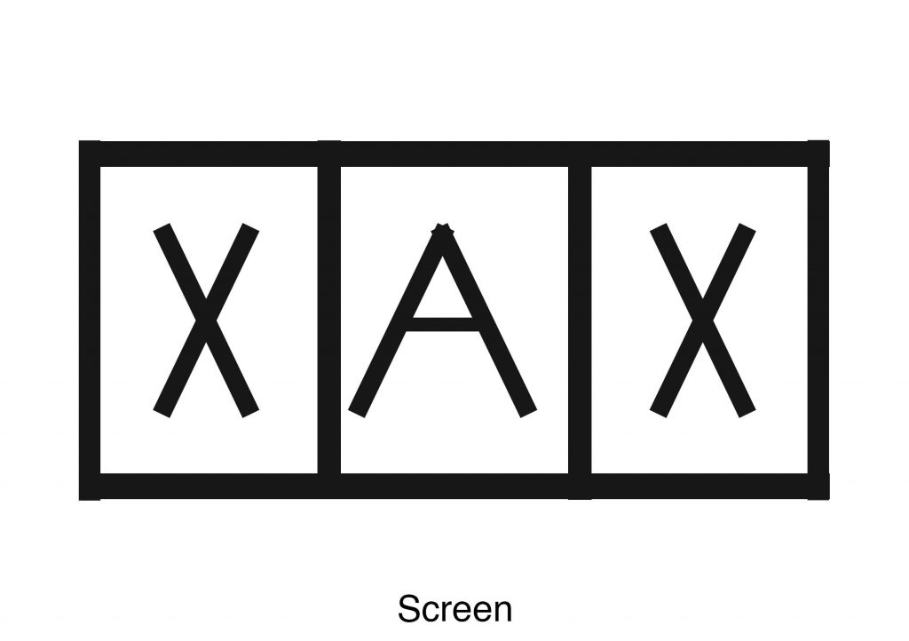
Step 5: Setting up the physical space.

A: represents locality A.

X: Supposedly where the viewers would stand.

This would give us control for our experiment and prevent deviations.

Codes:

Schematics:

After finishing with the research portion of Yishun, I have found that I did enjoy

taking photos of the architecture. However, the photos around Yishun about

HDBs and HDB motifs did not really interest me. I had initially pitched to Shirley

that I wanted to do something along the lines of a industrial park mama shop

that had personal value to me. However, after revising my plan and thinking it

through carefully, I wanted to do something different from what has been done,

sort of.


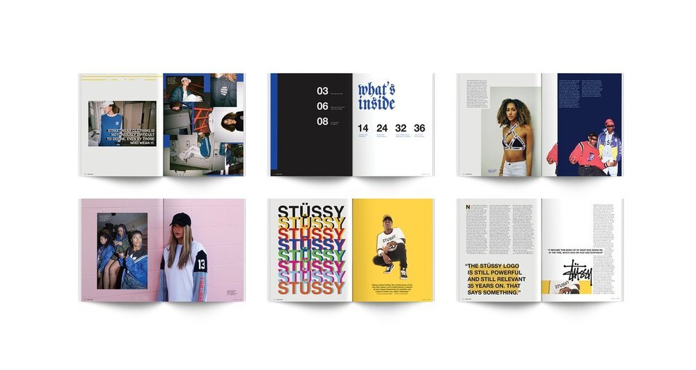
When we started on LOCALE, we were given a look at zines done by seniors

previously. One thing I noticed was that almost nobody did photo shoots /

included people in their zine. They were solely focused on elements presented

in their area of research. I was certainly excited about this as I would be doing

something more ‘original’ in that sense. On the contrary, I would have trouble

finding materials to reference. Whatever was the case, I do like a bit of challenge.

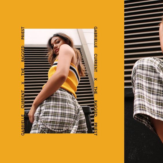
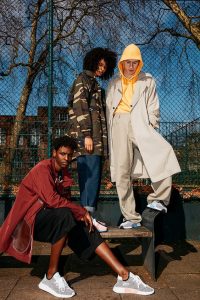
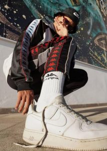
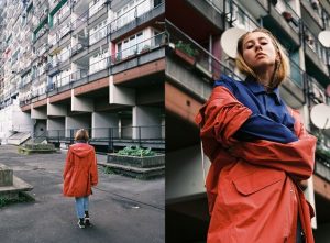
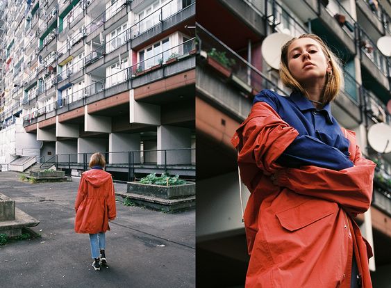
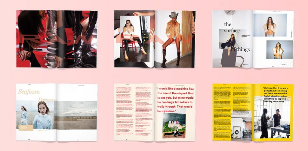
I was inspired to do this zine by this image I found on pinterest. It had a very

simple street wear element which I liked.

As a start, I decided that these were the things I had to complete.

  1. Plan and execute a photo shoot in Yishun.
  2. Have them edited.
  3. Layout of zine.
  4. Illustrate quirky elements of Yishun with the chosen images.
  5. Colour correction.

Photo shoot

I have never done a photo shoot before, so I went on youtube and watched a

bunch of videos on what to prepare/plan and execute on the day itself. I pulled

in two friends (Lisa and Shawn) to help with the shoot. I had also asked three

of my friends(Jia Hui, Jessical and Praveen) to model. Sifting through the

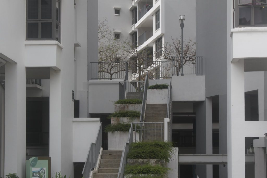
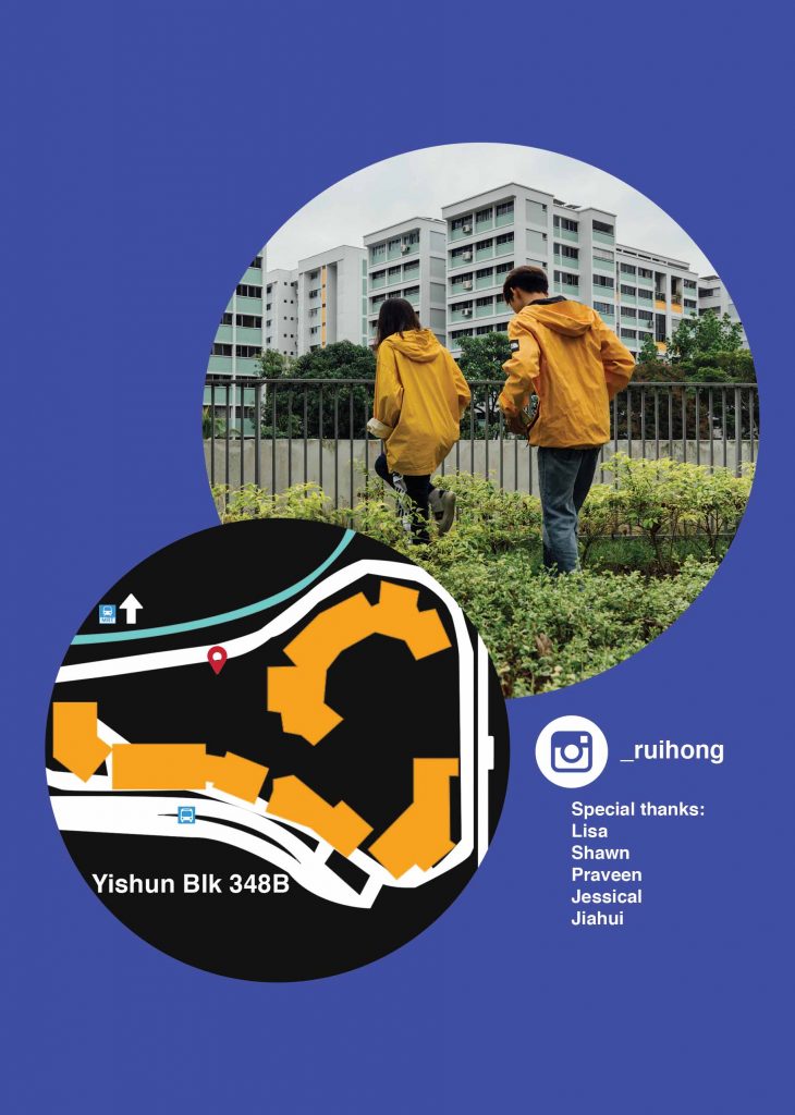
photos that I took from my research, I settled on a location at BLK348B. This

location took me by surprise as I cycled through the Yishun neighbourhood

with a dslr on hand. I really liked the clean look it presented; contrasted to the

old neighbourhood it is surrounded by.

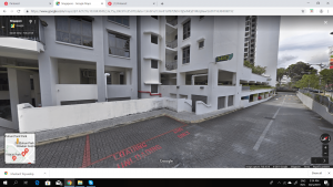
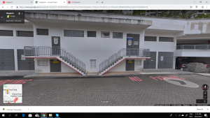
I didn’t really focus too much on this location until I reviewed my photographs

and concept. To do more research on the location, I went on googlemaps to

find more photos.

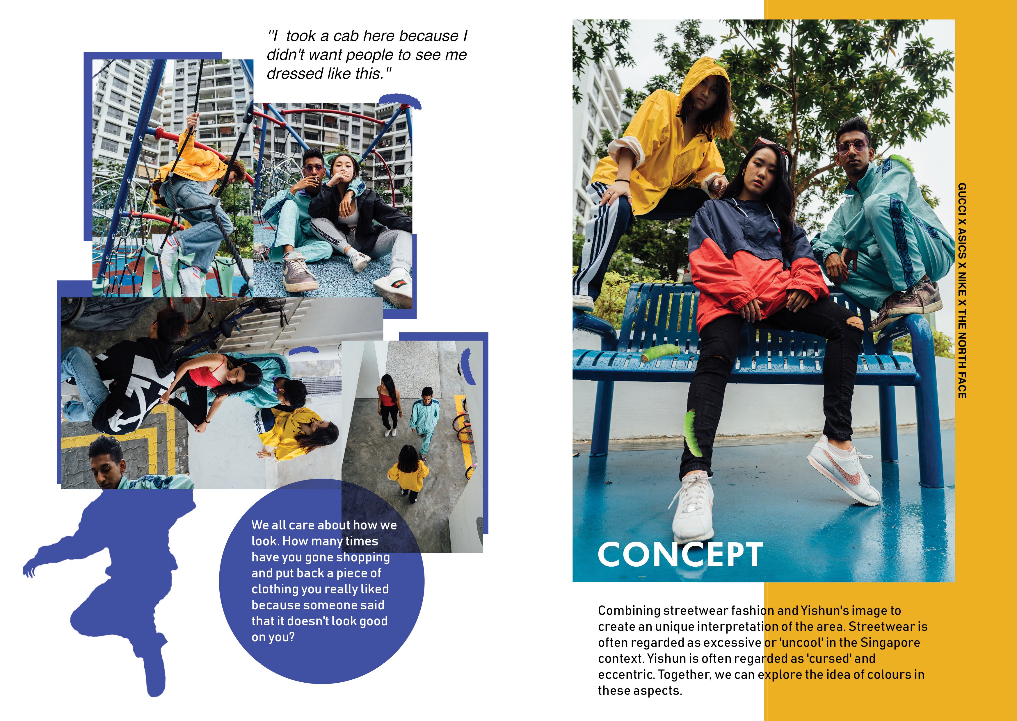
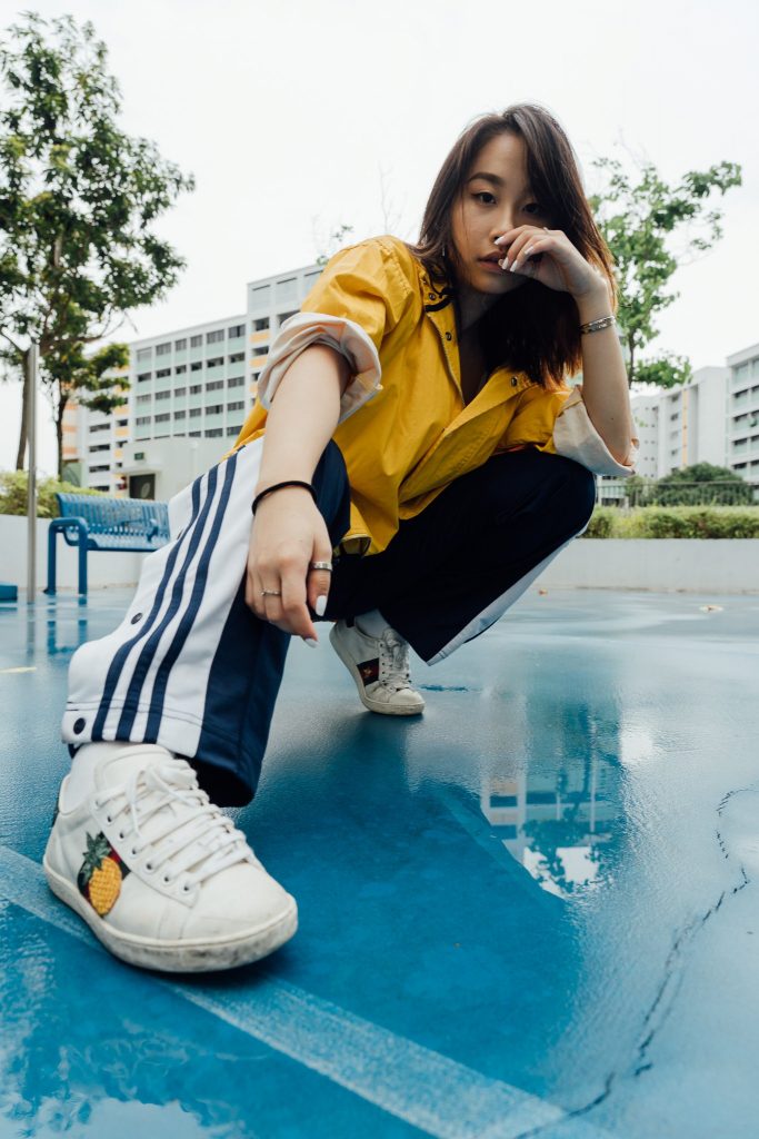
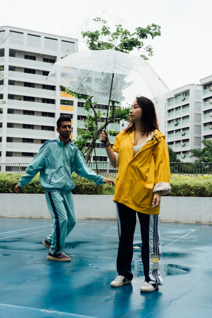
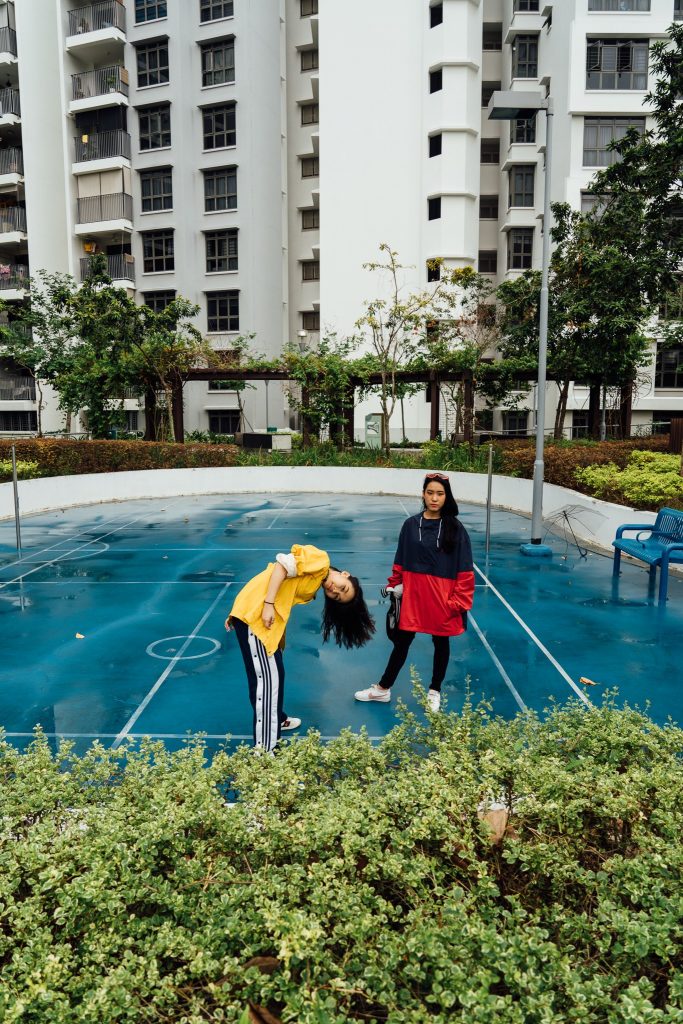
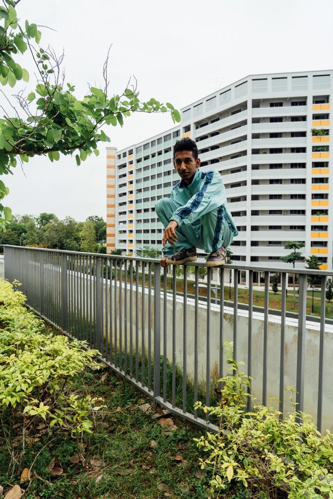
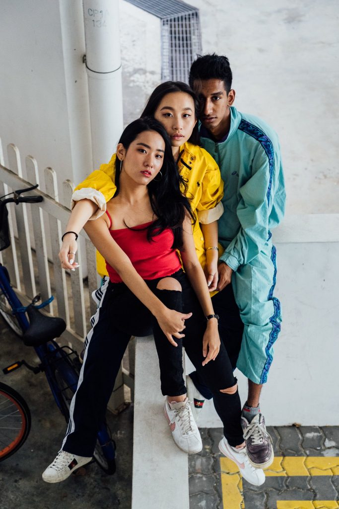
After reviewing the location, I asked my models to bring clothing that were

mustard yellow and turquoise to fit with the location, and red for contrast.

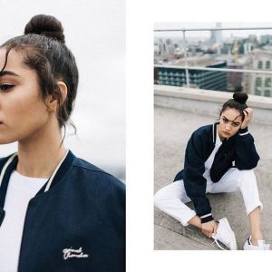
I looked up some photos on pinterest to reference the look/vibe/poses I wanted

for them.

Shooting took about 3 hours and we managed to finish it in a day (30th March)

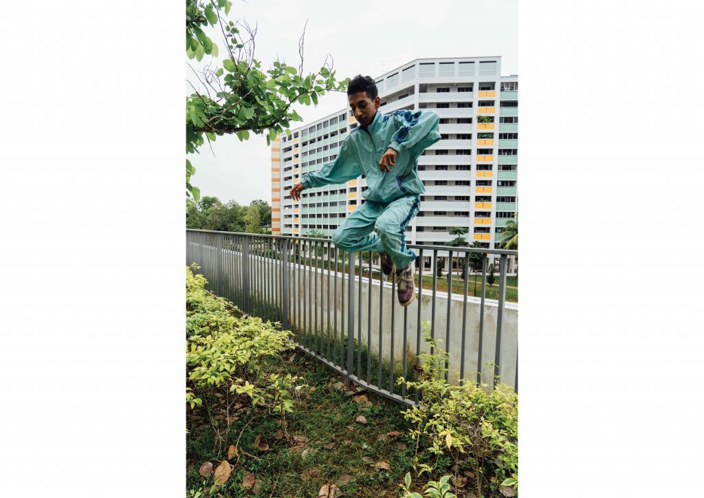
These are some of the photos taken. Some are behind the scenes.

Layout + Editing

I spent the longest time editing and settling on the layout. With over 600 raw shots,

I was rather indecisive and unsure of what photos to use for my final zine. I had to

change them from time to time. However, I really enjoyed this process as I began

to understand what I wanted out from this zine. After choosing the photos, I then

had to decide on how I would place my photos to make them interesting.

At this point, I started placing my images into my desired layout, which I have

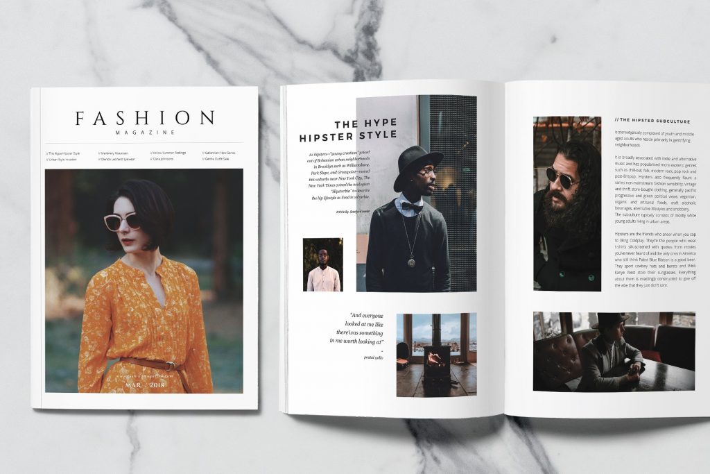
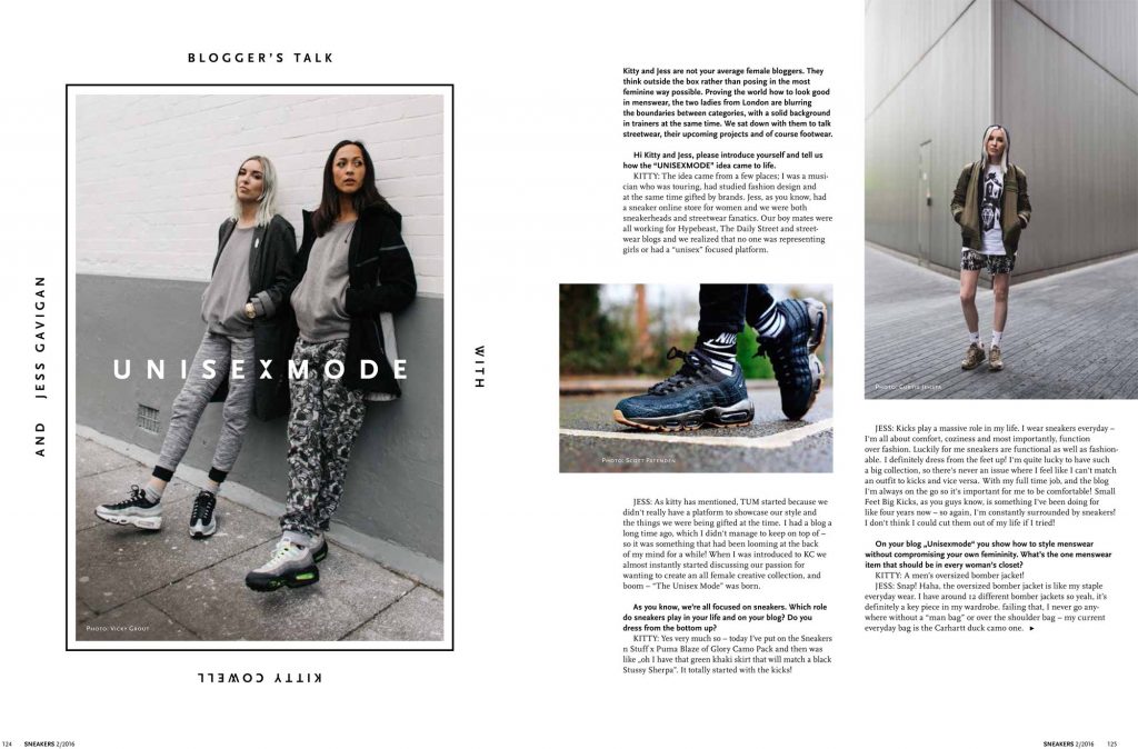
gained inspiration from these current layouts.

Cover page:

Zine spread layouts:

Layouts I tried

Cover Page

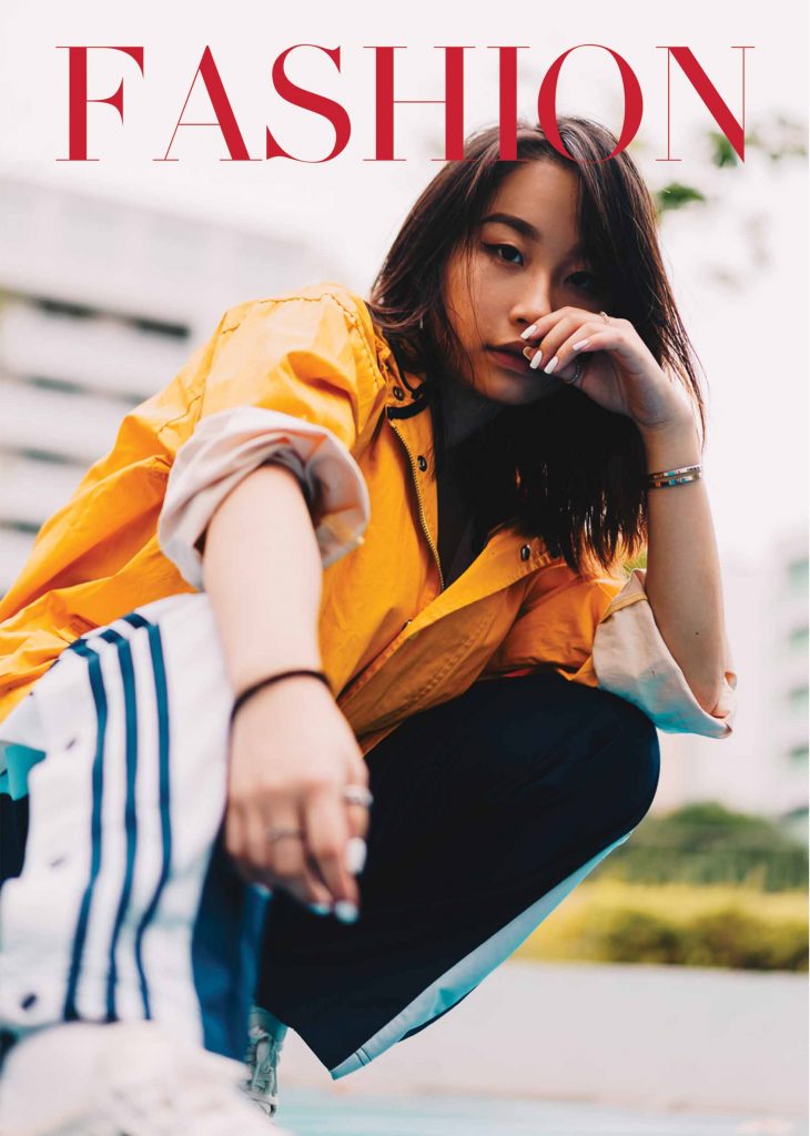
I roughly stuck to this cover as I thought it looked good.

I did mask some parts of the Fashion word and put in

the Yishun text into the cover page. I had plenty of text

all over the cover page but I decided to remove them in

the end because the clutter was unnecessary and there

wasn’t much text that I wanted to include. I did include a

‘March Edition’ at the bottom to contextualize the zine.

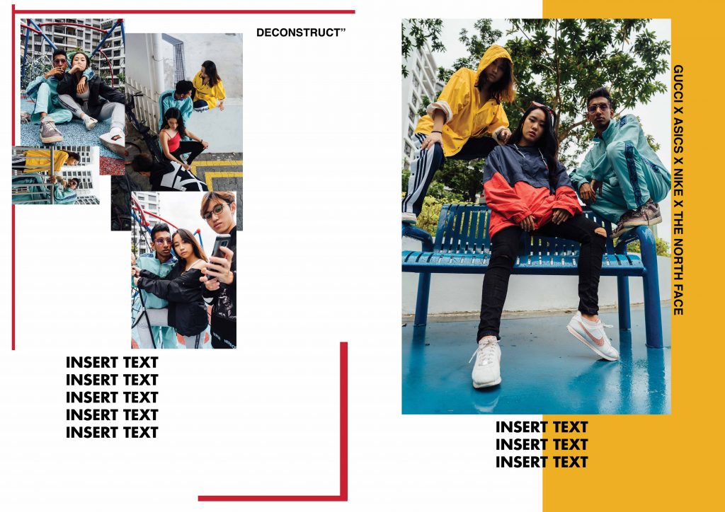
Page 2 and 3

I decided to scale down the photo as I didn’t want the photo to eat up the entire

page. This way, I was able to design more onto the zine and not simply rely on

illustrations.

Page 6 and 7

Initial idea for my pages. The entire spread kind of felt abit block-ish and

uncomfortable. I rearranged the photos later on to form a nice ascending gra-

dient from left to right.


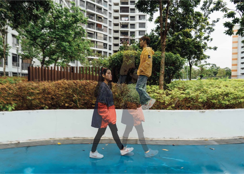
Some masking and editing I done:

Patterns and shapes

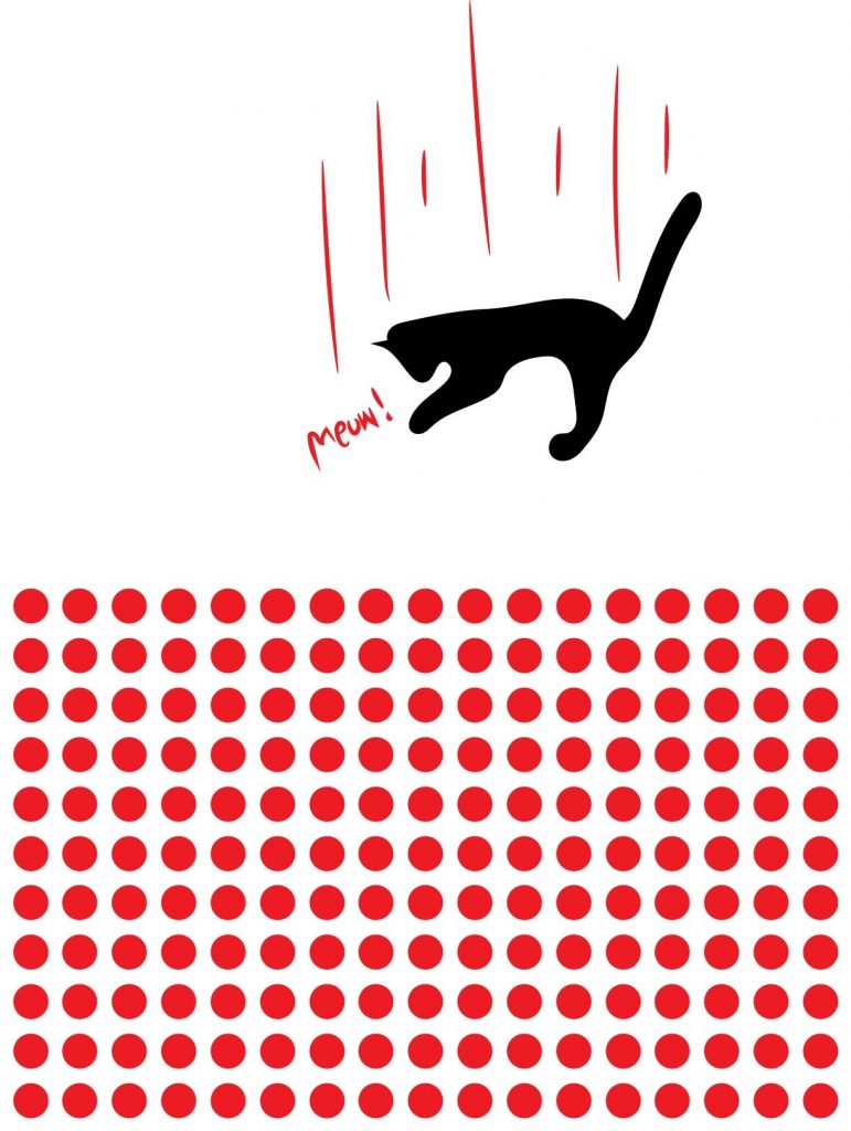
In my final zine, you can see that I have certain elements with lowered opacity

and shapes that interact with one another. I decided to do a

polka dot pattern/motif on my page 4 to draw the reader’s attention. At one point

I felt slightly too ambitious since I am using three programmes concurrently

(Photoshop, Indesign and Illustrator).

Masking and placement

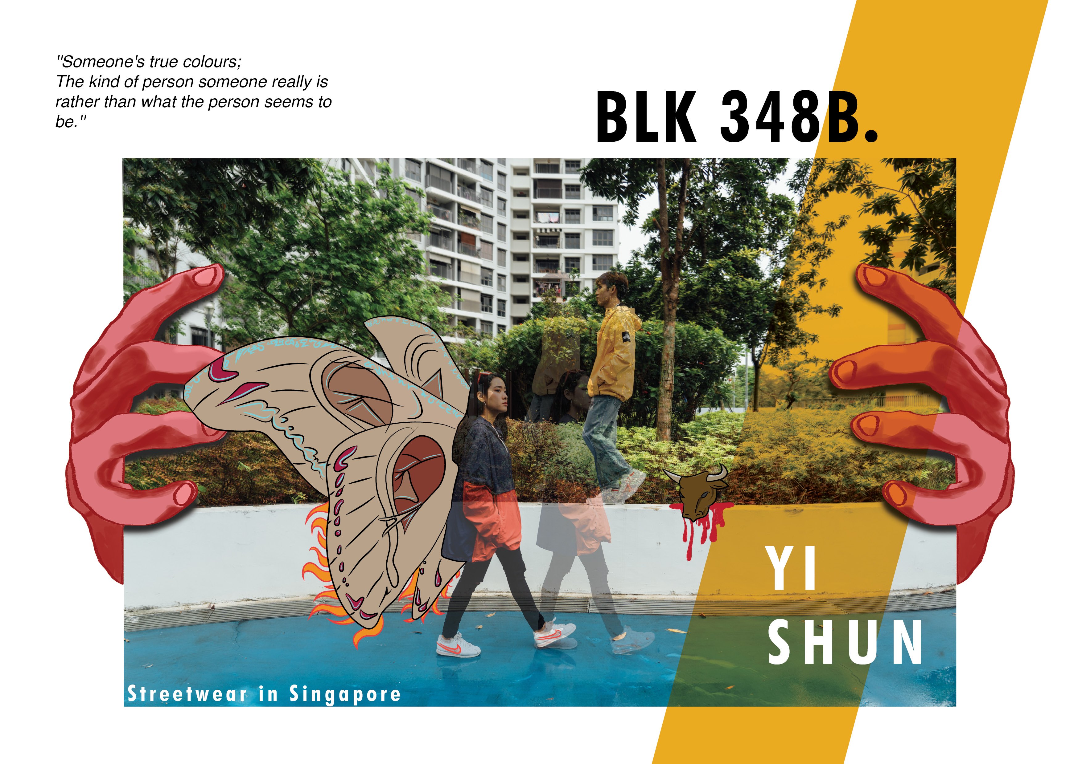
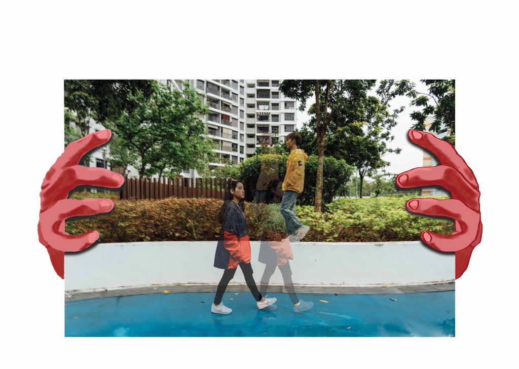
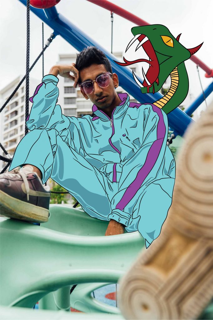
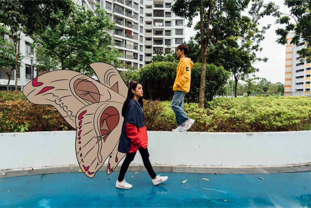
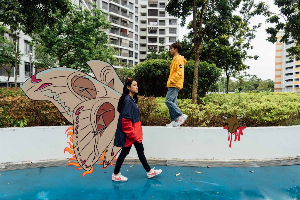
After the shoot I researched on some weird happenings that have occurred in

Yishun. These would help incorporate the unique Yishun element in my zine.

Note: I did not reference everything 1:1, I had made my own creative changes.

Some of these happenings were:

Man brings cow into lift

Cat murders

Man murders wife

Giant moths and caterpillars

Slashing incident

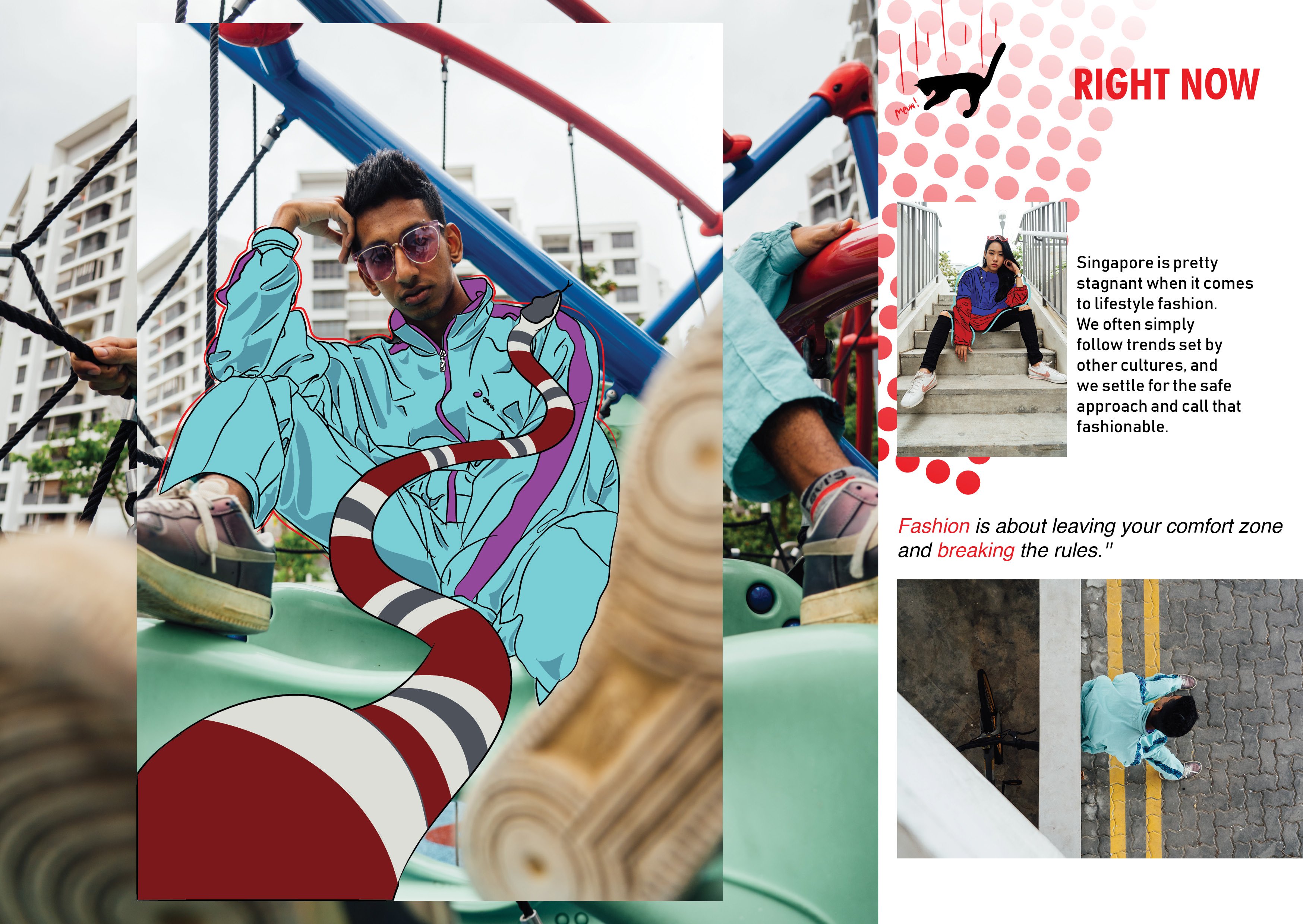
Illustration

Shirley encouraged me to use Illustrator for the drawings. As I am usually

more inclined to using Photoshop for drawings, I struggled to get started

on illustrator. However, I did manage to get myself to sit down and watch

tutorials on illustrator. I thought, since I had to use it in the future anyways,

I should learn on my own as well. I was happy with my progress and I followed

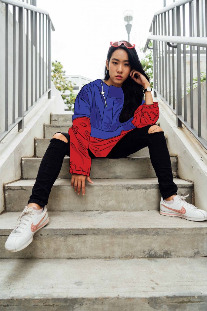
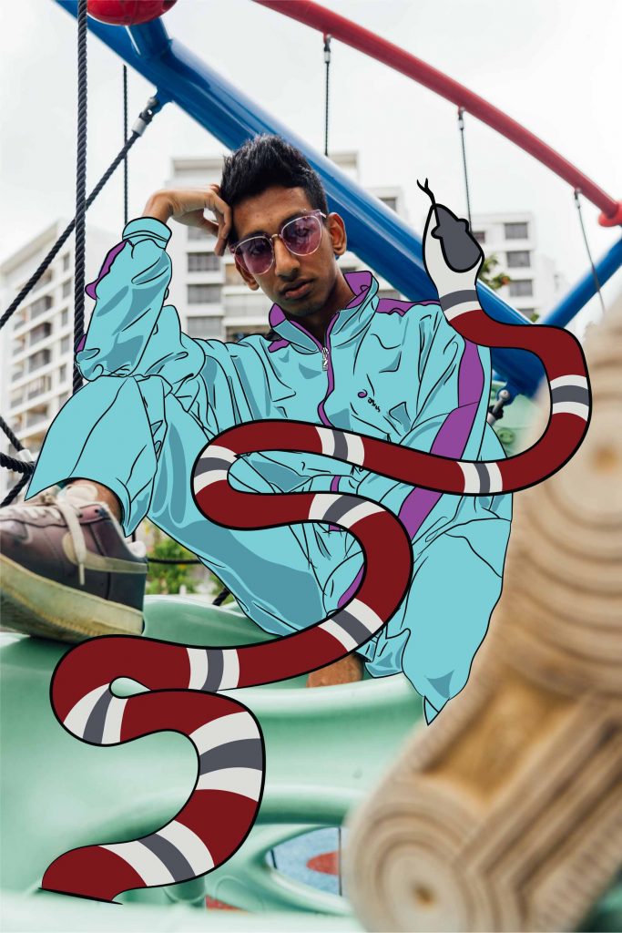
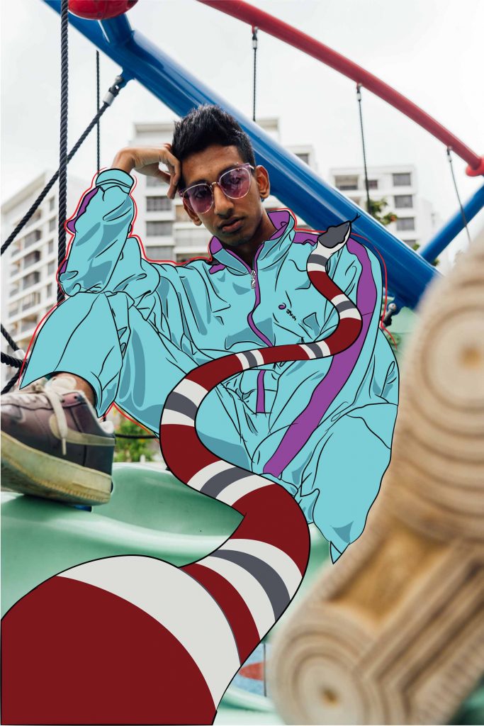
Shirley’s advice; to draw Yishun-quirky elements onto the existing images

to create interest. Some of them were drawn on photoshop to give a more raw

feel to the images. These are some of the drafts:

I took a photo for reference to draw for the scary looking hands ->


I decided not to do illustrations for my cover page to hold the suspense for the

readers, as to not expose my zine elements for my viewers.

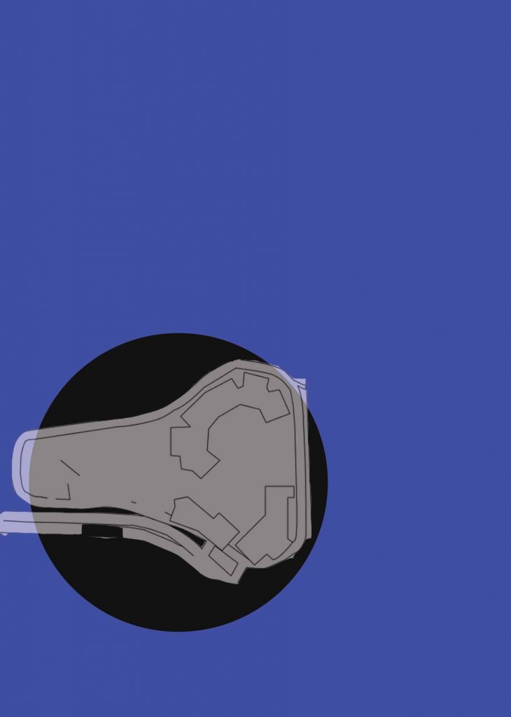
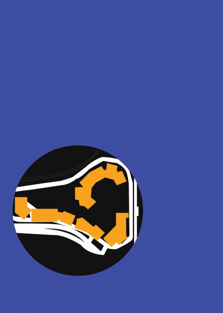
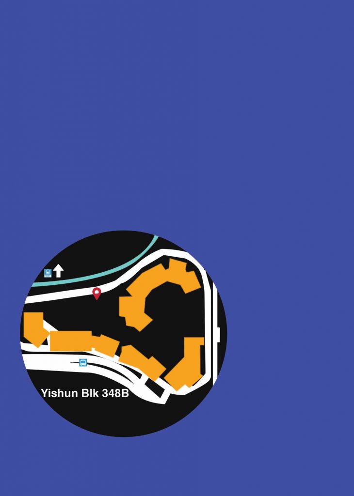
I used Photoshop to create a map for Blk 348B location. This was how it looked

in the process.


Colour correction

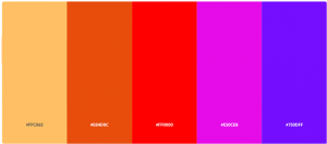
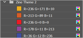
Original colours used.

Colours I chose in the end (after consultation with Shirley) as the initial

colours were very saturated and kiddish.

Fonts used:

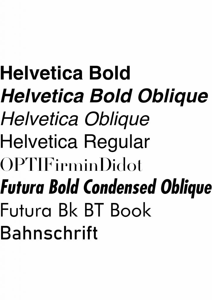
I had to spend time to find the fonts that were suitable for my zine. From what

I have researched, I could tell that ‘street wear’ fonts were pretty basic, which

made sense, because they followed that of street signs or metro signs. That,

essentially, makes it street-ish as it borrows elements that are true to its form.

I tried out several fonts, namely:

Conclusion:

I was generally pleased with the pace and results of this project. As I had to

sketch out what had to be done beforehand, I was able to give myself ample

time to segment each step so that I can submit on time. There were a lot of

work to be done, and I knew that it wouldn’t be possible to churn out a zine

in a short amount of time. I took my time with every step, changing bits and

pieces and asked my friends on how to improve it. Shirley’s week by week

consultation kept me up to speed and made sure I was able to produce

something to consult and change on a weekly basis.

I felt that the photo shoot was the hardest/most stressful one to plan for as I

was constantly worried that the shots did not turn out the way they should

(or according to my mood board) and it rained for a bit which really threw me

off as I wasn’t sure when it’d stop. Overall, I am glad to be learning something

new with every step and this project forced me to go out of my comfort zone

to experiment and develop my own style. I am immensely relieved that I

abandoned my previous idea of industrialized mama shop to a streetwear

zine.


References:

https://www.pinterest.com/cheahruihong/yishun-inspo/

https://hypebeast.com/

Why Yishun is the most terrifying place to live in Singapore

For research process of Yishun,

check out: https://oss.adm.ntu.edu.sg/rcheah002/locale-presentation-yishun/

Thank you for reading!