An Abnormal Normal

An Abnormal Normal-modelled by Ong Jiaying

Photo by Brendan

The design concept of this piece is based on the ideas of ‘normal’ and ‘abnormal’; ‘visible’ and ‘invisible’; ‘flexible’ and ‘inflexible’.

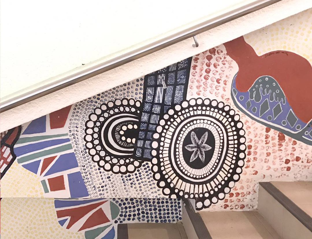
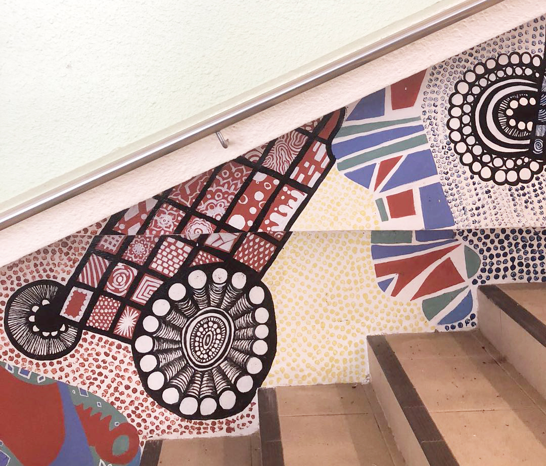
In the foreseeable future, there will be no return to the ‘old normal’ life. I believe that some of the habits that we have developed during the pandemic won’t go away completely, and not just the habits of working from home and Zoom meeting, in addition, such as robots and telemedicine are gonna be here to stay. Harvard experts say some of our adaptations have accelerated already existing trends, like the development of a cashless society, the increase in remote work, and the decline of brick-and-mortar retail. And, they expect, some of these will become a more permanent part of the post-pandemic’s ‘new normal’. So the main material of this outfit is linen bedsheets, to show the concept of WFH and some other new habits that we’ve developed at home during the pandemic. As we are doing more and more activities online, undoubtedly, digital tools need to be enhanced, and cybersecurity will also become a bigger concern than ever before. Therefore, the cage skirt and the mesh over the shoulder serve as a reminder of cybersecurity traps, making the hidden able to be seen. And those square shapes also symbolize the pixels, Similarly, when we are looking at the screen, the pixels cannot be seen unless we magnify them and make them ‘visible’ to the eye.

Photo by Brendan

The technology part was done by incorporating LED strip lights. There is an ultrasonic sensor (proximity) placed at the chest area so that when someone gets closer or the wearer makes the gesture of waving to someone, lights would be triggered and then turn from red to green to blue, which are the RGB colours that we see on our laptop screen. In addition, these lights also signify the new age, which is all about celebrating freedom; celebrating life. The ‘cage’ period is coming to an end, a new chapter will start. Red can be associated with love and passion, green can represent a new beginning and growth, while blue is associated with tranquility and calmness. May next year will bring an end to this pandemic and the start of an ‘abnormal’ normal lifestyle in which we finally decide it is time to build a fairer, more inclusive, and sustainable society. 

Process


Biomimicry

Biomimicry is a practice that learns from nature’s wisdom as plants, animals, insects, and other living organisms have evolved over billions of years in order to survive and adapt to dynamic environments, and many natural adaptations have proved to be more effective than man-made solutions. The biomimicry term appeared in 1982, it was invented and published by Janine Benyus, an American natural sciences writer, in her most significant 1997 book – “Biomimicry: Innovation Inspired by Nature”. She claimed to look to nature as a “Model, Measure, and Mentor” and she also suggested that the main aim of biomimicry is sustainability.

Biomimicry has been used by scientists and designers as a huge source of inspiration to create more efficient and more sustainable designs for different purposes. It always has been and will continue to be so in the future as we can see the world demanding more eco-friendly solutions. In 2011,  there was a project called Biomimicry done by fashion designer Stefanie Nieuwenhuyse. She created a collection of sustainable and durable garments by mimicking nature’s natural patterns and shapes like reptile skins. To minimise waste, she collected discarded pieces of plywood and cut the shapes out as efficiently as possible, and then layered them onto unbleached organic cotton. Another project is Biomimicry Shoe (Bird Skull Shoe), which was designed in the same year by designer Marieka Ratsma in collaboration with architect Kostika Spaho. The idea of this Biomimicry Shoe was also inspired by a combination of nature and modern technology. It highlights the aesthetics and the shape of a bird’s skull and uses 3D printing technology to manage to produce such a wearable product with a lightweight and efficient structure, which requires less support material, resulting in optimal efficiency, strength, and elegance.

References:

  • https://www.sciencedirect.com/science/article/pii/S1110016815001702
  • http://www.osmosis-industries.com/digital/2015/4/21/nature-inspired-fashion-design-through-the-theory-of-biomimicry
  • https://www.behance.net/gallery/2056440/Biomimicry-MA-Fashion-2011
  • https://trendland.com/marieka-ratsma-biomimicry-shoe/

Wearable Technology

UV Dress (2012)

The UV Dress was designed by Diffus Design, in collaboration with the Alexandra Institute and with fashion designer Mette Lindberg and interaction designer Martina Uhling. It was specifically designed for an exhibition about health care and both positive and negative consequences of UV light. They wanted to create a demonstration of how human behaviour in relationship to the sun could suggest a more creative look. It was meant as an artistic statement on sunlight and well-being, rather than a product or a solution. The apertures on the surface of the dress are made in textiles added some stiffening material and can open and close in relation to how much sunshine the wearer is exposed to. UV sensors are put on the shoulder of the dress to detect the level of UV light. And some small motors operate a system of strings to let the apertures open and close according to the UV light level. When the detected UV level is very high, these circular openings will be completely closed to avoid the wearer’s skin being hit by the sunlight. When the UV level is low, the openings will open up to let the sunlight reach the skin.


Reference

  • https://diffus.dk/work/project-uv-dress
  • https://digicult.it/news/dresses-natural-elements-and-weather-in-the-age-of-high-tech-fashion/

Project 2B_Research and Process

Reference

When I got the idea of doing my zine about discovering the black and white elements in Little India, the first thing came into mind was the design of Chanel and Dior magazine.

Images from Pinterest- minimalist style

https://aperture.org/shop/zoe-crosher-the-disappearance-of-michelle-dubois-book/ 
Process

Initially, I didn’t have a clear idea about the design of my cover. After the consultation with Shirley, I decided to draw patterns that I found in Tekka Centre in Little India on my front cover.


I put a picture of a door on the first page to show that    I used the photo of the outside view of Park 22 Hotel, which was the first building that I found in Little India that designed in colour of black and white only.  I was trying to make everything organised and put them in horizontal and vertical alignment.

For the spread of BIRDS, I used film strip as a border of the photos to show that this spread is like playing a documentary about the pigeons daily life in Little India.

I was trying to place the photos in a collage manner and made adjustments of their size and orientation to create a sense of depth. In addition, added some round shapes for the background to bring out a joyful atmosphere.

For the spread of CLOTHES, I got inspiration from the design idea of Dior Magazine. Then, I tried to tilt some of the pictures a bit and added some illustrations to make this spread more interesting and vivid.

Tried to create a diagonal arrangement in idea 2.

Test Print

In the end, pattern and map were both kept on my back cover. And I changed the style of the map to match the design of my front cover.

Final Work

Reflection

I was really enjoyed when I was doing this project, going down to the location, strolling around and taking photos, which is a kind of things that I would like to do in my spare time. In addition, one point added to my Indesign skills. 🙂 I have never ever touched Indesign before, it’s really cool to learn new things, although it’s hard at the beginning. Never stop learning and exploring, and try to jump out of the box to find out something different and unique.


Locale Gallery

Locale_Collection of data

Forrest Gump – Movie Quotes

Project 2

Here are the 4 movie quotes that I chose from different movies:
#1. “I want love…or death” – Léon: The Professional (1994)
https://pgcooper1939.wordpress.com/2012/05/31/pg-coopers-movie-of-the-month-leon-the-professional-1994/
https://giphy.com/gifs/love-90s-xjCn9uzHYsfPG
#2. “I am a princess. All girls are.” – Little princess (1995)
http://www.adorocinema.com/filmes/filme-47096/fotos/detalhe/?cmediafile=19899502
https://giphy.com/gifs/cute-girl-im-a-princess-QkLjyIPIi1nlS
#3. “I just know I’m hungry…All the time” – 17 Again (2009)
https://www.movieposter.com/poster/MPW-40271/17_Again.html
https://wifflegif.com/gifs/203692-zac-efron-17-again-gif
#4. “I came here to make the world a better place, but I think I broke it.” – Zootopia (2016)
http://oscar.go.com/nominees/animated-feature-film/zootopia
https://www.tumblr.com/search/zootopia%20gif%20mine


Pandora Box-Cantilever

Foundation 3D: Pandora Box-Cantilever

The word I got from the Pandora’s Box was Cantilever. I have searched on Wikipedia about this word: A cantilever is a rigid structural element, such as a beam or a plate, anchored at only one end to a (usually vertical) support from which it is protruding. Cantilevers are widely used in construction, such as in bridges and buildings. After a preliminary understanding of what is cantilever, I composed 2 sketch models on week 2.

  • D: Dominant
  • SD: Sub-dominant
  • SO: Sub-ordinate

3 views of Model 1:

Front view-the sizes of SD&SO are quite similar.

Side view-the widths of D, SD&SO are similar……

Top view-SD cannot be seen; the size of SO is too big.

3 views of Model 2:

Front view-the sizes of SD&SO are similar; the length of SD is longer than 1/2 length of D; the left side of the model is too flat.

Side view-the sizes of SD&SO are similar; the width of SD is longer than 1/2 width of D; everything is centralized.

Top view-SO cannot be seen; D&SD are shifted.

The feedback I got on week 2:

  • Keep rotating 3D sketch model while assembling it, make sure D, SD & SO can be seen from all angles;
  • Avoid similar sizes of SD&SO, and SD&SO won’t be shifted from different views;
  • No flushing, avoid flat looking of the 3D sketch model

With these points in mind, I tried to improve the two models above and explore some more different composition of Cantilever on week 3.

3D Sketch Model 1:

2D Analysis of Model 1:


3D Sketch Model 2:

2D Analysis of Model 2:


3D Sketch Model 3:

2D Analysis of Model 3: 

3D Sketch Model 4:


2D Analysis of Model 4:

The feedback I got on week 4:

  • Avoid putting everything along the central axis, try to make the model more interesting
  • Think about the materials that I am going to use

I decided to choose Model 4 as my final model.

Final sketch model:


Final adjustment:

  • The thickness of SD&SO are quite similar, SO should be cut in half. And after that, I decided to place the SO along the principal axis of SD.
  • Shift SO&SD to the left 1/3 point of the length of D.

Materials

  • Dominant: Chipboard
  • Sub-dominant: PVC sheet
  • Sub-ordinate: Rectangular ring

Considering the future application of this model, I decided to use chipboard(D), glass(SD), and metal wire(SO) as my materials at first. However, during the final model making process, I wanted the SD to be double layers, so I used transparent PVC sheet to replace the glass as it was in lighter weight and easier to cut.

My idea was inspired by Mash Bar. Mash is one of the smallest bars in Amsterdam, the designer used chipboard all around for the interior to create a cozy and warm atmosphere.

https://www.dezeen.com/2014/06/16/ninetynine-chipboard-mash-bar-amsterdam/

The main materials I can see from the bar’s interior are chipboard, metal, glass, and fabric.

FINAL MODEL

Application

1. Note board with a LED glass clock

The control buttons are placed at the edge of the note board. As the glass board is double layered, the user can put a paper in between and then write notes on the glass board.

2. Table

When you are not using the table, you can lift it up for more space. And now, it becomes a glass note board again…

Picture Story-Cruating Self

Assignment 1: Picture Story-Curating Self

Task 1: Object and representation of self.

As the saying goes, “An apple a day, keeps the doctor away”. My dad kept telling me about the benefits of apples tirelessly when I was a little girl. Apple is not my favorite fruit, however, now it is more than a fruit, and it has become a necessity of my life.

For the first mid-range shot, I put the apple in the center and took the photo from the top down. I did take photos of the apple from various angles, and I decided to choose the photo above because it looks like the apple is floating in the air or falling down.  

When I was in primary school, my mom put an apple in my bag every morning I left for school. Every day, there was an apple lying on my desk, listening to the lessons and watching me solving questions, just like deskmate. And it also became a recognizable symbol of my seat in my class. Hence, here comes the second image. In this image, it is obvious to see that I  am sitting a little bit far from the apple to show that I didn’t really like eating apples.
This photo was taken following the rule of thirds.

Now, apple is one of my daily necessity. In the third image, I cradled apple in hands and placed it at around the same position of my heart. I was trying to use this close-up shot and focus on the apple to show my love for parents, I want them to know that I cherish everything I have, and I am able to take care of myself even though without them by my side. On the other hand, it shows that I wanna step out my comfort zone and I am learning to accept the sour and face the challenges in my life.

The group of the photos taken above was inspired by Rinko Kawauchi, a photographer from Japan. Kawauchi as a photographer has developed the skill to create poetic moments and purity from everyday objects. I was also trying to achieve what she does in her images to create a beautiful picture out of an ordinary object, with a light tone and shallow depth of field.


Task 2: My World

Library is a place that is significant to me. It is a place where I go with my friends after class, and with my mom on weekends. Although I spent most of my leisure time in the library during my childhood, I am not a bookworm. But my mom is, she likes reading and she dreamt of becoming a writer when she was young. Personally, I really enjoy staying at a place like a library where has extra-high ceiling and huge windows on the walls. And I like such a quiet place and everybody there seems like they are immersed in their own world. It provides a kind of invisible power for me, which makes me concentrate on my own work and be more efficient,  therefore I prefer to go to the library to study.

In the first photo, I tried to make things in symmetry.

One point perspective shot to show how organized and tidy the library is. All the bookshelves arranged in lines, and all the books are neatly laid out.

The third photo was taken following the rule of thirds. I use the green apple to represent myself in the library. The photo was taken in ADM library to show that I am currently a student here.

For the three photos above, I tried to make the library look like a ‘wonderland’ by increasing the saturation and contrast of the image to show that how interesting and magical the world is. As reading is a way for traveling as well, we can see everything and go anywhere we want in our mind through a book. Therefore, the library is a place for me to create my own world.

The last photo was taken following the rule of thirds and using the contrast of lighting to show that books can guide us and light up our lives. Sometimes, I feel that reading a book likes we are passing through a tunnel, probably we cannot see and understand anything at first, it is a process of exploration and discovery. In the end, we will see the light and the fascinating world out there.