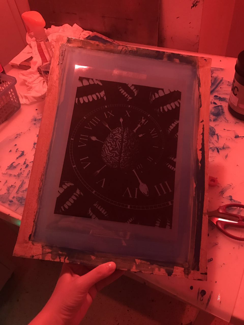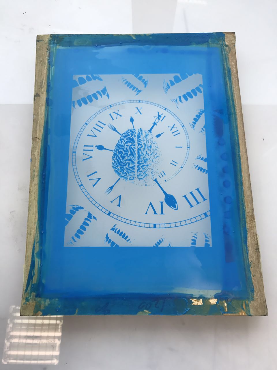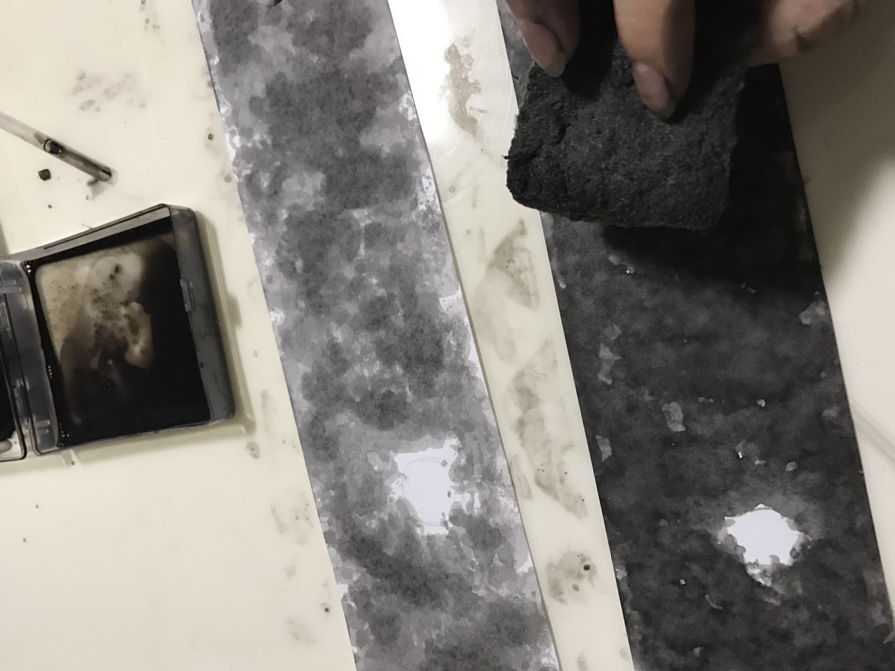
♣ PROCESS ♣
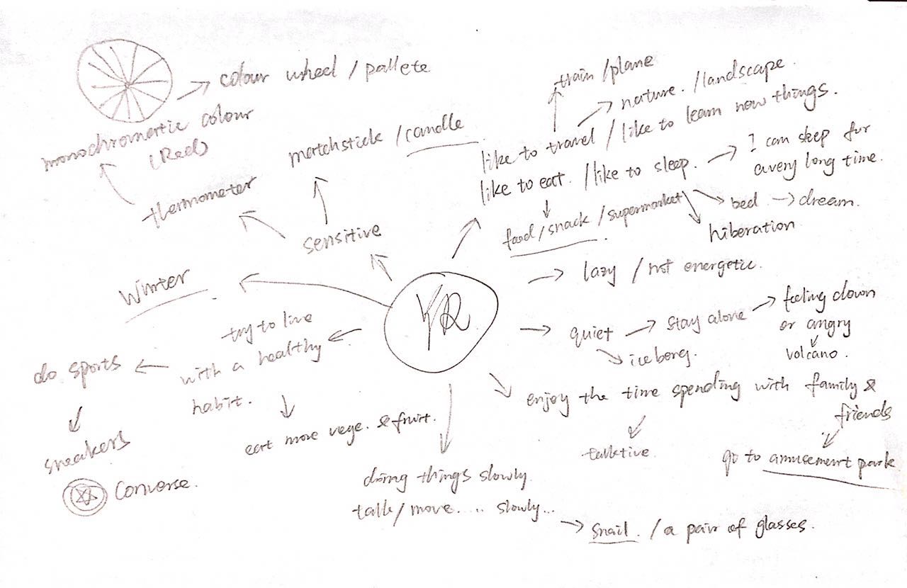
mindmap
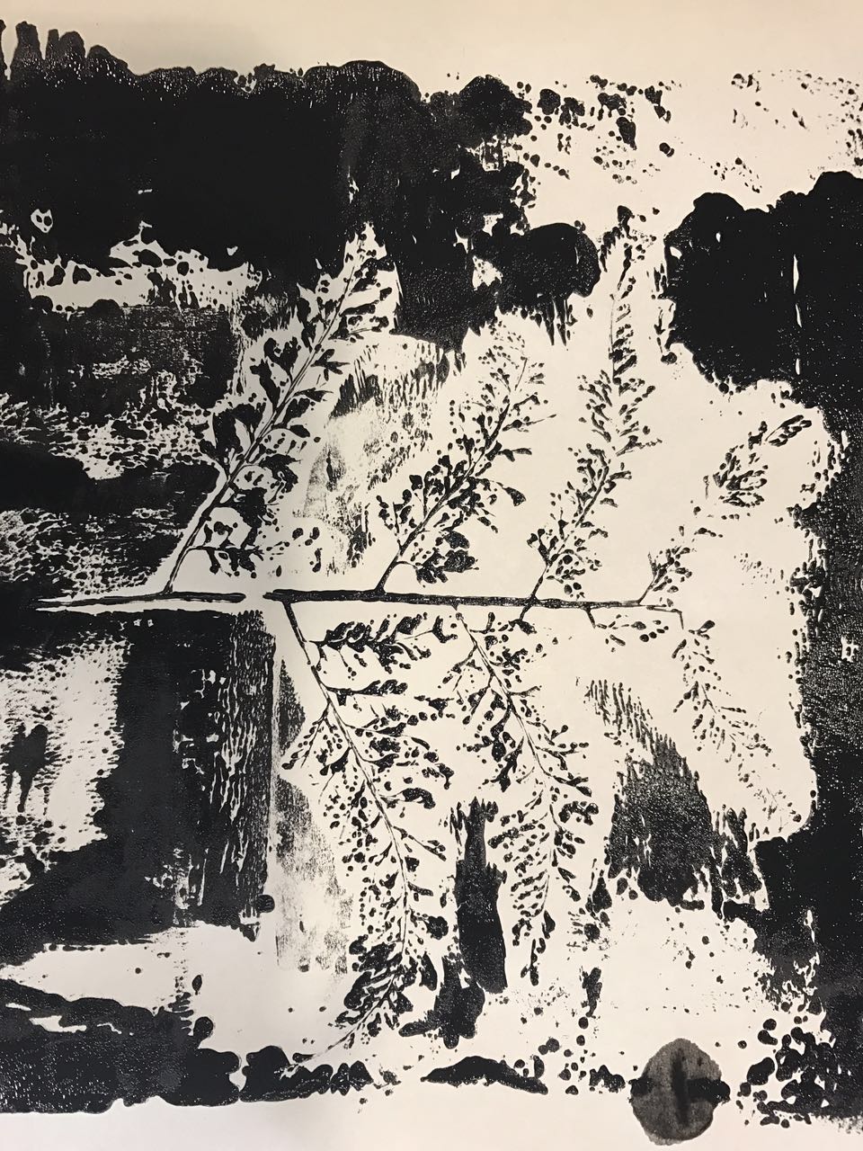
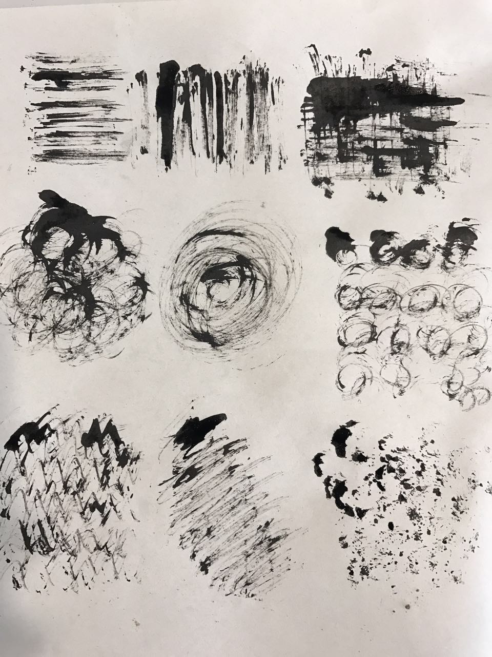
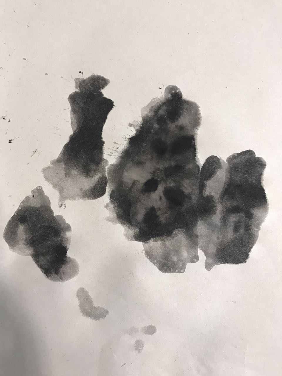
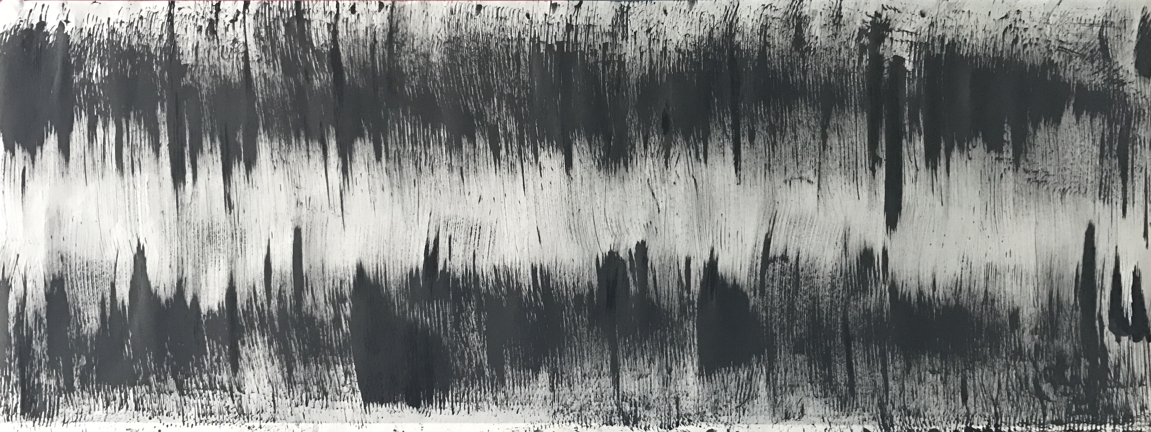
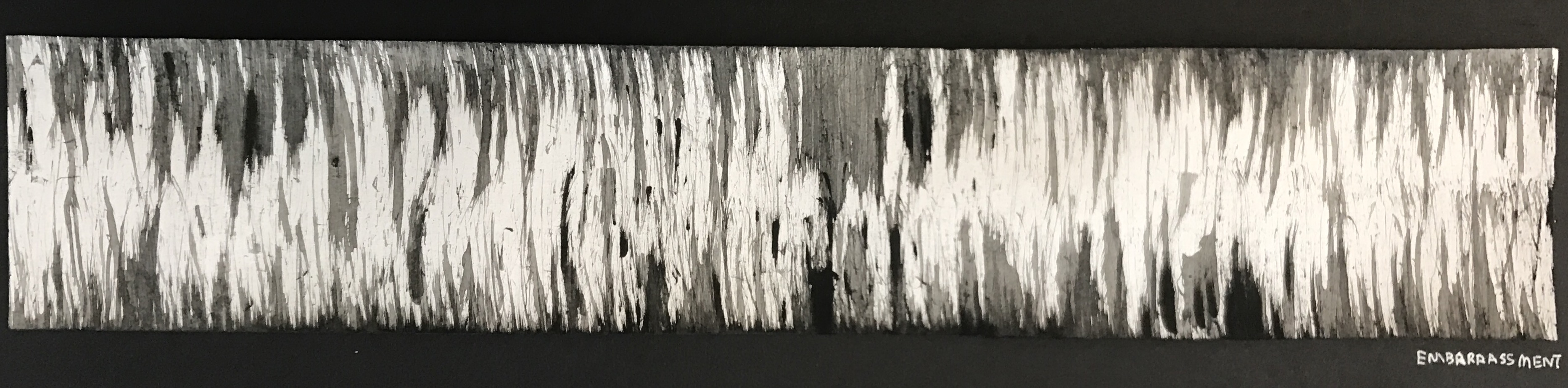
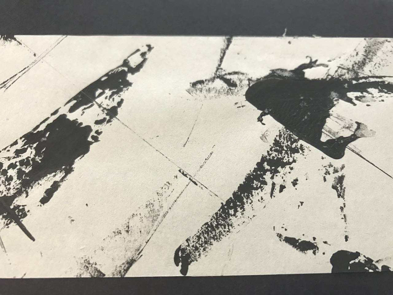
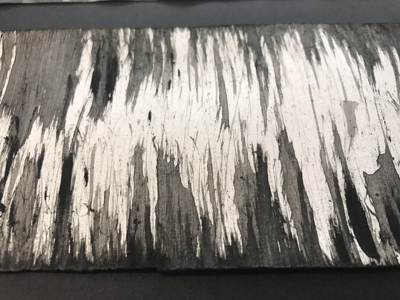
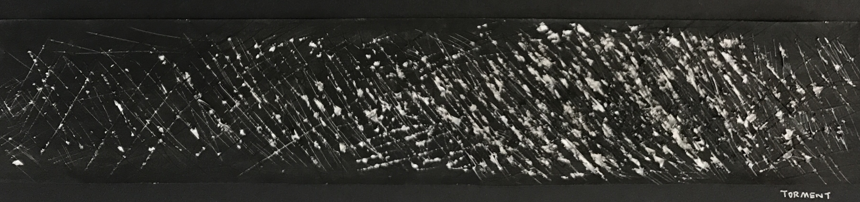
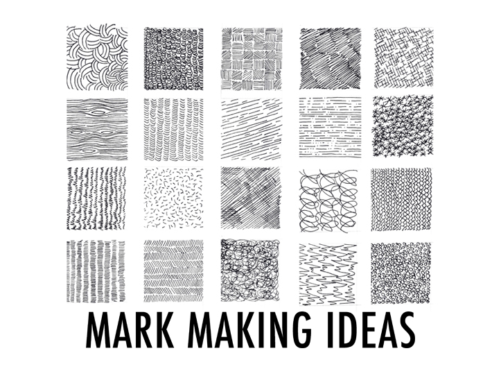
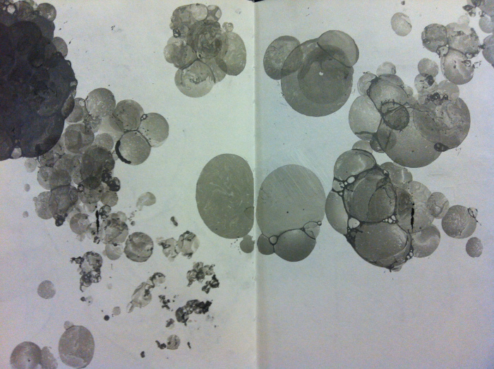
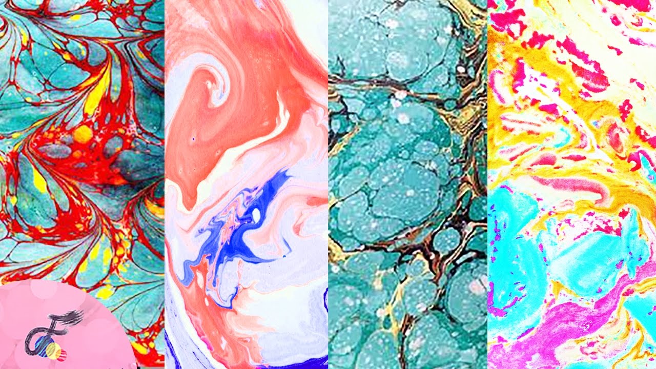
sketches
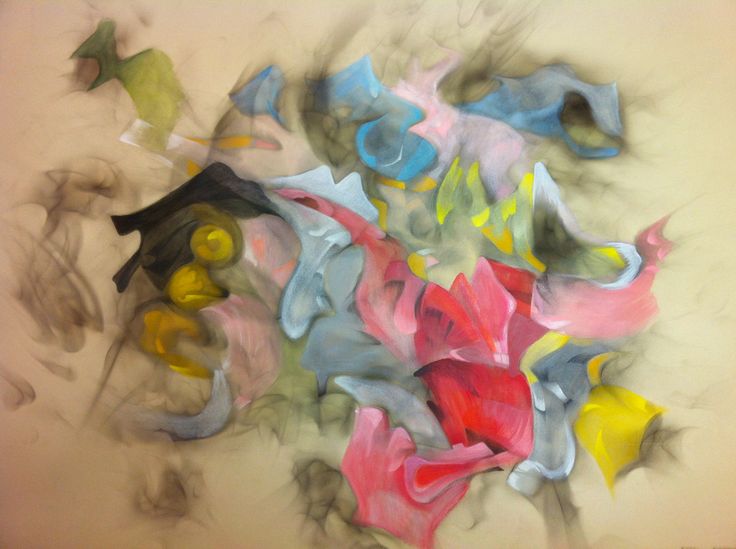
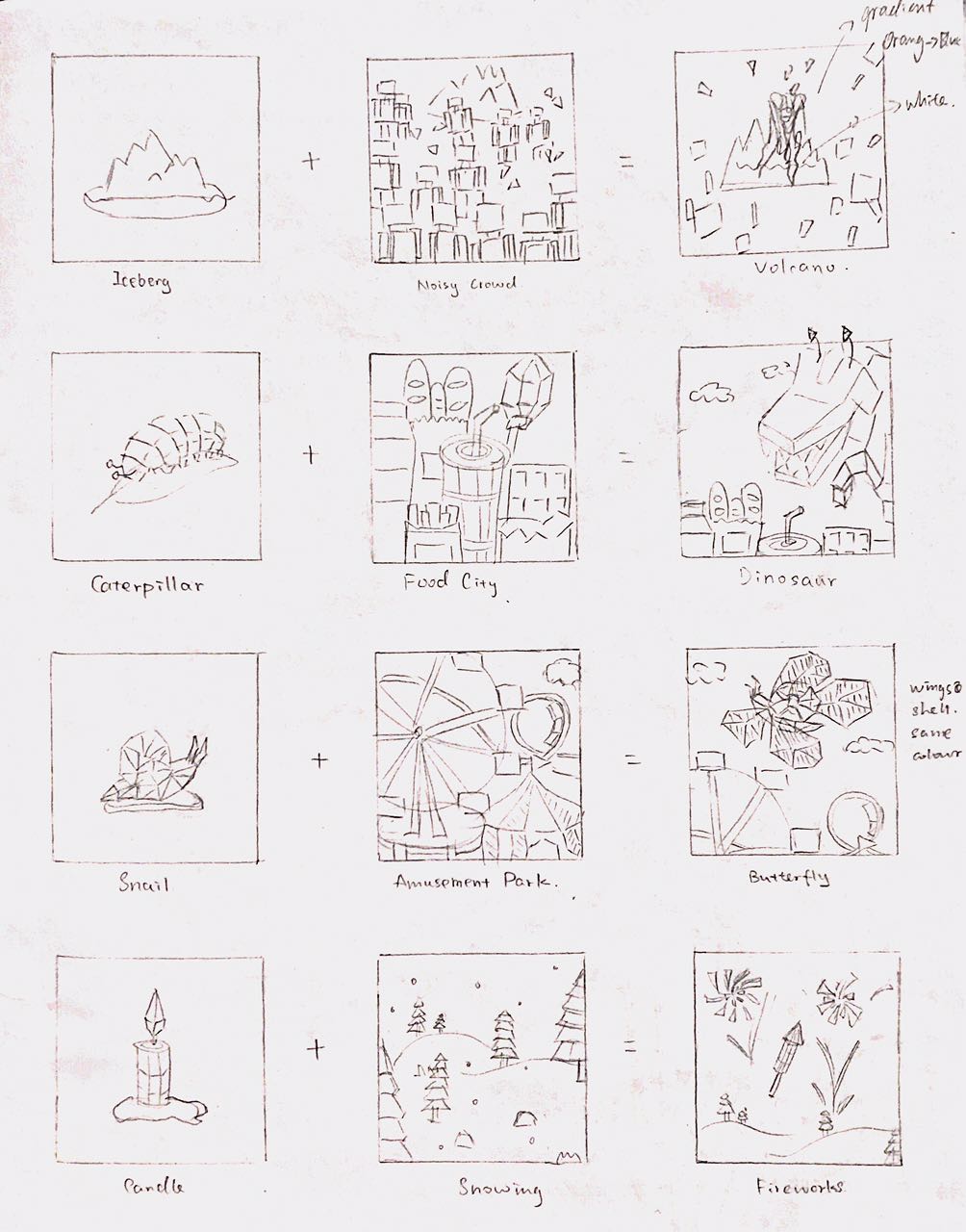
Based on the above mind map, after the consultation with Shirley, I decided to use iceberg, caterpillar, snail and candle to represent myself, and I sketched out all the compositions:
Me + Setting = Me or my reaction in the setting
development of ideas
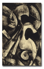
Low-poly 3D model references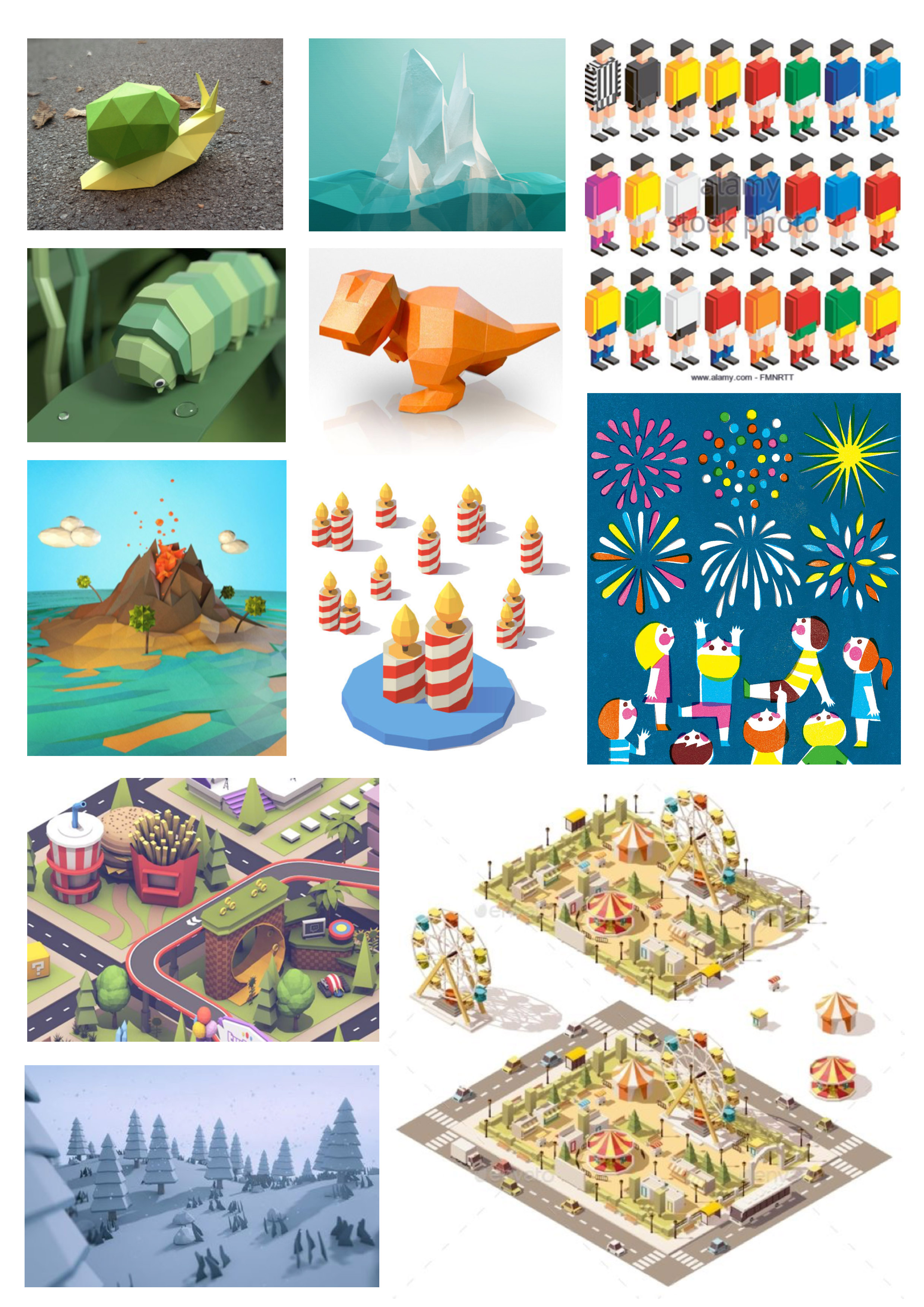
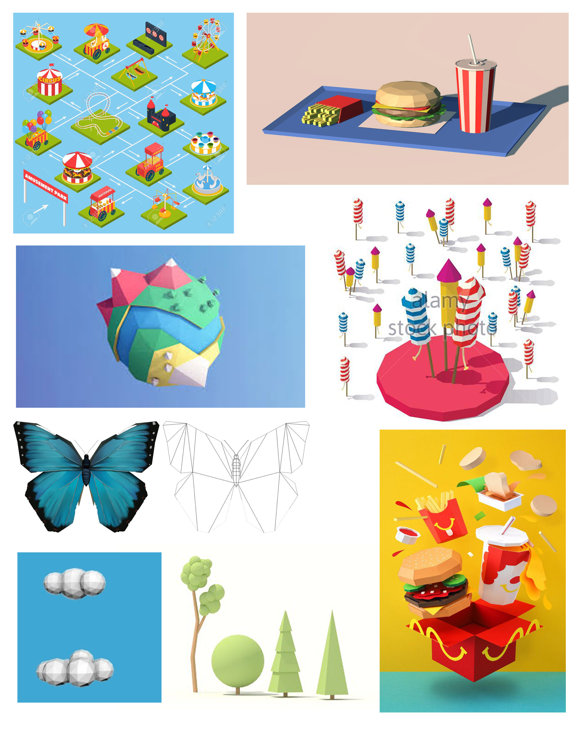
I created all the low-poly 3D models in Cinema 4D(C4D), and then adjust the background, layout and colours in Photoshop.
outcomes
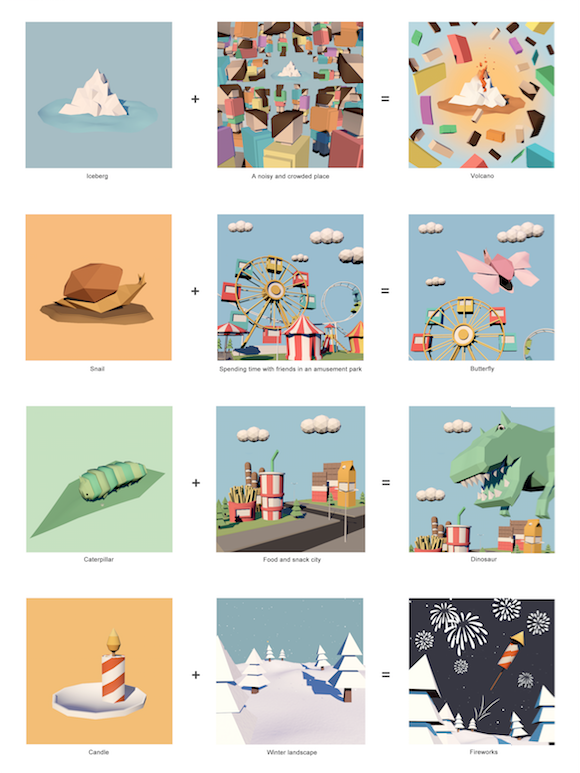
Me + Setting = Me or my reaction in the setting
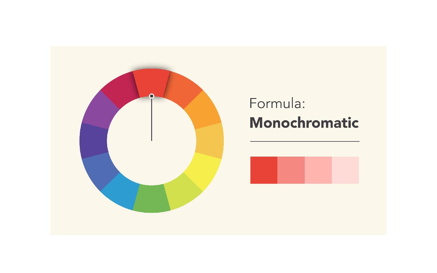
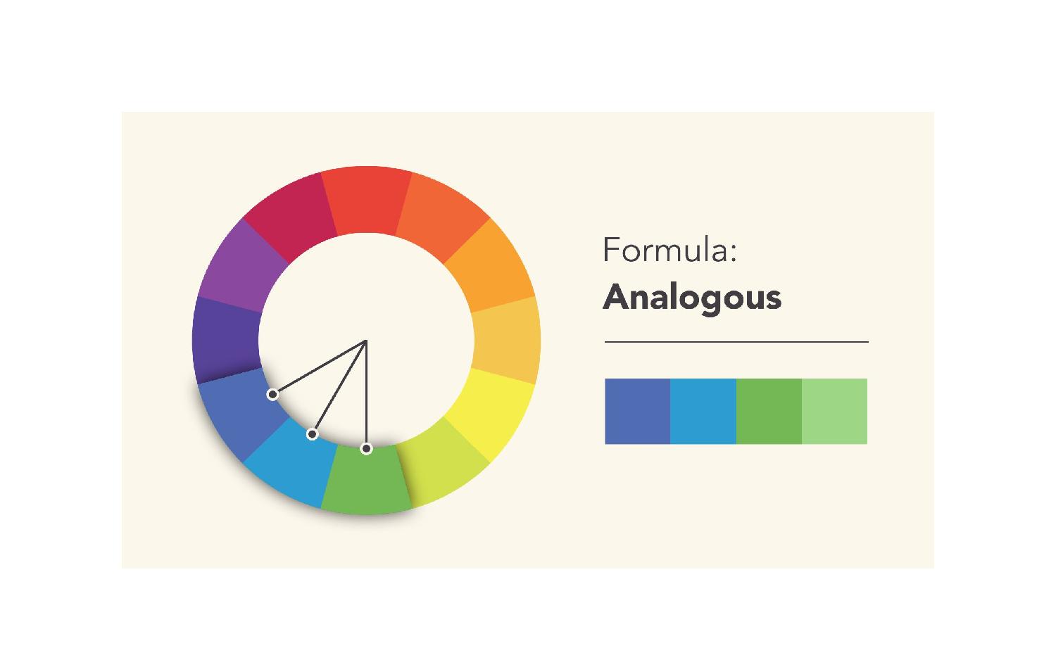
I decided to use monochromatic and analogous colours for all the four first squares which represent ME.


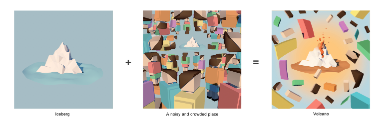
- ME: Iceberg
- SETTING: A noisy and crowded place
- OUTCOME: Volcano
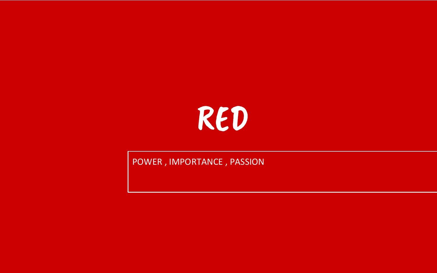
I start off the equation with me as an iceberg to represent myself when I am feeling down or angry, I don’t want to talk to anyone and prefer to stay alone. However, when being put in a situation where is crowded and noisy, the negative emotions will be built up, so I use a volcano to represent the moment that I am out of control. The colours used in the squares of setting and outcome are few groups of complementary colours (red&green, yellow&purple, orange&blue), which help to emphasise the ‘chaotic situation’ of both external (the setting) and internal (my emotions).

- ME: Snail
- SETTING: Amusement park
- OUTCOME: Butterfly
I use a snail to represent myself when I am lazy to move and doing things slowly. However, when being put in an amusement park, I will turn into a little girl, running around happily and tirelessly like a butterfly. For the setting, I use triadic colours (red, yellow and blue) to show that an amusement park is a place with a lot of fun. I also use the green colour which is relaxing, and youthful. In the last frame, I use monochromatic colours of pink for the butterfly, as pink is fun and girly. In addition, brighter colours also tend to have a fun vibe.


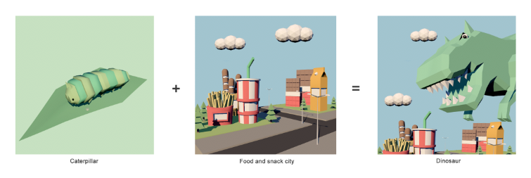
- ME: Caterpillar
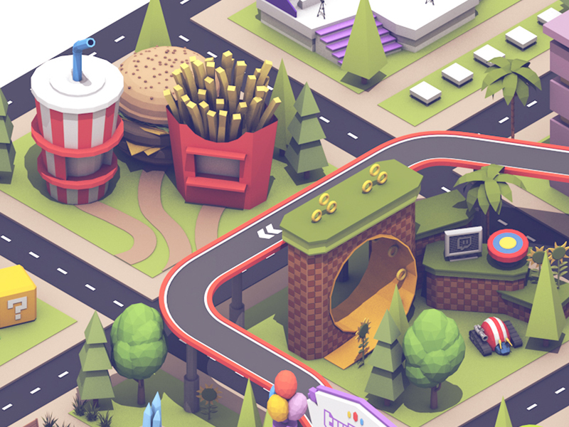
- SETTING: Food and snack city
- OUTCOME: Dinosaur
The first square is of me as a caterpillar as I always try to live with a healthy diet habit, eating more vegetables and fruits, and staying away from fast food and snacks. So I use analogous and monochromaticgreen which is not only associated with caterpillar but also the keyword ‘healthy’. However, sometimes I need a ‘break’, which means I can eat whatever I want. When being put in a food and snack city, I will become a hungry monster and eat as much as I can. For colours, I use red, which is the complementary colour of green to represent the ‘delicious junk food’.


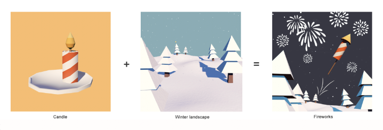
- ME: Candle
- SETTING: Winter landscape
- OUTCOME: Fireworks
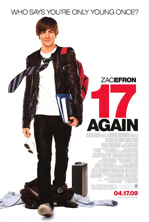
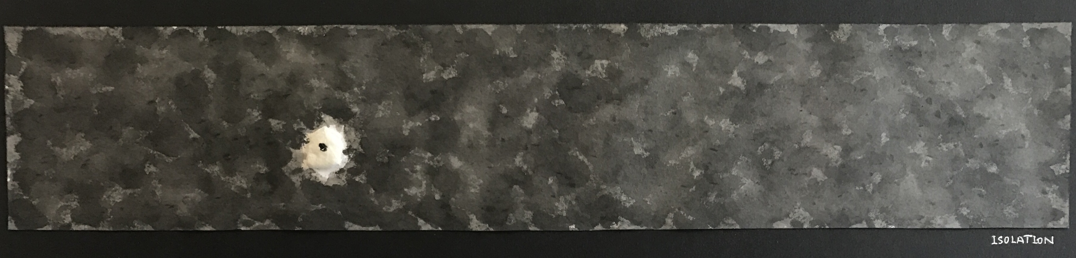
In the last equation, I use a candle to represent myself as sometimes I am not an energetic and enthusiastic person, however, when being put in a situation where the people around me are even quieter than me, I will become an active person who tries to break the ice between each other, like a fireworks rocket. However, as you can see in the last frame, the fireworks are still in white. A large area of white colour used for the setting to show the ‘silent environment’.
reflections
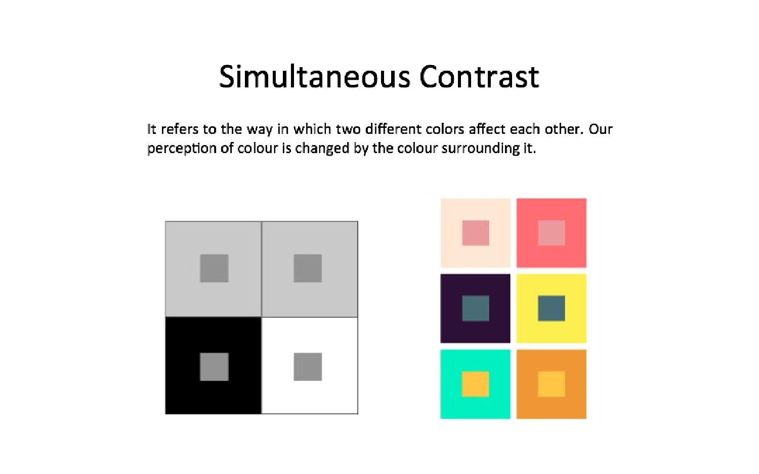
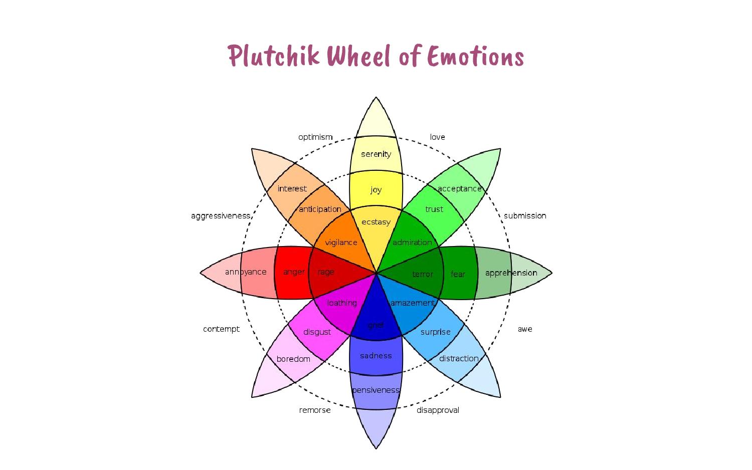
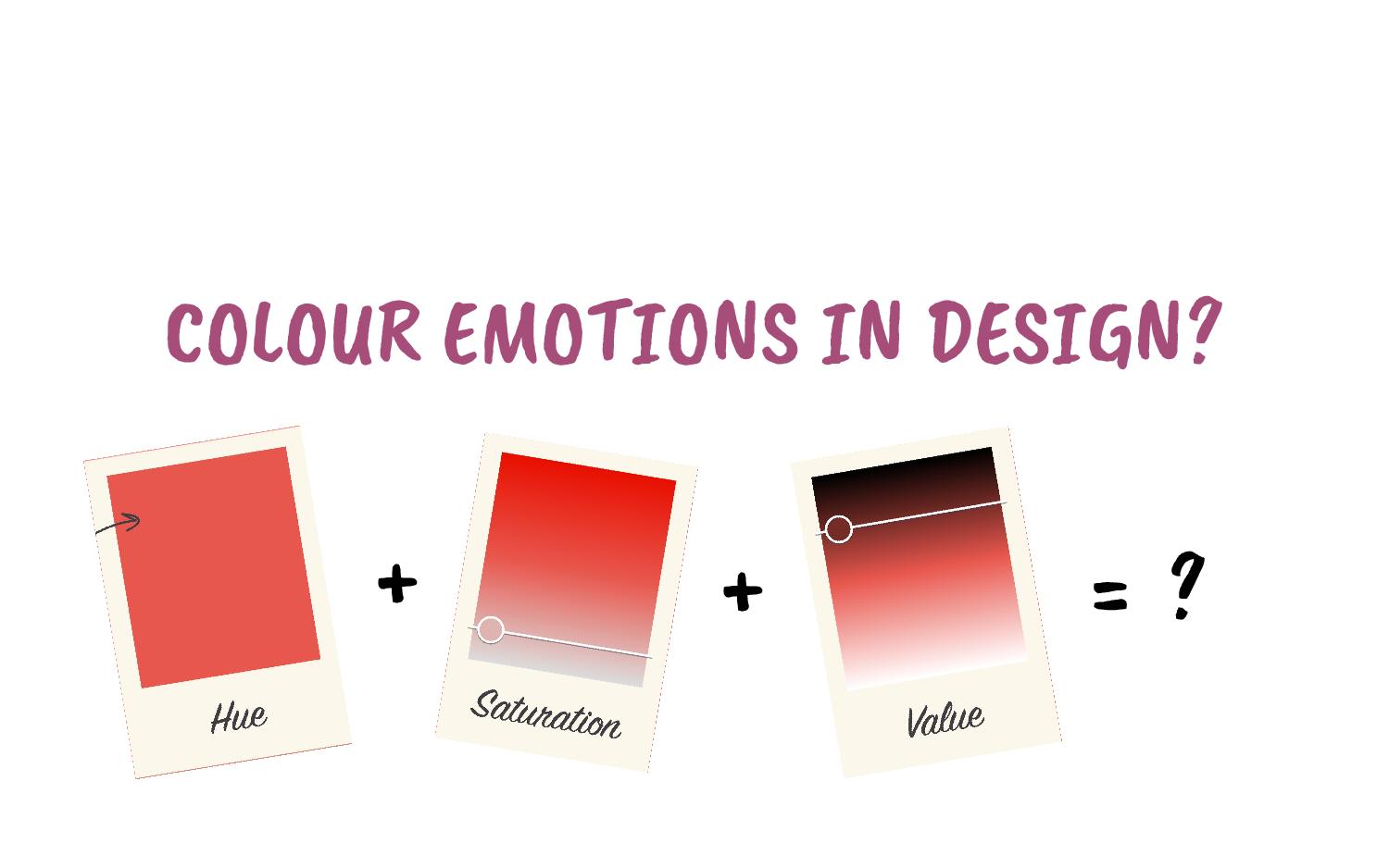
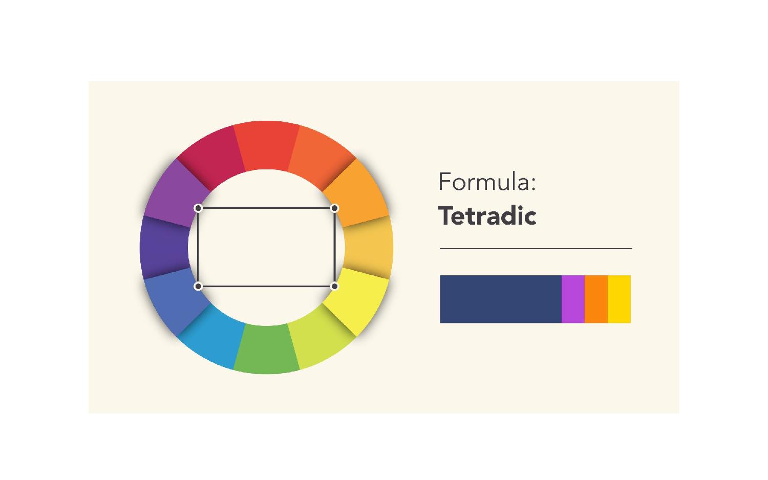
In project 3, different from the previous projects, we need to take colour harmonies into consideration for our compositions. To be honest, it is not easy to work with colours, as we have to think deeply about colour theory, and the connotations and emotions that come with the association of the colours we use. Understanding the colours schemes and how the colours work with each other will help us to create a better outcome in our work. Because there are no limitations to medium, technique or style, I decide to create my 12 compositions by using low-poly 3D illustration style. Therefore, this is also an opportunity for me to refresh my C4D skills and experiment in low-poly style.
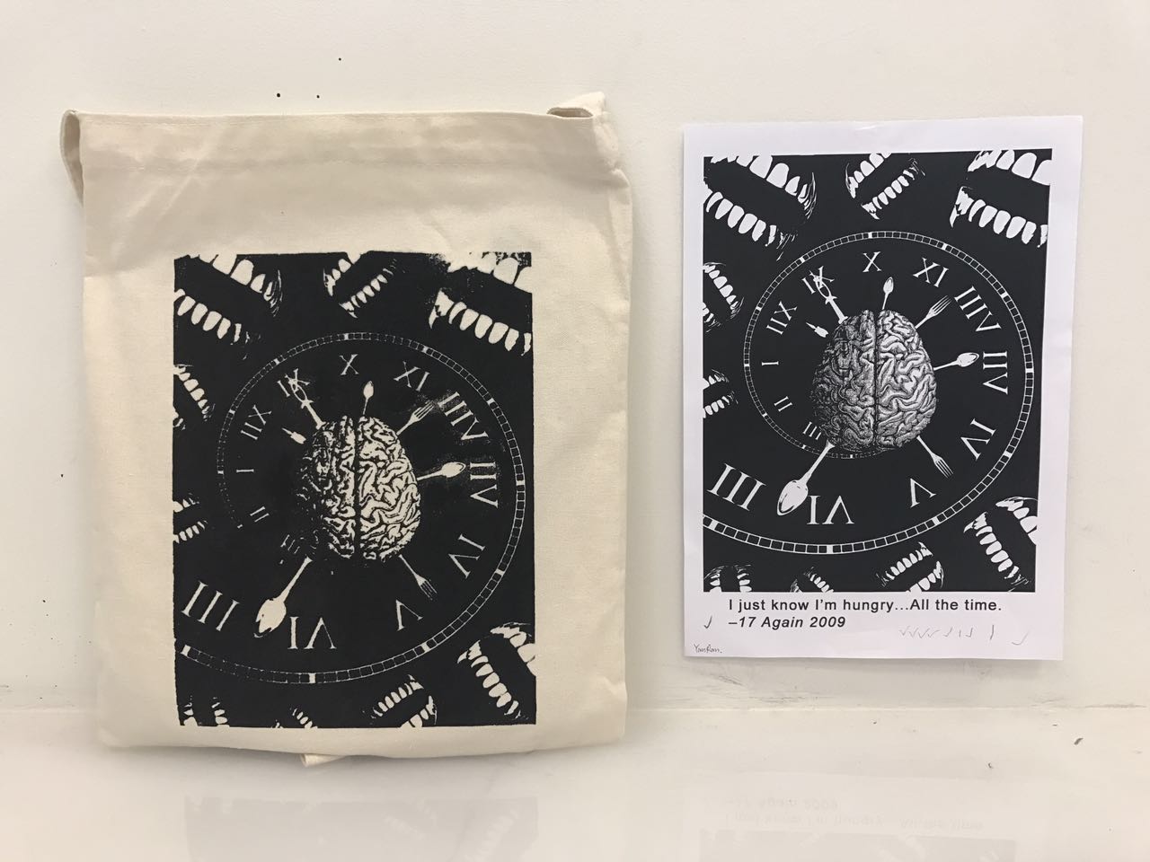
♣ FINAL SUBMISSION ♣