

Project 2-Forrest Gump Process & Final
Part 1-Design
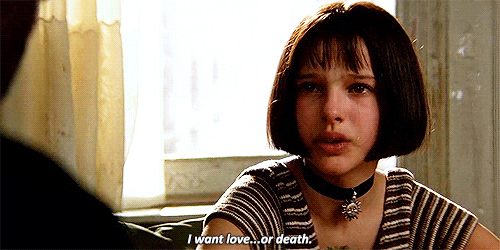
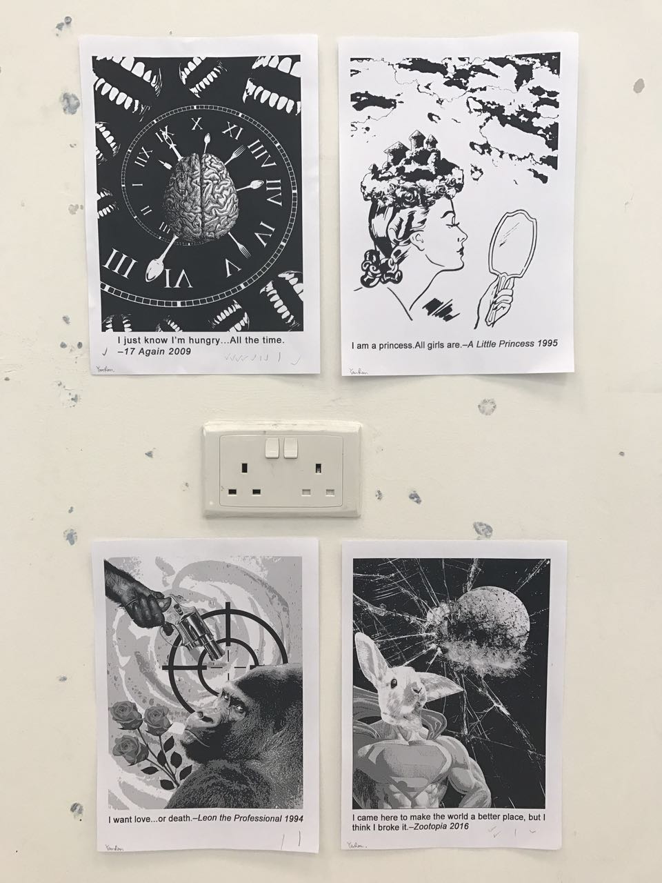
Quote 1: “I want love…or death.” – Leon: The Professional 1994
I broke down the quote into some keywords, and I tried to list down some visual elements that I could use to represent these keywords.
- WANT: grabbing hand/outstretched hand, brain
- LOVE: heart shape, rose, kiss, ring
- DEATH: gun, knife, gravestone, raven, blood, skull
My first draft. 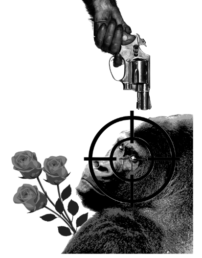
I used a bunch of roses to symbolise ‘love‘, a gun and a target icon to symbolise ‘death‘. When I was searching the visual elements online for the keyword ‘want‘, I suddenly changed my mind when I found the image of this gorilla, because I could see both craving and desperation in his eyes for love and death. I really love it. So I used this gorilla to symbolise ‘want’ instead of using a brain or grabbing hands. And there was a reason why I chose a gorilla over a human because humans are greedy and complicated, they always want more.
I tried to put the gun and the target along the 1/3 line by following the rule of thirds.
This is the second draft that I created. I shifted the position of the hand with the gun to the top left corner to create a diagonal arrangement. And it was also the farthest position from the gorilla in this composition, because I wanted to show that death is his last choice. But, he is not afraid of death, that is the reason why I put the gun towards the centre point of the target.
However, everything looked too dark except the target icon in this draft. I wanted to emphasise the words ‘love’ and ‘death’, so I inverted the colour of the target and changed another background of bloody rose.
Principle of design: diagonal arrangement, rule of thirds, contrast
Final Design:
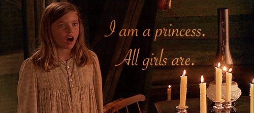
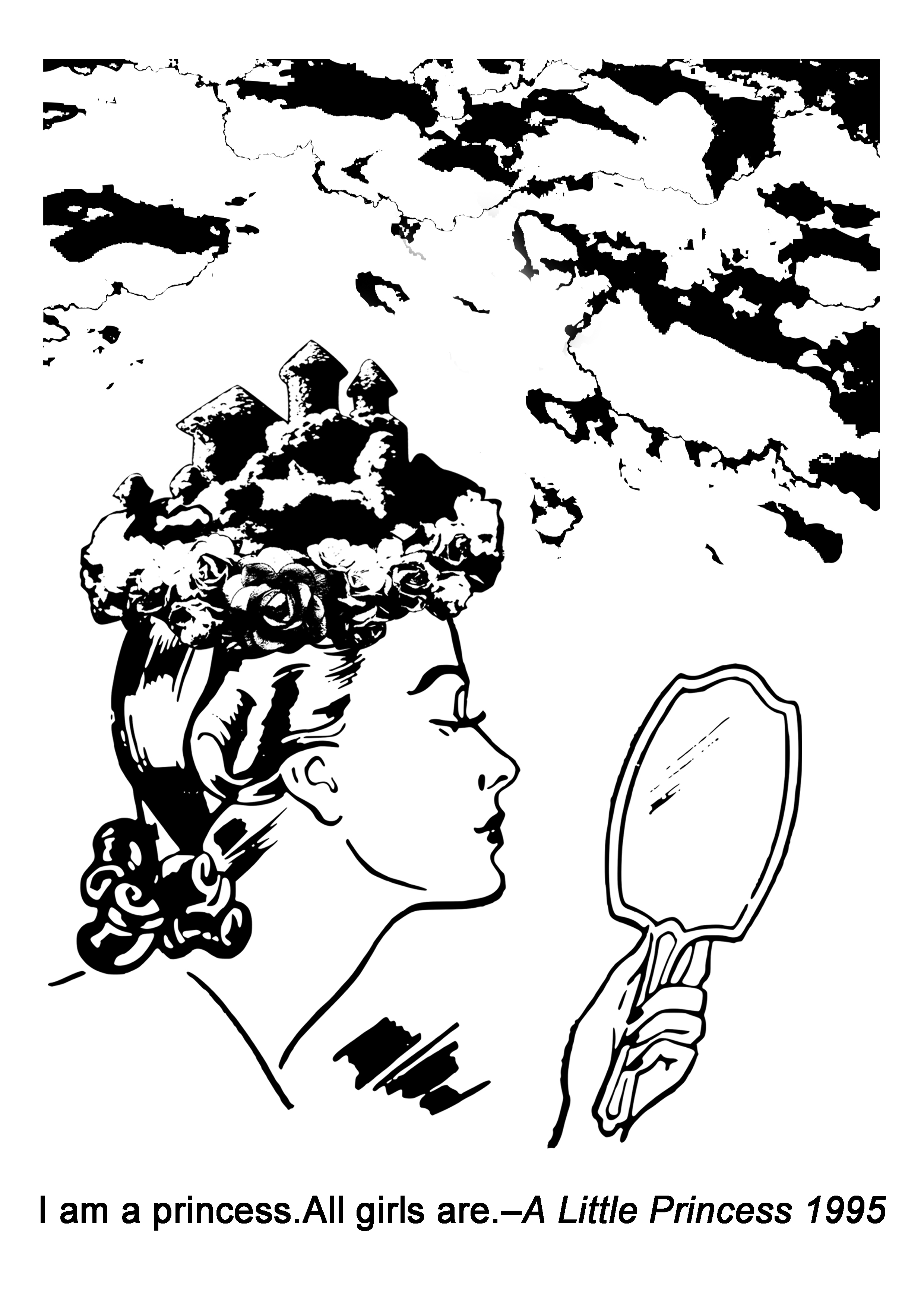
Quote 2: “I am a princess.All girls are.” – A little princess 1995
Broke down the quote into keywords:
- PRINCESS: crown, dress, castle, flower
- ALL GIRLS: mirror, different types of hair/dress/shoes
I wanted to compose a ‘crown’ myself by using a castle and flowers to make it more interesting, and the word ‘all’ reminded me that I had to think about what things that everyone can get it easily. So I used clouds in a castle shape for the top part of the crown, instead of using an image of an actual castle.
This is the first design that I came up with. I used the self-made crown to symbolise ‘princess‘, used different types of shoes as the background and a mirror as the face of the ‘princess’ to symbolise ‘all girls‘. But I thought the background was a little bit complicated and distracting.
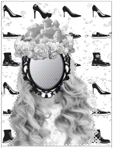
Final Design (Second design):
For the second design, I used clouds to fill up the top part of this composition to show that ‘all girls‘ in the world are the princess. In the end, I chose the second design as the final one, because it looked more harmonious and visually attracted me more.
Principle of design: rule of thirds, repetition, white space
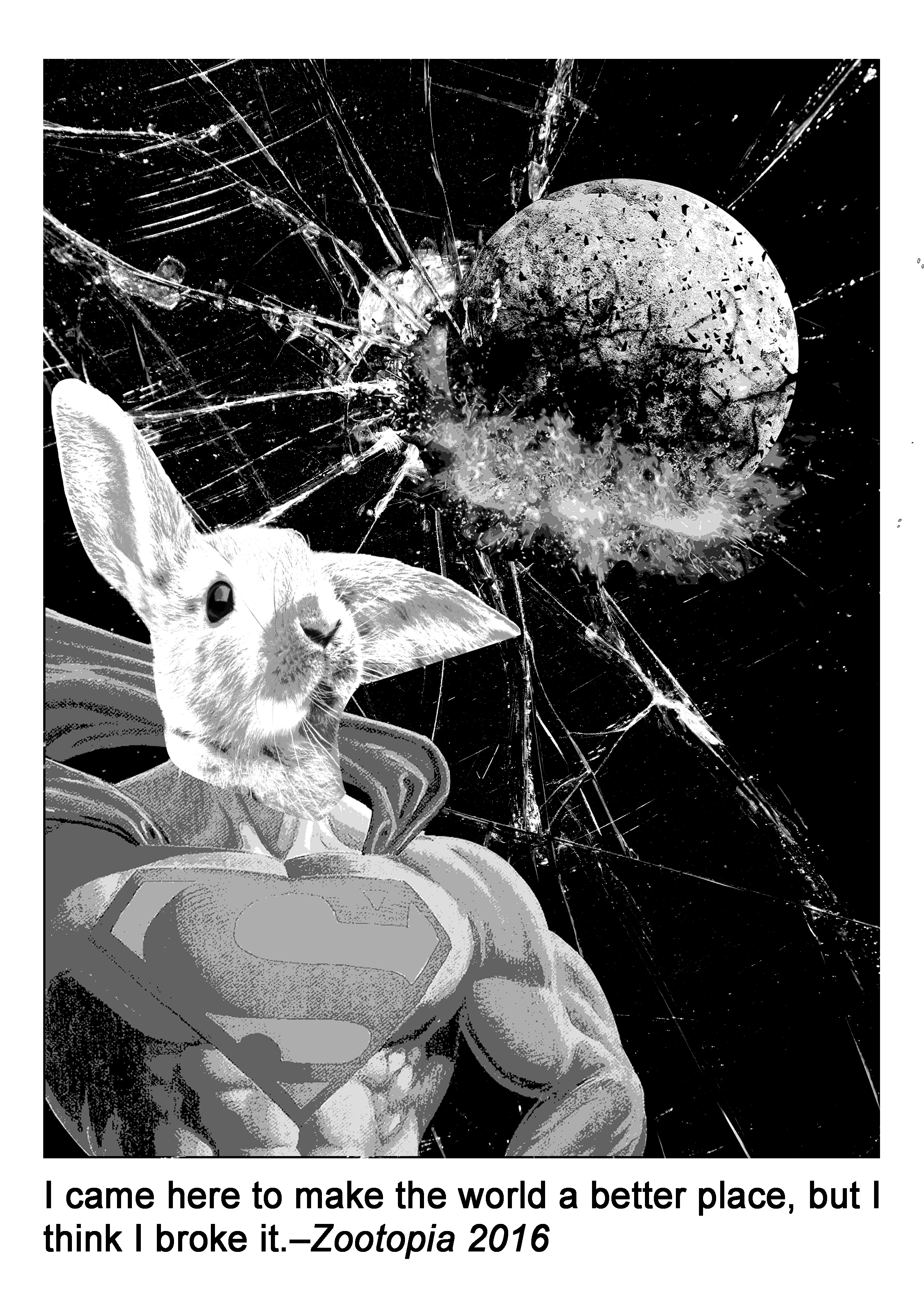
Quote 3: “I came here to make the world a better place, but I think I broke it.” – Zootopia 2016

- WORLD: world map, earth, globe, universe
- BROKE: shattered glass, debris, explosion
- MAKE THE WORLD A BETTER PLACE: Policeman, Hero (Superman, Spiderman, Batman……)
In this composition, I used an exploded earth to symbolise ‘world‘, and an image of shattered glass as the background to symbolise ‘broke‘, and I combined the upper body part of Superman with a rabbit head to represent the one who was trying to save the world or ‘make the world a better place‘, but failed. I was trying to arrange all the elements in this composition by following the rule of thirds. And I used negative space to represent the universe, at the same time, it also helped to make the dominant elements stand out.
Principle of design: negative space, rule of thirds, contrast
Final Design:
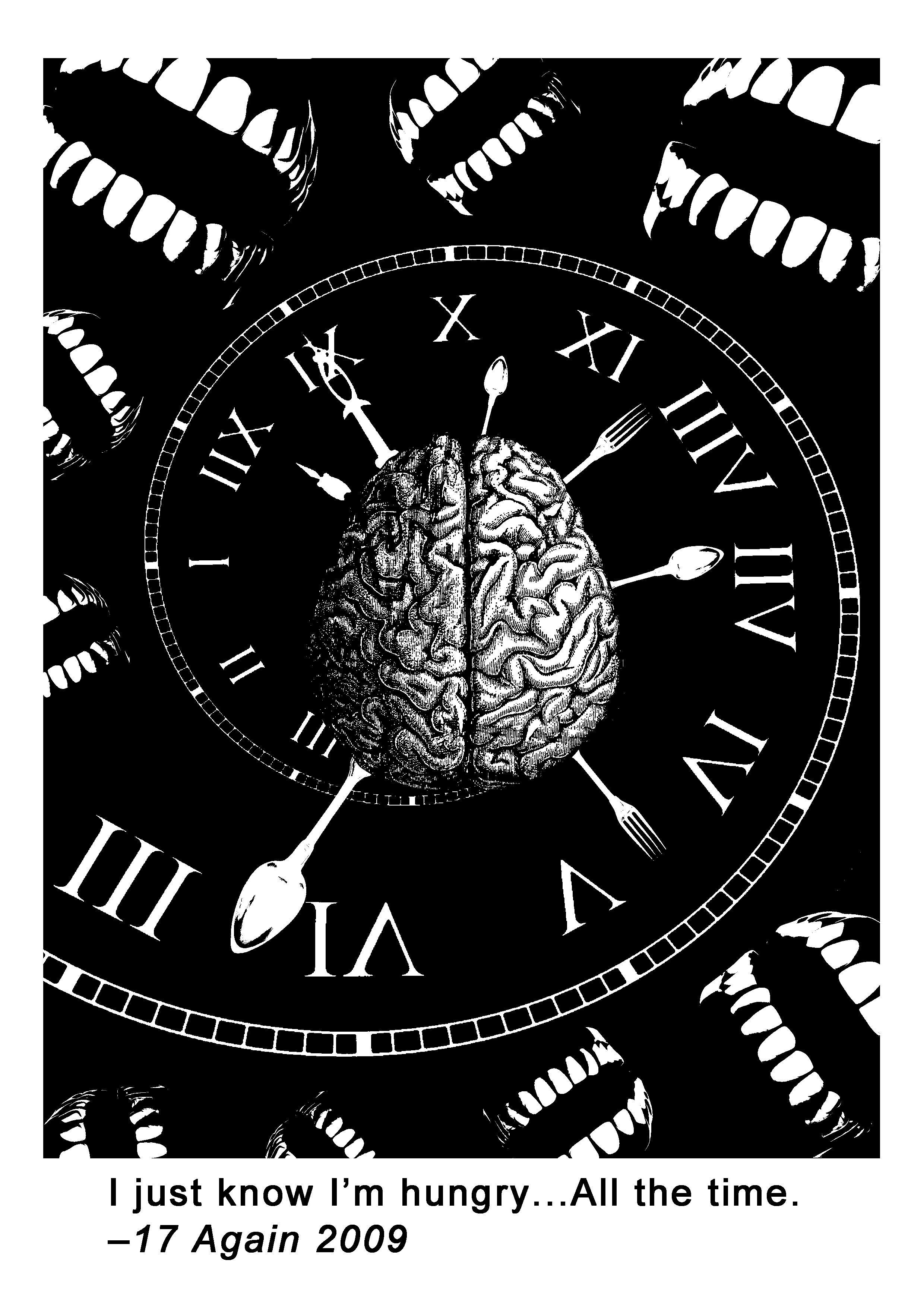
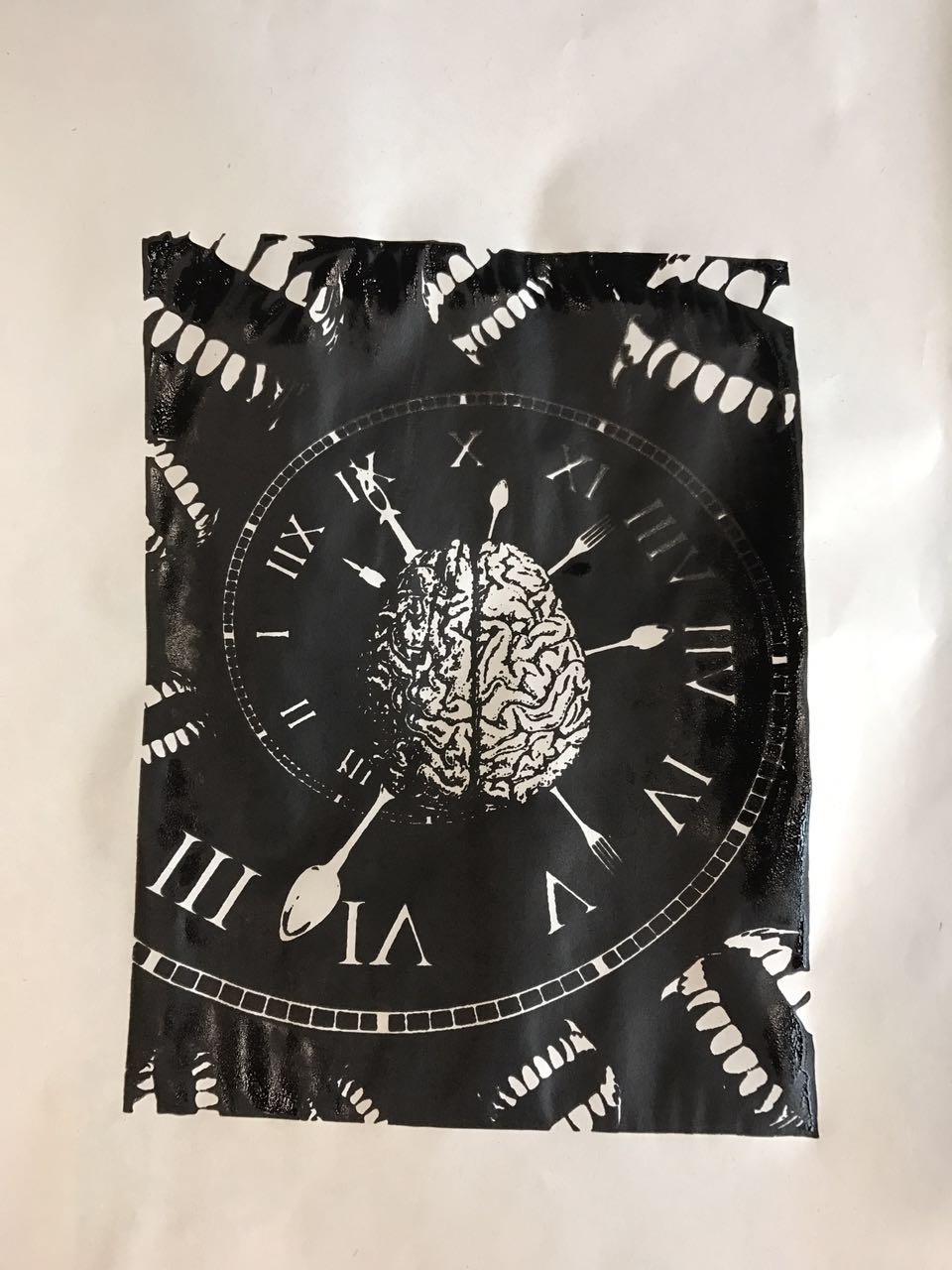
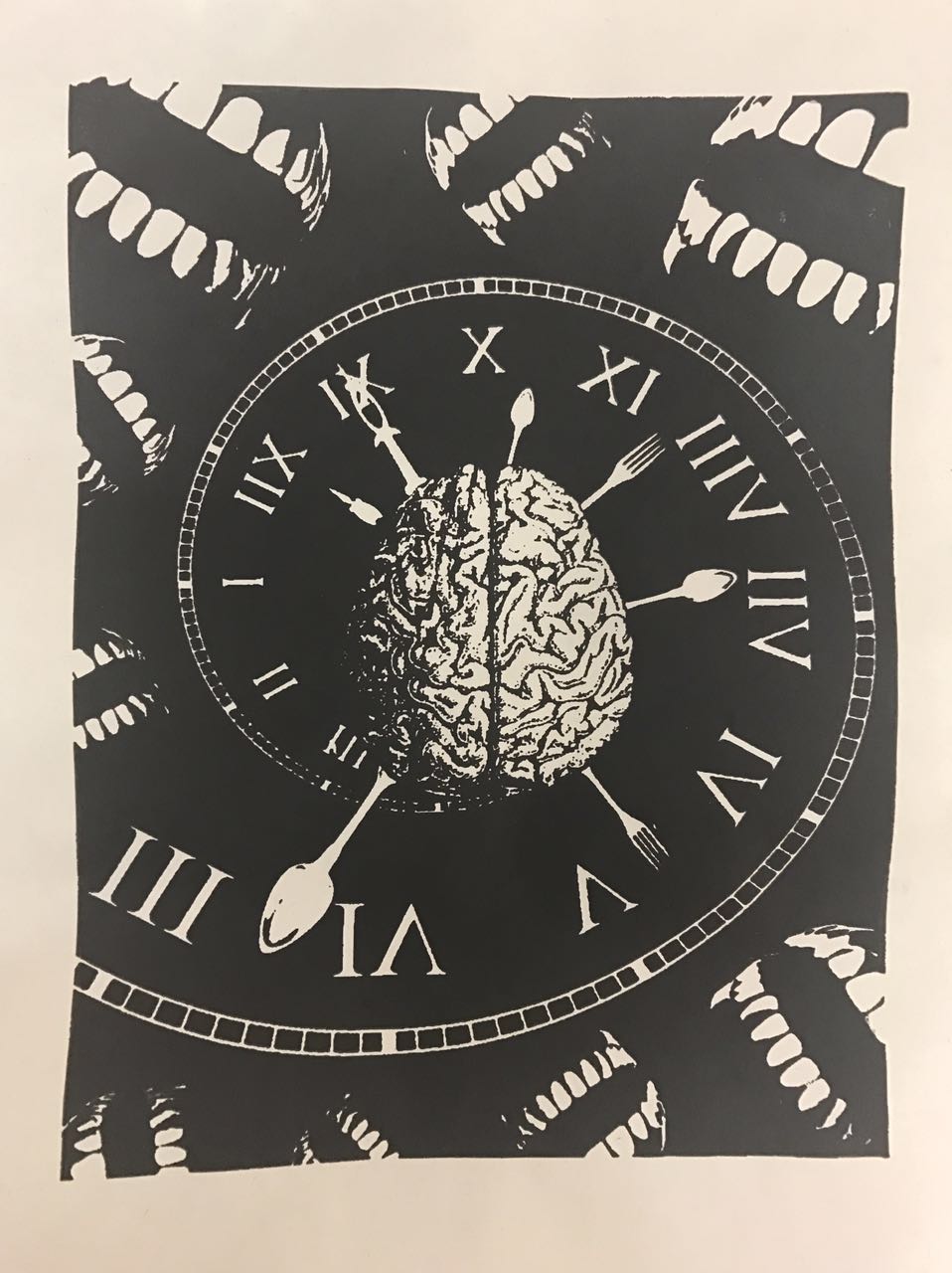
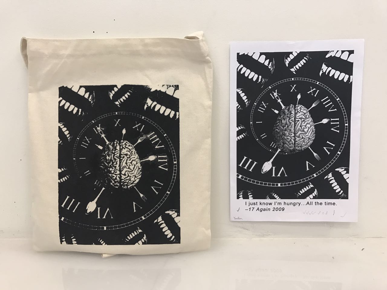
Quote 4: “I just know I’m hungry…All the time.” – 17 again 2009
- KNOW: brain
- HUNGRY: mouth, teeth, stomach, plate, spoon and fork, food, snacks
- TIME: clock, hourglass, sun and moon
I used a brain to symbolise the keyword ‘know‘, a spiral clock to symbolise ‘time‘ which also created a dynamic movement in this composition, and mouths to symbolise ‘hungry‘. In addition, I used spoons and forks to represent the second hand and minute hand of the clock to emphasise ‘hungry all the time‘. I placed the spiral clock behind the brain to show that ‘my mind is being trapped into the feeling of hungry’, and I used negative space to show that ‘my mind is going deeper and deeper into this feeling’.
This is the first draft that I created: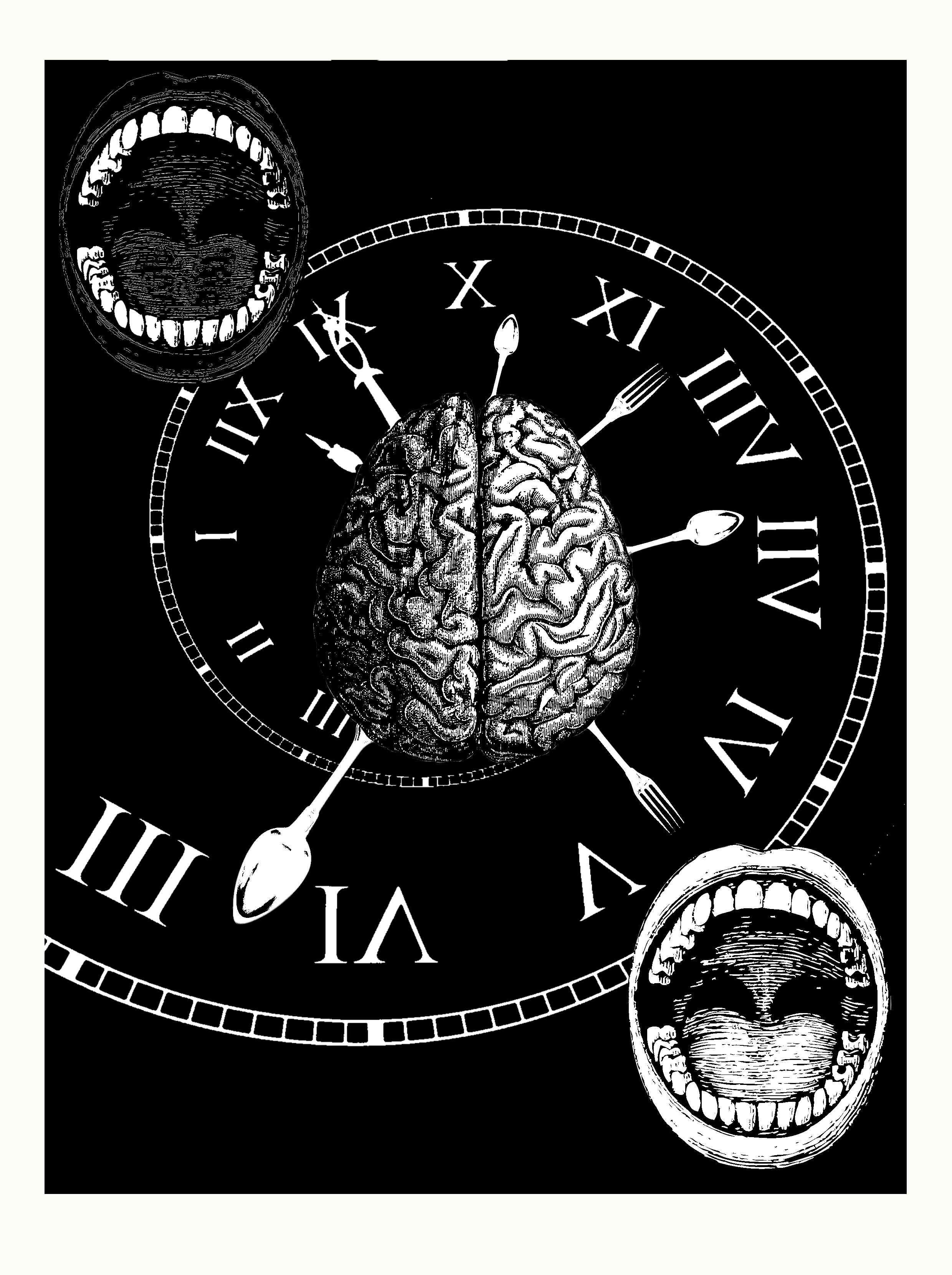 Put the mouths in a diagonal arrangement to show that ‘hungry all the time’, from day to night.
The second draft: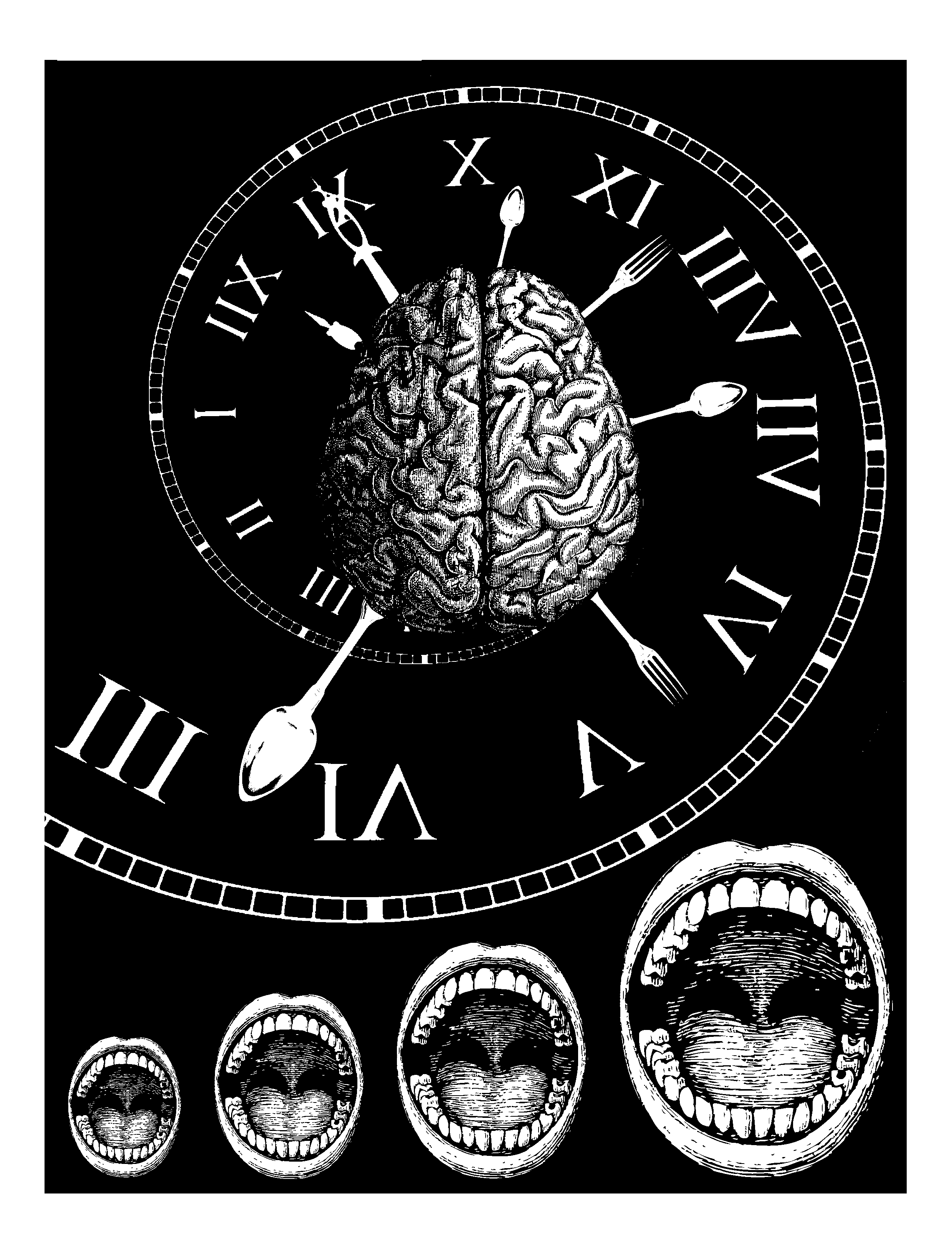
One difficulty I faced in this composition was the choice of the visual element for ‘hungry’. In order to emphasise on the keyword of ‘hungry’, I decided to use teeth in the end. I duplicated the teeth pattern and adjusted them in different sizes and orientation, then placed them randomly around the edges of this composition.
Principle of design: negative space, scale, dynamic movement, repetition
Final Design:
This is the composition that I chose to print on my tote bag.
Part 2-Silkscreen
Print the chosen composition on 2 pieces of transparent sheets.
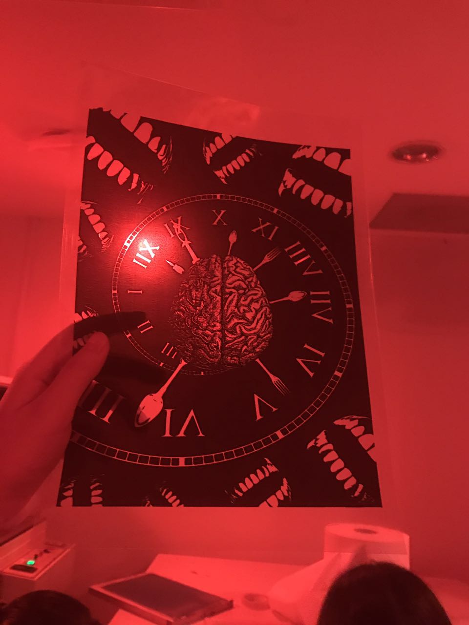
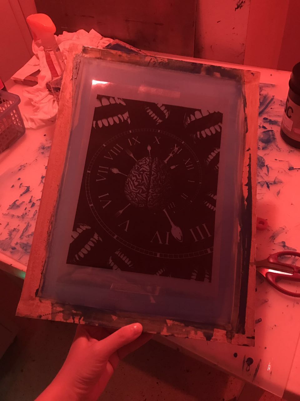
Coat the silkscreen with P5C blue emulsion, and put it into the dryer. When the screen is completely dry, paste the transparency on it.

Put it into the exposing machine for 18 seconds…..sorry for the blurred image.
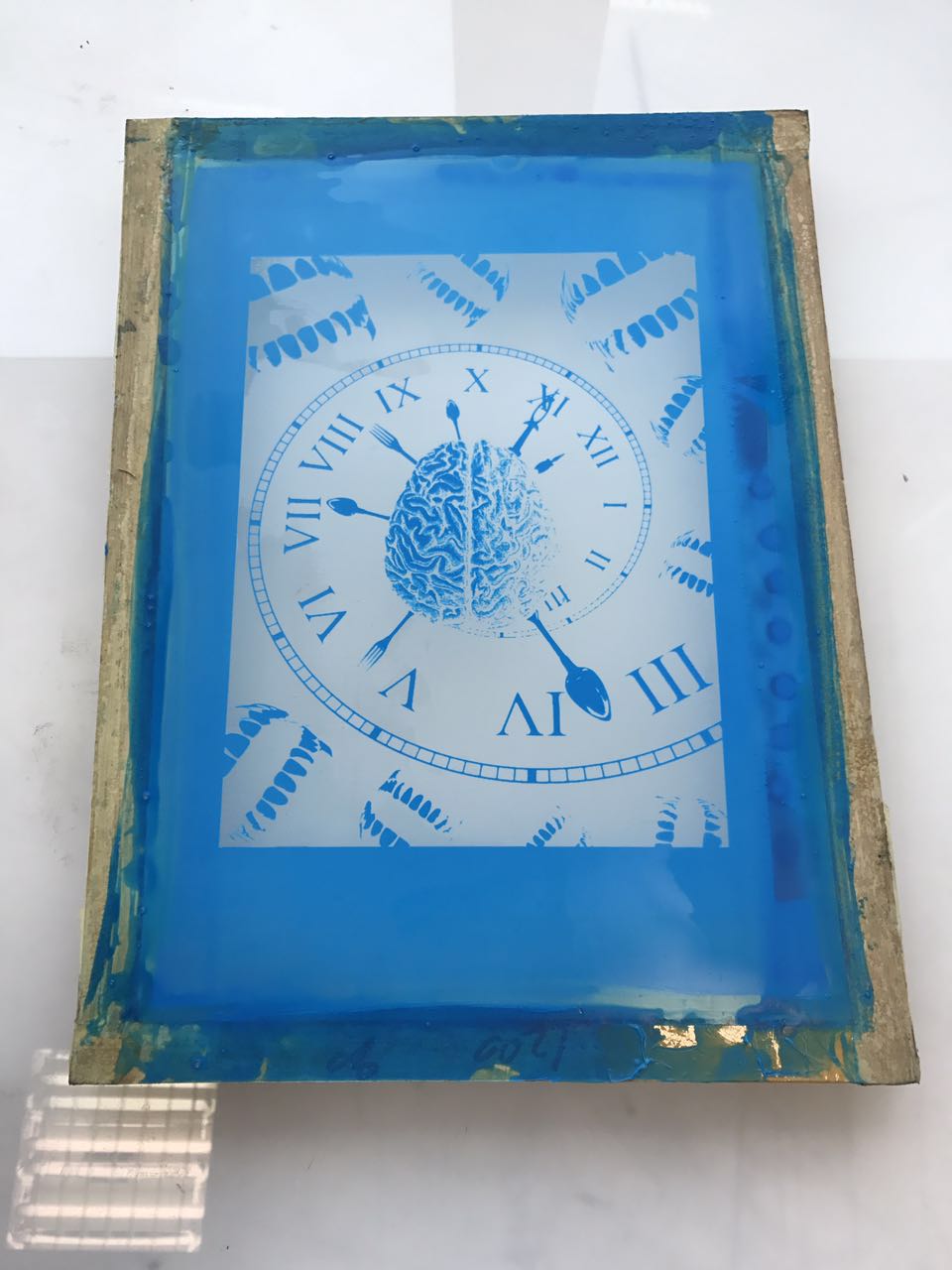
Wash off the unexposed parts. !TADA! My design shows up! Then, mask the edges of the screen with tape.
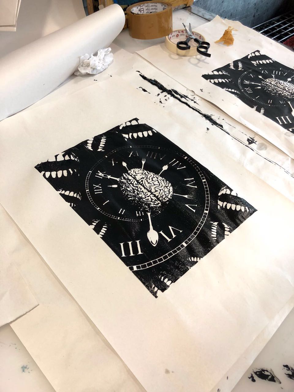
Here comes the printing part, which is one of the difficulties that I faced during this project.

Before printing on the tote bag, I did the test printing on newsprint.
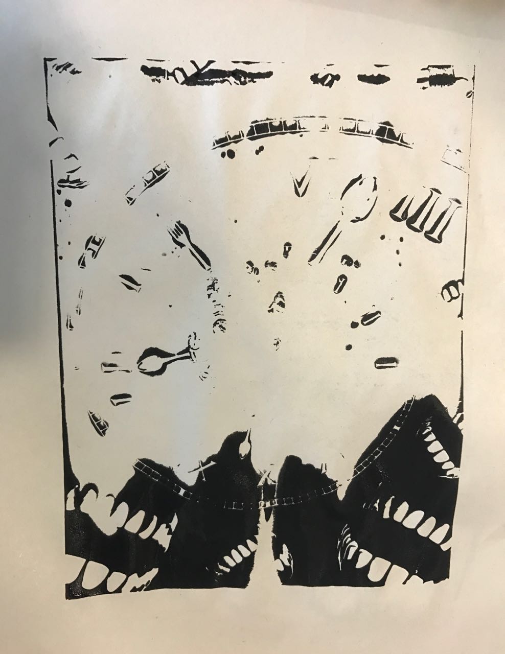
Uh ……………… what happened ………………….
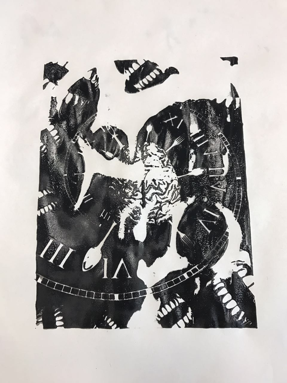
Because there were a lot of empty spaces in my composition so that I had to put more black ink on it. Thank you for the help of my lovely friends, it was clear to see that the results became better and better.
Finally! I am glad that I got a perfect printing in the end 🙂
Part 3-Final Submission

Part 4-Reflection
I really enjoyed this project because I learned some new skills in Photoshop and had a fun in the process of silkscreen. I think the most difficult part of this project was the choice of visual elements, and how to compose them in an interesting way by using different principles of design. It was hard, but it was a good experience for me to practice and expand my design thinking and skills.