Modular design, or ‘modularity in design’,is a design approach that creates things out of independent parts with standard interfaces, the smaller parts called modules or skids, that can be independently created and then used in different systems. This allows designs to be customized, upgraded, repaired and for parts to be reused. A well-known example of module design is LEGO plastic construction toys, the blocks are designed to fit together.
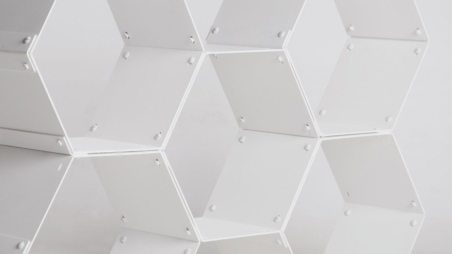
In nature, modularity refers to the construction of a cellular organism by joining together standardized units to form larger compositions, for example, the hexagonal cells in a honeycomb.
In an effort to help address the decline of coral reefs around the world, Australian designer Alex Goad of Reef Design Lab has created MARS, a LEGO-inspired modular system for building artificial reefs.
In Product
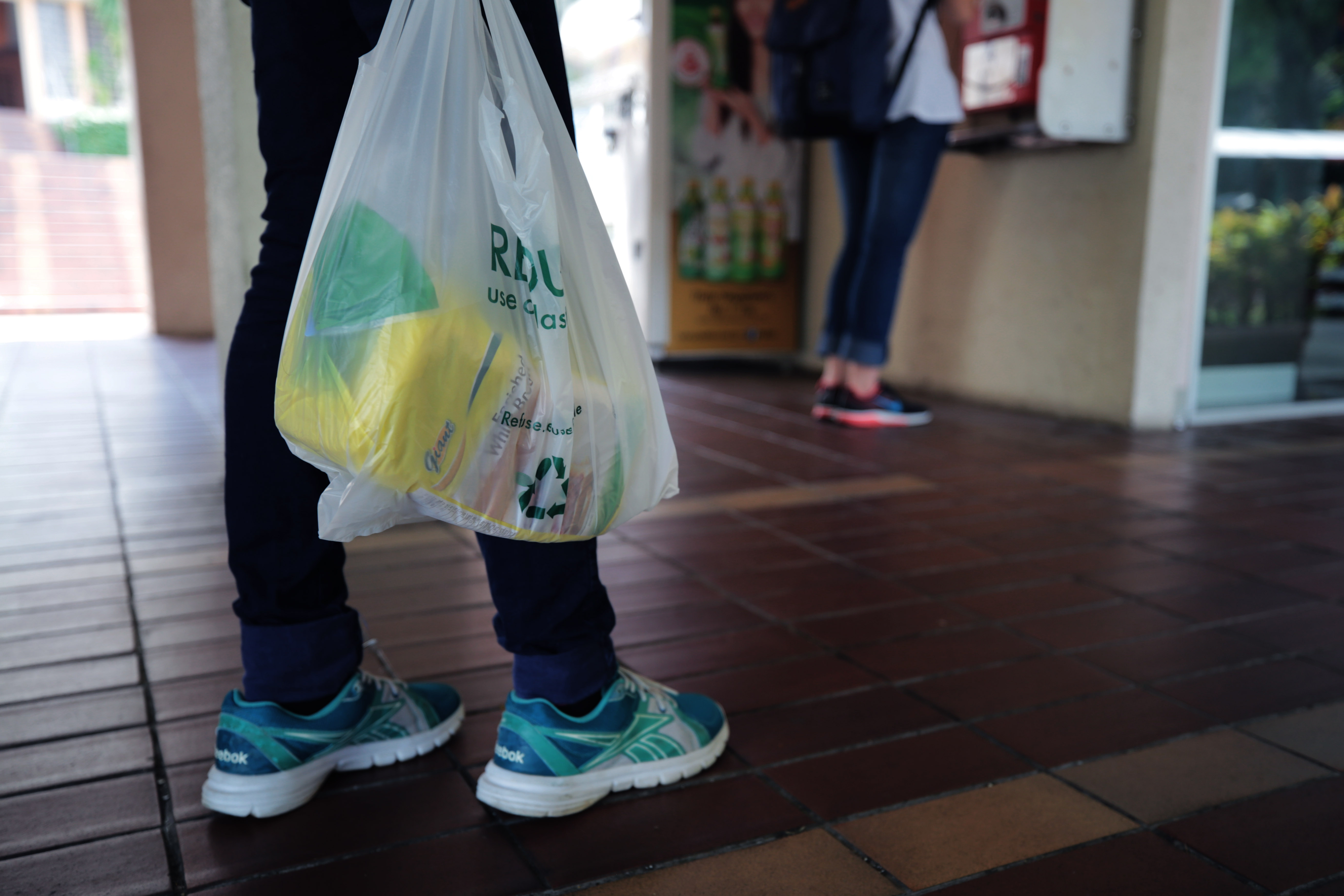
Modular products are products composed of interchangeable components, that may allow customers to customize, repair and reuse products. By being able to add on to and customize products, consumers now have the ability to better control purchasing decisions and personalize every aspect of their lives. The following are some examples of modular products.
Another simple example is a sectional couch, which composed of multiple small, individual units. A sectional couch can be rearranged in a variety of ways, depending on the space and user’s preferences.
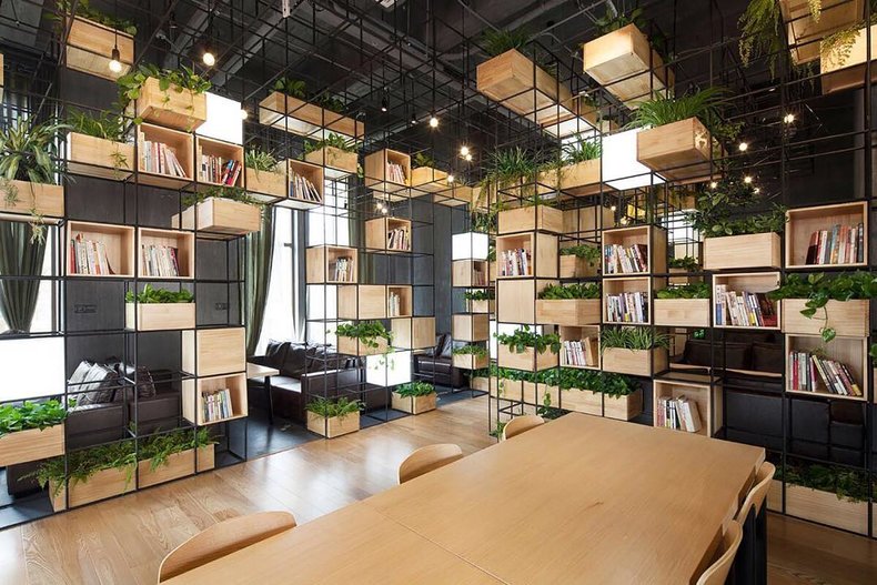
The modular industry includes two distinct types of modular buildings, temporary or relocatable modular and permanent modular.
Temporarymodular buildings are structures that meet interim needs and come in all shapes and sizes. they are capable of being relocated and repurposed. For example, Job site trailers, temporary classrooms, and temporary offices.
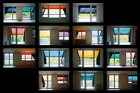
This stunning seaside structure is a series of honeycomb modular apartments with its dynamic array of brightly shaded cells. The complex was constructed as a low-income residence for young families and couples in the industrial district of Izola on the Slovenian coast. It makes smart use of solar shading and natural ventilation to regulate its interiors all year-round.
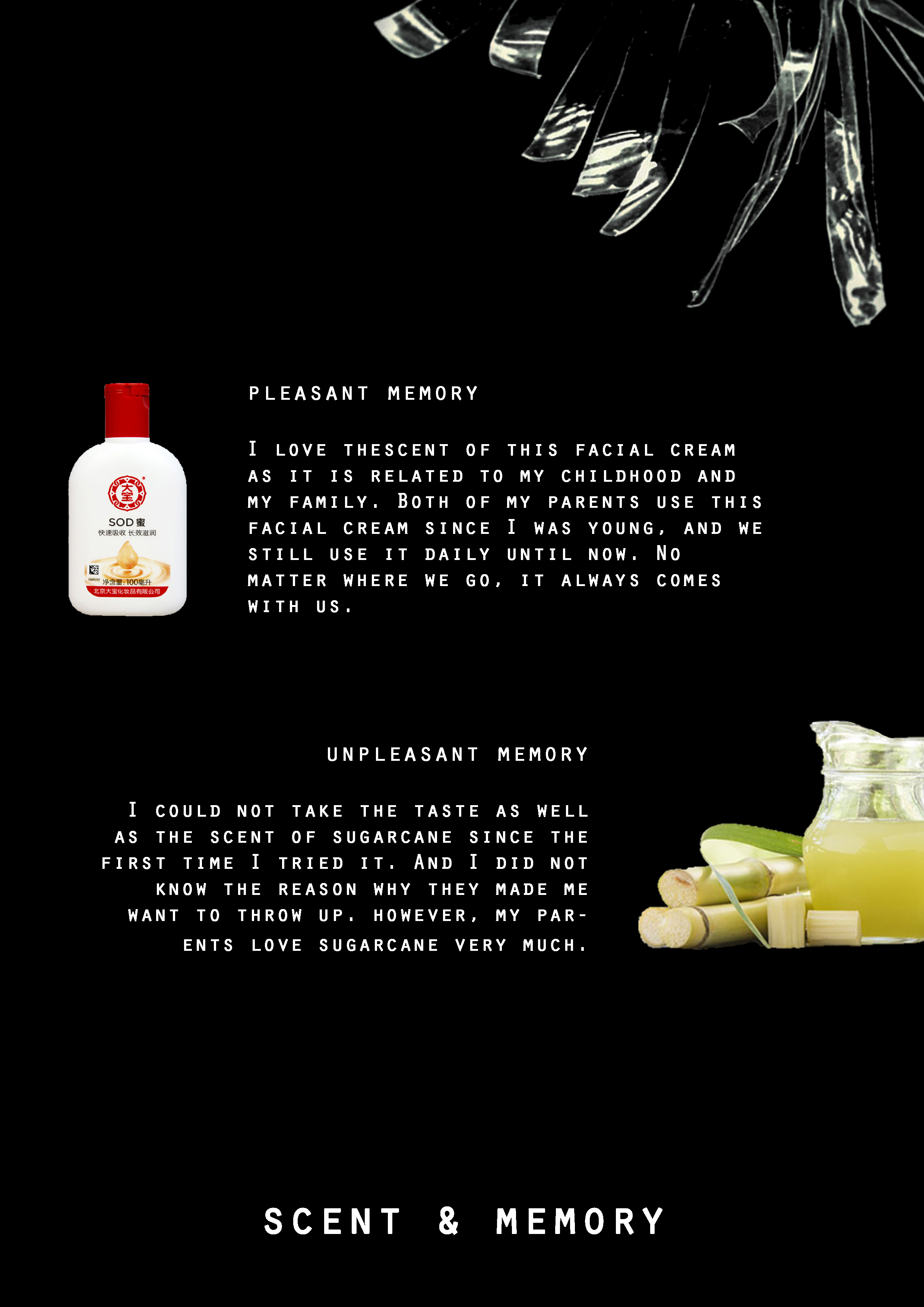
-Greek goddess of memory, who was considered one of the most powerful goddesses of her time.
A short film to accompany Daphne Guinness’s perfume beautifully explored the visuals of scent.
“I wanted to explore how I perceive scent visually,” says Daphne,
“scent is directly related to memory”
“It is something of a sensory path, evoking snapshots of one’s past as you smell it. It has the power to transport you from the room in which you stand, to a place buried within the depths of your memory. I wanted to illustrate that scent can take you on a journey.”
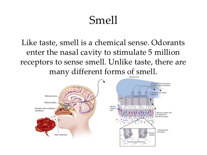
Smell
Everyone has a unique “smell print”. There are no two people smell things the same way because each of us has scent blind spots, which means specific odours we can’t pick up on. For example, that room spray smells like violets to you but like herbs to your friend. You can both be right. Good smells make people happier. Smelling a fragrance you perceive as pleasant has a positive effect on the mind.
Our scent cells are renewed every 28 days, so every four weeks we can get a new “nose”, but our sense of smell weakens with ageing. A woman’s nose is hypersensitive when she is pregnant, so pregnant women’s weird food cravings may be caused by their heightened sense of smell.
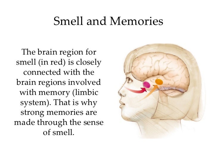
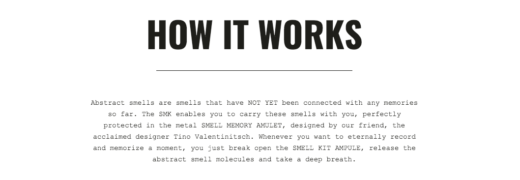
Smell and MemoriesSmells get routed through our olfactory bulb, which is the smell-analyzing region in our brain, and it is closely connected to our amygdala and hippocampus, brain regions that handle the memory and emotion.
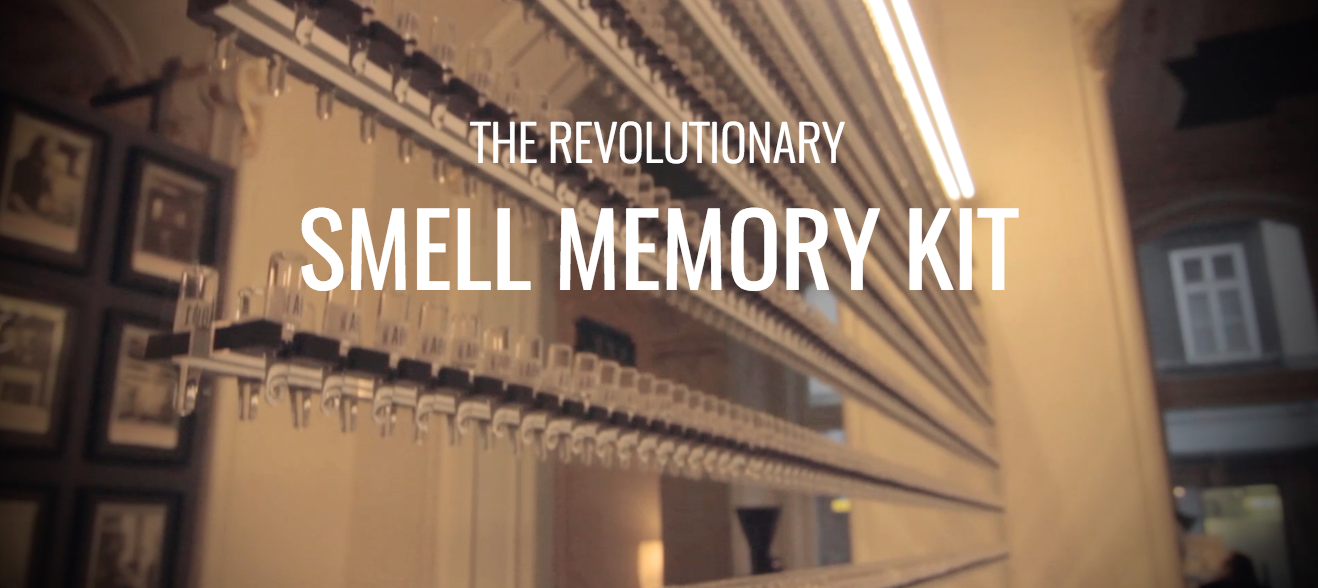
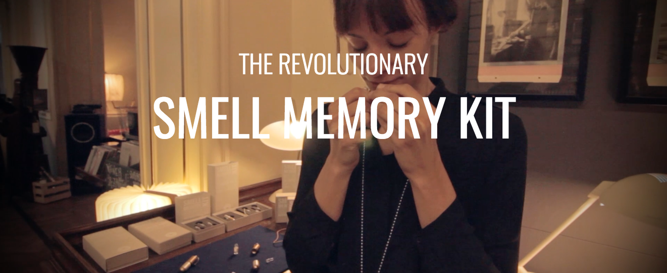
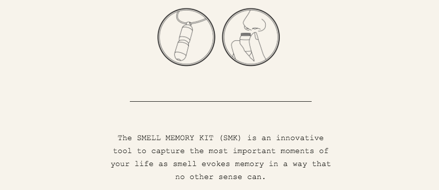
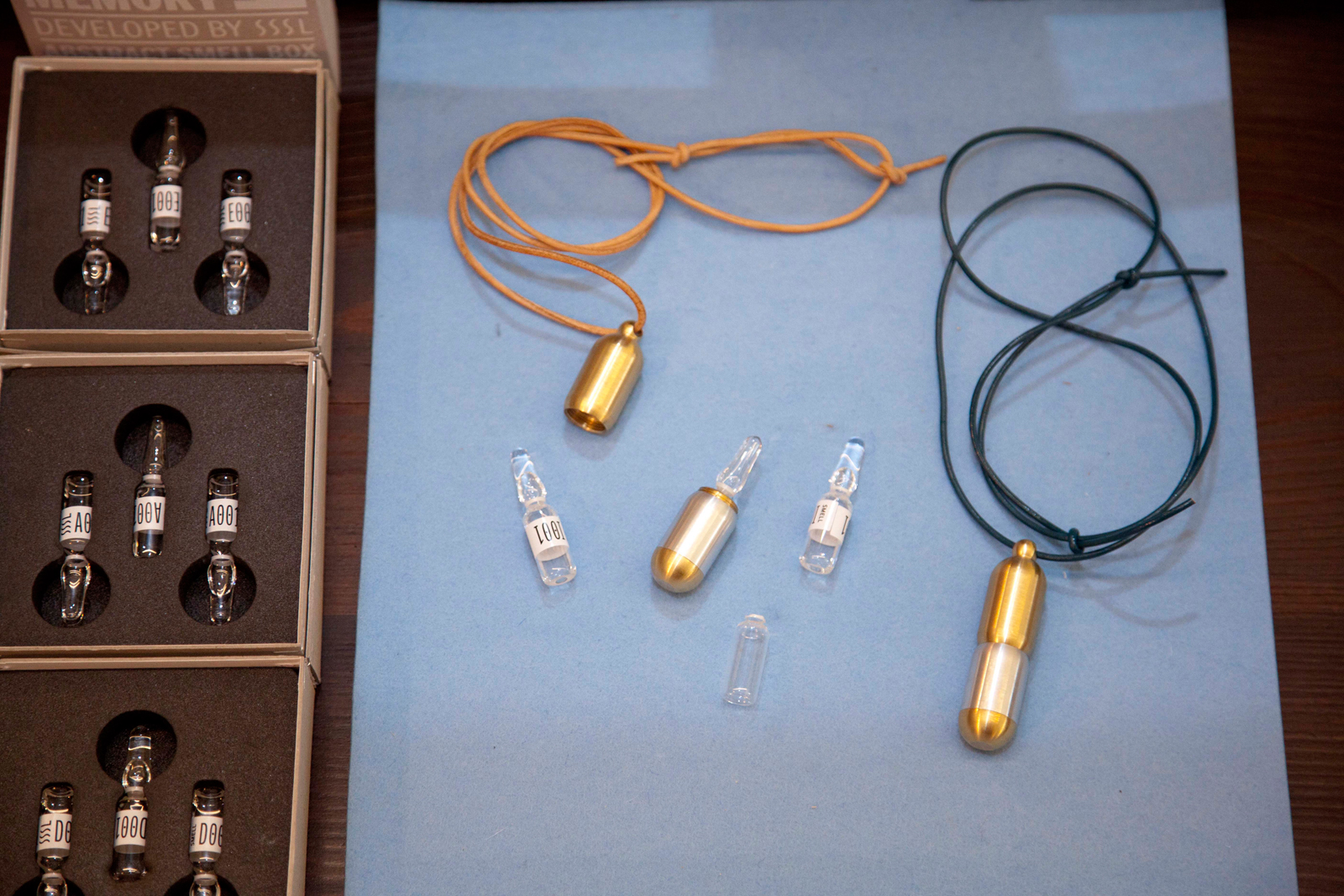
Smell Memory Kit (SMK)
http://smellmemorykit.supersense.com/
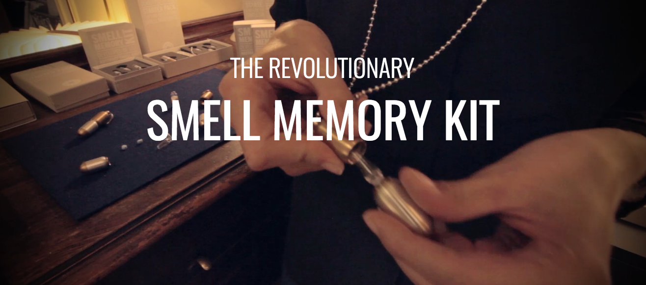
The SMK has been invented and developed by the famous smell scientist Sissel Tolaas (SSSL) in close cooperation with SUPERSENSE. Sissel Tolaas started her work in the 1990s, and she has spent seven years collecting 7,000 scents around the world. Now, her work is helping people make memories. The concept behind the SMK:
“WE THINK it is time to start creating the tools for the most effective and most emotional snapshots ever. Capturing and preserving your dearest and most important memories in a much deeper way than ever before, using your sense of smell.”
http://smellmemorykit.supersense.com/
The newly opened Smell Memory Lab at the SUPERSENSE palace in Vienna.
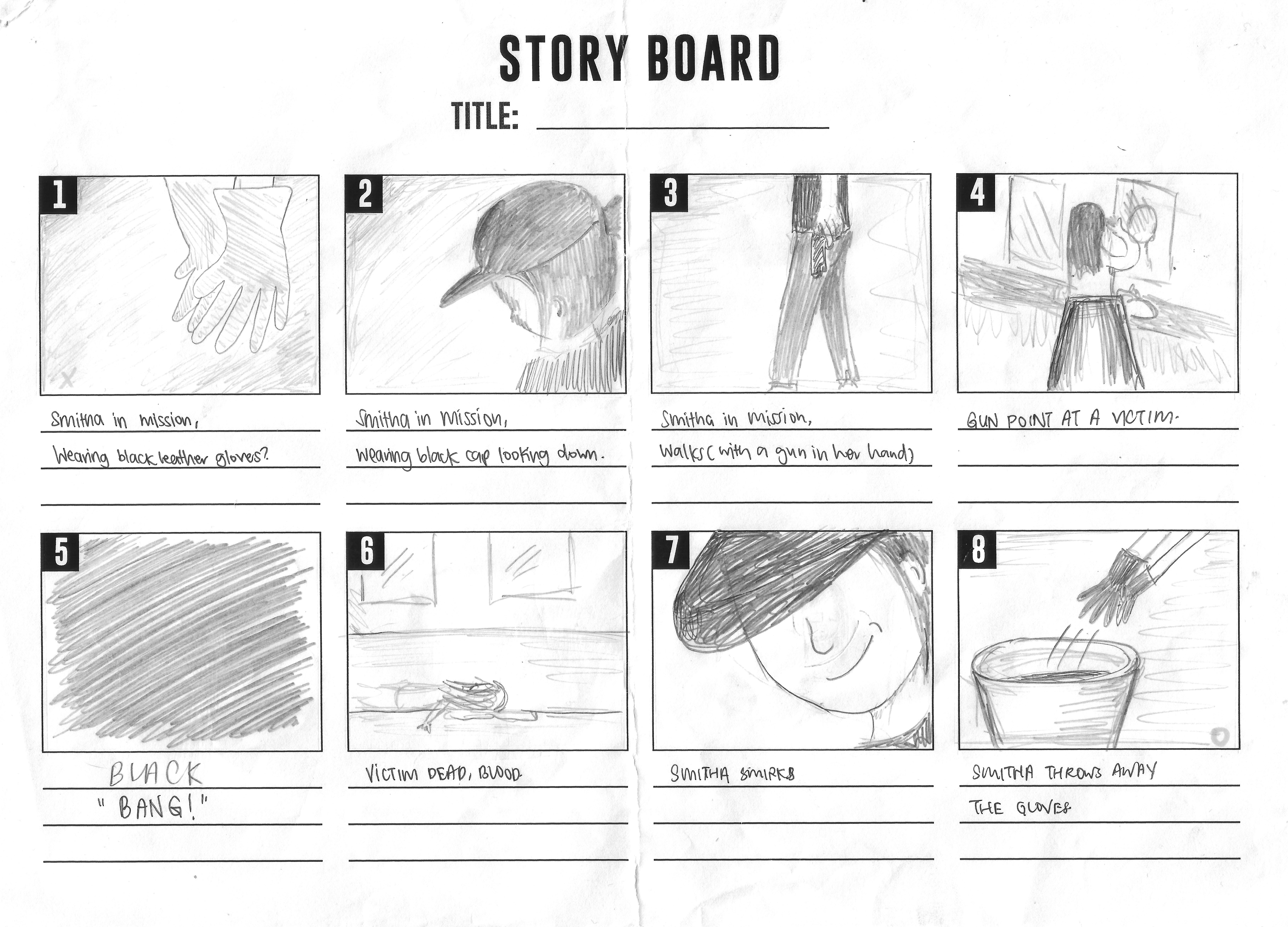
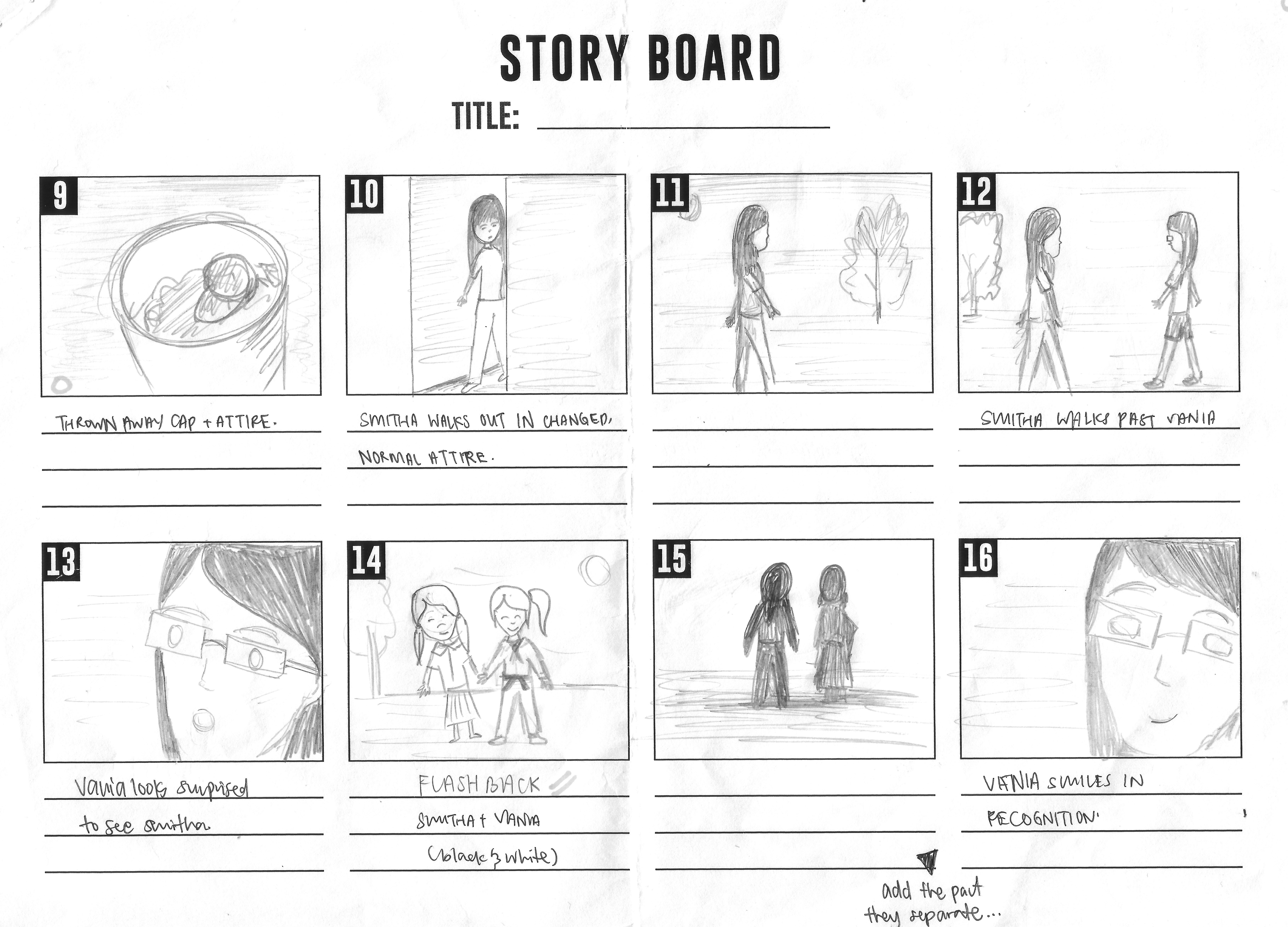
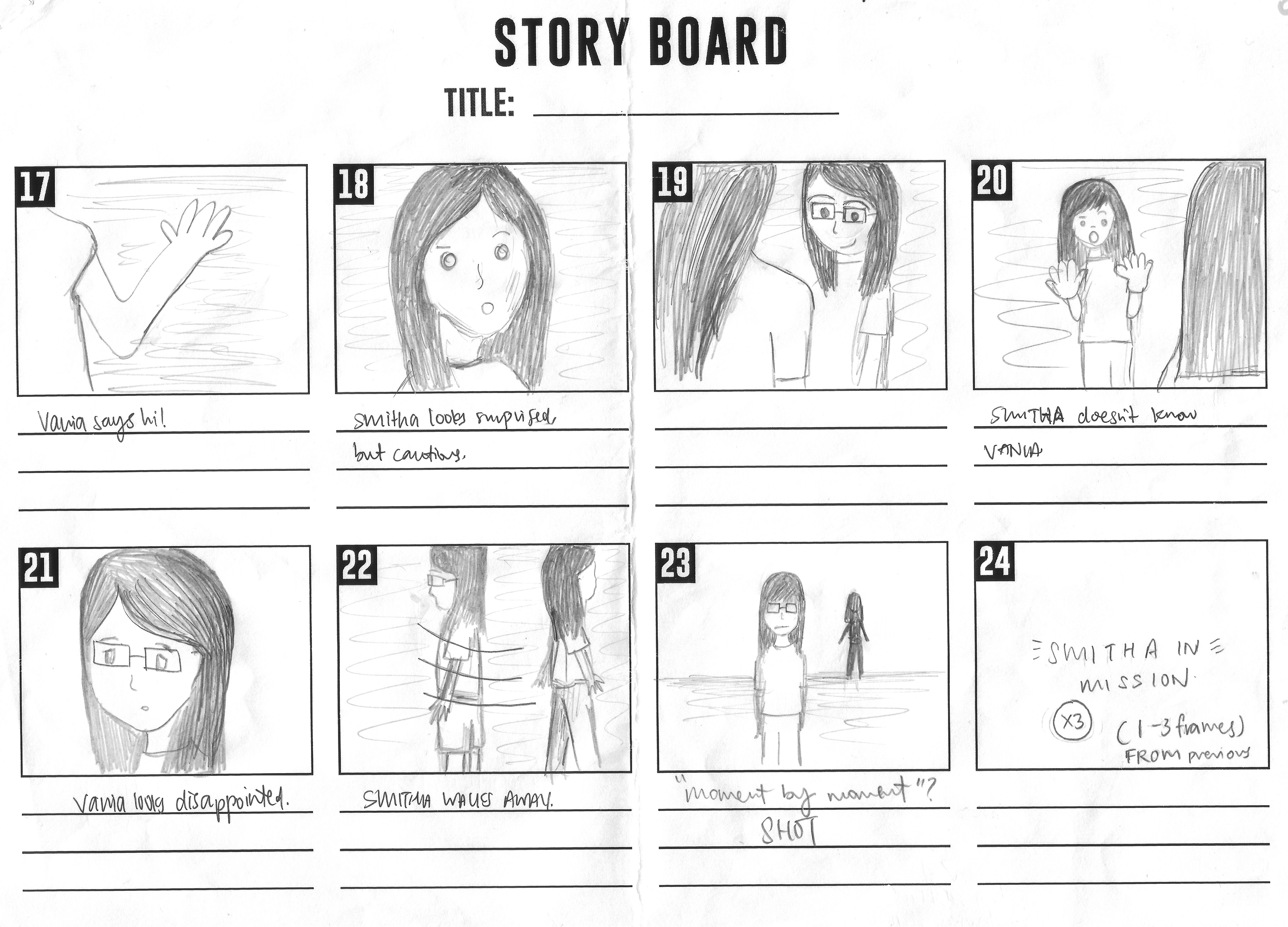
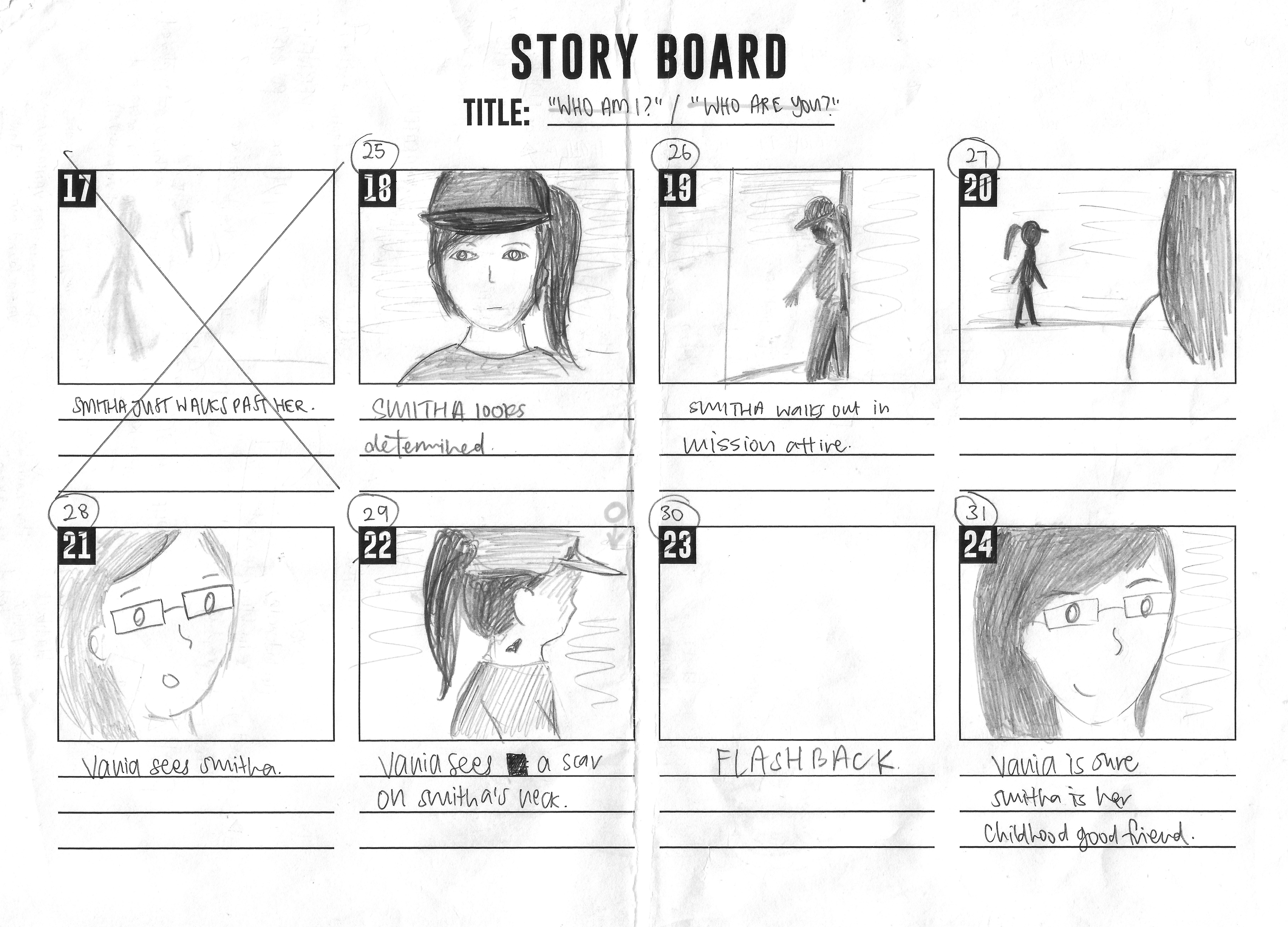
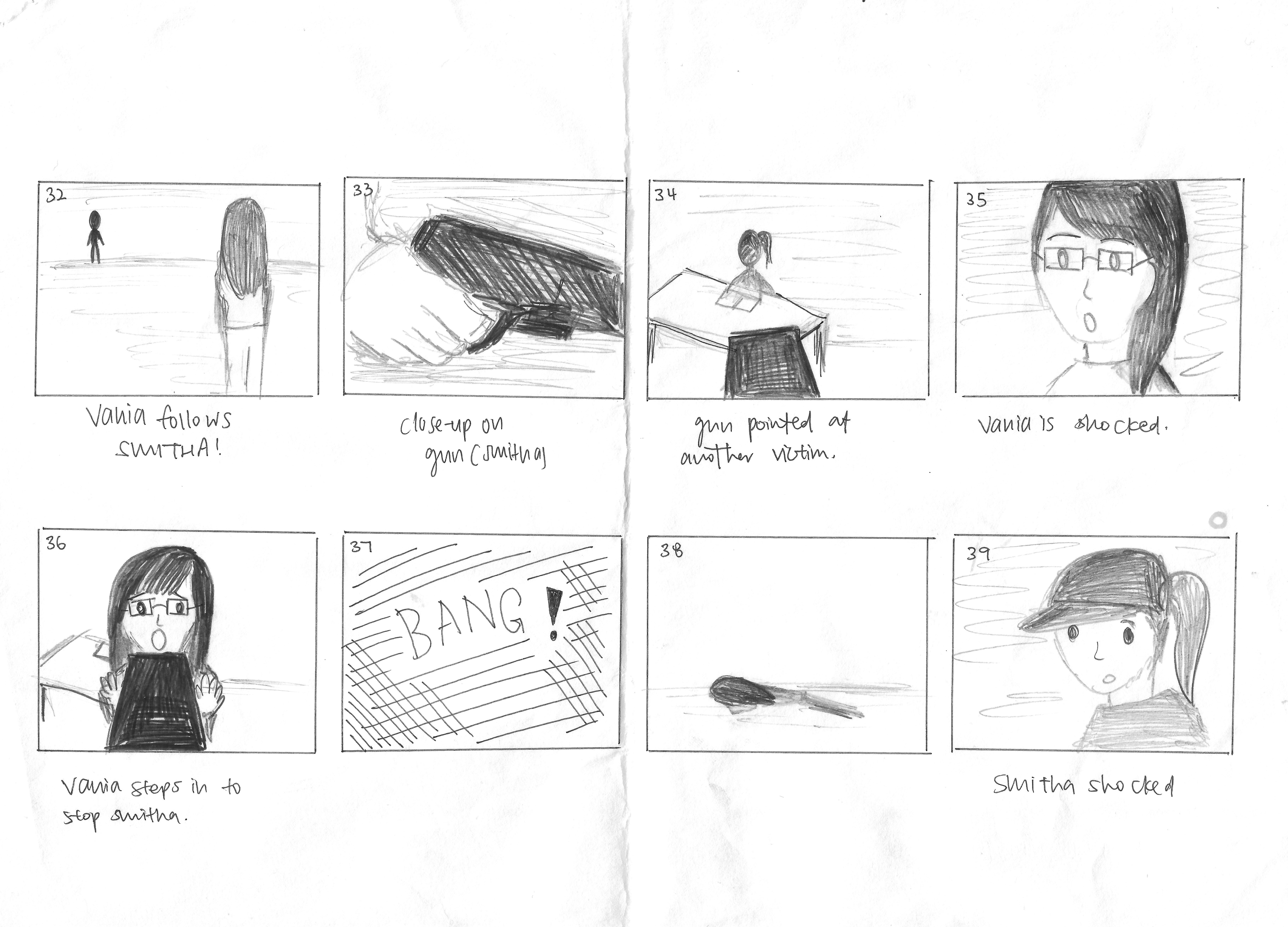
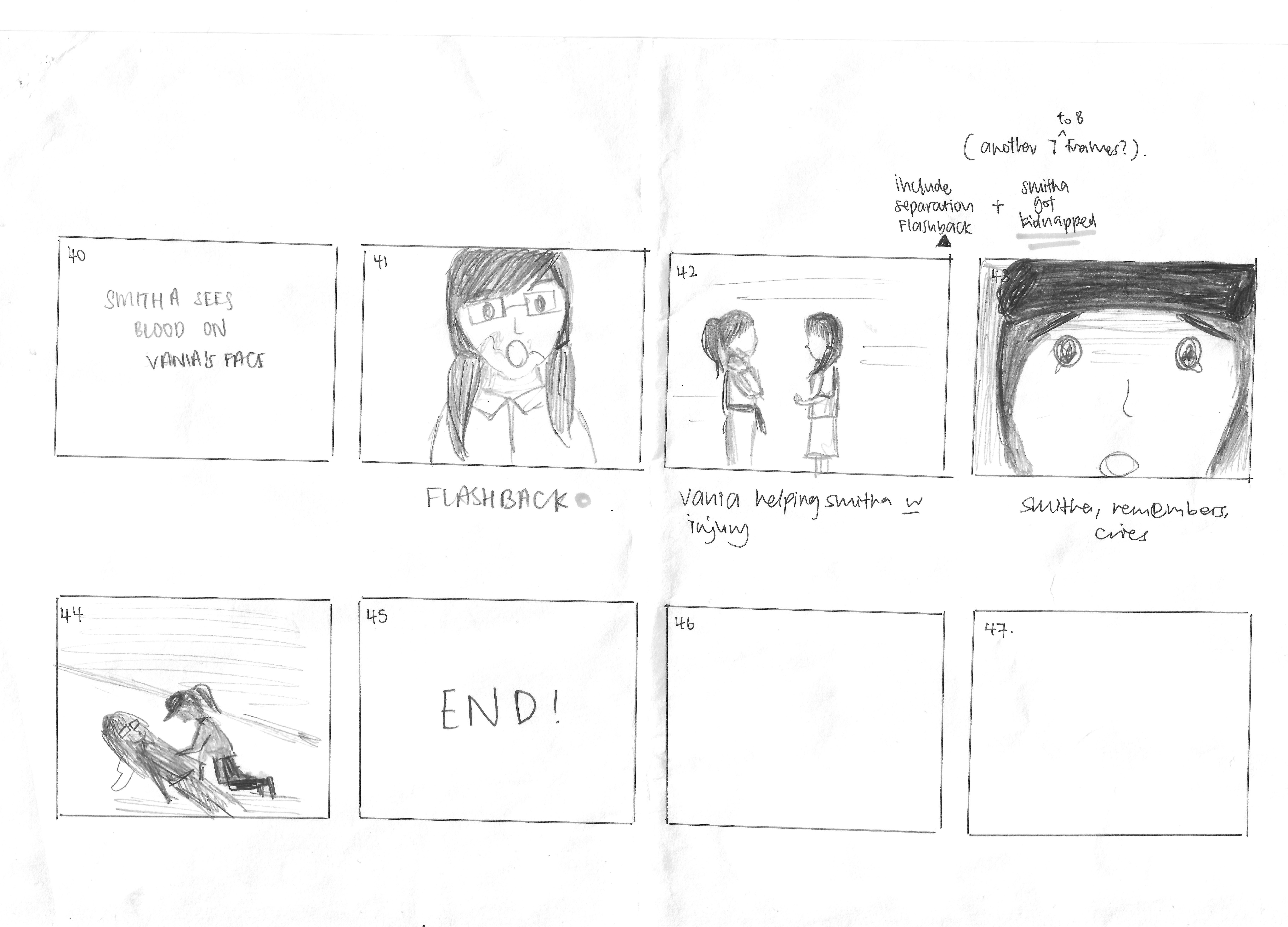
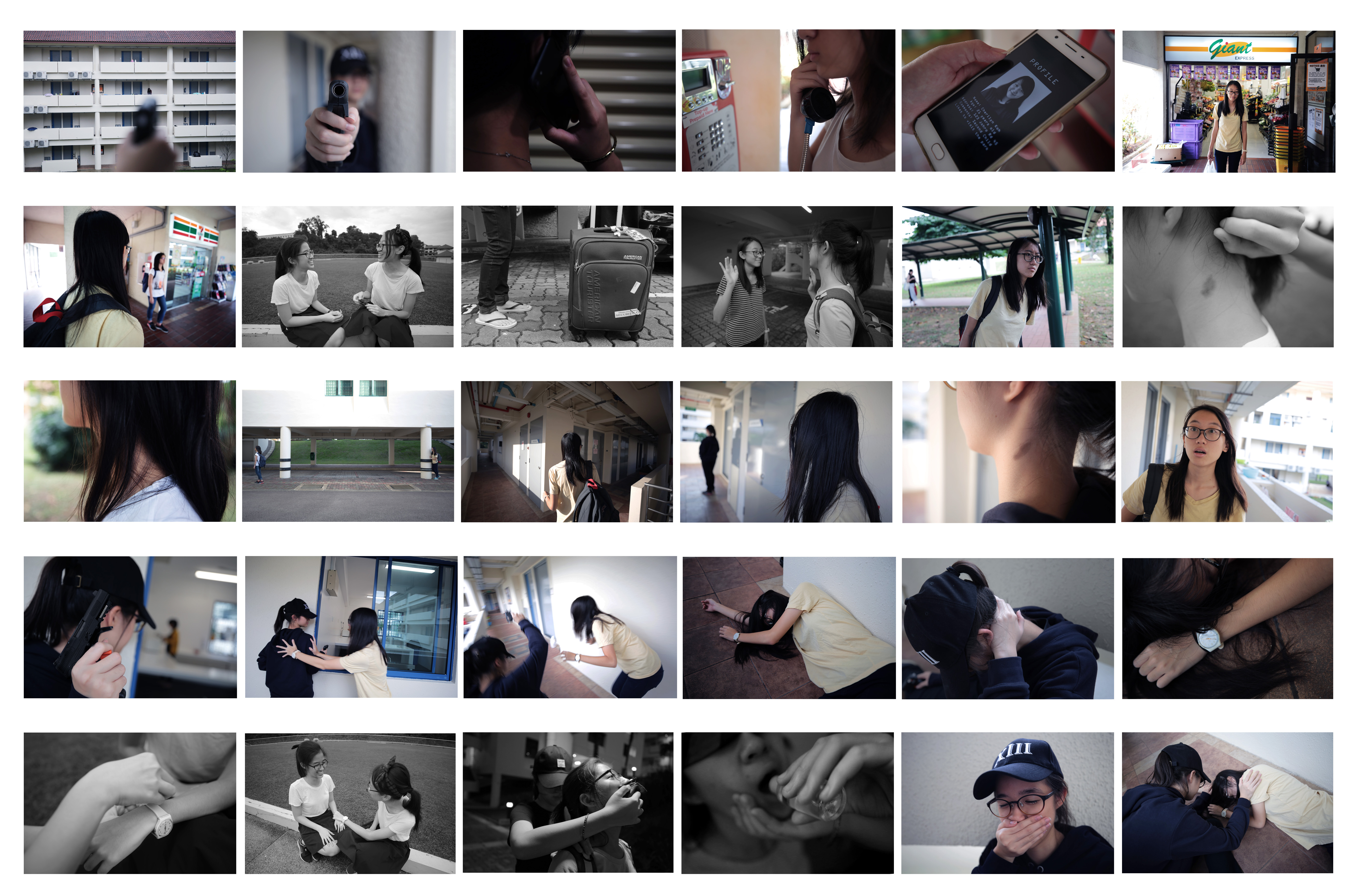
This is a story about Vania and her long-lost friend Smita. After high school, they separated because Smita decided to fly to London for university study. However, when they accidentally met each other again, things changed……
-Genre
Thriller&Mystery
-Storyboard
We tried to generate the storyline by following the 3 Act Structure. And Special thanks to Christina for creating the storyboard.
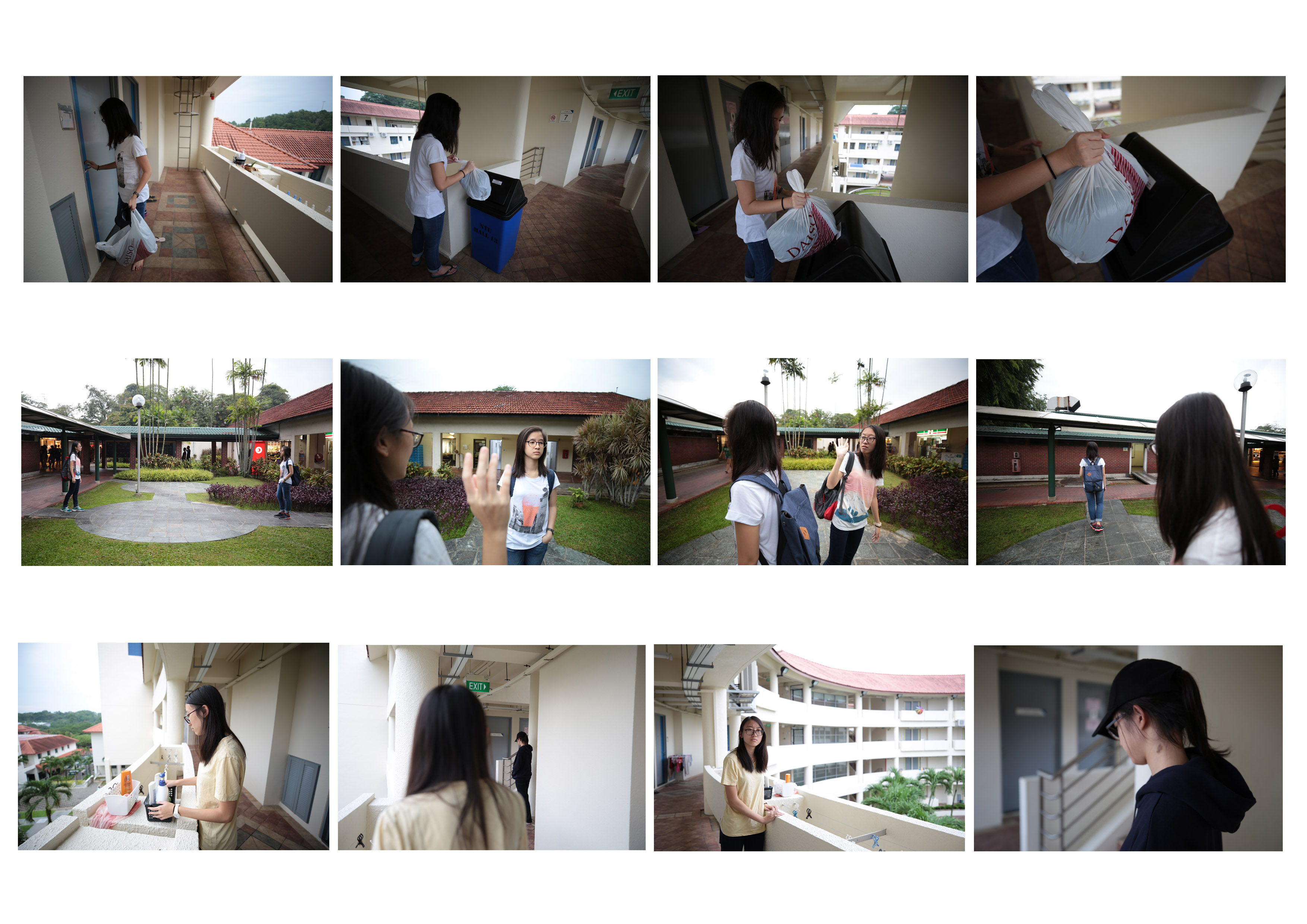
Task 1 – Sequencing Images
Production
-Process
We kept changing different locations, attires and props. And we had a lot of experimental shots to help us find out a better angle or a better movement to tell the story. The shooting process wasn’t that simple, but we did have a lot of fun! Special thanks to our talented actresses Esther and Vania!
-Reference:
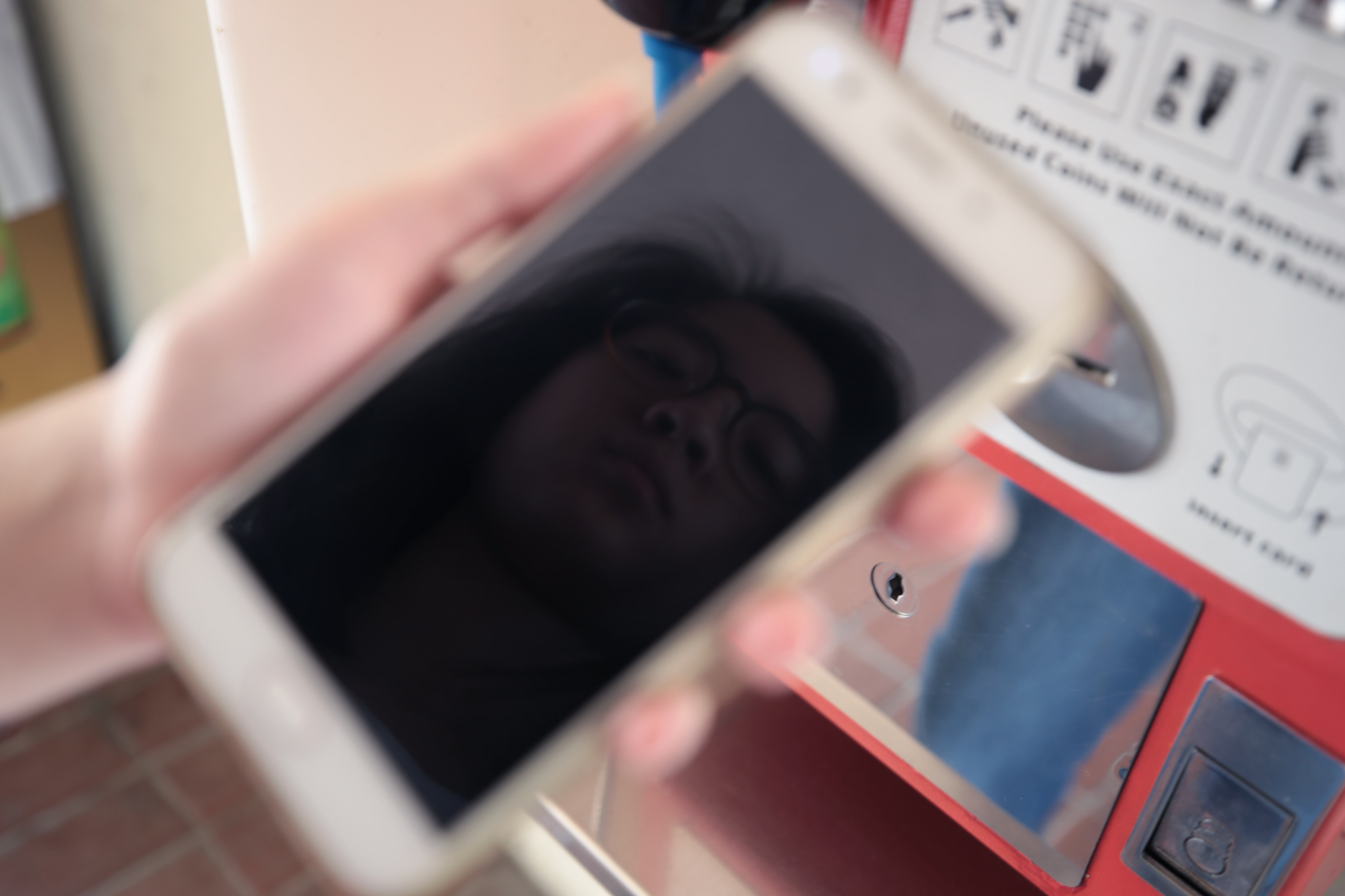
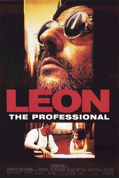
Leon-the Professional (1994), which is one of my favourites movies. I can watch it over and over again, and never get bored. It tells a story between a professional hitman Leon and a 12-year-old girl Mathilda.We can see the photo of the victim from the reflection of his sunglasses.
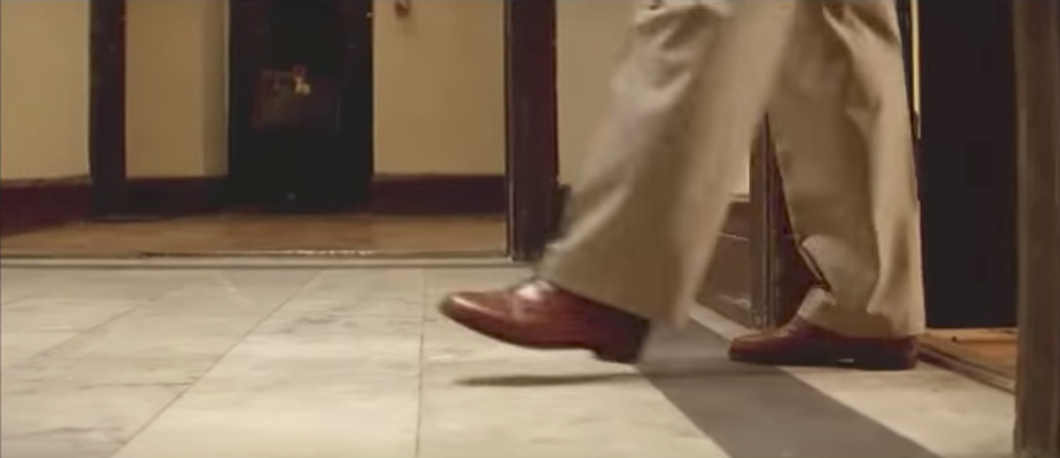
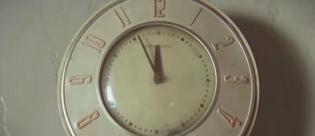
Focus on the shoes of the character; we can also see the position and distance between the room of Leon and the room of Matilda’s family. Close-up shot for the clock to show that something gonna happen.
We see the hand of the hitman first instead of seeing his face.
Rule of thirds
Some other techniques we used in our photos, such as
Two-point perspective/Medium shot
Long shot/Horizontal line
Diagonal line
We used colour images to show the present and B&W images to show the flashback; used close-up shots to show the details or convey the feeling and emotion of the character; used long shots to show the environment.
-Challenge
As there were too many coincidences and disconnections happened in the first storyline, after consultation, we tried to make some changes in our storyline to make the story more logical, clearer and smoother.
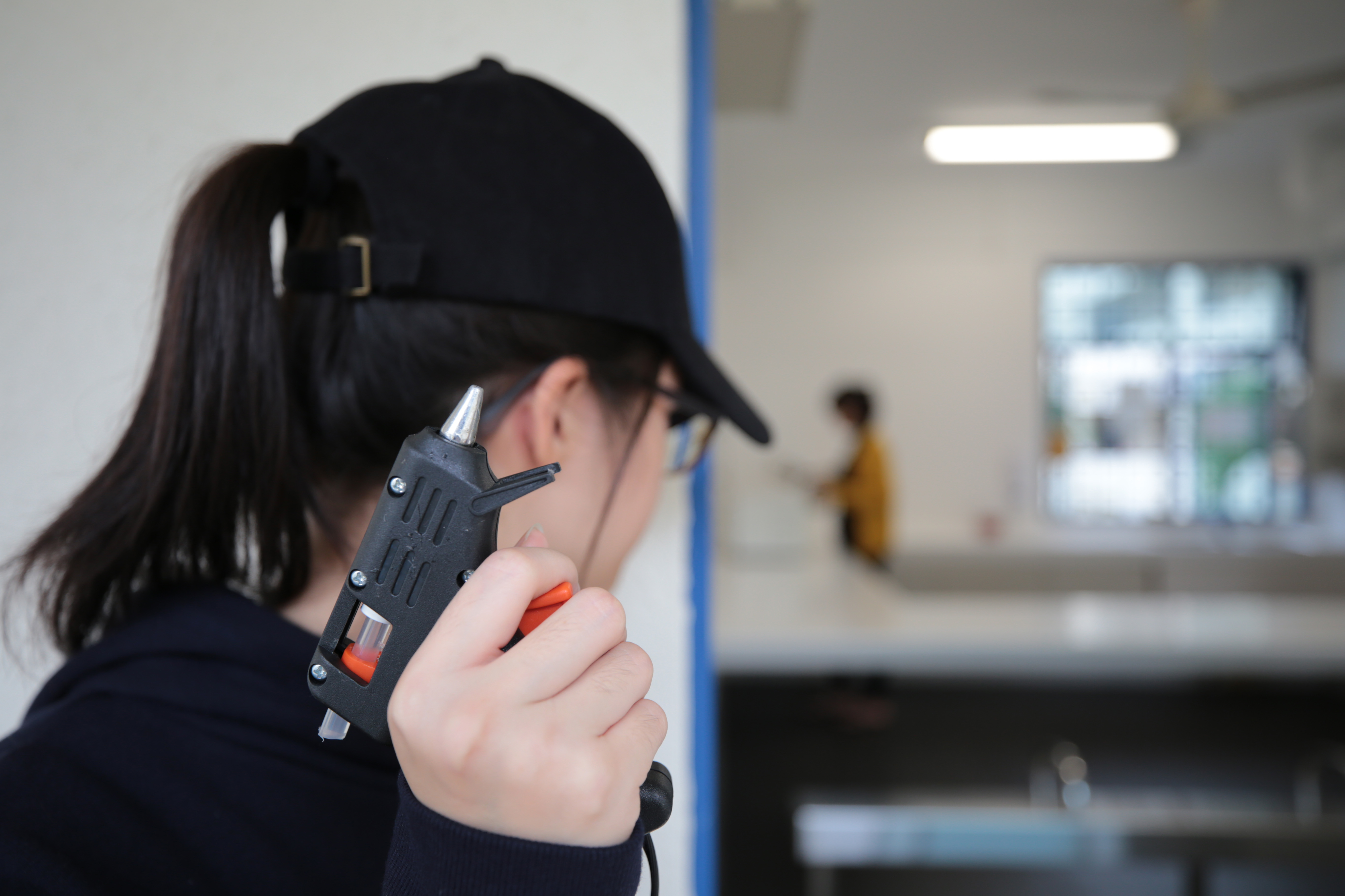
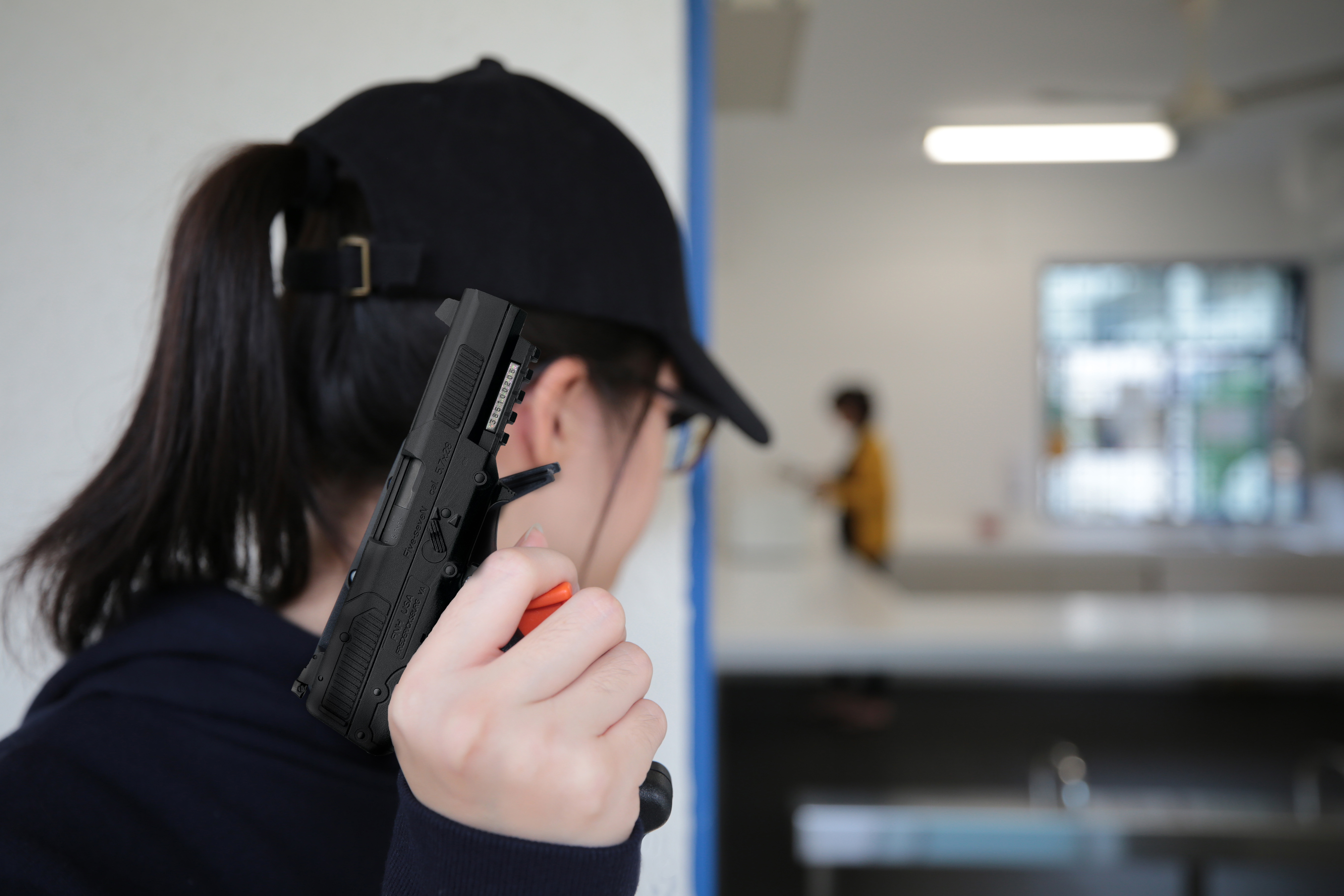
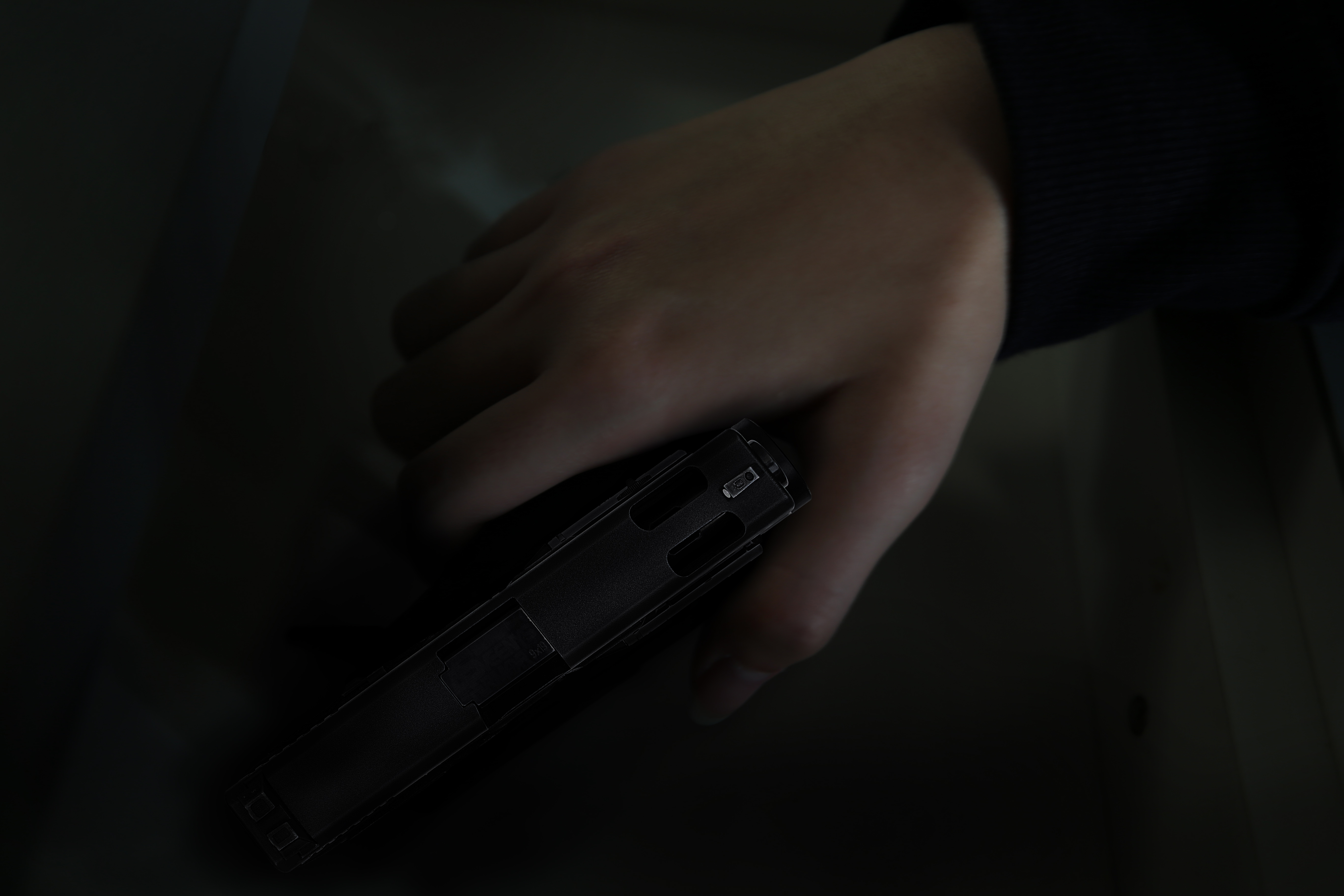
When we were not able to find a proper ‘gun’……
We borrowed a glue gun from Jingyi. 🙂
And photoshopped it into a real one!!! Special thanks to Christina for her magical work. 🙂
Problem solved!
-Photo Story
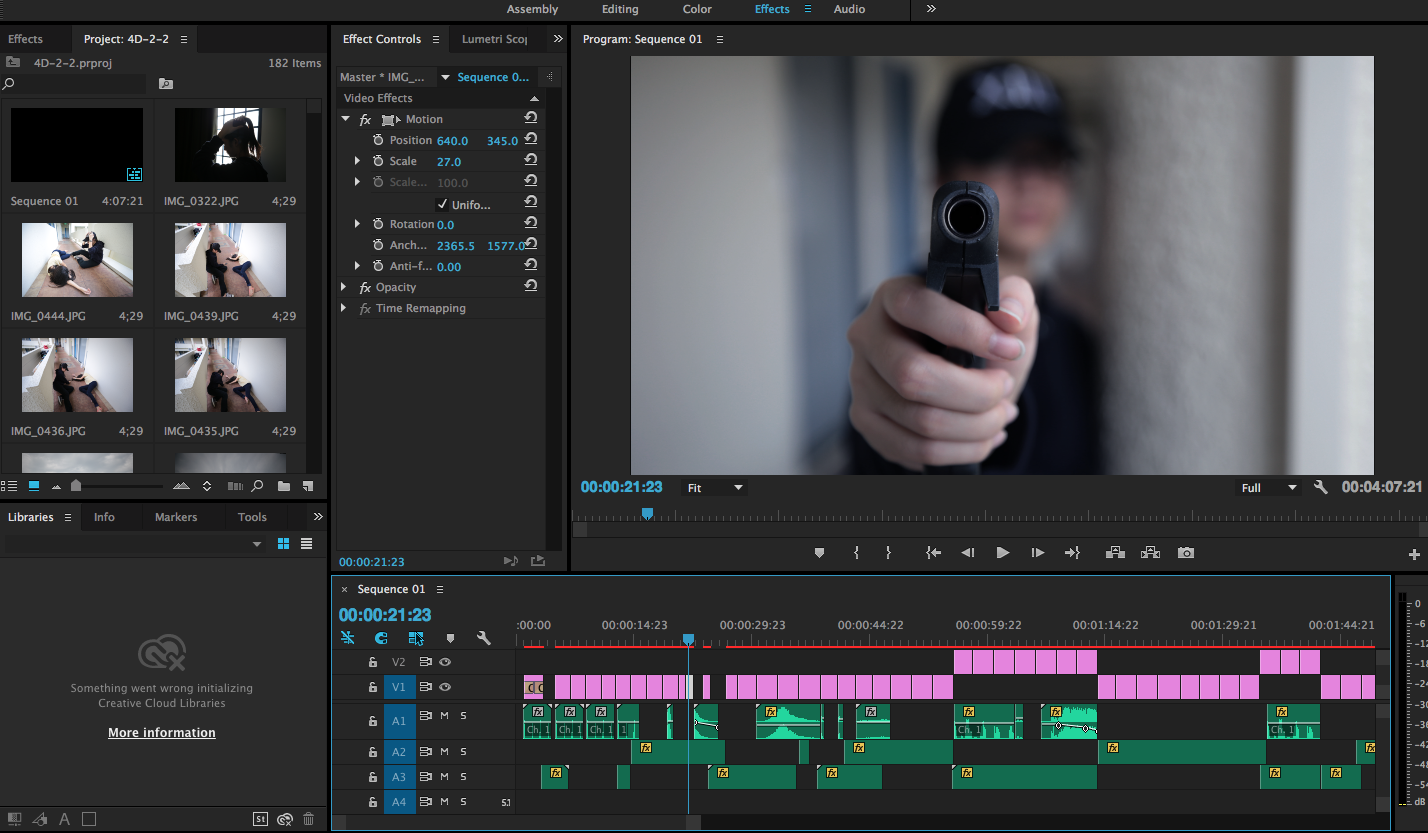
Task 2 – Sequencing Images with sound
-Process
-Sound
I have to say that the sound does help the video make sense. Sometimes, it can tell the story itself even without the image. The part of choosing and editing sound was another difficulty that I faced during this assignment. It took me a lot of time to find a right sound from the tons of resources online. For some specific scenes, we also recorded the sound ourselves.
-Reference:
I got inspiration from this movie clip of The Godfather that we watched in class, a sound of a passing train was thundering outside when Michael was in the toilet to represent the terrible thoughts were occurring in his mind and racing heart. Meanwhile, the train sound also helped to emphasise the tense atmosphere. The same sound returned when Michael sat back down at the table, and it became louder and louder, then, he pulled out the gun.
I used the church bell sound at both the beginning and ending part in my video to convey the audience an information that someone is dying, actually, there was no church bell in my video. In addition, I also used the clock sound effect at the beginning to show that Smita was on her mission, and when she got brainwashed, she was just like a cold-blooded killing machine.
-Video
It also took me a lot of time to choose photos and arrange them in a ‘right’ sequence because our story was a little bit complicated, . For the part of ending flashback, Smita got all her memory back at the moment she hit her head and saw the watch around Vania’s wrist. I decided to shorten the duration of each frame to show that everything was back together into her mind in a flash.
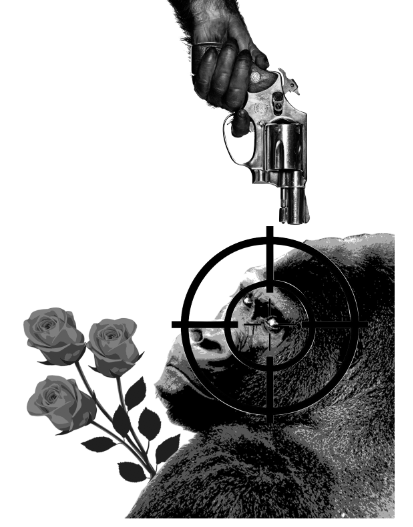
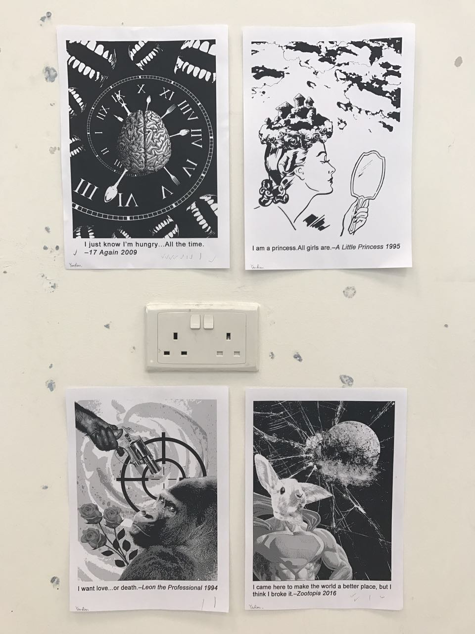
I used a bunch of roses to symbolise ‘love‘, a gun and a target icon to symbolise ‘death‘. When I was searching the visual elements online for the keyword ‘want‘, I suddenly changed my mind when I found the image of this gorilla, because I could see both craving and desperation in his eyes for love and death. I really love it. So I used this gorilla to symbolise ‘want’ instead of using a brain or grabbinghands. And there was a reason why I chose a gorilla over a human because humans are greedy and complicated, they always want more.
I tried to put the gun and the target along the 1/3 line by following the rule of thirds.
This is the second draft that I created.I shifted the position of the hand with the gun to the top left corner to create a diagonal arrangement. And it was also the farthest position from the gorilla in this composition, because I wanted to show that death is his last choice. But, he is not afraid of death, that is the reason why I put the gun towards the centre point of the target.
However, everything looked too dark except the target icon in this draft. I wanted to emphasise the words ‘love’ and ‘death’, so I inverted the colour of the target and changed another background of bloody rose.
Principle of design: diagonal arrangement, rule of thirds, contrast
Final Design:
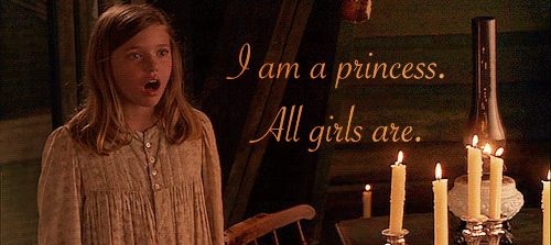
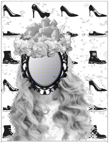
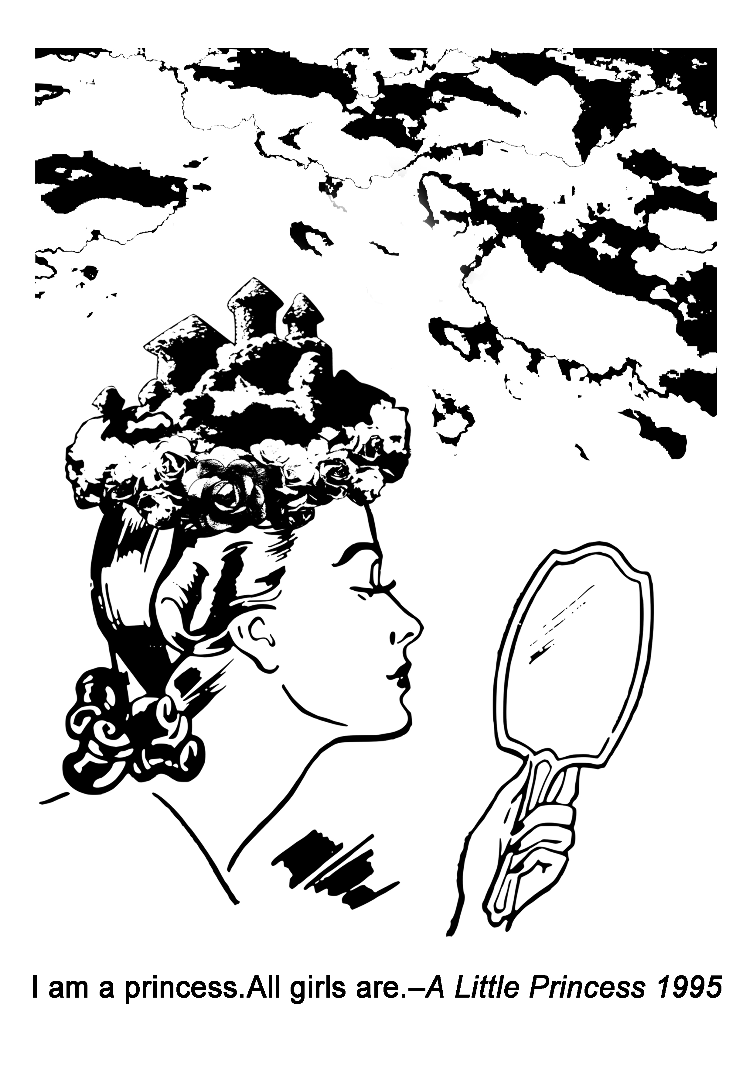
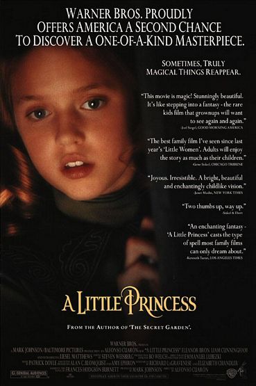
Quote 2: “I am a princess.All girls are.” – A little princess 1995
ALL GIRLS: mirror, different types of hair/dress/shoes
I wanted to compose a ‘crown’ myself by using a castle and flowers to make it more interesting, and the word ‘all’ reminded me that I had to think about what things that everyone can get it easily. So I used clouds in a castle shape for the top part of the crown, instead of using an image of an actual castle.
This is the first design that I came up with. I used the self-made crown to symbolise ‘princess‘, used different types of shoes as the background and a mirror as the face of the ‘princess’ to symbolise ‘all girls‘. But I thought the background was a little bit complicated and distracting.
Final Design (Second design):
For the second design, I used clouds to fill up the top part of this composition to show that ‘all girls‘ in the world are the princess. In the end, I chose the second design as the final one, because it looked more harmonious and visually attracted me more.
Principle of design: rule of thirds, repetition, white space
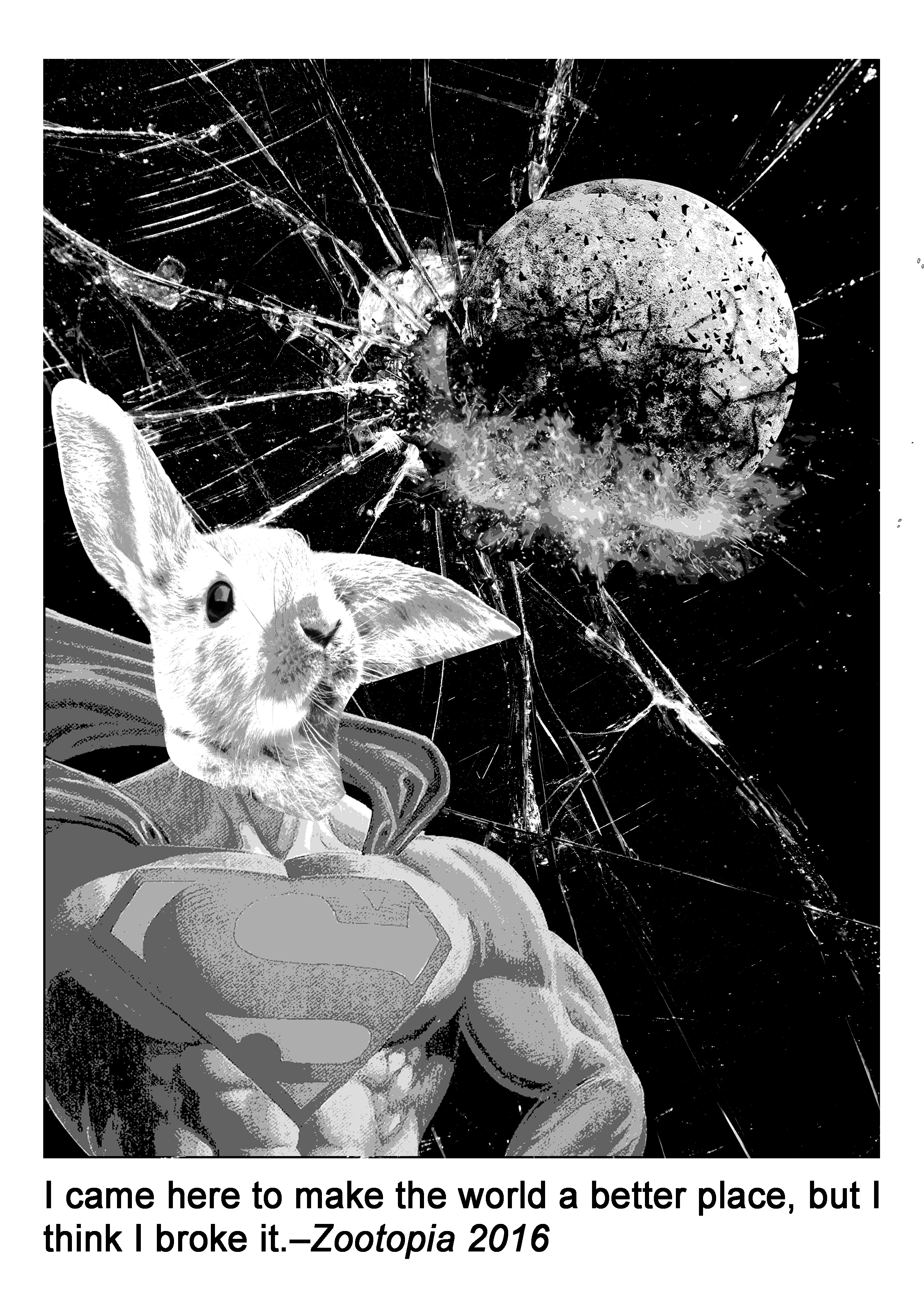
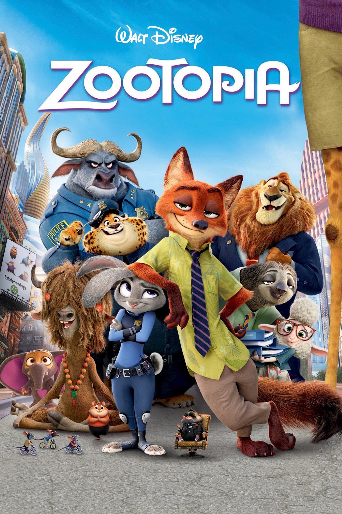
Quote 3: “I came here to make the world a better place, but I think I broke it.” – Zootopia 2016
MAKE THE WORLD A BETTER PLACE: Policeman, Hero (Superman, Spiderman, Batman……)
In this composition, I used an exploded earth to symbolise ‘world‘, and an image of shattered glass as the background to symbolise ‘broke‘, and I combined the upper body part of Superman with a rabbit head to represent the one who was trying to save the world or ‘make the world a better place‘, but failed. I was trying to arrange all the elements in this composition by following the rule of thirds. And I used negative space to represent the universe, at the same time, it also helped to make the dominant elements stand out.
Principle of design: negative space, rule of thirds, contrast
Final Design:
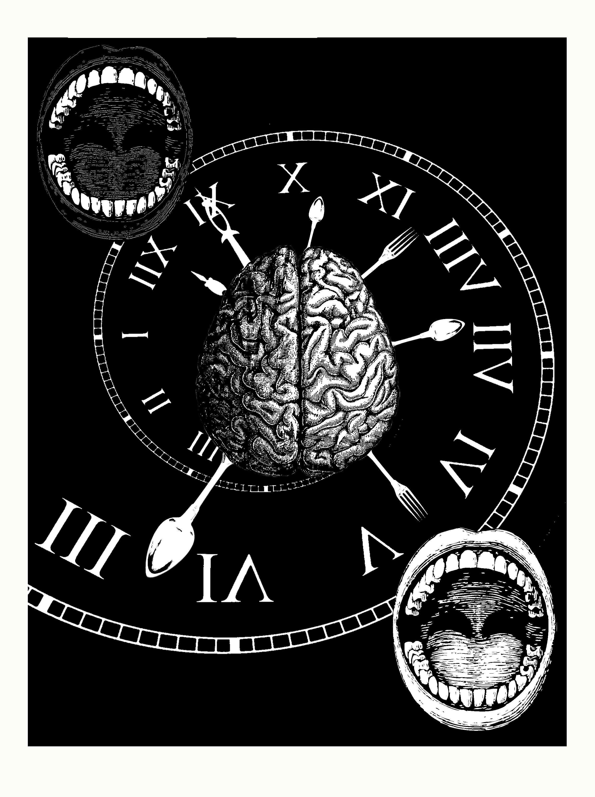
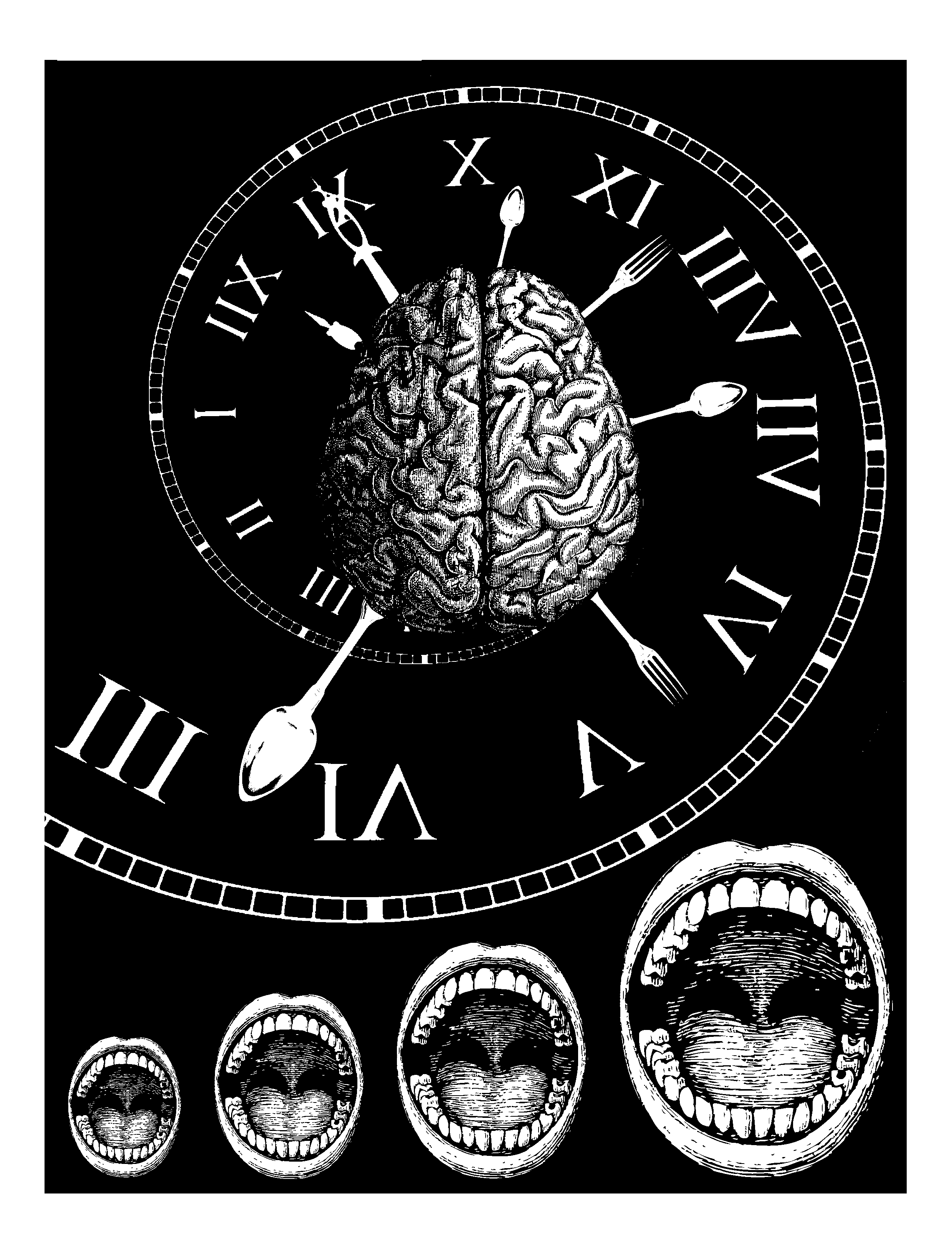
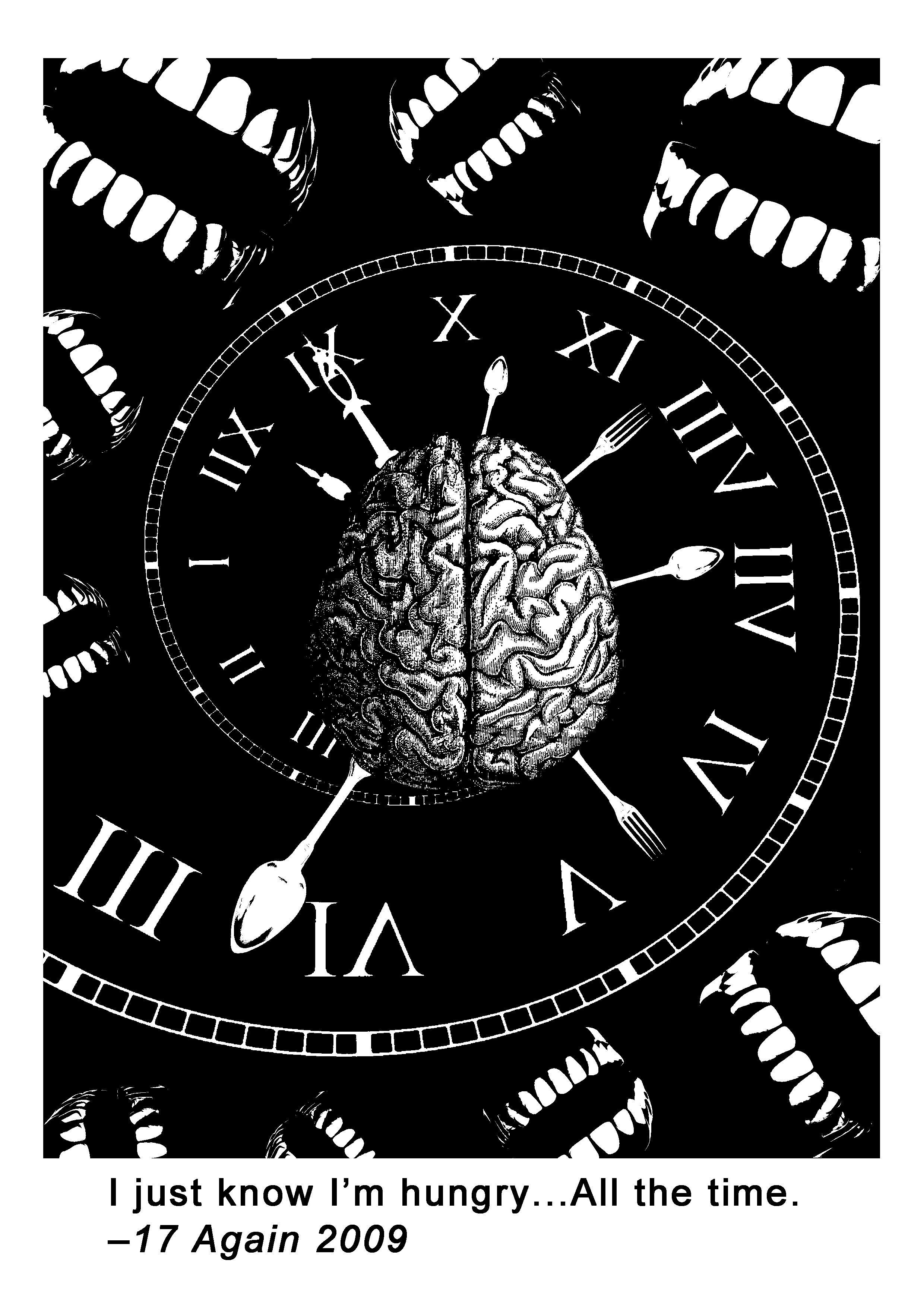
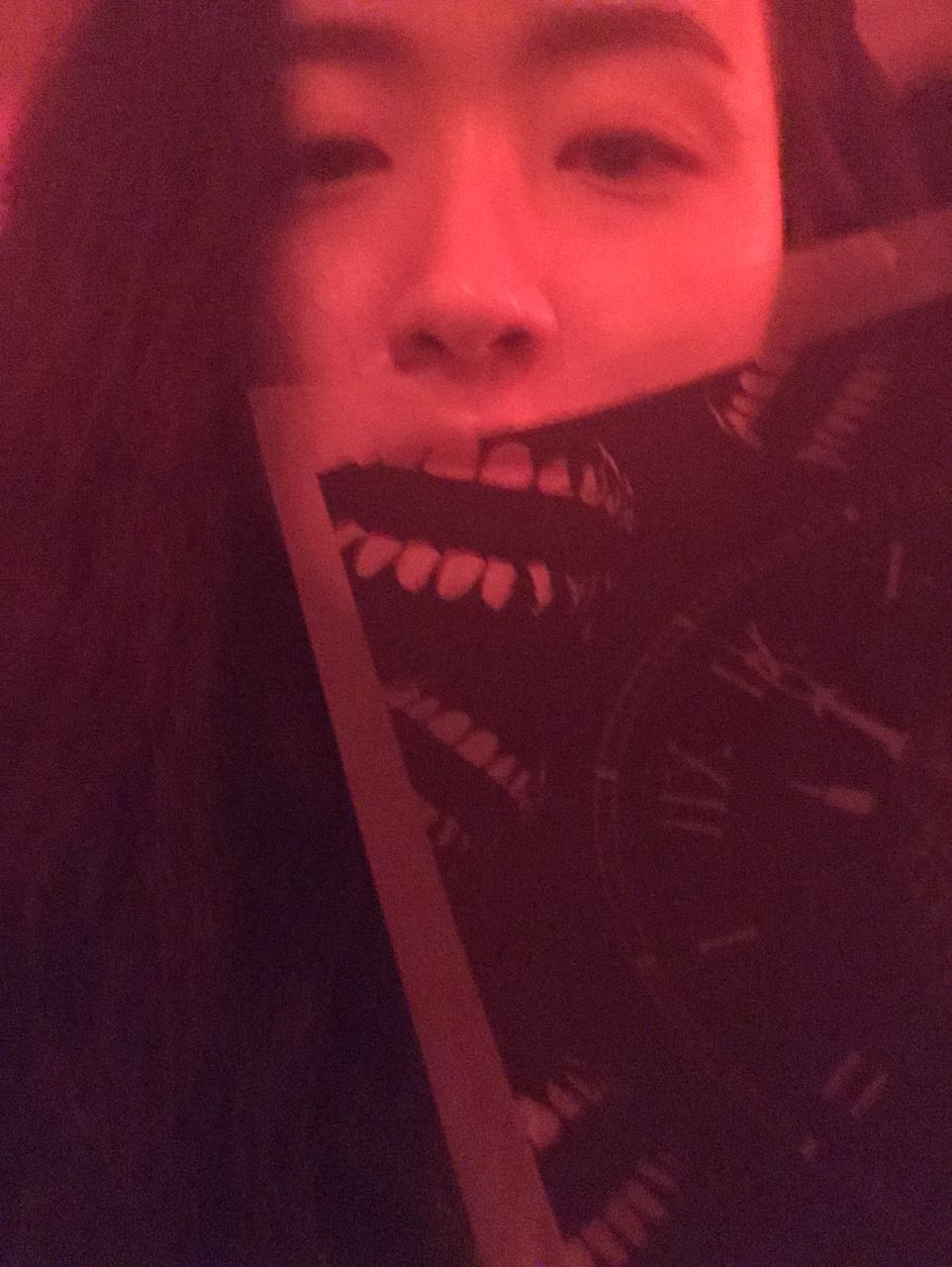
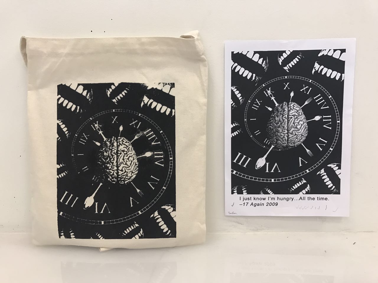
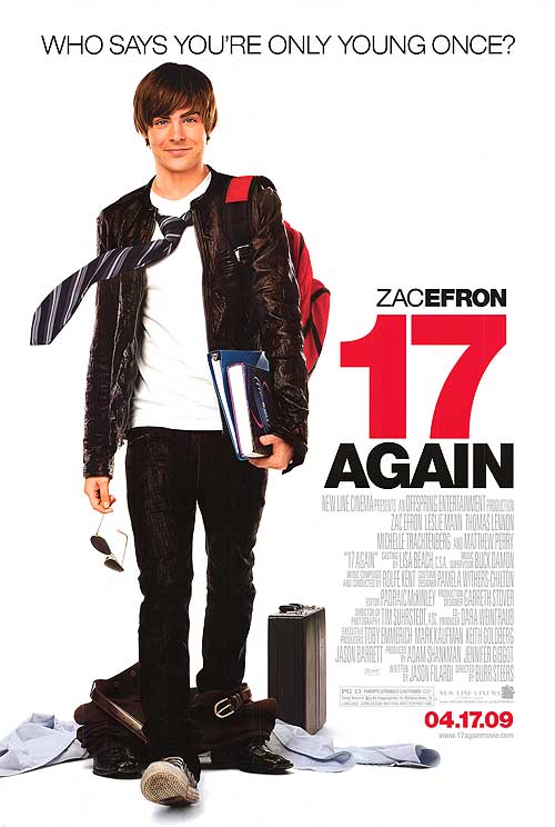
Quote 4: “I just know I’m hungry…All the time.” – 17 again 2009
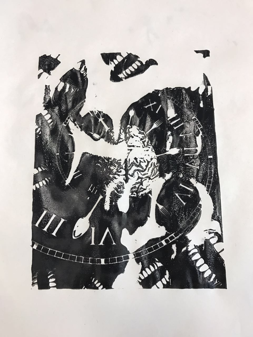
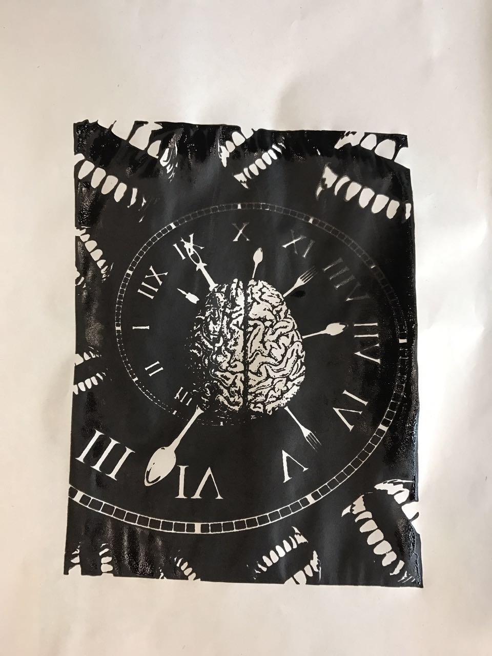
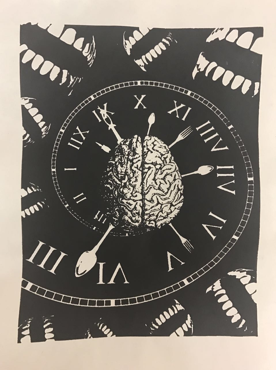
HUNGRY: mouth, teeth, stomach, plate, spoon and fork, food, snacks
TIME: clock, hourglass, sun and moon
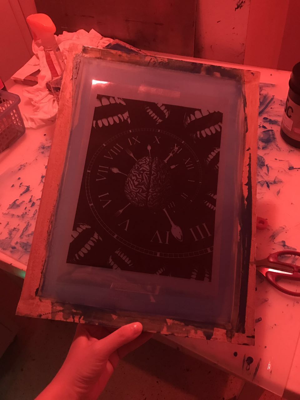
I used a brain to symbolise the keyword ‘know‘, a spiral clock to symbolise ‘time‘ which also created a dynamic movement in this composition, and mouths to symbolise ‘hungry‘. In addition, I used spoons and forks to represent the second hand and minute hand of the clock to emphasise ‘hungry all the time‘. I placed the spiral clock behind the brain to show that ‘my mind is being trapped into the feeling of hungry’, and I used negative space to show that ‘my mind is going deeper and deeper into this feeling’.
This is the first draft that I created: Put the mouths in a diagonal arrangement to show that ‘hungry all the time’, from day to night.
The second draft:
One difficulty I faced in this composition was the choice of the visual element for ‘hungry’. In order to emphasise on the keyword of ‘hungry’, I decided to use teeth in the end. I duplicated the teeth pattern and adjusted them in different sizes and orientation, then placed them randomly around the edges of this composition.
Principle of design: negative space, scale, dynamic movement, repetition
Final Design:
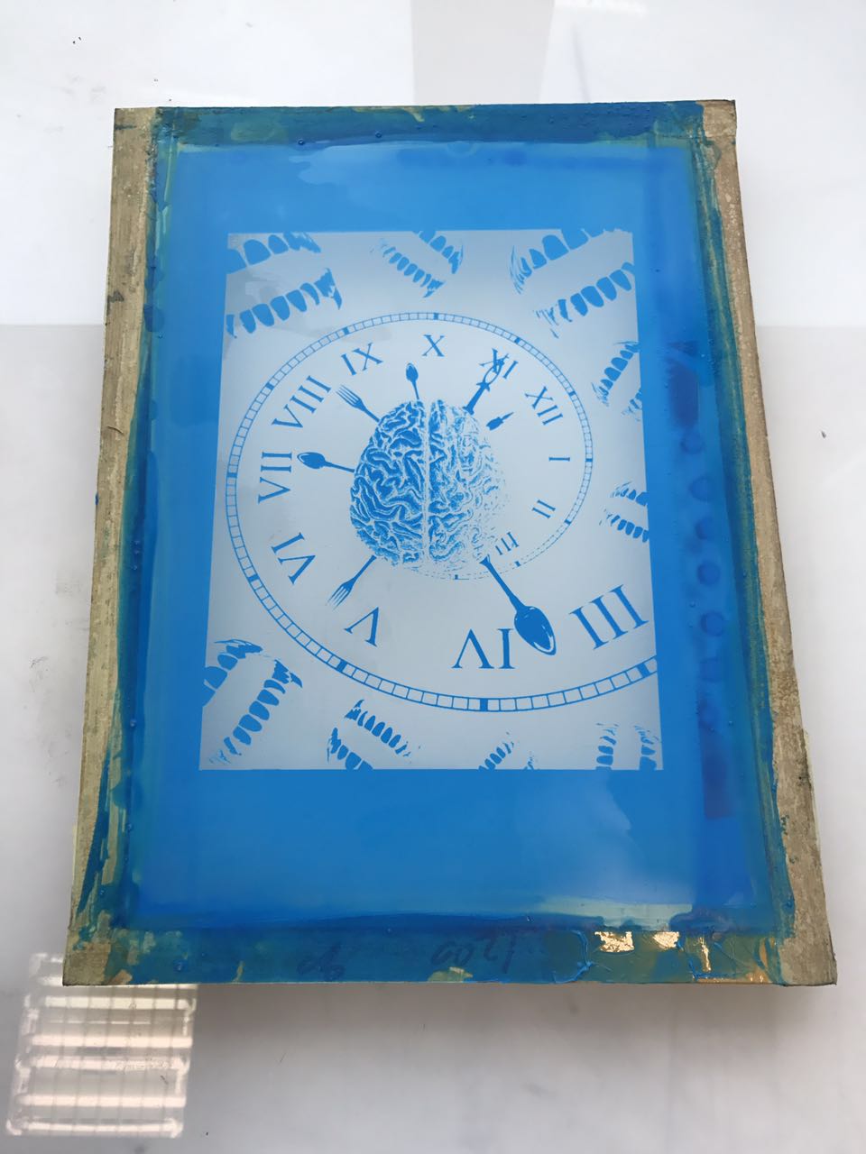
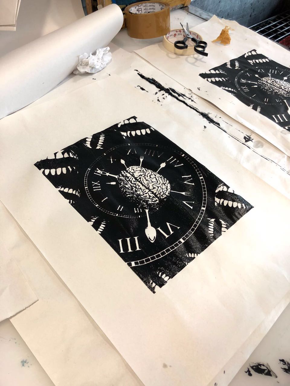
This is the composition that I chose to print on my tote bag.
Part 2-Silkscreen
Print the chosen composition on 2 pieces of transparent sheets.
Coat the silkscreen with P5C blue emulsion, and put it into the dryer. When the screen is completely dry, paste the transparency on it.
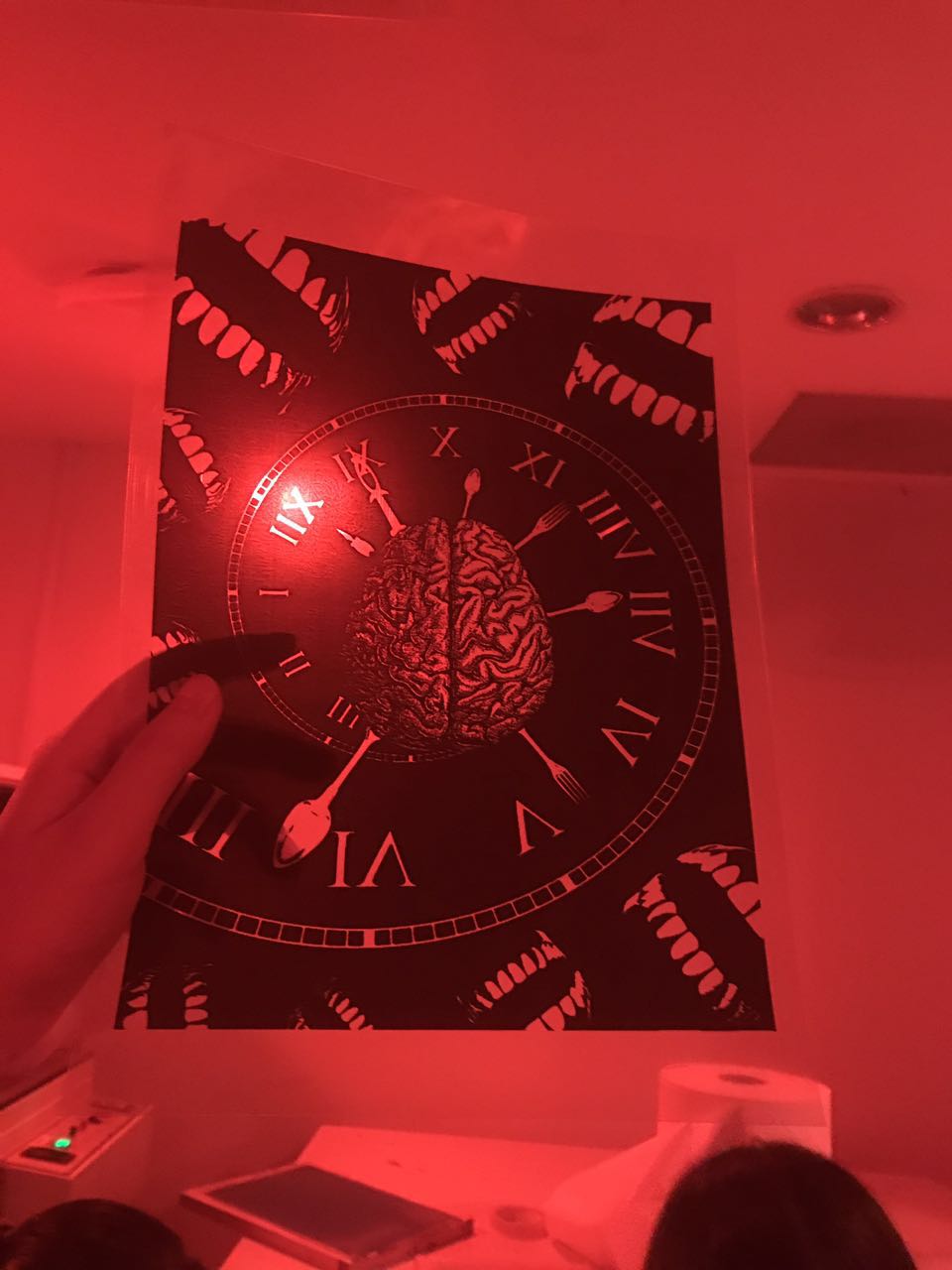
Put it into the exposing machine for 18 seconds…..sorry for the blurred image.
Wash off the unexposed parts. !TADA! My design shows up! Then, mask the edges of the screen with tape.
Here comes the printing part, which is one of the difficulties that I faced during this project.
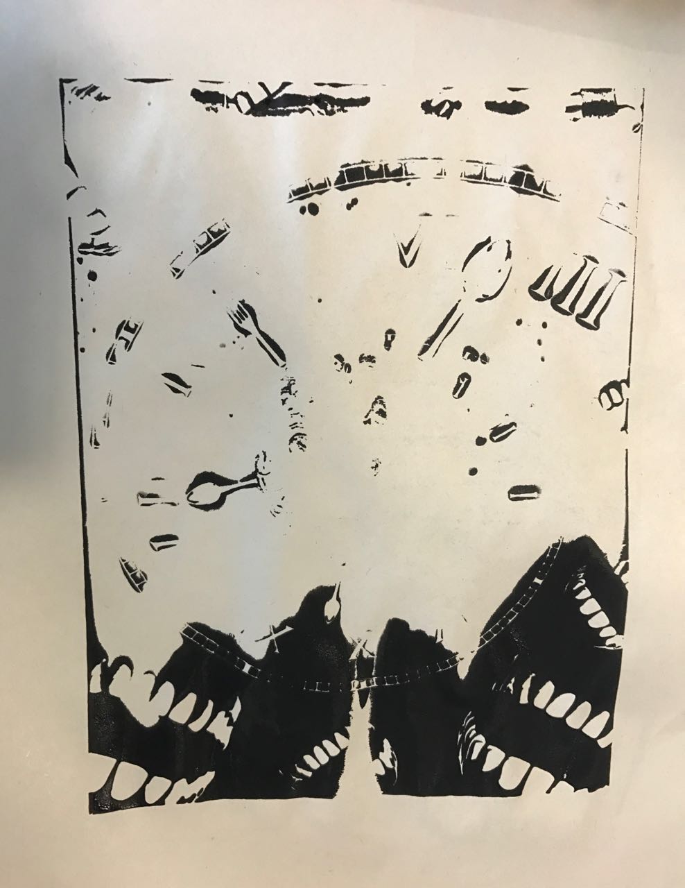
Before printing on the tote bag, I did the test printing on newsprint.
Uh ……………… what happened ………………….
Because there were a lot of empty spaces in my composition so that I had to put more black ink on it. Thank you for the help of my lovely friends, it was clear to see that the results became better and better.
Finally! I am glad that I got a perfect printing in the end 🙂
Part 3-Final Submission
Part 4-Reflection
I really enjoyed this project because I learned some new skills in Photoshop and had a fun in the process of silkscreen. I think the most difficult part of this project was the choice of visual elements, and how to compose them in an interesting way by using different principles of design. It was hard, but it was a good experience for me to practice and expand my design thinking and skills.
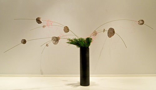
Ikebana (生け花, “arranging flowers”) is the Japanese art of flower arrangement, also known as kadō (華道, the “way of flowers”). The history of ikebana dates back to the 6th century when Buddhism reached Japan, the floral offerings were used to worship at Buddhist altars. A tradition over 600 years old, it is still alive and well, and continues to be practised as a cultural Japanese art form in modern days.
Different from Western floral arrangements which put flowers in the centres to make round shapes, and everything well-arranged without any spaces. Ikebana uses empty space and asymmetrical forms, simplicity and graceful lines are the most important keys. In order to create a sense of harmony, the choices of container and space around the arrangement are crucial as well.
Ikebana makes use of natural materials, bringing the beauty of nature indoors, and helping us to calm the soul. Therefore, the practice of ikebana can also be a meditative process by taking the time to carefully look at the materials and focus on the arrangement to express ourselves. The time spent in communication with the leaves, branches and flowers provides a respite from the stressful and busy lives in nowadays. In addition, some of the modern styles of ikebana (avant-garde ikebana) have evolved with using glass, iron and other materials instead of flowers.
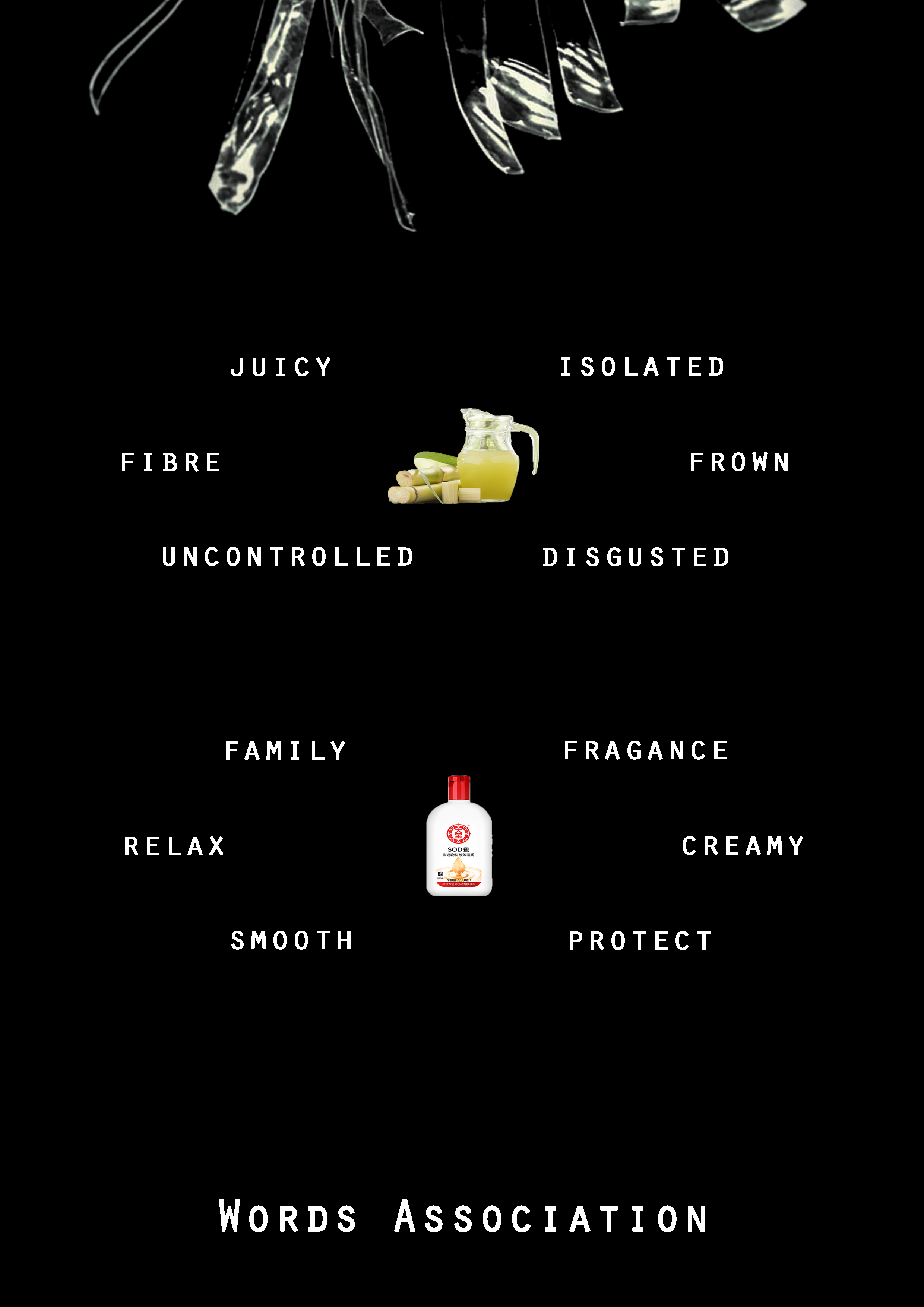
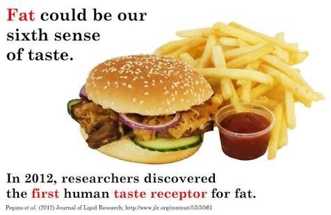
If you look at your tongue in the mirror, you can see it’s covered in little bumps. And in those bumps are taste buds. When you put something in your mouth, they send a message to your brain to give you information about whether the food is salty, sweet, sour, bitter or umami (a meaty, savoury taste).
The sensation of taste can be categorized into five basic tastes:
Sweetness-is a basic taste most commonly perceived when we are eating foods rich in sugars; always regarded as a pleasurable experience.
Sourness-is something with an acidic taste, such as lemon juice, vinegar, green fruit; or someone who is resentful or angry.
Saltiness-is a taste produced primarily by the presence of sodium ions; tastes bitter with an excessive amount.
Bitterness-is the most sensitive of the tastes, such as black coffee, or Chinese herbal medicine; and always be perceived as an unpleasant experience.
Umami– a word from Japanese. It is a pleasant savoury taste and has been described as brothy or meaty.
However, taste is a product of more than just buds on your tongue. It’s a combination of the look, smell, sound, texture as well as the heat or coolness of the food.
Smell and taste are intimately linked, and the smell also provides us with the specific information on the flavour of food. So that is the reason why it is hard to enjoy our meals when we have a cold.
By the way, fat has become our sixth sense of taste. And hot and spicy feelings are not actually a taste, they are pain signals sent by the touch and temperature receptors in the brain.
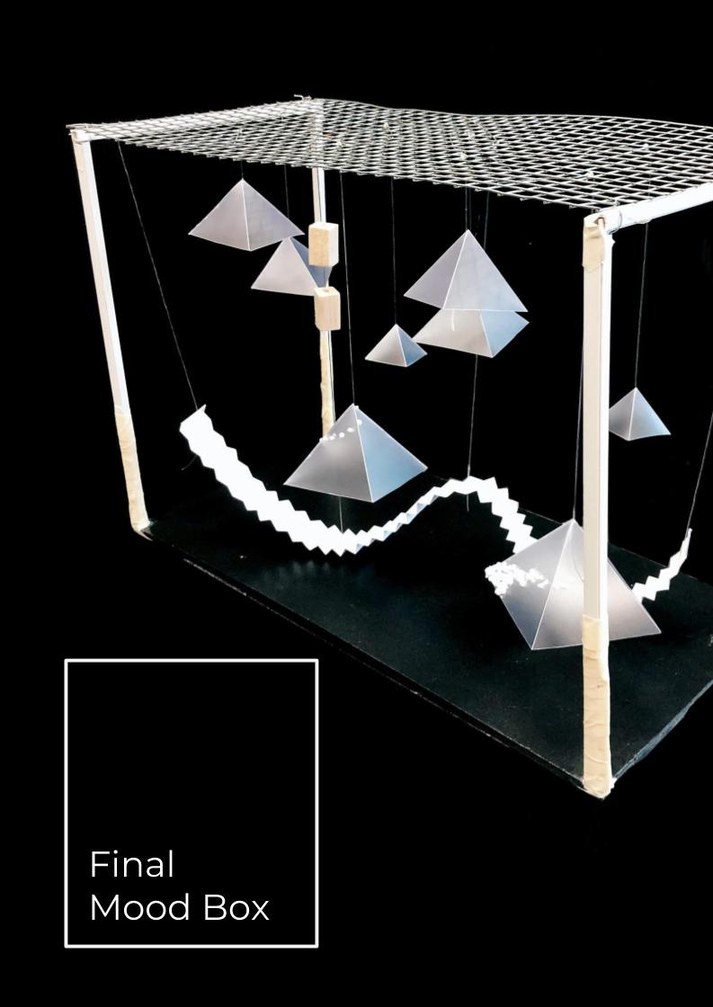
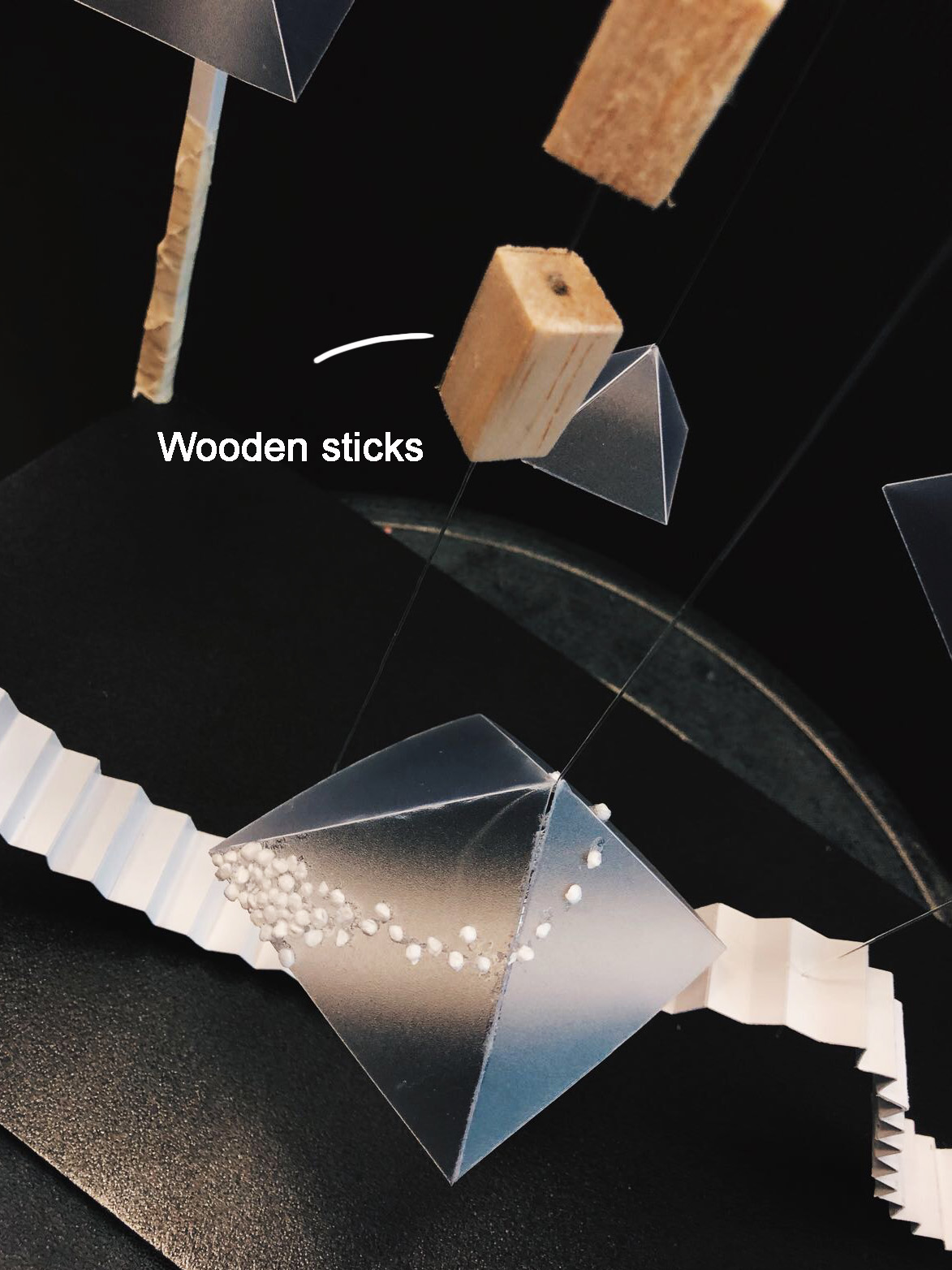
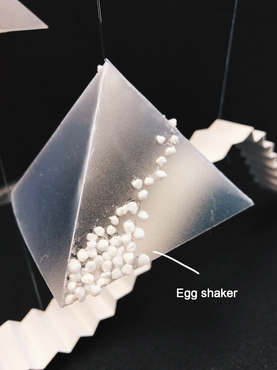
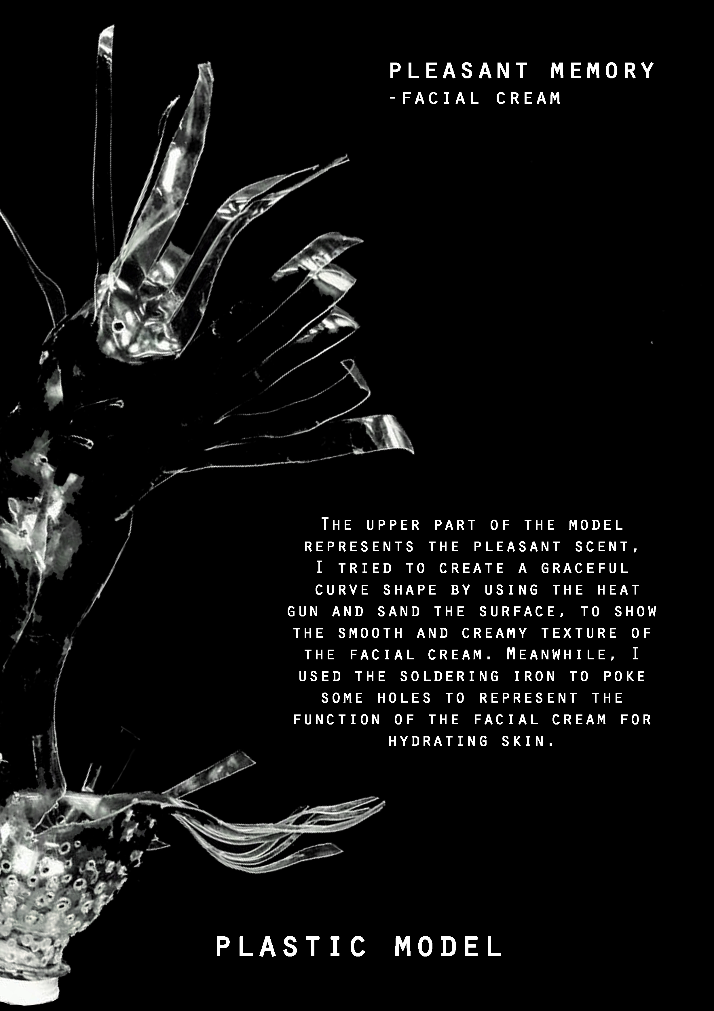
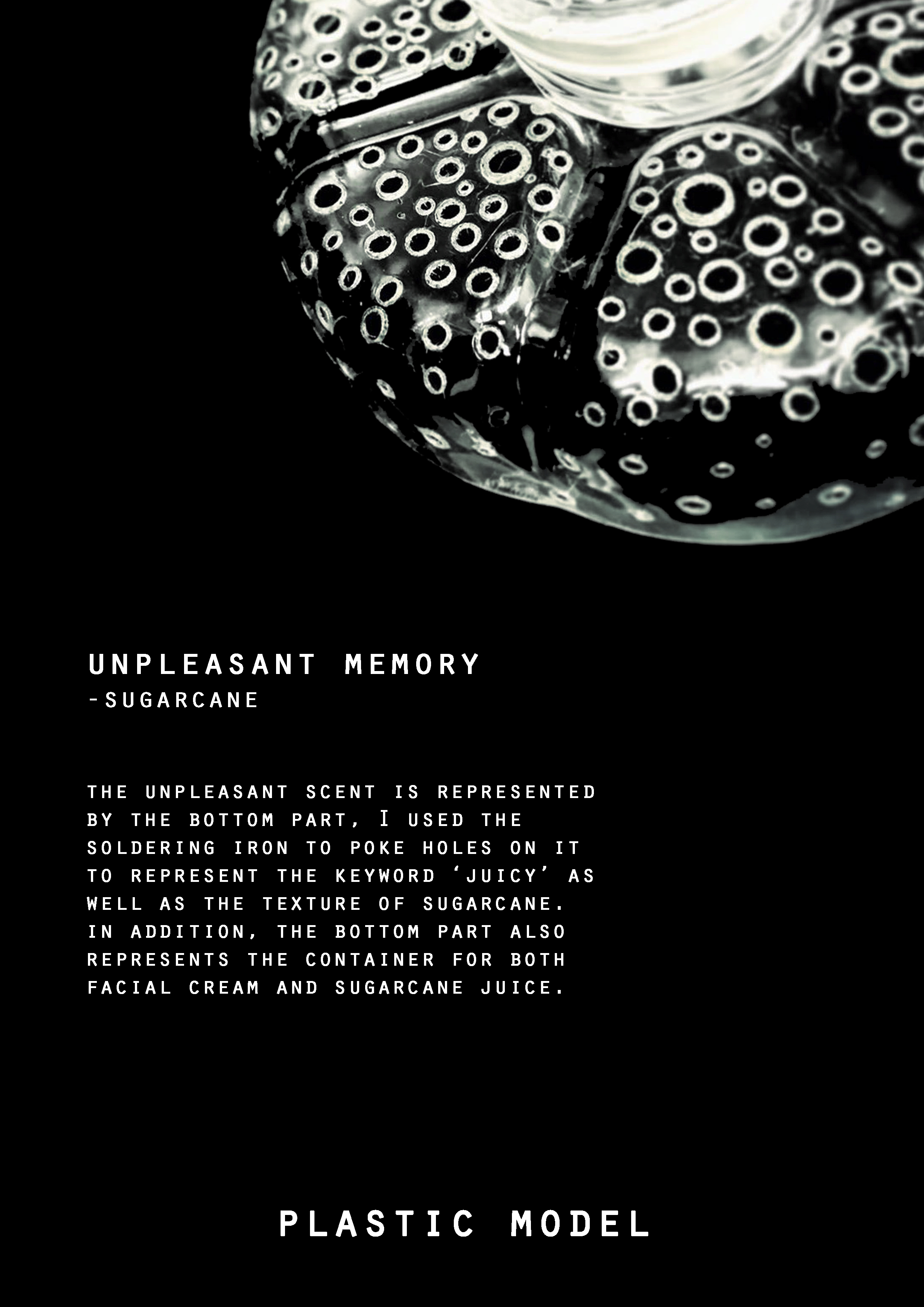
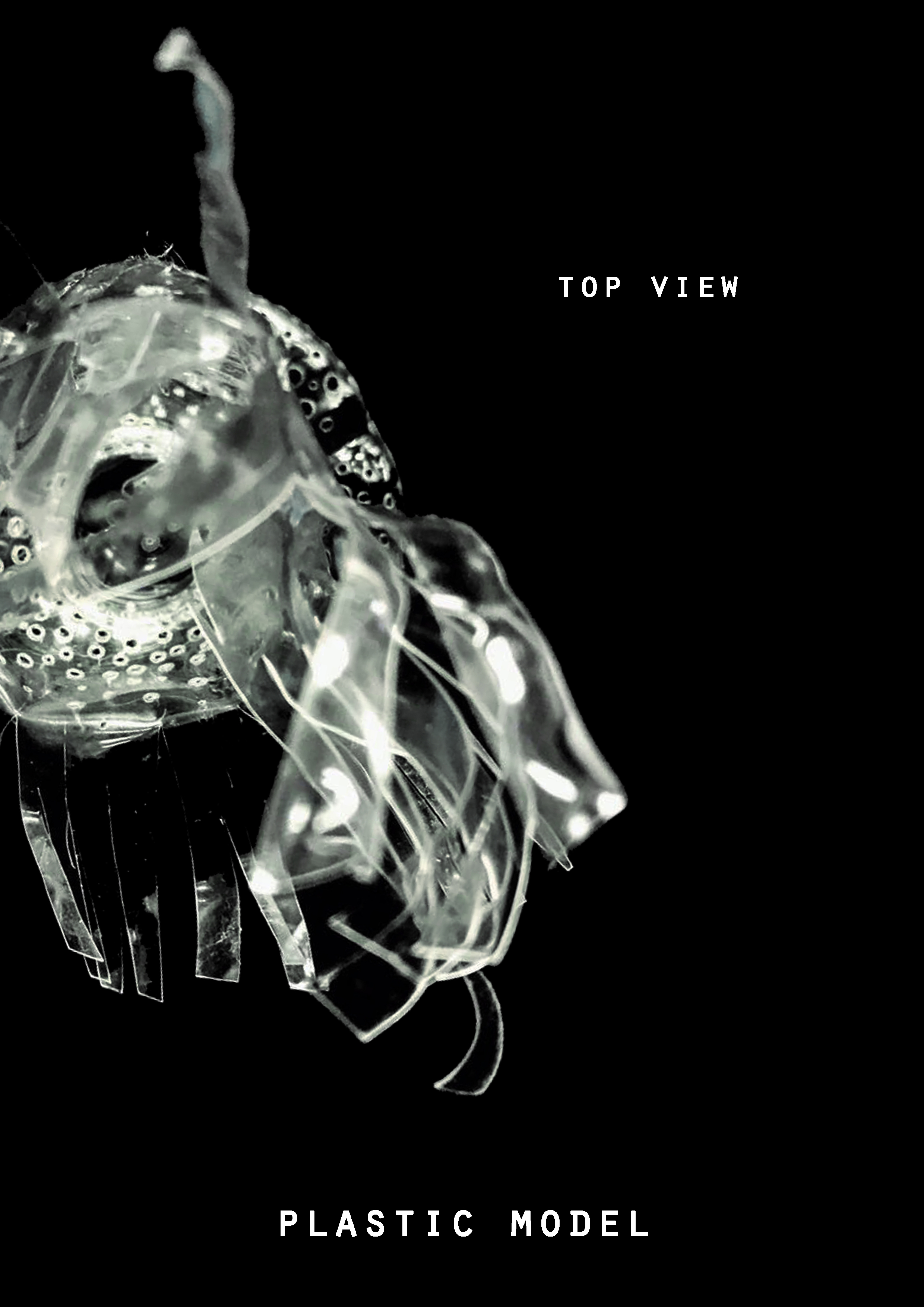
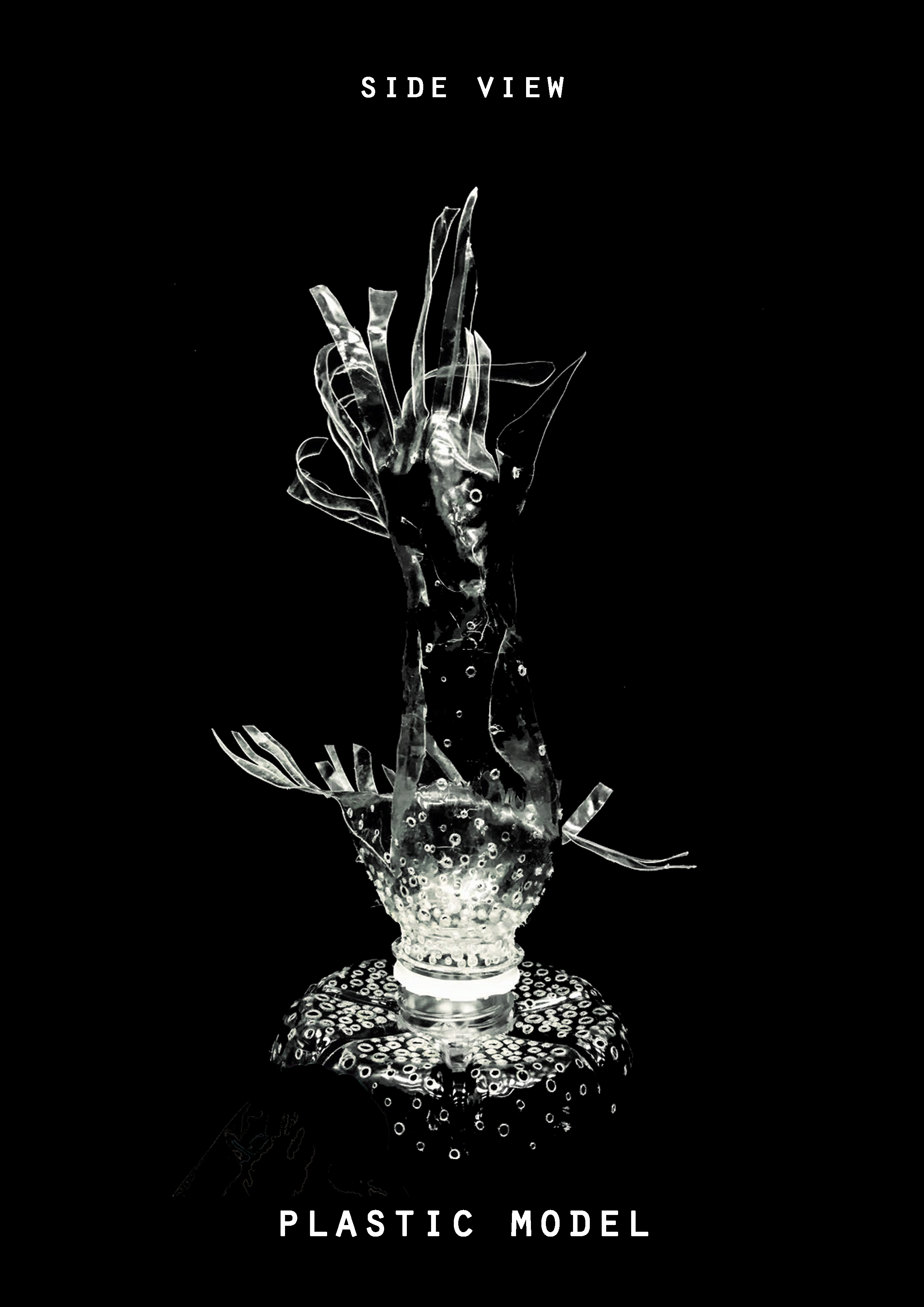
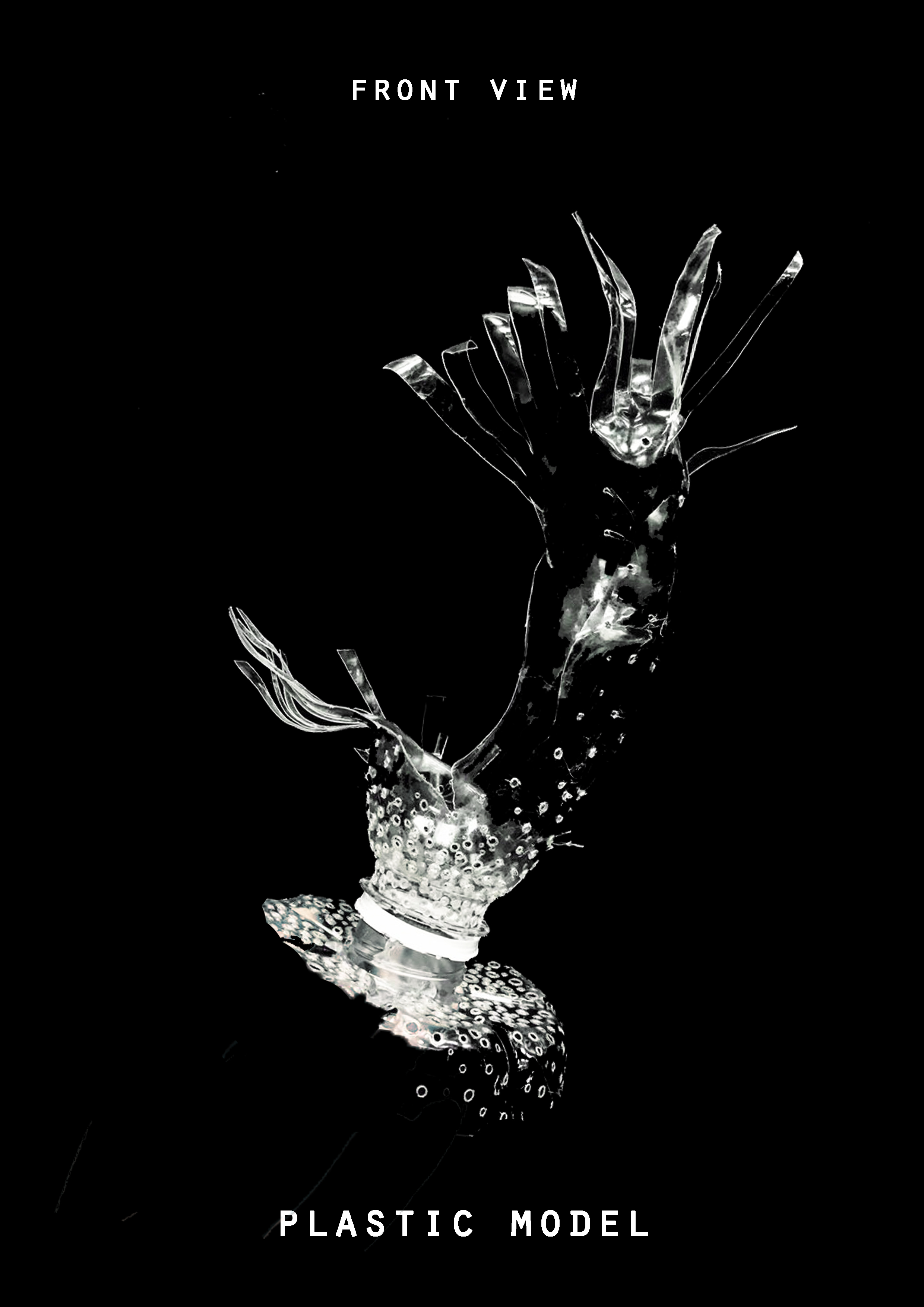
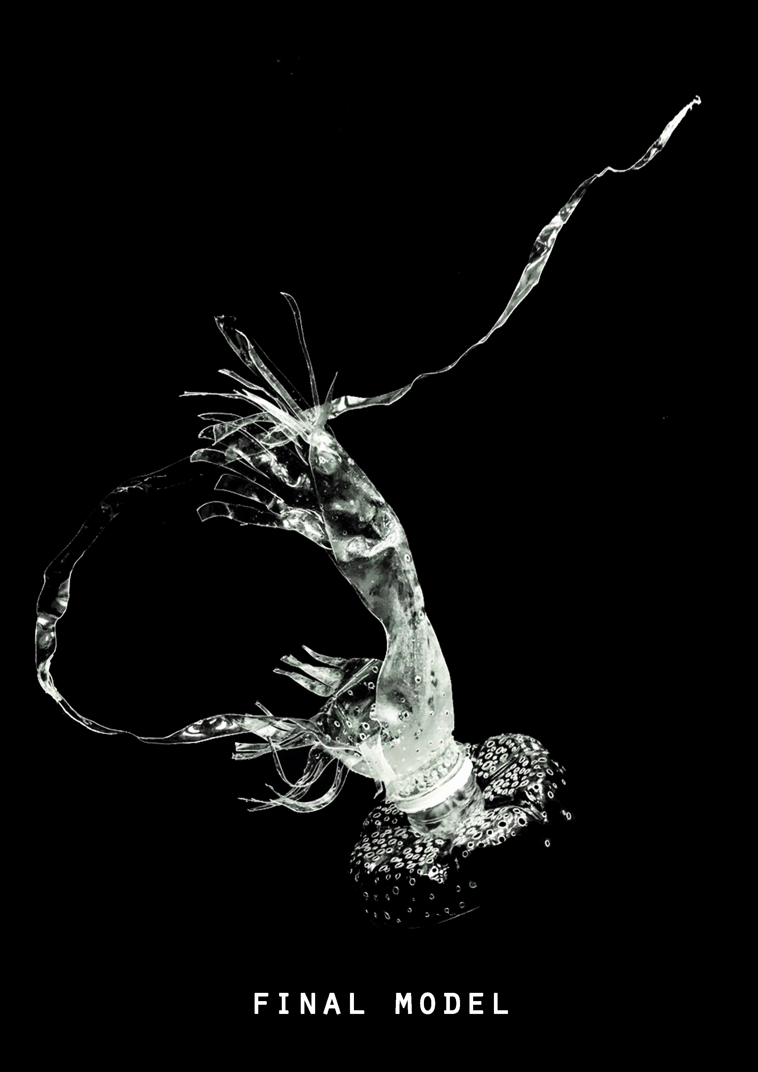
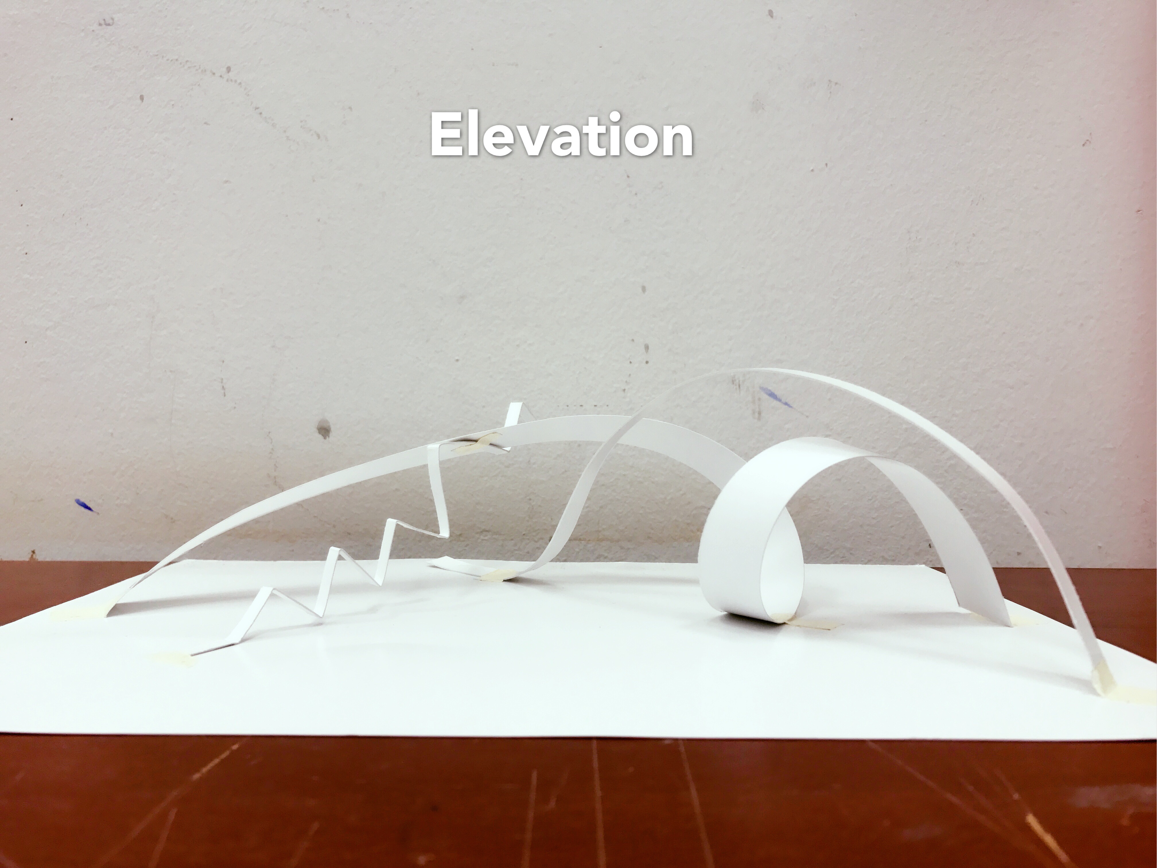
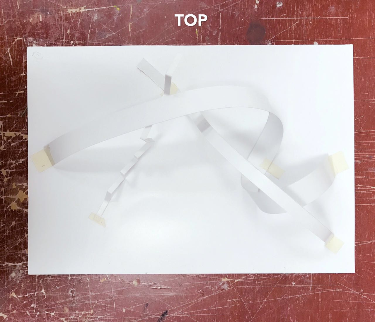
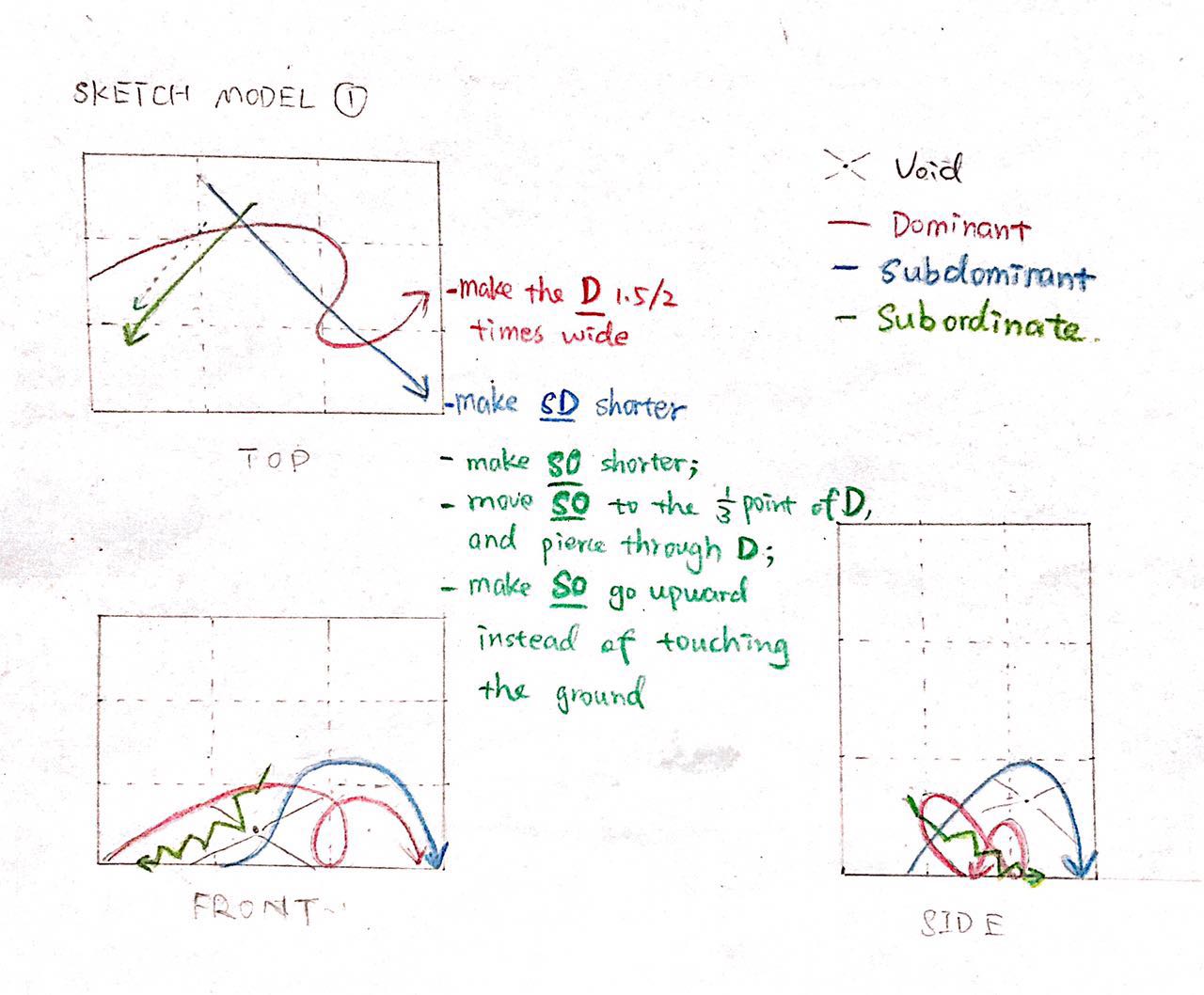
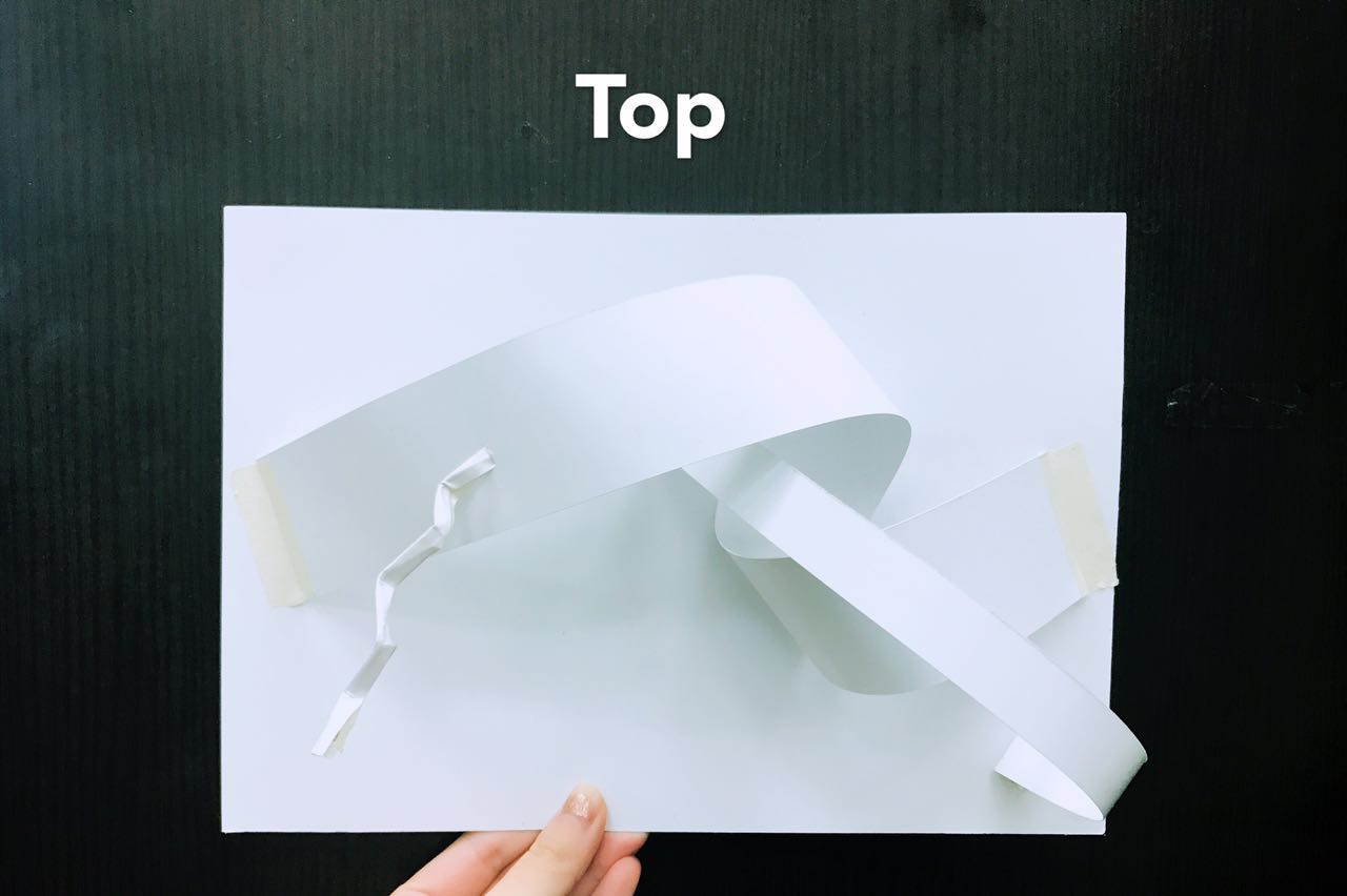
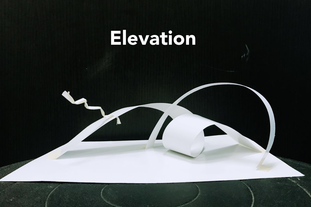
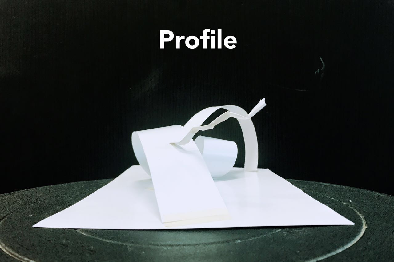
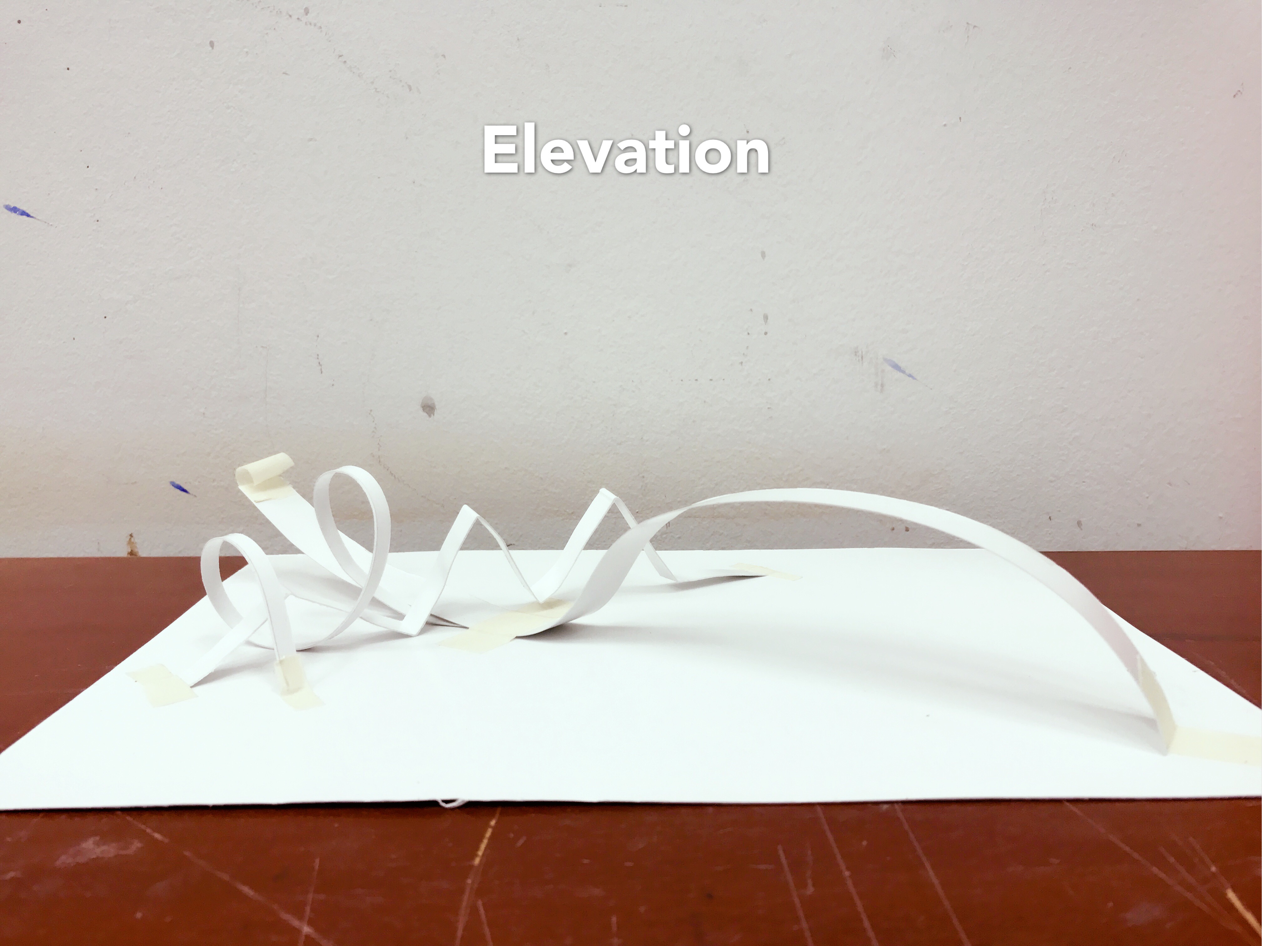
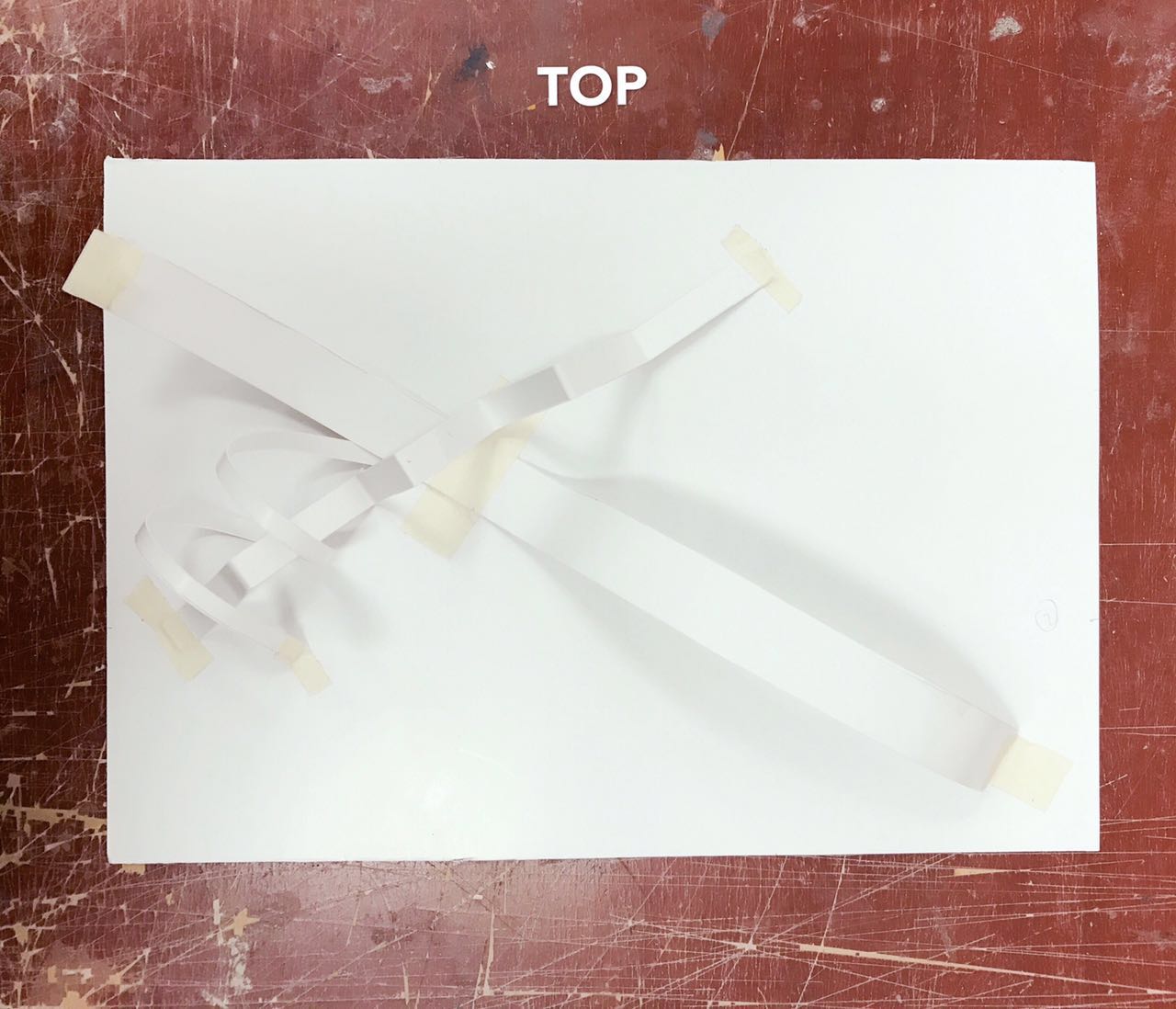
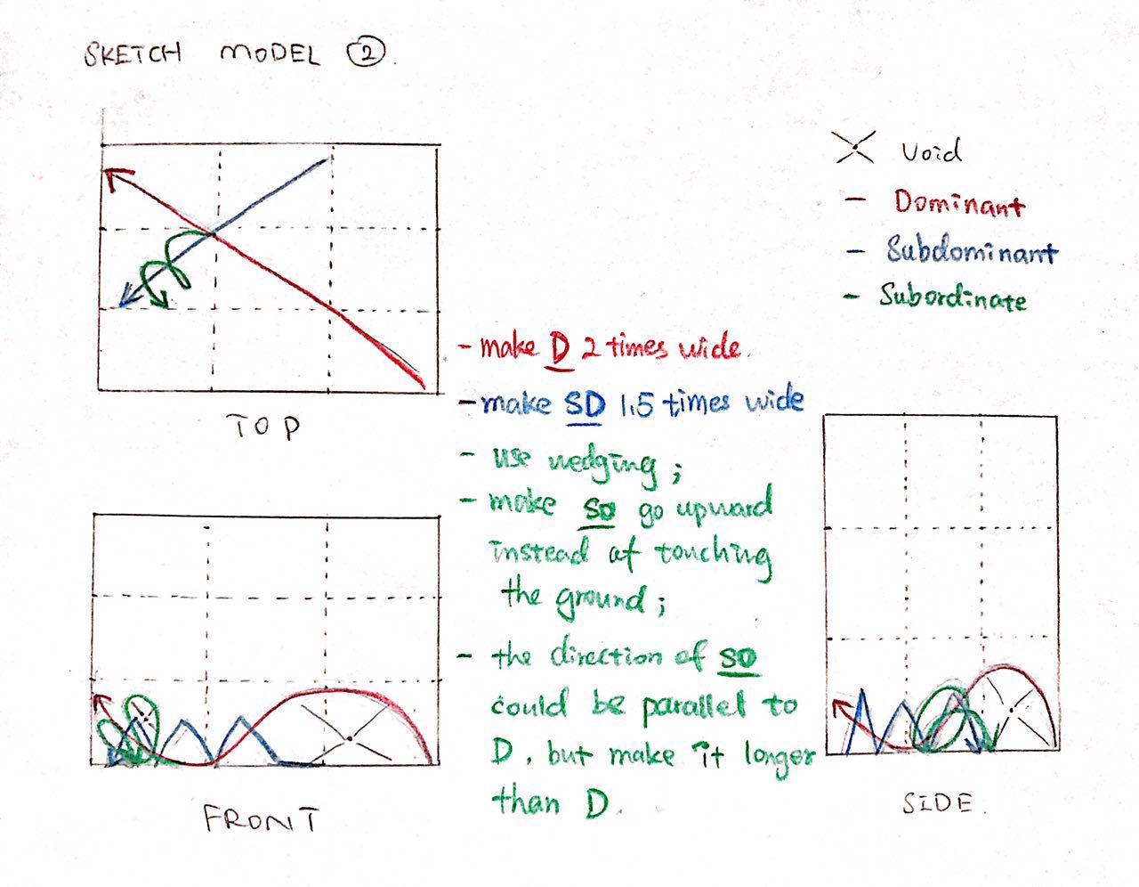
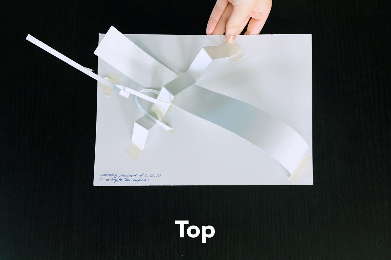
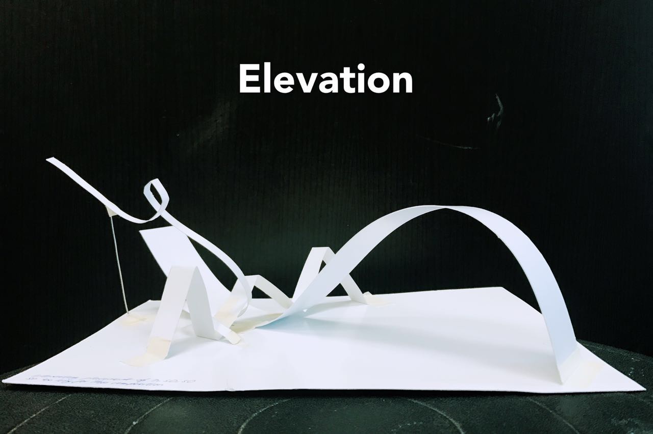
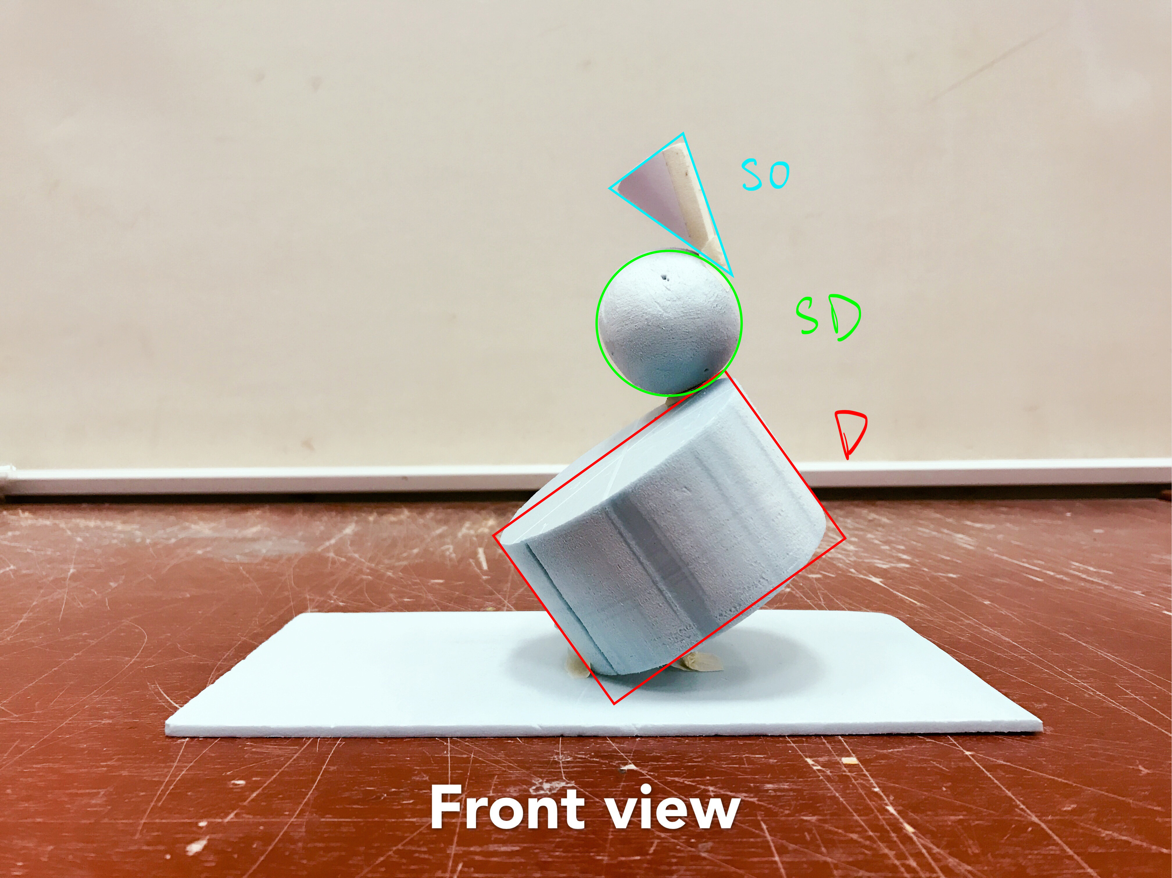
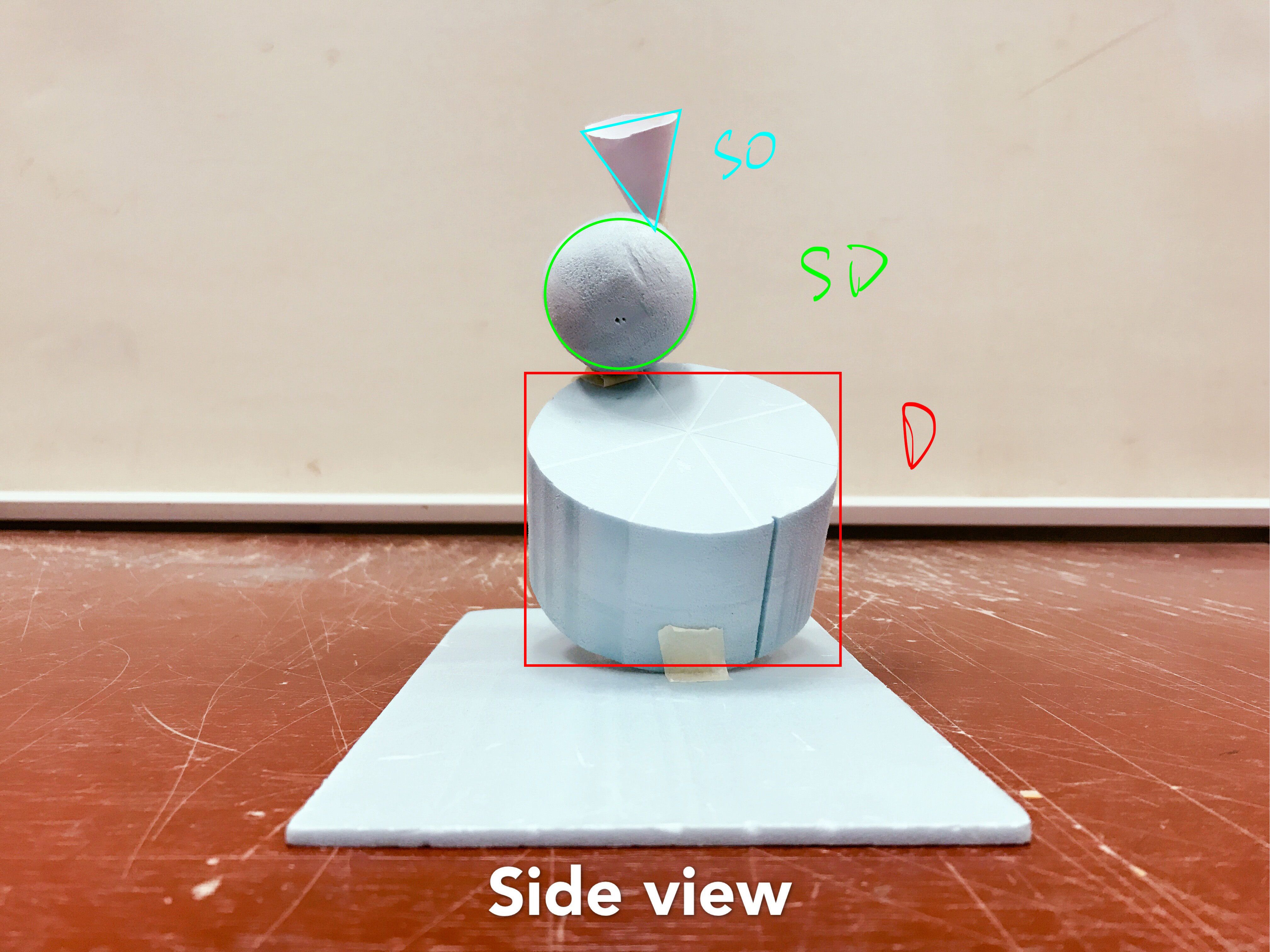
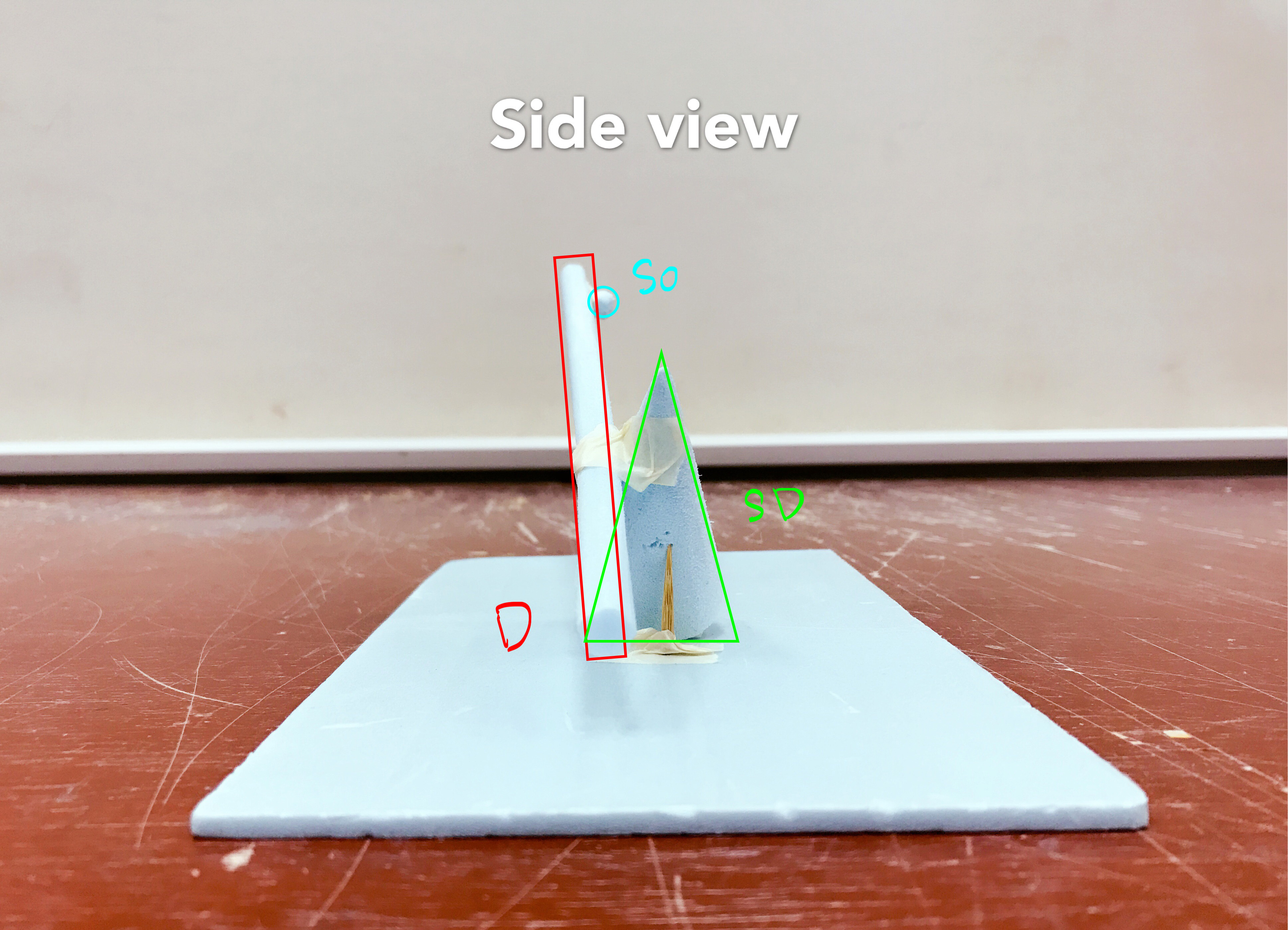
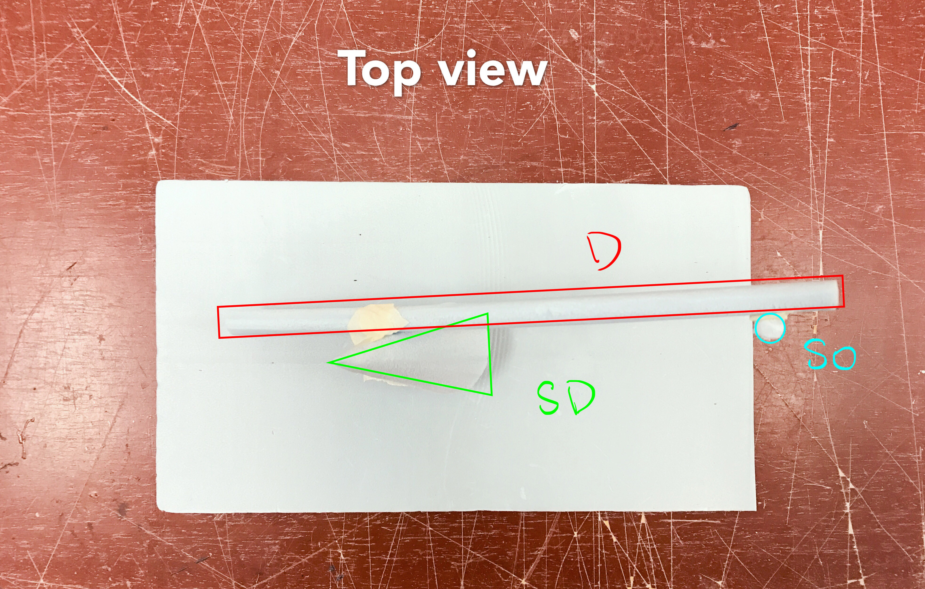
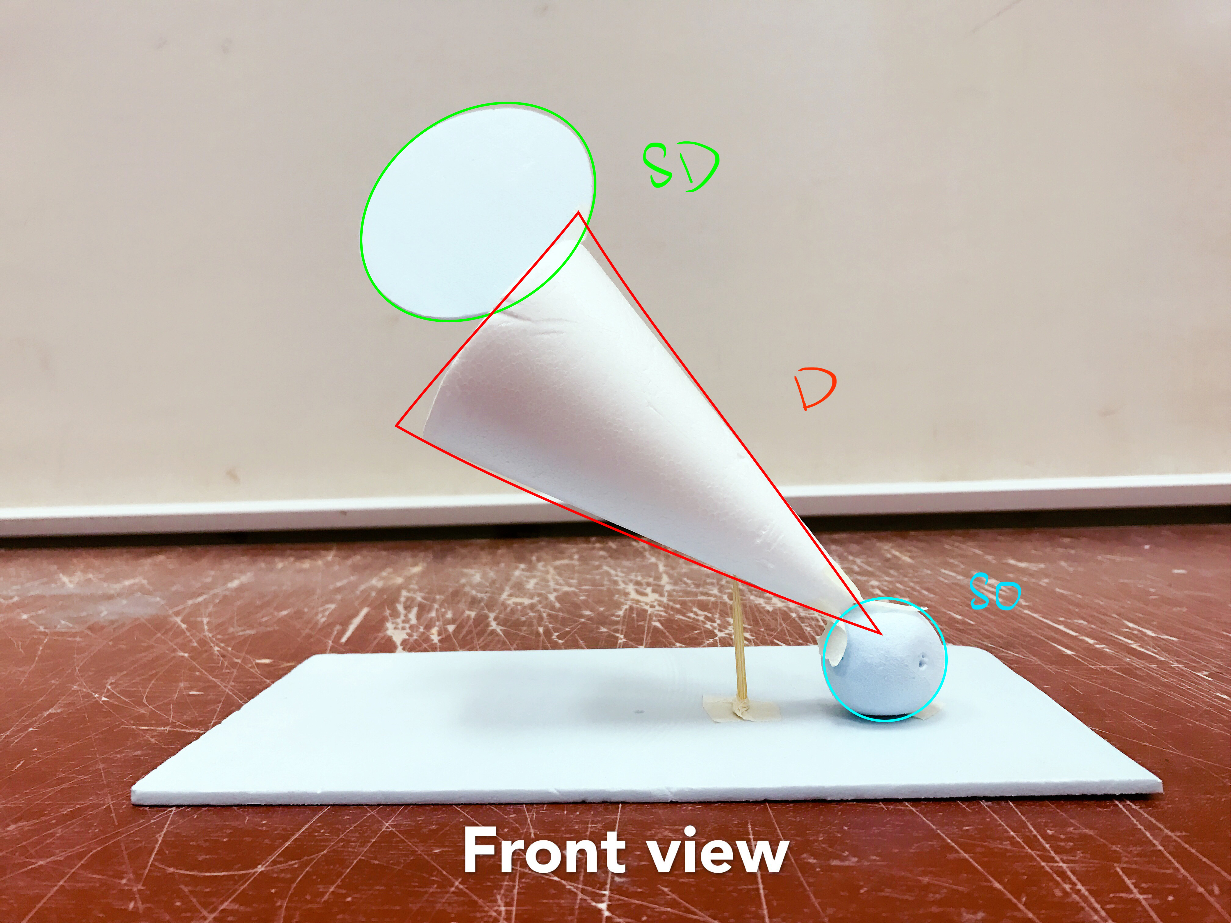
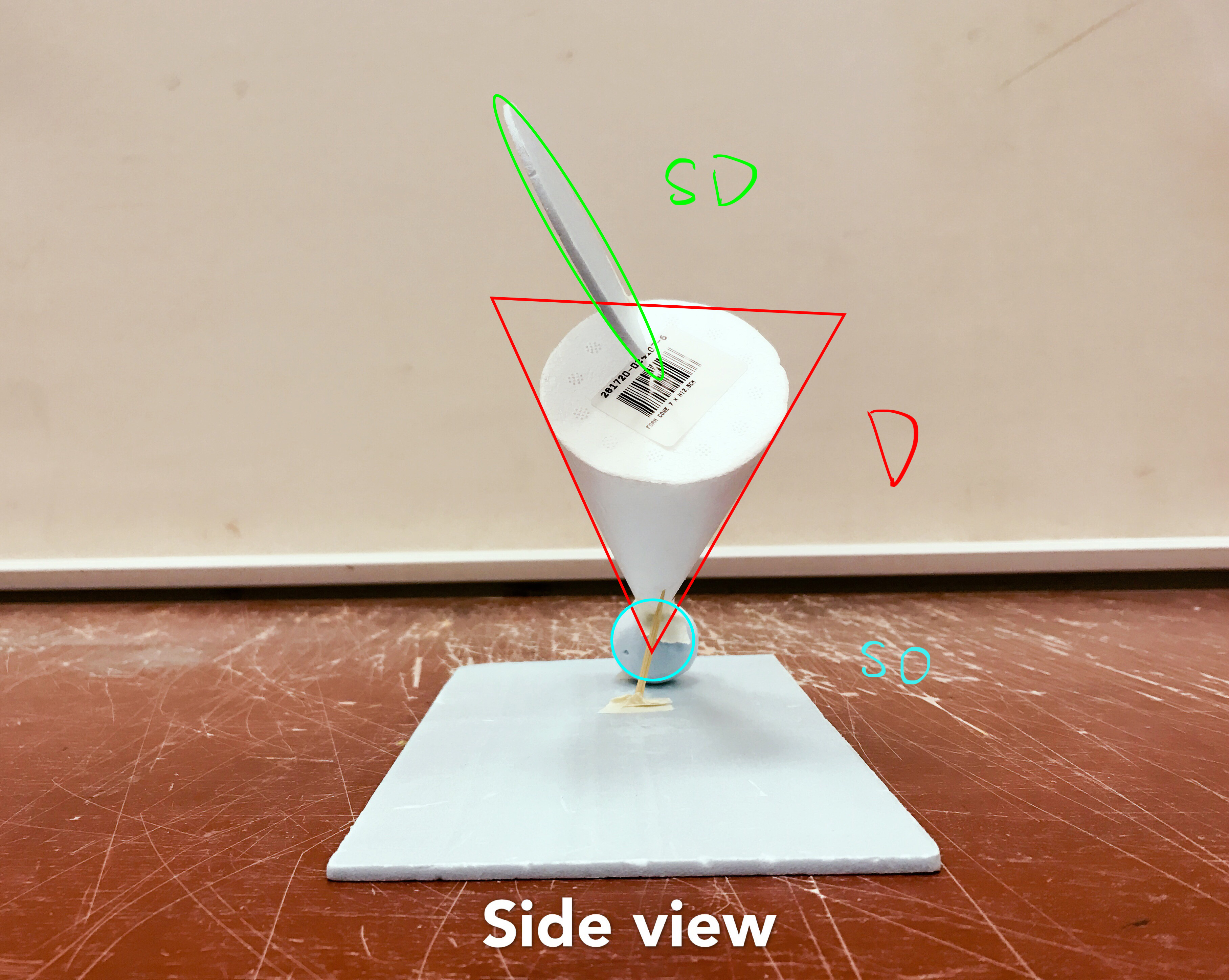
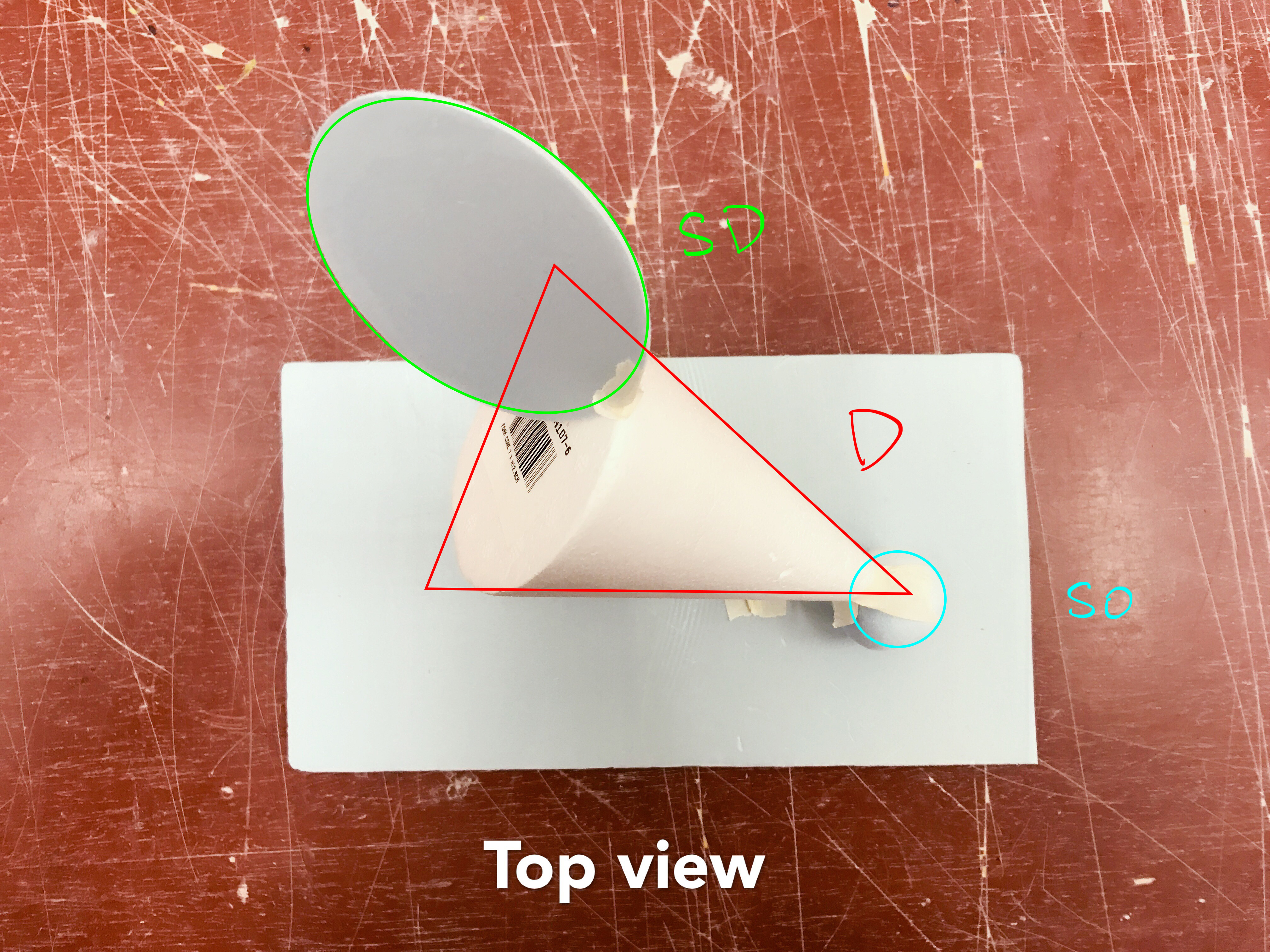
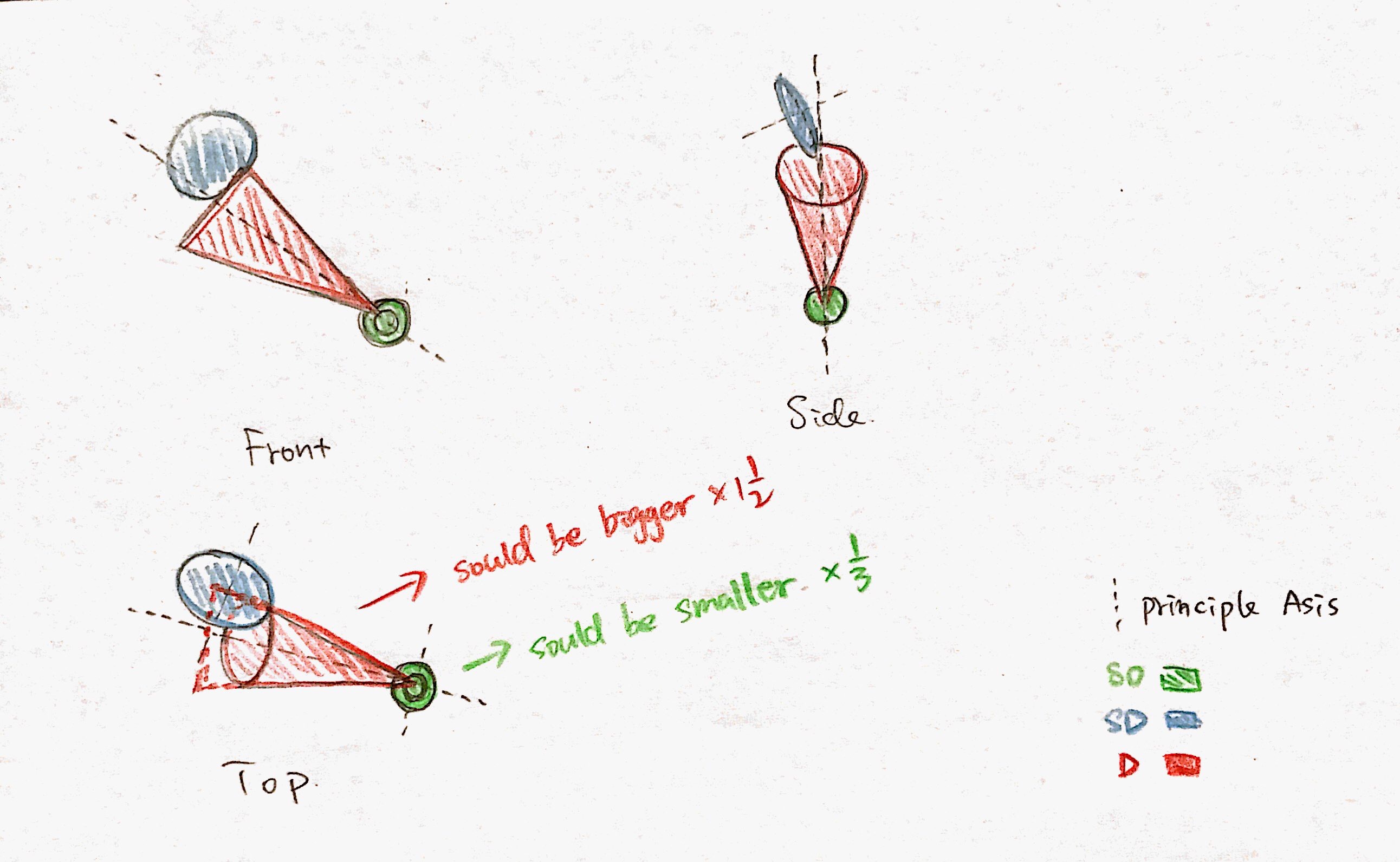
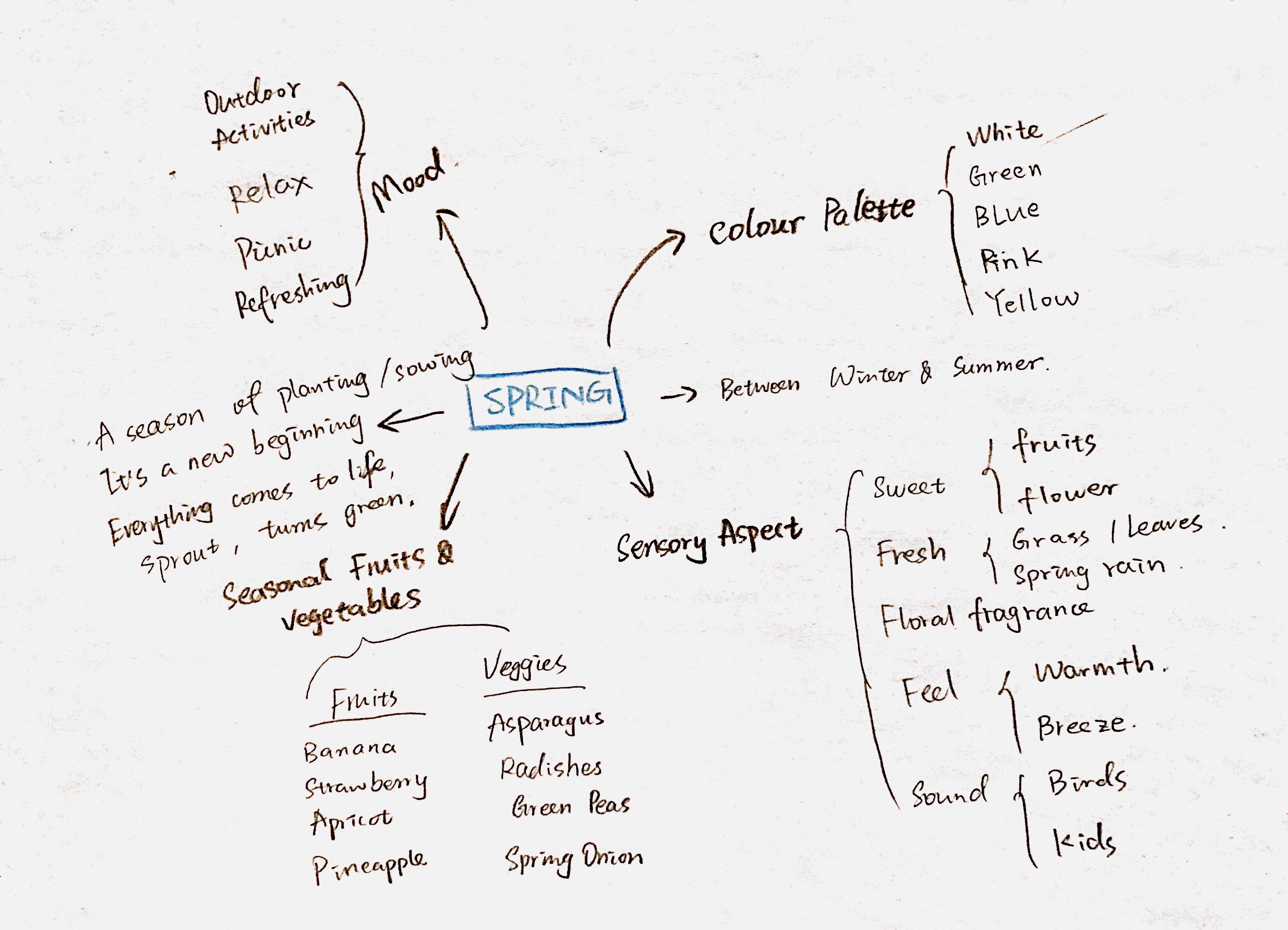
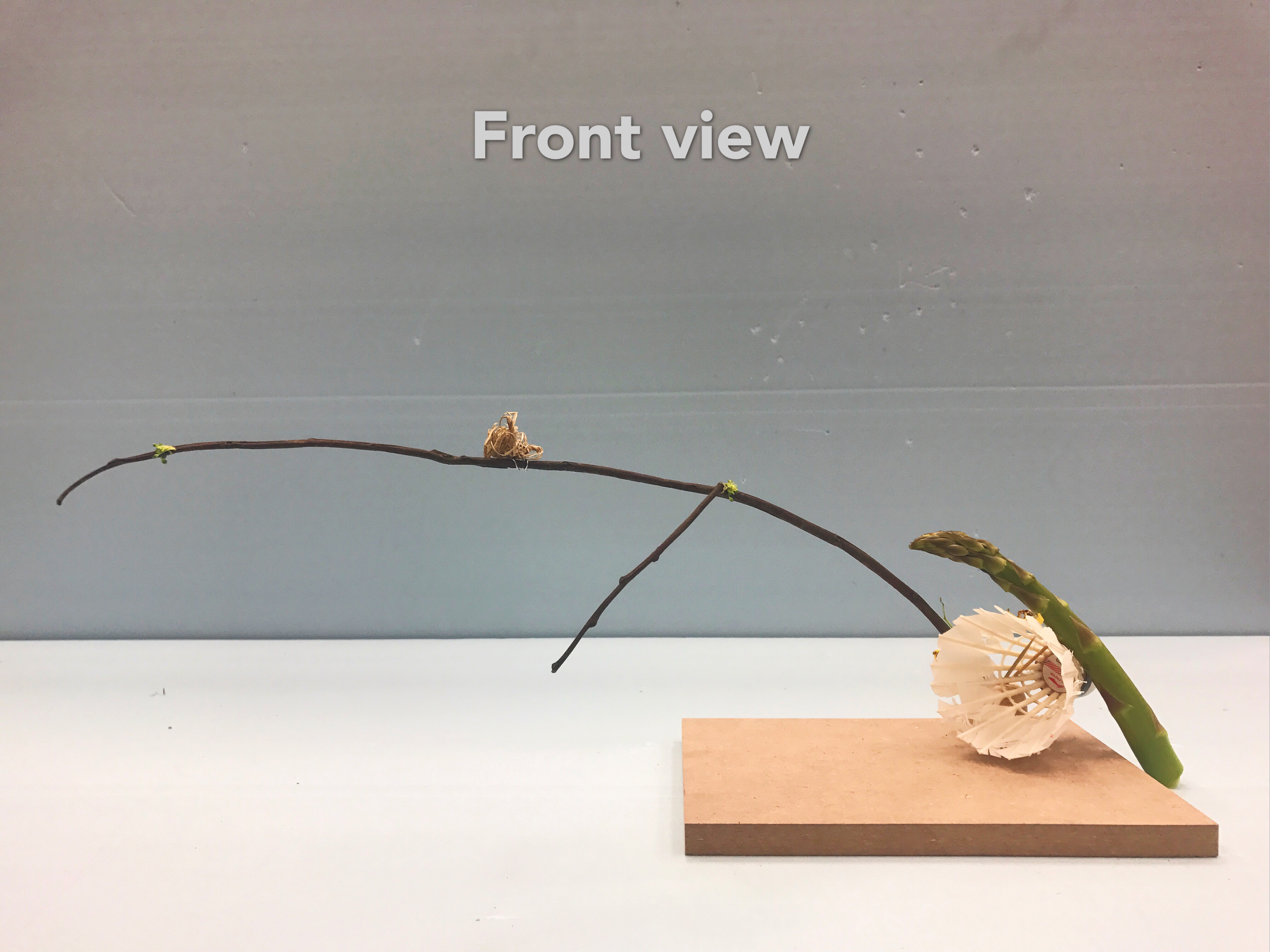
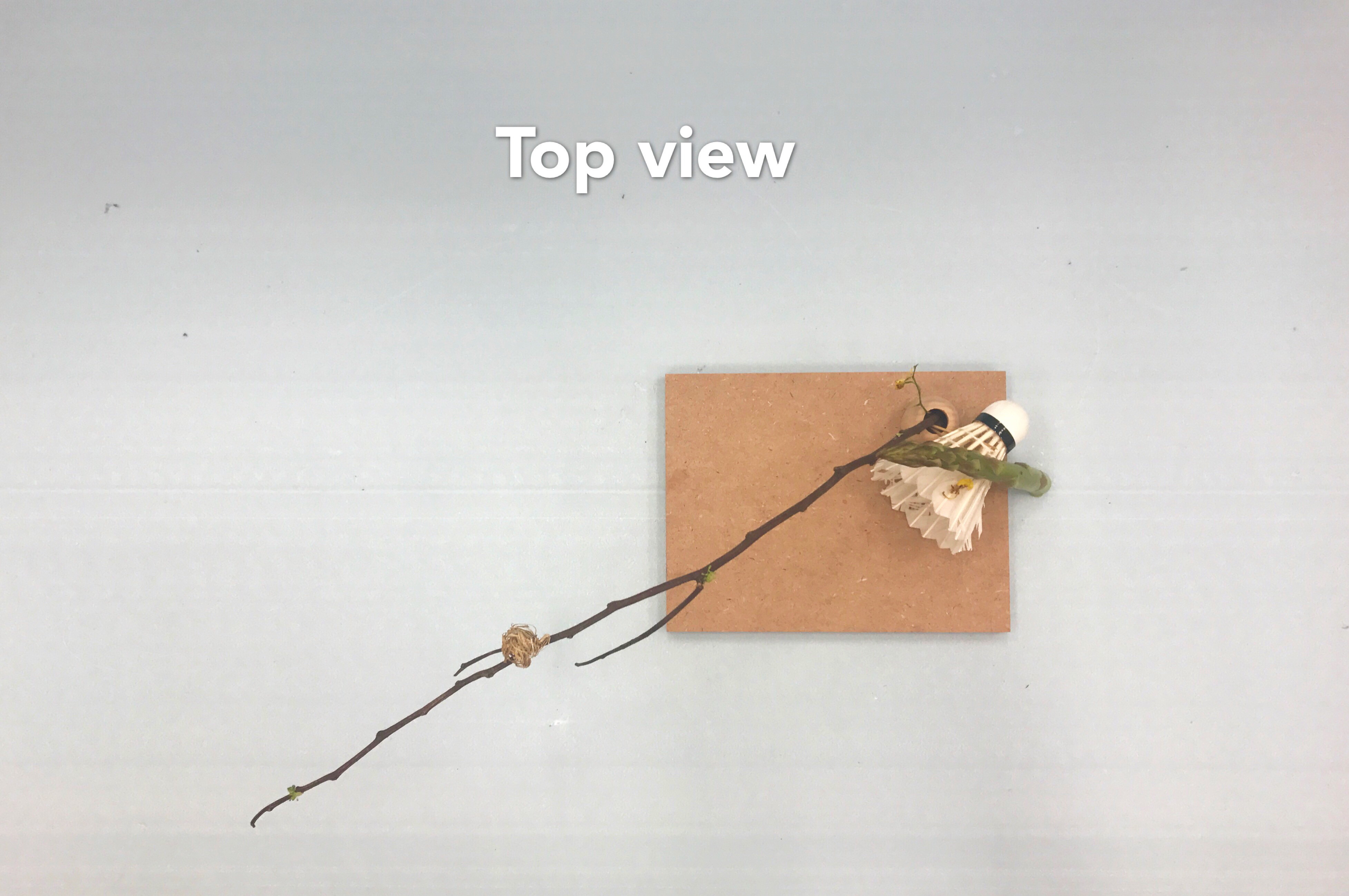
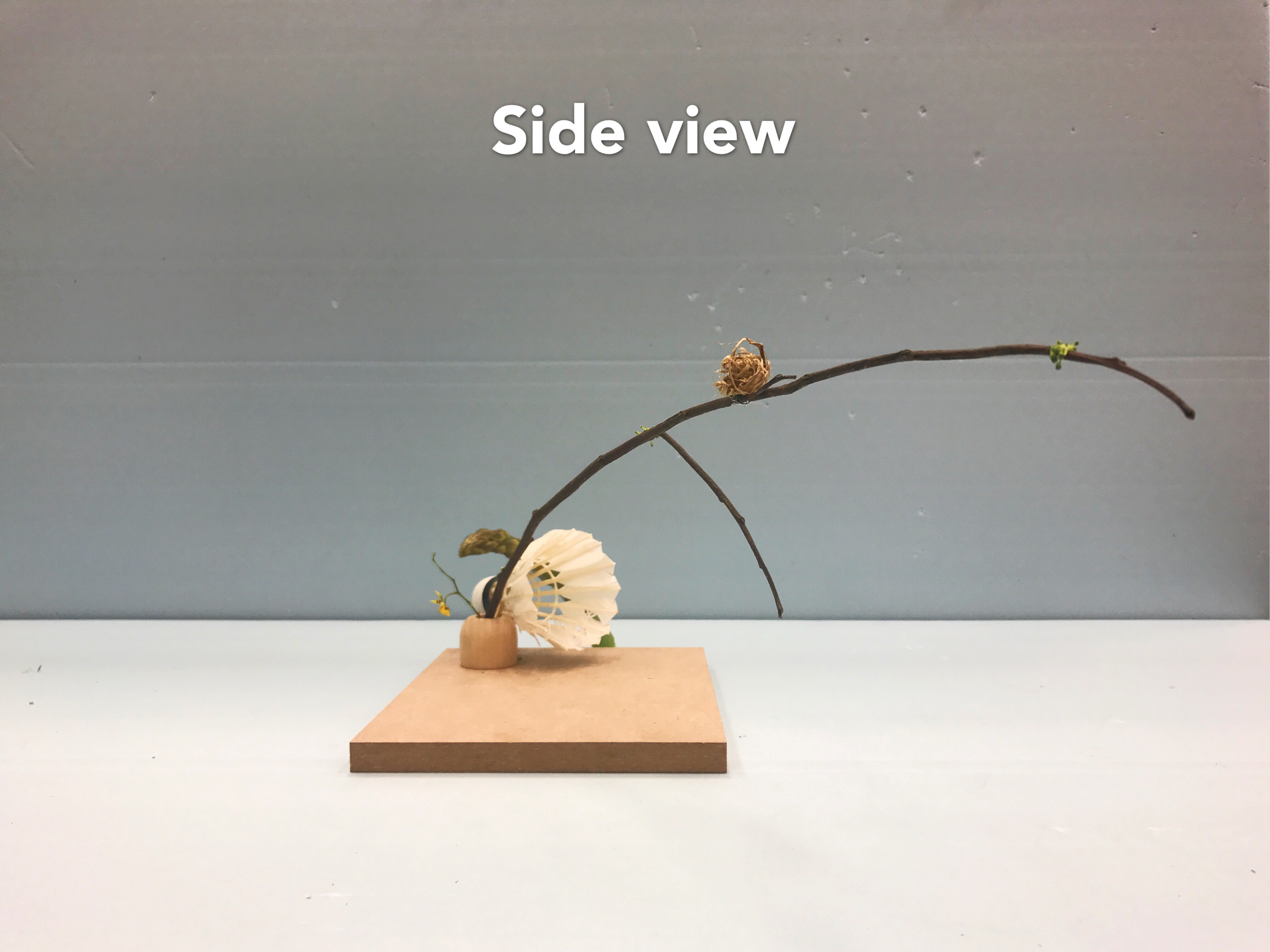
I chose the second sketch model as my final model. At first, I had no idea about the material for the cone. After searching online for spring fruits and veggies, I decided to use banana, strawberry and broccoli to compose a cone shape. And I also wanted to use their scents to show the sweetness and freshness of spring. However, it made the whole model too complex. Less is more, according to the principle of Ikebana which is about minimalism, Cheryl helped me to simplify my model by removing the ‘cone’ part, and placing the asparagus(cylinder) and shuttlecock(cone) at the corner of the chipboard to create a void and put everything in a diagonal arrangement (can be seen from the top view). And the branch also became a part of the model as the dominant.
Here is the final model, it looks much better! Thank you, Cheryl!
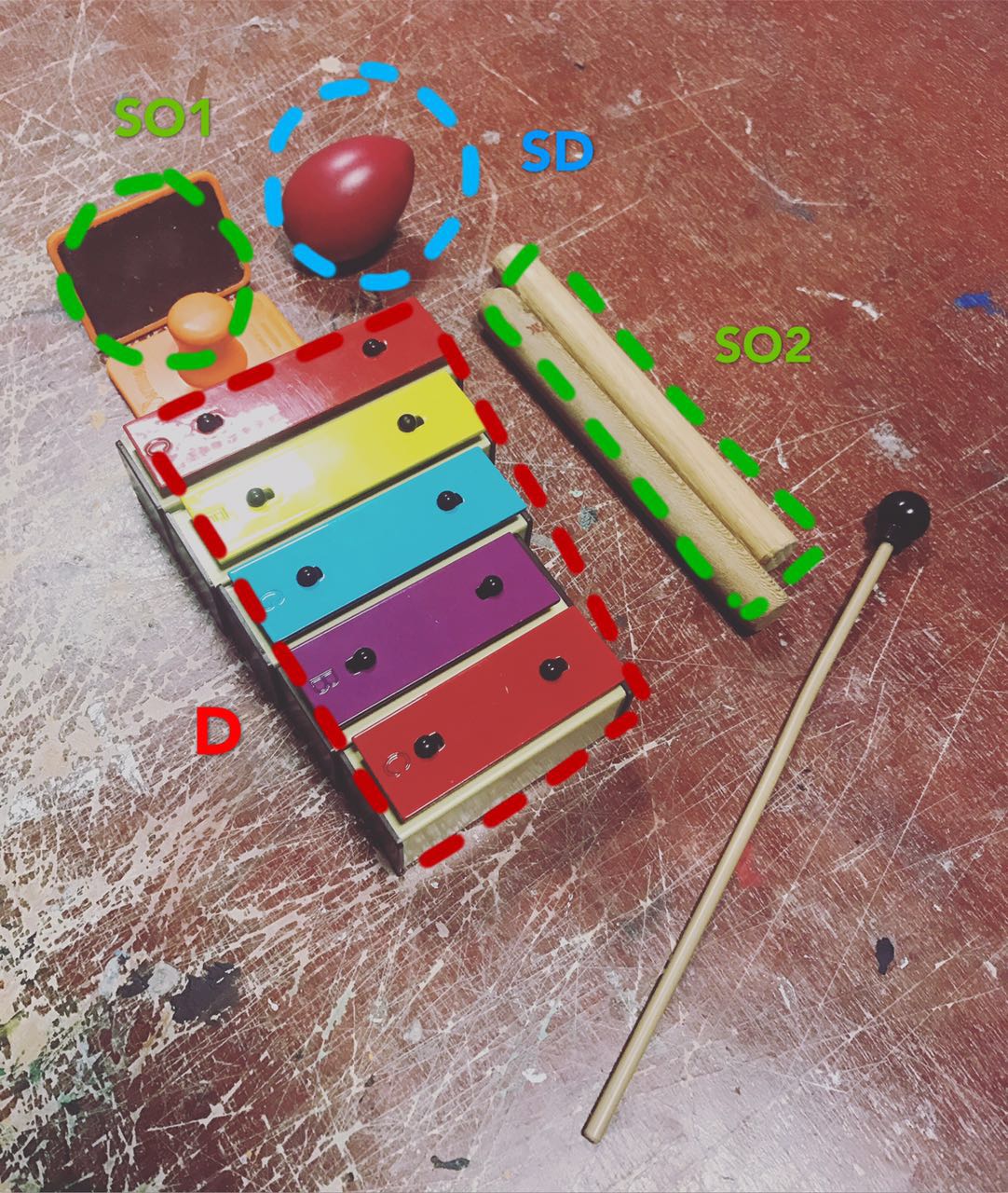
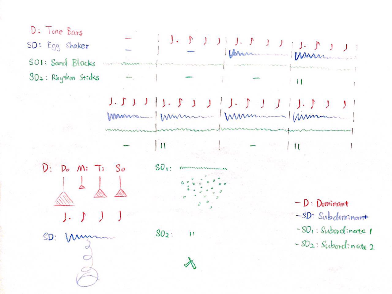
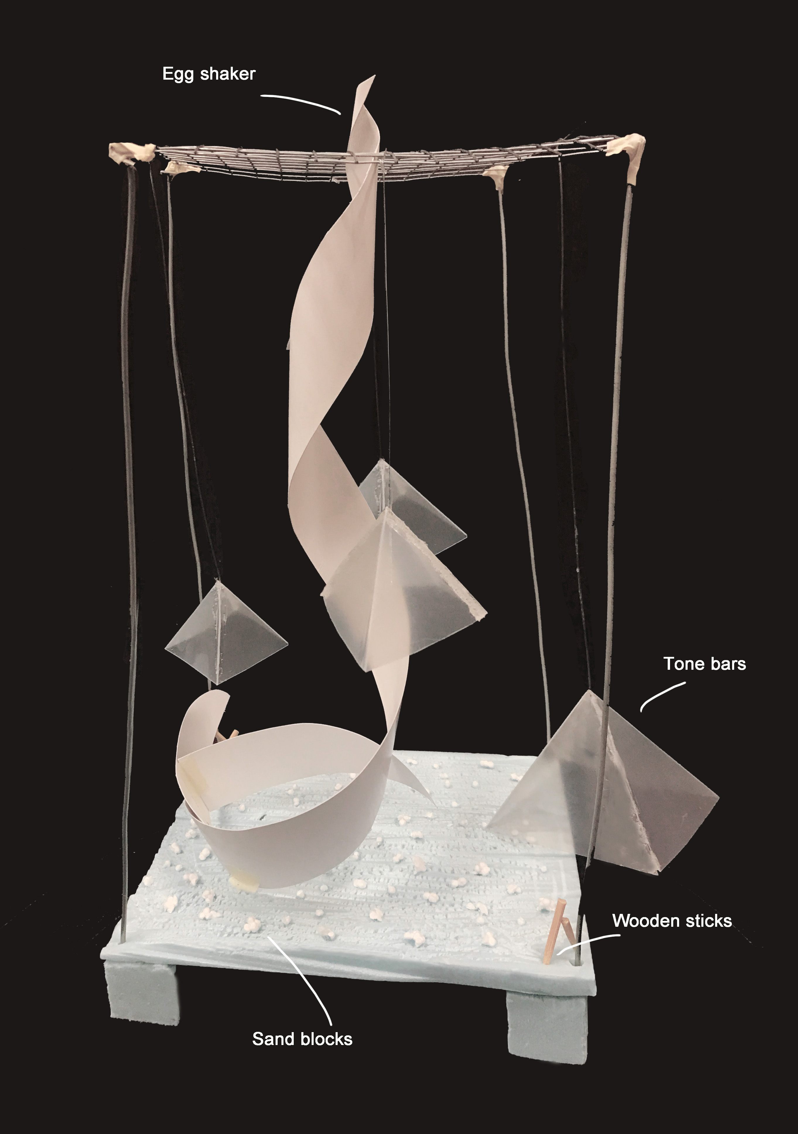
Dominant: Branch
Subdominant: Asparagus & Shuttlecock
Subordinate: Bird nest & Yellow flower
Colour
White, green, yellow, brown
Element
A branch with some tender leaves (broccoli) and a bird nest(dried grass)-birth of new life;
Asparagus-Spring vegetable;
Shuttlecock- people start playing outside to enjoy the warmer weather as well as the new look that Spring brings;
Yellow flower-represent Jasminum Nudiflorum, as a decoration to show the vitality of Spring;
Chipboard-use the earth tone base to act as the ground.