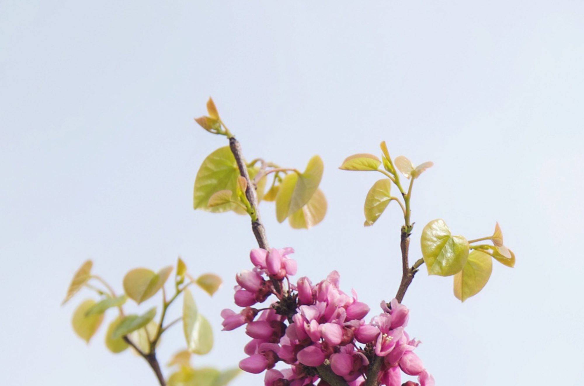

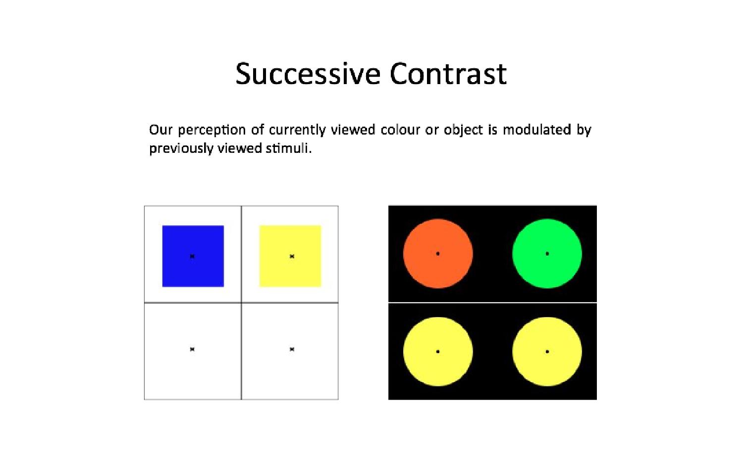
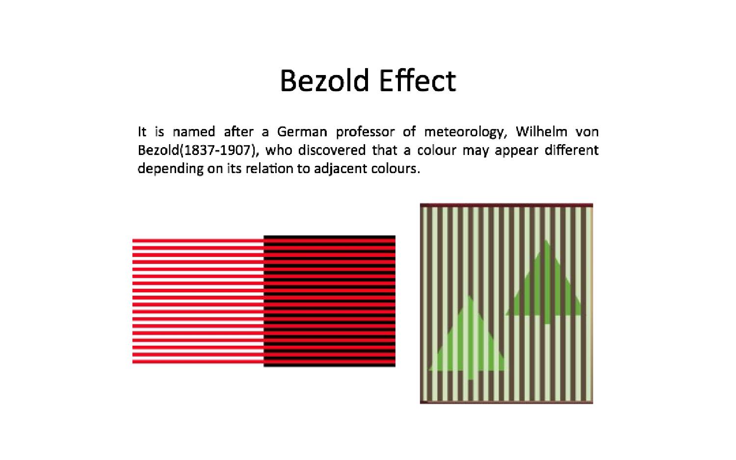
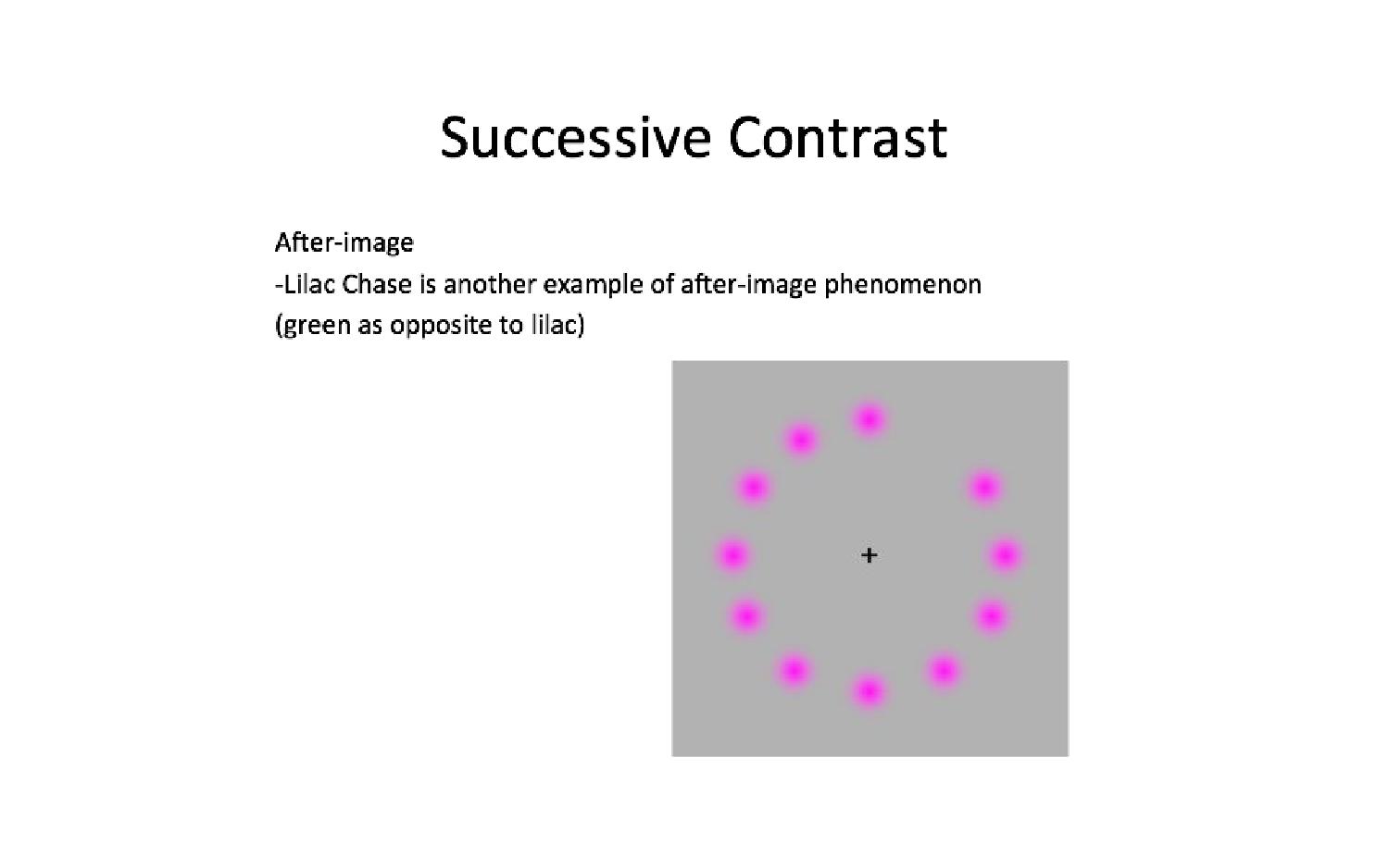
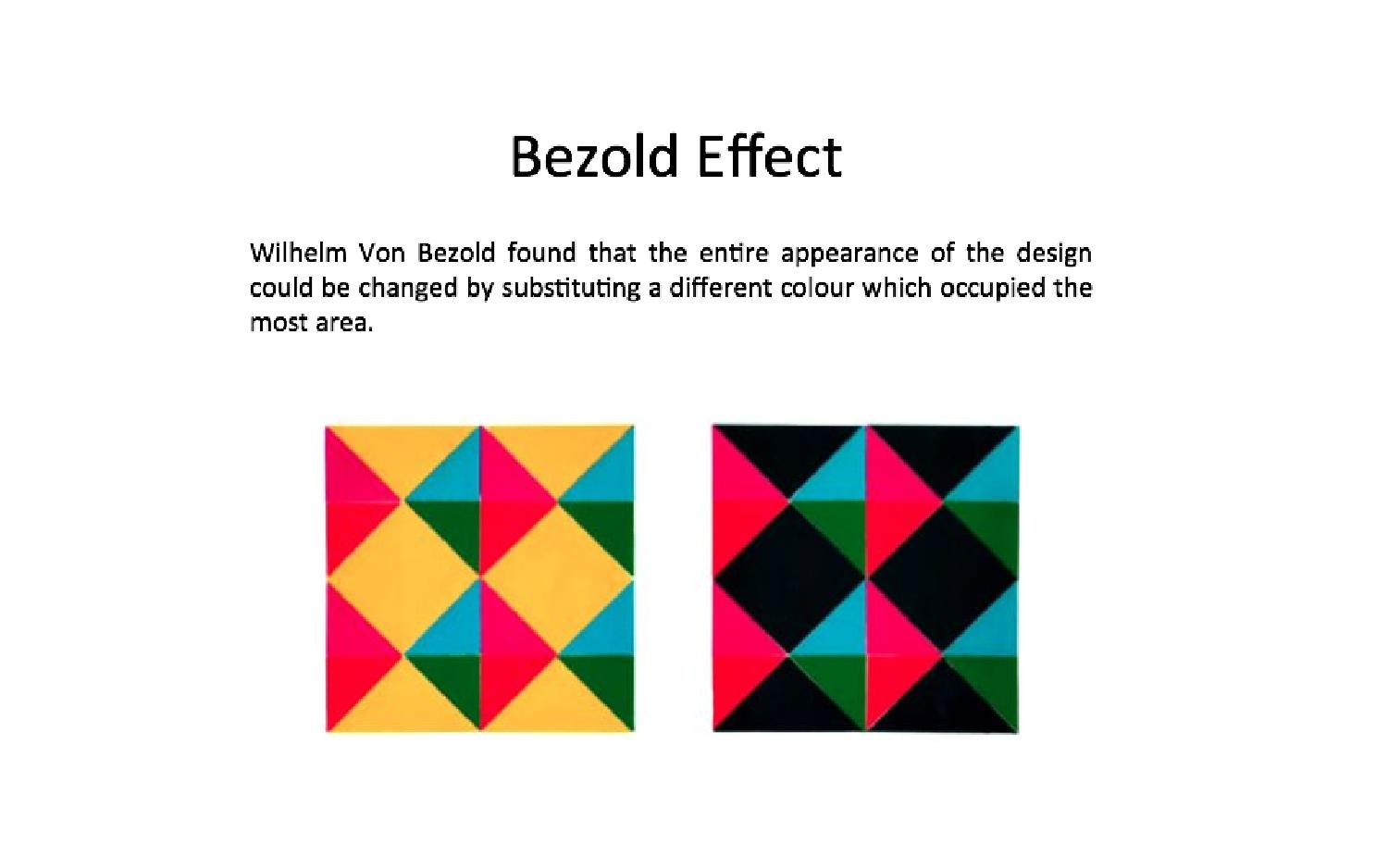
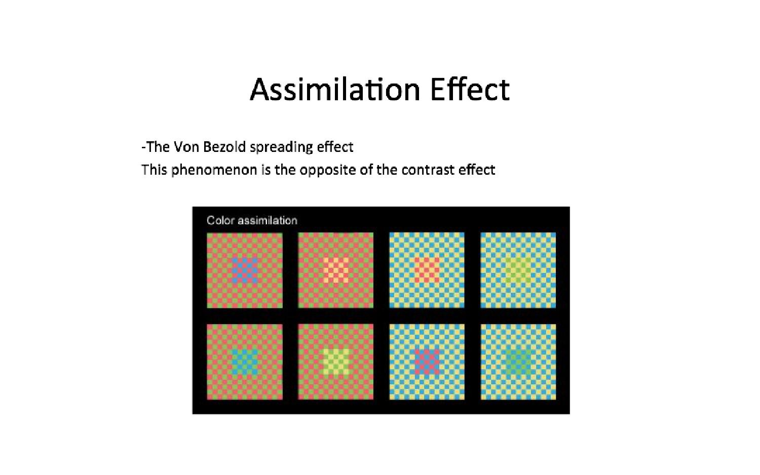
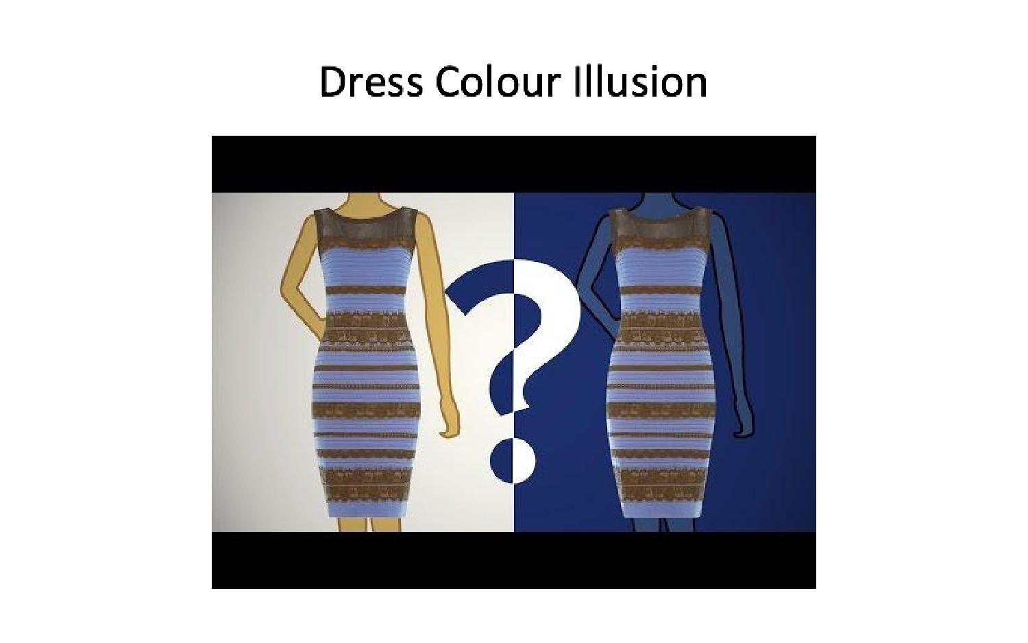

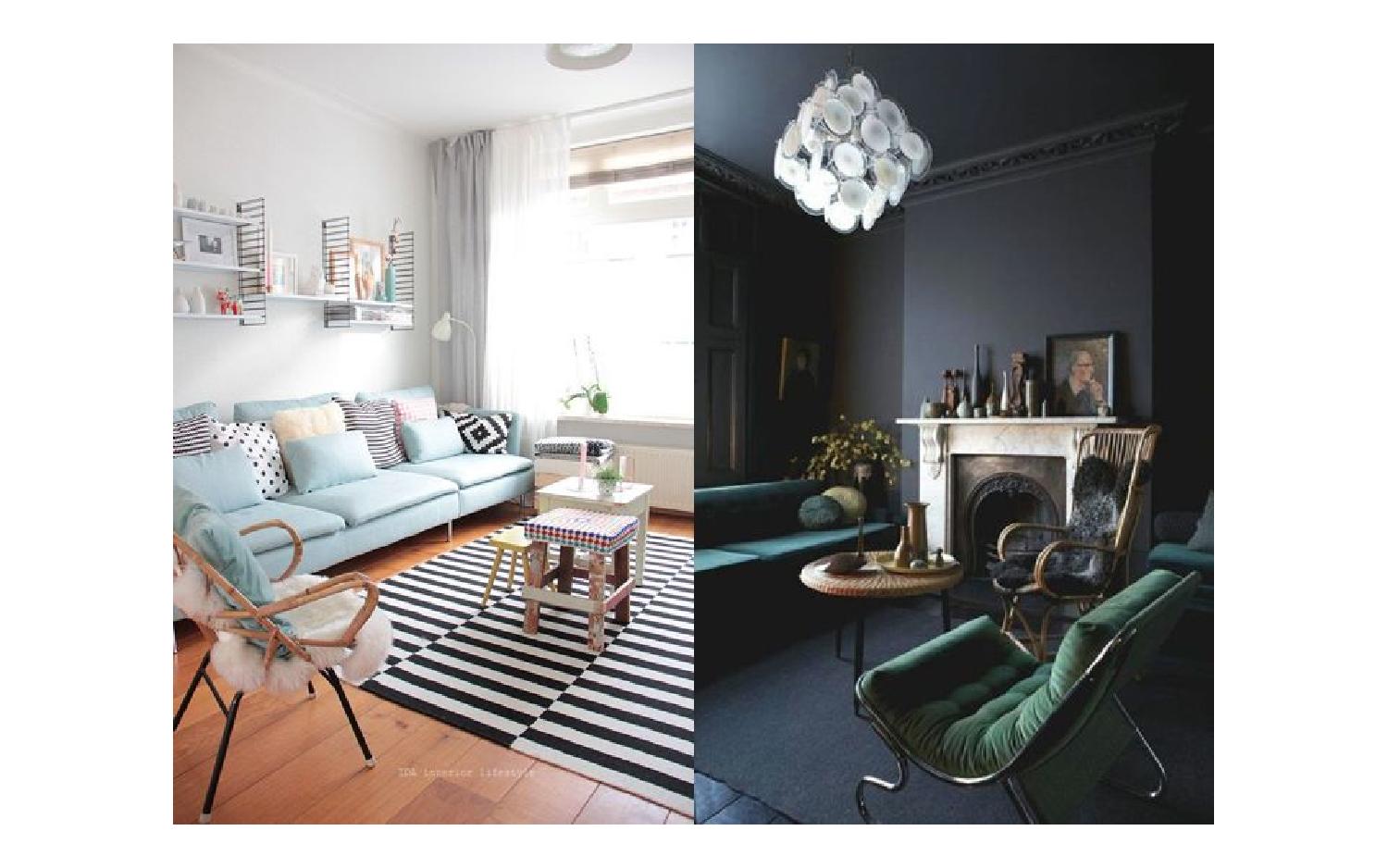
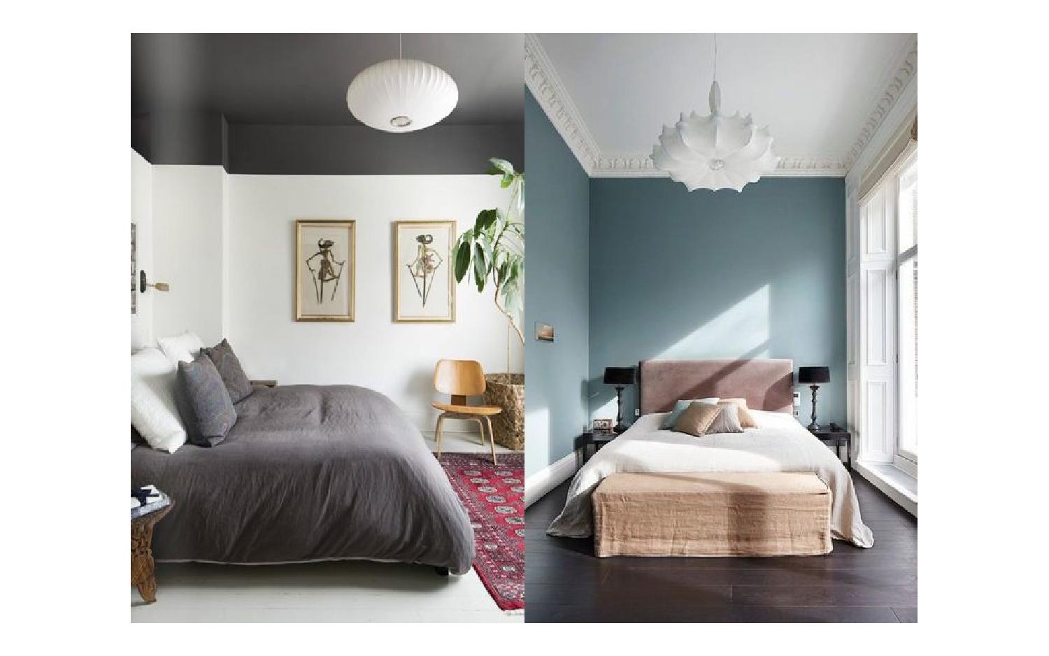
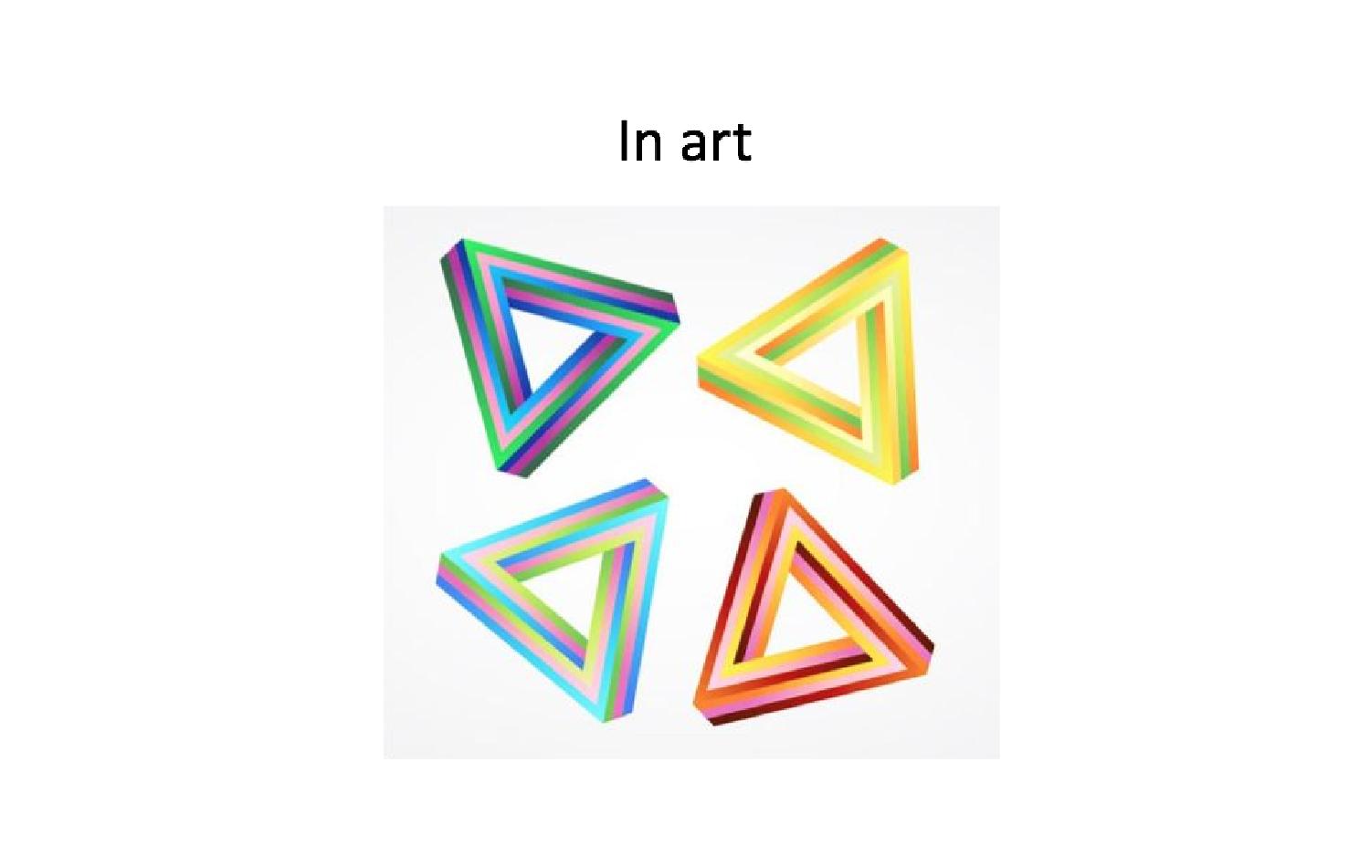
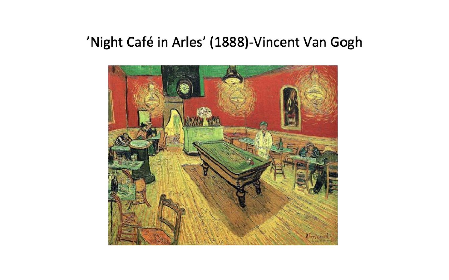
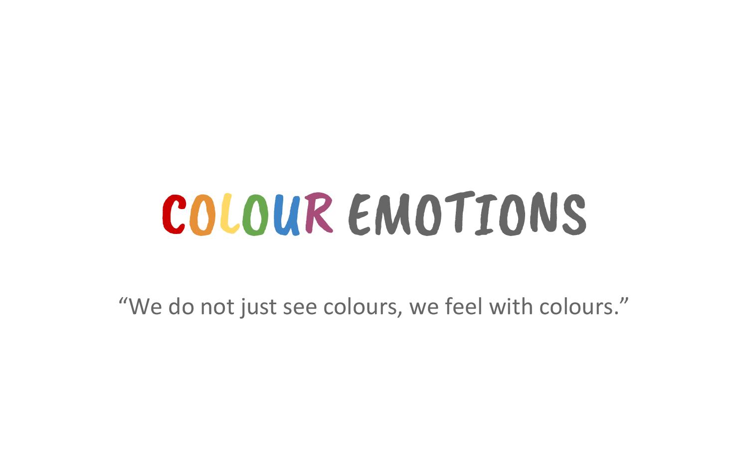
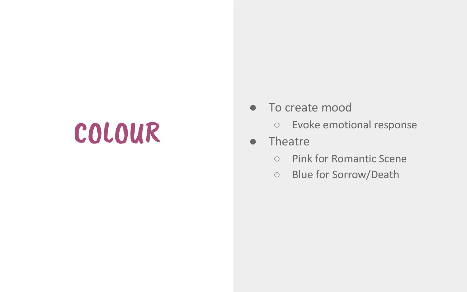
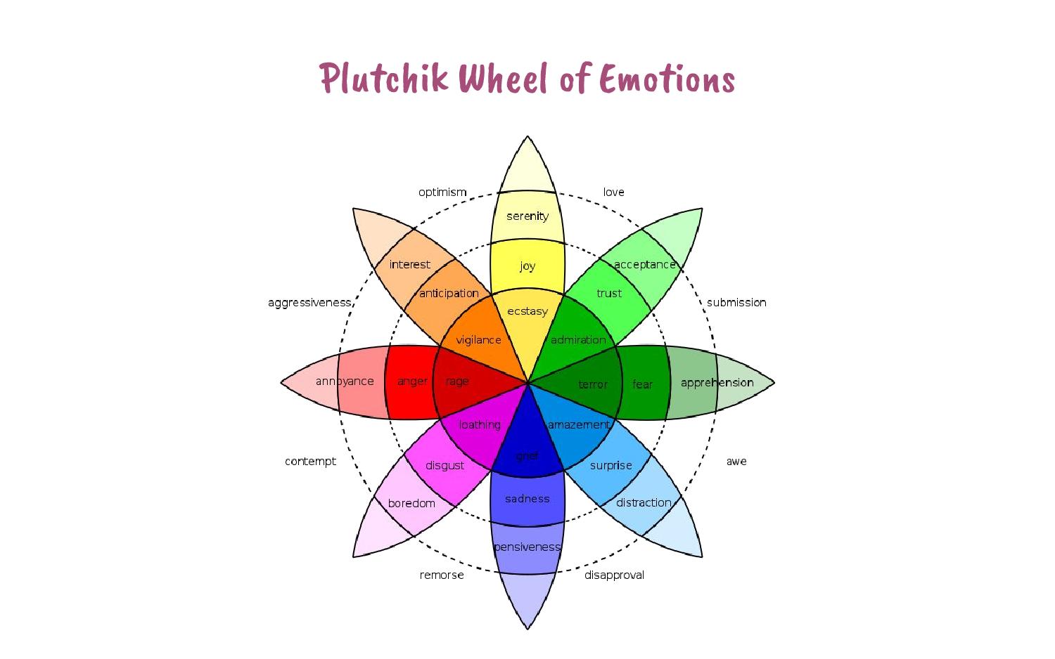
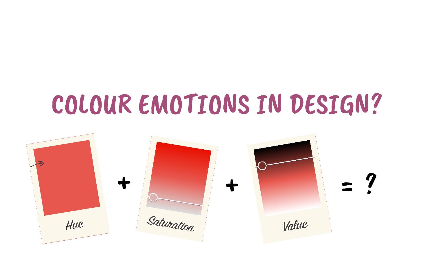

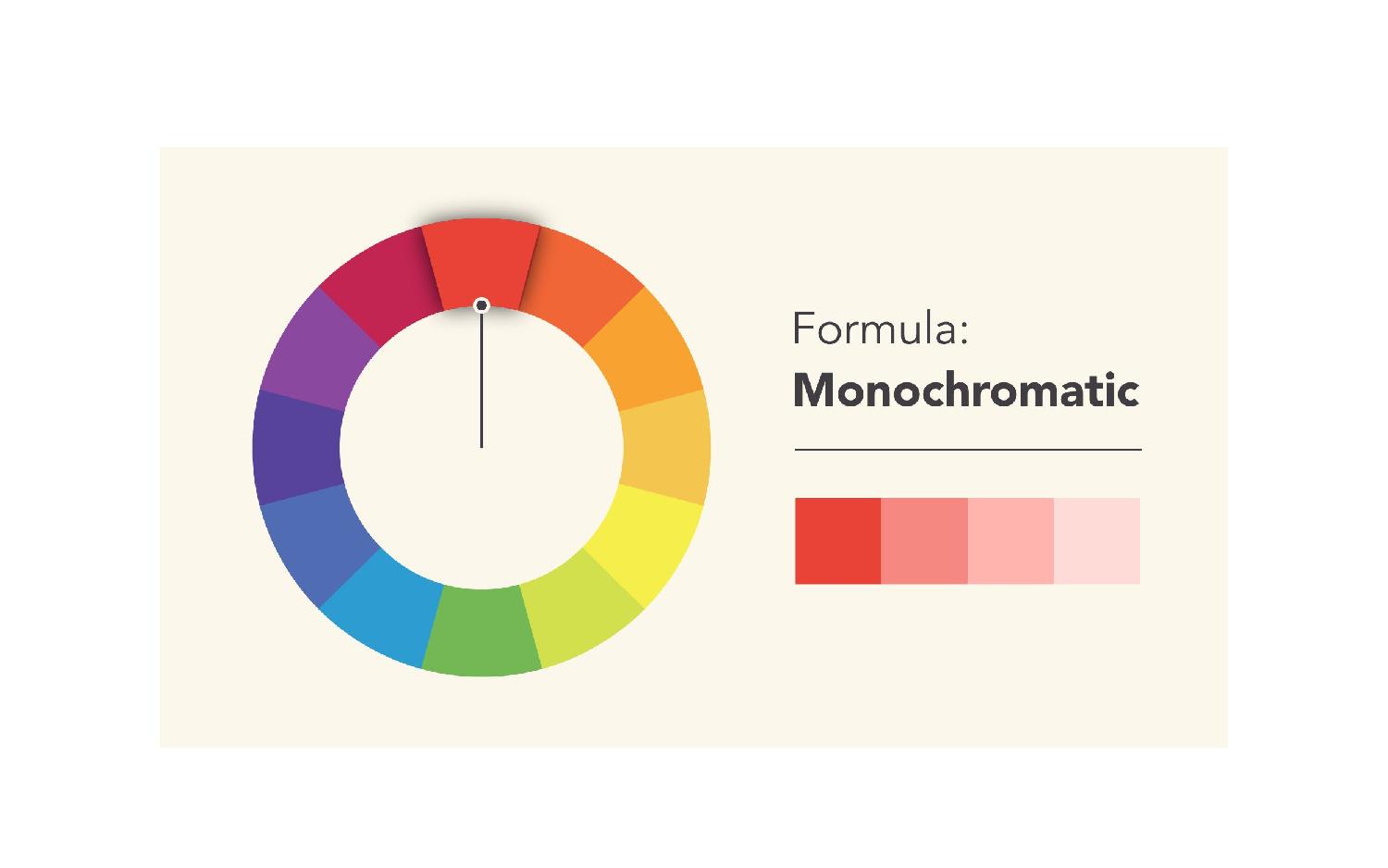
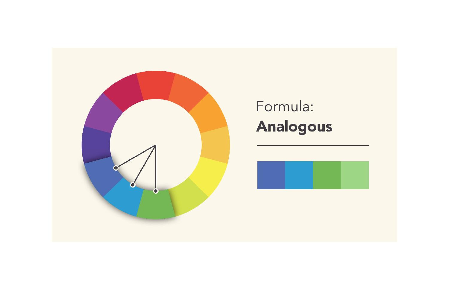


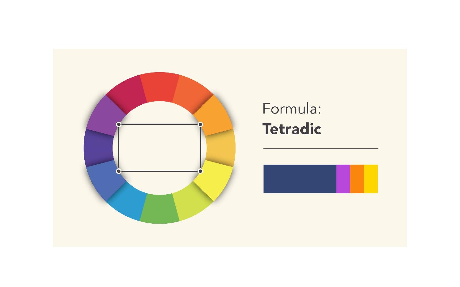
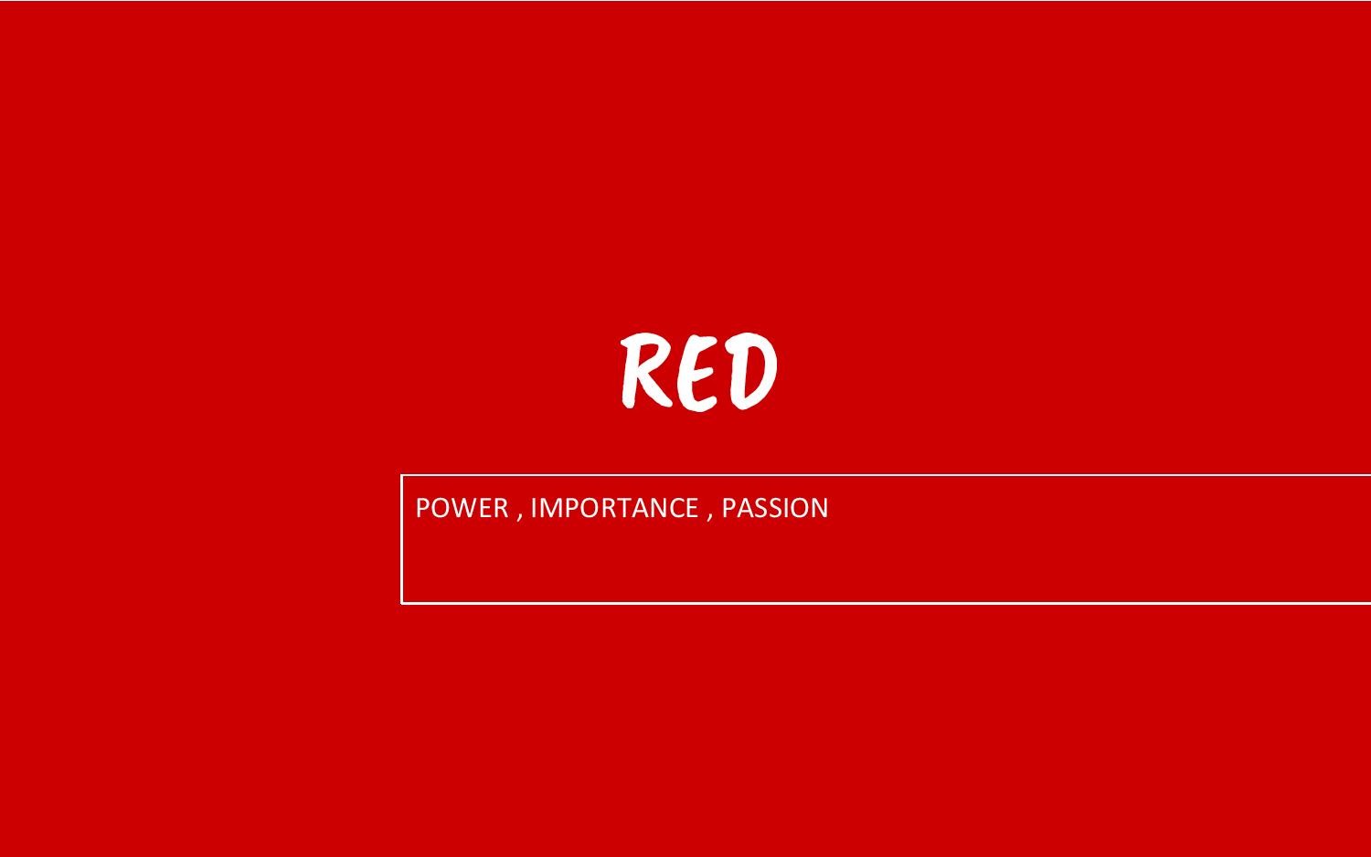
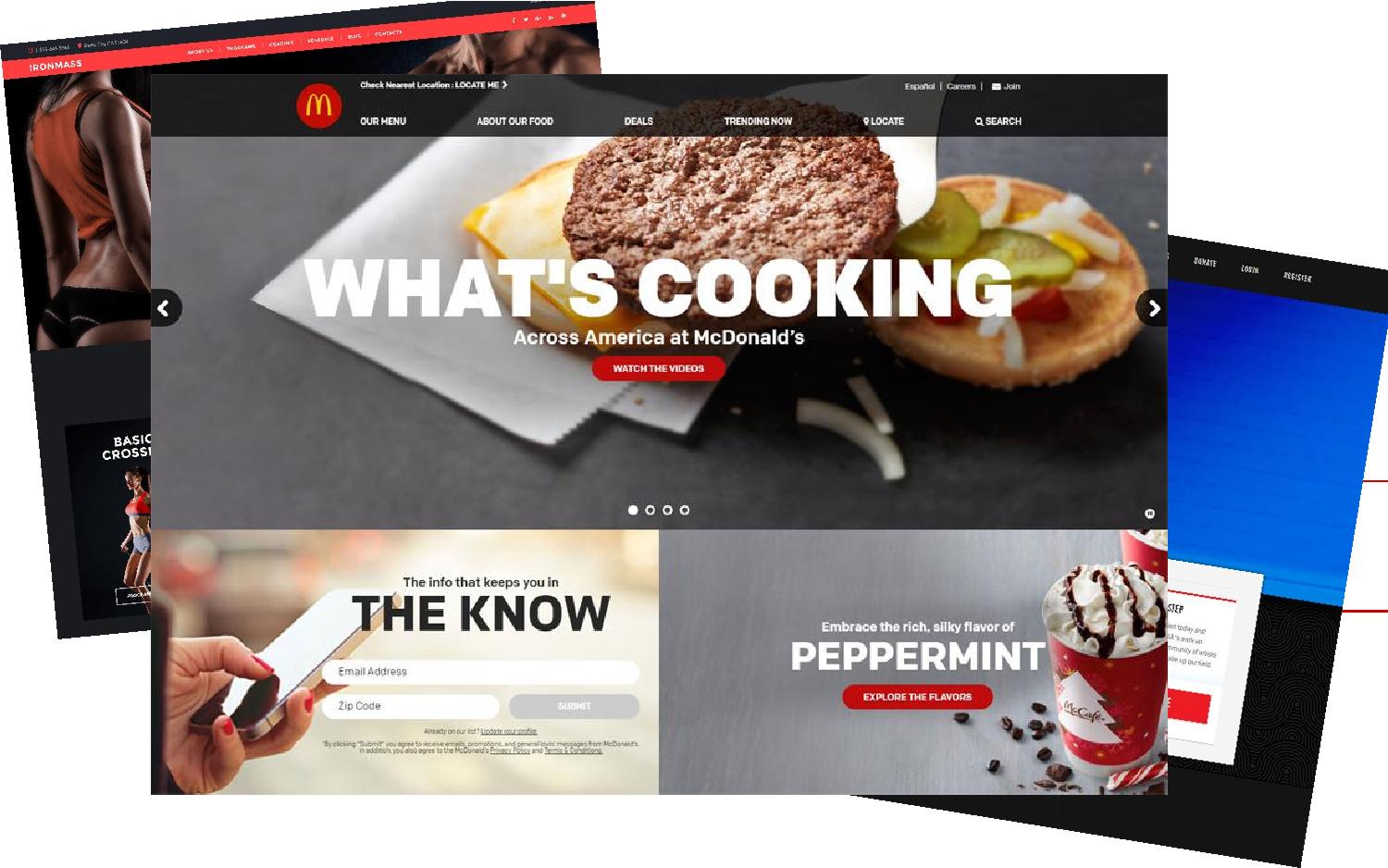

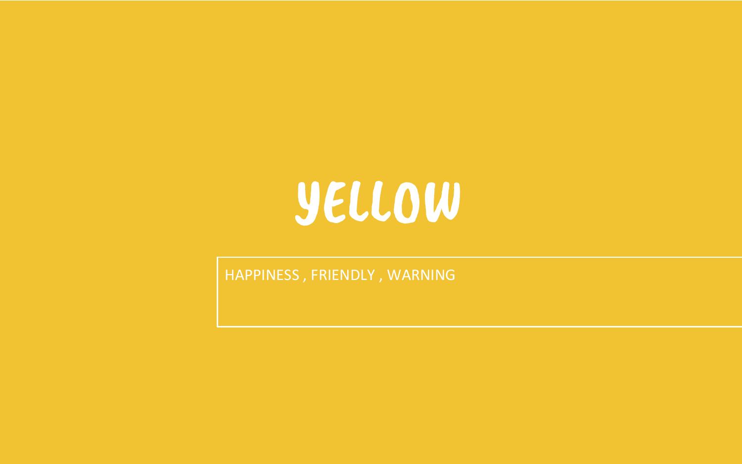
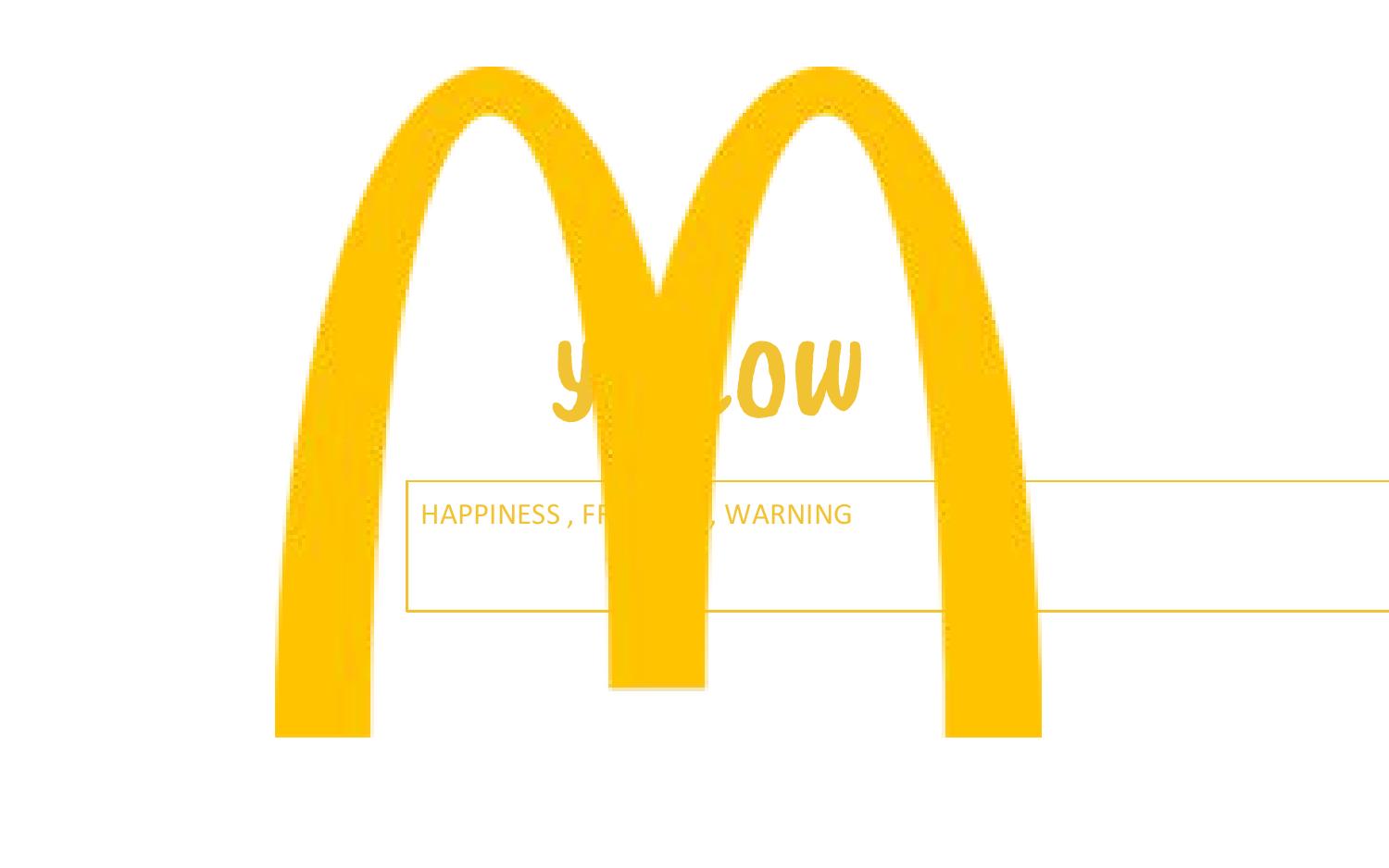

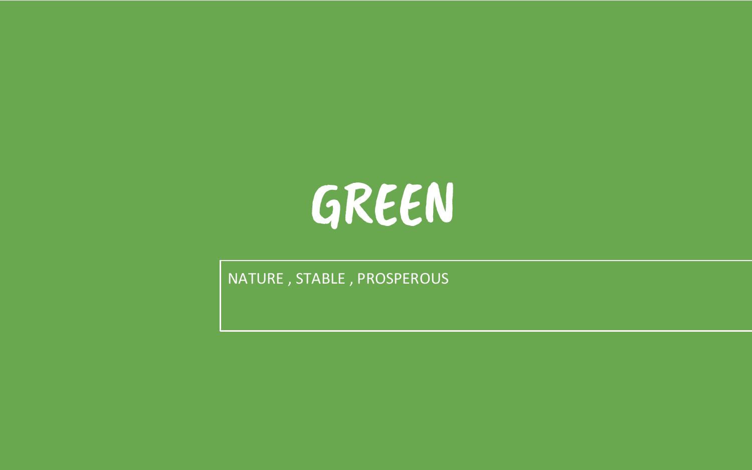
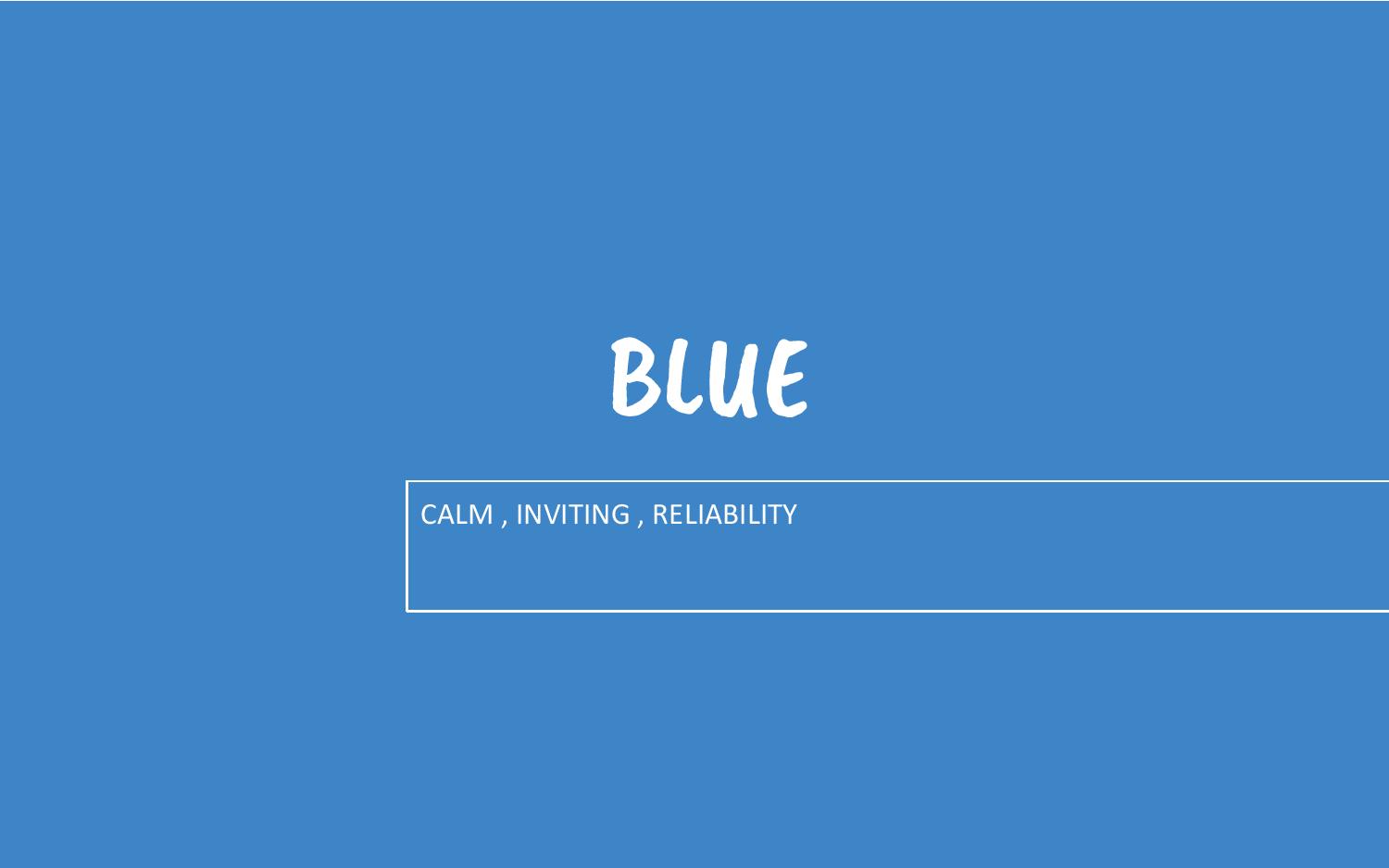

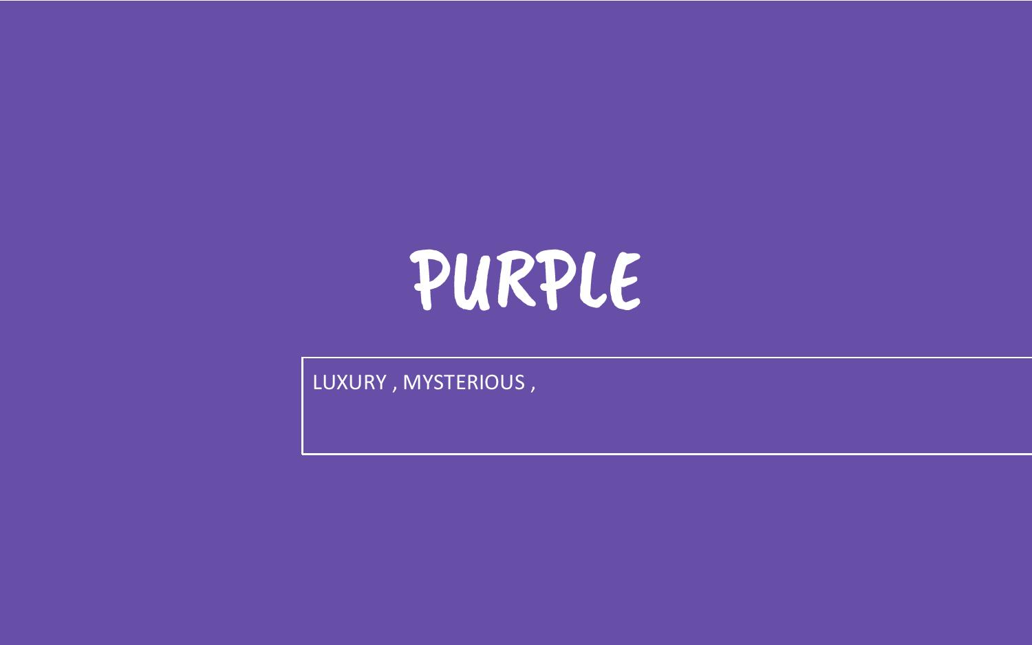
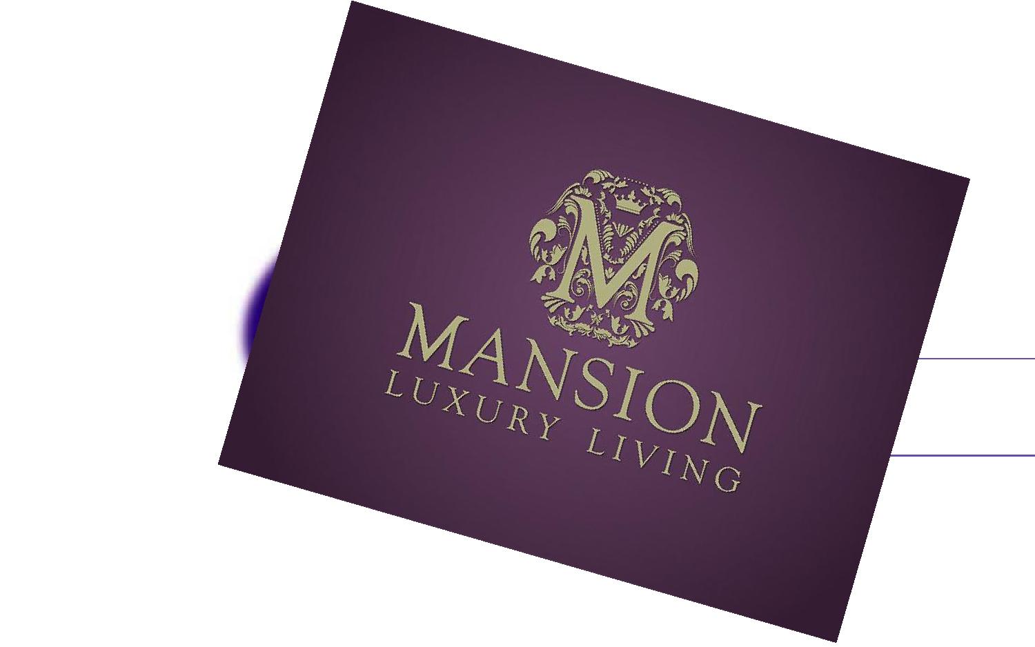
Colour Illusions and Emotions

Foundation 3D: Pandora Box-Cantilever
The word I got from the Pandora’s Box was Cantilever. I have searched on Wikipedia about this word: A cantilever is a rigid structural element, such as a beam or a plate, anchored at only one end to a (usually vertical) support from which it is protruding. Cantilevers are widely used in construction, such as in bridges and buildings. After a preliminary understanding of what is cantilever, I composed 2 sketch models on week 2.
3 views of Model 1:
 Front view-the sizes of SD&SO are quite similar.
 Side view-the widths of D, SD&SO are similar……
 Top view-SD cannot be seen; the size of SO is too big.
3 views of Model 2:
 Front view-the sizes of SD&SO are similar; the length of SD is longer than 1/2 length of D; the left side of the model is too flat.
 Side view-the sizes of SD&SO are similar; the width of SD is longer than 1/2 width of D; everything is centralized.
 Top view-SO cannot be seen; D&SD are shifted.
The feedback I got on week 2:
With these points in mind, I tried to improve the two models above and explore some more different composition of Cantilever on week 3.
3D Sketch Model 1:


2D Analysis of Model 1:
3D Sketch Model 2:


2D Analysis of Model 2:
3D Sketch Model 3:


2D Analysis of Model 3: 
3D Sketch Model 4:


2D Analysis of Model 4:
The feedback I got on week 4:
I decided to choose Model 4 as my final model.
Final sketch model:


Final adjustment:
Materials
Considering the future application of this model, I decided to use chipboard(D), glass(SD), and metal wire(SO) as my materials at first. However, during the final model making process, I wanted the SD to be double layers, so I used transparent PVC sheet to replace the glass as it was in lighter weight and easier to cut.
My idea was inspired by Mash Bar. Mash is one of the smallest bars in Amsterdam, the designer used chipboard all around for the interior to create a cozy and warm atmosphere.


The main materials I can see from the bar’s interior are chipboard, metal, glass, and fabric.
FINAL MODEL


Application
1. Note board with a LED glass clock


The control buttons are placed at the edge of the note board. As the glass board is double layered, the user can put a paper in between and then write notes on the glass board.
2. Table
 When you are not using the table, you can lift it up for more space. And now, it becomes a glass note board again…


Foundation 2D Project 1: My Line is Emo
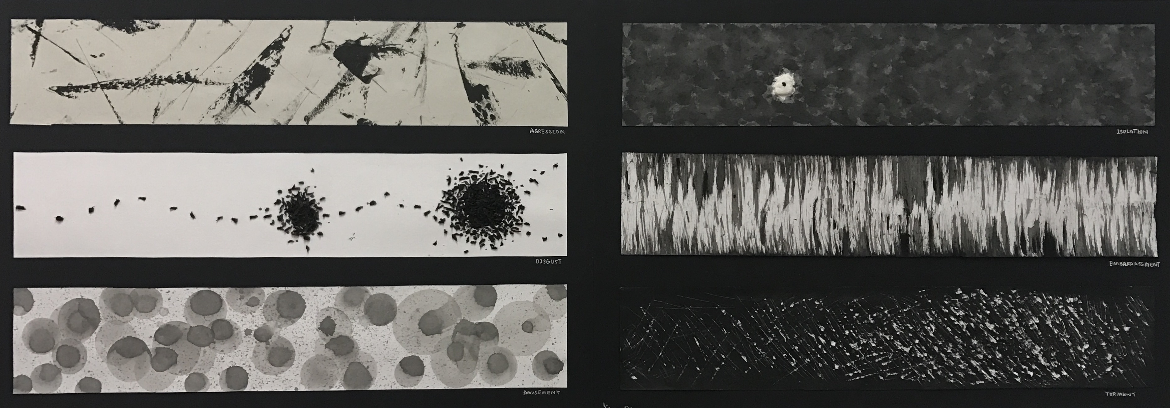
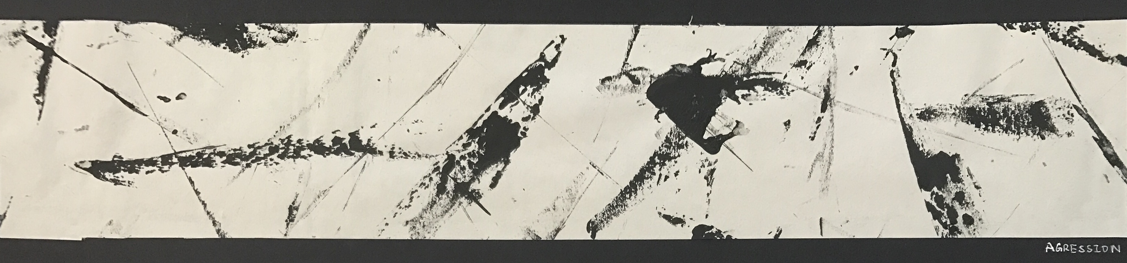
Definition: A feeling of anger or antipathy resulting in hostile or violent behavior; readiness to attack or confront.
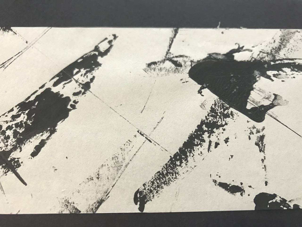
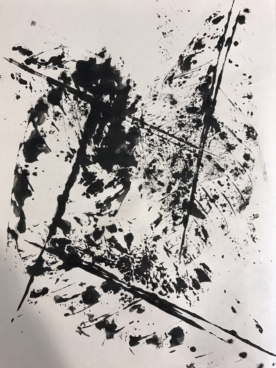
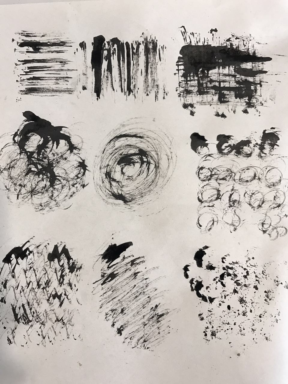
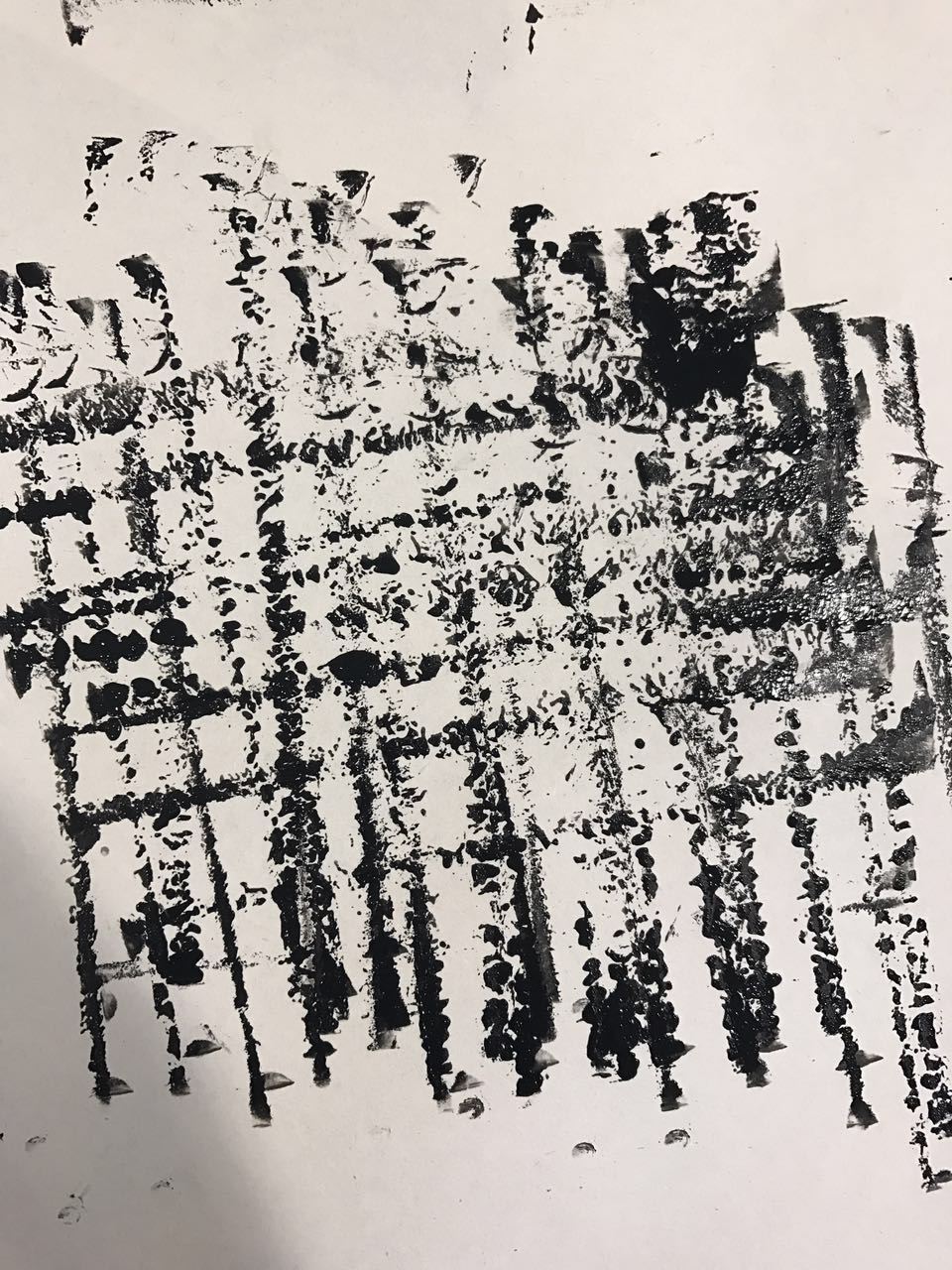
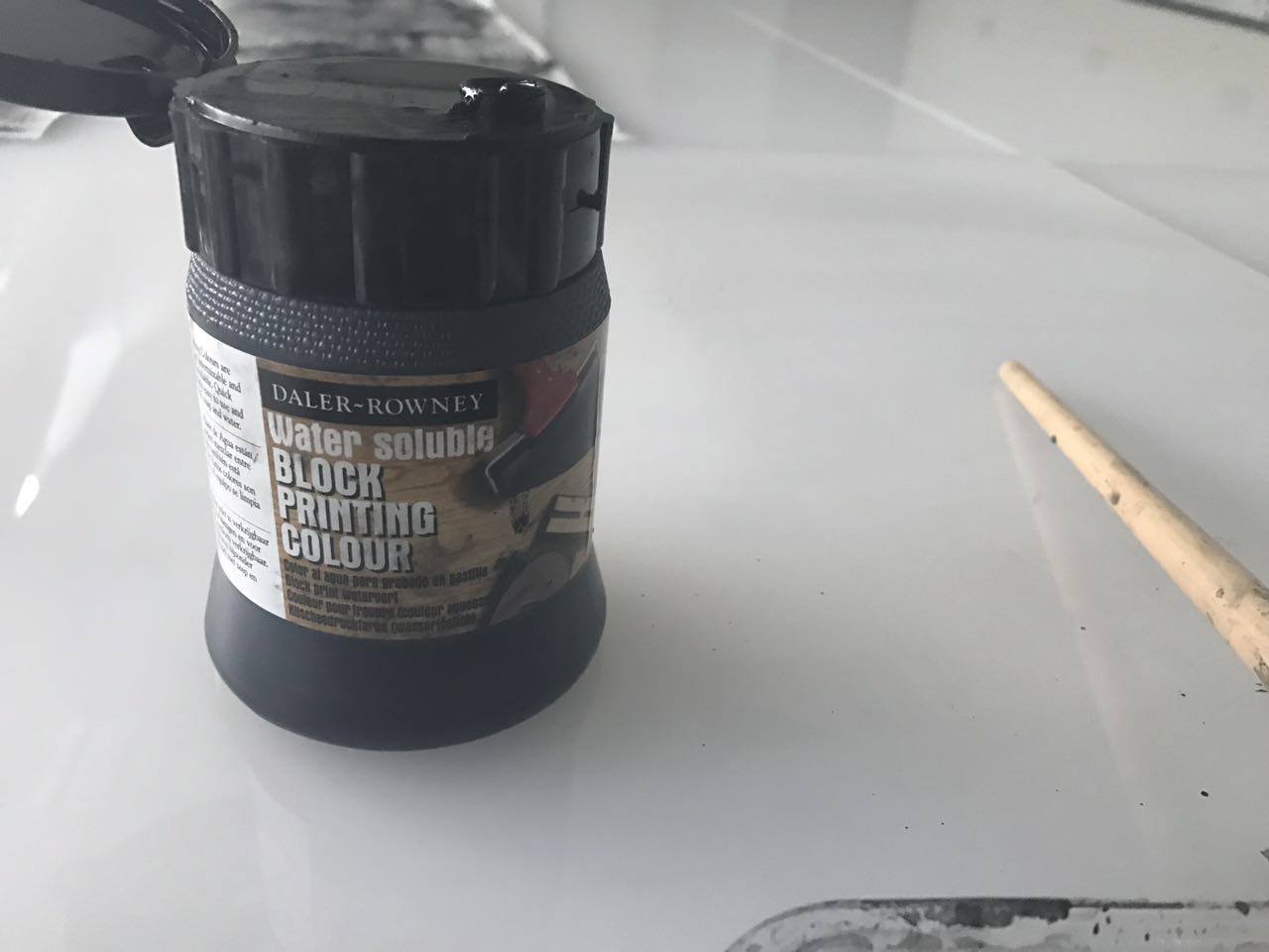
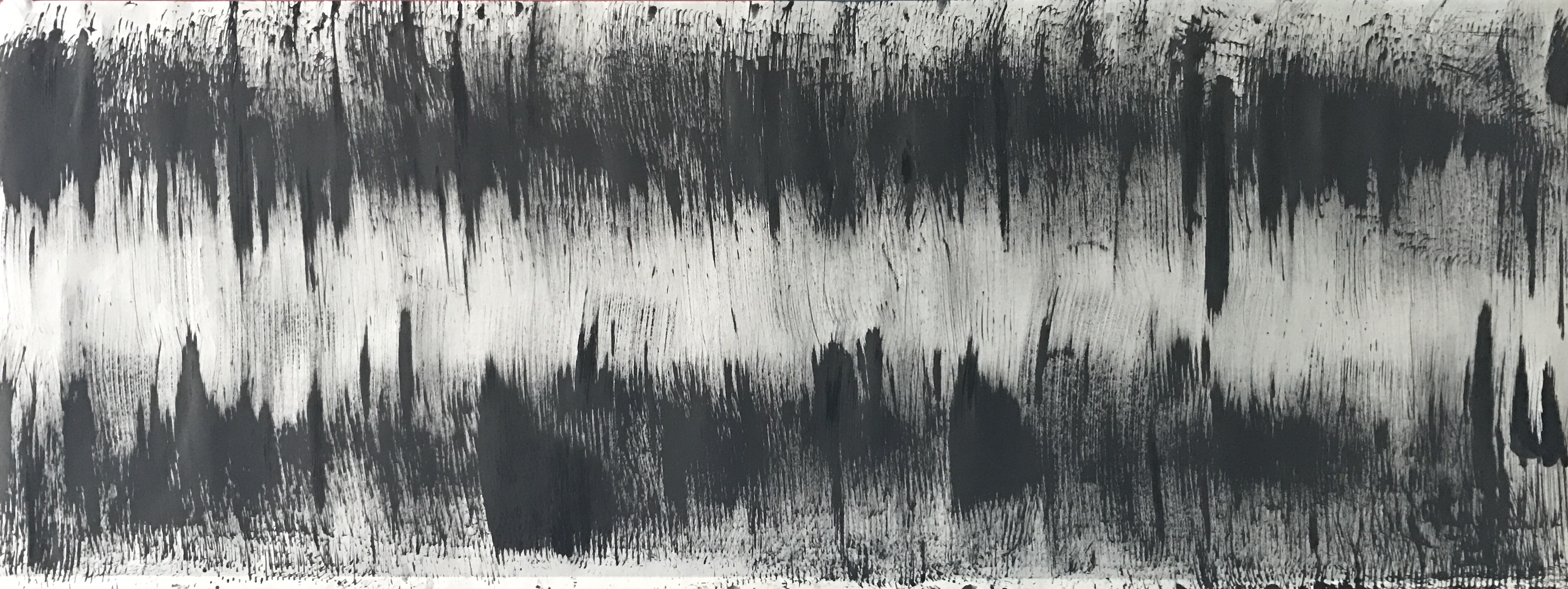
Self Interpretation: Angry feelings and associated with violent action, which remind me of weapons used in the ancient wars. The tools I used were Chinese ink, and palette knives with their sharp tip and edges.
The tools I used were Chinese ink, and palette knives with their sharp tip and edges.
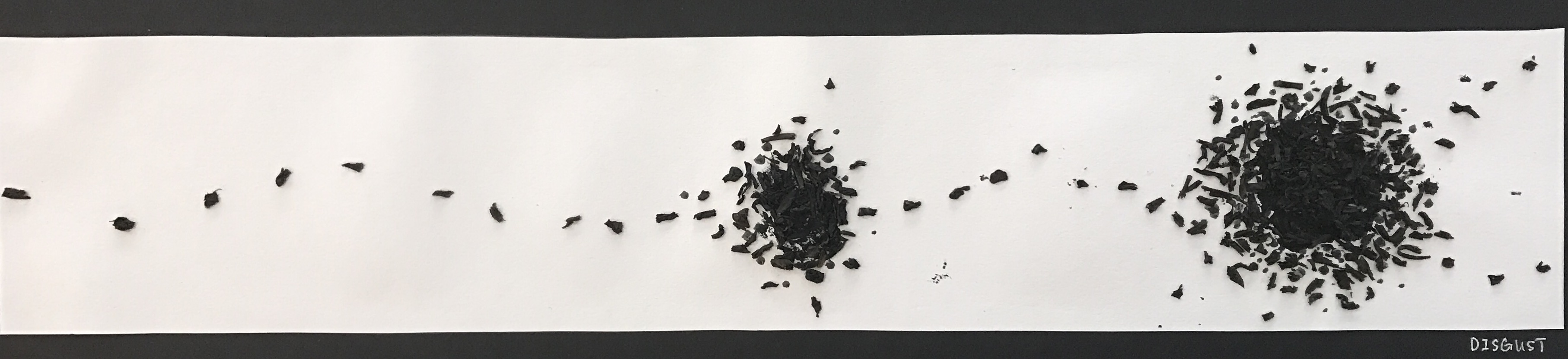
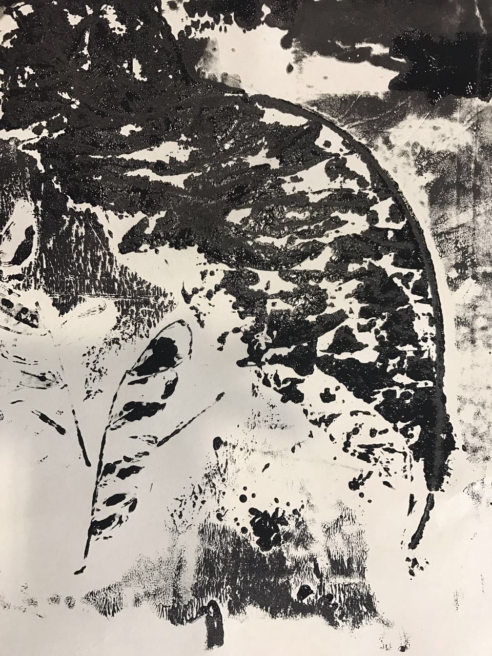
Definition: A feeling of revulsion or strong disapproval aroused by something unpleasant or offensive.
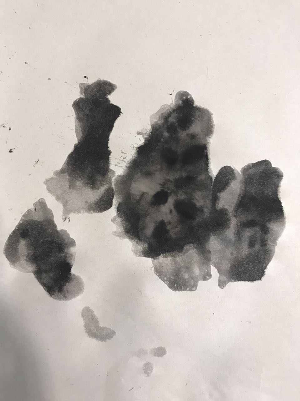
Self Interpretation: Things make me uncomfortable or make me tremble when I see it. Like vomit, rotten food, and dead animal or insect body, and swarms of flies or ants are attracted and gather around.
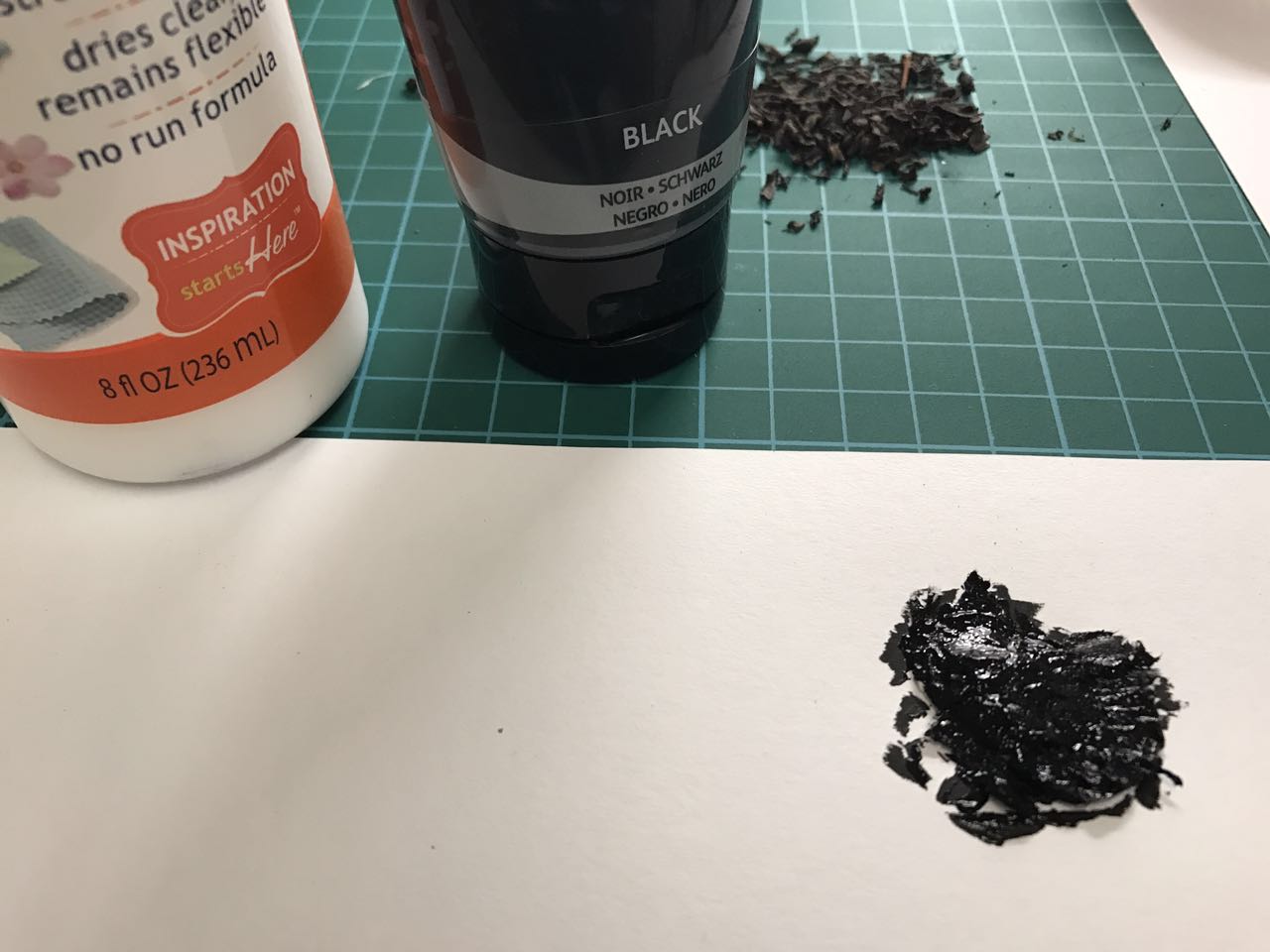
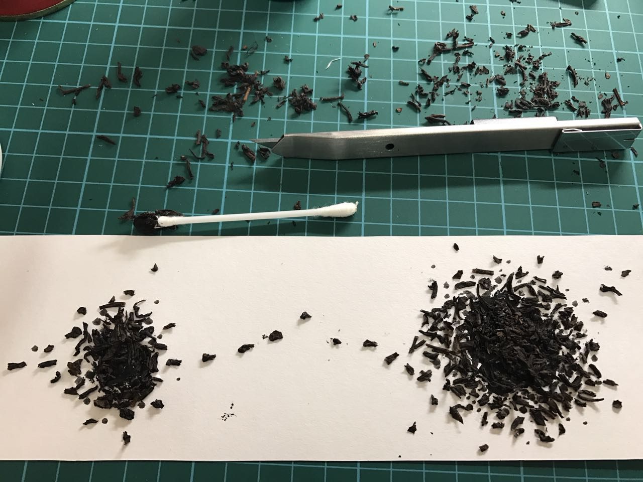
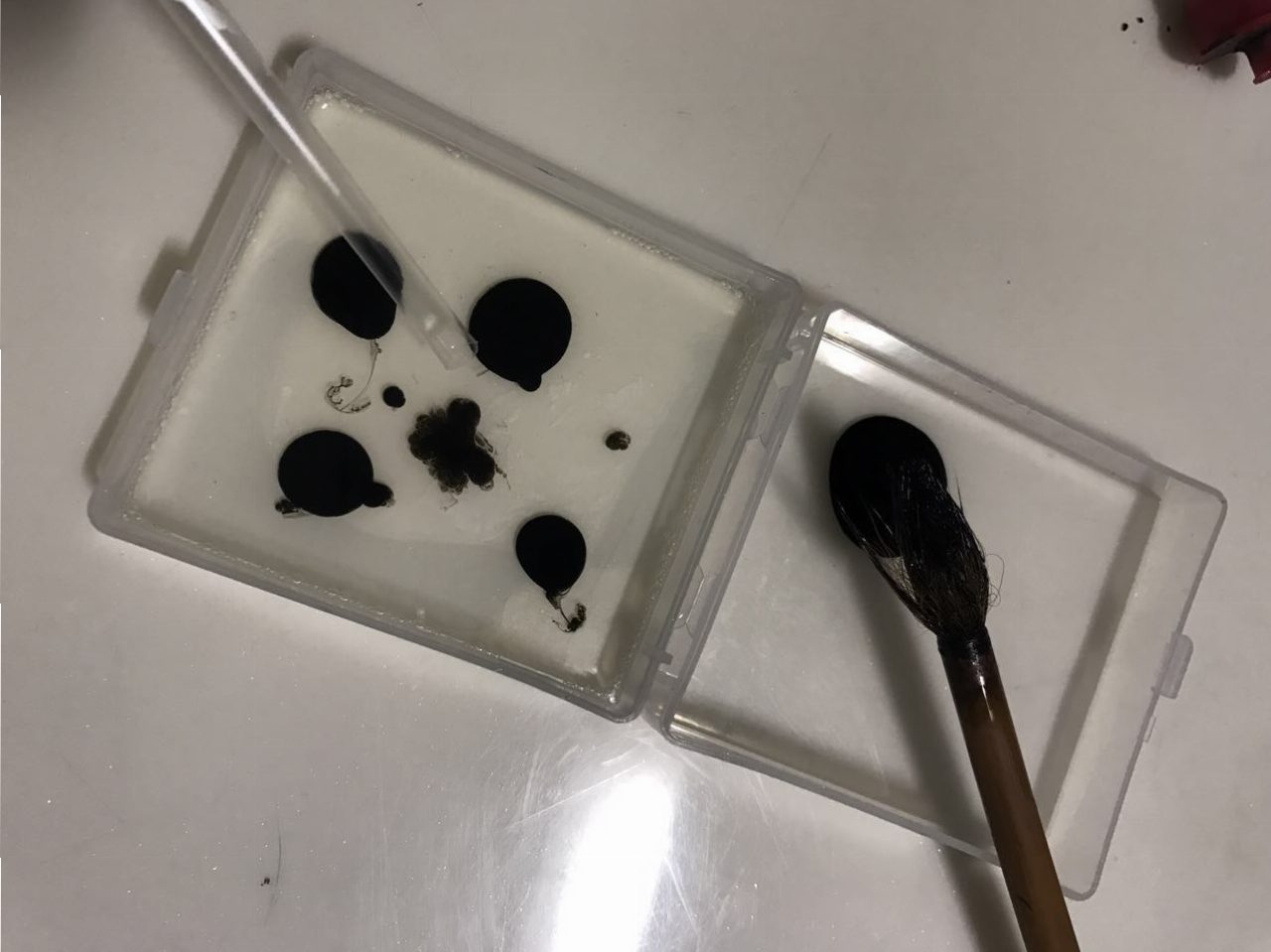
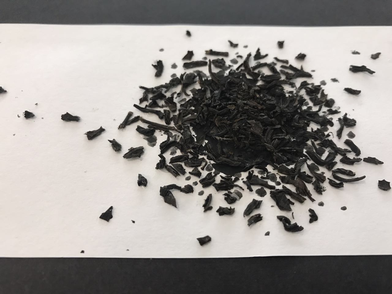
The tools I used were tissue with Chinese ink and a bag of dry tea. The final result also looks like the bacterial infection.
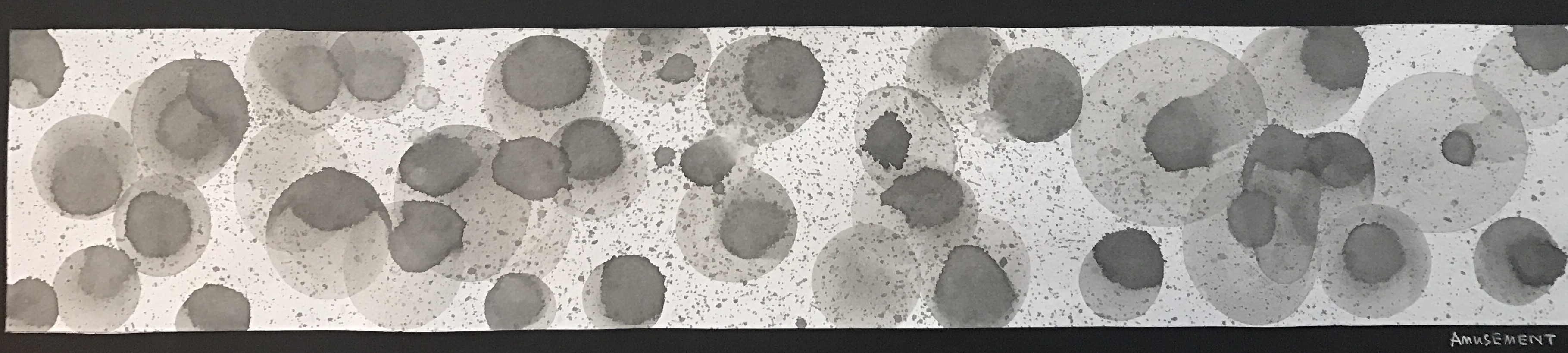
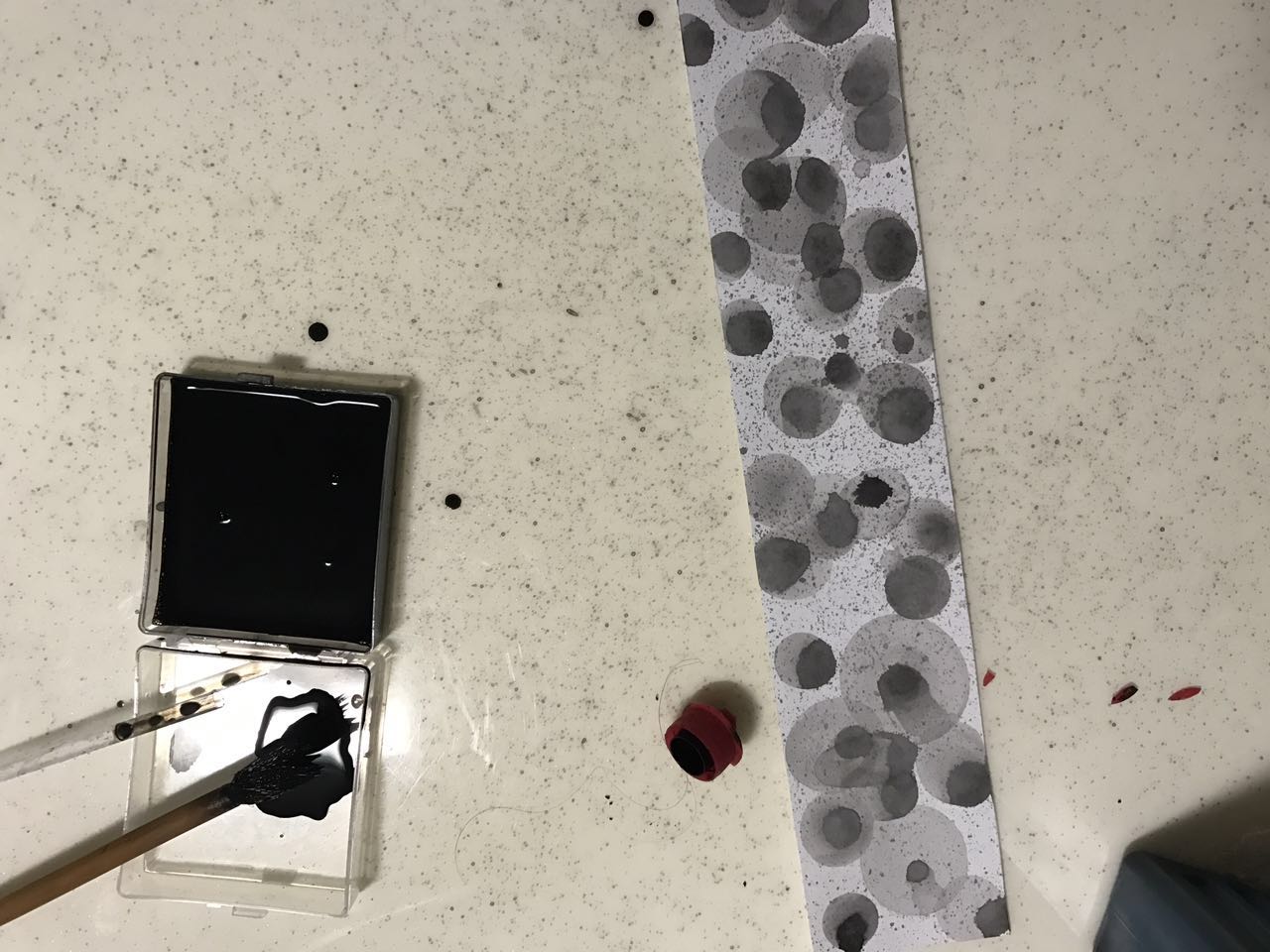
Definition: Anything that amuses; pastime; enjoyment
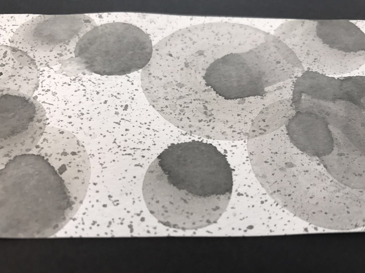
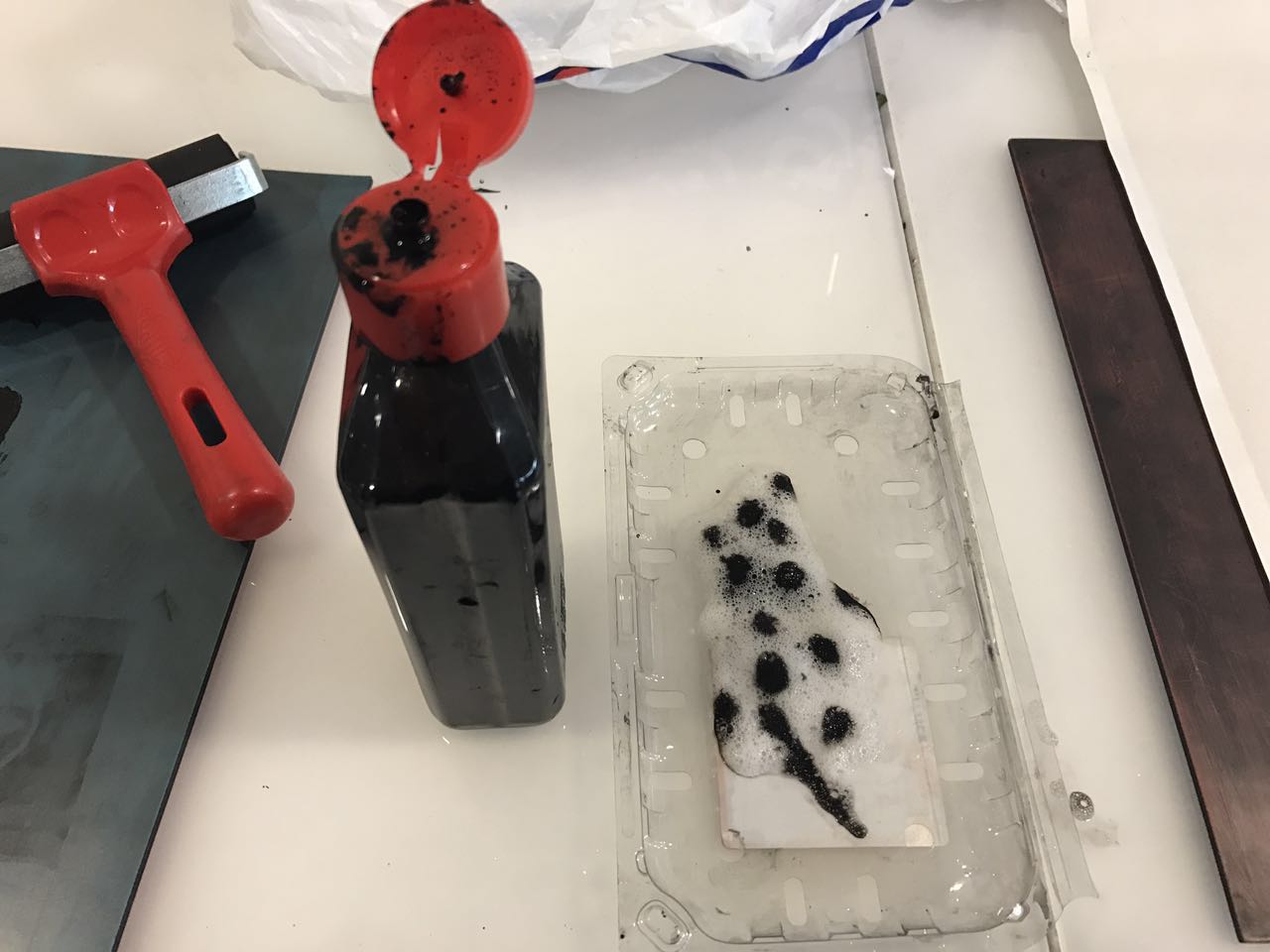
Self Interpretation: The Circular shape is a kind of fun element. I was trying to make this mark through an amusing way. So the thing I did was blowing bubbles directly onto the paper strip with a straw. Tried to create an atmosphere of happiness and enjoyment with different sizes and opacities of bubbles. The splashes around also helped a lot.
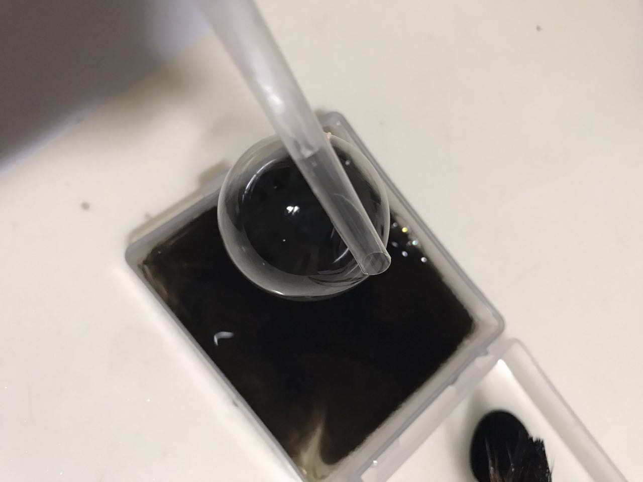
The tools I used were Chinese ink mixed with liquid detergent and a straw.
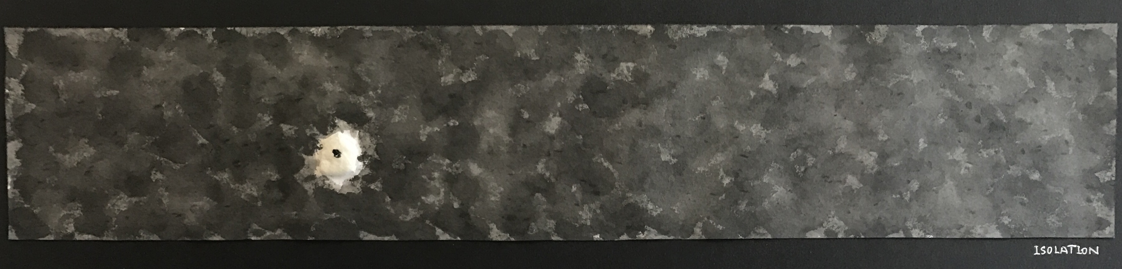
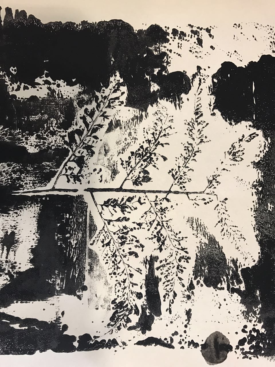
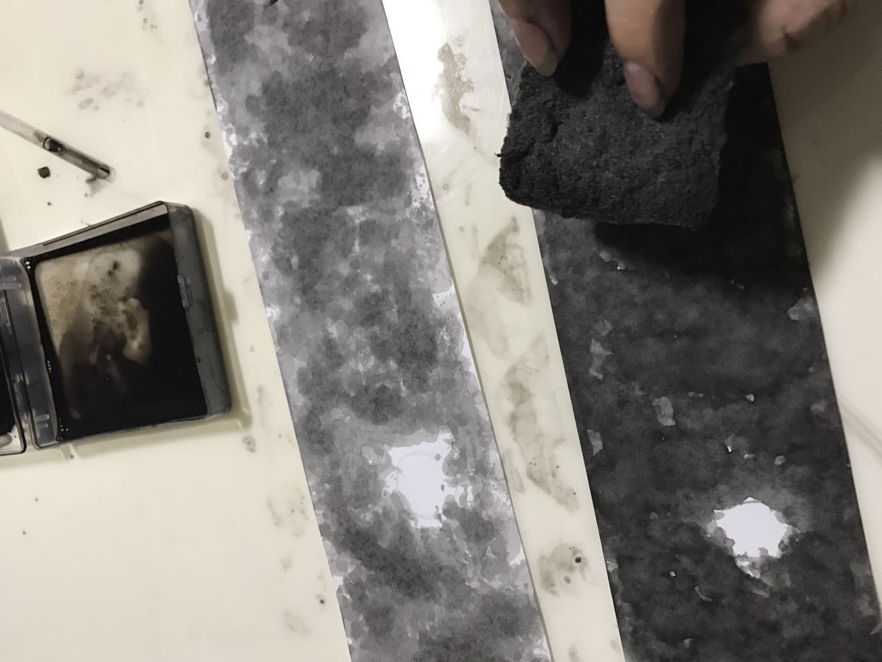
Definition: Far away from others or little in common with others
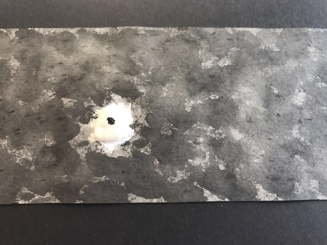
Self Interpretation: Different and distant from others and helpless, like a small island in the ocean. I placed the ‘island’ on the left side of the strip by following the rule of thirds.
The tools I used were tissue, Chinese ink, and a sponge.
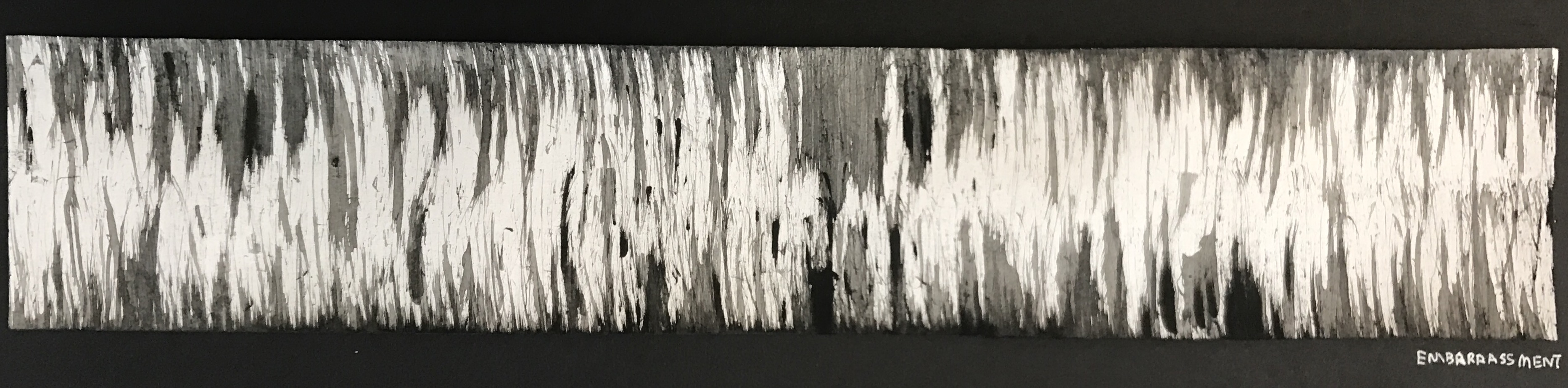
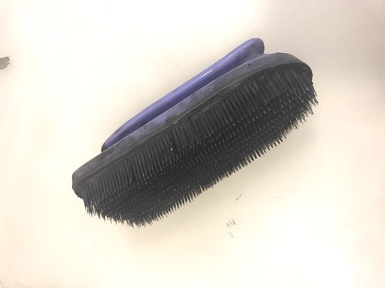
Definition: A feeling of self-consciousness, shame, or awkwardness
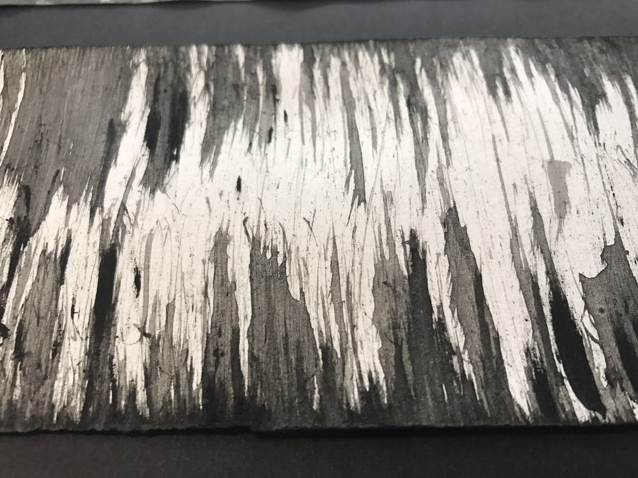
Self Interpretation: A feeling like being pricked by thousands of needles, and also comes with some feelings of fear and stress.
The tools I used were Chinese ink and cleaning brush.
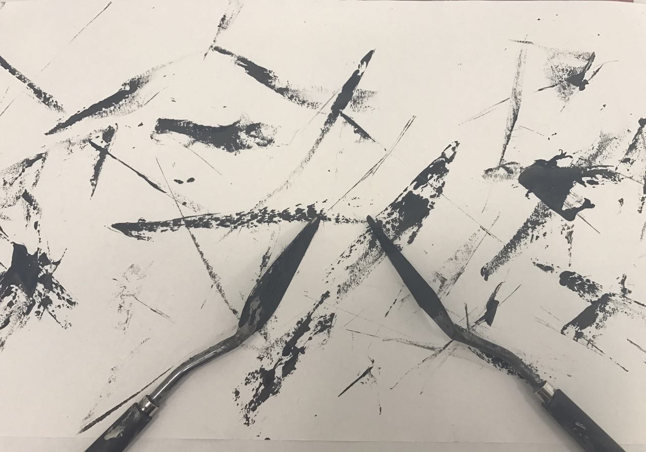
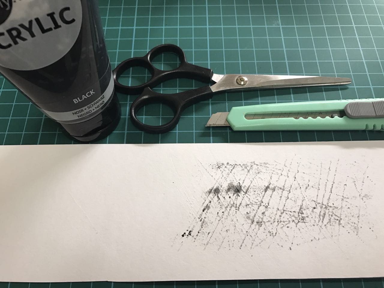
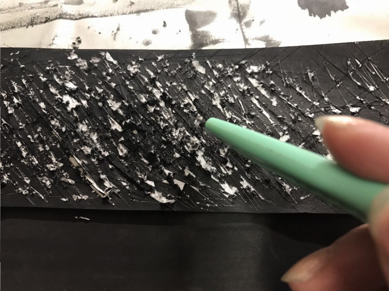
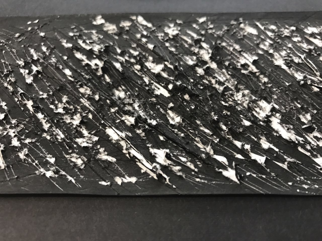
Definition: A state of great physical or mental suffering; agony; misery.
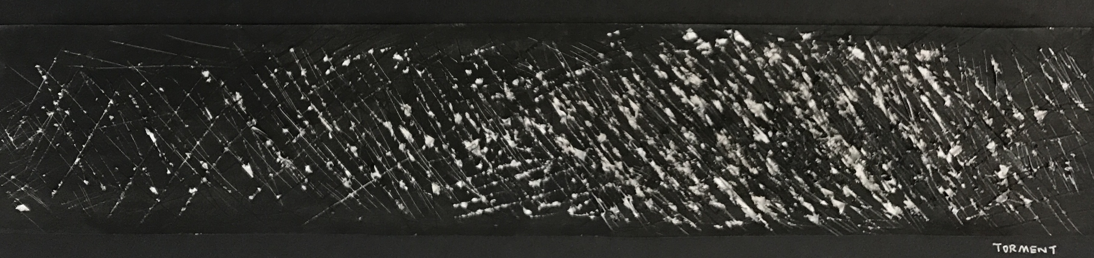
Self Interpretation: A feeling of suffering or torture; like a fierce wild animal with unhealed wounds and being imprisoned in darkness.
I used a penknife to create the scratches on the paper covered with black acrylic paint.
Everyone has their own interpretation of emotions. Doing research is definitely one of the most helpful ways to open our minds. Besides, there is also another way to help us get inspiration, which is observing life. Art comes from life. : )

4D Assignment 1-Research and Process
-Research
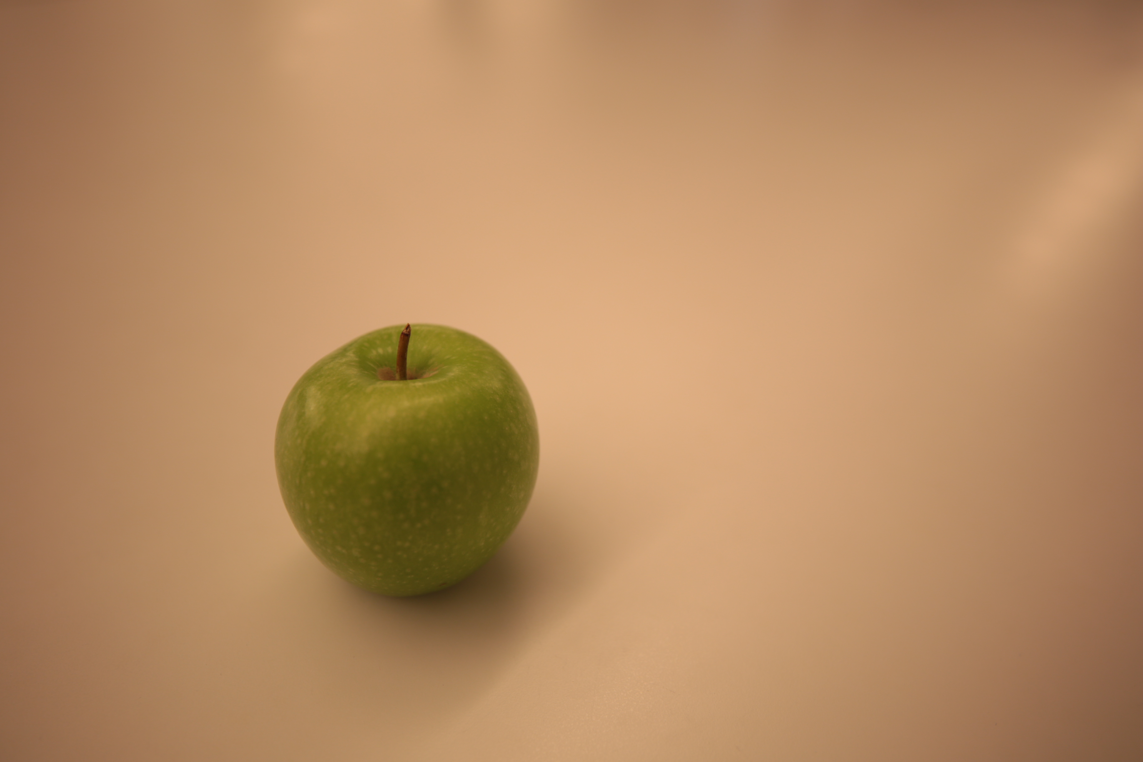
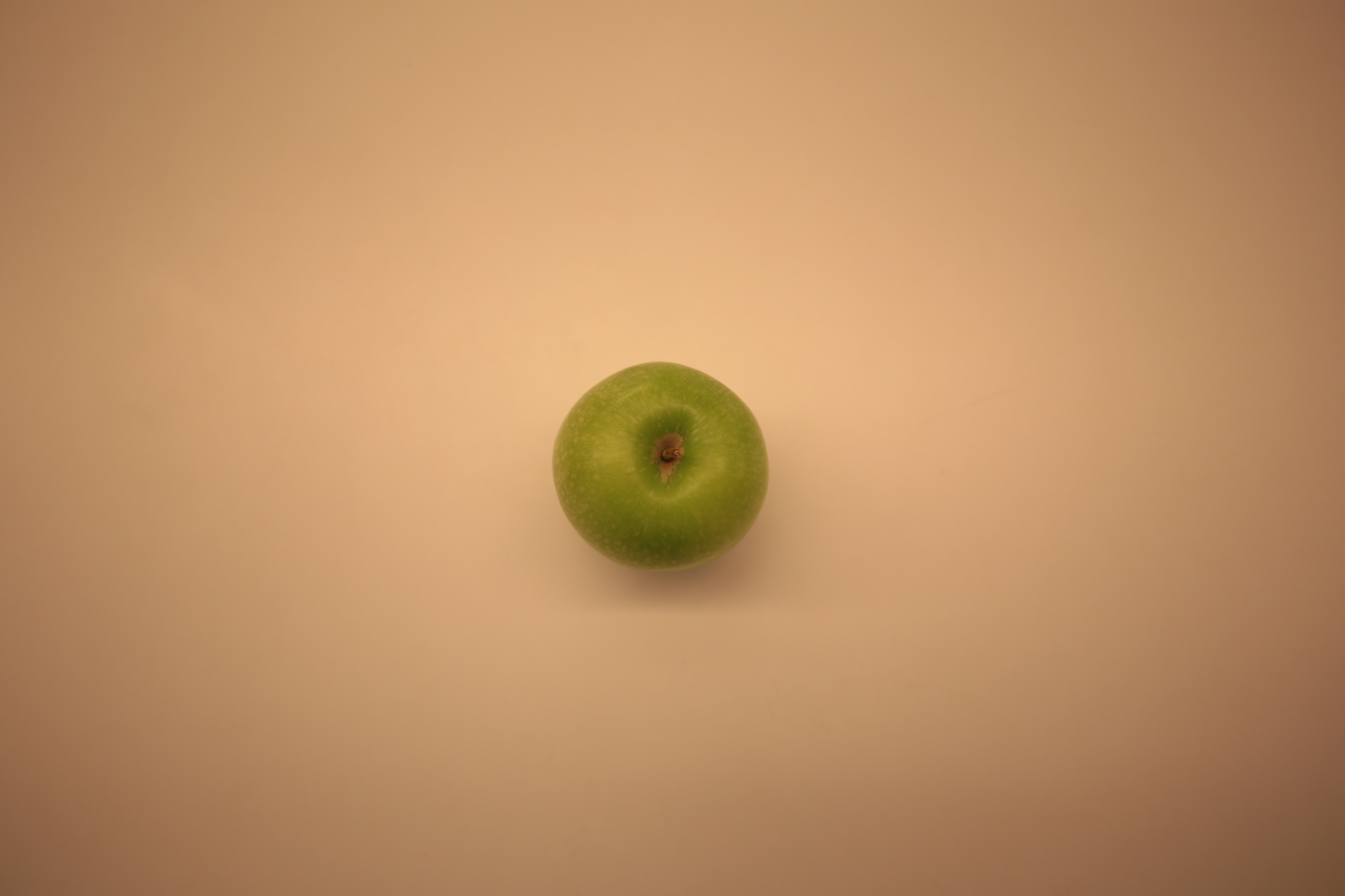
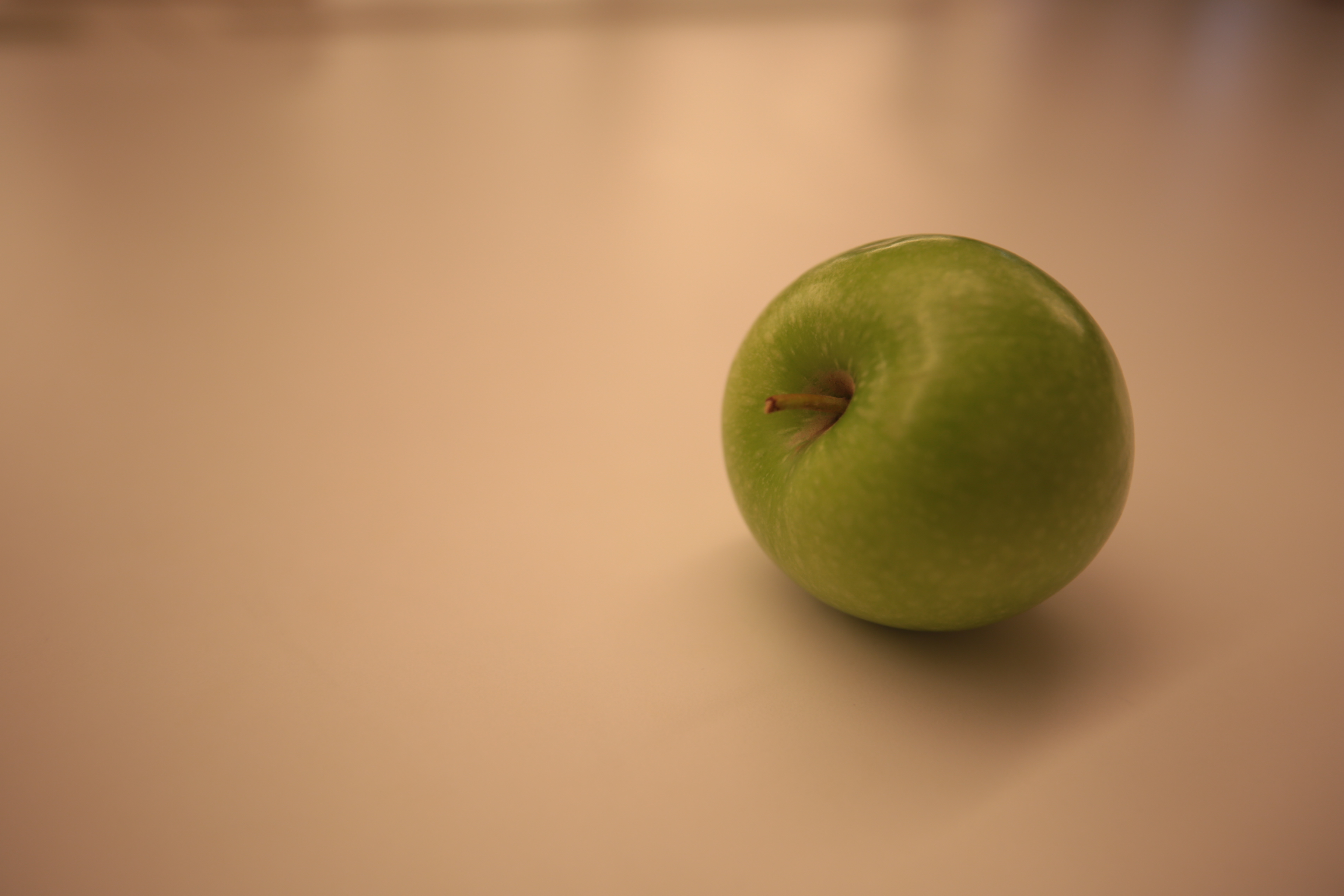
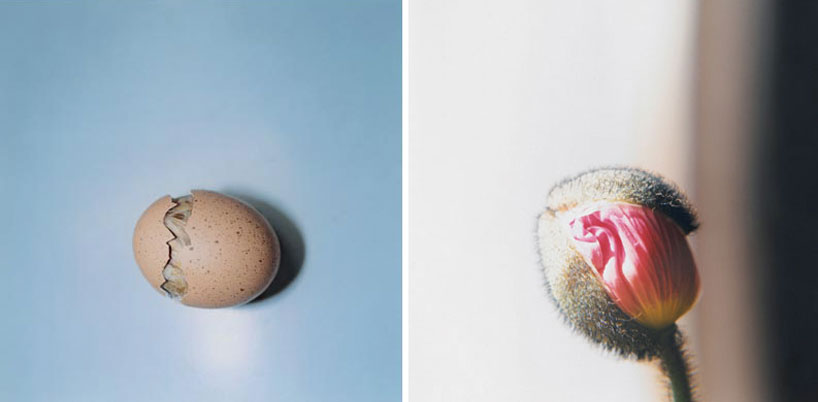
Rinko Kawauchi, a photographer from Japan. Kawauchi as a photographer has developed the skill to create poetic moments and purity from everyday objects. As I decided to choose an apple as my object. So I was also trying to achieve what she does in her images to create a beautiful picture out of an ordinary object, with a light, pastel tone and shallow depth of field. That is also the reason why I chose the plain white background.

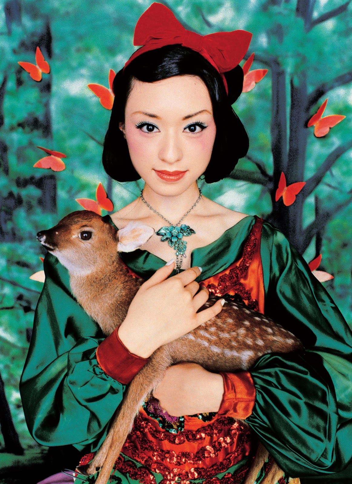
I have also inspired by another Japanese photographer and director, Mika Ninagawa. She is known for her vibrant and brightly coloured photographs. In her works, I can see that she is an expert of using high saturated colours. Her unique photography technique creates a fantastic world and the result is extremely wonderful.
-Process
Apple was the first one appeared in my mind when I was thinking about an object to represent myself. For me, apple is not just a kind of fruit, it is one of the necessities of my daily life since I was a child. It does accompany me for quite a long time.
I have been obsessed with the choice of colours of the apple. Comparing to the red one, I decided to choose a green apple instead in the end, as colour also help to convey the message. Red is an intense colour, it is not only associated with meanings of love and passion but also some contrary meanings of rage, danger and temptation. Green brings with it a sense of hope, health and growth. In addition, green apples usually taste sourer than red ones. I want to use it to show that I am trying to step out my comfort zone and accept the sour in my life.
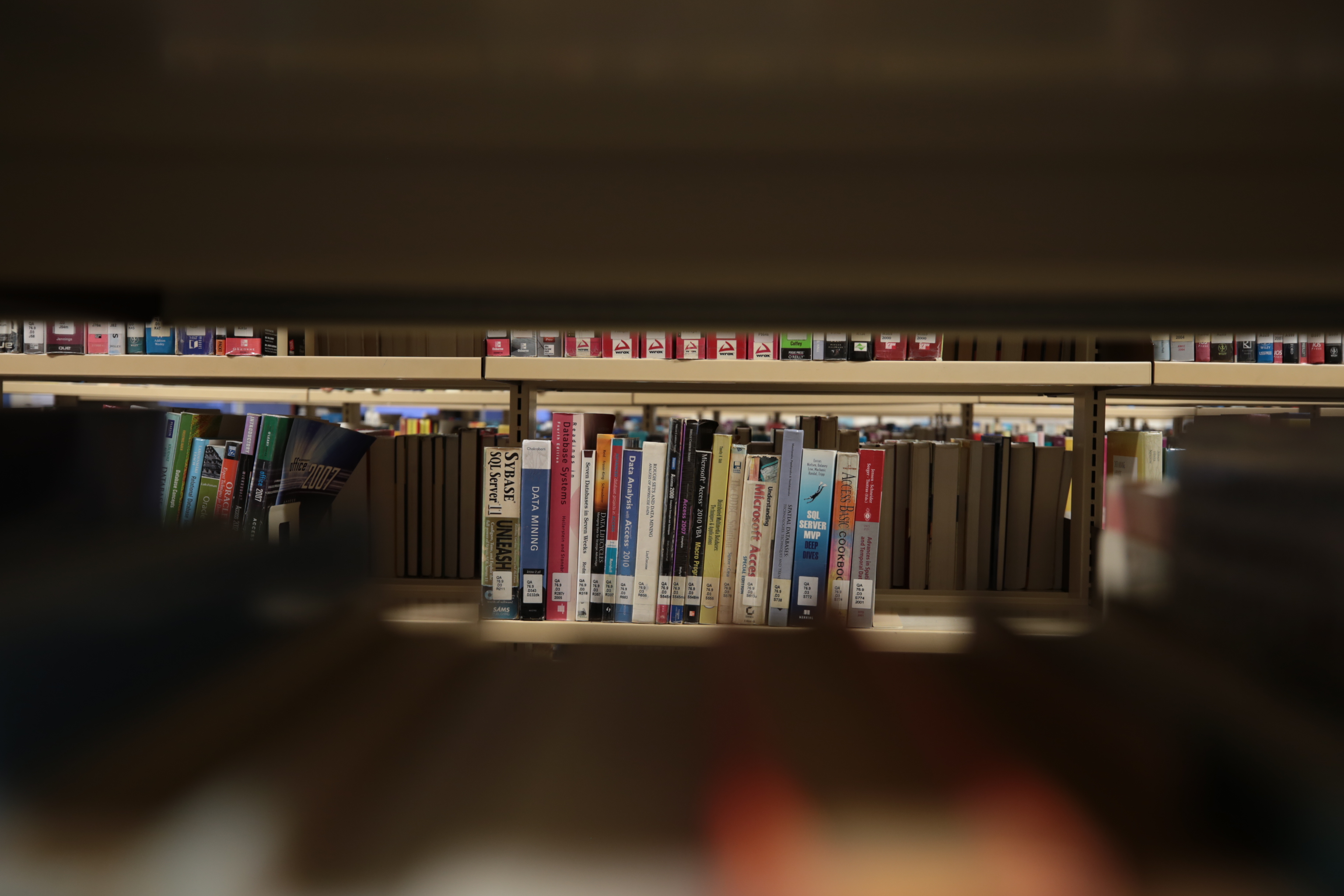
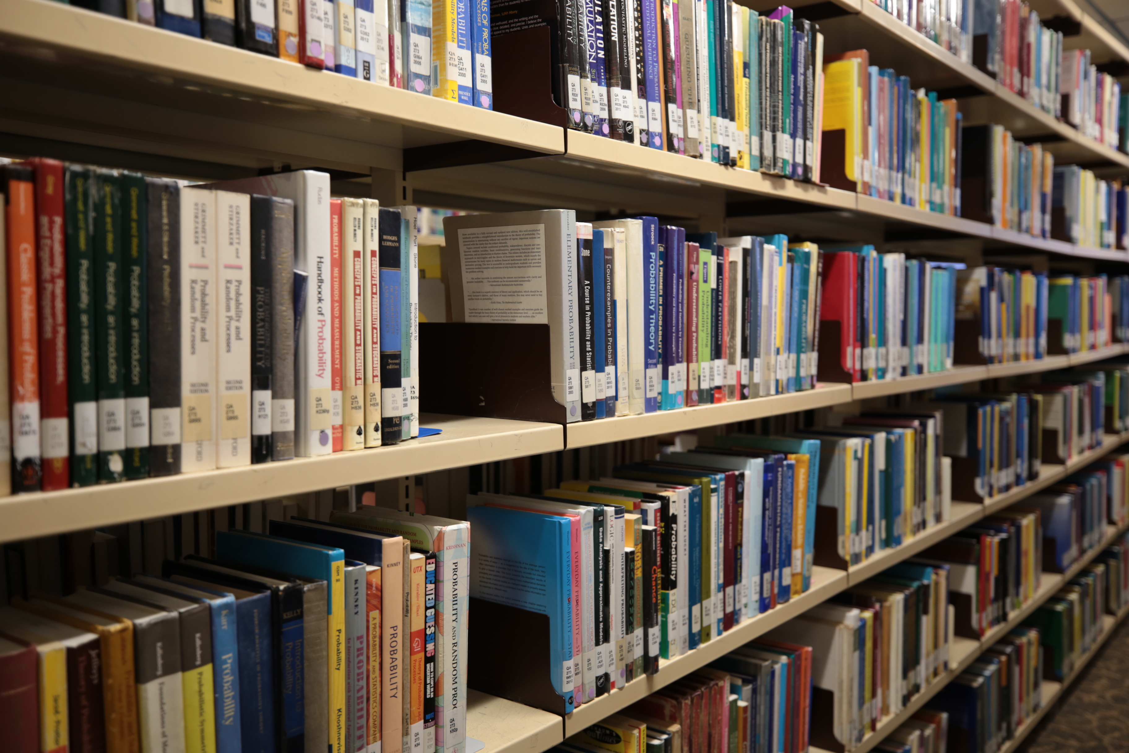
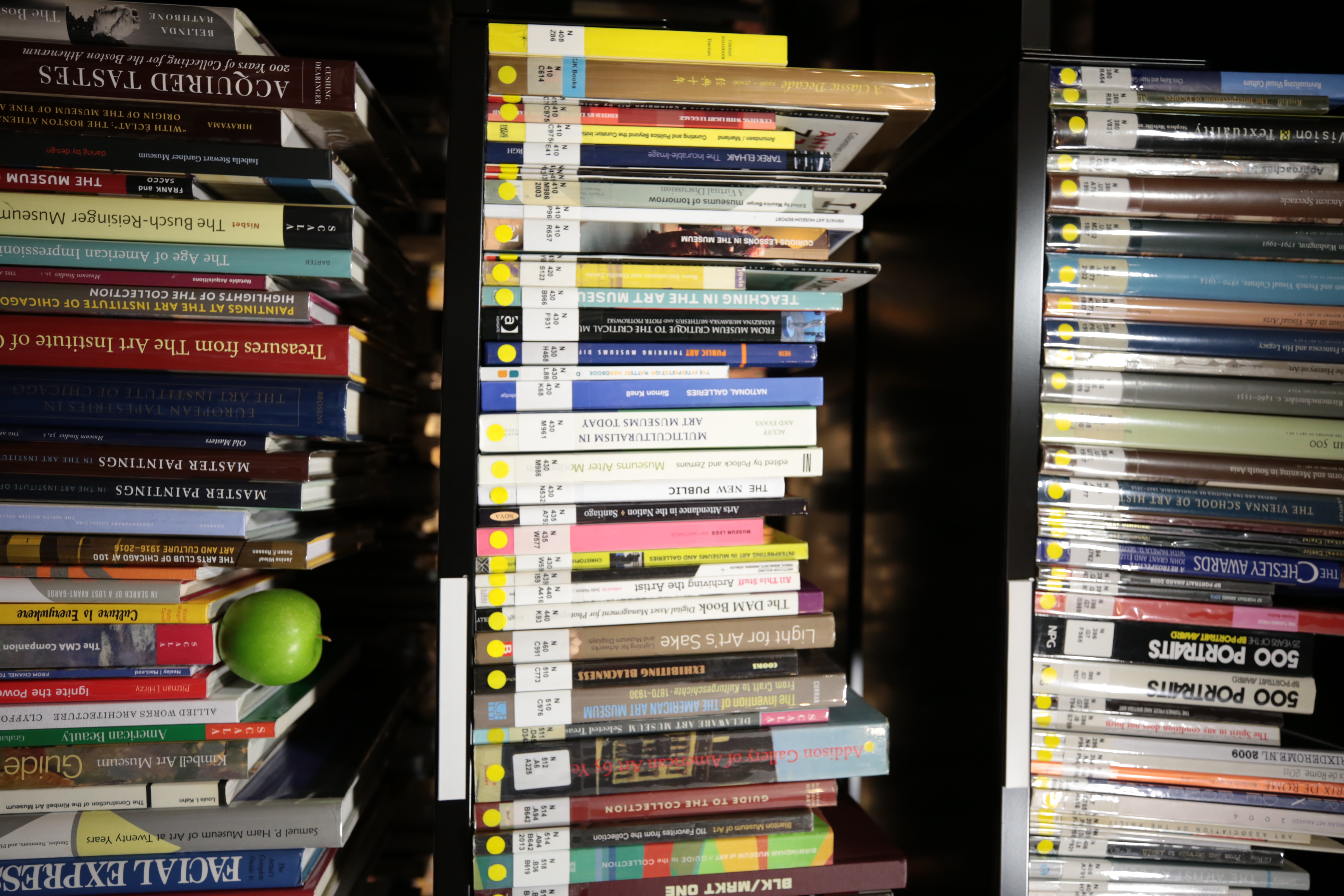
For the location of my world, library is a place that is significant to me. During my childhood, I spent most of my time to go there to study with my friends. Therefore, I decided to take photos of the library in NTU.
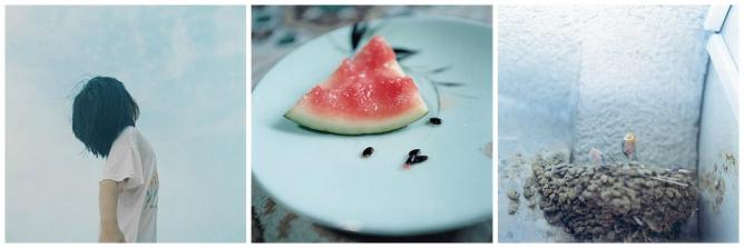
Here is a part of experimental photos that I did not choose as the final images. I have tried various vantage point. I cannot see clearly what I want to express through these images.