Tag Archives: design

Making my prototype

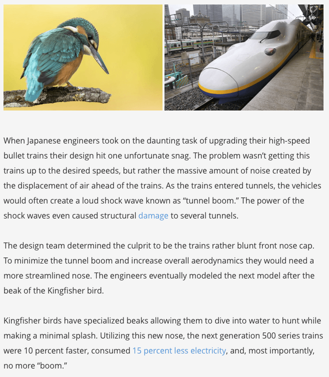
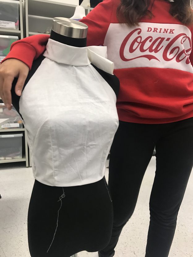
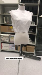
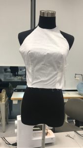
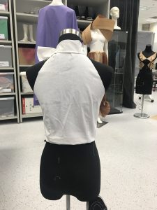
I first started by sewing together some muslin from this basic pattern Galina gave me. From there we tightened the darts, and cut the parts out to form a halter neck.

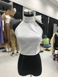
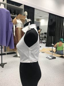
Then we added a thick piece of cloth to form the neck part. Then I was done with my top.

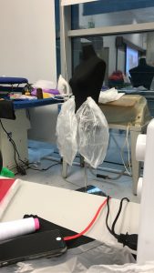
For my skirt, I was worried about how I was going to replicate the texture of the petal of a rose. Galina advised me that I could fuse plastic, to do that. I used simple clear plastic, tiled them together, and fused them in a way I could form a petal shape with. The process helped me create natural veins and curves. I then placed the petals together to form a skirt panel by panel.

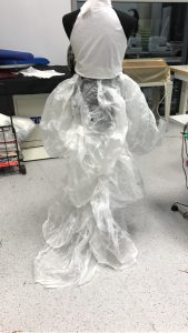
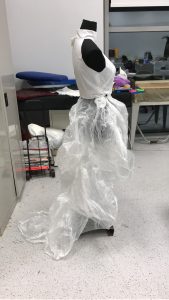
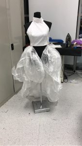
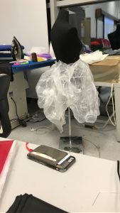
After panelling them, I felt that due to the weight of the plastic, the form of the skirt was compromised. It couldn’t hold the shape of the skirt I wanted. So I had to let go of my original design of the skirt from a high low to an all same length skirt. Also, the new design doesn’t touch the floor.

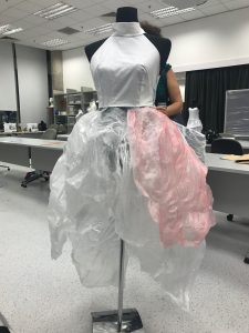
I was also worried about the colour, because it didn’t speak about the death of a rose. I tried spraypainting it and decided it would be the way to go.

Biomimicry

Biomimicry is a method where humans use to solve problems by emulating designs and ideas found in nature. It is commonly found in buildings, vehicles, clothing, and materials.

Bullet trains inspired from Kingfishers

Cephalopod Camouflage

Ventilation Systems Inspired By Termites

Antimicrobial Film Mimicking Sharkskin

Source: https://www.digitaltrends.com/cool-tech/biomimicry-examples/


2d: Printing the Tote

For printing, I decided to use the quote:

When will my reflection show who I am inside?

I decided to use it for my printing because it is most clear in communicating the idea of the quote. I did two attempts, one being smaller than the other. Below are the transparencies:

img_8592

The first printing went well. The fading tone in the reflection also somehow managed to come through. I was happy with it and received good and kind comments from my friends.

img_8505 img_8504

However, some said it may be too small for the tote bag. This is because I did not let the design take up the whole space in the square format.

There was also a problem of using too much ink and I quickly learnt you do not need so much ink to make the print. A little goes a long way.

Too much ink:

img_8593 img_8595

Too little ink:

img_8594 img_8597

Just nice:

img_8596


The second attempt definitely required as it is so much more bigger more ink but again I had to experiment how much ink to use.

Below you can see the transformation from too much ink to too little ink. In the the category where there is too much ink, details are lost in the peacock head.

img_8598 img_8604 img_8603 img_8599

img_8600 img_8605 img_8606

img_8554

2d: Cool Mom

I’m not like a “regular” mom, I’m a “cool” mom.

Keywords: Cool, Mom

When I thought of cool, I thought of tattoos, cigarettes….. maybe like a biker mom?

59feca26ad226a0dfd2e8f41b12ee210 cigg tumblr_npqlzkbnun1uwbuzbo1_1280 tumblr_nrlf3nkopx1uwbuzbo1_540

But I realise “cool” is very subjective. The mom could be depicted as a super mom. A mom that can do everything.

63d4c2ef8c59d419cf75b12414064353 2f5a2c6a469e0dcbd455d795e7f2609b 46970146-housewife-work-time-family-success-woman-pop-art-retro-style-a-woman-plans-the-time-and-manages-to-d

Or…she’s delusional thinking she’s excellent at being a mom but in fact she is not? —-> leading to an uncared for child

images baby-scan_pic0250


One picture though, inspired me. The look in her eyes. It is as if she is ready for any task ahead of her but doing it in her style.

vintage-housewife


This gave me an idea to start on:

A mother caring for her child but in her own style. I added tattoos, shades, bandana and a cool hairstyle for her baby. I wanted to add a cigarette somewhere around her fingers or mouth, but the way she is posing doesn’t allow me to.

6d9a99734b5ec98b972031191507e345

2-cool-mom


Below are some of the images I used to photoshop on the picture:

8b04ed50e53b4c2b58f811bac87cc74a a23039a686fb8eb837b41b4328422249 ae4a95f98922cab9d1ff359e1d582e59 new-2015-hipster-punk-glasses-women-designer-round-semi-rimless-oversized-sunglasses-font-b-party-b round-vintage-glasses-silhouette-icon_23-2147486652 tumblr_npqlzkbnun1uwbuzbo1_1280 tumblr_nrlf3nkopx1uwbuzbo1_540

2d: Trying to apply design elements

When will my reflection show who I am inside?

4-reflection
5-reflection
6-reflection

Here is a step by step progress of how I tried to be more clearer with my message using disproportion, and symmetry.


Hope. It is the only thing stronger than fear.

06

01 Hand to represent the strength of hope
02 Cut slits
03 And inserted “meat”
04 Black and White
05 Knives to represent FEAR which causes harm
06 Animals that survive represent HOPE
 07 But some animals still end up dying.

Final Product:

screen-shot-2016-09-30-at-1-58-03-pm


I think that I have improved in terms of trying to incorporate design elements in my work to make it more interesting and exciting. I also sense a sense of storytelling developing as I do my work.

2d: MORE research

As I was doing my work, I realised I needed more inspiration and guidance to help me get the right look. For the last research I did in my first post didn’t really provide good design reference. For now, I think I’m okay with achieving the vintage/historical look but I need my designs to be more graphical and exciting.

  1. RANDY MORA

randy-mora2 randy-mora4 randy-mora5 randy-mora6 randy-mora7 randy-mora8 randy-mora11 randy-mora12 randy-mora14

Here, I can see that the artist plays a lot with proportion to create a fantasy world. What is meant to be small is big and vice versa.

He also puts repeating lines if he wants to bring focus to somethings. Either that, or the biggest object in the picture is where we’ll look at first. There is great balance and flow to how we look at these images even though there are a lot of things to look at.

That’s what excites me the most about collage. When I face a work made out of diverse elements, I have the urge to get closer and just touch it. While a painting requires a certain distance and a contemplative posture, collage on the other hand, is more an intimate experience, less ceremonial.


2. DAEHYUN KIM

0001_800 0032_800 0045_800 0053_800 0058_800

There is some sort of a storytelling through these pictures. He uses very simple shapes and almost no textures here. Unlike Randy Mora, the design here is very minimalistic. There are disproportion, repetitive lines etc. However, the communication remains clear using composition and negative space. Also, he uses the same character in all the designs.


3. KACIE MILLS

mills_web4 mills_web6 mills_web7 mills_web8 mills_web9


4. MALIKA FAVRE

2_e_malika-favre-_hideseek-e1346134753305 3_e_malika-favre-_hideseek-e1346134773887 4_e_malika-favre-_hideseek-e1346134794454 5_e_malika-favre-_hideseek-e1346134817984 6_e_malika-favre-_hideseek-e1346134840994 7_e_malika-favre-_hideseek-e1346134862147

Actually these are snapshots taken from a video.

I find that the play of lines and negative spaces are endless. You could create illusions and tell a story in such simple technique.

5. LUCIE HARD’IE

lucy-hardie2 lucy-hardie5 lucy-hardie8

In Lucie’s work there is surrealism. The hair of the lady forms the hills. The hair from other lady are the seaweed/coral to form an underwater scene with someone floating in it. The last picture had symmetry although the two ladies are not the same person.

2d: Confirmed design – undecided

I’m doing on the quote “When will my reflection show who I am inside?

mulan

The KEYWORD is REFLECTION

Reflection can be shown in any shiny surface. Like a mirror or even the water.

In the quote there is some sort of a comparison element involved.

Comparison between what is on the exterior and what is on the interior. In other words, the comparison between the two sides of the character.

Another way to look at it: What if the character WANTS to be who she is inside? Therefore the action of going INTO the mirror to be her other character on the other side.

Example:

3140a71000000578-0-image-m-50_1455598547436 1935499-alice-through-the-looking-glass-1

Here are several ideas that I might want to confirm with for this quote:

1-reflection

My general idea is to have the two characters almost touching although they are reflections of each other. One character would be trying to get through to the other side. In this case, it would be the lion.

The reason why I chose the peacock and the lion is because I find that just like Mulan, the peacock represents someone who is elegant and gentle while the lion represents the fire that Mulan had in her while she was pretending to be a soldier.

I tried my best to represent the keyword REFLECTION but I think only the fourth one is successful in doing so.

2-reflection 3-reflection 4-reflection


Would appreciate some comments and suggestions to help my designs:)

2d: Design Sketches & Feedback

1-reflection 2-reflection 3-reflection

“When will my reflection show who I am inside?” 


3-try-is-butter-a-carb 1-try-is-butter-a-carb

“Is butter a carb?”

General Feedback:

  • Although I have achieved the vintage old look, my designs need to be more exciting.
  • Quotes need to be iconic of the movie.
  • Designs must be reflective of the quote and not the movie, in order to avoid clichés.
  • Find KEYWORDS in quotes and reflect them in my designs.
  • Choose interesting characters to put in my design.
  • Use composition, repetition, scale and other design elements to help communicate the quote visually.