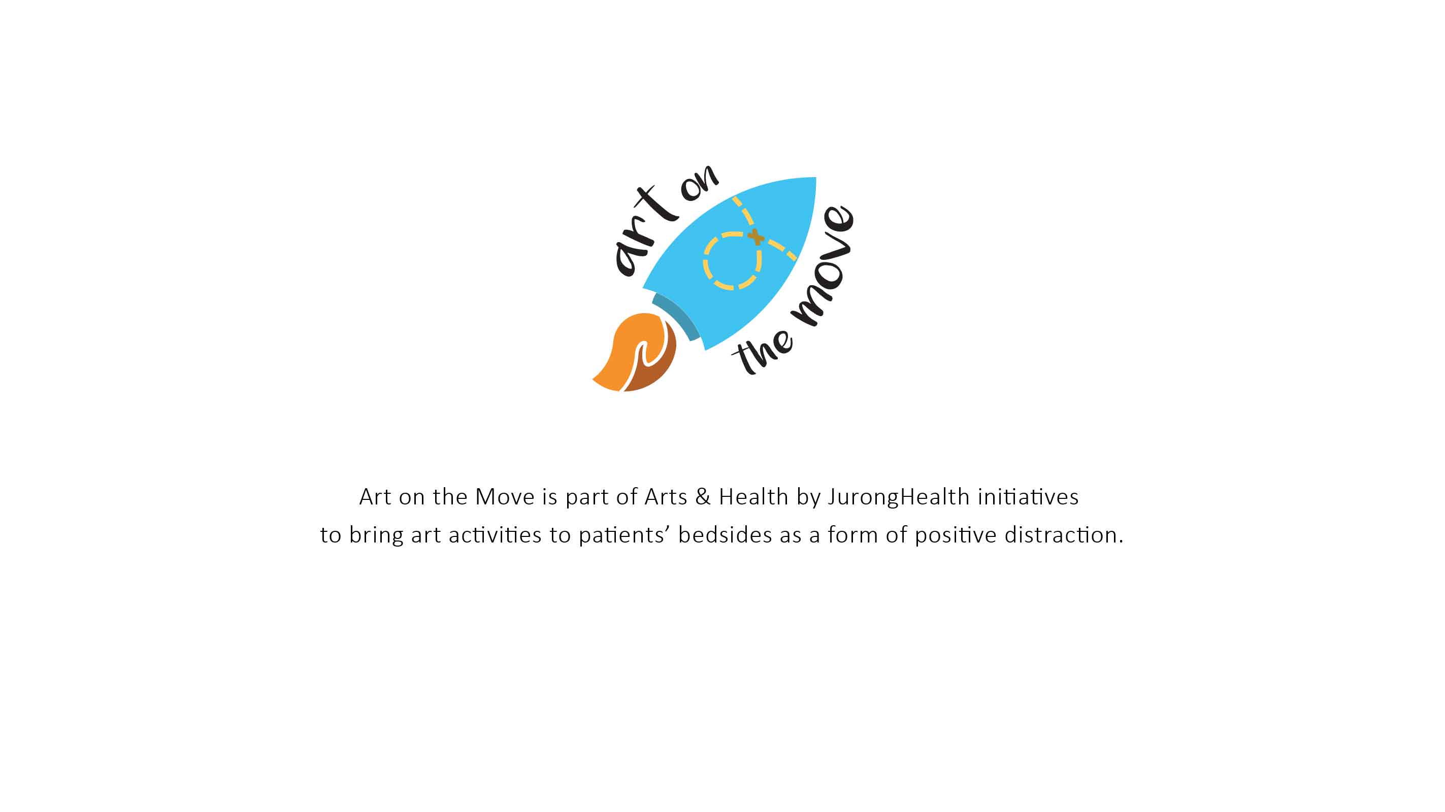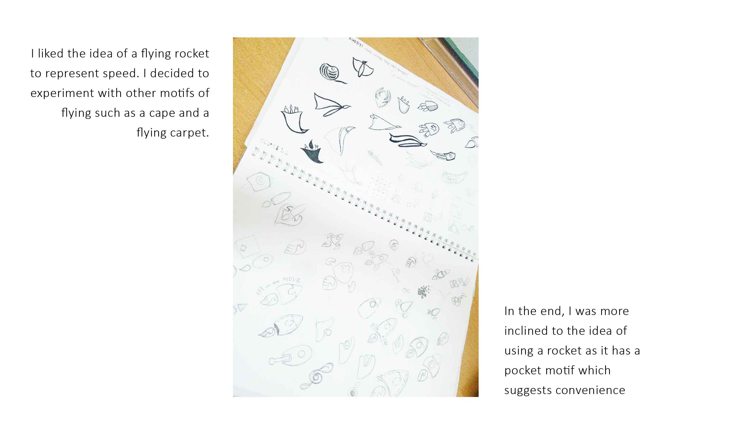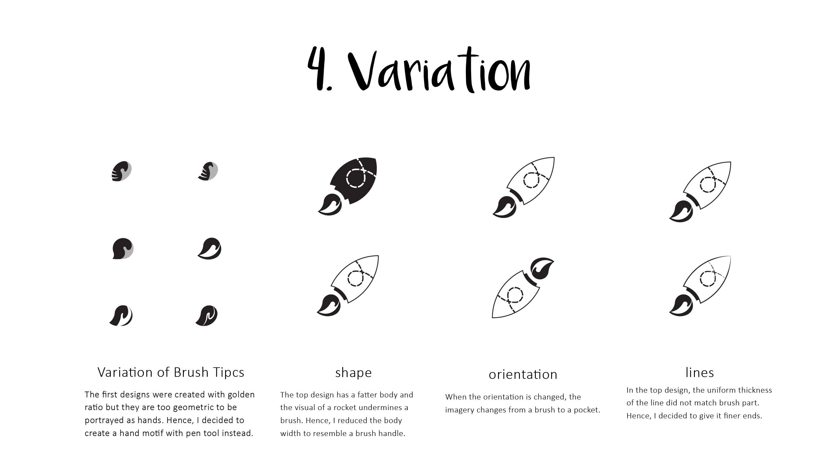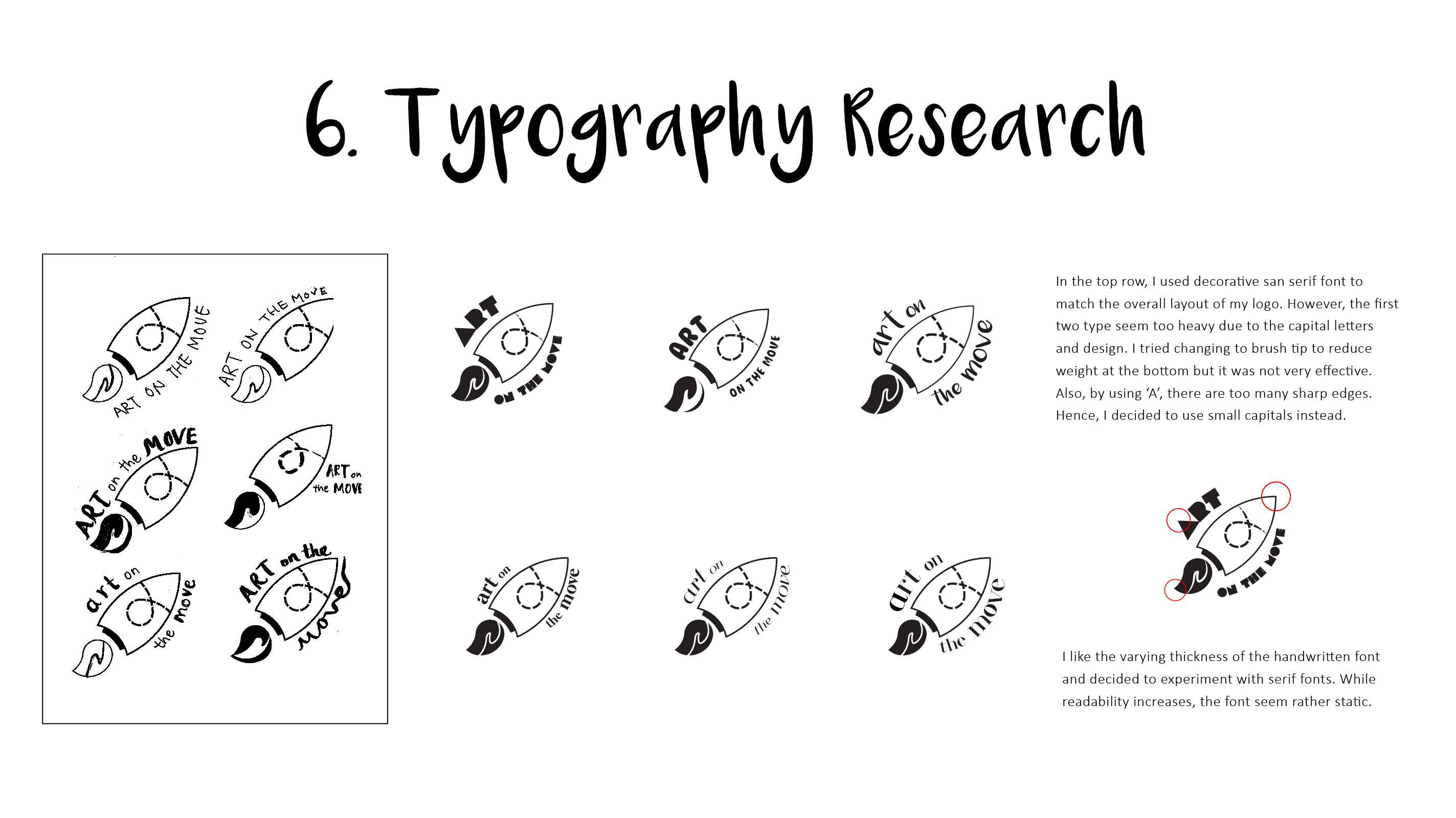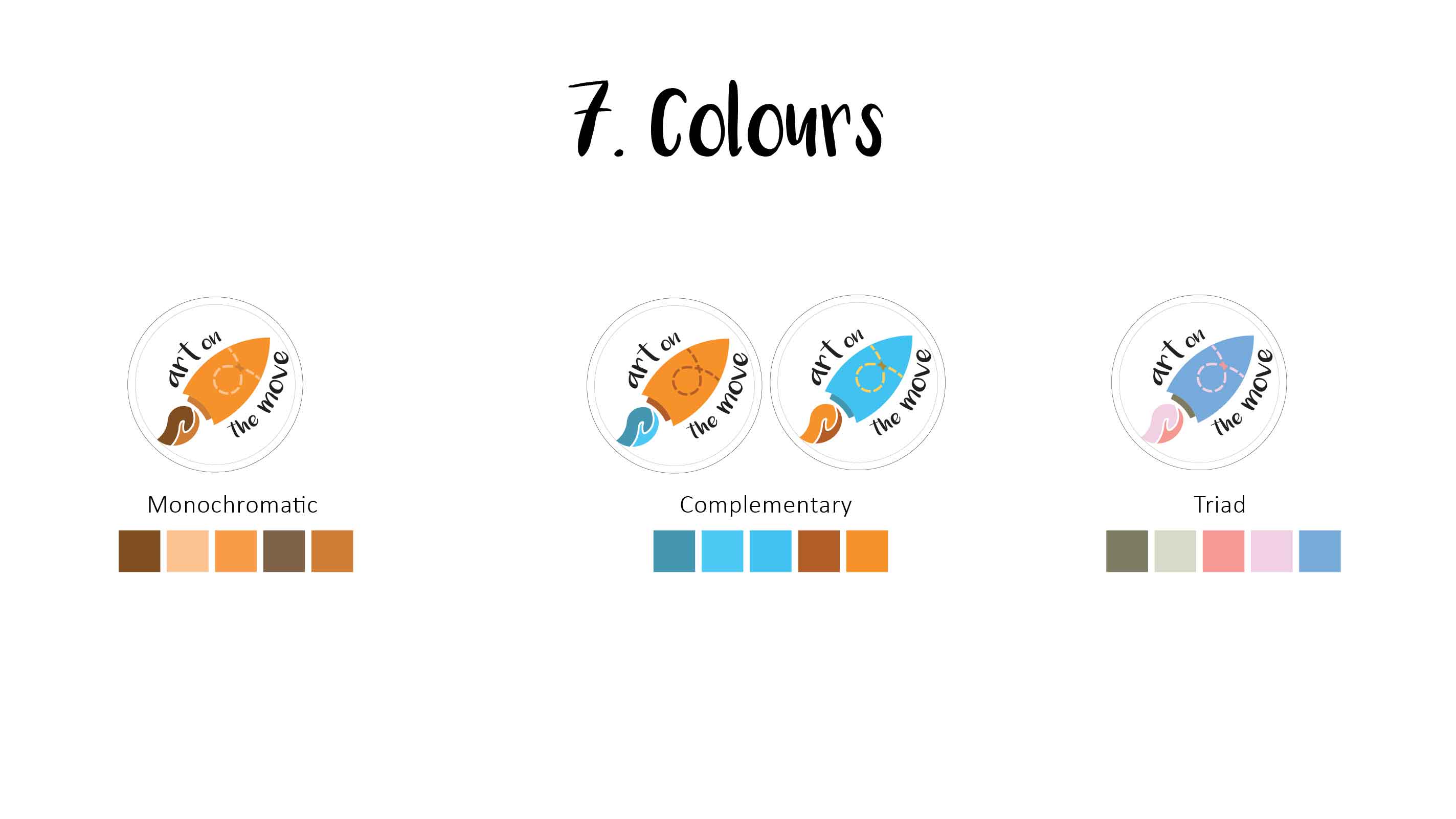
1. Exploring the Quote
I wanted a quote from our everyday lingo so that everyone could relate to it. To prevent my indecisiveness from becoming a stumbling block, I quickly decided on the quote
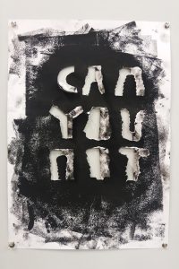
‘CAN YOU NOT’
This quote is interesting as it can be used in different contexts – sarcasm, annoyance, fury, etc. It could be said as a passing remark or in an argument.
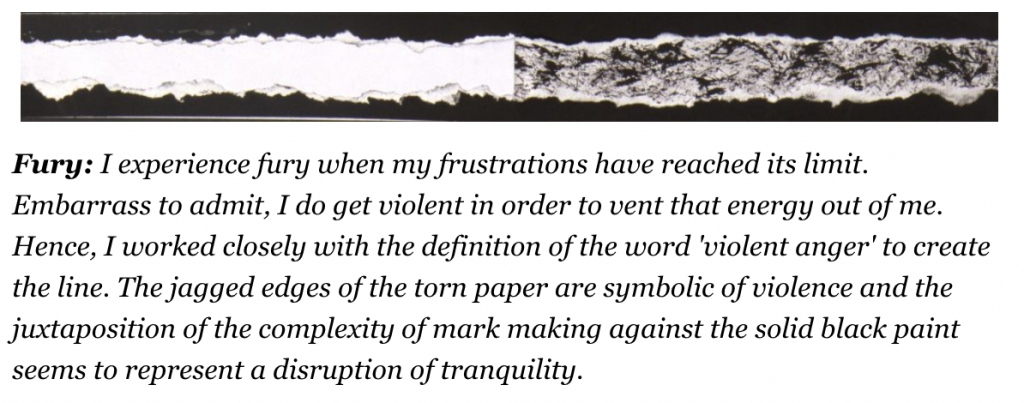
Project Emo Lines: Fury
This assignment reminded me of our very first 2D assignment about emotions and I decided to ride on one of them for my typography – FURY. Using the same aesthetic of black paint and torn paper, I experimented and created an A3 draft.
Thankfully all the alphabets are symmetrical!
While I do quite like the end result, I felt that this was too simple as it is riding too much on my previous work and not creating any new value. Hence, I decided to experiment with another emotions from the other end of the spectrum.
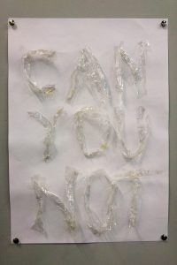
I get quite annoyed with sticky tapes when they crumpled up before I could use them. Translating this experience into my typography, I decided to use crumpled text to form the quote. The transparent crumpled PVC tape differentiate itself from the white cartridge paper. I thought the subtle difference may help suggest the slight annoyance. However, most classmates preferred the B&W one because it evokes a stronger energy. I decided to go with the piece that communicates better with people.
2. Experimenting with Material
I started to experiment with other materials that could also evoke the same strong emotions. I had a sudden inspiration from my friend’s complaint when she said “Why must he copy and not just use something else such as hair?” Oh yes, I get quite disgusted with wet hair stuck on toilet walls. (Can you not leave behind your wet hair on the toilet walls???) I could do something along that line! Perhaps a poster to tell people that.
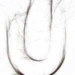
Hence, I collected hair from the nearby salon and hid in the toilet for an hour to ‘design’ this hair font. (P.s. I forget to prepare gloves and did it with bare hands.)
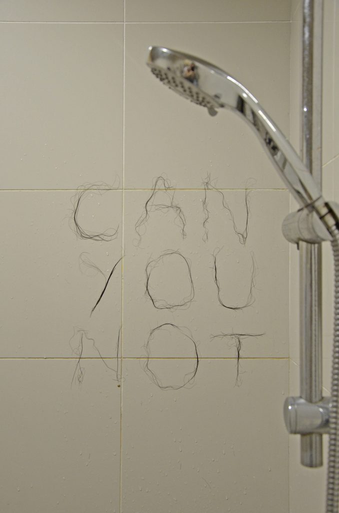
While the font is visible, I do agree with Shirley that the lines are too fine and not able to stand out if it is used as a campaign poster. Instead, the chromed shower head seem to demand for more attention in the poster. I needed to consider the hierarchy in my poster.
- Headline: ‘CAN YOU NOT’
- Suggested Context: a small shower head will do.
3. Finalising
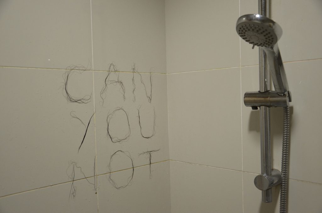
Firstly, to create outline of the alphabets, I had to shoot the alphabets individually because I did not have enough hair to form all the alphabets needed for the poster at once. And, at this point of time, I decided to use my own hair. It’s too gross to touch other people’s hair. This makes it convenient too as whenever I needed a bit more of hair, I would just snip a lock from my head.


Secondly, I had to create a pseudo toilet with Photoshop to get the right angle and elements within my poster.
I also decided to use white tiles instead because it helps to emphasise the alphabets a little more.
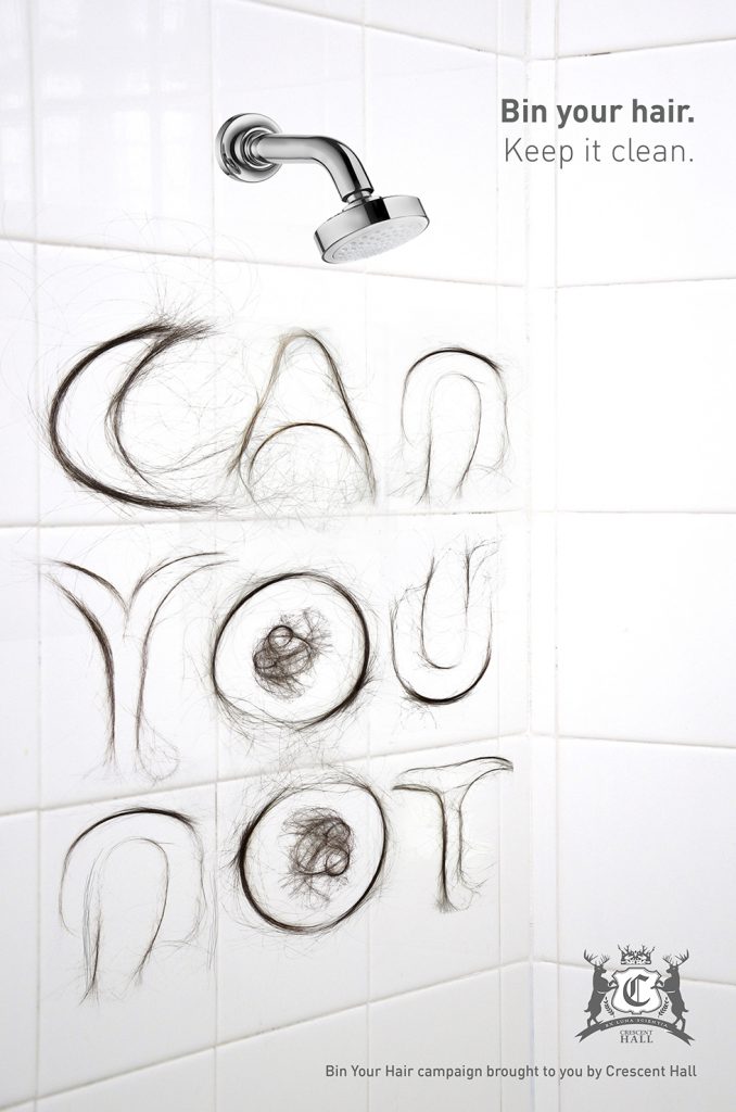
Alas, I’m using Crescent Hall’s logo for purely for aesthetic purpose. They have rather clean toilets actually.
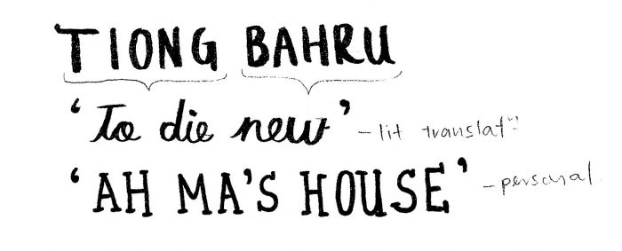
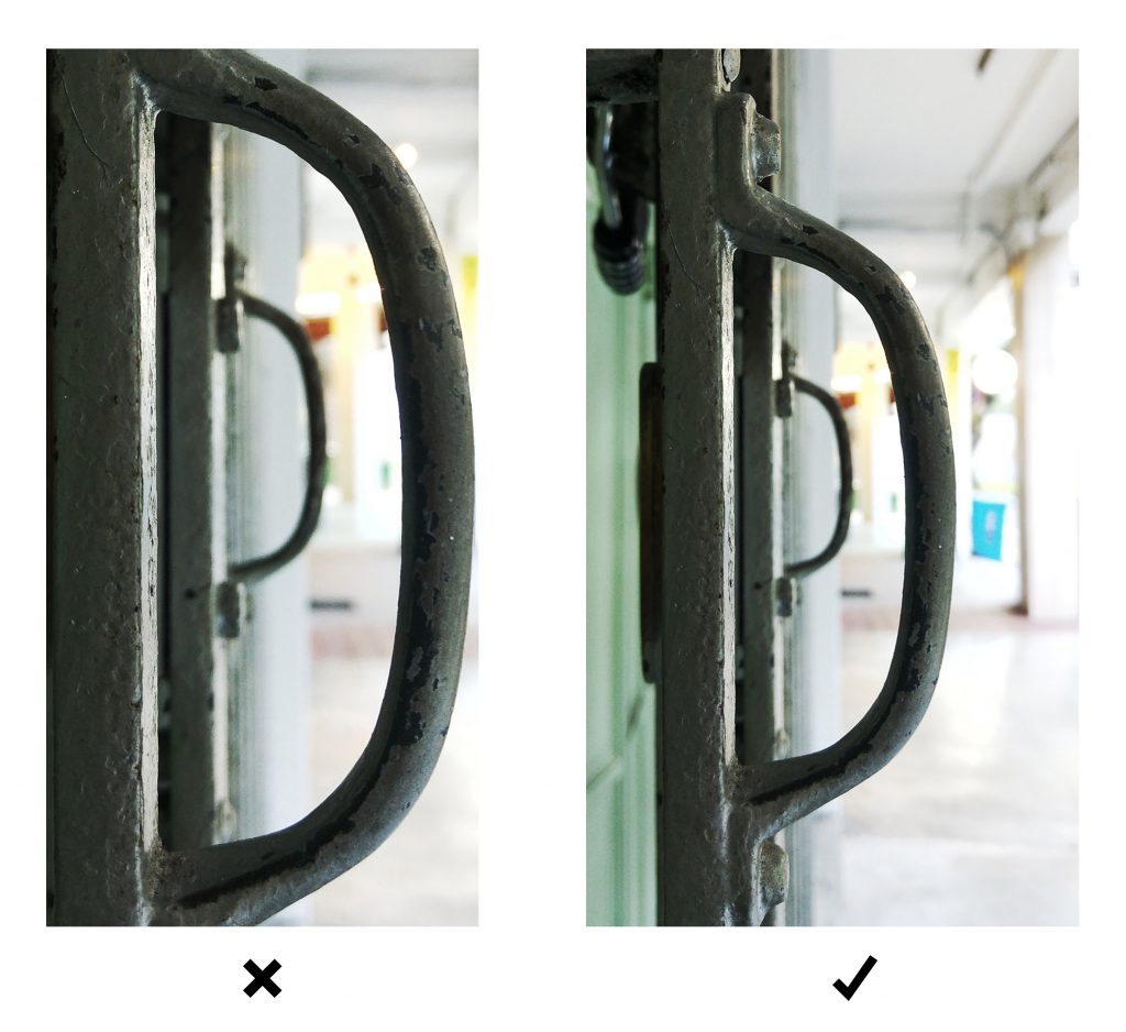
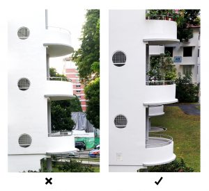
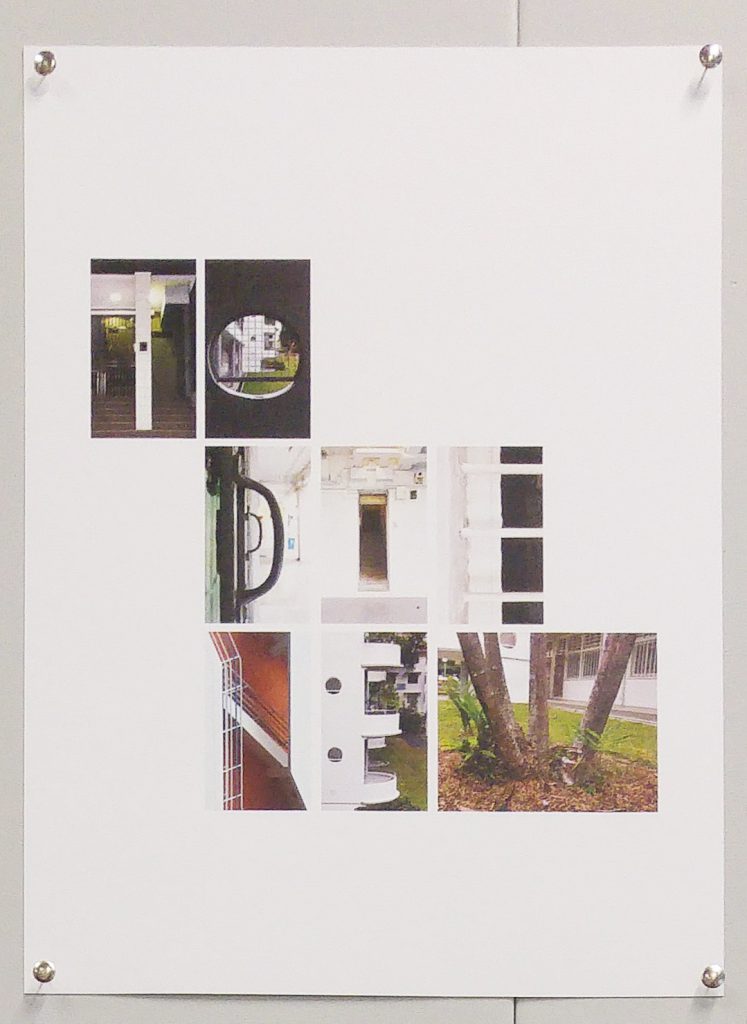
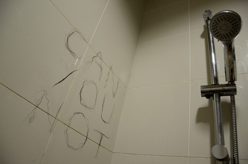
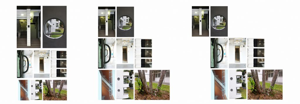 So, these were 3 layouts I were experimenting. While the first two are rather neat and structured, I decided to go with the last one because it resemble a flying bird could possibly symbolises the revitalisation of Tiong Bahru.