2D: Ego. [Final + Process]

Task
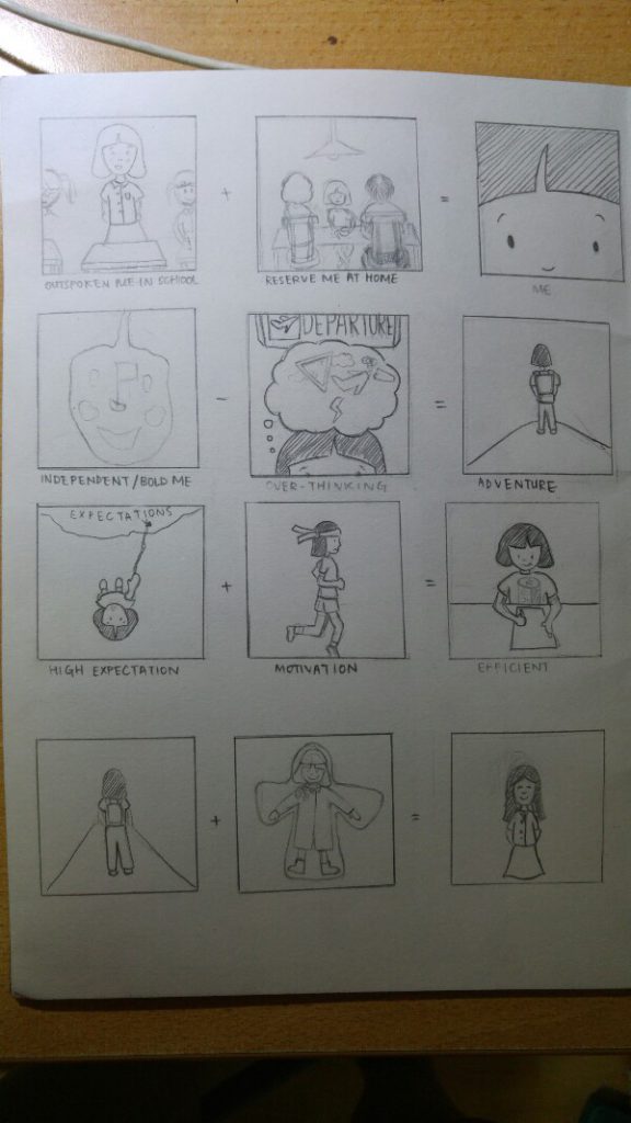
To design equations that describe about ourselves.

Ideation:

We were given a lot more room for creativity in this project as there was no restriction on type of medium.

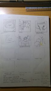
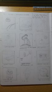
These were some ideas I had while brainstorming:

20161119_221948-600x1067

Idea 1: was to tell a very personal side of me

20161119_221956-600x1067

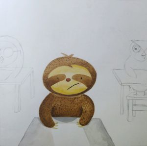
Idea 2: To represent myself with animals

Idea 1: Initally, I went straight into describing myself with random details about my personality. However, I felt there wasnt a strong overarching idea that ties the 4 different equations together as a whole and decided to ditch it. (which I realise was a big mistake and very unnecessary)

Idea 2: I decided to string the 4 equations together by listing them in a consecutive format:

Lazy me + exams = NERVOUS ME

Nervous me + Result Day =SAD ME

Sad me + Watch F.R.E.I.E.N.D.S = HAPPY ME

Happy me + Intellectual me = ACCOMPLISHED ME

|end.|

I wanted to use animals to represent myself solely because I like to illustrate animals. At this point of time, I’ve decided to try watercolour. I wasnt sure if this was a good move. But my intention was to try a different medium from the usual design projects. (usually, I would use illustrator/photoshop for design projects.) Here was a try-out for one of the image:

2016-11-19-10-34-08-1

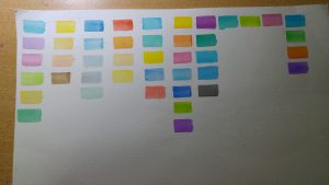
Draft of Colours (for final ideas)

Draft of Colours (for final ideas)

Instead of limiting myself to a fixed set of colours, I decided to use a range of similar colours in one image. Such as the graphic illustrations by Joey Chou
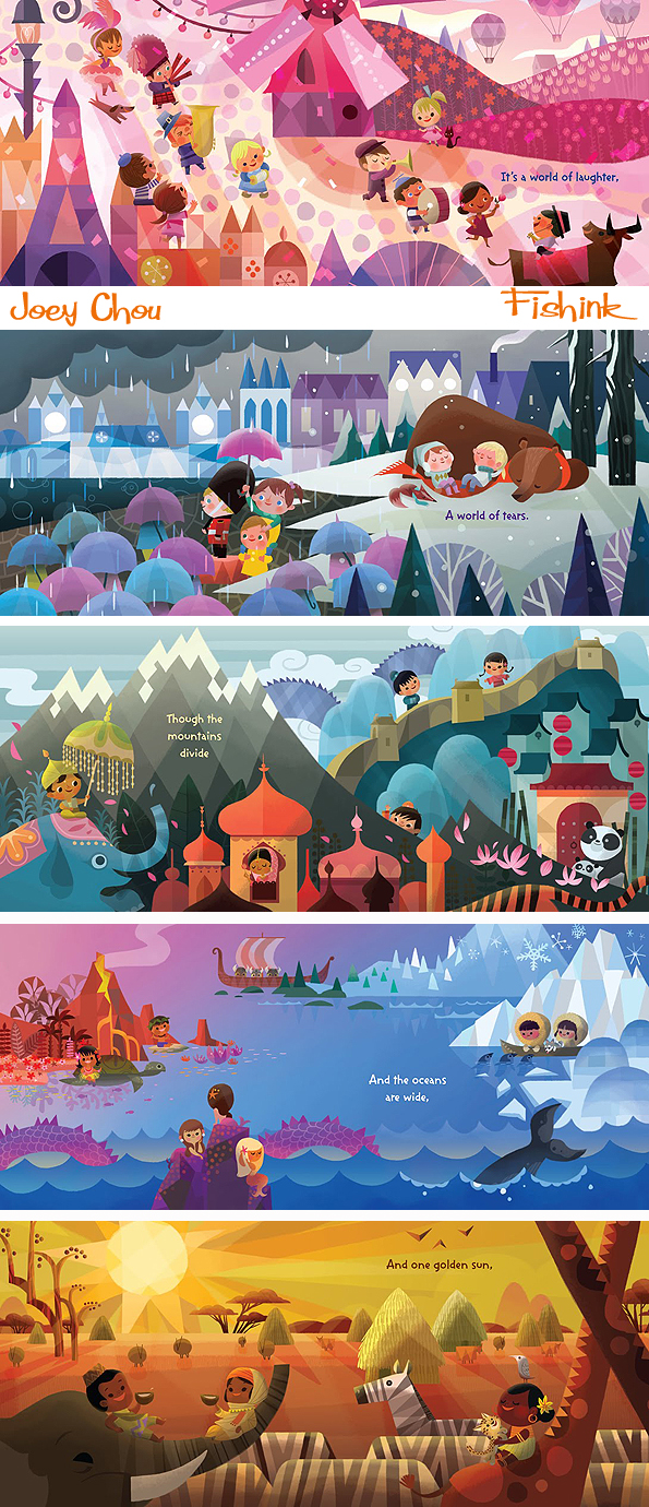
I decided to push it a little further in terms of my idea and use the animals to represent random stuff about my ADM/University life:

Idea 2.1

Idea 2.1

I felt that the use of University life as a shared experience with my experience. This became a problem as I felt that it lacked a personal voice. Bad move!

I ditched my ideas. AGAIN.

This time round, I decided talk to someone to discuss about it as I felt that I was too cooped up with my own ideas and self-restrictions. (I find talking with people is a very good way to generate ideas)

I talked to my mum as she knows me best. She started to recall some interesting episodes about me which describes my personality. One of it was my bad tamtrums I had while attending music class at 4 years old. Back then, my mum was the typical kiasu mum who decided to send me to music class despite me never showing interest in it. I did like drawing but she felt drawing classes were a waste of money. (like I could make money with music???) I on the other hand, would have nasty tantrums before every lessons.

While I’m no longer forced to attend classes I dislike now, I still witness such experiences in my students when I teached art to young kids on Saturdays. I would encounter students who just rebels and dont do the work given. As much as it is frustrating to handle such students, i can empathise with their frustrations.

Hence I decided to tell a story on the reversed roles I had taken up in life.

1. Student – Teacher

2. Local – Tourist

201611192350141000-600x830

Final ideas

The difference of being a local and being a tourist was something I experience I had pretty recent and think about it from time to time. For 2 days in Melbourne (during recess week), I was alone exploring the city. It was my very first experience of (somewhat) ‘solo travel’ and it really made me see myself and my home country from very different perspective.

Way before when I travelled lesser, I often find Singapore really bleak and skyscrapers everywhere. I was very much caught up in my comfortable world. Hence, i decided to use bleak colour tones to represent Singapore and place myself in a ‘Singapore globe’. I include as much reference about Singapore in my design.

My second image is toying with the fact that Singapore is always known for being a 24/7 summer city to most tourist. I used more cheerful and bright colours for the image and blue to represent the ever sunny sky in Singapore. I didnt want to be bias to any nationality hence, I decided to represent them with aliens entering via UFO.

The outcome of me lacking exposure to the outside world and often leads me to share about my home country from facts I picked up from Social studies class. I decided to insert humour here and portray it as a political poster. I strongly referenced the Chinese revolutionary posters in their use of visual reference. The use of intense red represent the burning passion for one’s country and the radiating lines clearly put across the figure of idolisation. Once again, I included as much reference about Singapore such as me donned in a Kebaya (signature uniform of SIA) and holding up a Singlish book.

Moving on to the next equation, I am portrayed as a tourist. Hence, the sun hat and some architecture in the background. The pale yet bright colours was to represent the sense of ‘fresh and foreign’ when in a foreign country.

Me falling from into the waters where lies a city beneath was a reference to the metaphor ‘fish out of water’. To me, being IN the water is ‘out of water’ as I am slow in adapting to new environments. The blue was to represent the sense of strangeness I feel when I am in a foreign place for the first time.

Lastly, was the outcome of learning more about my country when overseas. When overseas, I often can’t help but start comparing it with Singapore. This was especially so about the public transport in Singapore and Melbourne. Back in Singapore, I would get frustrated when there are train delays or waiting time is more than 5min. But I realised I had taken such convenience for granted when in Melb where buses runs on timetable (which means missing a bus would result in another 30 min wait for the next one) and intervals between train service are about 15 min. Both countries are major cities yet things can still be very different. This made me cherish the convenience of travel back in Singapore a lot more. (Melb is still a beautiful place btw!)

So here is a picture of my overall work:

2016-11-19-11-45-12-1-600x900

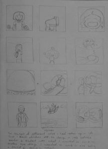
4 years old who loves drawing + attending music lesson I dislike = me feeling very tied up
19 year old me who do art + teach art to young kids = feel like I’m the one tying them down (esp those who dislike drawing)
comfotable me as a Singaporean + meeting foreigners in our sunny island = sharing about my country in a chauvinistic POV
me as a tourist + going new places = sees my country from a new POV
2D: Quotes [Final + Reflection]

1-01-copy2-01-copy

3-01-copy 4-01-copy

#1: “Everything changed in a blink of an eye.” -Mustang (2015)

(English translation may vary as this movie is originally based in Turkish)

Mustang (2015)

Mustang (2015)

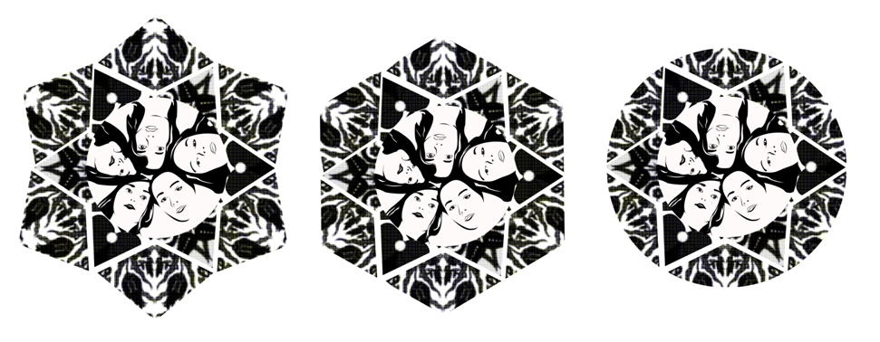
As this movie was set in Turkey, I decided to interweave Turkish designs into the image.

turkish-designAlso, I perceive Kaleidoscope as something that constantly changes its appearance ‘in a blink of an eye’. I interweaved more angular forms with the turkish design to get a unified design like this.

mustanggirlscircle-01

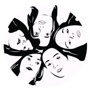
As I followed closely with the movie context, the girls are placed in the middle of the design as they are the main character of the show. I have outlined them on illustrator from the poster.

mustanggirlscircle  Print

I experimented with different shapes before deciding on the circcular layout as it seem more like eye, one of the keyword of the quote.

layout

Edit: This was my initial design (lol) where I took a very literal interpretation to the quote:

OLYMPUS DIGITAL CAMERAThe sun is the pupil while the moon is the eyelid. It literally changes when you blink. This interpretation was down-right cliche. This design is utterly freakyyy. So I ditched it and decided to interpret it based on the movie 🙂


#2. “I like to look for things no one else catches.” -Amélie (2001)

(English translation may vary as this movie is originally based in French)

Amélie (2001)

Amelie is an eccentric girl who loves to notice little details no one else does. In the movie, Amelie takes note of a buzzing fly in the movie during an intense scene. I started with exploring different ways of presenting ‘catching with her eyes’ – cyclops eyes, fish net eyes, bionic arms coming out from the eye.

scan

Among all these, design of beams from the eyes was easier to work with as it give more space for the ‘things she catches’. The other 2 designs (Fish nets and bionic arm) seem a little too creepy. Amelie is eccentric, not creepy.

I decided to use the less well-liked insects as I think they are little things that most people would fail to notice or care of as compared to butterflies.

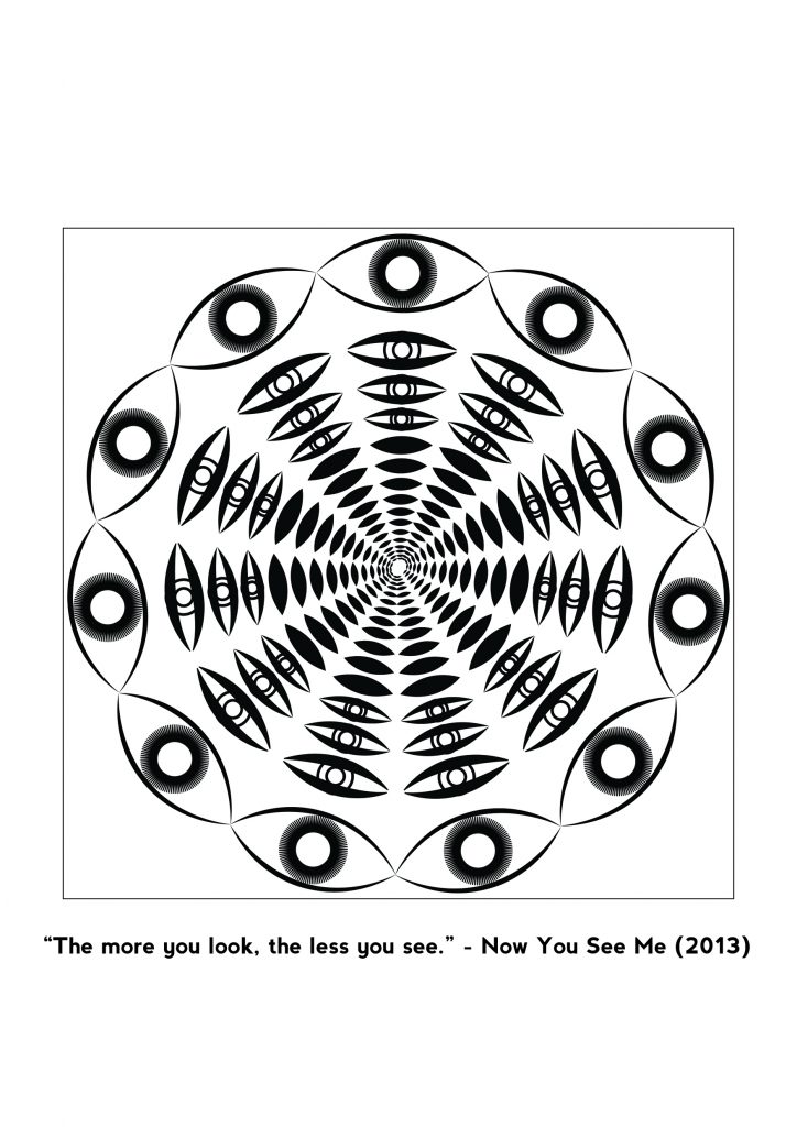
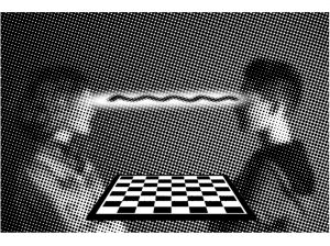
#3. “The more you look. the less you see.” -Now You See Me (2013)

This was my initial design-

chess

It was based on a Chinese saying 当局者迷,旁观者清 which means the chess player may not see as clearly/be as clear-minded as the onlooker of the game. Such a phenomenon is linked to the fact that ‘the more you look, the less you see’.  However, I felt this interpretation of the quote was a too complicated and indirect. Hence, I ditched this idea and analyse the quote again.

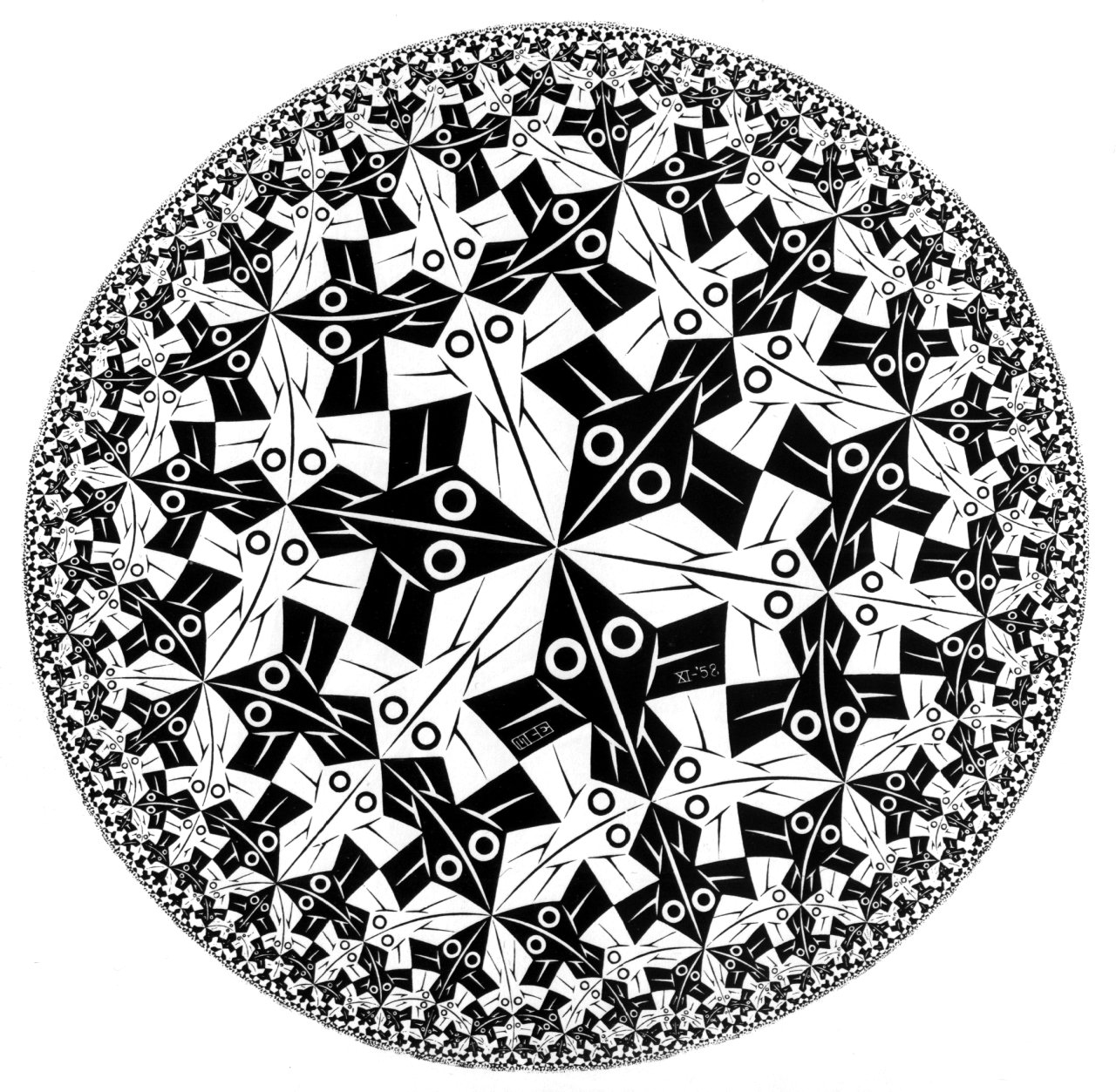
This is a paradoxical quote. Hence, I referenced works of paradoxical spaces by MC Escher. While viewing his works, I felt that circular optical illusions would highly work for my quote. I love the optical illusion it creates when you keep staring at it – just like how the quote talks about the sense of lost when you scrutinise/stare at the same subject for too long.

Hence, I started with the motif of an eye (since the quote is about seeing). Frankly speaking, I didn’t experiment much before I got this design:

eye

This design illustrates my quote in 3 different ways. Firstly, the circular layout makes it looks like an eyeball, the most symbolic organ for sight. Secondly, the eye gradually closes from the outer circle into the inner circle – signifying the change from looking to seeing nothing. Lastly, the circular layers of black rugby shapes creates an illusional abyss, signifying the sense of ‘lost’ suggested by the quote.

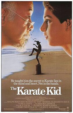
#4. “Ah, not everything is as seem.” -Karate Kid (1984)

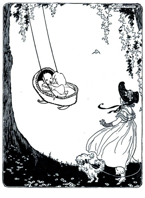
Here is another paradoxical quote said by Mr Miyagi in the 1984’s version of Karate Kid. I decided to take the quote out of the movie context and instead, work on uncommon known truths to express its meaning. I recalled reading an article a few years ago about the dark truths behind nursery rhymes. The irony about nursery rhymes is that they are often recited to young children but many of these nursery rhymes hold dark meaning when they were first created. One, for example, is Rock-a-Baby which is familiar to most.

baby

Ever realised the phrase ‘when the bough break; the cradle will fall’ sinister? According to the article…

The baby in question is supposed to be the son of King James II of England, but was widely believed to be another man’s child, smuggled into the birthing room to ensure a Roman Catholic heir. The rhyme is laced with connotation: the “wind” may be the Protestant forces blowing in from the Netherlands; the doomed “cradle” the royal House of Stuart.

As such, I have also decided to reference illustrations from the Golden Age of Illustrations. These illustrations are done in black and white and holds a strong narrative in order to illustrate the story.

201610221903201000

Scanned from ‘Illustrated Children’s Book’ pg 18-19

201610221905441000

Scanned from ‘Illustrated Children’s Book’ pg 30-31


Another reference I made was Goya’s Los Caprichos, a series of 80 etchings he made to condemn the universal foolies and foolishness of the Spanish society. As such, these images also holds strong narratives elements. However, the images often depicts gory looking creatures and majority were not useful for my design.

 Nevertheless, one of image proves to be useful – Capricho No. 24: No hubo remedio (There was no help). I did not read into the intention of this etching but I find the illustrations to accurately depicted the jealousy of people over the King-like figure.

No. 24: No hubo remedio (These was no help)

No. 24: No hubo remedio (These was no help)

I decided to juxtapose these 2 images on a book cover to represent the different perception of the nursery rhyme – the front cover was to illustrate the common understanding of the nursery rhyme and the back cover was to provide the back story of the nursery rhyme.

reading

2D: My Line Is Emo [Reflections]

My project is emo.

I think this project has been a tedious but fruitful self-discovery journey. We seem to discover more of ourselves as we move away from the rational and work with the irrational and unconsciousness.

For someone who loves to be in control, the initial phase was tedious. I had to force myself to move away from my comfort zone and explore various possibility of mark marking. Unlike all the other forms of art where there were rules, principles and theories to abide, mark marking was truly 100% democratic. To get the right frame of mind, I tried to imagine myself as a young child who explores creativity with the given materials. I probably looked silly in the art room with the mad experimentation but it’s okay ‘cos I got a number of prints I really like (and some eventually became part of final work).

Meaning is what makes the difference between a child’s work and a mature work. Hence, the next step was to add meanings to these works and push them further than just mere mark marking. This was much more interesting and enjoyable as I could apply my understanding of materials to establish meanings and vary the marks created. For stronger feelings I had encountered through personal experiences, I could interweave symbolic visual elements into it, making the emotion line relateble to all while significant to me. While this stage was enjoyable it was also tricky as I kept questioning myself which of these feelings felt were real and which were not?

Yknow, sometimes feelings are induced by surrounding environment and not just that single situation alone. Perhaps something occurred and my brain tells me ‘yeah you should feel this way because it’s the social norm’ but my heart probably felt different. Sometimes my emotions could be masked because it would influence how others would perceived me if I showed my true emotions. But i’m dwelling too deep into this so… move on.

For feelings that I had initially thought that might be interesting to work with but don’t emotionally attached to it, I had to change them. (eg Jealousy)

I think the greatest take away from this project was not to be afraid of making mistakes (a life lesson I always remind myself) because sometimes mistakes may work to our advantage. It’s better to have continuous development than delayed perfection. Be bold. Take risk. Discover new marks.

I’m glad that this project end up with a great sense of satisfaction (and relief)!

All right, off I go to pack my room now.


2D: My Line is Emo [Final Work]


15_nervousness 14_hysteria 13_horror 11_sentimental 12_anxiety 10_tenderness 9_euphoria 8_zest 7_joy 6_hopeless 5_isolation 4_despair 3_desire 18_frustration 17_torment 16_fury

1_surpriseSurprise: To me, surprise is a sudden outburst of happy energy

2_amazementAmazement: I get easily amazed with detailed artworks. Hence, I wanted the print to be filled with tiny details to give a bigger print making pattern.

3_desireDesire: Growing up, we have often desire for our parents acceptance in things we do. Hence, these makings are actually created with (part of) my parents’ signature. When I start to mature and start to nurture a sense of independence, this desire gradually wears off, resulting in a lower density at the end of the line.

4_despairDespair: This is pretty self-explanatory. The dripping ink are visually representative of tears of despair. I tried to varied the direction of the drips in order to portray the irrational feeling of despair.

5_isolationIsolation: This pattern is referencing to one of my favourite artist – Edward Hopper, who explores the them of isolation in NYC. He often uses window frames and door frames to depict isolation. Using the same visual motif, I created this pattern by interweaving unevenly cut strips into the black paper.

7_joyJoy: …it’s the simplest form of gratitude. As simple as the word itself, this pattern was created with forms taken from my happy drawing. They seem like happy creatures in a happy land!

8_zest

Zest: …is great enthusiasm and energy. This word stood out among the list of ‘happy emotions’ because it is repeatedly used in my secondary school’s song. My secondary school days were (and will always be) one of the greatest part of my life. Everyday were energetic and spend with great enthusiasm. Hence, I wanted to encompass the energy of zest within my pattern.

9_euphoriaEuphoria: To me euphoria is mystical happiness we feel that cannot be easily conveyed with words. It just all seems magical. Hence, I decided to use create swirly prints which black and white paint interweaves one another.

10_tendernessTenderness: This white strip is actually filled with embossed swirly lines that resemble enlarged fingerprints. I wanted to engage the sense of touch in this emotion line because tenderness often compel us to touch it more than merely seeing it.

11_sentimentalSentimentality: This project itself has been pretty sentimental as it asks us to dig through our deepest feelings. For me,  feelings are transient and I don’t really like to express them much. Hence, while experiencing sentimentality, there is also uncertainty within it.

12_anxietyAnxiety: When I do get anxious, I get jittery and loses focus easily. A million random thoughts would fill my mind and my thoughts would start to get wild.

13_horrorHorror: I hate horror shows as they feed wild thoughts to my mind especially when I’m alone at night. An imaginary creature seem to be lurking around me. Hence, the use of white nail polish in water creates these ghostly effects. If you look close enough, you could see some ghost in there 😛

14_hysteriaHysteria: Hysteria is a stronger sense of fear as compared to anxiety. Hence, while strokes are largely in the same direction, they are bolder and vary in thickness to make it seem more dynamic. 

15_nervousnessNervousness: Embarrassingly enough, I get sweaty palms when I’m nervous. The wet splodges reflects the sweaty palm prints I could possibly make when I’m extremely nervous. This print was made with wet paper tissue dipped with diluted black Chinese ink on newsprint.

16_furyFury: I do experience this when my frustrations had reached its limit. And yes, I do get violent in order to vent that energy out of me. Hence, I worked closely with the definition of the word ‘violent anger’ to create the line. The jagged edges of the torn paper are symbolic of violence and the juxtaposition of the complexity of mark making against the solid black paint seems to represent a disruption of tranquility.

17_tormentTorment: Torment would infer that lots of physical violence had been done. My paper had been ‘tormented’ with burns, tears and crushes. In order to emphasise ‘torment’, I added my body prints (in this case my hand print). This was reference from Performance Artist, Marina Abramovic, who often carry out physical torture on her body and show our human body to be vulnerable against such harms.

18_frustration


Frustration: I don’t like to verbalise my emotions and often bottle up my frustrations. Hence, I feel that frustration is a more subtle form of anger where it is hidden beneath the facade and only revealed when triggered. With this explanation, I created a pull-out-to-trigger-frustration-strip. Upon pulling out the right tab at the end, the soft strokes changes to reveal the harsh mark makings beneath it.


And yayyyy!!! Work is done!!!

tenderness

2D: Mark Making Experience [Process]

Different ways of experimenting with mark making:

Experimenting with brayer & print paint-

20160908_173714_HDR-600x106720160908_173347_HDR-600x1067

Lino Cut-

20160910_013157_HDR-600x1067

Tearing & Burning-

P.s. the tearing occurred by chance

20160908_212636_HDR-640x36020160819_110126_HDR-360x640

And markmaking with random daily objects-

20160824_165711_HDR-360x64020160818_233527_HDR-360x64020160906_210523_HDR-360x640


2D: 18 emotions

“The heart is a strange beast and not ruled by logic.”

  1. tenderness
  2. lust
  3. joy
  4. euphoria
  5. thrill
  6. eagerness
  7. relief
  8. optimism
  9. surprise
  10. amazement
  11. irritation
  12. grouchiness
  13. exasperation
  14. ferocity
  15. loathing
  16. disgust
  17. torment
  18. depression