2D: Quotes [Final + Reflection]

1-01-copy2-01-copy

3-01-copy 4-01-copy

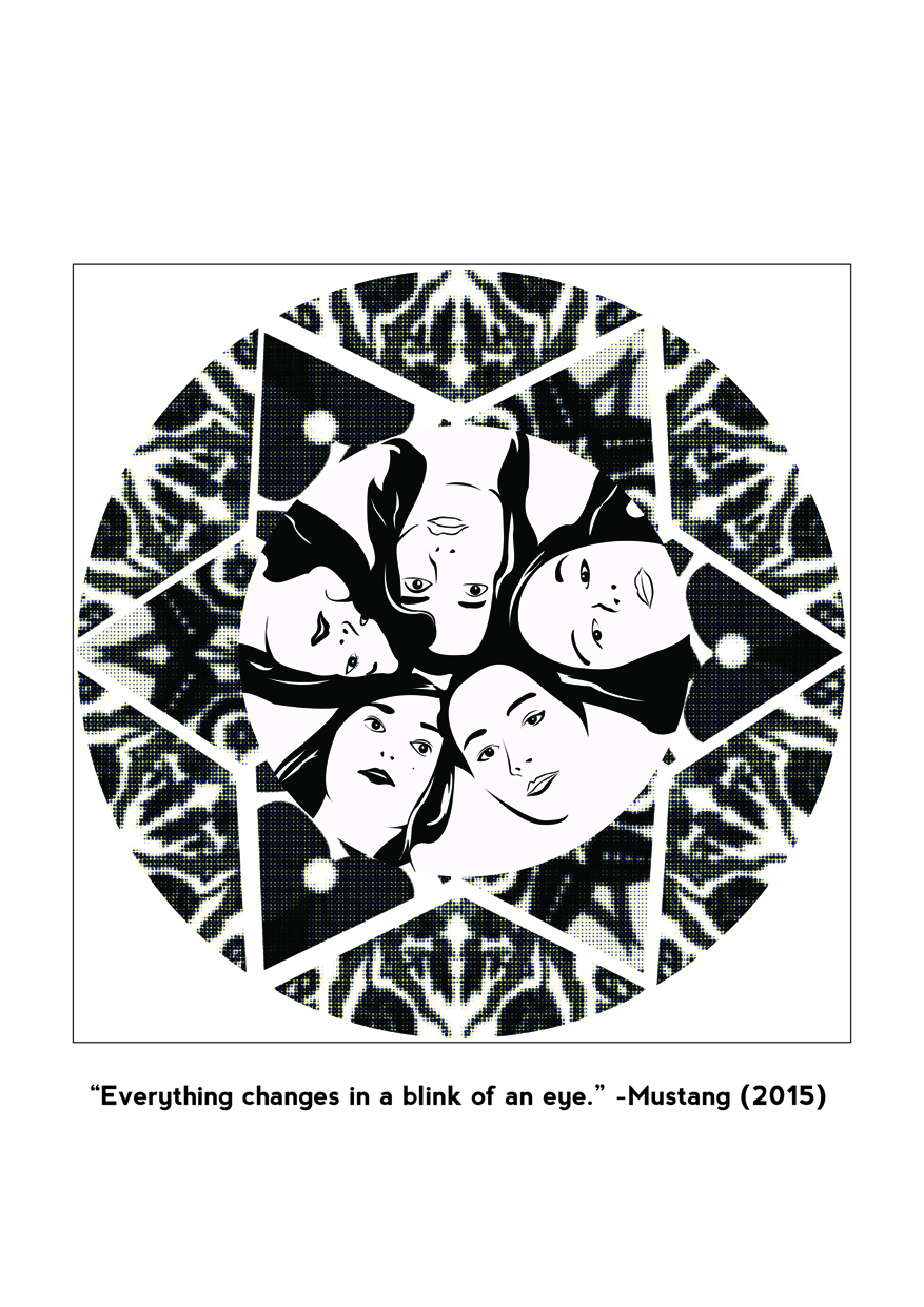
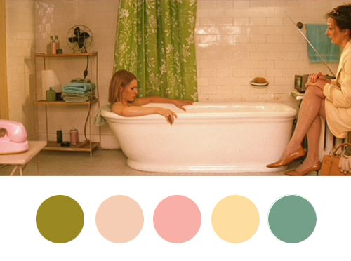
#1: “Everything changed in a blink of an eye.” -Mustang (2015)

(English translation may vary as this movie is originally based in Turkish)

Mustang (2015)

Mustang (2015)

As this movie was set in Turkey, I decided to interweave Turkish designs into the image.

turkish-design
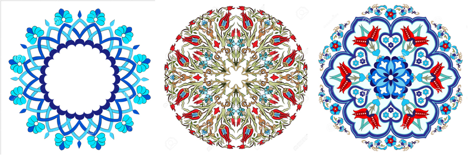
Also, I perceive Kaleidoscope as something that constantly changes its appearance ‘in a blink of an eye’. I interweaved more angular forms with the turkish design to get a unified design like this.

mustanggirlscircle-01

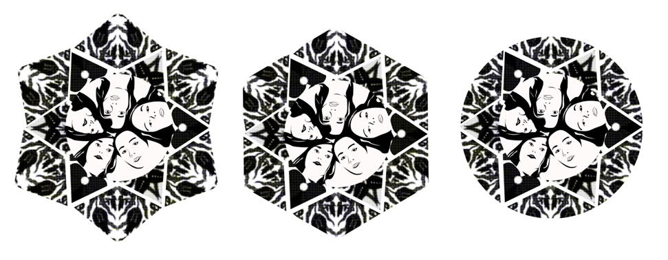
As I followed closely with the movie context, the girls are placed in the middle of the design as they are the main character of the show. I have outlined them on illustrator from the poster.

mustanggirlscircle  Print

I experimented with different shapes before deciding on the circcular layout as it seem more like eye, one of the keyword of the quote.

layout

Edit: This was my initial design (lol) where I took a very literal interpretation to the quote:

OLYMPUS DIGITAL CAMERA
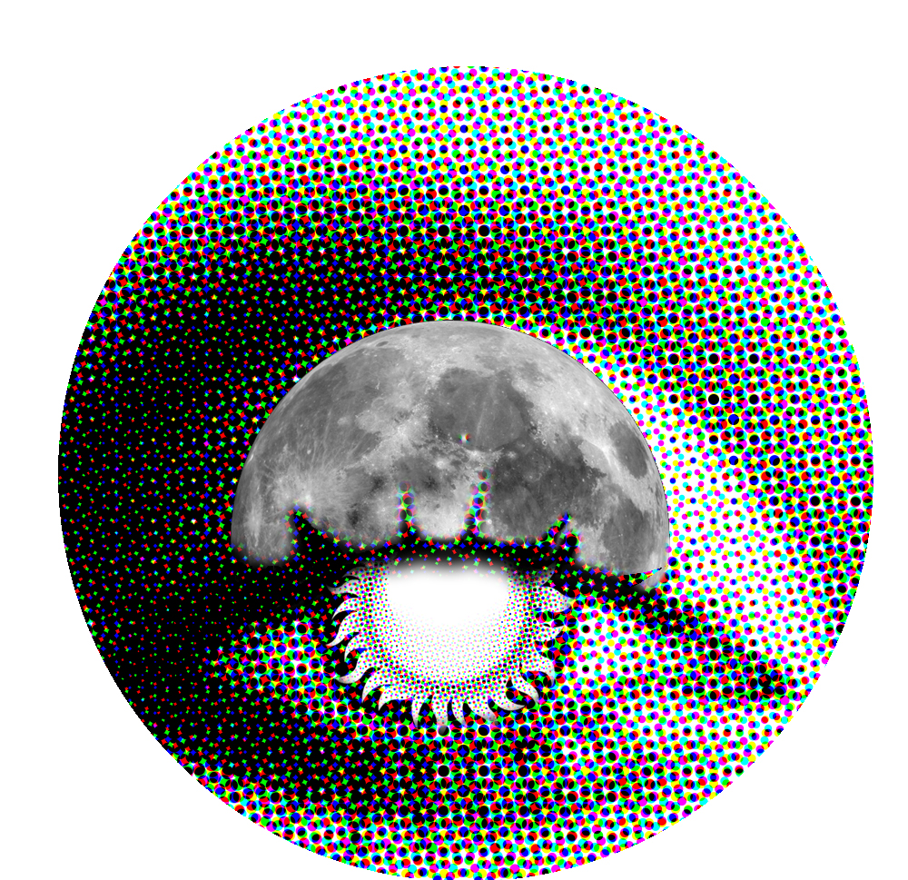
The sun is the pupil while the moon is the eyelid. It literally changes when you blink. This interpretation was down-right cliche. This design is utterly freakyyy. So I ditched it and decided to interpret it based on the movie 🙂


#2. “I like to look for things no one else catches.” -Amélie (2001)

(English translation may vary as this movie is originally based in French)

Amélie (2001)

Amelie is an eccentric girl who loves to notice little details no one else does. In the movie, Amelie takes note of a buzzing fly in the movie during an intense scene. I started with exploring different ways of presenting ‘catching with her eyes’ – cyclops eyes, fish net eyes, bionic arms coming out from the eye.

scan

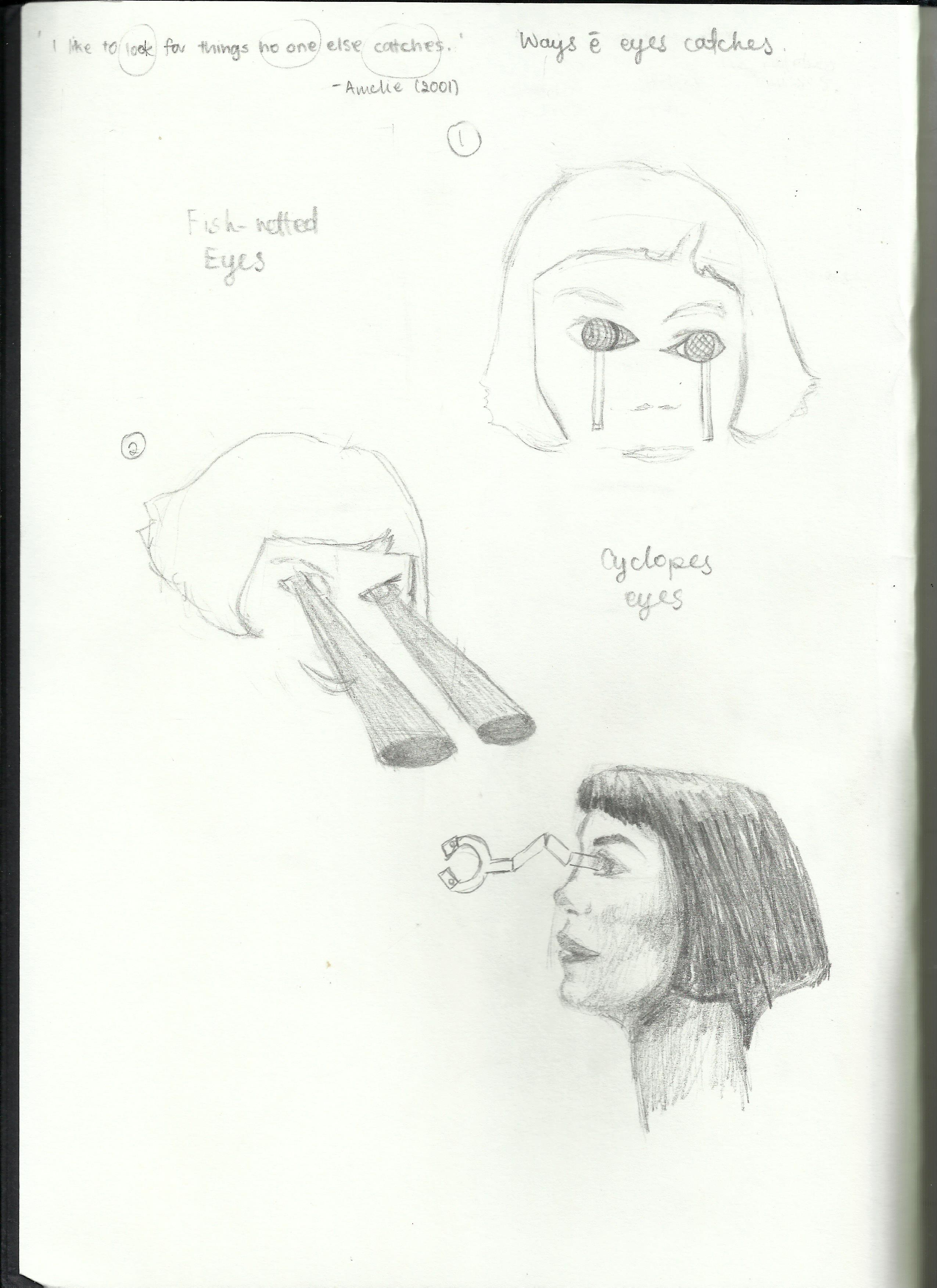
Among all these, design of beams from the eyes was easier to work with as it give more space for the ‘things she catches’. The other 2 designs (Fish nets and bionic arm) seem a little too creepy. Amelie is eccentric, not creepy.

I decided to use the less well-liked insects as I think they are little things that most people would fail to notice or care of as compared to butterflies.

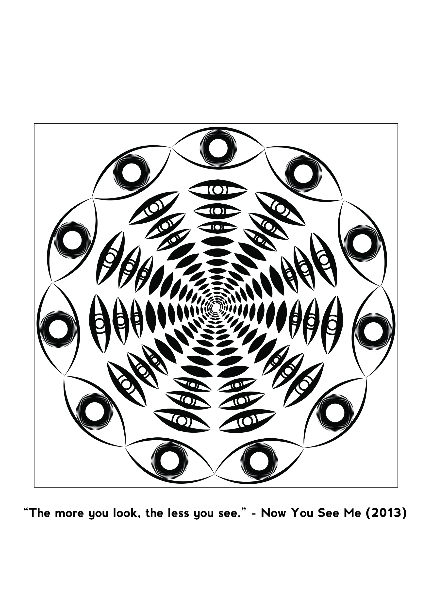
#3. “The more you look. the less you see.” -Now You See Me (2013)

This was my initial design-

chess

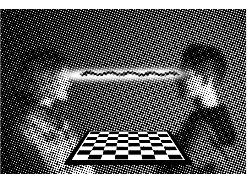
It was based on a Chinese saying 当局者迷,旁观者清 which means the chess player may not see as clearly/be as clear-minded as the onlooker of the game. Such a phenomenon is linked to the fact that ‘the more you look, the less you see’.  However, I felt this interpretation of the quote was a too complicated and indirect. Hence, I ditched this idea and analyse the quote again.

This is a paradoxical quote. Hence, I referenced works of paradoxical spaces by MC Escher. While viewing his works, I felt that circular optical illusions would highly work for my quote. I love the optical illusion it creates when you keep staring at it – just like how the quote talks about the sense of lost when you scrutinise/stare at the same subject for too long.

Hence, I started with the motif of an eye (since the quote is about seeing). Frankly speaking, I didn’t experiment much before I got this design:

eye

This design illustrates my quote in 3 different ways. Firstly, the circular layout makes it looks like an eyeball, the most symbolic organ for sight. Secondly, the eye gradually closes from the outer circle into the inner circle – signifying the change from looking to seeing nothing. Lastly, the circular layers of black rugby shapes creates an illusional abyss, signifying the sense of ‘lost’ suggested by the quote.

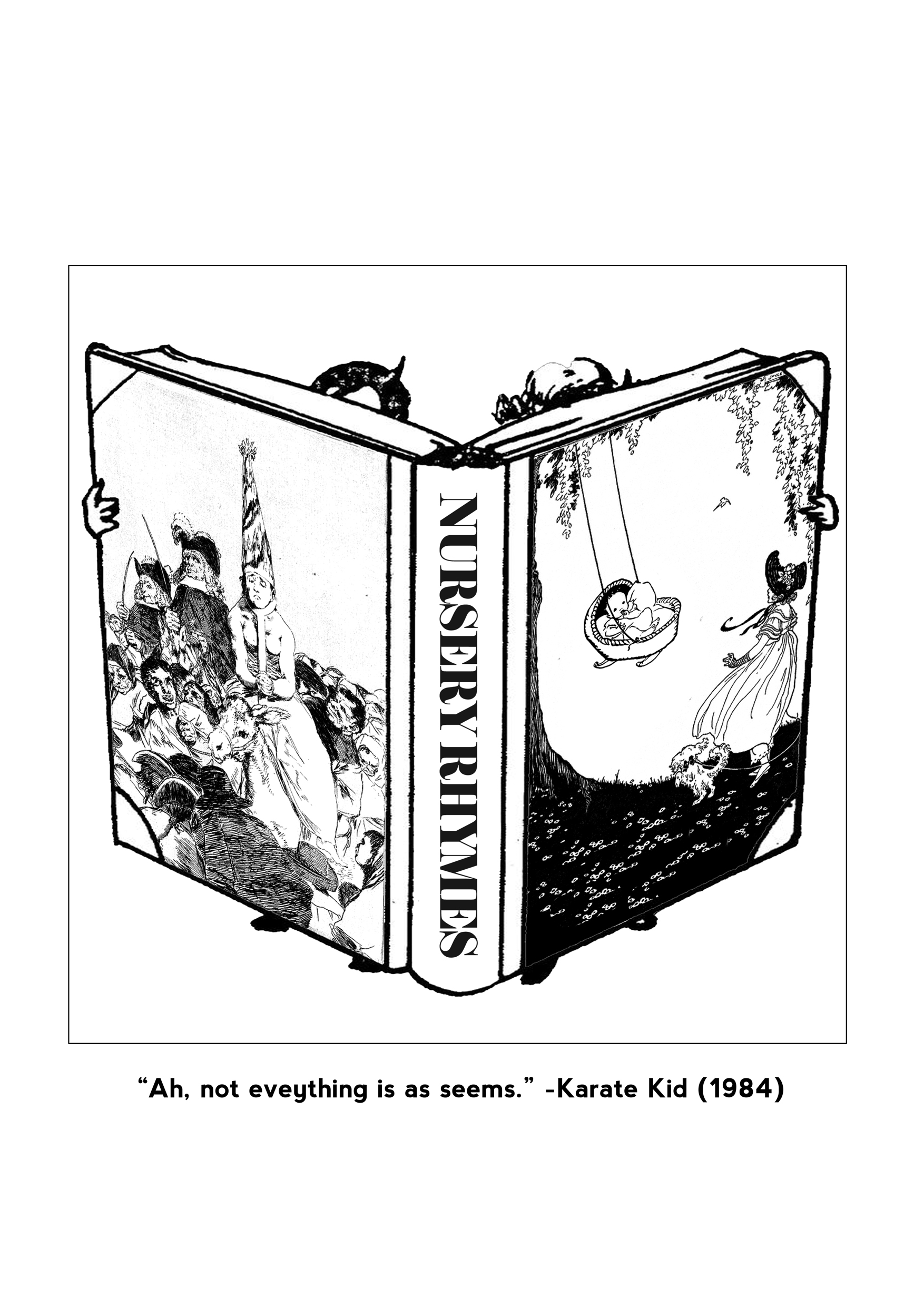
#4. “Ah, not everything is as seem.” -Karate Kid (1984)

Here is another paradoxical quote said by Mr Miyagi in the 1984’s version of Karate Kid. I decided to take the quote out of the movie context and instead, work on uncommon known truths to express its meaning. I recalled reading an article a few years ago about the dark truths behind nursery rhymes. The irony about nursery rhymes is that they are often recited to young children but many of these nursery rhymes hold dark meaning when they were first created. One, for example, is Rock-a-Baby which is familiar to most.

baby

Ever realised the phrase ‘when the bough break; the cradle will fall’ sinister? According to the article…

The baby in question is supposed to be the son of King James II of England, but was widely believed to be another man’s child, smuggled into the birthing room to ensure a Roman Catholic heir. The rhyme is laced with connotation: the “wind” may be the Protestant forces blowing in from the Netherlands; the doomed “cradle” the royal House of Stuart.

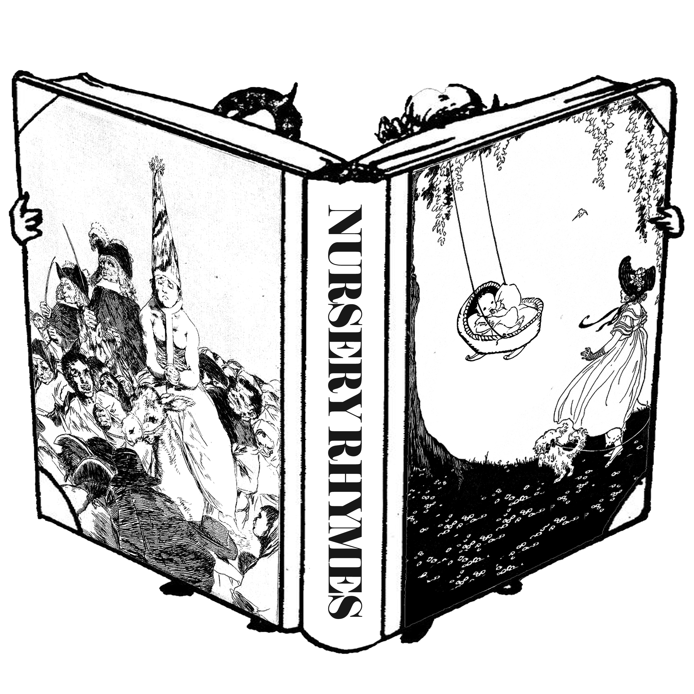
As such, I have also decided to reference illustrations from the Golden Age of Illustrations. These illustrations are done in black and white and holds a strong narrative in order to illustrate the story.

201610221903201000

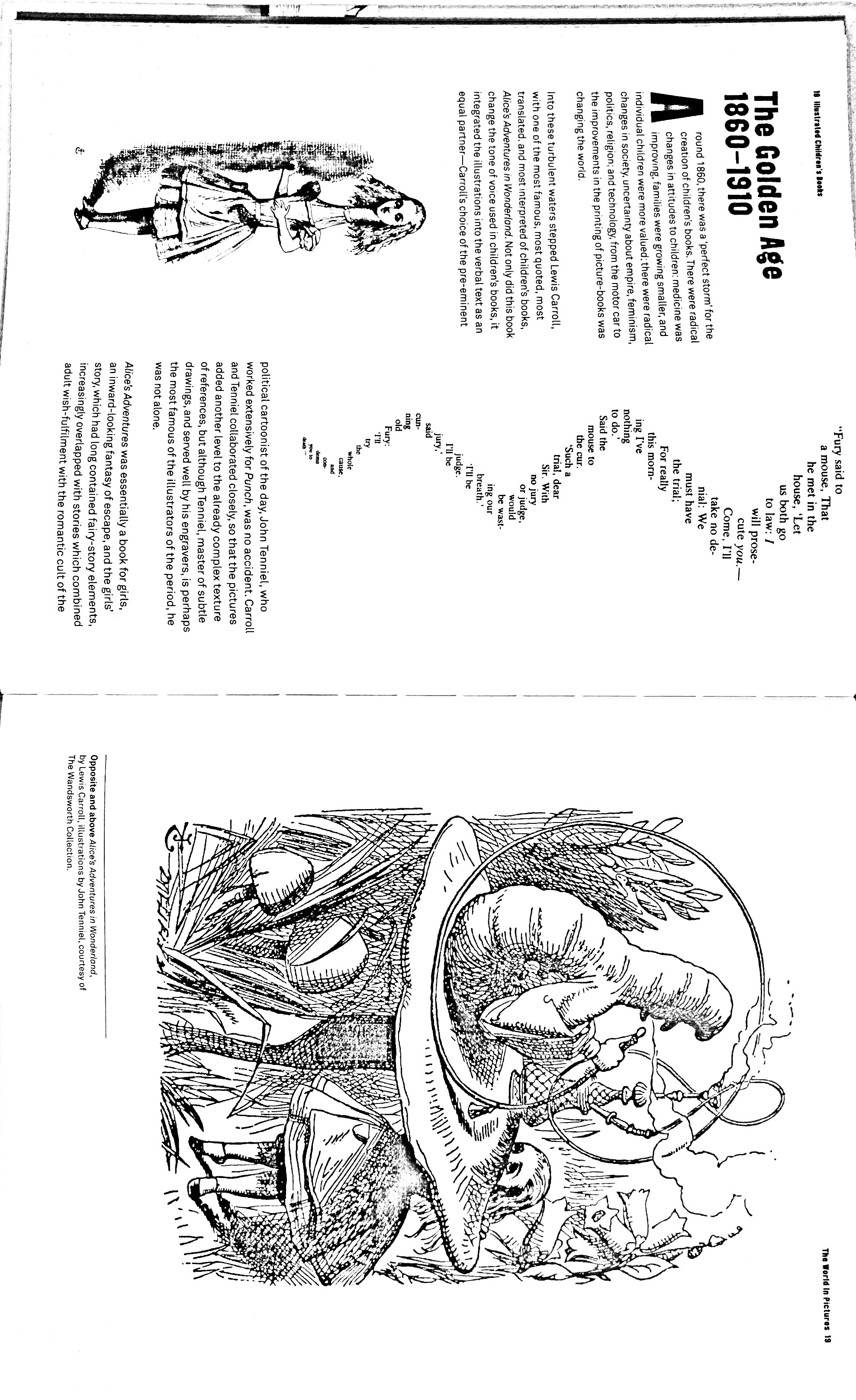
Scanned from ‘Illustrated Children’s Book’ pg 18-19

201610221905441000

Scanned from ‘Illustrated Children’s Book’ pg 30-31


Another reference I made was Goya’s Los Caprichos, a series of 80 etchings he made to condemn the universal foolies and foolishness of the Spanish society. As such, these images also holds strong narratives elements. However, the images often depicts gory looking creatures and majority were not useful for my design.

 Nevertheless, one of image proves to be useful – Capricho No. 24: No hubo remedio (There was no help). I did not read into the intention of this etching but I find the illustrations to accurately depicted the jealousy of people over the King-like figure.

No. 24: No hubo remedio (These was no help)

No. 24: No hubo remedio (These was no help)

I decided to juxtapose these 2 images on a book cover to represent the different perception of the nursery rhyme – the front cover was to illustrate the common understanding of the nursery rhyme and the back cover was to provide the back story of the nursery rhyme.

reading

The Blind Side – Reflection + Process

STORY:

“After a five-hour night flight and another hour of commute, I finally arrived at the hotel. The last traces of tiredness that had settled in my body were quickly ebbing away; I was all ready to explore the city of Melbourne. Before I left the hotel, I folded the white cane I was carrying and stored it in my bag. It was an aid, but also a crutch. The cane seemed to magnify my disability and, in some way, my insecurities of appearing inferior.

I was diagnosed with retinitis pigmentosa at the age of five, a condition that causes  my vision to steadily deteriorate. It was predicted that I would be completely blind by the time I was twelve, but seven miraculous years had passed and I still had 10 percent of my sight. Everyday since has been a blessing to me, especially as I was acutely aware of the fact that I was seeing on borrowed time. It was for that reason too that I made a goal to catch as many of the most spectacular sunsets around the world as possible. Though this was going to be my 22nd trip abroad, it was the first time I was travelling on my own. It took my parents much convincing before they agreed to let me go. Bringing the cane with me was one of the few concessions I had to make; of course, I would have much preferred to rely on my heightened sense of direction and spatial awareness to get around.

As I stepped out into the streets, it hit me then that I was completely and frighteningly alone. And I couldn’t be more exhilarated.

My first stop was the State Library. As soon as I walked into the La Trobe reading room, I was left awestruck by the magnificence of its octagonal architecture. Natural sunlight filtered through the glass dome ceiling and bathed the massive library and the many shelves lining the walls with a warm hue. I made my way to a less lit corner to take a look at the books when I suddenly bumped into a low-level shelf that I had not noticed due to my night blindness.

Thud. Thud. Two thick hardcovers dropped to the floor – the noise they made as they landed was amplified amidst the deafening silence of the library. Embarrassed, I hastily shoved the books back on the shelf before discreetly leaving the room.

It was the first of several bumps and trips in an oddly accident-prone day. I reassured myself that I would soon get used to my unfamiliar surroundings. The bouts of clumsiness did little to dampen my high spirits, as I went about visiting various places of interests in the days that followed.

It was my last morning in Melbourne, and I had saved the best for last. I was finally going to see the best sunset, one I had heard so much about. I had woken up earlier than usual that day. I squinted and tried to adjust my eyes to the blackness around me. The room was shrouded in an unusual darkness. Panic coursed through my veins. It couldn’t possibly be today. I groped around for the light switch and turned it on. But everything remained the same. The world was pitch black.

I was momentarily lost. Losing my vision was something I had always anticipated, but was never prepared for. Furthermore, I had yet to be fully efficient with my white cane! The independence I had built for myself over the years was gone along with my vision. I reached for my cane and tried to get to the door. A routine that typically took six seconds was now a 60-second exercise, as I kept bumping into furniture and knocking over objects. It was frustrating that a simple task had become so difficult. Maybe this room is too cramped. Maybe it’d be better once I’m somewhere more spacious.

I got changed and slowly got to the street level after a slow and steady 30 minutes. It was indeed more spacious outside the safe confines of the hotel. But never had the bustle of a city sound more threatening than exciting. The rumbling of the subway in the distance, the cars zipping across the roads and the beeping of the traffic lights suddenly seemed overwhelming, and fed my growing trepidation. As I was figuring out directions to the convenience store, I heard a bicycle bell ringing from behind me. Which direction should I stay on – left or right? The ringing got louder. The norm is left, right? Is it the same in Melbourne?

SCREEEEEEECH!!

I stood rooted to the ground, my eyes shut tight and my hands in clenched fists, hoping for the best as the bicycle came closer. While the bicycle missed me, it did nothing to soothe my irritation – I was unable to even  walk down the streets. I decided this was it. I was returning home. Once back in the hotel room, I feverishly started packing. As I was searching for my cane that I had angrily tossed aside, I tripped over it and fell over. Warm tears trickled down my face as I pounded the floor in frustration. I felt utterly useless.

Just then, I heard my room door being unlocked, followed by soft footsteps. “Sorry to intervene, I’m the housekeeper.  Is everything all right?” A lady’s voice spoke in a slightly accented tongue. She introduced herself as Jessica. I could feel her soft touch as she helped me up. With no one to turn to, I started pouring out my grief to her.
“My dear, never let what you cannot do interfere with what you can do. Master your cane like it’s an extension of your body. Meanwhile, continue chasing your goals. It might be tedious in the beginning, but persevere and you will emerge stronger. You’ve lost your sight, but not your freedom or independence.”

“You’re a beautiful lady with a beautiful heart,” I told Jessica. “Ha! I’m not sure you’d say the same if you could see my face.” She took my hand and ran it across her face. I could feel a rough patch of skin on her right cheek, stretching from her nose to her chin. It was a massive scar.

“How did this…?” “I was a runaway bride from Pakistan and this was an acid burn that I got as  punishment. I had no freedom back home. Thankfully, an NGO helped me and even found me a job here in Melbourne. I felt so relieved, I’ve never felt true freedom till I was here. So Alison, keep your chin up and embrace this new freedom. Stop packing and resume your journey!”

Jessica was right. Compared to what she had gone through, I was still in a far better state than she could have asked for. Life had to go on. Still fumbling with my cane, I headed out and continued with my city tour. By evening I was on my way to the Eureka Skydeck. During the 38-second elevator ride to the 88th floor, I felt adrenaline rushing through me. My ears were popping as we entered higher altitudes. As I exited the lift, I could hear the excitement of the children around me, presumably looking through the binoculars that were scattered around the deck.

“Look at the sun!” I heard several kids exclaiming. I tried to picture the sunset I’ve seen in my mind’s eye so many times. As I placed my hands against the glass panels, I could feel the heat emanating from the sun. Then, lifting my face to the sky, I let my skin bask in its warm rays. I imagined myself touching the sun. For the first time, I was ‘viewing’ a sunset with my entire body. It was a moment to remember.

It hit me then that I was completely and frighteningly alone. I couldn’t see. But I was at peace.”

Written by: Yu Qing
Edited by: Rahimah

The above is the original narrative story I had. However, I had condensed the story into a simpler 3-Act structure for my photo montage video.

  • Building Action: Establishing character + goals + Journey
  • Climax: Turn blind
  • Ending: Achieve goal

I love films about man vs man and was inspired to create such a story. One of the main movie reference for this video was ‘Wild’ (2014) where the story revolves around protagonist, Cheryl Strayed, embarking on a journey of self-discovery and healing. The film often uses wide angle shots to capture the magnificent environment. More importantly, the background provide a narrative element of the scene. wild

Picking up from this, I had also used the same for my work.

wideangle

During the week for filming, I happened to be in Melbourne. Hence, A number of my shots were taken there and then post-edited on Photoshop.

Another show I had referenced was Netflix series – Unbreakable Kimmy Schimdt. The show is about Kimmy who had been away from civilisation for 20 years and only visited New York City after 20 years. Her bubbly disposition is expressed through her colourful dressing.

melbourne-scenes

In order to present Melbourne city as it is, I only adjusted the vibrancy and had minimal colour distortion for the photos. Instead, the only scenes where I had greater control of colours was the climax where she had turned blind:

colours

As for the background music, they are all from the movie Forrest Gump. Similarly, the show is about the ups and downs in Gump’s life journey, hence the music was largely relevant to my story.


Photo Reference:

Santorini, Turkey:
http://www.topinspired.com/top-10-sunset-spots-in-europe/
Japan:
http://tokyocameraclub.com/photos/editors.php
Paris:
http://sun-surfer.com/sunset-in-paris-6868.html
Eureka Skydeck  (Low Vantage):
https://theausiedream.files.wordpress.com/2011/08/eureka_skydeck_88.jpg
Sound Effects:
https://www.freesound.org


2D: My Line is Emo [Final Work]


15_nervousness 14_hysteria 13_horror 11_sentimental 12_anxiety 10_tenderness 9_euphoria 8_zest 7_joy 6_hopeless 5_isolation 4_despair 3_desire 18_frustration 17_torment 16_fury

1_surpriseSurprise: To me, surprise is a sudden outburst of happy energy

2_amazementAmazement: I get easily amazed with detailed artworks. Hence, I wanted the print to be filled with tiny details to give a bigger print making pattern.

3_desireDesire: Growing up, we have often desire for our parents acceptance in things we do. Hence, these makings are actually created with (part of) my parents’ signature. When I start to mature and start to nurture a sense of independence, this desire gradually wears off, resulting in a lower density at the end of the line.

4_despairDespair: This is pretty self-explanatory. The dripping ink are visually representative of tears of despair. I tried to varied the direction of the drips in order to portray the irrational feeling of despair.

5_isolationIsolation: This pattern is referencing to one of my favourite artist – Edward Hopper, who explores the them of isolation in NYC. He often uses window frames and door frames to depict isolation. Using the same visual motif, I created this pattern by interweaving unevenly cut strips into the black paper.

7_joyJoy: …it’s the simplest form of gratitude. As simple as the word itself, this pattern was created with forms taken from my happy drawing. They seem like happy creatures in a happy land!

8_zest

Zest: …is great enthusiasm and energy. This word stood out among the list of ‘happy emotions’ because it is repeatedly used in my secondary school’s song. My secondary school days were (and will always be) one of the greatest part of my life. Everyday were energetic and spend with great enthusiasm. Hence, I wanted to encompass the energy of zest within my pattern.

9_euphoriaEuphoria: To me euphoria is mystical happiness we feel that cannot be easily conveyed with words. It just all seems magical. Hence, I decided to use create swirly prints which black and white paint interweaves one another.

10_tenderness
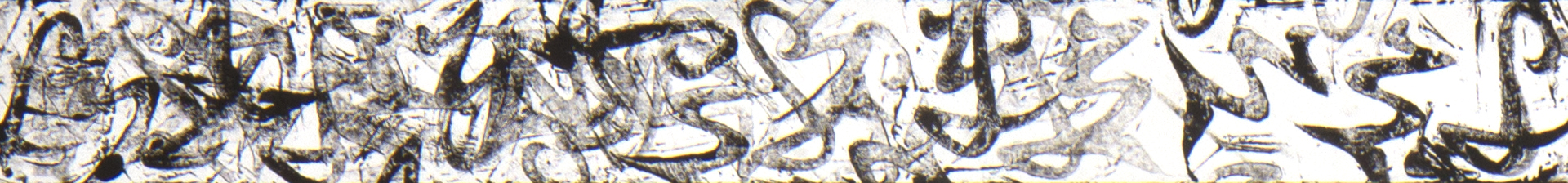
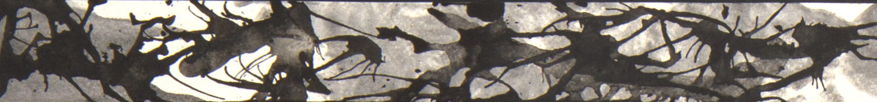
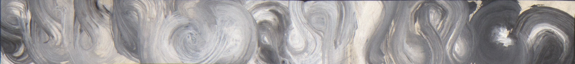
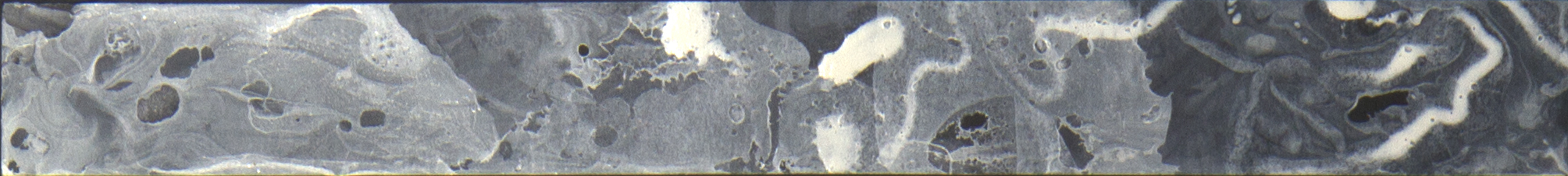
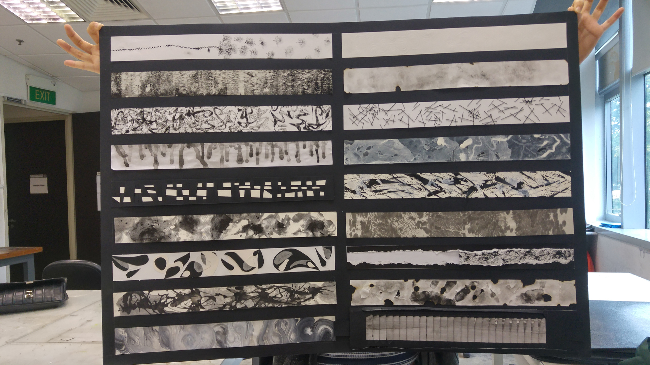
Tenderness: This white strip is actually filled with embossed swirly lines that resemble enlarged fingerprints. I wanted to engage the sense of touch in this emotion line because tenderness often compel us to touch it more than merely seeing it.

11_sentimentalSentimentality: This project itself has been pretty sentimental as it asks us to dig through our deepest feelings. For me,  feelings are transient and I don’t really like to express them much. Hence, while experiencing sentimentality, there is also uncertainty within it.

12_anxietyAnxiety: When I do get anxious, I get jittery and loses focus easily. A million random thoughts would fill my mind and my thoughts would start to get wild.

13_horrorHorror: I hate horror shows as they feed wild thoughts to my mind especially when I’m alone at night. An imaginary creature seem to be lurking around me. Hence, the use of white nail polish in water creates these ghostly effects. If you look close enough, you could see some ghost in there 😛

14_hysteriaHysteria: Hysteria is a stronger sense of fear as compared to anxiety. Hence, while strokes are largely in the same direction, they are bolder and vary in thickness to make it seem more dynamic. 

15_nervousnessNervousness: Embarrassingly enough, I get sweaty palms when I’m nervous. The wet splodges reflects the sweaty palm prints I could possibly make when I’m extremely nervous. This print was made with wet paper tissue dipped with diluted black Chinese ink on newsprint.

16_furyFury: I do experience this when my frustrations had reached its limit. And yes, I do get violent in order to vent that energy out of me. Hence, I worked closely with the definition of the word ‘violent anger’ to create the line. The jagged edges of the torn paper are symbolic of violence and the juxtaposition of the complexity of mark making against the solid black paint seems to represent a disruption of tranquility.

17_tormentTorment: Torment would infer that lots of physical violence had been done. My paper had been ‘tormented’ with burns, tears and crushes. In order to emphasise ‘torment’, I added my body prints (in this case my hand print). This was reference from Performance Artist, Marina Abramovic, who often carry out physical torture on her body and show our human body to be vulnerable against such harms.

18_frustration


Frustration: I don’t like to verbalise my emotions and often bottle up my frustrations. Hence, I feel that frustration is a more subtle form of anger where it is hidden beneath the facade and only revealed when triggered. With this explanation, I created a pull-out-to-trigger-frustration-strip. Upon pulling out the right tab at the end, the soft strokes changes to reveal the harsh mark makings beneath it.


And yayyyy!!! Work is done!!!

tenderness

Curating Self: BTS

‘The Things that Matters’ :

This post card was a reminder of the summer vacation I spent with my cousins this year. As we live on the opposite ends of the world, we cherish every opportunity we get to meet up.

I wanted to capture the times I reminisce whenever I stared at the post card during post-vacation. Hence, I decided to reference Wes Anderson’s retro colour palette.

Capture

Also, I’ve explored different body language and vantage points to integrate myself into the story of the object. I think the first few shots were successful in evoking emotions but not the right one I was looking for in my photo story. The use of silhouettes seems ominous. I looked like I’m fussing over some unpaid bill than reading a happy postcard.Capture3

The last photo, where the background was strongly lit against my subject matter, evokes a happier note as I read the happy note (oh bad pun!). After all, who sends sad messages on postcards?

‘The Place that Matters’ :

Among the places I had in mind, I’ve decided that the serenity of the yacht club was the most fascinating to me. The rhythmic crashing of waves, the bobbling yachts at the dock and the whiff of briny air is a breakaway from my daily cosmopolitan life.

Hiroshi Sugimoto’s seascapes series photos were the type of quality I was trying to capture. However, due to nature’s restrictions and my lack of capabilities, my images weren’t as powerful as his. Mine seems like cliche tourists shots.

Hiroshi Sugimoto Landscape 005 1989 Gelatin silver print 47 x 83 inches © 2012 Hiroshi Sugimoto

Time Exposed: #367 Black Sea, Inebolu , Hiroshi Sugimoto, 1991, print


IMG_8781 IMG_8784

Hence, I decided to try a different approach to capture the sea-view. And this time round, I was much luckier.
IMG_8680 IMG_8683

Being a yacht club, the yachts were one of the main subject matters I would capture and work on (derh!). While the yachts varied in forms, they were parked neatly in their respective docks. This creates an interesting visual as the mast of the boats converges to form a one-point perspective. The first few attempts weren’t as satisfying due to unbalanced composition and poor framing.

IMG_8659 IMG_8666

And finally, efforts were paid off when I managed to capture the post-sunset shot!
IMG_8822

This photo is greatly influence by one of my favourite photographer, Andreas Gursky.

F1 Boxenstopp I, C-print, 88 5/8 x 239 3/8 inches, 2007

F1 Boxenstopp I, C-print, 88 5/8 x 239 3/8 inches, 2007

Gursky’s photos often reflect order among chaos. While his subject matter is not deliberately placed in precise positions, his photos turns out to be very controlled in composition and lighting.

Lastly, the photo of the walkway at the dock was to bind the 2 previous photos and form a complete photo story of my sentiments on the yacht club.

IMG_8798…… and then I went home after a loooooooooong day.

Thanks for reading this loooooooooong post.

Curating Self II:

The Place that Matters


IMG_8683 IMG_8798 IMG_8822

The rhythmic crashing of waves, the whiff of briny air and the occasional egrets that glides across evening sky is my kind of perfect way to end the day. Its serenity and calmness is a much needed break from the hectic cosmopolitan life.

To read more about the work process, click here.

Curating Self I:

The Things that Matter


1.1 1.3 5.1
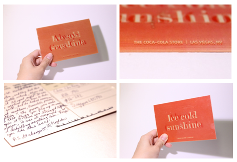
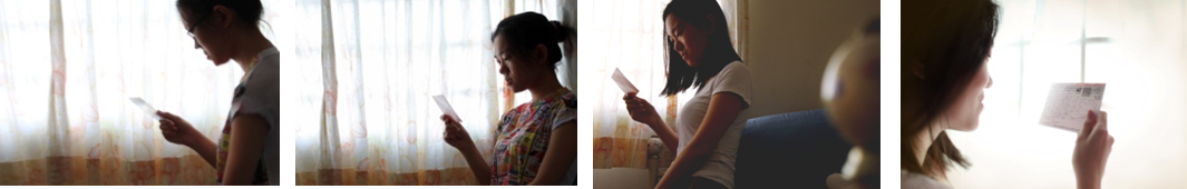
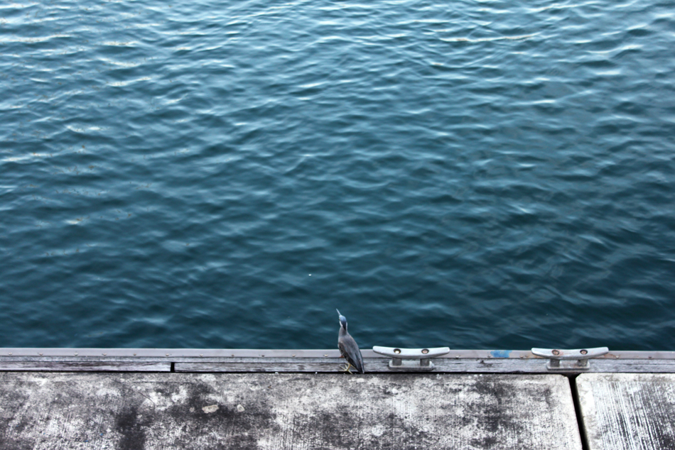
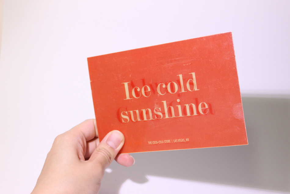
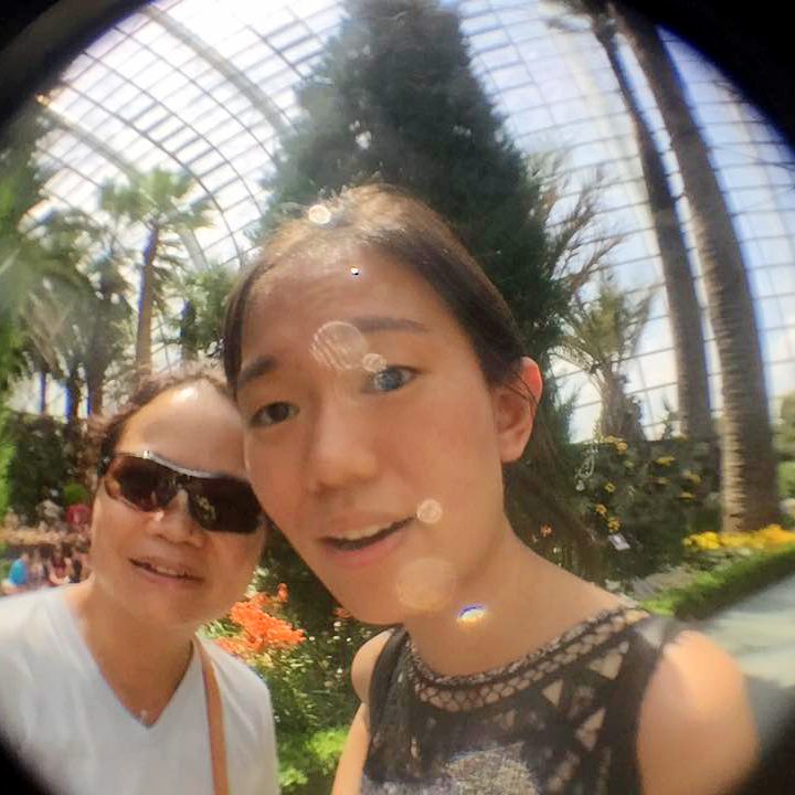
We spent our first summer vacations together for the first time this year. To do everything we missed out in the last 8 years within 1.5 month is simply too short. Thankfully for the photos we had taken and the postcards sent, I can easily reminisce on those time we spent together. Looking forward for our next meet up!

–Your Cousin