Media Art Nexus: Mood board and Concept

Concept:  Galatic Fantasia 

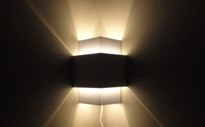
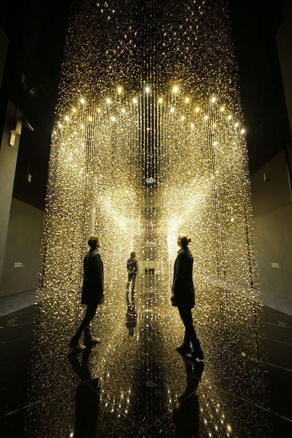
I was inspired by a photo I took when I was experimenting with trailing light photography and decided if I can create a similar effect but convert it into a video abstract effect.

Instead of taking the blue approach, I wanted to make it evoke a feeling of a cosmic spectrum instead.

Colour Mood board:

After creating my mood board, I realised that I would need another for effects that I am inspired by and want to use them to create the results I visualized.

Effect Mood board:

However, I realised that just having space effects is not rhythmic nor is it abstract, thus I wanted to experiment with other effects and elements to see if I can re-create an abstract galaxy while using the colour mood board.

Tutorials and Inspirational videos:

1. Galactic effect tutorials

2.  The video teaches me how to create smoke digitally. Although I do not have Houdini, this gave me some insight on how to apply this on Maya to perhaps create something similar.

3. These three videos will help me create the effect I want to achieve in my concept by combining the things that were thaught inside.

5. Lastly, I would like to add some moving bokeh to enhance the concept.


Project 2: Hyper-real Self Portrait

Dragon Lagoon

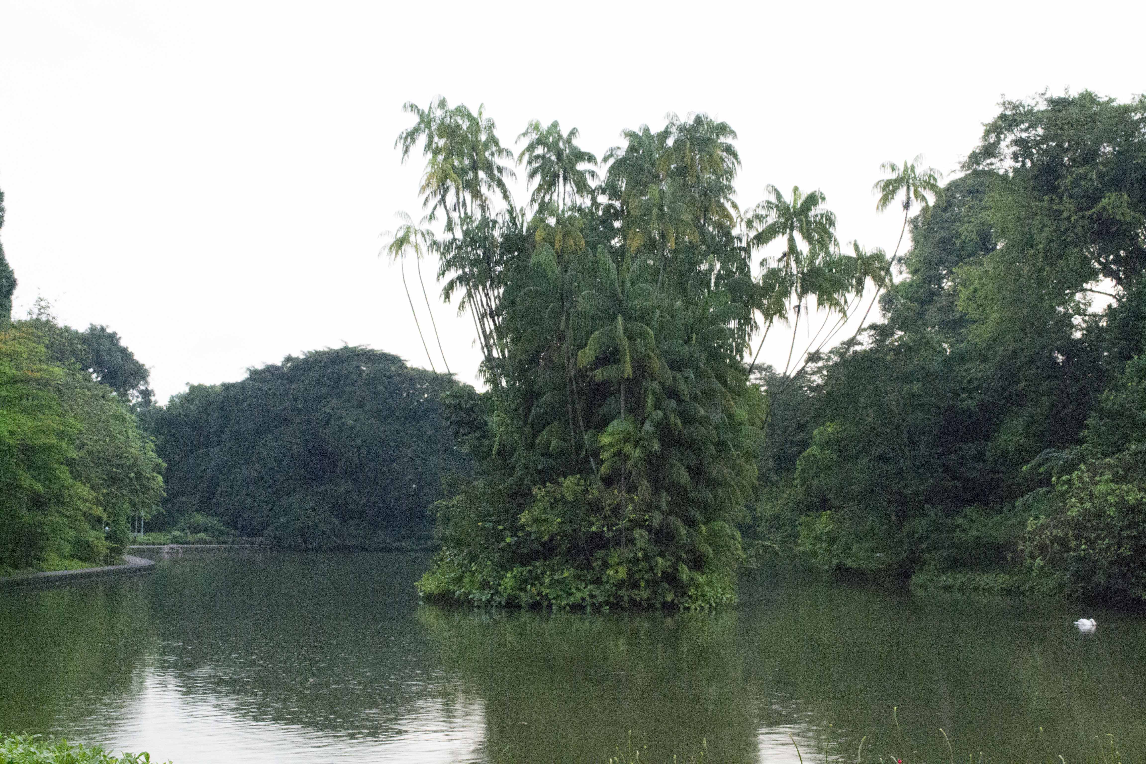
Before


Shot with Nikon D3100 – Botanic Gardens (swan lake)

After

After consult


Artist statement:

A place that seems real but unreal at the same time. I wanted to show how I visioned the place.

Art direction, fantasy and semi-realistic.

Concept:

Focus:
On the tree at the centre. Using the arch to bring the eyes to the centre.

Choice of Colour:
I chose a more vibrant and brighter colour to make the vegetation look more lush and abundant.

Dragons:
The dragons are there to bring life to the image and create a feral but beautiful eco-system.

Vegetation:
To create more diversity in the species of plants. It also helps to make a more dynamic frame and add subtle details.

Water:
Instead of leaving the water lake green, I decided to switch it to a more lagoon colour. In order to give an impression that this place is in the wild.

Sand:
These borders surrounding the lagoon makes the tree at the centre seem bigger than it actually is in the photo. Due to the compact space between making it slightly claustrophobic.

Waterfall:
Another element to create something surreal but believable in this setting. As 
making water gush out from trees, is not possible in the real world.


Camera:

Nikon D3100

Digital Processes:


Artist Reference:

How to train your dragon – Simon Otto

I took inspiration from the colours, composition and texture in this artwork in order to produce my work.

Looking at how the artist uses dark colours as the foreground and lighter shades as the background helps to bring contrast and focus to the midground. Prompted me to follow his method.

I especially love the usage of the bright green as the vegetation bringing in a surreal feeling to the audience.


Jungle book – Julian Calle: https://www.artstation.com/handsdigitalstudio

The second image that I took reference from helped me in planning the different type of vegetation I can explore in order to bring in some realism in a painting.


King kong – Island of the skull

Lastly, I took reference from this image due to the lighting and how the artist managed to capture such a realistic lighting, however, managing to retain the brightness and vibrancy of the vegetation. Which can never be seen in real life and can only be portrayed by the mind. Creating a semi-realistic environment.

(And some of Dennis Chan works in king kong)


My greatest influence would most probably be the first image, however, I manage to infuse the other two colours for vegetation in order to keep it still semi-realistic and not let it stray too much into a fantasy.

How this help contributes your image making process:

Helps me to reference on the lighting and colour of the environment that was used to create the effect of realism but at the same time not.

How to train your dragon helped to inspire me.

The other two, King kong and Jungle book helped me to reference the lighting and tonal value they used.


Mise-en-scène Research – Hacksaw Ridge (2016)

Summary:

  • The true story of Pfc. Desmond T. Doss, who won the Congressional Medal of Honor despite refusing to bear arms during WWII on religious grounds.

  • he risked his life — without firing a shot — to save 75 men in the Battle of Okinawa.

https://www.google.com.sg/search?q=hackksaw+ridge+summary&oq=hackksaw+ridge+summary+&aqs=chrome..69i57.2810j0j7&sourceid=chrome&ie=UTF-8

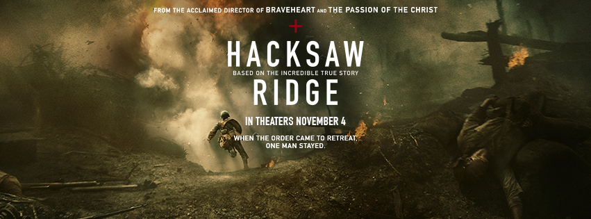
Chosen shot:

Mise on scene

A set-up to tell a story

Basic Framing:
Medium close up shot

Acting:
Even though there is no dialogue we can tell the main lead is tense and cautious.

Lighting:
The use of Backlight, Key light and Fill light can be seen.

Low key lighting

Backlighting is seen to be used more prominently to create intensity.

Blue lighting to make the place seem cold and unwelcoming.

Utilizing Background Elements:
The use of other actors to set the tense mood.

The fog to blur out the environment to create mystery.

The Frame:
The cropping of the frame helps the audience focus their eyes on the main cast and later guide it to the background cast with a smooth transitioning.

Space:
The main lead is bigger than the background cast; making him seem that he is taking the lead.  Due to the space between the rest and the main lead.

Composition:
Using the rule of thirds, the director leads the audience’s eyes from the top right centre to the top left.

Costume:
Past military clothes, showing the time of era and give a clearer understanding that they are soldiers in battle.

Semiotics:
Is a form of communication that uses signs and symbols to create a relatable and in-depth meaning which would need contextual knowledge in order to understand the reason behind it.

Visual Storytelling: Project 1 – Twisted Fable

Chosen Fable:
Ugly Duckling – http://www.dltk-teach.com/fairy-tales/ugly-duckling/story.htm

Twist:
The ugly duckling thinks its ugly however it is not because it thinks society expects more.

Meaning:
Similar to modern society, where how we perceive ourselves all depends on our perception.

Semiotics:
Cracked Mirror – Self-conscious, reflective and  broken
Ballerina – Stress to upkeep their beauty
Sinister Swan on shoulder – Societies expectations
Duckling – A reminder of her past
Feathers on right arm – Represent that she is a swan

Mediums Used:
Pencil
Pen
Photoshop

4D: Project 4_Poetics of Time

Time is Precious

Summary:

A continuation of project 3.

4D: Project 3_ Impossibilities of Being (Coffin)

Research:

4D: Project 4 – Research

Psychological Time:

Psychology of Time

Proposal:

Title: Time is precious

  1. Describe the Art Project
    1. What is it about?
  • Questions the viewer’s thought process or opinion on time.
  1. What has inspired you?
  • Not enough time
  • When someone dies with regrets
  • Time seems long for someone without the will to live but time is short for someone that has a purpose to live.
  1. Are you trying out a new concept or a continuation of a previous project?
  • Continuation of Project 3, expand on the idea.


  1. What do you intend to communicate to your audience?
  • To treasure their lives and make use of their lives doing something they want by evoking their emotions.
    1. What is innovation or new about it?
  • Would they choose to stay or will they choose to struggle out?
  • More comfortable with the idea of death or not


  1. Execution
    1. Big box – enhance experience
    2. Projector – light

Place the audience in a box and the only light source is the projector.

Comforts the disturb and vice versa

  1. Objective and activities
    1. A life-size coffin
    2. Use Ikea boxes, headphones and a projector
    3. Installation
    4. Life-size, length 170cm, Height 30cm, width 60 cm (Rough estimation)
    5. 1 minute
  2. Art materials and equipment for the art project
    1. Cardboard boxes, spray paint, Duct tape
    2. Projector, Headphones, mirror, sleeping bag, pillow, projector stand
  3. Mounting and installing the art project
    1. Lay It on the floor

After the experience, the audience can give a review

Execution of gathering resources:

  • Getting unwanted boxes from Ikea

Materials:

Process:

The process of moving the installation: 

It was too huge to go into the lift. Thus I have to drag it up and down to install it and dispose of it.

Set-up layout:

The Final Set-up:

Outside-


Inside-

Elements:

Colours – Help make the viewer really feel like they are sunk underwater or burnt alive. It also sets the temperature.

BGM/SFX – Sets the mood and describes the environment using familiar noises.

Light – Creates movement so that the installation wont be lifeless during the process.

Atmosphere – The box with a lid and the headphones, helps to make the viewer feel enclosed and disconnected from the outside for a period of time.

Space – The mirror and box help to create a sense of immersive and depth.

Audience Experience:

Classmates Feedback:

Size comparison:

Survey:

3 people out of the audience decided to take part in the installation and give insight into what they feel about it.

  1. Do you feel uncomfortable being inside?
    • No – 2
    • Yes – 1
  2. Would you leave earlier or stay?
    • Stay – 3
  3. Does it make you feel negative or positive?
    • Both – 3
  4. Which word do you think represents the installation more, Life or death?
    • Both – 1
    • Life – 1
    • Death – 1
  5. Did it feel more or less than 1 minute?
    • Less – 3

Conclusion:

People have a different opinion when they are shown an abstract form of art.

By using words such as coffin and certain ominous sounds can lead viewers to psychologically think of thoughts related to the topic when they are in the installation.

How does this lead to time?

This installation is based to portray psychological time.

Although the installation is 1 minute all of them felt that it was shorter than a minute and wished it was longer in order to reflect even deeper.

Documented Videos:

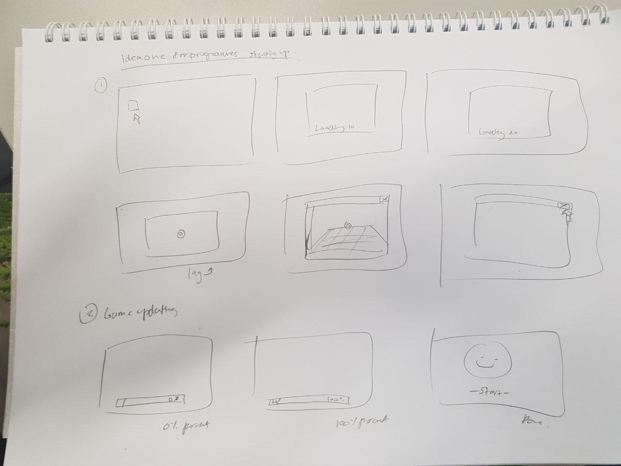
4D: Exercise 2 – 30 Second video (Clock time)

Ideas:

  1. Starting up Autodesk Maya, feels longer than the actual time.
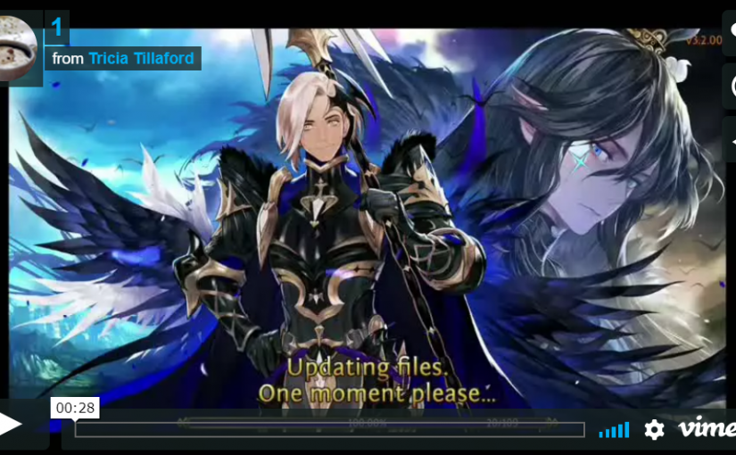
  2. Updating a game, feels longer than it actually is.

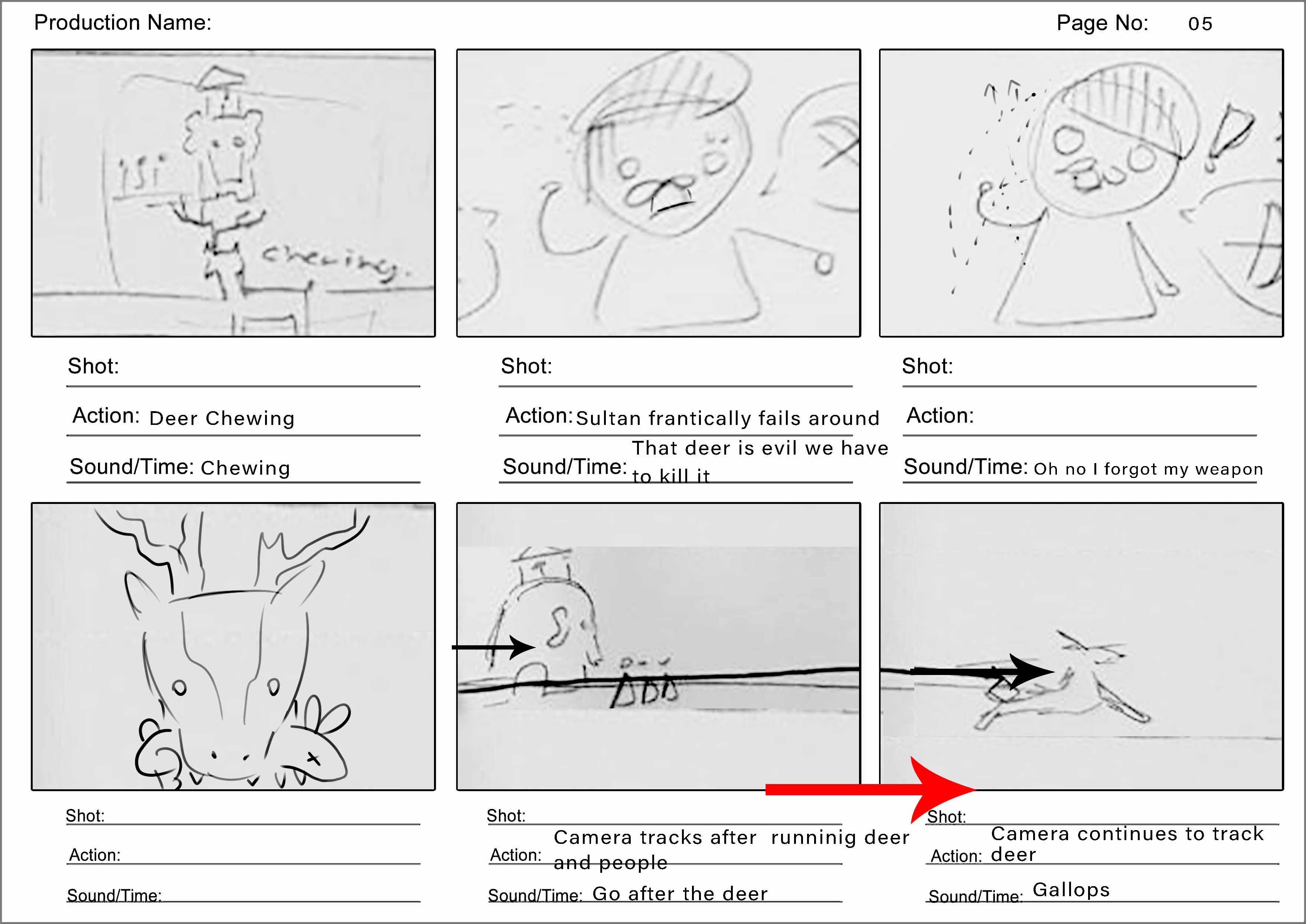
Concept Sketches ( Storyboard ) : 

30 second Videos:

  1. Exactly 30 secs, the opening and closing lag of a heavy-processing program.
    – Measured time –

2) Played with speeding up (x4) to 27 seconds.
– Time laspe –

Both are based on personal opinions.

For those who plays games or uses programs one might seem longer than the other.

2D : Project 2 – Forest Gump

Artist Research :

1. Vladimir Kush

A modern-day surrealism artist. He loves to use similar objects to represent another. For example, using an eggshell to make the sun look like an egg yolk, but even though the paintings may look straightforward there is a more in-depth meaning to it. Making viewers feel more intrigued once they know the hidden message.

2. Salvador Dali

He is a Spanish dadaist and surrealistic Artist. Most of his works are from what he dreams of. He loves to play with symbolism also. For example, he uses elephants with thin legs to represent how paintings can make the impossible, possible.

3. Zdzislaw Buuski

He is a Polish surrealistic Artist, he had a total of 300 over works depicting his nightmares over the years.  Most of his works are made to bring comfort to the disturbed and disturb those which are comfortable. Thus his works are not made to look aesthetically nice, however, it is to share the feelings he felt when he dreamt of these images.

From all these research, I have realised that they like to use animals to symbolize the message they want to convey.

What they all have in common, is that this art style forces the artist to express their personal opinion. Most of the art is not about making it look pretty and pleasing to the eyes of the audiences. Instead, some might even be disturbing but relatable to certain individuals. (E.g. Zdzislaw Buuski’s works)

Other Modern forms of surrealism:

  1. Movies (E.g. Alice in Wonderland, BFG)
  2. Fantasy/Children books (E.g. Roald Dahl, Enid Blyton, The night circus by Erin Morgenstern)
  3. Music Videos (E.g. Beyonce, Jane chang and Shakira music videos)

Quotes:

  1. “I don’t know how I am going to live with myself if I don’t stay true to what I believe.” – Hacksaw Ridge (2016)

  2. “I don’t understand how a world that makes such wonderful things could be bad.” – The little mermaid (Disney, 1989)

What these quotes meant to me:

1. I took this quote as someone struggling with their own morals. Whether it is the society deems it wrong or right, morals depends on each individuals perspective of it.

2. When I heard this quote I felt that if one is able to make wonderful things. People would automatically assume them as a good person. Further expanding my thoughts, society loves beautiful things and everyone strives to be beautiful.

Does this mean going to the extreme to achieve/obtain such beauty in order to be deemed as good is right?

However, even though most know its probably wrong, plenty still choose to do it anyways, to feel accepted and wanted by this current society.

Composition concept Ideas:

Linking the research and quotes together. I want to be able to create surrealistic works with a dadaism mix into in, about my views of our current society.

With further research on the second quotes ideas, to enforce a stronger and relatable imagery. I chose to reference pride and prejudice plus zombies book cover and phantom of the opera concept.

Like how beauty is fragile like a rose. The woman could be beautiful and admired but because of the ripped rotting skin, society is unable to accept it.

or

Phantom of the opera where the main male lead is shunned because half of his face is scarred and he has to hide it in order for society to accept him. Despite his talents and kind personality.

These works reflect how the society thinks at that point of time. Even now, others still so think that way. Trying to obtain such beauty to be seen as a good person.

Experimental Compositions:

2) 

1) 

Final Composition:

“I don’t understand how a world that makes such wonderful things could be bad.” – The little mermaid (Disney, 1989)

First composition:

Skeleton/Ballerina/Fishtail –

Mirror –

Snake –

Rotting Betta Fish –

Measuring tape –

Makeup –

Second composition:

Skull –

Skeleton/Human –

Measuring tape –

Heart –

Cigarette –

Intended Similarities:

  • The positive space is more than the negative space.
  • Repetitive symbolism to echo the same message.

“I don’t know how I am going to live with myself if I don’t stay true to what I believe.” – Hacksaw Ridge (2016)

Third composition:

Brain –

Heart –

Stormy Sea –

Sky –

Hands –

Person –

Earth –

Fourth composition:

Dragon –

Knight –

Sword –

Wings –

Stacked up skulls –

Hands –

Intended Similarities:

  • Negative space is more than the positive space.
  • There is a white focal point in the centre.
  • The bottom has an echo of the same image. (outreached hands)

Silk Screening Process:

Final Outlook Print:

Final Tote Bag Silk Screen Print:

Final Presentation:

Presentation layout

The white is on the top while the black is on the bottom.

For the black compositions, both have a white centre focus.

There is also an echo and lead of images,

  1. Skeleton
  2. skull, heart
  3. heart, hands
  4. hands

Challenges:

Trying to create a distinct focal point.

Solution:

Adjust the positive and negative space, by using the black and white or halftones to create contrast or gradients.