Lost – A story from 90 photos

This 90 photographs sequence shows a story which explores 3 main themes, namely “lost”, “mystery”, and “friendship”.

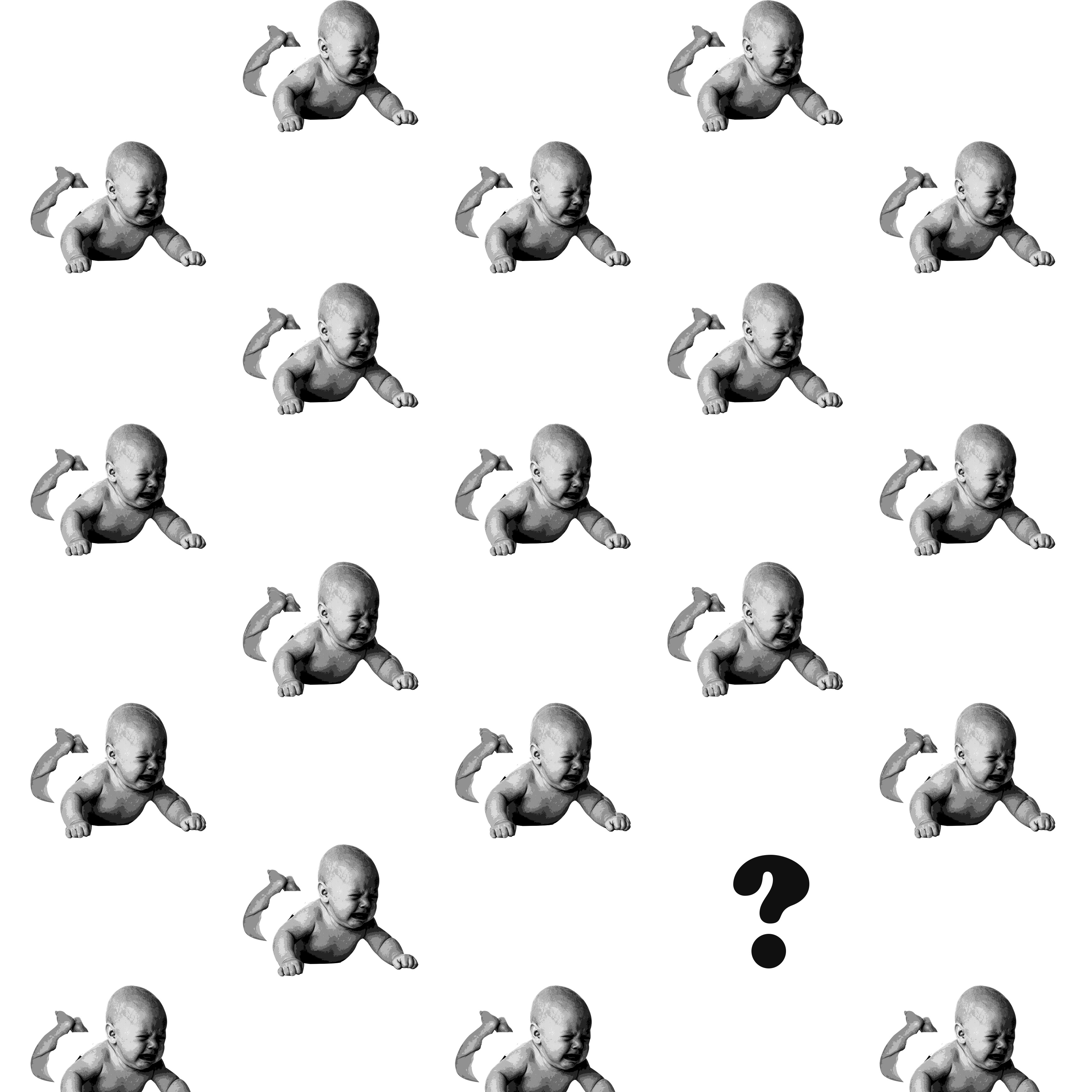
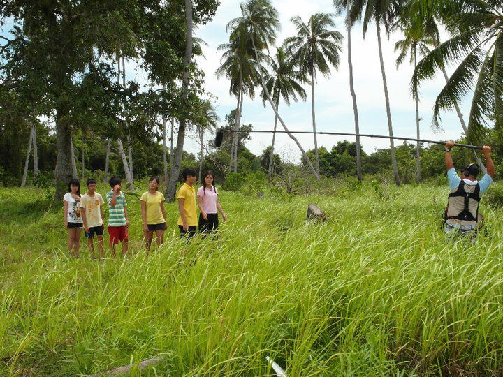
It shows me being lost in my dream, in a forest which I could not seem to get out no matter how. Every place looked different yet the same, making it confusing where I am even at or how to get out from there. Then, it transitioned into a mystery where I saw my friend, who vanished right in front me. This happened several times while I was trying to find a way out, and also trying to find him after his first appearance. He would always mysteriously appear and disappear. However, over time, the quest to look for him happened to lead me out of the forest, after which I woke up from this dream. I believe that it was the friendship that helped me out when I needed help the most.

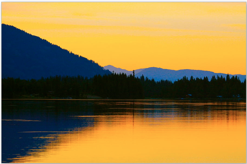
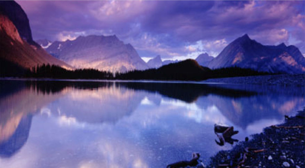
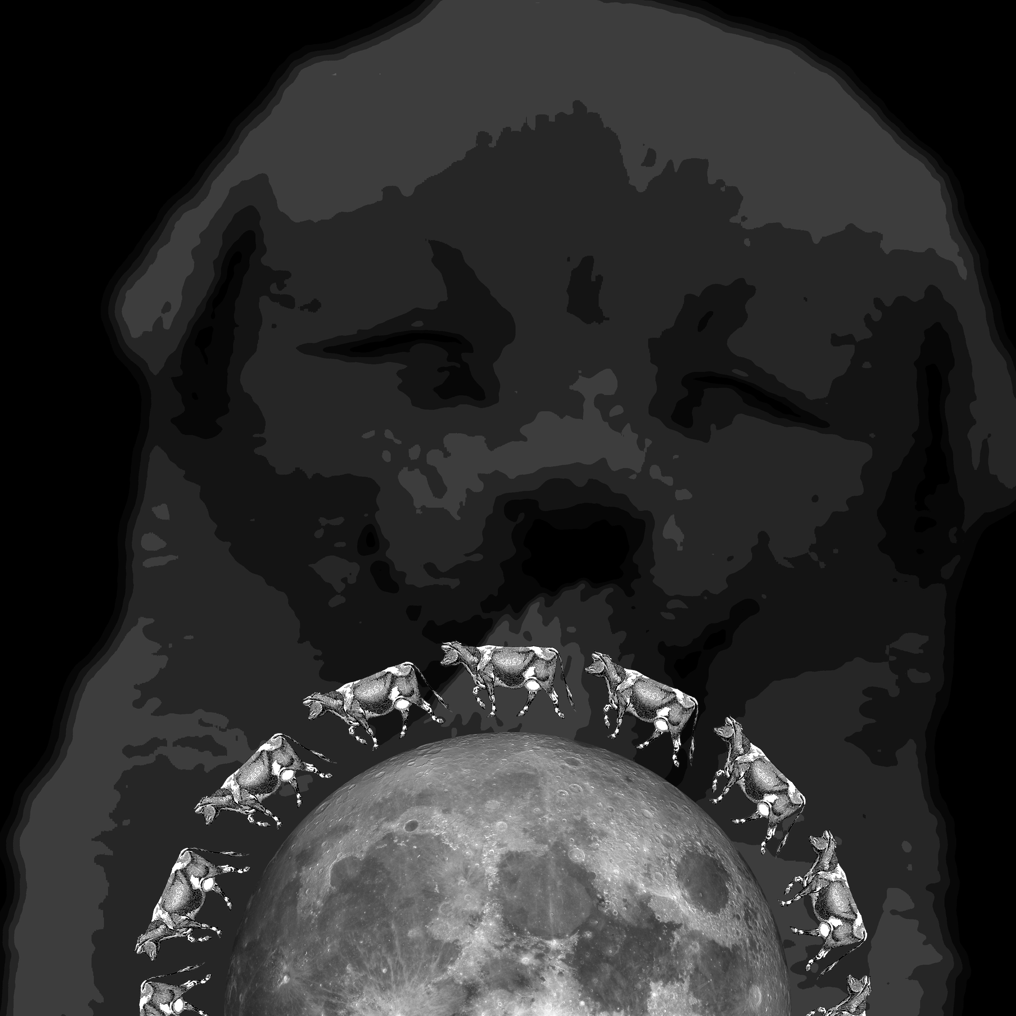
The images were used to represent the various ideas I wanted to display. The forest helps to show the feeling of lost and helplessness and everywhere looks different yet so similar, and the vastness of the place further exemplifies this feeling of being lost. The appearance of my friend was to signify the importance of friendship, where I believe plays a big part in everyone’s life as humans are social beings. Friendship has the power to help and influence us, which eventually brought me out of being lost in the forest to signify the power of friendship.

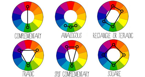
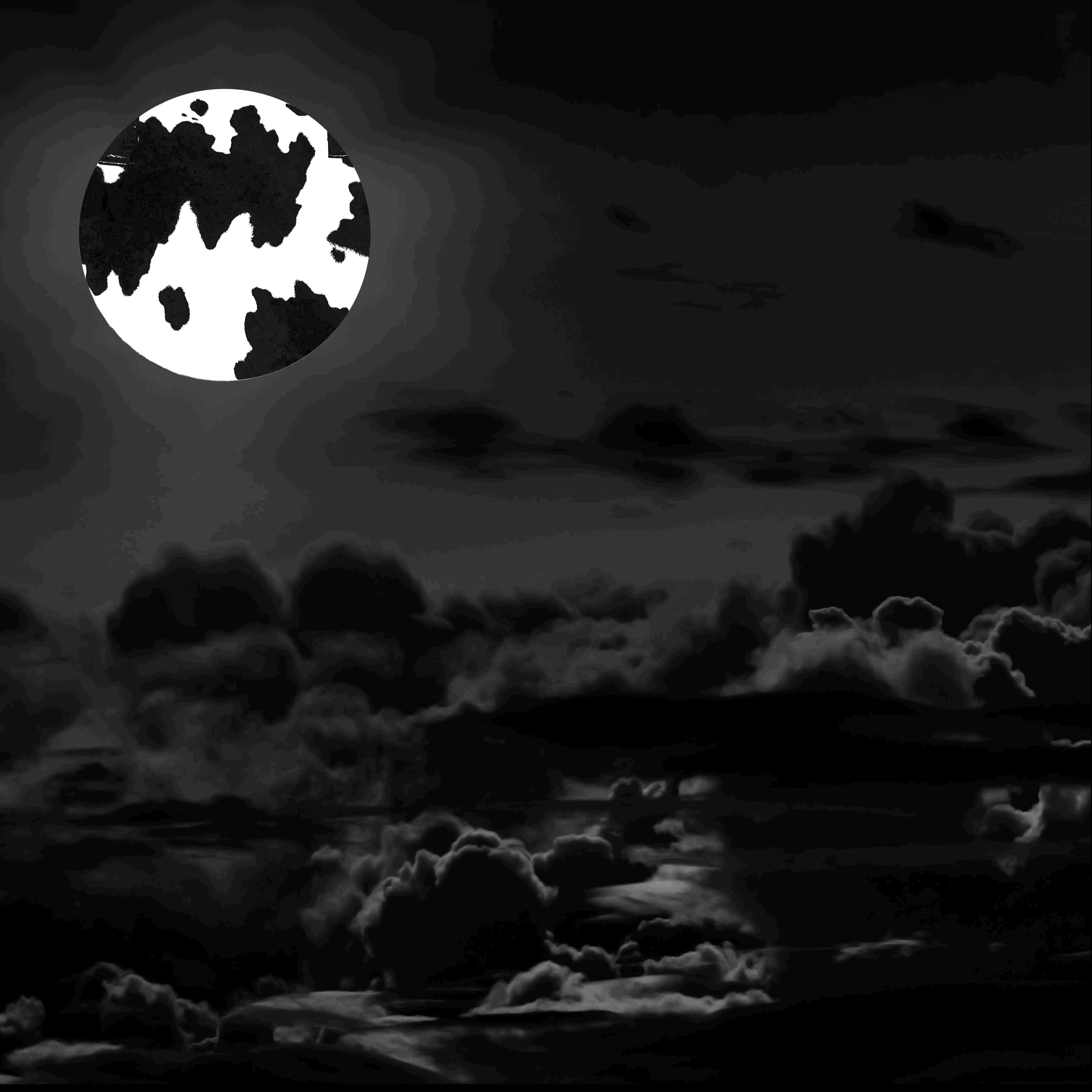
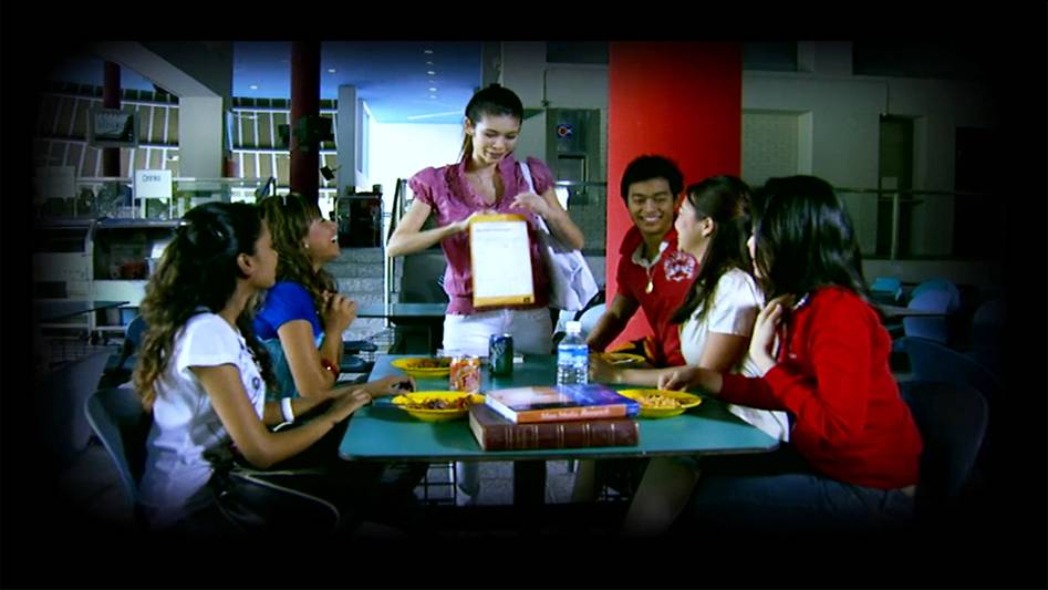
I chose to take my pictures either by focusing the main subjects along the thirds of the image, or to centralize the main subject in the middle of the image to have symmetry and let the subject be the center of focus. The photos were also not heavily edited and most of which were not even edited, so as to be more realistic and portray what I see, just as how some dreams actually feel very real even after waking up. I chose to darken the borders of the photos that occur in my dream to make a distinction between being awake and asleep, and that some dreams have a blurry and darker effect.

For this project, I did not have any specific research or artist that i referred to. I felt that one main factor that influenced my decision and style for this project was drama. Perhaps I have been exposed to TV dramas since young, especially chinese mediacorp dramas, it seems to me that forest was always a main theme for being lost. They always featured the main characters, who were lost, in forests being very helpless, walking around trying very hard to get out of it. National service probably further built this mentality unknowingly as the exposure to many different forested areas allows me to understand the vastness of these terrains and how the similar environment makes it easy to be lost, and hard to find an exit. One example would be “Stranded”, a drama series showing a group of teenagers lost on an island. I also think that the use of darkened borders makes it feel more like a dream, or a recalling of incidents which differentiates it from the real time.  An example would be “Incredible Tales”, where the entire story would have a darkened border to show the character recalling and retelling the story.

A set from "Stranded", which shows scenes of a forest.
A set from “Stranded”, which shows scenes of a forest.
A scene from "Incredible Tales", which uses a darkened border to tell the story.
A scene from “Incredible Tales”, which uses a darkened border to tell the story.

Through this project, I understand how the use of various image compositions and some editing helps to convey the message across and sets the mood right for the story. I start to understand how difficult it is to send a message subtly through images and also how various images do not turn out the way I wanted them to be. There were certain compositions that could not be easily created to fit those in mind and I had to find a way to tweak it, to make it feasible yet still able to bring out the same effects and message. I also realised how having a goal or “quest” makes it less boring even though everything might seem repetitive and dull. For example, many shots were taken in the forest, where everything looked so similar although they were different. However, the goal to find my friend or get out of the forest makes it less boring to go through repetitive images as there is a final aim to keep the audience going. This shows the importance of having a storyline and an aim to keep audience interested. By looking at my classmates’ presentations, I also realised how music and sound played an important in setting the atmosphere, giving viewers a more in-depth experience.

Color Harmonies

Colors are everywhere, present in everything. More often than not, colors are not alone, but in fact, a combination of a few colors! So, how do colors work with each other, and how do they match?


COMPLEMENTARY

Colors that are opposite each other on the color wheel are considered to be complementary colors. (e.g. Red and Green)

The high contrast of complementary colors creates a vibrant look especially when used at full saturation. This color scheme must be managed well so it is not jarring.

Complementary - Blue and Orange
Complementary – Blue and Orange

SPLIT-COMPLEMENTARY

The split-complementary color scheme is a variation of the complementary color scheme. In addition to the base color, it uses the two colors adjacent to its complement.

Split-complementary - Blue, Orange, and Yellow
Split-complementary – Blue, Orange, and Yellow

ANALOGOUS

Analogous color schemes use colors that are next to each other on the color wheel. They usually match well and create serene and comfortable designs.

Analogous color schemes are often found in nature and are harmonious and pleasing to the eye.

Analogous - Shades of Blue and Violet
Analogous – Shades of Blue and Violet

RECTANGLE / TETRADIC

Tetradic color scheme uses four colors arranged into two complementary pairs.

This rich color scheme offers plenty of possibilities for variation. It works best if you let one color be dominant.

You should also pay attention to the balance between warm and cool colors in your design.

Tetradic - Blue, Green, Red and Yellow
Tetradic – Blue, Green, Red and Yellow

SQUARE

The square color scheme is similar to the rectangle, but with all four colors spaced evenly around the color wheel.  Similarly, it works best if one color is the dominant.

You should also pay attention to the balance between warm and cool colors in your design.


TRIADIC

A triadic color scheme uses colors that are evenly spaced around the color wheel.

Triadic color schemes tend to be quite vibrant, even if you use pale or unsaturated versions of your hues.

Triadic - Red, Blue and Yellow
Triadic – Red, Blue and Yellow


Colors – What do they mean?

Colors make up an important part of everyday life. They are everywhere. They give things identity and let people feel a certain kind of emotions. So what do they tend to represent?


RED

Red represents anger.

It also represents love, energy, power, strength, passion, heat, danger, physical courage, warmth, stimulation, masculinity, excitement, defiance, aggression, visual impact, strain and warning.

RED_anger


ORANGE

Orange  represents physical comfort and sensuality.

It also represents courage, confidence, friendliness, success, ignorance, warmth, security, passion, abundance, fun, deprivation, frustration, frivolity, immaturity and sluggishness.

ORANGE_Sunset


YELLOW

Yellow represents happiness.

It also represents brightness, energy, the sun, creativity, intellect, irresponsibility, optimism, confidence, self-esteem, emotional strength, friendliness, creativity, irrationality, fear, emotional fragility, depression, anxiety, and unstable.

YELLOW_hapiness


GREEN

Green represents harmony.

It also represents money, growth, fertility, freshness, balance, refreshment, universal love, rest, restoration, reassurance, environmental awareness, equilibrium, peace, boredom, stagnation, blandness and healing.

GREEN_growth


BLUE

Blue represents serenity.

It also represents intelligence, communication, trust, efficiency, serenity, duty, logic, coolness, reflection, calm, coldness, aloofness, lack of emotion and unfriendliness.


PURPLE

Purple represents introvert.

It also represents spiritual awareness, containment, vision, luxury, authenticity, truth, quality, decadence, suppression and inferiority.

PURPLE_luxury


PINK

Pink represents love.

It also represents physical tranquility, nurture, warmth, femininity, love, sexuality, emotional claustrophobia, emasculation, physical weakness.


BROWN

Brown represents seriousness.

It also represents warmth, nature, earthiness, reliability, support, lack of humor, heaviness and lack of sophistication.

BROWN_earthiness


GREY

Grey represents depression.

It also represents psychological neutrality, lack of confidence, hibernation and lack of energy.

GREY_depressed


BLACK

Black represents oppression.

It also represents sophistication, glamour, security, emotional safety, efficiency, substance, coldness, menace and heaviness.

BLACK_glam


WHITE

White represents purity.

It also represents hygiene, sterility, clarity, purity, cleanness, simplicity, sophistication, efficiency, coldness, barriers, unfriendliness and elitism.

WHITE_purity

Rhymes – Image Composition

This assignment was to research on rhymes and compose images using Photoshop, to represent lines given in the rhymes and explore the principles of design.

We were initially broken down into groups and each group was assigned a rhyme to research on and compile a photo bank after editing on Photoshop. After which, we were to compose multiple image compositions and then choose our final 4.

My group was assigned to do the rhyme “There Was An Old Woman Who Lived In A Shoe“. This was how the rhyme went:

“There was an old woman who lived in a shoe.
She had so many children, she didn’t know what to do.
She gave them some broth without any bread;
And whipped them all soundly and put them to bed.”
Thus I started to look for images that could represent what I understand from the rhyme. The images had to be rather high definition as it is used for printing, thus at least 300 pixels per inch. It was not easy to look for images that fully represent and suit what I need, yet has the requirement of 300 dpi. Thus, it took quite some time to look for a variety of images that fit all the requirements.
Compilation of images used for photo bank.


 Some of the images were more literal, such as the old woman, children, bread, whip and shoes, while the ones representing death was what I inferred from the last two lines of the rhymes.
After getting the photos, they were then all cropped out, changed to grayscale and either halftone, threshold or posterize. They were then uploaded into our class google drive so that everyone could access each other’s photo bank, making the photo bank more complete and have a greater variety to choose from.
We then broke down the photos into individual lines and tried to compose images based on them. We were advised to try out all 12 lines of the three rhymes – “There Was An Old Woman Who Lived In A Shoe”, “Humpty Dumpty”, and “Hey Diddle Diddle”). However, I chose to focus on doing drafts to explore some of the lines twice instead of doing everything. In total, I had 15 compositions as some of my compositions were too literal, I was advised to think of something that represented them and ways to improve them.
 –
"Hey Diddle Diddle! The cat and the fiddle."
“Hey Diddle Diddle! The cat and the fiddle.”

Just the cat and the fiddle. Literally. The huge fiddle in the middle contrasts in size with the cat at the corner. The small cat at the corner also helps to balance out the big fiddle in the middle.


02_The cow jump over the moon
“The cow jumped over the moon.”

The cows have a gradual change in size to signify movement. The smaller group at the top contrasts in size with the bigger group at the bottom.


02_The cow jump over the moon_DRAFT 2
“The cow jumped over the moon.” DRAFT 2

The cow skin covers the moon, signifying the cow jumped OVER the moon. The moon is brighter than the entire picture being relatively black to bring attention to it.


03_The little dog laughed to see such sport
“The little dog laughed to see such sport.”

The sport refers to the cow jumping over moon. There is a laughing dog in the background, showing contrast between size and colour tone of background versus foreground. Shows symmetry.


03_The little dog laughed to see such sport_DRAFT 2
“The little dog laughed to see such sport.” DRAFT 2

The paws are tilted and have a variety of sizes to show the dog dancing around happily or laughing, while the white mooncake in the foreground represents the moon. Shows contrast between fore and background.


04_The dish ran away with the spoon
“And the dish ran away with the spoon.”

The gradual change in size and opacity to represent movement. Purposely twisted to have a dramatic path and show both the dish and the spoon.


04_The dish ran away with the spoon_DRAFT 2
“And the dish ran away with the spoon.” DRAFT 2

Added a background of grass texture to give the context of running on grass or mountains. Stripes added to give texture and more contrast with foreground. One dish added to foreground out of frame to have a hint that they have not stopped running.


05_Humpty dumpty sat on a wall
“Humpty dumpty sat on a wall.”

An egg on a wall. Egg is off-center to reduce symmetry, placed along one-third of the picture. It is also tilted to have more movement and life, imitating a relaxed and laid back sitting position.


06_humpty dumpty had a great fall
“Humpty dumpty had a great fall.”

The gradual change in opacity to show movement, and the different angles along the bottom further adds to the movement and life of the egg.


06_humpty dumpty had a great fall_DRAFT 2
“Humpty dumpty had a great fall.” DRAFT 2

Background of brick wall added to give the context of falling from the wall. Size of the eggs have also changed to have a gradual change to signify the falling from a further place, i.e. top of the wall.


07_all the kings horses and men
“All the king’s horses and all the king’s men.”

Replaced decorations of the the king’s crown with imperial soldiers and soldiers on horses. Emphasizes on the symmetry of the image and the stark contrast between black and white.


08_Couldnt put humpty together again
“Couldn’t put Humpty together again.”

Stark contrast between shape of egg and background, with low contrast of soldiers in the background. Small little dots in the egg represents how the egg has shattered into tiny bits and cannot be put together, despite having so many people.


08_Couldnt put humpty together again_DRAFT 2
“Couldn’t put Humpty together again.” DRAFT 2

Shifted the egg to a corner to reduce symmetry and bring the center of focus to a point. Egg is purposely shifted out of frame as audience will complete it mentally, also making the composition more interesting.


10_She had so many children she didnt know what to do
“She had so many children she didn’t know what to do.”

The symmetry and pattern of the babies to bring the center of focus to the only difference – the “?”. The babies are also crying to signify the lack of attention as there is too many of them.


10_She had so many children she didnt know what to do_DRAFT 2
“She had so many children she didn’t know what to do.” DRAFT 2

The idea was changed to using milk bottles and pacifiers to represent the vast amount of children, and then a subtle “?” is across the entire composition by having a darker tone and contrast. Parts of the “?” are out of the frame to make the composition more interesting.

Among all of the above, 4 final ones were chosen to be printed, 297mm x 297mm.
10_She had so many children she didnt know what to do_DRAFT 2
“She had so many children she didn’t know what to do.” DRAFT 2

The amount of milk bottles and pacifiers represents the huge number of children that the old woman has. There is then a subtle “?” formed in the middle by having a darker tone and more contrast to represent the idea of lost and not knowing what to do.

The above composition has rhythm and repetition in the milk bottles and pacifiers. It also has contrast to bring out the “?”.


08_Couldnt put humpty together again_DRAFT 2
“Couldn’t put Humpty together again.” DRAFT 2

The entire image is filled with silhouettes of soldiers, then an egg at the bottom left corner. The silhouettes of the soldiers show the huge number of soldiers, and the egg represents Humpty Dumpty. The egg was edited with halftone to have the dots , in which the soldiers can be seen through the egg. These small little dots that form the soldiers represent that Humpty Dumpty has shattered into tiny pieces and cannot be put back together again.

The composition shows repetition and rhythm in the soldiers, and also contrast of the colour and size of the egg to let it become the center of interest. The egg itself actually also has a gradation of tone to give depth of the egg.


04_The dish ran away with the spoon_DRAFT 2
“And the dish ran away with the spoon.” DRAFT 2

This image shows a trail of a dish and a spoon, following a gradual transformation of size and opacity, small to big, transparent to opaque. This is to signify the movement of the dish and spoon. They are also composed to take a curved path to emphasize on the dramatic movement, and also to show both the dish and the spoon clearly. The background is laid with texture of grass to give a context of the dish and spoon running on grass or mountains. The stripes serve to increase the contrast of the background versus the dish and spoon.

This shows repetition of the dish and spoon, their directional movement through the change in size and opacity, and contrast between the background and foreground.


03_The little dog laughed to see such sport_DRAFT 2
“And the little dog laughed to see such sport.” DRAFT 2

The background is decorated with varying shapes and directions of dog paws, showing the happiness of the dog, seemingly running and dancing about, to signify the laughing of the dog. The low contrast of the paws and the black background is to bring out the high contrast of the foreground. The foreground shows a mooncake to represent a moon. It is made to be white to seem more like the moon, and also have a greater contrast from the background. It is slightly out of frame to let audience complete the circle. The cows are placed around to the moon in one direction to signify the movement of the cow over the moon, and made to have a same size to have a contrast with the varying sizes at the back as well.

This shows contrast between the foreground (white, consistent sizes) and the background (black, varying sizes). It also shows repetition of the cows and paws,  and the center of interest of the foreground through the stark contrast.