In-class exercise, week 6, by Debbie Ng, Lau Yiwen and I.
This week, we explore the use of narratives in film. Narrative in films appear in a range of different styles, but can be categorized into two main types – First-person and Third-person. We were tasked to use some of these strategies to make a video, either based on our previous exercise, or a whole new story. After having much fun exploring our own story, we decided to continue working on it. We chose to employ the use of Third-person Limited POV and Stream of Consciousness to develop our story.
[0:06 – 0:37] We used Third-person Limited POV as an introduction to our story, to tell the story of the protagonist through an unidentified third-person. This narrator talks about the protagonist’s single-parent family after the mother passes away, and hints about his family’s financial status. The scene also serves to hint that the protagonist is an orderly, neat and responsible person through the tidying up of the table, as well as his love for his family through his handphone wallpaper.
[1:36 – 1:55] We then chose to use Stream of Consciousness to bring out the sad theme in our story, to allow the very quiet father to express his feelings. This method would be effective in portraying his guilt and his helplessness. It also shows how he has no courage to voice it out to his son, no courage to face his family for his lack of responsibility and thus, can only speak silently inside. This further brings out the lack of warmth in this family, like how they are unable to communicate properly and nicely like a family should, which is our idea as a conflict for this entire story.
The entire sequence was then merged into one video, drawing the connections within and improving on the previous rendition of the video available here.
In this project, we were supposed to come up with a list of characters that have values which hold a special affinity with us. This list would include characters from fictional references, public figures, and also people that I personally know.
Here’s the list and some details of the more important characters that I had in mind:
Project / Exercise 1 – Alter Egos
Fictional Characters
Public Figures
People I know
Katniss Everdeen
Sylvester Stallone
Father
Scott Lang (Ant-Man)
Michael Jordon
Mother
Ip Man
Mike Tyson
Maternal Aunt
The Joker
Barack Obama
Sister
Tony Stark (Ironman)
Lee Kuan Yew
Yu Jie
Katniss Everdeen
At the age of 16, volunteered to be a tribute in her sister’s place in the Hunger Games, where the risk of dying is very high. She also wanted to overthrow the rulers then to stop this event, and to save her district as well as the others from poverty. Her selflessness and care for her family as well as others make her a very prominent character worth learning from.
Scott Lang (Ant-Man)
Was an ex-convict for burglary, but after his release made good use of his forte of breaking-in to do good. He needed money to be with his daughter again, as his wife could not stay with him because of insecurity. He had to find ways to get back his family, and ended up with the responsibility to fight a supervillain. His ability to make use of his specialty to do good is his plus point, but his indecisiveness and turning back to burglary after his release is a bad example.
Ip Man
Ip Man is a very righteous man and a legend in Chinese wushu history. Since the first movie of Ip Man, he has been portrayed as a down-to-earth righteous man. Despite having very good kungfu, he makes good use of it to protect rather than misuse it to bully. He talks sense into people rather than using his fists, and uses them only when he has no choice. He is very loyal to his friends, always helpful to them and his neighbourhood, including strangers. However, he does at times neglect his wife, and only started to cherish her and spend quality time with her when he found out she has terminal illness. Nonetheless, he devotes all his time to her from that point on and even went to the extreme of forgoing his reputation of Wing Chun just to keep her company. I chose to categorize Ip Man as a fictional (movie) character rather than a public figure as he is from a long time ago, and media exposure has been very different. I have only come to know him after the movies were made.
Sylvester Stallone
Was a very broke man, couldn’t afford food and housing, so bad he had to sell his dog for $25. Came up with his script “Rocky”, offered from $125 thousand to $350 thousand, but he did not want to sell because he wanted to be the main lead, the company did not want him. He finally sold it at $35 thousand and secured the role as the main lead, and bought his dog back at $15 thousand. His perseverance to pursue his dreams despite being very broke, as well as his concern and love for his dog is very inspiring.
Michael Jordon
“I’ve missed more than 9000 shots in my career. I’ve lost almost 300 games. 26 times, I’ve been trusted to take the game winning shot and missed. I’ve failed over and over and over again in my life. And that is why I succeed.” Jordan was rejected by his university basketball team as he did not meet the required height when he was young. He did not give up his dream and love for basketball, but played and trained every day without fail, and finally making it into the university team after he grew by 10cm in height, and his hands were also big enough for him to perform slam dunks by then. His passion and perseverance is admirable.
My Father
My father is a hardworking man. We come from a not very well-to-do family. My father used to be the sole breadwinner, until my brother and sister started working. Nonetheless, things did not get much better, especially when my father suffered a mild stroke in late 2014. Despite being poor, my father has never complained about his tough work under the sun, and has always tried his best to provide us with whatever he could. He is also rather selfless, and sometimes offering to treat friends and family despite being tight on cash flow. This is a dilemma as it is both a good and a bad trait at the same time, giving our financial status.
My Mother
My mother is a housewife. Being married to a man not rich enough to pamper her with luxuries that others could enjoy, she seldom complained about all these. She has been contented with our family and did not ask for more. She did not yearn nor ask for holiday trips, branded bags, spa, massages and manicures like other tai tais, but focused on taking good care of all of us. She is an easily-contented woman.
From the list above, I have chosen to do an alter-ego of Ip Man.
Initially, I wanted to do a scene from the latest movie, where he cried after his wife asked for a photo with him before she passed away. He cried because he had been neglecting her and the fact that even such a strong and calm man cries brings about a strong emotion. In fact he did not burst into tears, he held back his tears so hard that it became heartwrenching. It was also relevant to me has I often spend too much time on work and gaming that I tend to neglect my loved ones. The thought of what if it becomes too late hit me when I saw this scene.
However, I could not find this scene / movie online, and was unable to do more research into this scene. I also could not find a co-actor for this and decided to make a change to display another trait of him.
I have been fascinated by his down-to-earth characteristics, and his attitude towards life. He was always helpful to anyone, be it whether he knows them or not. In the movie series, he was often fighting for a reason, and those reasons make his fights acceptable and “heroic”. He was righteous, standing up for what is morally right and in protection of his loved ones or friends.
In the first movie, he was a very simple man, living peacefully but due to economical reasons and the Japanese occupation, he had to work as a coolie with little food. He witnessed his friend get shot after giving up a fight that would let him have rice if he wins. This triggered his anger and intolerance towards such inhuman acts, and he decides to fight, in revenge of his friend and co-worker.
This is the scene from the movie:
After which, I decided to make an adaptation to this scene, but removed the fighting scenes as it was not the main focus of the message I wanted to bring across. I had to give the contextual knowledge of his friend dying, and at the end showing that he did not fight for the reward or reputation, it was for his people, the Chinese.
Throughout the video, there is a slow sad music playing in the background to give a melancholic feeling, showing that he was sad and had to fight because of no choice, rather than because his was good and wanted to show off. After he said his “name”, the music instantly changed to an upbeat trademark music for “Ip Man”, to give a “heroic” and righteous feeling to the video.
Some challenges that I faced was that it was hard to make the video interesting without the fight scenes. Watching “Ip Man” without fight scenes seemed kind of boring, but I wanted to bring the message across within the time frame of a minute. I also focused more on the body language with some frame cropping out the face, to explore how body language plays an important role in bringing across the message.
It was also too awkward to be shouting “I WANT TO FIGHT TEN” in public. People would be thinking I’m crazy. I decided to film a video without making any sound, and dubbing over it back in my room.
It was difficult to find a location suitable to bring out the “darkness” of the scene, as well as enough characters to complete the scene. Thus, some of my shots were closed up to have less emptiness in the surroundings. I could not find a metal grille gate suitable enough as well, thus resorting to the use of staircase railings to film.
I also had to research on appropriate background music, attire, sound effects, and arrange the timing and volume to create the atmosphere.
Throughout the filming process, I had to use a tripod as friends were busy with their own schedule, and this made it harder to adjust the framing and focus of the shots. I was also quite new to Premiere Pro, making the editting process very tedious and hard, and turning out to be less of what I had imagined. Nonetheless, it was a fun experience and learning to explore what emotions I could bring across was interesting.
In this exercise, we are supposed to explore ourselves, our memories and emotions, to sieve out what affects us the most, so as to better present our ideas using first-hand experiences.
My list of significant emotions and events consists of:
Dad suffered a mild stroke
This happened in 2014. I was booking out on a Friday evening, when my sister told me my dad was hospitalised due to a stroke earlier in the day. This news was a sudden blow to what I had looked forward to as a weekend.
Retaining in JC 1
Secondary school has been average, but JC has been a steep increase in difficulty. Being too laidback and lazy, I started worrying too late and when I received my results and found out I had to retain in J1, I felt like this can’t be happening to me, I never ever thought I would perform so badly as to retain. It was a painful lesson learnt.
Loss of controlled equipment during NS
It was a stormy outfield night, where it was dark and pouring. We were all drenched and were rushed to board our buses to go back to camp after our exercise ended. Only in camp, during declaration that my section realised we had one entire bag of communications sets missing. This was a grave offence that could lead to a term in detention barracks, and all of us panicked and starting blaming and trying to find out who was the last to hold that bag. Turns out during the time we were leaving the field, some other sections took our bag wrongly and left it back there when they realised it was not theirs. We checked that we left nothing behind and thought we had everything. Thankfully superiors were kind enough to understand it was a rush and it was not exactly any single one’s fault, so we were only given warning.
First and Last outdoor rollercoaster ride
Since young, I have had a fear of heights. Rollercoaster was definitely not my thing, but my girlfriend had to drag me up on the “Battlestar Galactica” at USS. Simply put, I felt like my soul had been tossed out in mid air and I felt like I died up there. My first and probably the last outdoor rollercoaster ride.
Army training graduations
Army training has been tough, with a BMT that lasted 16 weeks, being sent to SCS, and worse still, getting posted as infantry. Strong bonds were forged throughout all the trainings as it would have been impossible to go through them without the buddies around. Graduations felt like it was finally the end of the tough period, but also a farewell from all the buddies made in there. A mixture of happiness and sadness that made me feel like crying.
First relationship
Had my first relationship at 17, did not last very long but was also an experience gained. The moment of happiness when she accepted me, and a moment of being lost when she initiated a break up. It was like a “YAY!” followed by a “What went wrong??”. Things turned out fine after that and we are still friends thankfully.
Sending recruits to detention barracks
Sent about 10 recruits in one trip to DB in 2014. They were caught for cheating in IPPT and worse still, caught by the Commanding Officer (CO). Dishonesty would land one into DB easily, but past cases of IPPT cheating has been so common it usually calls for Stoppage of Leave (SOL) only. Not condoning what my recruits have done wrongly, but it pains to be sending them into jail knowing what they did was merely a moment of folly from knowing them for almost 4 months. Felt helpless to be unable to plead for them.
Almost retained in Sec 2
Being far too playful in lower secondary, I almost retained in Sec2 as I had a GPA of 1.9, whereby 2 is the passing requirement. Only on the last day of school, the clerk came up to my class to look for me, telling me there is an calculation error and that I can proceed to Sec3. My parents were originally supposed to meet the principal that evening too. Felt relieved at the good news.
Enlistment
I have been a very home person and disliked camps, and have always felt awkward with strangers. Enlistment sounded like a nightmare, being only about a week after ‘A’ Levels. To be staying with strangers for three weeks straight without any civilisation and familiarity, and also to face the “tekan” from commanders sounded too much for me. Felt anxious and jaded, but turns out not as bad as I had imagined.
Thunderstorm during field camp in Taiwan
Probably one of the worst nights I have experienced staying outfield. We were having fieldcamp in Taiwan, and one of the nights it started pouring. The rain was mad heavy and ground was squishy and muddy. My section was planted at the foot of a hill, and mudwater flowed down to us the entire night. We tried building a shelter, which we were limited to only waist level for tactical reasons. Nonetheless, rainwater came in from all directions. We tried sitting on our fieldpacks and bending down under the shelter to avoid the rain and also the constantly incoming mudwater, but turns out we realise it was impossible to spend the night like this. We gave up. We lied on the mud and slept in the flowing mudwater, shivering and blaming our luck for this.
With this 10 events in mind, I categorised them into 3 groups, namely “Why me?”, “Success”, and “Vulnerable Side”. Some events fall into more than one category based on my thoughts and emotions.
Why me?
Success
Vulnerable side
Dad suffered a mild stroke
Army training graduations
Dad suffered a mild stroke
Retaining in JC 1
First relationship
Sending recruits to detention barracks
Loss of controlled equipment during NS
Almost retained in Sec 2
Enlistment
Sending recruits to detention barracks
Almost retained in Sec 2
Thunderstorm during field camp in Taiwan
I think that one general theme that would summarize my experiences would be more towards a sad and helpless emotion. This is something that moves me the most personally, and I believe exploring in this direction would allow me to properly portray what kind of emotions I want to bring across, to evoke the same feelings in others.
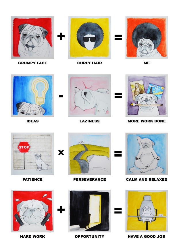
EGO – This project was to explore and portray ourselves using a series of equations, as well as the first and only project from 2D to be dealing with colors, unlike the previous monochromatic projects. Medium was also free for us to explore, making this project one of the most interesting and enjoyable one to do.
The equations were as follows:
__________ + __________ = ME
__________ – __________ = A BETTER ME
__________ x __________ = AN IDEAL ME
__________ +/- __________ = ME IN 5 YEARS
I decided to choose watercolor as my medium as i had recently bought some dry watercolor pellets, and wanted to have some fun with them. This is my second time trying to paint something with watercolor.
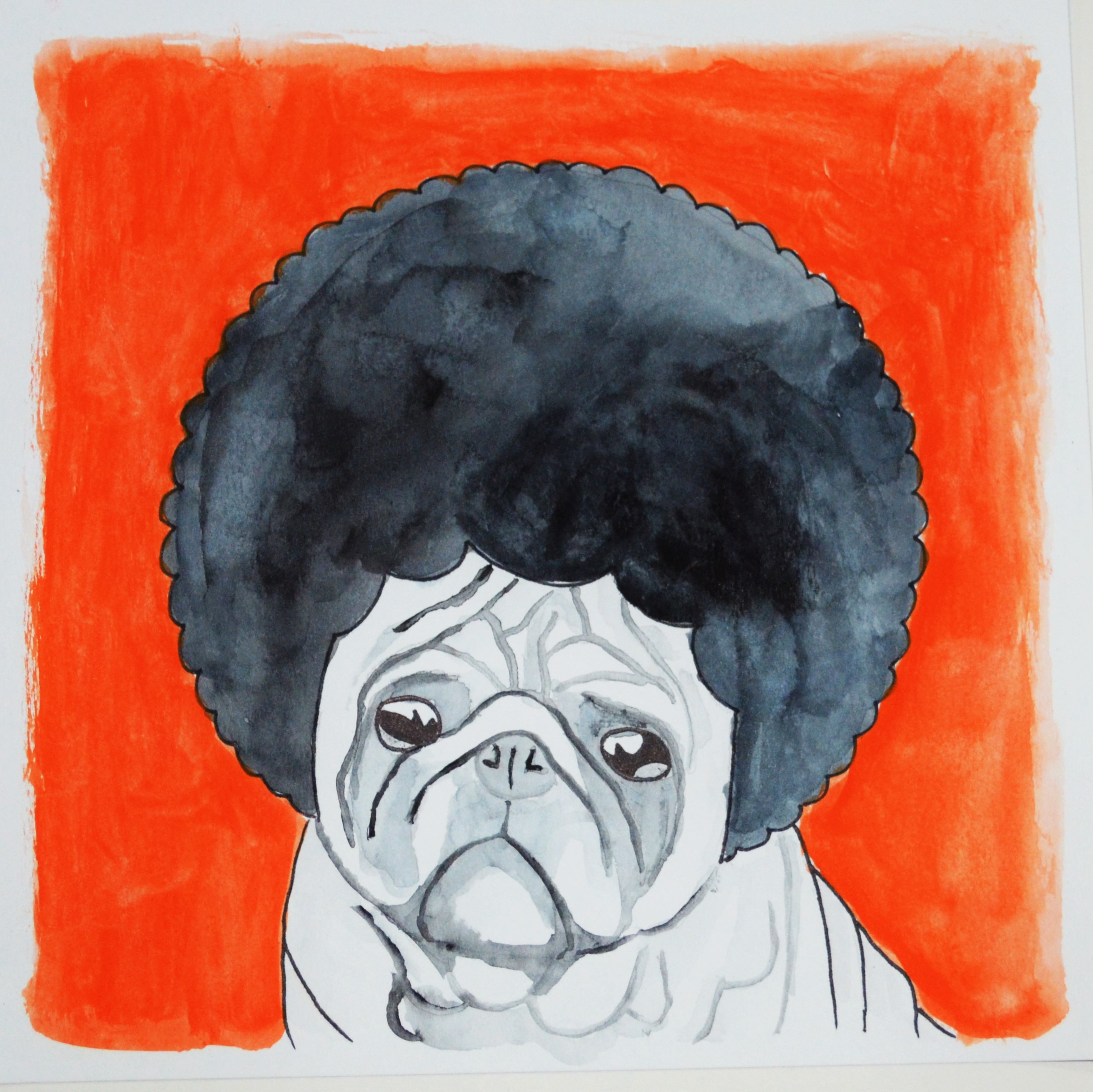
I started to brainstorm what was relevant and very significant of me, and the first things that came to mind was my face, which almost every single one said that i looked fierce and grumpy, and also my curly hair, which friends who are closer had realised. In secondary school and JC, I was sometimes called “Bulldog” or “Q-mo” (curly hair). As such, I decided to make use of these identities in this project. I chose to portray a pug instead of a bulldog as a pug seems cuter and funnier, which ties in well with my humorous personality.
Thus, my equations were made as follows:
GRUMPY FACE + CURLY HAIR = ME
IDEAS – LAZINESS = MORE WORK DONE
PATIENCE x PERSEVERANCE = CALM AND RELAXED
HARD WORK + OPPORTUNITY = HAVE A GOOD JOB
Grumpy Face + Curly Hair = ME
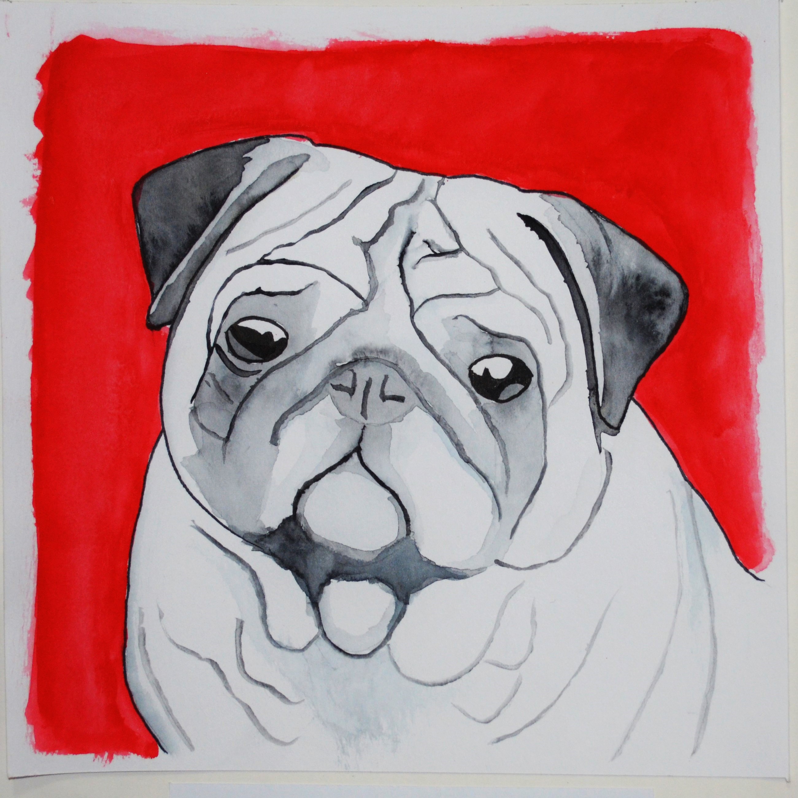
GRUMPY FACE
Most of the pictures had the main subject occupying a huge portion of the picture so that it stands out and the message I want to bring across is very clear and simple, unless the background has something important and relevant to the message. As such, I drew a very big pug, against the red background as red signifies anger.
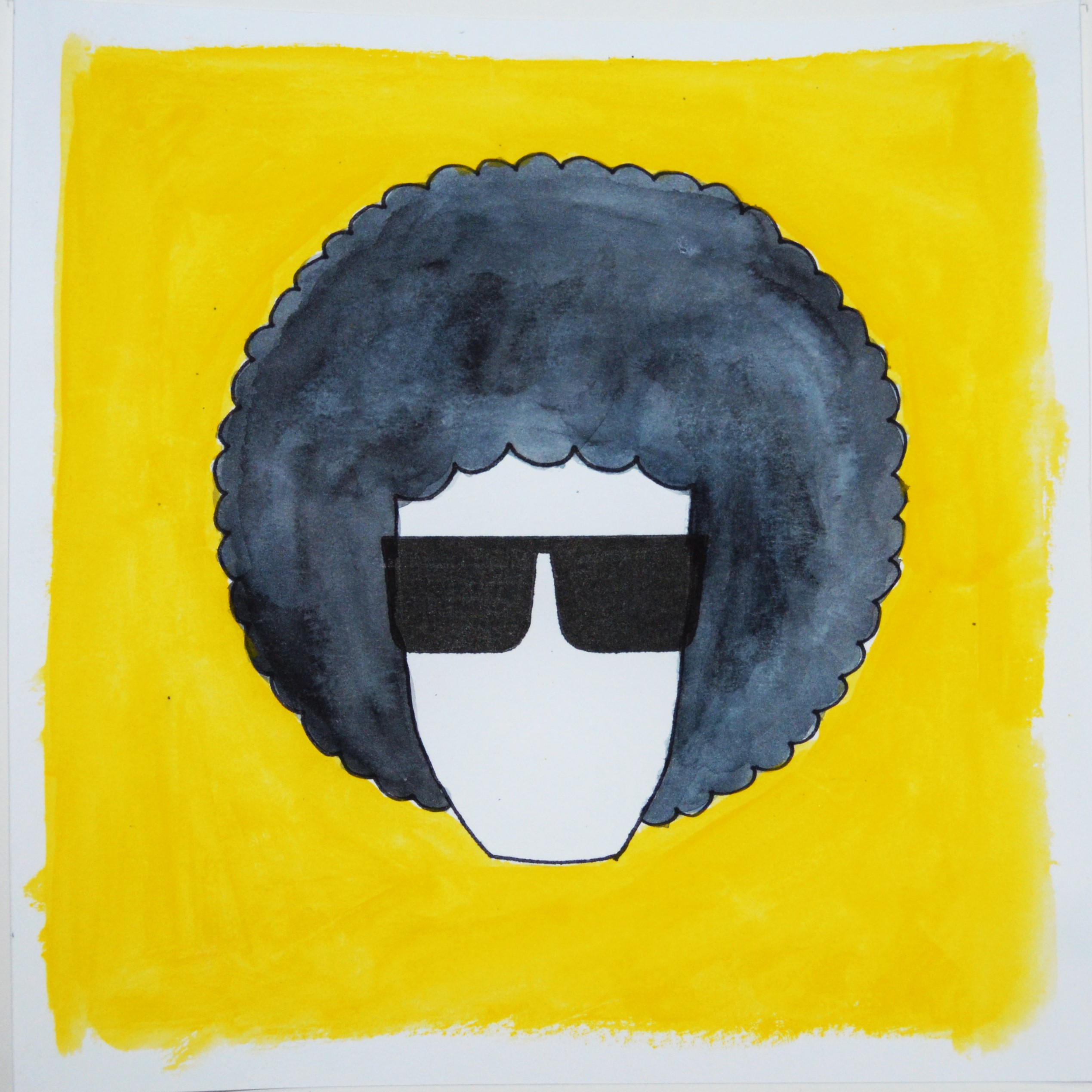
CURLY HAIR
Then, I chose to draw a guy with an afro hairstyle as I felt that an afro is the epitome of curly hair. I gave the guy a pair of shades and a yellow background to have a huge color contrast, and yellow gives a happy and groovy feeling to this picture.
ME
Tada! Grumpy face + curly hair = ME! The background was orange due to the addition of red and yellow, and that it represents friendliness and also passion. I put the afro wig over the pug for a simple addition which tells the message very clearly. The first equation is then complete with a very warm color scheme.
Ideas – Laziness = More Work Done
IDEAS
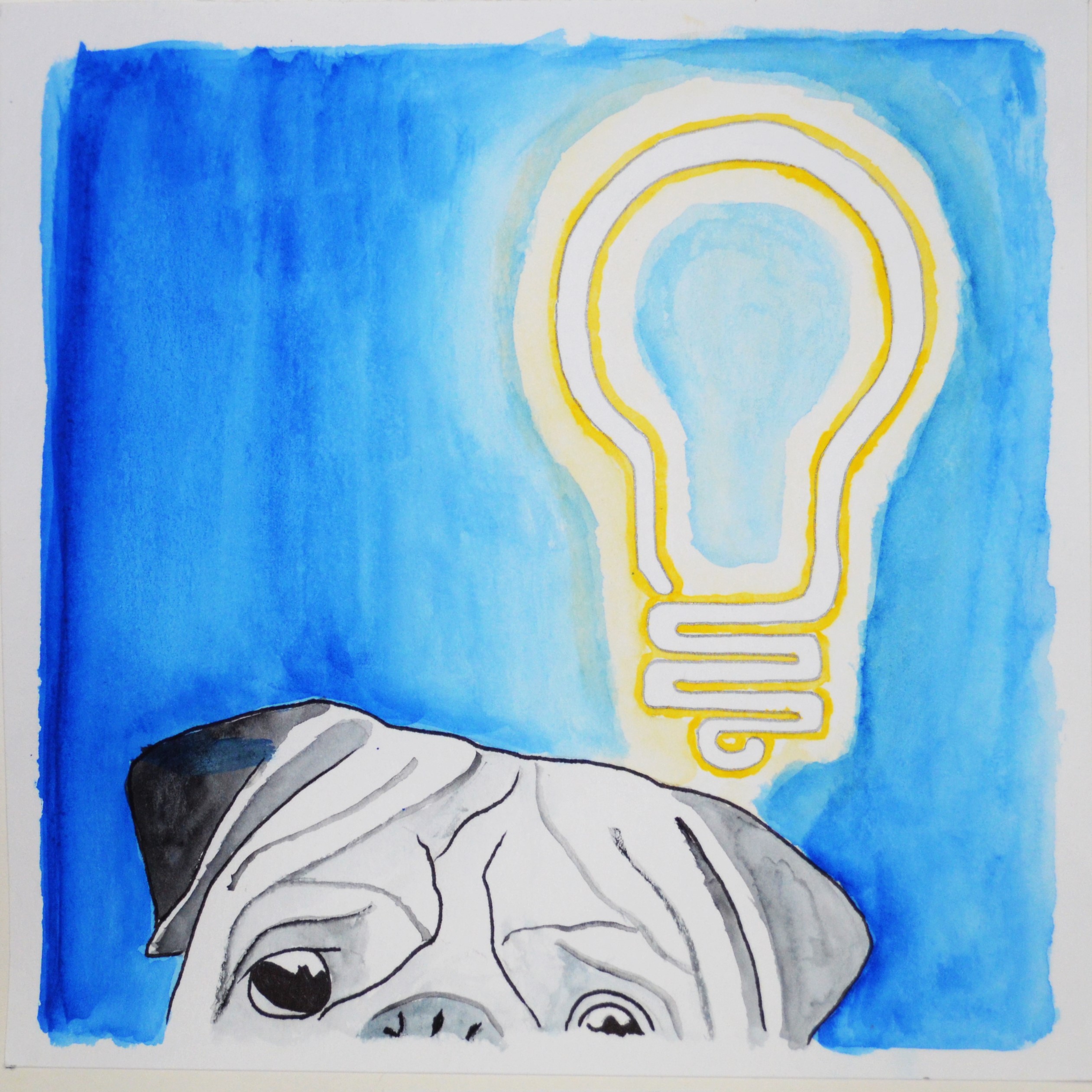
I can usually come up with many ideas for anything, but my laziness becomes a burden and makes me find only the easiest way out which sometimes might not be the best option. As such, I drew half a pug, obvious enough to tell that it is a pug, and a glowing neon light bulb above him to suggest “ideas”. I chose a yellow bulb against a blue background as they are complementary colors, showing a comfortably high contrast.
LAZINESS
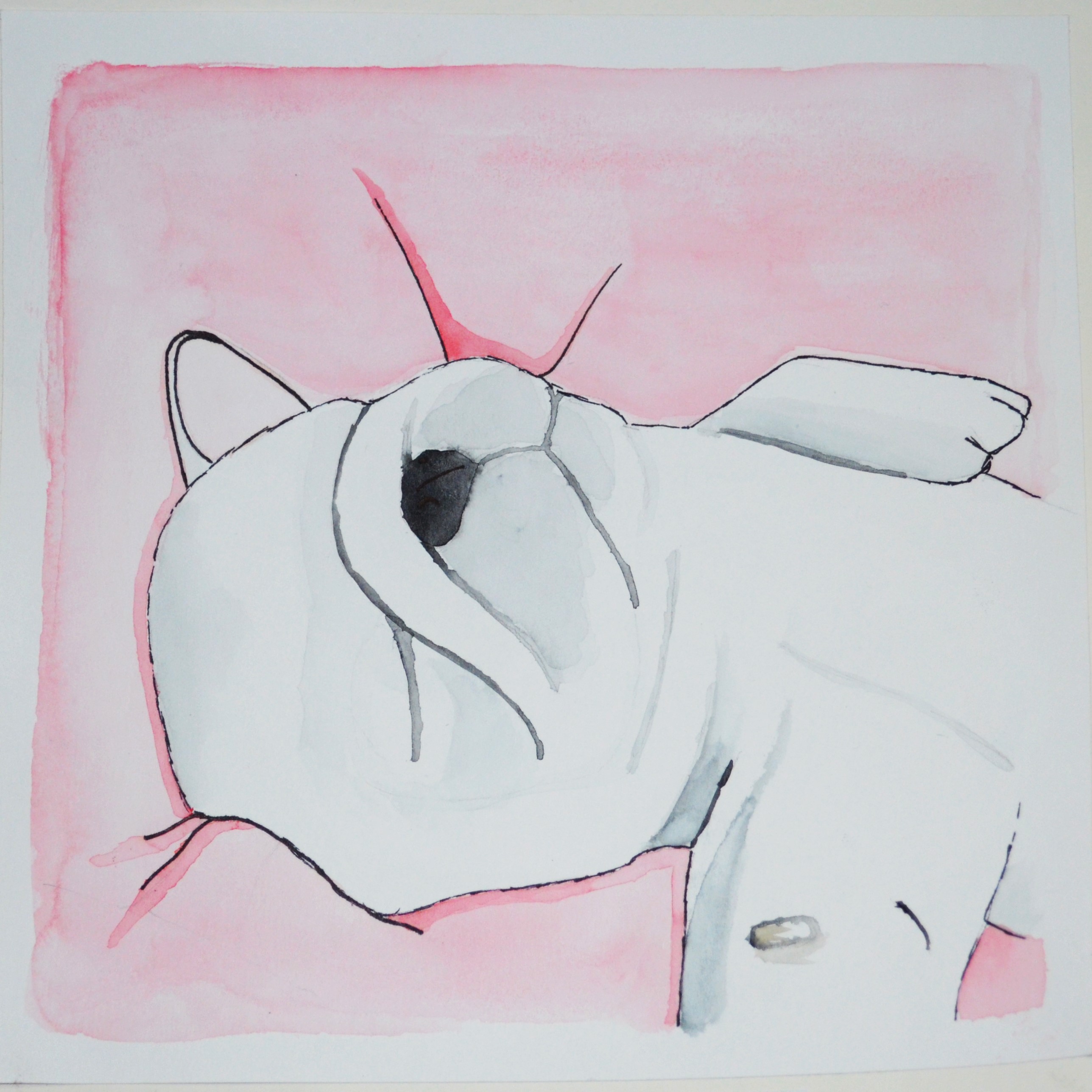
Then, i pictured a dog sleeping to represent laziness, as well as through the very soundly asleep posture. I chose a very light shade of pink as the background that the dog is sleeping on as this shade of pink is very soft, comfortable and warm, tying in with the idea of being lazy and wanting to snooze.
MORE WORK DONE
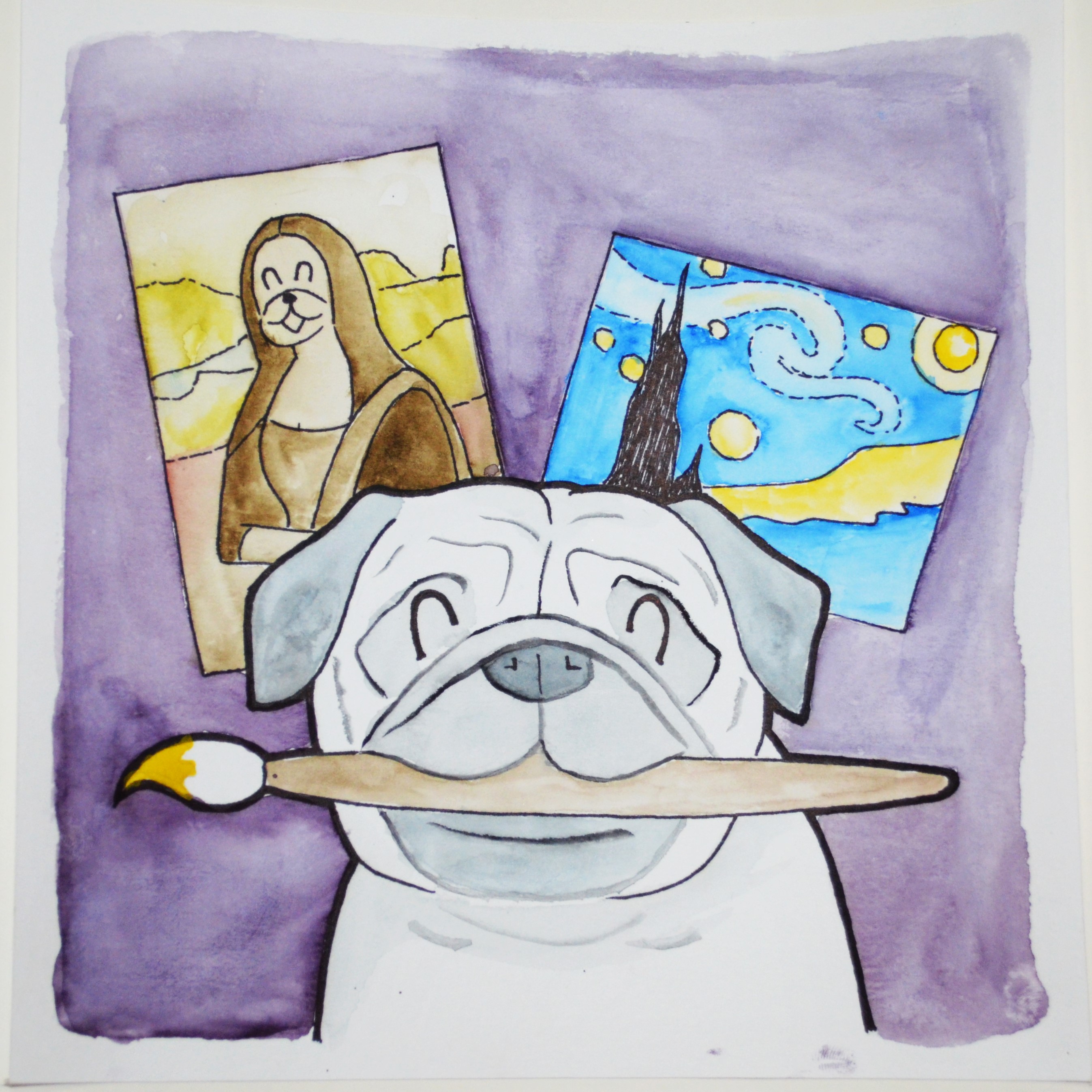
Then, if my ideas were not burdened by my laziness, I would have more work done! I chose to portray a pug in the foreground biting a paintbrush, his artworks in the midground, then a purple background. The artworks is to symbolize the works done by him, which i chose “Mono Lisa” (with a pug’s face as if he was drawing his friend), and “Starry Night”, which were famous paintings to show how good he is. The purple background gives the idea of luxury or royalty, going in line with how he is able to come up with such good and expensive paintings. This entire equation shows a gradual color transition.
Patience x Perseverance = Calm and Relaxed
PATIENCE
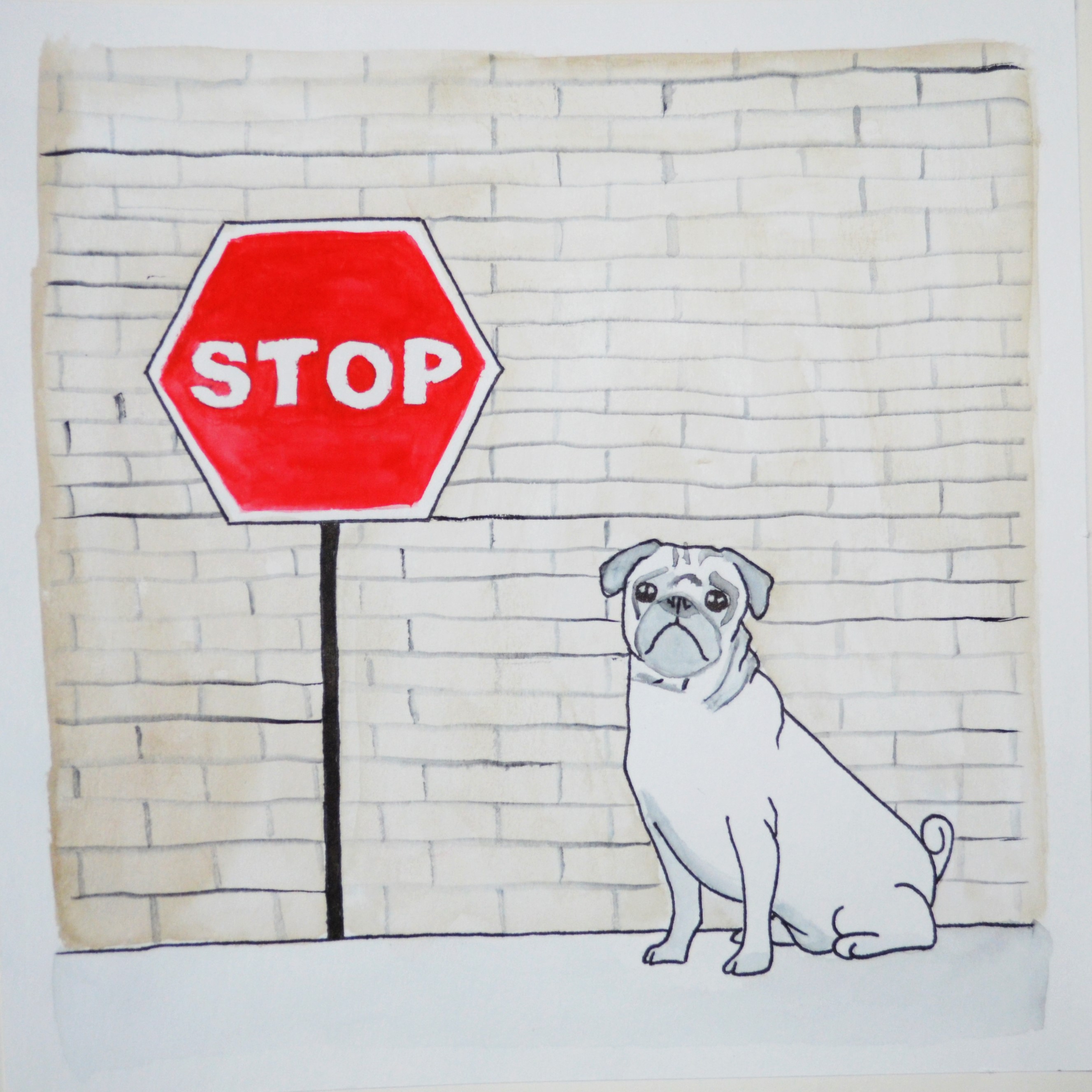
For the third equation with multiplication, I felt that it means an attribute that I already have, but have to multiply the quantity in order for it to be ideal. I felt that I have patience and perseverance, but would be even better if I had more of these. For patience, I drew a pug next to a stop sign against a brick wall. The wall was in a faded shade of brown to show that it is dull and boring, which requires even more patience to pull through these periods of dullness and boredom. The stop sign was then in a very vibrant red to stand out from the rest of the picture, with the word “STOP”, which symbolizes waiting and to have patience.
PERSEVERANCE
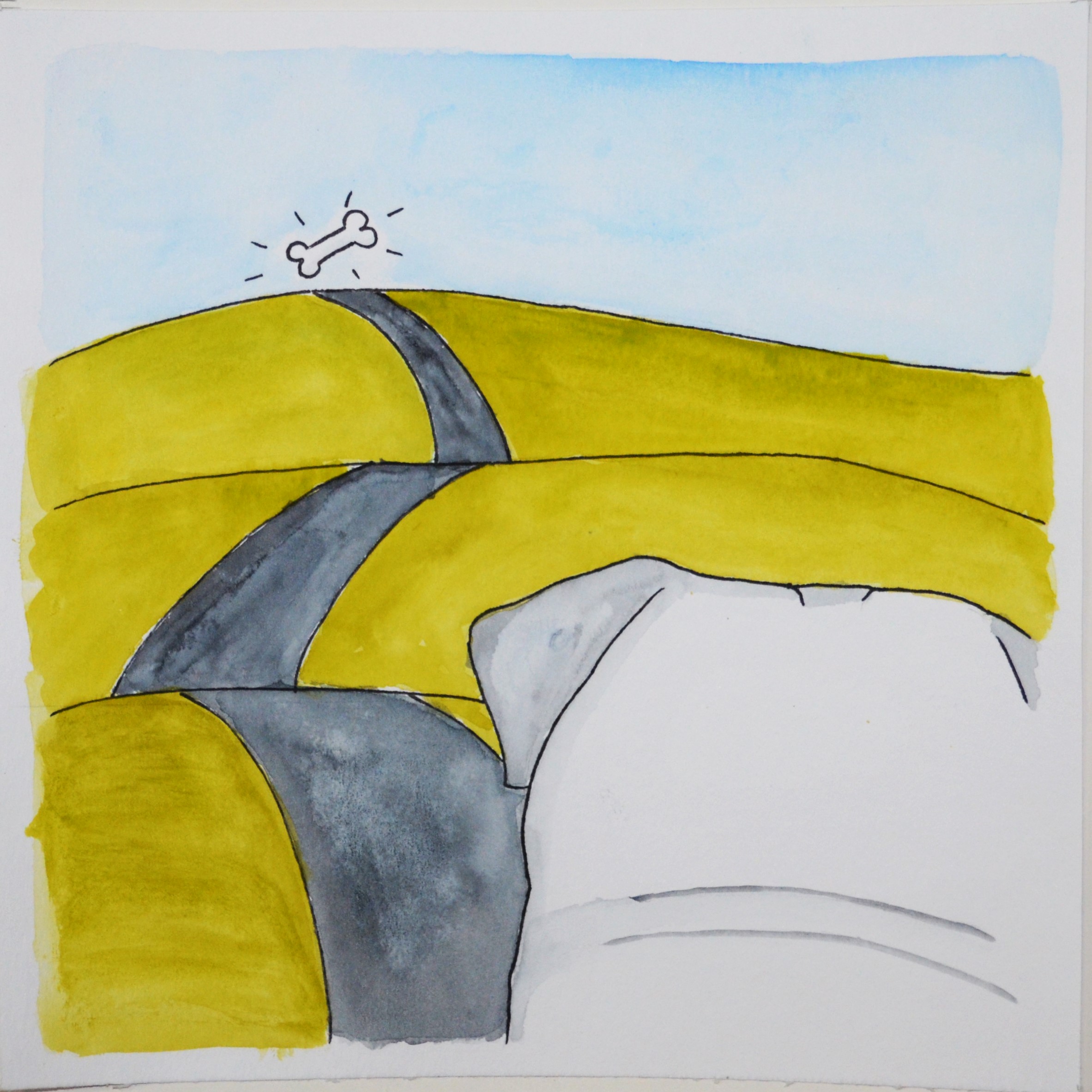
Then, I showed a back view of a pug looking towards a very very long road across mountains. This is to show that the road is long and he has to persevere to get to the end of it, where there is a bone to represent a reward. The green mountain was to represent peace and balance, like the statement “Keep Calm and Carry On!”. The blue sky goes well with the green mountains as an analogous color scheme.
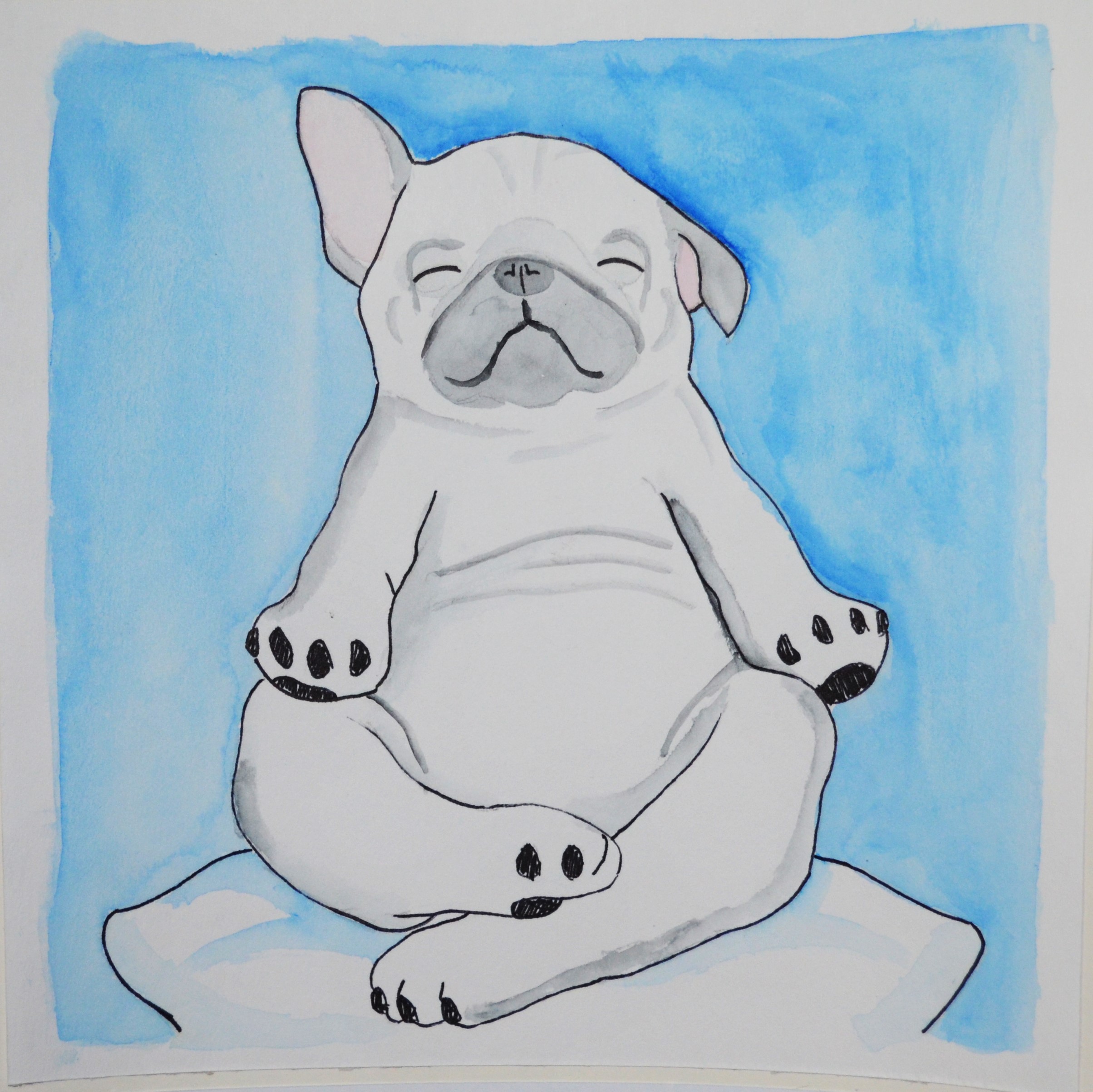
CALM AND RELAXED
The last picture of this equation shows a pug sitting in a zen or yoga position on a cushion, where everything is very white and light blue. This shows the calmness if I could have a lot of patience and perseverance, and I would be able to solve and do everything, slowly but surely. This would be the ideal situation where I wouldn’t have to worry about anything and just be very relaxed.
Hard Work + Opportunity = Have A Good Job
HARD WORK
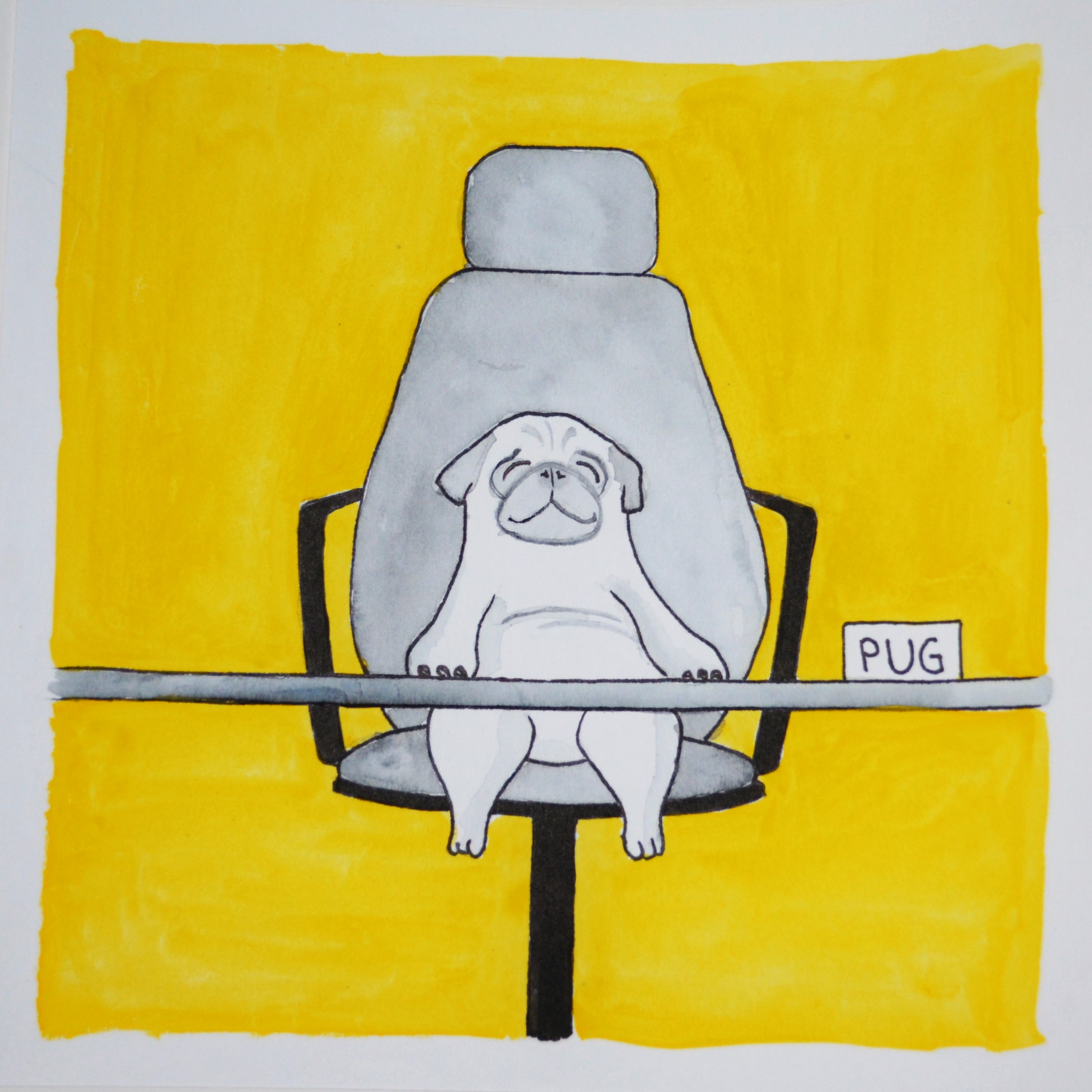
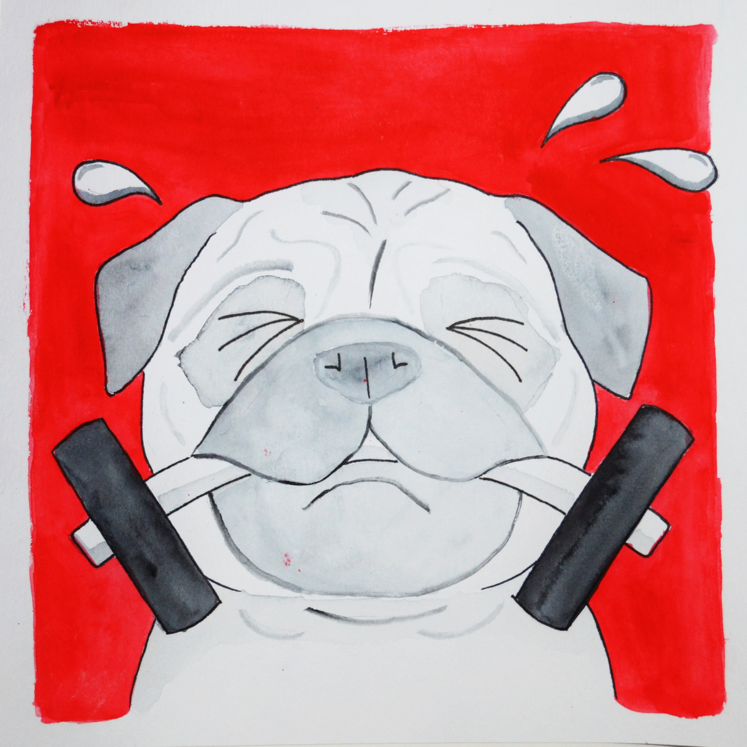
So what would I want to happen to me to me in 5 years? One of the biggest worries of ADM students is being unable to find a job. So, of course I want to have a good job in 5 years, after I have graduated from ADM! I believe that whatever we are doing now is all hard work towards building a name for ourselves to find a good job as artists and designers. As such, I showed a pug using a dumbbell to represent the effort put in and the hard work, against a red background which represents energy and passion.
OPPORTUNITY
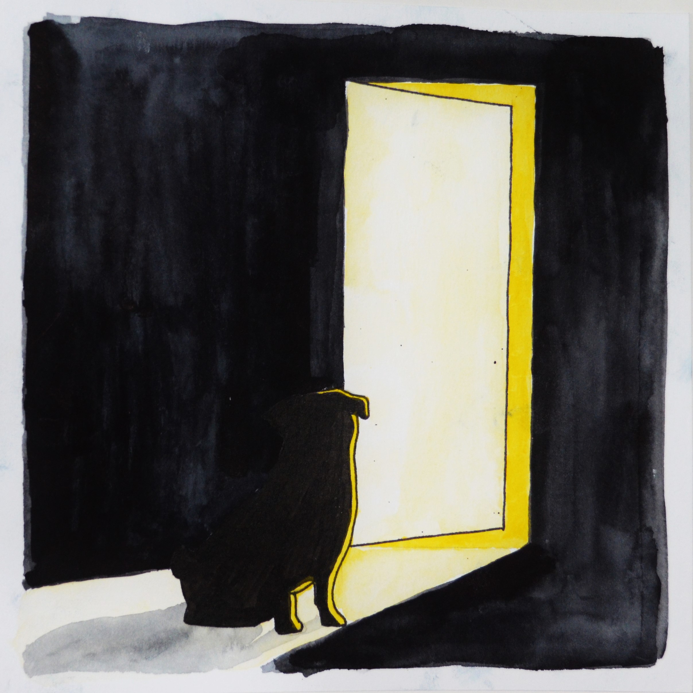
But of course, hard work alone does not necessarily pay off. We all need to have that exposure and be given that opportunity to shine and carve a name for ourselves. Success is when preparation meets opportunity. Here, I chose a door to represent opportunity. It is slightly open to let the light in, like how people see light as hope and a chance. I chose yellow as the light, and everything else is black and just silhouettes, as yellow represents optimism and hope, and also gives a high color contrast against black.
HAVE A GOOD JOB
So, when hard work meets opportunity, I might just be able to have a good job within 5 years! I showed a small pug on a high chair to represent how new I would be to the industry and being just a very small character, but the high chair suggests a rather good job. The yellow shows happiness of being “successful” in finding a job which is enjoyable and pays well!
When all put together, this completes my EGO project, with a simple concept of the pug tying through the entire project and every square having a simple color composition.
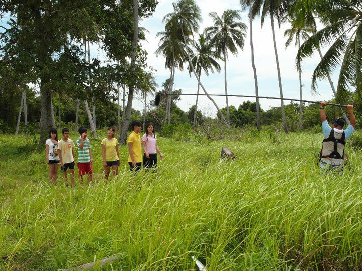
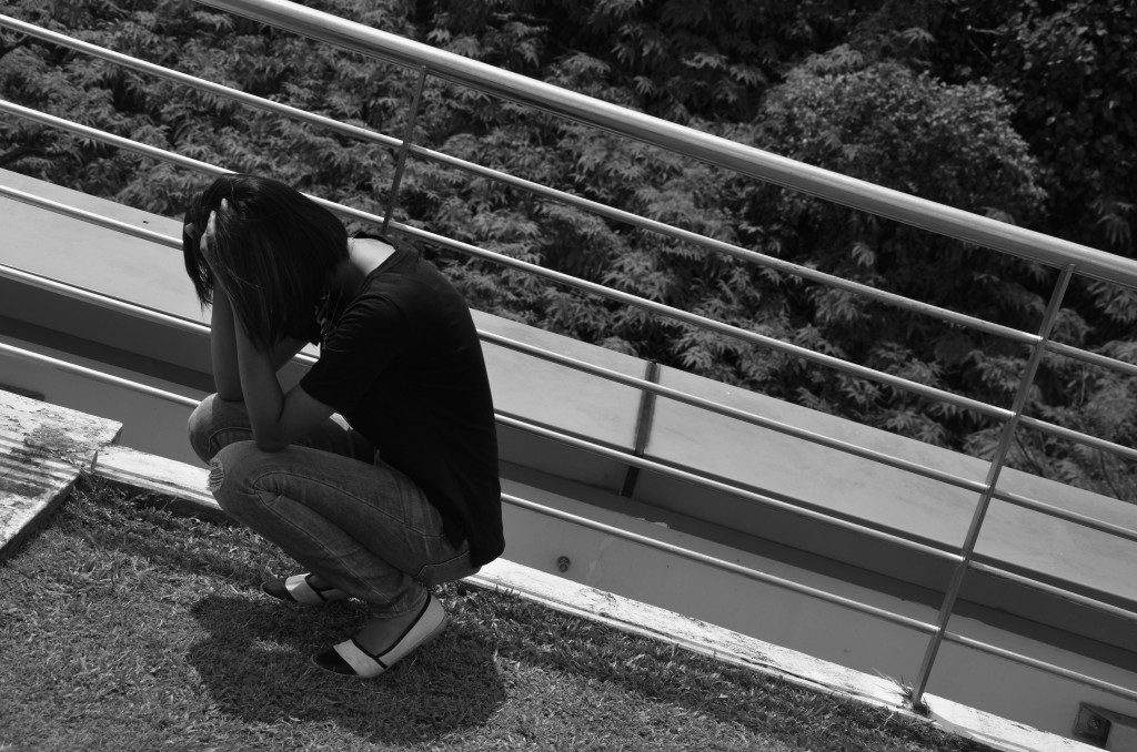
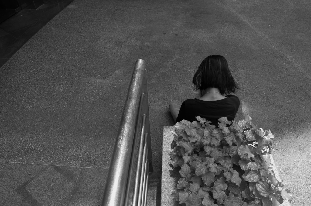
This 90 photographs sequence shows a story which explores 3 main themes, namely “lost”, “mystery”, and “friendship”.
It shows me being lost in my dream, in a forest which I could not seem to get out no matter how. Every place looked different yet the same, making it confusing where I am even at or how to get out from there. Then, it transitioned into a mystery where I saw my friend, who vanished right in front me. This happened several times while I was trying to find a way out, and also trying to find him after his first appearance. He would always mysteriously appear and disappear. However, over time, the quest to look for him happened to lead me out of the forest, after which I woke up from this dream. I believe that it was the friendship that helped me out when I needed help the most.
The images were used to represent the various ideas I wanted to display. The forest helps to show the feeling of lost and helplessness and everywhere looks different yet so similar, and the vastness of the place further exemplifies this feeling of being lost. The appearance of my friend was to signify the importance of friendship, where I believe plays a big part in everyone’s life as humans are social beings. Friendship has the power to help and influence us, which eventually brought me out of being lost in the forest to signify the power of friendship.
I chose to take my pictures either by focusing the main subjects along the thirds of the image, or to centralize the main subject in the middle of the image to have symmetry and let the subject be the center of focus. The photos were also not heavily edited and most of which were not even edited, so as to be more realistic and portray what I see, just as how some dreams actually feel very real even after waking up. I chose to darken the borders of the photos that occur in my dream to make a distinction between being awake and asleep, and that some dreams have a blurry and darker effect.
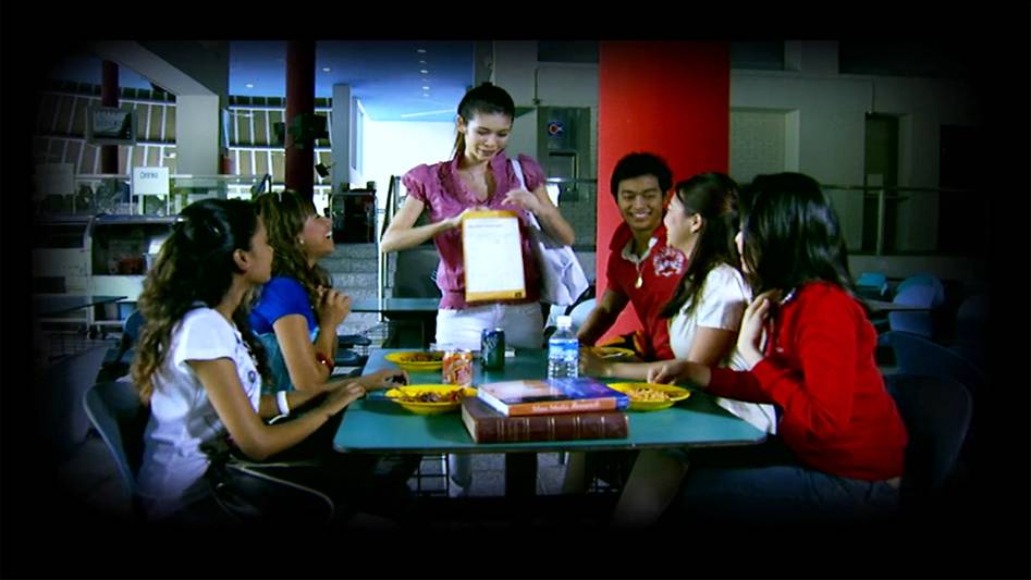
For this project, I did not have any specific research or artist that i referred to. I felt that one main factor that influenced my decision and style for this project was drama. Perhaps I have been exposed to TV dramas since young, especially chinese mediacorp dramas, it seems to me that forest was always a main theme for being lost. They always featured the main characters, who were lost, in forests being very helpless, walking around trying very hard to get out of it. National service probably further built this mentality unknowingly as the exposure to many different forested areas allows me to understand the vastness of these terrains and how the similar environment makes it easy to be lost, and hard to find an exit. One example would be “Stranded”, a drama series showing a group of teenagers lost on an island. I also think that the use of darkened borders makes it feel more like a dream, or a recalling of incidents which differentiates it from the real time. An example would be “Incredible Tales”, where the entire story would have a darkened border to show the character recalling and retelling the story.
A set from “Stranded”, which shows scenes of a forest.A scene from “Incredible Tales”, which uses a darkened border to tell the story.
Through this project, I understand how the use of various image compositions and some editing helps to convey the message across and sets the mood right for the story. I start to understand how difficult it is to send a message subtly through images and also how various images do not turn out the way I wanted them to be. There were certain compositions that could not be easily created to fit those in mind and I had to find a way to tweak it, to make it feasible yet still able to bring out the same effects and message. I also realised how having a goal or “quest” makes it less boring even though everything might seem repetitive and dull. For example, many shots were taken in the forest, where everything looked so similar although they were different. However, the goal to find my friend or get out of the forest makes it less boring to go through repetitive images as there is a final aim to keep the audience going. This shows the importance of having a storyline and an aim to keep audience interested. By looking at my classmates’ presentations, I also realised how music and sound played an important in setting the atmosphere, giving viewers a more in-depth experience.
Colors are everywhere, present in everything. More often than not, colors are not alone, but in fact, a combination of a few colors! So, how do colors work with each other, and how do they match?
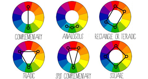
COMPLEMENTARY
Colors that are opposite each other on the color wheel are considered to be complementary colors. (e.g. Red and Green)
The high contrast of complementary colors creates a vibrant look especially when used at full saturation. This color scheme must be managed well so it is not jarring.
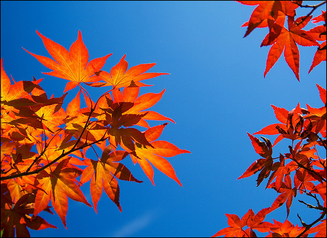
Complementary – Blue and Orange
SPLIT-COMPLEMENTARY
The split-complementary color scheme is a variation of the complementary color scheme. In addition to the base color, it uses the two colors adjacent to its complement.
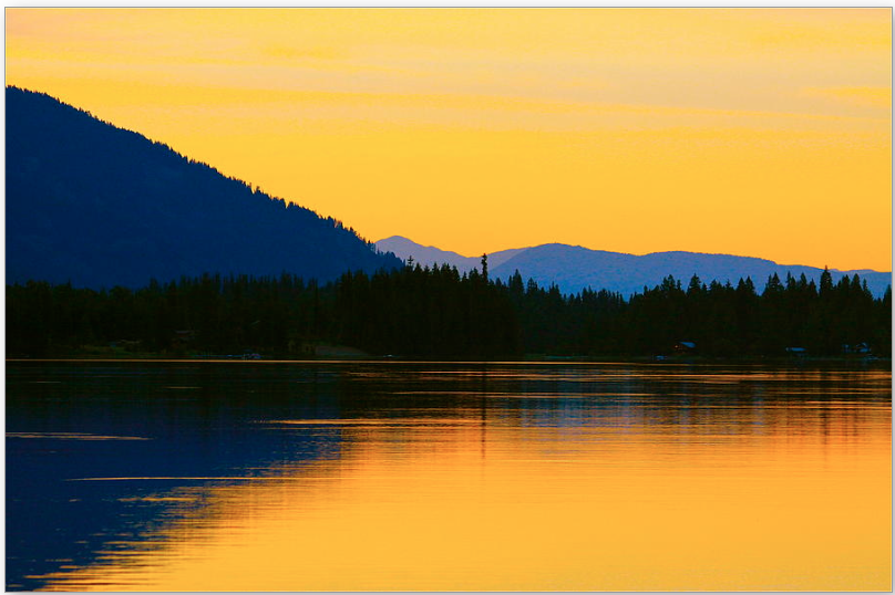
Split-complementary – Blue, Orange, and Yellow
ANALOGOUS
Analogous color schemes use colors that are next to each other on the color wheel. They usually match well and create serene and comfortable designs.
Analogous color schemes are often found in nature and are harmonious and pleasing to the eye.
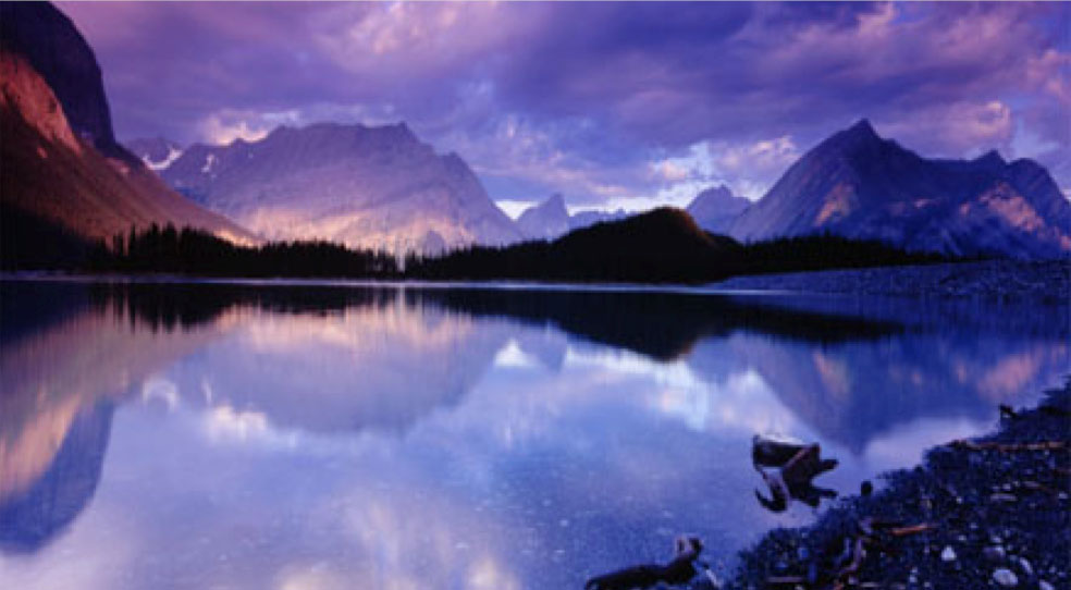
Analogous – Shades of Blue and Violet
RECTANGLE / TETRADIC
Tetradic color scheme uses four colors arranged into two complementary pairs.
This rich color scheme offers plenty of possibilities for variation. It works best if you let one color be dominant.
You should also pay attention to the balance between warm and cool colors in your design.
Tetradic – Blue, Green, Red and Yellow
SQUARE
The square color scheme is similar to the rectangle, but with all four colors spaced evenly around the color wheel. Similarly, it works best if one color is the dominant.
You should also pay attention to the balance between warm and cool colors in your design.
TRIADIC
A triadic color scheme uses colors that are evenly spaced around the color wheel.
Triadic color schemes tend to be quite vibrant, even if you use pale or unsaturated versions of your hues.
Colors make up an important part of everyday life. They are everywhere. They give things identity and let people feel a certain kind of emotions. So what do they tend to represent?
RED
Red represents anger.
It also represents love, energy, power, strength, passion, heat, danger, physical courage, warmth, stimulation, masculinity, excitement, defiance, aggression, visual impact, strain and warning.
ORANGE
Orange represents physical comfort and sensuality.
It also represents courage, confidence, friendliness, success, ignorance, warmth, security, passion, abundance, fun, deprivation, frustration, frivolity, immaturity and sluggishness.
YELLOW
Yellow represents happiness.
It also represents brightness, energy, the sun, creativity, intellect, irresponsibility, optimism, confidence, self-esteem, emotional strength, friendliness, creativity, irrationality, fear, emotional fragility, depression, anxiety, and unstable.
GREEN
Green represents harmony.
It also represents money, growth, fertility, freshness, balance, refreshment, universal love, rest, restoration, reassurance, environmental awareness, equilibrium, peace, boredom, stagnation, blandness and healing.
BLUE
Blue represents serenity.
It also represents intelligence, communication, trust, efficiency, serenity, duty, logic, coolness, reflection, calm, coldness, aloofness, lack of emotion and unfriendliness.
PURPLE
Purple represents introvert.
It also represents spiritual awareness, containment, vision, luxury, authenticity, truth, quality, decadence, suppression and inferiority.
PINK
Pink represents love.
It also represents physical tranquility, nurture, warmth, femininity, love, sexuality, emotional claustrophobia, emasculation, physical weakness.
BROWN
Brown represents seriousness.
It also represents warmth, nature, earthiness, reliability, support, lack of humor, heaviness and lack of sophistication.
GREY
Grey represents depression.
It also represents psychological neutrality, lack of confidence, hibernation and lack of energy.
BLACK
Black represents oppression.
It also represents sophistication, glamour, security, emotional safety, efficiency, substance, coldness, menace and heaviness.
WHITE
White represents purity.
It also represents hygiene, sterility, clarity, purity, cleanness, simplicity, sophistication, efficiency, coldness, barriers, unfriendliness and elitism.
This assignment was to research on rhymes and compose images using Photoshop, to represent lines given in the rhymes and explore the principles of design.
We were initially broken down into groups and each group was assigned a rhyme to research on and compile a photo bank after editing on Photoshop. After which, we were to compose multiple image compositions and then choose our final 4.
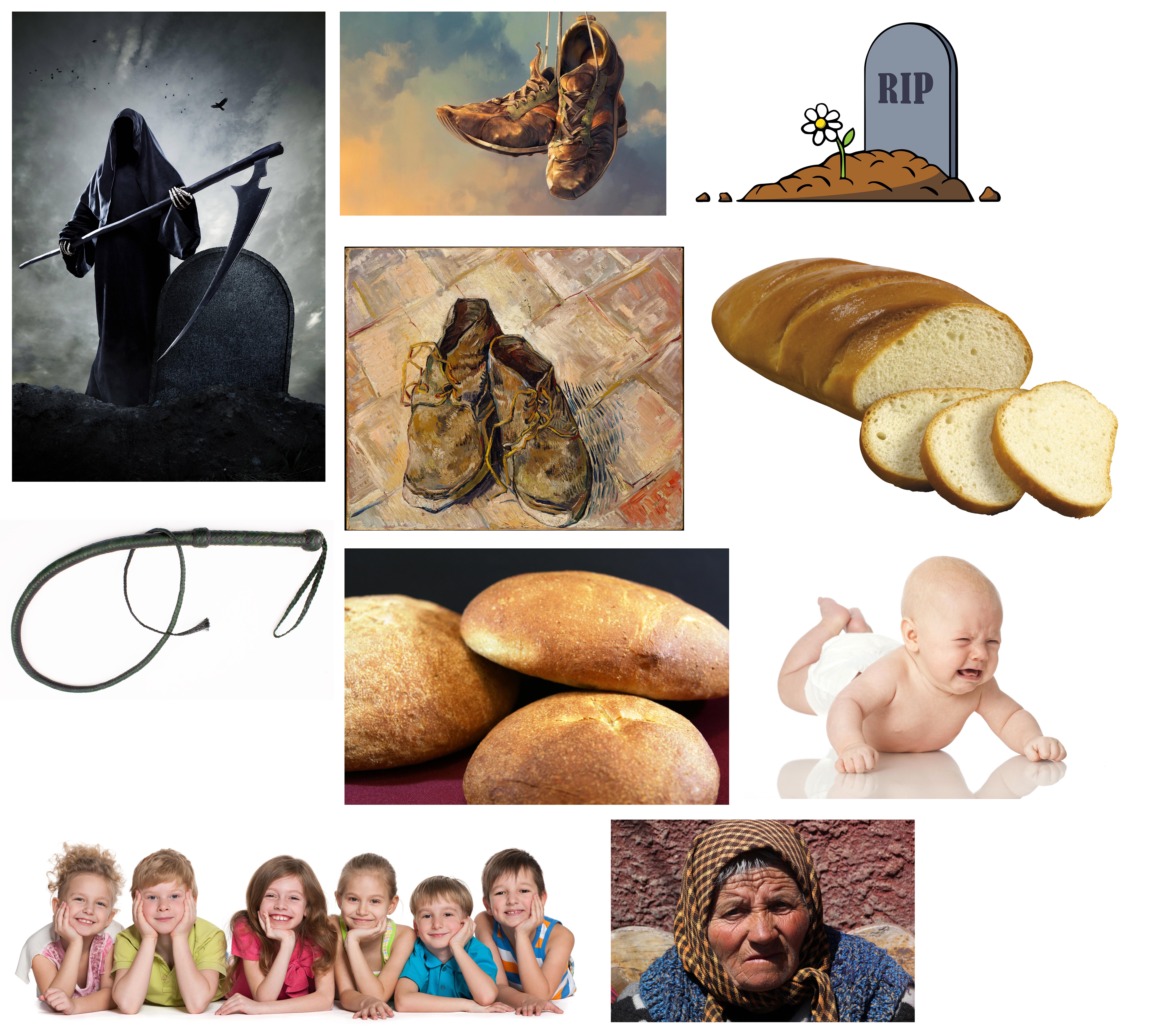
My group was assigned to do the rhyme “There Was An Old Woman Who Lived In A Shoe“. This was how the rhyme went:
“There was an old woman who lived in a shoe.
She had so many children, she didn’t know what to do.
She gave them some broth without any bread;
And whipped them all soundly and put them to bed.”
–
Thus I started to look for images that could represent what I understand from the rhyme. The images had to be rather high definition as it is used for printing, thus at least 300 pixels per inch. It was not easy to look for images that fully represent and suit what I need, yet has the requirement of 300 dpi. Thus, it took quite some time to look for a variety of images that fit all the requirements.
Compilation of images used for photo bank.
Some of the images were more literal, such as the old woman, children, bread, whip and shoes, while the ones representing death was what I inferred from the last two lines of the rhymes.
–
After getting the photos, they were then all cropped out, changed to grayscale and either halftone, threshold or posterize. They were then uploaded into our class google drive so that everyone could access each other’s photo bank, making the photo bank more complete and have a greater variety to choose from.
–
We then broke down the photos into individual lines and tried to compose images based on them. We were advised to try out all 12 lines of the three rhymes – “There Was An Old Woman Who Lived In A Shoe”, “Humpty Dumpty”, and “Hey Diddle Diddle”). However, I chose to focus on doing drafts to explore some of the lines twice instead of doing everything. In total, I had 15 compositions as some of my compositions were too literal, I was advised to think of something that represented them and ways to improve them.
–
“Hey Diddle Diddle! The cat and the fiddle.”
Just the cat and the fiddle. Literally. The huge fiddle in the middle contrasts in size with the cat at the corner. The small cat at the corner also helps to balance out the big fiddle in the middle.
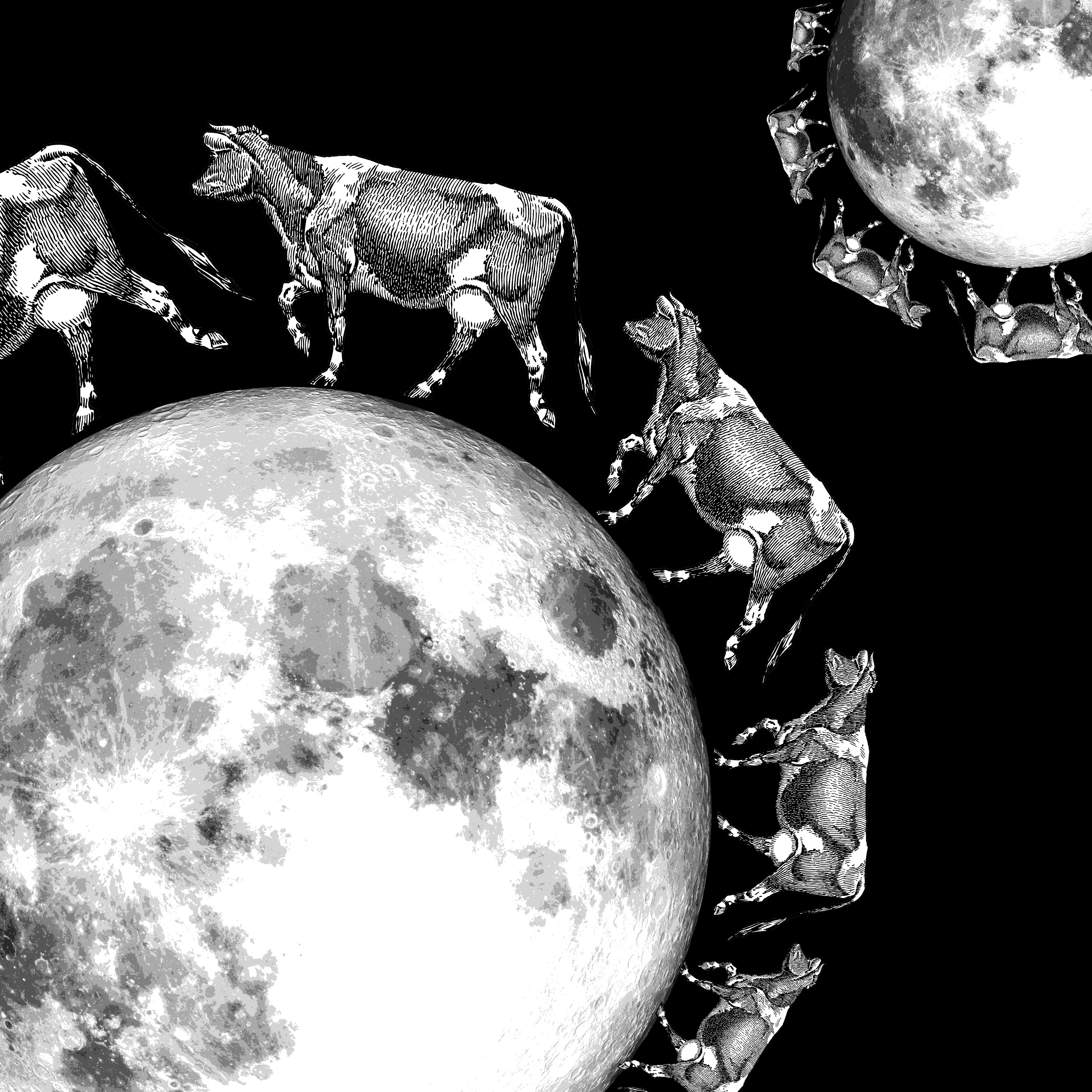
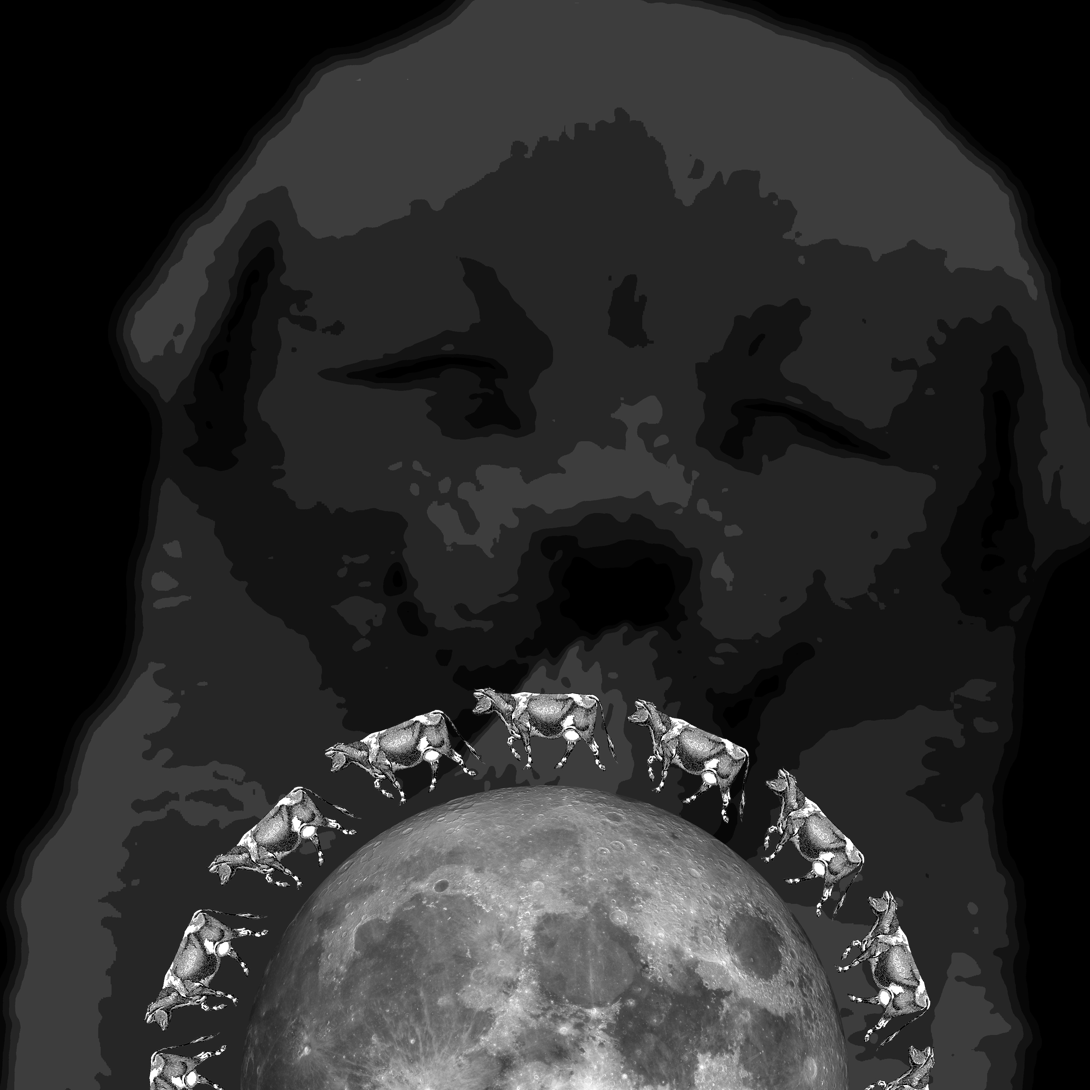
“The cow jumped over the moon.”
The cows have a gradual change in size to signify movement. The smaller group at the top contrasts in size with the bigger group at the bottom.
“The cow jumped over the moon.” DRAFT 2
The cow skin covers the moon, signifying the cow jumped OVER the moon. The moon is brighter than the entire picture being relatively black to bring attention to it.
“The little dog laughed to see such sport.”
The sport refers to the cow jumping over moon. There is a laughing dog in the background, showing contrast between size and colour tone of background versus foreground. Shows symmetry.
“The little dog laughed to see such sport.” DRAFT 2
The paws are tilted and have a variety of sizes to show the dog dancing around happily or laughing, while the white mooncake in the foreground represents the moon. Shows contrast between fore and background.
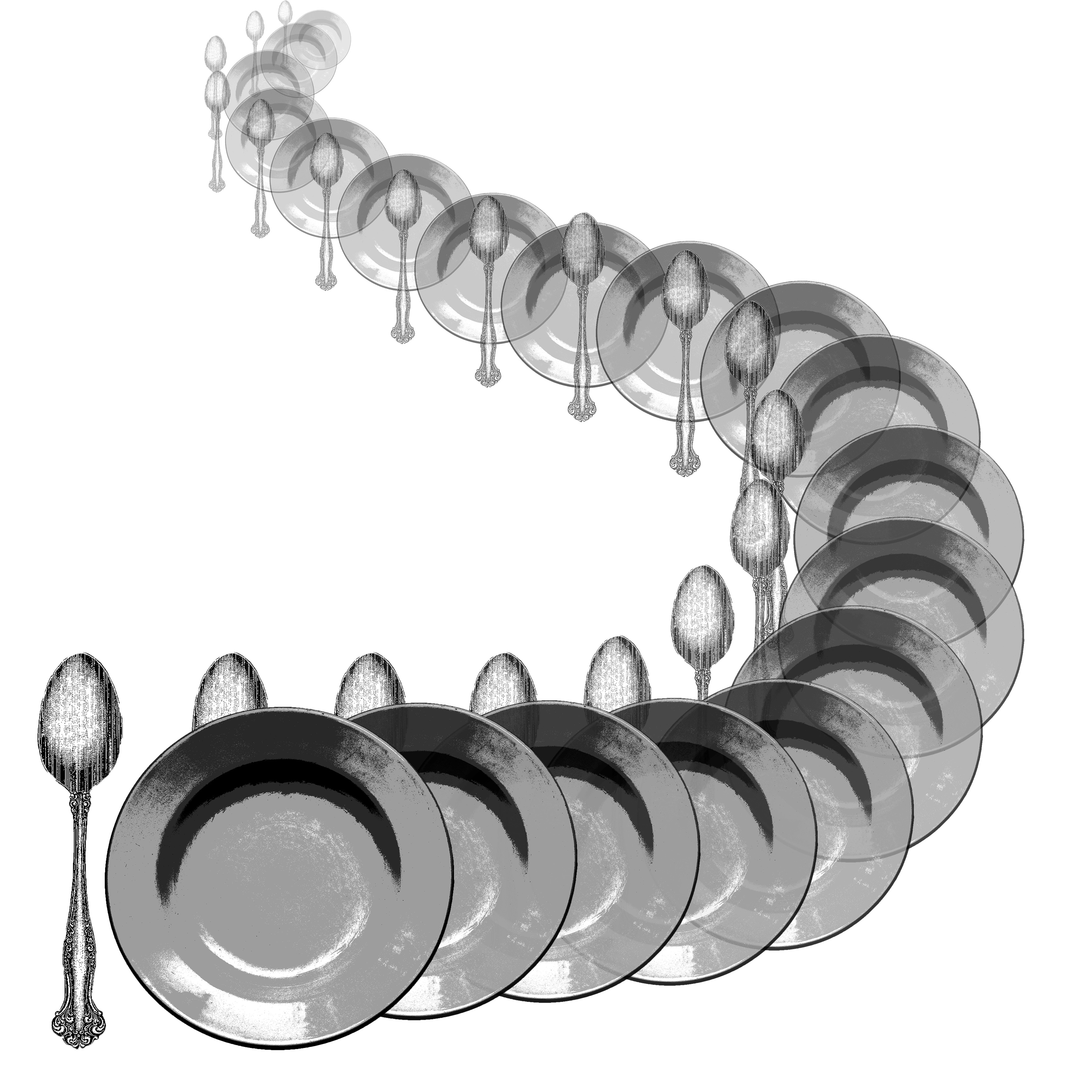
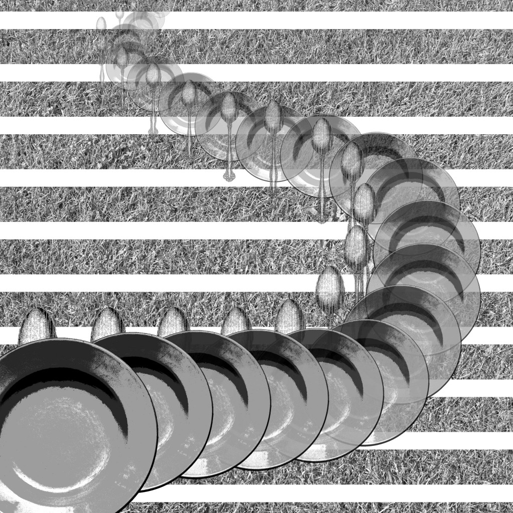
“And the dish ran away with the spoon.”
The gradual change in size and opacity to represent movement. Purposely twisted to have a dramatic path and show both the dish and the spoon.
“And the dish ran away with the spoon.” DRAFT 2
Added a background of grass texture to give the context of running on grass or mountains. Stripes added to give texture and more contrast with foreground. One dish added to foreground out of frame to have a hint that they have not stopped running.
“Humpty dumpty sat on a wall.”
An egg on a wall. Egg is off-center to reduce symmetry, placed along one-third of the picture. It is also tilted to have more movement and life, imitating a relaxed and laid back sitting position.
“Humpty dumpty had a great fall.”
The gradual change in opacity to show movement, and the different angles along the bottom further adds to the movement and life of the egg.
“Humpty dumpty had a great fall.” DRAFT 2
Background of brick wall added to give the context of falling from the wall. Size of the eggs have also changed to have a gradual change to signify the falling from a further place, i.e. top of the wall.
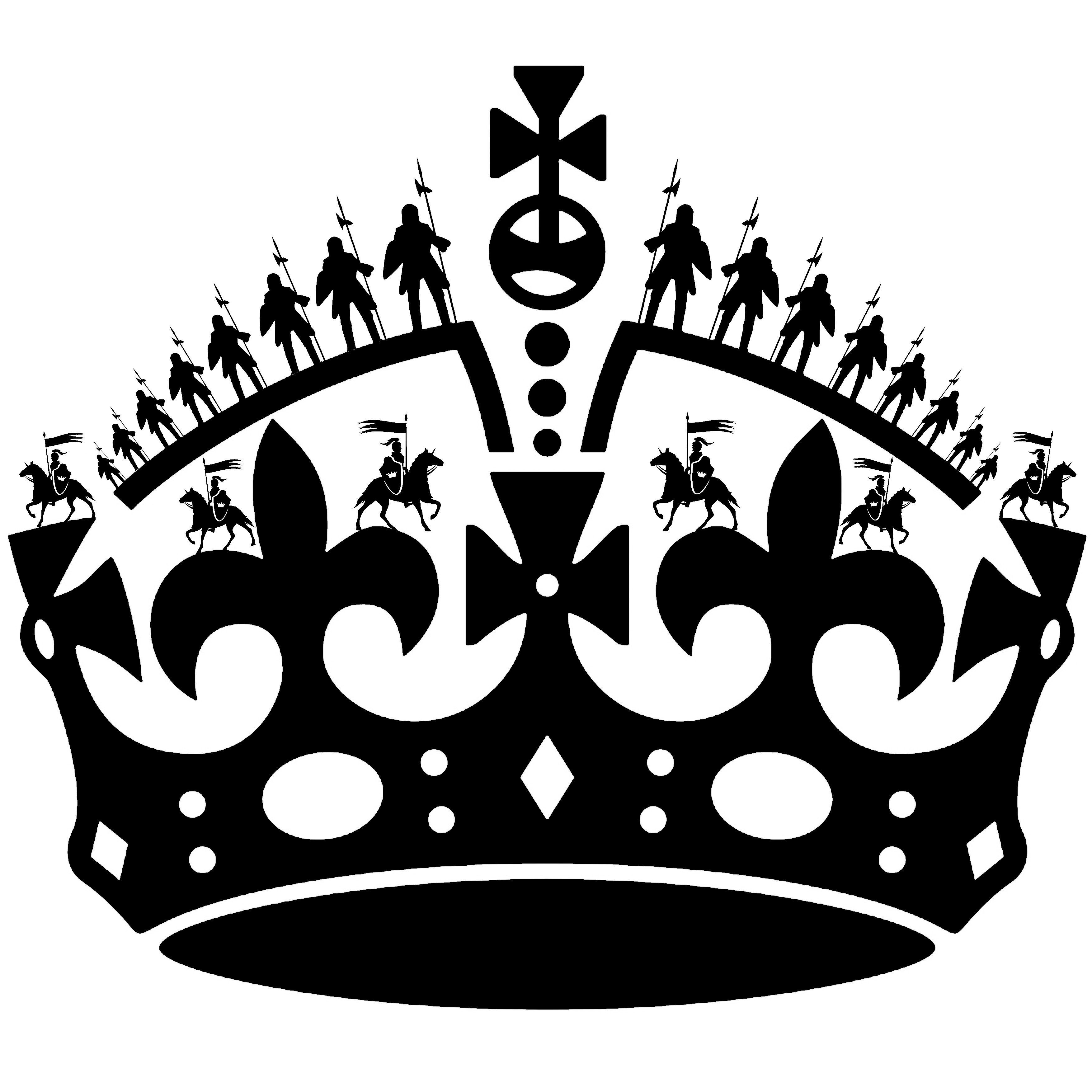
“All the king’s horses and all the king’s men.”
Replaced decorations of the the king’s crown with imperial soldiers and soldiers on horses. Emphasizes on the symmetry of the image and the stark contrast between black and white.
“Couldn’t put Humpty together again.”
Stark contrast between shape of egg and background, with low contrast of soldiers in the background. Small little dots in the egg represents how the egg has shattered into tiny bits and cannot be put together, despite having so many people.
“Couldn’t put Humpty together again.” DRAFT 2
Shifted the egg to a corner to reduce symmetry and bring the center of focus to a point. Egg is purposely shifted out of frame as audience will complete it mentally, also making the composition more interesting.
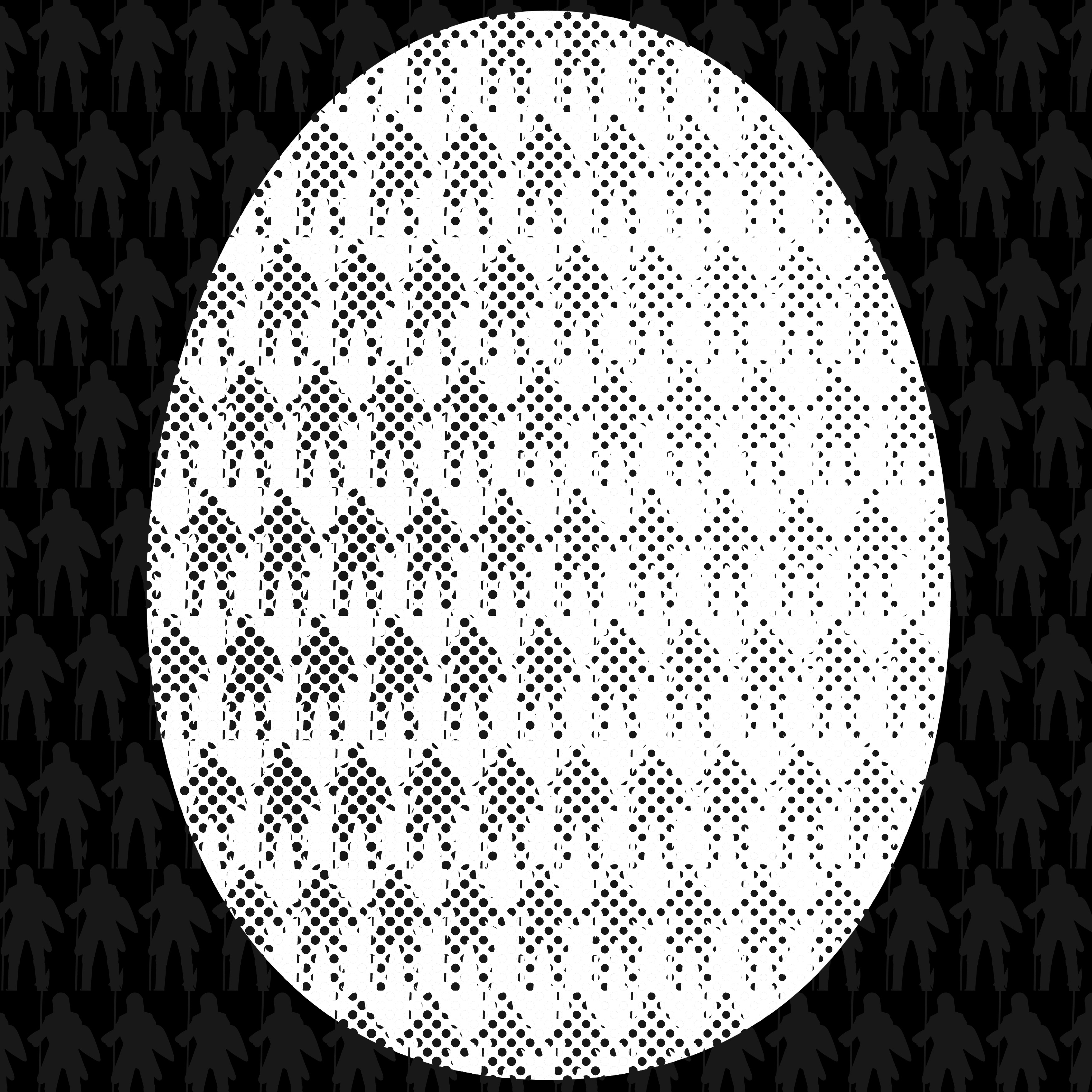
“She had so many children she didn’t know what to do.”
The symmetry and pattern of the babies to bring the center of focus to the only difference – the “?”. The babies are also crying to signify the lack of attention as there is too many of them.
“She had so many children she didn’t know what to do.” DRAFT 2
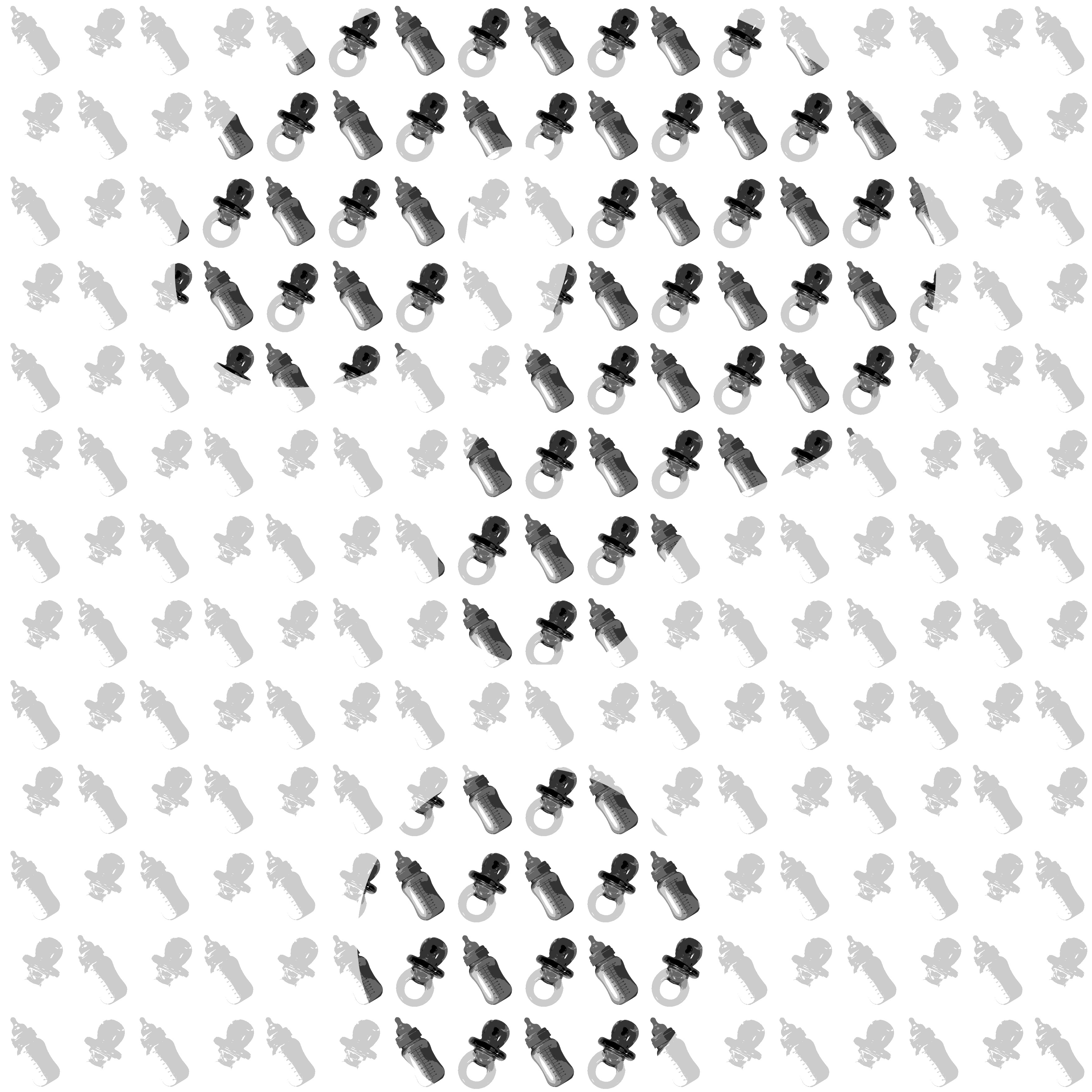
The idea was changed to using milk bottles and pacifiers to represent the vast amount of children, and then a subtle “?” is across the entire composition by having a darker tone and contrast. Parts of the “?” are out of the frame to make the composition more interesting.
–
Among all of the above, 4 final ones were chosen to be printed, 297mm x 297mm.
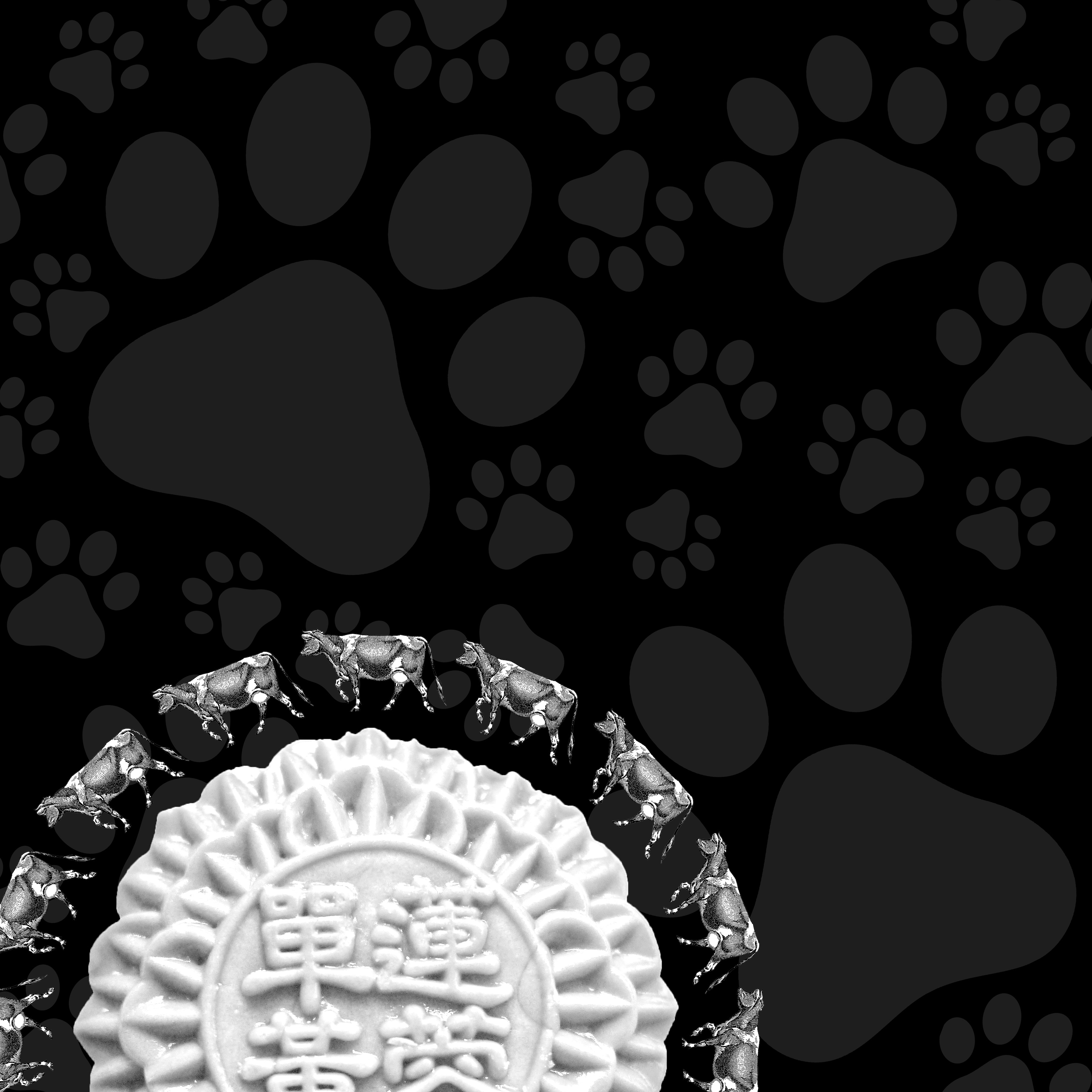
“She had so many children she didn’t know what to do.” DRAFT 2
The amount of milk bottles and pacifiers represents the huge number of children that the old woman has. There is then a subtle “?” formed in the middle by having a darker tone and more contrast to represent the idea of lost and not knowing what to do.
The above composition has rhythm and repetition in the milk bottles and pacifiers. It also has contrast to bring out the “?”.
“Couldn’t put Humpty together again.” DRAFT 2
The entire image is filled with silhouettes of soldiers, then an egg at the bottom left corner. The silhouettes of the soldiers show the huge number of soldiers, and the egg represents Humpty Dumpty. The egg was edited with halftone to have the dots , in which the soldiers can be seen through the egg. These small little dots that form the soldiers represent that Humpty Dumpty has shattered into tiny pieces and cannot be put back together again.
The composition shows repetition and rhythm in the soldiers, and also contrast of the colour and size of the egg to let it become the center of interest. The egg itself actually also has a gradation of tone to give depth of the egg.
“And the dish ran away with the spoon.” DRAFT 2
This image shows a trail of a dish and a spoon, following a gradual transformation of size and opacity, small to big, transparent to opaque. This is to signify the movement of the dish and spoon. They are also composed to take a curved path to emphasize on the dramatic movement, and also to show both the dish and the spoon clearly. The background is laid with texture of grass to give a context of the dish and spoon running on grass or mountains. The stripes serve to increase the contrast of the background versus the dish and spoon.
This shows repetition of the dish and spoon, their directional movement through the change in size and opacity, and contrast between the background and foreground.
“And the little dog laughed to see such sport.” DRAFT 2
The background is decorated with varying shapes and directions of dog paws, showing the happiness of the dog, seemingly running and dancing about, to signify the laughing of the dog. The low contrast of the paws and the black background is to bring out the high contrast of the foreground. The foreground shows a mooncake to represent a moon. It is made to be white to seem more like the moon, and also have a greater contrast from the background. It is slightly out of frame to let audience complete the circle. The cows are placed around to the moon in one direction to signify the movement of the cow over the moon, and made to have a same size to have a contrast with the varying sizes at the back as well.
This shows contrast between the foreground (white, consistent sizes) and the background (black, varying sizes). It also shows repetition of the cows and paws, and the center of interest of the foreground through the stark contrast.
A large shape close to the center can be balanced by a small shape close to the edge.
A large light toned shape will be balanced by a small dark toned shape (the darker the shape the heavier it appears to be)
Large object in the middle, balanced by small object near the edge.
Gradation
Gradation of size and direction produce linear perspective.
Gradation of colour from warm to cool and tone from dark to light produce aerial perspective.
Gradation can add interest and movement to a shape.
A gradation from dark to light will cause the eye to move along a shape.
Gradation of tone.
Repetition
Repetition with variation is interesting, without variation repetition can become monotonous.
If you wish to create interest, any repeating element should include a degree of variation.
Repetition with a slight variation.
Contrast
Contrast is the juxtaposition of opposing elements eg. opposite colour, contrast in tone or value, contrast in direction
The major contrast in a painting should be located at the center of interest. Too much contrast scattered throughout a painting can destroy unity and make a work difficult to look at. Unless a feeling of chaos and confusion are what you are seeking, it is a good idea to carefully consider where to place your areas of maximum contrast.
Contrast of colours.
Harmony
Harmony in painting is the visually satisfying effect of combining similar, related elements. eg.adjacent colours on the colour wheel, similar shapes etc.
Harmony of adjacent colours.
Dominance
Dominance gives a painting interest, counteracting confusion and monotony. Dominance can be applied to one or more of the elements to give emphasis
Dominance of size.
Unity
Relating the design elements to the the idea being expressed in a painting reinforces the principal of unity.eg. a painting with an active aggressive subject would work better with a dominant oblique direction, course, rough texture, angular lines etc. whereas a quiet passive subject would benefit from horizontal lines, soft texture and less tonal contrast.
Unity in a painting also refers to the visual linking of various elements of the work.
How unity works.
Center of interest
An area that first attracts attention in a composition. This area is more important when compared to the other objects or elements in a composition. This can be by contrast of values, more colors, and placement in the format.
Difference in colour and shape.
Directional Movement
A visual flow through the composition. It can be the suggestion of motion in a design as you move from object to object by way of placement and position. Directional movement can be created with a value pattern. It is with the placement of dark and light areas that you can move your attention through the format.
Gradual change in size causing movement.
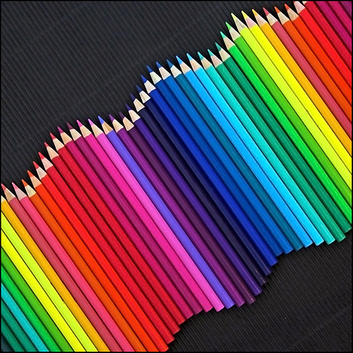
Rhythm
A movement in which some elements recurs regularly. Like a dance it will have a flow of objects that will seem to be like the beat of music. The Principles of design are the results of your working with the elements of art. Use them in every piece of art you do and you will be happy with the results.
Repeated wavy movement of colour pencils forms a rhythm.