Colours living in harmony.

Colour Schemes|Colour Palettes|Colour Harmonies

Colours can set a mood, attract attention, or make a statement. You can use color to energize, or to cool down. By selecting the right color scheme, you can create an ambiance of elegance, warmth or tranquility, or you can convey an image of playful youthfulness. Color can be your most powerful design element if you learn to use it effectively.

Colour Harmonies

Complementary

Complementary Colours

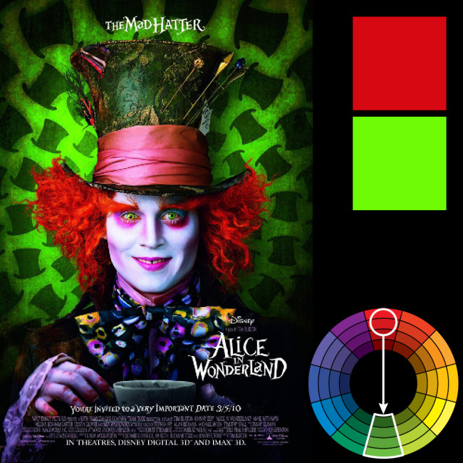
Colors that are opposite each other on the color wheel are considered to be complementary colors (example: red and green).

The high contrast of complementary colors creates a vibrant look especially when used at full saturation. This color scheme must be managed well so it is not jarring.Complementary color schemes are tricky to use in large doses, but work well when you want something to stand out.

Complementary colors are really bad for text.

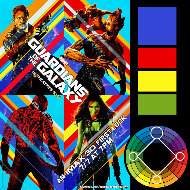
Triad

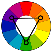
Triadic Colours

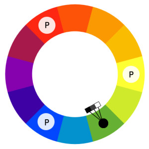
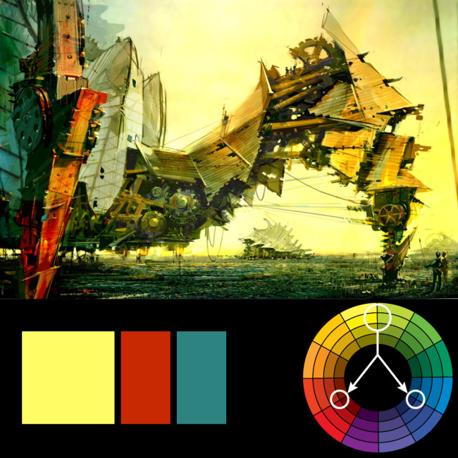
A triadic color scheme uses colors that are evenly spaced around the color wheel. Triadic color schemes tend to be quite vibrant, even if you use pale or unsaturated versions of your hues. To use a triadic harmony successfully, the colors should be carefully balanced – let one color dominate and use the two others for accent.

Analogous

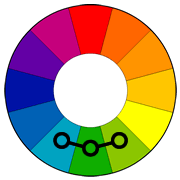
Analogous Colours

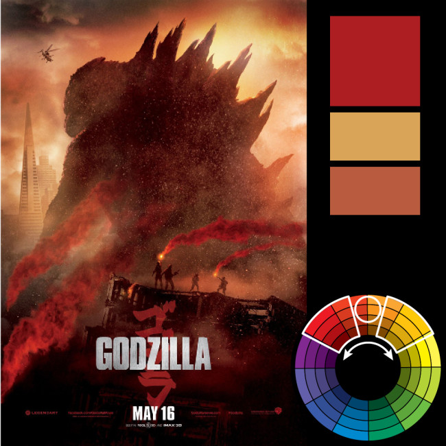
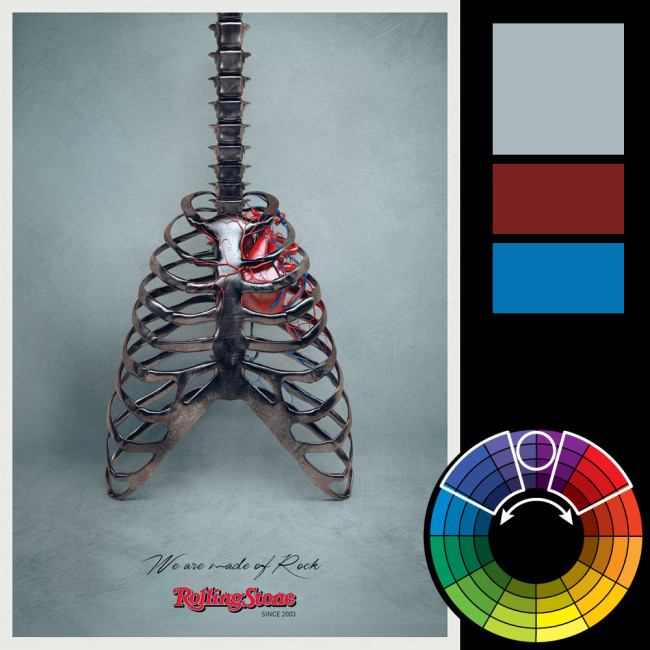
Analogous color schemes use colors that are next to each other on the color wheel. They usually match well and create serene and comfortable designs. Analogous color schemes are often found in nature and are harmonious and pleasing to the eye.

SplitComplementary

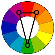
Split-complementary Colours

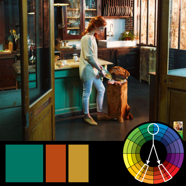
The split-complementary color scheme is a variation of the complementary color scheme. In addition to the base color, it uses the two colors adjacent to its complement. This color scheme has the same strong visual contrast as the complementary color scheme, but has less tension.

Tetrad

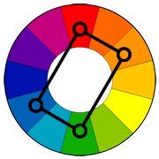
Tetradic Colours

The rectangle or tetradic color scheme uses four colors arranged into two complementary pairs. This rich color scheme offers plenty of possibilities for variation. Tetradic color schemes works bestwhen one colour is dominant.

Square

Square Colour Scheme

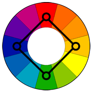
The square color scheme is similar to the rectangle, but with all four colors spaced evenly around the color circle.

monochromatic-300x300

Monochromatic Colours

The first way to achieve color harmony is through the use of monochromatic colors. It means that different tones, tints, shades of a single (mono) color (chromatic) are used. To achieve this, add more black, white or grey to a chosen color on the colour wheel. This creates a visually appealing image that is balanced. However, it may lack color contrast.

Visual Examples

Triadic Colours

triadic-harmony-650x650triadic-harmony8-650x650


Complementary Colours

direct-harmony6-650x650

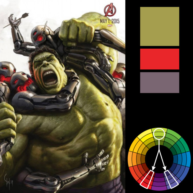
direct-harmony8-650x650

direct-harmony-650x650


Split Complementary Colours

split-harmony4-650x650

split-harmony-650x650


Analogous Colours

analogous-harmony6-650x650

analogous-harmony-650x650


Tetradic Colours

tetradic-harmony5-650x650

tetradic-harmony2-650x650

Sources:

Color Harmony: Why Hulk Wears Purple Pants

http://seeinginmacro.com/colors-in-photography-learn-how-to-achieve-color-harmony/

http://www.tigercolor.com/color-lab/color-theory/color-theory-intro.htm


Colour it up!

PSYCHOLOGY-OF-COLOR-INFOGRAPHIC-KCB-2014

Everybody has a favourite colour of their own. Colours make things interesting and appealing. Based on statistics as shown in the infographic above, majority of the consumers would purchase products based on the colours.


There are 6 different colours that appeals to consumers the most.

cocacola2

RED | Excitement, Youthful, Bold

Red is the color of excitement. It is one of the most popular brand colors and is iconic of some of the top companies around the world. Coca-Cola, Target, CNN and Pinterest all contain distinctly red logos.

The exuberance of this color makes it stand out and connects with people instantly. While the color can be seen as unstable, it is generally something people can relate to.

Red is also a popular choice among food manufacturers since the bold color is thought to help stimulate the appetite. Kellogg’s, Nabisco and Heinz all use red to help steer customers into buying their tasty offerings.


nick

ORANGE | Friendly, Cheerful, Confidence

Orange is a popular color for brands related to fun. The color exudes a warmth and friendliness that brands such as Nickelodeon and Crush soda have built on for years. The color is also cheerful and confident.


2000px-Facebook_New_Logo_(2015).svg

BLUE | Trust, Dependable, Strength

The most universally accepted color emotionally is blue. The color of dependability, trust and strength is used by businesses of all kinds.

Banks, retailers and auto makers rely on the color to make customers feel at ease. Healthcare companies also rely heavily on blue to gain the trust of patients and put them at ease.

Darker blues feel more solid and trustworthy, while lighter blue loses some of those associations while maintaining feelings of dependability.


backup-android

GREEN  | Peaceful, Growth, Health

There’s nothing more soothing and calming than taking a walk. That’s the emotional connection you get when you see green – the color of nature.

So it makes perfect sense that companies like Whole Foods, John Deere and Animal Planet use the color as a dominant hue in their logo and branding materials. It’s also of interest that green is also a popular color for gas and oil distributors, such as BP and Hess.

Green has also come to associate with some tech-based business as well – no doubt that the emotional connection to growth is an undercurrent. Android and Spotify both use bright greens.

While there is quite a large spectrum of green hues, the emotional connections are fairly consistent. It is worthwhile to note that lime green is very trendy and has been called the new neutral, and is being used with a variety of other colors.


National-Geographic-logo

YELLOW | Optimism, Clarity, Warmth

If you want to be associated with happiness and sunshine, yellow is your go-to color. While the color can be difficult to use in overall design schemes, it can make a great color for a logo. (Just be wary of yellow text.)

Brighter sunnier yellows are the happiest hues. While more golden yellows are thought to be richer. Yellow is thought to be a fast color as well and often implies some sort of movement.

Yellow is the color of optimism. This is not the color for a project that is depressing or unhappy.

When it comes to yellow, the color works best as a shape or background to text or another icon. Think to the yellow tag used as the Best Buy logo or the iconic National Geography rectangle.

References from: https://www.designcontest.com/blog/color-and-emotion/

Time for the Rhyme

In the previous post, I’ve researched and introduced several principles of design. Following which, I went on to applying and exploring these principles. Inspired by nursery rhymes, I put together different graphic elements into an art canvas.

With different compositions and the application of a few design principles, I came up with several artworks which I find some of them turned out to be pretty interesting.

I have taken more towards the approach of symmetry, leading lines and the Rule Of Thirds. I find them very pleasing to the eye and it catches my attention easily, which is the reason why I decided on this approach to adopt.

Here are some of the first few explorations I’ve made.

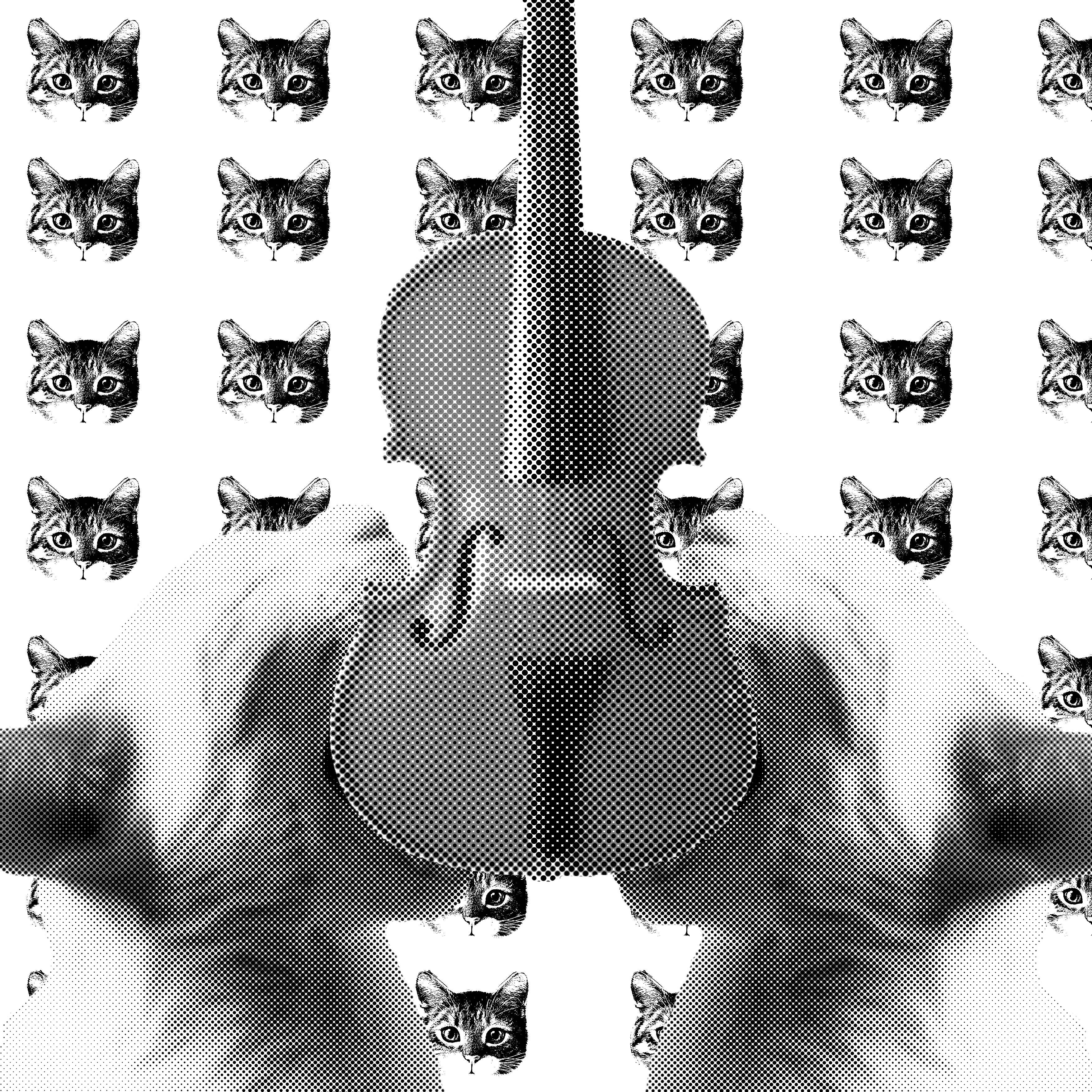
Cat and the FIddle

Hey Diddle Diddle! The Cat and The Fiddle

This would not be a good graphic image as the foreground appears to be blur after the post processing, while the background is very clear and sharp. This should not be the case.

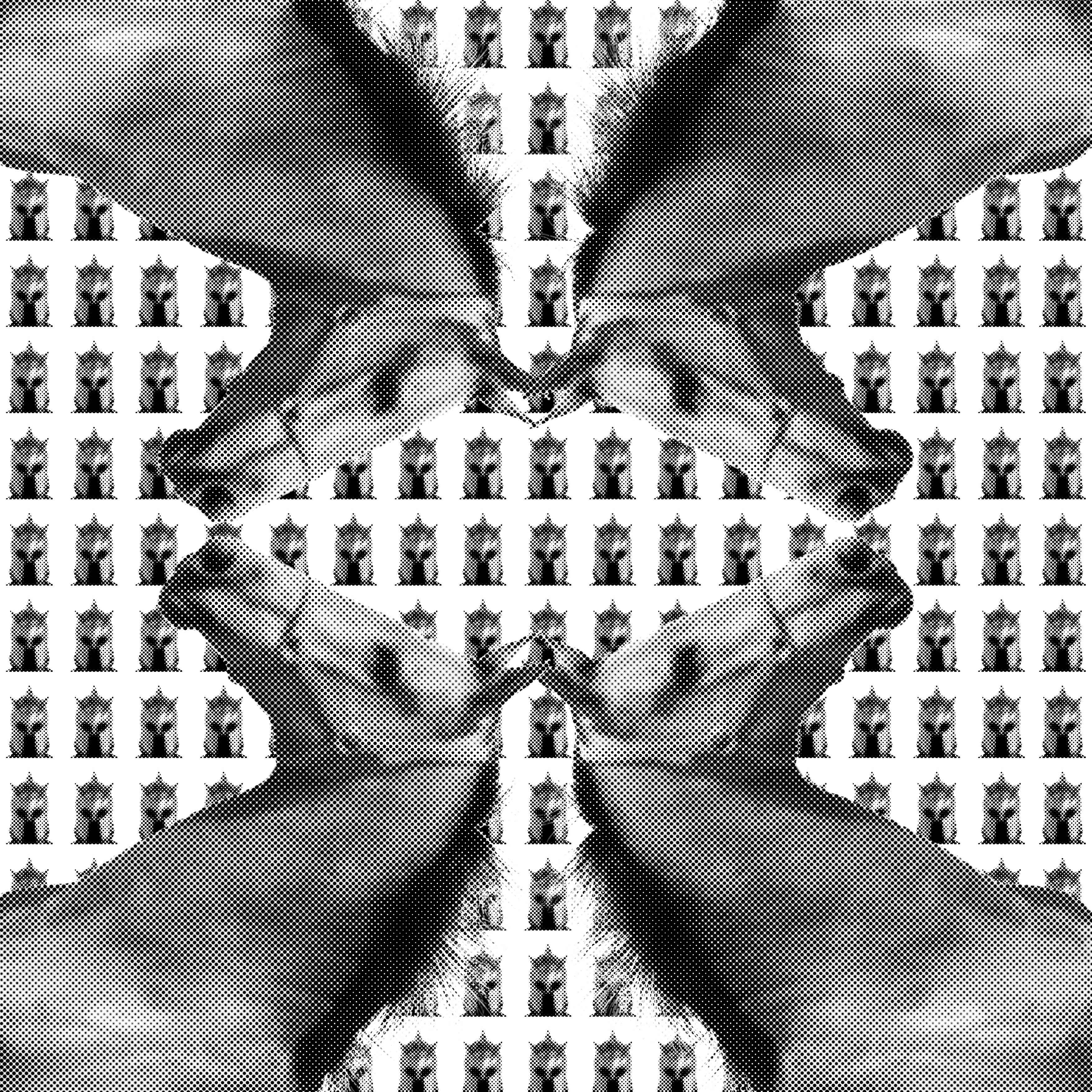
All the king horses and men

All the King’s horses and all the King’s men.

Initially I liked this image as I feel that it has a strong emphasis on the subject in context of the sentence of the rhyme. However, I feel that this image lacks of a variety of elements. The smaller illustrations are the same as the main subject. Therefore, it makes the image look flat and uninteresting.

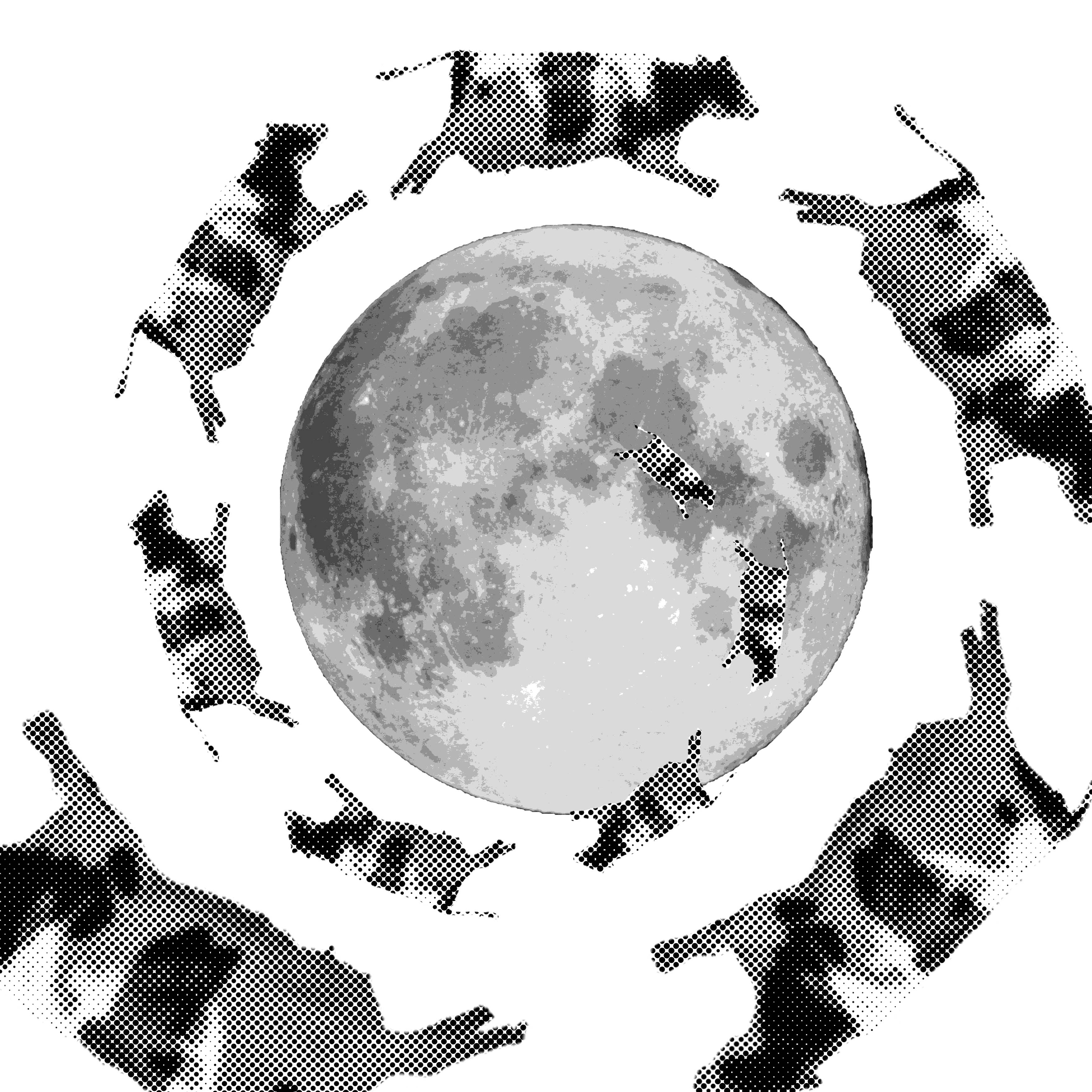
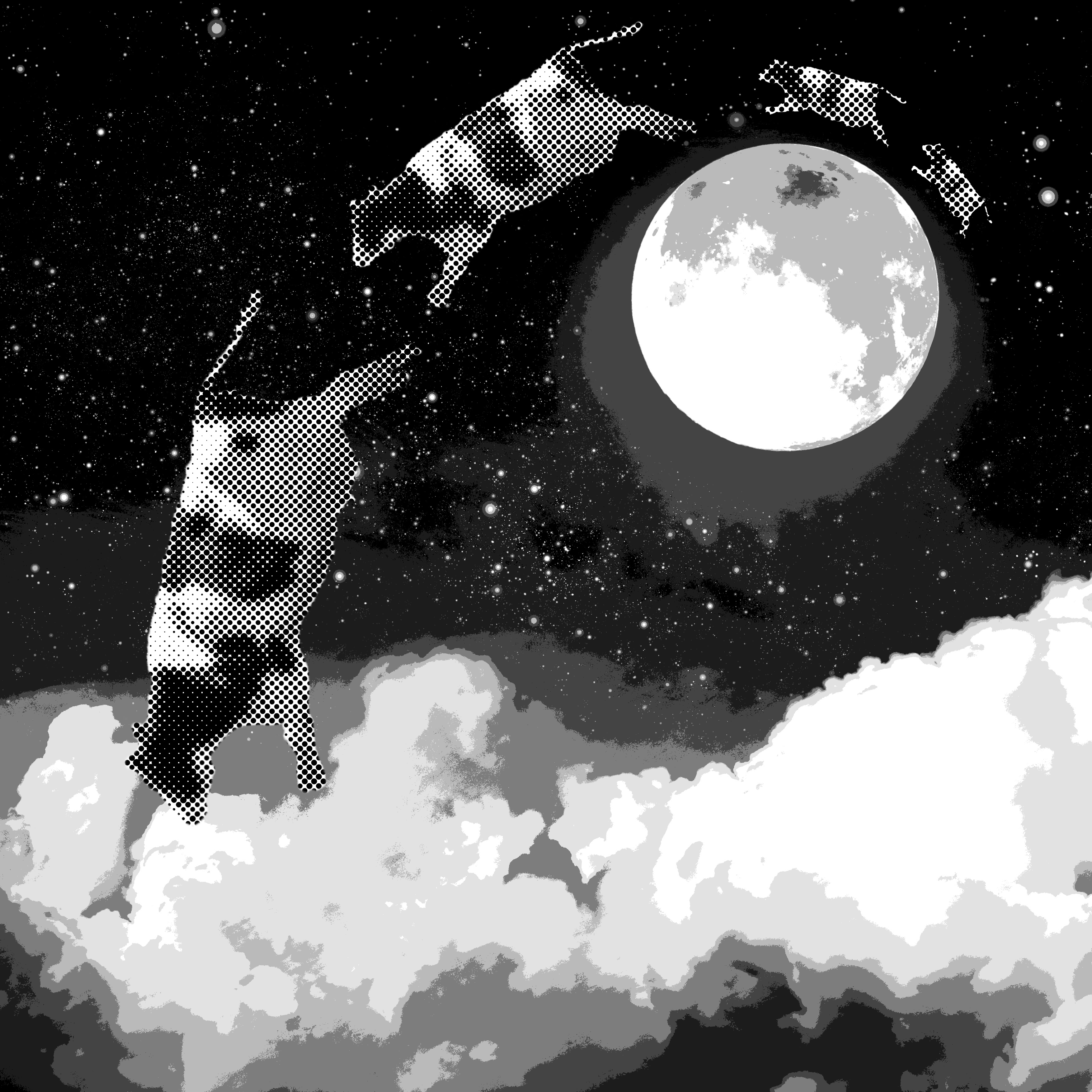
Cow Jump Over The Moon

The cow jumped over the moon.

This image is a good intepreation of leading lines. However, it looks plain and lacks context in showing more background instead of just the moon.

Humpty Duumpty On a Wall

Humpty Dumpty sat on the wall.

The framing of the image which shows Humpty Dumpty sitting on the wall is one thing i like about this composition. One thing that can be improved on this is having more perspective on the wall and Humpty Dumpty itself. This would make the image more dynamic and interesting.


After exploring on different sentences of the rhymes, I proceeded to explore more on bolder, out-of-the-box compositions. These are the final ones which i chosen for submission.

All the horses2

All the King’s horses and all the King’s men.

I have chosen this one to be my final piece is because I find that it falls safely in terms of composition and design principles. I also like how it turned out when I placed the horse heads on 4 different corners of the artboard.

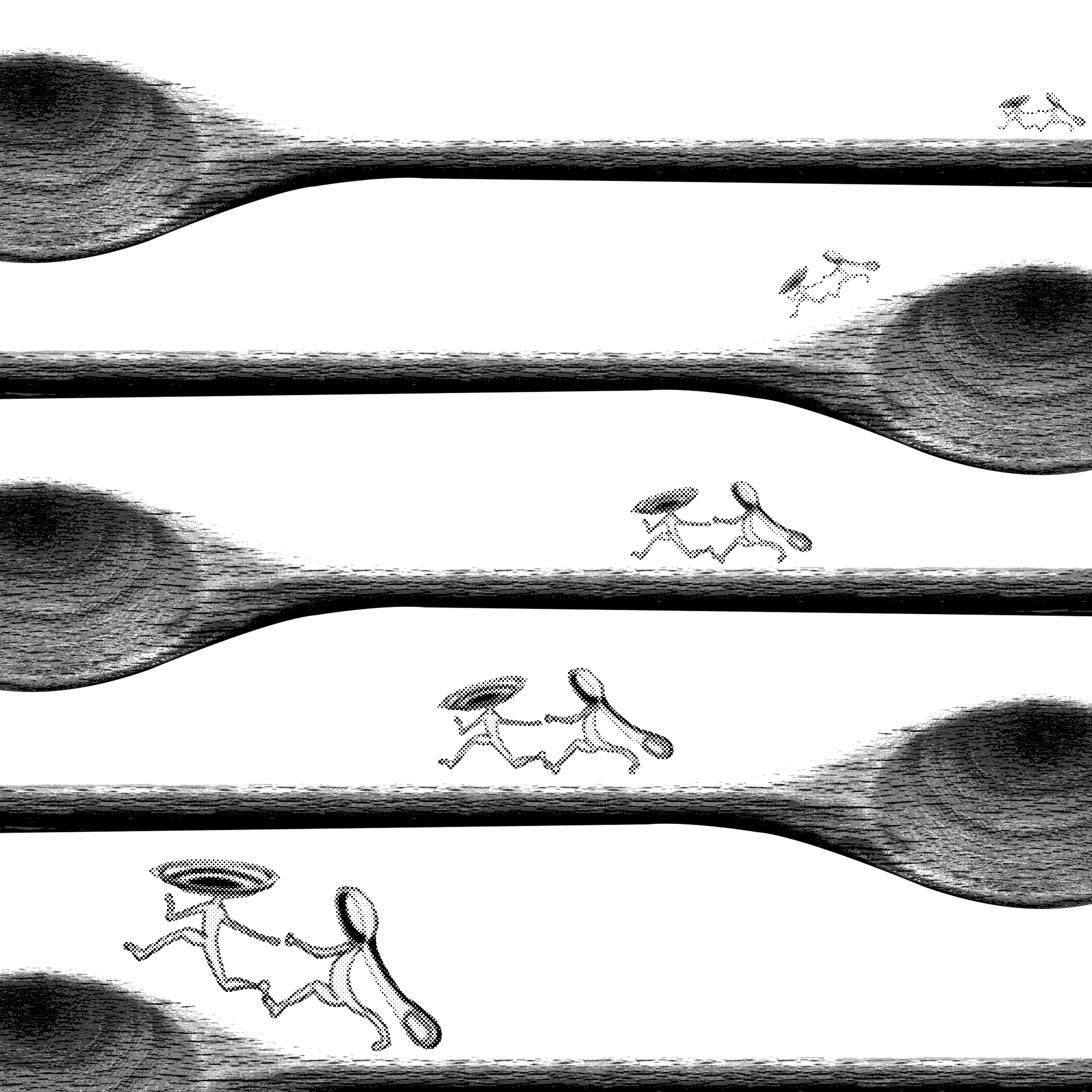
Spoon Run

And the dish ran away with the spoon.

The strong diagonals of the dish and the spoon runing is very interesting as it shows them getting clearer on each wooden spoon. It looks very simple and clean yet interesting.

Jump Over Moon2

The cow jumped over the moon.

As compared to the previous tryout which I have done, this image shows more context. Having a stronger background, the cow immediately blends into the background that shows not just the moon, but also clouds and stars.

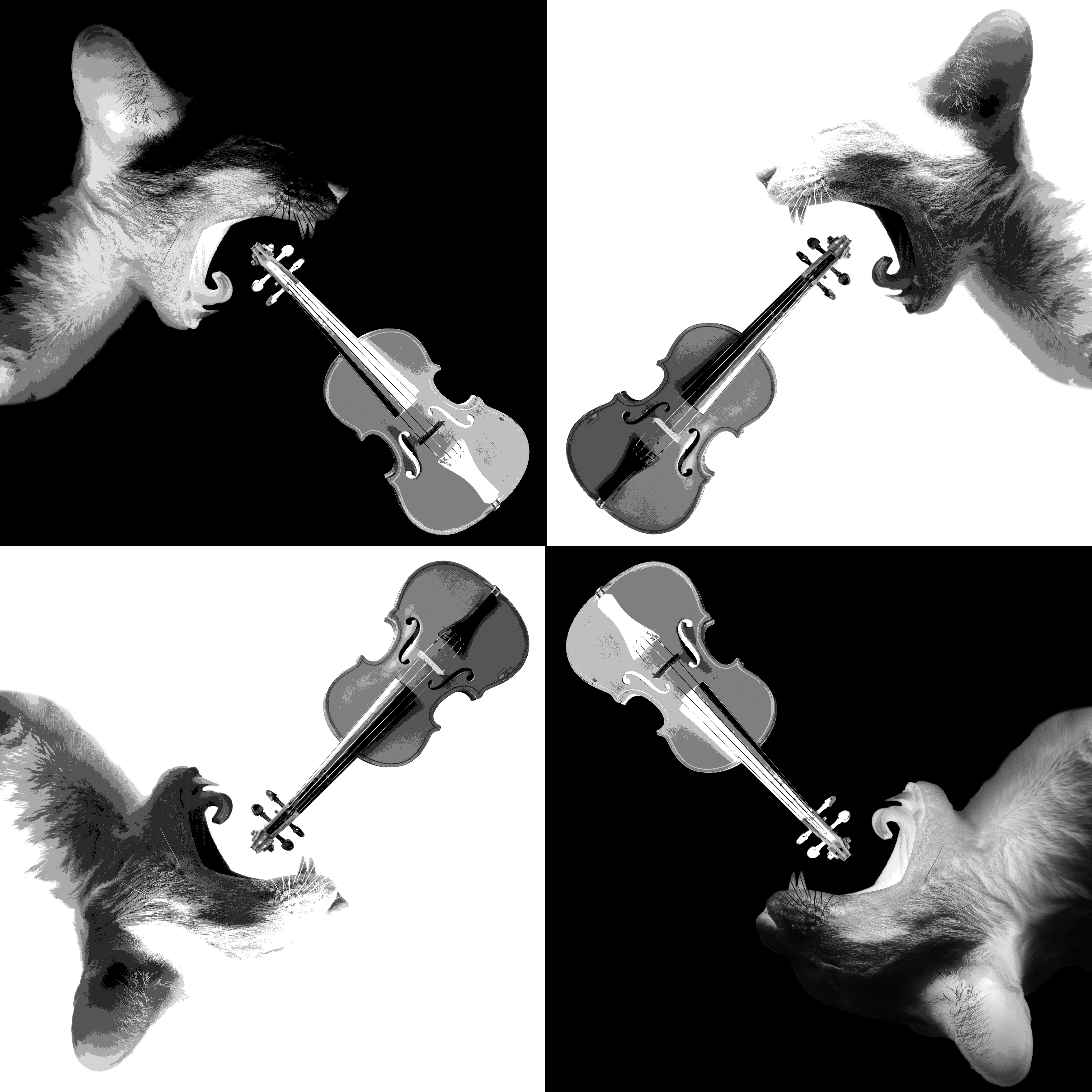
Cat and the FIddle

Hey Diddle Diddle! The Cat and the Fiddle.

Last but not least, playing with inverted grayscale is something new which I tried. I found that the inverted and normal grayscale image of the cat complements each other well, hence I decided to place them alternately and it did form an interesting composition afterall.

Through this project, I have learnt to think more creatively. By thinking out of the box, I am able to get results which are more unconventional which ultimately will make my work different from others.