Before starting on this project, I thought of what jobs i really wanted to be when i was younger and how it gradually changes along the way when i grew older due to the difficulties faced on achieving it along the way.
I shortlisted 5 jobs at the beginning which was:
- Dentist
- Cleaner
- Hairdresser
- Netballer
- Designer
DENTIST
I always wanted to be a dentist since young as i was never really afraid of going to the dentist and in fact, i actually like it a lot. Many kids would cry when they reach the Dental clinics but i would be a little excited every time cause i really like the smell of a dental clinic HAHAHAH. Also, i used to always pluck out my baby teeth myself when i was younger when it was of course, very shaky. Thus i took triple science in Secondary school and i realized that i can’t do science for nuts, however it didn’t really kill me yet as my results were still acceptable. Only until i entered JC and i stubbornly continued taking Biology and Chemistry which i knew i couldn’t take it anymore as I’ve been failing very badly throughout my 2 years. It was too much content and i really couldn’t absorb any of it.
Due to all these failures i faced, i got really demoralized at a point of time when i really wanted to give up which brings me to my next job.
CLEANER
There is a sterotypical way of thinking that if you don’t study well, you would end up being a cleaner as you don’t need any qualifications to do this job. Thus, for a period, i was really afraid that i would end up as a cleaner or a road sweeper due to all the failures I had after taking science all my life.
HAIRDRESSER
However, to persuade myself that i could actually get a proper job, i thought of an easy way out to my failures. I could just take up a hairdressing course in other schools and just take over my dad’s shop since he owns a salon himself. Therefore, my third job is a hairdresser. Which was something very interesting and new to me.
NETBALLER
Or maybe i thought that since i am bad at science and studying, i decided to focus on what i am actually pretty good at which is playing sports in particular Netball. However, a job that i can think of for being a good netballer is just simply representing the country for it and making into the National team which i never pursued due to my studies.
DESIGNER
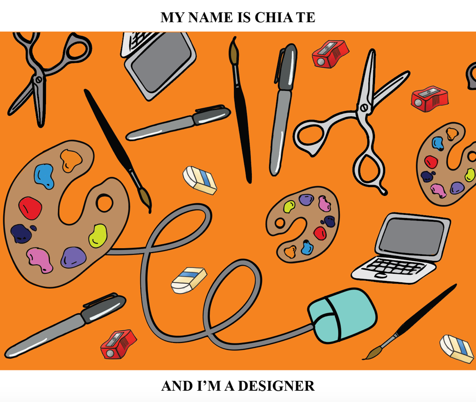
Lastly, after all the failures and difficulties faced along the way, i still got into a local university and studied something i always had a interest in but never thought of pursuing further since i do not have a strong background for Arts. However, everything somehow worked out and i am in ADM now, thus, a job i want to be now would be a designer.
IDEATION:
In the end, i decided to leave out the job as a netballer and chose the other four jobs: Dentist, Cleaner, Hairdresser and Designer for this project.
As i brainstormed on how i wanted to illustrated the jobs out, it was tough thinking of how to incorporate initials of my name into the compositions as well. Then i decided to go with a cheeky and happy approach to this project since its something that i wanted to be and i was young and how it gradually changes along the way. Therefore, i wanted to use bright colours for all the 4 compositions and somehow link them together since it is pretty much a short story of my life.
An approach i really want to take was to have a repetition of a tool that is required in the job to represent the job-
For example Dentist, teeth and some other tools could be used. Hairdresser, scissors, comb?
I also sketch out some of the tools, thinking how to link them from one composition to another to make all of them to have a similar tone to all the compositions.

Also, i wanted to do a full on digital to try to experiment on Ai and photoshop since i have never learn them before. I a decided to draw out on a wacom for all the equipments.
I started with the Dentist composition and it turned out something like this at first:

However, after the first consultations, Joy suggested that i don’t add any text into the compositions and instead use the tools to form out my name.

Before adding colours to it.

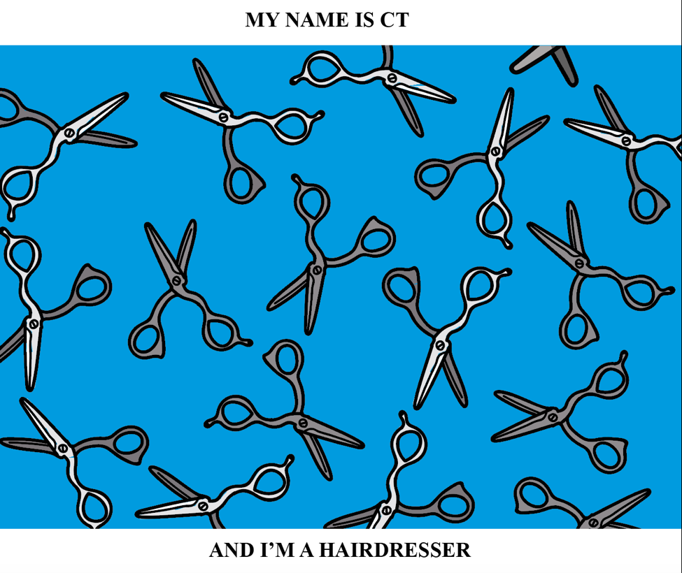
Making use of the whites from the scissors by playing with colours to bring out the initials “CT”.
Next, another difficulty i faced was the colour i should use for the compositions. I wanted the Dentist job to be bright then it fades for the cleaner job, increase in the brightness of the colour again for the hairdresser and for the designer, it will be bright and clear. Then i decided to find some artist reference i could use for the colours.
- Keith Haring:


I really how he uses contrasting colours to bring out the subject making it look very fun and happy.
2. Andy Warhol


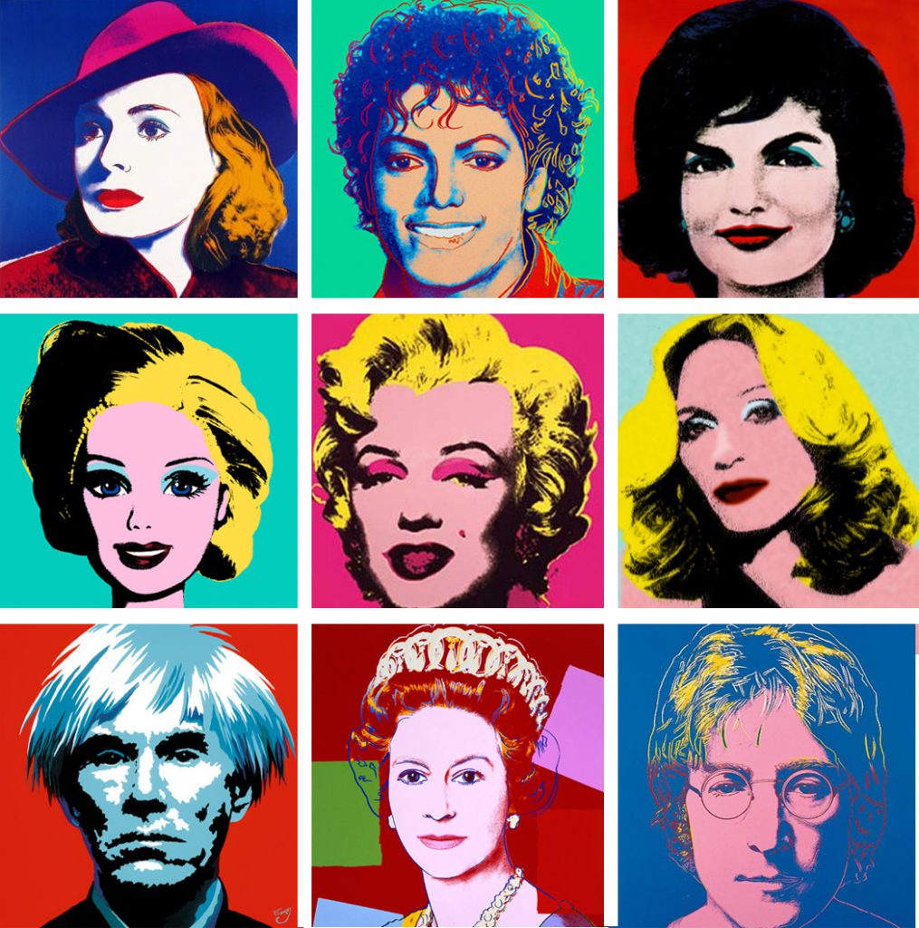
Andy Warhol uses more of the pop-art techniques which was effective as well in bringing out the content to the eyes.
I got inspired by all of these pictures and decided to use split complimentary colours for my compositions but i have yet to think about which colours until the last part.

The thought of how to link such tools was another big problem cause i wanted all my 4 compositions to be close together showing how each job evolved into another through the tools.

Whether the compositions should be placed into one straight line or a rectangle (2 at the top, 2 on the bottom) was another consideration i had in mind. As i continued to work on the dentist composition, i decided to incorporate my name in this way:

The mirror tool makes out “TE”. 🙂
For the other compositions i was thinking of a way to insert my name as for this kind of repetition composition, it is best if the words don’t have many letters or it would be too complicated.
Names: Chia Te, Te, CT, Chia, 21? (my favourite no.)
I scraped the idea of my chinese name as it was too much strokes to it and it would definitely make the composition very messy.
These are parts of my process mainly only for the first two compositions and i’ll have another post on my final compositions! 🙂 Thanks for reading!!


