Task 3: Colour Explorations & Final Design

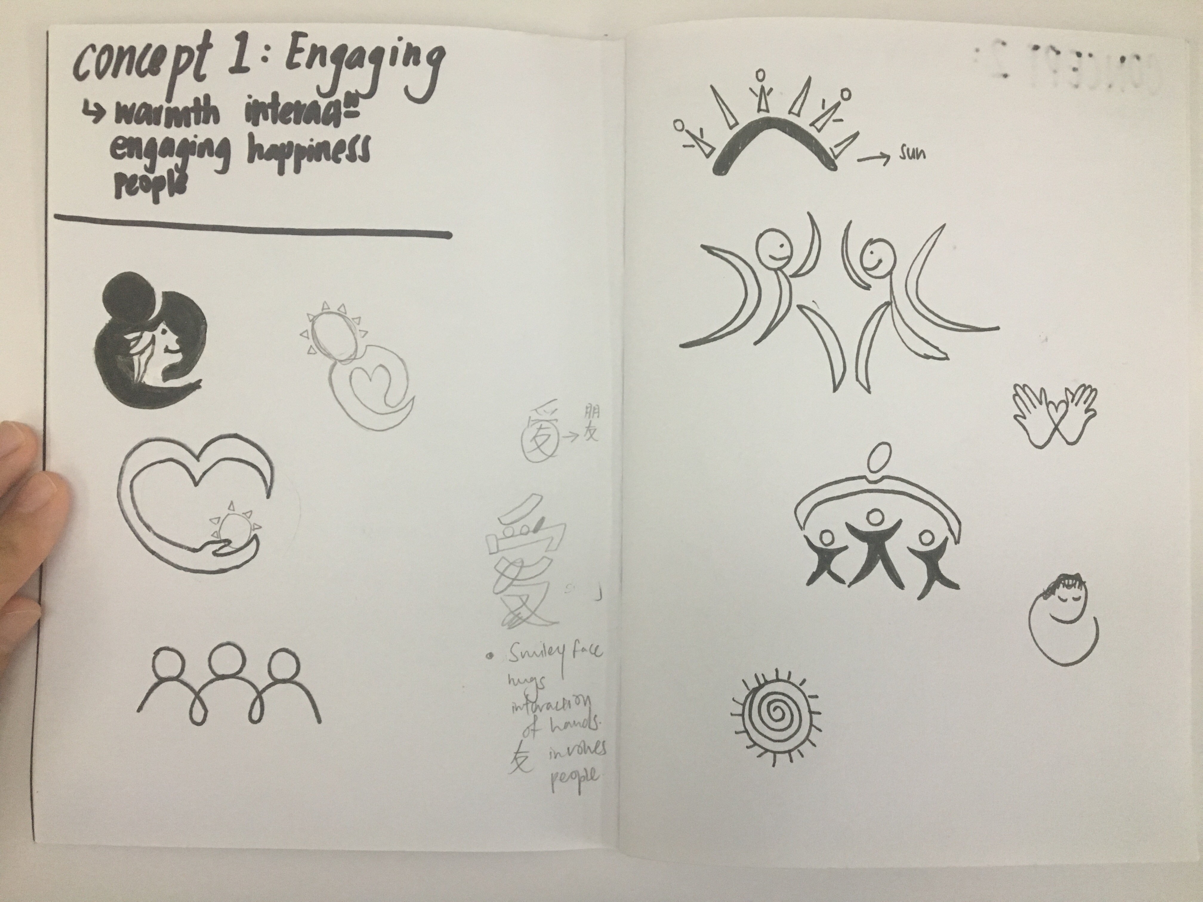
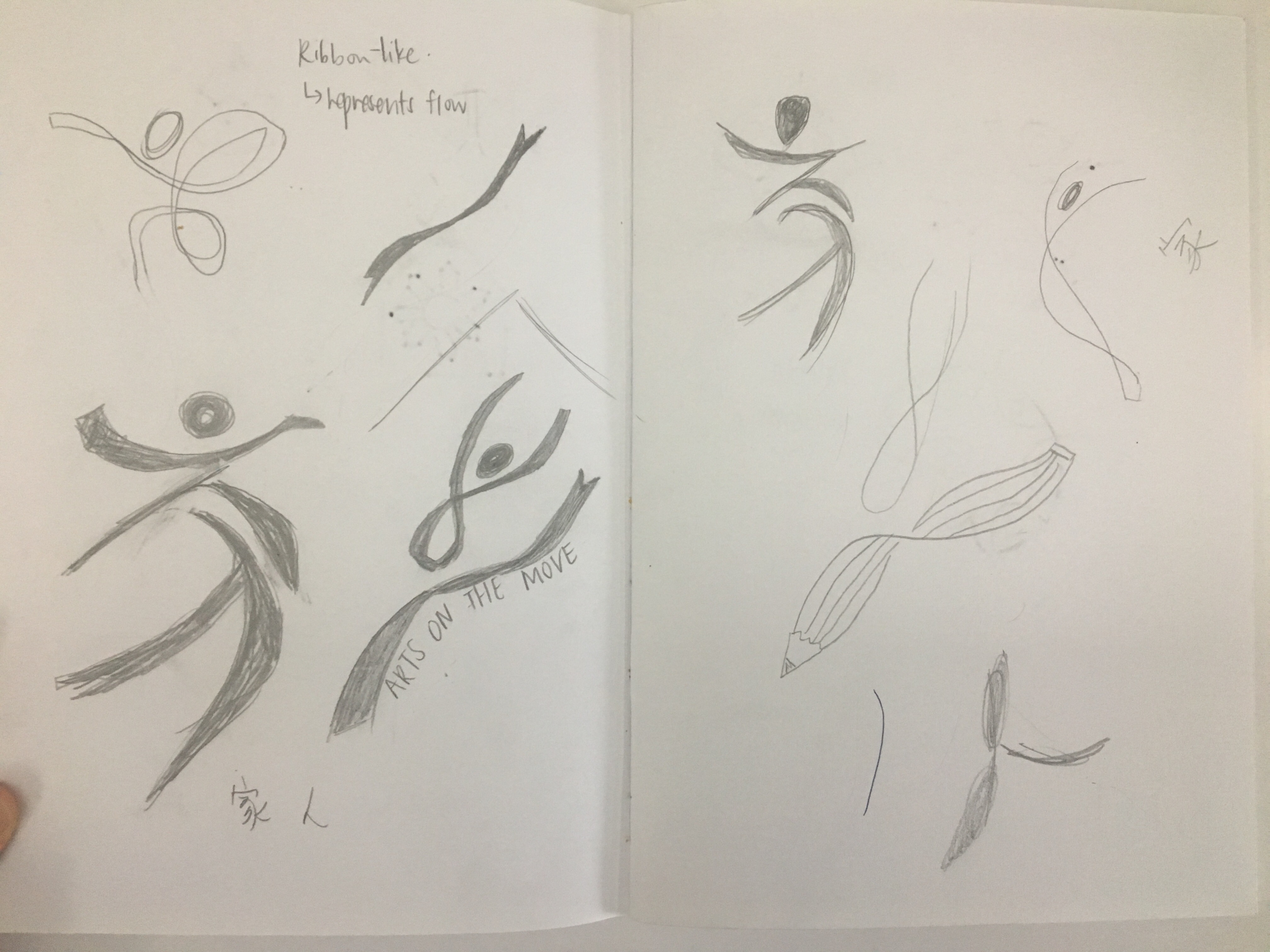
After the last lesson where we had some feedback on our chosen logo, I decided to go with the same logo, but refining the visual weight for some of lines and also to work on the where i should put the words “Art On The Move” in the badge. 

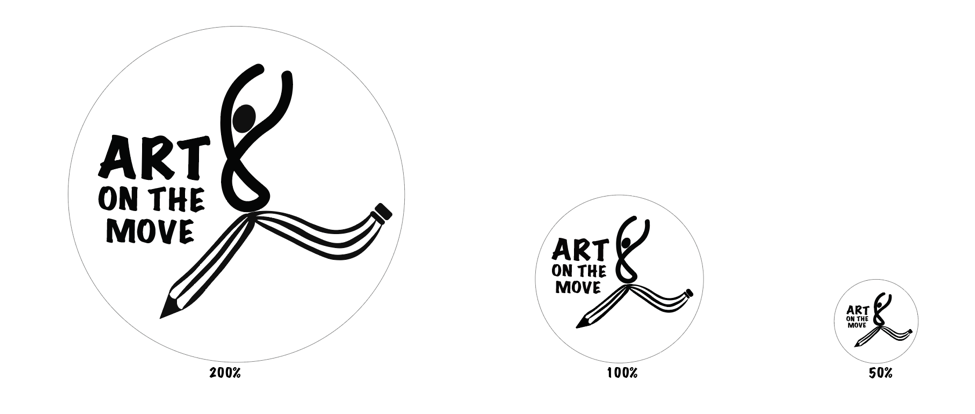
This was my first attempt, and as mentioned, the feedback was that from a far, the lines were not distinct and the wordings were slightly awkward.
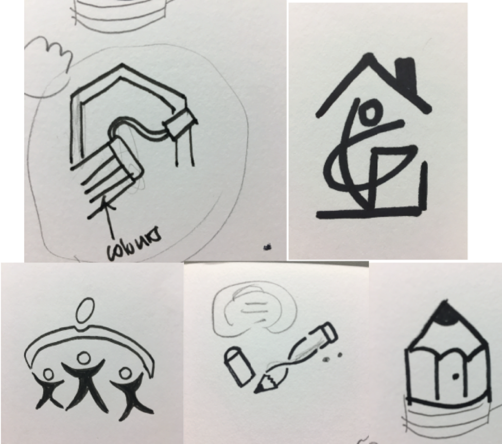
Michael mentioned that i could look at the 50% size and derive the shape of the pencil to incorporate it into the 100% one to add more visual weight. Hence i tried that and added colours after.

COLOUR EXPLORATIONS:

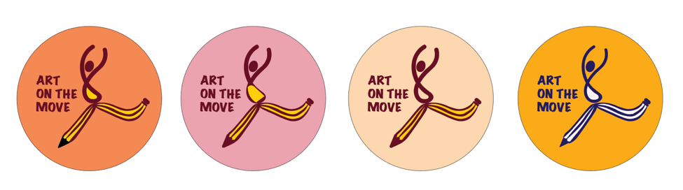
I wanted to explore warmer tones to show the sense of warmth through the button badge hence my colours are all within yellow-orange-darker shades of pink-red-maroon. It was pretty tough for me to choose a colour that allows the figure to stand out. Besides for the background of the badge, i mainly wanted it to be complementary to the turquoise vest that the volunteers would be wearing hence i chose the orange-y shade as shown below with the vest colour.
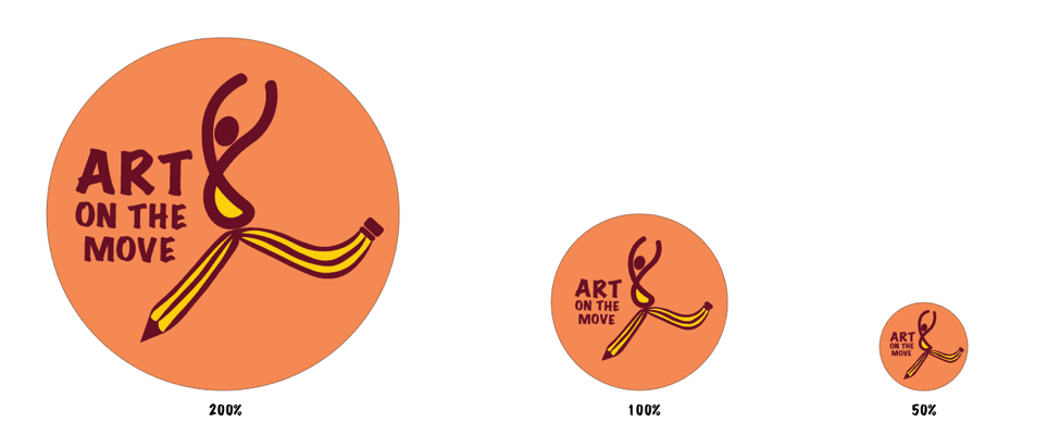
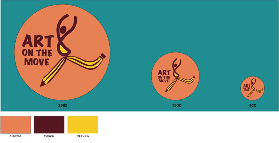
FINAL DESIGN:
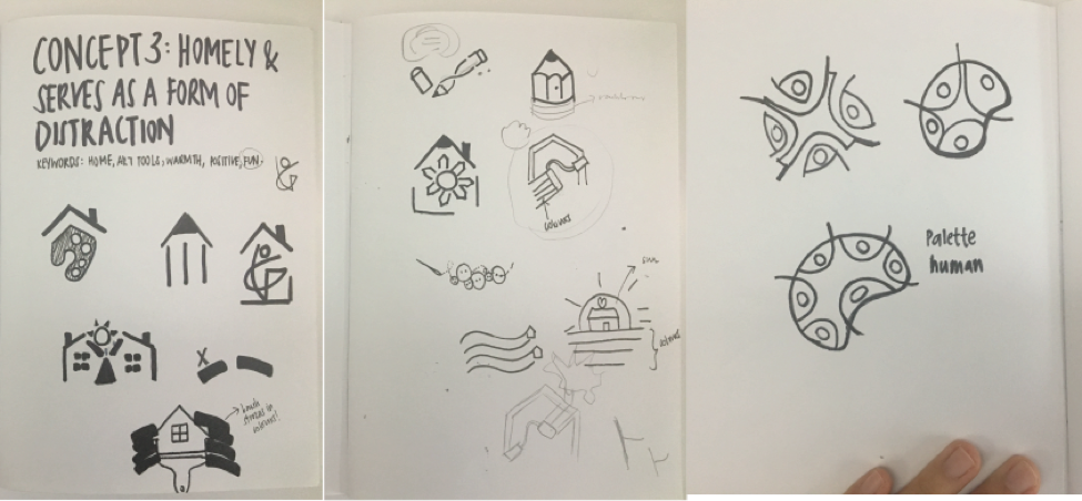
My final design is a improved version of my third concept which is to show homeliness which serves as a form of distraction for the patients. I feel that this “Art On The Move” programme is mainly set up to allow patients to have fun where they could direct their thoughts away from the feeling people normally get when they are sick. Hence, people (Volunteers & Nurses) are around to take care of them and allow them to relieve their stressful mind by doing Art & Crafts. People, who plays and important roles to patients are represented through this logo i have design, which shows the chinese character “人” which is people in Chinese. To give some flow and movement to the person in the logo, i decided to depict him in a form where he looks like he’s rejoicing and having fun, leaping around. Hence, his legs are wide apart which is represented in a form of a twisted pencil. To balance out the slightly tilted figure, i decided to add the words on the left side of the person instead of being at the bottom of the legs. Also, I specifically emphasized the word “ART” and “MOVE” since this programme is indeed about doing art in many different ways.
Lastly, as for the colours, i chose maroon and yellow as they are both on the warmer side which conveys my concept of the warmth brought to the patients to let them know that there are people who care for them. Maroon signifies sacrifice and bravery and yellow signifies hope, happiness & positivity. These are mainly the traits of the volunteers and what this programme aims to achieve. 


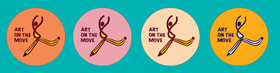
Representation of badge as seen when placed on the turquoise vest.


Task 2: Translating & Exploring Design

From the 3 concepts we have chosen, we were suppose to do at least 30sketches and these are some of the sketches i did:

Concept 1: Engaging

Concept 2: Crafty & Fun

Concept 3:

These are some i really liked:

Thus, i decided to do a slight change to Concept 3 which is to allow patients to feel homely at the hospital so as to serve as a form of distraction. The keywords included are home, art tools/materials, warmth, people and fun. I really wanted to do something that is dynamic to represent fun hence i did some sketches to see how i can play with the art materials and a person, to allow it to be relevant to “Art On The Move”.
This leads me to a design which shows fun and freedom which brings back to my concept of serving as a form of distraction to the patients through this programme and how they can not only have fun through art and how they can interact with people. My final logo i have chosen and the colours i chose will be documented in the next post! 🙂


Task 1: Information gathering and idea generating

Observation Notes:
During our visit to Ng Teng Fong General Hospital last week, I realized that this particular hospital does not look like other hospitals such as KK hospital/ SGH. Instead of just having posters and some banners from the health promotion board, they actually include different artworks from various local artist and even artworks done by their patients such as the corner with batik paintings. I feel that it is a very good way to allow patients to be involved in these art activities which also helps in transforming the hospital into a more comfortable place for the patients. 

“Art on the move” aims to create a healing environment for our patients through art and craft. Thus, the aim of this project is to develop a logo design for this programme and apply it on button badges which will be worn by the volunteers. The design of the badge should represents the spirit and mission of the programme and volunteers where it appeals to volunteers so that they can collect these badges and feel a sense of achievement.

Brain Storming
List of words that reflects the programme and volunteers:
Connection, dynamic, imagination, transformational, community, interaction, inspiration, care, warmth, fun, exciting, surprise, active, engaging, colours, healing, hands-on, companion, freedom, friendly.

Design Short list & Rationale

CONCEPT 1: ENGAGING
To depict how volunteers could really engage with patients and allow them to feel a sense of longing and make the patients feel comfortable and happy despite being in the hospital which can be very boring and lonely without any companion.

Keywords: Warmth, engaging, people, interaction, happiness

Mood Board:

CONCEPT 2: CRAFTY & FUN

Since the Art on the Move mainly focuses on art and craft, i was thinking to incorporate fun into the activities that the patients do in the hospital. Also, since most of the activities would be hands-on, i would like to include hand/hands as well. Therefore this concept would include a range of bright colours and shapes similar to the coloured papers they use to make origami  and papercuts which i want to include into the logos for a more abstract and crafty look.

keywords: Colours, Papercuts, creativity, shapes, hands/hand

MOOD BOARD:

CONCEPT 3:HOMELY & IT SERVES AS A FORM OF DISTRACTION

The fact that being a patient is already not exactly a good thing, the hospital needs to be a comfortable and homely place for the patients. By having the programme Art on the Move, patients are able to do craft work which serves as a form of distraction and allow them to have fun while doing them instead of having the depressed feeling that they are at the hospital with nothing to do for them to occupy their time. 

Keywords: Home, Art tools (paint, pencil, markers etc), warmth, Positive, Fun

MOOD BOARD: