Week 5 – 11 February 2016
Hello there! ^^
Next week is our first Foundation 2D presentation of semester 2!
Can’t wait to learn from my classmates project!
Similar to last week, today entry focus on the Work-In-Progress. ??
Part 1: Creating the Setting.
As learnt from my previous OSS entry, my composition will involve the use of 3 layers.
1) Background
2) Animalistic Typography (To be Printed on Transparent Sheet)
3) Silt Panel
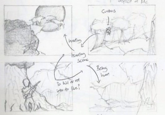
This is my initial 6-Panel concept.

Followed by the edited 4-Panel concept.
Proceeding with the edited concept, I created a landscape design with Photoshop.
Refer to below illustration.

In the informal critique last week, I was recommended to decrease the Saturation of the ‘Split-Complementary’ colours so that it lower the chances of interfering with the Animalistic Typography (2nd Panel). The result is shown above in Version 3.
However, I was struggling with this background design because it does not seems as ‘Realistic‘ as I wanted it to be. ? I tried positioning the ‘Animals’ – I have in mind for this project, to fit in a actual wilderness situation. I placed the animals in their respective position and Eureka! *Ding!* I finally know the reason why!! ?
 In the background design above, assuming the distance from the Wolf and the Deer are 5Km apart, there are various explanation that the placement is not logical. ?
Firstly, the wolf could have died speeding along the way. (Mountain have sharp edges.) ?
Secondly, with reference to the distance, the Wolf could probably look for other closer preys to hunt. ?
Thirdly, the deer could have been kill by ‘other’ animals instead ?
Lastly, the wolf is too small to be recognized. (Considering Audience View)
Hence, designing a background isn’t as easy as it seems!
I have to create it in a way that not only it looks presentable, it must be logical as well.
(& I went to watch National Geo Wild to get inspiration for the background concept.) ?
To further develop on my concept, June provided me with valuable insights as to work towards a ‘more’ realistic background design. She browse through my Visual Journal and found out that my ‘Initial Idea’ could actually be workable. ??
Having gain back more confident, I went to design the background with the software I’m most familiar with – Photoshop CS4. But I struggle once again, unable to create a desire background…
I told myself, I have no other choice.. Adobe Illustrator CS4 is my Last Resort!
Part 2: Panel 1 (Orangutan)
Moving on, I went to execute my very first ‘Animalistic Typographic‘ with the animation effect.
The animation design element was surprisingly new to me, because I’ve never done any form of animation before. This was rather risky for me but but but! I have to get this done! It may be challenging for me but I’m not letting it discourage me! ??
To start off, the design process involve the sketching phase.
With reference to my reference artists: Dan Fleming, Casey Girard and Marcus Reed. (Animal Typography)
and ‘Fun’ typography I refer to was Chris LaBrooy (Use of Setting)
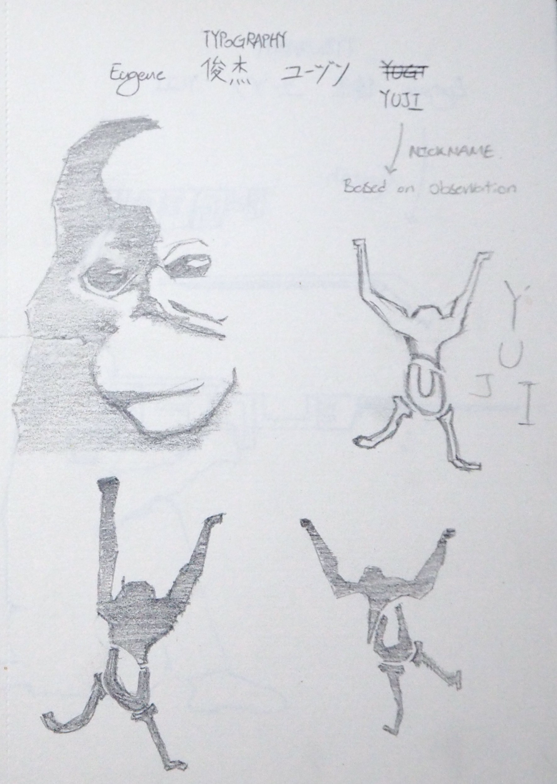
Refer to below for Orangutan ‘Animalistic Typographic’ Sketch.
Basically, I broken down the Orangutan into 4 sections.
The Orangutan was formed by my nickname: ‘YUJI‘
With ‘Y = Arms & Head’, ‘U = Lower part of body’, ‘J = Left Leg’ and ‘I = Right Leg’.
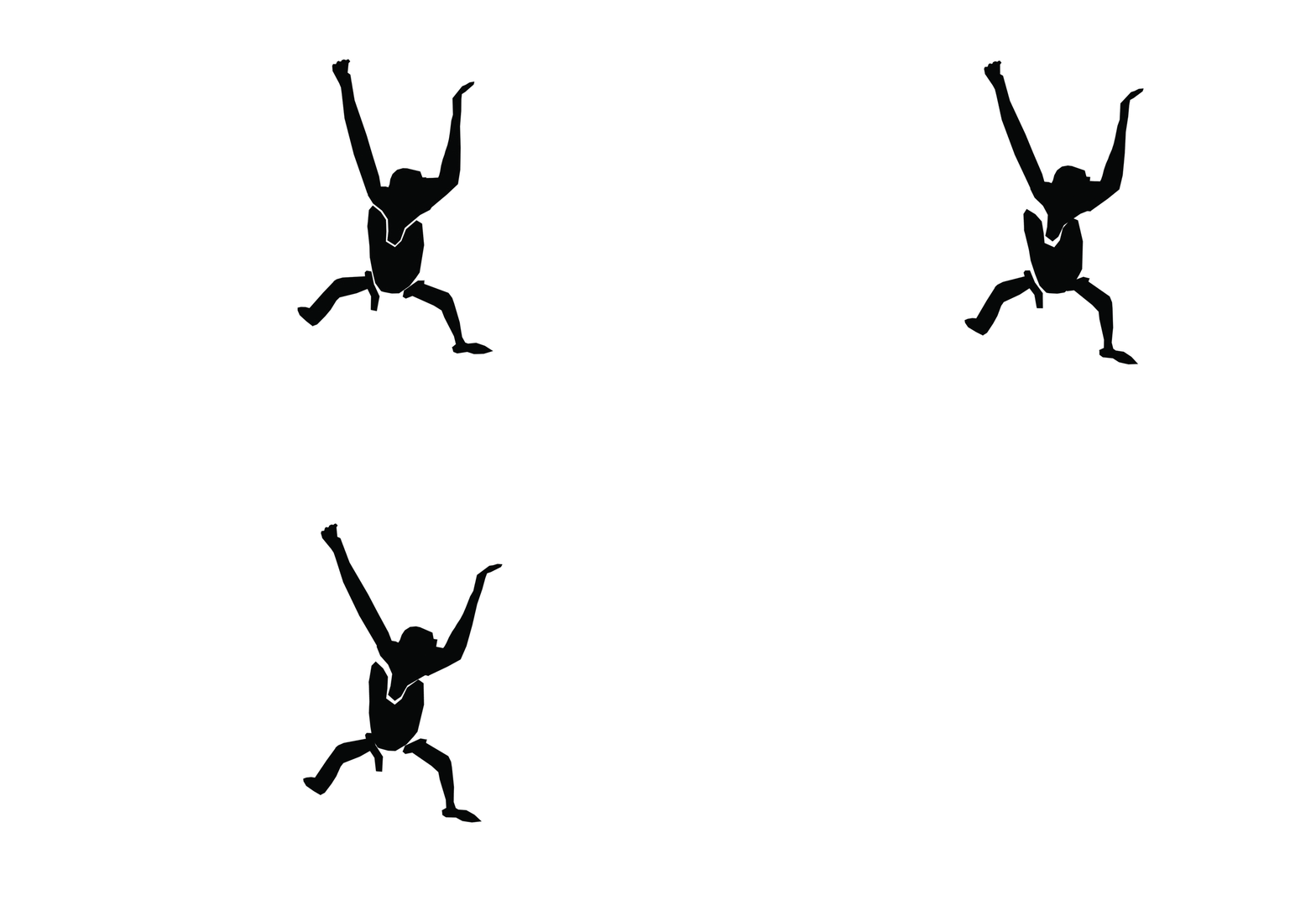
Later, I edited it in Photoshop (Frame by Frame) to give the silhouette a animation effect.
Refer to image below.
And! Here’s a video! ^^
Please note that the materials used in the above video is a draft and not for the final presentation.
(I smudge the ink on the Orangutan, and the Silt panel isn’t in it’s best form.)
I also tried out other types of transparent plastic sheets that I can find from Popular Bookstore, doing a ‘Trial and Error’ once again, let’s see which plastic sheets are the best! Can recommend to classmates if they require it for their future projects. ?
With reference to ‘NATURE‘, I pay attention on the movement of Orangutan between trees too!
Here’s a video from Youtube that explain how Orangutans swing from tree to tree.
Part 3: Visual Journal
Last but not least, let me bring you through my update for Week 4 Visual Journal entry. ?
Week 4 entries focuses on the character development.
As I was drawing the animal, I try to depict them in the best literal form as possible.
So you may be curious why am I doing as part of the composition? ?
I was inspired by Raffaello Sanzio da Urbino – The school of Athens, where he painted himself in the composition. Hehe! ^^
But of course, placing myself as a subject in the composition narrates a story as well! ?
So stay tune for my presentation next week! ^^
On the side note,
I discussed and presented my ideas to some of my previous Classmates.
In the meantime, improving on my presentation and gather intakes from them.
Ziyaard, Vimal and Hsien Wei are pleased with my brief presentation and Andrew threaten to shred my Visual Journal. ? Haha^^
Alright! That marks the end of this week post.
See you next week!


