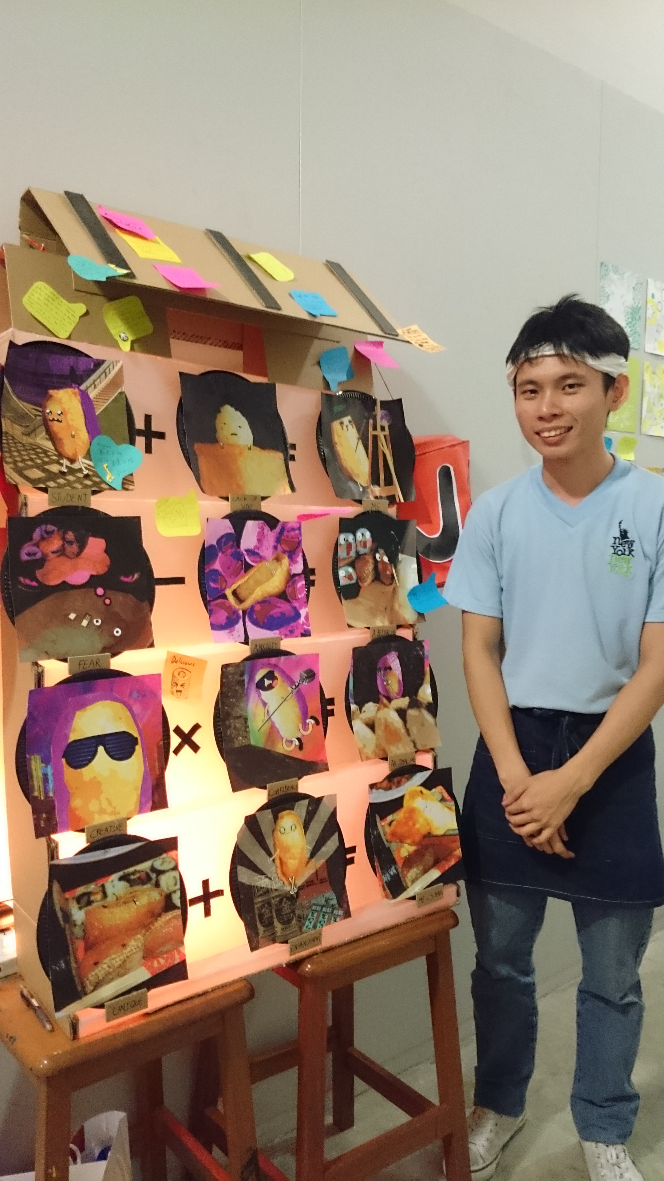
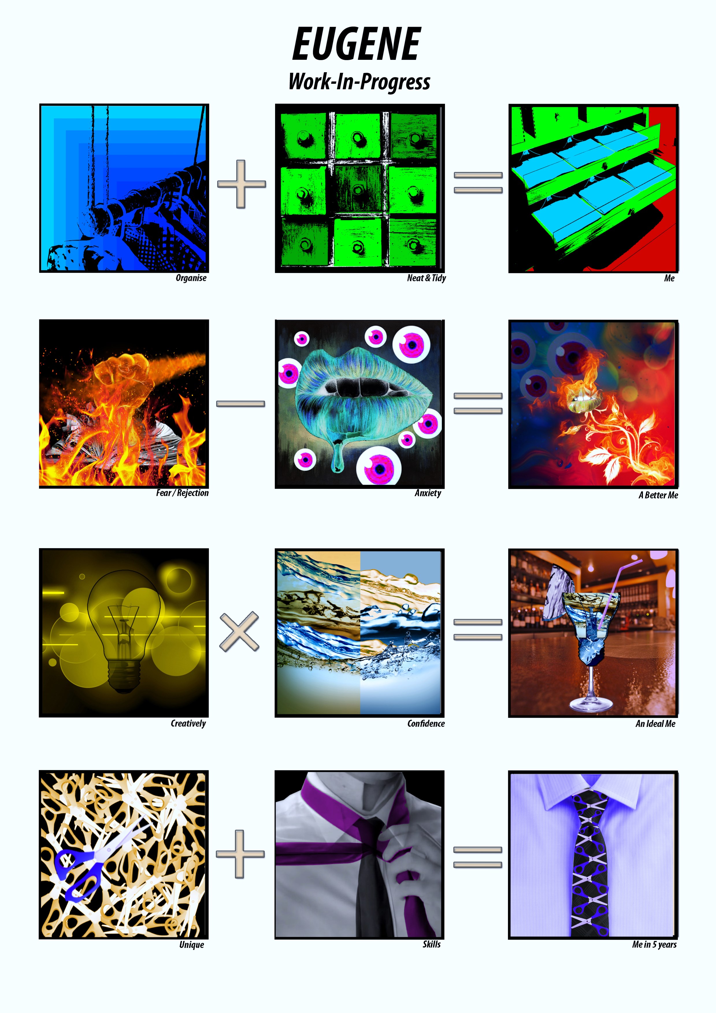
Foundation 2D Project 3 – Ego (Final)

いらっしゃいませ!
Welcome!
私の店への歓迎。
Welcome, to my shop!
私のプレゼンテーションを聞いてくれてありがとう、感謝!
Thank you for listening to my presentation, appreciated!
ユージン Yuji
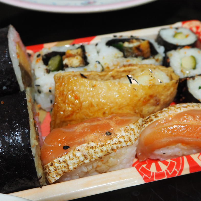
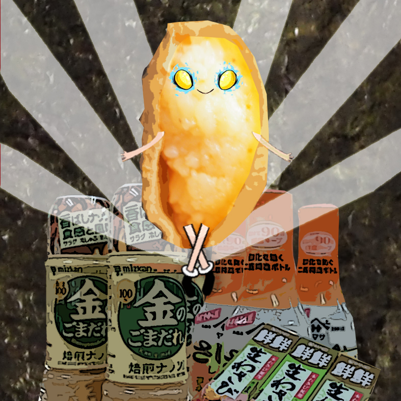
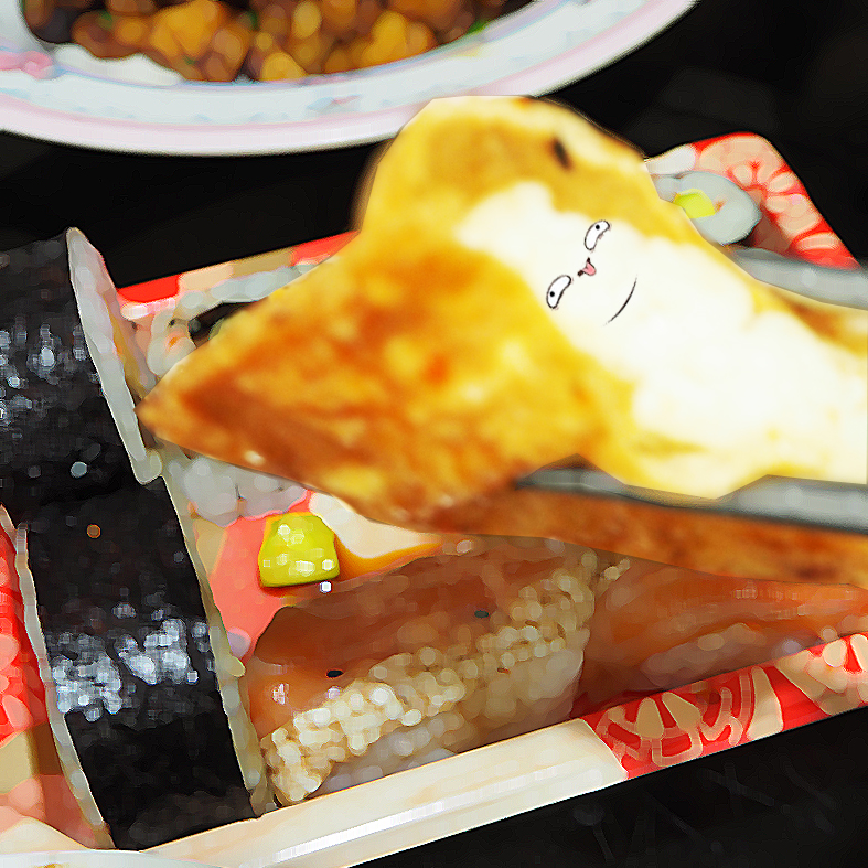
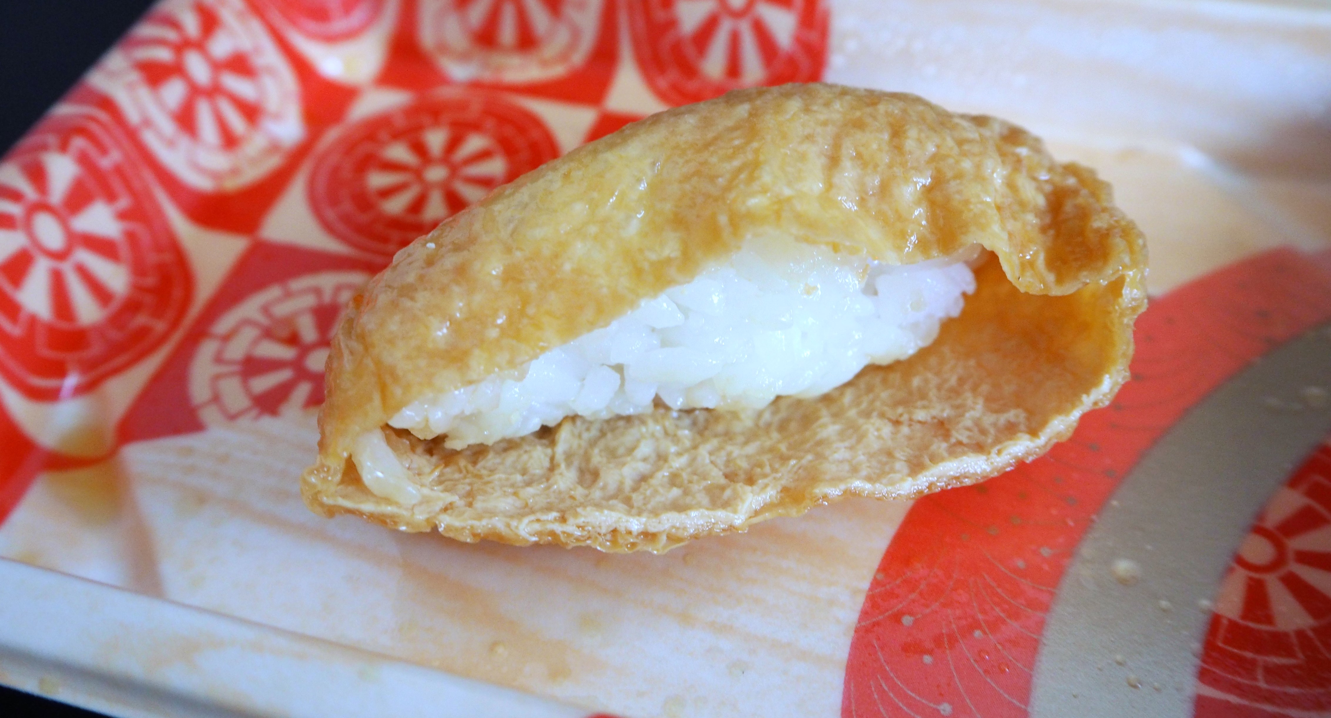
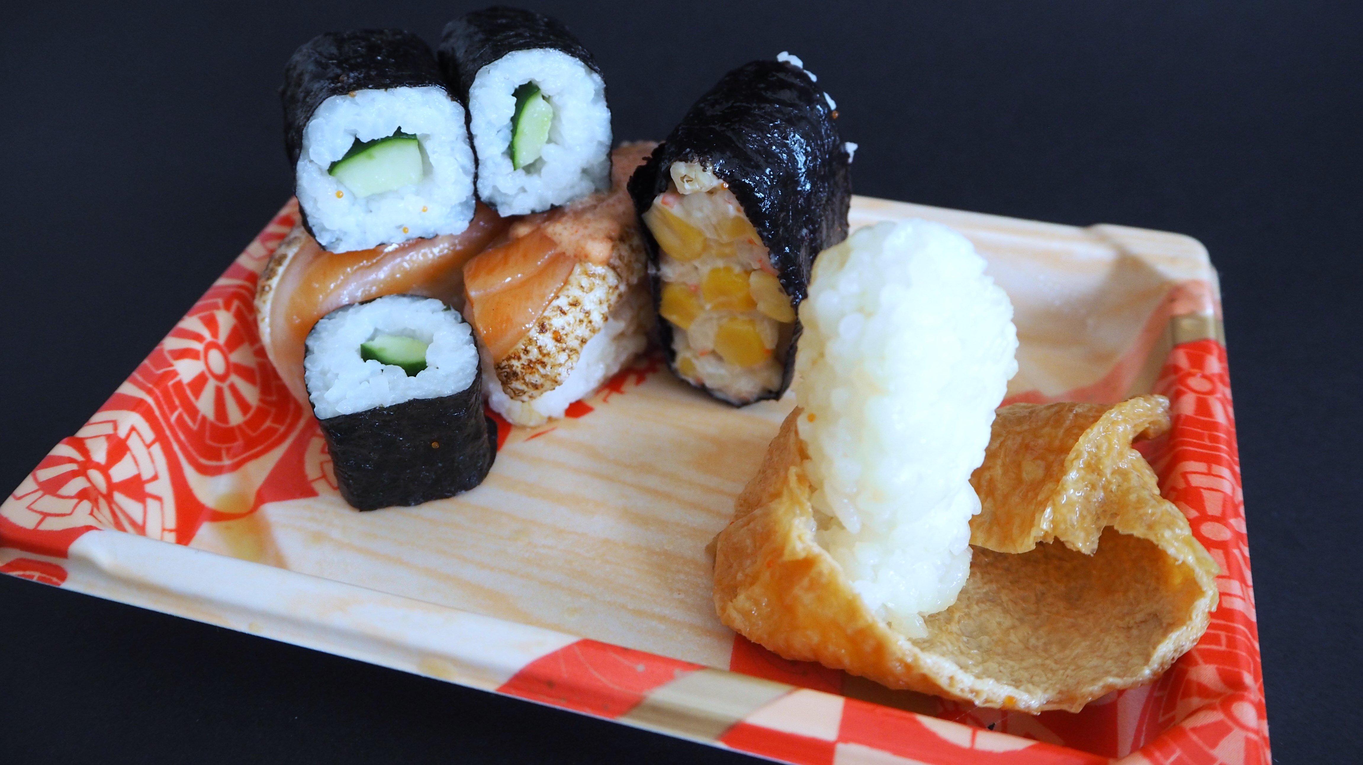
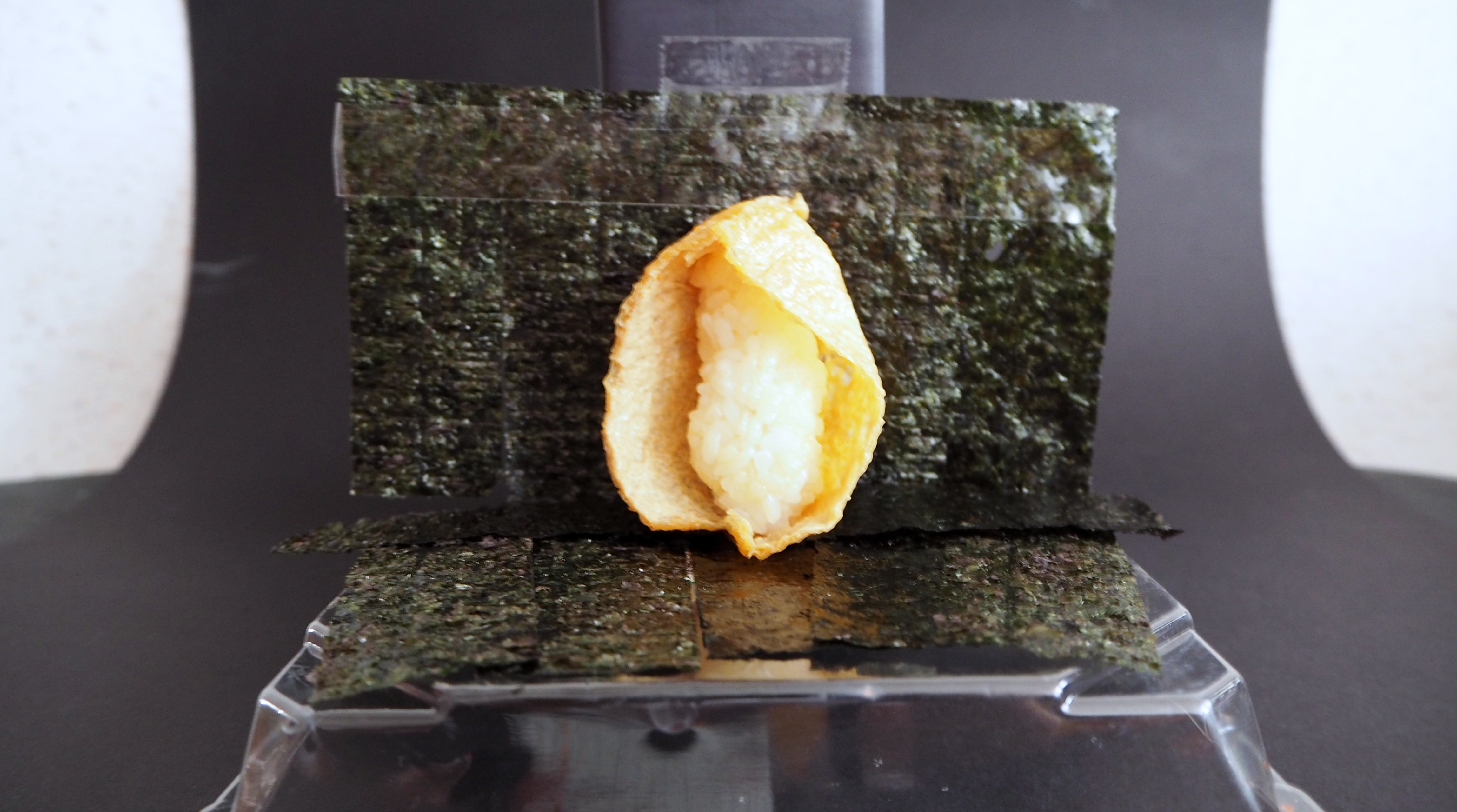
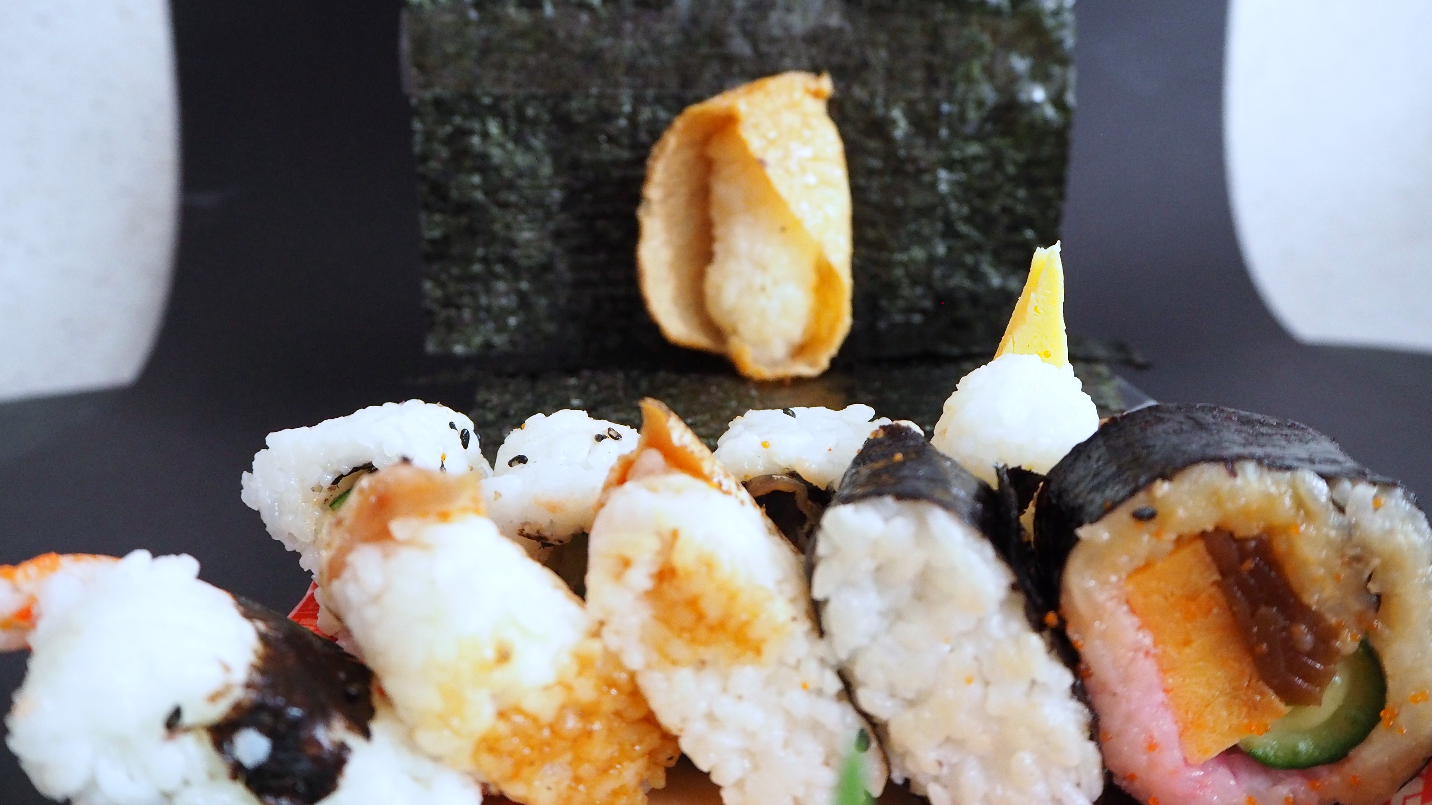
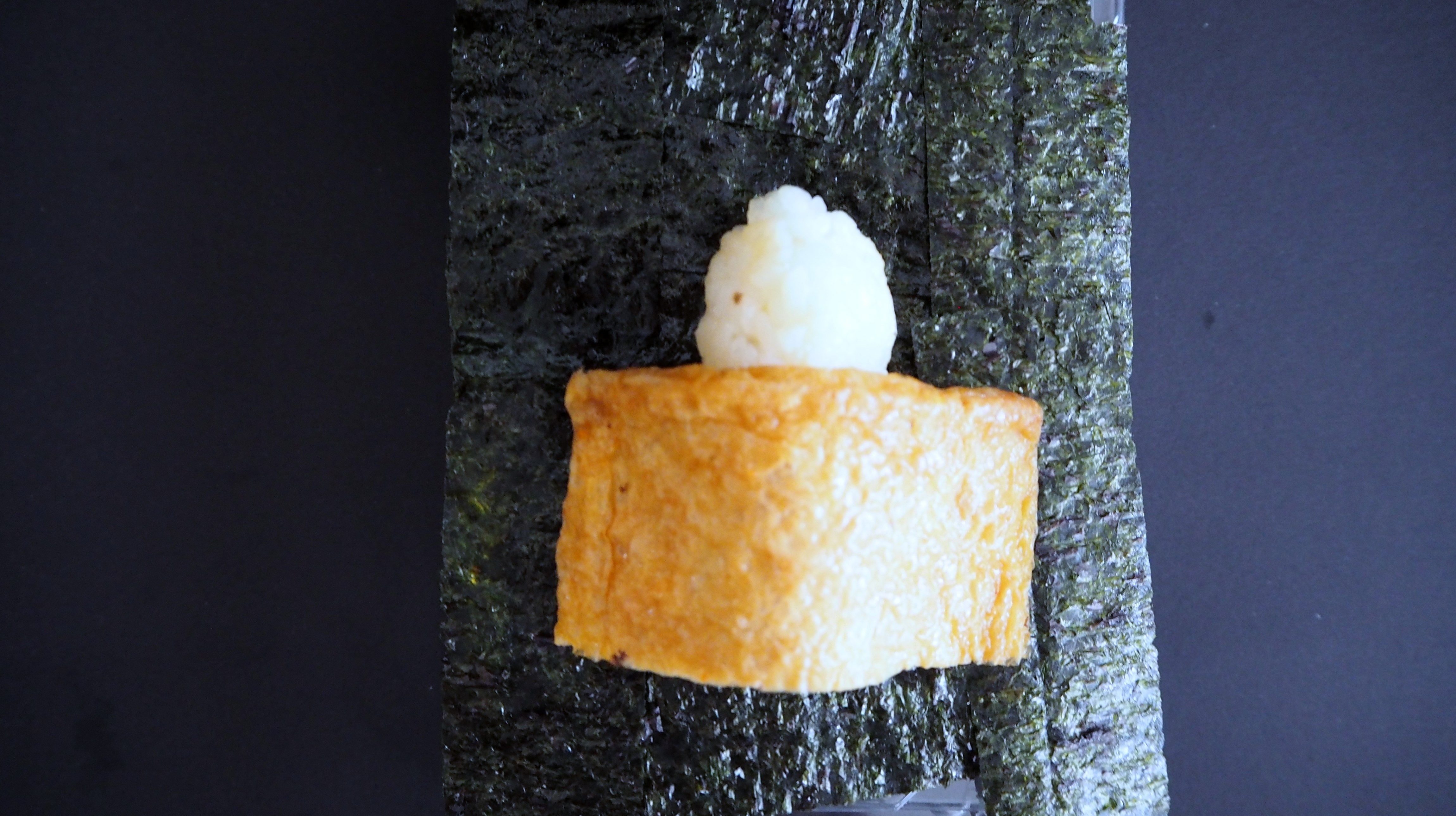
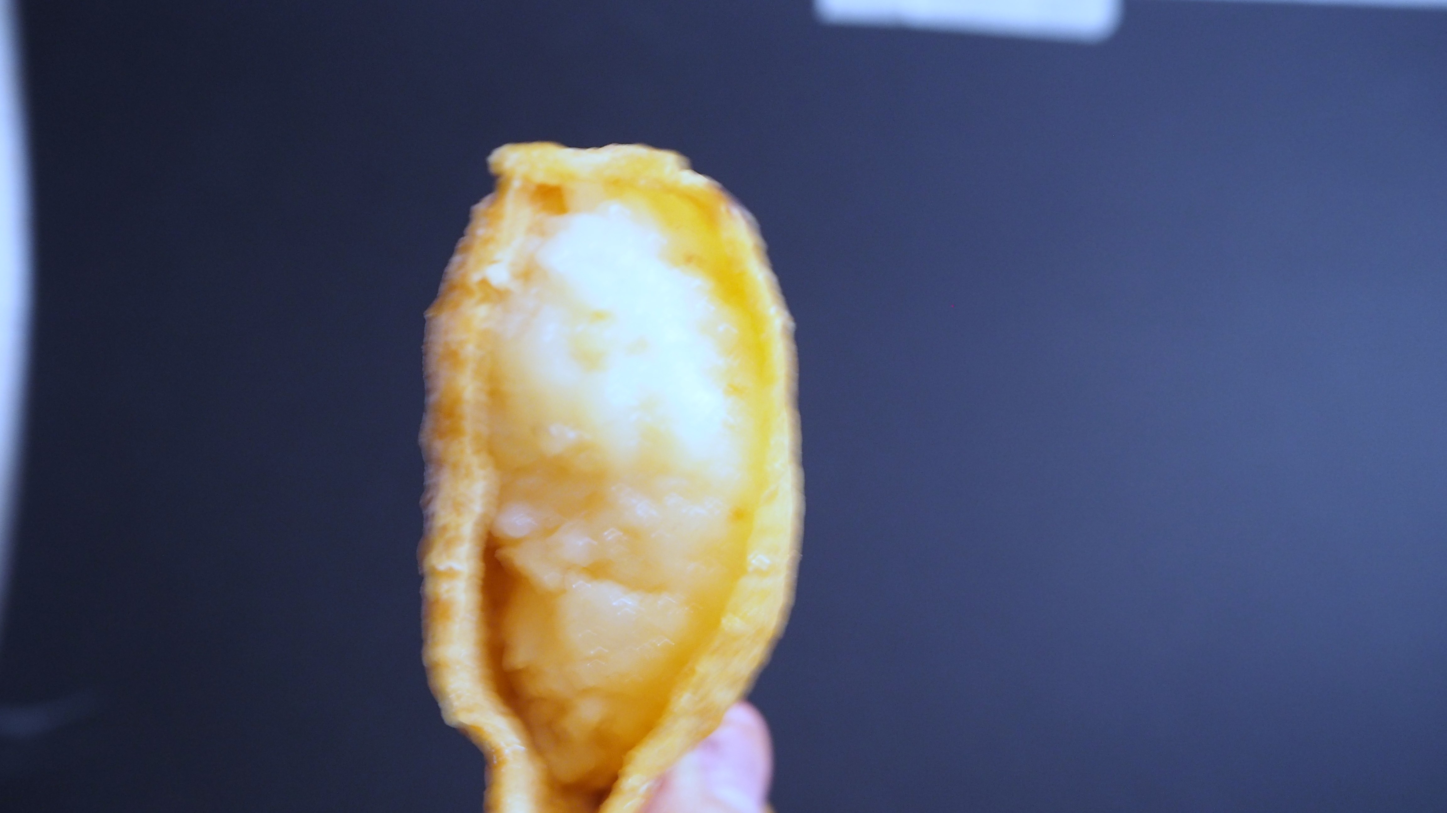
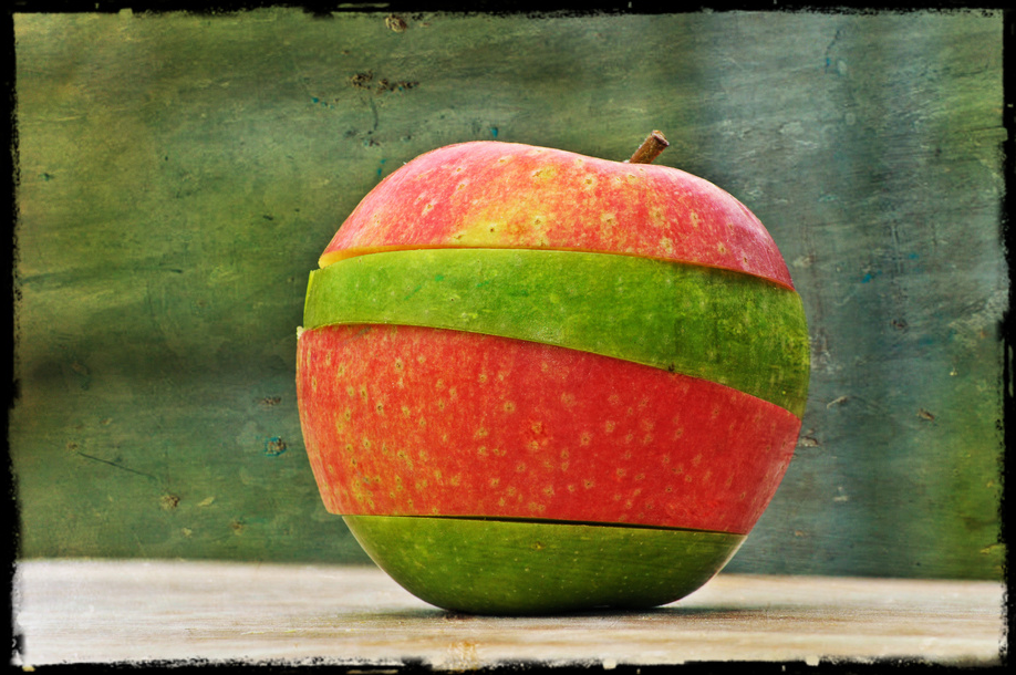
Myself as Sushi
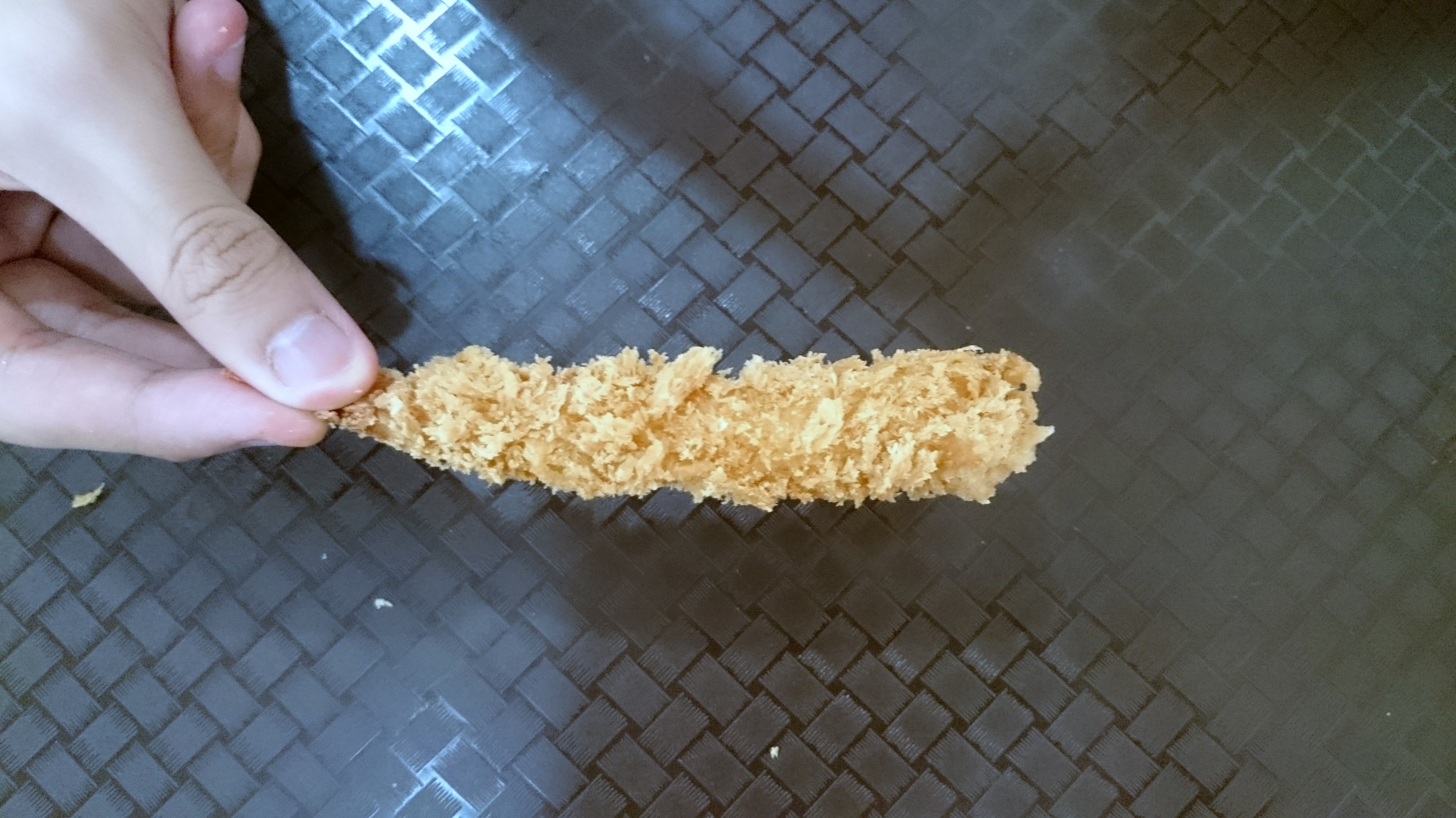
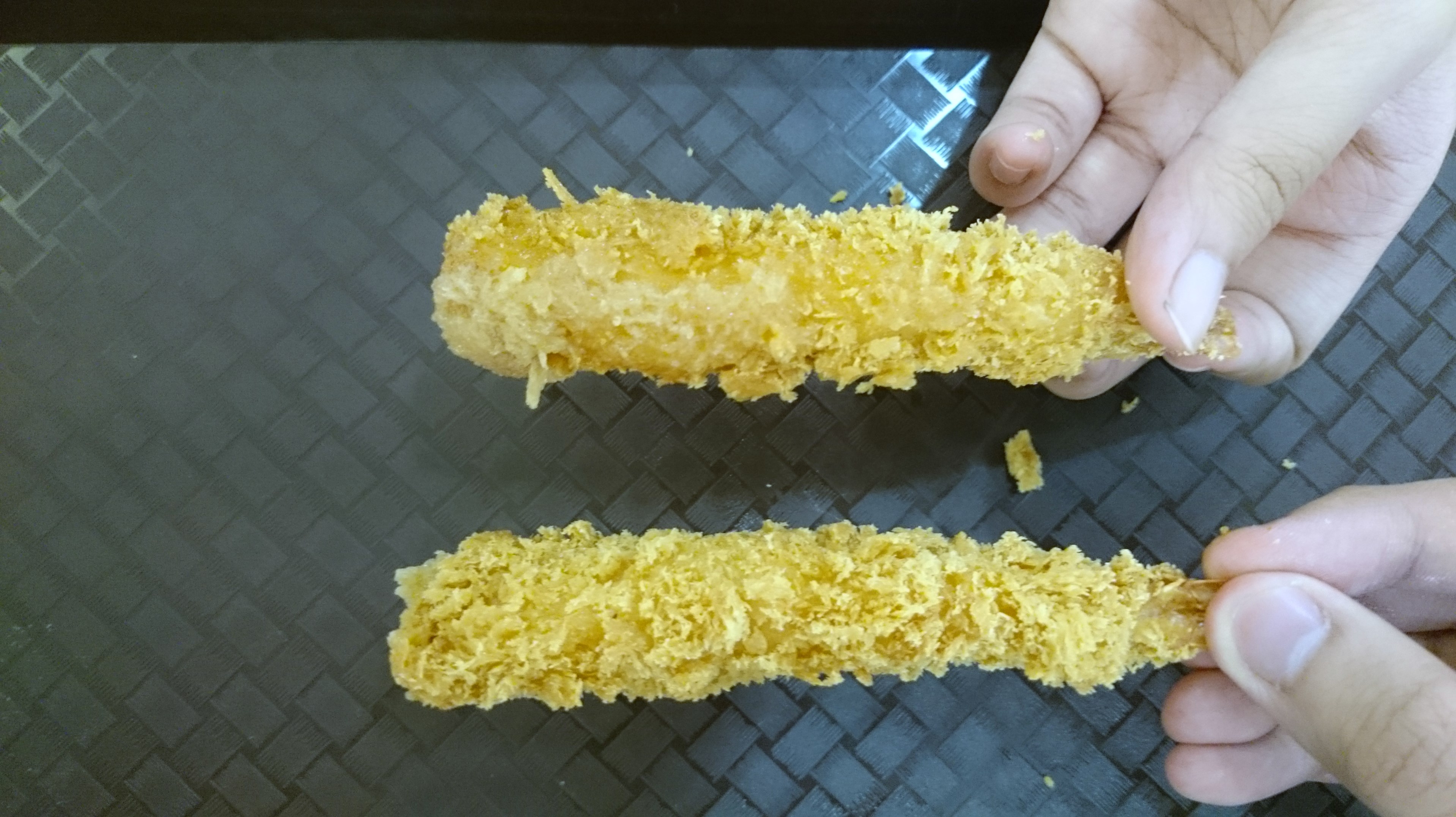
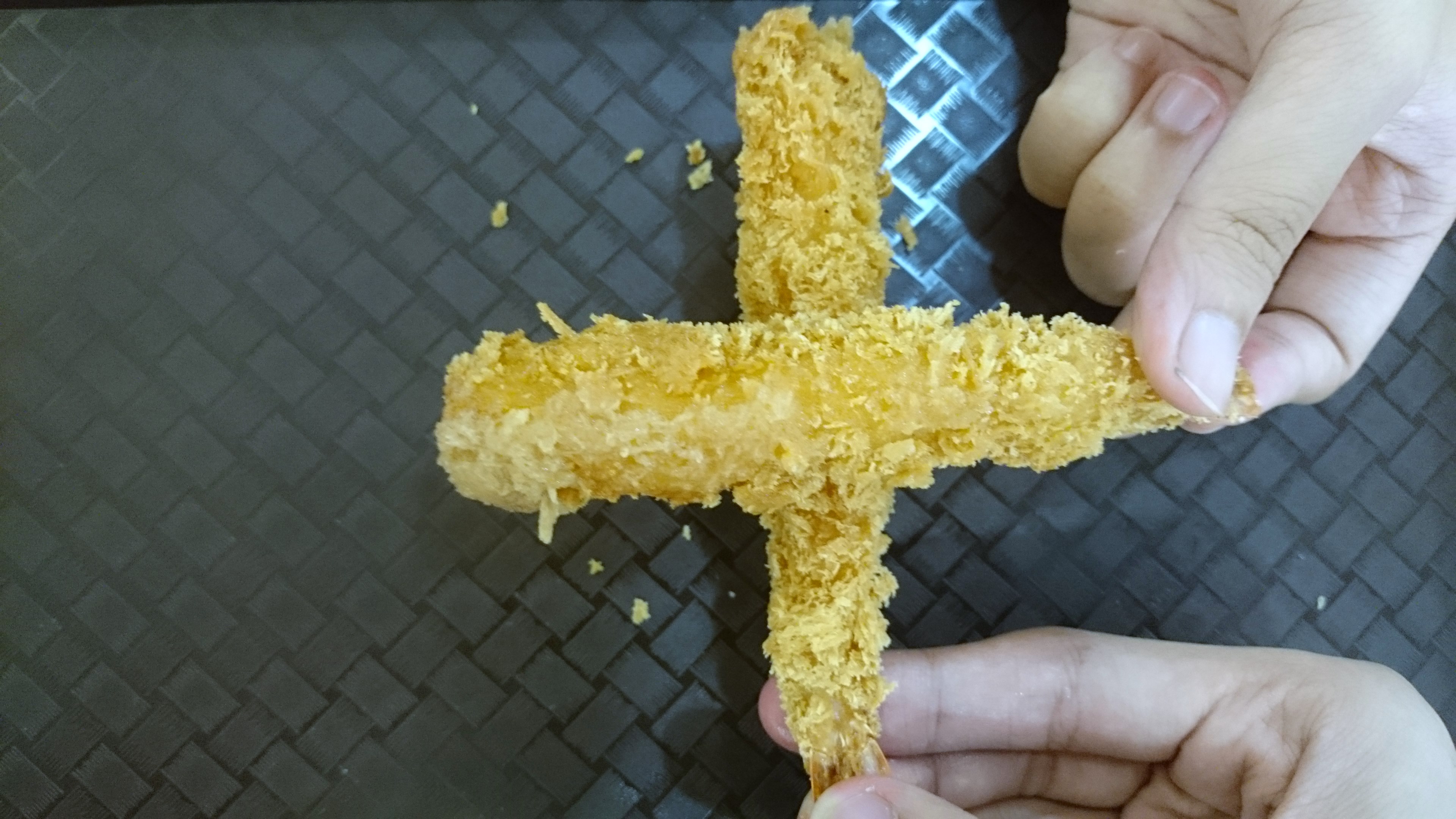
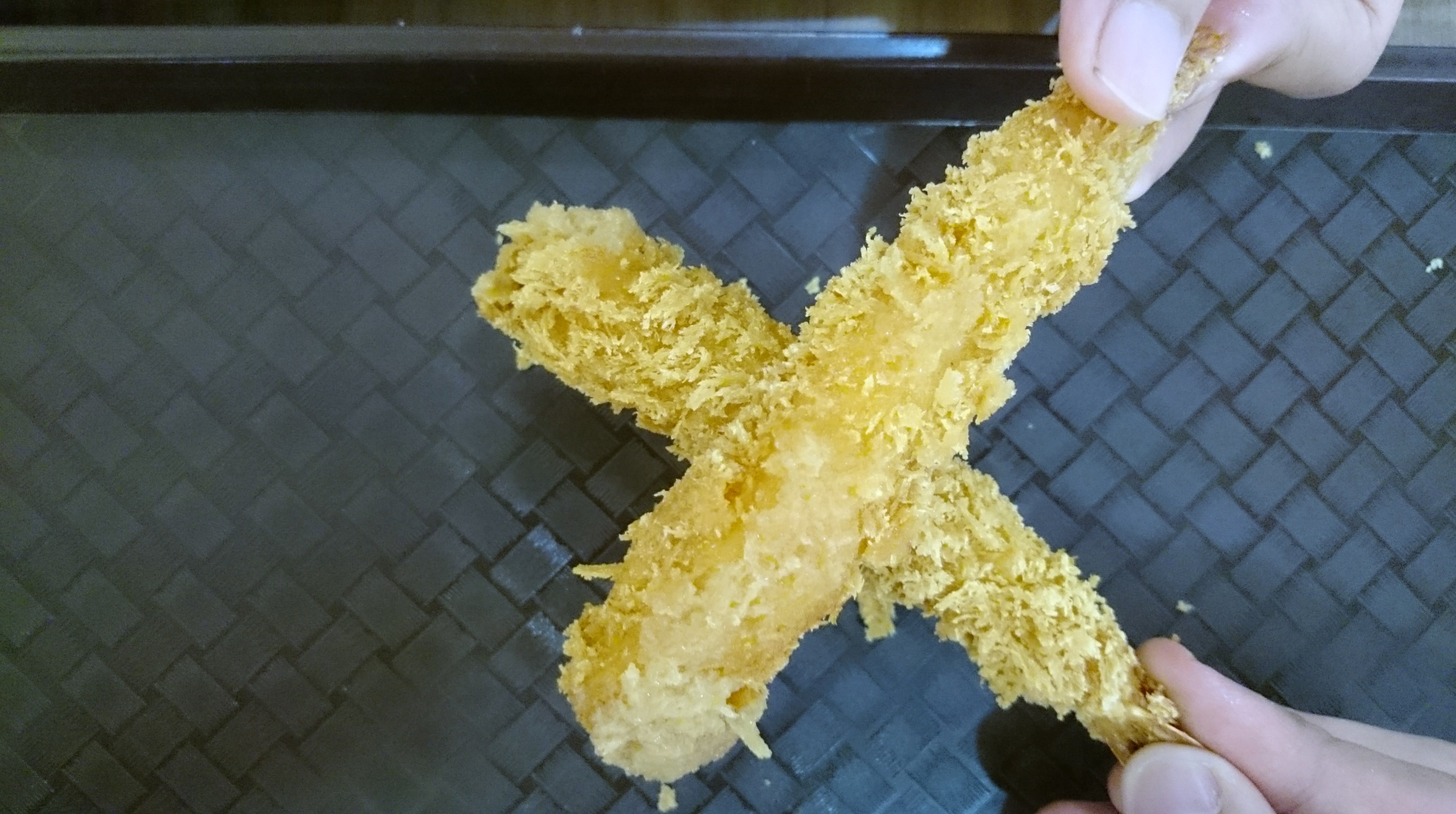
Representation: Inarizushi 稲荷寿司

Definition: a kind of sushi or rice ball that is stuffed in seasoned tofu pouches. Inarizushi is technically sushi, but it is not something you order at nice sushi restaurants.In addition, it is a very casual food and a perfect lunch for picnics.
Source: Japanesecooking101
Why?
1) Spongy texture – My skin
2) Greasy – My oily skin
3) Tofu pouches – My skin colour, served as a clothing as well
4) Economic – Everyone favorite 😀
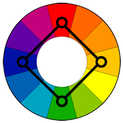
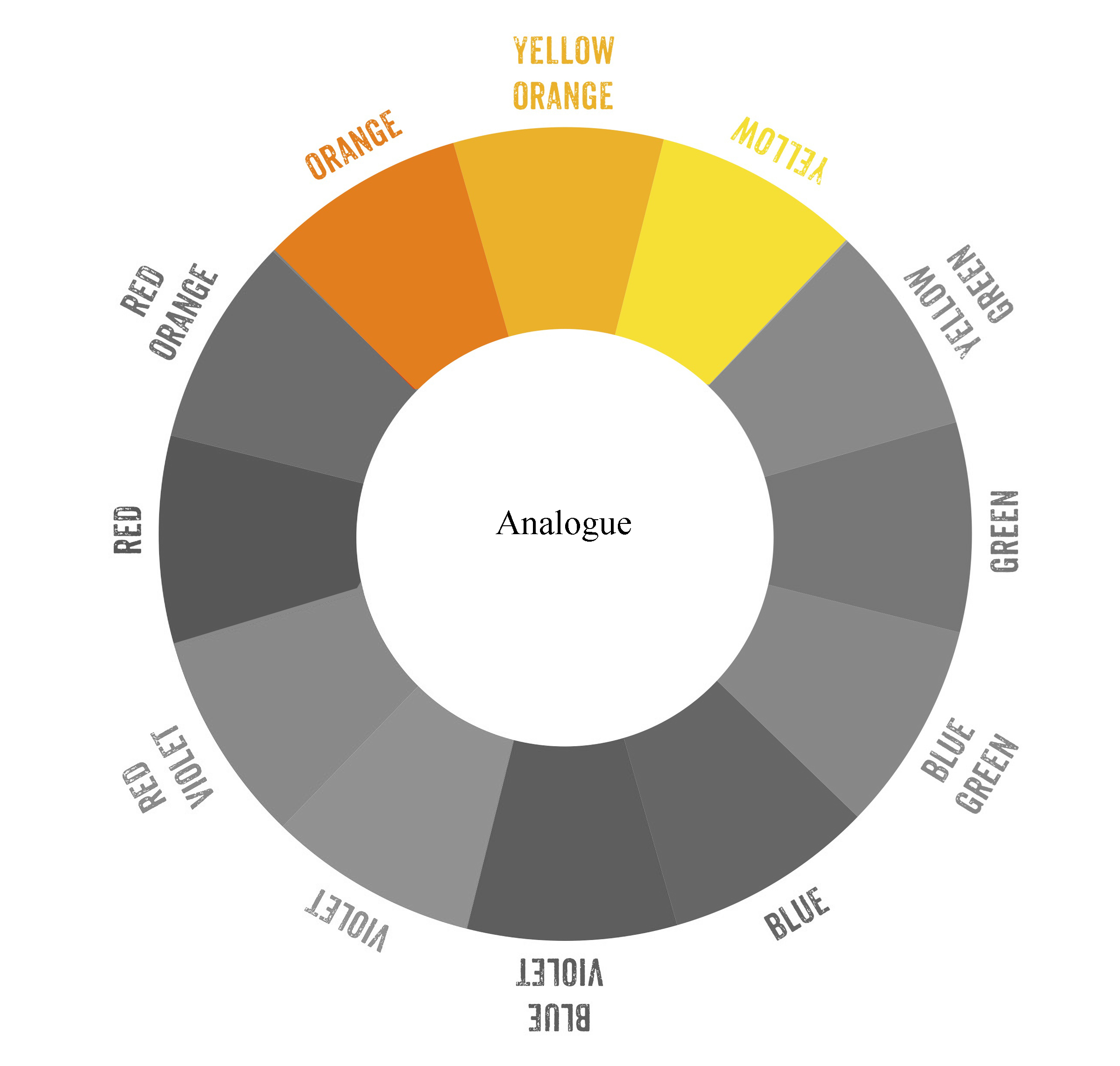
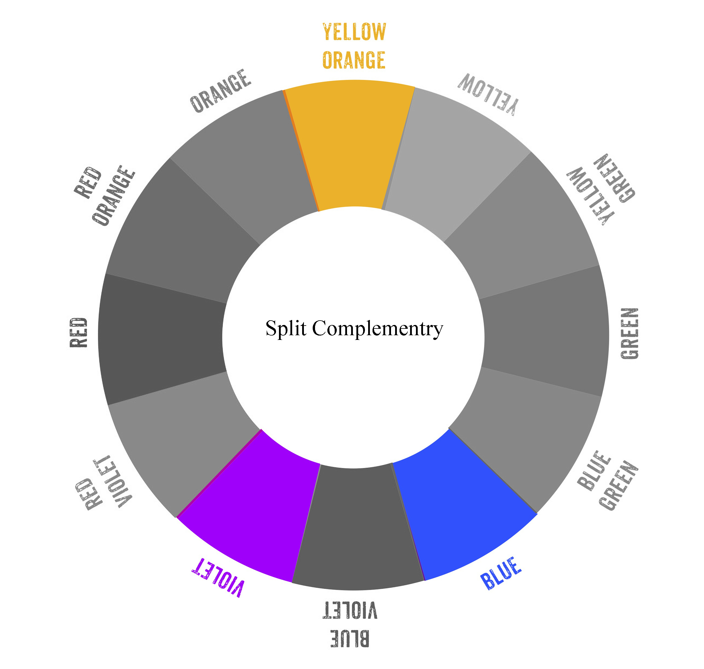
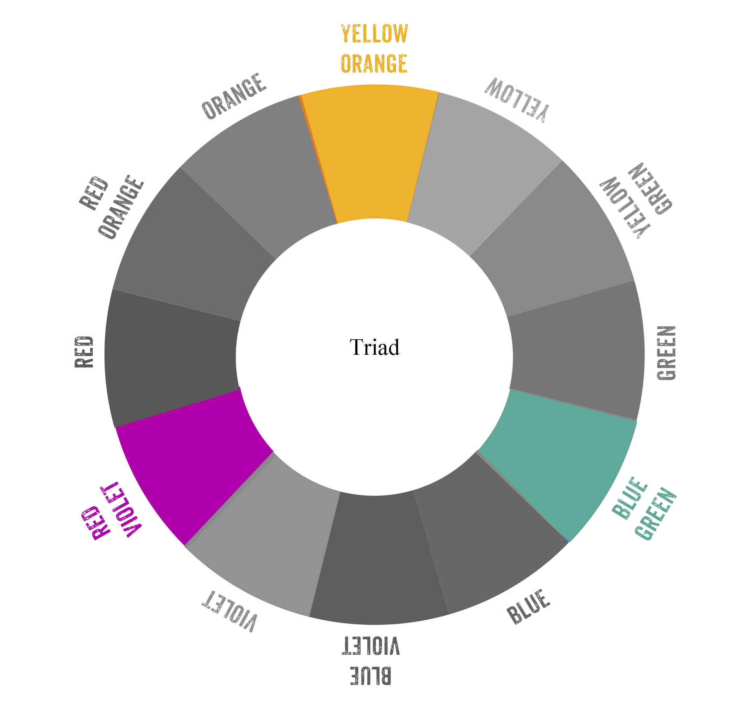
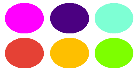
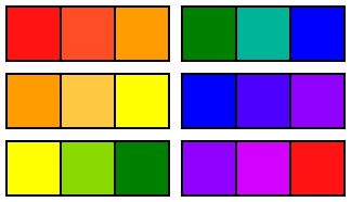
Colour Harmonies
Core Colour: Yellow-Orange
In the composition, I aim to make use of the various colour theories to play with the idea of ‘Interaction’.
The experiment will bring out the effect of ‘Yellow-Orange’ have on other colours.
Below are examples of colour theories that I’m applying in my compositions.
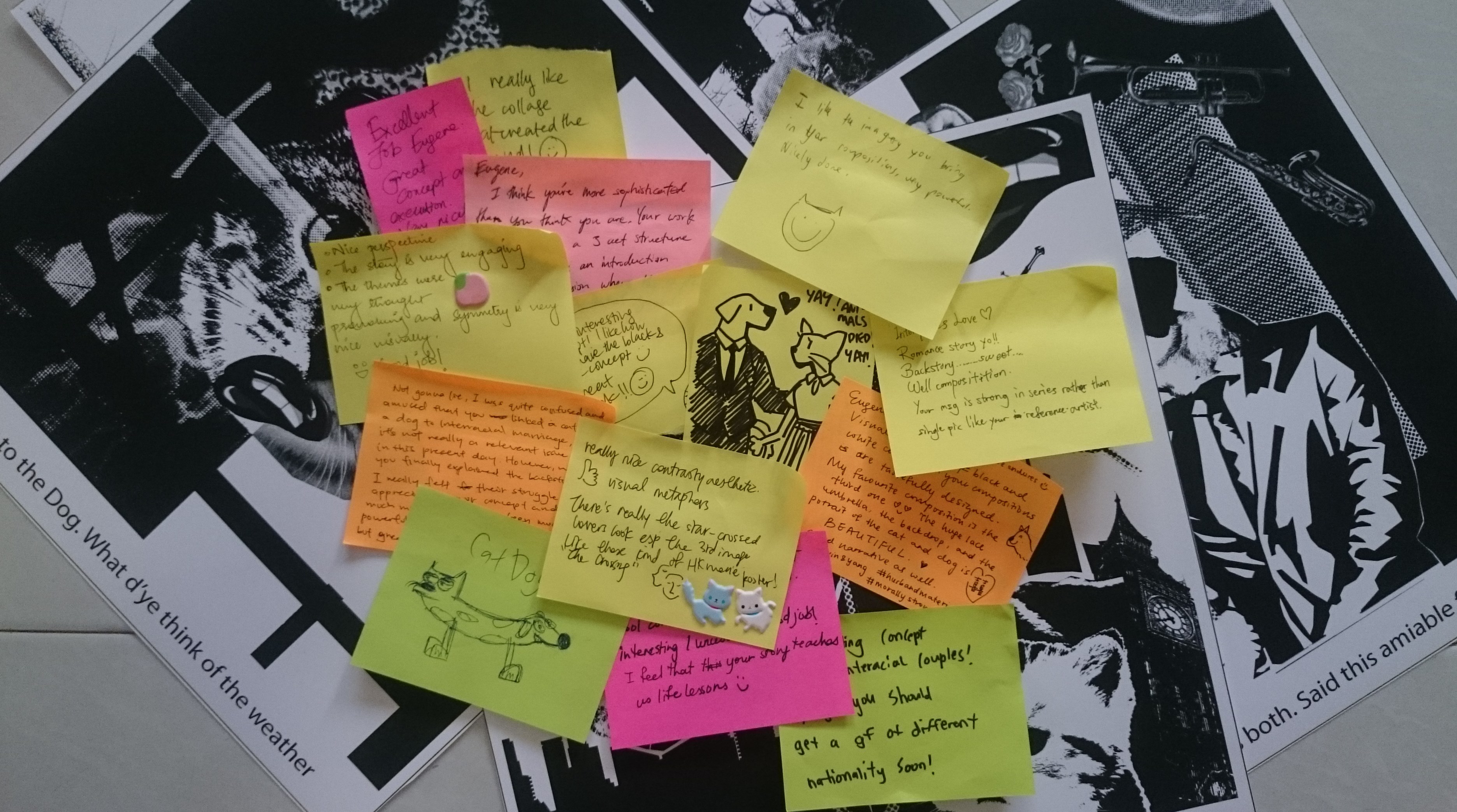
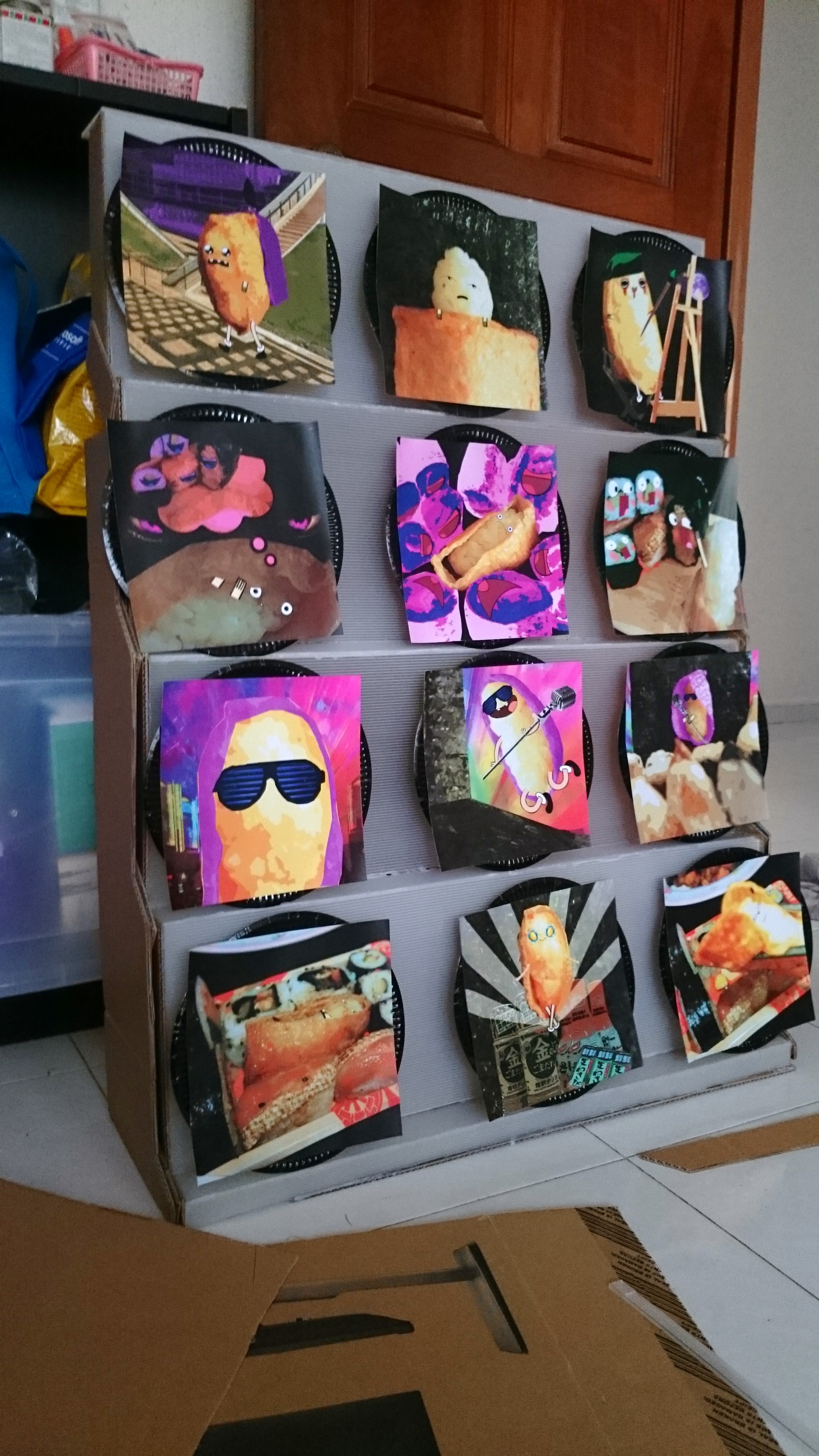
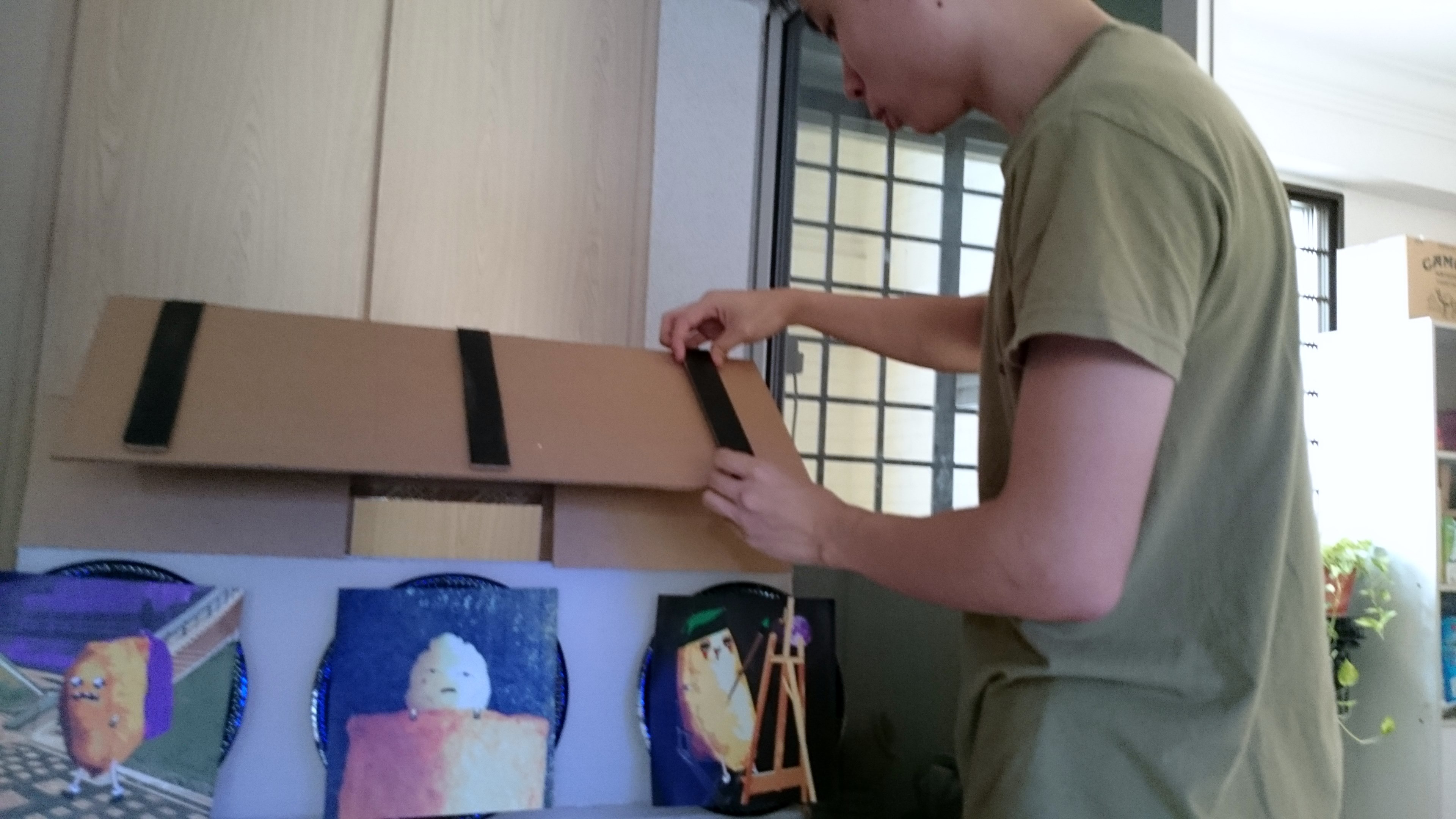
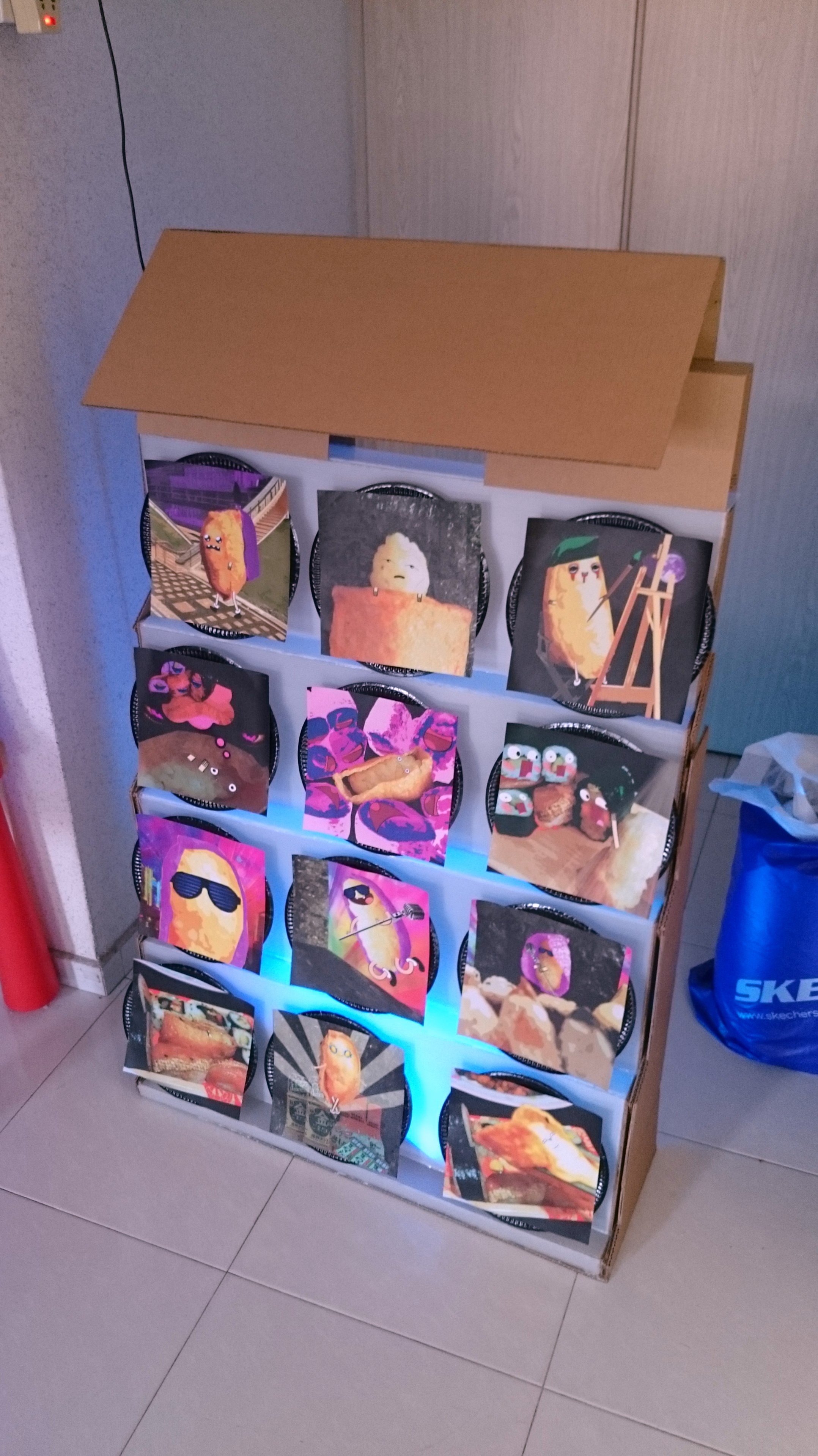
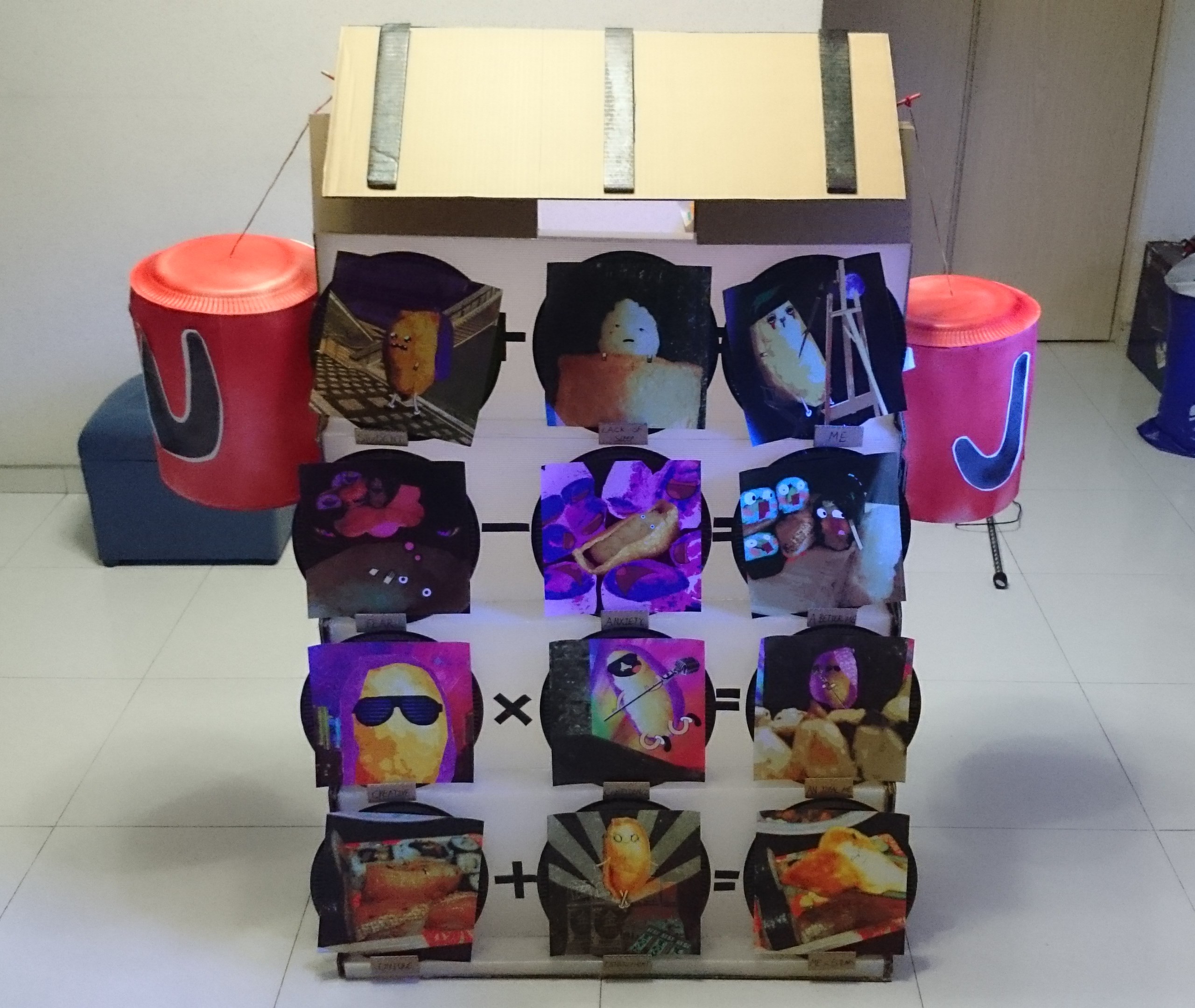
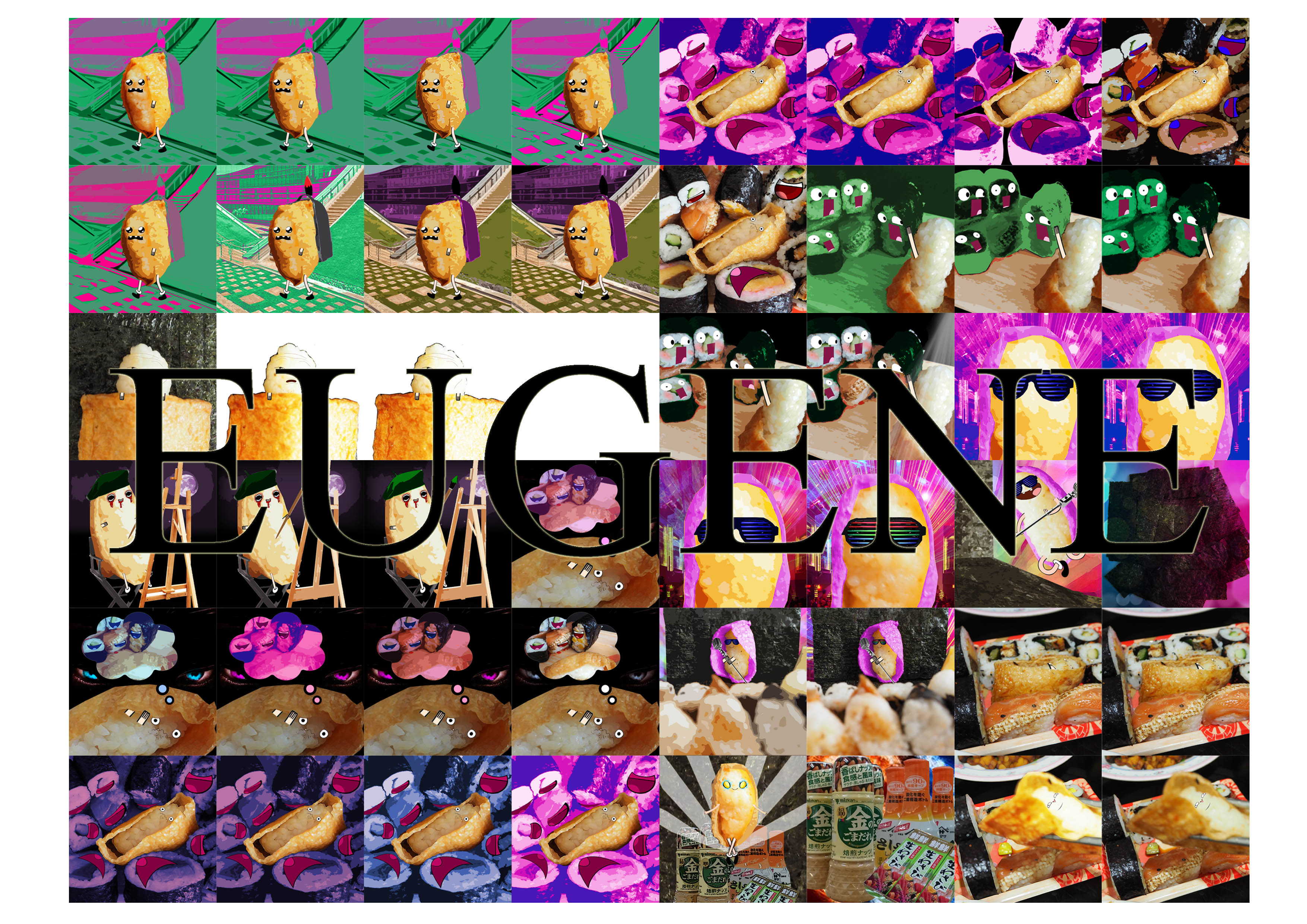
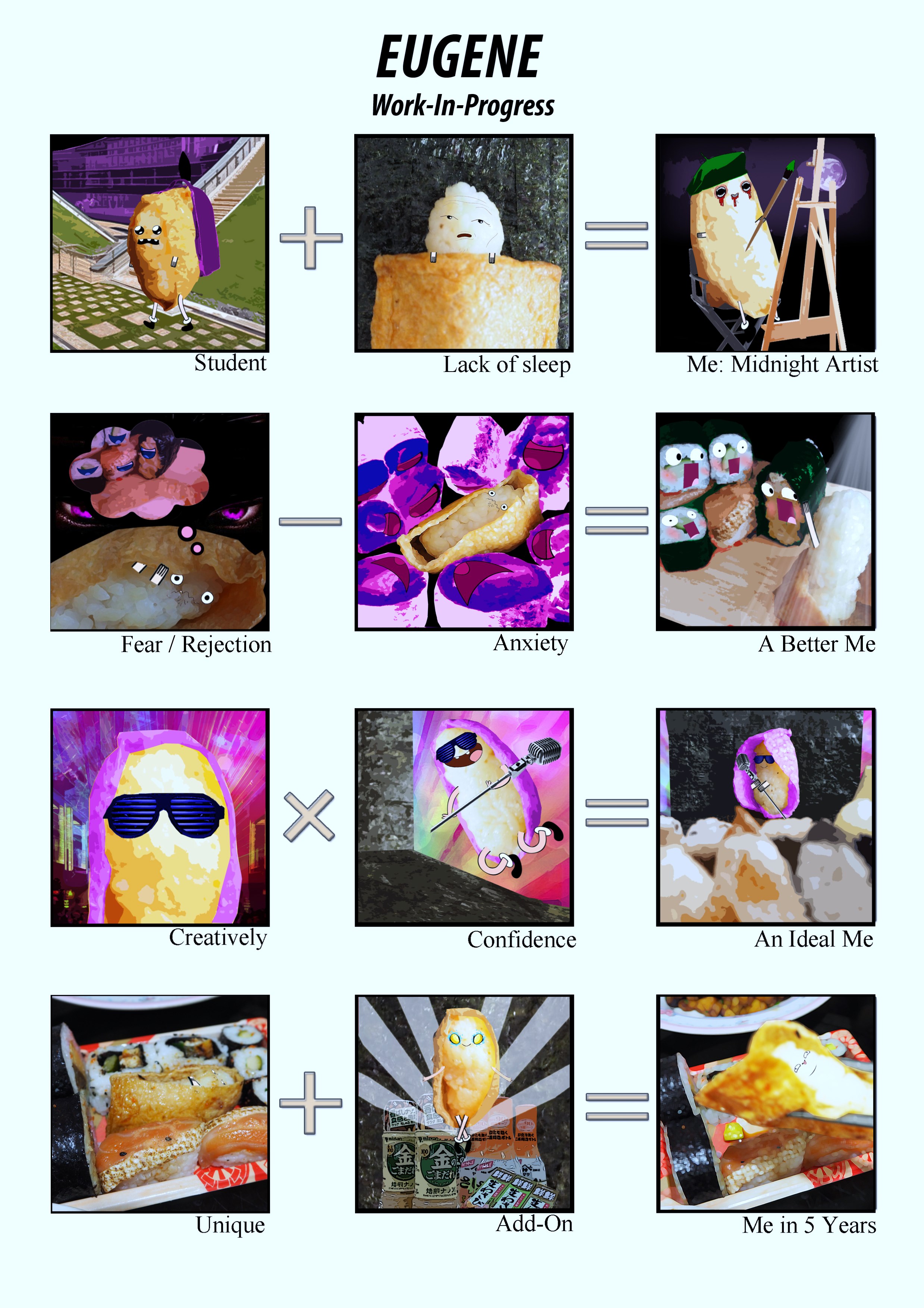
Final Artwork
The Breakdown.
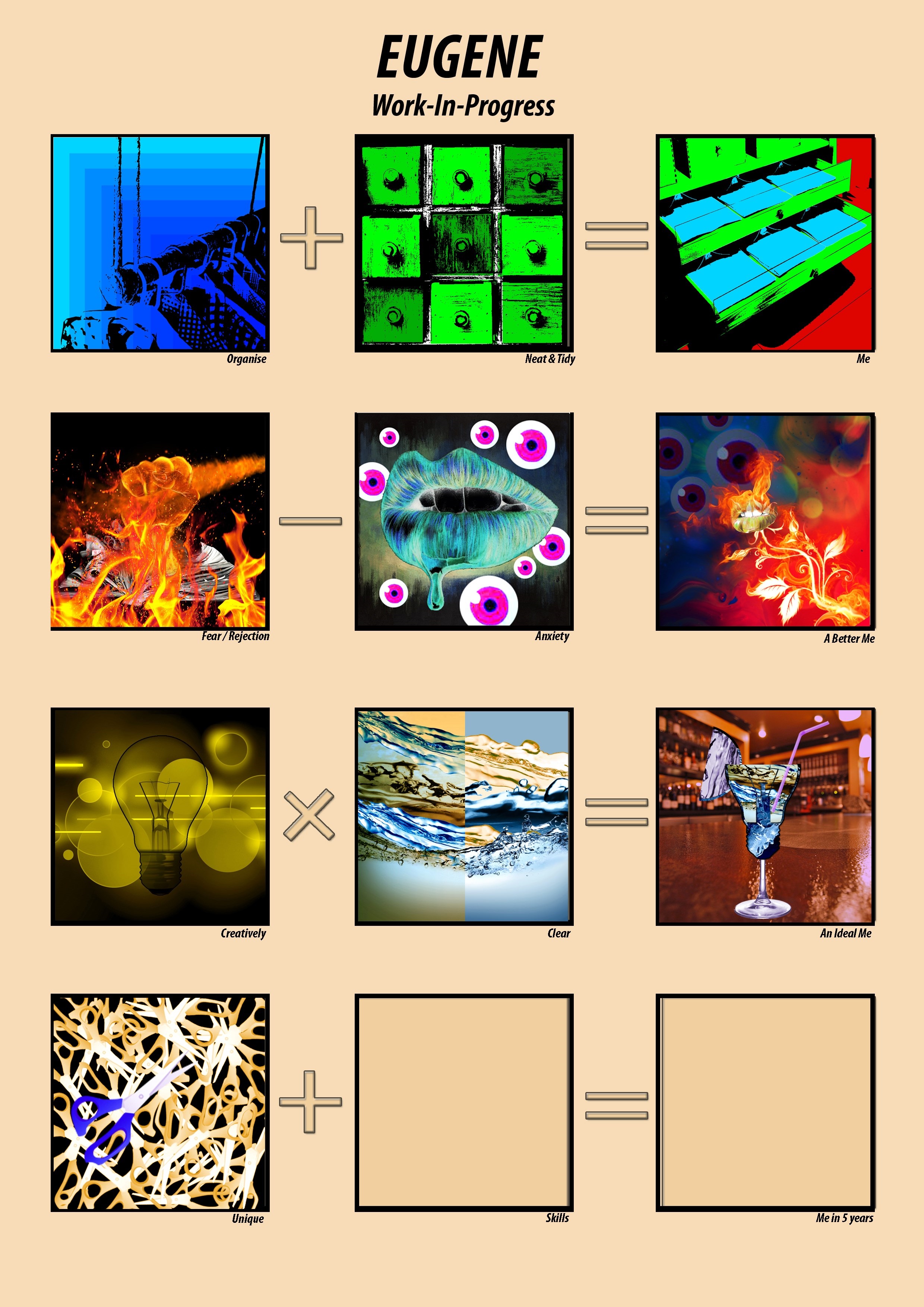
Line 1: ME 私
Explanation:
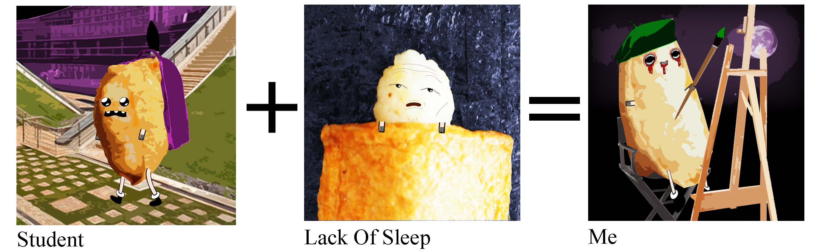
#1 Student
Colour Theory: Triad
Core Colour: Yellow-Orange
Sub Colours: Purple, Green.
Description:
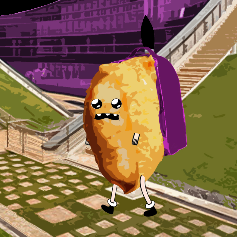 A student of ADM, (Core Colour: Yellow-Orange), walking towards the school entrance with his heavy backpack.
The colour of his backpack is similar to the ADM building (Purple) (School-Related Items). Green shows the beautiful walkway/scenery while it serve as a balanced to the overall composition.
Reason for Triad: A balance between warm and cool colours. Education teaches us to take pride in our work and at the same time teaches us the balance between school assignments and personal time.
#2 Lack of Sleep
Colour Theory: Complementary
Core Colour: Yellow-Orange
Sub Colours: Blue
Description:
 While school work maybe hectic most of the time, we require additional time to complete our assignments. To do so, sleeping time have to be reduce to make up for the time use for school assignments.
In this composition, I made use of Complementary colour theory to bring across the idea of ‘choose one only.’ For example, it’s either I decide to sleep more and do less on school assignment vice versa.
#3 Me: Midnight Artist
Colour Theory: Triad
Core Colour: Yellow-Orange
Sub Colours: Purple, Green.
Description:
 ‘Midnight Artist’ as interpreted is an artist who work throughout the night.
The composition uses colour theory: Triad, which focuses on an individual in achieving a balance in his academic performance and non-academic performance. Education motivates the desire in an individual to read, to write and to learn, allowing the student to ‘learn things the hard way’ so that they can be as competitive in the working industry. Hence, an individual must find ways to ‘balanced’ themselves in order to ‘Know Thyself.
Line 2: A Better Me より良い私を
Explanation:
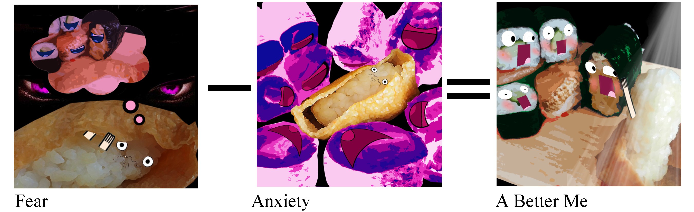
#4 Fear
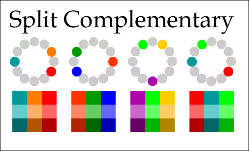
Colour Theory: Split – Complementary
Core Colour: Yellow-Orange
Sub Colours: Purple, Blue
Description:
 Everyone have fear, but it varies from different people in different situations. In the composition, I aim to portray the nervousness as nightmare as I usually experience before or during an appearance, usually presentation. (Stage Fright)
The colour theory used in ‘Split-Complementary’. Reason because ‘Nervousness’ happens due to doubt and insecurity. However, once we are used to it, we are able to deliver a confident speech. The fact that ‘Spilt-Complementary’ have 2 paths, it demonstrate the idea of ‘path-crossing’. For example, once we conquer our fear, we move towards a ‘more confident side’ vice versa.
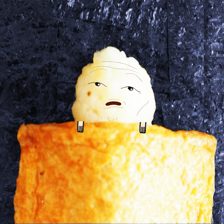
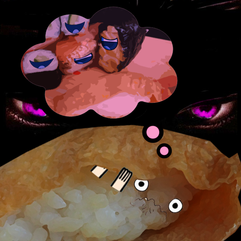
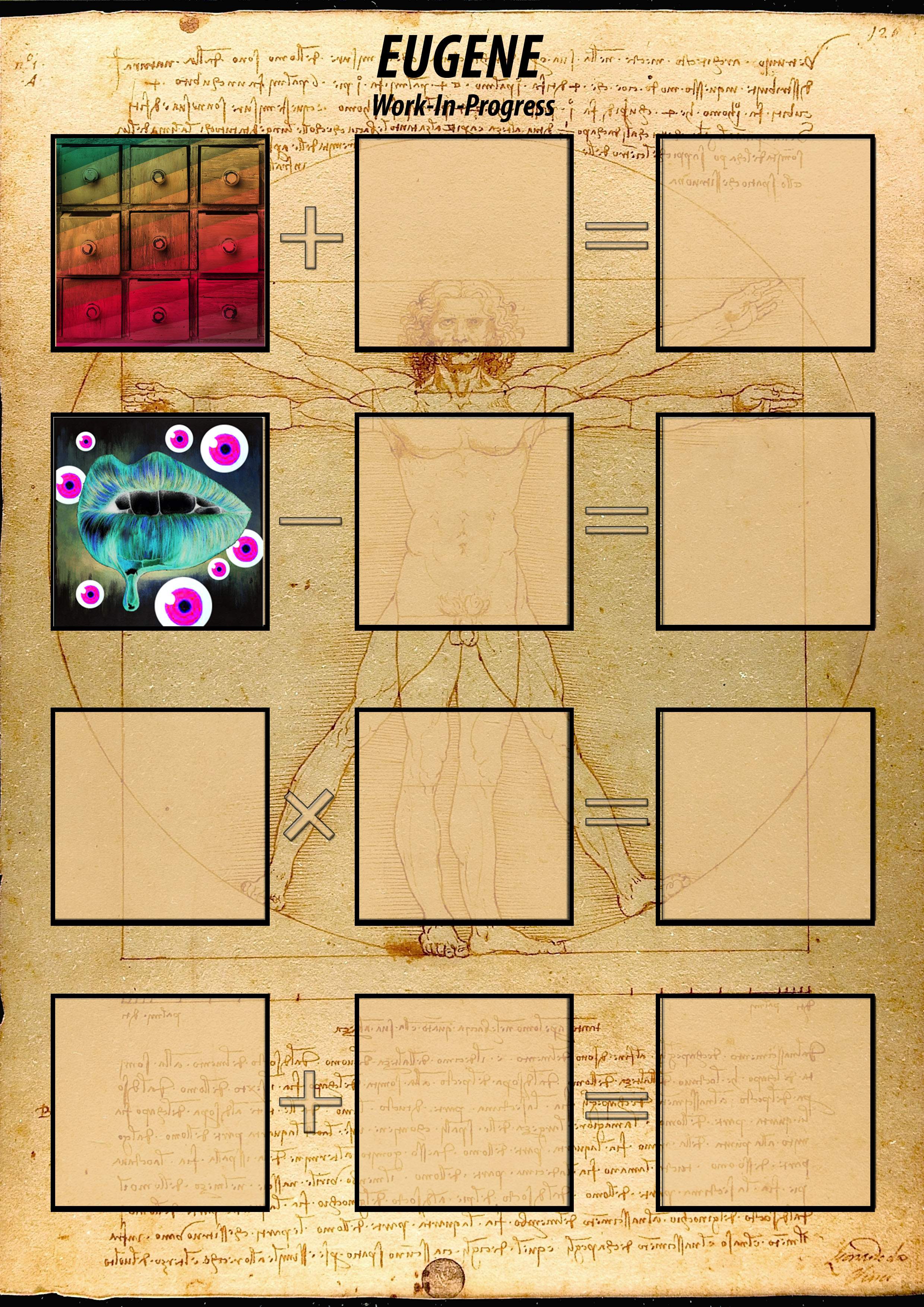
#5 Anxiety
Colour Theory: Split – Complementary
Core Colour: Yellow-Orange
Sub Colours: Purple, Blue
Description:
 Sushi are usually raw and uncooked, sometimes I wonder if it is safe to eat it. I question myself and I seems to develop a mixed feeling of anxiety. The idea shares common identity as the above^ ‘Fear’. The fear of being judged and criticised. The composition is more or less conveying about the fear of public speaking. Because taking in front of a crowd is too scary, it gives me anxiety. The colour theory is as similar to above^: ‘Spilt-Complementary’. In this composition, there is a high contrast of Purple and Blue as it is based on the colour of a bacteria named: Staphylococcus aureus. In this situation, ‘Spilt-complementary’ colours demonstrate the core colour being devoured by the sub colours.
#6 A Better Me: Me in New Light
Colour Theory: Triad
Core Colour: Yellow-Orange
Sub Colours: Purple, Green.
Description:
 I always wanted to see myself in a ‘New Light’. Want to see myself becoming stronger in both mentally and physically. My ego is usually the part of me that doesn’t want me to take risks. However, taking risks is not all that terrible it turn out to be. Only if we are willing to get out from our comfort zone, we can then see the world in another dimension.
The colour theory used is ‘Triad.’ This is because there is a need to understand myself through self-assessment and self-understanding. By doing so, I am able to cultivate a balanced self.
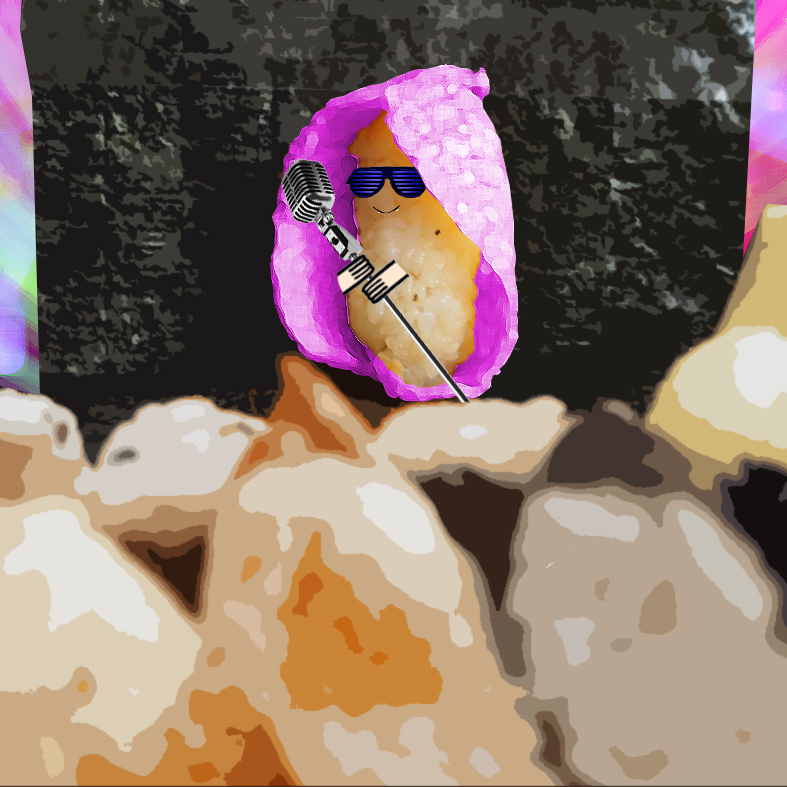
Line 3: An Ideal Me 理想的な私
Explanation
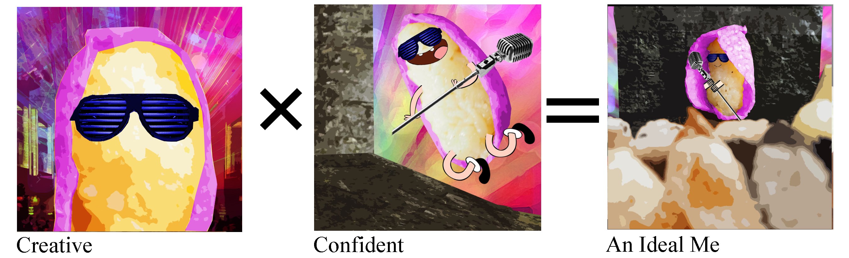
#7 Creatively
Colour Theory: Split – Complementary
Core Colour: Yellow-Orange
Sub Colours: Purple, Blue
Description:
 I always wanted to get creative but sometimes I find it very hard.
Inspired from Lady Gaga – Paparazzi. The music video leave me a very memorable image because she was dressed creatively or rather stupid. Although most of her Music Videos makes no sense, I find her use of visual metaphor creative in her video.
Colour theory use is Split-Complementary, like a Split-Personality. Can sometimes get crazy with idea and sometime cry without idea.
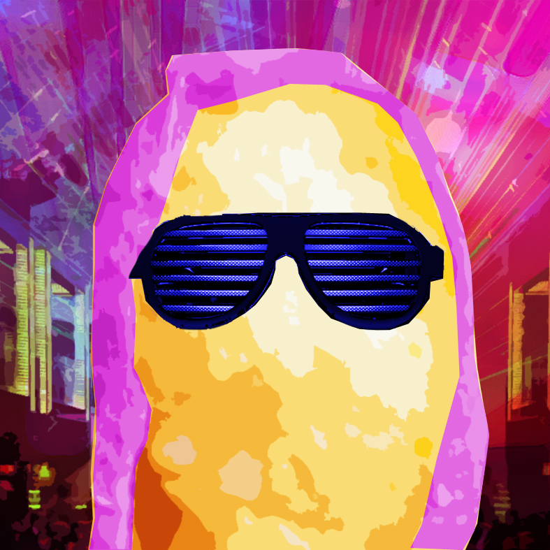
#8 Confidence
Colour Theory: Triad
Core Colour: Yellow-Orange
Sub Colours: Purple, Green.
Description:
 Shaking is nervousness.
Confidence – The ability to talk to a large group of people.
The most important thing is not about convincing other people, but believing in ourselves. In this composition, the idea was to convey the fearless attitude of going up the stage.
Colour theory used is Triad. Because in colour mixing, if the colours of the triangular sides mix together, the outcome is either black or white. Hence the confidence in addition or subtraction of colour mixing.
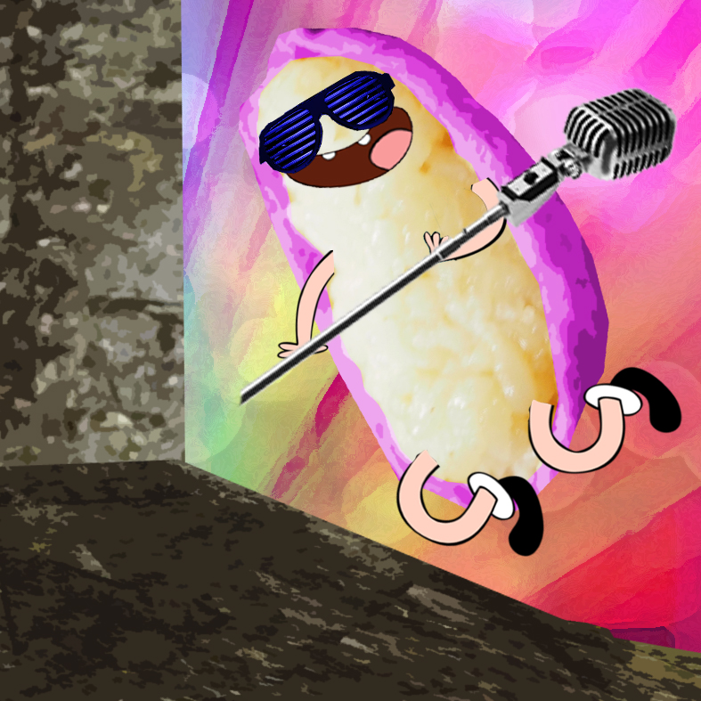
#9 An Ideal Me: Super Eugene
Colour Theory: Triad
Core Colour: Yellow-Orange
Sub Colours: Purple, Green.
 Description:
To be able to deliver a speech to a large crowd about my ideas and story with confident.
In other words, no fear of being judge by people. So just be yourself, whatever we feel like to be.
Colour theory is Triad.
Line 4: Me in 5 Years 5年間で私

#10 Unique
Colour Theory: Analogue
Core Colour: Orange
Sub Colours: Yellow
Description:
 Colour theory is Analogue. Because we can be the same as the rest, in terms of knowledge and skills learnt in ADM, but what is unique is that you stand out from them, acting as the core colour, someone unique and important.
#11 Enhancement
Colour Theory: Triad
Core Colour: Yellow-Orange
Sub Colours: Purple, Green.
Description:
 Competition is in all sphere of student life. So, what make us widen our outlook in this competitive world? The knowledge and skills we acquired during the 4 years of studies in ADM. (Enhancement), which get us ready to make a living out of our passion.
Colour theory used is Triad. Which the triangle represent the ‘Golden Triangle’.
Self-Confidence: Believe in yourself, in your passion, your skills and talents.
Values & Recognition.
#12 Me in 5 Years: A Special Me
Colour Theory: Triad
Core Colour: Yellow-Orange
Sub Colours: Purple, Green.
Description:
 With the ‘enhancement’, we widen our knowledge and broaden our outlook in this competitive world. Thats why the person choose me instead of others, because of my unique personality and ability.
Colour theory used is Analogue.
So why Sushi?
Quote:
You are what you eat.
The food you eat can either be the safest & most powerful form of medicine or the slowest form of medicine.
Part of the secret of a success in life is to eat what you like and let the food fight it out inside.
The way you think, the way you behave, the way you eat, can influence your life by 30 to 50 years.
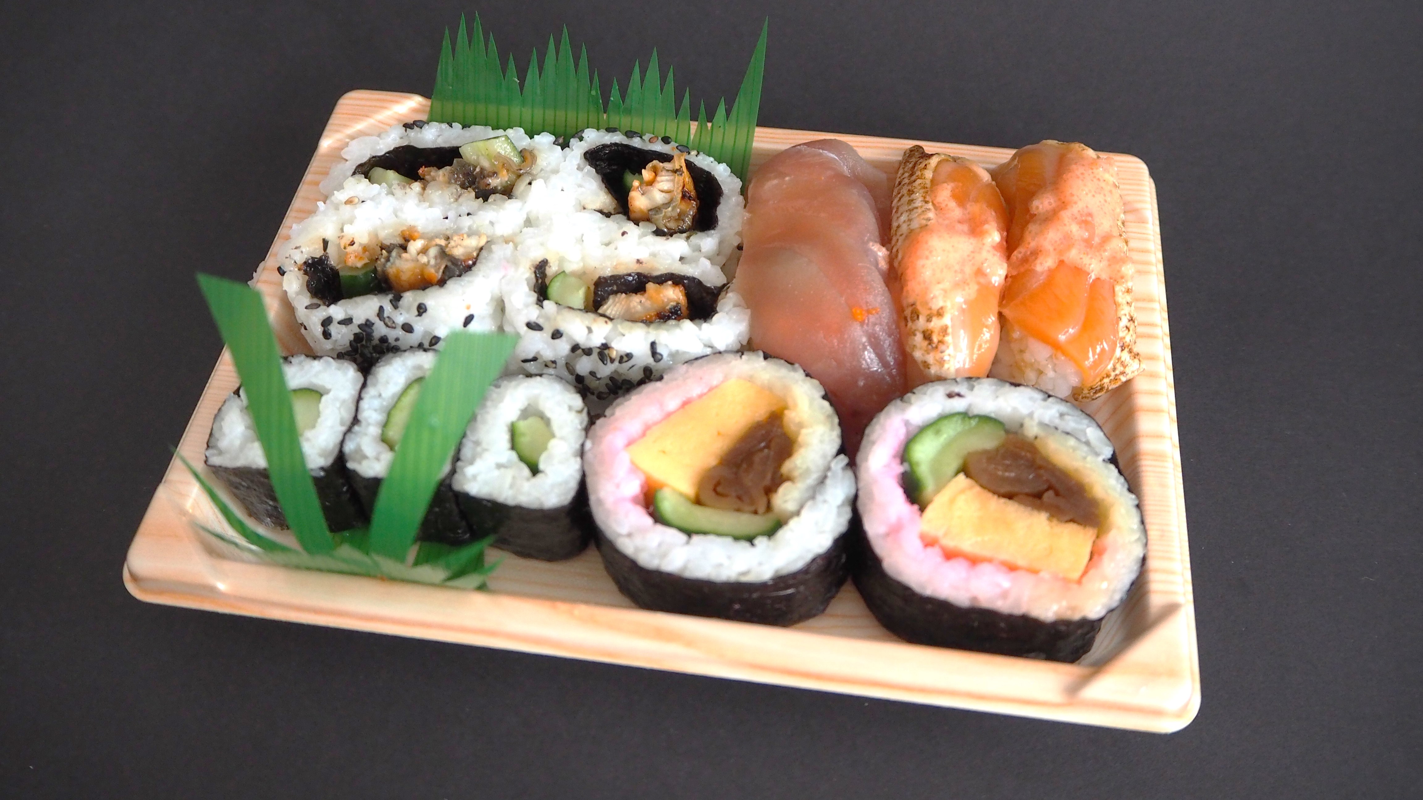
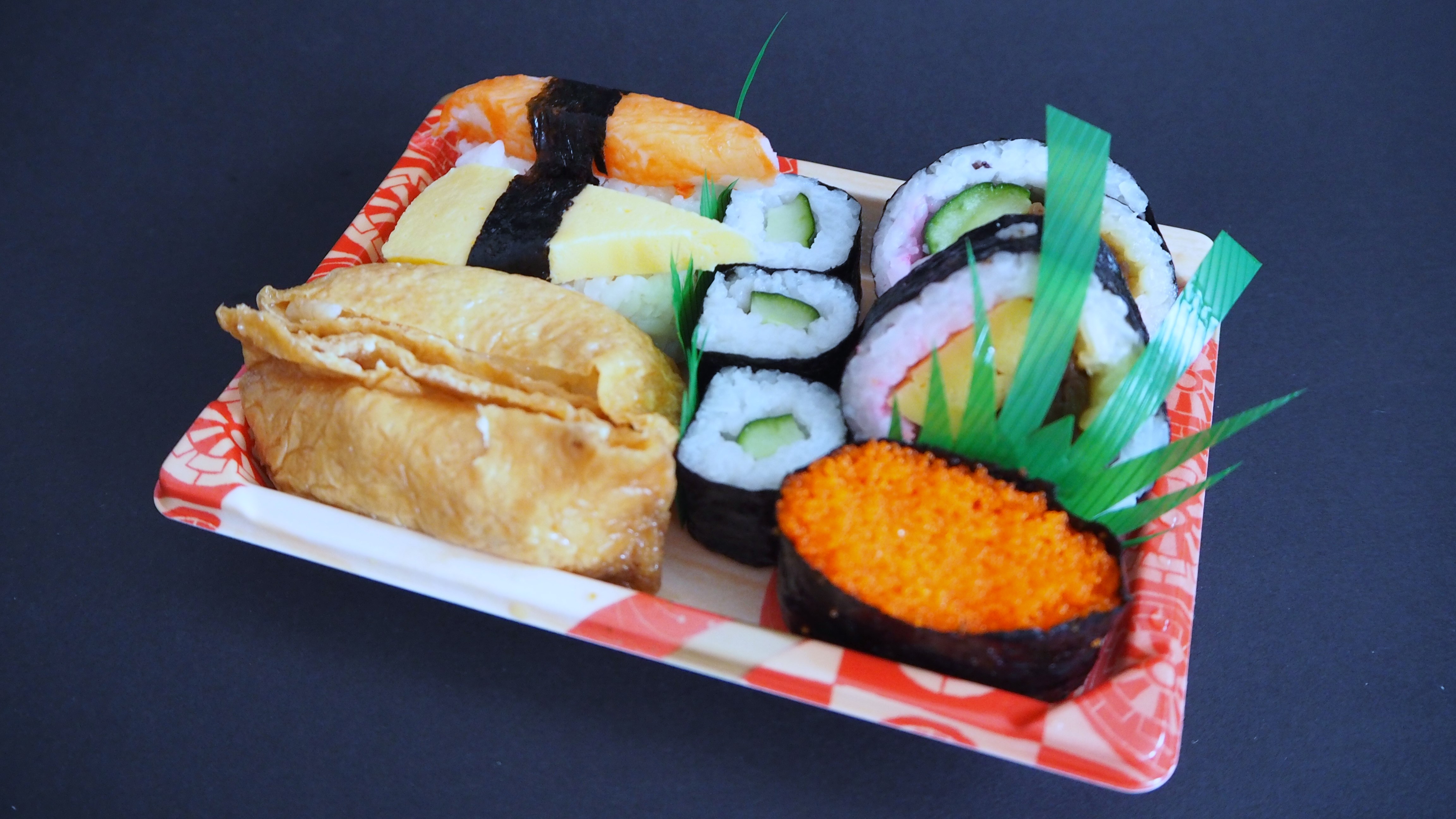
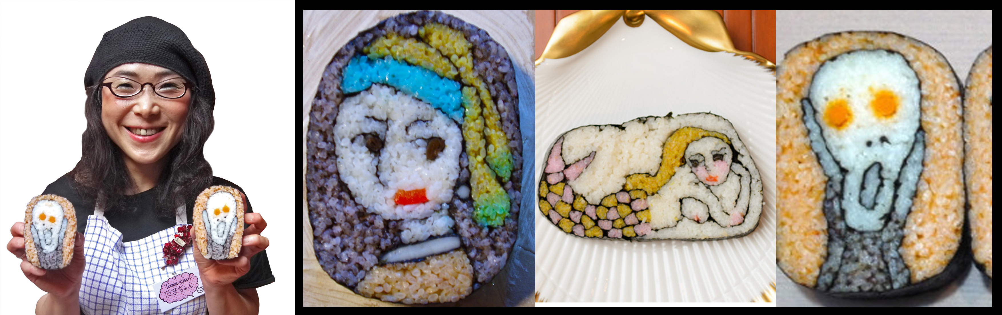
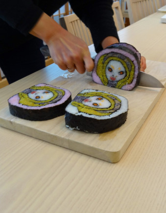
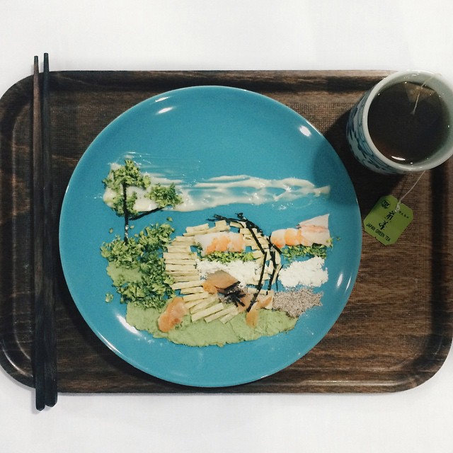
More Reference Artists
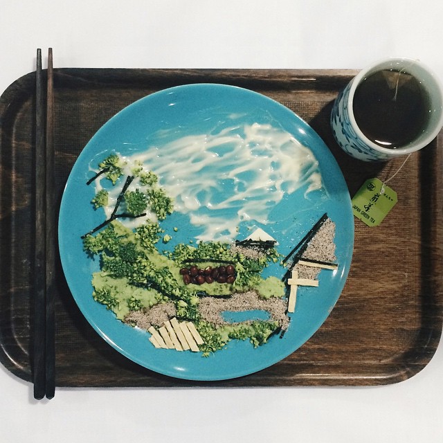
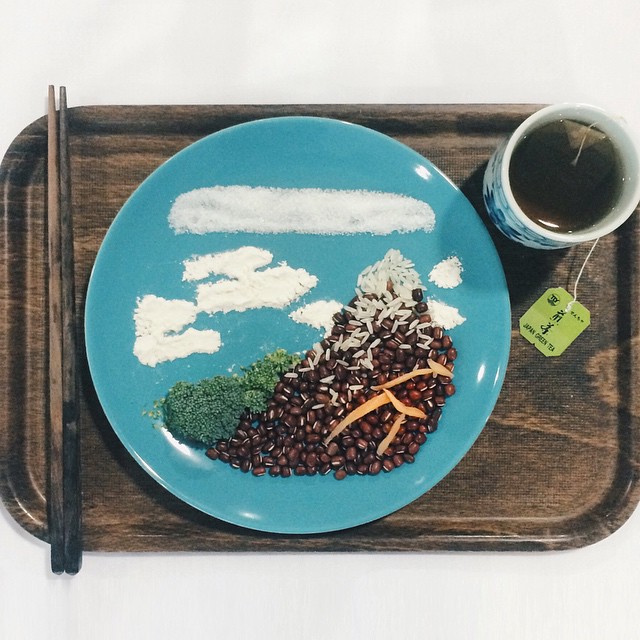
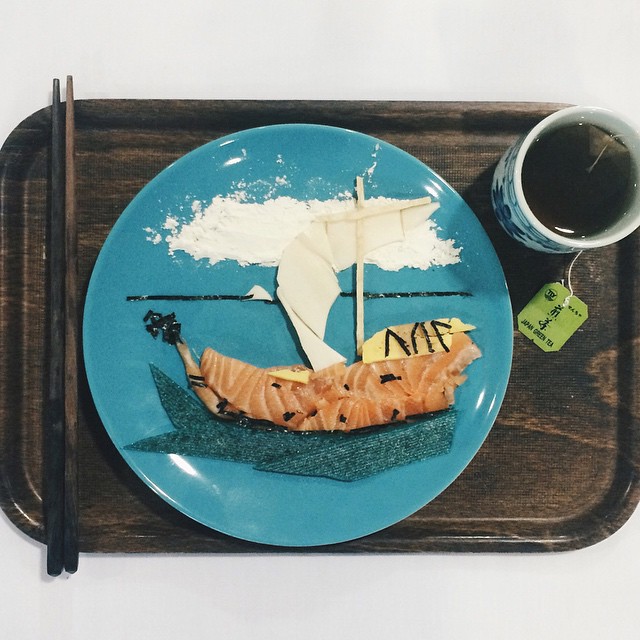
‘Red’ Hong Yi
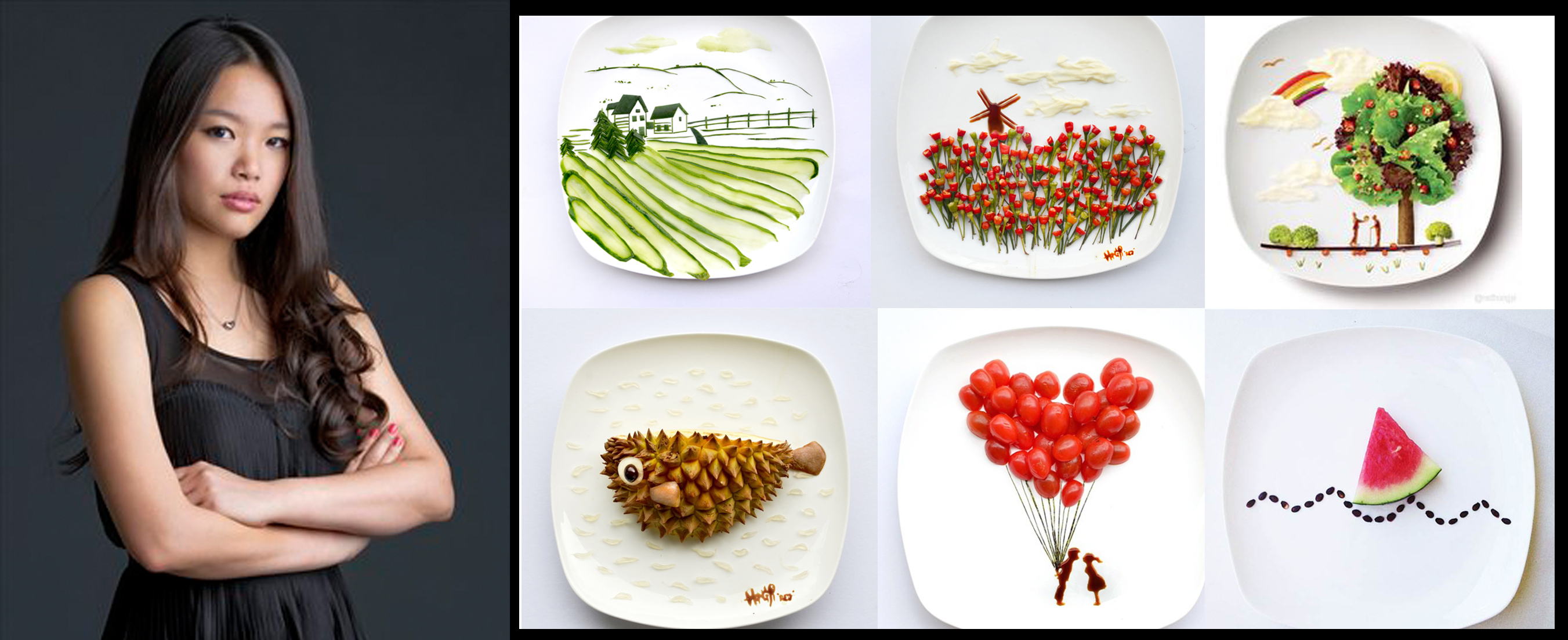
31 Days of Food Creativity
‘Keep exploring various type of medium, & never lose your sense of wonder’ – Hong Yi
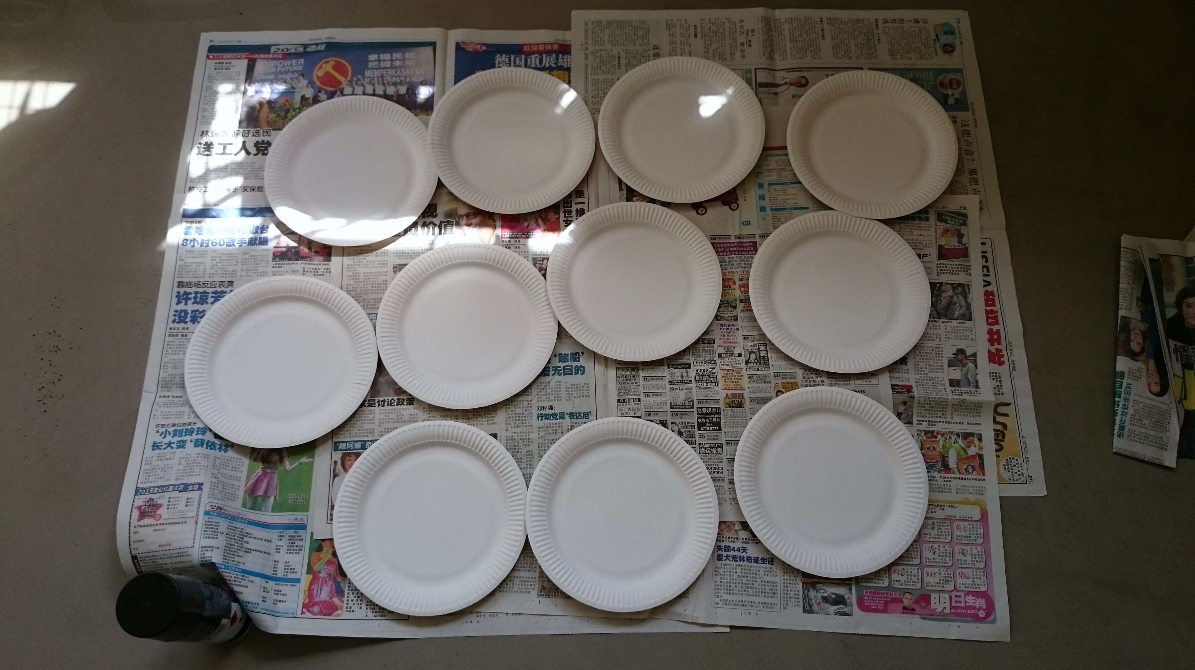
Images were comprised entirely of food product and the only backdrop is from white plate.
I find her use of medium to create landscape, animal, abstract art demonstrate the ability to ‘Imagine beyond boundaries’
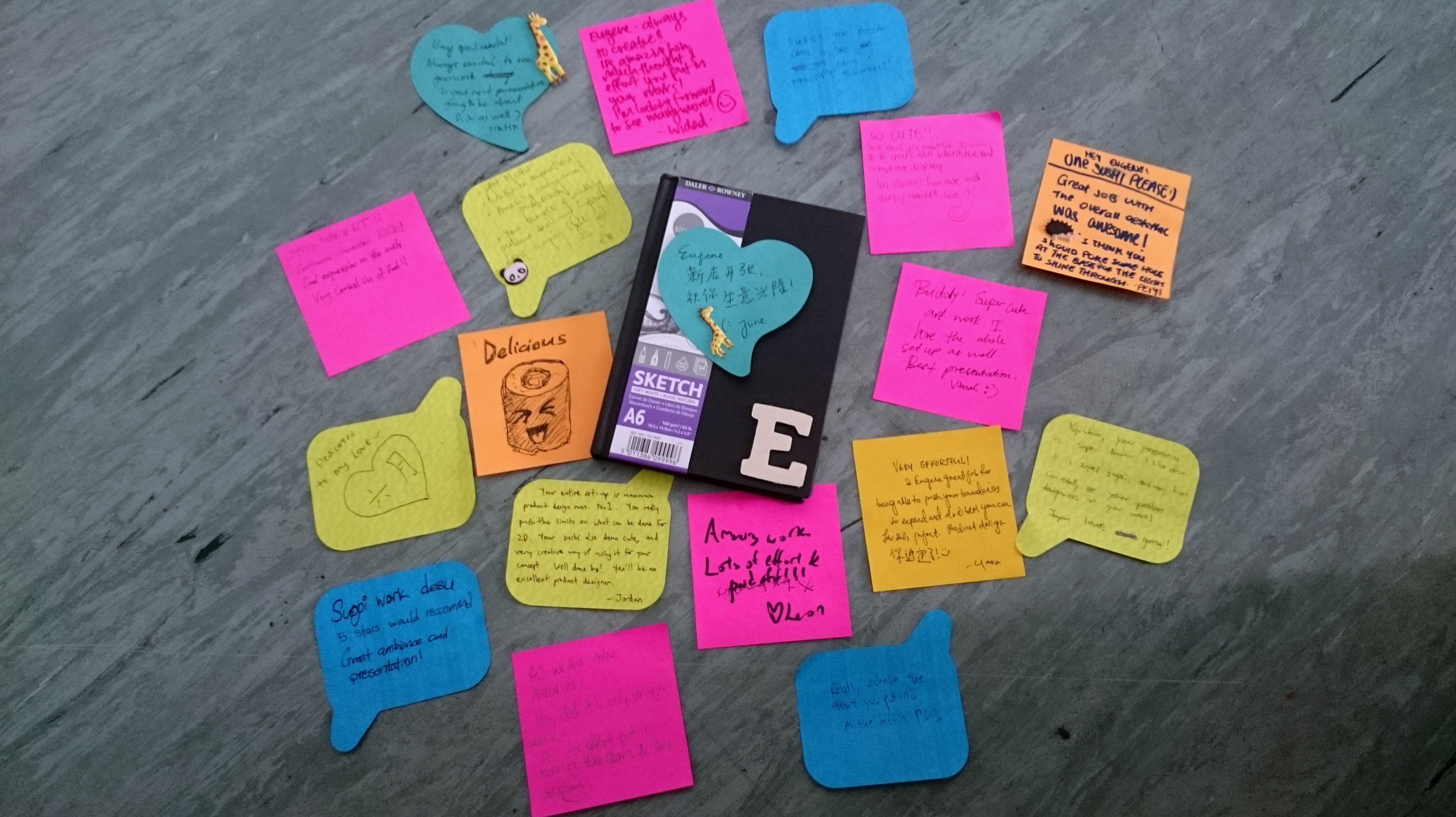
Thank you Joy & G1!
We did it!


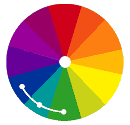

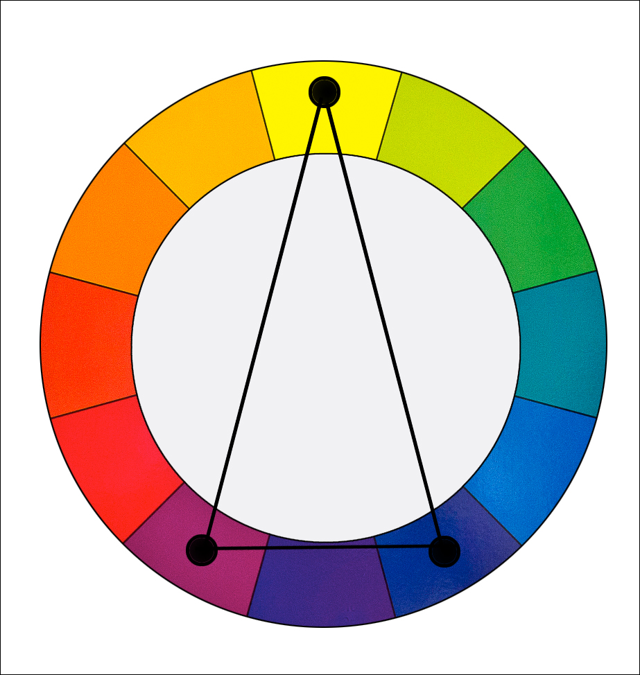

 As the name suggest, it is the selection of colours found in a triangular shape on the colour wheel.