
Foundation 2D Project 3 – Research
Activity # 1 Your Interests & Traits.

Activity # 2 : Yourself in Year 2020.

Many thanks to my classmates for the contributions!
Had fun adding points to the drawings of other classmates as well. (:
How does colour have impact on a painting?
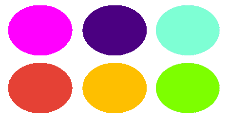
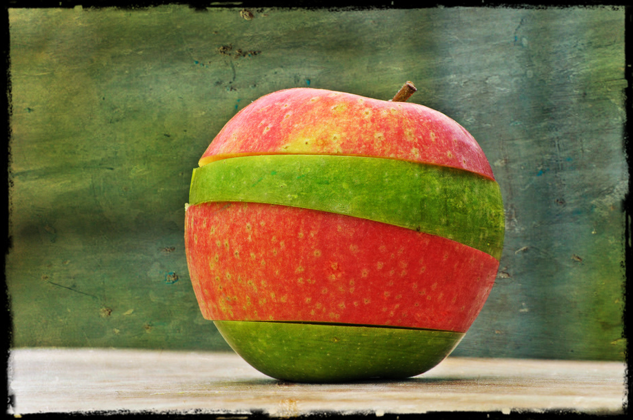
Colours breathe life into artworks. Besides enchanting an artwork, it controls how the intended message is being convey. For example (Fig.1) below, shows how colours can affect the mood of an artwork. The use of bright colours in a painting is able to “evoke a certain mood” that creates positive feelings such as happiness while the use of ‘Colours of one Value’ may create negative feelings such as being lifeless. Research have shown how the choice of colours may affect the artwork. Bright colours such as ‘Yellow’ produce more cheerful feel whereas ‘Red’ reminds us of annoyance. Hence, colours can influence the way we interpret an artwork.
(Fig.1)


Warm & Cool
Colours can be classified into 2 segments; Warm and Cool colours.
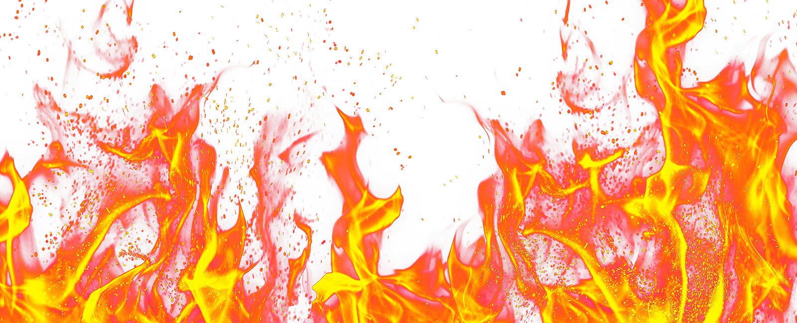
Warm colours such as ‘Red’, ‘Orange’ and ‘Yellow’ are colours of FIRE.
It range from happiness to violence which may represent – Passion, Energy and Impulsiveness.
In other words, Warm colours are eye-catching, makes people excited.
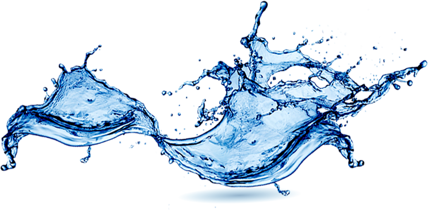
Cool colours, on the other hand, consist of colours such as ‘Green’, ‘Blue’ and ‘Violet’. Those are the colours of WATER. It is usually associated with calmness, trust and sadness. Hence, Cool colours are used to bring soothing harmonious properties.
“Artists are always looking for ways to create meaning in their work.” – Lori McNee
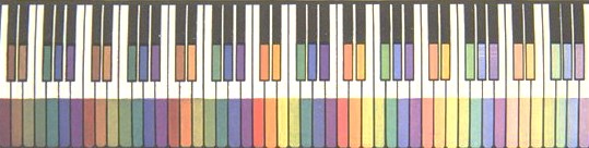
Check this out! > Colours Explanation
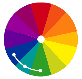
Colour Categorisation
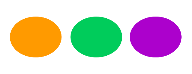
According to Moses Harris theory on the colour wheel, ‘Red’, ‘Blue’ and ‘Yellow’ are Primary colours that cannot be created by mixing any other colours together.
Primary Colours: RED, BLUE, YELLOW

The colour wheel was further extended to include the Secondary and Tertiary colours.
Secondary Colours: ORANGE (Red + Yellow), GREEN (Yellow + Blue), PURPLE (RED + BLUE).
Tertiary Colours: (Yellow-Orange), (Red-Orange), (Red-Purple), (Blue-Purple), (Blue-Green) & (Yellow-Green).
Colour Harmony
Definition: something that is pleasing to the eye. It engages the viewer and it creates an inner sense of order, a balance in the visual experience. When something is not harmonious, it’s either boring or chaotic.
Monochromatic Colour Harmony:

What is that? Colours that are shade, tones or tint variations of the same hue. The hue is affected by the amount of ‘Black’ and ‘White’ present in the mixture.
Why & When do I use it? Recommended in producing a soothing effect through visual perception. Good for creating a balanced and visually appealing artwork.
How does it works? Creates from one of the twelve Hues from the Basic Colour Wheel and repeating it in various Tints, Shades and tones. The monochromatic colour scheme use variation in lightness and saturation of a single colour.
Analogous Harmony (Dominance):

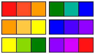
What is that? Colours that are close proximity to each other on the colour wheel, usually in group of 3, that shares similar hue and saturation. One of the Primary or Secondary will act as the dominant colour.
Why & When do I use it? To create a blending, comfortable design that is pleasing to the eye.
How does it works? Features colours that lie adjacent to each other on the colour wheel. Each of the three colours has one colour in common hence resulting in almost no contrast and less vibrant.
Analogous Harmony: Warm & Cool:
WARM:

Warm colours are colours of FIRE. Colours such as ‘Red’, ‘Orange’ and ‘Yellow’ associate with WARMTH.
COOL:
Cool colours are colours of WATER. Colours such as ‘Green’, ‘Blue’ and ‘Violet’ associate with CALMNESS.
When using Analogous Harmony, avoid combining warm and cool colours concurrently.
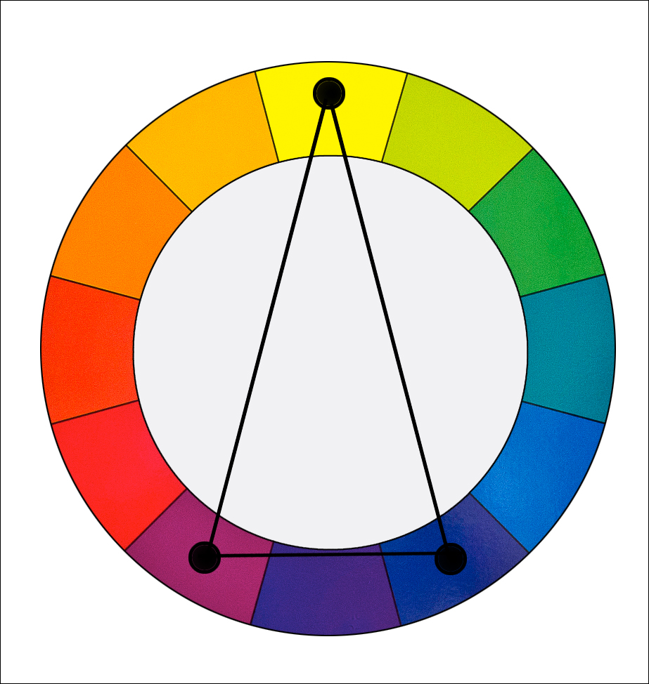
Complementary Hues (Opposite):

What is that? They are made from colours of the opposite side in the colour wheel.
Why & When do I use it? Use to bring strong contrast in an artwork when colours are at full saturation.
How does it works? Apply a warm colour against a cool colour to create high contrast.
Check this out! > Complementary Colours in Landscape
Split Complementary (Compound)
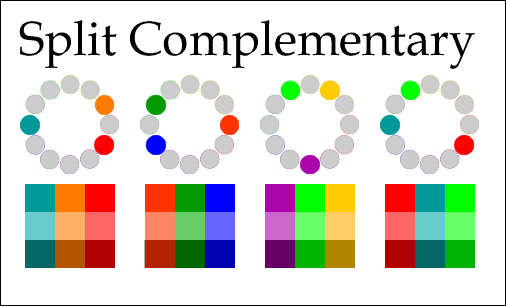
What is that? It uses a colour and 2 colours adjacent to its complementary.
Why & When do I use it? To provide high contrast without strong tension of the complementary scheme.
How does it works? *Insert Picture* By combining 1 base colour with 2 colours of the adjacent opposite, not with the complementary colour itself.
Check this out! > Spilt Complementary in Textile

Other Colour Schemes
Triadic Complementary (Triangle)
 As the name suggest, it is the selection of colours found in a triangular shape on the colour wheel.
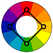
Tetradic Complementary (Rectangle)

The use of 4 colours found in a complementary pair in a rectangular format on the colour wheel.
Square Complementary
 Positioned in a square format, the colours used are found on any four corners on the colour wheel.
Read More:
http://www.color-wheel-pro.com/color-schemes.html
http://www.worqx.com/color/combinations.htm
http://www.tigercolor.com/color-lab/color-theory/color-theory-intro.htm