Foundation 2D Project 3 – Ego (Research) – Part 2
Andy Warhol
Left to Right
Mao, Marilyn Monroe, Orangutan
Besides what was covered in Project 1, Andy Warhol is also famous for his Pop art and Silkscreen printing methods. Painting of famous people such as Mao Ze Dong and Marilyn Monroe were painted in harmony.
For example, the painting of ‘Marilyn Monroe’ (above) shows the method of ‘Triadic complementary’ or the 3 Primary Colours (Yellow, Red, Blue), and ‘Monochromatic’ in harmony.
Whereas for the painting of ‘Mao Ze Dong’ (above), Andy Warhol made use of Analogous Harmony (Yellow-Orange, Yellow, Yellow-Green).
Personal Opinion:
I find his use of colours interesting and the painting of the noticeable figures adds up to the overall composition which engage his audience as promised. Although his artwork can exist in many different colours, his choice of colour combinations follows the rule of colour harmony which was present in the colour wheel.
Click here to > Create your photo with ‘Andy Warhol Effect’
Piet Mondrian
Left to Right
Broadway Boogie Woogie, Die ideale Wirklichkei
“Simplicity is the ultimate sophistication.” – Leonardo da Vinci
In the painting above, Piet Mondrain radically simplified the elements by using primary colours (Red, Blue & Yellow) to bring out the expressionism in his geometric abstracts.
His use of geometric shapes and lines creates a sense of asymmetrical balance in the overall composition. In addition, the use of Negative space, such as the use of Black lines and white planes, sets the contrast and focus in the painting.
Personal Opinion:
I was amazed by how Piet Mondrain use of primary colours to express the harmonious order through art. Also, I like how the grid-like format drawing that brings out a clean, organised yet unfinished feel through the use of negative space. (So which is the focus? – White or the Colours?) In my opinion, I feel the white should serve as the focus due being the dominant in his painting.
Click Here For > Steps to make a Piet Mondrian’s inspired painting.
Other Interesting Finds,
Bauhaus art movement

Herbert Bayer – Chromatic Intersection

Gunta Stölzl – Rot Grün
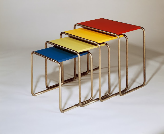
In Product Design.


