
For this project, we are to create 4 different typographic portrait by using either your whole name, part of your name, your nickname or your initials to describe your future job.
Concept
To a large extent, these jobs, despite the difference in title, are related to one another if you look at it from a different perspective. Hence, instead of creating the typographic portraits as 4 different portraits, I wanted them to come together as a whole.
Art Direction
I chose to use photography as my medium and I will undertake the chiaroscuro (light-dark) style to create a focus on the alphabet incorporated in the portraits.
set-up
In the below, is a short video of how the make-shift set-up that I created at home to shoot the portraits.

I was only able to create this set-up with the help of my mom and dad for helping me source the wooden plank and black cloth as the backdrop!!!!!
So thank you parents, for helping me out in ways possible!

Not forgetting my lovely model, that is my best friend for being such a sport! Thank you for dedicating so much into helping me, you’re such a gem!!
So thank you karmun, for helping me wholeheartedly!
shortlisted future jobs
In the below, are the jobs that I have shortlisted for the 4 typographic portrait.
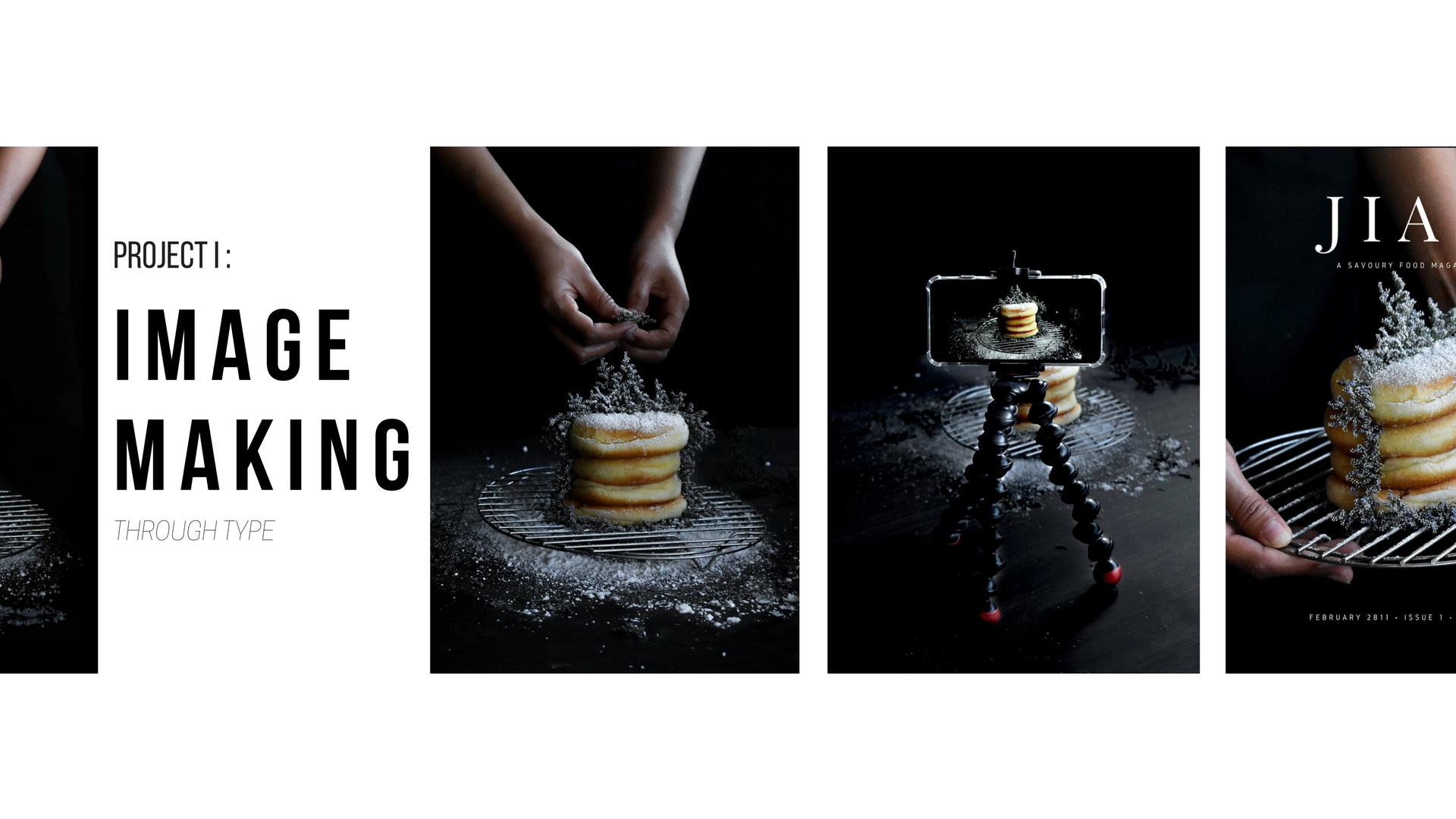
first Job: Baker
I’ve never seen myself as someone that suits cooking despite that little tinge of excitement bubbling in me whenever I get to assist in any cooking process! Reason being, I am an ultimate klutz. So I tend to mess things up unknowingly where I’ll add the wrong condiments, weigh the wrong amount of flour to be added, casually burning the food and even, breaking the utensils. That’s just me. But I guess I am pretty lucky in a sense, I am way better at baking.
If there is anything I like about baking, it would be the idea of creating something from nothing. For this particular typographic portrait, I chose to use the alphabet Y from my name. This idea actually came from a photo that I found on Pinterest while looking from inspiration.

As seen from the picture in the above, the alphabet S is clearly represented using elements relating to the particular job.
Riding onto this direction, I figured that the alphabet Y would work the best for me. I started by listing down the elements that I would want to include in the portrait and this was what I came up with:

By including two hands filled with icing sugar and creating the motion of sprinkling down onto the donuts that were stacked, the alphabet Y was created.

For this particular portrait, I actually tried out various angles and style with different props as seen in the below:

I really had a hard time choosing the photos but I eventually went ahead with the one that I felt suited the overall theme better.

Final portrait:

Second Job: Florist/Decorator
Back then when I graduated from poly, my family and friends were so kind to get me flower bouquets. But as we all know, flowers wither really quickly and me being me, I couldn’t bear to throw the flowers away hence I started researching on ways to preserve the flowers for as long as possible. This actually sparked an interest in me where I started exploring on flowers.
If there is anything I like about flower arrangement or just handling with flowers in general, it would be freedom to create and enhance the aesthetics of another. Flowers, is a beauty on its own but what makes it special, is it’s ability to complement and further enhance the aesthetics of another when being placed together.
As usual, I listed down the elements that I would like to include in the portrait and this was what I came up with:

For this particular typographic portrait, I chose to use the alphabet I from my name. This is based on the structure of the donuts that are stacked onto one another. If you look closely, you’ll realise that the donuts at the top and bottom are slightly longer and wider whilst the middle two donuts are shorter and thinner. This actually follows the letterform of an alphabet ‘I’ as seen in the below:

However, I only managed to settle on the alphabet I after many attempts. Previously I was working on the alphabet A for this portrait as seen in the below:

However after consulting Joy, she mentioned that instead of intentionally creating the alphabet, we should focus on highlighting the unique features of the letter form. Hence with that, I decided that the alphabet I works the best.
Using the exact same setting in portrait 1, I included the flowers to represent the idea of a florist and also, to show the relation between the two jobs where as a baker, not only do you bake for the taste, you also decorate to create that finishing product.

Final portrait:

Third Job: photographer
Despite specialising in design, it has always been a dream of mine to be a photographer, be it a professional or a freelance photographer. I can’t exactly pin-point what draws me into photography, but if there’s anything I like about it, it would be the freedom to express your point of perspective (in terms of how you view things), capture it and turn it into something tangible for memory keepsake.
As usual, I listed down the elements that I would like to include in the portrait and this was what I came up with:

For this particular typographic portrait, I chose to use the alphabet A from my name. This is based on the structure of a standing lamp. In my opinion, light, be it natural or artificial, is an essential tool to every photographer. Besides, the leg of the standing lamp follows the structure of the alphabet A as seen in the below.
However, as I was trying to prepare the set-up for the photoshoot, I realised that I did not have a standing lamp, hence I figured that a tripod would be a better substitute.

Similarly, the legs of the tripod follows the structure of the alphabet A. With that, I went ahead with the idea. Using the exact same setting in portrait 2, I included a phone with a camera function on attached to a tripod to represent the idea of a photographer and also, to the relation between the jobs where after putting in so much effort into baking and decorating the product, you’ll want or have to capture nice shots of it to include it on your menu or for personal and/or business references in the future.

It took me a while trying to choose the final portrait because being a biased photographer, I really like all the photos taken.
Final portrait:

fourth job: journalist
I have never been good with words, in fact, I’m bad at it! Neither am I good reader, because half the time, I don’t get the content. This is why I have always looked up to anyone holding a job related to content writing. Being able to convey your message while ensuring that the content is interesting, is not an easy feat. Despite being bad with words, if I could, I would want to challenge myself to be a journalist, explaining my choice of job.
As usual, I listed down the elements that I would like to include in the portrait and this was what I came up with:

For this particular typographic portrait, I chose to use the alphabet J from my name. This is actually inspired from the word ‘Jiak’ which actually means eat in dialect. Since my name itself contains the three alphabets – J, I and A, I thought it’ll be cool to actually title the magazine cover with the word ‘Jiak’ since it is of the same context.

Also, the structure of a hook actually follows the letterform of an alphabet J. In other sense, what better way to hook the attention of your readers by placing a stack of freshly baked donuts as the cover of the magazine. I get that this is way too abstract to even be incorporated into the typographic portrait, and is something that I’ve faced and learnt from this project.

Using the photo taken in portrait 3, I included a magazine brand or title and some details to recreate a magazine cover, representing the idea of a journalist, and also, to show the relation of the jobs where after capturing nice shots, you would want to document it down.
Final portrait:

Thank you for reading!