WHY A RAMEN CHEF?
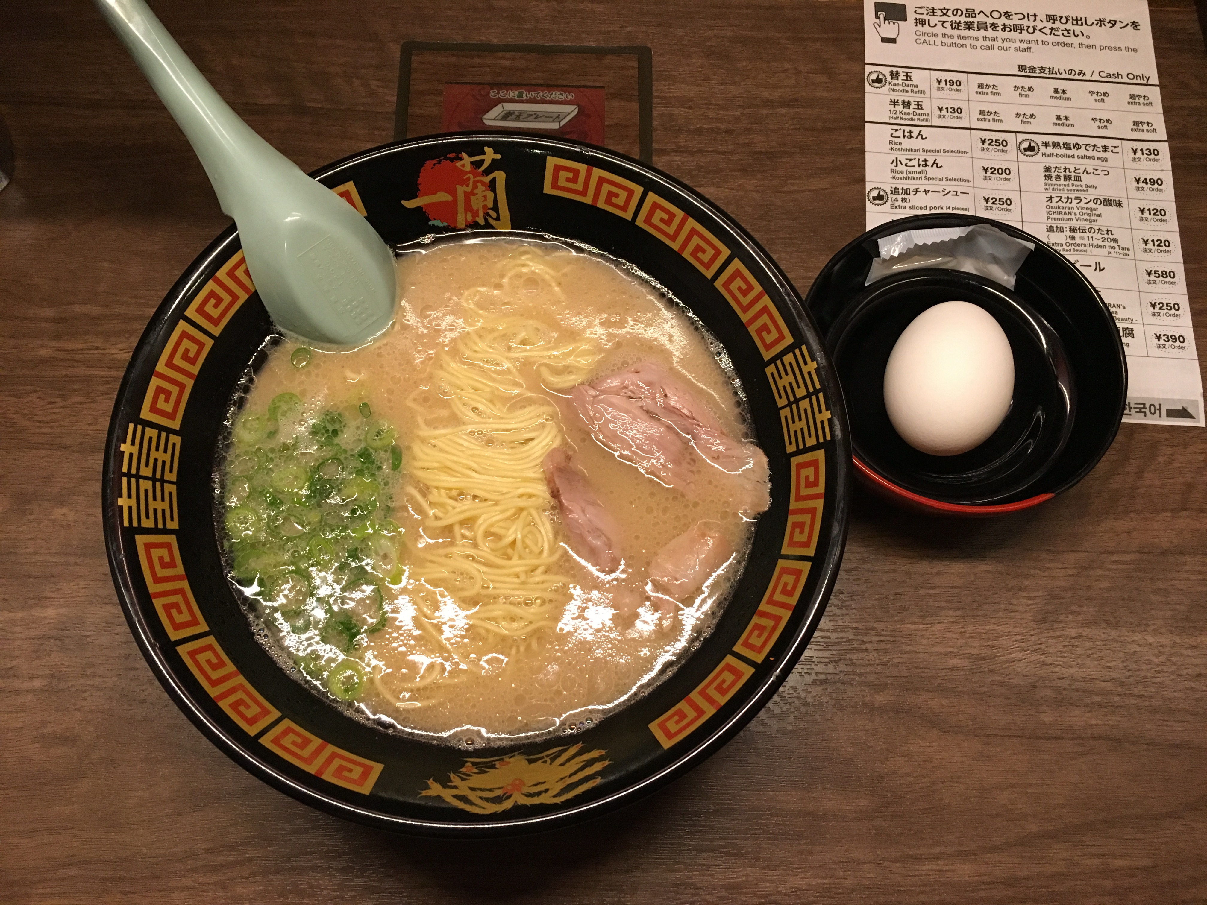
That’s because ramen is one of my favourite food is the world! Whether it’s instant or the authentic one, I love them all. It’s just super shiok to slurp the noodles up and in my humble opinion, it’s one of the best comfort food ever. My love for ramen increased when I visited Japan last year and I had the best ramen over there. I still long for the day when I return and enjoy them again…
IDEATION
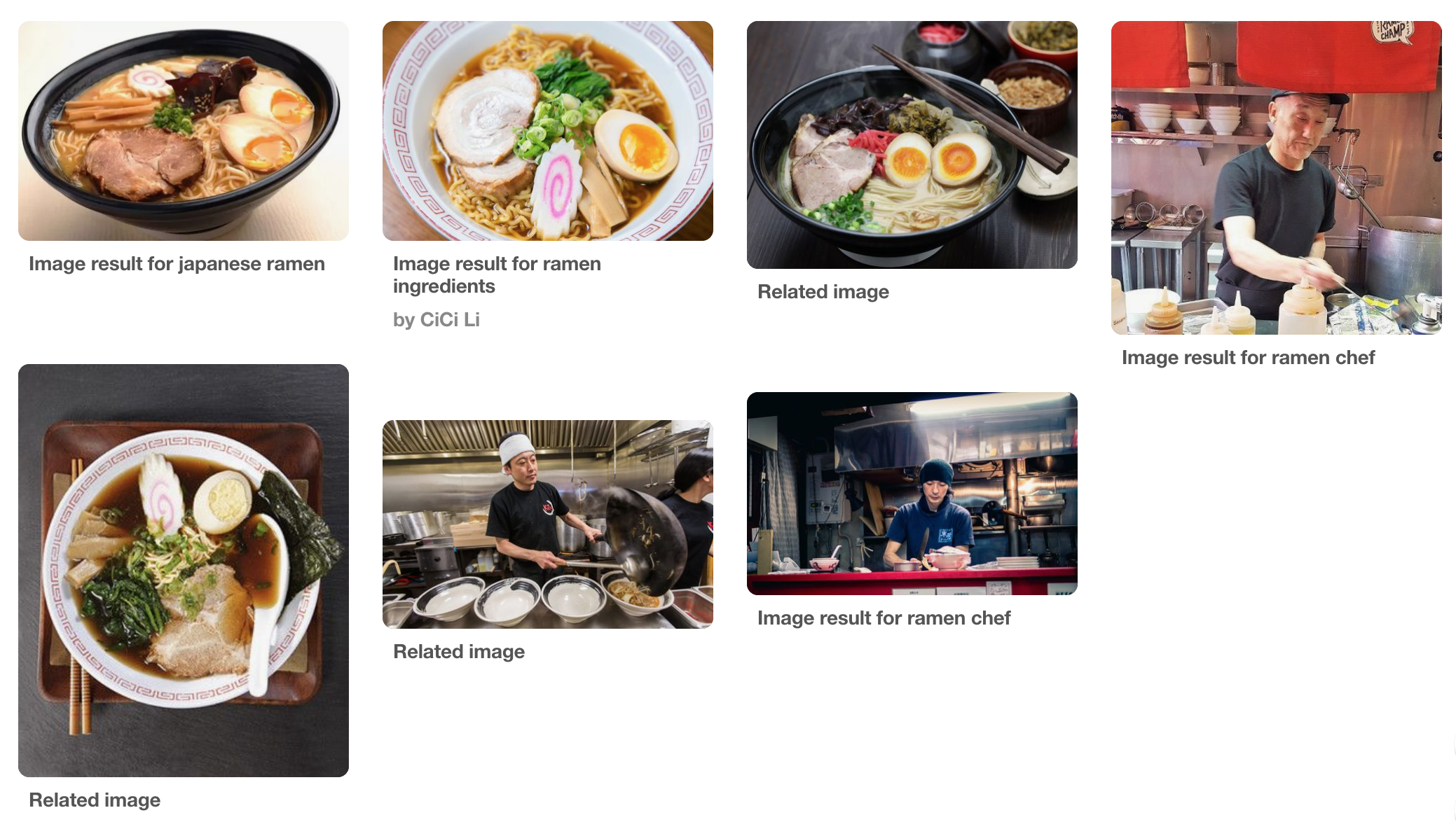
Moodboard:
This moodboard mainly consists of ramen noodles and the common ingredients that go into them, as well as ramen chefs at work.
Art Direction/Artist Reference:
Vanni Vaps is a graphic designer and illustrator from Italy, specialising in culinary illustrations. Her illustrations are very dynamic and energetic. They definitely capture her fondness for food!
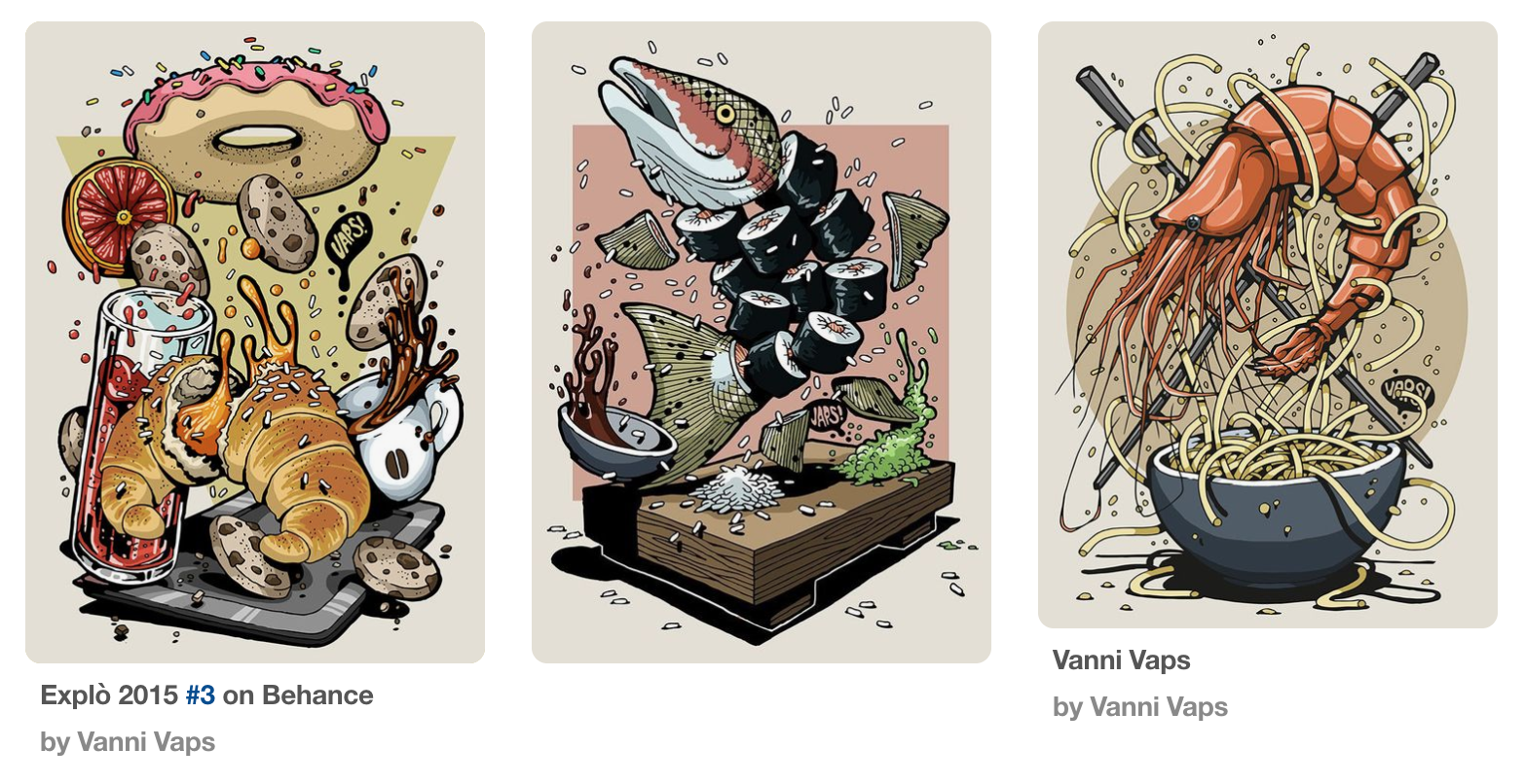
Image sources:
https://www.behance.net/gallery/23644521/Explo-2015-1
https://www.behance.net/gallery/23912771/Explo-2015-2
https://www.behance.net/gallery/24129915/Explo-2015-3
Colour scheme:
- Brown tones with pops of green and yellow
- Sticking to the actual colours of ramen
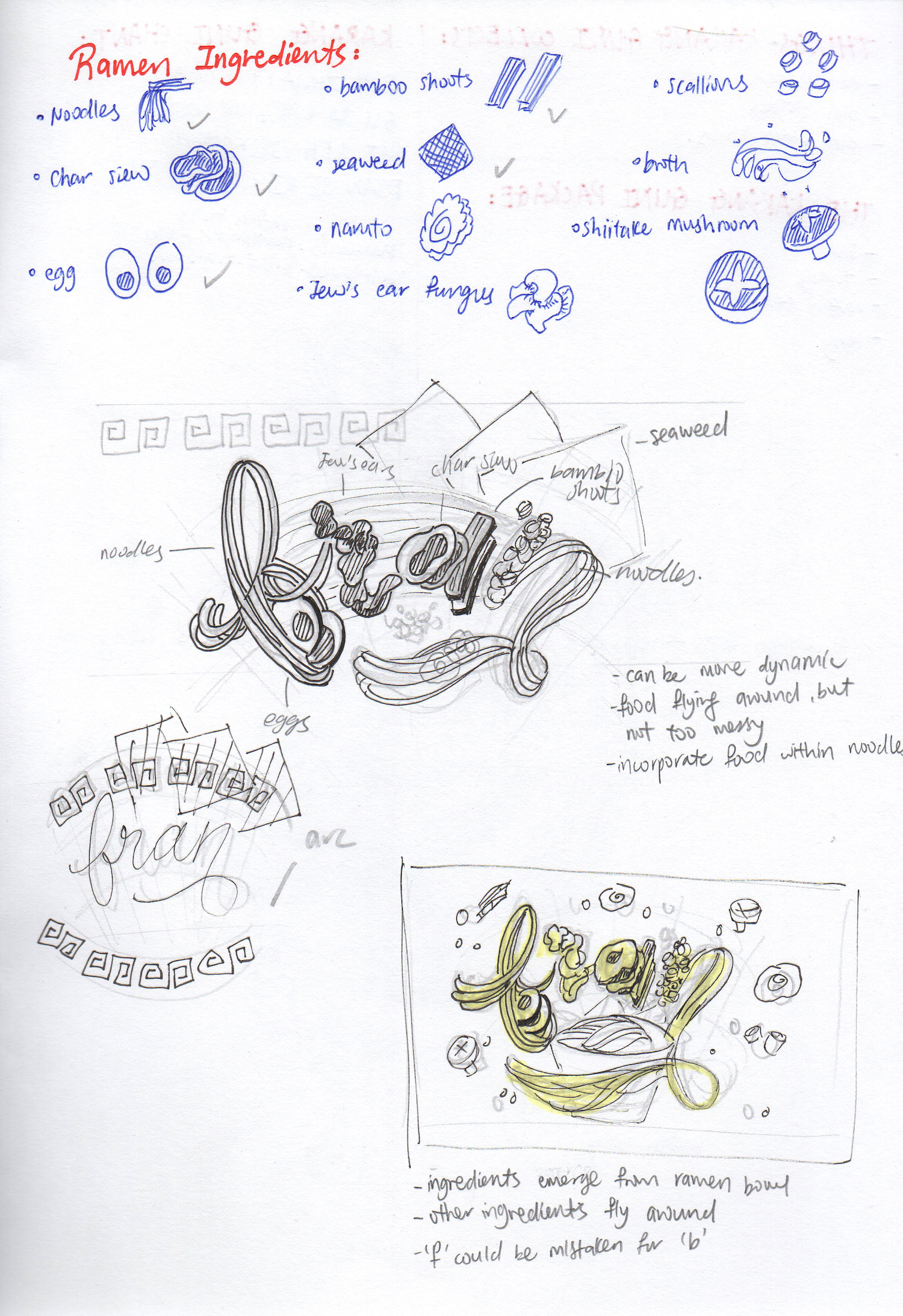
Sketches:
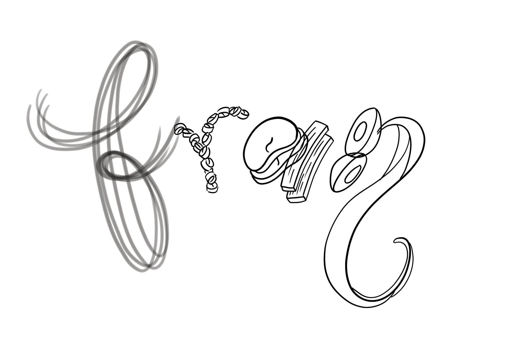
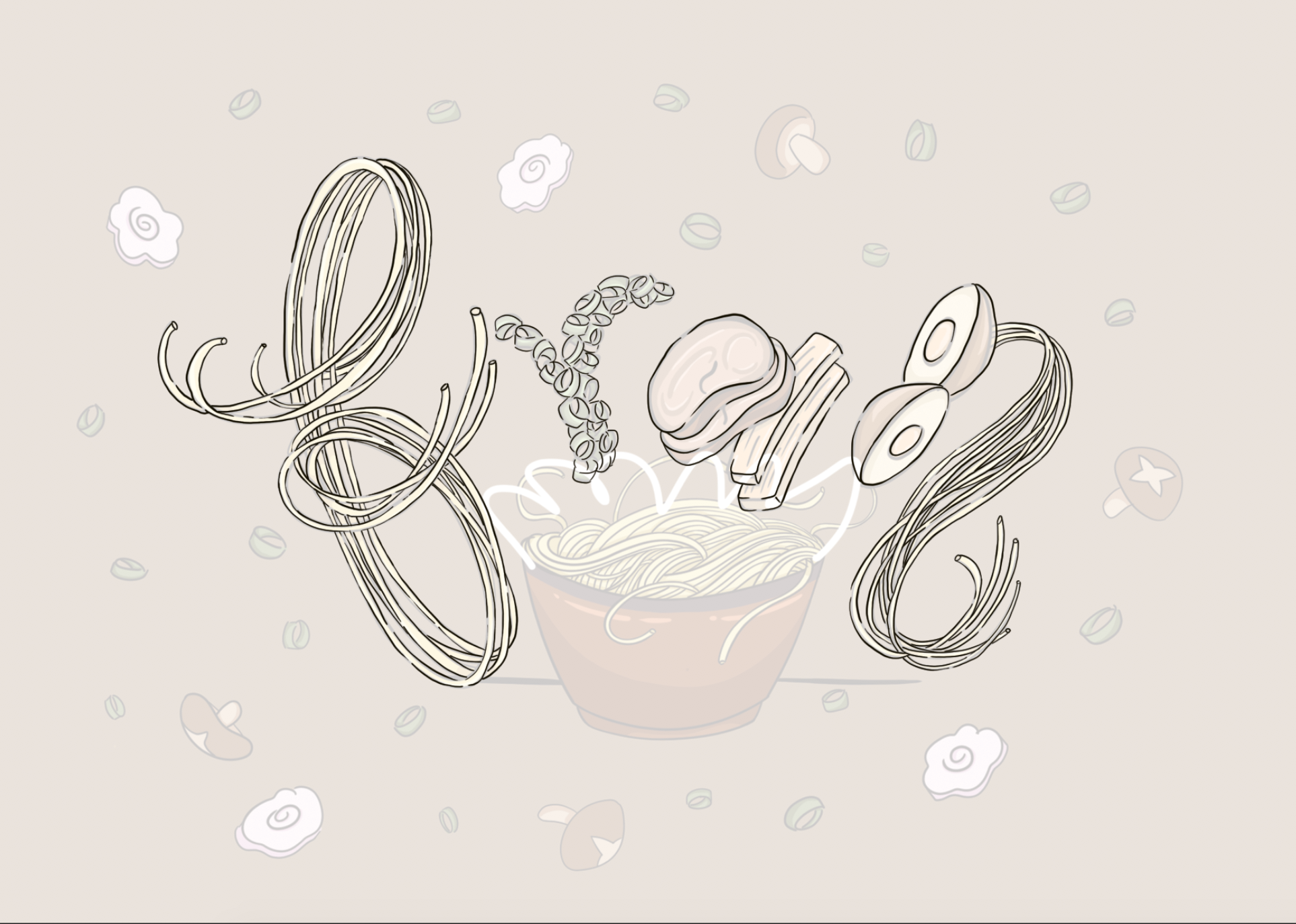
Listing out the ingredients that go into ramen and doing some thumbnail sketches. I wanted the ingredients to be floating about, appearing to be very dynamic. After many years of watching MasterChef and Gordan Ramsay’s endless yelling, I know that the kitchen is a very busy and stressful place especially during peak hours, therefore the dynamism would convey the high energy that resides in the kitchen.
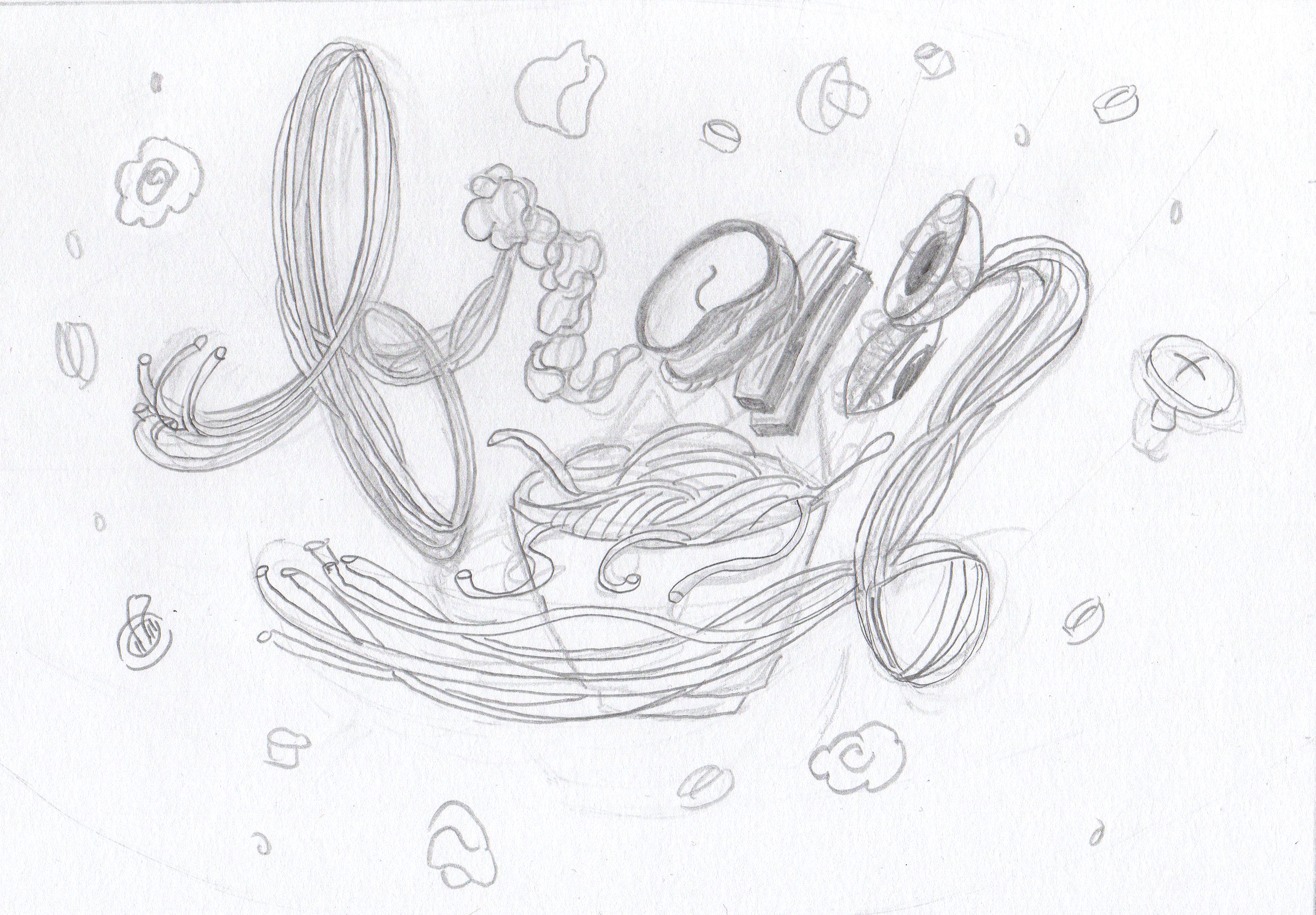
Final sketch:
EXECUTION
Development 1:
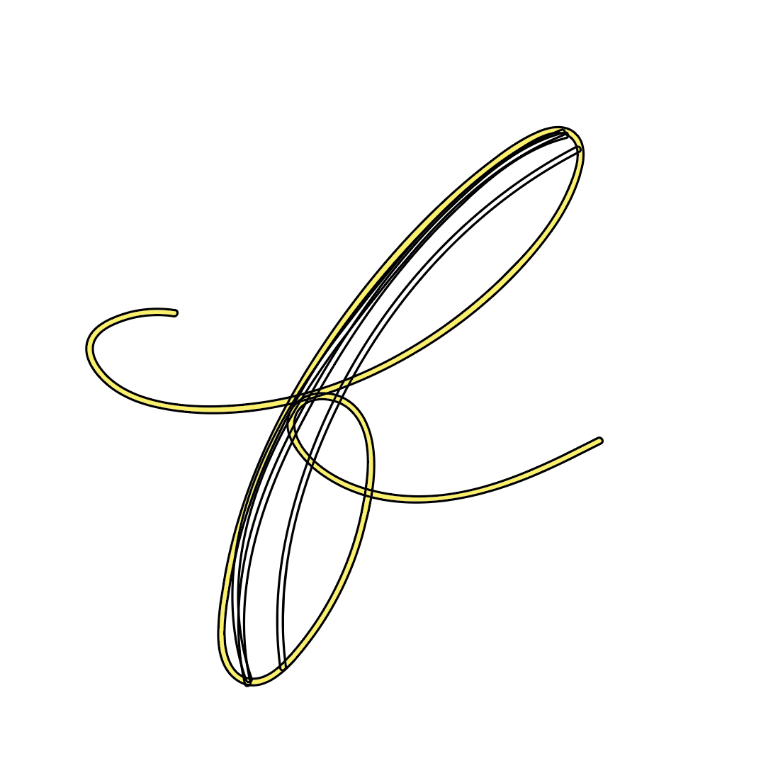
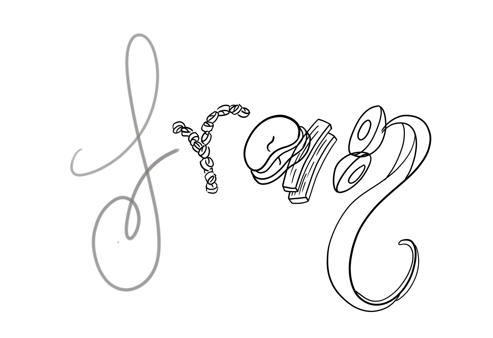
The noodles were the most challenging to illustrate because I couldn’t decide whether to draw them strand by strand or in a collective form.
Here are my attempts in trying to illustrate the noodles:
- Vector illustration
- Pros: Smooth, clear and precise lines
- Cons: Unable to give the impression that the noodles are overlapping one another because Illustrator doesn’t allow me to erase the line work freely like Photoshop does.
2. Various Photoshop brushes
- Pros: Fast and easy way to draw many noodle strands at the same time
- Cons: Too neat and unrealistic because real noodles don’t form together like this. Does not have the dynamic quality as seen in Vanni Vaps’ work.
3. Illustrating strands as a collective whole (evident in ‘N’)
- Pros: Faster method, not as tedious as illustrating strand by strand
- Cons: Still too neat and unrealistic like before
Therefore I decided to be hardworking and illustrate the individual noodle strands myself. It will be tedious but the results will be worth it!
I was also in a dilemma because I couldn’t decide on whether to use an uppercase cursive ‘F’ or a lowercase one. I decided to stick with the lowercase one eventually because it’s more legible.
Development 2:
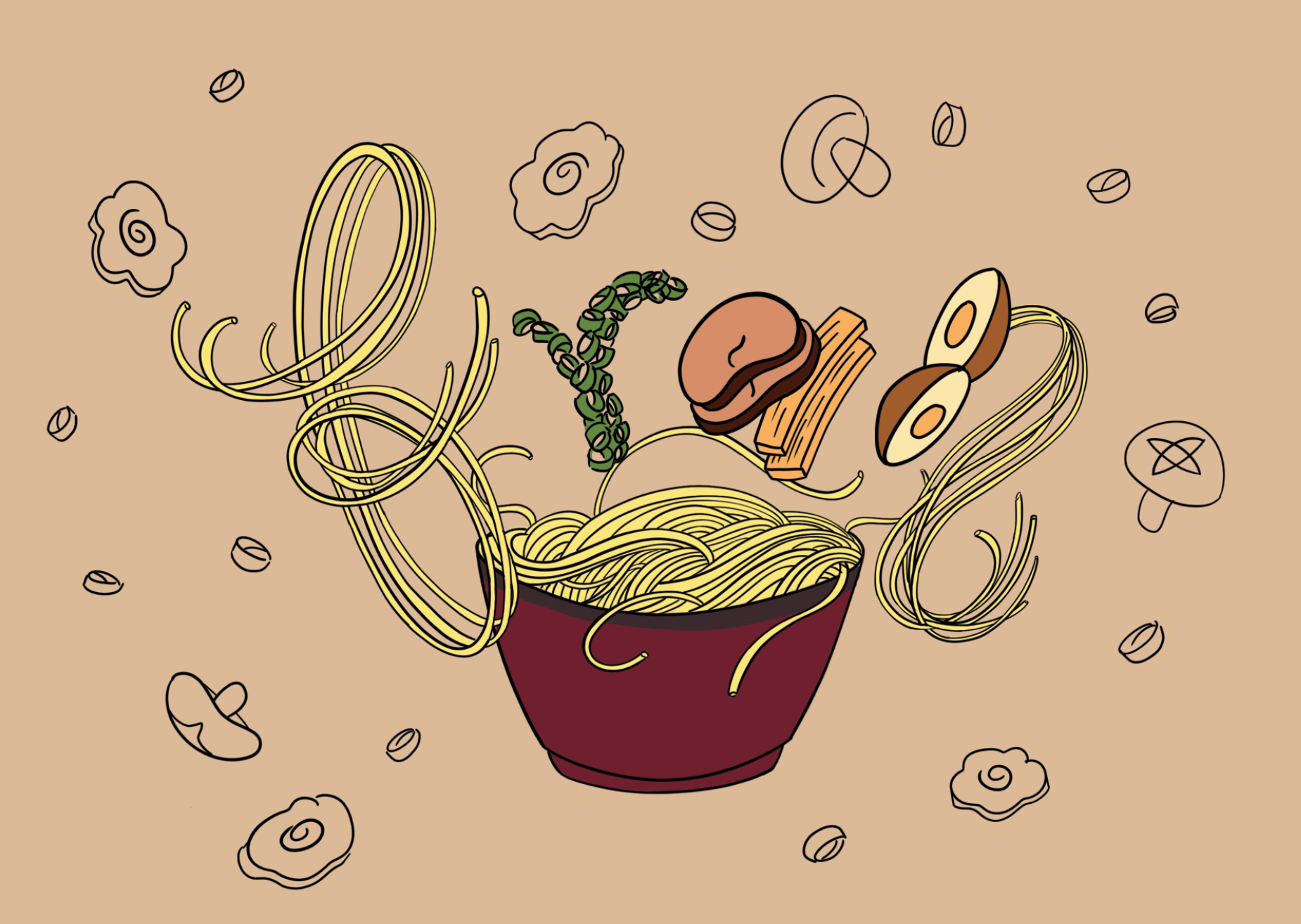
Testing the colour scheme colours once the lineart is completed.
Final illustration:
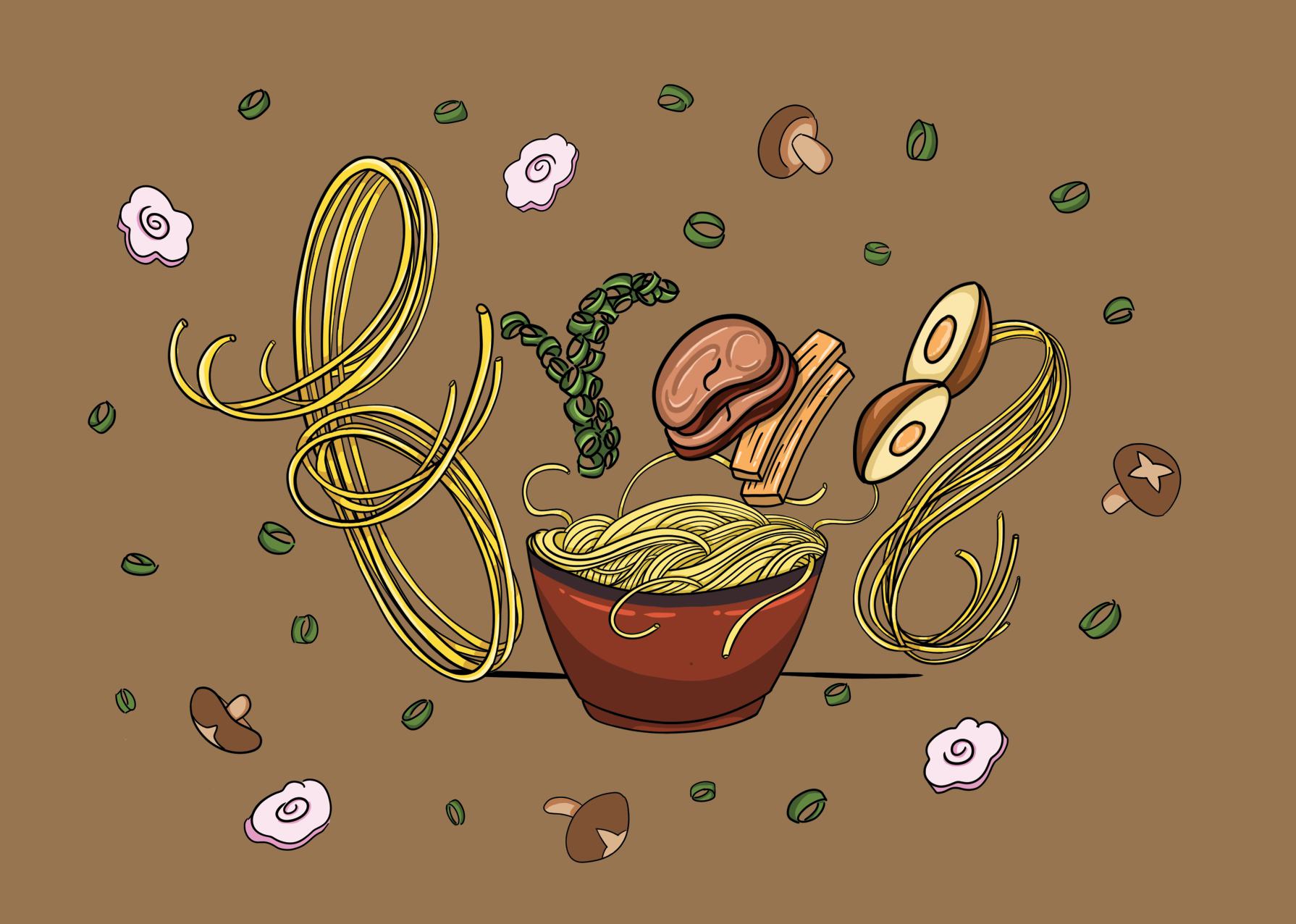
Made the background colour darker so that the ingredients will stand out. I also added highlights and shadows to the illustration so that the artwork will not look so flat.
However, looking at this illustration, something to feels off. I feel that it’s still too stiff and doesn’t reflect the Japanese culture. Therefore I decided to retain the illustration, but change the art direction and style of it. You’ll know what I mean in the next development!
Development 3:
New art direction:
This art direction is reflects the Japanese art style more clearly. The thin but fluid lines make the illustration appear more playful. The colour scheme consists of earth tones such as brown and green, which is more cohesive and pleasing to the eyes too.
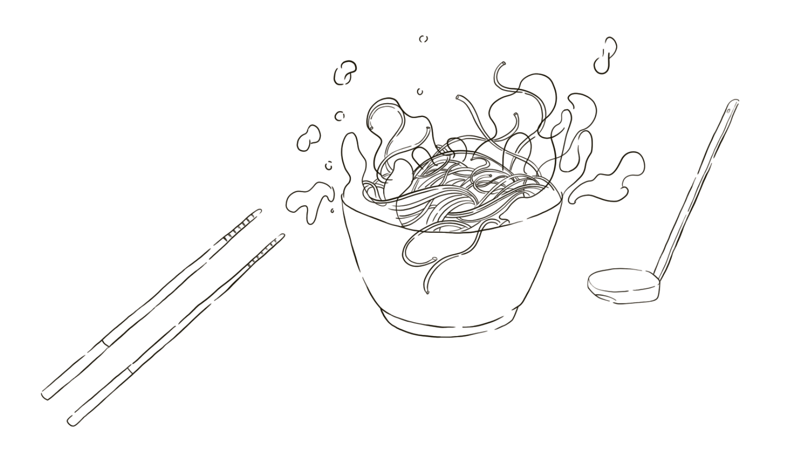
From the new art direction, I observed that the lineart is actually of different widths throughout. The lines are broken up too, instead of a single solid line throughout. Since I already have my ‘finalised’ illustration from before, I just traced over it and tried to imitate the style of lineart in my new art direction.
I redrew the noodles in the bowl and made the broth spill over to make them appear more dynamic and fluid. The addition of utensils complete the entire meal, and it’s ready to be served!
Development 4:
Now that the lineart is settled, it’s time to colour it again. For the colour scheme, I stuck closely with that of my new art direction because I felt that it conveyed the nature of the occupation very well.
Attempt 1:
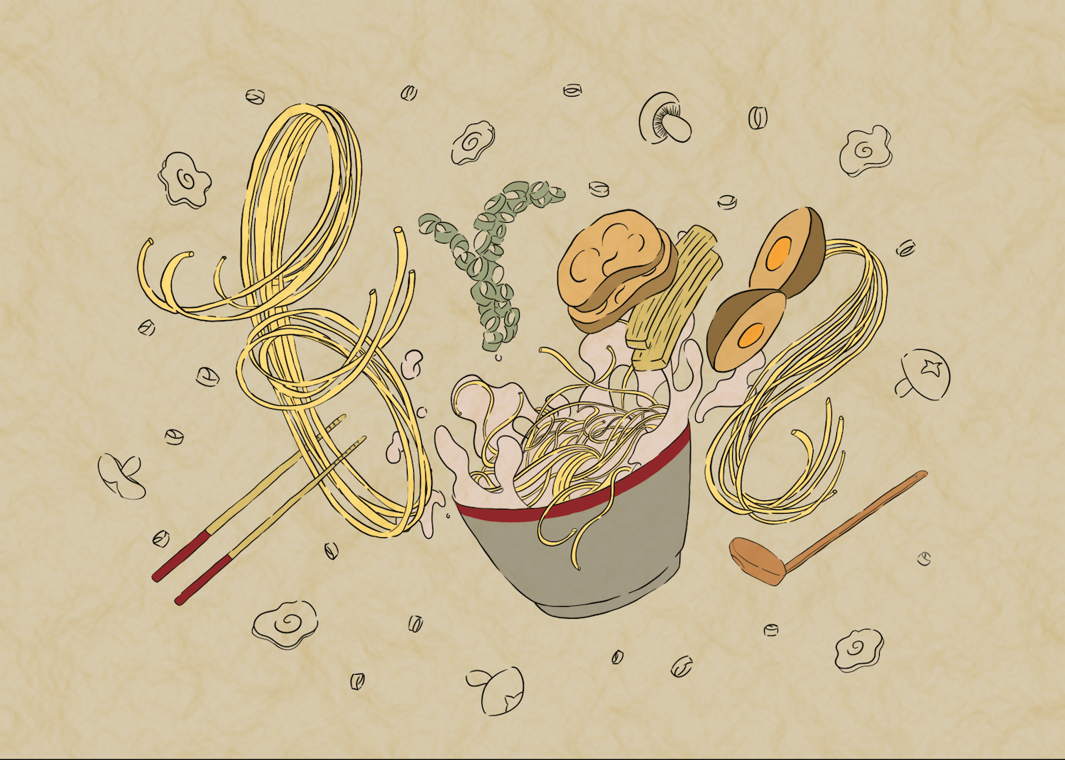
The colour of the broth is too dark and it stands out too much.
Attempt 2:
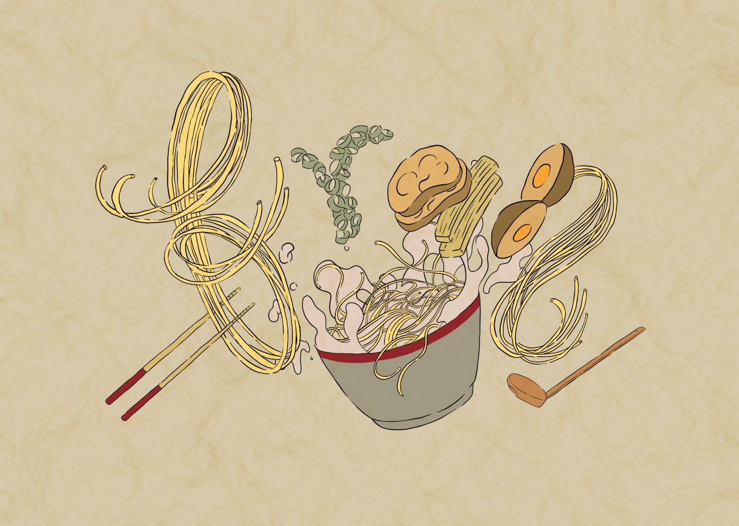
I feel that this colour scheme works better together! My original idea was to include flying ingredients around the main composition, but I felt that they were too distracting because I already had the dynamic bowl of noodles going on at the bottom already. I consulted my friend and she shared the same sentiments, therefore I decided to remove the flying ingredients in the end.
The new art direction that I had resembles the traditional Japanese illustrations on scrolls. This gave me the idea to overlay a Japanese paper texture to give the illustration more historical context, that indicates this is an illustration done in the past and has aged since then.
Development 5 – FINAL DESIGN:
Touched up with a few details such as adding some light shadows and the movement lines to show that the ingredients are moving.
