
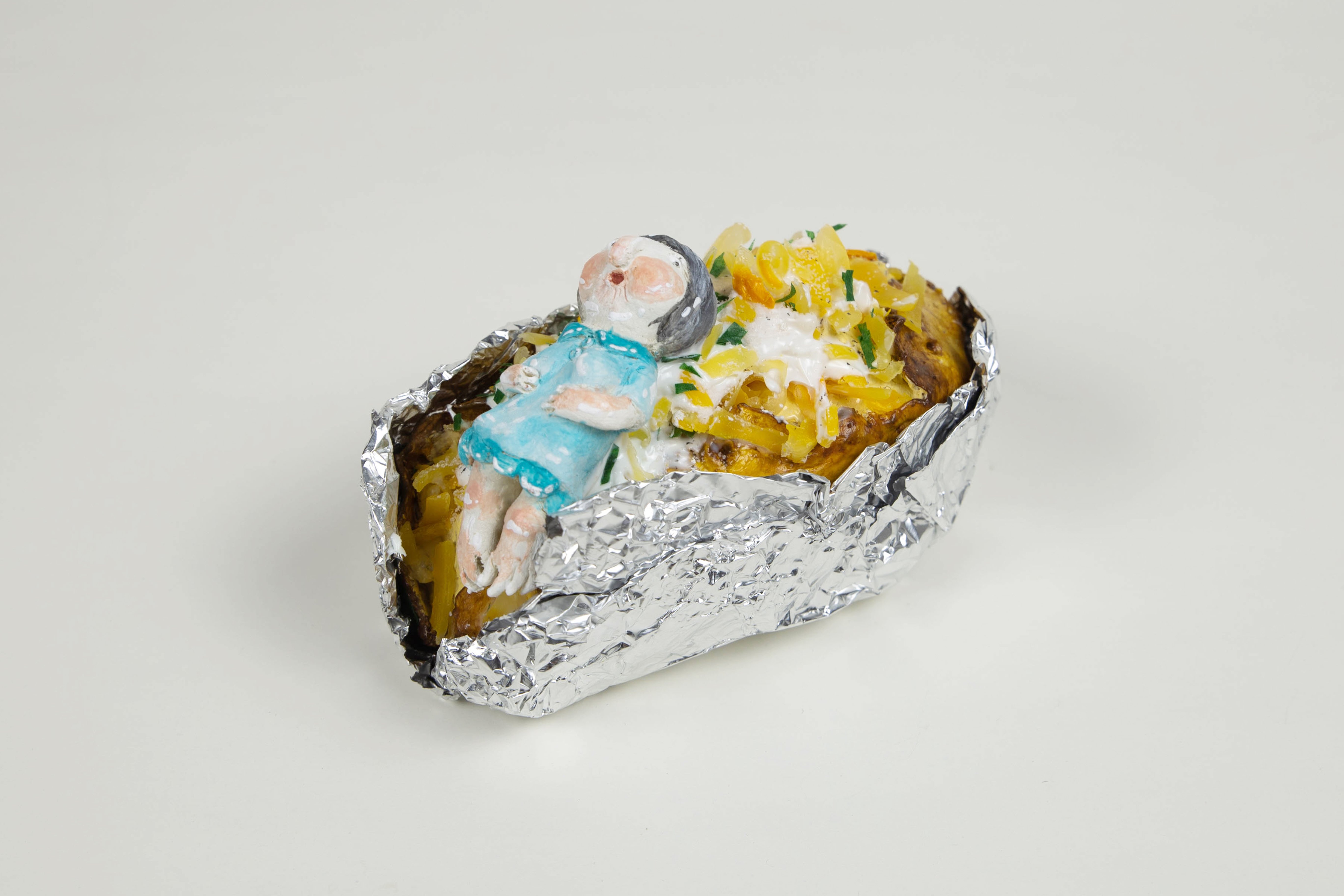
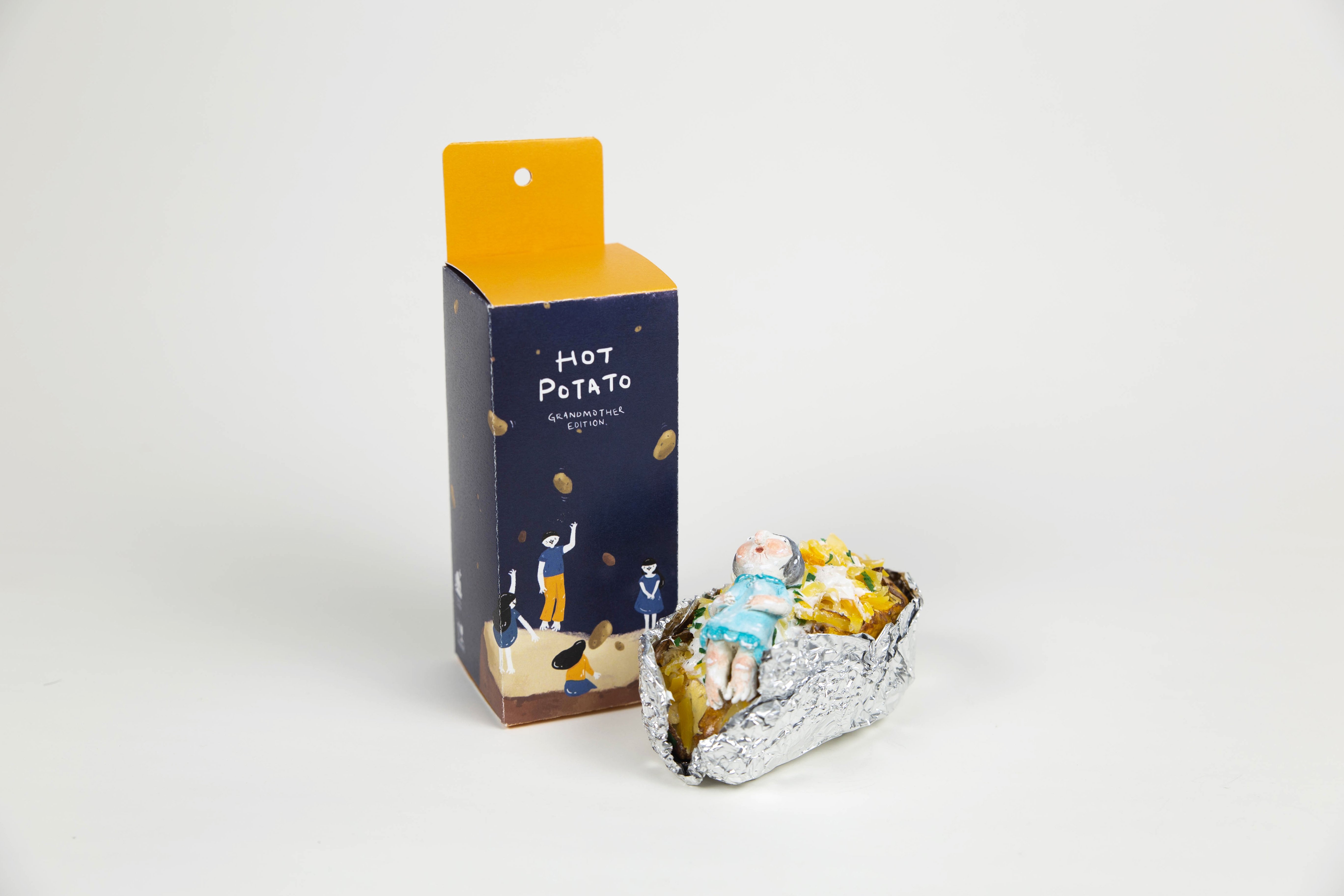
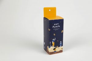
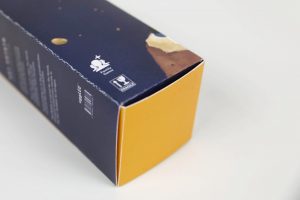
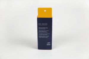
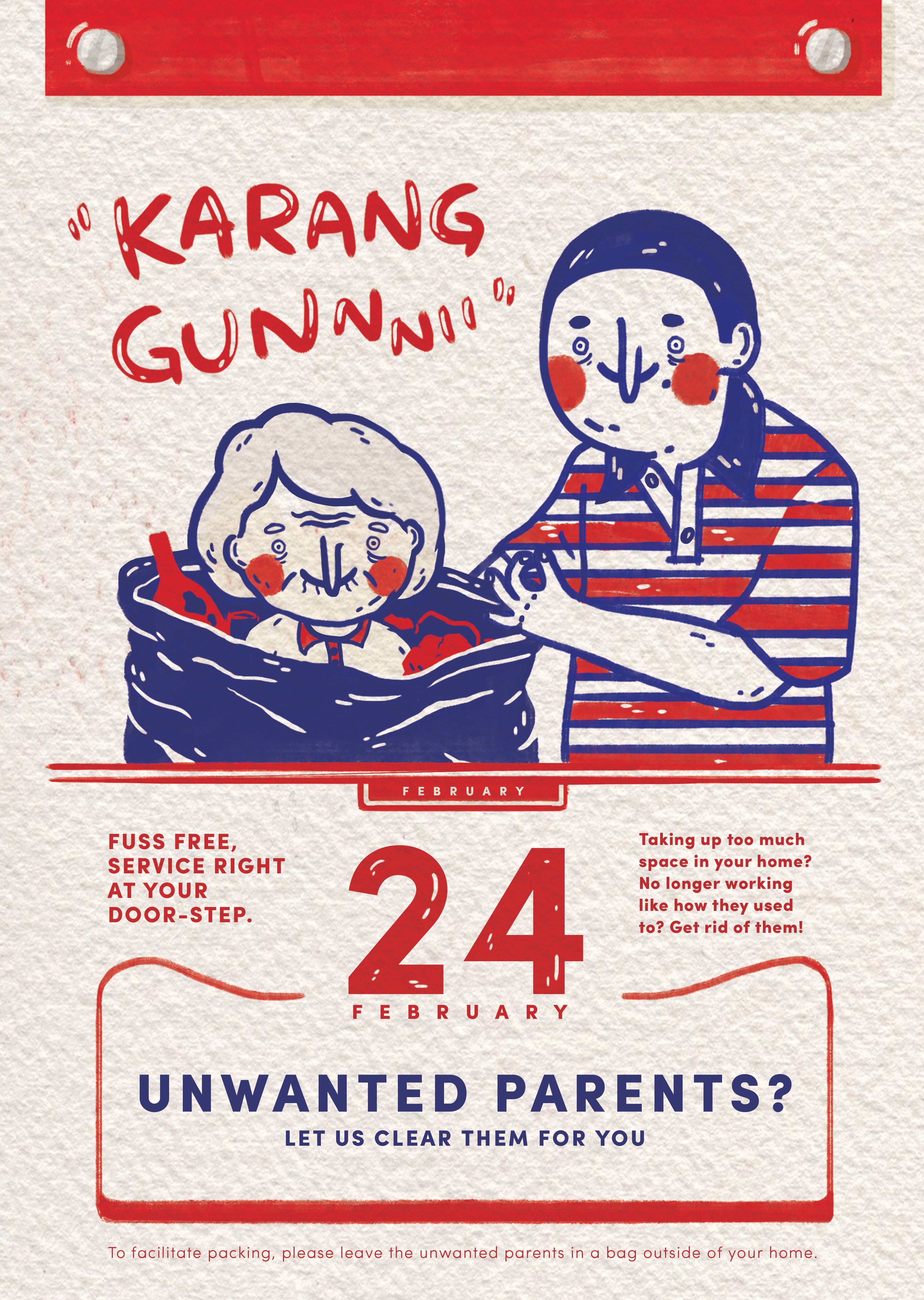
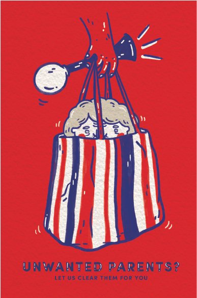
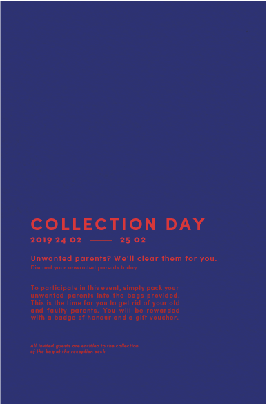
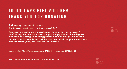
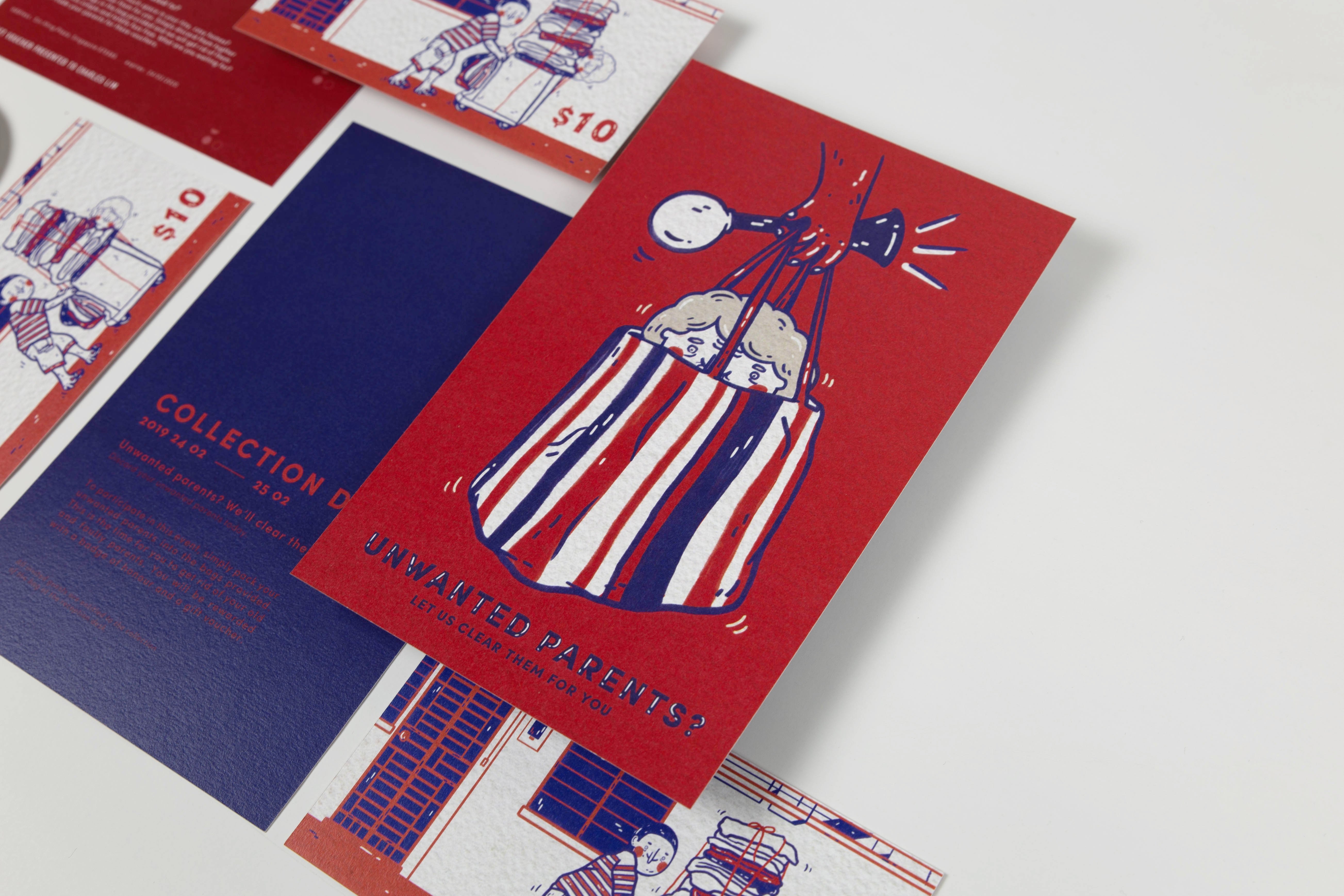
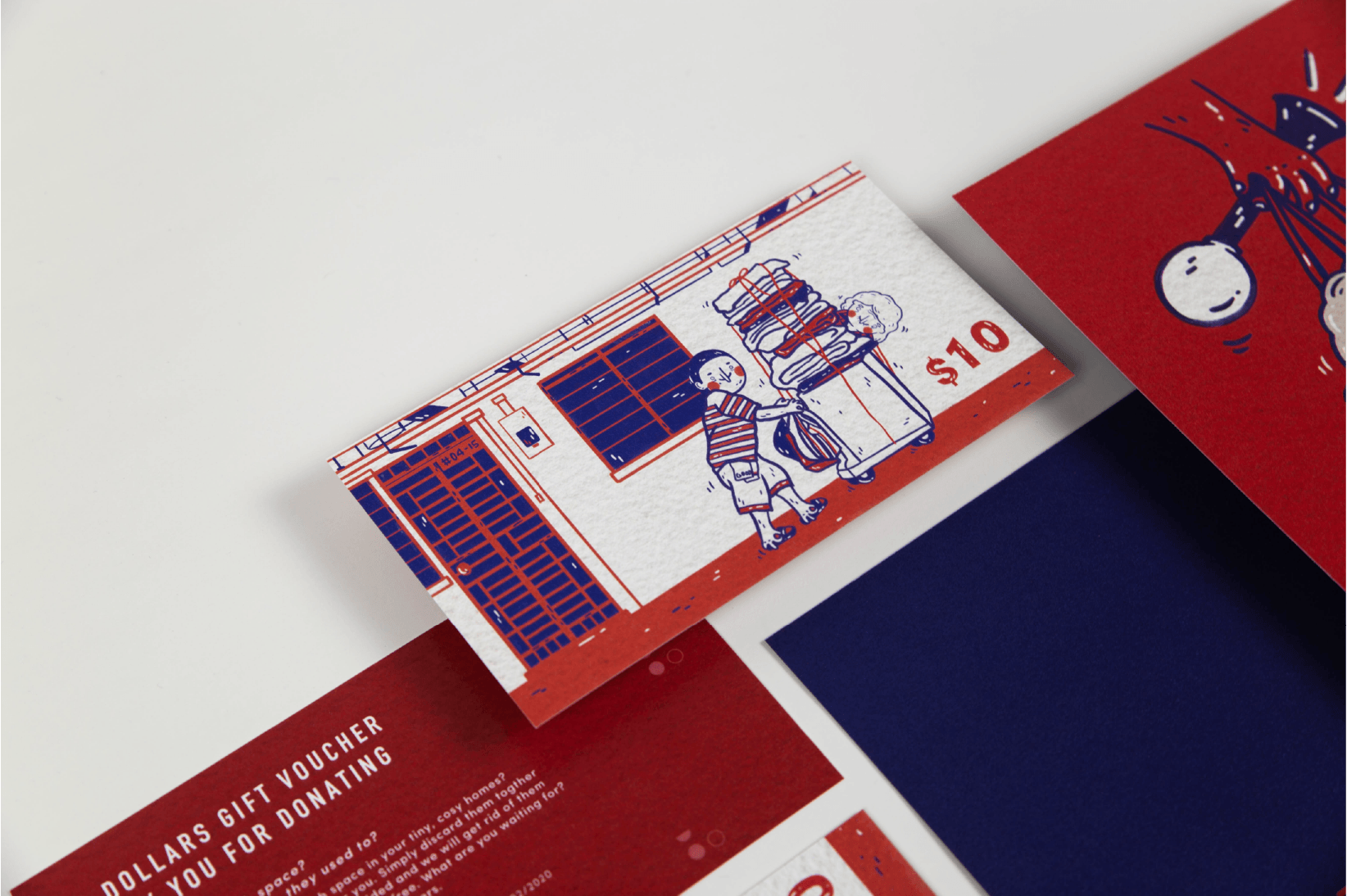
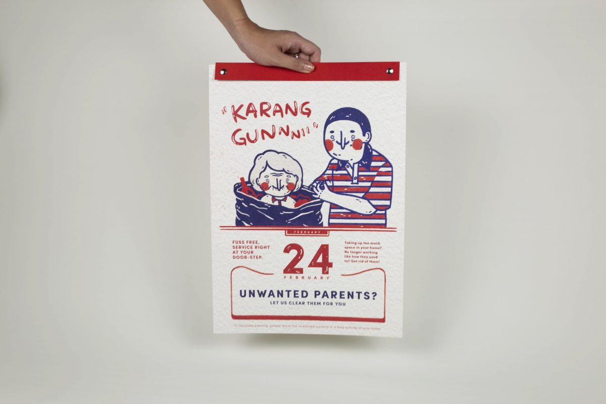
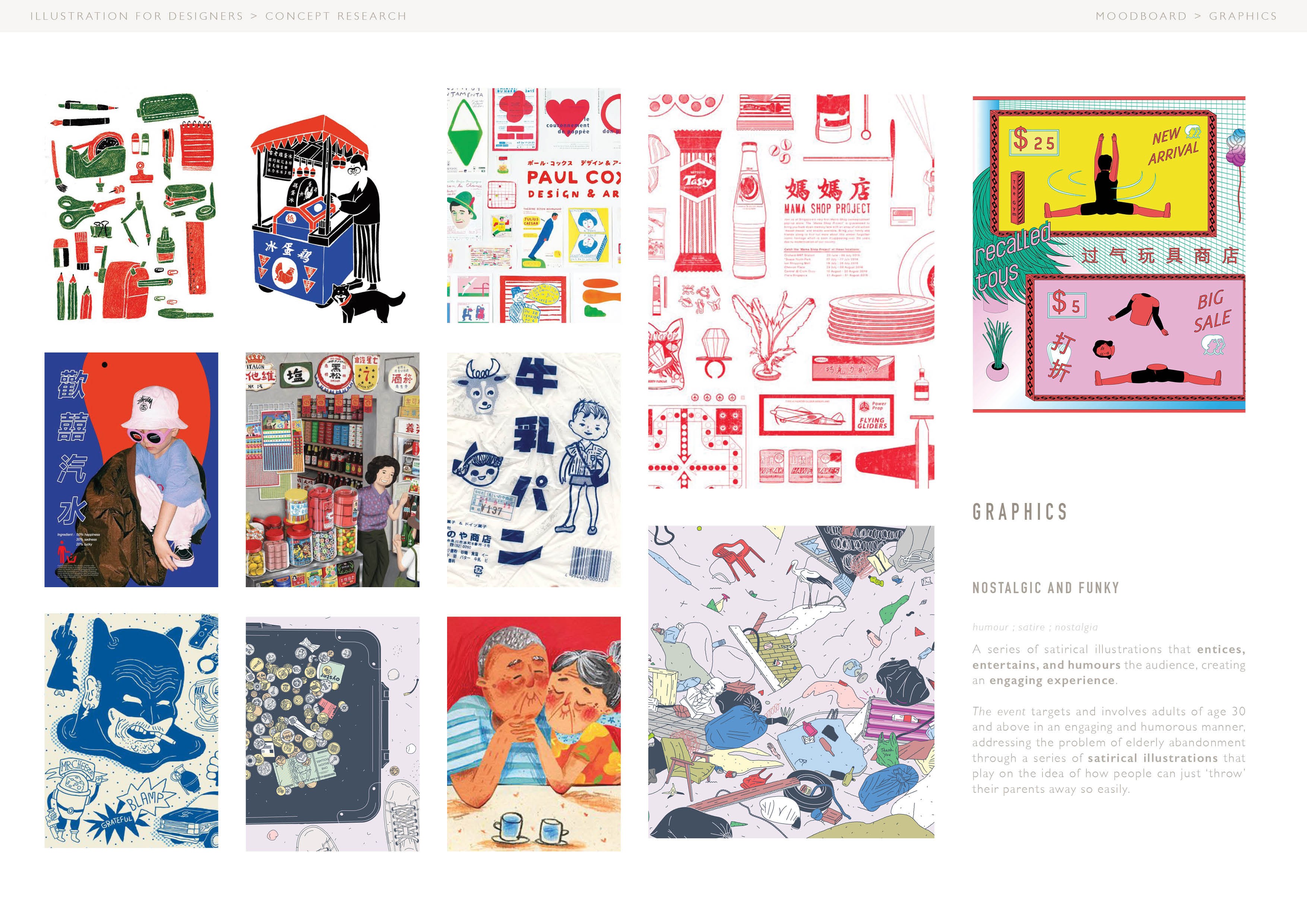
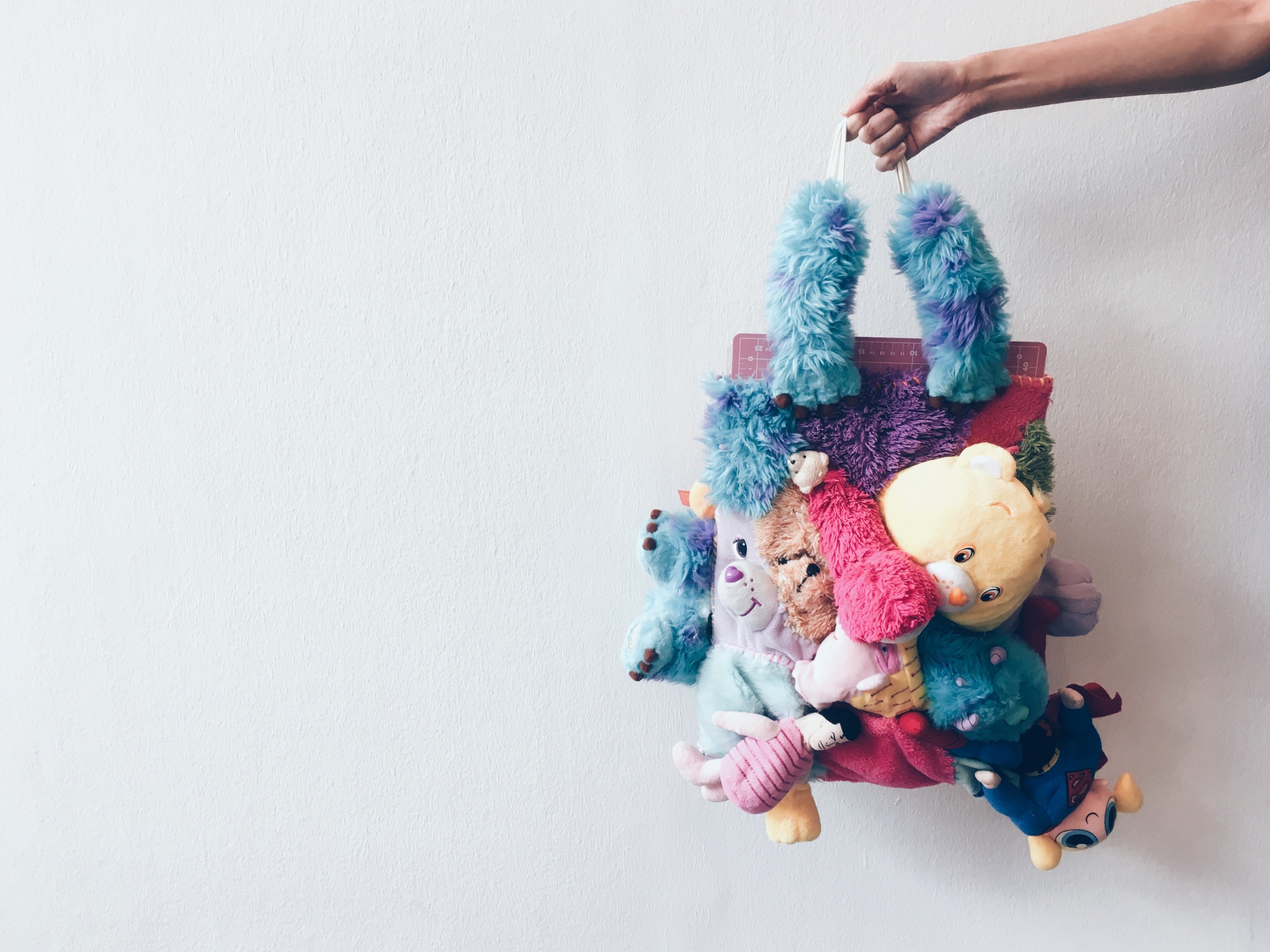
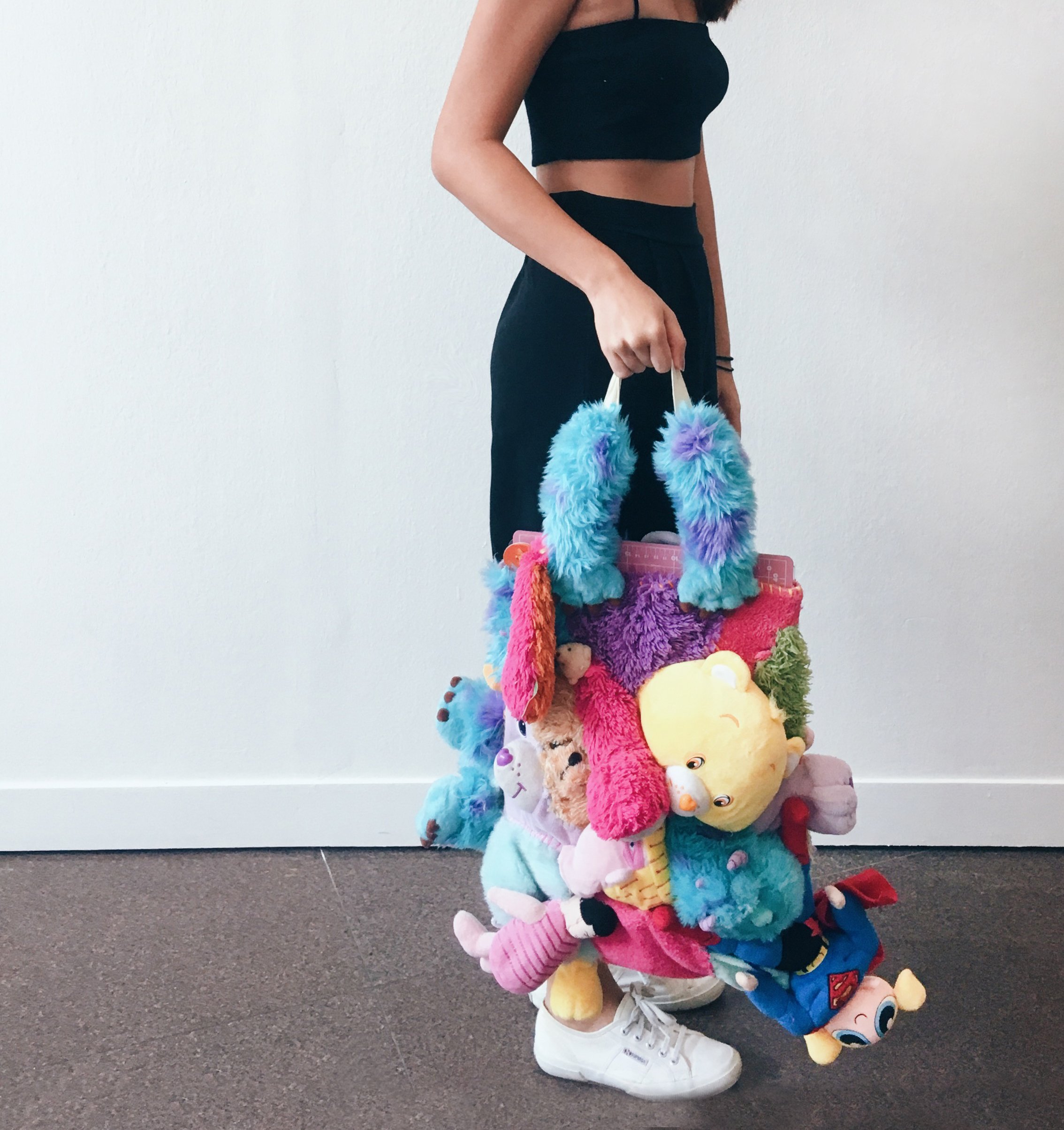
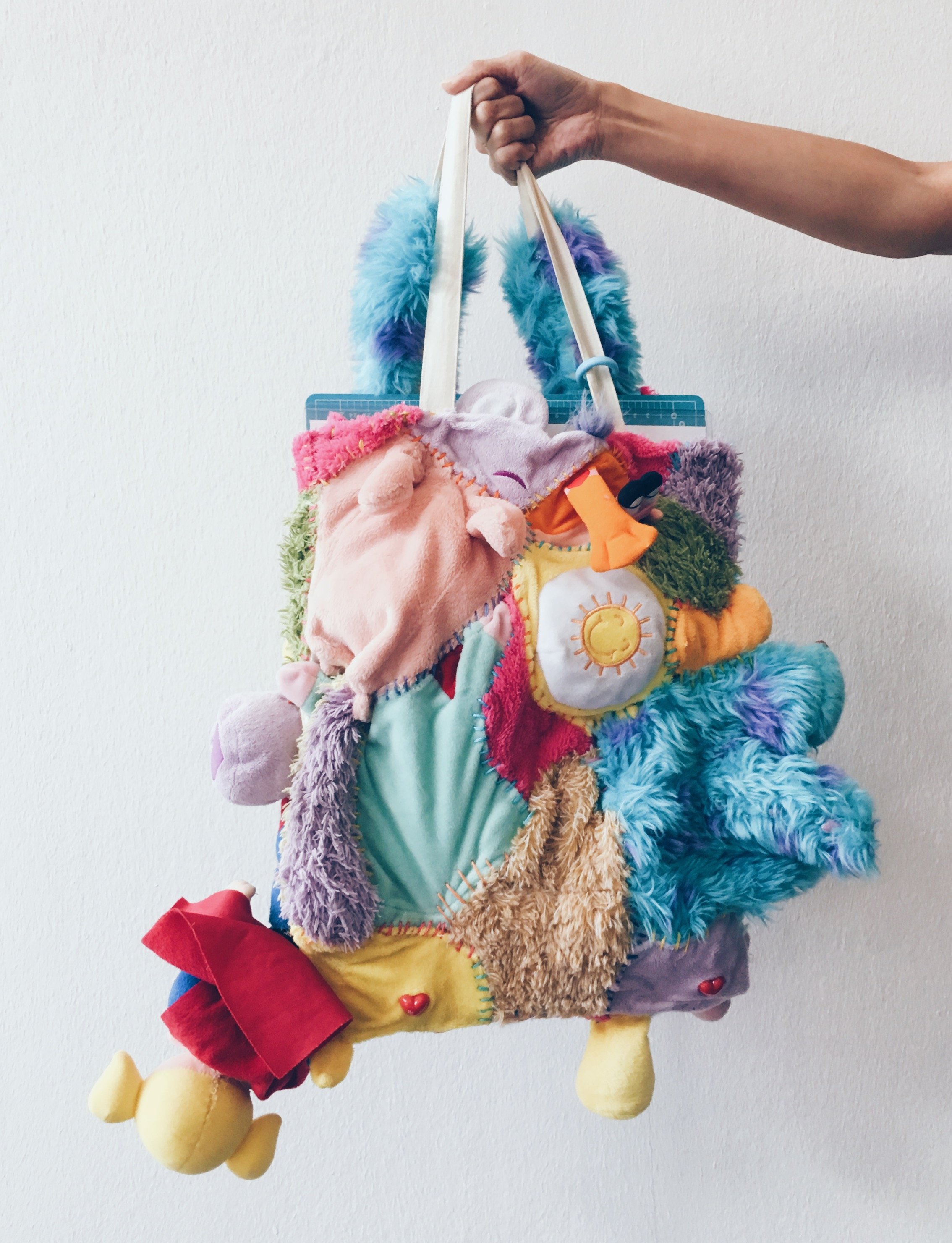
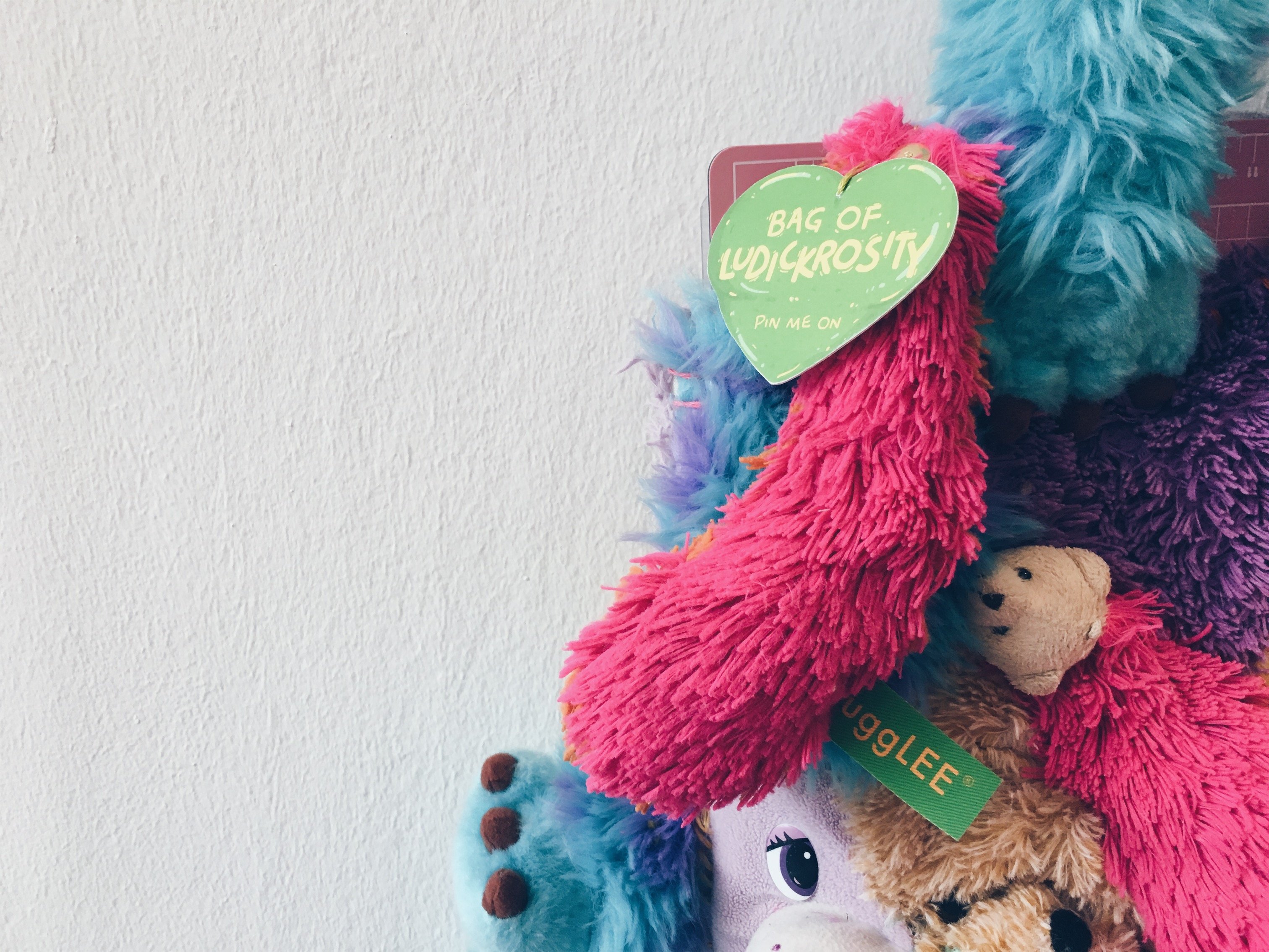
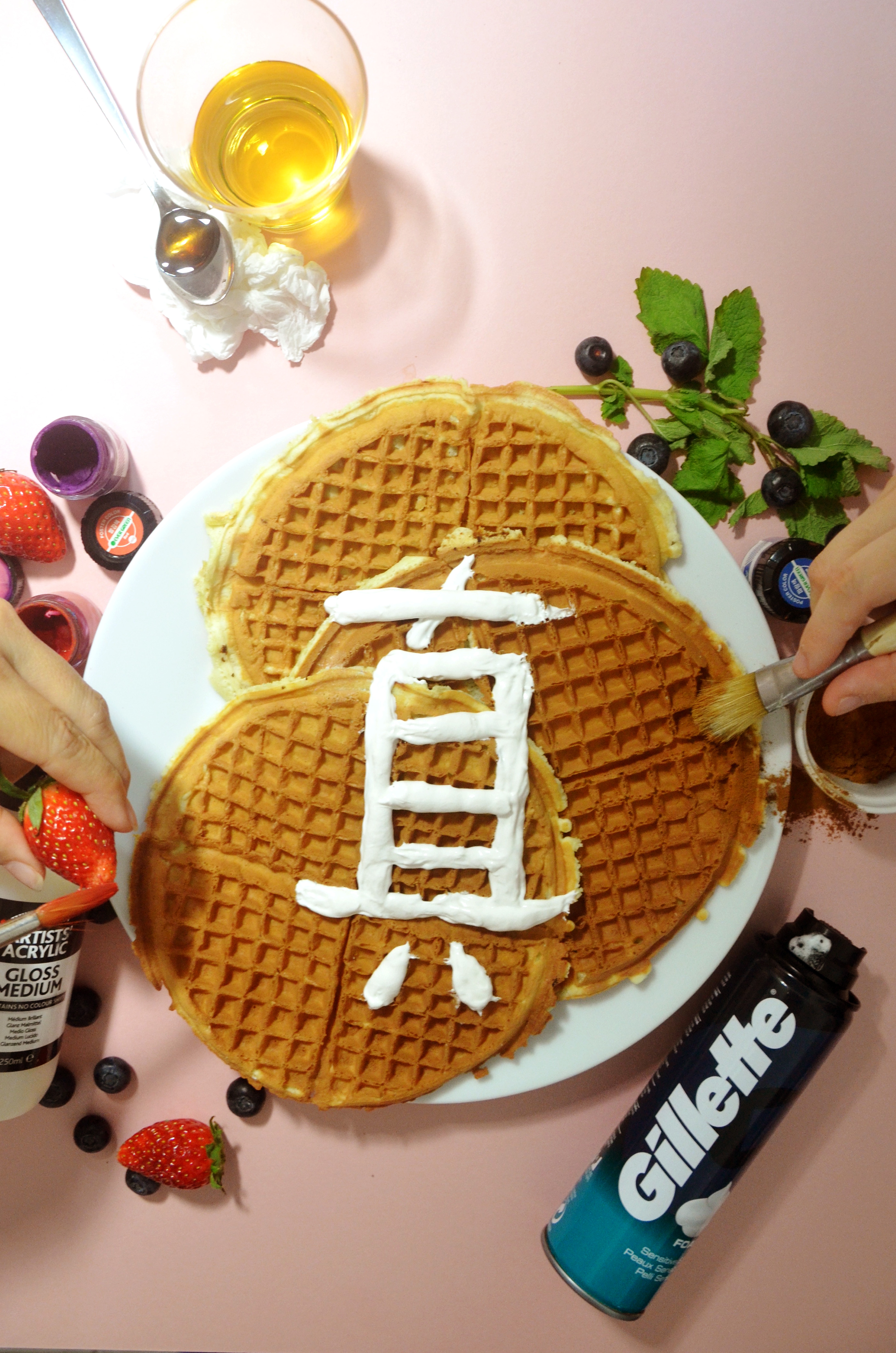
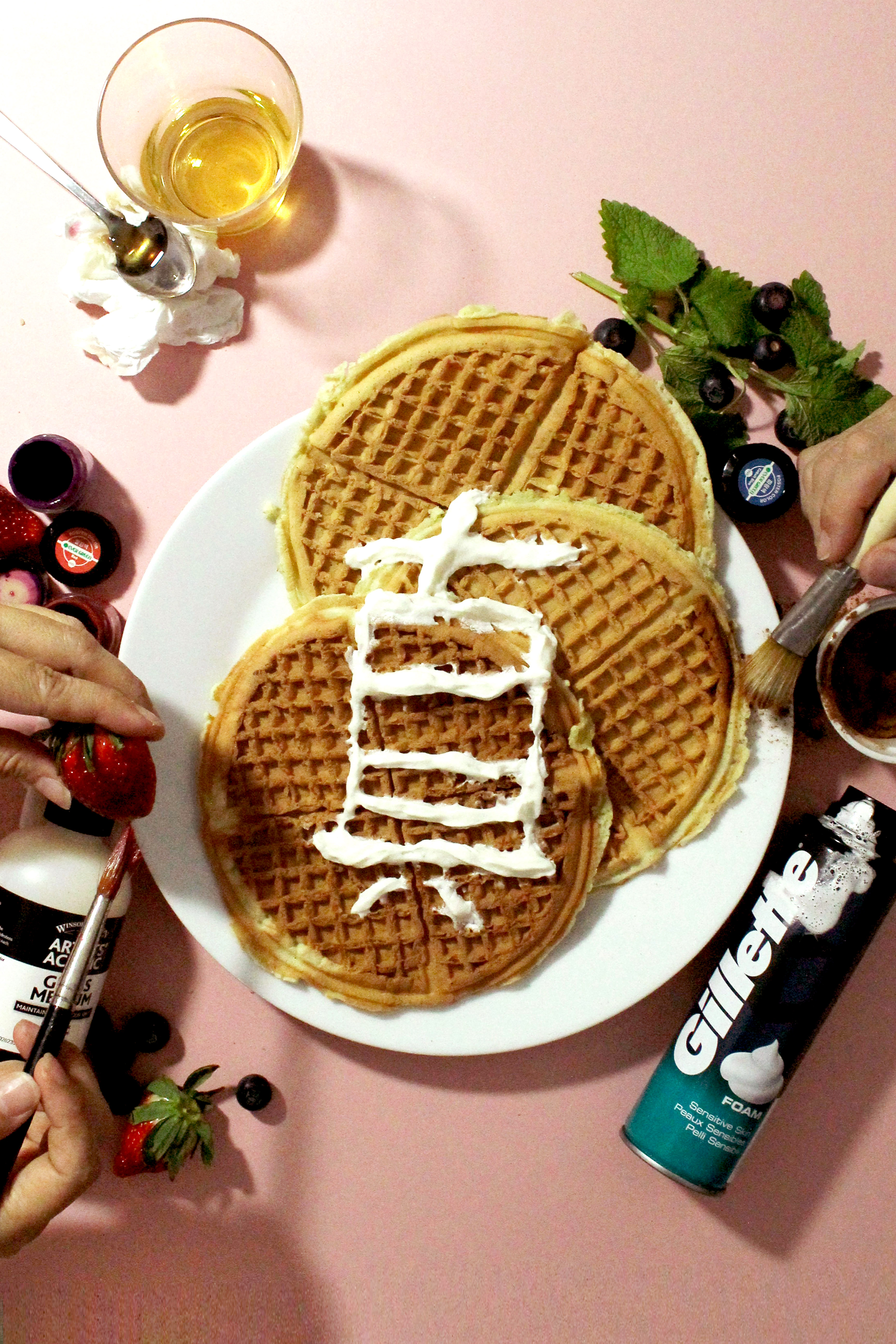
HOT POTATO
GRANDMOTHER EDITION
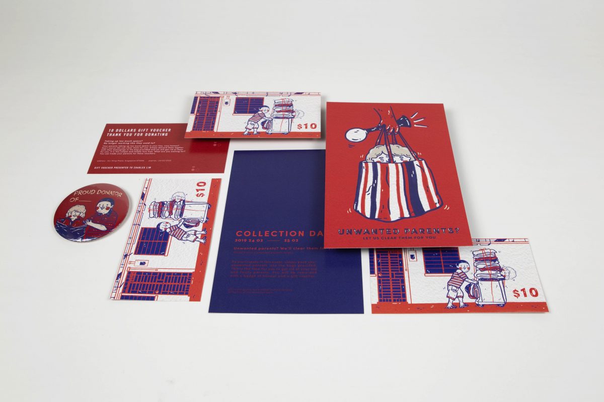
Gather your family in a circle. Pass the grandmother around the circle to the music.
When the music stops, the family member holding on to the grandmother loses the game.
Avoid holding on to the grandmother. Avoid all responsibilities. Hot potato is a great game
for the family, this game puts your morals to the test. Suitable for all ages.
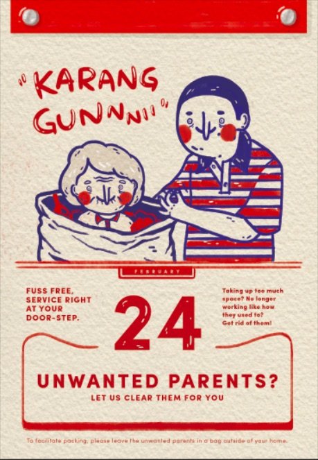
We often try to shift and push our responsibilities away in face of difficult times. Are we
willing to provide care for our parents when they are old or will we simply push them away
with the roles reversed? The main objective of this game is to pass the hot potato on to
your other family members and to try your best not to hold on to your grandmother or else
the responsibilities would now lie in your hands. This game of play demonstrates how people
try to shift and push the responsibilities of having to care for my the aged.
Just to give you a context behind this work:
Recently, my grandmother fell sick. Little did we expect this to happen as she was a really active lady and is always in and out of the house. Her sickness took a drastic turn on her lifestyle, needs, as well as her mentality towards life. She began to coop herself up in her room, storing her basic necessities the enclosed space and seem to lose that zest she took on her everyday with.
Also, with my grandmother falling sick and having to make trips to and fro the hospital, it took a toll on her children who have to juggle between their work and making time to drive my grandmother to the hospital for her sporadic medical checkups. Having to bear this burden, my ever so filial uncles and aunties decided that it was my dad’s responsibility to care for my grandmother fully. They stopped bringing my grandmother to the hospital and even avoided visiting her. My grandmother called them multiple times to ask when they would visit and they would not pick up the phone. 2 months and 12 days. It took them that long to come and see my grandmother after she was discharged from her latest stay at the hospital. To claim that they love my grandmother very much and how much they have done for her before she fell sick yet they could simply push her away just like that was so ironic and appalling to witness.
Till today, I still can’t spell out the emotions and thoughts I have towards this whole thing. Anger? Disappointment? Guilt? I haven’t too been the best granddaughter through this process. Michael suggested that I dont think too much and just go ahead and do this project and maybe through the process of making and with the final product, maybe resolve some of these negative emotions I had in my heart.
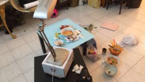
click images to view clearly


My process
Oh my goddd it took me awhile before finally deciding on what to do. I was stuck and having an art block with my illustration book and finally decided to ditch that for I was not feeling it and it did not have the satirical quality I would like my work to possess. Hence after much (i mean a lot) deliberation, I eventually decided on making a hot potato. A “game” that manifests the idea of elderly abandonment and demonstrates how we shift and push responsibilities around when it comes to taking care of the elderly. We all want to avoid this burden.
I felt that this was a more apt in terms of the medium to convey the idea as opposed to an illustration book as I really struggled to portray this idea across in the form of still images. With this ‘game’ the audience get to participate and experience the act of passing on the grandmother which in this case is the responsibility that is passed on to their hands to the next family member. This gets them to ponder as they are confronted with this responsibility place upon them. Also this method of presenting this rather gloomy topic makes it more digestible as it is injected with the idea of play and is presented in a more light hearted manner.
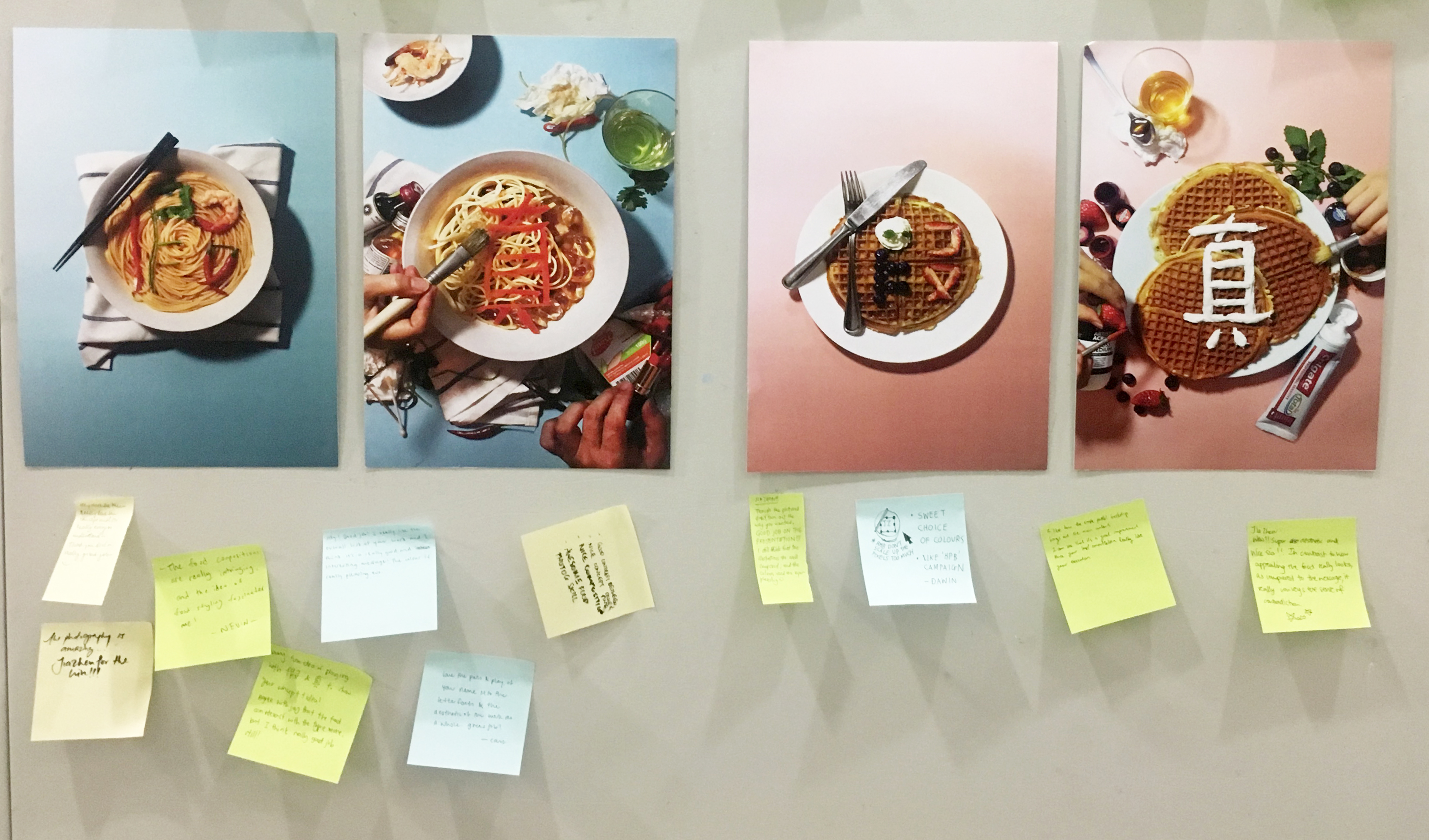
Just to share a little on the Illustration book – Winter is coming.
Initially, I wanted to juxtapose my dialogue with my grandmother against a series of illustrations of a squirrel collecting and hoarding nuts in preparation for winter. Winter here is the lat season of the year and also the last stage. It represents ageing. The grey death of everything. Days are shorter, nights are longer. My grandmother finds it tough to fall asleep at night. Minutes feel like hours and her nights are tough to get through. Winter is also the coldest and most gloomy season like how ageing is the stage of live that we all want to avoid.
My grandmother would hoard food in her room as just living through each day and feeding herself becomes her priority in life. This is similar to how a squirrel hoards its food in its burrow in preparation for the arrival of winter. The main problem here was too come up with a series of visual strong enough to convey this idea and to have a powerful dialogue that flows with the illustration. I spoke to my grandmother but she just was not in the right state of mind to be conscious or to know of her actions. Hence, I did decided to write it based on my observation of how she lives her day:
In the morning, in the morning i get up.
What is the time now?
When will you give me my food?
I don’t know what I should be doing, I don’t know what I am waiting for.
What do you do everyday?
Just wake up.
Walk up and down, up and down in my room.
Wait for the telephone to ring. Wait for my friend to call me.
Just sleep in my bed.
Hungry eat biscuit, go toilet, up and down, up and down.
No one talks to me.
However, I was not feeling it deep down hence I knew that this was not working.
My thoughts
I was hoping that I could resolve some of the negative feelings and also the guilt of not being there for my grandmother as I did not take this whole ageing thing well. Initially, I did not want to accept this reality, how can someone so healthy just become like that. “Why are you like this?” “Why can’t you get better?” These thoughts ran through my head and I avoided talking to my grandmother and looking at her. I basically lived in denial.
I was afraid of crying, afraid of the pain and just afraid of this change. I didn’t want to break down. Till today, I have yet to fully accept this change but I am learning. The process of making this work did not make me feel better as I have hoped it would have. But it did make it easier to approach this topic and to talk about it to my friends. Maybe with time, things would get easier but it her time running out?


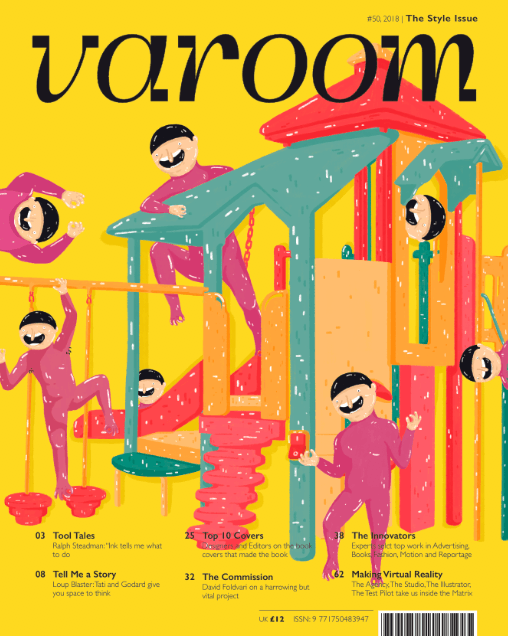
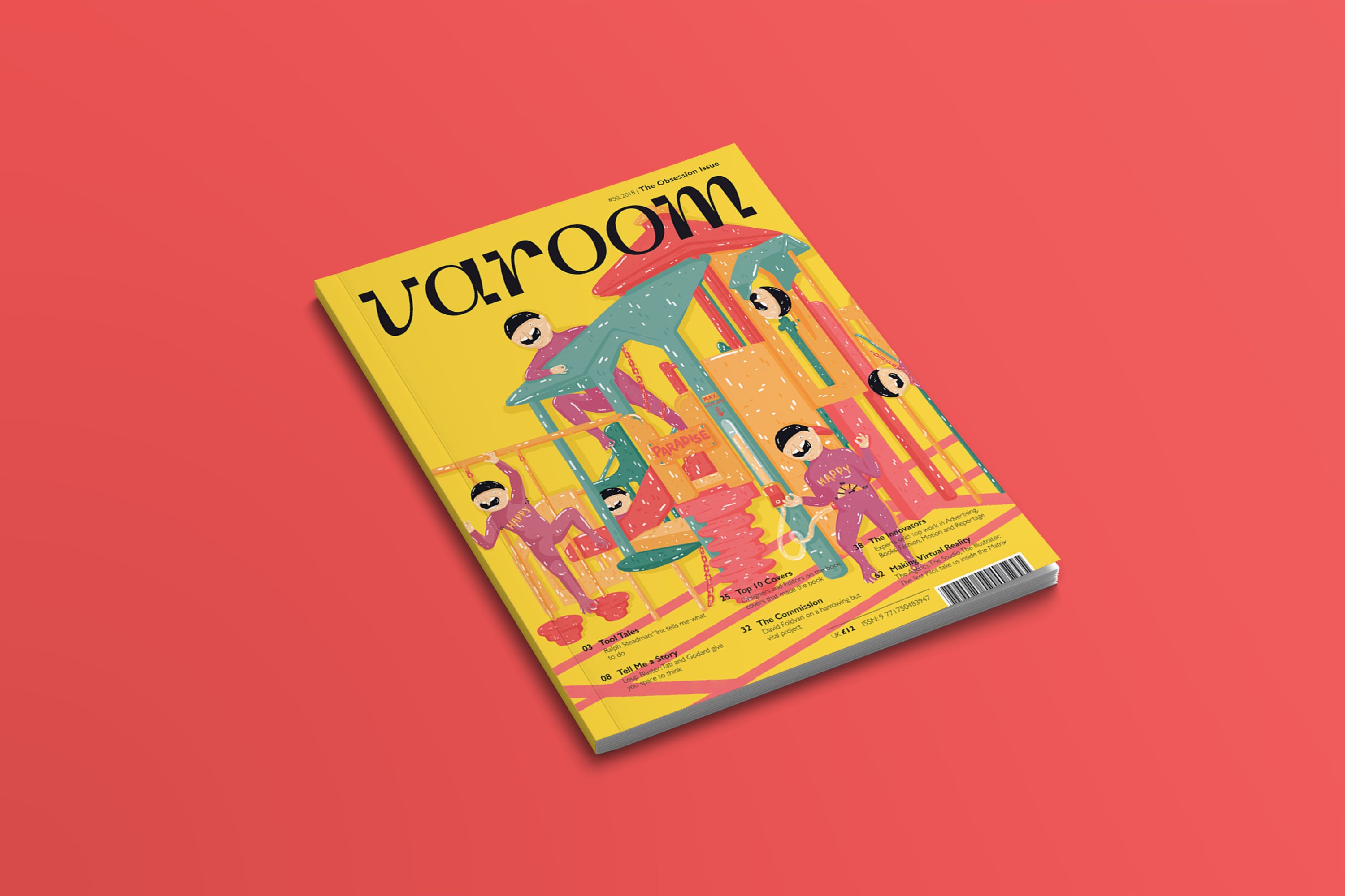
![NEVER-NEVER LAND [ PROCESS AND FINAL ]](https://oss.adm.ntu.edu.sg/jlee147/wp-content/uploads/sites/832/2019/03/VAROOM-MOCKUP-1200x800.jpg)


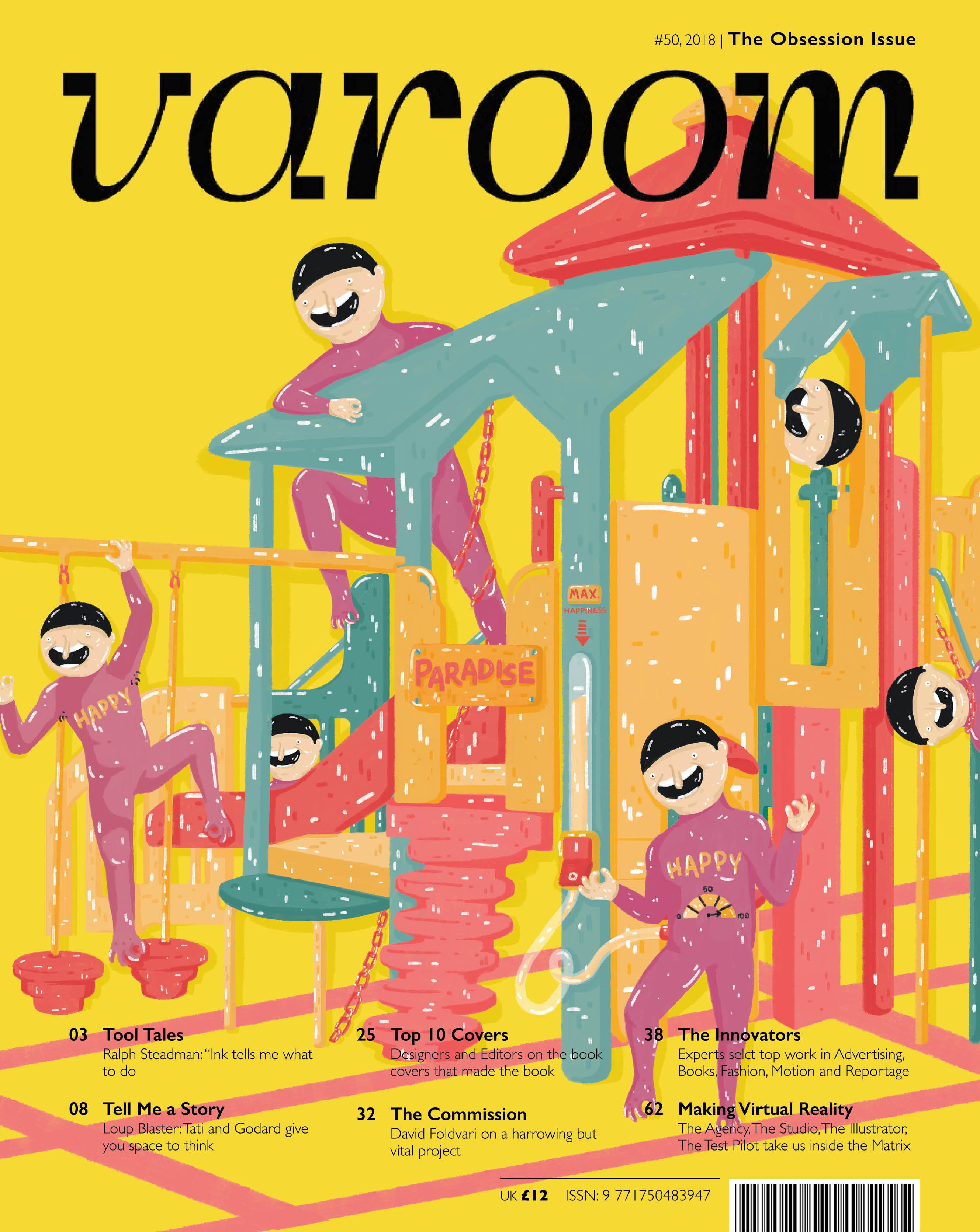


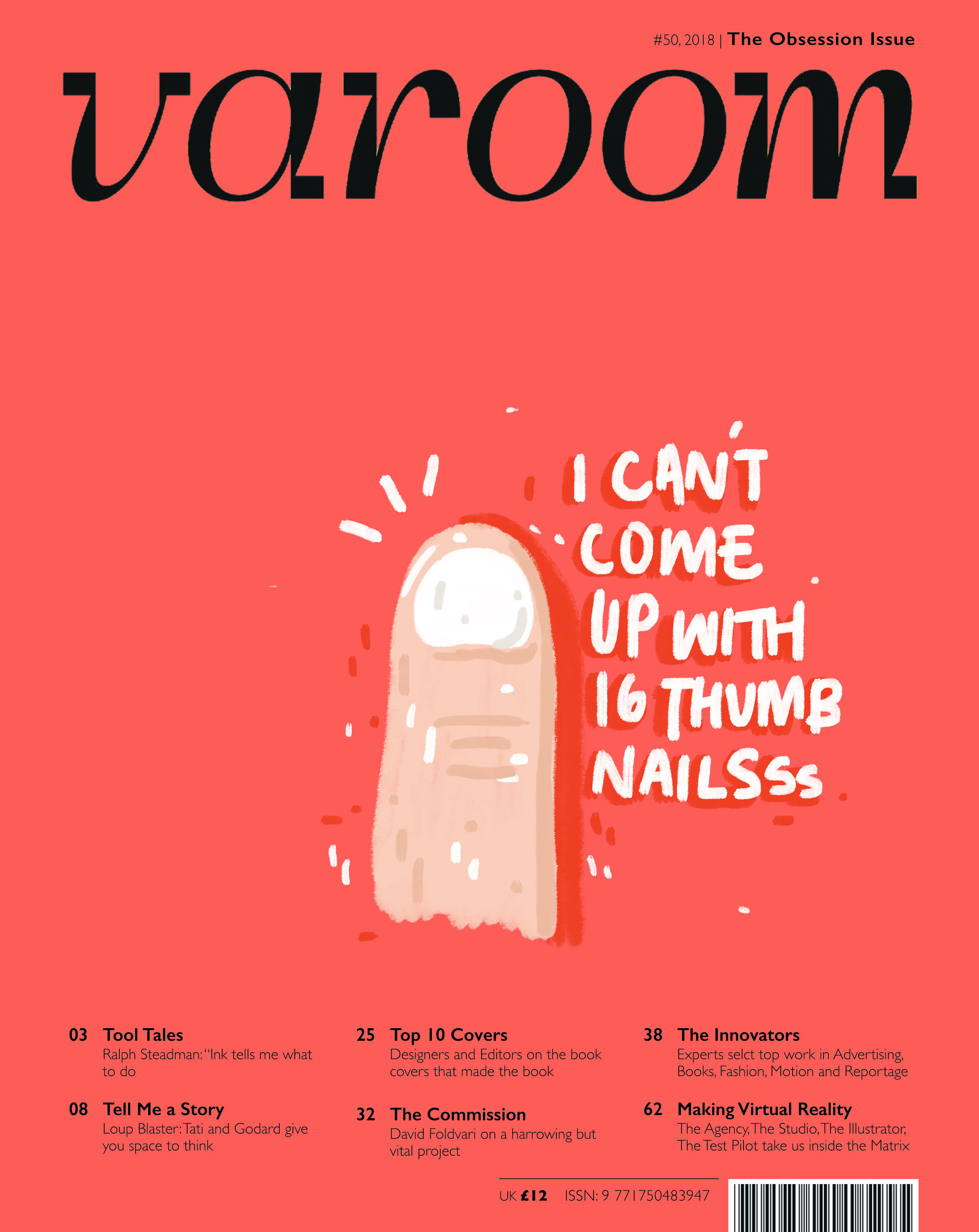
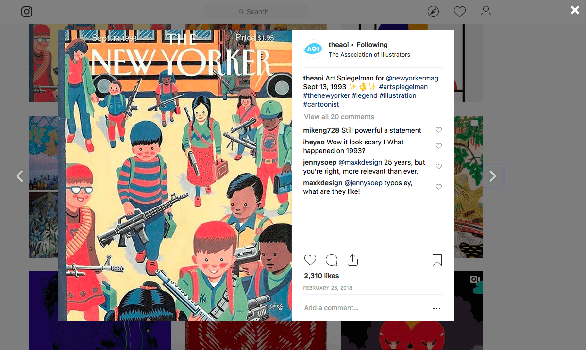
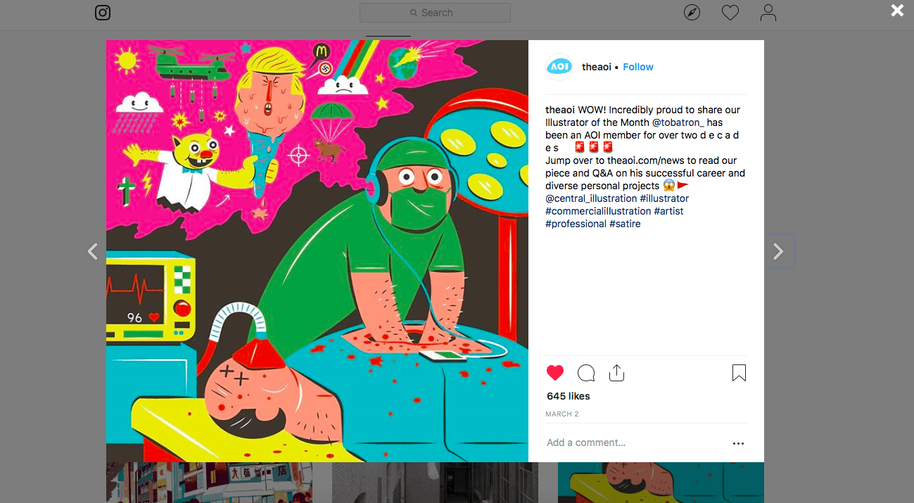
![VAROOM [ RESEARCH ]](https://oss.adm.ntu.edu.sg/jlee147/wp-content/uploads/sites/832/2019/03/e31ad482-3109-46fc-a9f1-bfe890d01def_rw_1200.png)


