

In this day an age, more than ever, thoughtful interaction design has become a pertinent concern to the everyday man. More and more, systems and services are being digitized and the careful construction of an interface around these products can determine if someone will accomplish their goals, or cry out in frustration.
With Great Power comes Great Responsibilities
Unlike the sentiments expressed in Designing for the Digital Age – where the designer comes to his final design through a thorough process of research, end-user guided decision making, and must keep his creative pursuits outside of the equation – Löwgren & Stolterman argue in Thoughtful Interaction Design that the designer is as involved in shaping the end-product as the end-user is in informing the design decision. This symbiotic back-and-forth is what constitutes towards a good design product in their opinion. They also argue that no piece of design is ever truly a tabula rasa. Instead, the designer will always leave behind traces of their world-view and opinions in their work whether consciously or not.
The solution then becomes the practice of thoughtful design, where every minutiae of the interaction process is considered, analyzed and determined if it should exist. The power that a designer potential holds over the lives of millions of people should never be taken lightly or ignored throughout the design process. I share these sentiments as well. By affecting and the interactive experience of a potential end-user, the designer is disrupting an almost primal instinct and these actions need to be thoroughly considered. We can control to a certain extent, through the interactive experience, how a user perceives a product. This can serve to support the user in his tasks, or disorient and distract the user from finishing the task altogether. Löwgren & Stolterman urge interaction designers to take responsibility for this power by making sure their designs satisfy the end users and their society.
The pair also touch on the idea of the material properties of digital artifacts. They acknowledge the almost infinite possibilities of executions offered by technology as a material that possesses no intrinsic qualities. It becomes what the designer wills it to be. Thoughtful interaction design in the technological realm then refers to the process that is arranged within existing resource constraints. To create, shape, and decide all use-oriented qualities (structuarl, functional, ethical, and aesthetic) of a digital artifact for one or many clients.
In summary, the writers argue that for interaction design to be successful, the designer has to learn to overcome challenges, push himself constantly and to learn to have a critical mind. The designer needs to understand the intrinsic and extrinsic relationships between users and the interface, and formulate their own considerations and actions for the interaction.
Examples of Thoughtful Interaction Design
1. TouchID
My first example comes from a company whose lineage is based around fantastic interaction design.

When Apple first introduced the TouchID Fingerprint sensor into the iPhones three years ago, it was a game-changer in the industry. Suddenly, high-end security for personal phones became a norm. No longer were messy long passwords or PINs required to unlock your phone.
When Apple improved upon their own invention a few years after, the sensor got so good and so fast at recognizing fingerprints that it would unlock the phones of people who just wanted to look at the time or glance at notifications on the lock screen.
With the latest iteration of iOS, Apple worked around this shortcoming by having users also press upon the button to unlock their phones. This made the unlocking process a fluid interaction. Not only did this solve the problem above, depressing on the button simultaneously scanned the fingerprint providing end-users with the illusion of unlocking and accessing their phones instantly and securely at the touch of a button.
2. Inertial & Elastic Scrolling

Apple also paved the way for multi-touch displays in mobile devices. This new kind of touch-input allowed the device to sense multiple inputs and velocities. Apple took advantage of this and created the concept of inertial and elastic scrolling. When scrolling on an iPhone, the UI calculates how quickly or slowly your finger moves across the display and mirrors these movements into the content view. A user moving very quickly will keep building momentum on the scroll animation allowing long content to be traversed in a very short time. This behavior is deeply rooted in real-world physics and requires almost no extra effort in terms of learning on the end user. The visual feedback alone is enough.
Elastic scrolling takes effect when the end of the content is reached. The view of the content “overshoots” a little before returning, visually letting the user know that the end of the content has been reached. Such subtle interaction clues inform the user about the content on screen and where they are in relation to the rest of it.
3. Content Placement and Breadcrumbs
The iPhone user interface excels at having the user know where they came from. The difficulty with having sophisticated devices with multiple functions is keeping track of how different screen views are related to each other and how the fit into the bigger picture. With modal computing interfaces like iOS, this becomes even more important. Apple tackles this issue quite elegantly by literally showing the viewer where they came from.
In the home screen of the device tapping on an icon first expands the icon and the grid before morphing into the application’s user interface. Quitting the application reverses this animation. This subtle animation cue changes depending on the position of the application’s icon on the grid. This allows the user to visually know which part of the screen they “came from”.
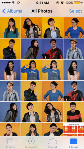
This effect becomes even more helpful when seen within the context of the photo album. Scrolling through large numbers of photos can be taxing on a user to keep track of. Apple uses a similar animation to the home screen to show users which photo the came from, allowing an end-user to even easily discern between duplicates.