A R T I S T R E F E R E N C E
genicecream
She has a very strong and defined style of adding shadows, something I’ll love to do in my compositions.
jenny yu
Similar with genice, jenny also uses strong shadows.
My drawing skills is rather limited so her style of using solid shapes is something I’ll like to reference on.
E G O M I N D M A P
IDEATION
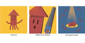
1_ Sotong me + Doing 3D = Cuts myself (Cuts off all my “tentacles”)
2_ Snake me + Finding my way = Gets lost (Unexpected place? Outer space.)
3_ Polar bear me + Eating ice-cream = Gets so cold (FROZEN INTO AN ICEBERG)
4_ Black cat me + Rushing 2D = Worse thing that could ever happen (PHOTOSHOP CRASHES)
I tried using 2 animals with attributes unique to themselves:
Sotong – Very blur
Black Cat – Bad omen, associated with bad luck
And 2 animals that are NOT supposed to act/react in a certain way:
Polar bear – arctic animal, why would a polar bear get cold easily?!
Snake – Navigator, predator. Definitely not an animal that would get lost finding its way to somewhere.
P R O C E S S / F I N A L
I started this project with illustrator. It was a painful process. I never finished my sotong series, and changed to using photoshop.

SOTONG
Clumsy me. I choose a bright mustard colour for the background to give it a playful feel. And the last panel a blue one to add on to the dramatic feel for this series. I feel that the inversion of the yellow background to blue really changed the atmosphere of the panel compared to the first 2 which was what my intention.
Addicted me. Colours used here are of a cooler tone to give the series a cooler feel. Continuity used here too. A colour from the previous panel will be used in the next.
1st panel: Cream (bear) in 2nd panel hands > 2nd panel: Green (ice-cream) in 3rd panel background > 3rd panel: Blue (Ice) in 1st panel background
Explorer me. The snake is red and placed on a green background to so that emphasis can be on the snake. Everything in this series is green in different hues, to bring focus on the main subject of the GPS logo and snake that is of a red colour. Colours used are complementary.
Unlucky me. Everything is almost blue in different hues, with only the warning window in grey and the sign in a striking red. Our eyes are naturally drawn to the striking red, because the colour is of a high contrast compared to the blues. I choose blue not just to compromise on the colour scheme of the photoshop panel, but to also give the the series a mysterious feel. I also really like the highlight here. Really added a nice look to the series. 🙂
My photoshop also crashed… and I had to redo EVERYTHING.
Lesson learnt: To not save everything in 1 file and saving multiple copies as i work.

One of the biggest takeaway from this project was lighting theory. Shadows are not just black, and light is not just white. Using different colours for shadows and light will make my compositions stand out so much more.


