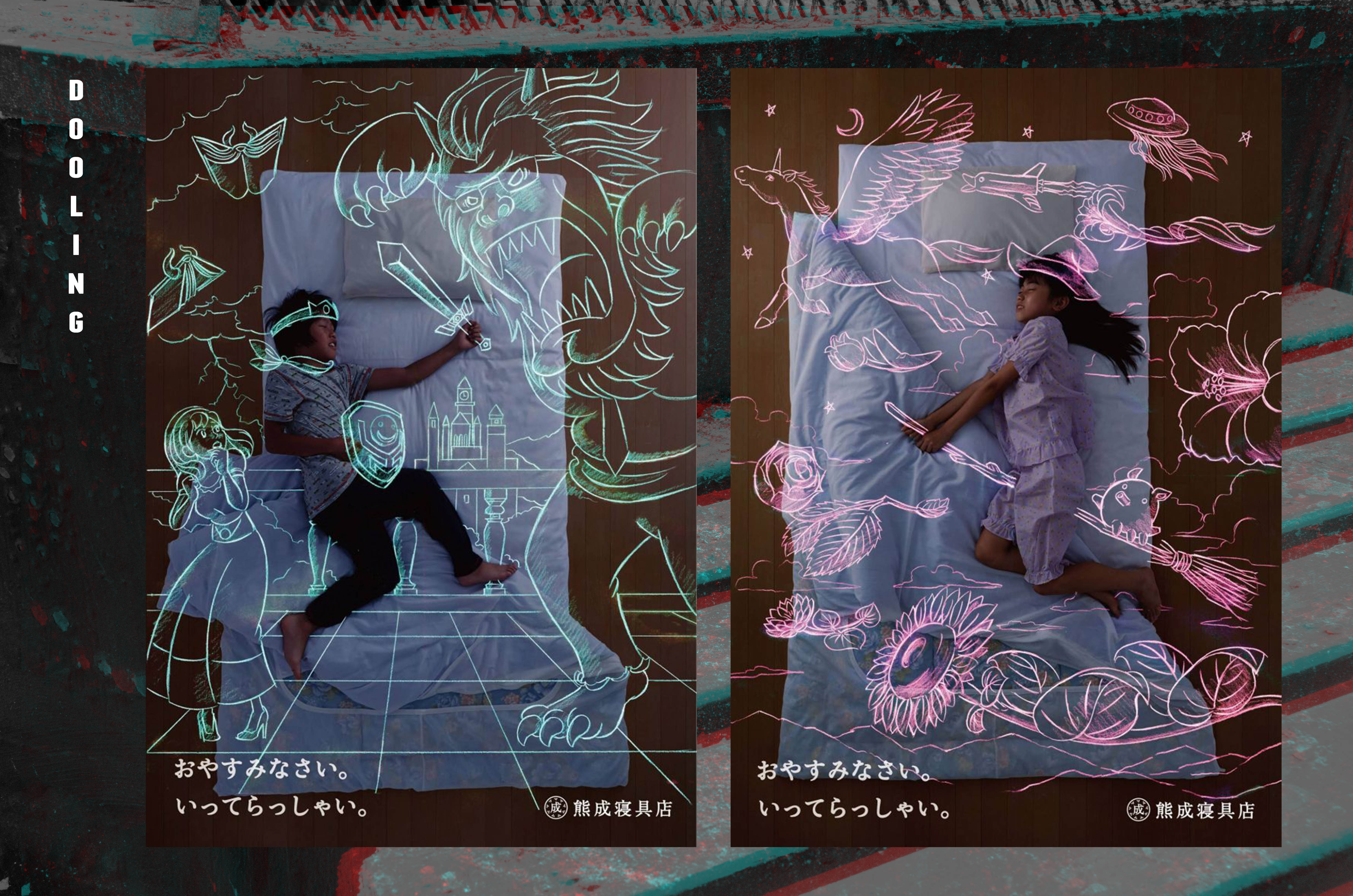
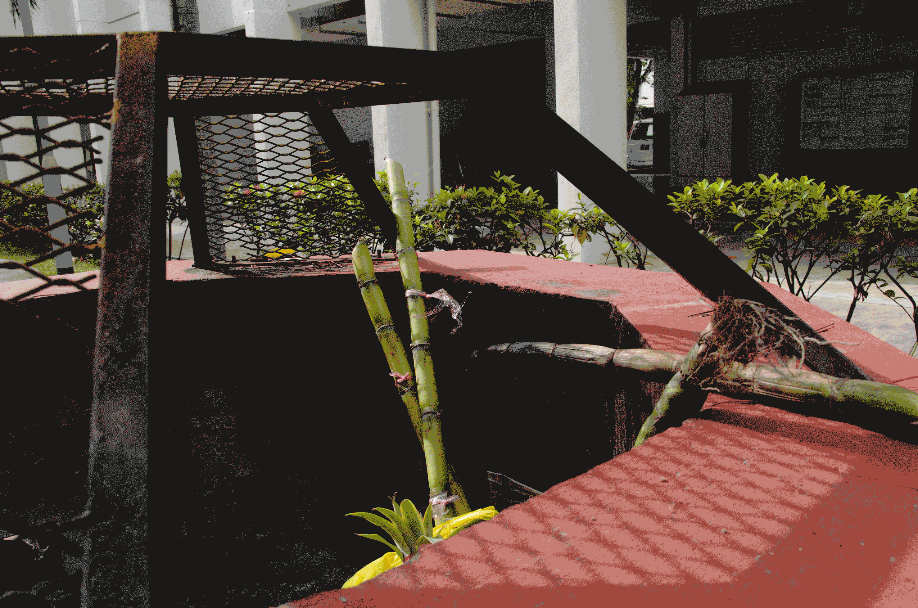
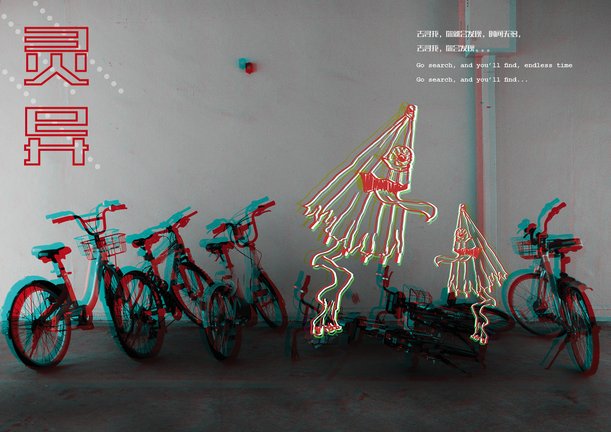
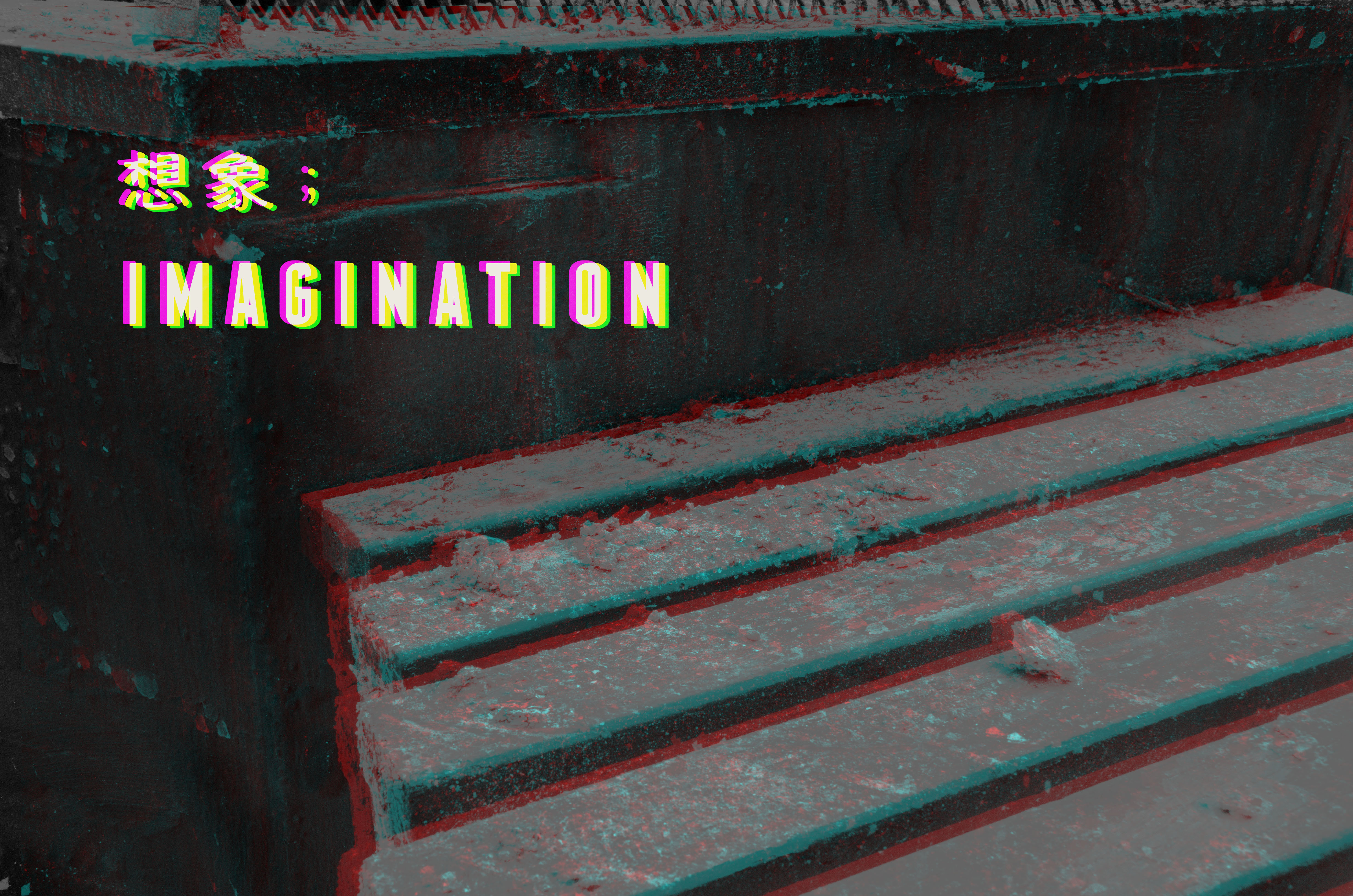
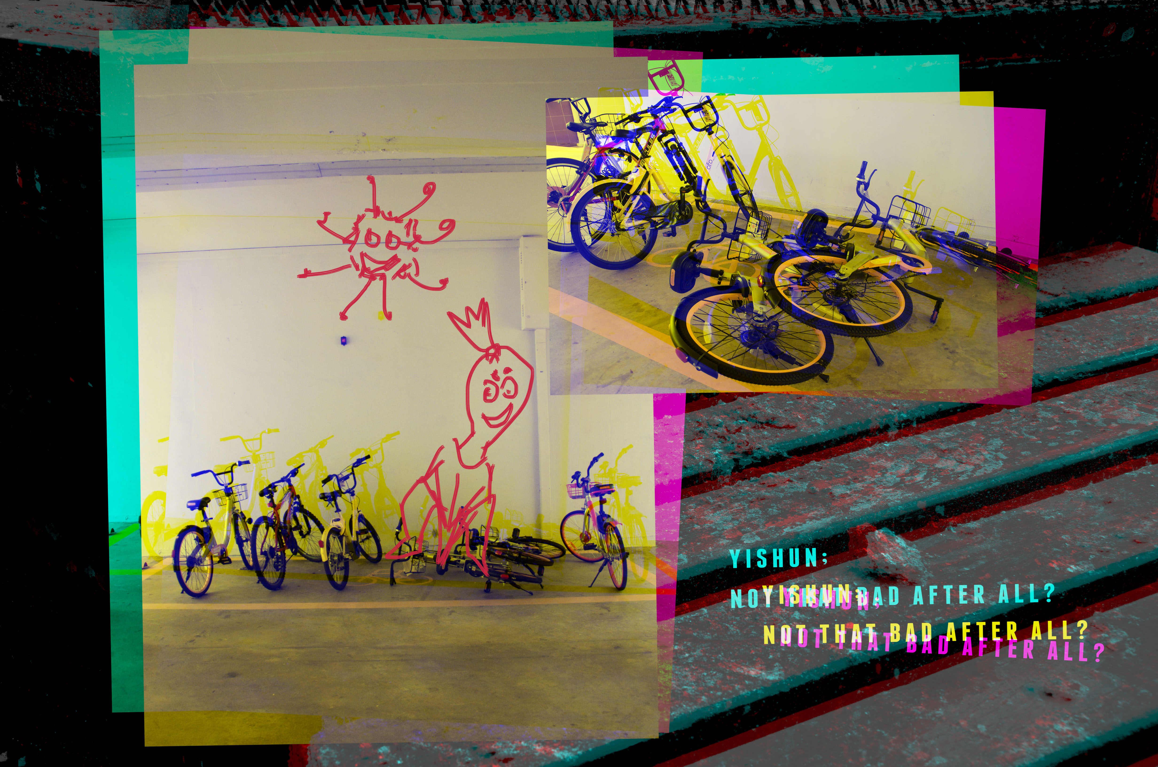
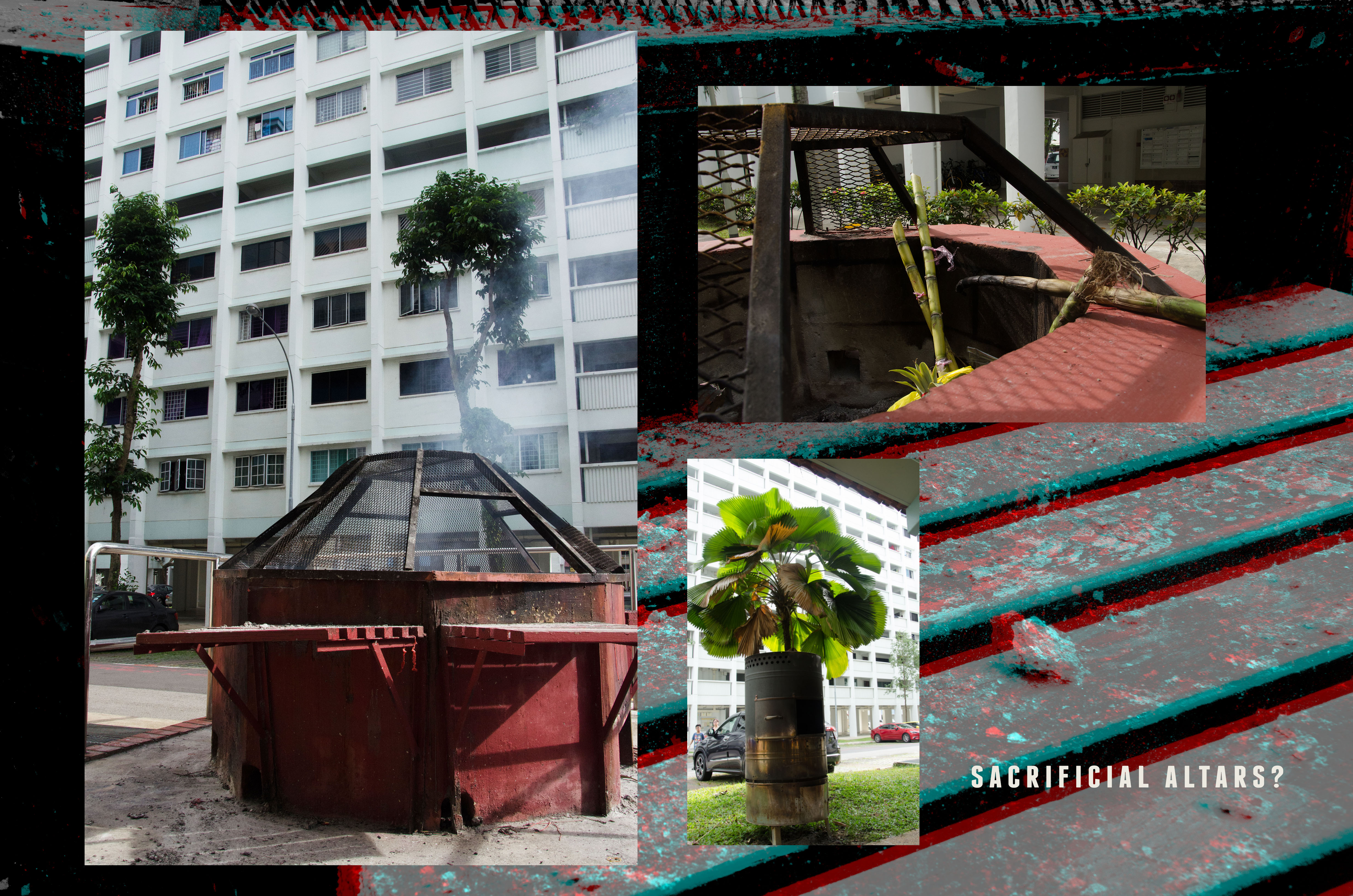
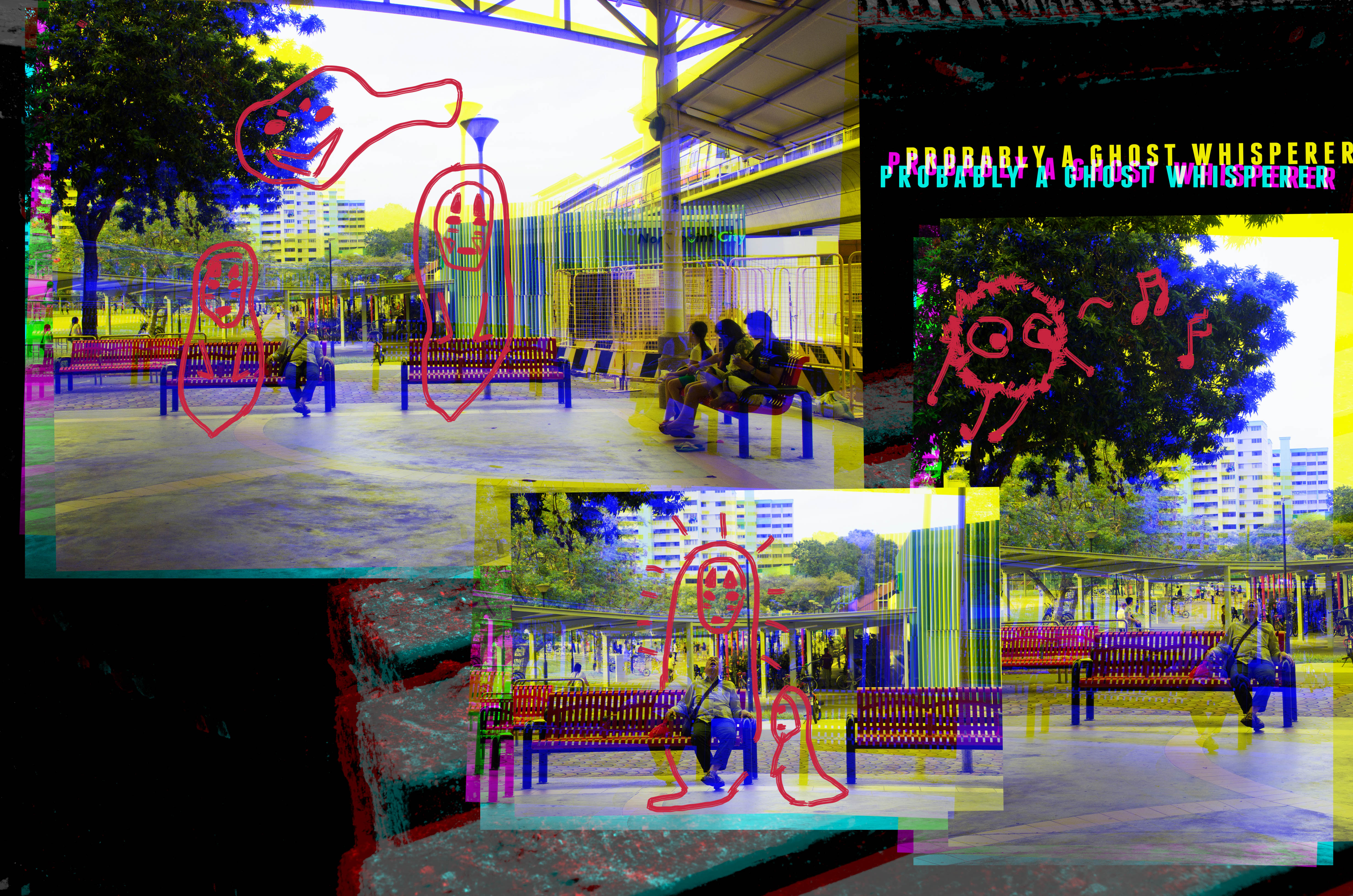
I was going for a glitchy look, with doodles on the pictures I took on site.
DOODLES
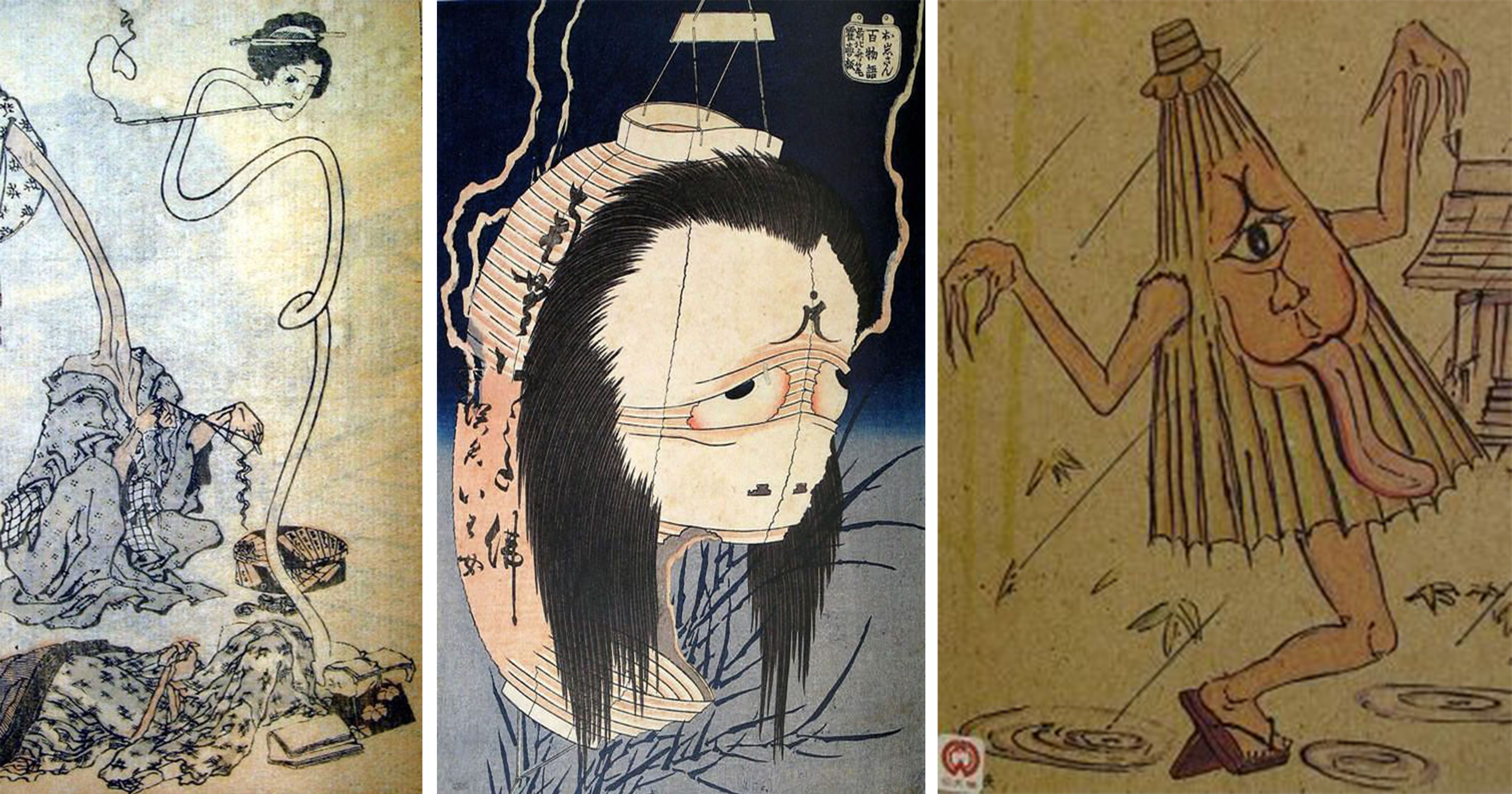
Inspiration/References of the ghost doodles
The ghost doodles were done first before the realization of the actual zine. I wanted to set the look and feel first.
I choose red to draw them. In a sense, I already had a direction of what I wanted the zine to look like, a black and dark tone.
INITIAL DESIGN
PAINFUL TRIAL AND ERROR
I tried out many different “feel” for the zine. The process of finding the look/theme of the zine took the most time.
I did start with trying to make the zine look fun? Initially, I was trying to go for a fun concept. But as I laid and try it out, I figure that it wouldn’t work out and just looked really weird and generic. In the end, I went back to my original concept of making a dark and glitchy looking zine.
Another take on glitch
I also tried to experiment with the look of the glitches for the pictures.
For this particular SS, it seemed abit too red for my liking as I was going for something more eerie looking.
PHOTO EDITING
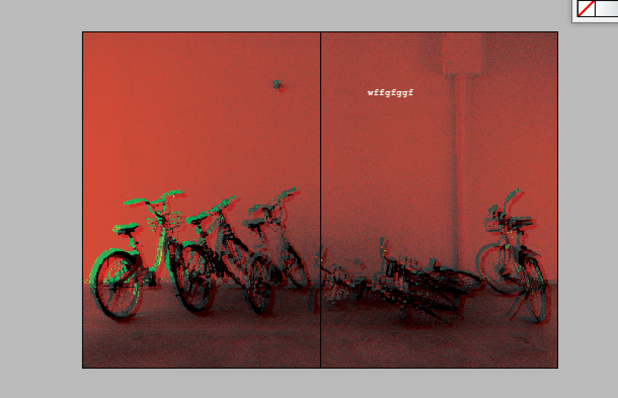
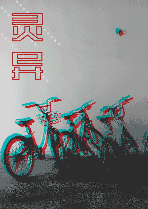
For all the photos with the ghost illustration, they are edited into a black and white version with a blue and red after effect to them.
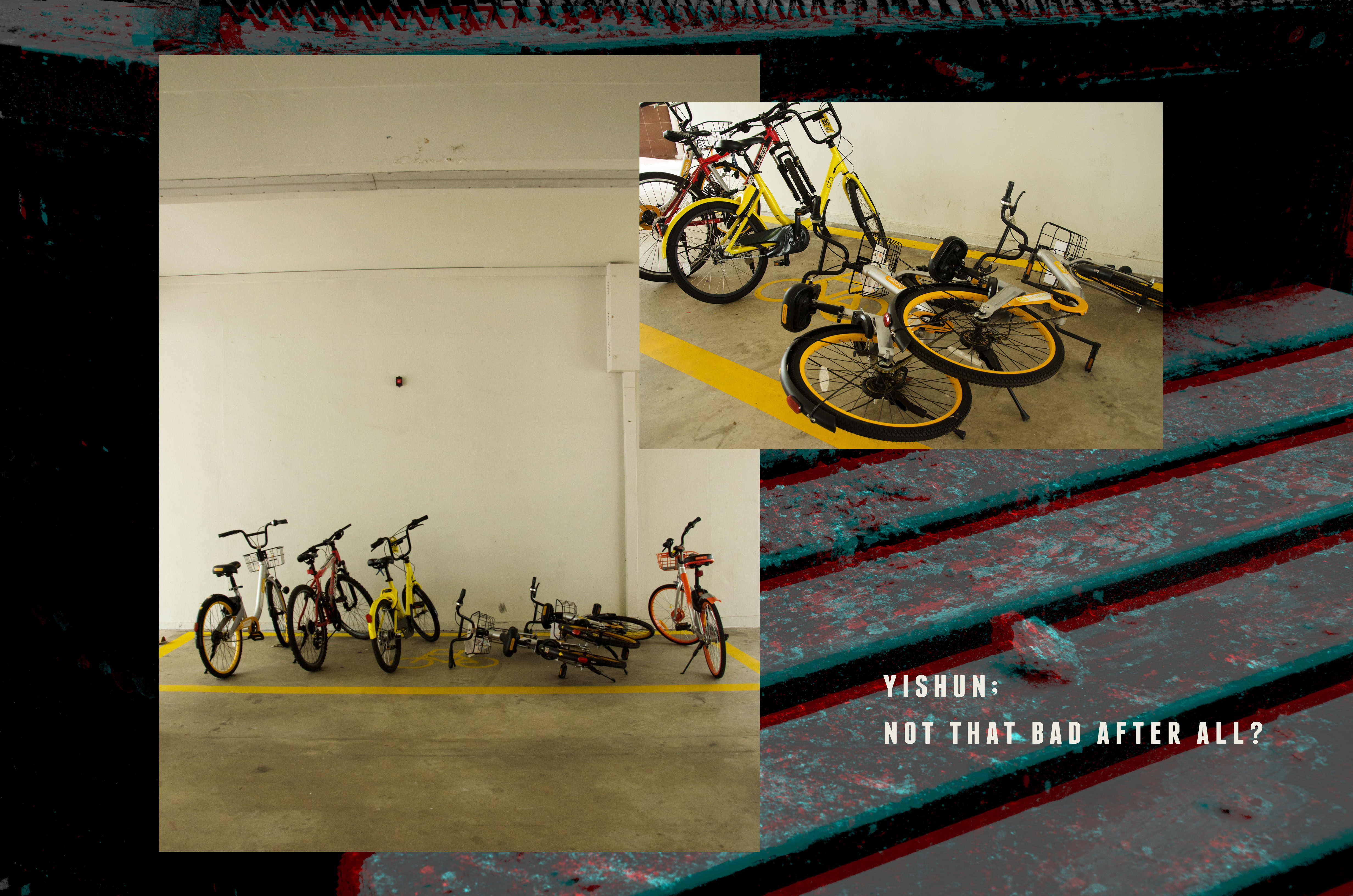
BACKGROUND
Deciding what to put in the background is another difficult thing to decide. I wanted to put a black background but went against it because it looked too plain.
Then I thought about how my zine revolves around glitches, and attempted to create that feeling by using the background.
Playing with triangles and transparency
I didn’t glitch the background for every spread because I felt that it would be too repetitive.
Grainy noisy background
Instead, the first spread was a calmer background with a noisy texture
As you read through the zine, the background gets more and more glitchy.
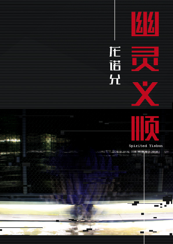
TITLE
The title of each spread was actually a solid red fill. I played around with the different settings and took up Shirley’s suggestion of a red outline instead.
FEEDBACK
Thanks for the very constructive feedbacks! ^^
TAKEAWAYS
I’ve learned how to apply different elements (eg: colours) for the spreads. But not making the spreads look repetitive by changing and twerking things such as the background and image sizes.
Making the spreads look aesthetically pleasing but at the same time maintaining a visual hierarchy was definitely something challenging for me.
Drawing digitally is still something very new to me (picked it up from the last project) and I would love to explore and practice more in the future!
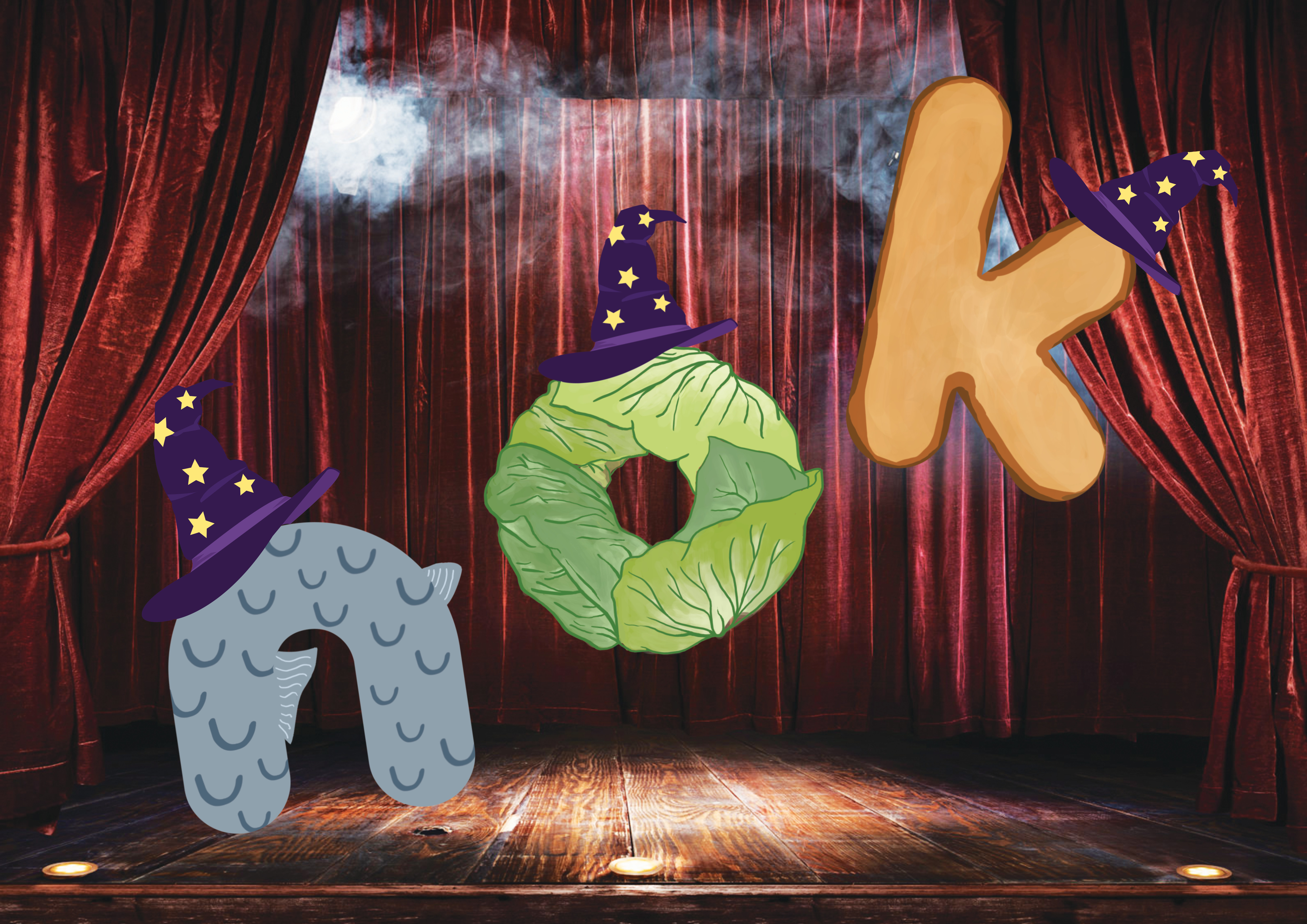
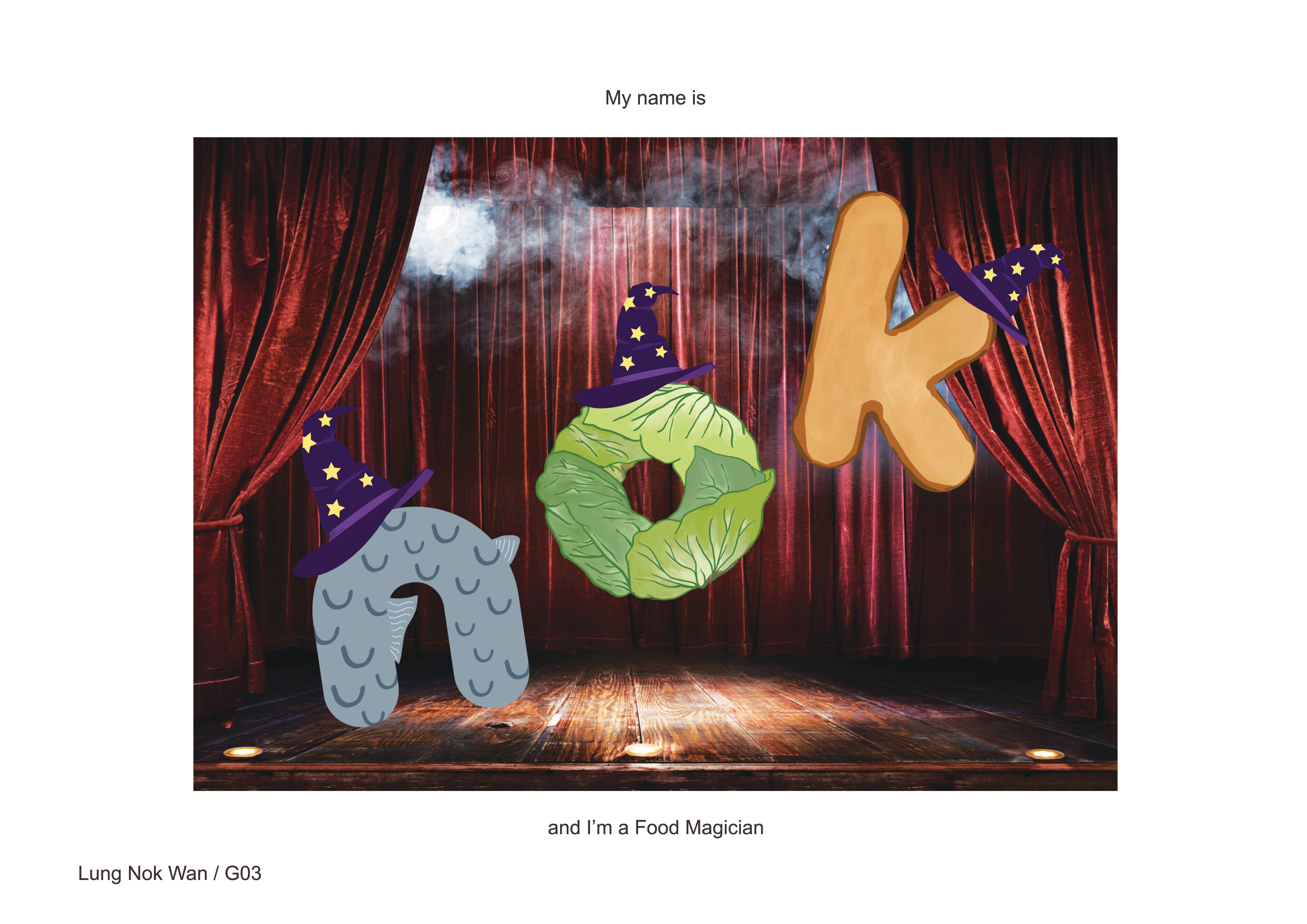
I can make food appear from thin air! These are MAGICIAN FOODS
I wanted this piece to be fun and have a cute doodling style to it. Hence the rounded font and hand-drawn elements.
The composition of the letters are also tilted and floating, giving it a jumpy and fun feel, like how a action-packed magician show would feel like.
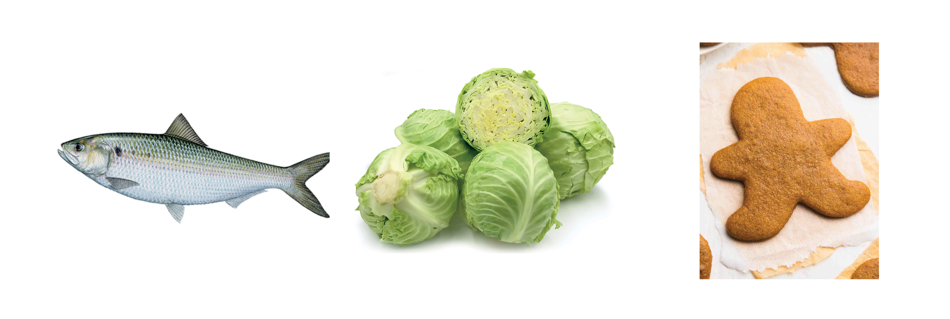
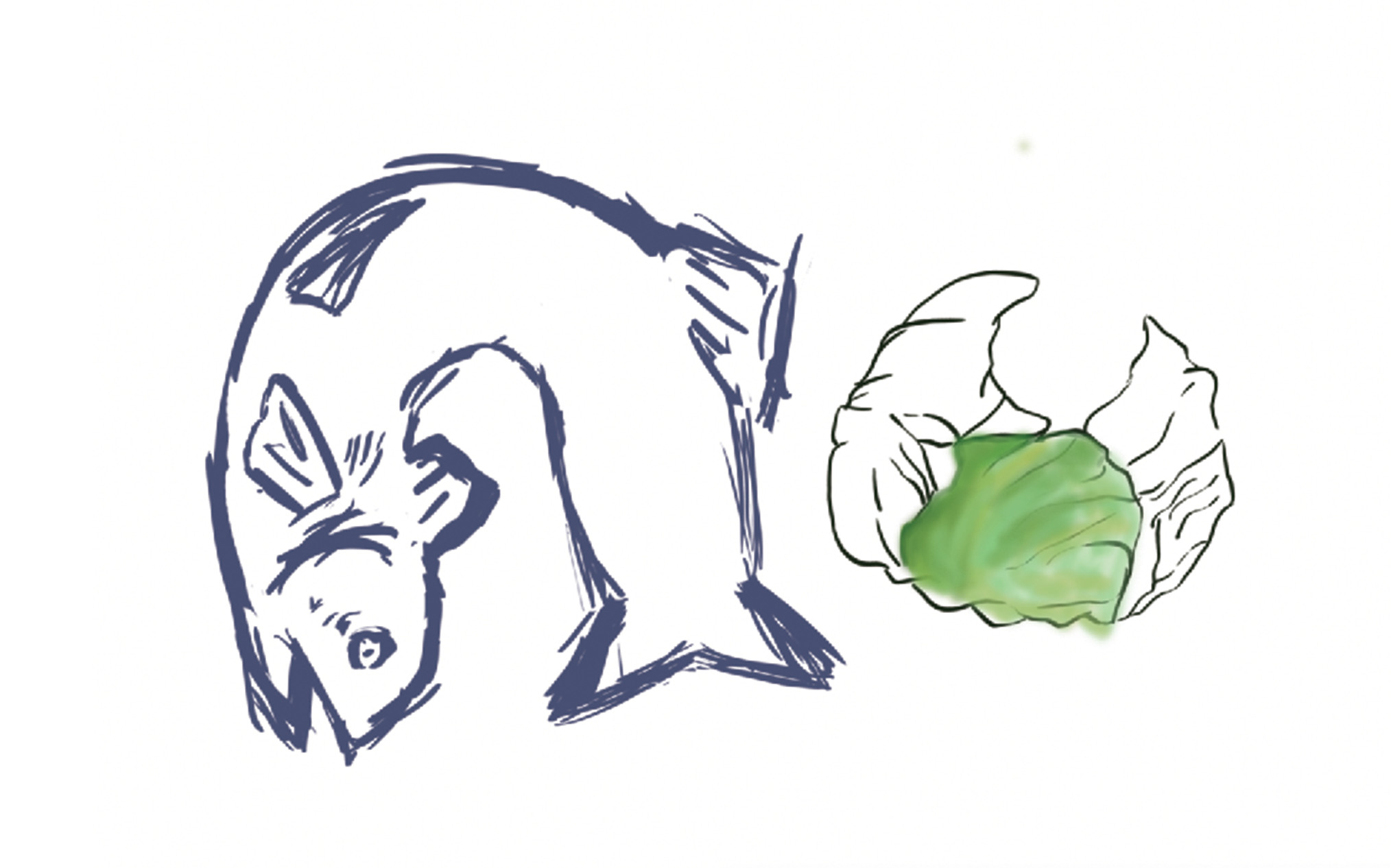
FOOD: represented by the usage of a meat (fish), vegetable (cabbage) and a pastry (gingerbread)
Dat fish tho
It was very painful doing the line art for the cabbage.. It was my first time using a tablet so it really took some getting used to even just getting the above sketched out.
Especiallythe painting. It just looked so weird.
I wanted it to look cartoonish, not realistic. (It didn’t turn out looking very realistic either…)
MAGICIAN: wizard hats worn by the foods
I actually started this with the idea of doing food esper.
Initial sketches for the magical element in magician/esper
After consultation, we agreed that (2) had too many elements and it’s quite messy.
After going through hours of trying to make the cabbage line art looks smooth and neat, I decided that I shouldn’t torture myself that way and tried using AI for the first time. (why didn’t I do that earlier…)
O mighty illustrator
BACKGROUND: A night sky background was what I had in mind, flying in the sky = magical? Shirley suggested a stage background and I thought that it’ll work better so I went on with that in the end.
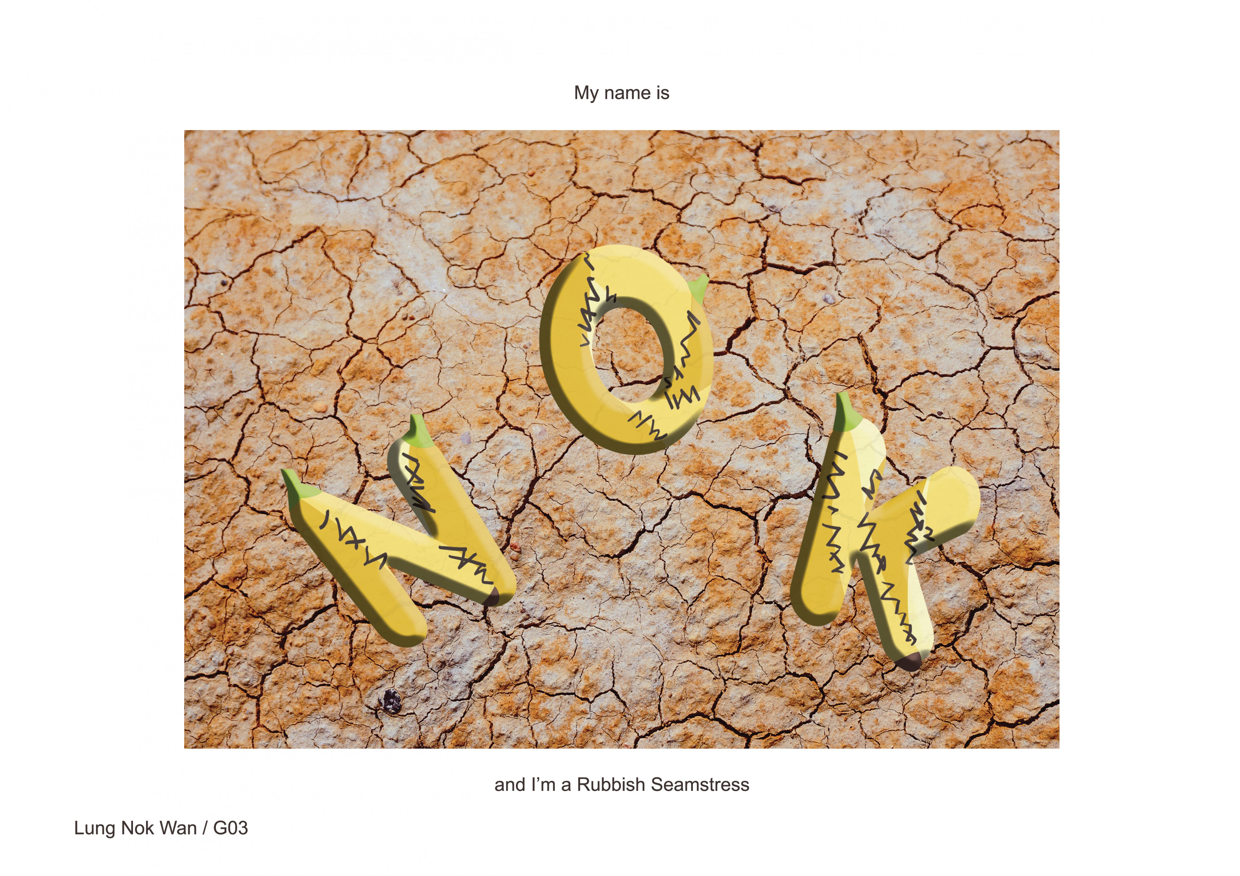
RUBBISH SEAMSTRESS
Sloppy sewing skills + sloppy materials = sloppy art
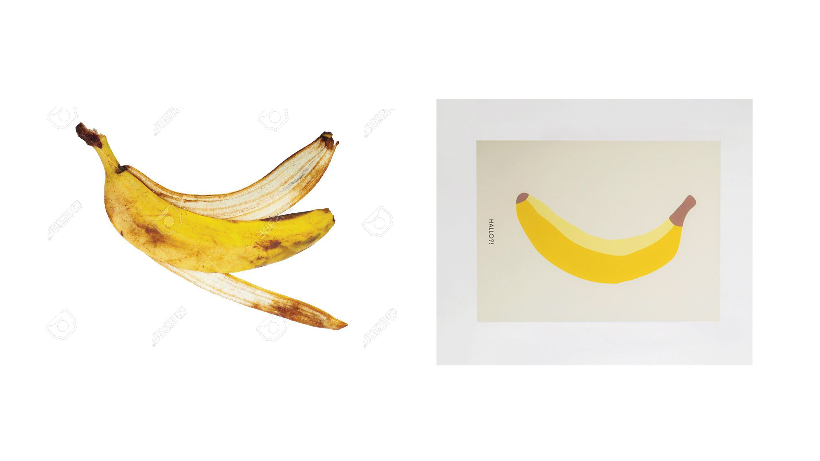
The composition is made as such as you’re looking down on the floor, at the banana peels. The stitches were meant to look untidy, giving the impression that it’s sloppy, no effort made.
RUBBISH: Initially, my idea of rubbish were plastic bottles. I wanted to use different types and sizes of plastic bottles to illustrate the idea of rubbish. After consultation, I change to use banana peels instead as using so many different plastic bottles seemed to be too messy.
Googling my time away for some peels
Funfact: My banana tips were original in brown due to the images i found above. I realise it should actually be green…..
SEAMSTRESS: Dark brown stitches sewed. Very sloppy looking, which was what I was trying to portray with this job!
BACKGROUND: I couldn’t find a hi res concrete alleyway ground to my liking. Then I found this cracked ground and thought that it was suitable. Kind of give of the poverty vibes so have to resort to selling whatever you could find A.K.A. banana peels art
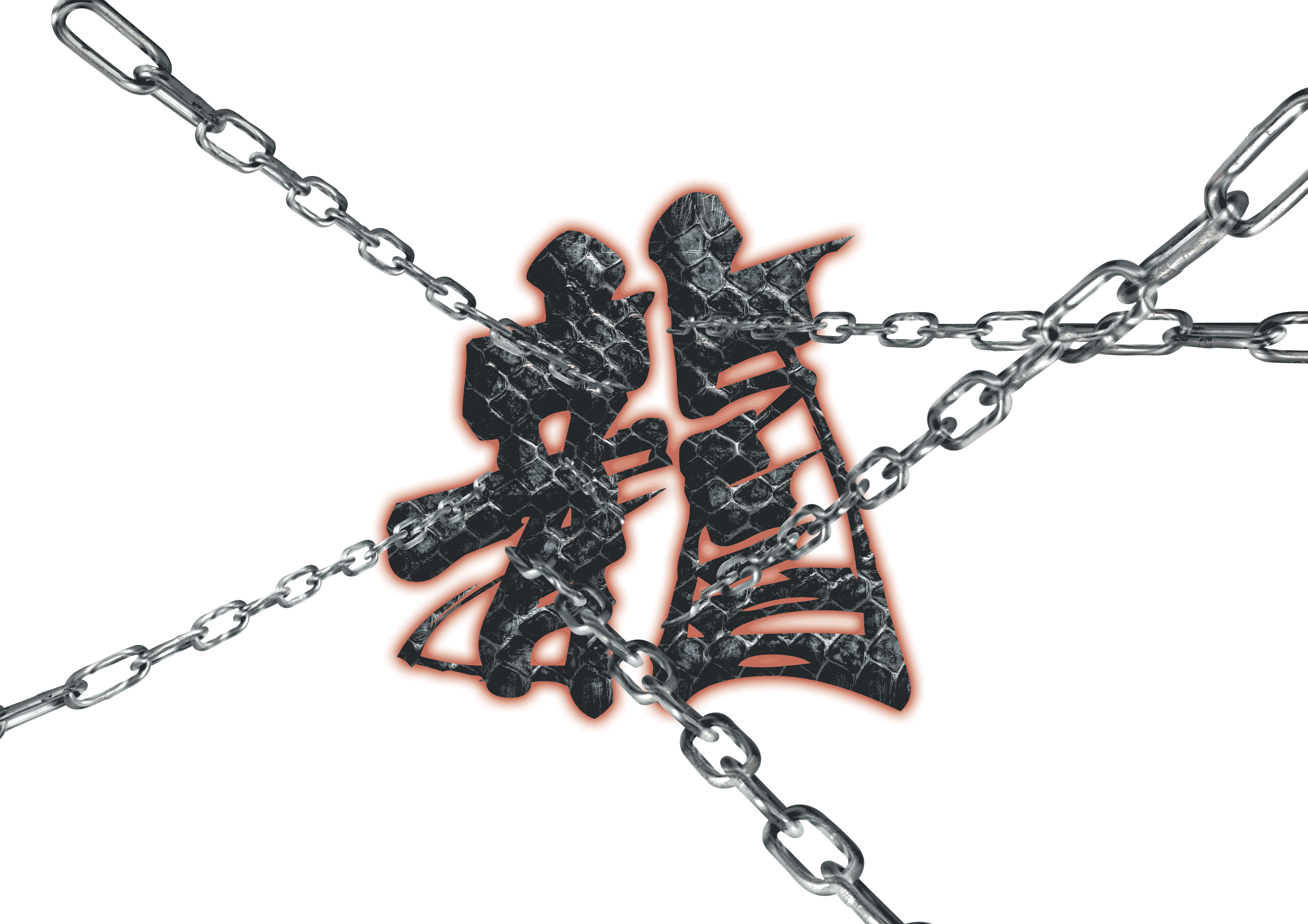
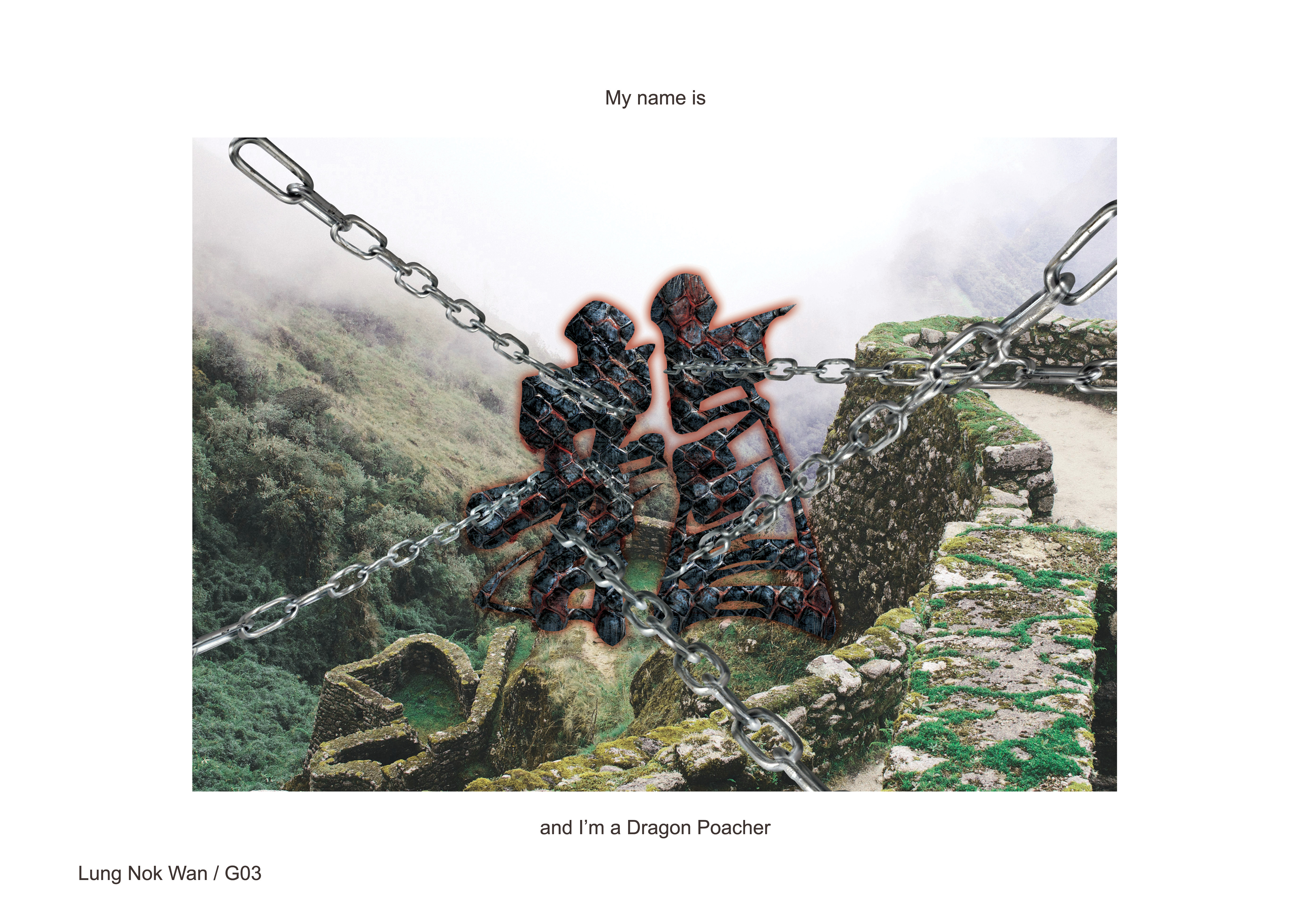
DRAGON POACHER
Masters of the wild trapped by $$ hunters like me
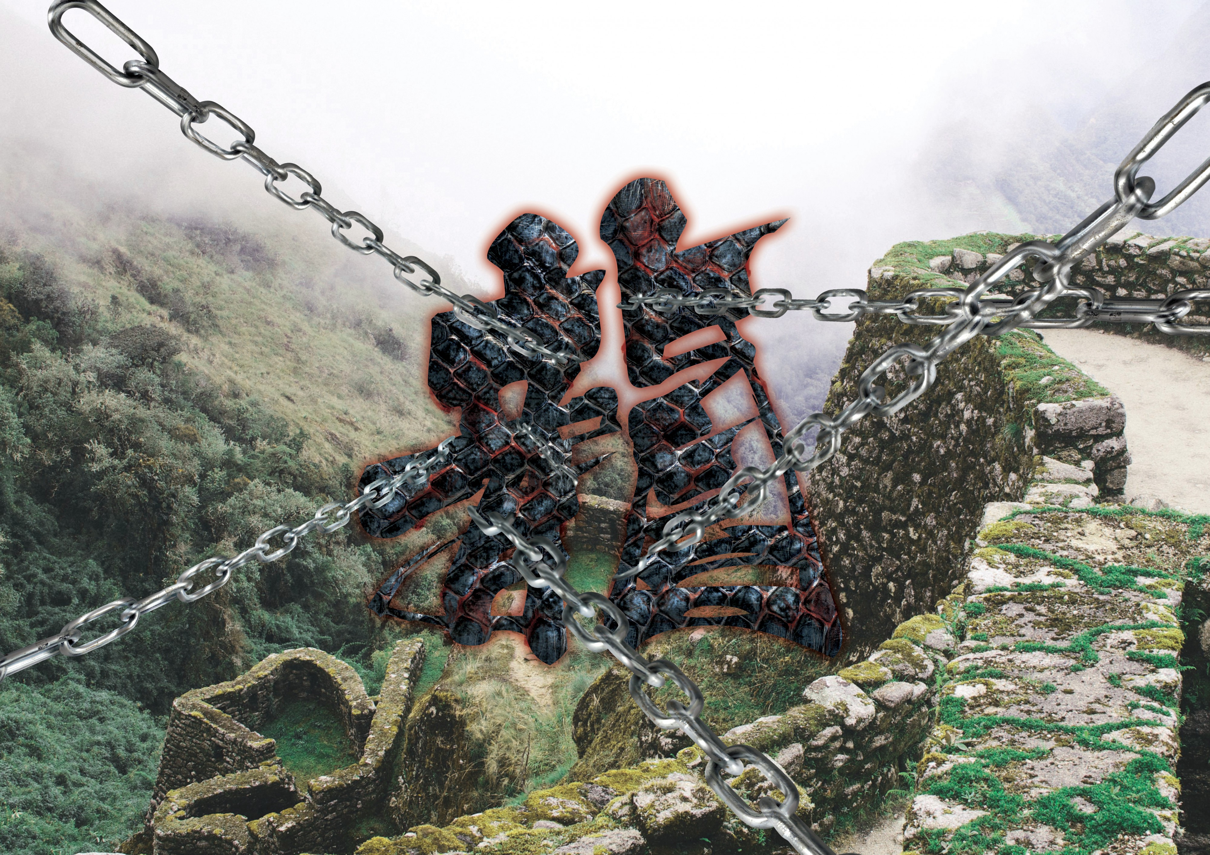
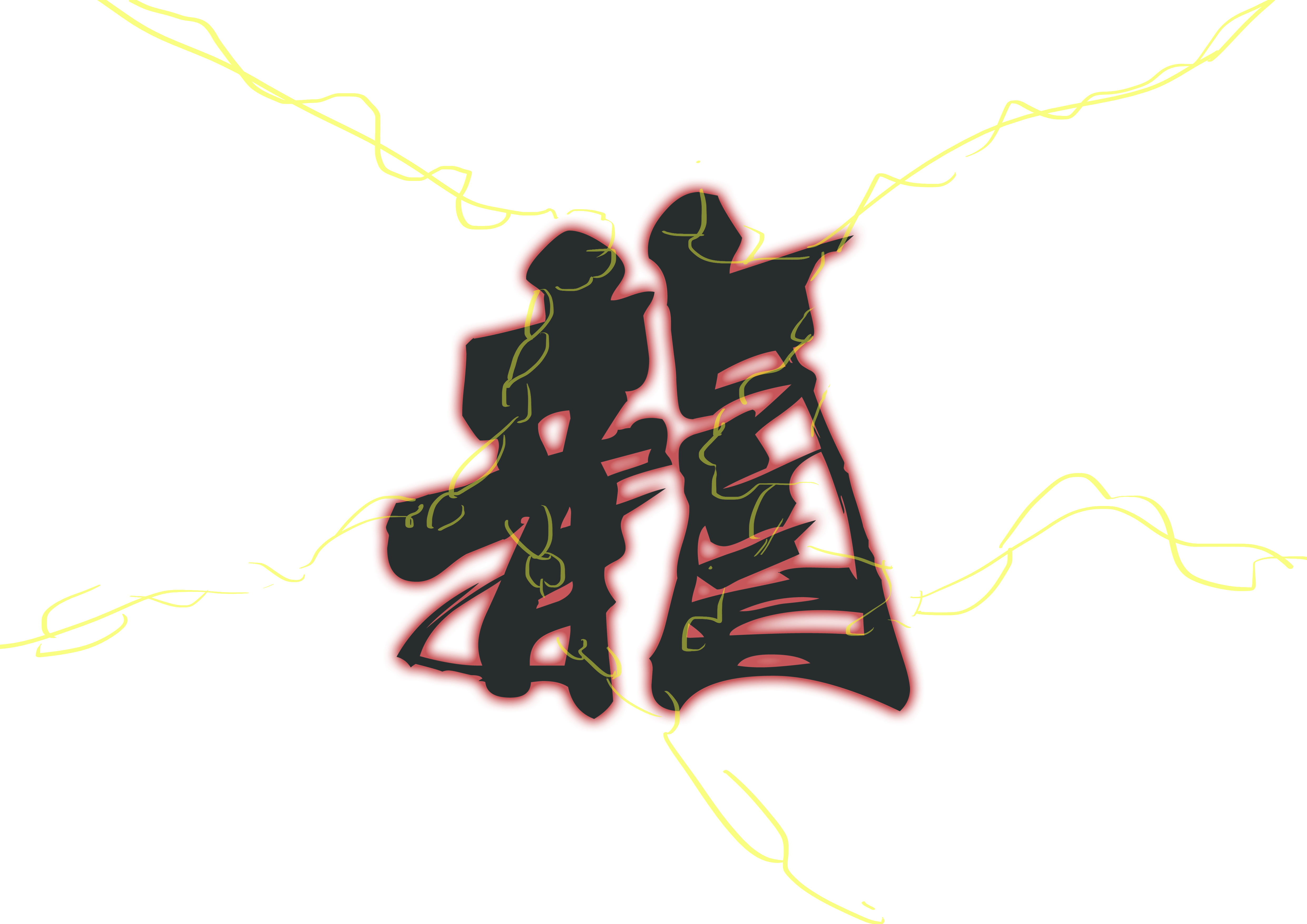
This is my surname is Chinese. Thought that it’ll be cool if I were to include my Chinese name in 1 of the compositions! I choose a calligraphy style of type because it gave off a traditional feel, and dragons are myths from the past!
Initial sketch
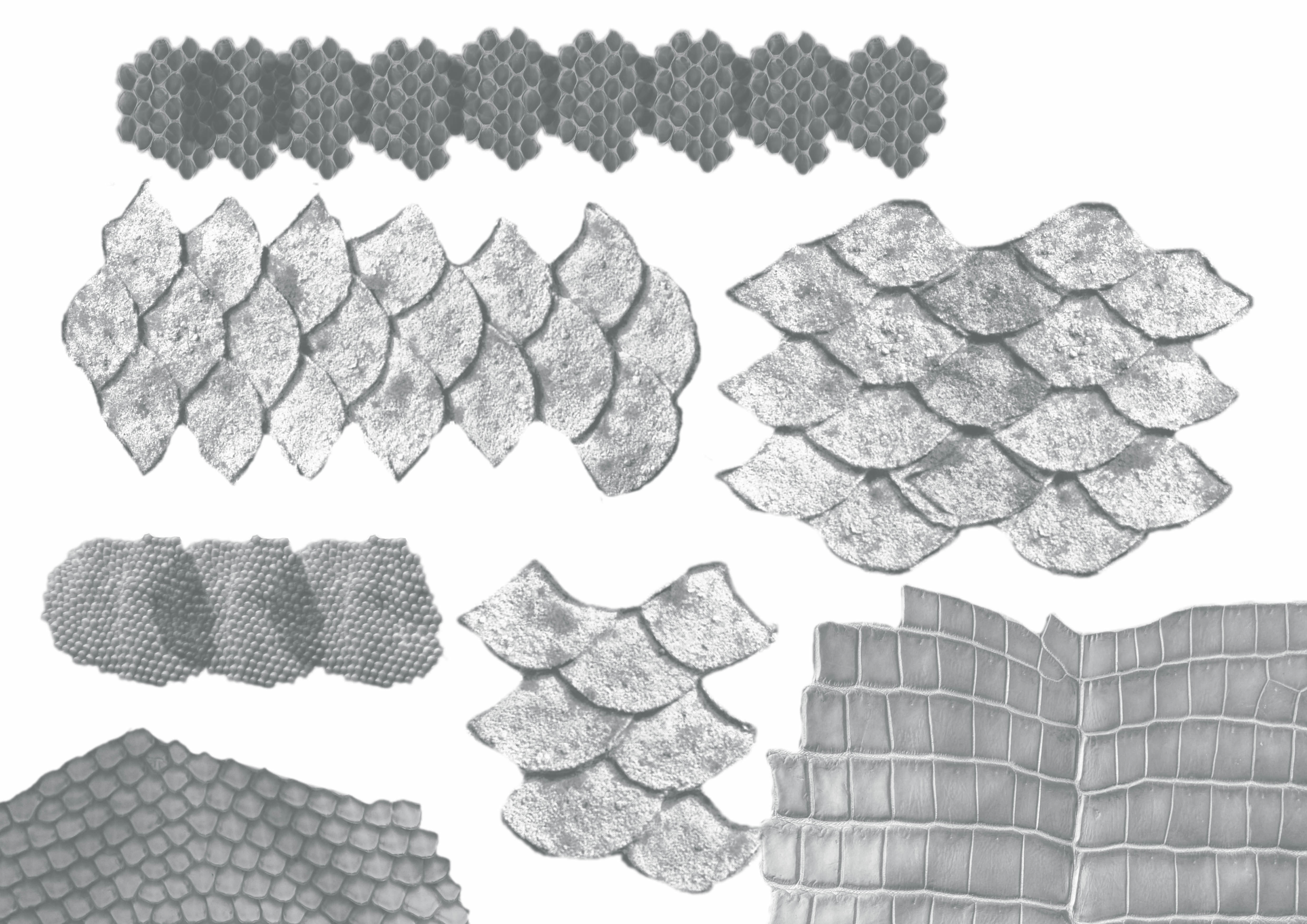
DRAGON:
Scales brushes
I went to google some reptile brushes to use for the dragon skin. After some experimenting and adding in of blood…
After twerking with the colour…
POACHER: The chains are holding back the dragon, I also played with perspective of the chains, giving the impression that the dragon is being constrained from all directions.
BACKGROUND: I had a lot of problems trying to find a suitable background. The background needs to be bright enough for the type to pop up. I didn’t want to change the colour of the scale texture used for the type because I felt that black scales gives off a stronger impression of a majestic dragon. (which also highlights the danger of this job!) However… I was looking for a background that will make the composition seem mysterious.
It really was a dilemma as to what background to use, and whether I should compromise on the colour of the scales or the background…
Backgrounds I had in mind
I choose this background of a ruin-like place with the scenes of the nature at the back because the nature is where the dragons should belong, all free to be flying wherever they want to. Instead, these majestic creatures are trapped by poachers (ME!!!)… 🙁
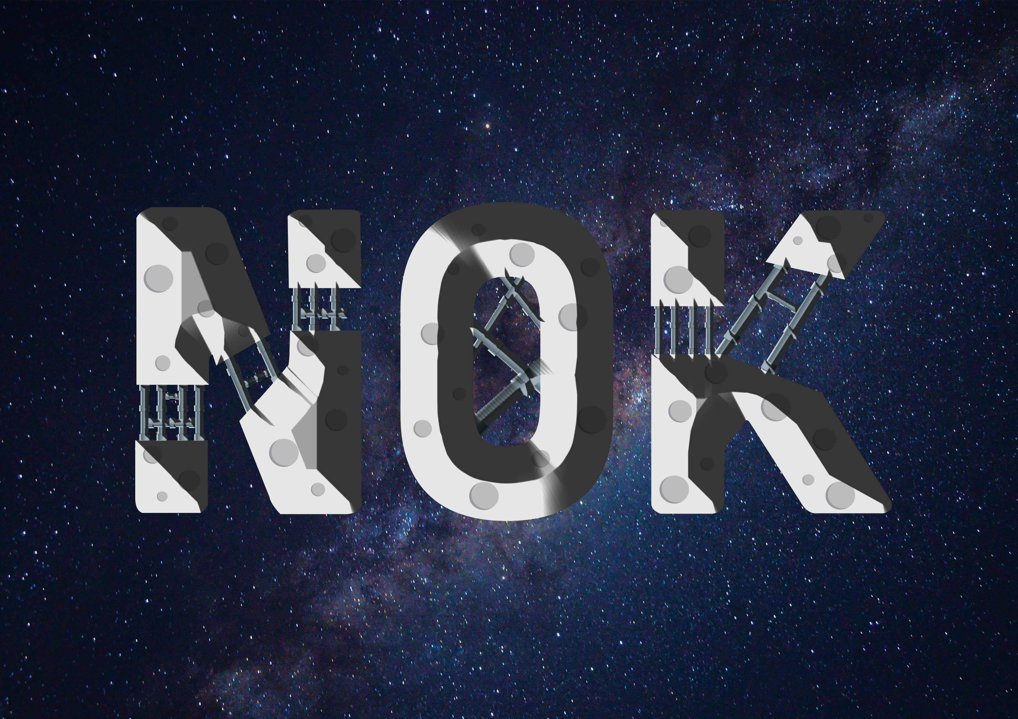
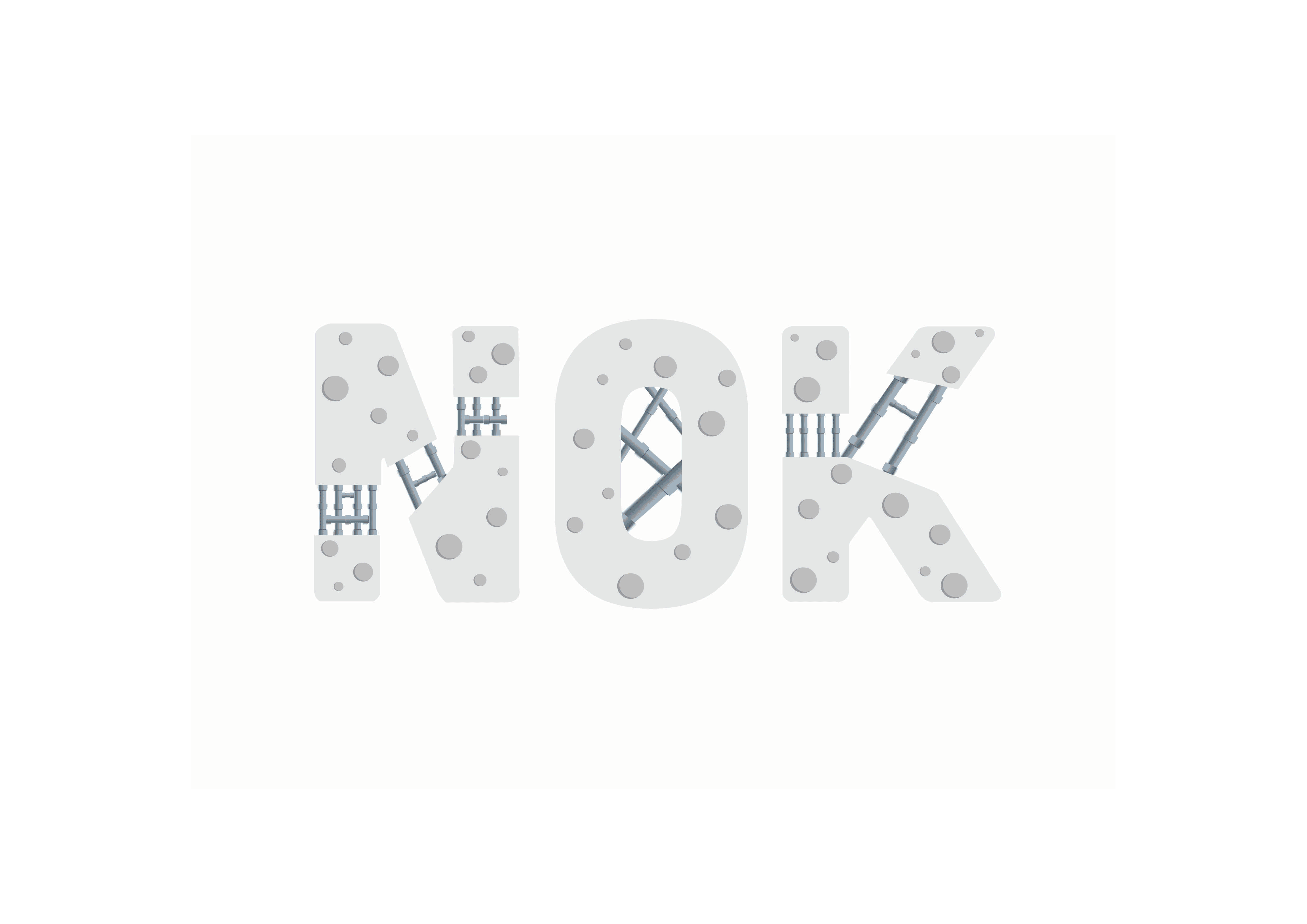
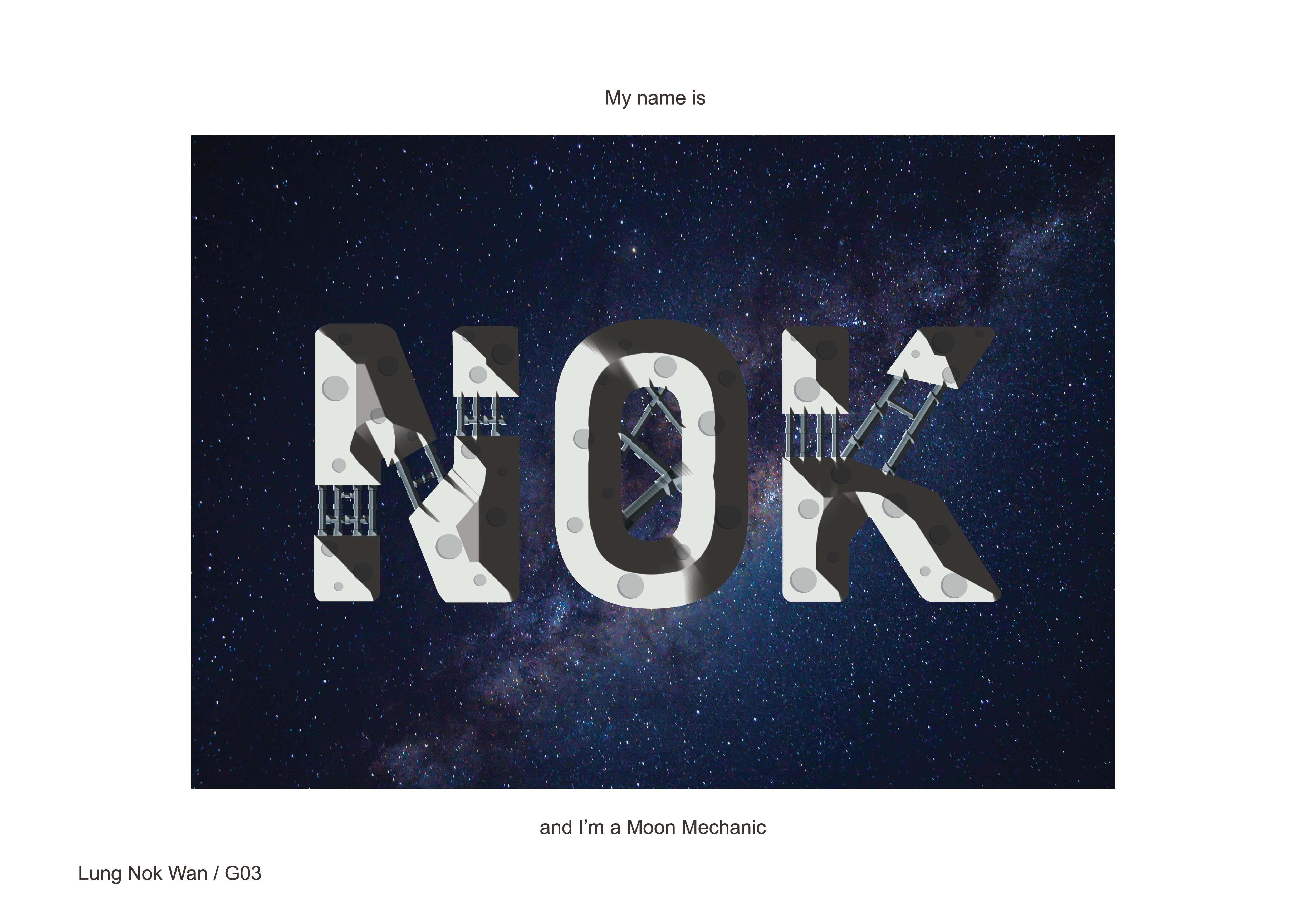
MOON MECHANIC
The moon needs maintenance too!!
The vector of the moon and pipes are first done illustrator, and transfer over to photoshop for bevel and the editing of the background image. This is using what I’ve learnt from the food magician composition.
I made the type seemed very rigid and rectangular, because thats the way people would perceive of machines!
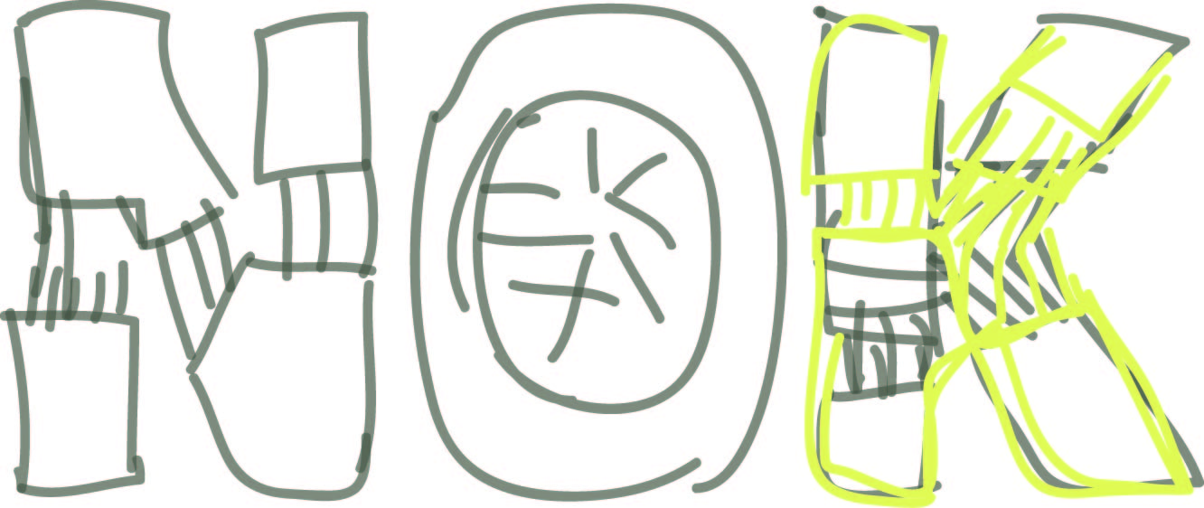
Sketch
References
MOON: I have no idea why, but the colour I was intended to use at first was yellow for the moon.
That might have to do with how animations and the media tend to associate yellow with the moon. Luckily I went to search for some moon references and change the colour to a whitish-grey.
MECHANIC: Again, AI’s here to save da day :’) All pipes vectorised in courtesy of O’ mighty AI. Due to my poor planning, the pipes are actually intended to be in the shades of the moon. However, due to the change from yellow to whitish-grey, I had to rethink the colours for the pipes! I thought that blueish-grey would be a nice combination, not very striking and feels complimentary with the colours of the moon.
BACKGROUND: I wanted to use a vector of a night sky. But changed to a real image as I wanted the 4 jobs to feel like a series (since all are already using real images)
THE TRANSFORMATION OF NOK MOON
DIFFICULTIES/TAKEAWAYS
I really went out of my comfort zone and tried many new things for this project. I’ve learnt how to use AI, using a tablet and drawing/painting digitally for the first time and even combining techniques from both Photoshop and AI into 1 composition.
This project was really one that required lots of research and perseverance. It was really hard for me to to not give up and push through into translating what I had in mind to the compositions.
I’ve also learnt to not be so fixated and be more opened to different method in creating my work. (Eg: not just wanting to using a single program, use whatever that can do the job the fastest and most efficient!)
Not giving up was also very important, I tend to be very impatient when I can’t transform what I’m thinking onto what I intend to portray. The process is as important as fine-tuning and refining from failing would definitely slowly shape into the final work.