EGO: RESEARCH/PROCESS/FINAL

A R T I S T   R E F E R E N C E

genicecream

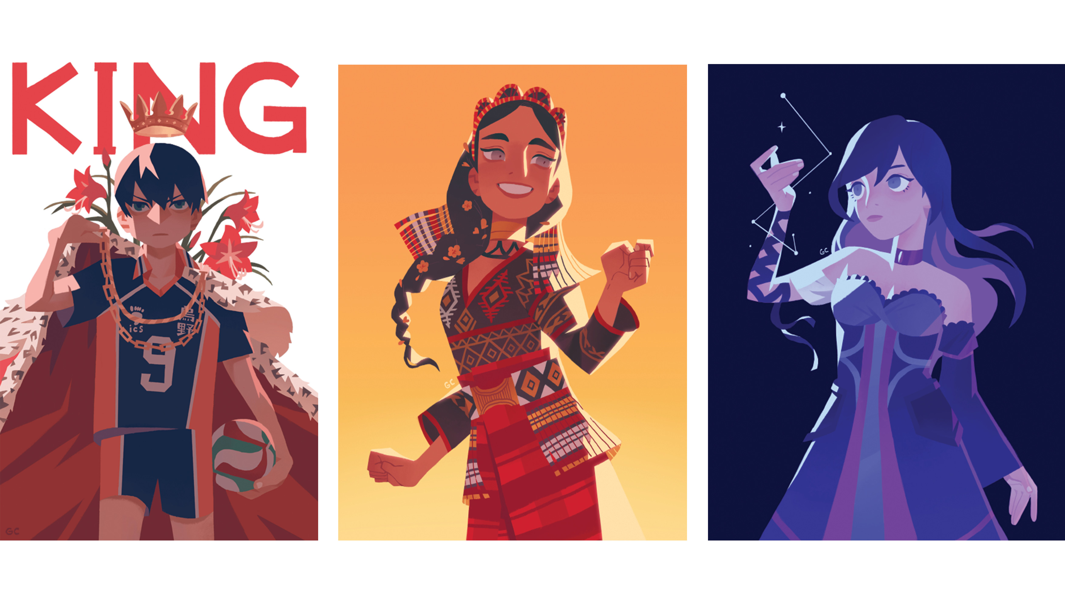
She has a very strong and defined style of adding shadows, something I’ll love to do in my compositions.


jenny yu

Similar with genice, jenny also uses strong shadows.

My drawing skills is rather limited so her style of using solid shapes is something I’ll like to reference on.


E G O  M I N D M A P

IDEATION

1_ Sotong me + Doing 3D = Cuts myself (Cuts off all my “tentacles”)

2_ Snake me + Finding my way = Gets lost (Unexpected place? Outer space.)

3_ Polar bear me + Eating ice-cream = Gets so cold (FROZEN INTO AN ICEBERG)

4_ Black cat me + Rushing 2D = Worse thing that could ever happen (PHOTOSHOP CRASHES)


I tried using 2 animals with attributes unique to themselves:

Sotong – Very blur

Black Cat – Bad omen, associated with bad luck

And 2 animals that are NOT supposed to act/react in a certain way:

Polar bear – arctic animal, why would a polar bear get cold easily?!

Snake – Navigator, predator. Definitely not an animal that would get lost finding its way to somewhere.


P R O C E S S / F I N A L

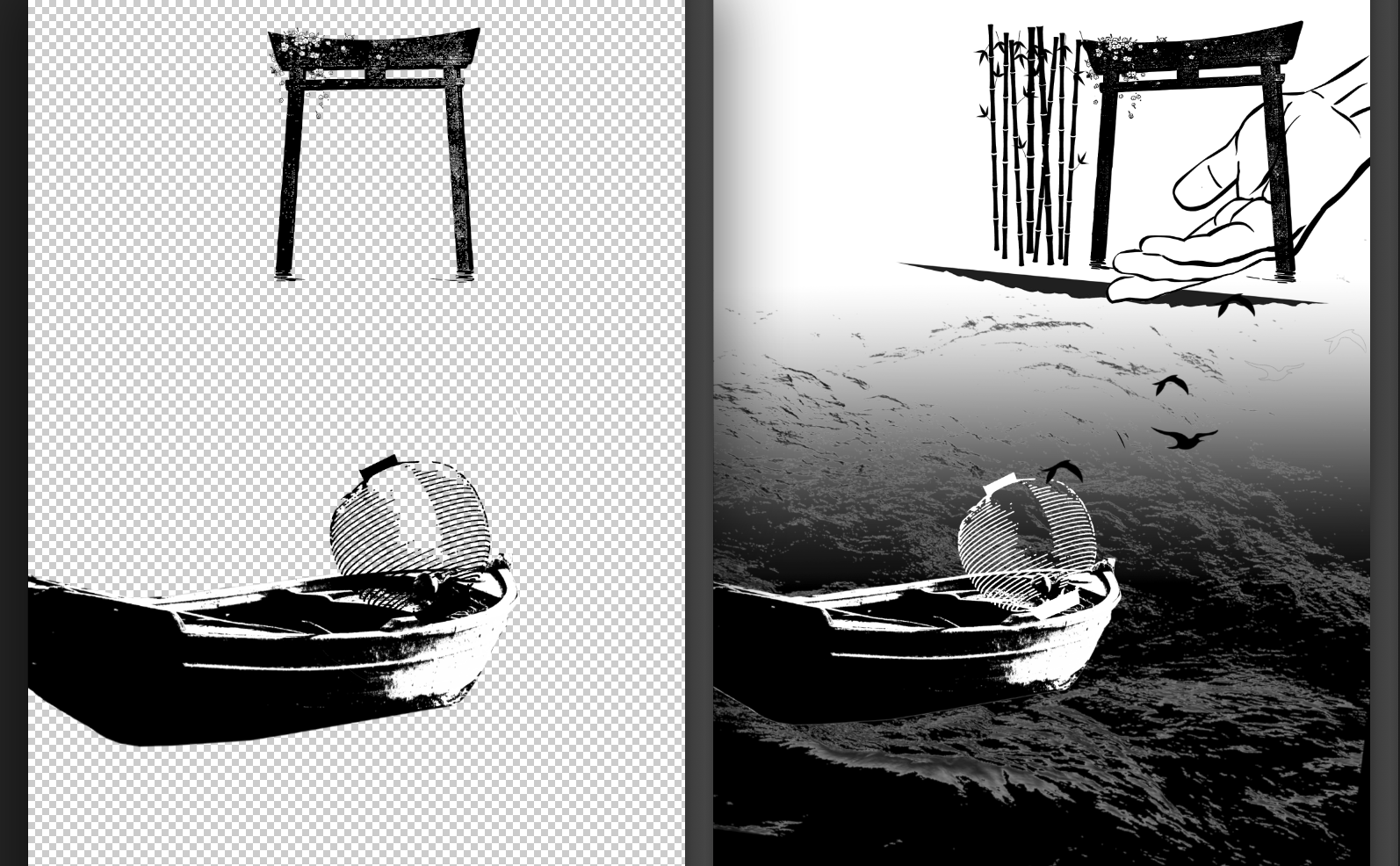
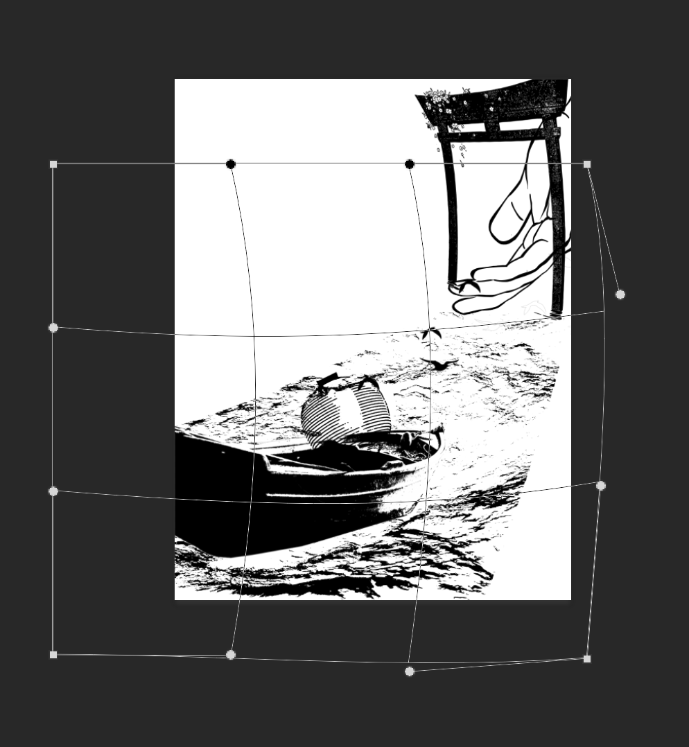
I started this project with illustrator. It was a painful process. I never finished my sotong series, and changed to using photoshop.
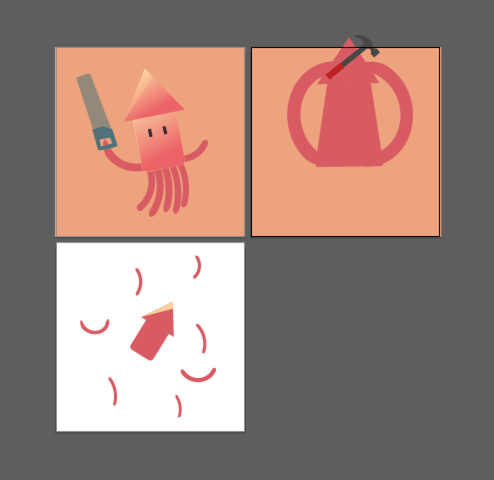
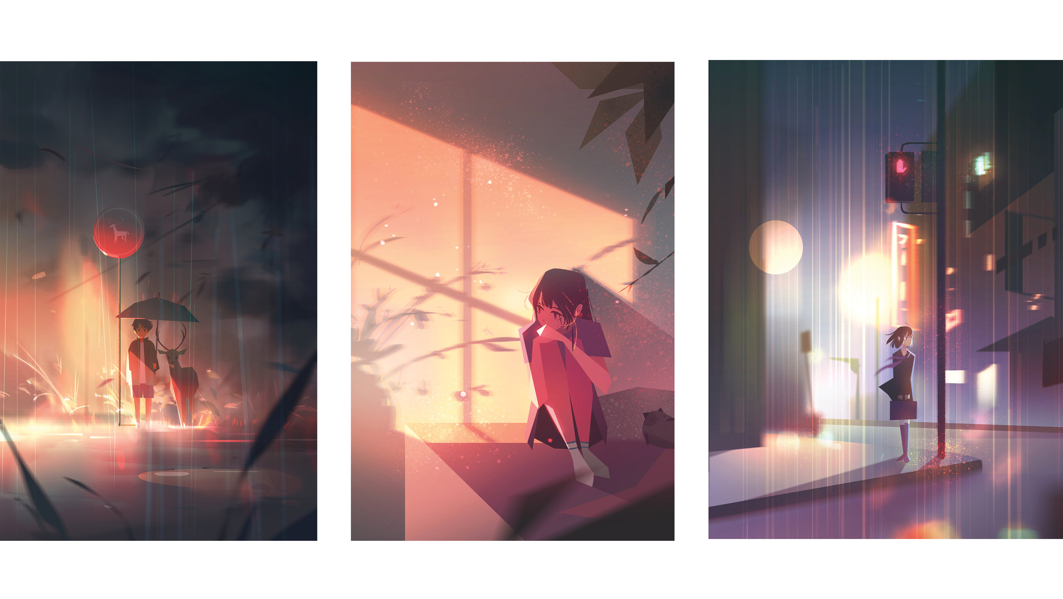
AI attempt

SOTONG

Clumsy me. I choose a bright mustard colour for the background to give it a playful feel. And the last panel a blue one to add on to the dramatic feel for this series. I feel that the inversion of the yellow background to blue really changed the atmosphere of the panel compared to the first 2 which was what my intention.

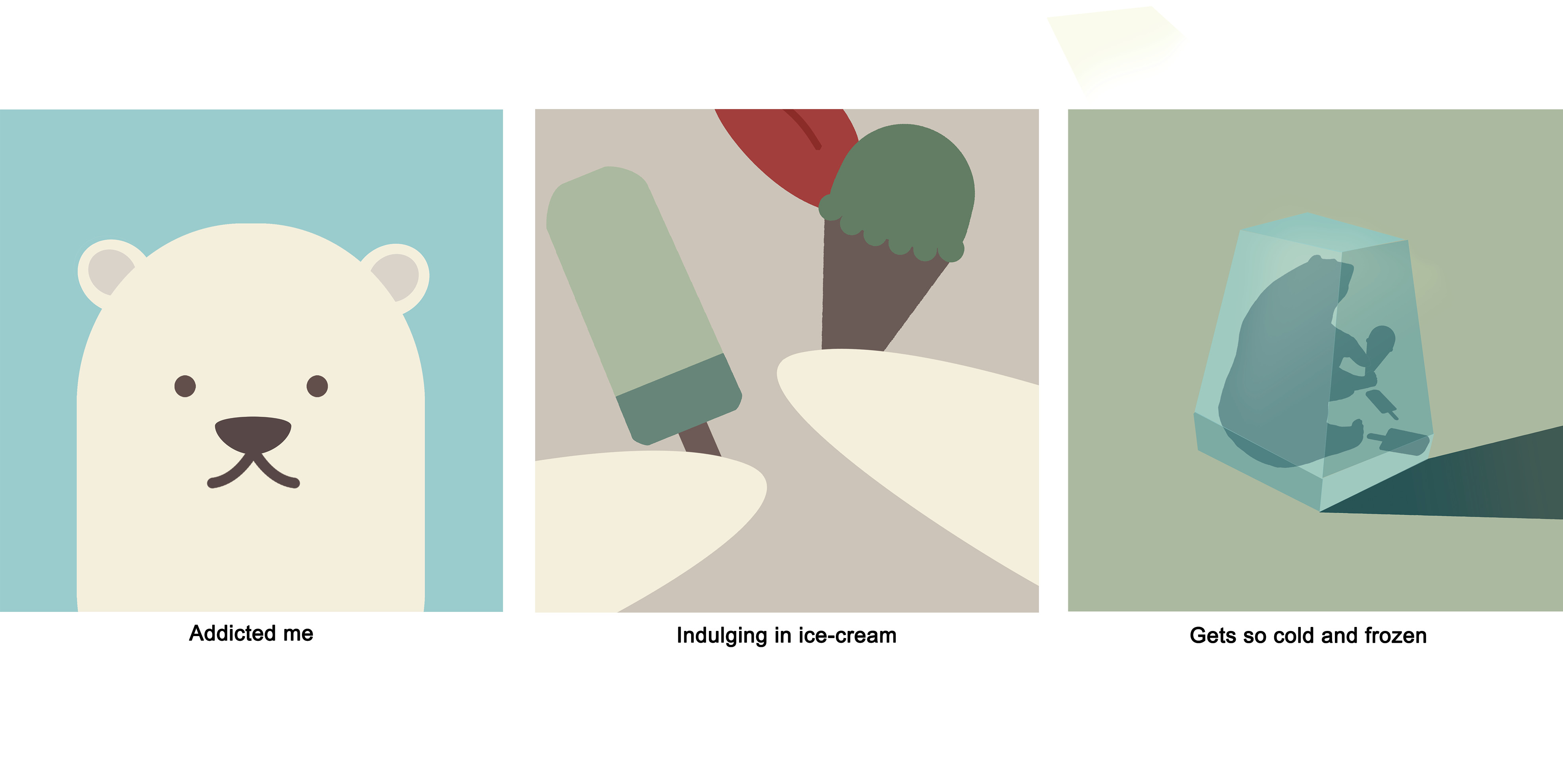
Addicted me. Colours used here are of a cooler tone to give the series a cooler feel. Continuity used here too. A colour from the previous panel will be used in the next.

1st panel: Cream (bear) in 2nd panel hands > 2nd panel: Green (ice-cream) in 3rd panel background > 3rd panel: Blue (Ice) in 1st panel background

Explorer me. The snake is red and placed on a green background to so that emphasis can be on the snake. Everything in this series is green in different hues, to bring focus on the main subject of the GPS logo and snake that is of a red colour. Colours used are complementary.

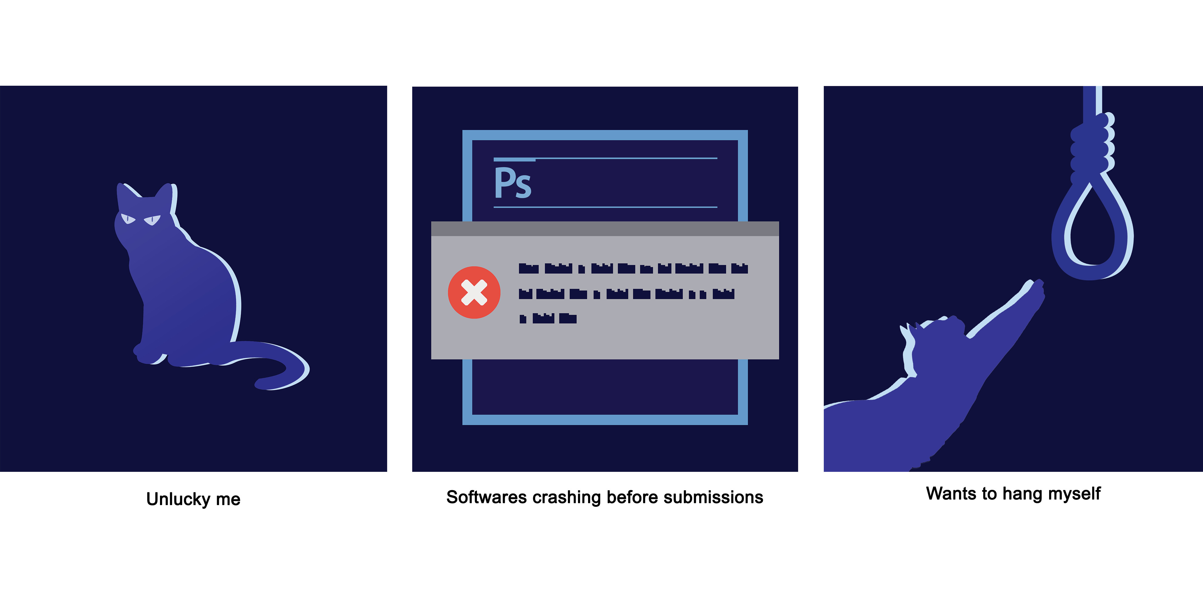
Unlucky me. Everything is almost blue in different hues, with only the warning window in grey and the sign in a striking red. Our eyes are naturally drawn to the striking red, because the colour is of a high contrast compared to the blues. I choose blue not just to compromise on the colour scheme of the photoshop panel, but to also give the the series a mysterious feel. I also really like the highlight here. Really added a nice look to the series. 🙂


My photoshop also crashed… and I had to redo EVERYTHING.

Lesson learnt: To not save everything in 1 file and saving multiple copies as i work.

Photoshop hates me

One of the biggest takeaway from this project was lighting theory. Shadows are not just black, and light is not just white. Using different colours for shadows and light will make my compositions stand out so much more.

FOREST GUMP: PROCESS/FINAL

RESEARCH

All my 4 quotes are from animated movies!

Went onto pinterest to look for some inspiration…

http://frame.bloglovin.com/?post=4897013751&blog=14634063&group=0&frame=1&frame_type=none&avpp=true&context=&context_ids=&feed_order=&click=0&user=0
https://www.behance.net/gallery/31645977/Goverdose-20-10-30-Years-of-Studio-Ghibli
http://www.crossconnectmag.com/post/137042557651


I really like the how the artists play with perspective and warping to make the space feel and look more fantasy. Will try to do that in the project!


1. “A heart’s a heavy burden” – ( Howl’s Moving Castle )


Mindmap


Interpreting the quote

“A heart‘s a heavy burden

  • Heart – What could be used to symbolise having a big heart? Blue whales. They have the biggest hearts in the world.
  • Heavy – Being tied down, confined and constricted by something (e.g.: responsibilities). I used the ropes to represent the responsibility the balloons plays in flying the enormous whale. Enlarging the blue whale in the composition also made the animal seemed heavier in the visual sense.
  • Burden – This whole task of flying the blue whale with balloons appeared to be a very troublesome and impossible task. The whale symbolising the heart just seemed like a pain in the butt.

Principles of design

  • Scale – Scale variation provides the viewer a sense of perspective. Clouds that are further can smaller in size compared with the ones that are nearer. The same concept can be seen with the balloons. The play on sizes gives depth and makes the composition feels more dynamic.
  • Movement – The ropes are all flying in the air in different directions! This makes the composition feels more dynamic in general.
  • Texture – Just having a black background is boring. I photoshoped in a galaxy-liked star background to make the composition feel more fantasy.


2.  “The Earth speaks to all of us, and if we listen, we can understand” – ( Castle in the Sky )


Mindmap

Evolution


Interpreting the quote

“The Earth speaks to all of us, and if we listen, we can understand.”

  • Earth – First thing I thought off was mother nature. Trees, animals, grass field. A place out of human reach, somewhere peaceful.
  • Speaks/Listen/Understand  – How do nature communicate? Animated movies always tries to convey that through songs. Music is a universal language, no boundaries. Instruments felt like a good representation of what I was going for. Brass instruments like trumpets and saxophones seemed like a great choice.
  • We – Humans. I used a little girl and not a teenager/grown adult in this case. Children symbolises innocence, which I thought was suitable in this fairytale-liked composition.

Principles of design

  • Scale – The variation of scale gives the viewer a sense of perspective. The closest object which is the tree is the biggest and the furthest which is the deer is the smallest. The play on sizes gives depth and makes the composition feels more dynamic.
  • Golden rule/ratio – The tree and girl are placed  1/3 from the right. The tree and girl are warped to the left side, leading the viewer’s attention and leaving them to imagination about what is there.
  • Visual Hierarchy  – Our eyes are first naturally drawn to the biggest elements in the composition: the tree and trumpet. The visual weight makes it so that we first sees the subject.
  • Rhythm – Everything in the composition are on the right side, facing or leading to the white spaces at the left. The white spaces leaves the viewer thinking about whats at the left, outside the composition.


3. “They say that the best blaze burns brightest when circumstances are at their worst” – ( Howl’s Moving Castle )


Mindmap

I wanted to give myself a challenge and try make something with minimal engraving and mostly black and white.

The first composition was too static and boring. Changed for the firecracker to be at the 1/3 mark after consultation!

Interpreting the quote

“They say that the best blaze burns brightest when circumstances are at their worst.”

  • Burns brightest – Something very big and bright. Some objects that came to mind were fireflies, lamps, lanterns and fireworks. I choose firecracker sticks in the end because I wanted to portray a sense of playfulness and innocence just like in my other compositions. (Animation movies woohoo!!)
  • Circumstances/worst – A situation when only the fittest could survive. A firecracker burning brightly despite a heavy shower seemed like a pretty impossible thing to happen.

Principles of design

  • Golden rule/ratio – Placing the firecracker at the 1/3 mark makes the composition feels more dynamic and less static. The ground is also warped to enhance this effect.
  • Visual Hierarchy – The first thing the viewer will be drawn to is the sparkle as its the brightest and biggest element.

4. “Why do fireflies die so soon?”  – ( Grave of the Fireflies )


Mindmap


This composition gave me A HUGE HEADACHE….

I started the project with this quote, made so many changes and finalised this the last.

Drafts

The main reason I had so much trouble with this was because I didn’t know what to do with the white spaces. I had no idea how to link the gate with the boat.

Warping

I love warping. There’s warping in all 4 compositions! I love how it gives the composition look more dynamic.

Interpreting the quote

“Why do fireflies die so soon?”

  • Fireflies – Fireflies lit up the darkness. We keep fireflies in a jar, so I thought : why not in a lantern? Since this was a Japanese movie about war, I used a Japanese lantern since I wanted this to have the ancient Japanese feel.
  • Die – Death normally means separation. But if we think about it deeper, it means reunion too. When life gets so tough especially in the context of the movie, sometimes dying might be the only way out, the only comfort. The gate signifies crossing over to the afterlife where the hand reaches out for the souls coming to be reunited with the dead.
  • Soon – Something fast, something that can signify the transition between life and death. The birds flying from the lantern to the gate signifies exactly that, giving that transition a beautiful and bittersweet visual effect.

Principles of design

  • Scale – The variation of scale gives the viewer a sense of perspective. The closest object which is the boat is the biggest and the furthest which is the gate and hand is the smallest. The play on sizes gives depth and makes the composition feels more dynamic.
  •  Leading Lines – All the elements are composed so that attention will be lead to the gate and hands.


REFLECTION

Silkscreening was really fun yet tedious on the mind. Started off badly when the printing uncle printed my transparency too dark, which affected my exposure and in turn resulted in the countless redo-ing cycle… But the tote bag turned out beautiful in the end!!

The most difficult part of this project was to not use too many elements to convey my message. For this project, I think a lot and a little too deeply and tend to not go straight to the point – which was very very difficult because I kept discarding and restarting my designs 🙁

Mind mapping really helped me a ton,I find that I’ll focus only on the keywords and stay on track! ( Will 10/10 mind map everything from now on )


Woohoo!!!!

SILK SCREEN PROCESS

Printed transparency to be used for the silk screen!

My first few attempts exposing the screen ended up in failure because the transparency was printed too dark.

Coating the screen with the P5C blue emulsion after washing the screen.

Coat applied needs to be even and not too thick.

Transparency would be pasted on the screen and sent to be exposed to light.

After washing off the blue emulsion…

Failed silkscreen 🙁
Washed off details

This was the failed attempt, look at the washed off rope 🙁

After a few tries and re-printed the transparency…

Success!!

Next would be to test print on newsprint.

vid

It was very difficult trying to figure out the suitable amount of paint to use and the right strength to be applied.

Not enough paint
Too much strength

Not losing hope and after many painstaking print-wash-dry cycles…

I DID IT!!!!!!!!!!!
I DID IT!!!!!!!!!!! PT.2
Victory shot :^>

FOREST GUMP: MOVIE QUOTES

Being someone that watches mostly animated movies… These are the quotes I’ve found for this Forest Gump project!


“A heart’s a heavy burden”

– Sophie Hatter ( Howl’s Moving Castle )


“They say that the best blaze burns brightest when circumstances are at their worst”

– Young Sophie ( Howl’s Moving Castle )


“Why do fireflies die so soon?”

– Setsuko ( Grave of the Fireflies )


“I hate humans!”

– San ( Princess Mononoke)


“Now go, and don’t look back”

 – Haku ( Spirited Away )


“You still haven’t noticed that something precious to you has been replaced”

– Haku ( Spirited Away )


“Once you’ve met someone you never really forget them”

– Zeniba ( Spirited Away)


“The Earth speaks to all of us, and if we listen, we can understand.”

– Uncle Pomme ( Castle in the Sky )

MY LINE IS EMO: FINAL

ANXIETY

Anxiety

Definition: feelings of worry, nervousness, or unease about something with an uncertain outcome.

Unease represented by white thread. Some loose threads can be seen spilling over the strip to suggest the inability to contain anxiety.

The calm before a storm that would soon break into a bigger mess of unease.

Materials: White sewing thread, masking tape

Method: White thread used to go round and round strip and masking tape to hold composition and patterns in place.

DEPRESSION

Depression

Definition: feelings of severe despondency and dejection.

A black on black strip. The hole in the middle signify depression, and the faint stains represents how depression cannot be seen but it’s still there.

Materials: Water, Penknife, Brush

Method: Penknife to cut out an uneven hole in the middle. Tilting the piece and using gravity, dab a wet brush at the centre and spread to both ends of the strip.

OBSESSION

Obessesion

Definition: an idea or thought that continually preoccupies or intrudes on a person’s mind.

The charcoal represents the urges & actions of obsessions. Clear plastic wrap to show that these tendencies just tend to show & cannot be hidden.

Materials: Black acrylic paint, Charcoal, Clear food wrap

Method: After painting the strip black, mixture of paint and charcoal is applied. Clear plastic wrap to wrap around the strip and mounting board, secured with masking tape at the back.

OVERTHINKING

Overthinking

Definition: think about (something) too much or for too long.

The dot represents the small subject of overthinking. Soft wiggly lines extend out of it to represent thoughts. These lines goes darker and wilder to represent overthinking, which is being suggested to extend out of the strip to signify how uncontrollable the thoughts goes.

Materials: Black acrylic paint, Sugarcane fibre

Method: Dip sugarcane fibre into paint and control the strokes by varying strength used.

PSYCHOPATHIC

Psychopathic

Definition: suffering from or constituting a chronic mental disorder with abnormal or violent social behaviour.

Black represents a dark and violent side all human have inside of them. White symbolises the kind, loving side. However, for this strip, the white part are crumbled to signify the twisted unsure love of a psychopath. The cuts refers to the actions and tendencies of psychopaths.

Materials: Black acrylic paint, Penknife

Method: White strip is first crushed by hand and placed on black paint. Pat the strip down so that only part of the strip would come into contact with the paint. Lastly cut through the strip in a random manner.

FRUSTRATION

Frustration

Definition: the feeling of being upset or annoyed as a result of being unable to change or achieve something.

Lesson brief for Foundation 4D is used because I was feeling very stressed up as it was submission week for that when I was doing up the strips for this. Very frustrated at myself for being very slow in producing work. Charcoal used to represent the chaos in me when doing the strip.

Materials: Foundation 4D assignment brief & photo for submission, Charcoal, White glue, White mounting board

Method: After tearing up assignment brief & photo into pieces, use the charcoal to produce wild strokes all over them. Stick them on the mounting board with white glue and use the charcoal to produce more wild strokes all over.