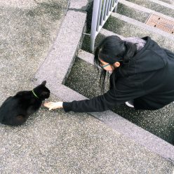

INSPIRATION (ZINE LOOK)


I was going for a glitchy look, with doodles on the pictures I took on site.
DOODLES
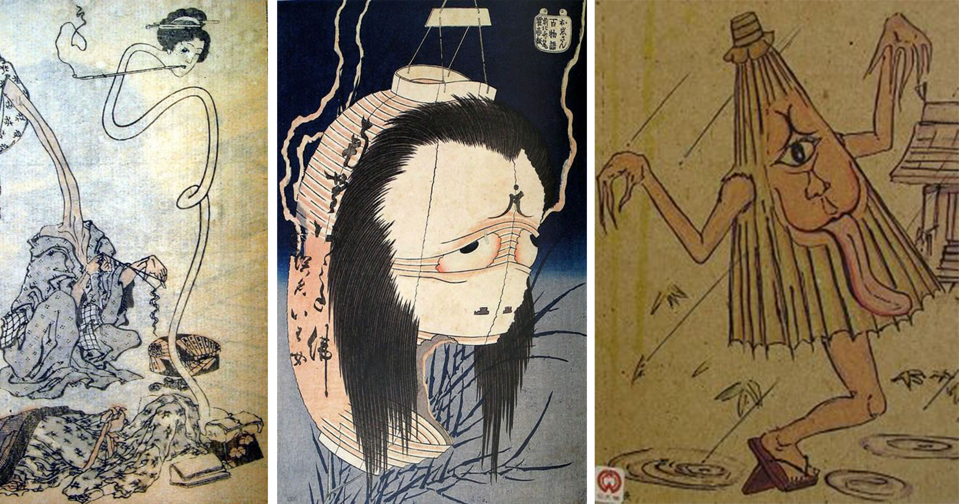
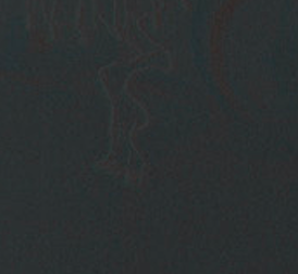
The ghost doodles were done first before the realization of the actual zine. I wanted to set the look and feel first.
I choose red to draw them. In a sense, I already had a direction of what I wanted the zine to look like, a black and dark tone.

INITIAL DESIGN

I tried out many different “feel” for the zine. The process of finding the look/theme of the zine took the most time.
I did start with trying to make the zine look fun? Initially, I was trying to go for a fun concept. But as I laid and try it out, I figure that it wouldn’t work out and just looked really weird and generic. In the end, I went back to my original concept of making a dark and glitchy looking zine.
I also tried to experiment with the look of the glitches for the pictures.
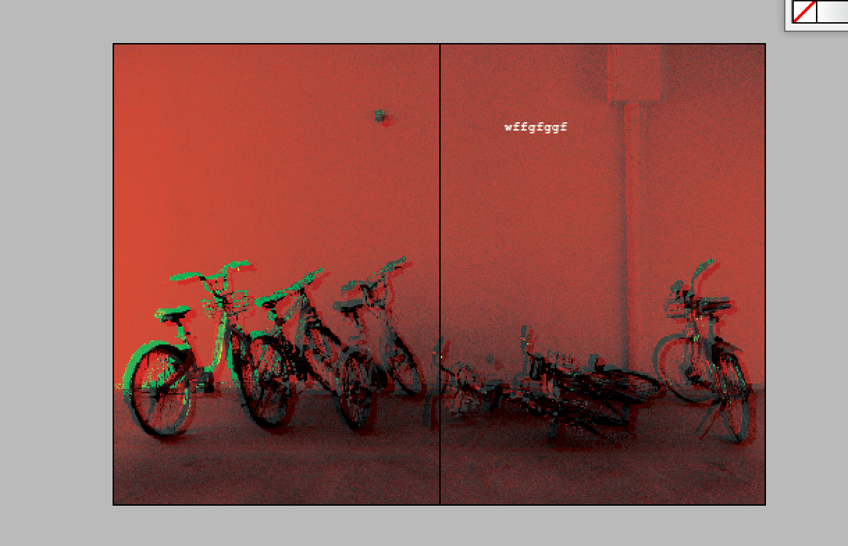
For this particular SS, it seemed abit too red for my liking as I was going for something more eerie looking.
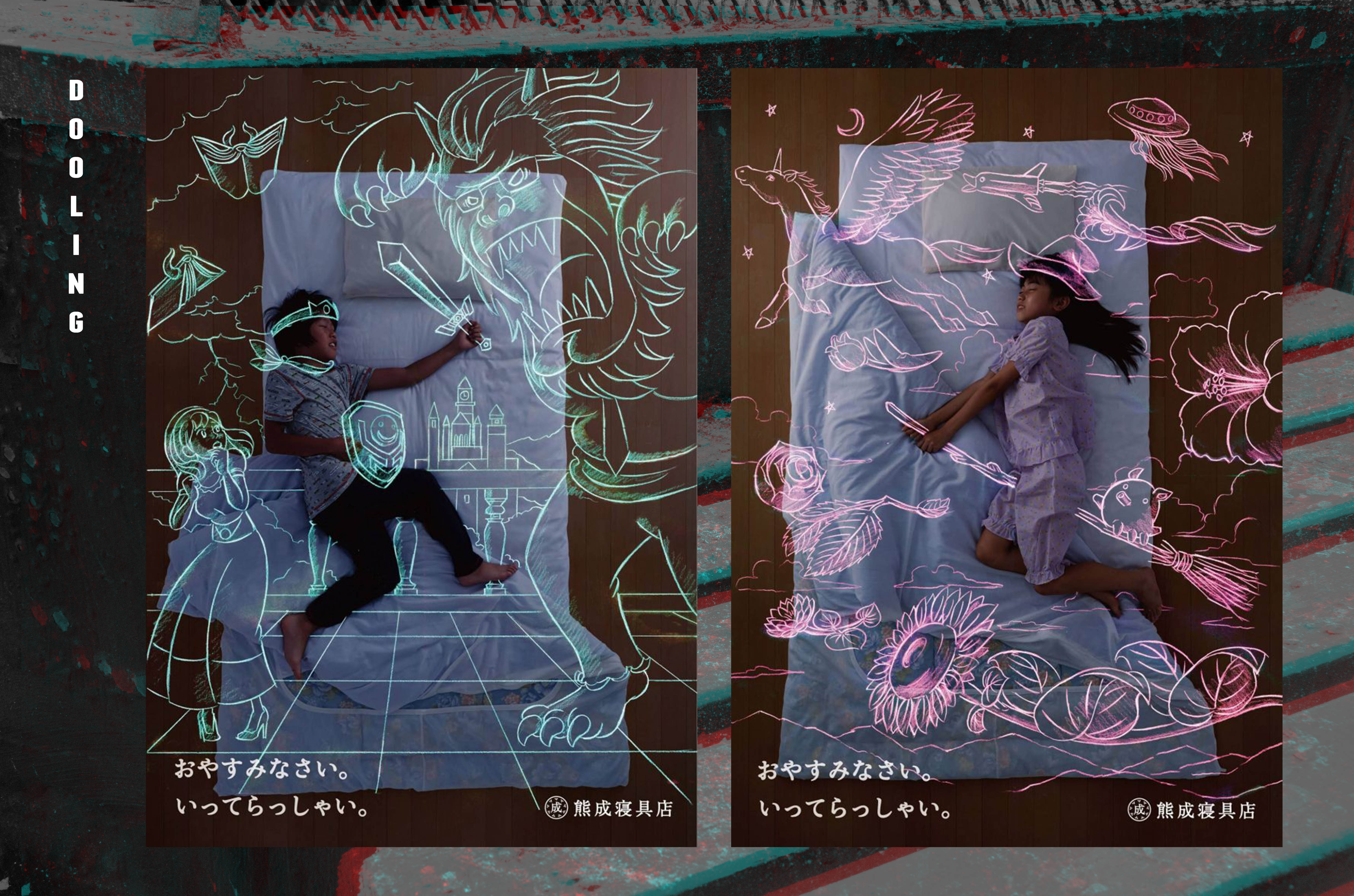
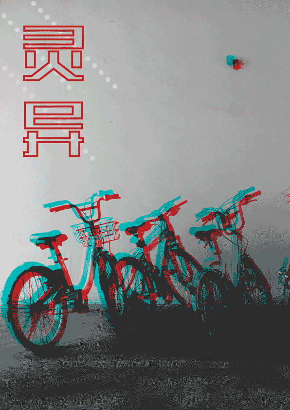
PHOTO EDITING
For all the photos with the ghost illustration, they are edited into a black and white version with a blue and red after effect to them.
BACKGROUND
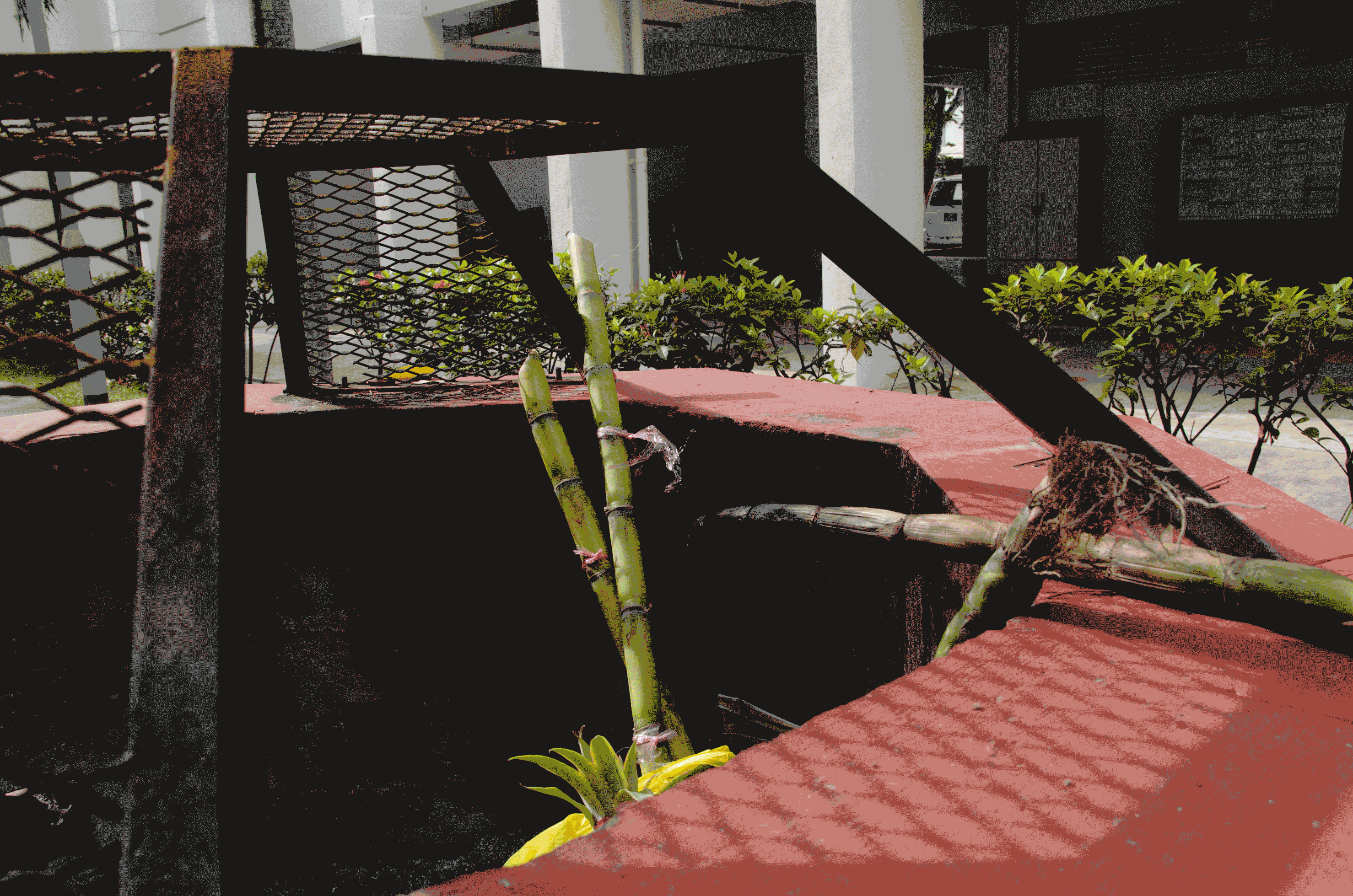
Deciding what to put in the background is another difficult thing to decide. I wanted to put a black background but went against it because it looked too plain.
Then I thought about how my zine revolves around glitches, and attempted to create that feeling by using the background.
I didn’t glitch the background for every spread because I felt that it would be too repetitive.
Instead, the first spread was a calmer background with a noisy texture
As you read through the zine, the background gets more and more glitchy.
TITLE
The title of each spread was actually a solid red fill. I played around with the different settings and took up Shirley’s suggestion of a red outline instead.
FEEDBACK

TAKEAWAYS
I’ve learned how to apply different elements (eg: colours) for the spreads. But not making the spreads look repetitive by changing and twerking things such as the background and image sizes.
Making the spreads look aesthetically pleasing but at the same time maintaining a visual hierarchy was definitely something challenging for me.
Drawing digitally is still something very new to me (picked it up from the last project) and I would love to explore and practice more in the future!
Click me for Research!
Click me for Final Zine!