In color theory, a color scheme is the choice of colors used in design for a range of media. Color schemes are used to create style and appeal. Colors that create an aesthetic feeling when used together will commonly accompany each other in color schemes.
Complementary colors
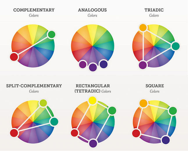
The complementary colors are pairs of colors which, when combined, cancel each other out. This means that when combined, they produce a grey-scale color like white or black. When placed next to each other, they create the strongest contrast for those particular two colors.

Analogous colors
(also called Dominance Harmony) color scheme are groups of colors that are adjacent to each other on the color wheel, with one being the dominant color, which tends to be a primary or secondary color, and two on either side complementing, which tend to be tertiary.
The term analogous refers to the having analogy, or corresponding to something in particular. An analogous color scheme creates a rich, monochromatic look. It’s best used with either warm or cool colors, creating a look that has a certain temperature as well as proper color harmony. While this is true, the scheme also lacks contrast and is less vibrant than complementary schemes.

Split-complementary
(also called Compound Harmony) color scheme is a variation of the complementary color scheme. In addition to the base color, it uses the two “Analogous” colors adjacent to its complement. Split-complementary color scheme has the same strong visual contrast as the complementary color scheme, but has less pressure.

Triadic colors
The triadic color scheme uses three colors equally spaced around the color wheel. The easiest way to place them on the wheel is by using a triangle of equal sides. Triadic color schemes tend to be quite vibrant, even when using pale or unsaturated versions of hues, offers a higher degree of contrast while at the same time retains the color harmony. This scheme is very popular among artists because it offers strong visual contrast while retaining balance, and color richness. The triadic scheme is not as contrasting as the complementary scheme, but it is easier to accomplish balance and harmony with these colors.

Tetradic colors
The tetradic (double complementary) colors scheme is the richest of all the schemes because it uses four colors arranged into two complementary color pairs. This scheme is hard to harmonize and requires a color to be dominant or subdue the colors.; if all four colors are used in equal amounts, the scheme may look unbalanced.
Rectangle
The rectangle color scheme uses four colors arranged into two complementary pairs and offers plenty of possibilities for variation. Rectangle color schemes work best when one color is dominant.
Square
The square color scheme is similar to the rectangle, but with all four colors spaced evenly around the color circle. Square color schemes works best when all colors are evenly balanced.


Recent Comments