
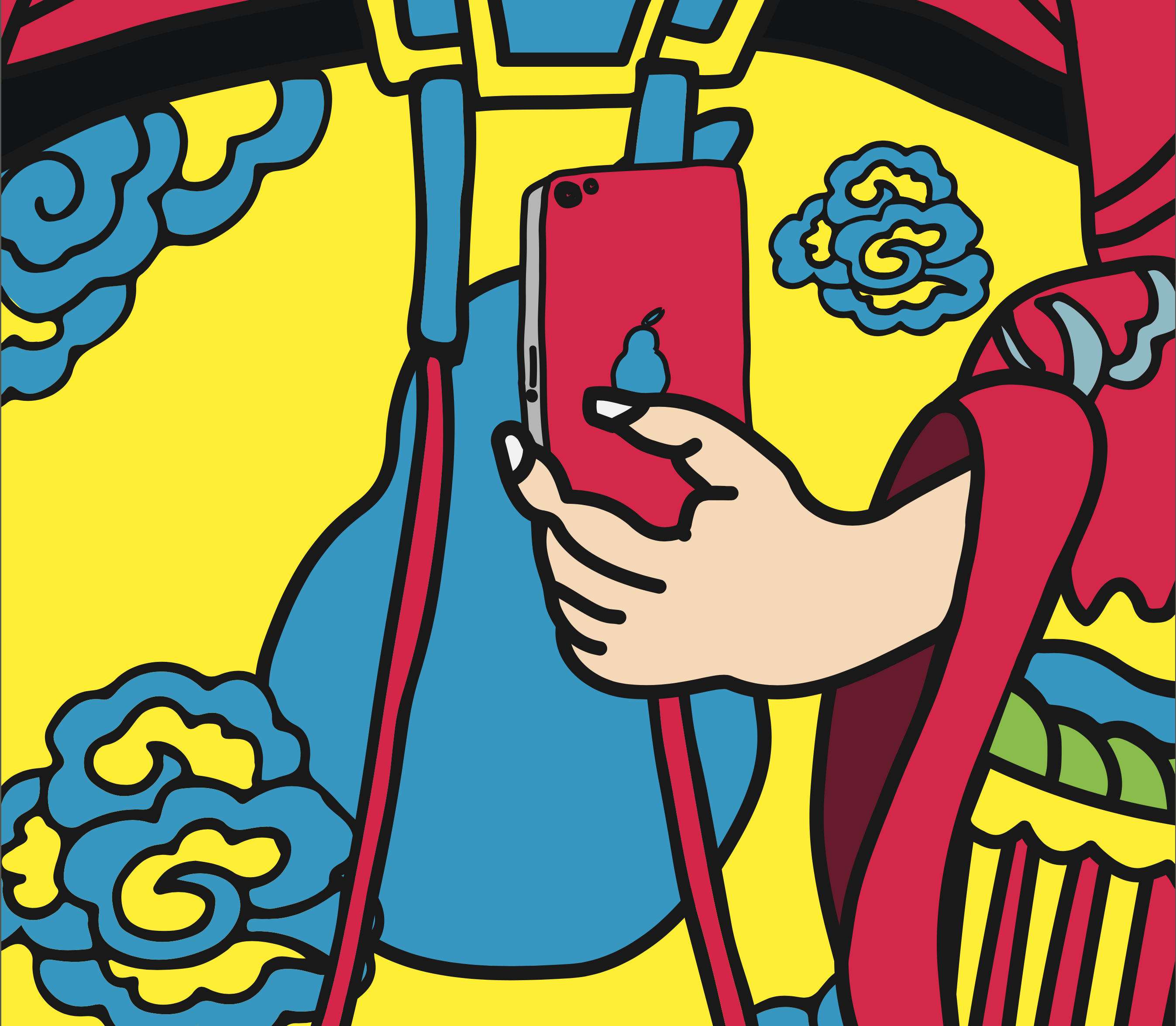
Closeup


Exhibition
@ School of Arts, Design and Media, NTU
MEDIA WALL


LED
15m by 2m
Media Art Nexus NTU
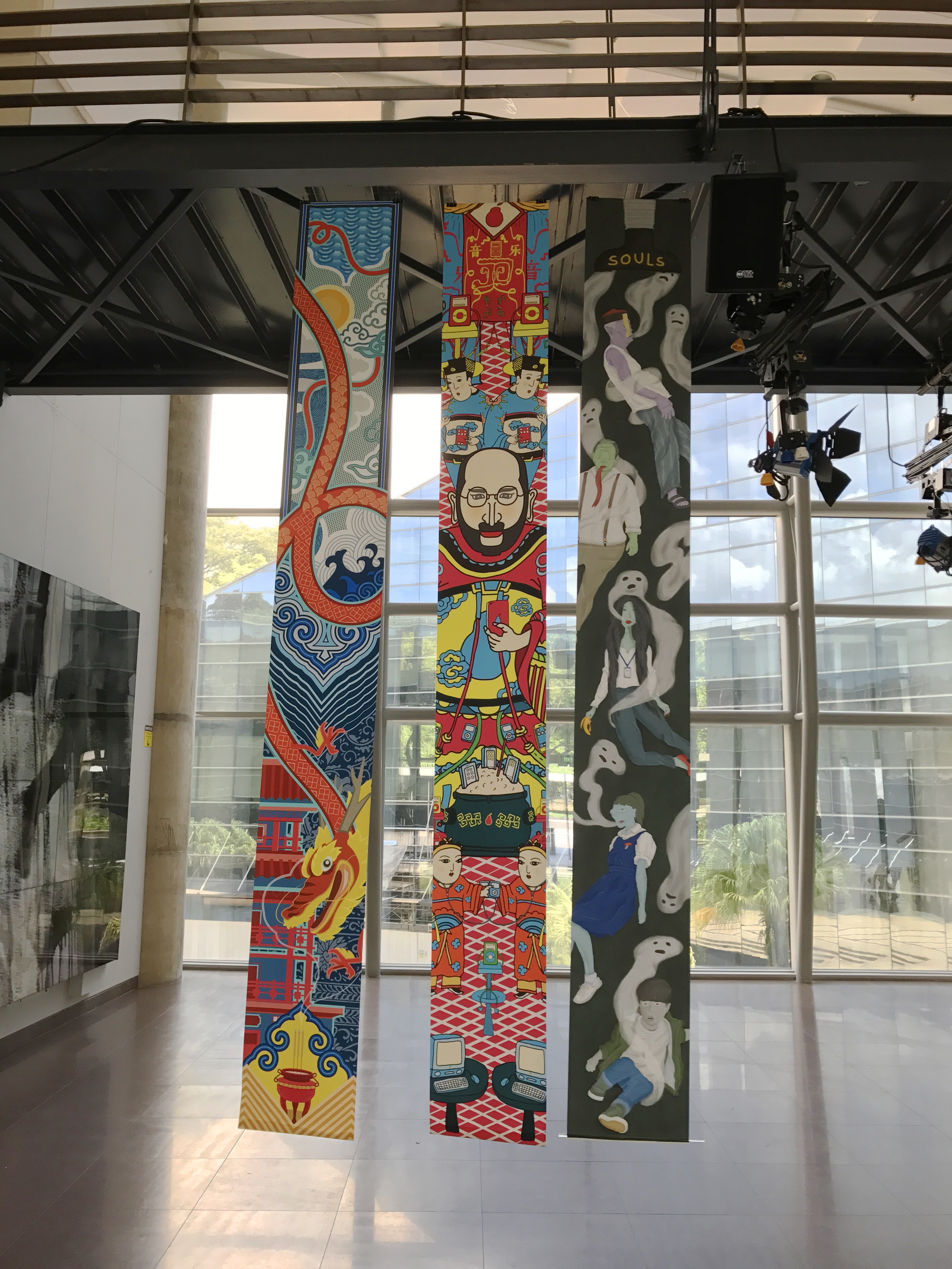
Actual Exhibition
@ North Spine, NTU


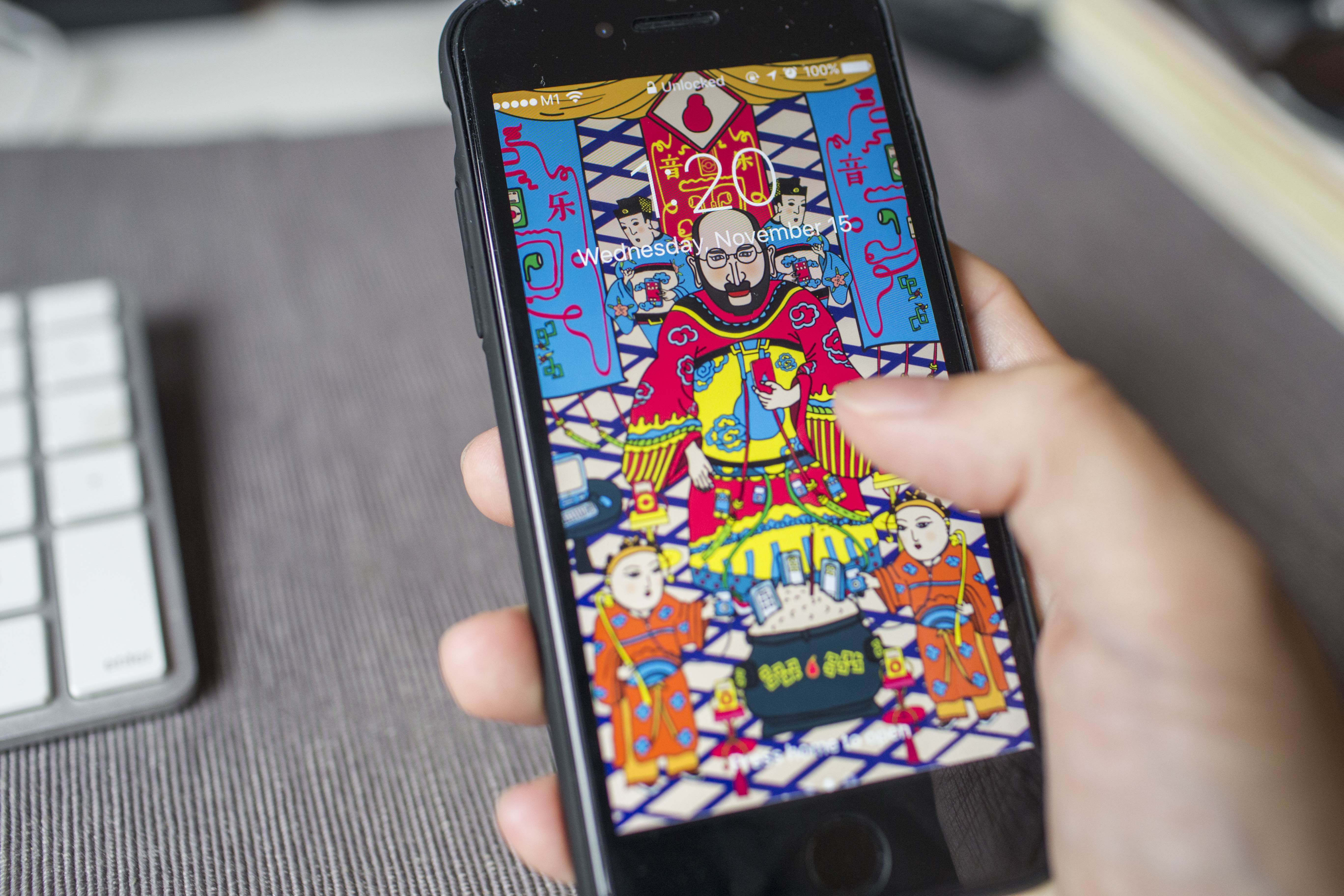
SWATCHBOOK

APPLICATION
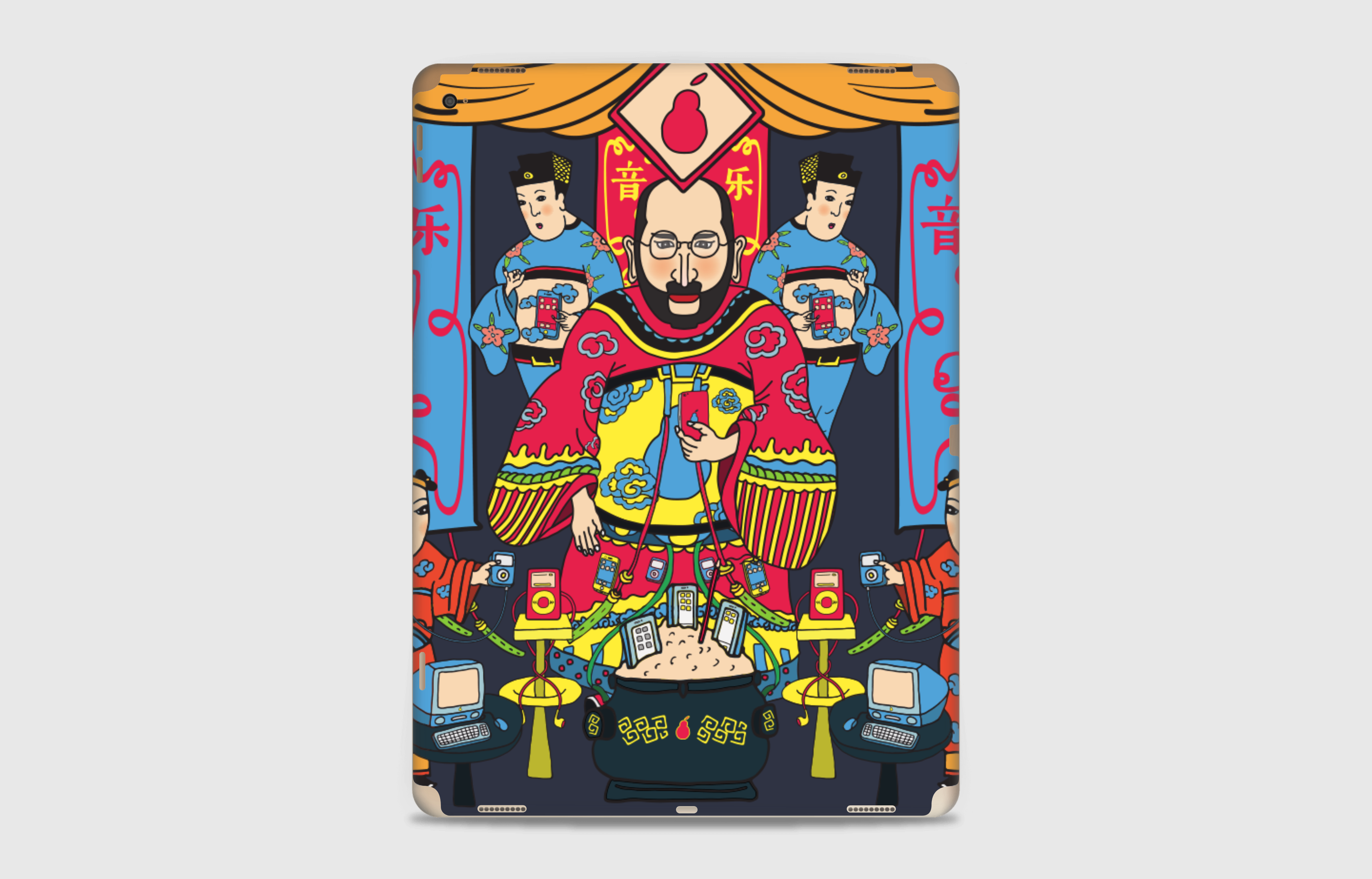
iPad Pro

iPhone 7


@ School of Arts, Design and Media, NTU
LED
15m by 2m
Media Art Nexus NTU
@ North Spine, NTU

iPad Pro
iPhone 7


Final Banner
Test Print on A4


After testing on A4 paper, I’m satisfied with 15% up of saturation and brightness.
Final Print @ VC Print Centre


Color & Composition Study
![]()
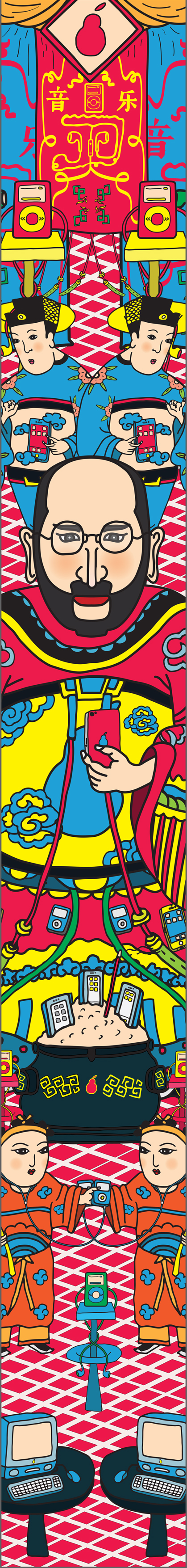
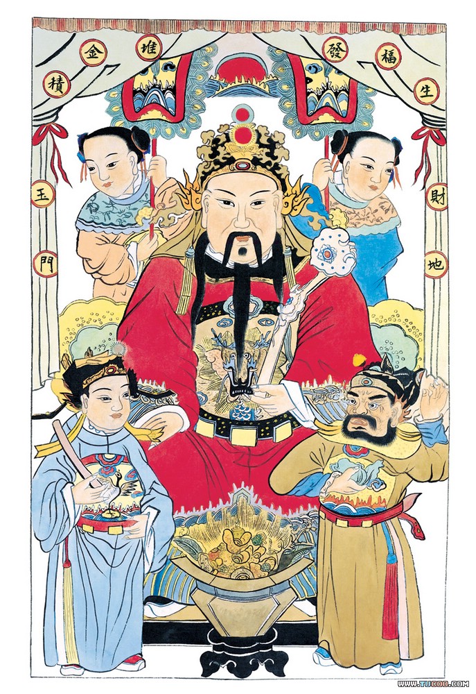
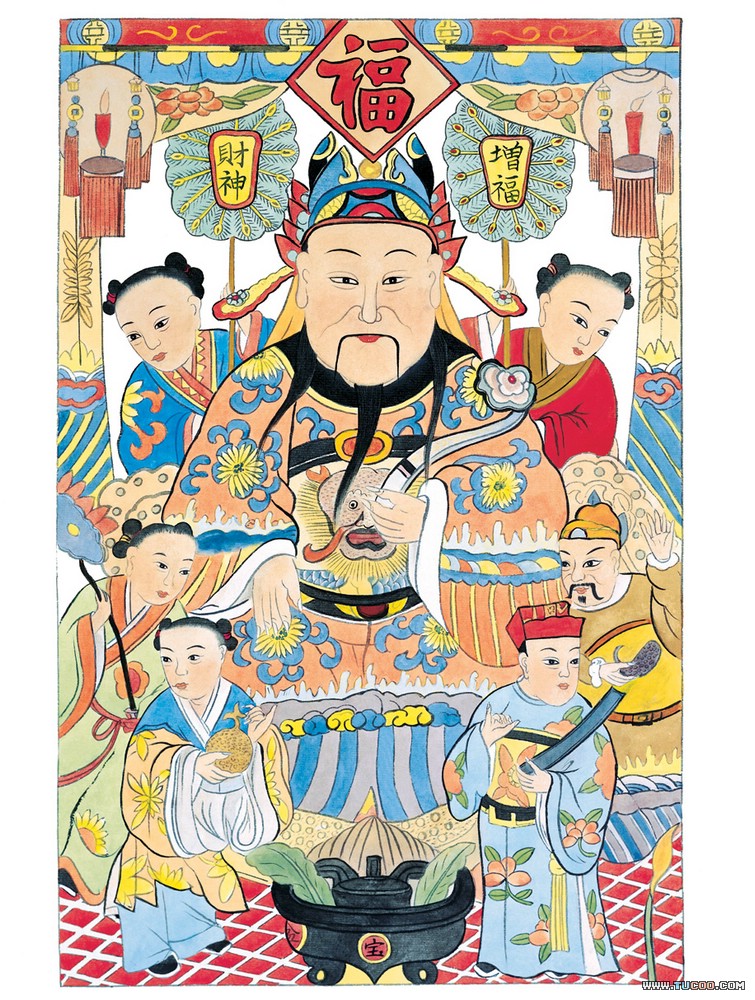
Based on the traditional door poster of fortune god, I employed its layout and color scheme.
Composition in Color
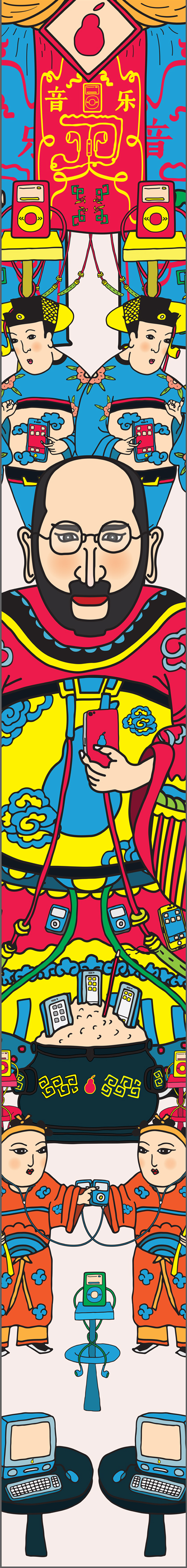

Based on my concept, “new door god”, I planed to design a door god poster. It contains a main god in the center and several elements surrounded.
Main God
I chose to use Apple and Steve Jobs as my main visual representation. Replacing the logo to a pear shape adds a subtle pun.


Steve Jobs as fortune god(left) and general(right)
Ritual tools
Referencing from how Chinese people worship their ancestor and god, I created Apple-related sacrifices and Ritual tools.

iPhone sacrifice

Imac on a sacrifice plate

iPod attached to a candle stand

iPhones tucked on bronze incense burner

Amulet
Servants


Mock-up
This is the first try-out with all elements, based on traditional fortune god door poster.


1.TYPOGRAPHY

Concept
Applying a mixture of Chinese and English letters from my name to represent my identity and imply my strong interest in typography and design.
2.ABSTRACT SOLUTION


Concept
Symbol of eye and colorful light rays indicate my desire in exploring and experimenting new things.
3.CONCEPTUAL


Concept
Using negative film to represent my favorite hobby ‘Photography’ literally.
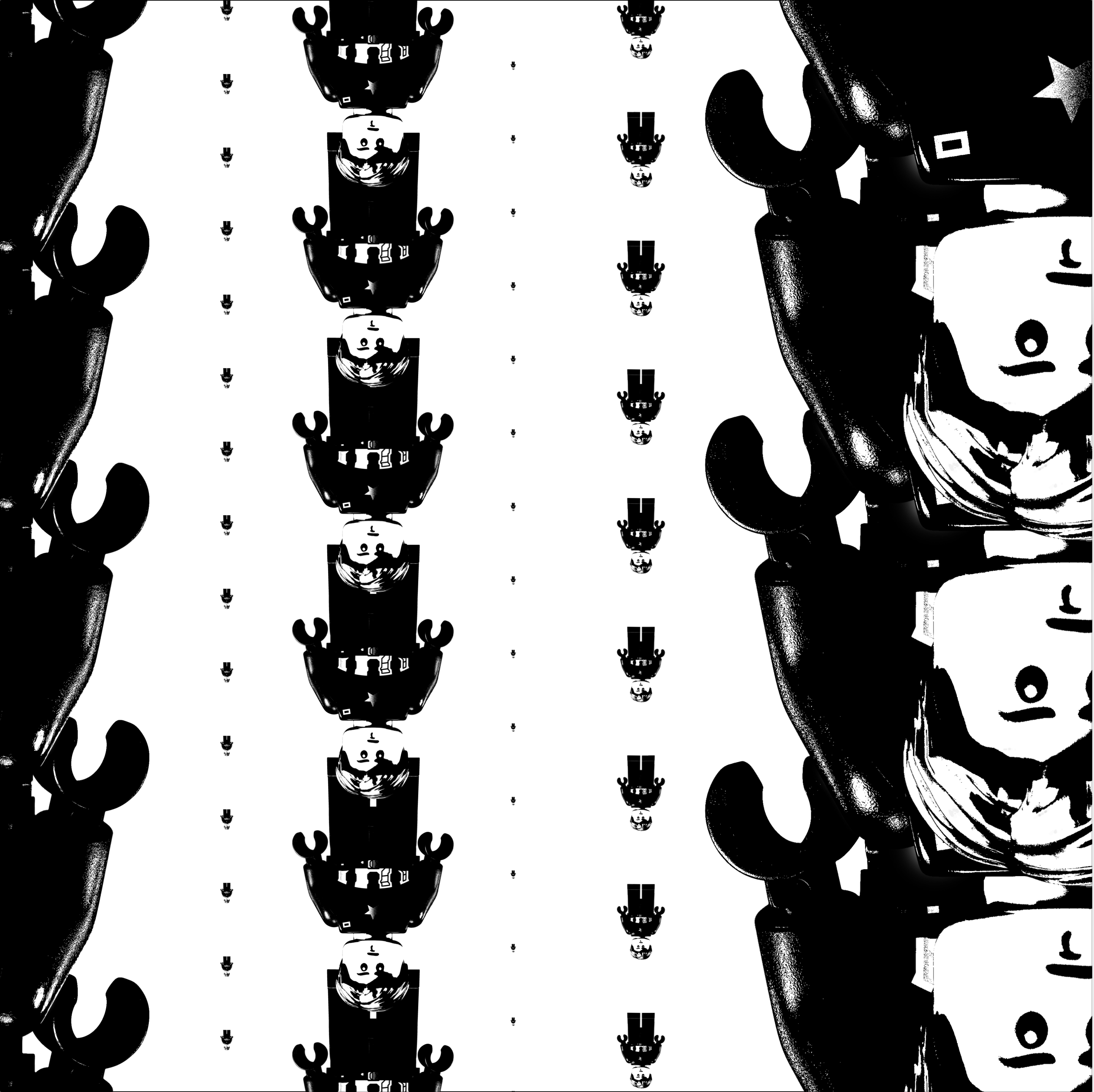
Frame 1 humorously resembles a scene from movie ‘Matrix’ , while bringing contrast to convey a depth and creating a downwards movement by repeating the subjects.
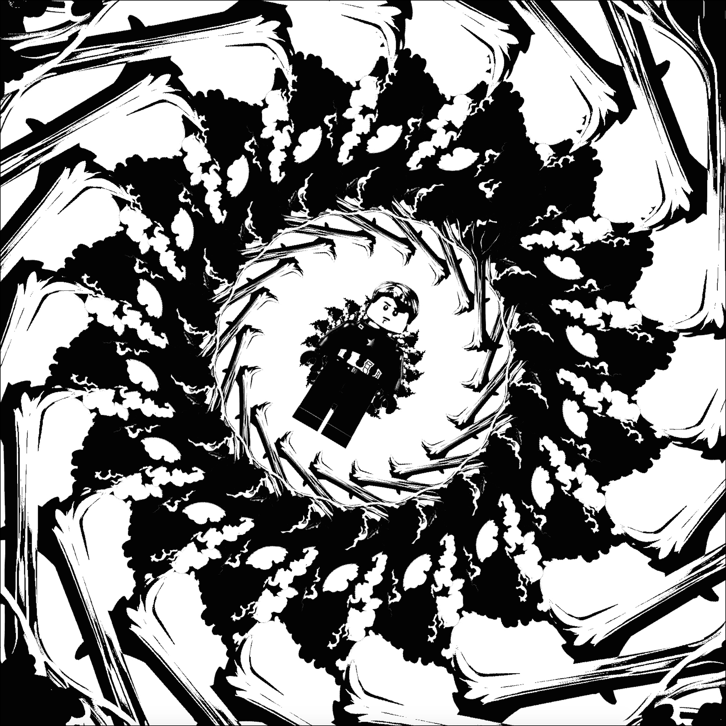
In Frame 2, the repeated trees are arranged around a central point, directing along different scales, to create a swirling movement towards the main character.
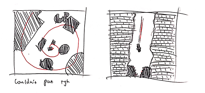
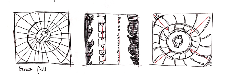
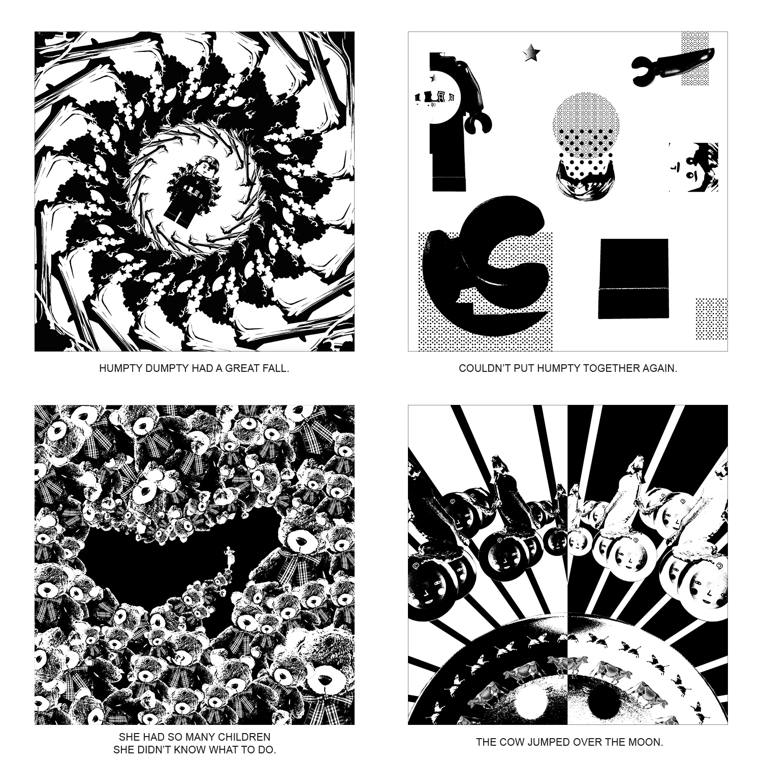
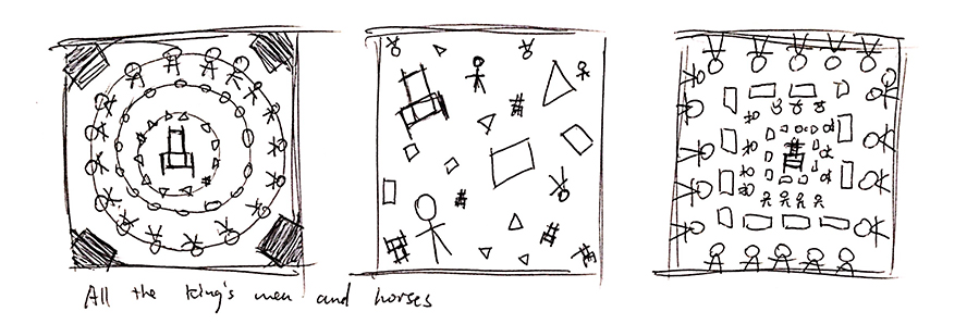
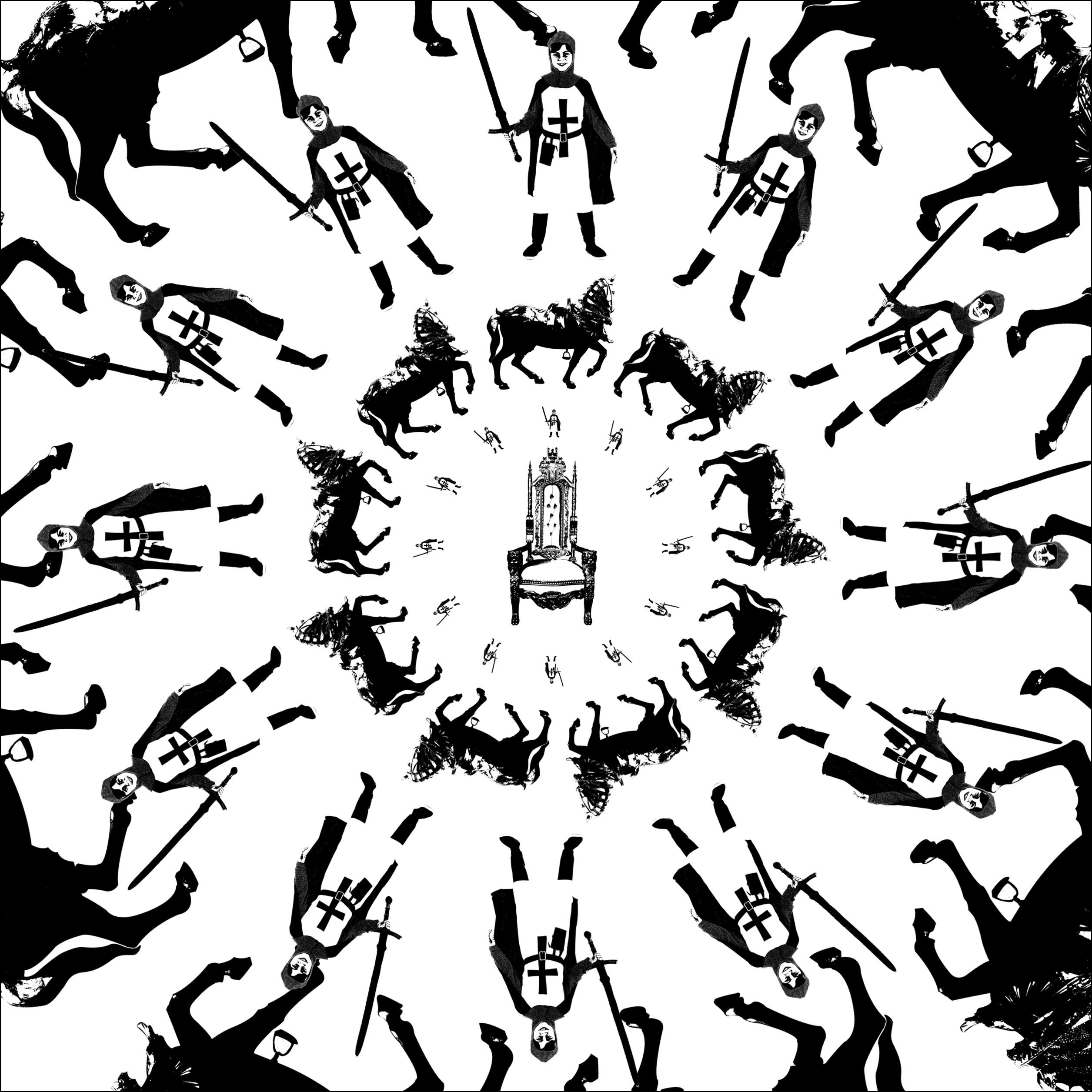
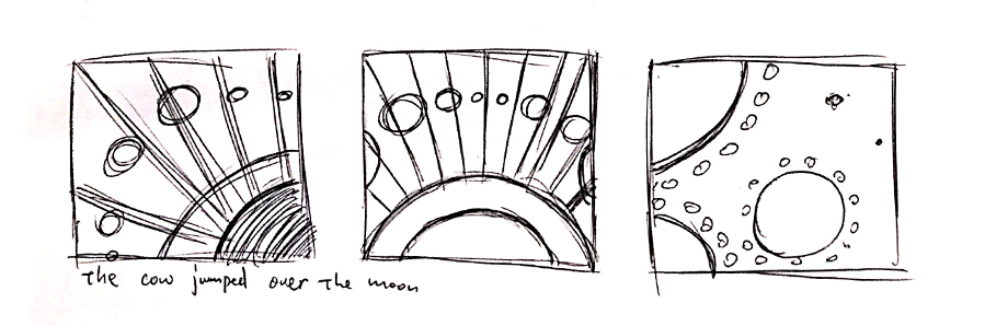
 HUMPTY DUMPTY HAD A GREAT FALL.
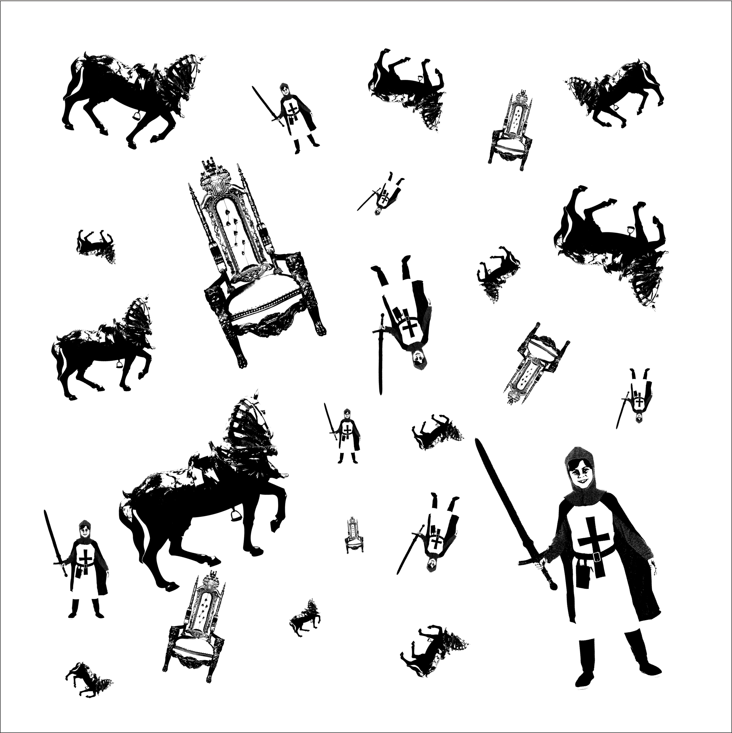
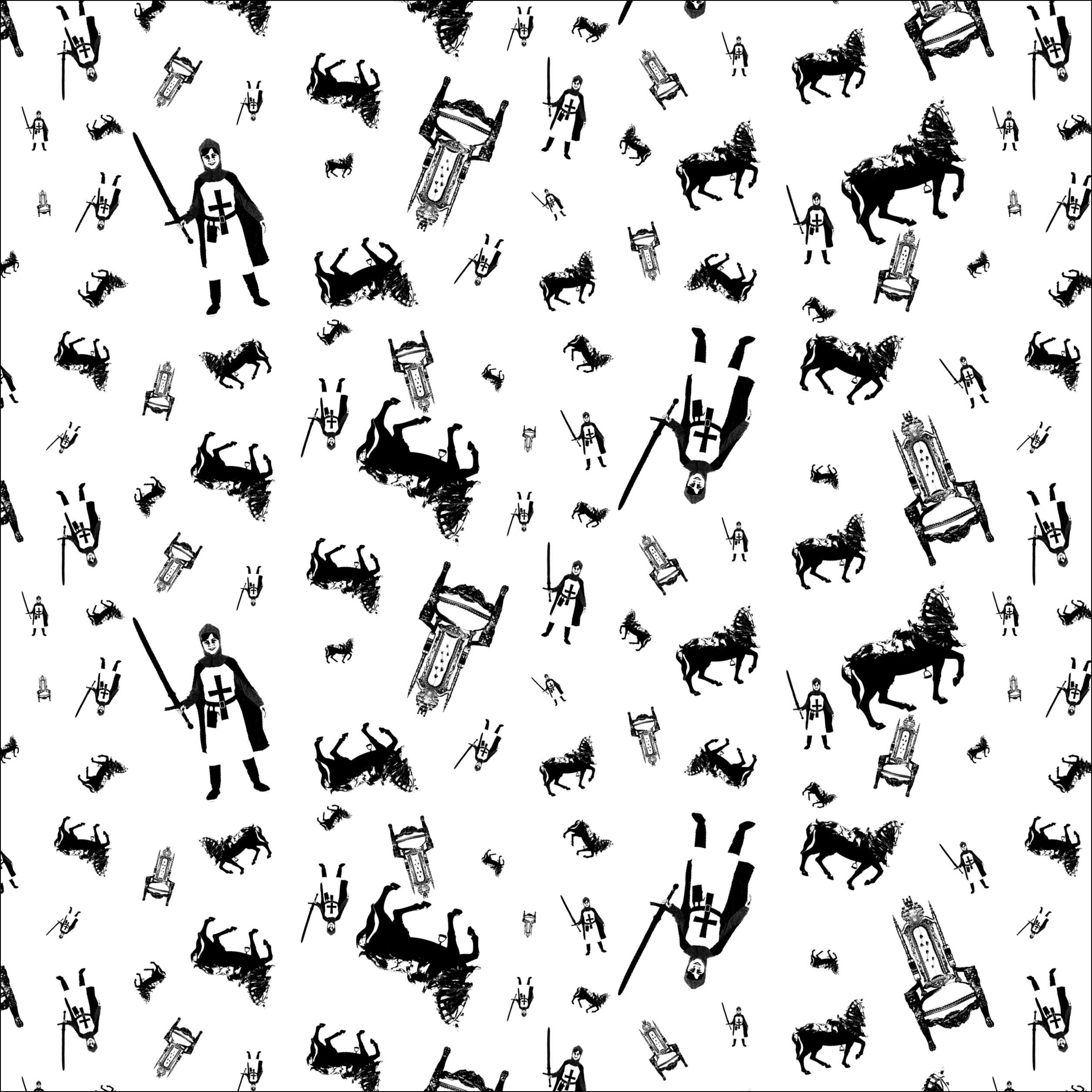
In Frame 1, horses and knights are arranged in radial balance from small to big size, which gives a distinct focal point to King’s throne.
Frame 2 and 3 demonstrate repetition and patterns in a random way. Different subjects are contrasted in size, position and rotation, bringing dynamism into the layout.

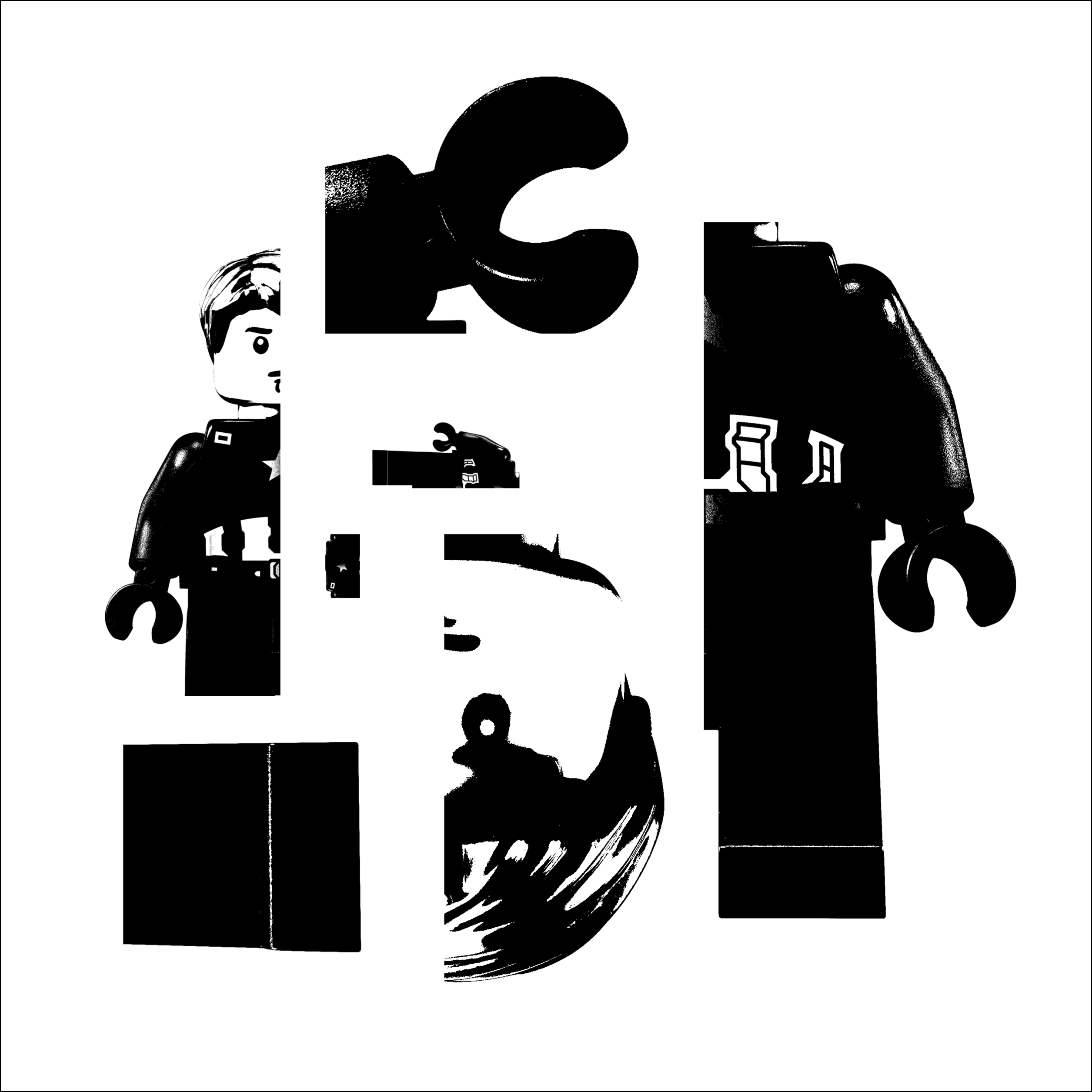
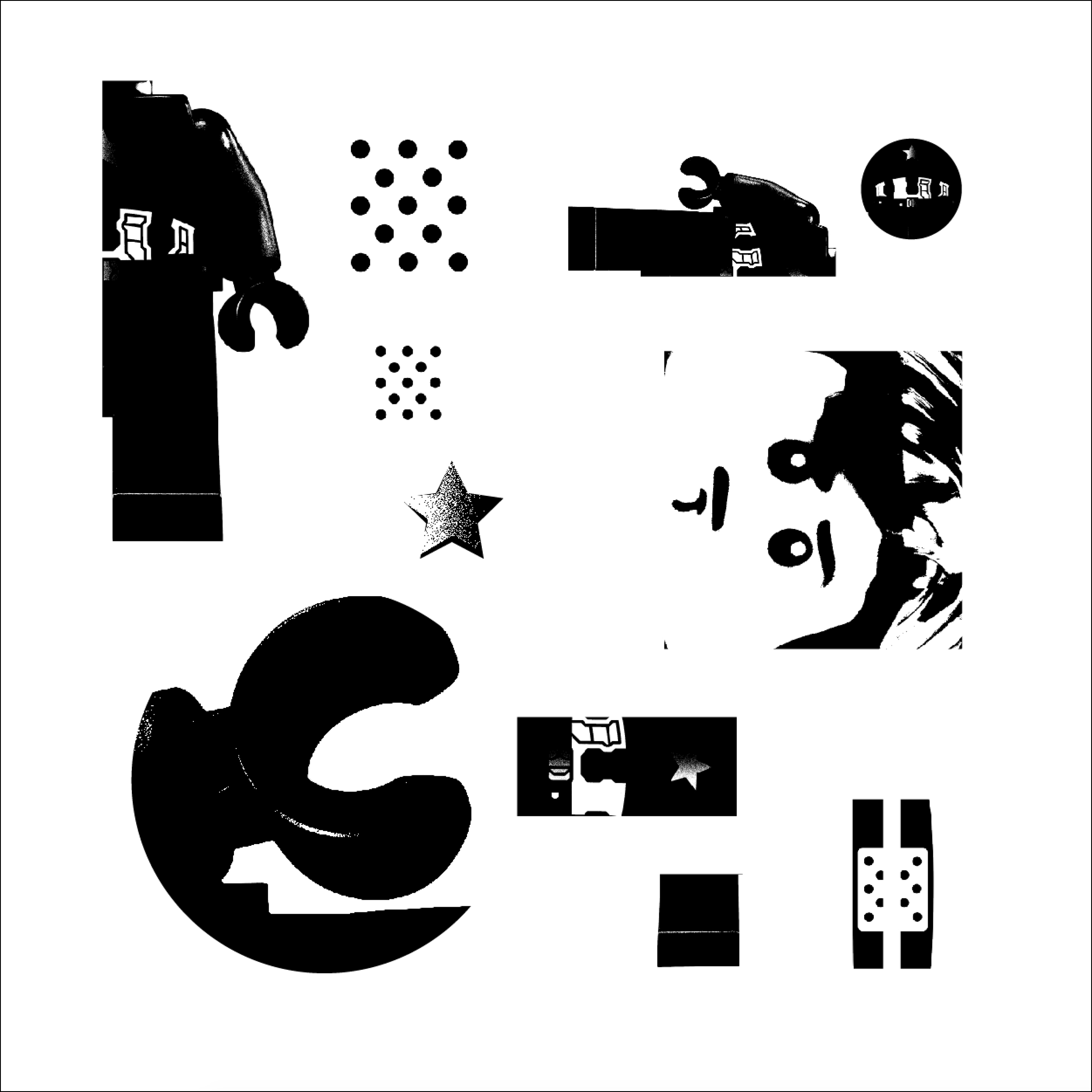
The main subject is broken into pieces, creating various shapes. Harmoniously all shapes unites into a brand-new piece, which creates a sense of completeness.

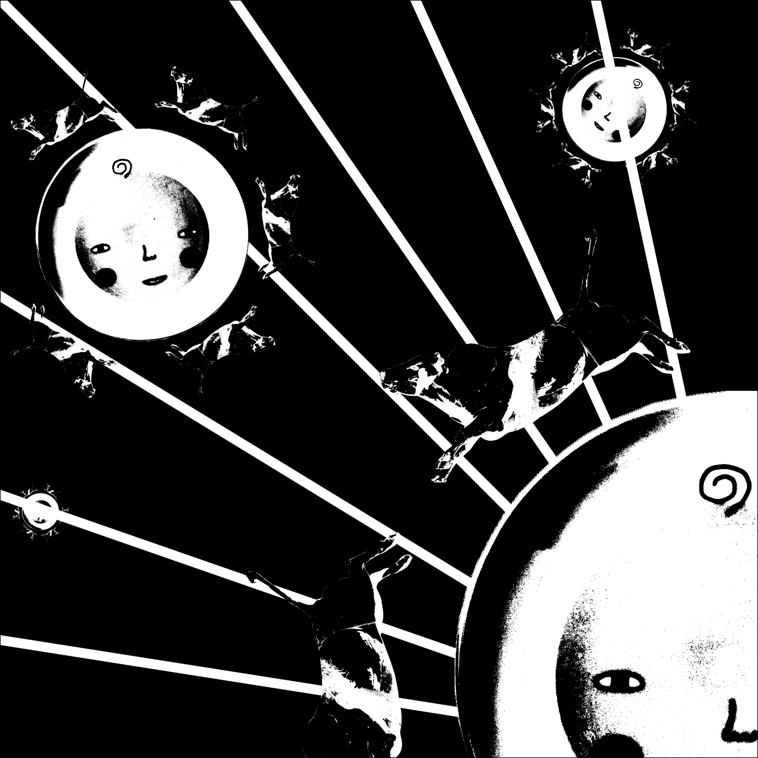
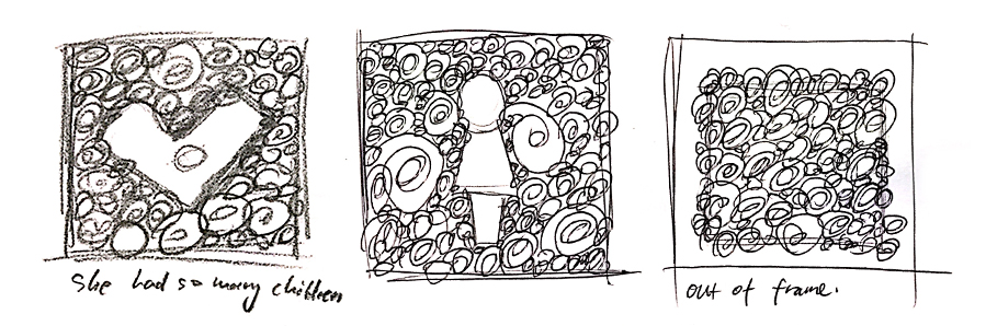
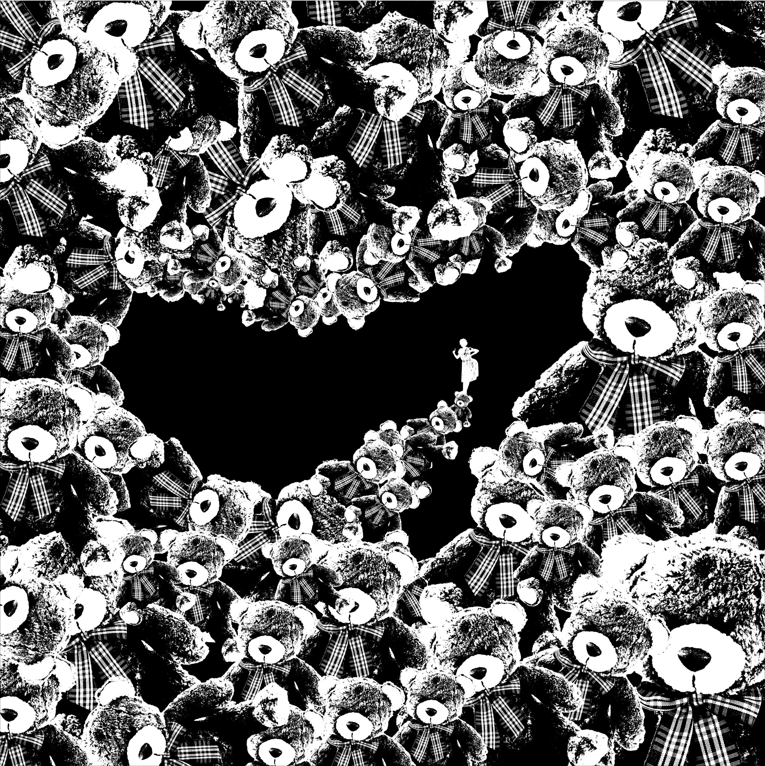
Frame 1 and 2 depicts a cow orbiting a plate, contrasted by different size, in an asymmetrical layout.
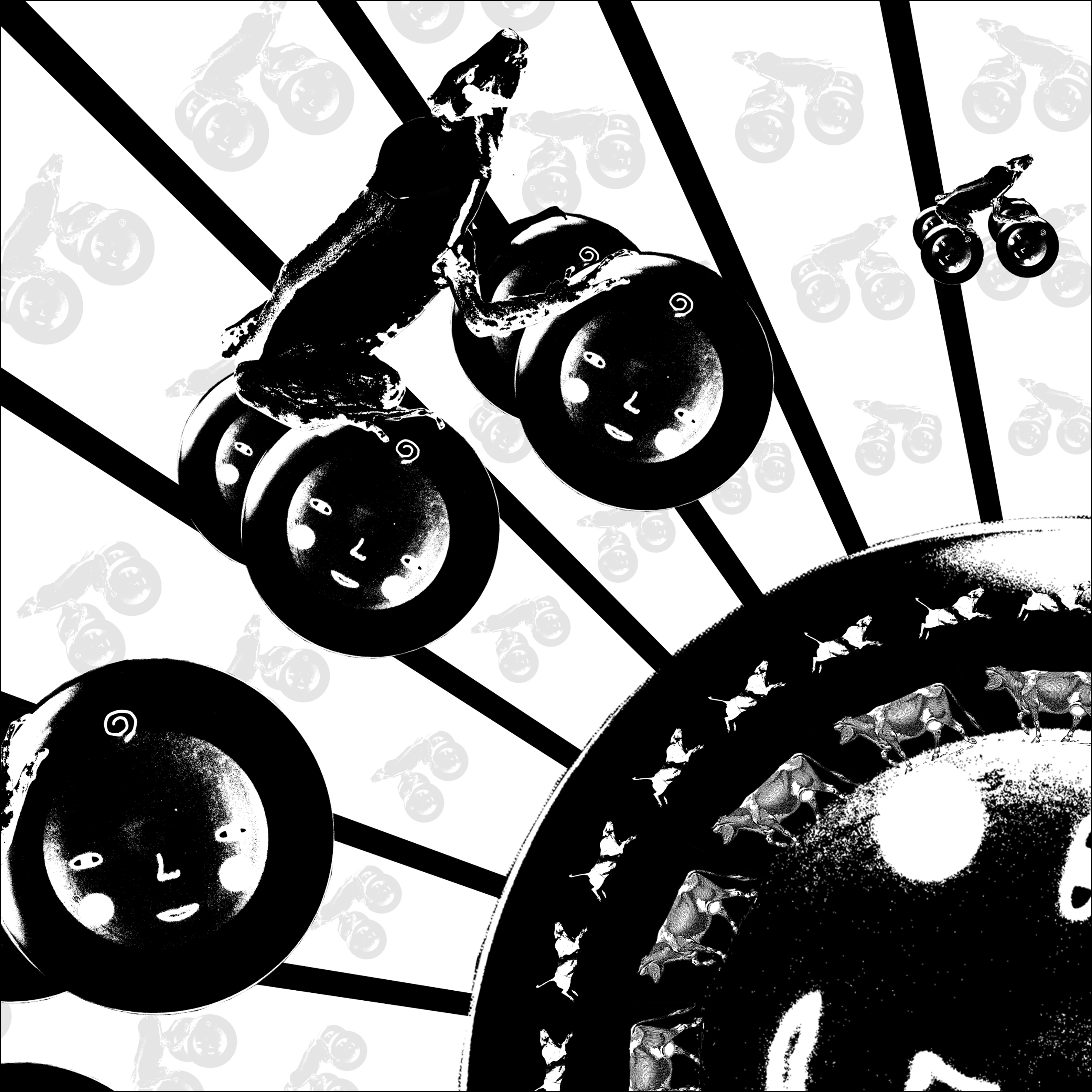
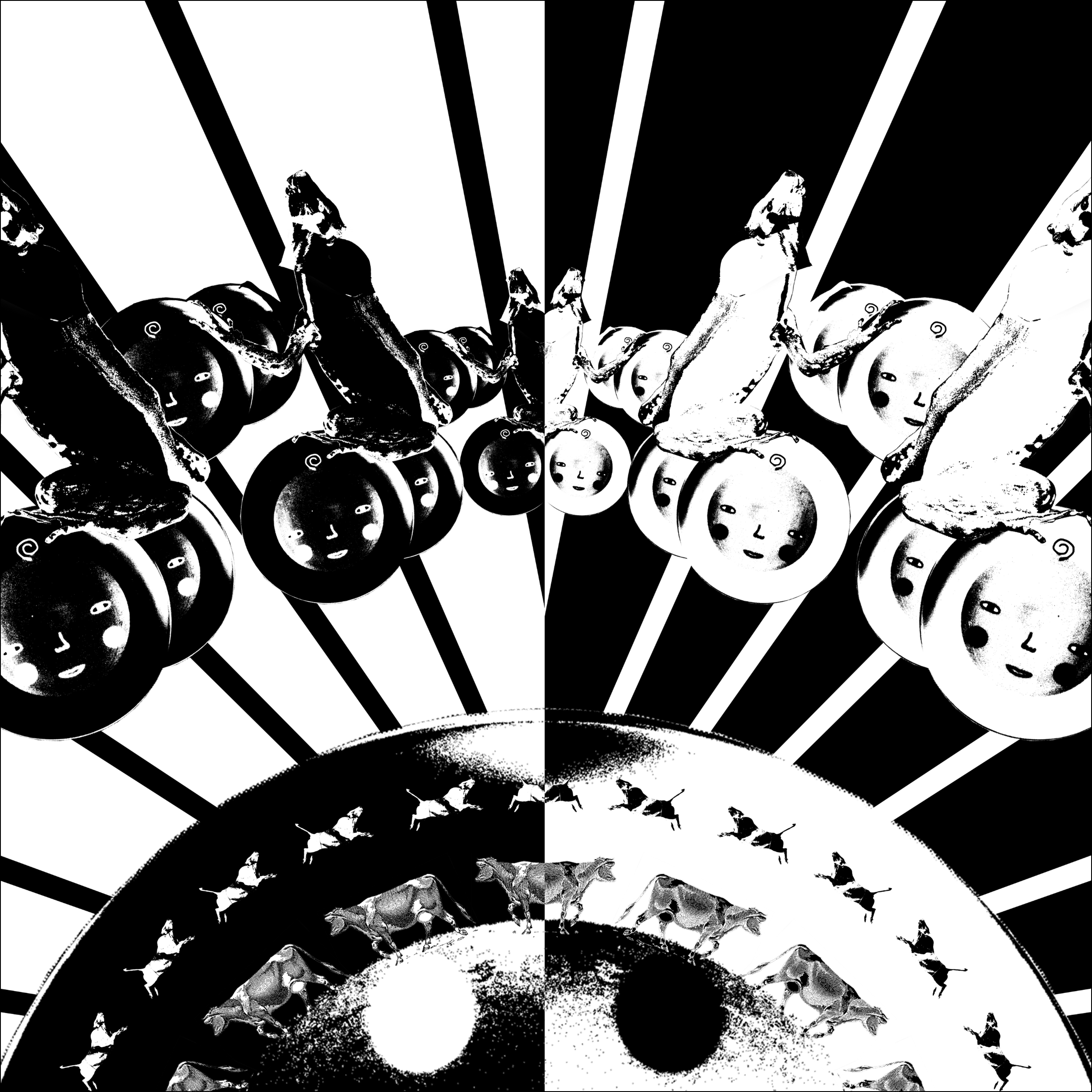
Frame 3 demonstrates cows riding on the moon and flying to the sky in an symmetrical way, while contrasted by reversing color.
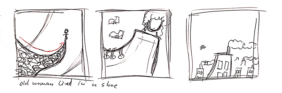
Frame 1 demonstrates a flow of shoes flying towards a woman, who is in the upper third of layout. And white space casts on the main elements as if the light is shining through a open door, which makes the composition more cinematic.
Frame 1 and 2 are exploring different spatial composition.
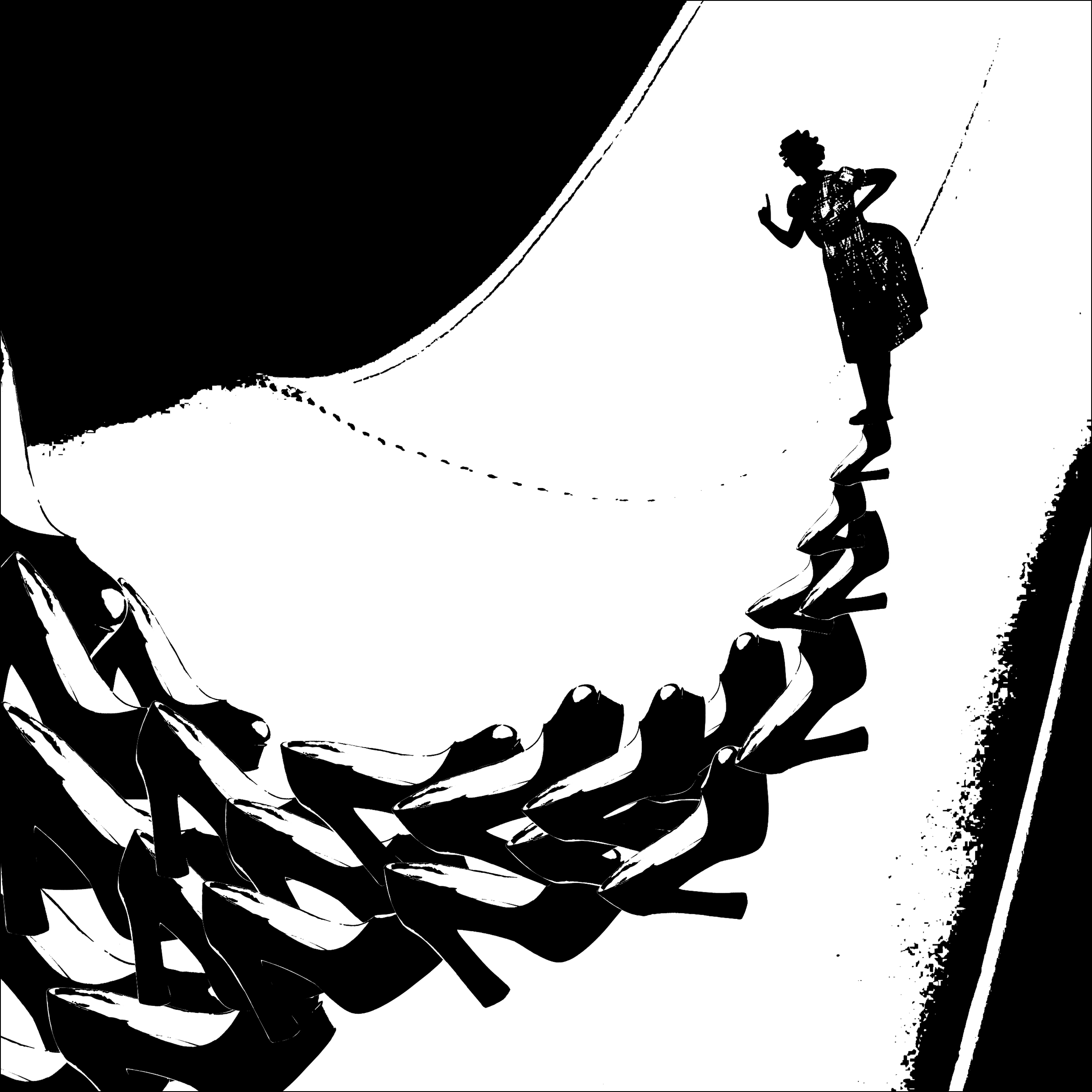
Frame 1 depicts a direction from bottom to top and mimic the explosion from a small point to the entire filled up space. It demonstrates contrast by silhouetting out a woman figure.
Frame 2 depicts a flow from far to deep space, creating a silhouette of a lady shoe to indicate where they live. Finally the flow ends at where the woman stands, portraying a progressive problem to her.
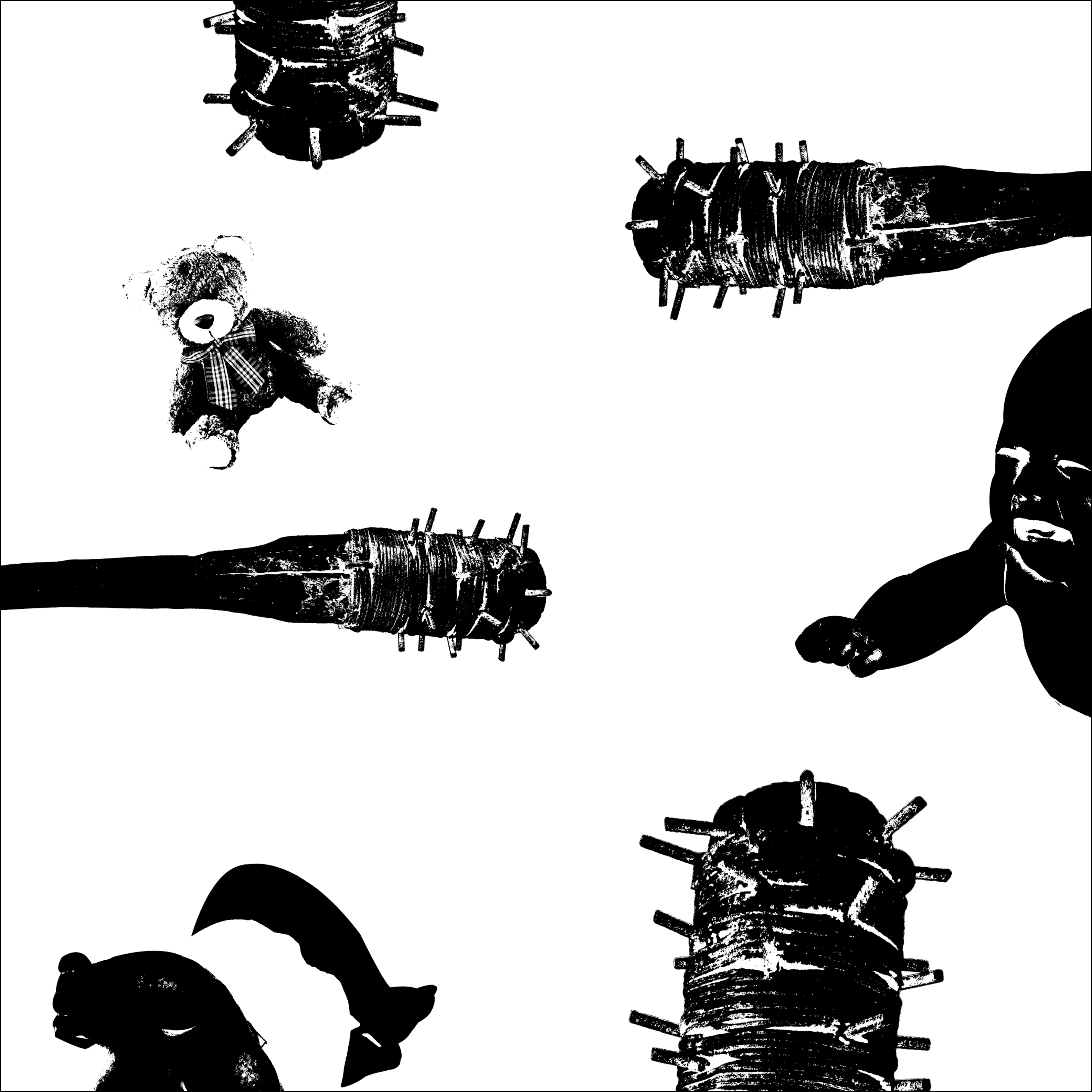
In Frame 1, Baby is threatened by pointed wood sticks and away from his toy.

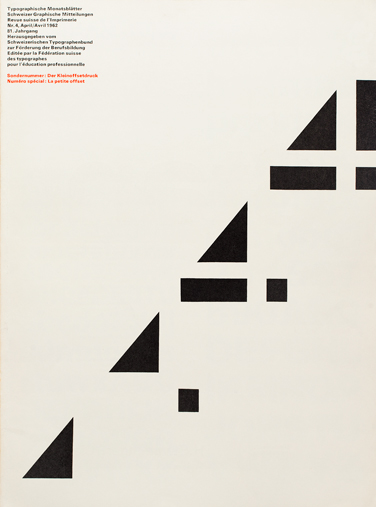
The principles of design describe the ways that artists use the elements of art in a work of art.
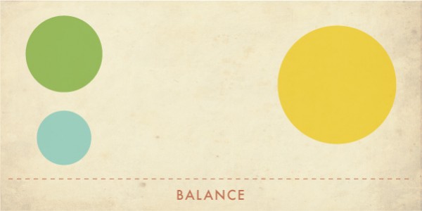
Balance is the distribution of the visual weight of objects, colors, texture, and space. If the design was a scale, these elements should be balanced to make a design feel stable. 
In symmetrical balance, the elements used on one side of the design are similar to those on the other side;
In asymmetrical balance, the sides are different but still look balanced.
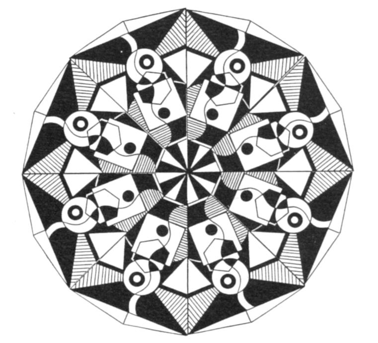
In radial balance, the elements are arranged around a central point and may be similar.
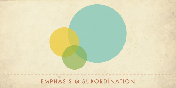
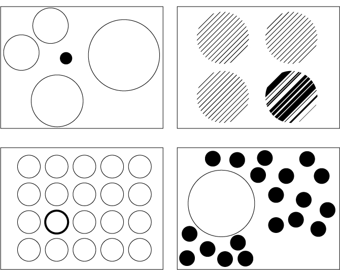
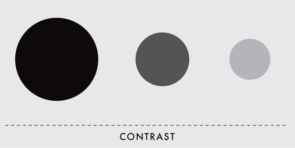
Emphasis is the part of the design that catches the viewer’s attention. Usually the artist will make one area stand out by contrasting it with other areas. The area could be different in size, color, texture, shape, etc.
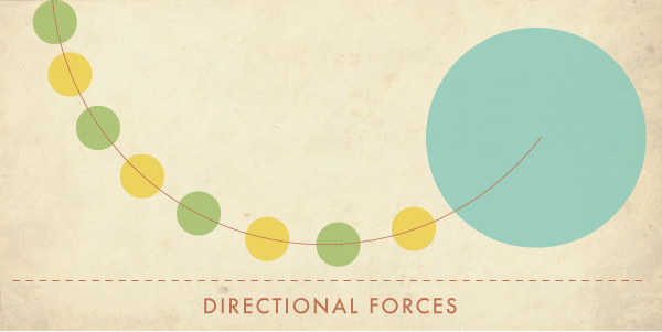
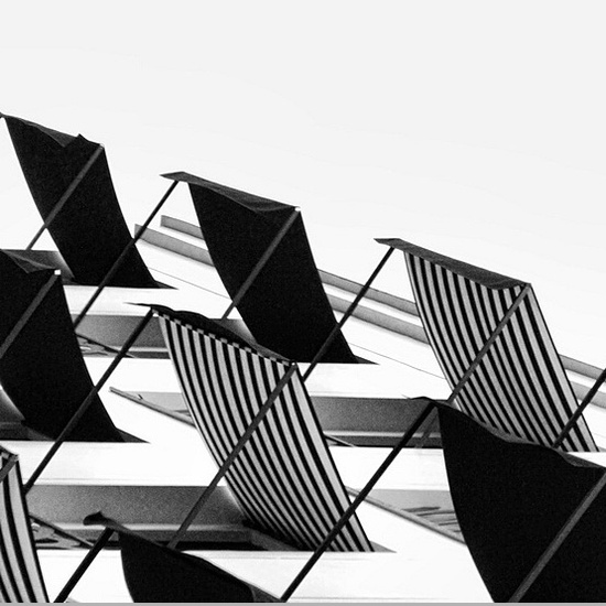
Movement is the path the viewer’s eye takes through the work of art, often to focal areas. Such movement can be directed along lines, edges, shape, and color within the work of art.
Pattern is the repeating of an object or symbol all over the work of art.
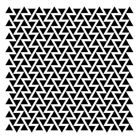
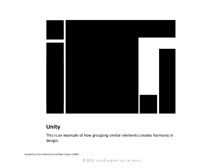
Repetition works with pattern to make the work of art seem active. The repetition of elements of design creates unity within the work of art.
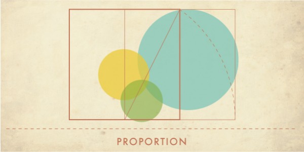
Proportion is the feeling of unity created when all parts (sizes, amounts, or number) relate well with each other. When drawing the human figure, proportion can refer to the size of the head compared to the rest of the body.
Rhythm is created when one or more elements of design are used repeatedly to create a feeling of organized movement. Rhythm creates a mood like music or dancing. To keep rhythm exciting and active, variety is essential.
Variety is the use of several elements of design to hold the viewer’s attention and to guide the viewer’s eye through and around the work of art.
Unity is the feeling of harmony between all parts of the work of art, which creates a sense of completeness.


Recent Comments