Closeup
Exhibition
@ School of Arts, Design and Media, NTU
MEDIA WALL
LED
15m by 2m
Media Art Nexus NTU
Actual Exhibition
@ North Spine, NTU
SWATCHBOOK
APPLICATION


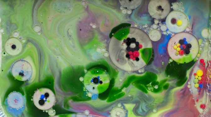
Before starting actual filming, I went down art friend and supermarket to purchase acrylic, food color, milk, cups and ect.
Because I couldn’t find very liquid acrylic. Instead, I have to dilute the paint by myself. And I also prepare food color to try out, as I had the experience of mixing milk and food color before and want to see which medium is better.
Oli is to create bubbles and resemble alien’s big eyes. And dish soup like a catalytic agent is able to spread out the paint and create movement.
In the end, I kind find out that food color is actually better than acrylic paint, in terms of saturation and effect. Acrylic paint intends to sink down and after dropping in dish soup, the color will not be as saturated. But acrylic paint can create minimalistic kind of effect which is also usable.
I also noticed that I need to started small with one or two color, because after a while, the all the colors started to blend and became ugly. After mixing too many colors, it become messy and ugly.
All forms are composed in After Effects by simple masking and mirroring effects. I also inverted the color of footages to match my styleframes and moodboard.
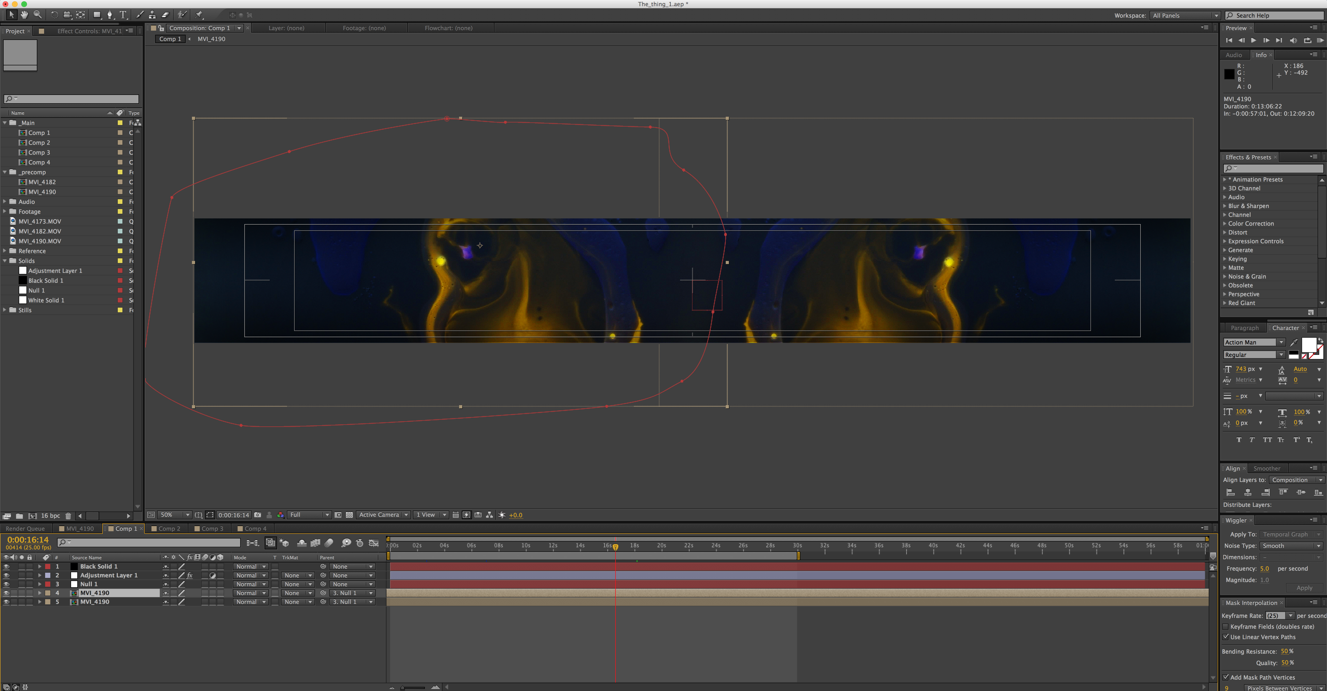


Next step, I will film more footages next week and try out adding some visual effects
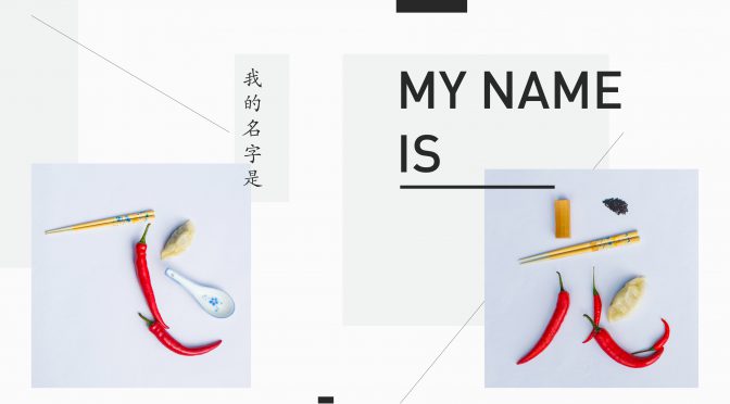
The intention of Zine project is to seek my own identity through the essence of Chinese culture – Food. We have developed a complicated custom, which is deeply based on food and determines our social behavior. It also rooted people to the soil they live on, as it is capable to produce abundant food. Especially during Chinese New Year, the reunion dinner calls every Chinese to return home and celebrate a brand new year with plentiful food.
To make the layout more interesting, I introduced elements like lines, and shapes. It also balances with and unifies the photographs and text. And all the elements are offset for the reason of dynamic composition.
In this project, I have learned a new software InDesign for the first time. I also had a chance to try different ways of creating a booklet, which is an enjoyable experience. What’s more, I’m quite interested in playing with images and typography to make a lively and dynamic composition.
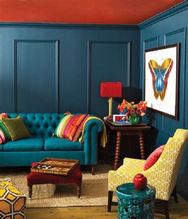
In color theory, a color scheme is the choice of colors used in design for a range of media. Color schemes are used to create style and appeal. Colors that create an aesthetic feeling when used together will commonly accompany each other in color schemes.
Complementary colors
The complementary colors are pairs of colors which, when combined, cancel each other out. This means that when combined, they produce a grey-scale color like white or black. When placed next to each other, they create the strongest contrast for those particular two colors.
Analogous colors
(also called Dominance Harmony) color scheme are groups of colors that are adjacent to each other on the color wheel, with one being the dominant color, which tends to be a primary or secondary color, and two on either side complementing, which tend to be tertiary.
The term analogous refers to the having analogy, or corresponding to something in particular. An analogous color scheme creates a rich, monochromatic look. It’s best used with either warm or cool colors, creating a look that has a certain temperature as well as proper color harmony. While this is true, the scheme also lacks contrast and is less vibrant than complementary schemes.
Split-complementary
(also called Compound Harmony) color scheme is a variation of the complementary color scheme. In addition to the base color, it uses the two “Analogous” colors adjacent to its complement. Split-complementary color scheme has the same strong visual contrast as the complementary color scheme, but has less pressure.
Triadic colors
The triadic color scheme uses three colors equally spaced around the color wheel. The easiest way to place them on the wheel is by using a triangle of equal sides. Triadic color schemes tend to be quite vibrant, even when using pale or unsaturated versions of hues, offers a higher degree of contrast while at the same time retains the color harmony. This scheme is very popular among artists because it offers strong visual contrast while retaining balance, and color richness. The triadic scheme is not as contrasting as the complementary scheme, but it is easier to accomplish balance and harmony with these colors.
Tetradic colors
The tetradic (double complementary) colors scheme is the richest of all the schemes because it uses four colors arranged into two complementary color pairs. This scheme is hard to harmonize and requires a color to be dominant or subdue the colors.; if all four colors are used in equal amounts, the scheme may look unbalanced.
Rectangle
The rectangle color scheme uses four colors arranged into two complementary pairs and offers plenty of possibilities for variation. Rectangle color schemes work best when one color is dominant.
Square
The square color scheme is similar to the rectangle, but with all four colors spaced evenly around the color circle. Square color schemes works best when all colors are evenly balanced.
Recent Comments