
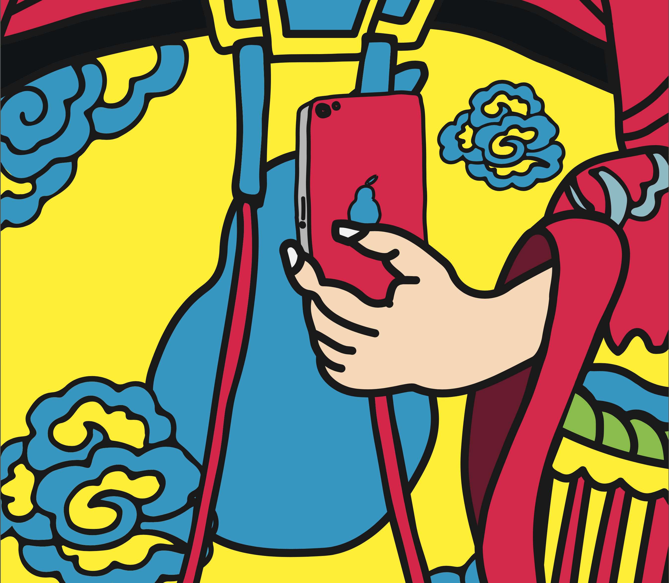
Closeup


Exhibition
@ School of Arts, Design and Media, NTU
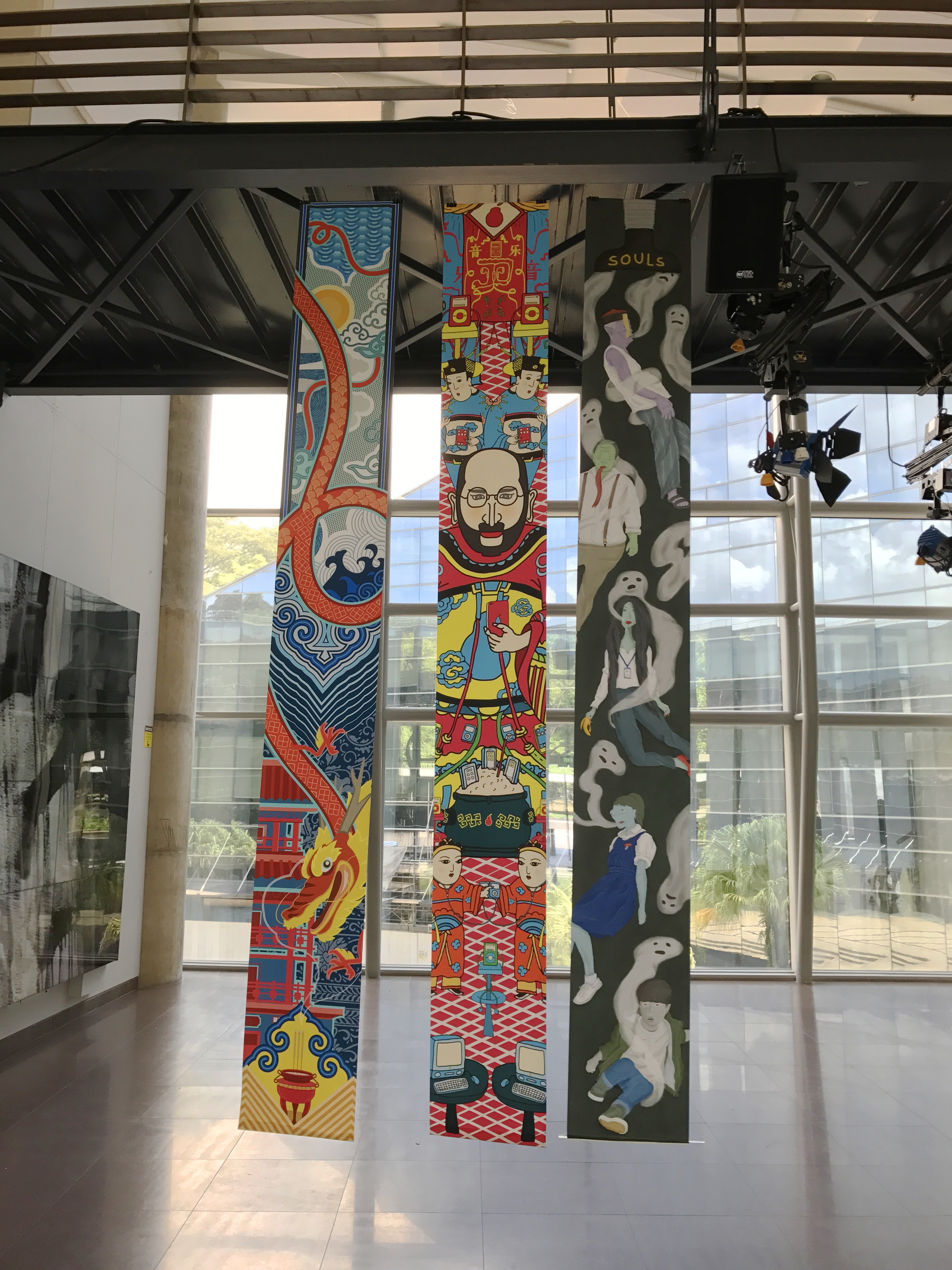
MEDIA WALL


LED
15m by 2m
Media Art Nexus NTU
Actual Exhibition
@ North Spine, NTU


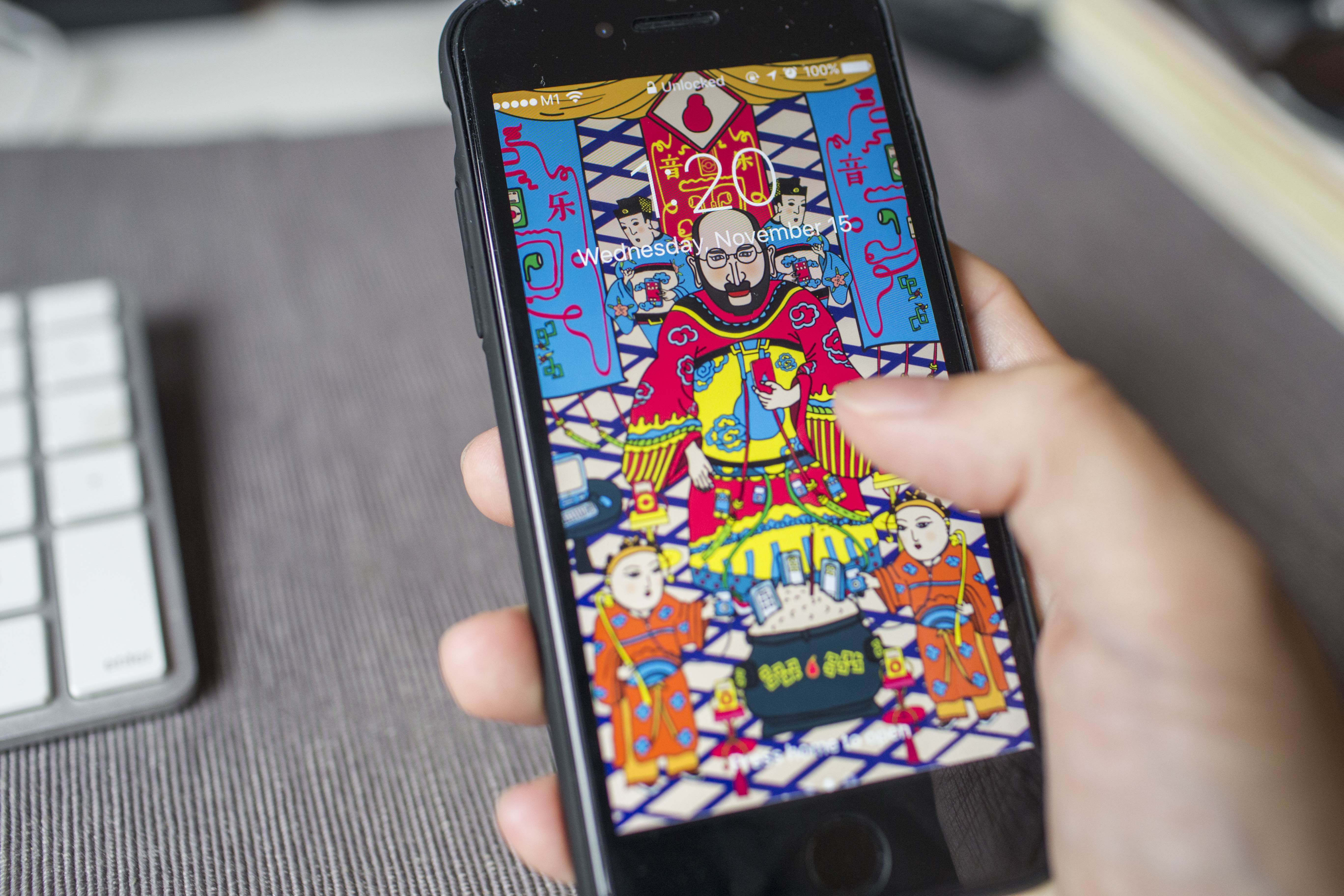
SWATCHBOOK

APPLICATION
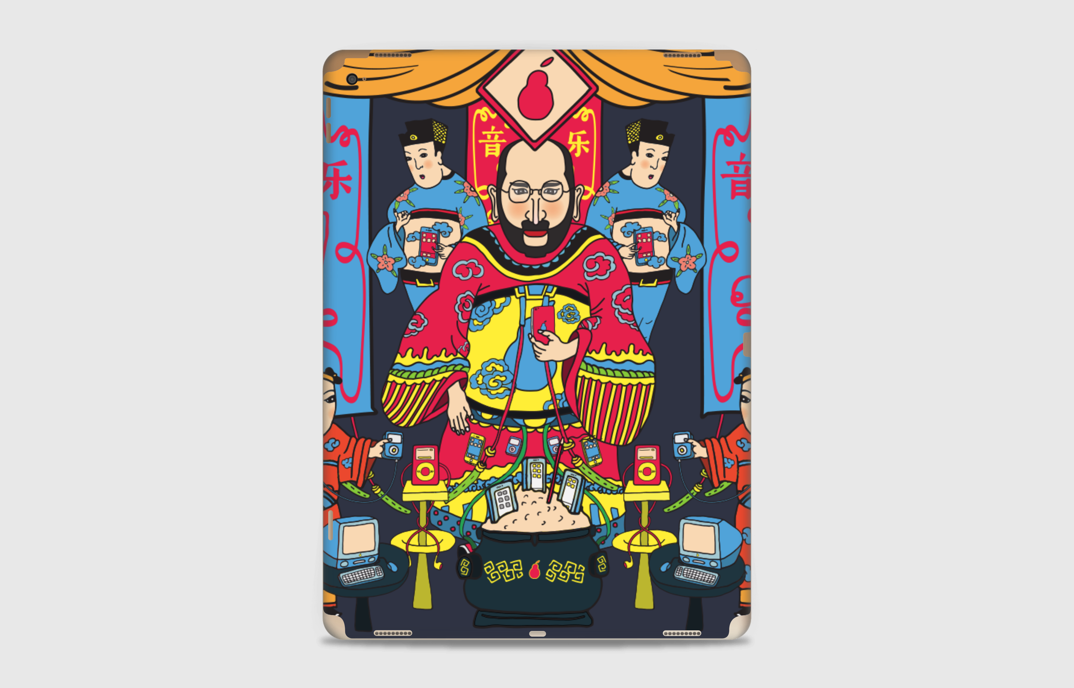
iPad Pro

iPhone 7


@ School of Arts, Design and Media, NTU
LED
15m by 2m
Media Art Nexus NTU
@ North Spine, NTU

iPad Pro
iPhone 7


Final Banner
Test Print on A4


After testing on A4 paper, I’m satisfied with 15% up of saturation and brightness.
Final Print @ VC Print Centre


Color & Composition Study
![]()
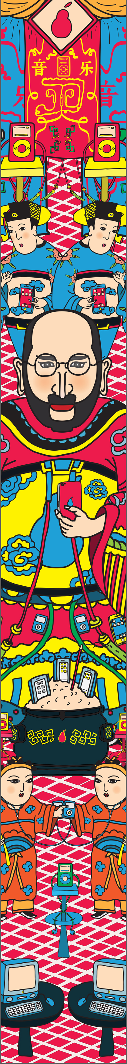
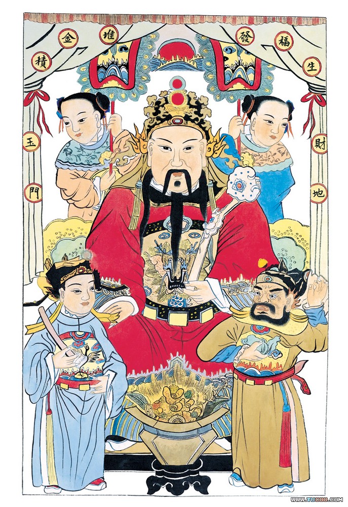
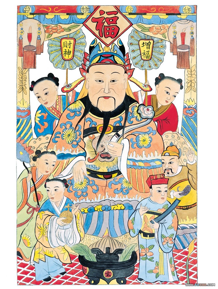
Based on the traditional door poster of fortune god, I employed its layout and color scheme.
Composition in Color
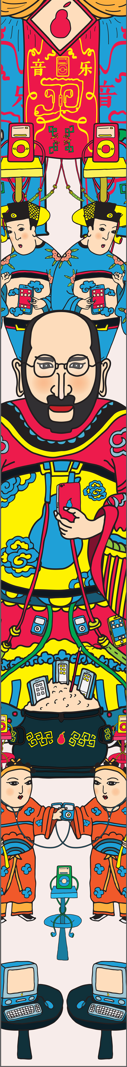

Based on my concept, “new door god”, I planed to design a door god poster. It contains a main god in the center and several elements surrounded.
Main God
I chose to use Apple and Steve Jobs as my main visual representation. Replacing the logo to a pear shape adds a subtle pun.


Steve Jobs as fortune god(left) and general(right)
Ritual tools
Referencing from how Chinese people worship their ancestor and god, I created Apple-related sacrifices and Ritual tools.

iPhone sacrifice

Imac on a sacrifice plate

iPod attached to a candle stand

iPhones tucked on bronze incense burner

Amulet
Servants


Mock-up
This is the first try-out with all elements, based on traditional fortune god door poster.

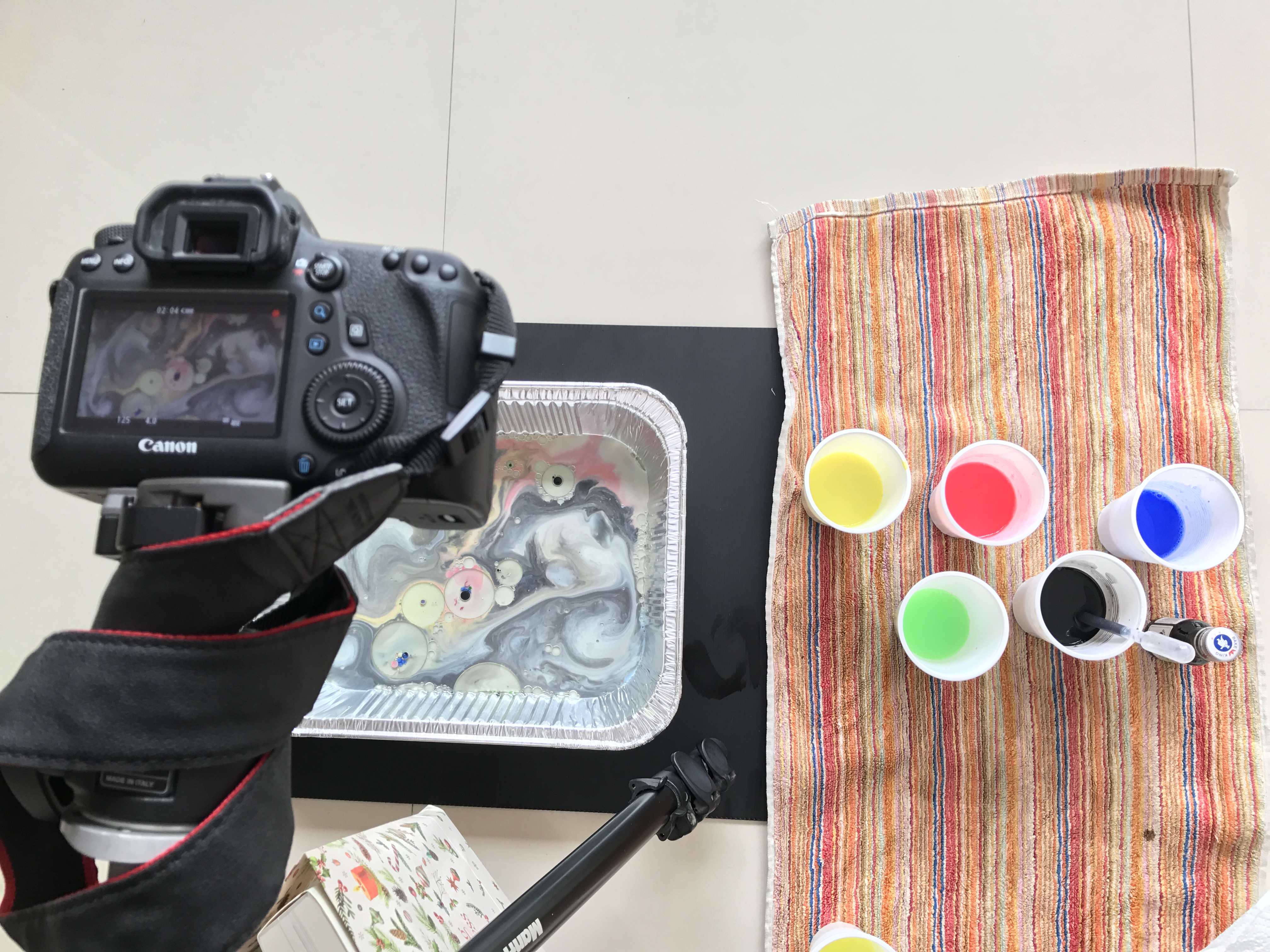
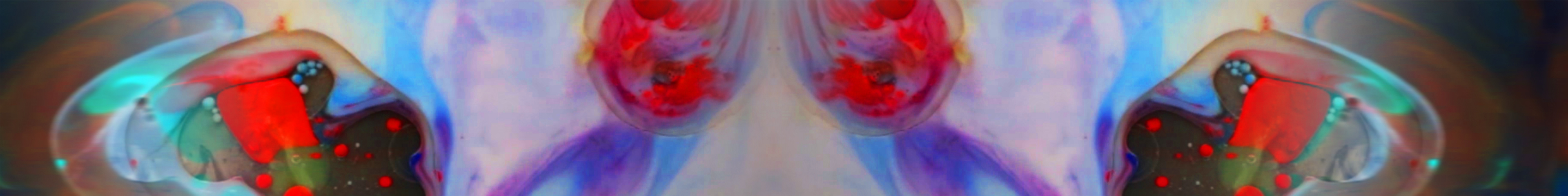
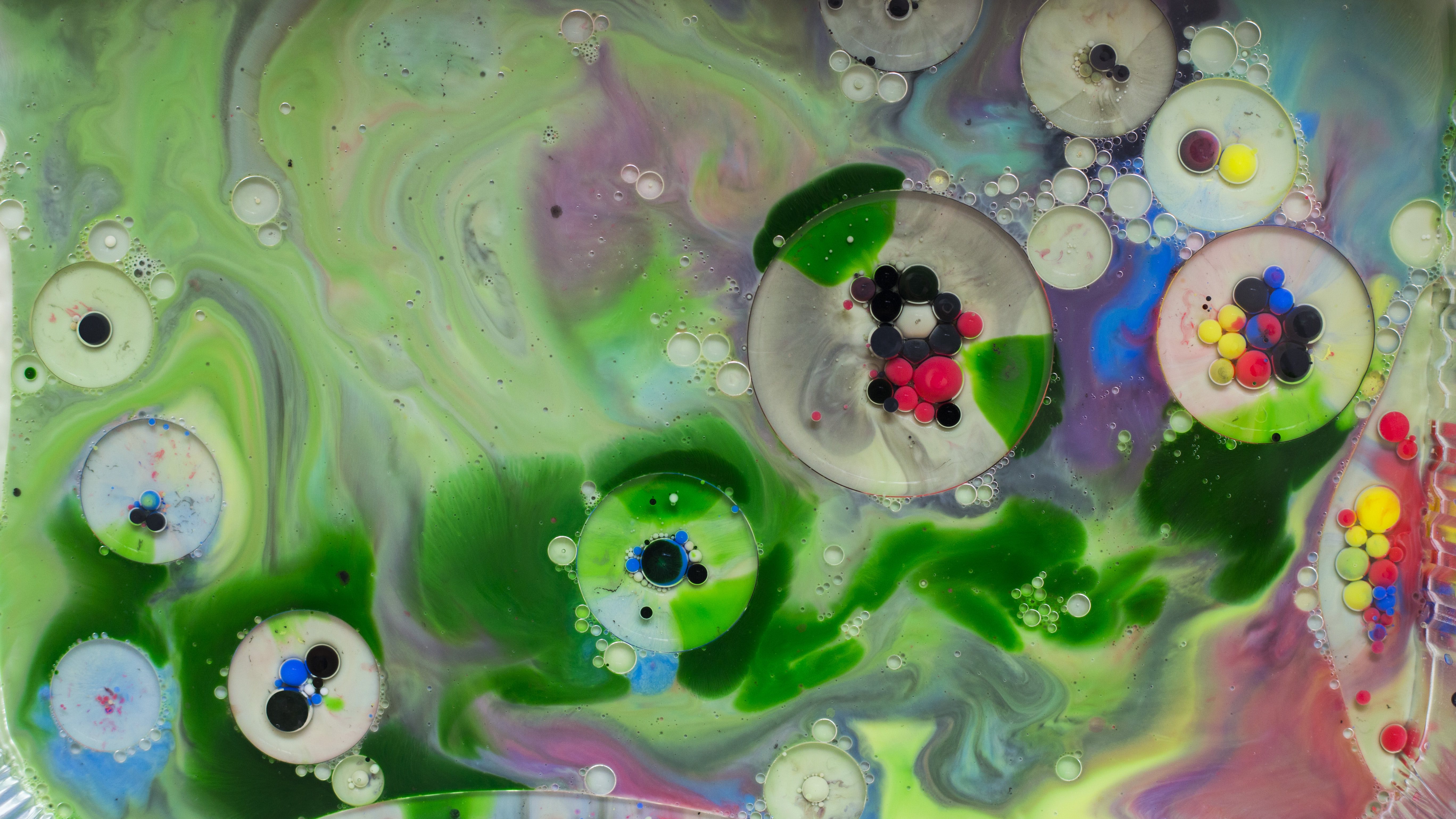
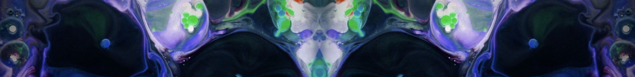
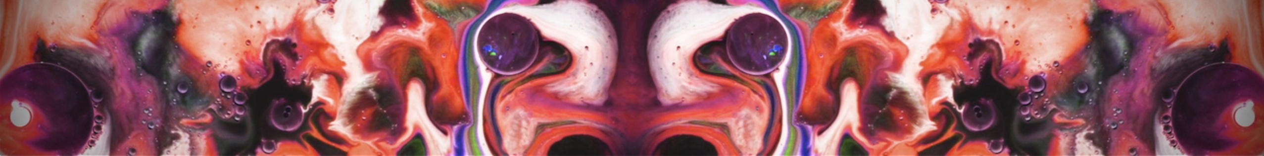
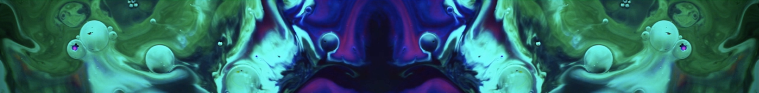
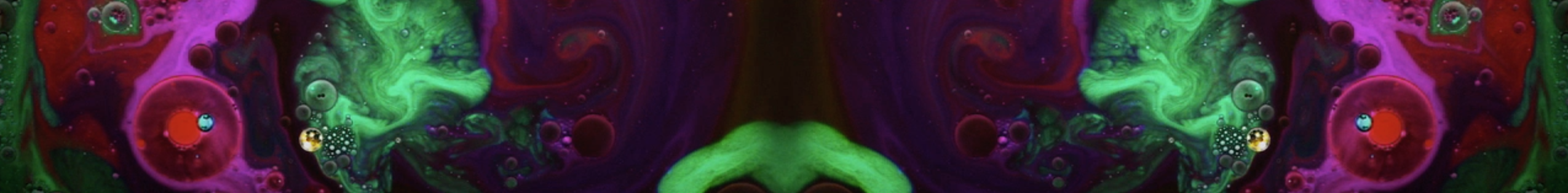
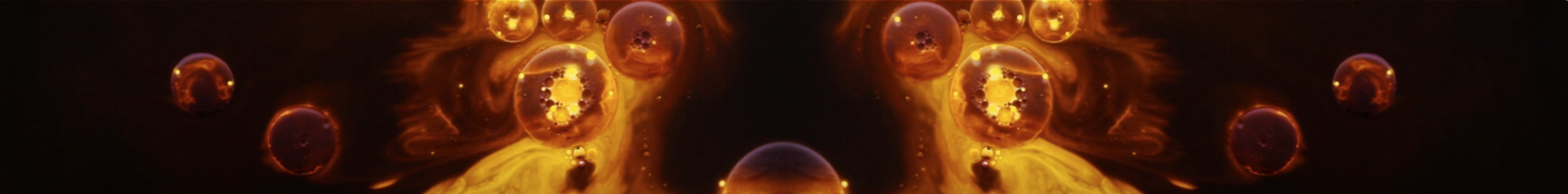
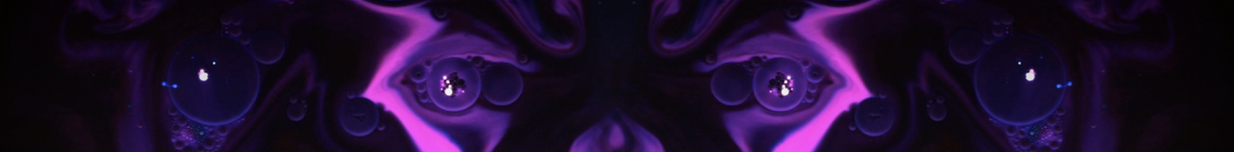
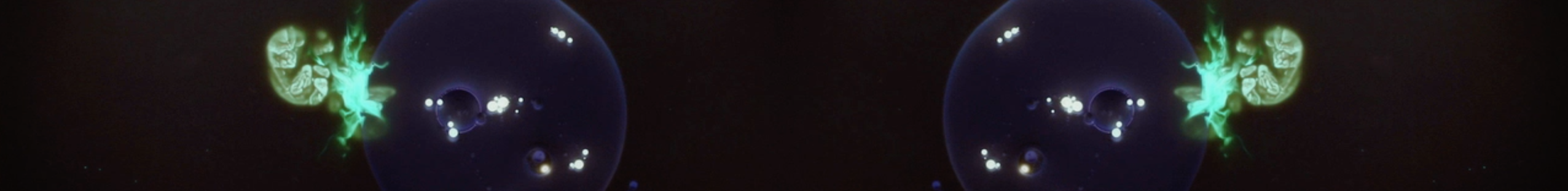
It is an experimental film which describes a life cycle of various abstract creatures, from birth, maturation to death.
With the help of simple chemical reaction in milk, it also allows audience to experience an immersive visual-journey.
PSYCHEDELIC REVIVAL, Moment Factory
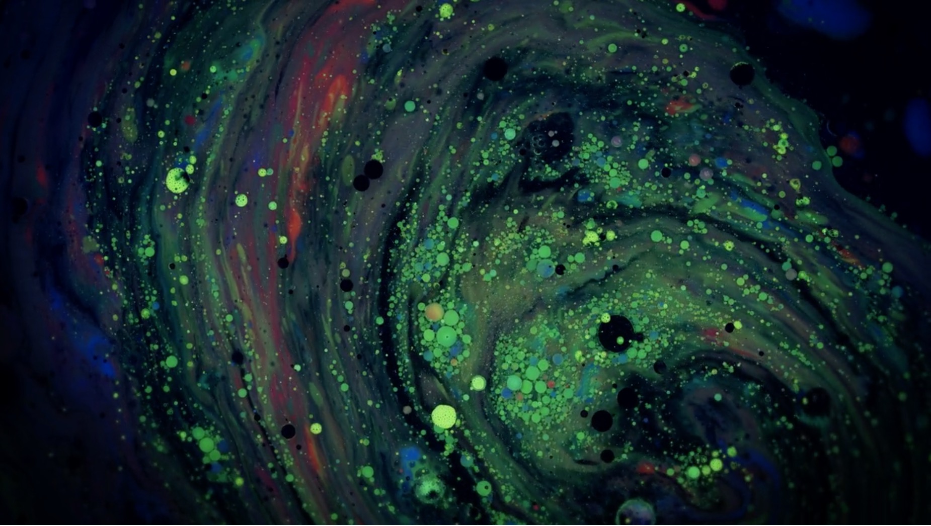
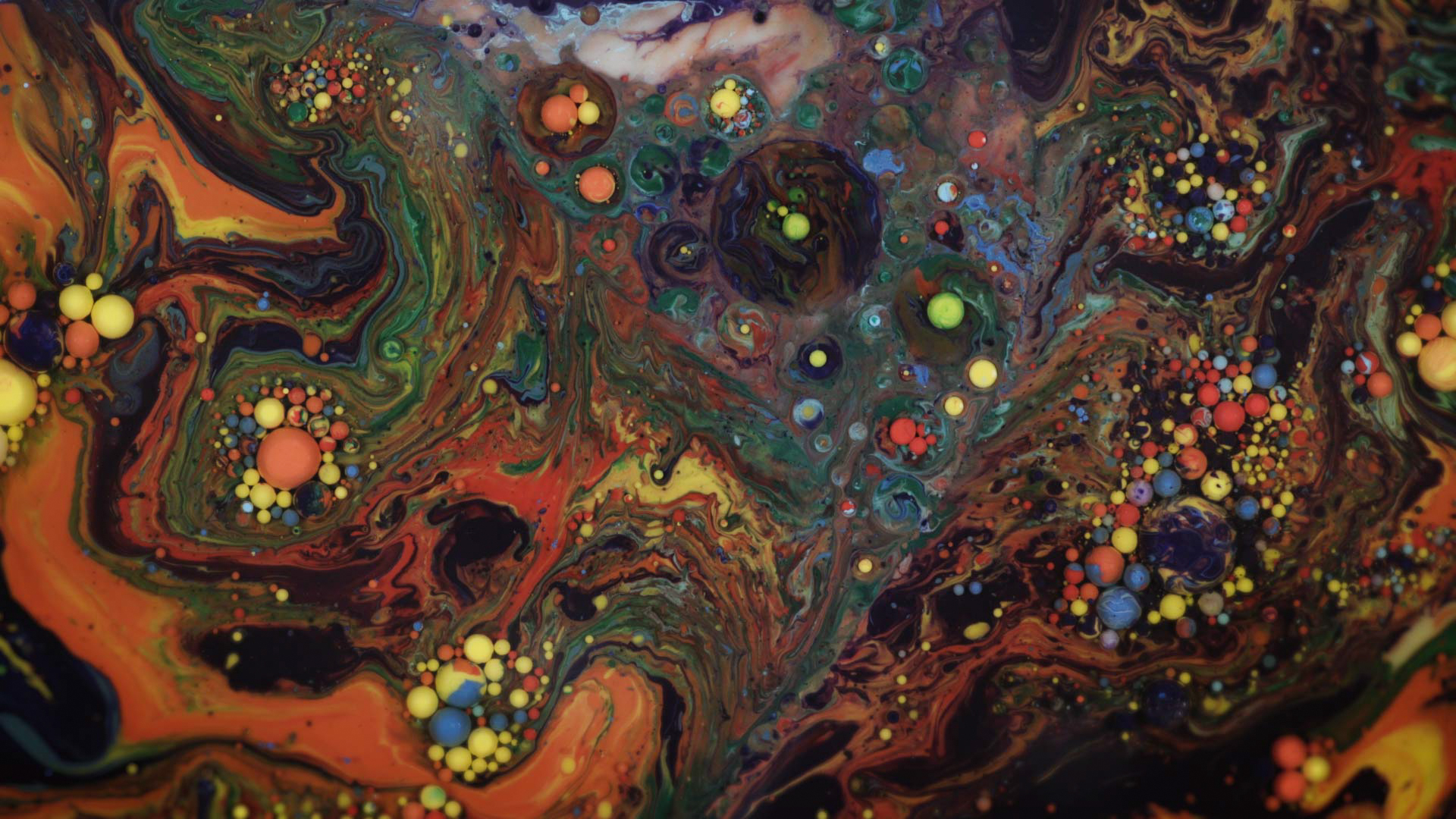
Because of the nature of dish soap, it will push away the paint molecules to different directions continuously, which creates a color explosion.
The autonomous chemistry not only creates chaos and but also the freedom of imagination and inspiration.
Experiement by ValincoTV
Experiement by artFido
I used Adobe After Effects to compose my shots, which is designed for motion graphics design mainly.
After the initial shoot, I realize some problems immediately:
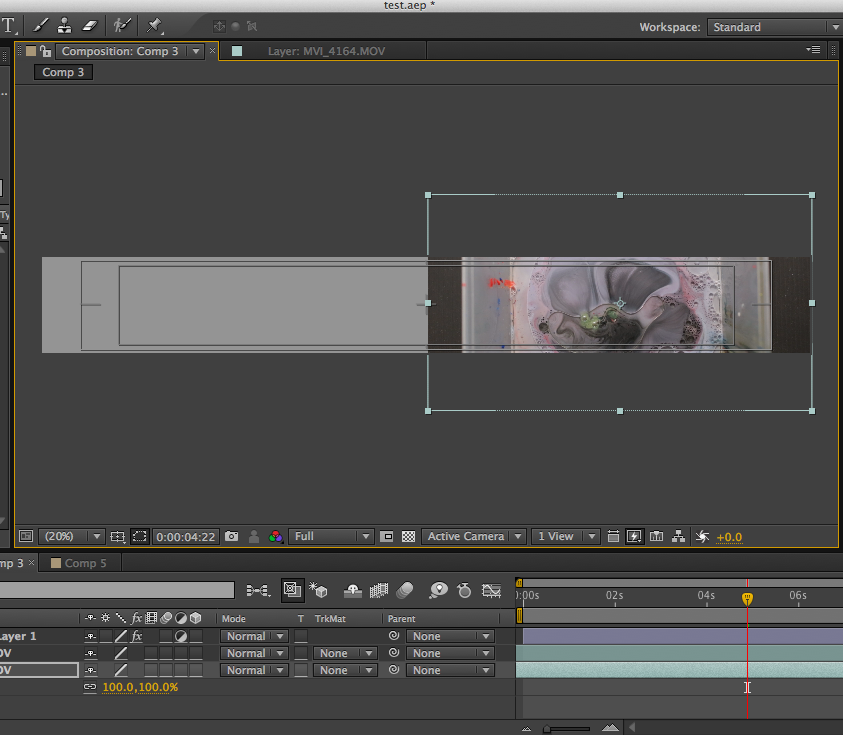
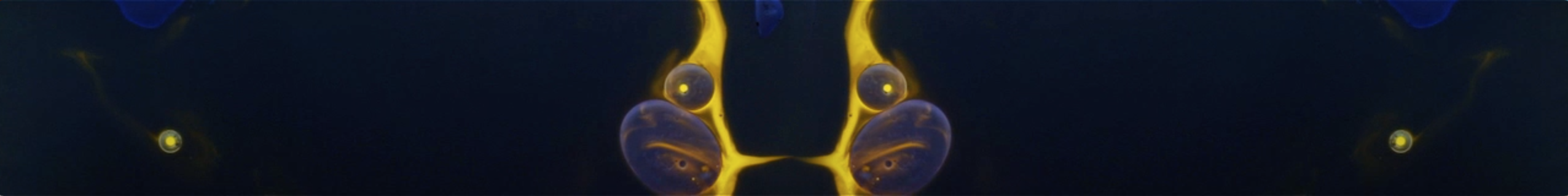
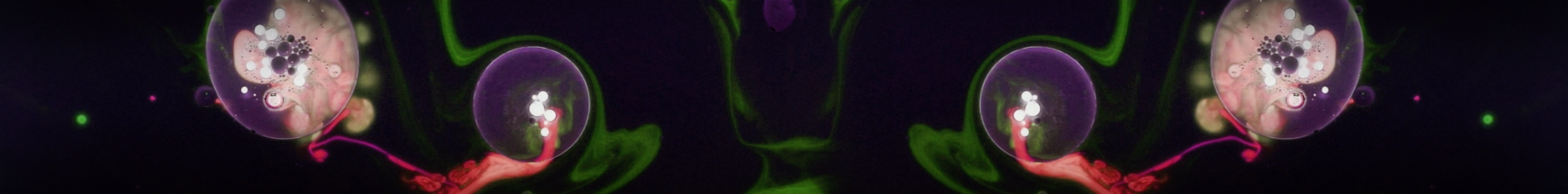
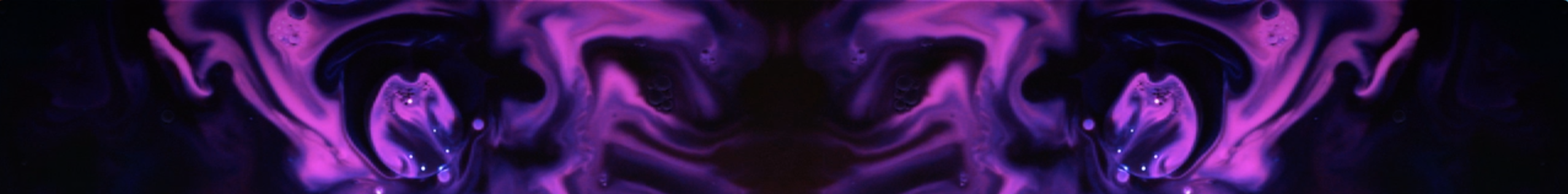
The good solution is mirroring the same footage.
Approach 1
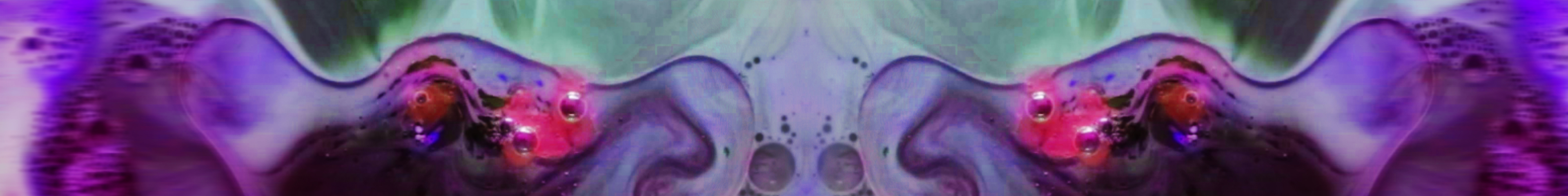
By only flipping once and feathering the edges, the visual becomes like a lively and organic thing, a brain, a face and a creature.
Approach 2
By flipping 4 footages, it creates a nice pattern but doesn’t look like a live thing.
I decided to go for approach 1 which is more organic.
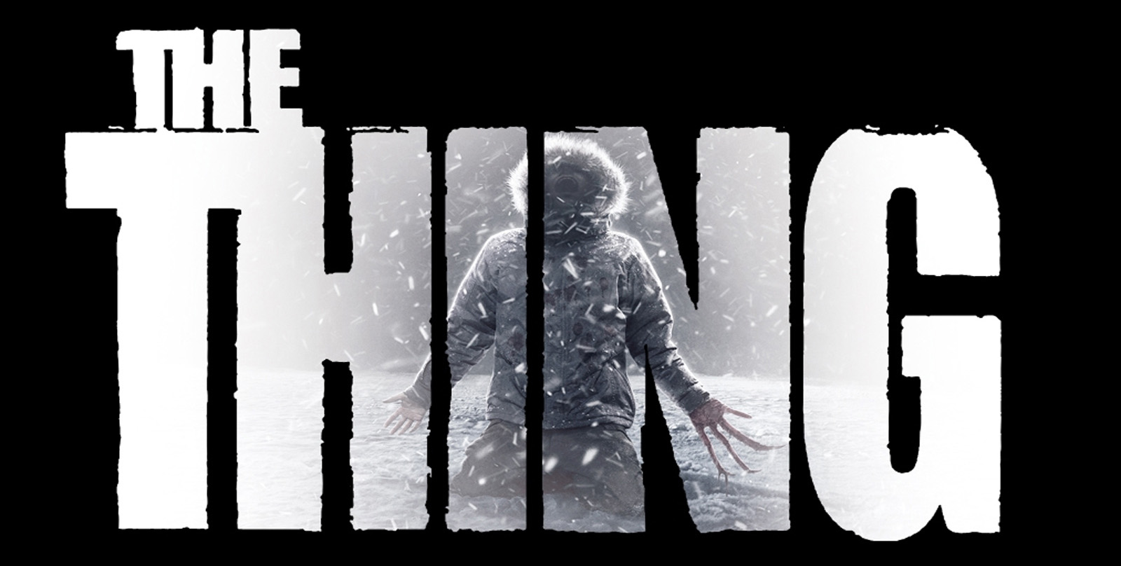
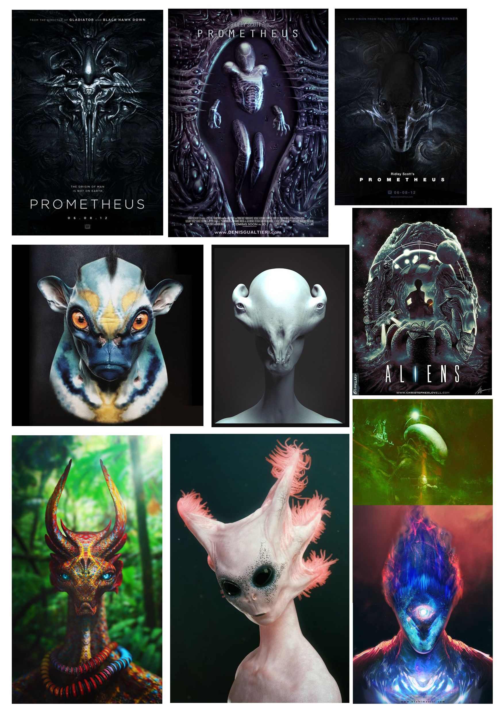
Reference from 3d model design as well as sci-fi movies, like <The Thing>, <Alien> and <Prometheus>.
Mood of mystery, alienation and isolation.
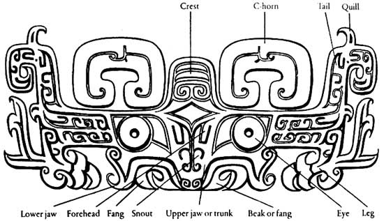
It reminds me an ancient creature from Chinese culture called Taotie, which is often casted on bronze vessels dated back thousands of years ago from Shang and Zhou dynasty.
In ancient Chinese mythology, taotie (饕餮) is one of the “four evil creatures of the world” along with Hundun (渾沌), Qiongqi (窮奇)and Taowu (梼杌).
It has a very symmetrical deign with prominent facial features standing out.
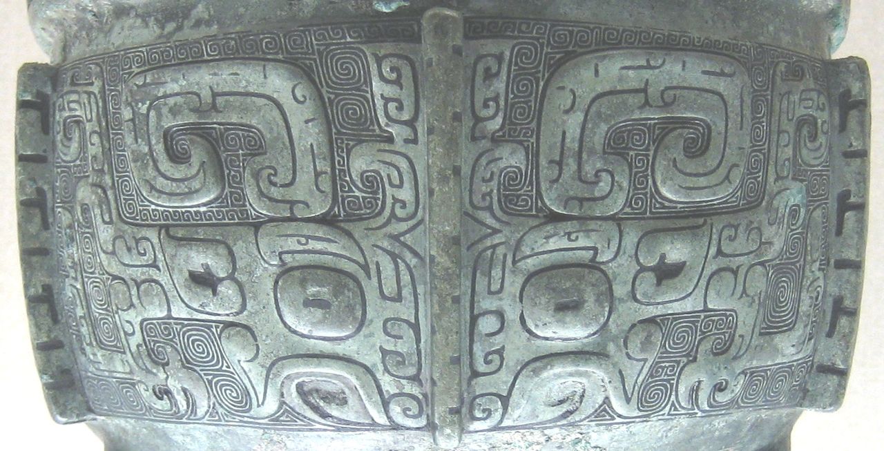
Taotie on a ding bronze vessel from late Shang era


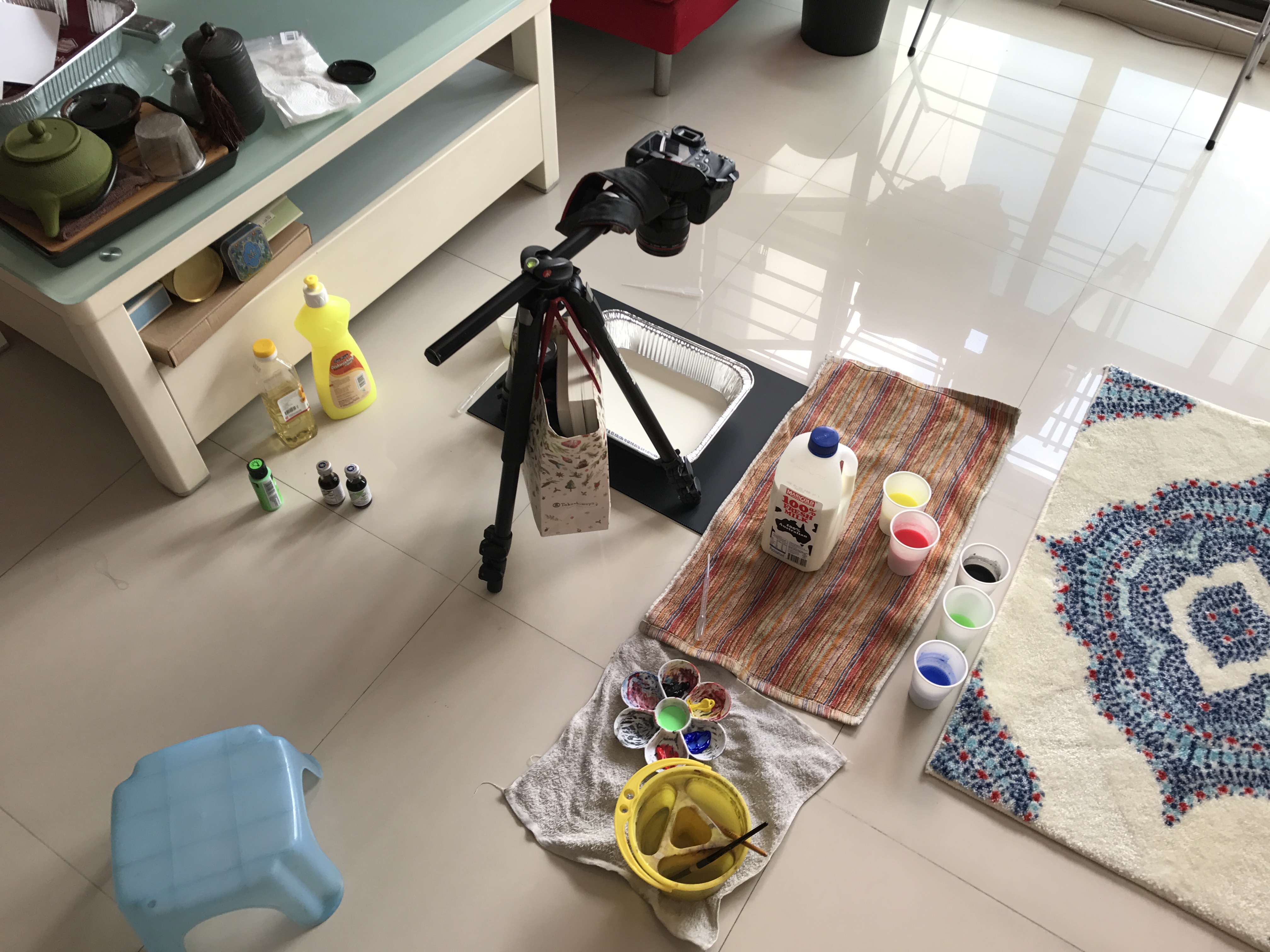
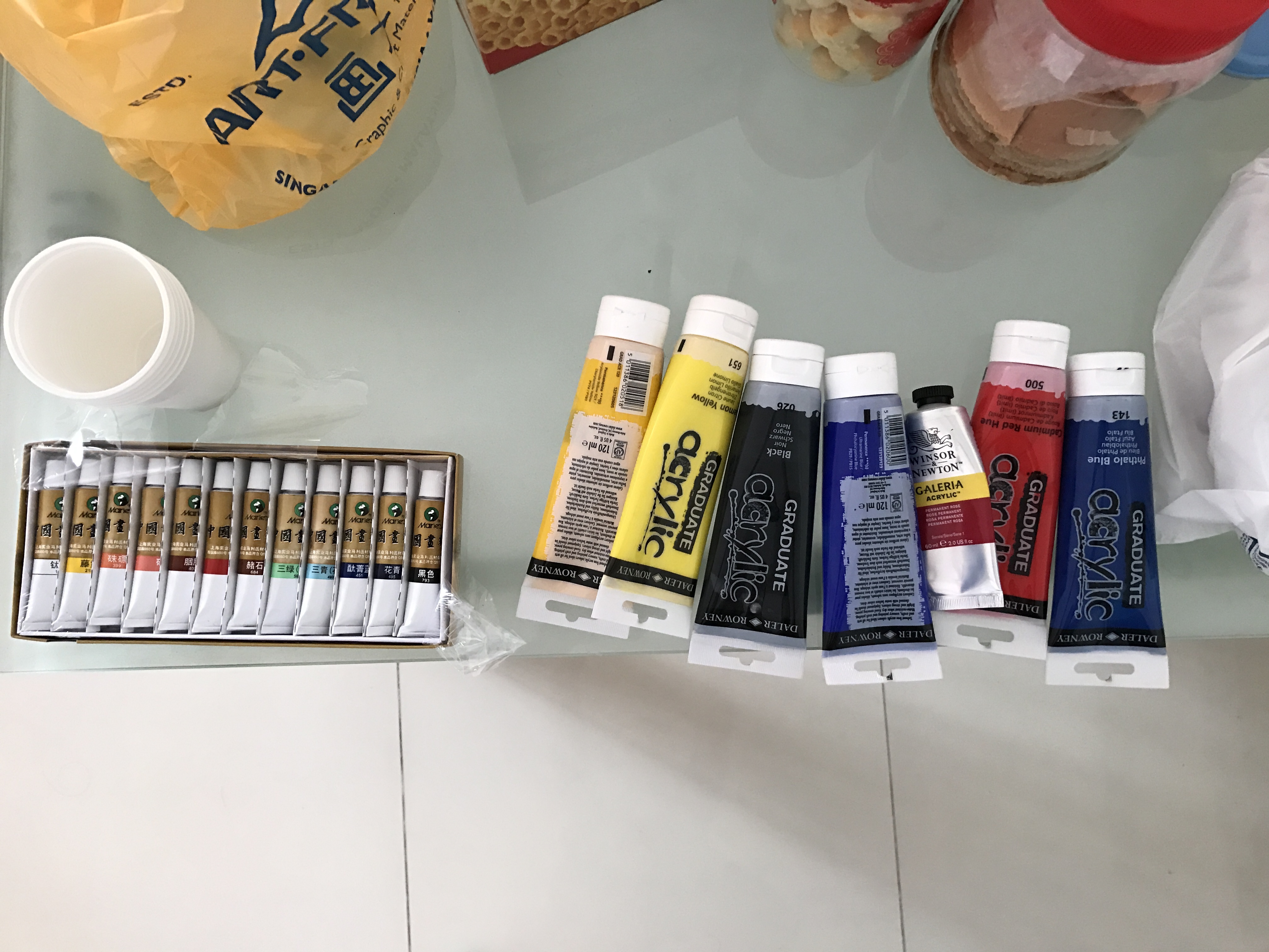
I’m using food coloring instead this time. Because it has more saturated color in milk
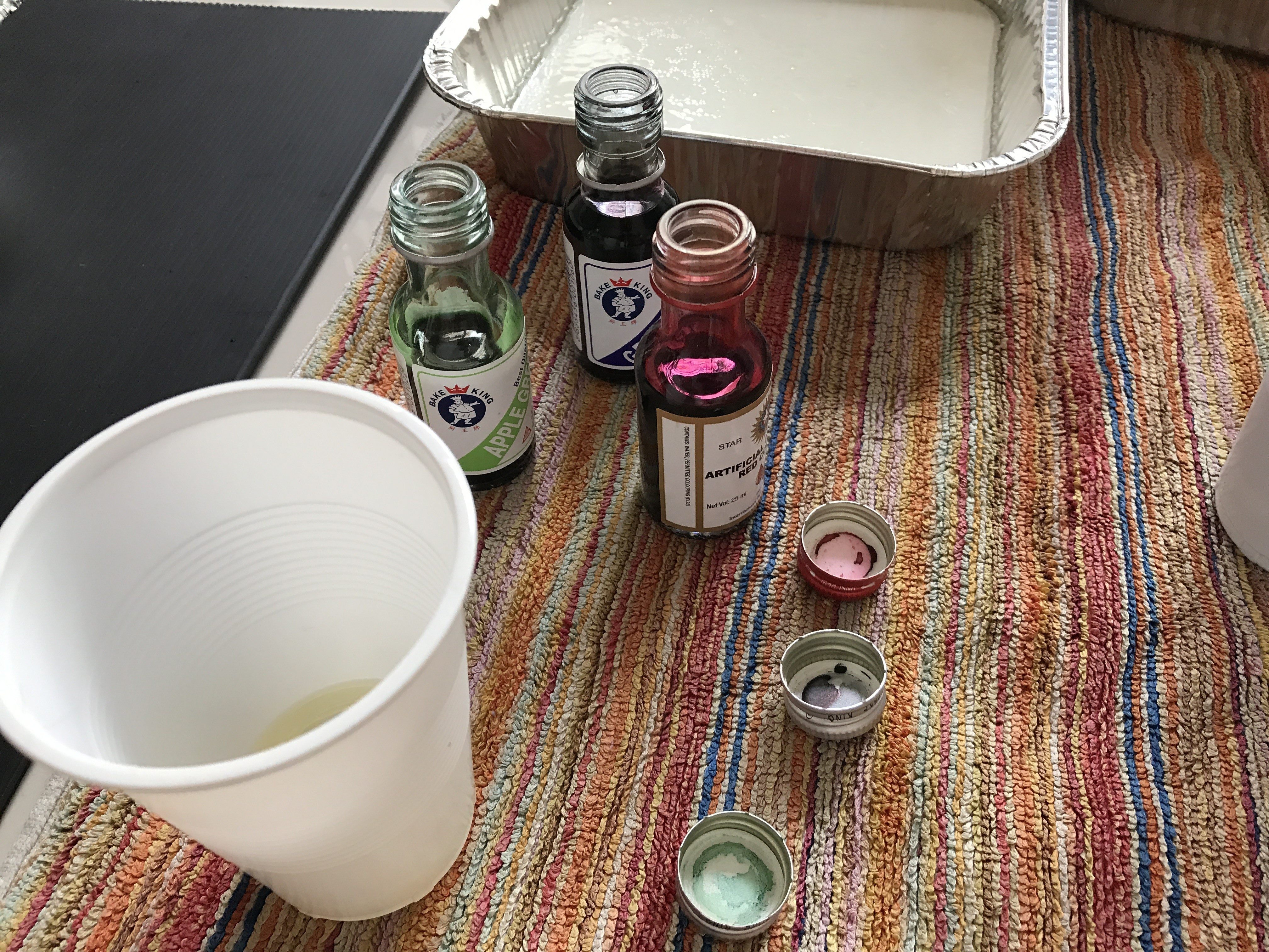
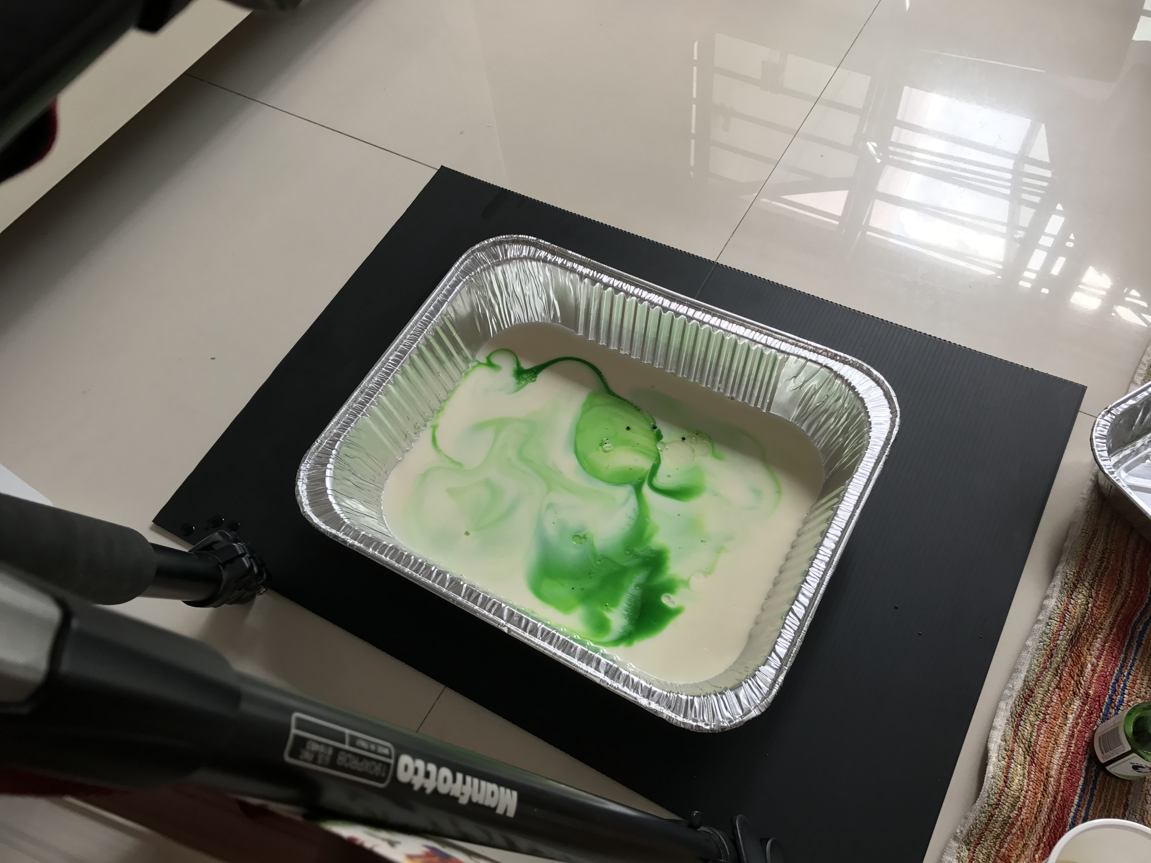
I tried to avoid more than 3 colors, or it will turn out too messy and formless.

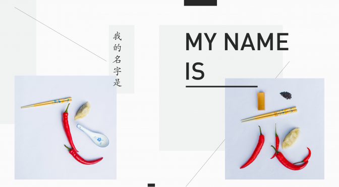
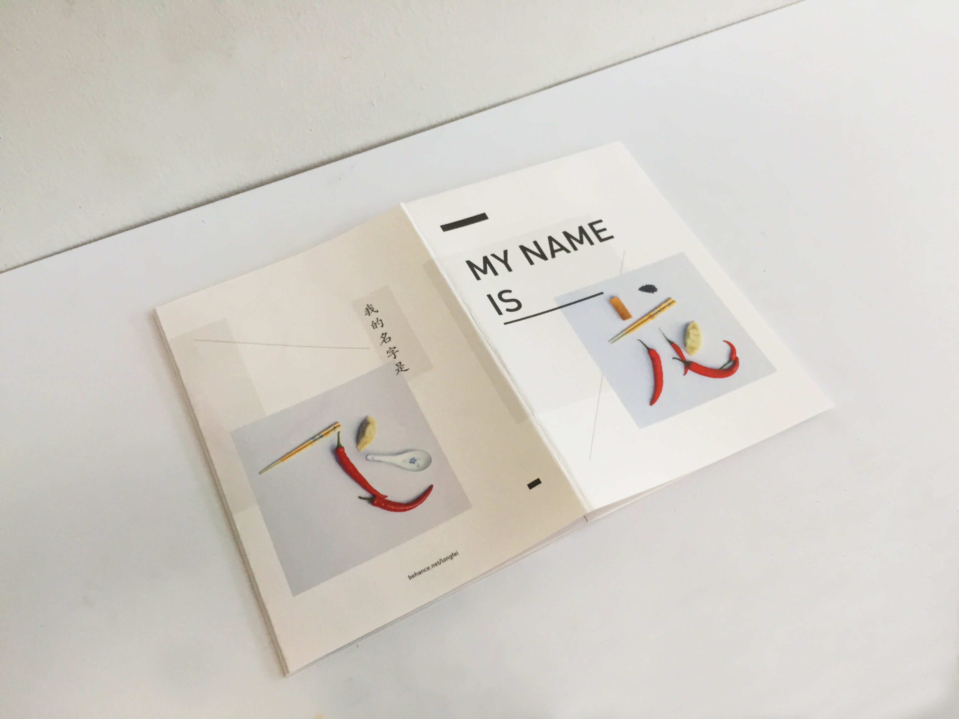
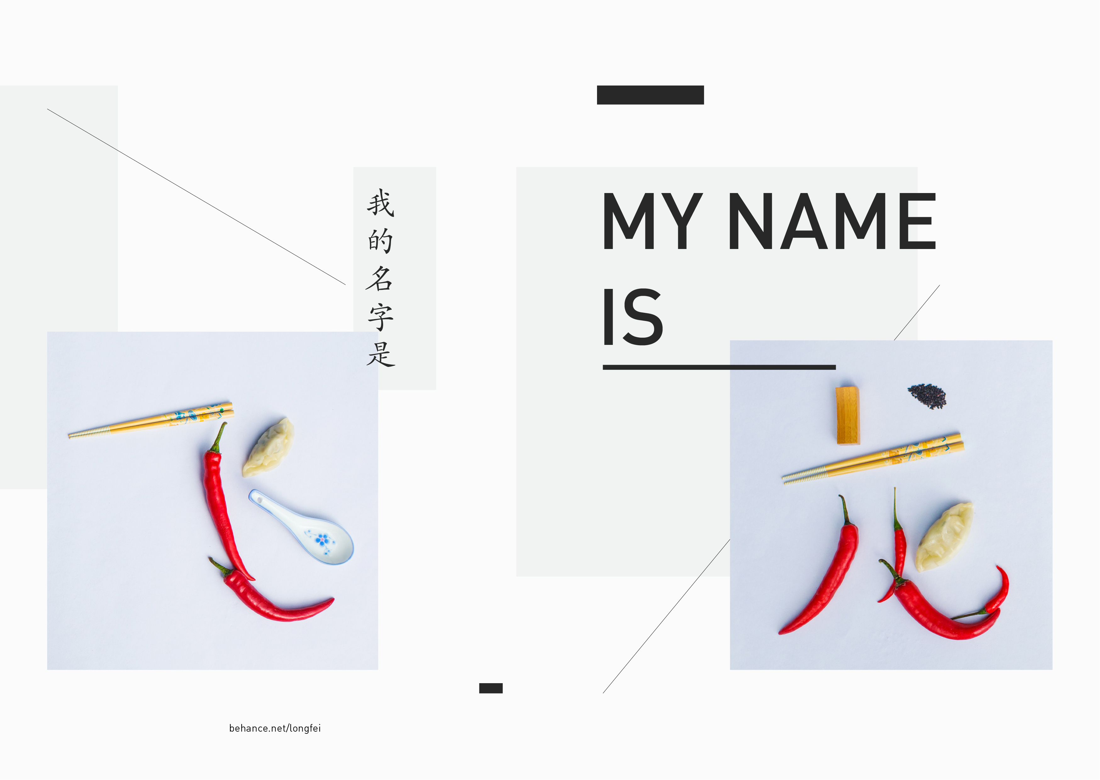
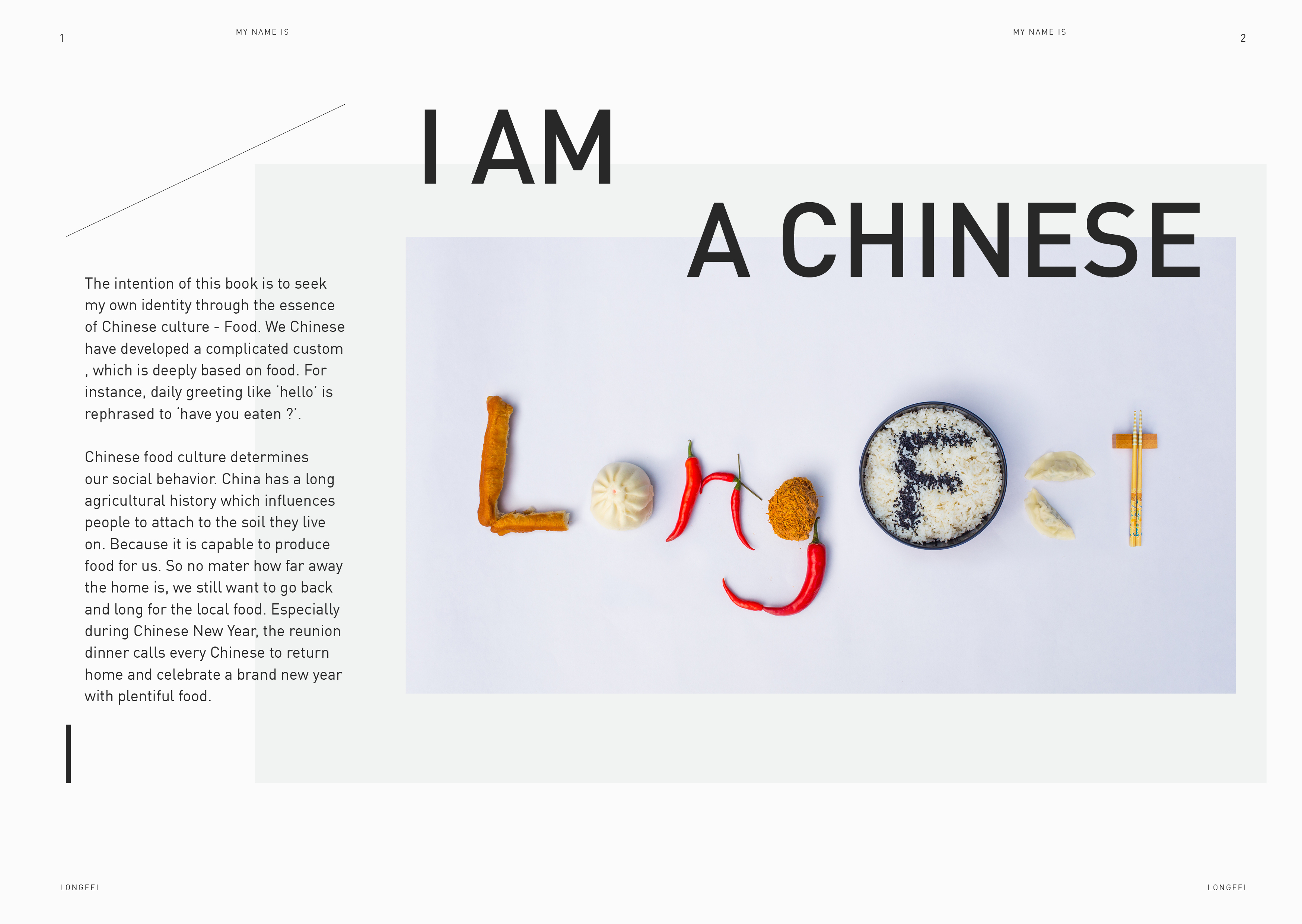
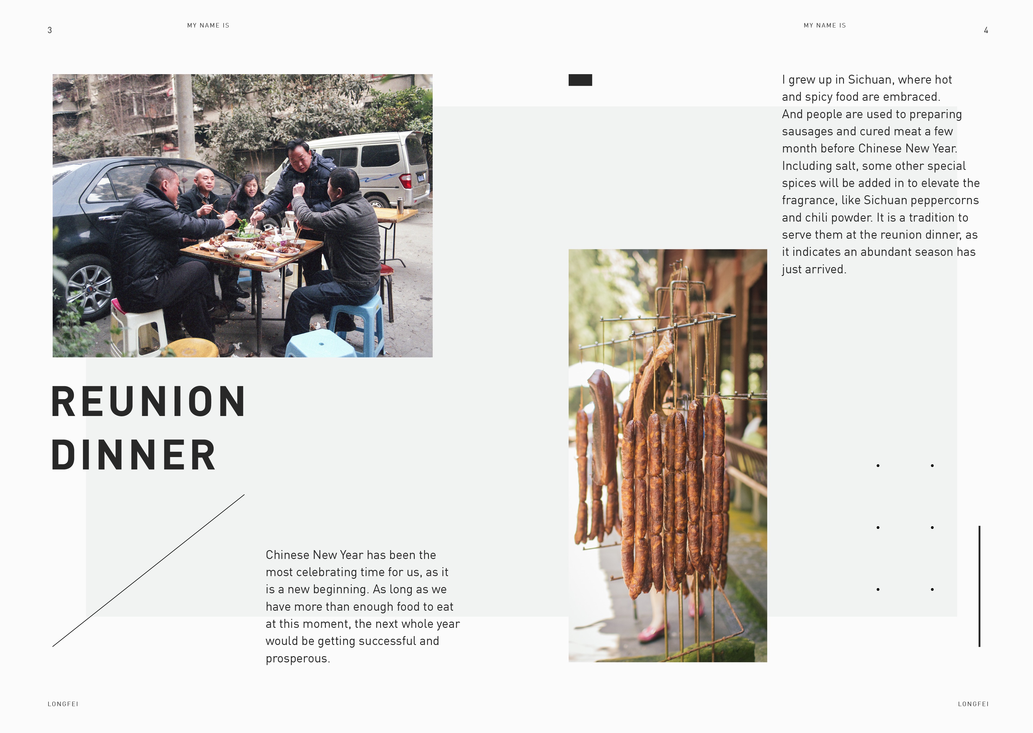
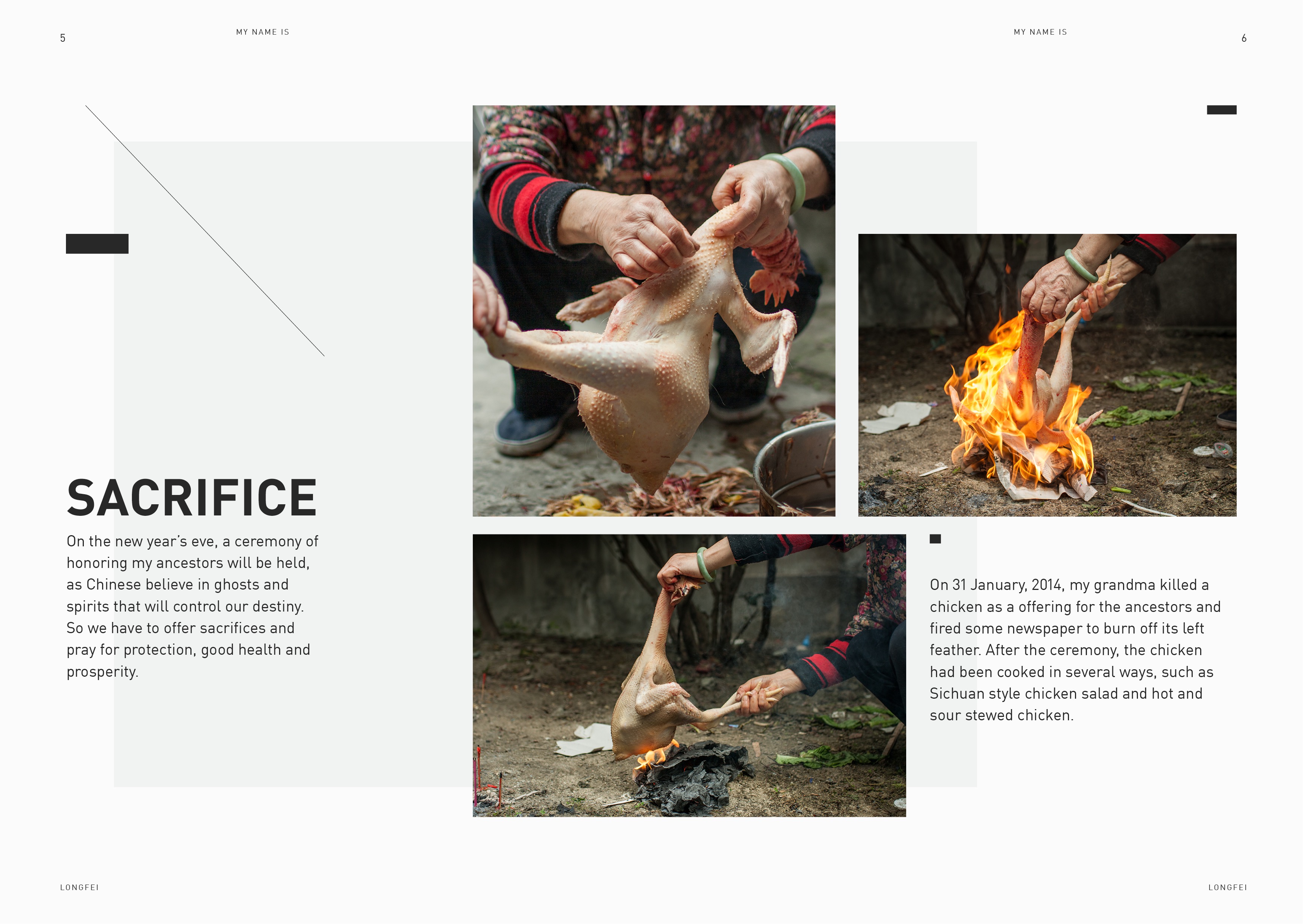
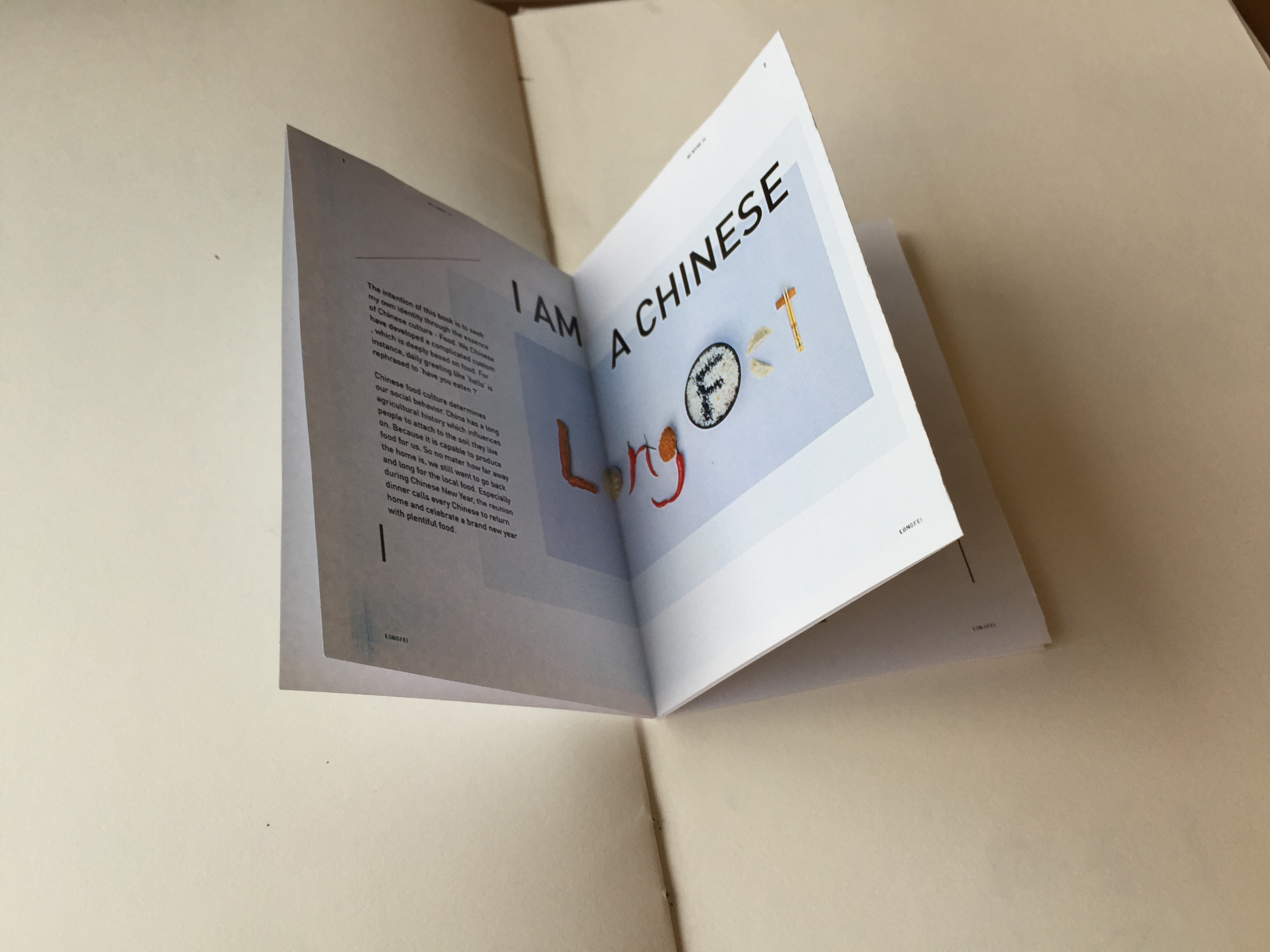
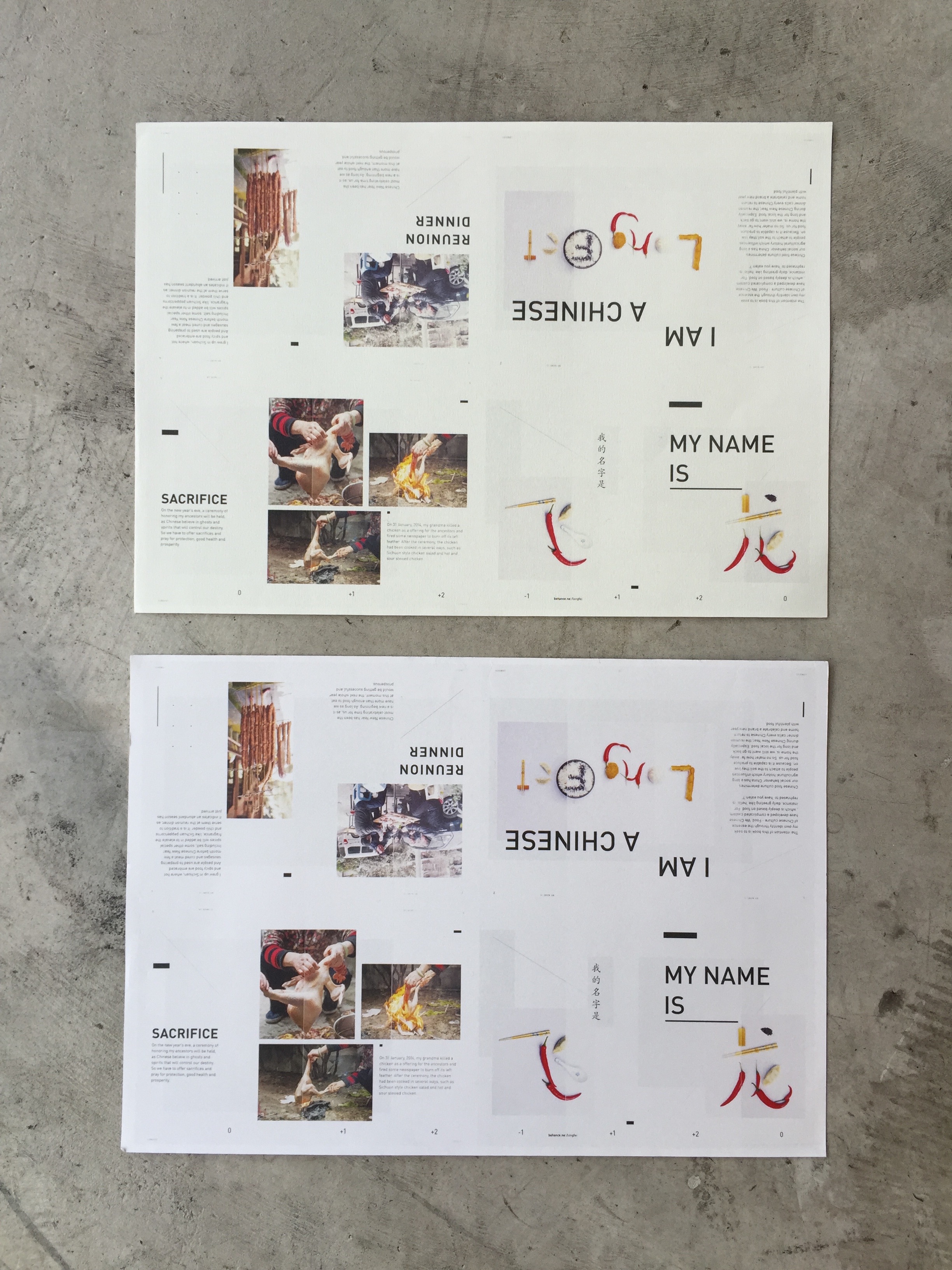
The intention of Zine project is to seek my own identity through the essence of Chinese culture – Food. We have developed a complicated custom, which is deeply based on food and determines our social behavior. It also rooted people to the soil they live on, as it is capable to produce abundant food. Especially during Chinese New Year, the reunion dinner calls every Chinese to return home and celebrate a brand new year with plentiful food.
To make the layout more interesting, I introduced elements like lines, and shapes. It also balances with and unifies the photographs and text. And all the elements are offset for the reason of dynamic composition.
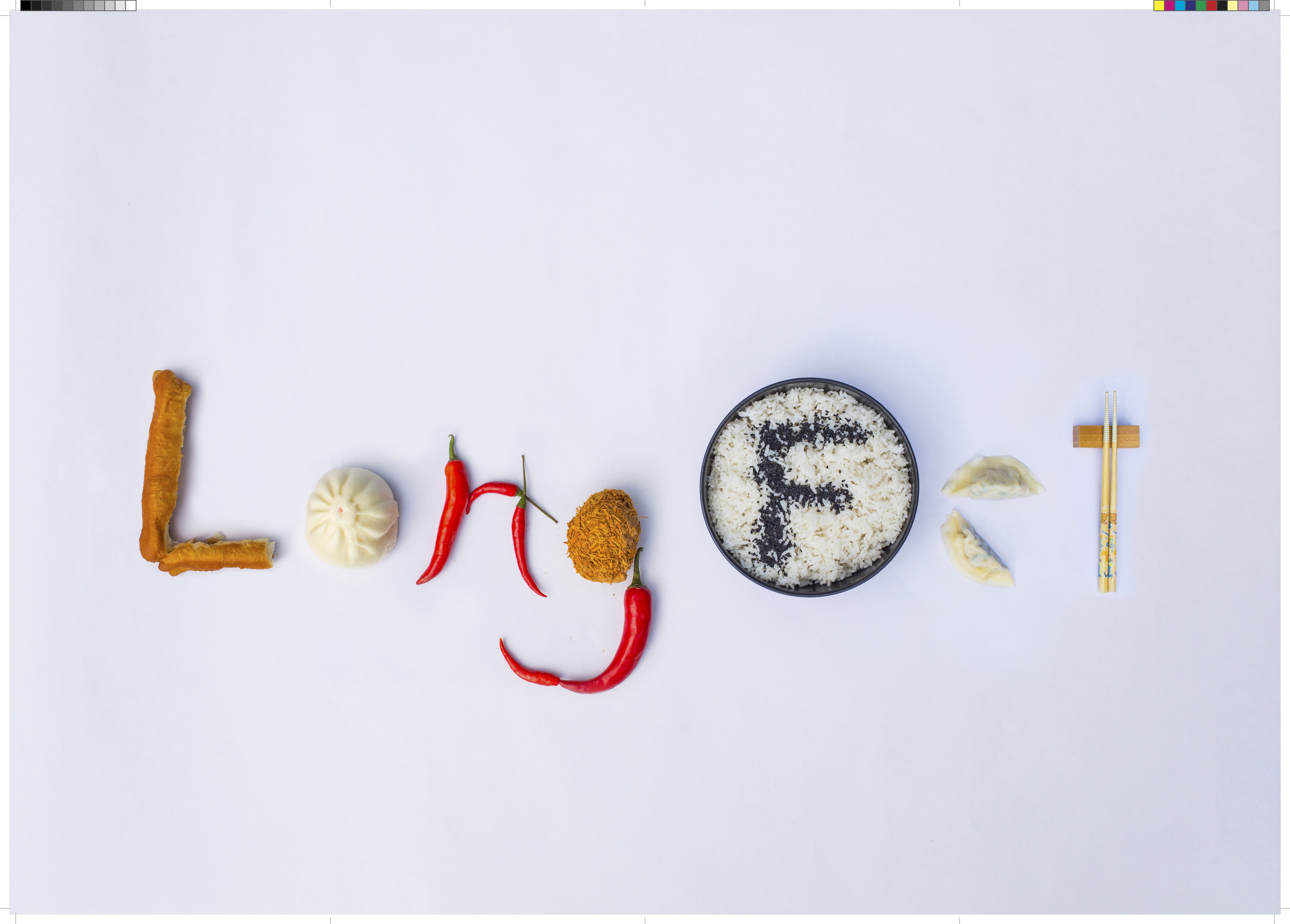
Back & Cover
IFC & PG 1
PG 2 & PG 3
PG 4 & IBC
A2 back poster
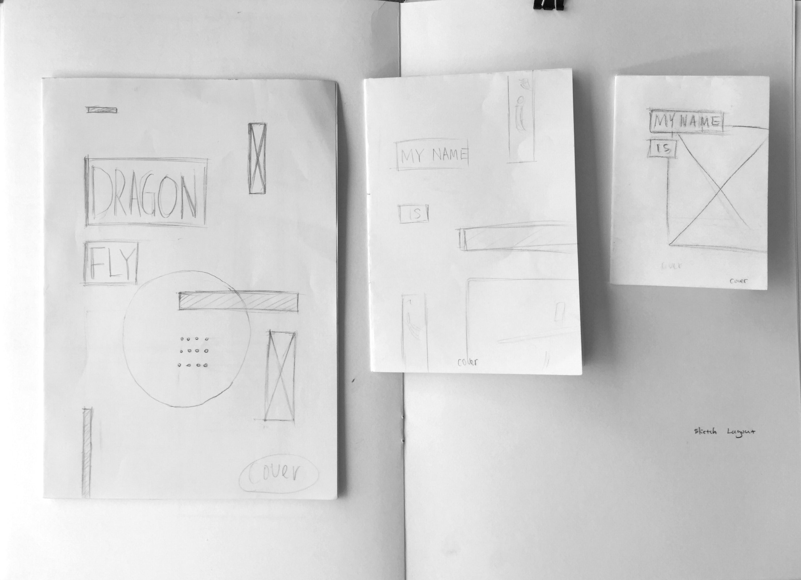
Brain Storming
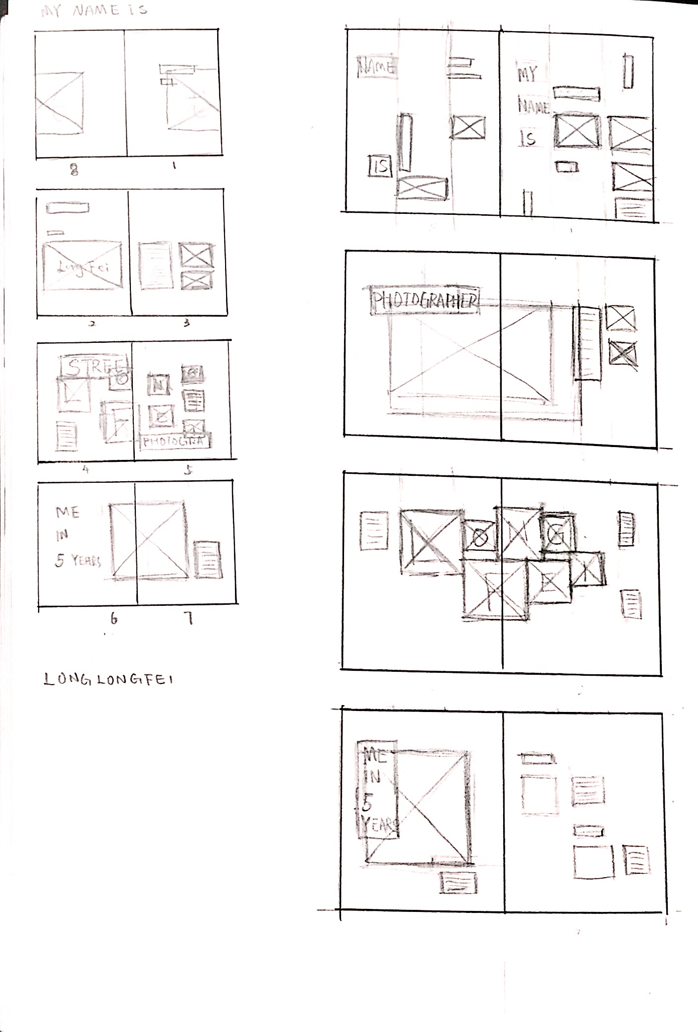
Initial Layout sketches on paper
Tryouts of different layouts on mock-ups
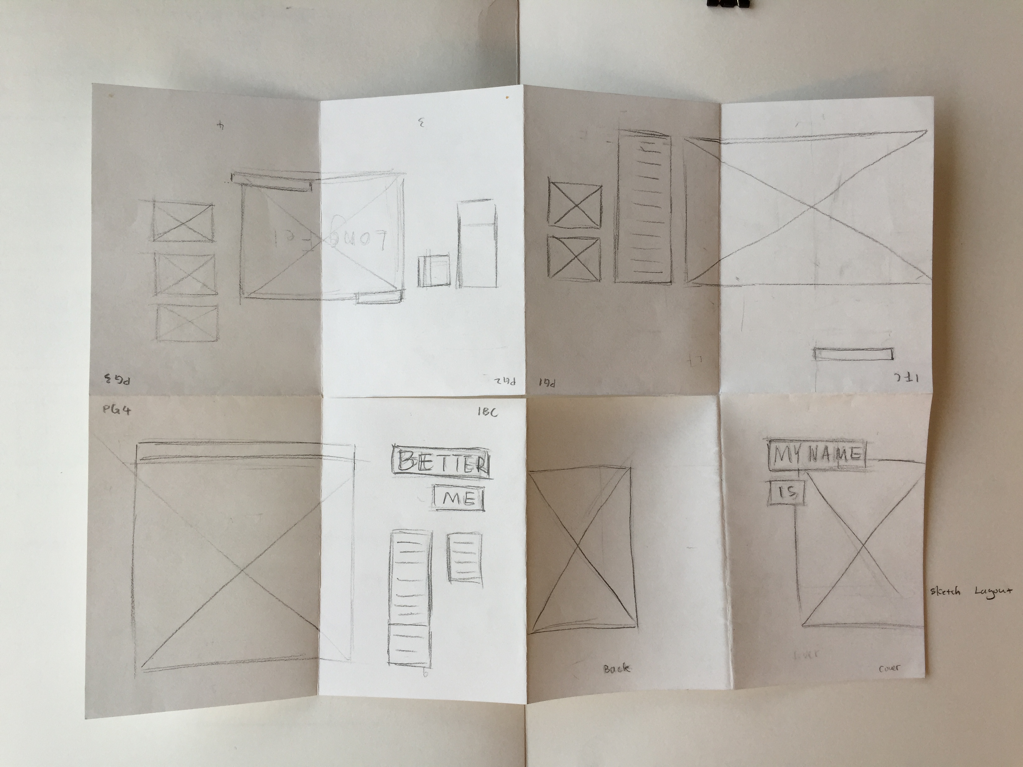
Full spread of A4 mock up
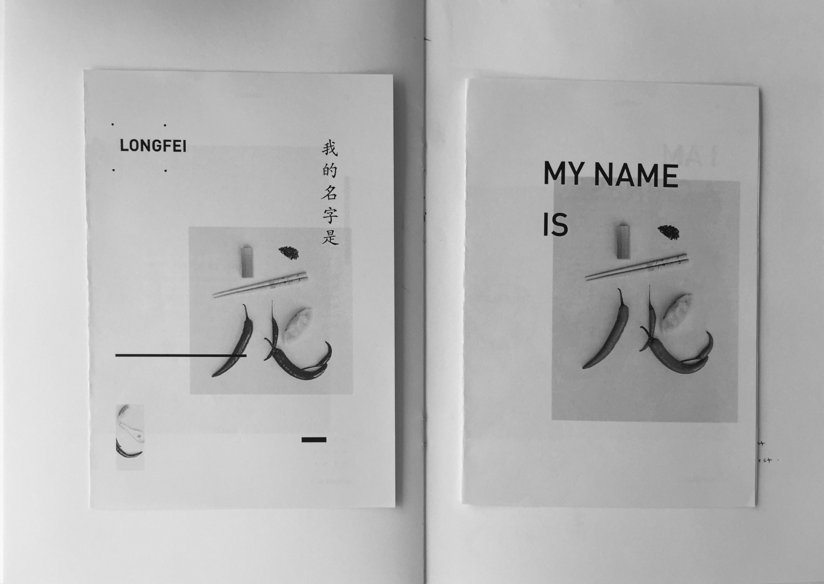
Test Print on black&white
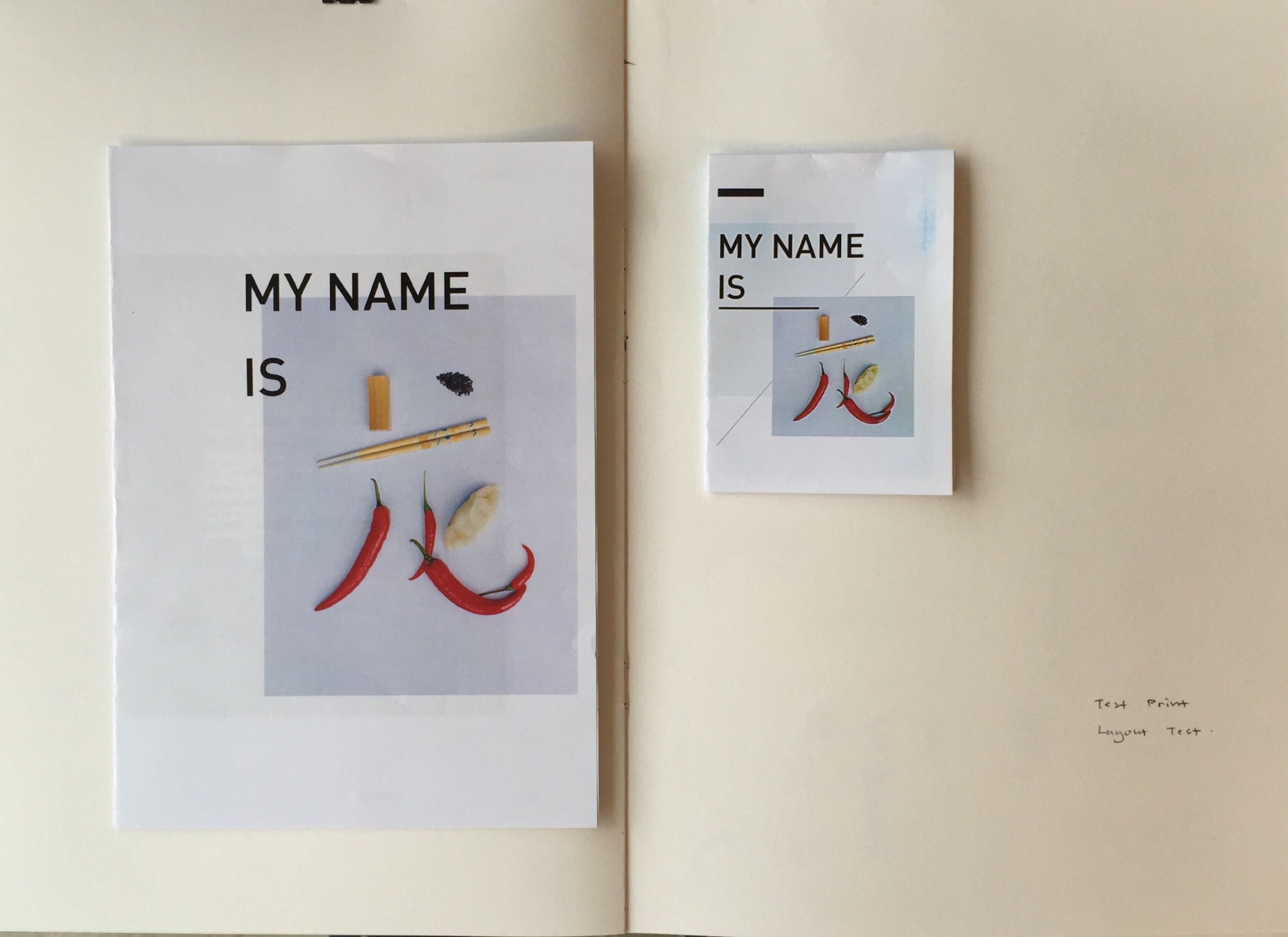
Test print on color
Final mock-up with color
Color testing on different scales and materials
In this project, I have learned a new software InDesign for the first time. I also had a chance to try different ways of creating a booklet, which is an enjoyable experience. What’s more, I’m quite interested in playing with images and typography to make a lively and dynamic composition.
And I’m in insomnia.

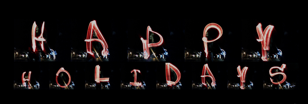
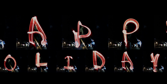
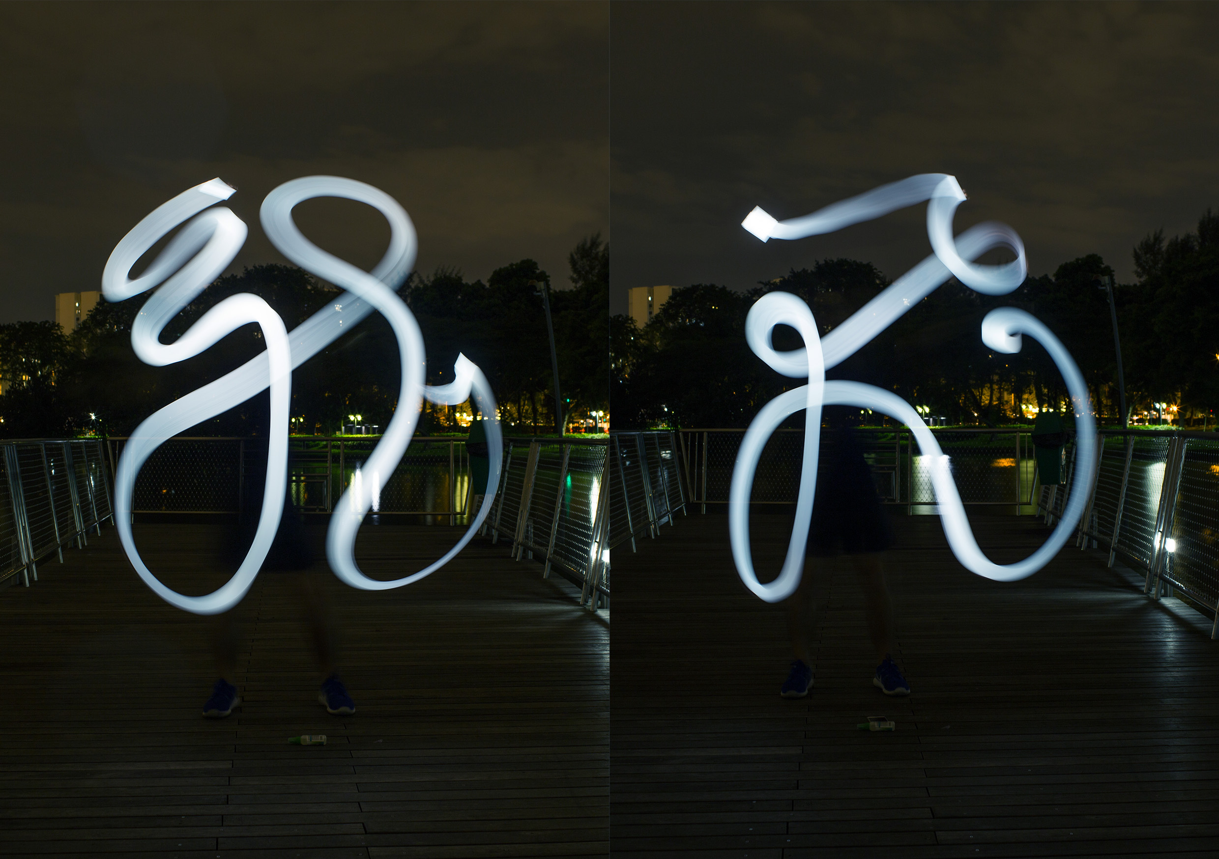
Slow shutter speed of camera creates an illusion of ghosty lines, which can be applied in creating typography.
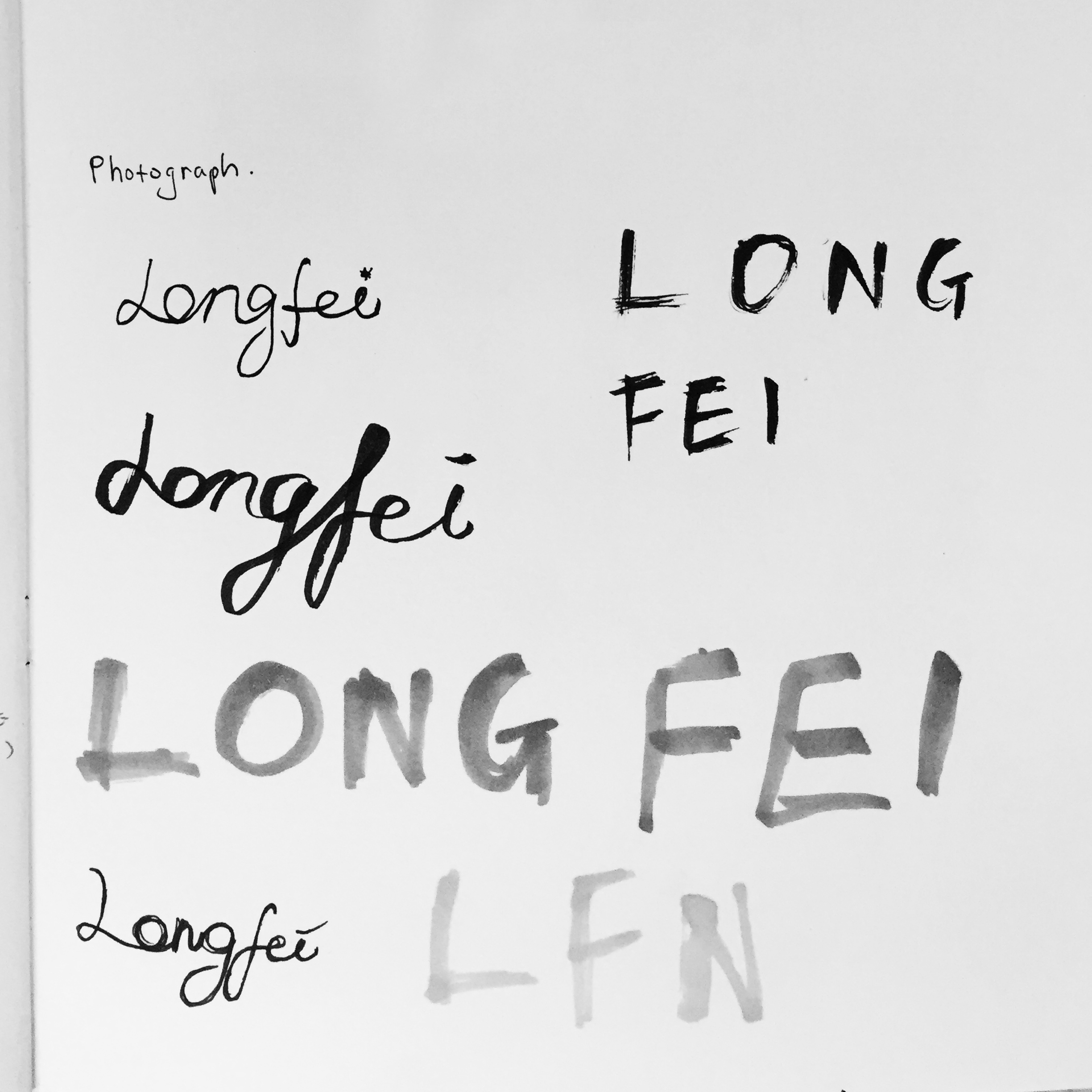
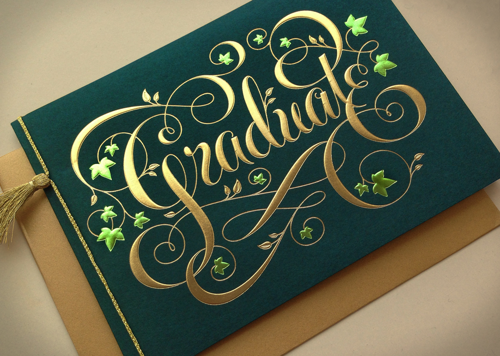
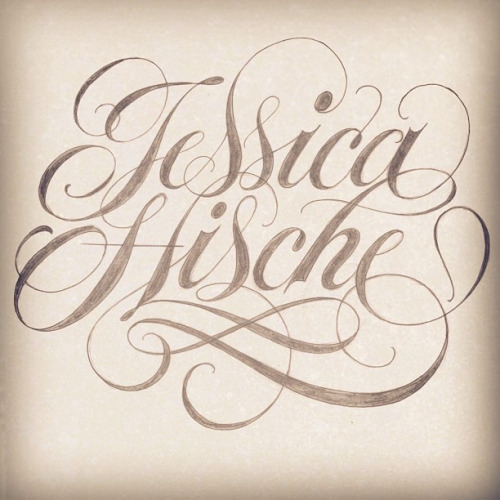
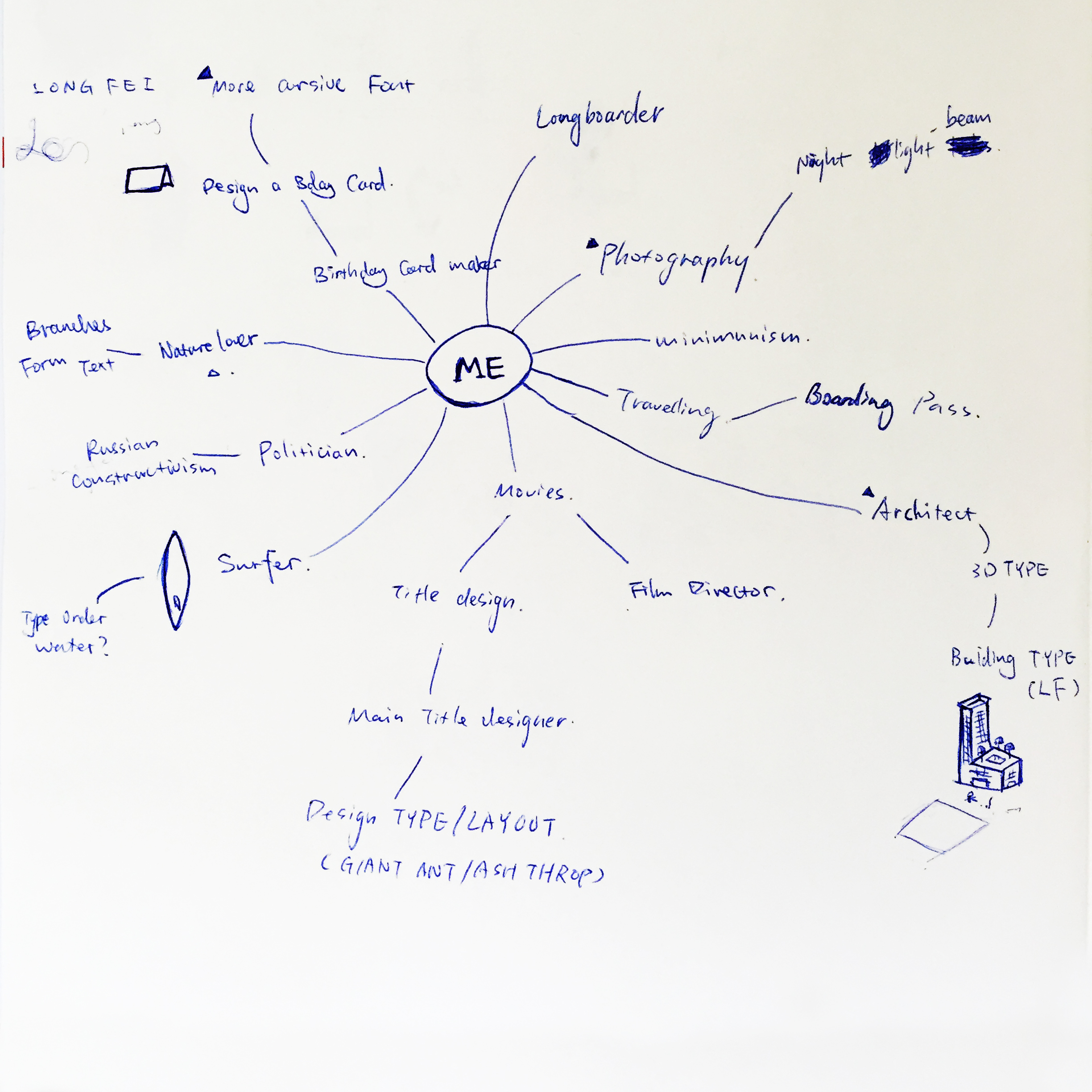
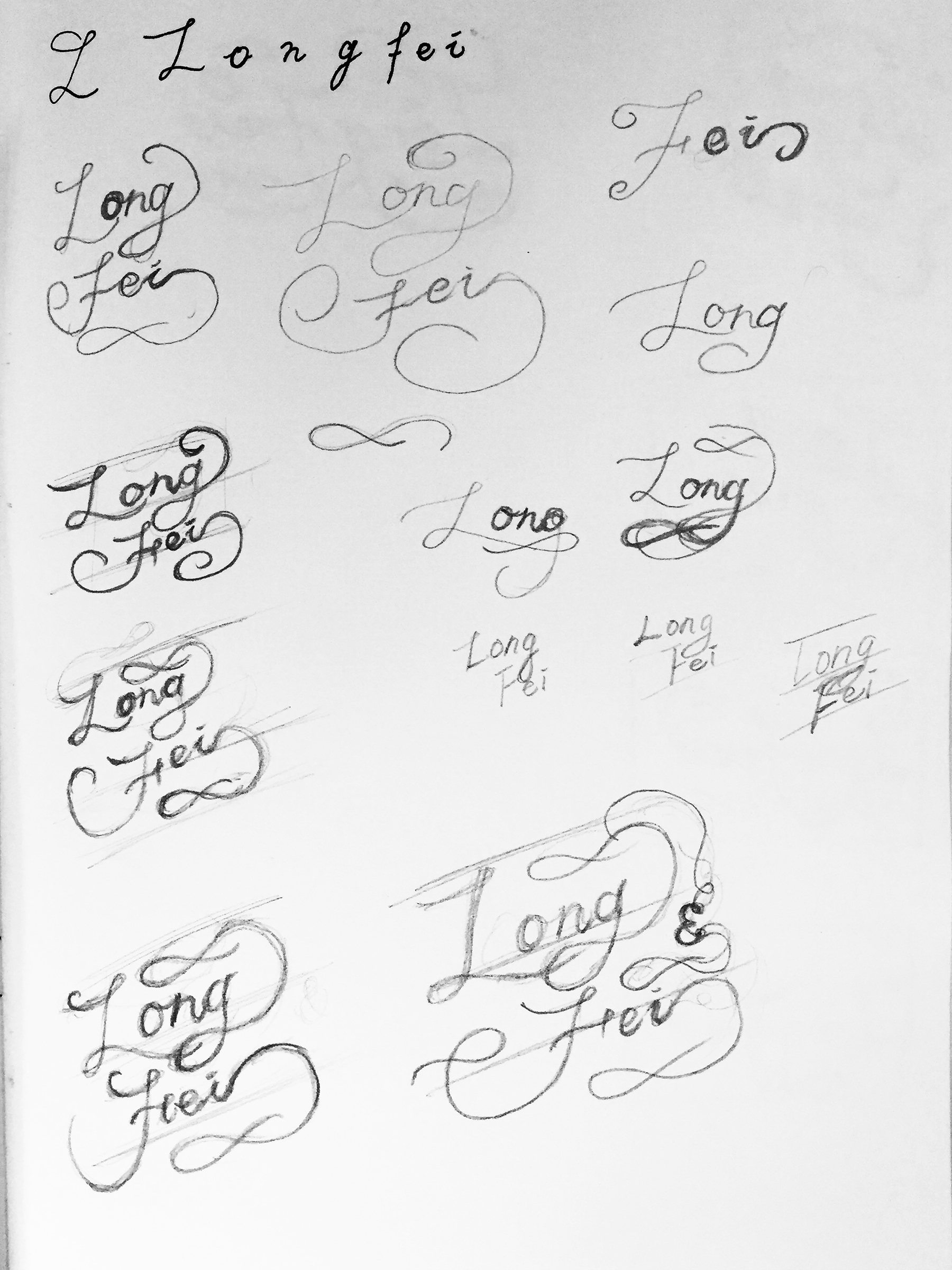
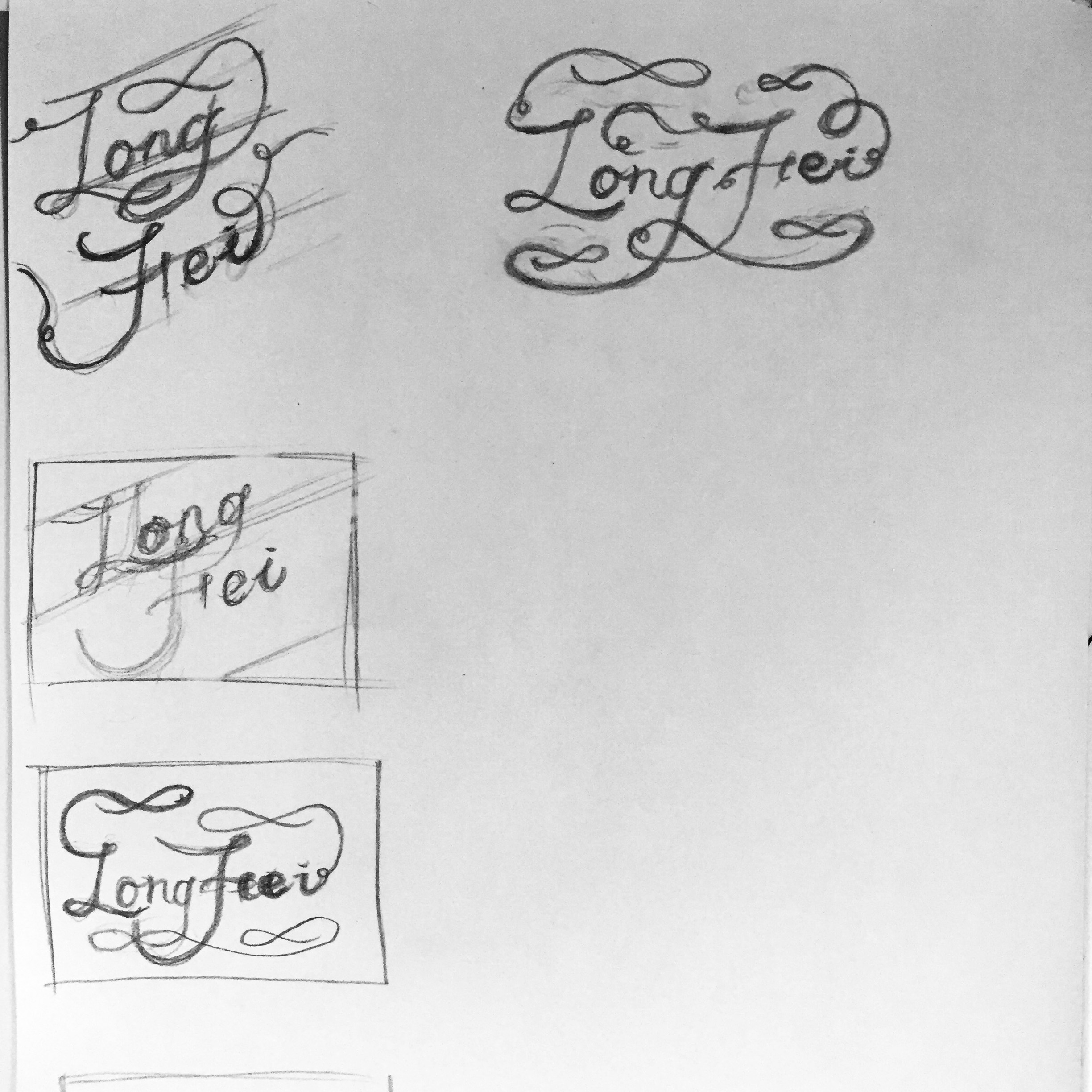
I’d like to design birthday card for my friends as a birthday gift. The font is always cursive and elaborated.
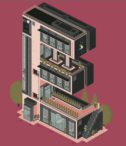
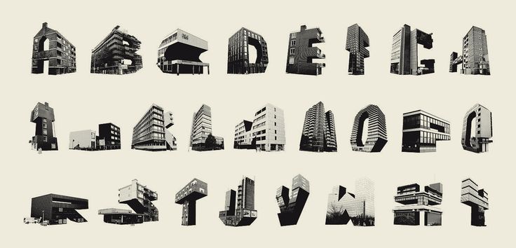
I have a strong obsession on cubic architecture and interior design, which I can apply on my initials “L” & “F”.
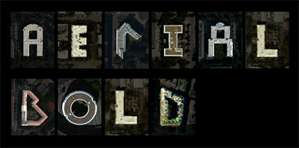
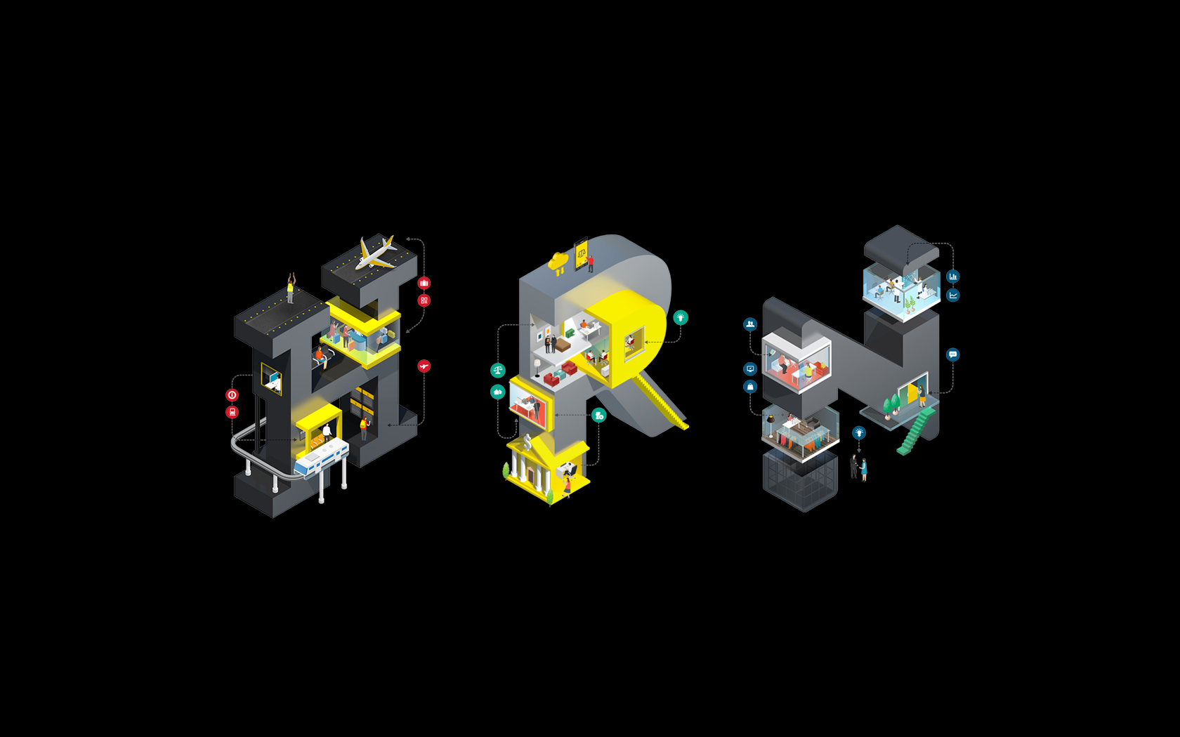
It was inspired by how pilot observes our cities and recognises individual building for reference object or signs.
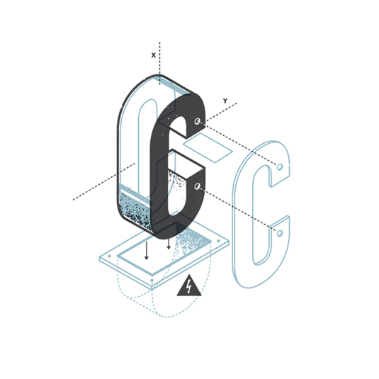
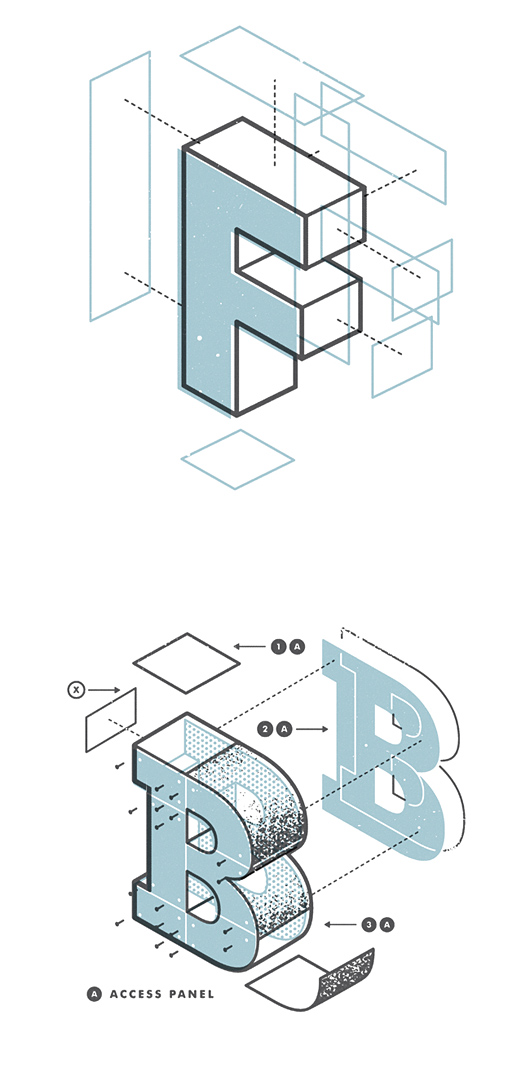
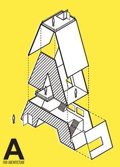
I was inspired by how manual book has changed the efficiency of work through simple visuals and imageries. Maybe I’ll combine “Architect” and “Manual maker” together as one concept, showing how to build a house.

1.TYPOGRAPHY

Concept
Applying a mixture of Chinese and English letters from my name to represent my identity and imply my strong interest in typography and design.
2.ABSTRACT SOLUTION


Concept
Symbol of eye and colorful light rays indicate my desire in exploring and experimenting new things.
3.CONCEPTUAL


Concept
Using negative film to represent my favorite hobby ‘Photography’ literally.


Recent Comments