
SEQUENCE 3
| My third subject is are eggs on kimchi fried rice. The egg to me is the ultimate compliment to basically any food. It doesn’t taste like much and don’t really add much flavour to a dish but it makes it so much better. I hope to see myself as a service for the arts in the future, similar to the function of a fried egg. The main dish/art can exist, but I will be able to provide support to make the end product even better.
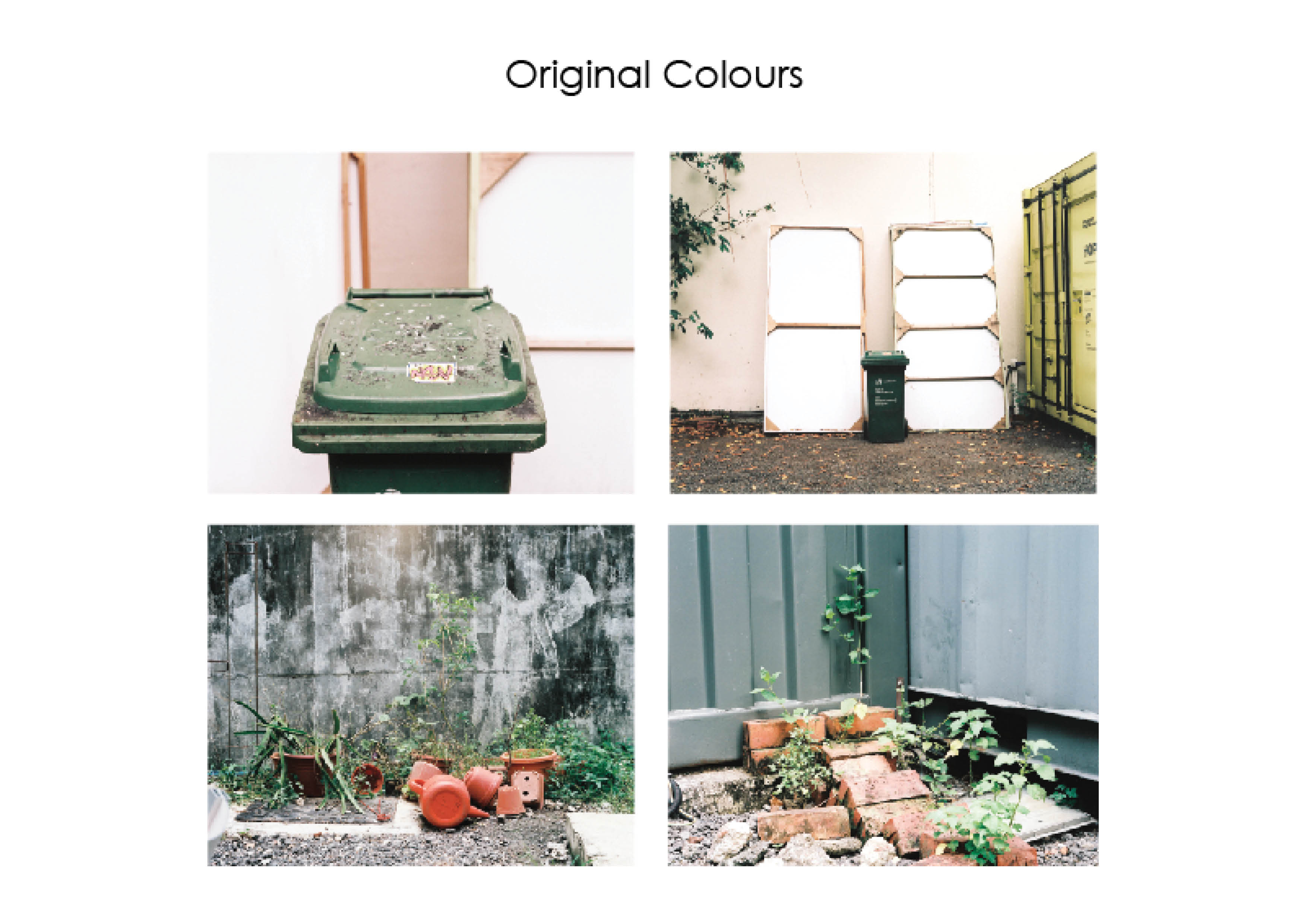
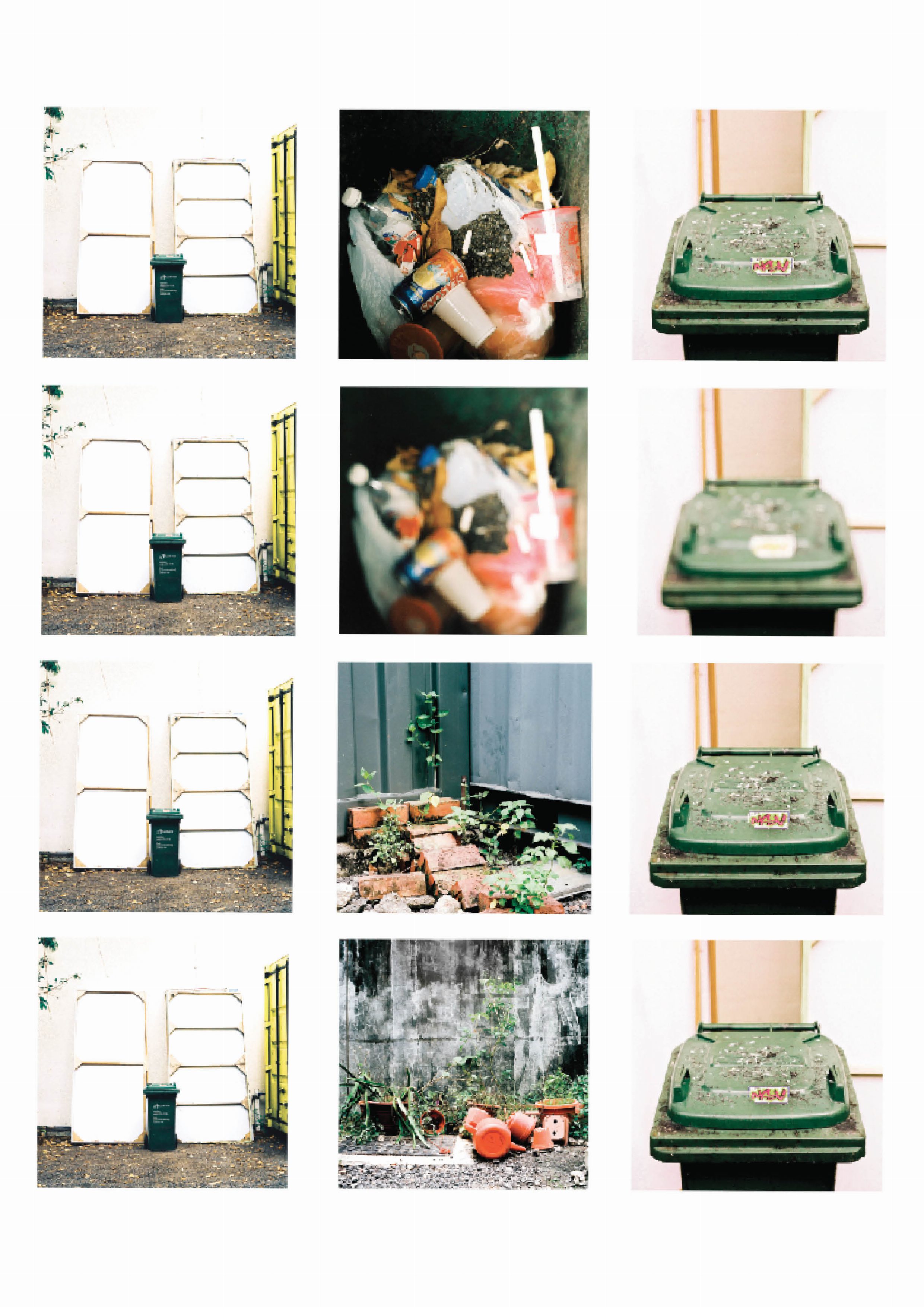
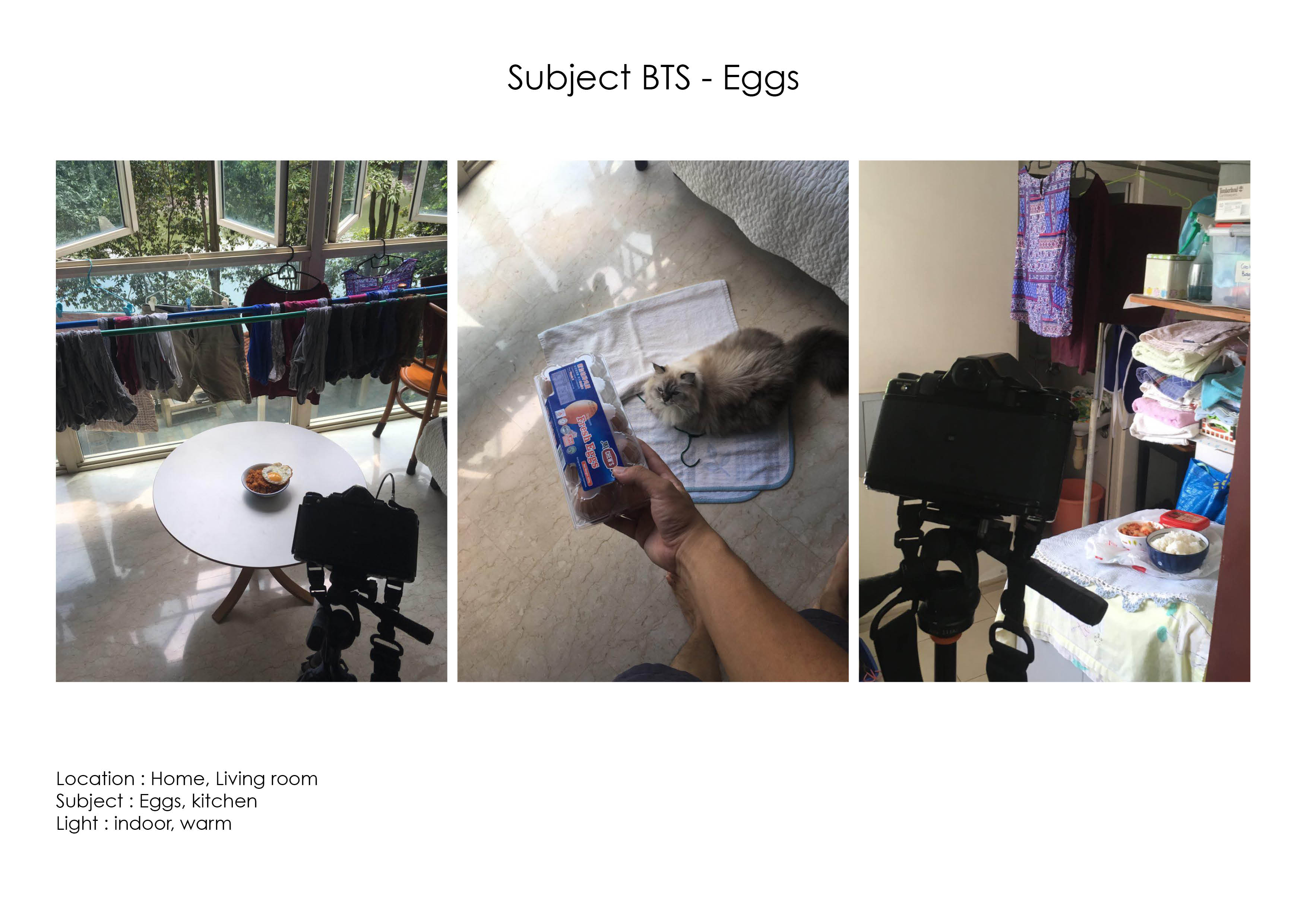
For this sequence I plan to use the triadic colour harmony that features red, blue and yellow. As the shoot is in a controlled environment at home, I had more control in terms of including elements within the image taken. I included small elements such as the NTUC plastic bag which have vibrant red and blues into the image to reinforce the colour theme. The backdrop also featured a blue Ikea bag that provided blue and yellow tones into the image. |


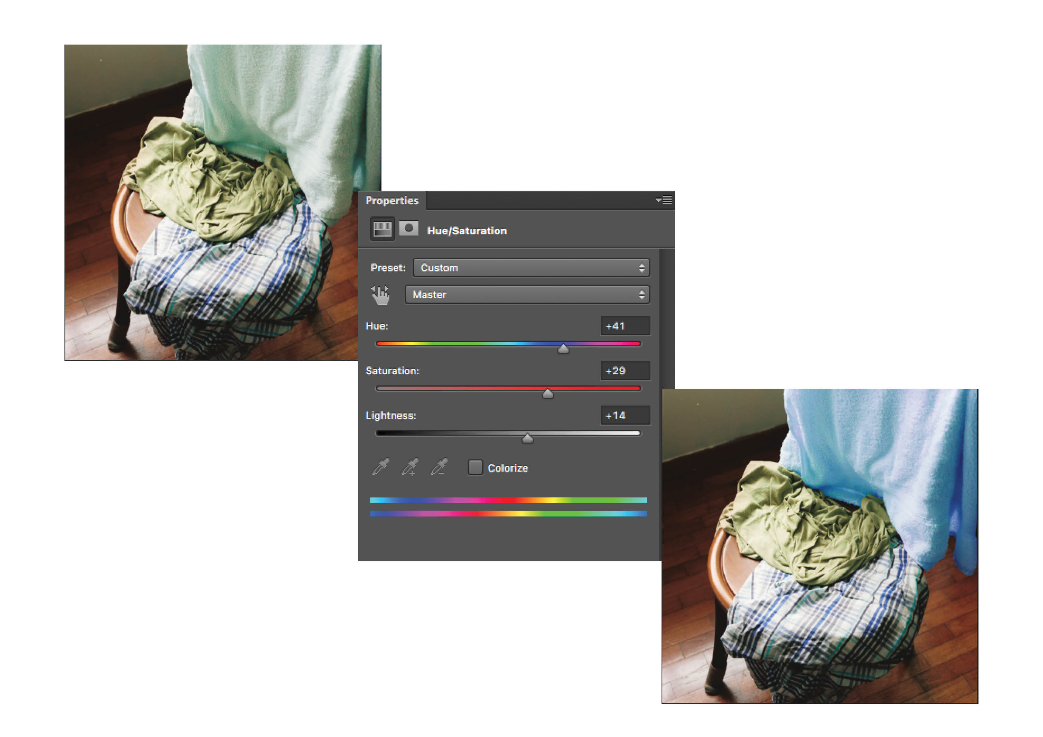
| The original colours of the shots leaned towards an orange hue. I had to correct the overall warm glow of the photographs and then increased the saturation and luminance of the reds and the yellows to make sure they do not blend with the background.
The primary colours should come from the subject, which is the elements of the kimchi fried rice. I then enhanced those elements to allow them to stand out with the aid of colour. |
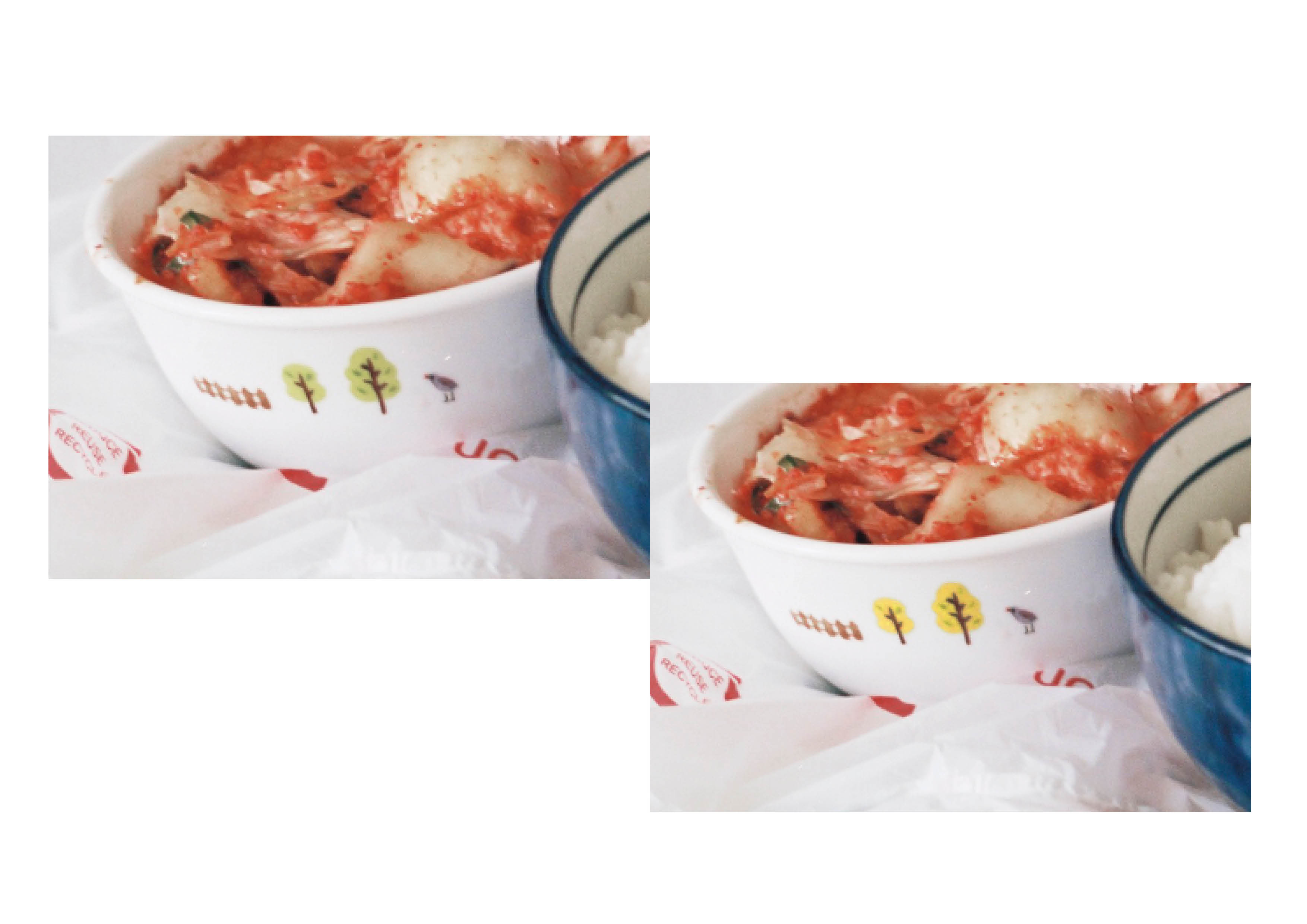
| As the main 3 colours in the chosen triadic harmony are red, blue and yellow, I had to correct the colours of some details and elements that may be distracting. For example, I edited the the trees on the bowl to have a yellow finish instead, to avoid introducing another colour into the triadic colour harmony. |

| I also corrected the glow of the yolk to be more yellow. However after consultation with my tutor and peers, the original colour way suited the sequence better. |

| Due to the issues that came up during print (which will be covered in later), the final image was left un-cropped with brought in elements of the window in the background. This also introduced some greens in to the image which I then attempted to alter the hues to match the blues in the sequence. It was a pity I wasn’t able to salvage the crop but i guess that was takeaway i can keep. |
SEQUENCE 4

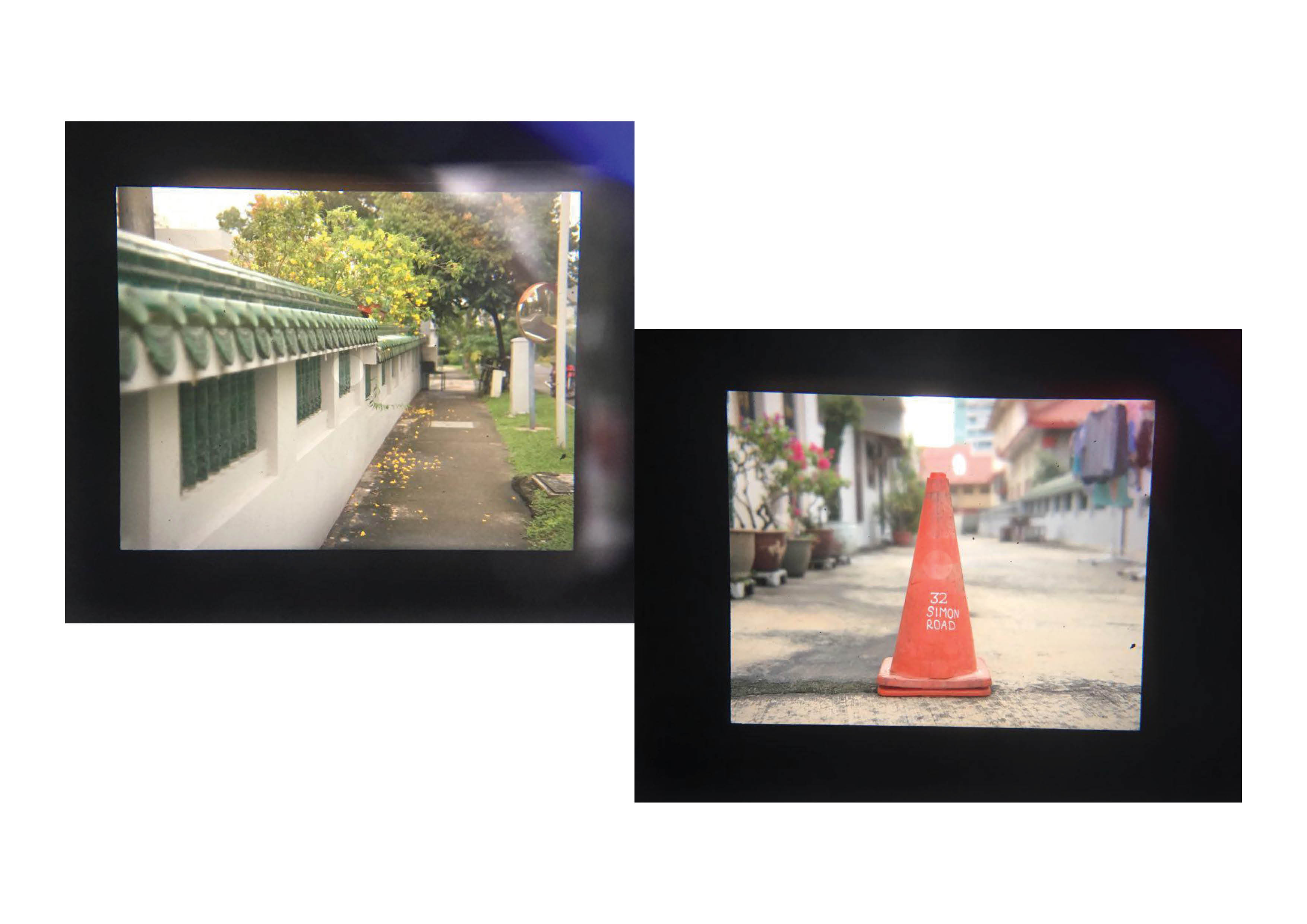
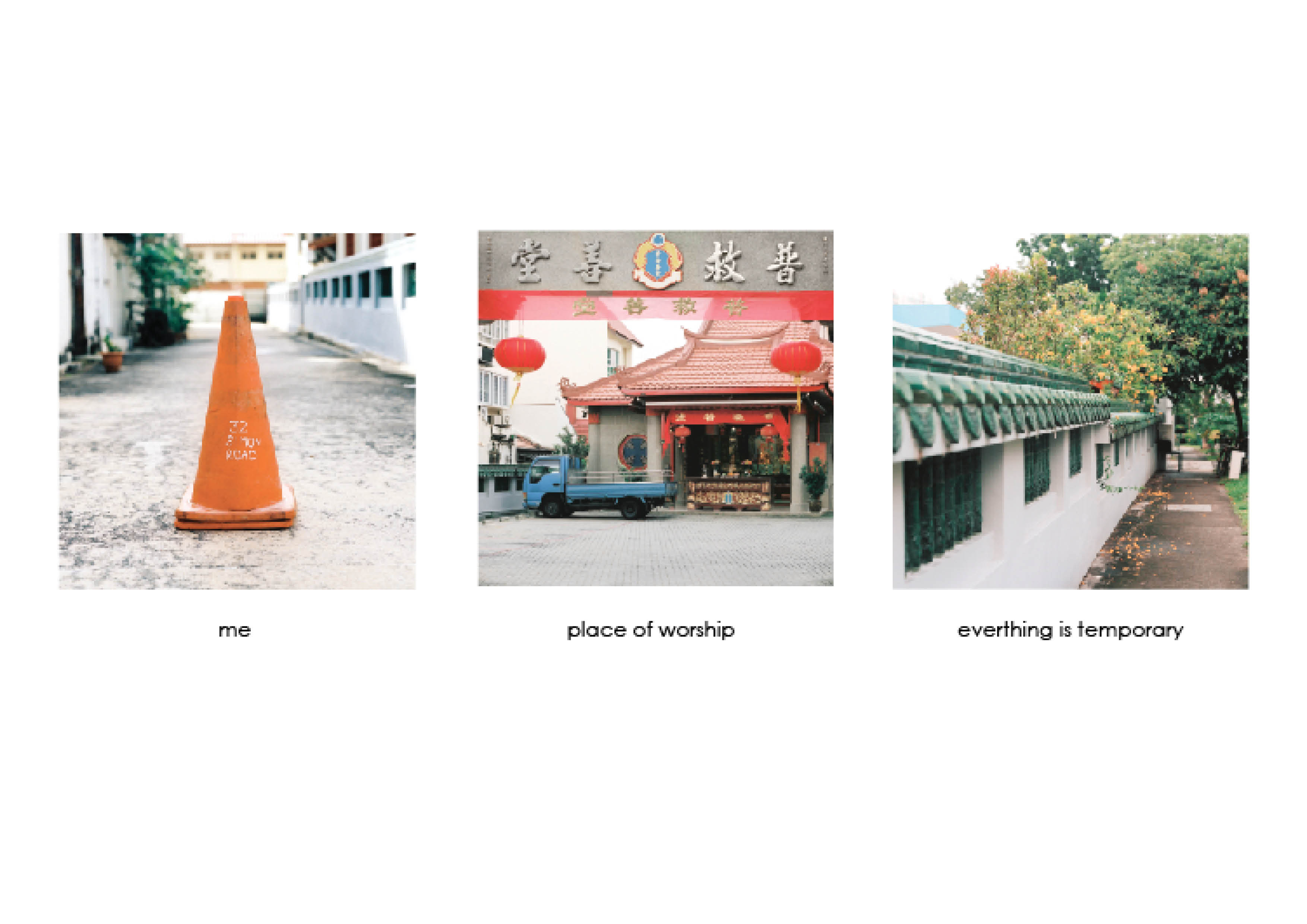
| The fourth and last sequence revolved around the temple as a subject. There is no main subject in focus for this sequence but rather the idea of the connotation a location holds.
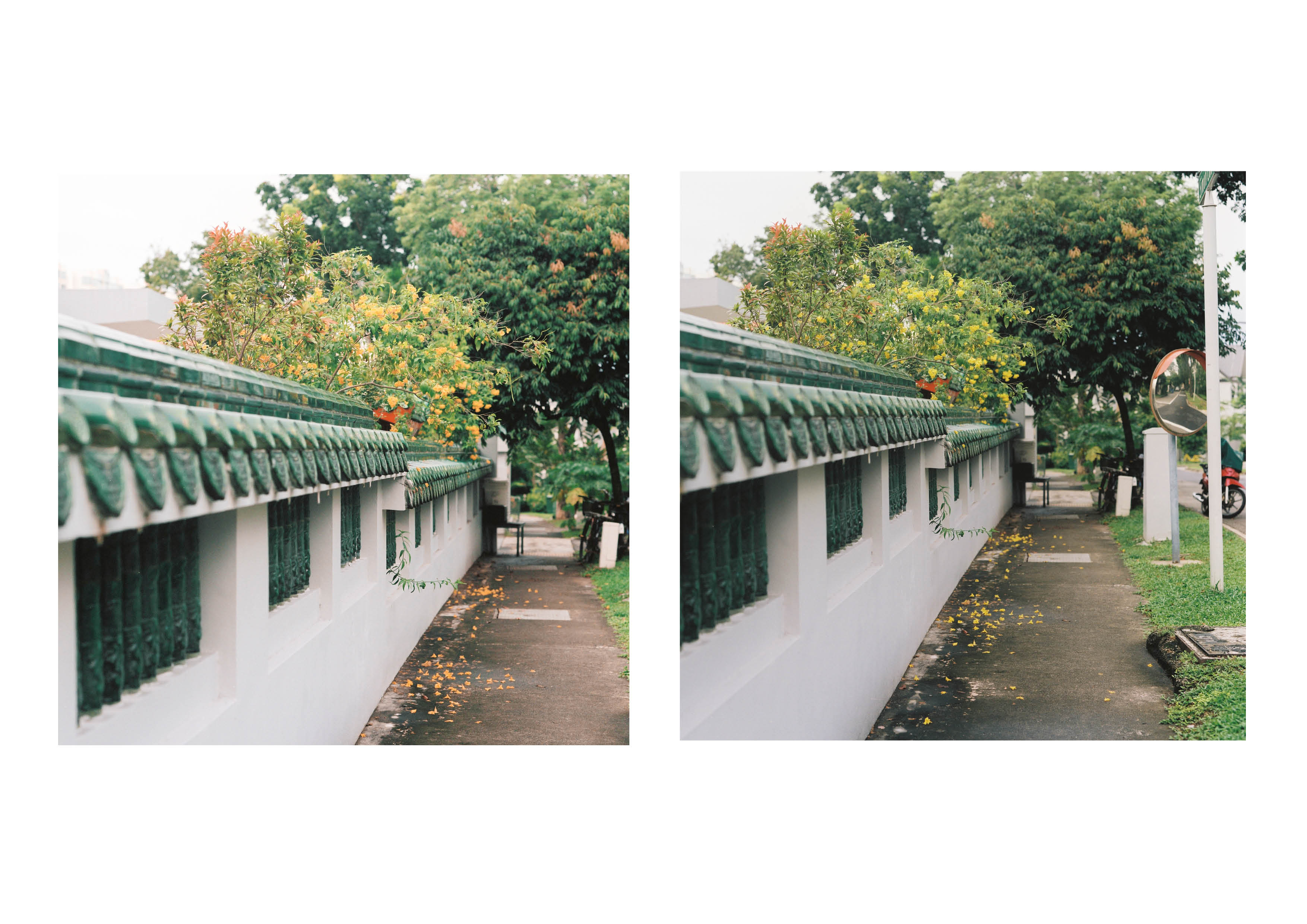
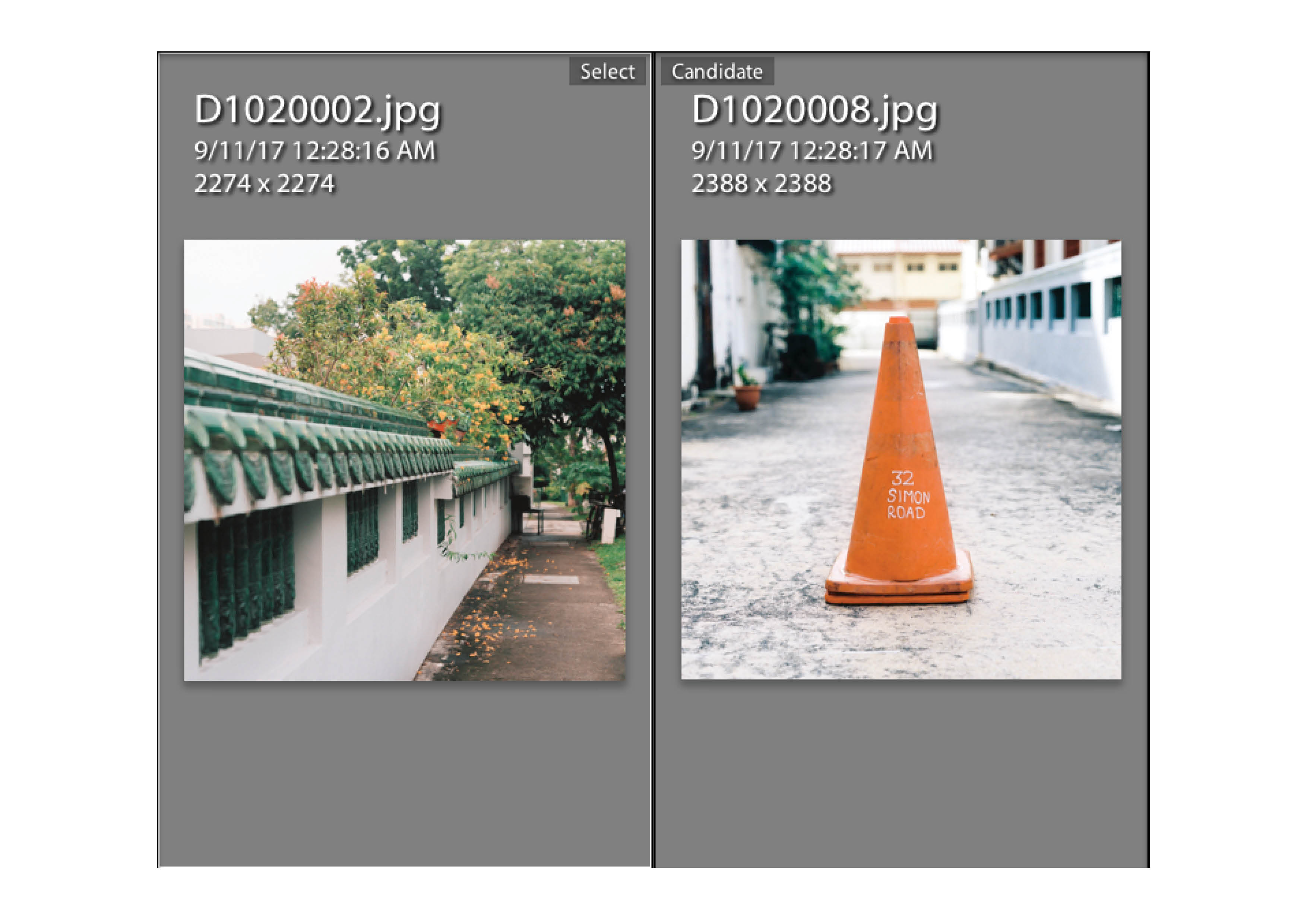
I identified myself with a traffic cone marker beside the Phoh Kiu Siang T’ng temple that had the temple’s address on it. It alone does not have any meaning but in the compound of a temple it becomes a small landmark holding the name of the place of worship. The temple is special to me as it holds my grandfather’s ashes. Places of worship to me slowly grew to becoming places that holds death or becomes the resting place of the dead. It brings about the idea of how earthly life is temporary and cyclical. I represented this idea through the last square which featured a flowering tree with some flowers falling off and slowly losing its colour on the floor. After walking around the space for awhile, I figured that the tetradic color harmony of blue,green,orange and red stands out in the location. |

| The original colours that came out from the camera were well saturated. However to match the tetradic colour harmony, the yellows in the image had to be converted to orange. There are some elements that are sitting in between orange and red that have to be corrected to suit the harmony too. |
| The biggest change was the colour of the flowers as i felt if i altered it they would look strange. Thankfully they turned out alright and i also decreased the saturation of the traffic cone to allow it to match the hues of the orange flowers. |

| After the consultation, I received feedback that the signage of the temple was distracting as it introduced a muted yellow into the colour harmony. After getting quite abit of help from my fellow classmates, we figured the easiest way of getting rid of the yellow is to match the signage with the granite colours of it’s backing. |

| One other issue that surfaced was the last square which lacked a colour for it to be part of the tetradic colour harmony. The composition lacked the blue of which there were various options to work around it with. One of the options is to change the colour harmony to a split complementary of green orange and purple. I decided to stick with the tetradic harmony for consistency throughout the series and added a light blue outline to the building on the top left. It’s pastel finish camouflages in well and blended well with the hues of the sky. |
TEST PRINTS
| After the first two equations were approved, I went ahead to try out some test prints to see if the colours come out right. I printed the photos on 250 gsm matte paper as i felt the colours may go off if I were using a thinner paper. I chose matte over glossy as my previous experience with gloss resulted in prints being too saturated and the reflection could be pretty annoying |
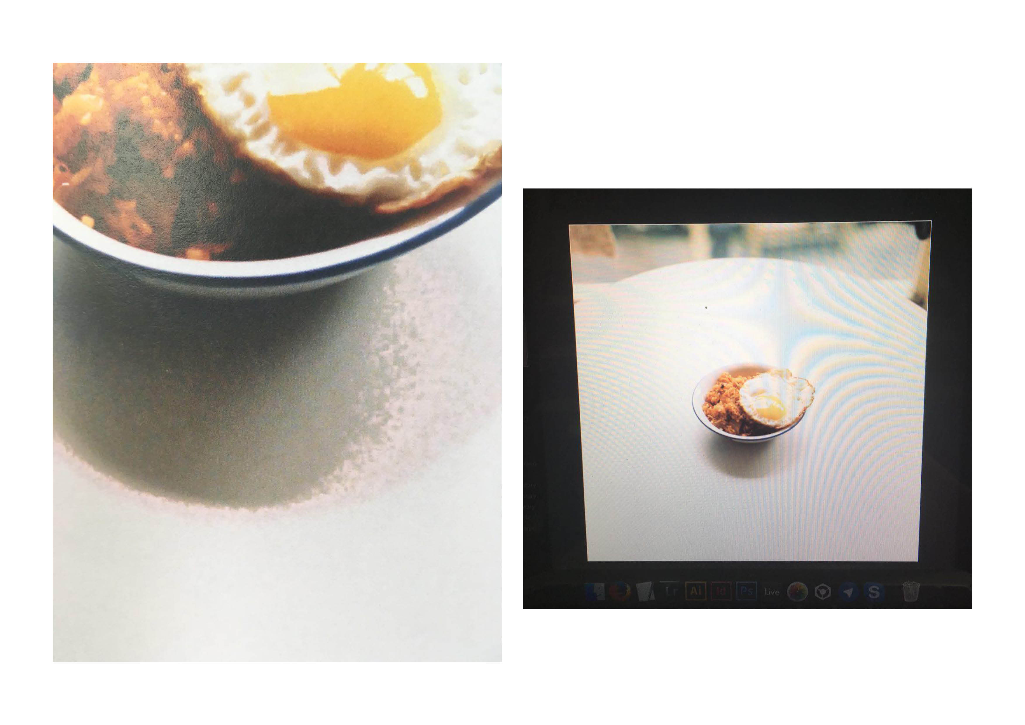
| Just when i thought all was well, the reality of bad quality lab scans hit me real hard. One of the rice compositions was heavily pixelized as the lab scans of my film roll was low in resolution.
Commercial film labs in Singapore cater for the general crowd, so the scans are just sufficient for web publishing. This was a factor i totally overlooked which was made worse as I cropped into the image of the rice bowl. After various tries on salvaging the original image through digital means, the pixelation was way too horrible to be exhibited on the wall for crit. I therefore used the uncropped version instead, that thankfully suited the colour harmony as well as bringing the whole homely vibe of the line together. |