final project – call to hold

call to hold


call to hold is an attempt on shaping the sound of feedback into a sound that can be controlled and manipulated. The device works around the main sound of a feedback loop generated by picking up environmental sounds, growing and distorting and getting louder. To keep the sound alive without peaking, the volume and lower end frequencies can be adjusted to shape and tone the sound of the feedback. These parameters are controlled with the gestural inputs of the rotation of the first palm over the sensor, and the second hand’s distance to the sensor. The experience becomes a small game of balance and improvisation.

Developments


The initial idea was to have a small brass and wood sculpture featuring a rotating contraption with multiple small microphones. These microphones are contained within a structure of small speakers, and through the rotation and movement of the microphones passing the speakers, they will create small tones and blips of feedback.

However through the process of making small electret condenser mic / preamp/ speaker circuits, I learnt that there is a certain balance of the amplification and frequency for the feedback sound to occur.

A brief example of the frequency of the speakers generating different tones of feedback can be seen through this video:

My back up was to use a microphone and speaker that is tried and tested, in terms of creating feedback. The movement instead would be tugging onto the microphone to let it swing slowly across the speaker. This doesn’t change the quality of the sound as the mic is a directional mic, therefore the movement just acts as a on/off character to the sound of the feedback.

The piece later developed into having the input of the mic go through a volume and eq control, this is done by touch designer. I isolated the gestures of the rotation of a palm and the varying height of the other hand to control these parameters.


Reflections

After some interactions from other participants messing around with the device, I learnt that visual feedback is important to keeping the attention and interest of the user. The participants often use the volume and frequency gauge to see if they are doing the right thing or not, rather than experimenting the relationship of the gestures to the sound.

I didn’t really put the user interface as priority as the device was meant to be more of a performative tool. The movement of the hands had potential for it to have a choreographic element to the experience. When I was documenting it with the lights the shadows casted accompanied with the sounds made for a pleasant connection.

Moving forwards I feel that more can be developed onto adjusting the EQs or adding modulation and tagging them onto specific fingers or gestures.
Project Management for Design Professionals

TO REACH THE END OF A PROJECT

This point in the reading that may seem very obvious and logical, however we often take it for granted when approaching a project. We assume that all the objectives within that point will be fulfilled as we complete a project but we may miss out crucial planning steps in the process. Listing out the various objectives such as budget, safety, expectations before executing a project allows for clarity when making decisions. The decisions made have to keep all the goals in check before proceeding, preventing irreversible problems that may crop up and snowball in the future.

For a case study, I will be using my recent project as a Technical Support and Artist Assistant for a children play space to highlight how the lack of planning in certain criteria resulted in the respective issues that surfaced. The project was completed but I seem to be constantly going back to fix or check on things, so have I actually reached the end of a project?

TO REACH THE END ERROR FREE

To create a work that is error free begins with working with tools / technology that you have experience and confidence in. Ideally if it’s a service you provide, it should be something within your speciality that you can offer with pride. However, the interactive pieces we designed were developed on the go with allowance to learn while creating the work. Therefore some of the elements are not tried and tested and resulted in longer hours in de-bugging and troubleshooting. This required me to go down on every other week when the space reports an error on when something starts to fall apart. From this I can reflect that reaching the end error free starts with setting boundaries and managing expectations when planning these devices. There is room to try new methods but there should be at least a fail safe if that experiment to extend the experience does not work out technically. With a device that doesn’t function 100% without supervision, it results to man hours being wasted in repairing and debugging that could be invested in other parts of the project. As a result of going ahead and developing the interactive element, there is a high risk of not being able to fulfil the desired product of the overall project.

TO REACH THE END MEETING EVERYONE’S EXPECTATIONS

As the tech support, I had to fulfil the expectations of the artist as well as the project manager. One of the errors on my part was over promising certain interactions when brainstorming and allowing the planning to continue with those proposed elements to be catered for in terms of vision, time and budget. I ended up spending more time trying to fix an element rather than using the stipulated time to create the other pieces. We ended up simplifying certain interactive elements to cater for the ones that had more errors. Although my role was not as a project manager, I have still had expectations from the artist, the manager and my own to meet. Setting boundaries on what’s realistic and executable is extremely important as it sets the baseline on what can be delivered. Additionally, these steps can only be done when there is honest and clear communication between the various members of the team. Being comfortable to raise concerns and needs allows for problems to be attended to immediately and not grow into a severe one further into a project.
The reading emphasises this point with what makes a good project manager. A project manager has the responsibility to understand, respect and respond to the various motivations of each team member. They are also required to be well versed in the profession territory, knowing enough about the nature of work to understand what their team members can do and their limits. The project manager for this space was the coordinator from the venue. She understood her space very well in terms of what the client requires as well as working with the artist and technical team. As this project was sensor and electronic heavy, she had foresight of giving more time for the development knowing that anything with electronics will come with their difficulties. A project manager knows about all the tasks but is not a specialised expert in all of them. She was able to provide resources to me as the technical support when I came across technical walls and bugs. Instead of trying to help solve the issues in my language, she provided solutions to the problem that are outside of tech to create the same end result experience.

The transmission of ideas: instruction-based artworks

Sol Lewitt

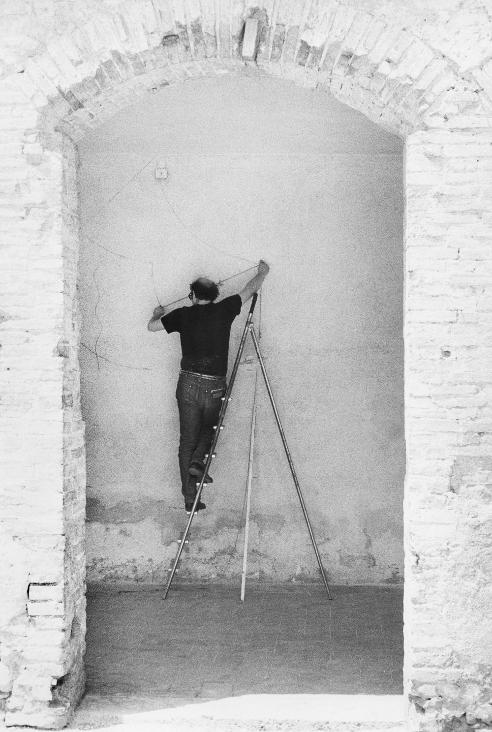
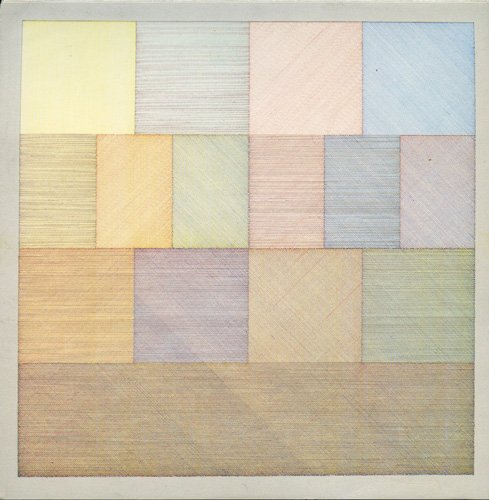
One of the ideas that i was drawn towards from the exhibition was the idea of works that are recreated by the artist studio in a space. Some of the works are recreations of the original concept which are recreated through specific instructions. The primary example would be Sol Lewitt’s wall drawings that consists of huge panels created by colour pencil lines on the gallery wall. The work required draftsman locally to carefully draw layers of coloured lines on top of each other creating a soft pastel wall of which was a spectacle in size. While I adore the idea of instruction-based installations, a few fun questions were running in my head.

the medium is not the end

Lewitt’s approach on the wall drawings was firstly to focus on the idea of communication between the artist and the audience. This idea was expressed in one of his earlier inspirations by Seth Siegalaub’s project The Xerox Book where Siegalaub invited various artists to contribute pieces to a book that would be cheaply reproduced by the Xerox machine. Siegalaub described the Xerox process as ‘such a bland, shitty reproduction, really just for the exchange of information’ . I felt this statement resonated with the concept on instructional based work of which the medium is transient and temporary. It’s just taking in form of a messenger to communicate the idea across to the audience. The importance of the work then lies more on how specific and detailed the instructions are. On how after various reiterations of the work, it’s still identical in technical execution.

the context of the space

The medium of drawing with colour pencils is relatively accessible to the common man. So if I get my hands on the instructions of one of the drawings, does the work still hold it’s integrity if i attempted to recreate it in my own wall at home? Ignoring the ideas of legal ownership and representation by recreating the work as is questions the context of the work. Would the work still communicate the same message if it isn’t in a gallery or art space? Would it still work without it’s monetary value that justifies it’s credibility as art?

Restaging of Trisha Brown’s Sticks by dancers from LASALLE student dancers

recreations are always different

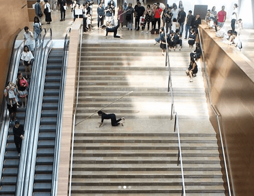
The curator mentioned due to the nature of how sol lewitt’s wall drawings are permanent on the gallery walls, they can’t be removed but will be painted over after. This results in each drawing being unique to the space and in such, there is no constant piece to be referenced as the benchmark. Therefore you never actually know what is the original and intended piece of the artists. This state of change in ideas are more prominent in the Trisha Brown dance pieces that I was watching a week before where the dance was restaged by local dance students. The transmission of the idea through the work is always different in the context it is staged in despite how much you can control the creation of the work. It encourages the timelessness of the piece as there is a new life to each iteration of the work, with a new collaborator or artist coming from a different time and place putting a part of them into the process.

External readings:
https://www.tate.org.uk/research/publications/tate-papers/14/ideas-in-transmission-lewitt-wall-drawings-and-the-question-of-medium

2D Project 3 Final : Ego in different settings

Ego in different settings

My previous research and process can be seen here:

Research

Process_1

Process_2

FINAL PRESENTATION

chair

chair
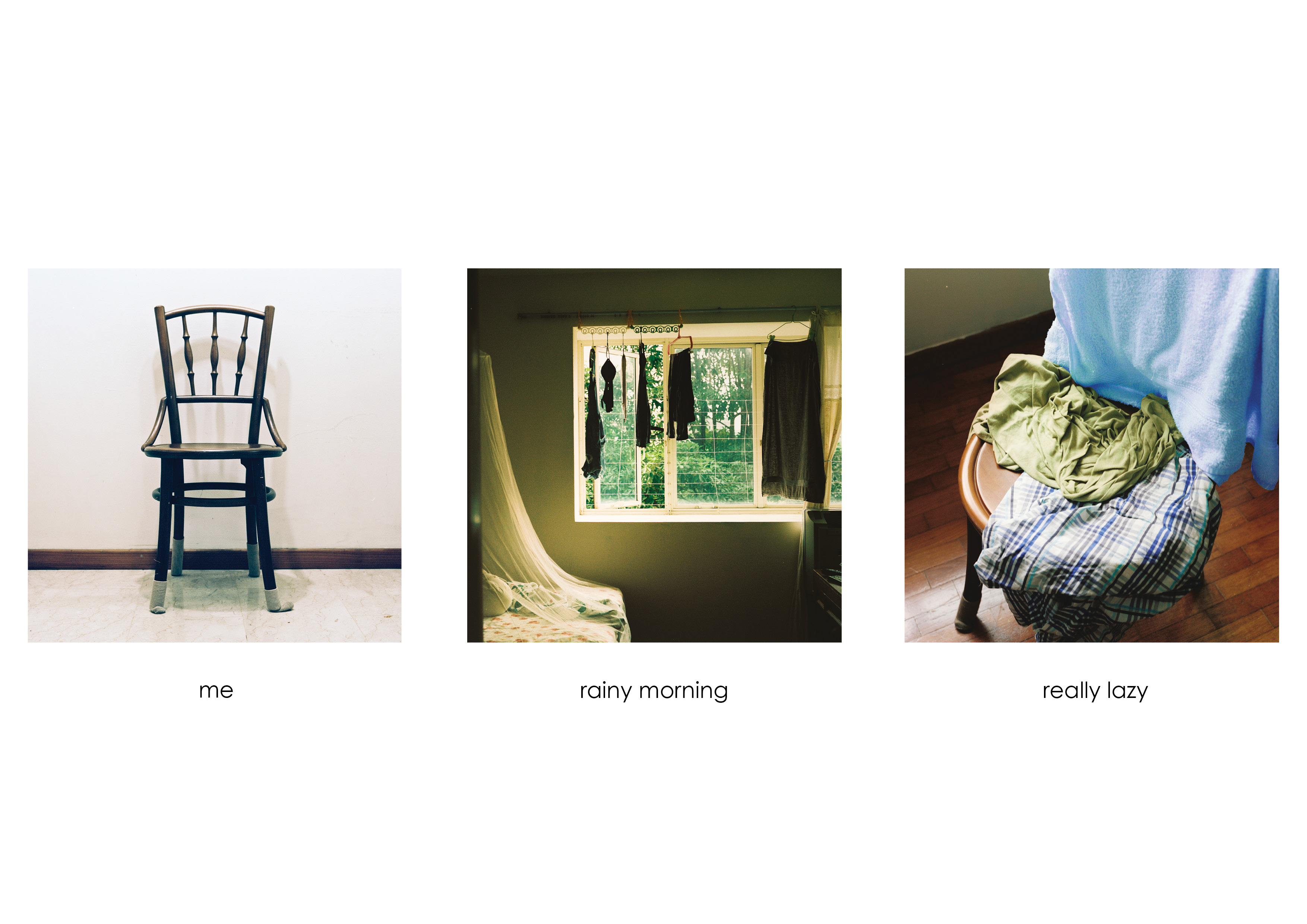
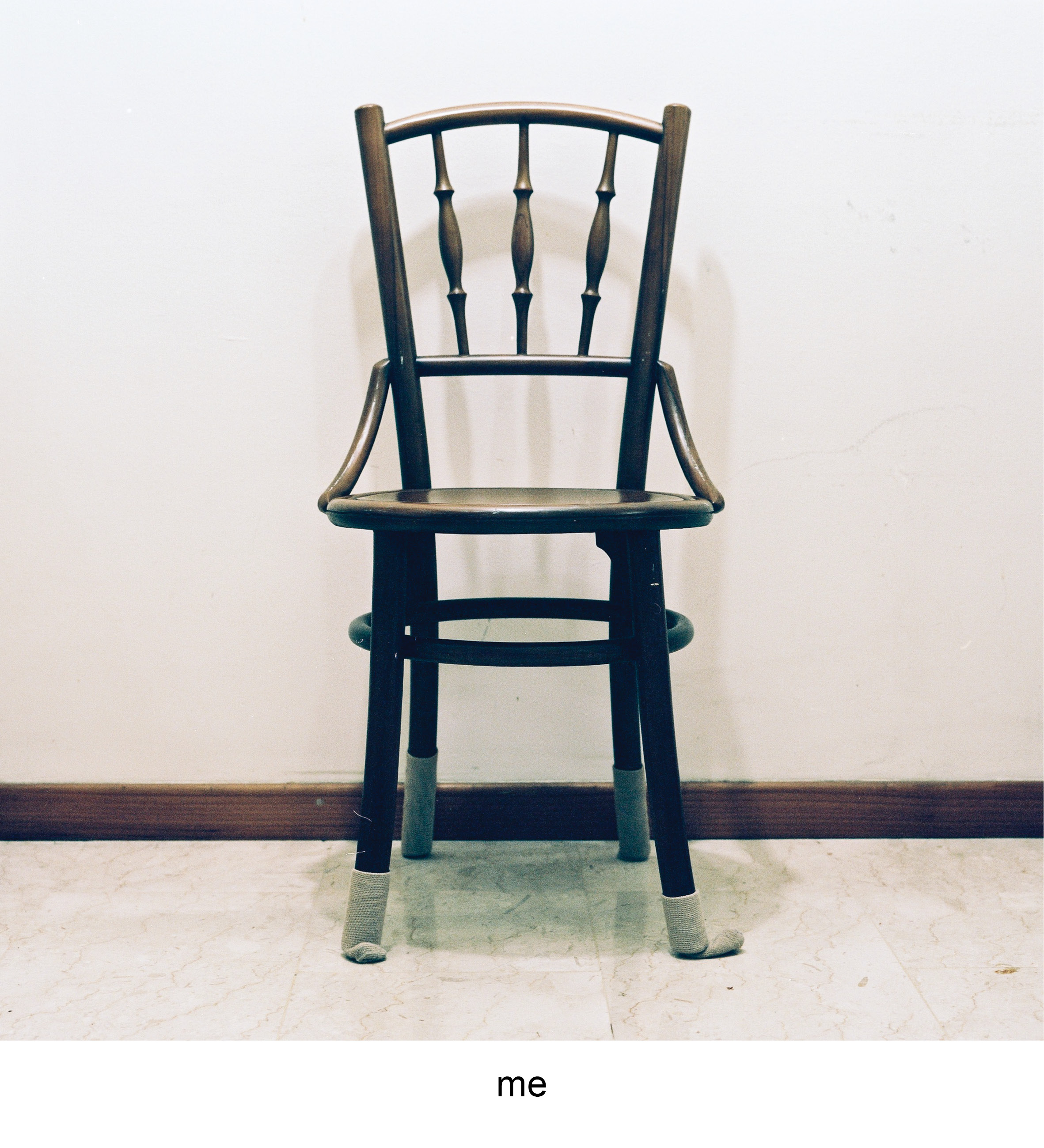
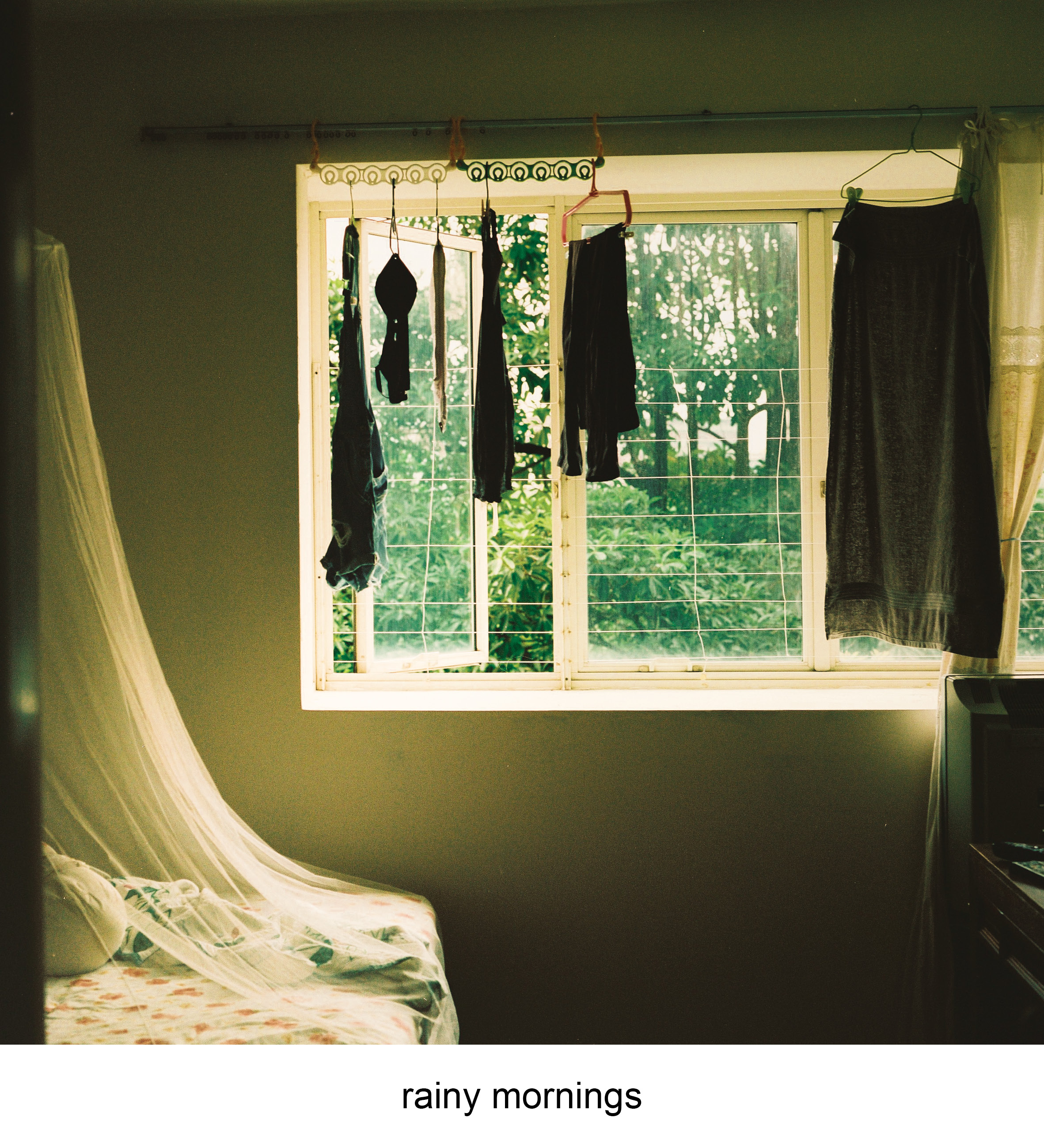
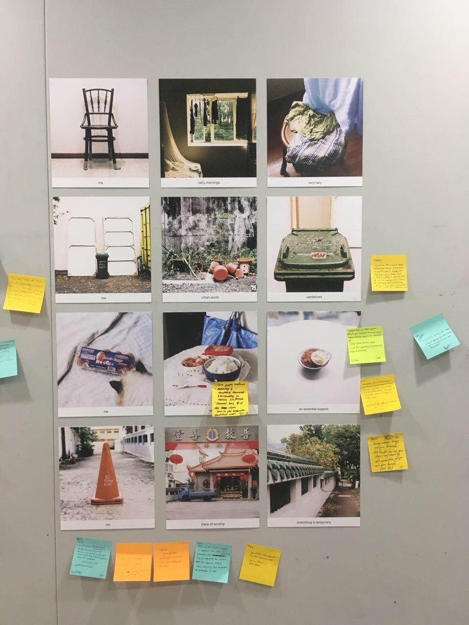
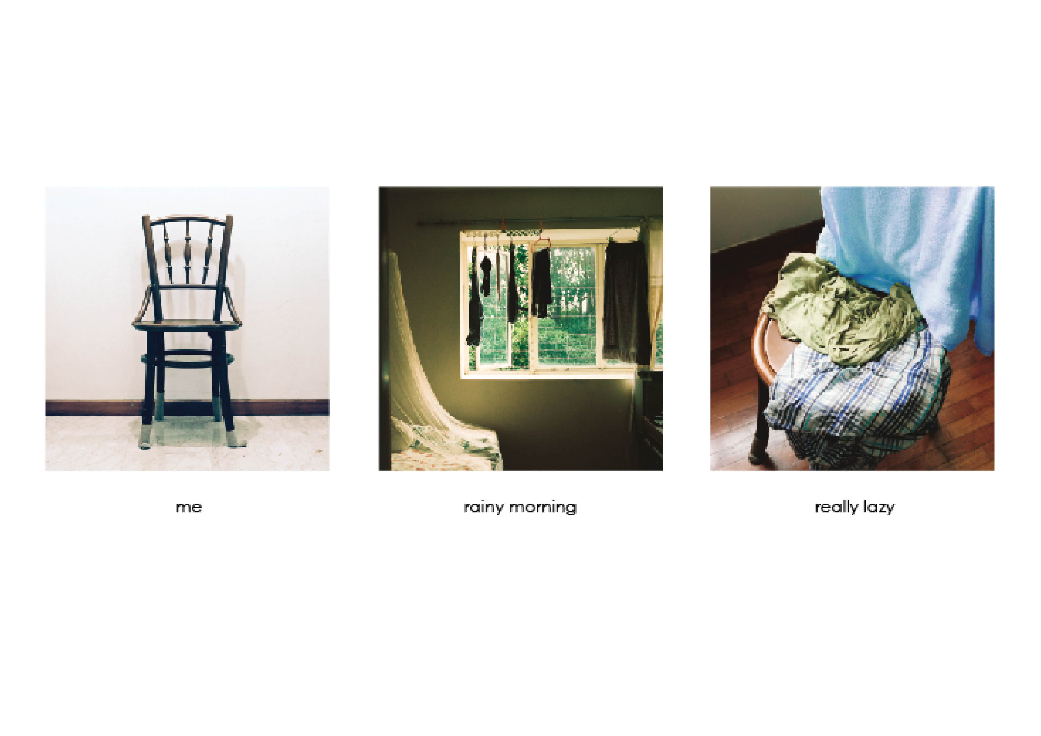
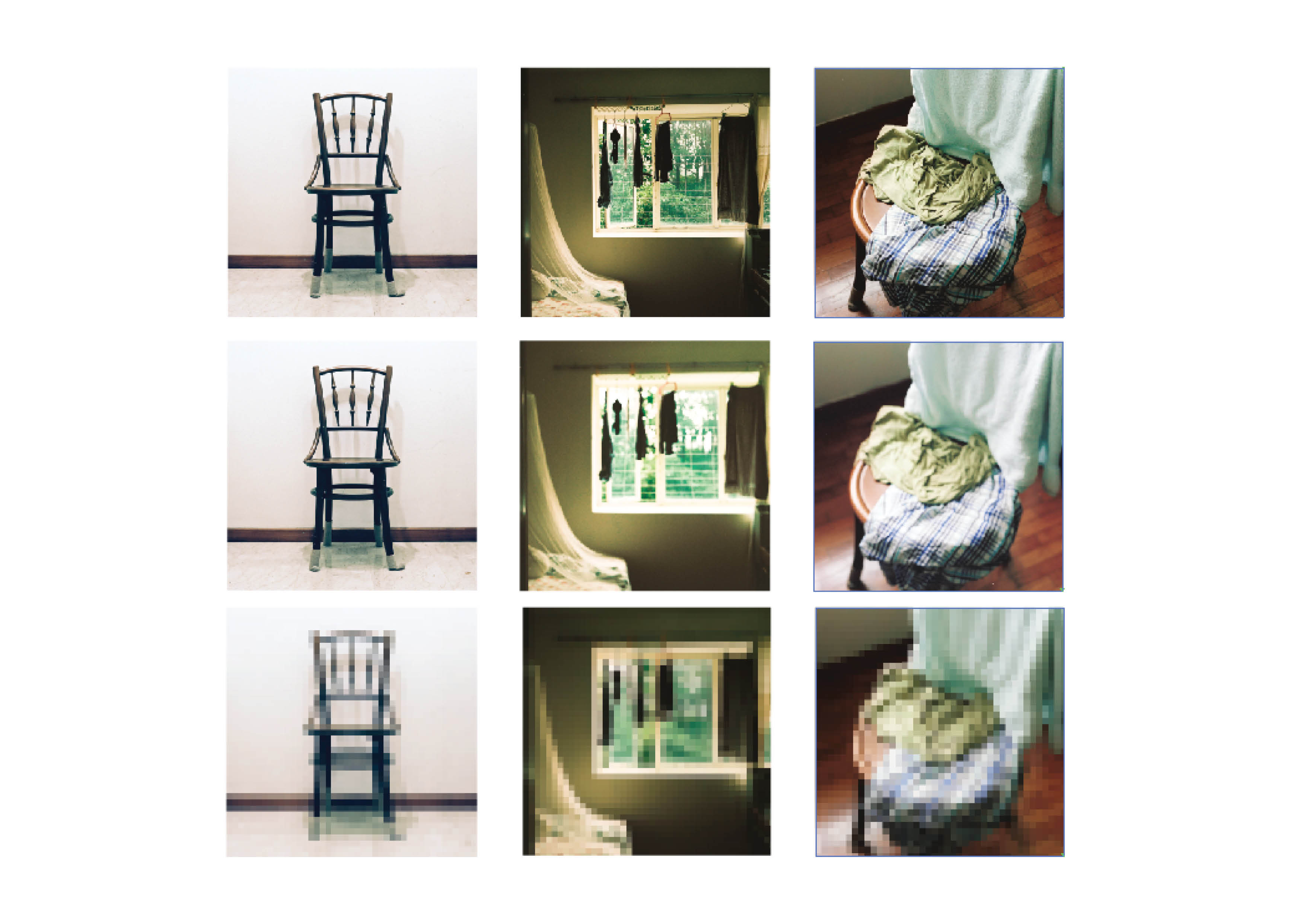
This project is a study on banal objects and how they adapt and change in the environment they are placed in. In the first equation I identified myself with a chair at home. Through the cozy weather when in rains, I get really lazy. The chair is a victim of my laziness as it takes up my sloth in through holding onto my clothes and laundry that will be dealt with later in the day


The colour harmony that is present throughout this equation is the split-complementary through the colours of green, blue and brown. The first photograph shows the chair in a neutral setting, where the individuality of it is played out through the presence of only a single deep brown colour of the chair.

The second photo shows a room, where the cool green colours from trees outside mimics the indoor hue when a gentle rain goes on in the morning. The gradient also splits the green into analogous green yellow.

The last photo shows the combination of both compositions with the chair being draped with clothes of blue and greens. It depicts the laziness of throwing clothes haphazardly on the chair and ties up the mood of the weather.


trash

trash
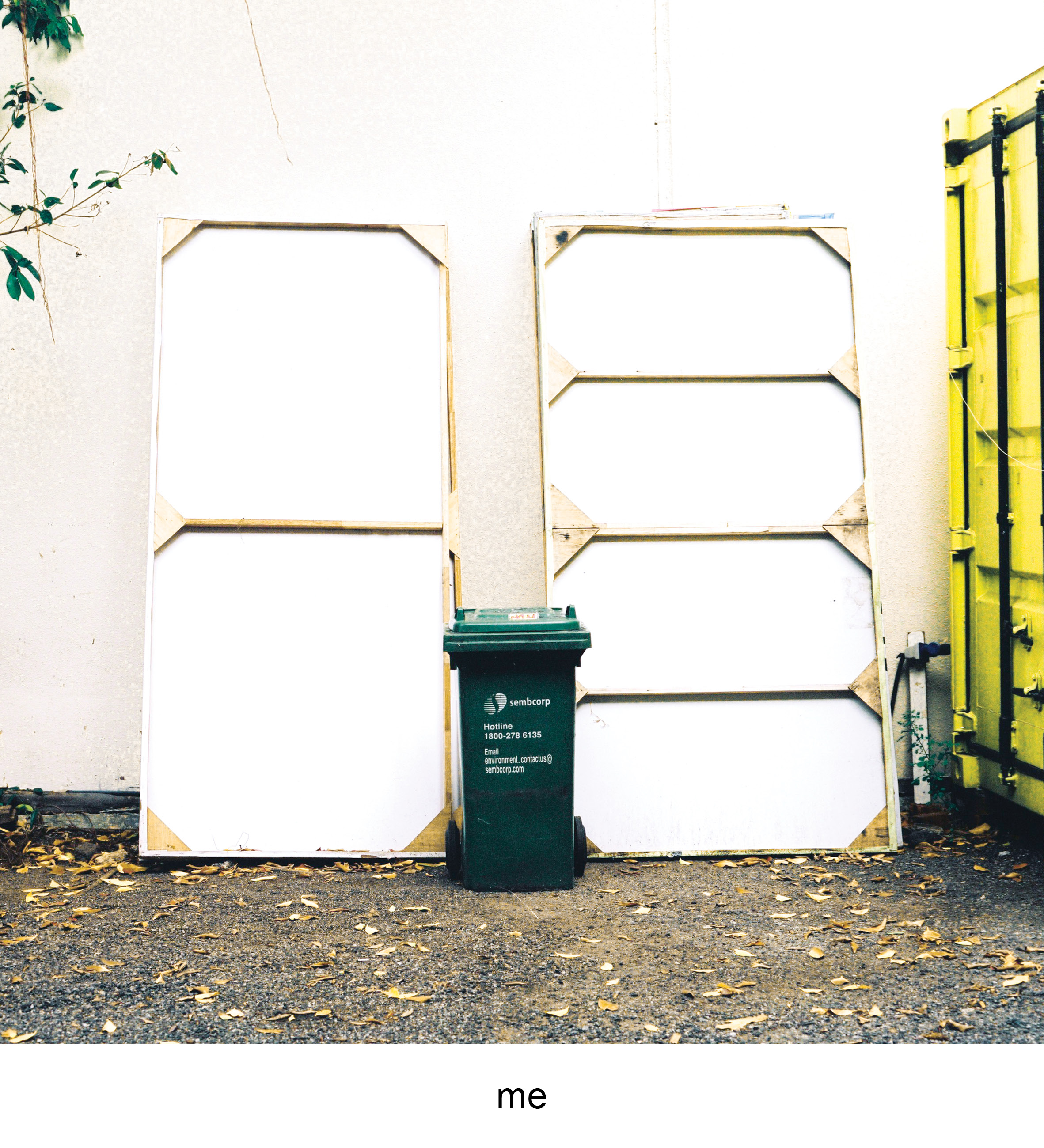
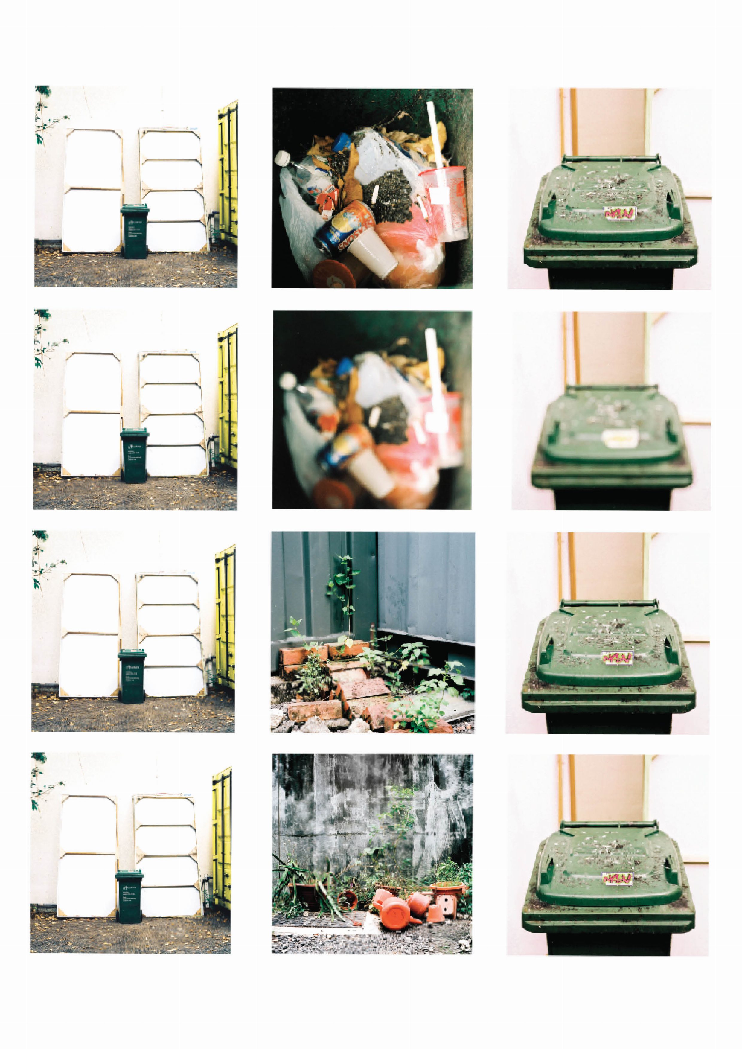
The green Sembcorp trash can is a common object that is found in almost every registered address. It sits right outside the compound with the address noted on the side. The trash bin to me is great representation of the activities that occur in a set place. Through its exterior and contents it leaves small traces that hints on the attitues, lifestyle and things the occupants of the address does on a daily basis.

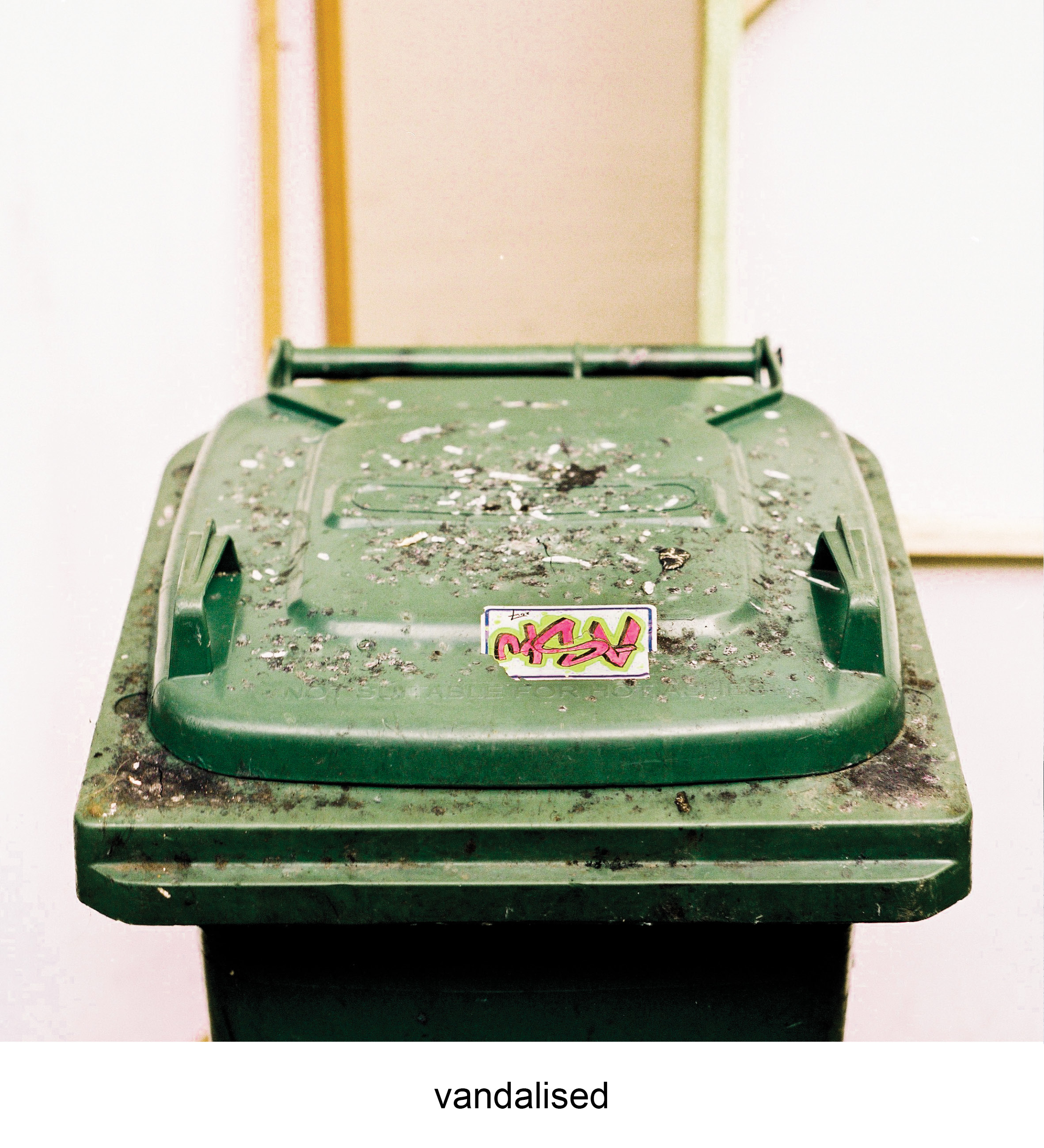
I identify myself with this trash bin as I felt it represents the the effects of urban life to humans, the jarring mix of dirty concrete and gravel compared to green fauna that is creeping through the cracks. Presented through the graffiti and cigarette marks on the trash bin, I echo the sentiments of the vandalism that is left on it. Living in the concrete world is not ideal but you have to stand through it.


The colour harmony used across equation is the split complementary colour scheme of green, orange and purple. The first photo uses an analogous green yellow, that highlights identifiable green of the trash bin in a neutral setting.

The second photo introduces an environment with the contrast of greens of the plants with the bright orange plastic pots and watering cans. The contrast brings a sense of uneasiness where one object do not belong with the other.

The last photo is a close up of the trash bin that presents the aftermath of what the environment has done to it. Similarly, there is a new contrast of colour of green and purple. However the green is not natural but in a plastic form of a trash bin and a new form of conflict is given through the bright purple of the graffiti. The uneasiness is replicated again however subverted as the green is “natural”, plastic instead of a plant.

Eggs

eggs
I don’t actually enjoy eating eggs usually, but they are my favourite ingredient. Fried eggs are the ultimate support in any dish. You can have a random plate of maggie which may be nice, but it becomes so much better when topped with a gooey fried egg on top. Fried eggs don’t taste much alone but they bring a dish to a whole new level of comfort.

The (super) fried egg is a metaphor of what i want to do in the future as an art assistant/technician. I hope to be able to be the support of artists in the future, bringing them advanced technical support in both traditional and contemporary mediums, allowing their work to be more impactful and timeless.


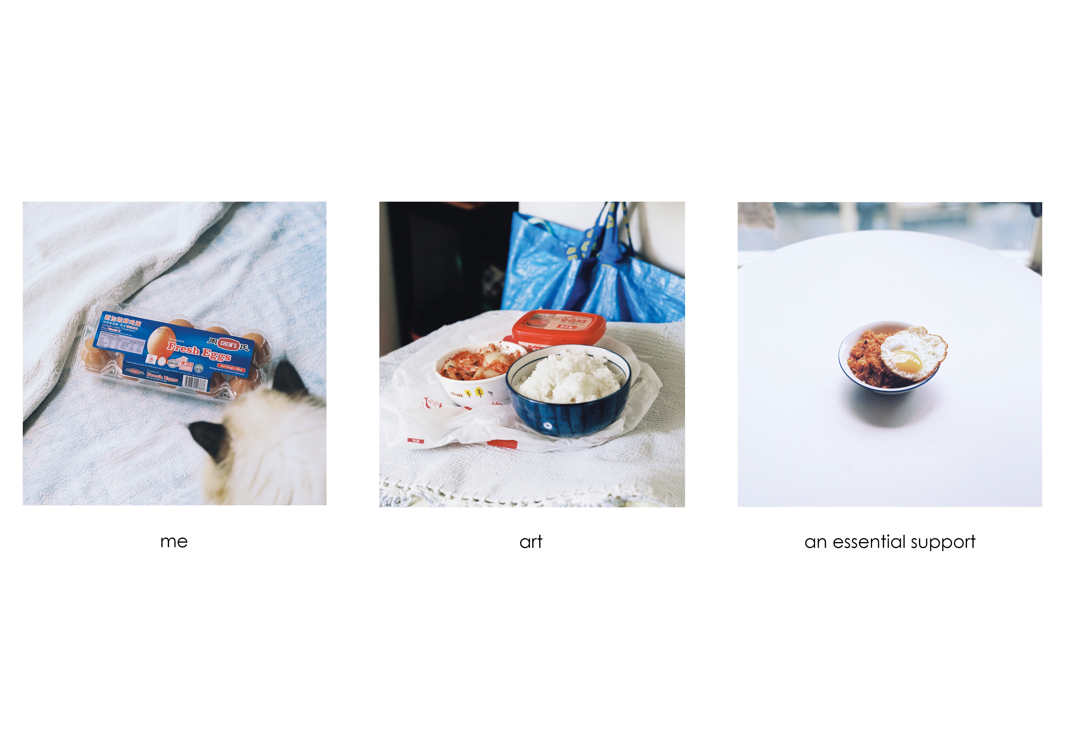
This equation uses the colour harmony of the triadic colour scheme of blue, red and yellow. The first photo shows the eggs in a neutral setting, uncooked and in shell. There is a sense of individuality in the composition as the primary colour in it is blue with hints of red from the packaging and shades of the eggshell.

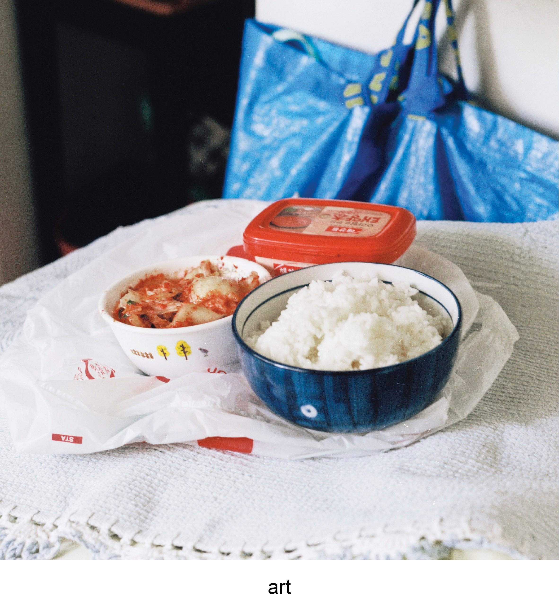
The second photo introduces the elements of red through the red pepper paste and kimchi in the bowl. The photo of raw ingredients to kimchi fried rice introduces a new subject of a finish dish, or a metaphor for art. The red complements the surrounding of blue tones from the Ikea bag and the blue bowl. The colours work together in sync as there is a balance of striking colours such as red with the cool colours of blue.

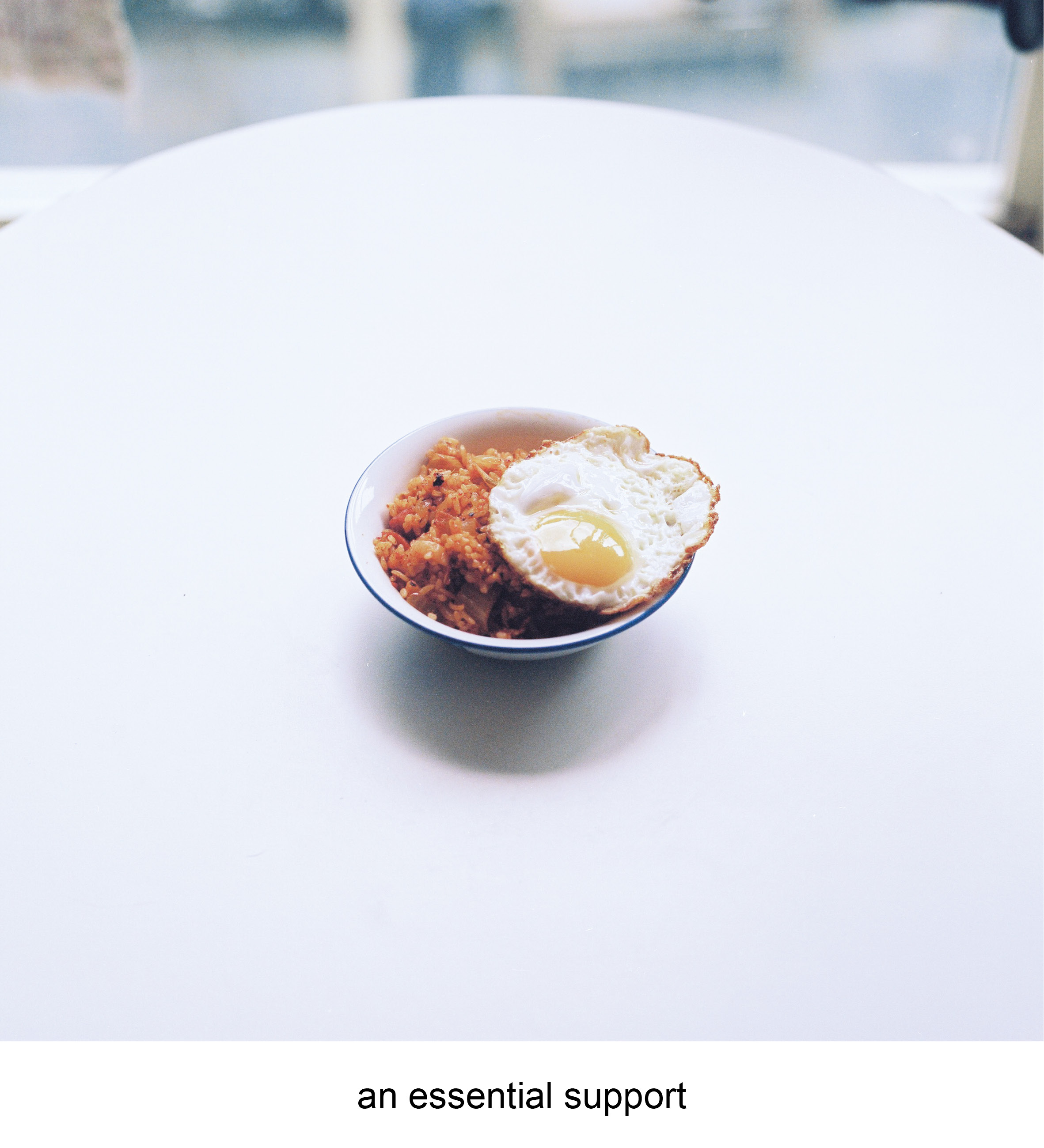
The last photo is culmination of both blue and red and a slight touch of yellow from the egg yolk. The final dish showcases how all elements work in harmony with no colours standing out, as a perfected dish.

temple

temple
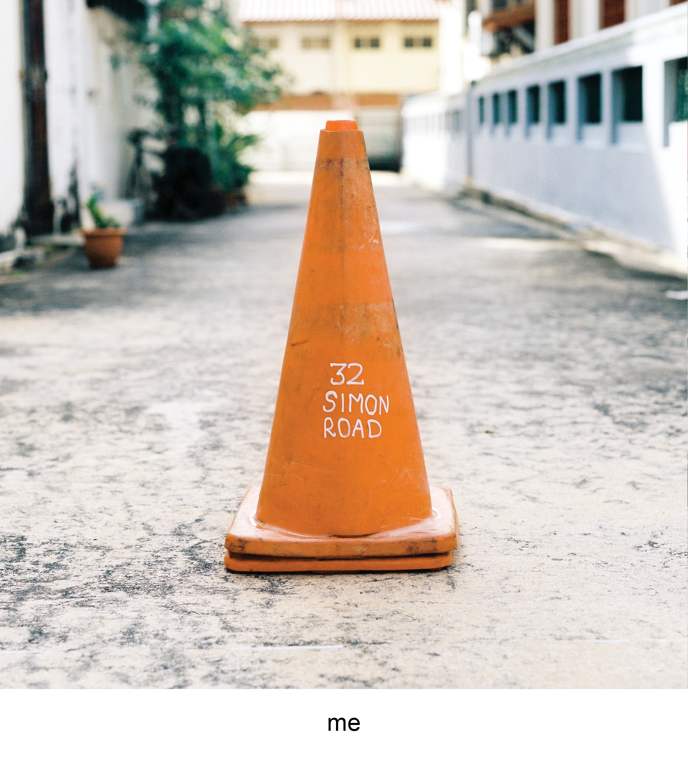
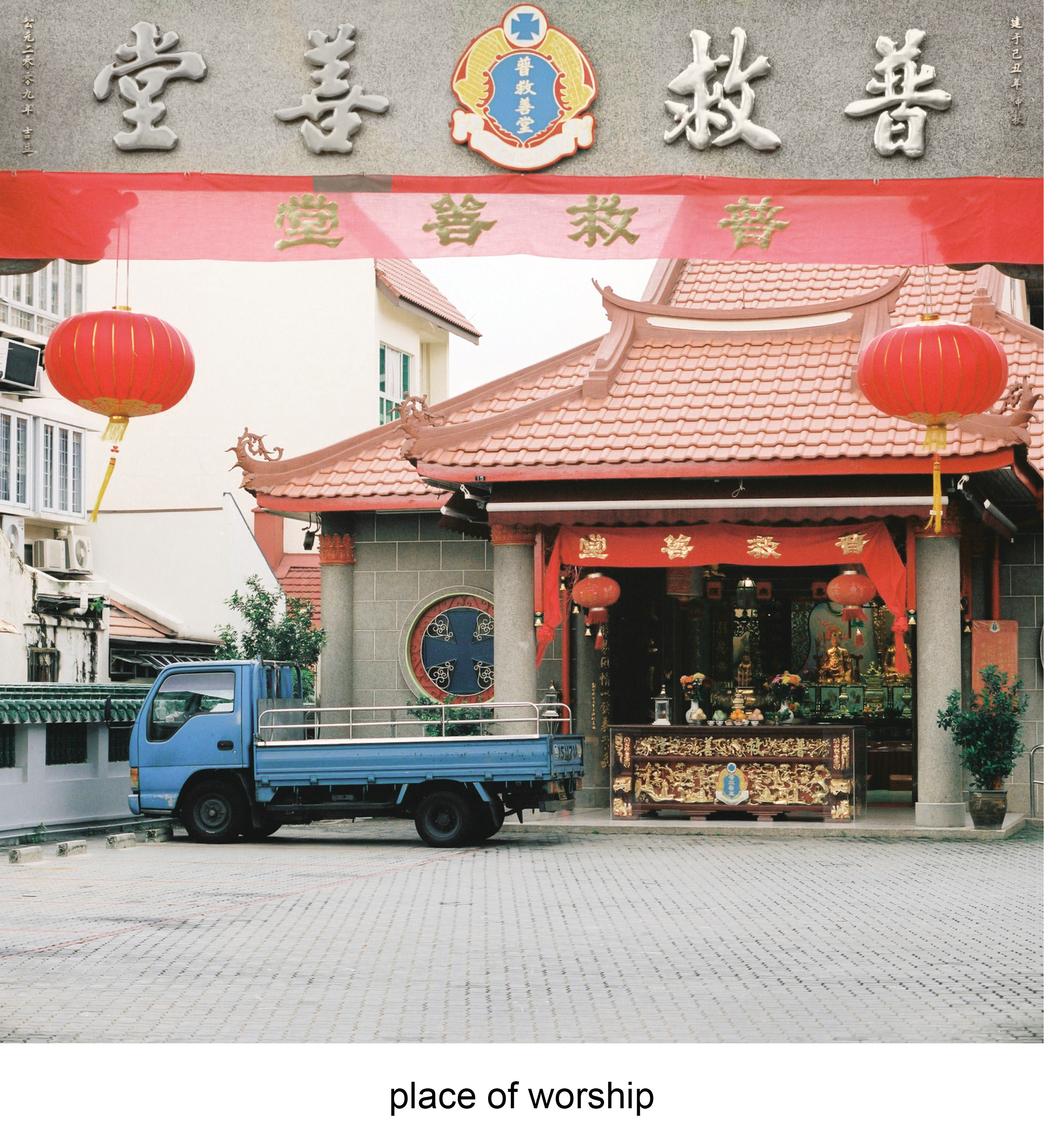
The last object i identified myself with was the traffic cone. Similarly to the trash bin, some of them have their addresses marked on them. Places don’t linger in a person’s mind generally unless they have a memory that is attached with it. They get special when the memory or event of it is strong, you start having a emotional connection to non living buildings, which is part amusing and yet nostalgic.

This traffic cone is the address of the temple my granddad’s ashes are placed in. Places of worship usually have the connotation of death with the current generation of mine where quite a few people I know do not follow a religion or faith. Temples then becomes a ritual of sorts where you only visit to pray or visit the dead. I personally find myself contemplating the idea of death whenever visiting the dead.

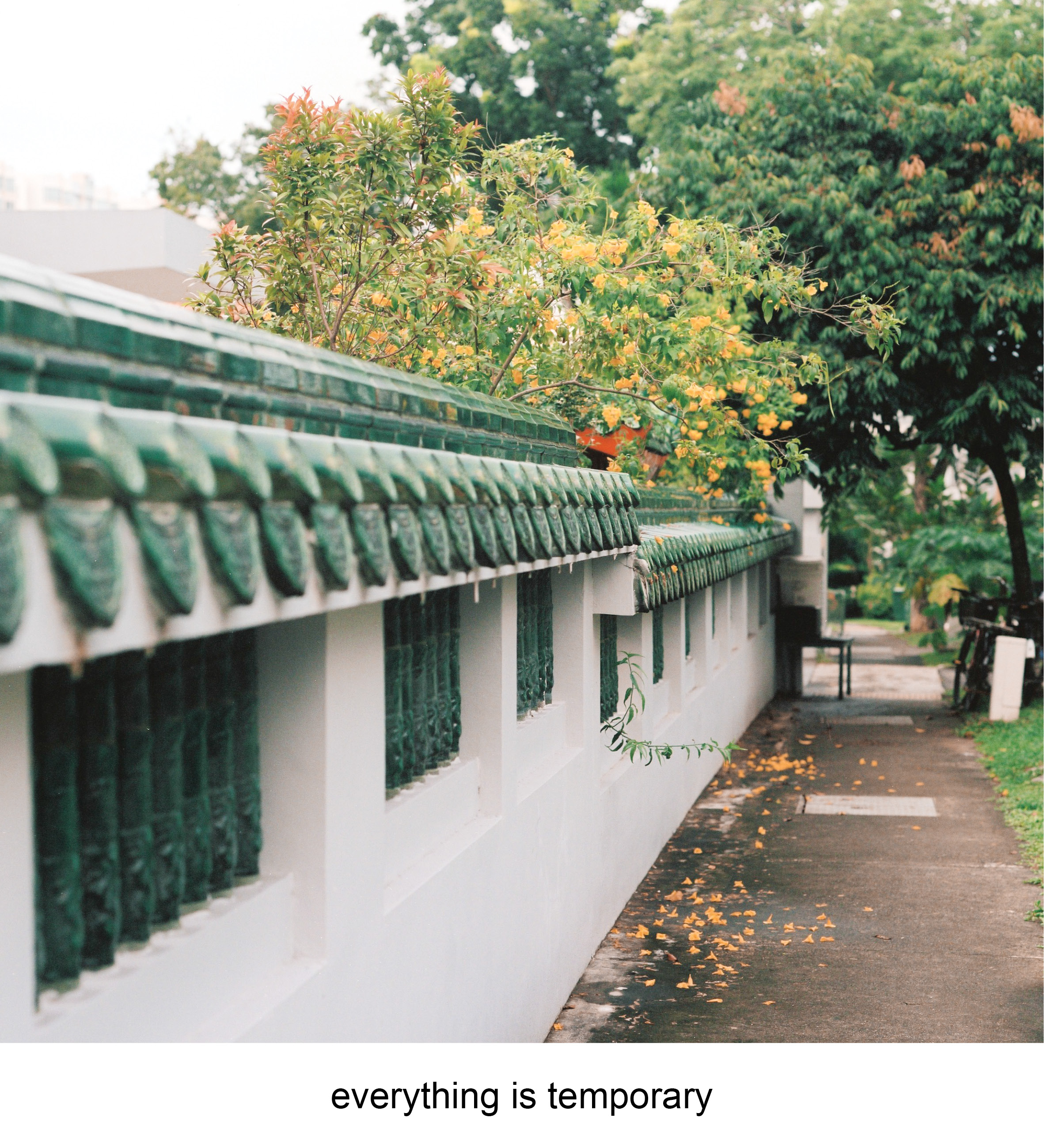
People die but everything still goes on, I believe the physical presence is temporary, but what you do passes down to those who are still in the earthly world.


The last equation uses the tetradic colour scheme throughout the photos with the colours of blue, green, orange and red. The colours are relatively balanced
that made a more neutral vibe for the whole equation. The first photo features the traffic cone where the primary colour of orange, similarly setting the neutral state of the object.The second photo introduces the environment, where the main colours of red pops out. The red accentuates the idea of a temple, through the identifiable drapery and red lanterns. The red does not seem to striking as the effect is muted by the dull blue truck with hints of the green fence.The last photo has larger bulk of green which brings the mood of the equation closer to a relaxed state due to the trees and fence that blends in. There is a small highlight of the orange from the flowers of the trees that connect this photo to the first photograph of the “self”. The metaphor of the flowers falling off the tree while the main tree is still up and healthy brings forth my sentiments of temporal physical self in the world. The orange unlike the first photo is muted takes up less attention, this also represents the insignificance of the self in a larger spectrum of the world.

FEEDBACK

crit day
I was really relieved on crit day when the colours in the various colour harmonies can be seen by my peers. The difficulty in using photographs in the project was the natural state of the subjects, where you cannot control what elements that would be in the composition. Altering the colours afterwards also is not foolproof as some objects look awkward when colours are removed from them.

Joy brought in an interesting note on how people recognize objects for their colour. For example the Ikea bag and is easily recognizable due to it’s well known branding. It also works for banal objects such as the trash bin and the traffic cone as these objects are known based off the colour. Colour have the ability to play on their connotation to relate with the viewers. Looking back at this project I feel there are avenues to experiment subverting the common connotation with some colours. The idea of how we link certain colours to objects but when they are in a different colour it would bring a new reaction, emotion or even irony to them.


2D Project 3 Process_1 : Ego in different settings

PROCESS

I decided to work with the medium of photography for this brief. Unlike creating illustrations or images from scratch to apply the colour theories with, i have to seek for subjects that already have colour theories being applied. Therefore location scouting and the framing of the shots are key in communicating the message to the viewer as distracting subjects or colours have to be excluded when taking the photograph.

SEQUENCE 1 : TRASH

Trash – Site BTS
My first subject is a trashcan located at 120 Prinsep street. The trash can was my primary focus as i felt the graffiti sticker and burn marks on the lid represented the gradual change over a standard public object in a specific environment. My main locations revolved around close ups of the trash can, the interior, and the general space around it. Light meter readings were also taken to give a rough gauge on what aperture range I’m allowed to work with.


Trash- BTS
Trash – Original Colours
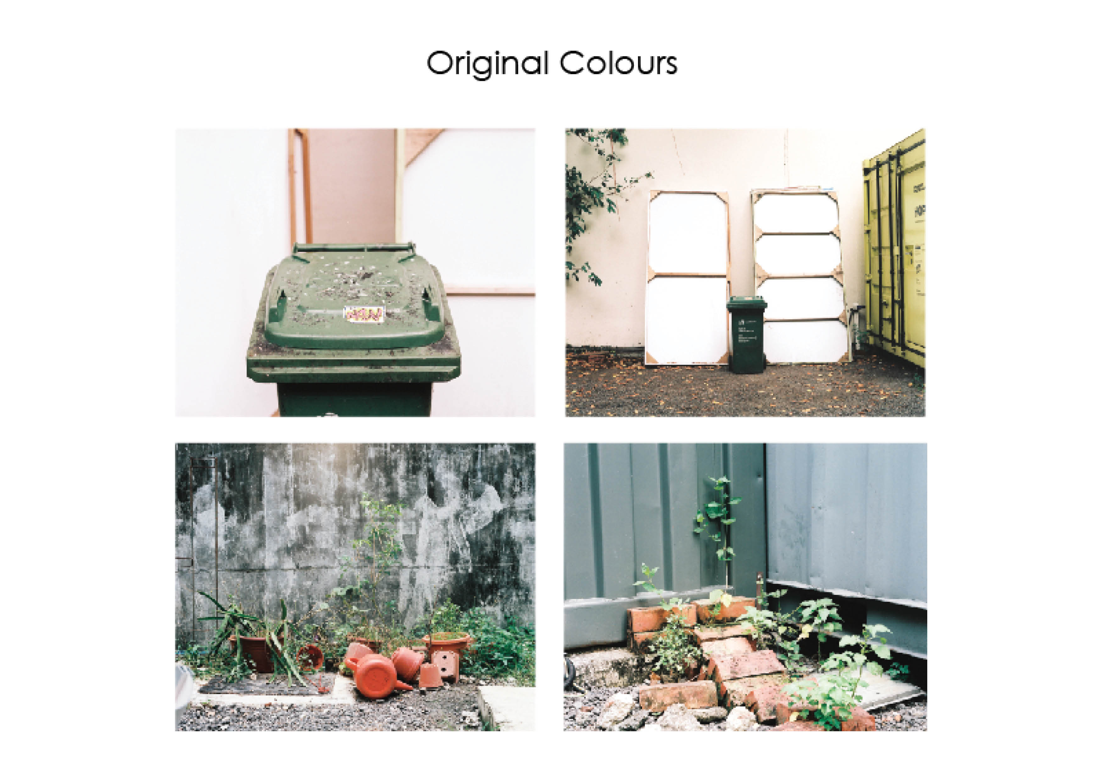
The original colours that was captured on film had a cool overcast due to the cloudy weather that made the light diffused. The primary colours that stood out were the green, yellow, red/orange and pink. The main colour theory i wanted to apply was the complementary colour scheme along with the Split- complementary color scheme. In order to bring the colours to the foreground, I enhanced the colours by raising their contrast and saturation to allow the colour harmonies to stand out.
Trash – Drafts
There were a few variations for the line sequences that although follow a similar colour scheme, different photo subjects play an important role in relating the accompanying words to the understanding of  whole sequence. I experimented with images being out of focus to capture the essence of the shot through colour instead of subject. What felt like a good idea in concept did not translate well in the final shot, highlighting the importance of shooting more safety shots and spares as they you never know when you need them again. Going back to the same location may not produce the same results as the light is dependent on the weather and the colour hues will change along with it. Editing the choice of images were then an important factor to take note of when creating the sequences.
Trash – text edit
The selected sequence is then layed out with the accompanying text to see if the they work together coherently and in harmony. Text is a strong element to create a narrative. For this example, the text provides ideas or insight on linking qualities of the subject to human qualities or emotion.

SEQUENCE 2: CHAIR

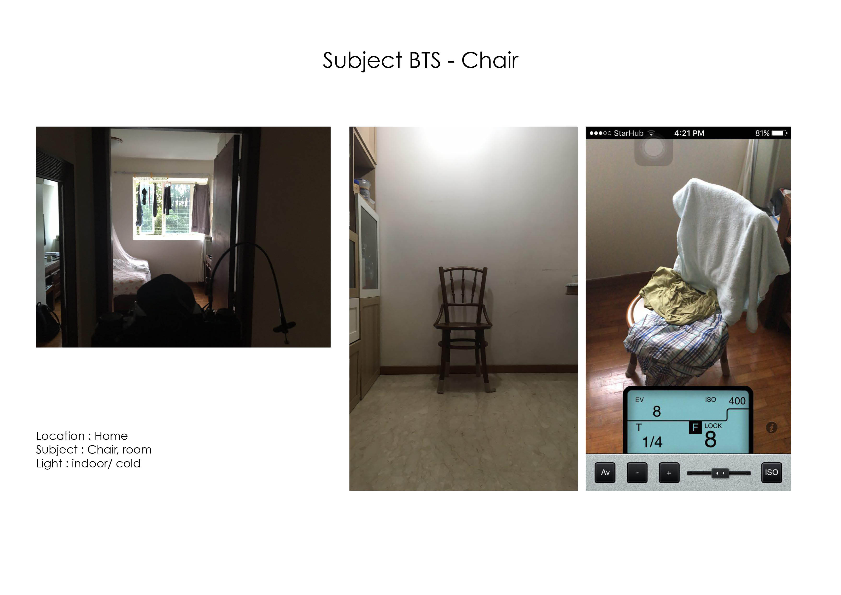
Subject BTS – Chair
Subject BTS – Chair
Chair – Original Colours
My second subject for the project was a chair located in my house. The chair is a constant in every room that is occupied in the house, what gives it a character is the individual in the room and the objects the keep in it. The main colour scheme i wanted to showcase in this sequence was the analogous colour scheme from green to blue.
Chair – Drafts
Similarly I experimented with various effects on blurring the subject but after a few tries the concept didn’t really play out that well.

The original colours were actually very pleasant however the greens and blues are crossed each other too often and did not fit in a colour theory or harmony. The greens are then enhanced to be more illuminated and obvious to spot.

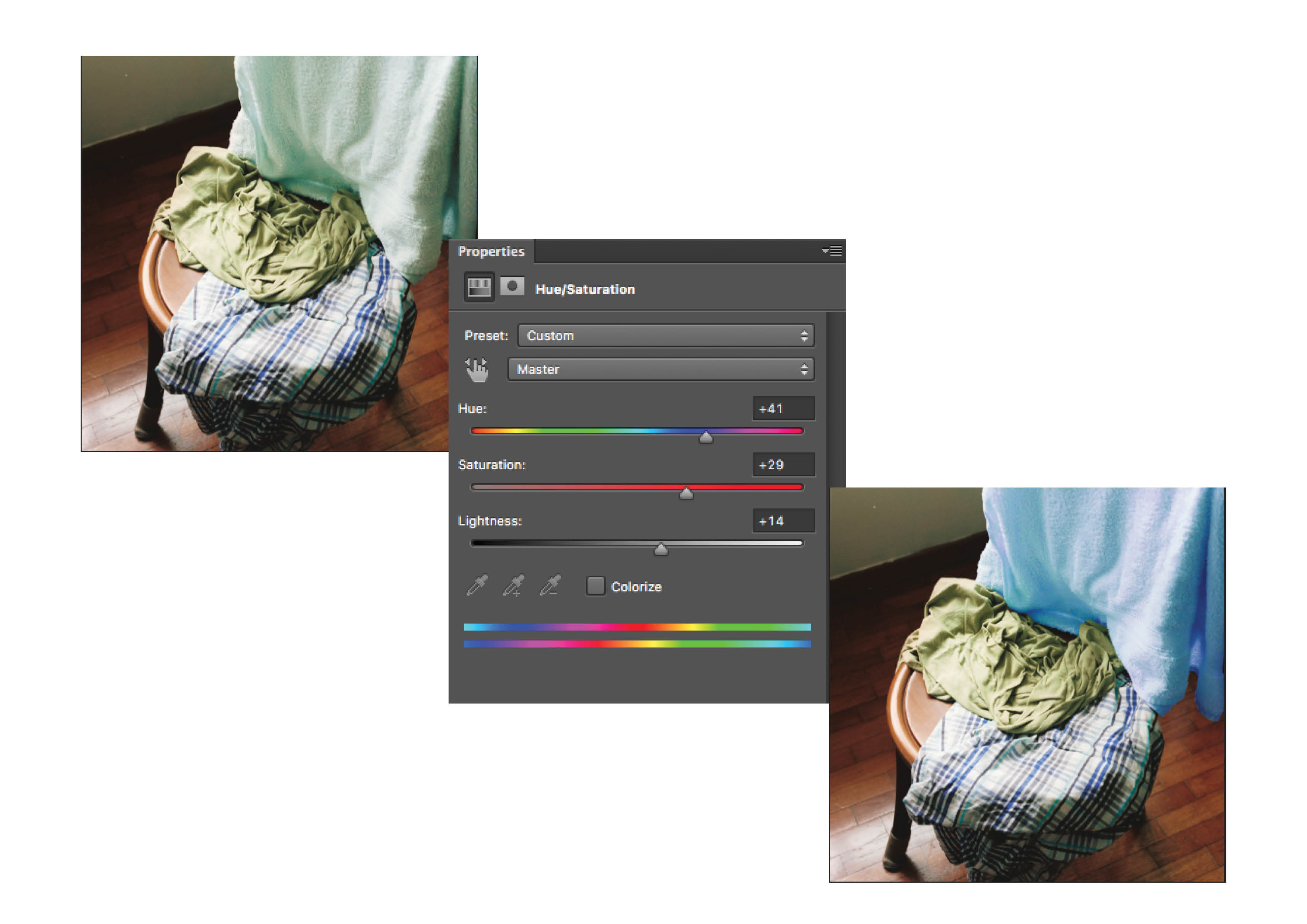
The chair image on the right has the colours of blue, green, green blue and a reddish brown. I was advised that to continue with the split complementary harmony of blue, green and red, the blue green towel in the composition have to be adjusted.

Chair – Adjustment
The towel was masked out in Photoshop and it’s hue and saturation was worked on to bring it towards the blue colour tones.
Chair – Text Edit
After editing the colours on the towel, the blues were more prominent with less distracting colour tones. There is also a running theme of the “self” square being neutral in terms of colour, the “setting” square to be of a stronger, saturated colour, and the “response” square to be a balanced colour to it.