
Ego in different settings
My previous research and process can be seen here:
FINAL PRESENTATION
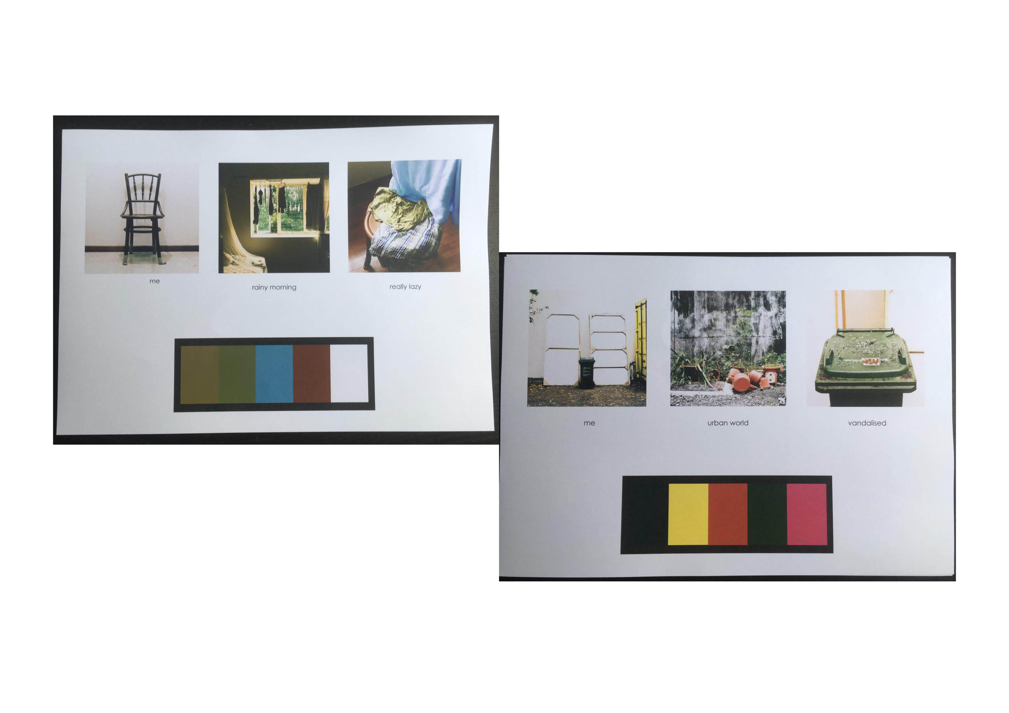
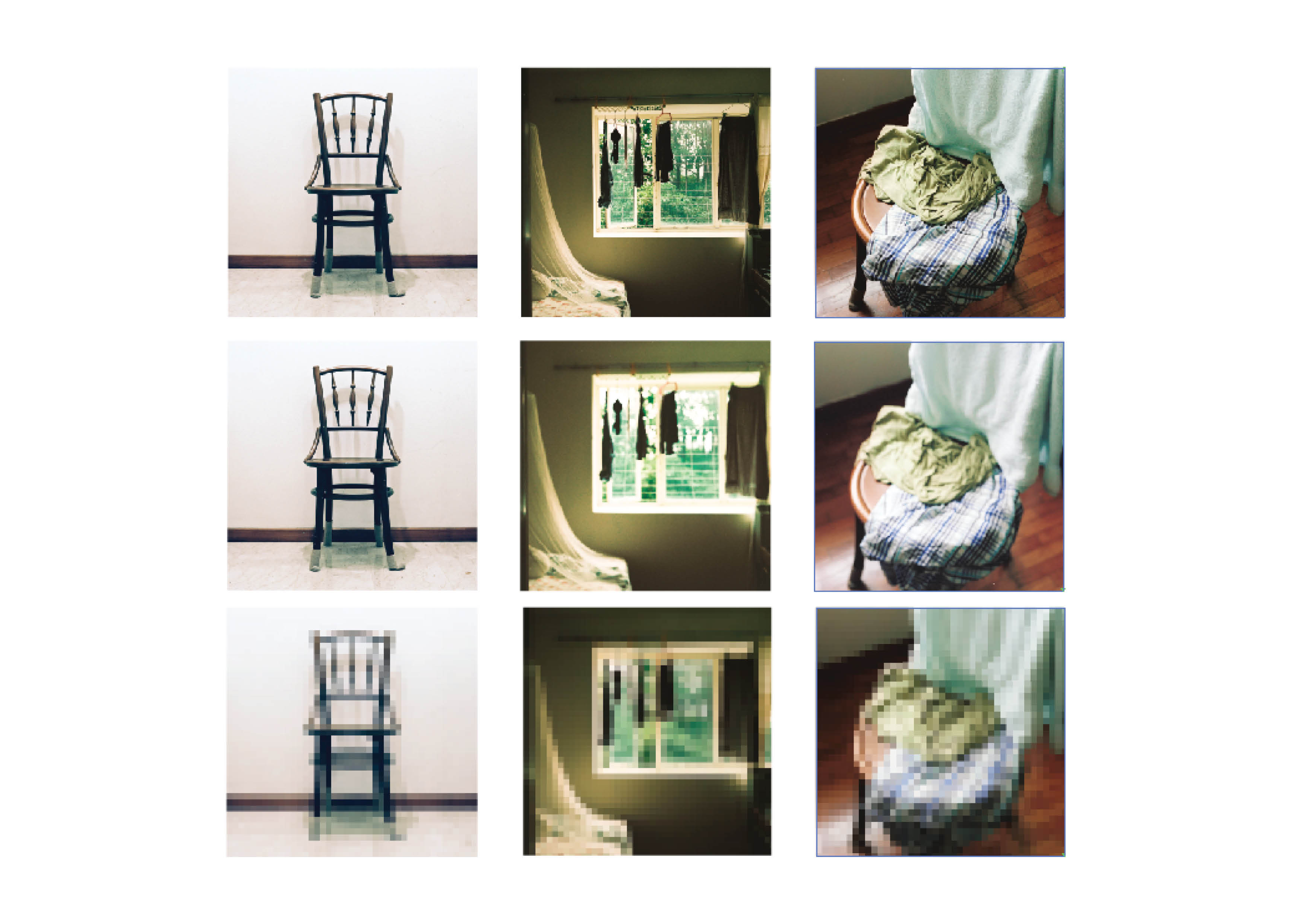
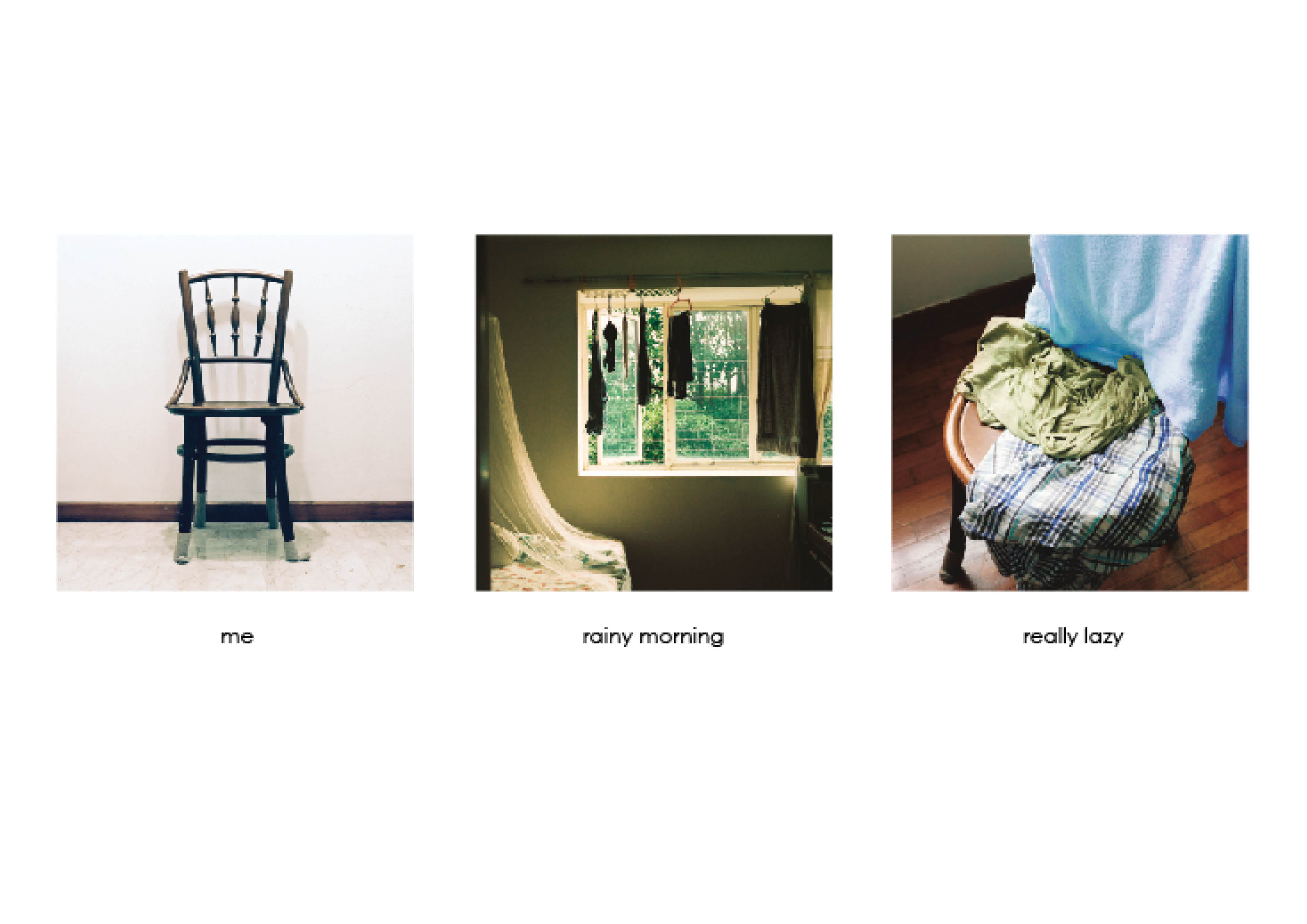
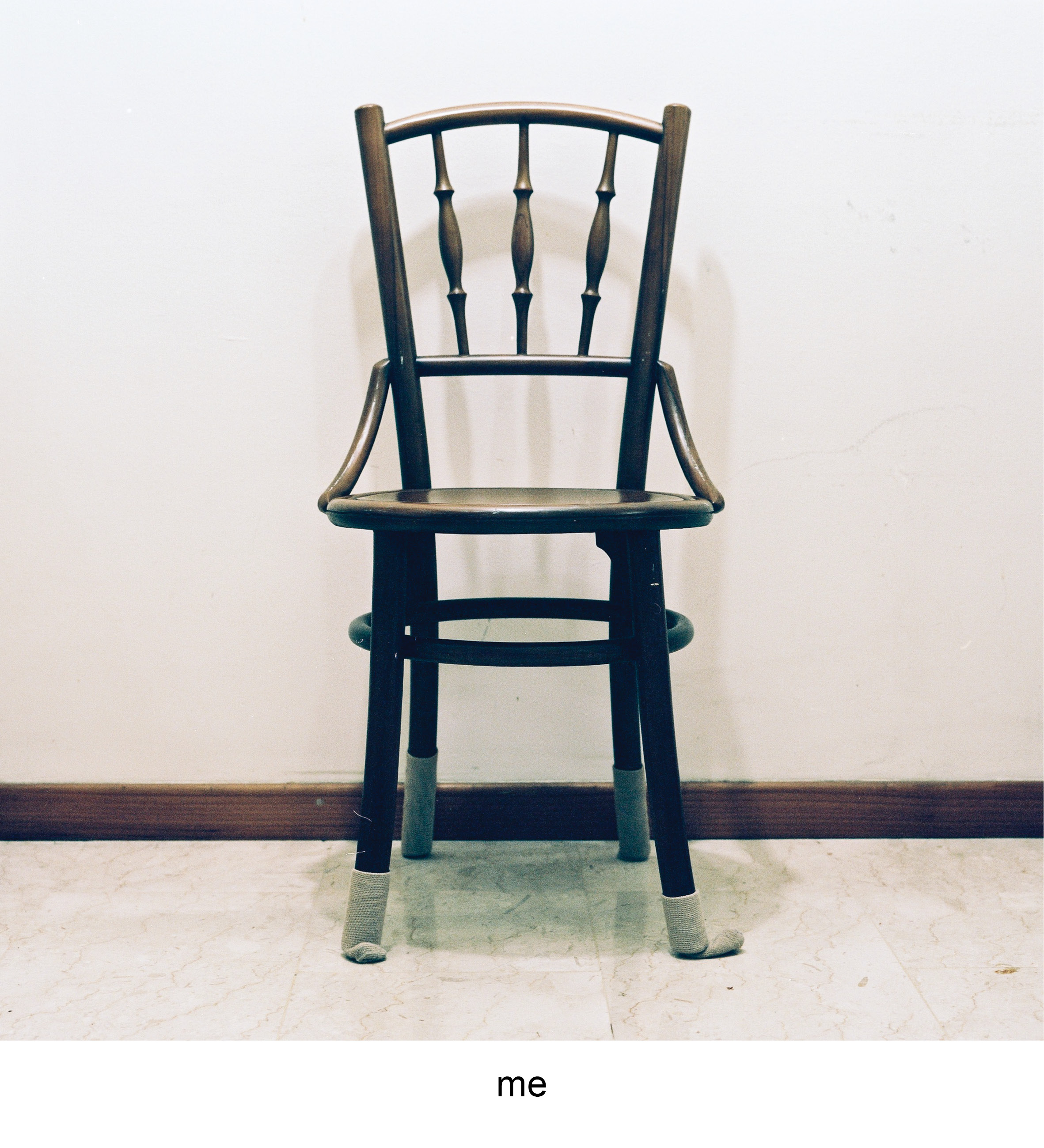
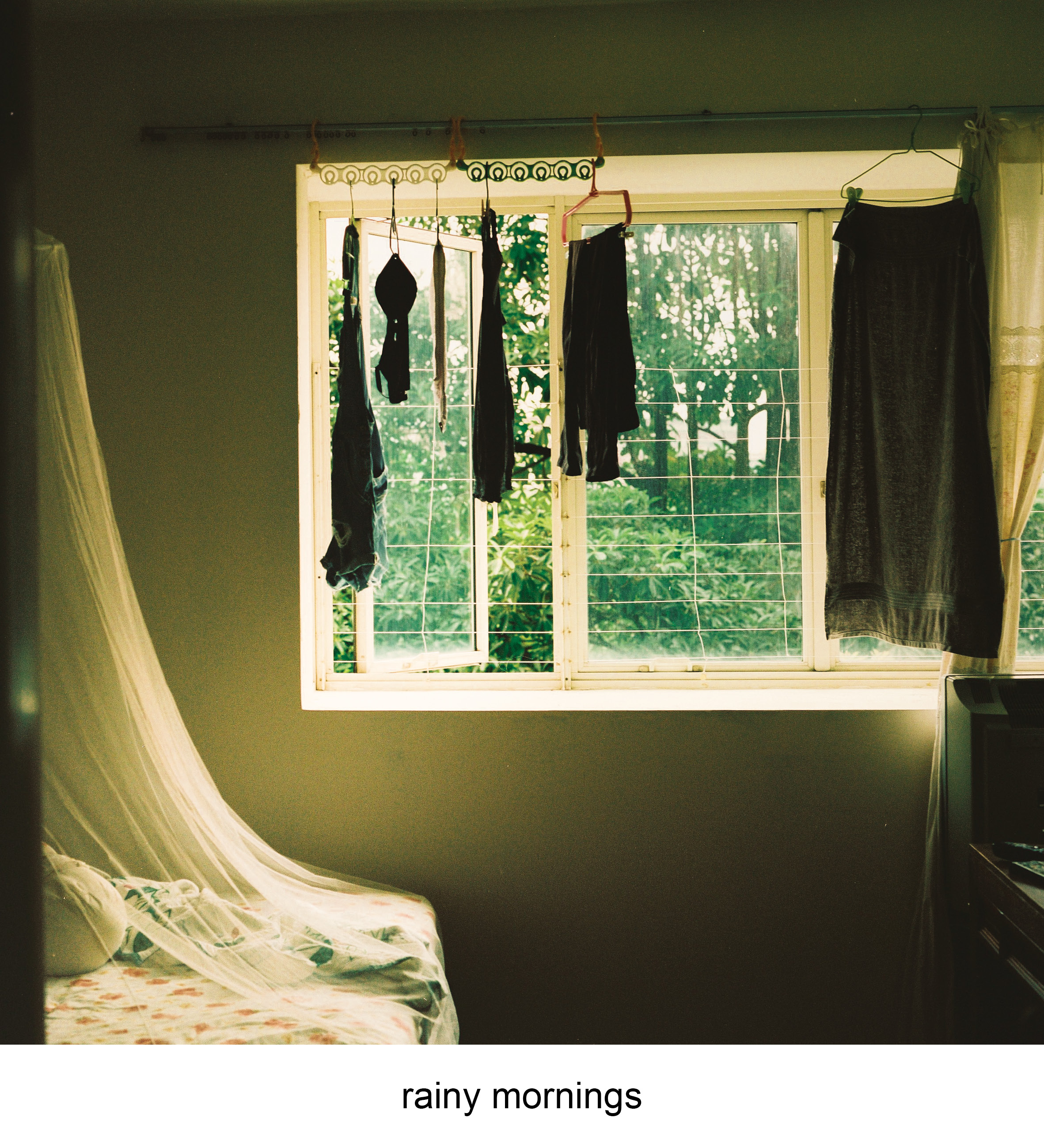
chair
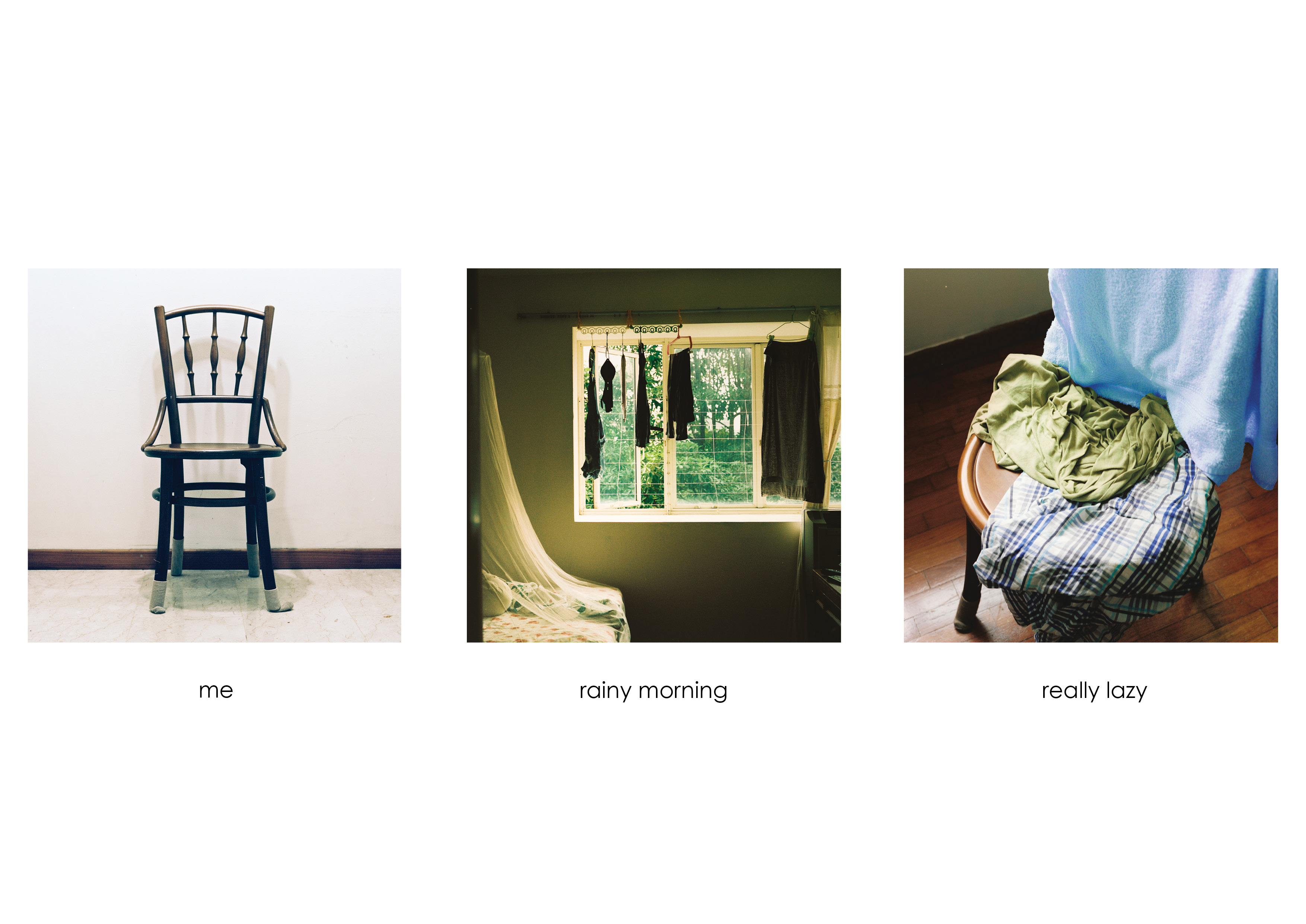
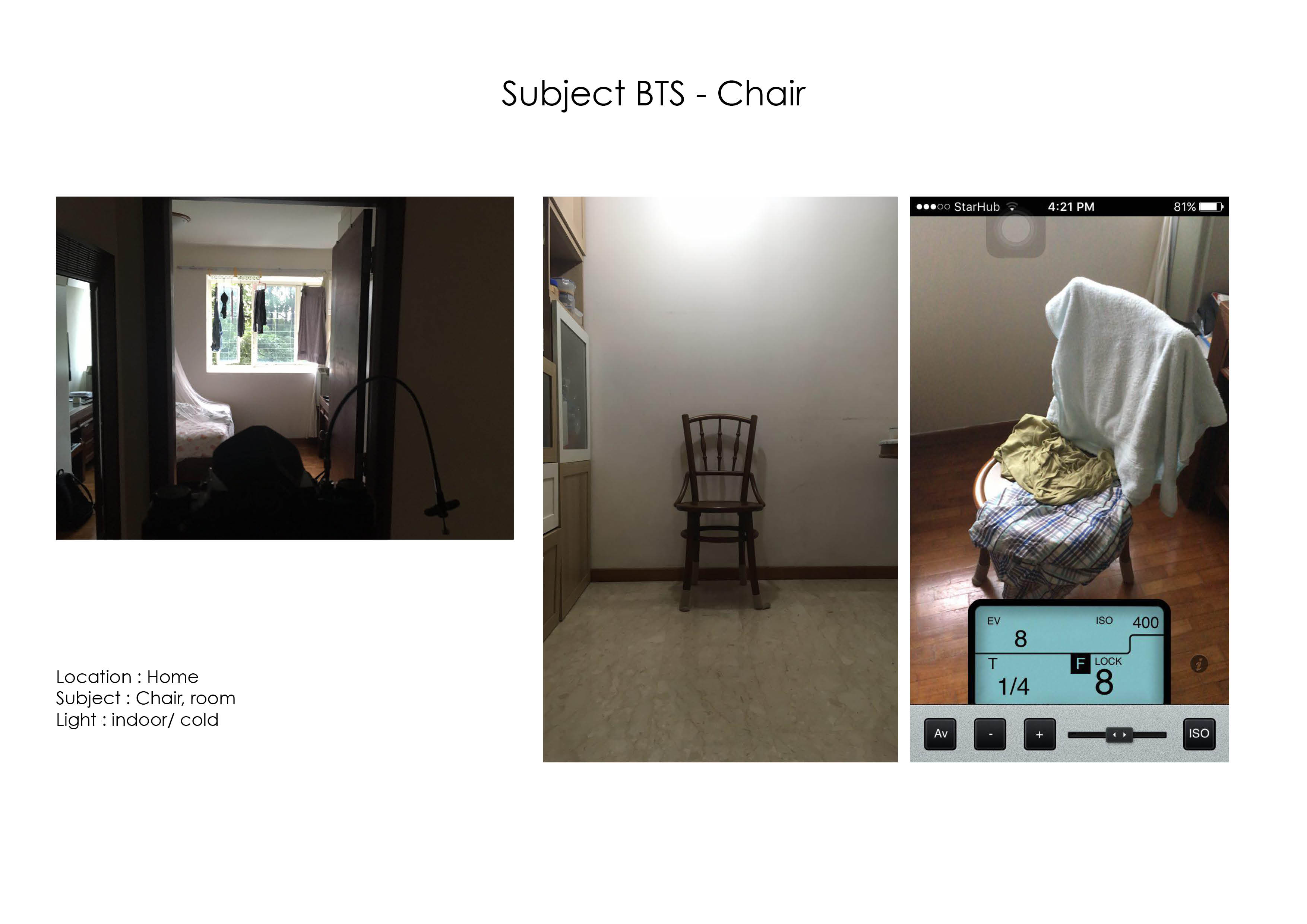
| This project is a study on banal objects and how they adapt and change in the environment they are placed in. In the first equation I identified myself with a chair at home. Through the cozy weather when in rains, I get really lazy. The chair is a victim of my laziness as it takes up my sloth in through holding onto my clothes and laundry that will be dealt with later in the day
|
| The colour harmony that is present throughout this equation is the split-complementary through the colours of green, blue and brown. The first photograph shows the chair in a neutral setting, where the individuality of it is played out through the presence of only a single deep brown colour of the chair.
The second photo shows a room, where the cool green colours from trees outside mimics the indoor hue when a gentle rain goes on in the morning. The gradient also splits the green into analogous green yellow. The last photo shows the combination of both compositions with the chair being draped with clothes of blue and greens. It depicts the laziness of throwing clothes haphazardly on the chair and ties up the mood of the weather. |

trash

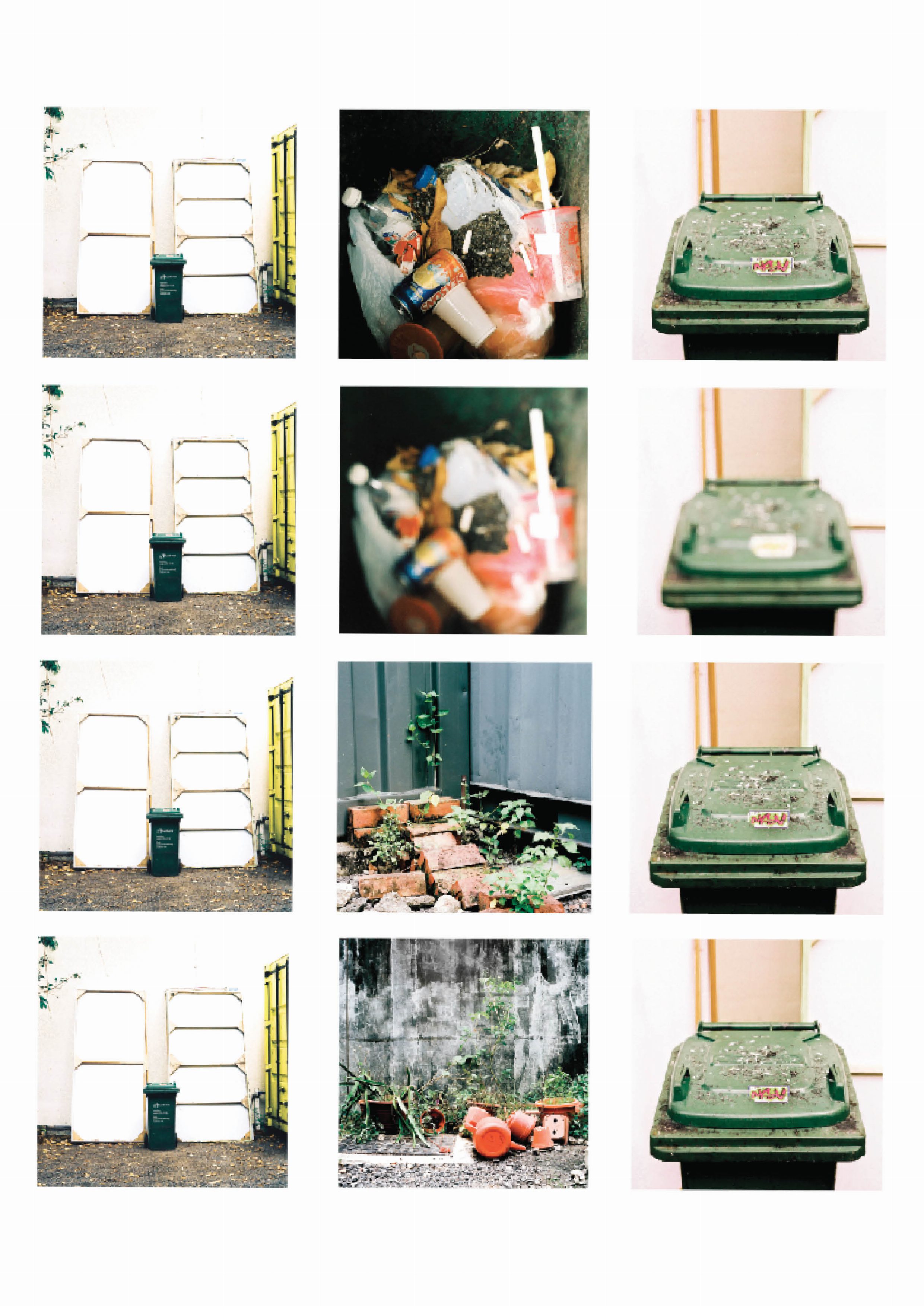
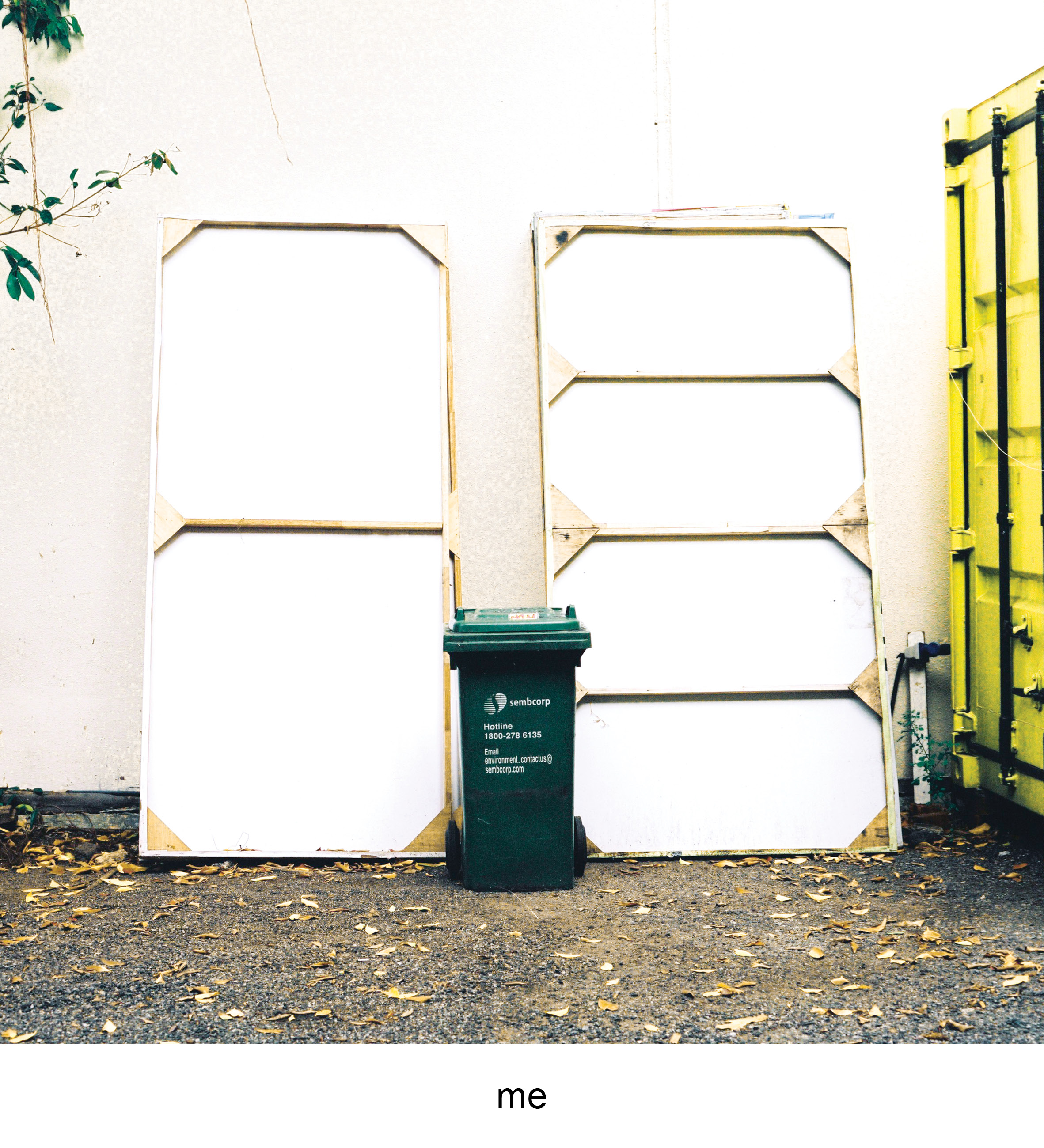
| The green Sembcorp trash can is a common object that is found in almost every registered address. It sits right outside the compound with the address noted on the side. The trash bin to me is great representation of the activities that occur in a set place. Through its exterior and contents it leaves small traces that hints on the attitues, lifestyle and things the occupants of the address does on a daily basis.
I identify myself with this trash bin as I felt it represents the the effects of urban life to humans, the jarring mix of dirty concrete and gravel compared to green fauna that is creeping through the cracks. Presented through the graffiti and cigarette marks on the trash bin, I echo the sentiments of the vandalism that is left on it. Living in the concrete world is not ideal but you have to stand through it.
|
| The colour harmony used across equation is the split complementary colour scheme of green, orange and purple. The first photo uses an analogous green yellow, that highlights identifiable green of the trash bin in a neutral setting.
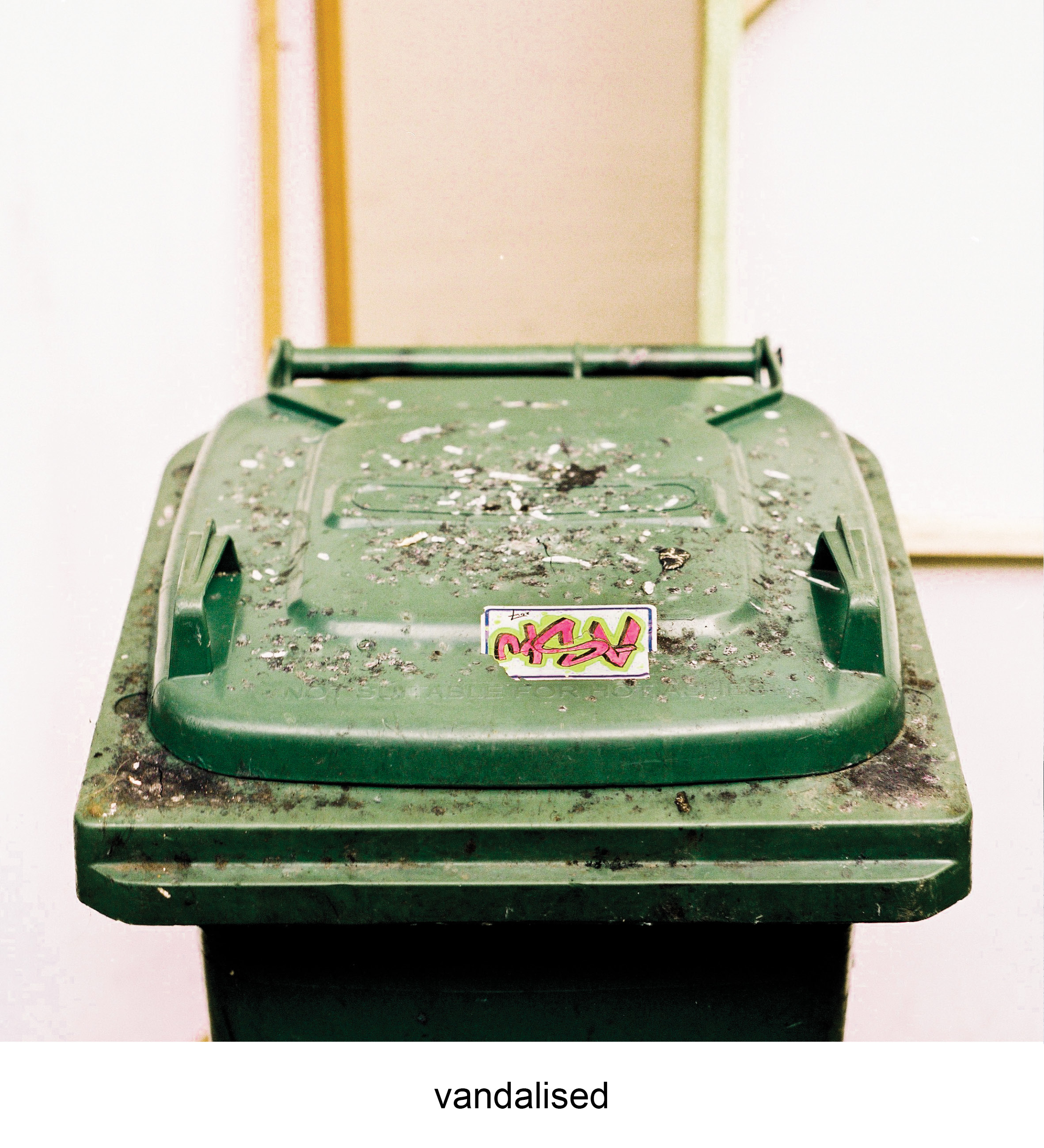
The second photo introduces an environment with the contrast of greens of the plants with the bright orange plastic pots and watering cans. The contrast brings a sense of uneasiness where one object do not belong with the other. The last photo is a close up of the trash bin that presents the aftermath of what the environment has done to it. Similarly, there is a new contrast of colour of green and purple. However the green is not natural but in a plastic form of a trash bin and a new form of conflict is given through the bright purple of the graffiti. The uneasiness is replicated again however subverted as the green is “natural”, plastic instead of a plant. |

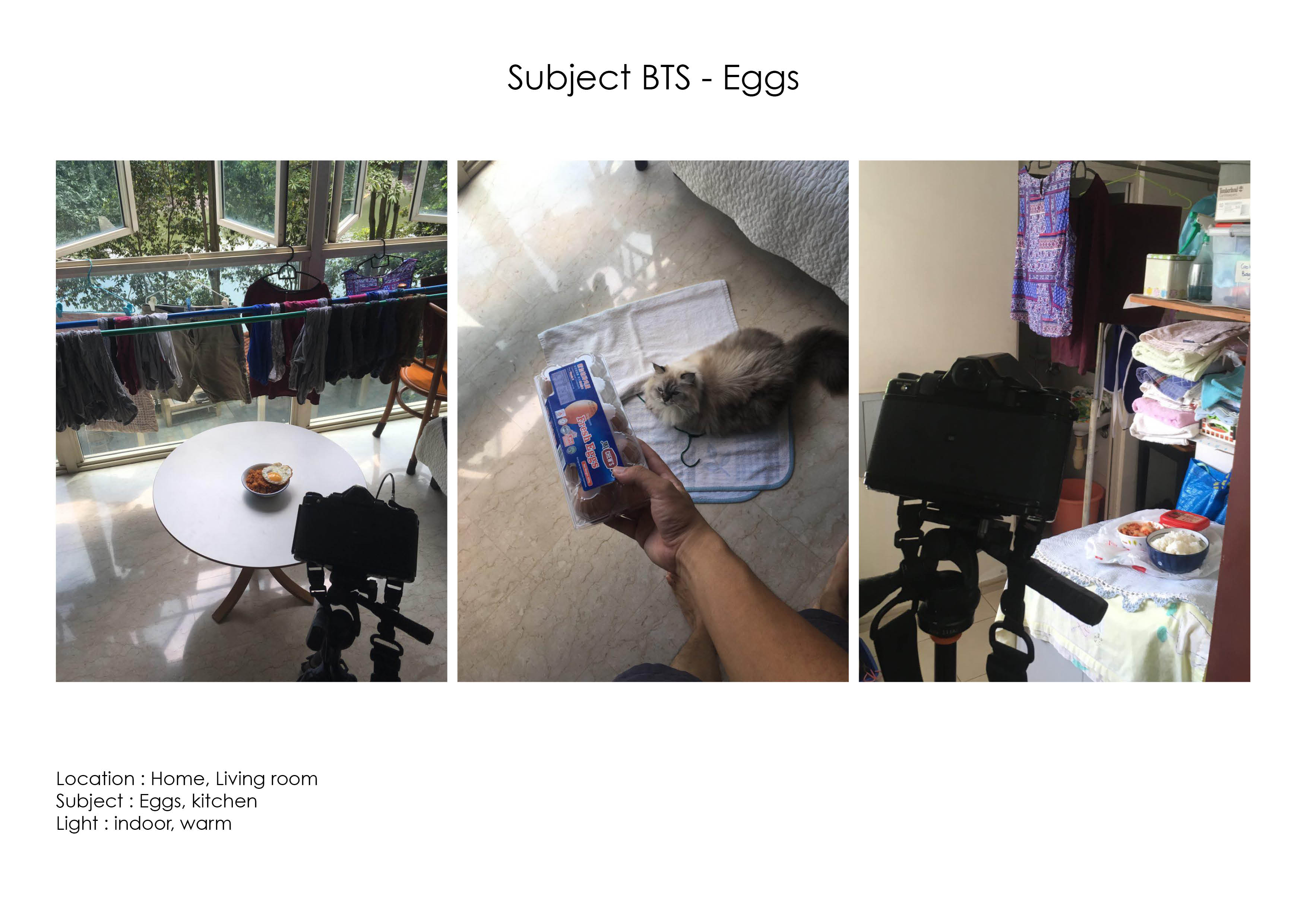
Eggs
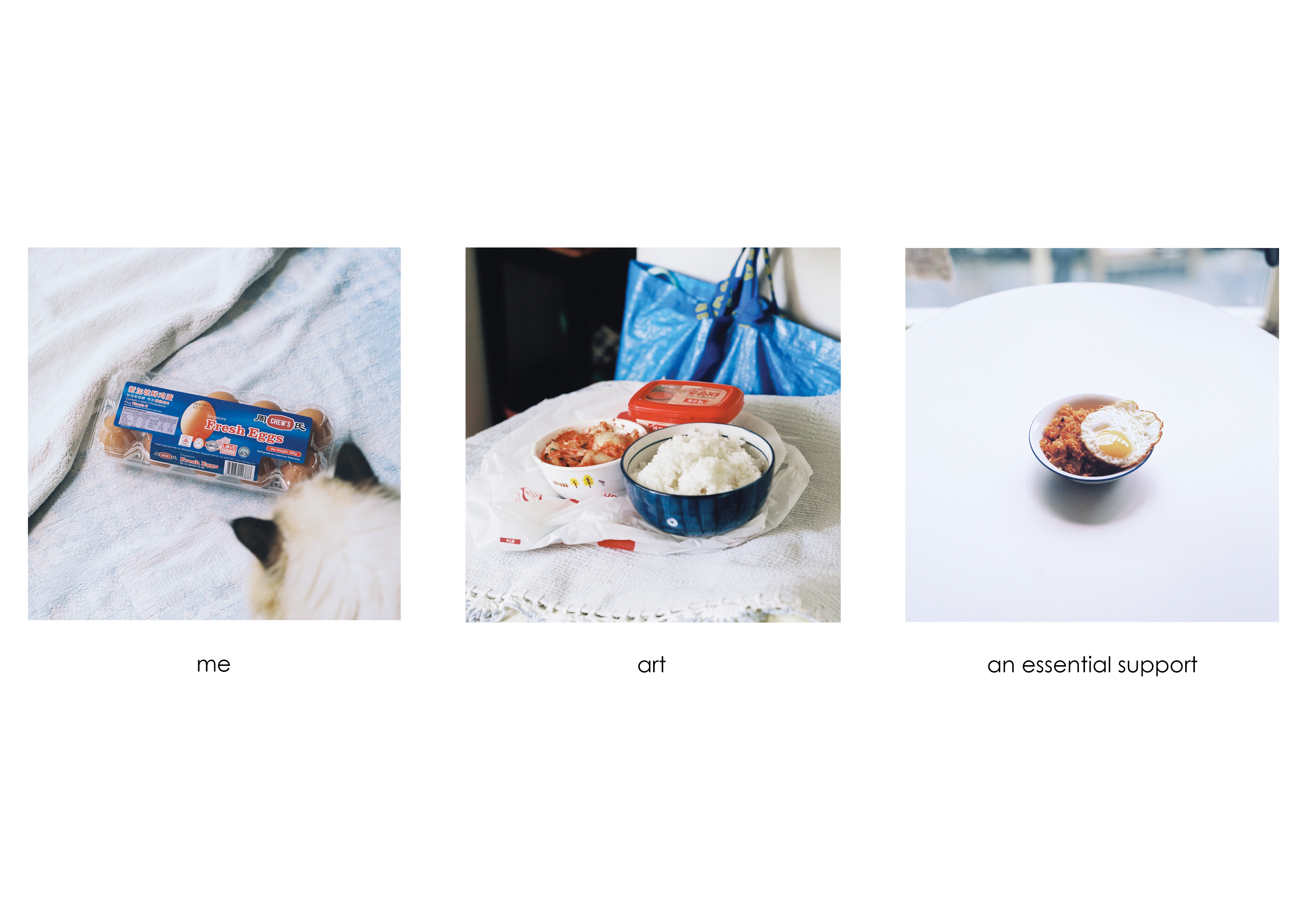
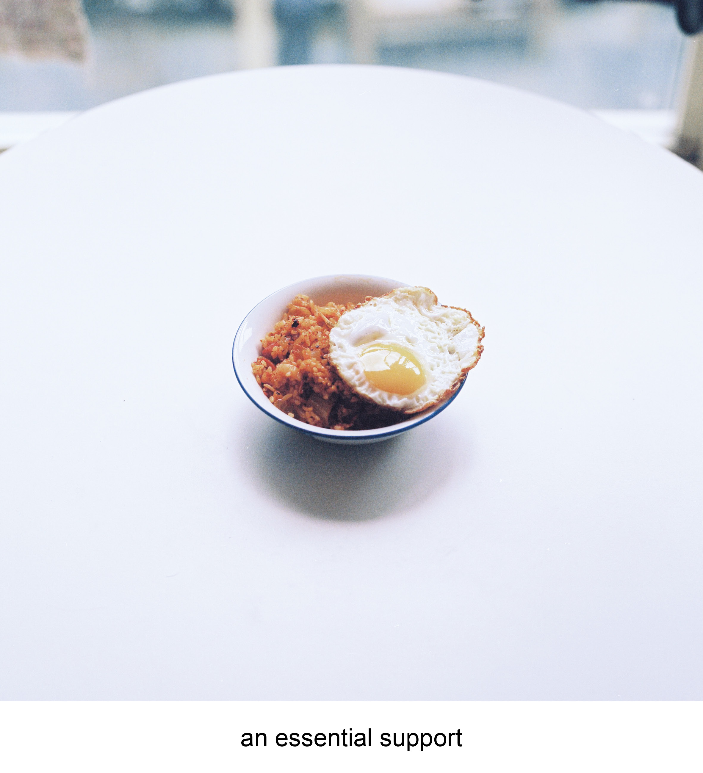
| I don’t actually enjoy eating eggs usually, but they are my favourite ingredient. Fried eggs are the ultimate support in any dish. You can have a random plate of maggie which may be nice, but it becomes so much better when topped with a gooey fried egg on top. Fried eggs don’t taste much alone but they bring a dish to a whole new level of comfort.
The (super) fried egg is a metaphor of what i want to do in the future as an art assistant/technician. I hope to be able to be the support of artists in the future, bringing them advanced technical support in both traditional and contemporary mediums, allowing their work to be more impactful and timeless.
|
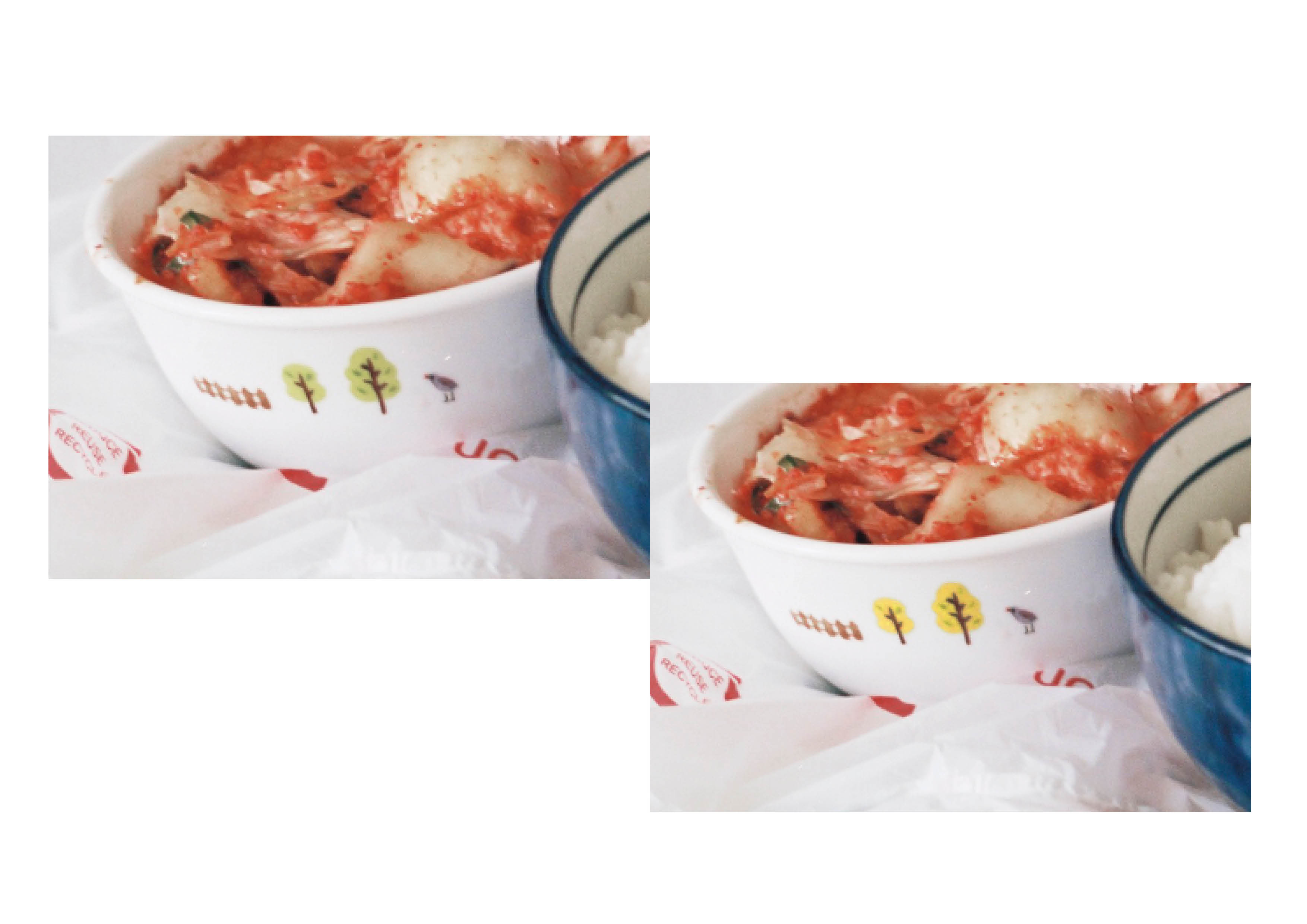
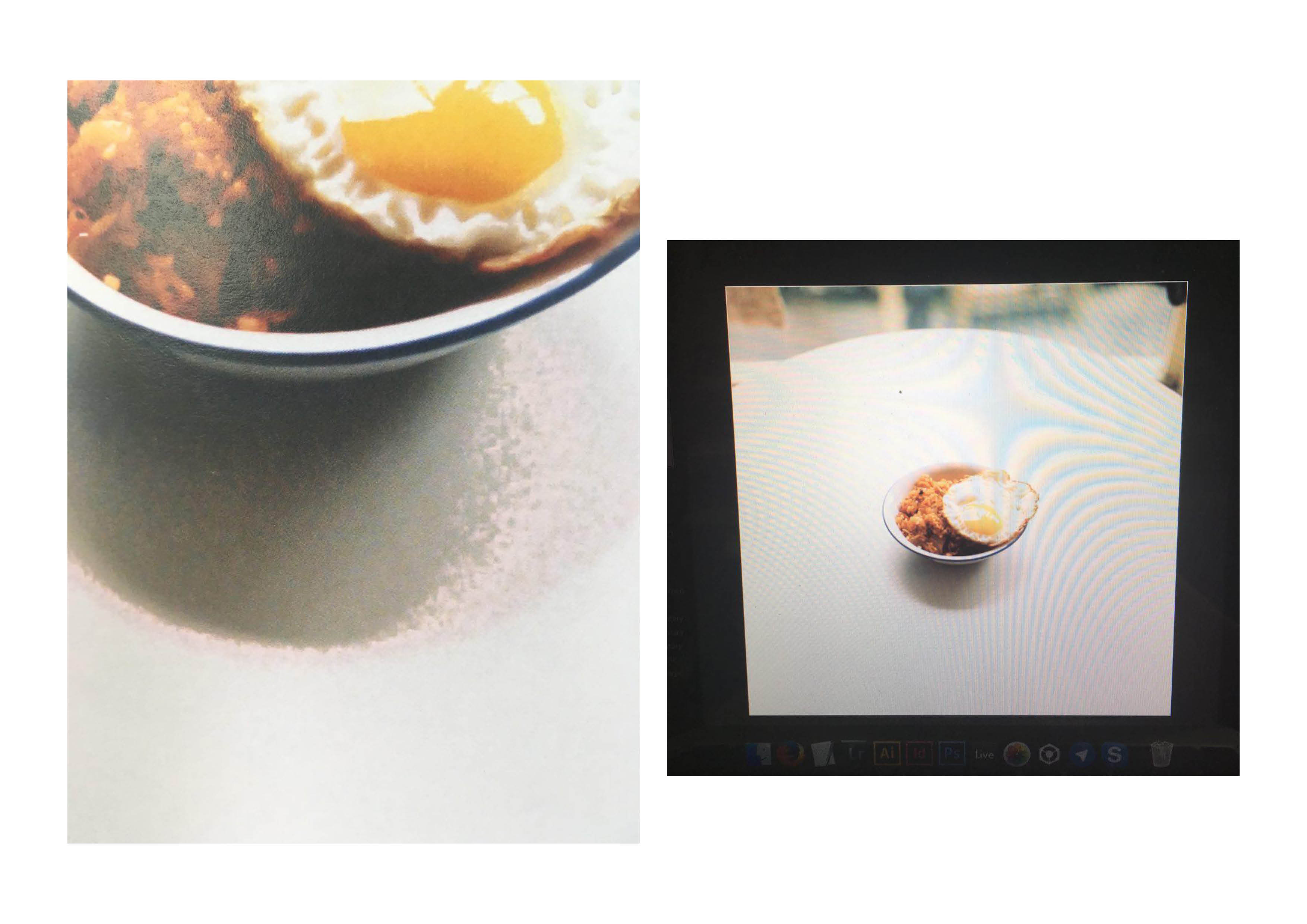
| This equation uses the colour harmony of the triadic colour scheme of blue, red and yellow. The first photo shows the eggs in a neutral setting, uncooked and in shell. There is a sense of individuality in the composition as the primary colour in it is blue with hints of red from the packaging and shades of the eggshell.
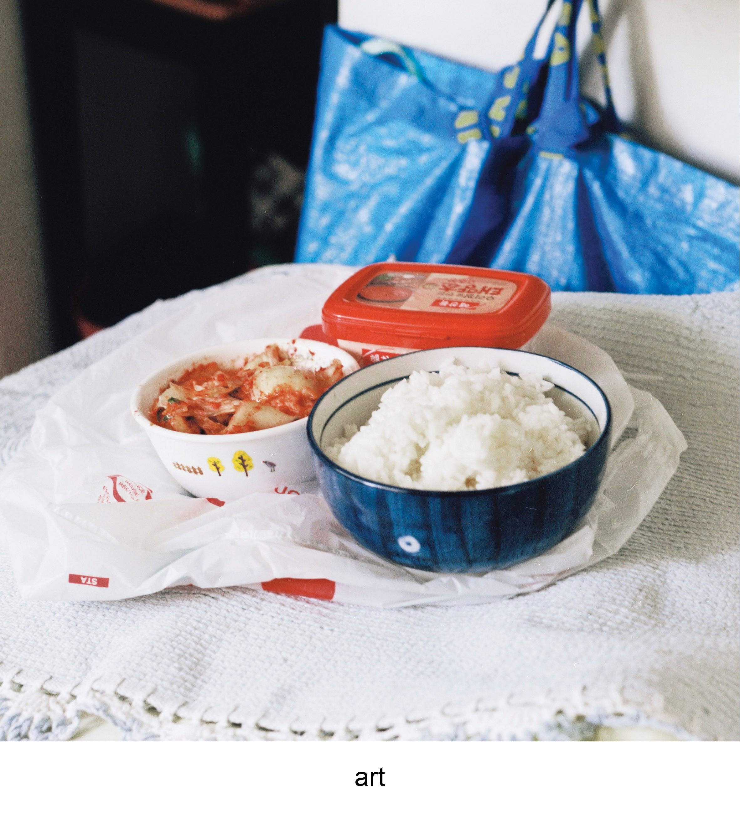
The second photo introduces the elements of red through the red pepper paste and kimchi in the bowl. The photo of raw ingredients to kimchi fried rice introduces a new subject of a finish dish, or a metaphor for art. The red complements the surrounding of blue tones from the Ikea bag and the blue bowl. The colours work together in sync as there is a balance of striking colours such as red with the cool colours of blue. The last photo is culmination of both blue and red and a slight touch of yellow from the egg yolk. The final dish showcases how all elements work in harmony with no colours standing out, as a perfected dish. |

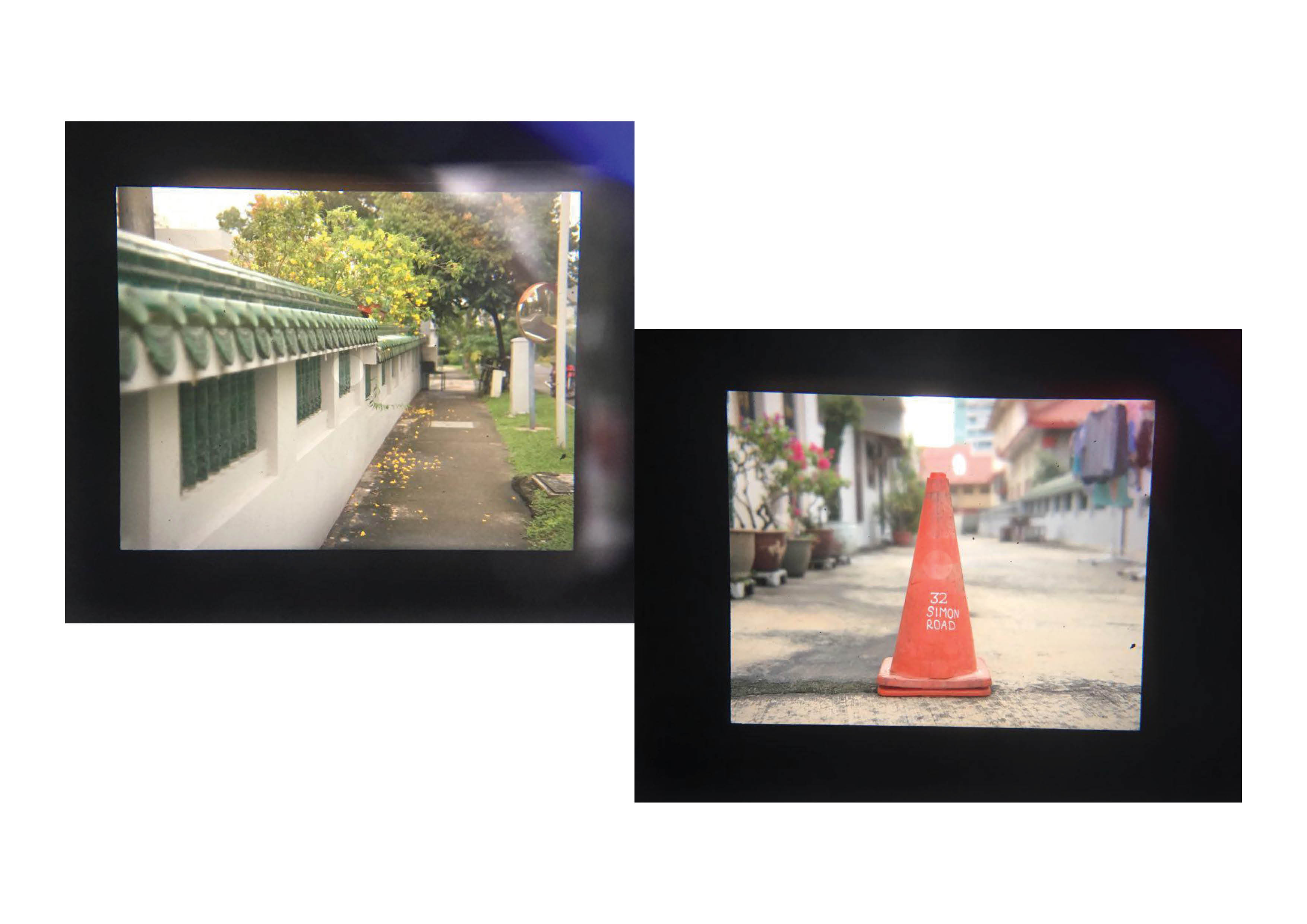
temple

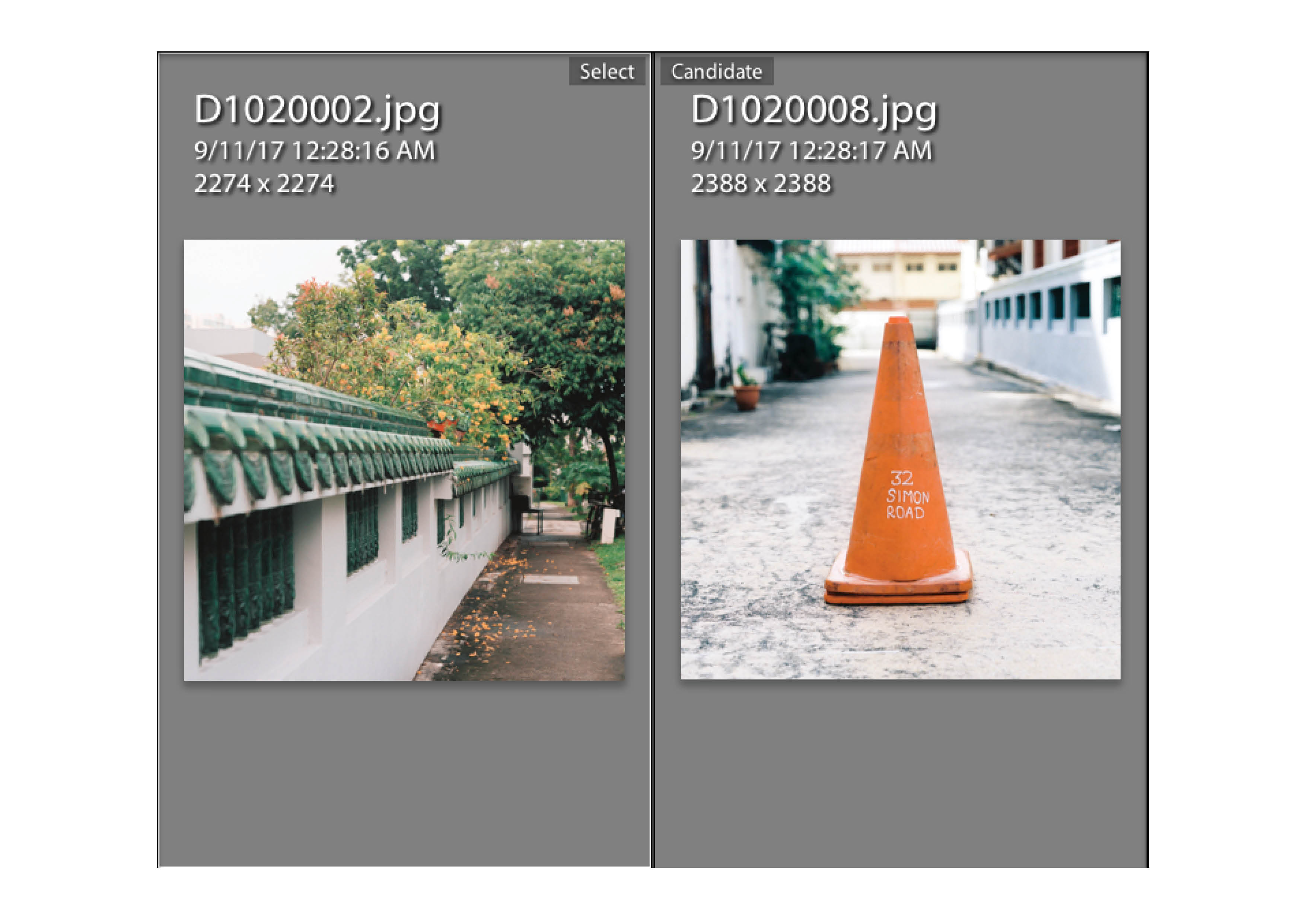
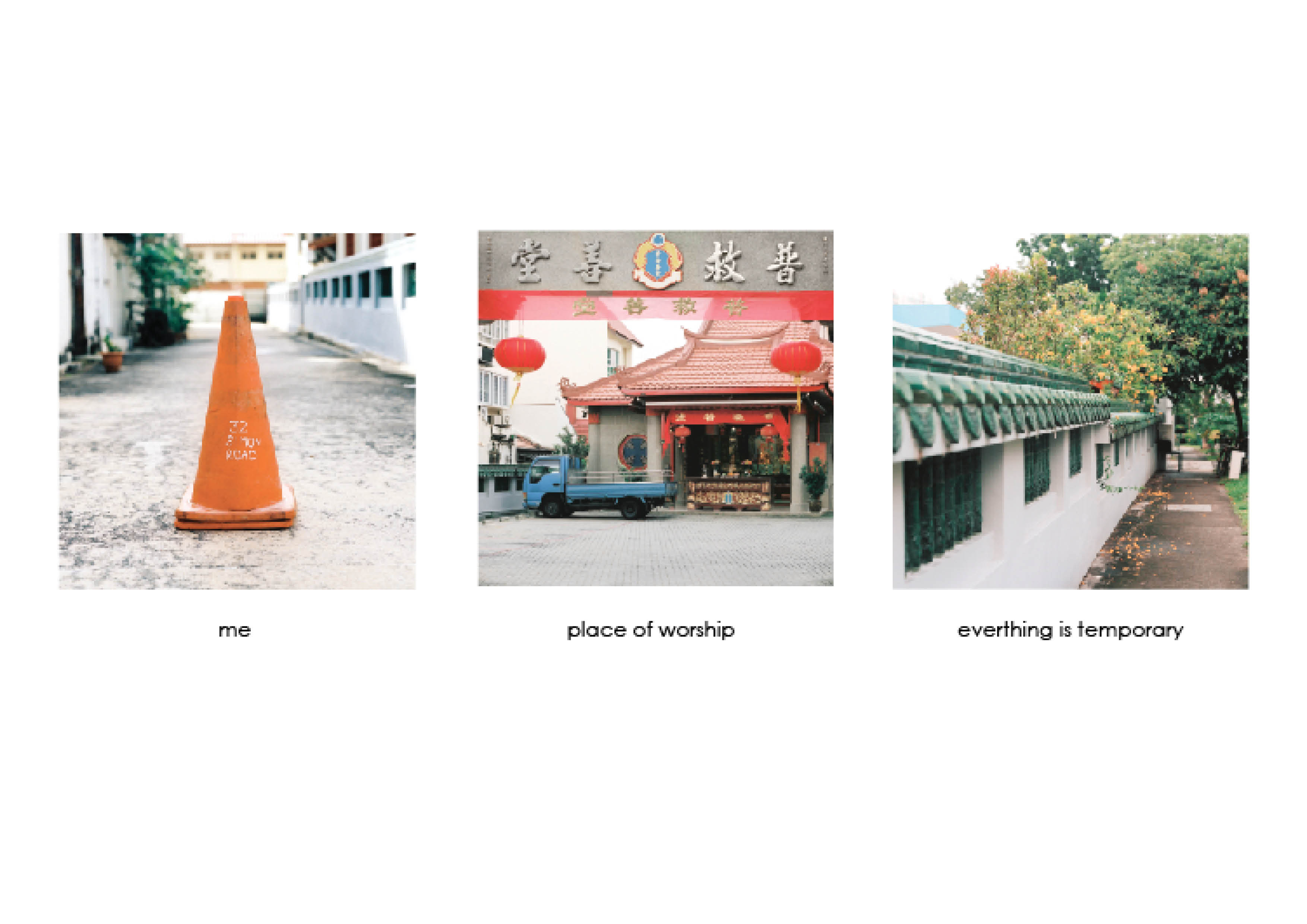
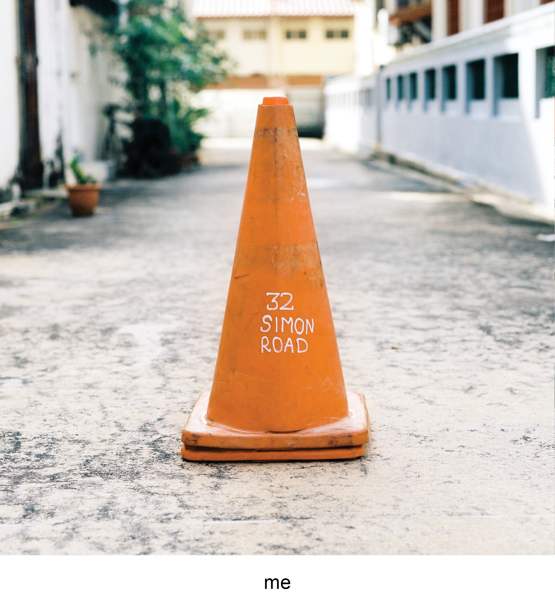
| The last object i identified myself with was the traffic cone. Similarly to the trash bin, some of them have their addresses marked on them. Places don’t linger in a person’s mind generally unless they have a memory that is attached with it. They get special when the memory or event of it is strong, you start having a emotional connection to non living buildings, which is part amusing and yet nostalgic.
This traffic cone is the address of the temple my granddad’s ashes are placed in. Places of worship usually have the connotation of death with the current generation of mine where quite a few people I know do not follow a religion or faith. Temples then becomes a ritual of sorts where you only visit to pray or visit the dead. I personally find myself contemplating the idea of death whenever visiting the dead. People die but everything still goes on, I believe the physical presence is temporary, but what you do passes down to those who are still in the earthly world.
|
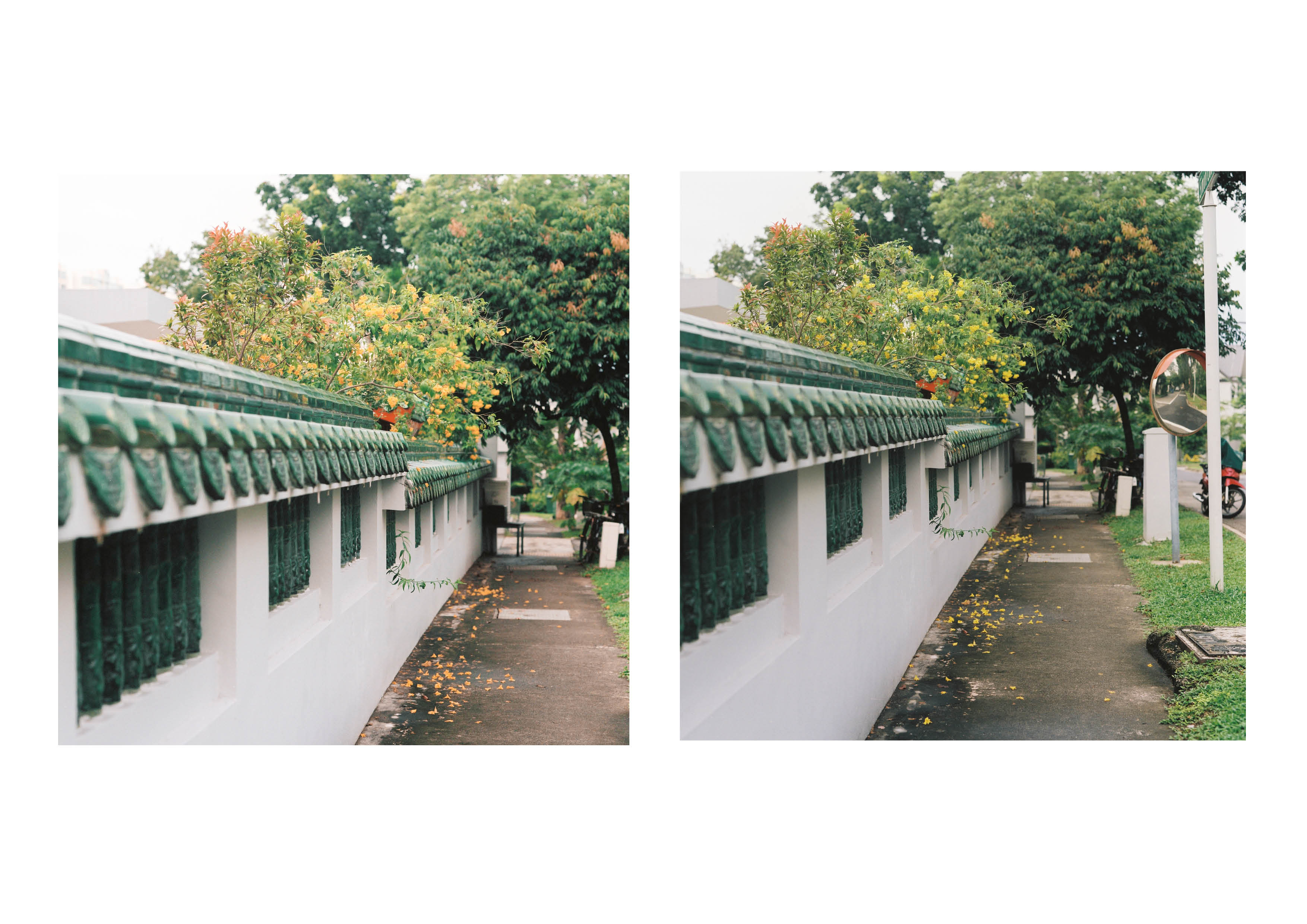
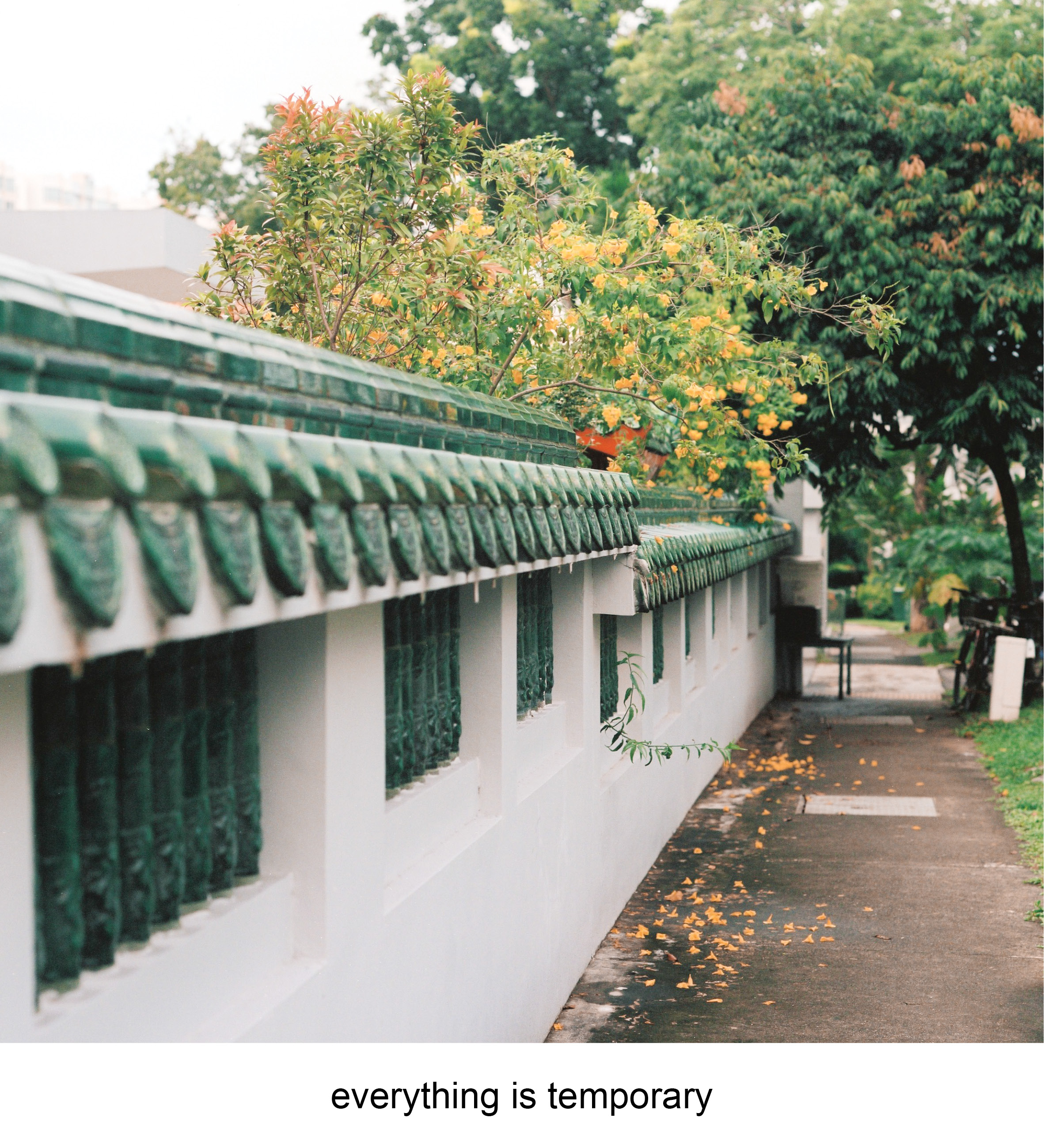
| The last equation uses the tetradic colour scheme throughout the photos with the colours of blue, green, orange and red. The colours are relatively balanced that made a more neutral vibe for the whole equation. The first photo features the traffic cone where the primary colour of orange, similarly setting the neutral state of the object.The second photo introduces the environment, where the main colours of red pops out. The red accentuates the idea of a temple, through the identifiable drapery and red lanterns. The red does not seem to striking as the effect is muted by the dull blue truck with hints of the green fence.The last photo has larger bulk of green which brings the mood of the equation closer to a relaxed state due to the trees and fence that blends in. There is a small highlight of the orange from the flowers of the trees that connect this photo to the first photograph of the “self”. The metaphor of the flowers falling off the tree while the main tree is still up and healthy brings forth my sentiments of temporal physical self in the world. The orange unlike the first photo is muted takes up less attention, this also represents the insignificance of the self in a larger spectrum of the world. |

FEEDBACK
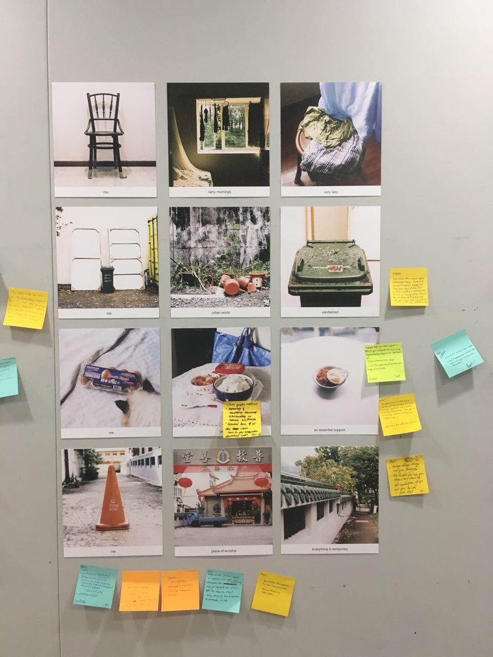
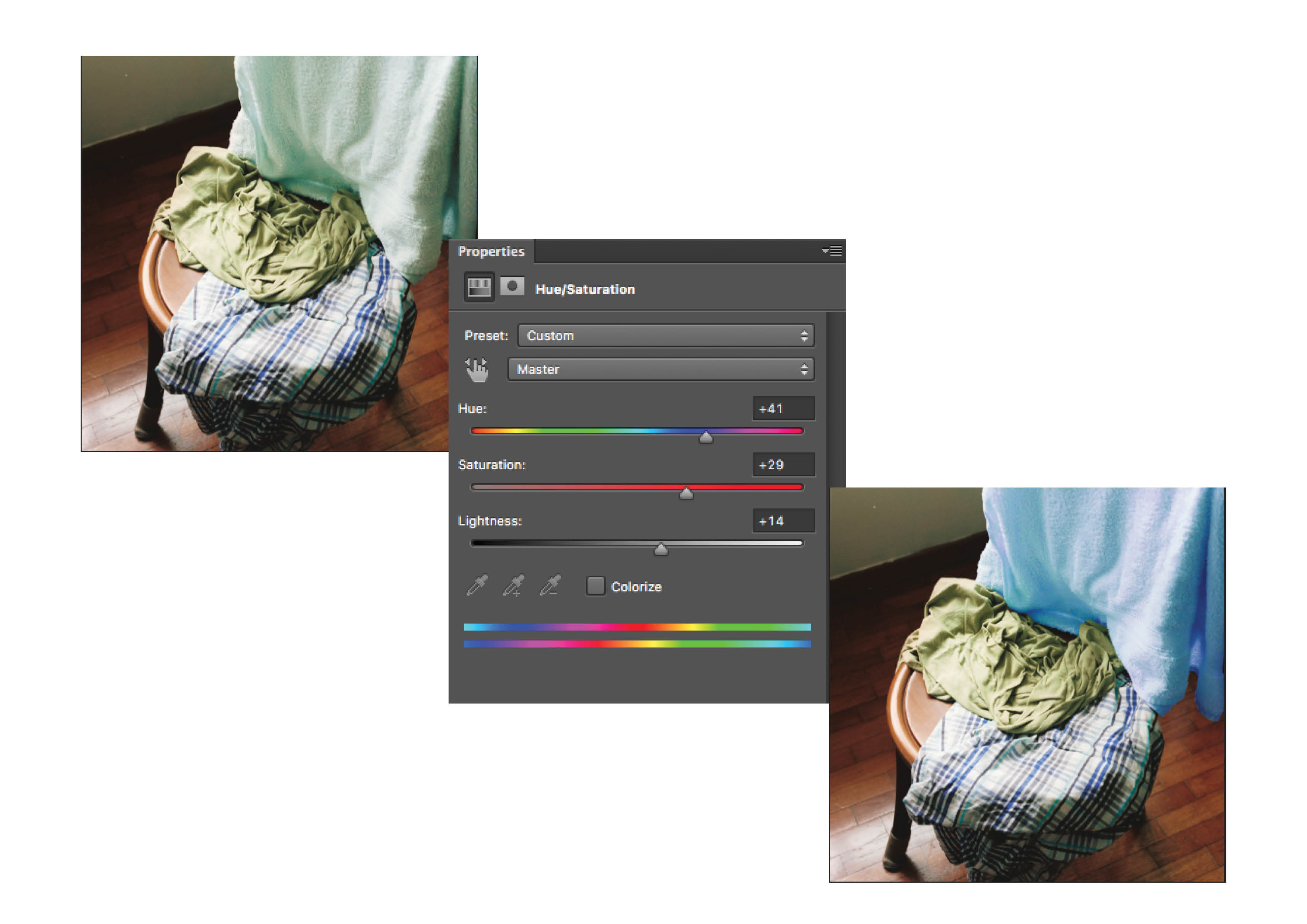
| I was really relieved on crit day when the colours in the various colour harmonies can be seen by my peers. The difficulty in using photographs in the project was the natural state of the subjects, where you cannot control what elements that would be in the composition. Altering the colours afterwards also is not foolproof as some objects look awkward when colours are removed from them.
Joy brought in an interesting note on how people recognize objects for their colour. For example the Ikea bag and is easily recognizable due to it’s well known branding. It also works for banal objects such as the trash bin and the traffic cone as these objects are known based off the colour. Colour have the ability to play on their connotation to relate with the viewers. Looking back at this project I feel there are avenues to experiment subverting the common connotation with some colours. The idea of how we link certain colours to objects but when they are in a different colour it would bring a new reaction, emotion or even irony to them.
|