Project Management for Design Professionals

TO REACH THE END OF A PROJECT

This point in the reading that may seem very obvious and logical, however we often take it for granted when approaching a project. We assume that all the objectives within that point will be fulfilled as we complete a project but we may miss out crucial planning steps in the process. Listing out the various objectives such as budget, safety, expectations before executing a project allows for clarity when making decisions. The decisions made have to keep all the goals in check before proceeding, preventing irreversible problems that may crop up and snowball in the future.

For a case study, I will be using my recent project as a Technical Support and Artist Assistant for a children play space to highlight how the lack of planning in certain criteria resulted in the respective issues that surfaced. The project was completed but I seem to be constantly going back to fix or check on things, so have I actually reached the end of a project?

TO REACH THE END ERROR FREE

To create a work that is error free begins with working with tools / technology that you have experience and confidence in. Ideally if it’s a service you provide, it should be something within your speciality that you can offer with pride. However, the interactive pieces we designed were developed on the go with allowance to learn while creating the work. Therefore some of the elements are not tried and tested and resulted in longer hours in de-bugging and troubleshooting. This required me to go down on every other week when the space reports an error on when something starts to fall apart. From this I can reflect that reaching the end error free starts with setting boundaries and managing expectations when planning these devices. There is room to try new methods but there should be at least a fail safe if that experiment to extend the experience does not work out technically. With a device that doesn’t function 100% without supervision, it results to man hours being wasted in repairing and debugging that could be invested in other parts of the project. As a result of going ahead and developing the interactive element, there is a high risk of not being able to fulfil the desired product of the overall project.

TO REACH THE END MEETING EVERYONE’S EXPECTATIONS

As the tech support, I had to fulfil the expectations of the artist as well as the project manager. One of the errors on my part was over promising certain interactions when brainstorming and allowing the planning to continue with those proposed elements to be catered for in terms of vision, time and budget. I ended up spending more time trying to fix an element rather than using the stipulated time to create the other pieces. We ended up simplifying certain interactive elements to cater for the ones that had more errors. Although my role was not as a project manager, I have still had expectations from the artist, the manager and my own to meet. Setting boundaries on what’s realistic and executable is extremely important as it sets the baseline on what can be delivered. Additionally, these steps can only be done when there is honest and clear communication between the various members of the team. Being comfortable to raise concerns and needs allows for problems to be attended to immediately and not grow into a severe one further into a project.

The reading emphasises this point with what makes a good project manager. A project manager has the responsibility to understand, respect and respond to the various motivations of each team member. They are also required to be well versed in the profession territory, knowing enough about the nature of work to understand what their team members can do and their limits. The project manager for this space was the coordinator from the venue. She understood her space very well in terms of what the client requires as well as working with the artist and technical team. As this project was sensor and electronic heavy, she had foresight of giving more time for the development knowing that anything with electronics will come with their difficulties. A project manager knows about all the tasks but is not a specialised expert in all of them. She was able to provide resources to me as the technical support when I came across technical walls and bugs. Instead of trying to help solve the issues in my language, she provided solutions to the problem that are outside of tech to create the same end result experience.
Singapore Biennale : Zai Tang Escape Velocity III

I am always intrigued with the concept of visual scores as everyone has a different way of breaking down sounds and expressing it with a visual medium. It translates with the theory of visual rhythm, in the way certain shapes mimic a sound in terms of it’s accent, flow and expressiveness. Tang’s approach to translating sound seem to be more of an atmospherical one where there isn’t a strict translation of a certain sound to appear as a certain motif. Instead, he uses an overarching theme to describe the sound, through the choice of medium and subject matter. The piece that describes the natural side of the story featured organic materials such as charcoal as well as fluid and free form illustrations, while the opposite featured pen ink illustration with structured patterns of lines and repeated shapes. It’s hard to tune in to a certain sound and see it’s visual representation in the piece, therefore I felt like the visual score was an accompaniment to the sound. The visual score itself was not successful in communicating the idea of the presented sound piece.

This leads to the part that did not work out for me, the lack of visual heirachy to the installation. The strongest element of the work was the way Tang manipulated the sound to express both sides of nature and the urban occupation.

Due to the multiple elements of two contrasting illustrations and physical turntables, the audience becomes distracted. Visual objects attracts a viewer’s attention from far and they would be the first to be assessed and interpreted. The illustration is already fighting for attention with the moving turntables. Both illustrations and turntable have very contrasting metaphors in terms of how it visualises the soundscape. With so many elements to a work, it is challenging for the viewer to process all of it at one go. Being in the space, I was unable to pick up that the speakers were playing two different tracks.

I found the method of which he recorded and manipulated the sound with AI fascinating and hoped that the visual cues were directed to visualising that manipulation of sound in contrast to an uncut, raw recording. This installation is a good case study on how audiences approach multi-media works and the importance of deciding what elements to include in the experience. With more visual and kinetic objects, the mind often gets distracted by it. If the emphasis of the work is in the sound and the subtleties of it, the work should have placed more importance of the communication of that element to the audience.
Social Practice Art : SuperHero Me

Social Practice Art to me is art that is being created with the aim of improving and enabling a specific audience group. The concept uses art as a medium to provide opportunities to reach out to the selected audience and work together to fulfil the decided goal. For this analysis I will be presenting about SuperHero Me, an arts organisation that uses art to empower children from less privileged backgrounds and special needs communities.

SuperHero Me runs Peekaboo! Which is an inclusive arts festival that invites artists to work with the superhero me and the children from various communities in a 5 month residency programme.  Important note is that the festival is organised by superhero me and then inviting artists to be part of the programme.

The artists are supported by a big crew of facilitators titled captains. They all are volunteers and are carefully trained to communicate and create with the children.

Our process began with classroom observations, trainings in disability awareness and understanding children with special needs. We trained ourselves in programme, space, team and personal readiness and the inclusive arts approach, which puts the children who work with us in positions of power. We see them as equals, not beneficiaries. In fact, we have gained far more in expanding our notion of creativity, exploring new ways to connect them with the public and building our collective confidence in facilitating inclusive experiences.”

Their emphasis on empowering the children shows in the works that are created for the festival, in particular Camouflage by UYII  & The Story of the Sky by Ng Fongyee

Camouflage encouraged the participating children to create in the act of play and the prints and work were then curated into a playspace that invites other children to engage and play. The Story of the Sky presents a piece that works in particular with children that have limited mobility that are often overlooked by artists facilitators. The work weaves in technology of eye tracking to enable the children to draw by moving their heads and have their works be created into creatures of a digital sky.

The works that were presented in the festival were a testament to the organisation’s mission and goals of inclusiveness and advocacy. The works were more of a display of the experience of the 5 month residency, sharing to the audience various ways of engagement. It highlights what is required to engage with the children as equals and how the artists learn from both the children and the facilitators.  The exhibition was open to the public but only in a form of tours. The captains who led the tours shared all the experiences and stories of each exhibition, pulling the audience into the creative processes. This festival works as they present the whole residency process as the final artwork and through art, the audience learn about the methods and sensitivity involved when working with people with special abilities.

What works for a social practice work is for the organisation that works closely with their demographic to reach out to artists and art as a form of outreach, compared to artists creating a concept and then reaching out to the organisation. Often artists do not spend enough time with the targeted demographic and end up creating a work that doesn’t serve their needs and come across as a surface attempt on social work.

As much as raising awareness and exposure is the trend in social practice art recently, it does nothing if the efforts and programmes are not sustained. In Peekaboo! , the programme trains a large team of facilitators and artists that have the first hand experience and education on working with people with disabilities. It doesn’t educate a relatively large audience, but provides the resources for this group of people to be better educated and apply and share their knowledge to people around them on a daily basis.

Week 2 Reading Response

Designing for the Digital Age

“We shape the world to suit ourselves”

The article begins with a statement of how we used to design, however with the way the world is changing, we have to be forward thinking and find a solution to cohabit with the planet we live in. Design methods that may be destructive where design practices may not be ethical or environmentally sustainable. Not only in the final product but the process of prototyping and product testing. In the age of environmental degradation and dwindling natural resources, we have to keep the environment in mind when designing, understanding how much resources will be required when the product is in place and how they will exist in the world after the are created, used and disposed. Products created with “environmentally friendly products” or creating products that last a lifetime and thus reducing waste?

Designers should train themselves to understand the workflow of the builder, hearing their needs and concerns and keeping them in mind when designing a product. Can you translate the imagery into a physical prototype? In what medium works best to describe the form and features of the product to the builder? The builder is unable to see inside your mind, thus you are required to understand their language and translate your thoughts into a common language.

Designing beyond yourself extends into the reading’s introduction to Alan Cooper’s Goal Directed Design. “we can design every aspect of the environment to encourage an optimal experience, but since each person brings her own attitudes, behaviours, and perceptions to any situation, no designer can determine exactly what experience someone has”  With goal directed design, personas are created to emulate the behaviours and responses of various target audiences. Although it may seem to be all inclusive theoretically, I feel that it is almost impossible to categorize a whole population of users into a few channels of traits. The dynamics of certain categories may function and behave differently in a community at the other side of the globe due to cultural and contextual differences. Designers have to accept that when they create a product, it may reach beyond the community they serve and keep that in mind when creating.

Social Practice Art

The article begins with a sentiment that I agree so strongly with. Why do artists “recreate” a situation of a social issue with intention of “creating awareness” when that is not what the community in mind requires? What does awareness even do to an audience if they can have the same information fed to them through various other mediums of media? Social Art is mostly still exhibited in commercial galleries where all the talks and the money circulates between the art collectors and the artists, using the targeted community just as a talking point.

This sentiment was brought up again in the article where the patron list for the Project Row Houses listed big companies such as the Bank of America which are one of the roots contributing to the housing issues in that community. Big companies use these non-profit, for community programmes as a PR opportunity to fulfil their Corporate Social Responsibility agendas. Instead of the companies supporting the goal by fixing the problems the contribute to it, they use the image of donating and supporting such causes to show their “support and belief” into the programme. Why would you invest money into a programme that is helping the people who are suffering but not use the money to prevent it from happening in the first place.

Art as a social practice is a big trend as audiences have their opinions swayed easily in the social justice era of the internet. Social practice pieces have the power to spread through the internet at an alarming speed through social media platforms like facebook, twitter, youtube etc. Artists recognise the power of the internet and often use it as a tool for support and backing, as people are generally moved by a powerful image. With more eyes on the work, your name as an artist grows and the potential of breaking into the commercial market also increases. Creating work for a social cause growingly becomes a trend and the question of it’s sincerity comes into the picture.

How much does an artist actually care and give to a community if they can be all for a single social cause for one work, but be talking about a totally different situation in the next month?


Artist Bio

Mark Lim (b.1995) works with kinetic sculptures and sound. He is intrigued over the human cognition and behaviour to sound. He is inspired by music genres and and their origins, particularly how they are defined by the culture they provide for as well as the way the sounds are theoretically structured.

Pursuing his curiosity in analog electronics, He insists on demystifying the use technology in artworks and makes a point to be transparent about the technical aspects of his works. Building his knowledge in both mechanical structures as well as digital interfaces, he persists to be an technical assistant to artists who are incorporating technology in their works.


Works

200227 was project that worked well as it allowed me to understand the process of refining a piece beyond a school assignment. The project introduced me to the many layers of archiving a work, through the research, documentation of the process, and capturing archival images and videos into a package that can be then used as collateral for potential shows in the future.

Whether Weather was a project that didn’t go so well as most of the work was created in Singapore in the assumption that it’ll work in the physical space of Edinburgh. The lack of physical site research and planning resulted in the lack of time for troubleshooting and finding new locations for safety shots. This resulted in a concept that had potential but could not be executed to it’s optimal level and also not using resources and time effectively.


Project 4 Final Part II

Marble Run

Concept

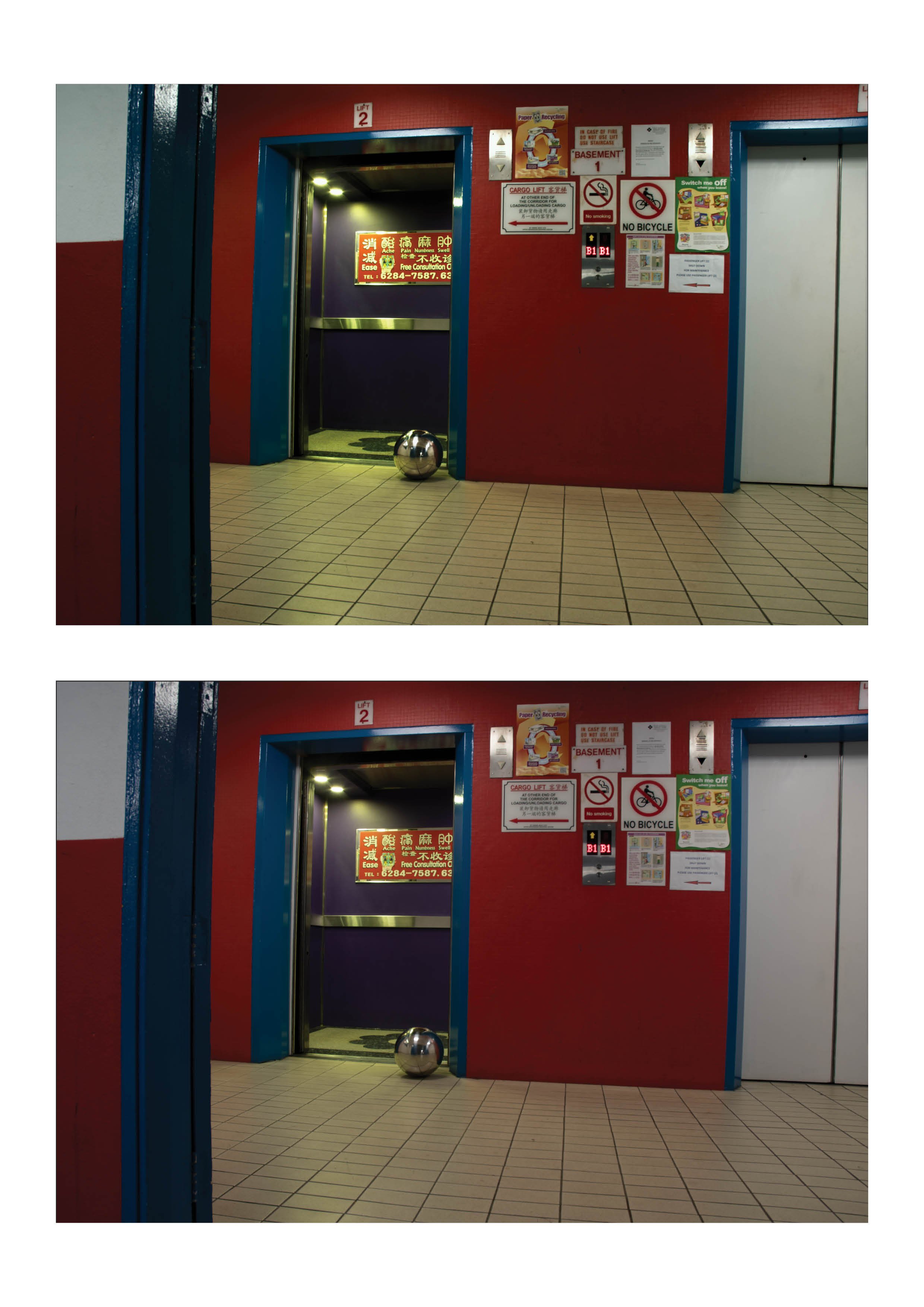
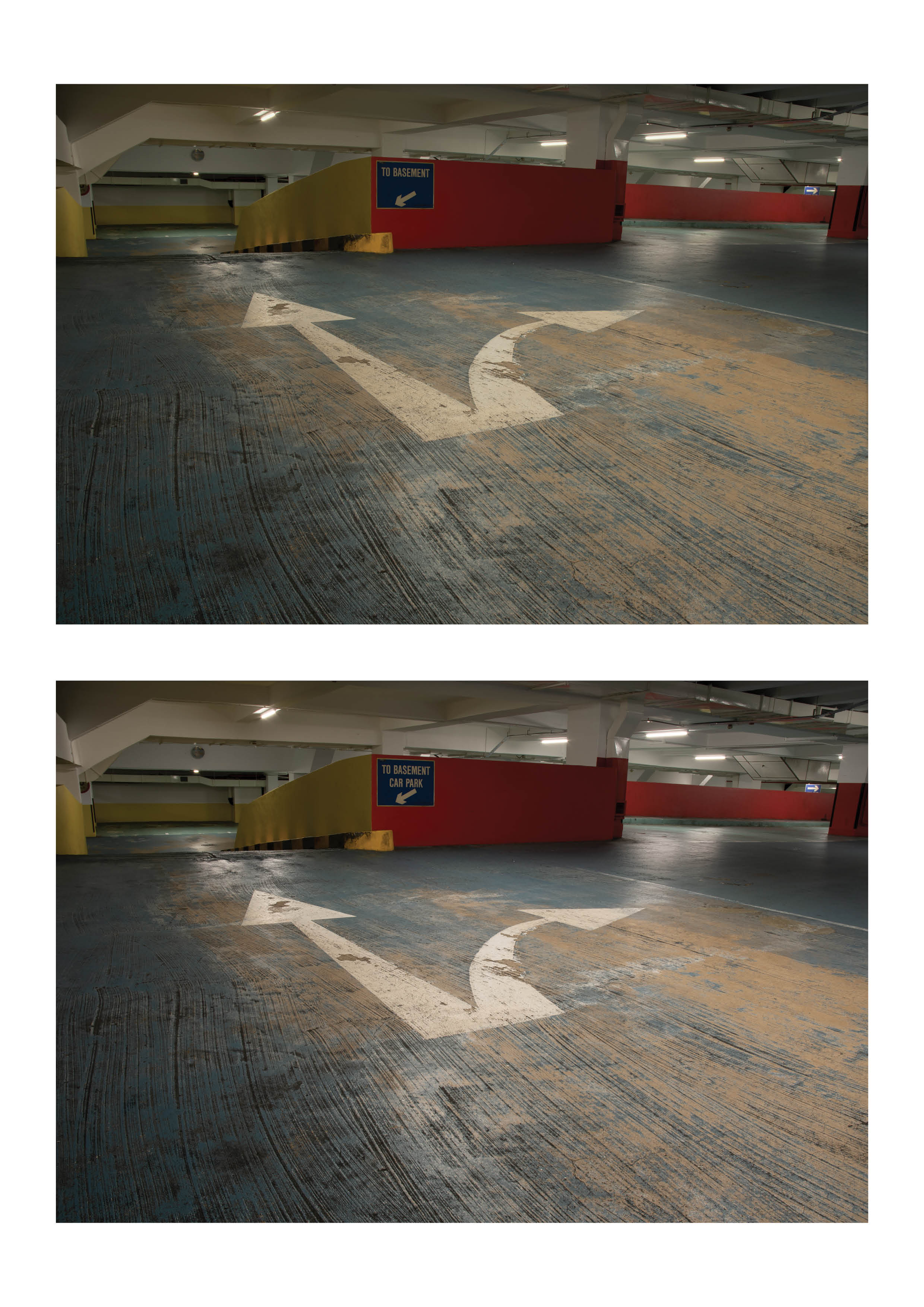
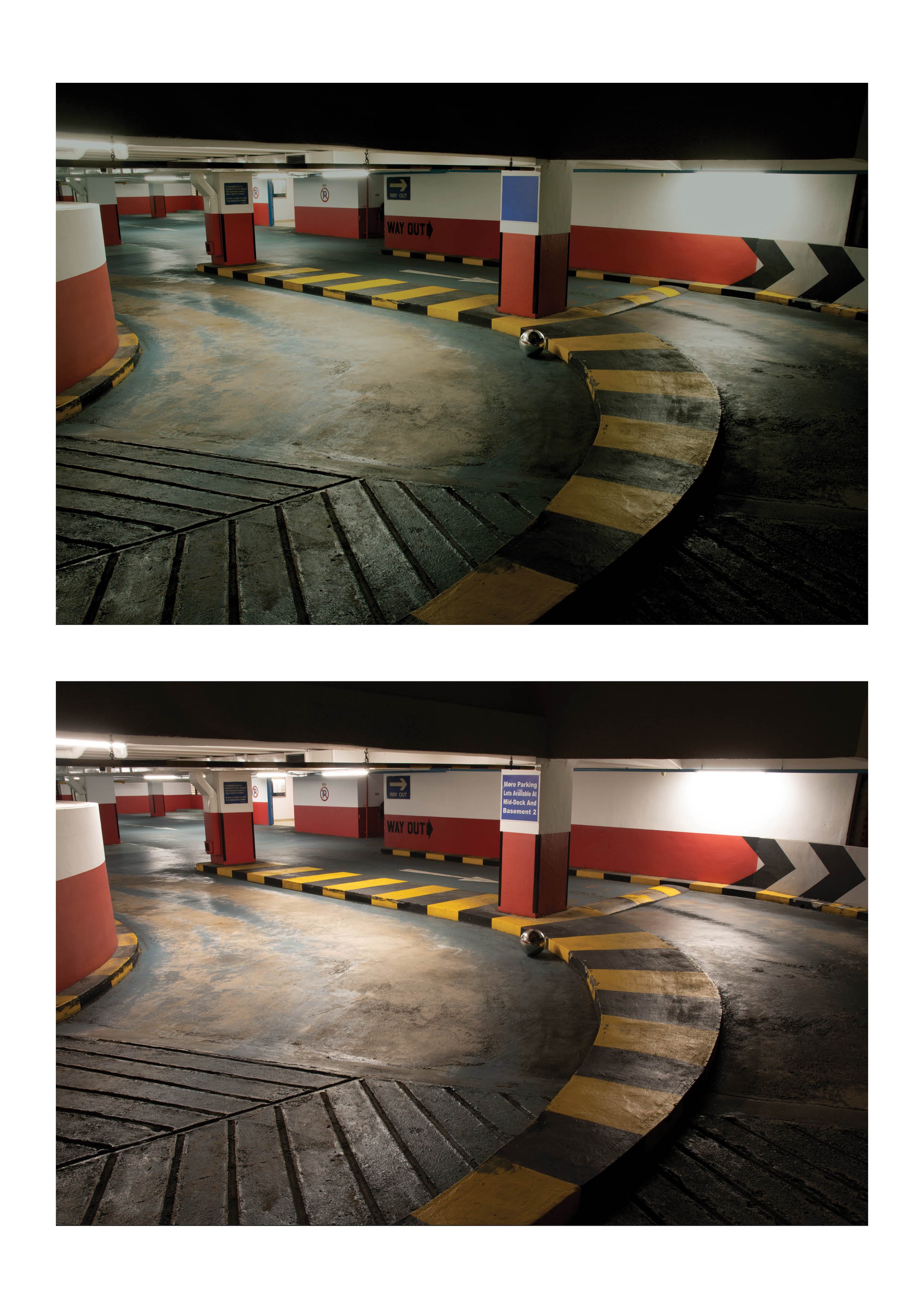
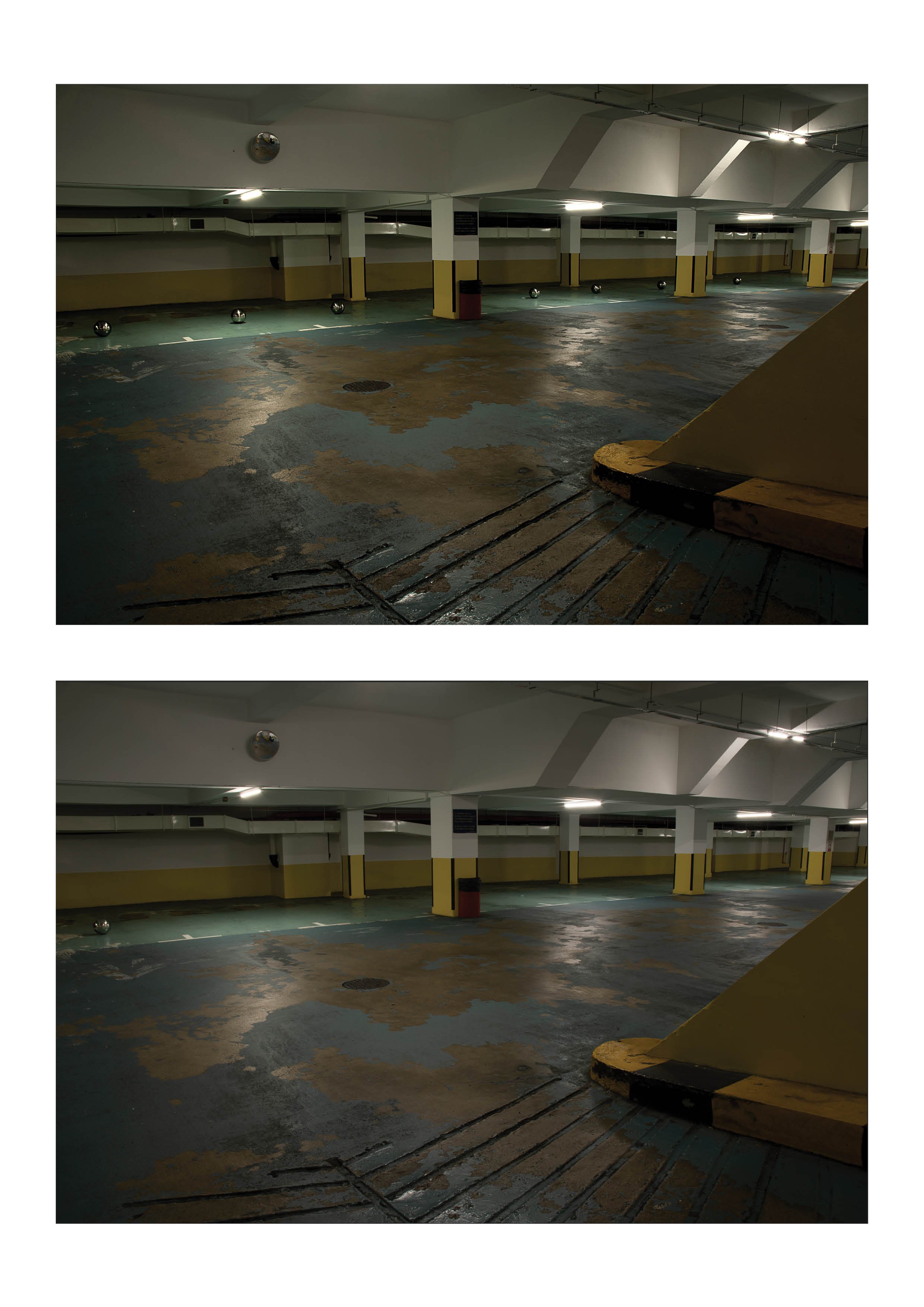
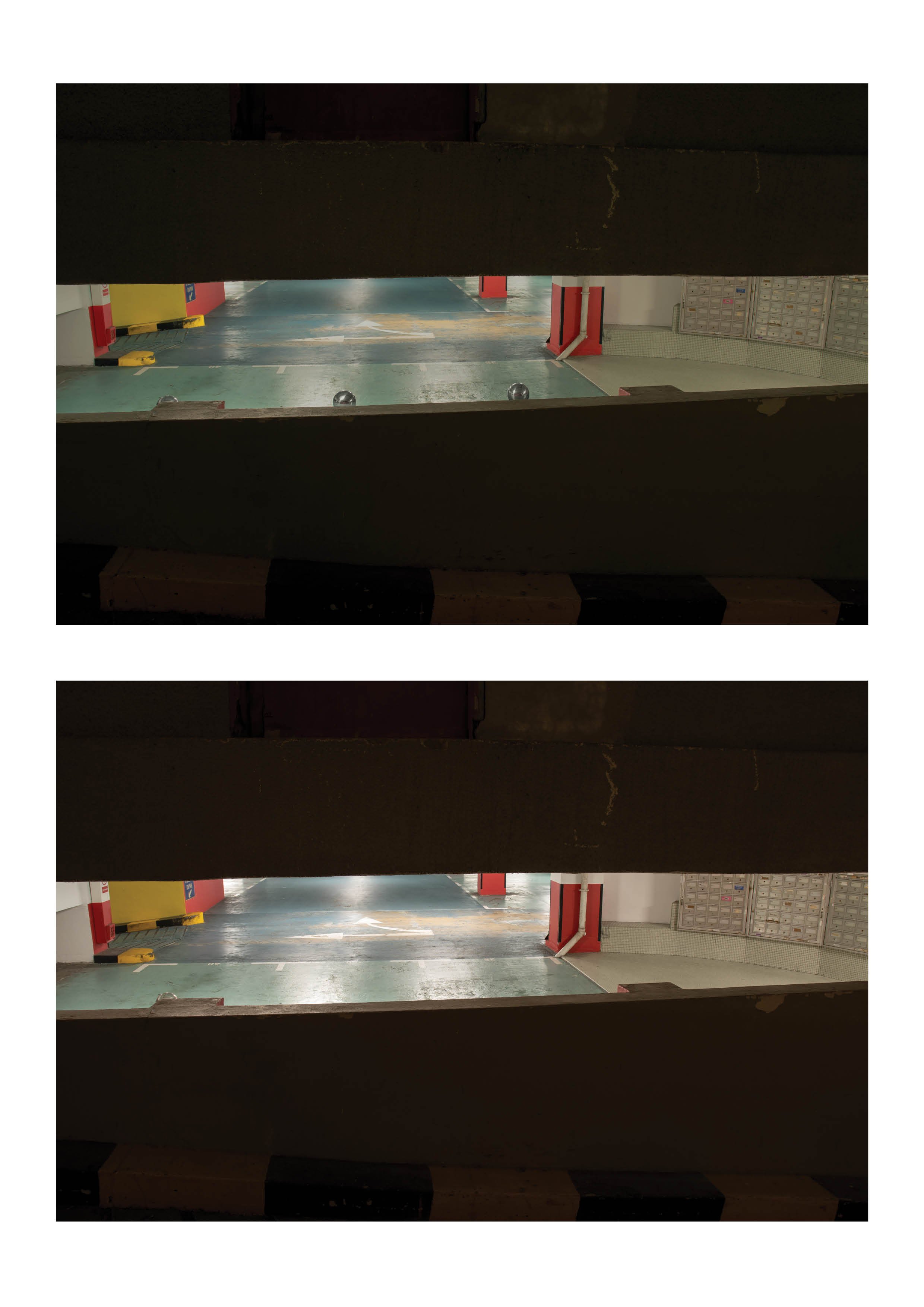
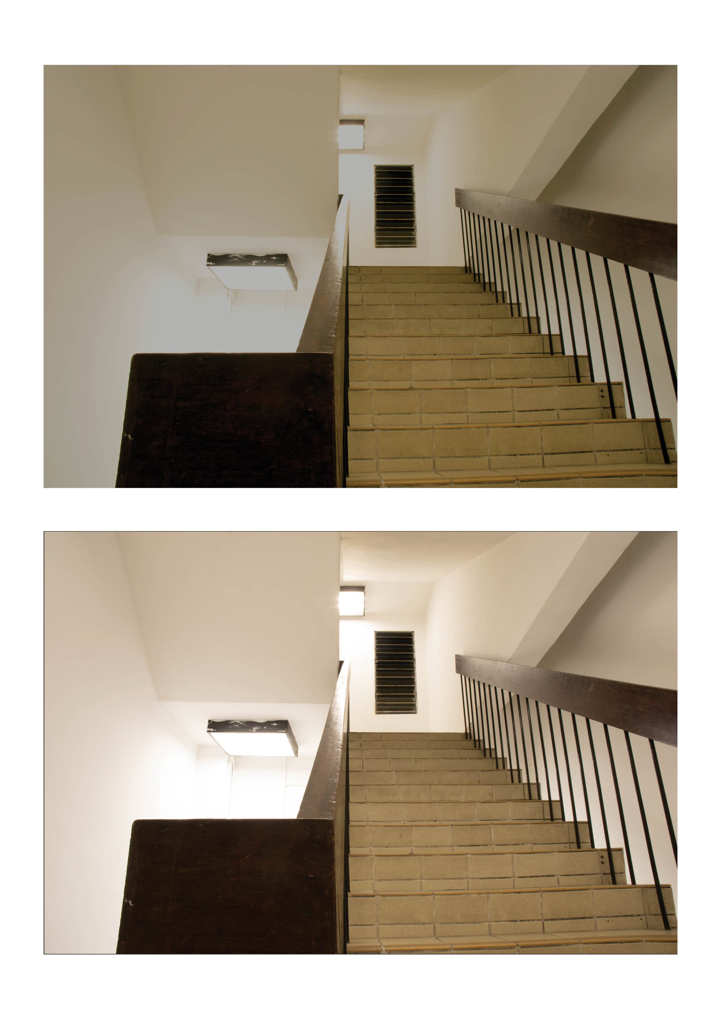
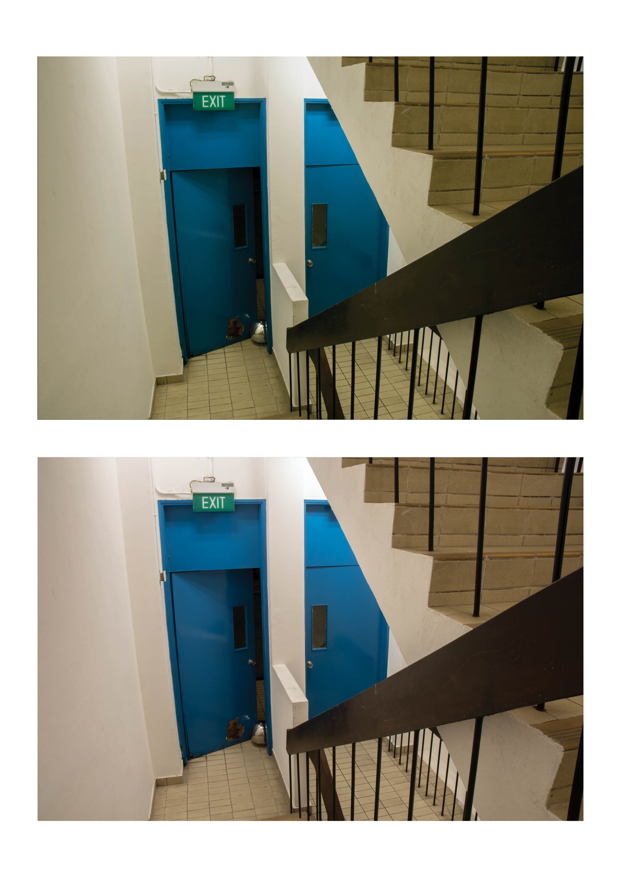
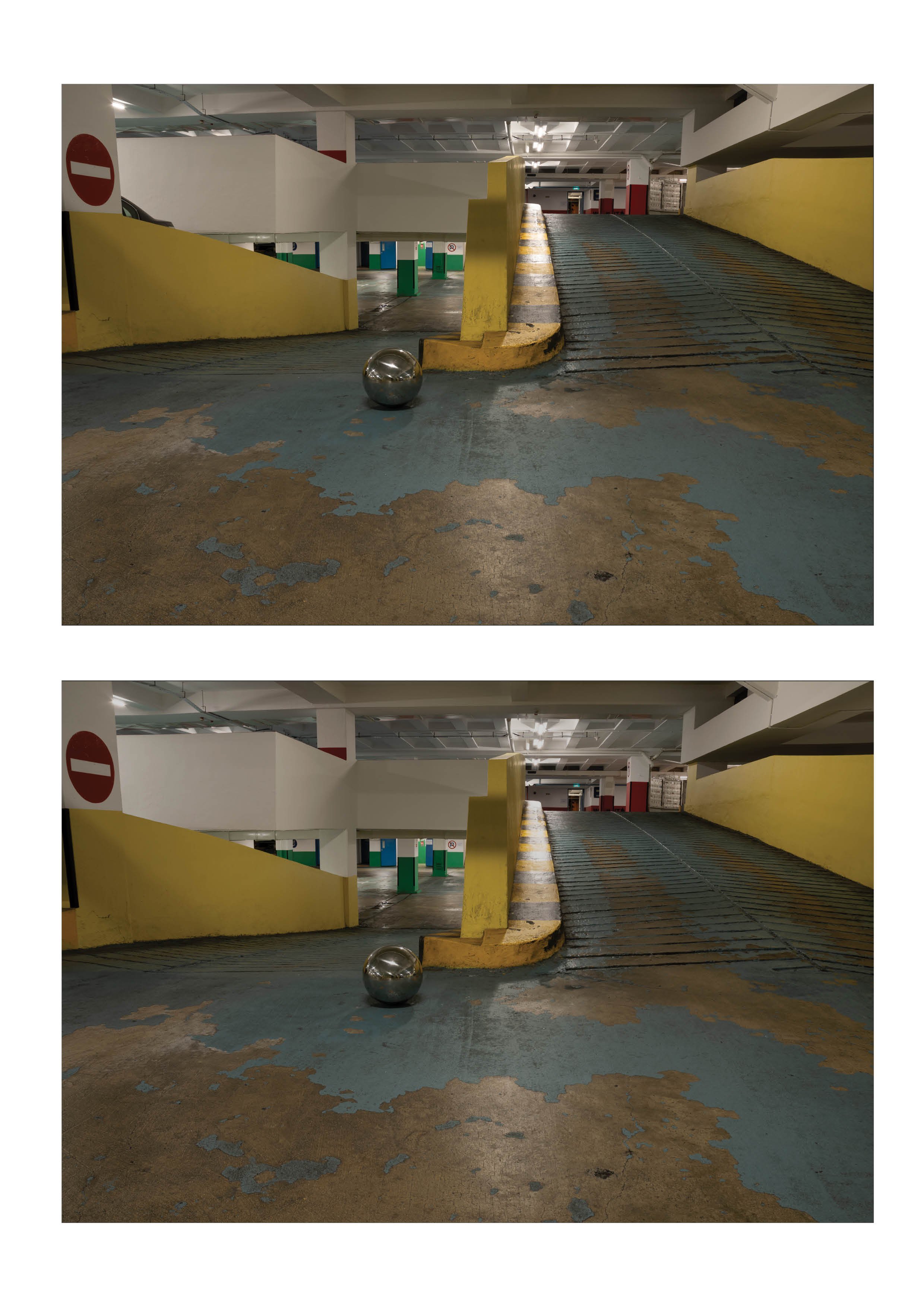
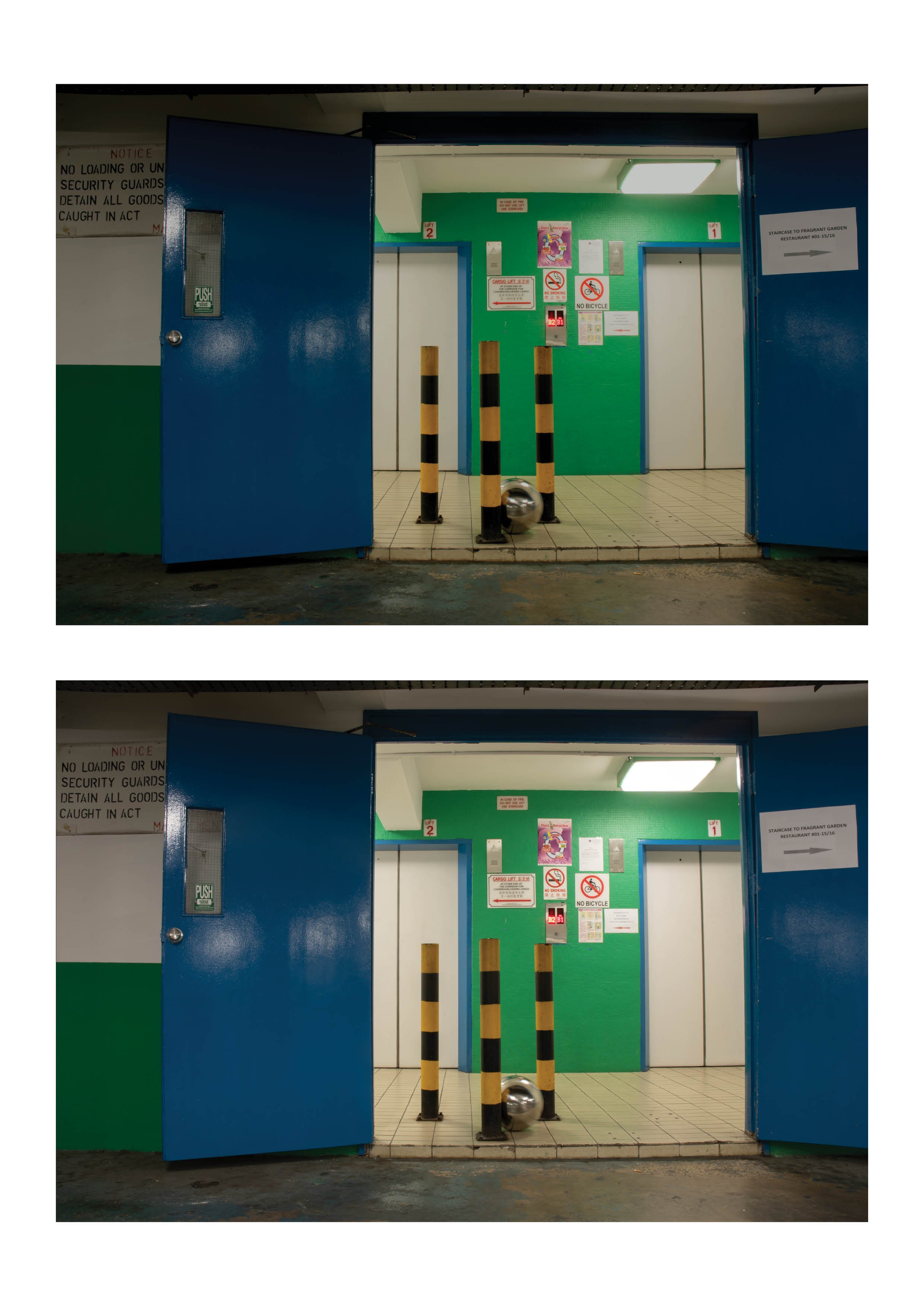
This series is a study on the movement of a sphere, reimagining a carpark space as a elaborate marble run. The compositions encourage the imagination of movement through the form of the build and architecture of the space. The start and the end of the series suggesting a loop of going back to the starting peak of the run. The imagined movement also suggests a sound scape the the metal ball creates as it travels through it’s path.

Technical Decisions

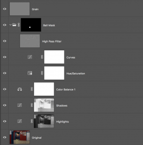
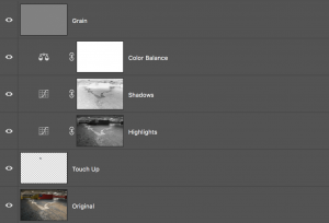
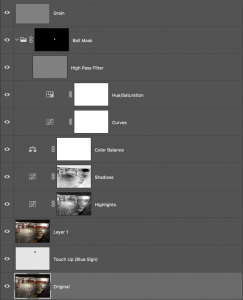
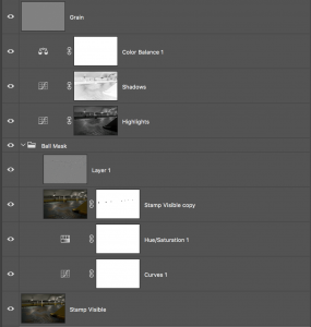
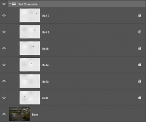
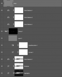
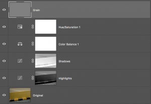
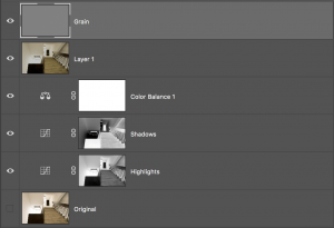
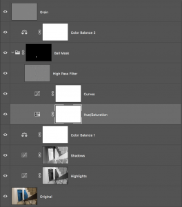
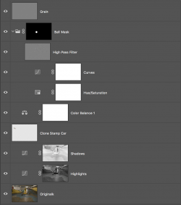
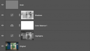
The images were shot with long exposures due to the low light conditions of the carpark. This resulted in flaring from the fluorescent light sources and thus most of the post processing was to bring the highlights down. I also desaturated and adjusted the curves for the metal balls to pop out from the compositions. A general green/warm hue is applied throughout all the images to make a more coherent colour scheme. The following are the images in the After (above) and Before( below) followed by the adjustments for each image.


Final JPEG Images can be viewed here


Evan Grant: Making sound visible through cymatics

Cymatics is a vibrational phenomena that consist of visual waves that are formed by the movement of sound waves through a medium. This is a term that was coined by Hans Jenny (1904 – 1972) and still continuously explored in the current times in the search of expanding the visualisation of sound. The most prominent experiment was the physical formations of cymatics by Ernst Chaldni as displayed below.

These formations were created by placing sand on top of a metal sheet and the metal was stroked with a violin bow. The frequency created by the vibration from the bow was translated both into sound and into physical sand formations that are organic and mathematical at the same time.

Throughout the talk Evan Grant introduces the idea of how there is data in everything we see and interact with, and how Cymatics is a first step in accessing that data. We can now visualise the frequencies of sound into a tangible and pictorial form. He introduces current applications of this research in forms of oceonography where scientists are capturing sonic records created by  dolphins and how it’s being recorded as language.

Cymatics is a factual and accountable approach in visualising sound, however it is limited in terms of it’s ability to express the human cognition of sound. Sound and emotion is still a phenomena that is extremely hard to visualise. Sounds we hear on a daily basis is a mash up of multiple frequencies and tones that create complicated structures that hold various positive and negative emotions. That being said, classifying a sound to an emotion isn’t a natural cognition but a constant conditioning of our experiences and daily interactions. I personally feel conflicted with the ideal of visualising sound as it’s a highly subjective experience. Often certain visuals can bring out the idea of a sound more accurately than the cymatic representation of the same sound. With the emergent of sound artists and music visualisation techniques, I look forward in seeing the gap between factual/mathematical visualisation and expressive visualisation close in as we try to unpack the magic of sound and it’s visual language.


Project 3 Final Part 1

Concept Draft

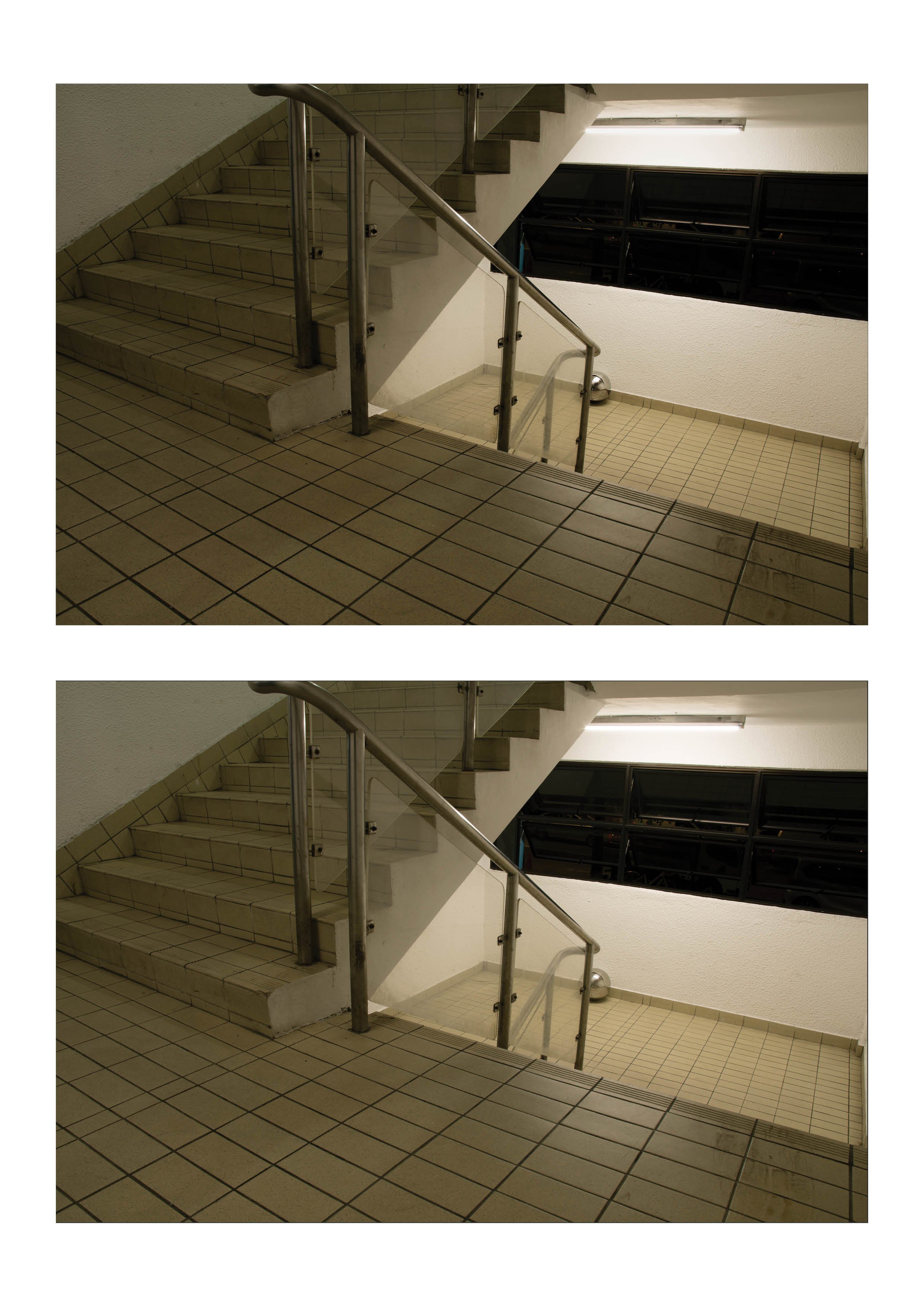
This series examines the flow in the form and movement of structures. I plan to use the silver ball as a motif to encourage and highlight the imagination the movement of the composition through the path of the ball being released from the subject.

Technical Decisions

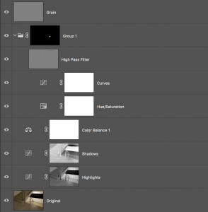
I decided to use a wide-zoom for the series to enhance the spectacle of the size of the compositions, where the setting is in a big space and the subject being smaller in comparison. To bring out the path or the flow in the image, I decided to desaturate and wash out the elements that are distracting and bring the focus into the subject and the ball.


The transmission of ideas: instruction-based artworks

Sol Lewitt

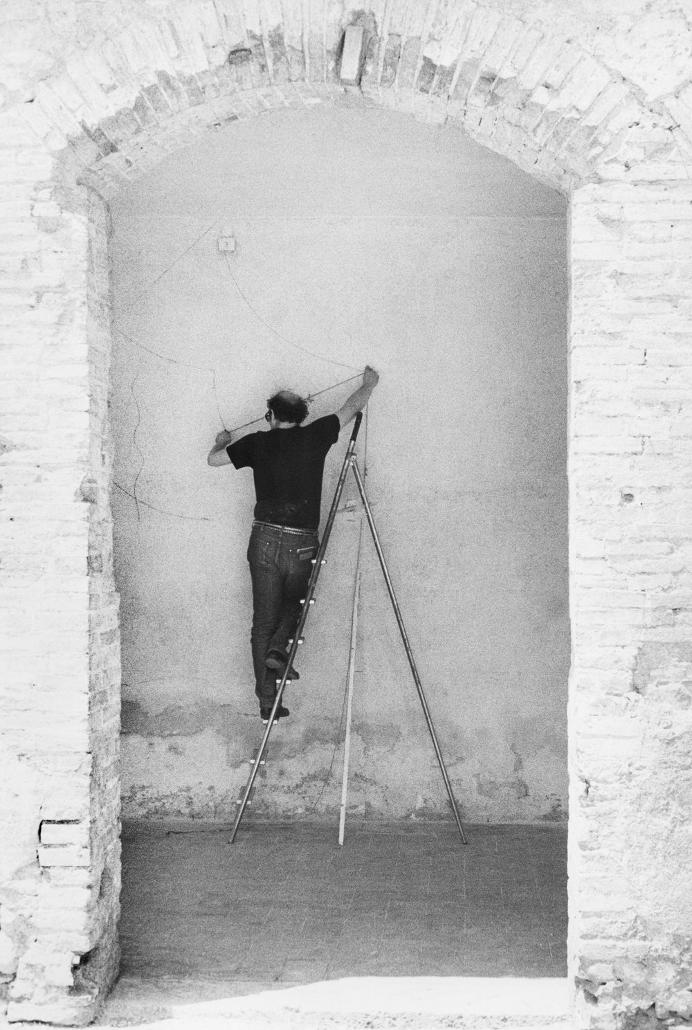
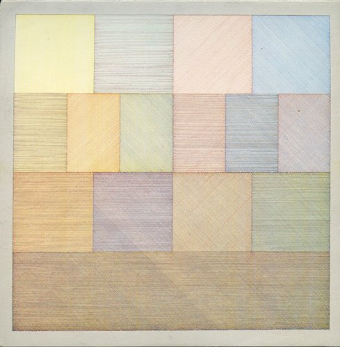
One of the ideas that i was drawn towards from the exhibition was the idea of works that are recreated by the artist studio in a space. Some of the works are recreations of the original concept which are recreated through specific instructions. The primary example would be Sol Lewitt’s wall drawings that consists of huge panels created by colour pencil lines on the gallery wall. The work required draftsman locally to carefully draw layers of coloured lines on top of each other creating a soft pastel wall of which was a spectacle in size. While I adore the idea of instruction-based installations, a few fun questions were running in my head.

the medium is not the end

Lewitt’s approach on the wall drawings was firstly to focus on the idea of communication between the artist and the audience. This idea was expressed in one of his earlier inspirations by Seth Siegalaub’s project The Xerox Book where Siegalaub invited various artists to contribute pieces to a book that would be cheaply reproduced by the Xerox machine. Siegalaub described the Xerox process as ‘such a bland, shitty reproduction, really just for the exchange of information’ . I felt this statement resonated with the concept on instructional based work of which the medium is transient and temporary. It’s just taking in form of a messenger to communicate the idea across to the audience. The importance of the work then lies more on how specific and detailed the instructions are. On how after various reiterations of the work, it’s still identical in technical execution.
the context of the space

The medium of drawing with colour pencils is relatively accessible to the common man. So if I get my hands on the instructions of one of the drawings, does the work still hold it’s integrity if i attempted to recreate it in my own wall at home? Ignoring the ideas of legal ownership and representation by recreating the work as is questions the context of the work. Would the work still communicate the same message if it isn’t in a gallery or art space? Would it still work without it’s monetary value that justifies it’s credibility as art?

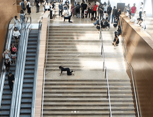
Restaging of Trisha Brown’s Sticks by dancers from LASALLE student dancers

recreations are always different

The curator mentioned due to the nature of how sol lewitt’s wall drawings are permanent on the gallery walls, they can’t be removed but will be painted over after. This results in each drawing being unique to the space and in such, there is no constant piece to be referenced as the benchmark. Therefore you never actually know what is the original and intended piece of the artists. This state of change in ideas are more prominent in the Trisha Brown dance pieces that I was watching a week before where the dance was restaged by local dance students. The transmission of the idea through the work is always different in the context it is staged in despite how much you can control the creation of the work. It encourages the timelessness of the piece as there is a new life to each iteration of the work, with a new collaborator or artist coming from a different time and place putting a part of them into the process.

External readings:
https://www.tate.org.uk/research/publications/tate-papers/14/ideas-in-transmission-lewitt-wall-drawings-and-the-question-of-medium

Digital Photography Assignment 2: Landscape

Download Link

Before

After


Technicals

1/50     F3.5   ISO100
28mm
Canon 5DMKII

Artist Statement/Concepts

This image was a shoot with friends at Golden Mile Tower. The building probably has the best dynamic architecture that consist of bold colours that are fading and large flows spaces. The emphasis is therefore on the background and the human subjects to fill in the mid ground for scale. The original image was slightly overexposed in the highlights and the colours of the space is bit too cool. In the corrections I masked out the arc windows to bring details back in and use the spit tone technique to balance out the exposure. I also toned down the saturation of the colours and added some warmth into the light that was projected on the floor.

Process

Before and After split-toning the exposure. I brought down the highlights and darkened the shadows

Adjusting the hues for the walls and the interior

After masking the arc windows to drop the exposure, bringing details of the trees in

Warming the yellows in the image by adjusting the mids and the highlights.


Final Image