Inspiration:
Subject
I have always loved the Persona series from the Shin Megami Tensei franchise. The series explores the Jungian psychology’s concept of Shadows and Personas.
Persona’s being the masks we wear to fit into society and fit the environment in. In Jungian psychology, an individual can have multiple personas for the many different situations he experiences.
A shadow according to Jungian psychology on the other hand are thoughts and parts of us that we repress or hate.
In the Persona series, the main character fights against shadows, of the collective unconscious and certain individuals, that takes the form of demons and monsters using personas which the take the form of heroes and gods from myths and legends.
I have always loved the art and aesthetics of the series, it is always tactful and with purpose. Persona’s 3-5 for example has a theme colour that their art revolves around to match the theme of the game

Persona 3’s theme is the colour blue, to match the game’s themes of death and sacrifice.
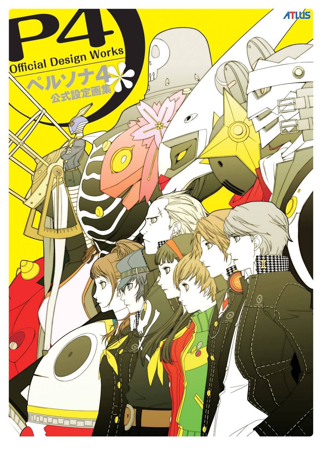
Persona 4’s theme is yellow, to match its bright and cheerful small town setting.
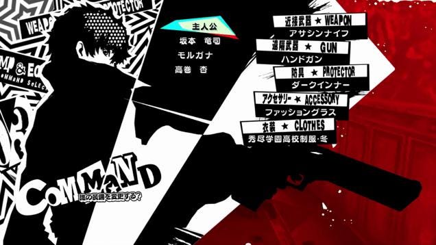
And in the latest installment, a red theme is adopted to coincide with the game’s themes on rebellion and freedom.
These colours influence every aspect of the artwork for the game right down to the interface.

I am actually pretty excited to see what colour theme and what aesthetic the artists would adopt for their next installment.
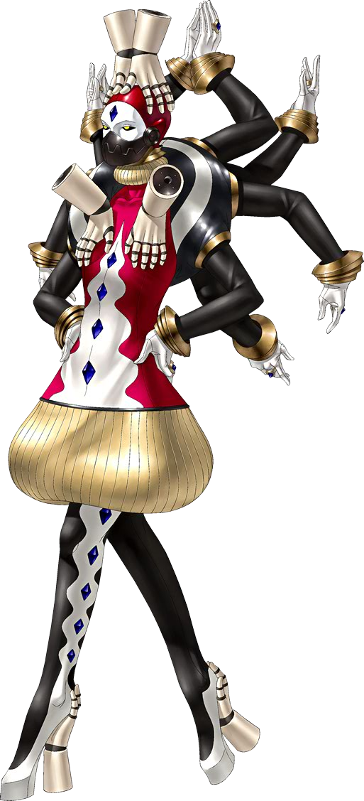
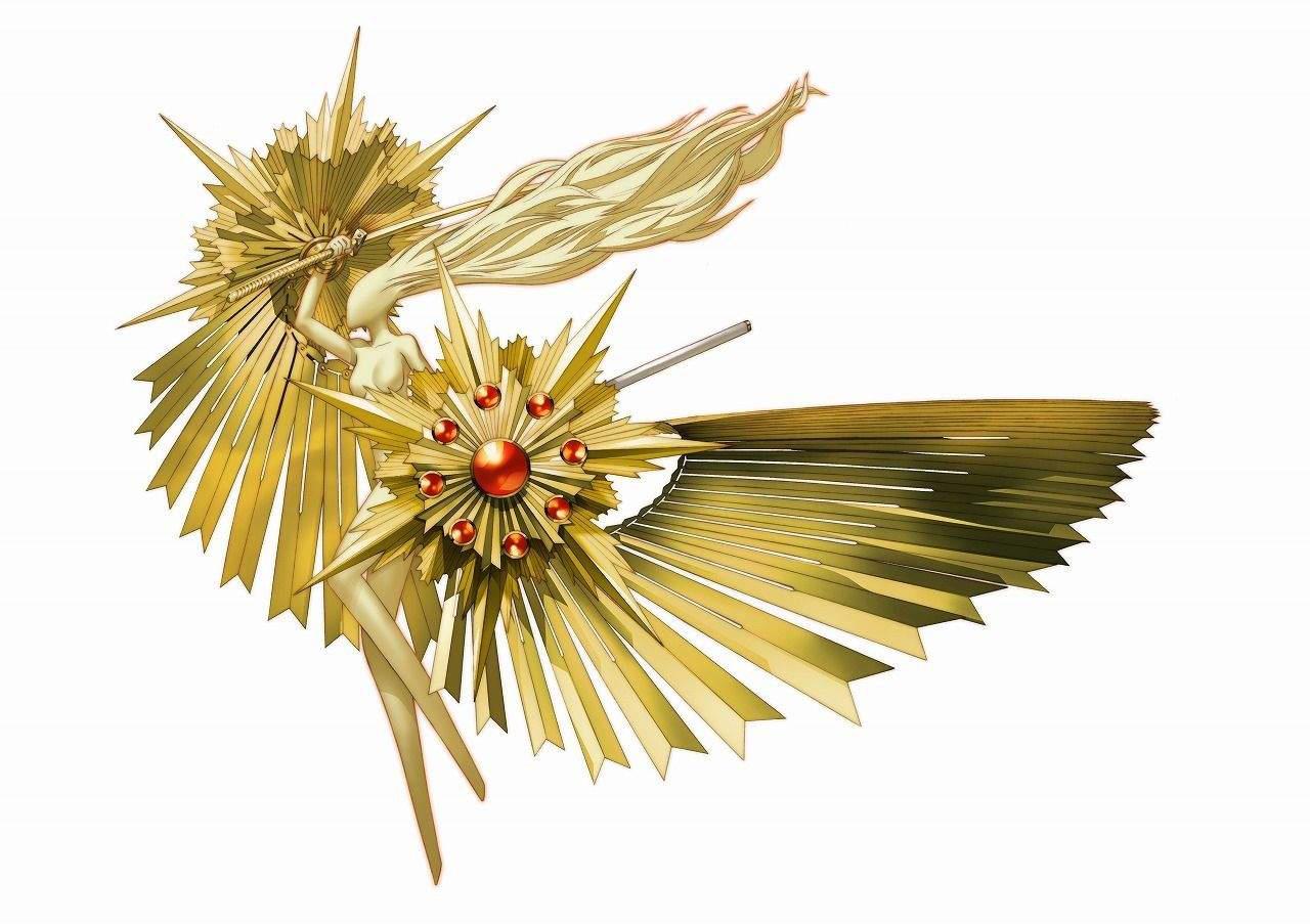
However, more than just the overall art for the game, I really love the works of Japanese illustrators Kazumi Kaneko and Shigenori Soejima. Both of them are character designers for the persona series and I personally feel that their works are phenomenal.
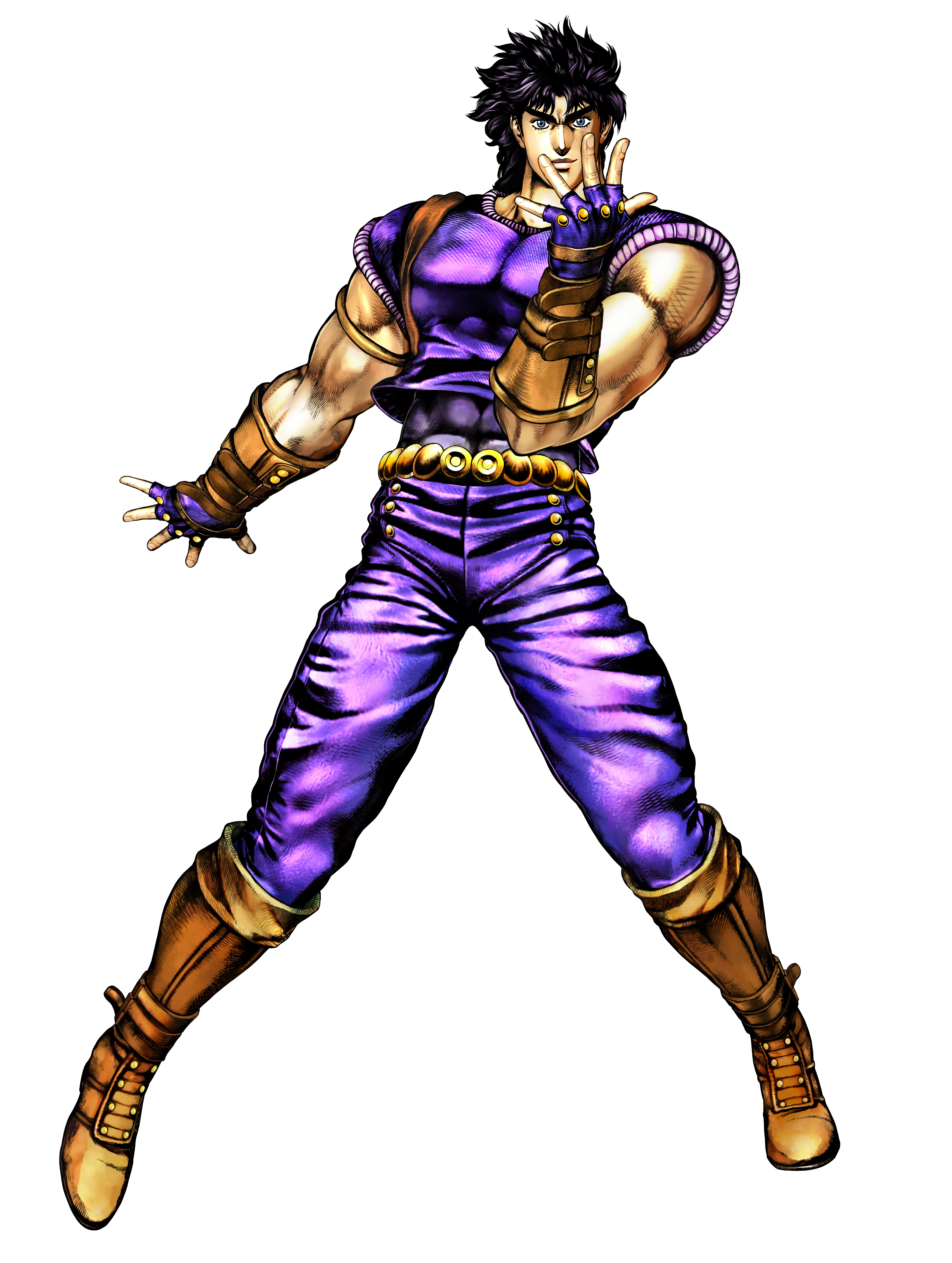
Kazuma Kaneko is the head director for game developer company Atlus. Kazuma Kaneko did character, demons and persona designs for Persona 2. In creating his designs, he was deeply inspired by high fashion. This is apparent in the proportions and the clothes/forms his designs take. Kazumi Kaneko was also inspired by mangaka artist Hirihiko Araki ( Who was in turn inspired by Kazuma Kaneko and High fashion too… Inspiration inception)


Shigenori Soejima was an understudy to Kazuma Kaneko while working on Persona 2. Shigenori Soejima was then put in charge as Art Director for the next few installations for the series. Shigenori Soejima’s works are undoubtly influenced by Kazuma Kaneko, but he tries to not conciously copy his designs and tries to create a new fresh look for the fans of the series.


How I used this
Taking inspiration from this, I represented the different personas I take and am influenced by as humanoid figures ( like the personas from the persona series). Also looked into my own shadows, part of myself that I really hated to depict.
Story
Besides this, for the overall narrative for this project I also took inspiration from tarot cards, to be specific, the Lewellyn Tarot card set, which is a deck I use.
I looked into tarot cards as an inspiration as each card in the set represents something from the human psyche and the imagery depicted on each card clearly represents that.
Each persona, demon and character in the Persona series too has an associated major arcana which fits their traits
More than that, I have always loved the tale of the Fool’s journey depicted in the Major Arcanas.
The story of the major Arcana starts with the number 0, the fool. Where an individual starts in a journey with a blank slate.

He is then influenced by his experiences and the people he meets.


And ends with the individual reaching enlightenment or self actualisation which is depicted by The Universe or The World arcana, the last card of the major arcana series.

How I used this
Since I was depicting parts of myself that allowed my to grow as a person, even though most of it was negative, I decided to depict them as characters of the Major Arcana. This tarot card motif also influenced my choice of medium as, water colour is usually used for painting Tarot Cards. ( A choice I regretted for a while halfway as I was not too adept at using it, but at the end I was really glad with how my works turned out and how I improved with using the medium)
Form
Now that I have figured out what I was going to depict, that is a central subject with a coloured background, next I worked on how I was going to depict them.
If the composition had the central subject simply in a standing pose that would have led to a very boring final piece.

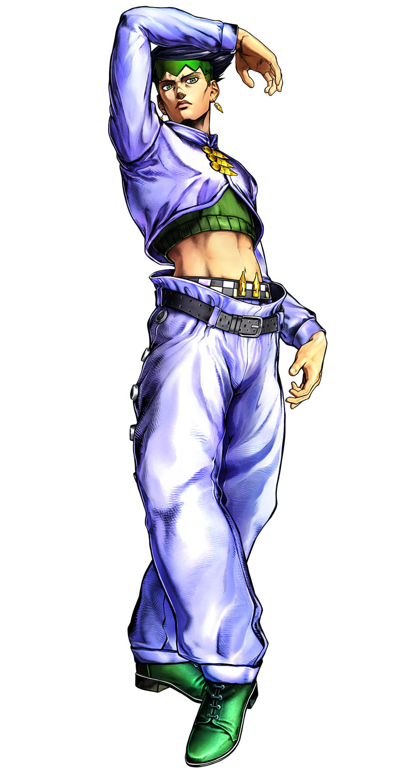
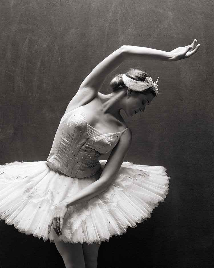
I then decided to make the pose more dynamic to make each composition more interesting. For the posture of each subject, I took inspiration from firstly, Hirohiko Araki who is well known for making his characters, usually burly muscular men, take poses that models from High Fashion usually take on the runway.


Notice how even the layout for this artwork is reminiscent of a fashion magazine cover.
Infact, in 2014, Hirohiko Araki had a collaboration with Gucci.

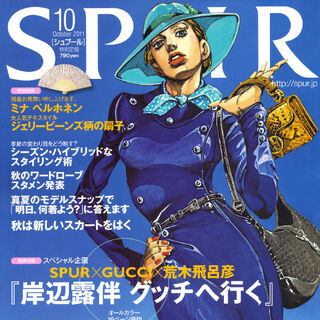
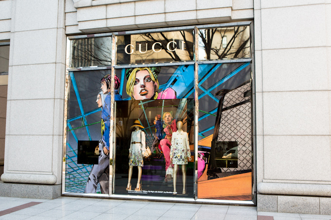
Hirohiko Araki is also known for using bright and vivid colour to depict his characters and has said in his interview that he is inspired by Paul Gauguin for his colours.

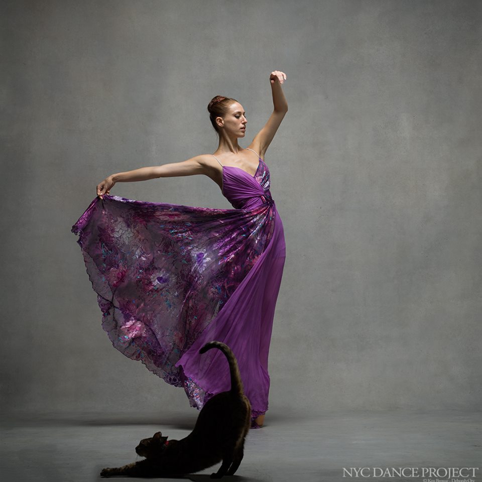
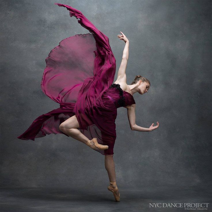
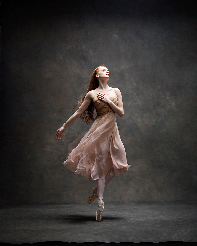
Besides this, I also borrowed poses from dance, through the NYC dance project.
The NYC dance project Ken Browar ( a fashion and beauty phtographer) and Deborah Ory (dancer). The project aims to showcase wonderful dancers from all over the world centered in New York City. The photographs taken for the project feature usually a singular subject striking a very dynamic pose. Even though the the photograph itself isn’t moving. Through the the lines created from the dancer’s body, the photograph clearly portrays movement.


How I used this
Hence, I tried depicting each of my figures in a dynamic pose dance or fashion pose.
The 1st Equation

Row 1 depicted my experience in using dating apps.
Panel 1

For the first panel of the first row, I thought it was only apt for me to use The Fool Arcana to depict myself.
Story wise, the fool still fits as it represented starting on a journey, for better of for worse. Dating apps initially was anew venture for me. I was at a stag eof my life where I wanted to to be adventurous. But like a fool, no matter how many bad experiences I had, I kept returning to it. I kept telling my self that it was just an experiment.
Colour wise, once again since it was the first panel for the project, it wasonly suitable for me to use the primary colours, the first three colours we learn, in a triadic colour scheme.

My first challenge doing this project was colour itself. Although I am comfortable in picking the colours to use for an artwork, I am never sure of the proportion to use. Researching online, I discovered that for triadic colour schemes, we should make the one colour the dominant colour, and the other two subordinate colours. Here I made red the dominant colour as the fool has always been garbed in red. It is a colour that depicts energy and freedom.
Initially, only the colour red and black were used as I was not confident in my abillity to use multiple different colours in the same compsotion, but in the end, I decided to add in blue and yellow. At first, i was unsure if this decision worked, but looking at it a third time, I was sure that this was the right choice and it made the composition more exciting. To test out the colours, I also used colour pencils first.


For the pose, I decided to use one that suggested forward movement to match how The Fool arcana’s meaning.
Panel 2

In the second panel, I decided to personify the dating apps I used as the temperance. The temperance is usually a card that represents direction, control and conviction. Reversed however, it represents being lost, having a lack of direction in one’s life.
Personally, I usually end up returning to using dating apps when I have a lack of direction in my life. I used it a lot during my NS period where life became a continuous routine for example. And I find this true for the others who use dating apps excessively too.
The colours used for this panel is the same colours used in the dating app Grindr.

I wanted the colours to be bright, but so bright to the point that it was unsettling. So I used pure yellows and blue. The background was also a direct imitation of the dating app’s messaging interface. The words too were usually standard exchanges when talking to almost anyone on the app.
For the pose, I chose one that was spiraling, a representation of how to me, using dating apps was a downward spiral.
Panel 3

The last panel for the first row was The Tower Arcana. The lightining struck tower usually represents disaster was approaching. Almost every interaction I had using dating apps ended in disaster, and that usually starts when I reply ” Yeah Sure”.
For the colours, I wanted to make it looks sinister and dark despite using yellow and blue. Thus I opted to use the complimentary colours yellow ochre and indigo blue instead and used darker shades.

Before working on the actual piece, I first tested out the colours this time using copic markers.

For the dance pose, i used one where the subject was looking down but still had an air of confidence. It was to represent the fake confidence I surrounded myself in when using the dating apps.
The 2nd Equation

In Row 2, I depicted the kind of relationship I felt I had with my parents. My parents are very proud conservative muslims, who hold the image we portray to every one especially to our relatives higher than anything else. Because of this, the liberal ideologies that my siblings and I prefer usually get shunned and looked down upon by my parents and thus this leads me to keep many secrets from my parents. Don’t get me wrong, I still love my parents dearly, and that is why i hate it that I have to keep so many secrets from them.
Innitially, I wanted to use purely monochromatic colour schemes for my 2nd Row, but that evolved instead to analogous colour schemes as I liked using a range of similar colours when shading. I would use browns to shade shade the darker part of something yellow for example. Here I also used colour moods an emotions, matching the particular feeling I wanted to portray with the colours used.
Panel 1

The first panel depicted the Hermit arcana which usually symbolises and individual finding ones way through solitude and introspection. Being a young adult, I love trying out new things, even ones deemed forbidden by my parents. To me, a kid has to live their own life and figure for themselves what is right and wrong through their own self reflection. Not simply follow a path set out to them.
That is why for the colours used, I used a range of warm yellows and browns because, as an introvert, I enjoy discovering myself through deep reflection. That is how I better myself as a person.

Initially, a green colour palette was used instead but I decided to scrap that Idea as I realised the colur green would be better suited for the next panel and didn’t really line up with the emotions I was trying to show in this panel


So fianlly I decided to use a range of yellows and browns.

For the pose, i decided to use one where the body seemed relax, to reflect the calm attitude one usually adopts when indulging in self reflection.
Panel 2

In the next panel, I depicted my parents as the Emperor and Empress arcanas. Both of which represented a leading male figure and a leading female figure respectively.
Here I used the colour green as the colour green usually represented evil or nastiness and I wanted the sinister side of my parents to show. Hence I used the range of yellow green to teal.

I made sure to test out the colours first to make sure I knew how to mix the different range of greens and also to see how they looked next to each other.


For the pose I decided this time to use one with less movement but one that portrayed a proud and dignified individual. So I took inspiration from Hirohiko Araki’s fashion inspired poses.

Panel 3

The last panel for the second row depicts The Moon arcana. I chose this arcana to represent the way I am with my parents as its a card that represents secrets and the unknown mirroring how I keep a lot of things hidden from my parents.
Accordingly, I used the colour blue to show a reserved cold personality.


The 3rd Equation

Row 3Row 3 here depicted how I am like around people that reminded me of myself, or to be more exact, of my past self. This makes me pretty much a hypocrite. Although I am an individual ruled by my ideals, when with certain people, I go back on them. For example, i think it is okay to be sad as being sad allows one to reflect and grow as a person. At the same time, I get really annoyed when someone is overly depressed all the time. Another example would be how I think the true self does not exist, as we are molded by the experiences and memories we forge true life, there is no one core being we should have. At the same time however, I get really annoyed at people very obviously trying to be people they are not. Even I don’t really understand why this is so. It is a side of my that I really don’t like.
For this row, I tried to step outside of my comfort zone and use tertiary colour to create very bright and energetic compositions, but so as to not make the compositions too chaotic and muddled ( as tertiary colours are being used), I limited myself to mainly 2 colours, the tertiary colour and its complimentary.
I also added a halo of sorts around each figure as the arcanas used for the 3 panels usually depict and angelic or demonic figure and to unify the panels
Panel 1

The first panel, The Justice Arcana represents idealistic me. It is an Arcana that usually represents ideals and righteousness. Her I also depicted elements commonly found with lady justic who is the figure usually depicted in the tarot card as well, like the scales, the blindfold and the sword.
For the colour, I wanted it to look harsh yet soft and kind at the same time. Thus I chose Teal ( blue-green) the softest tertiary colour and orange, its complimentary.


For the, test, I accidentally made the colour too blue and corrected the mixture for the final.

For the pose, I used something soft yet regal. To bring out the qualities of lady justice, kind but fair.
Panel 2

The Judgment arcana was used to depict the judgmental me that surfaces around people who potray qualities that I don’t like.
I used very very bright obnoxius colours for this panel to match the annoying personality a very Judgemental person person would have. Thus I used the colour green-yellow and pink accompanied by their respective complimentaries, purple and green.


For the pose, I used one that had a very annoying condescending look. One that screamed ” I am holier than thou”.

Panel 3

In third panel, I depicted myslef as the devil arcana as I felt that hating on people who depicted or potrayed qualities that you yourself portray or being hypocritical is quite diabolical in nature. And I thought a figure that goes against typically accepted ideals was the devil, hence the devil arcana.
The colours used here were indigo and its complimentary yellow. I wanted to use a colour that was cold yet had a hnt of kindness, hence the colour blue and a colour that was warm and bright but could be harsh, thus the two colours were used.


The pose used here was one that was poised and graceful, yet humbled with the head bowed down. It was to depict someone who knew of his mistakes and knew that he has done wrong.

The Last Equation

For the last equation, instead of depicting a side of me that I hated, I chose to depict instead something hopeful and happy. I wanted to show how we can develop personas not only through negative dark situations but through happy situations and the masks formed from these aren’t necessarily bad.
In this equation I also tried to focus on a secondary colour orange and show how the same colour can look very different when used differently.


Panel 1

The first panel depicts the magician arcana, which a card that depicts the learning of new skills. I chose arcana numbered 1, the second arcana in the whole series, for the 1st panel of the last row to show how, despite everything, I am still at the start of my journey. The Magician Arcana also aptly depicts the start of my university life, a time where I am going to learn new skills.
Here I also tried to challenge myself by using 4 colours and thus adopted a tetriadic colour scheme. Using the colour orange and yellow, nd their complimentaries teal and blue.
I also added a recurring elements in all 3 panels, that is the halo, but this time in the form of radiating panels. ( me experimenting with different ways of depicting halos)

For the pose, I used something collected and regal.
Panel 2

In the second panel, I used the Sun Arcana to depict my boyfriend Miko. This card usually depicts an individual who is bubbling with positive energy. I think this arcana is the only one deserving my radiant and wonderful boyfriend who I felt instantly comfortable with the moment we met.
Here for the colours, I made orange as bright as possible and used the colour yellow to create a analogous colour scheme, creating a very bright and colourful composition to match the theme of the Sun Arcana.

For the pose, I chose one that would best depict my boyfriend’s personality. I chose one that showed poise, grace and yet one that brimmed with energy.
Using this reference, I created the robes for the figure in the composition. It was key to follow the curves as the curves of the robes also added to the energy of the figure.
Panel 3

The Star arcana. One that portrays hope. With everything good happening to me now, having someone I loved dearly, being in a place I enjoyed and learning what I love to do, it makes me feel hopeful for the future.
For this panel I wanted to use pastel colours instead and use a different form of orange, that is peach.
I wnted to use softer colours to match the soft feeling hope invokes.

For the pose itself I wanted to use one that mirrored the foreward movement of the first panel for the first row, but something less grandoise flashy.
Thus I ended the project on a happy and bright note.
Challenges faced and reflections
- my first challenge was definitely using water colour which I wasn’t too adept at using. I am usually too impatient to wait for the colour to dry and work in layers making a the product quite messy and blotchy. But I worked around this by firstly, looking at numerous videos on how to use water colour and secondly using other mediums such as water colour pencils ( which also made it easier t work with a wider range of hues as I didnt need to mix them) and copic markers.
- My next challenge was colour itself. I was comfortable with trying out different colours, but I wasn’t sure of what proportion to use them in. I worked around this by first creating a sketch and playing around with the colours. However this lead to a slow process in making the final product. This i didnt find a workaround, I didn’t want to compensate on the quality by rushing through things.
Overall I thought this was a very personal project for me as I tapped into sides of myself that I usually bury deep within myself. Having to actually paint them made me reflect on these sides of myself quite a lot. But this I felt was a very cathartic journey. As Carl Jeung theorised, acknowledging and accepting your shadows would lead to self actualisation.
With that, I thank you and have a nice day.