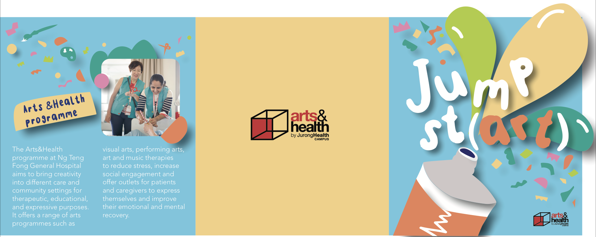
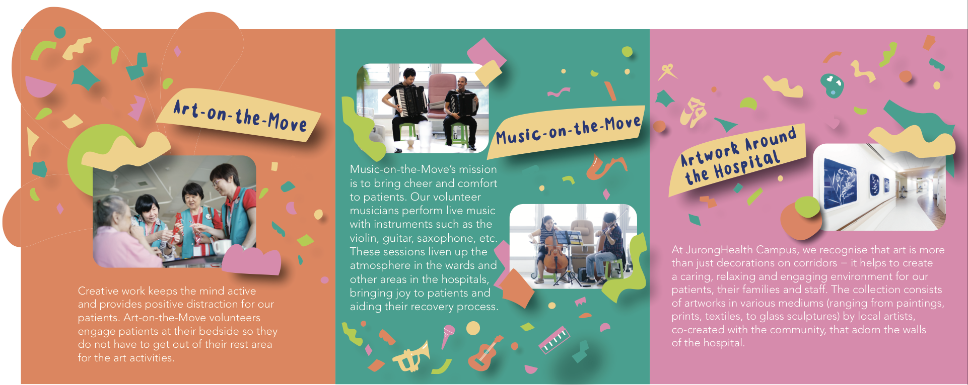
Final Brochure Design:
By reducing the size of the shapes the attention is now focused on the body copy and the featured image. Each information page has similar features such as the yellow title and shapes framing the images making the whole design intergrate.
The final brochure could have been presented better as I didn’t have time to test print and I had experimented with cutting the fold for a clean fold but ended up peeling the paper off.. I also didn’t realise that I was aligning the blue page with the pink page instead of the orange page when folded came together.
Rationale:
This brochure design represents the Arts&Health Programme, a programme that brings creativity into patients lives for therapeutic, educational and expressive purposes. Using bright colours and confetti-like shapes conveying happiness, positivity and celebration of creativity. The die cut of the shape creates visual interest and sense of surprise in comparison to a standard threefold brochure. All colours and elements are taken from the previous poster design, creating a family of collaterals. The shapes and yellow framed header flowing throughout the pages creating a sense of flow enticing the eyes to move from page to page.


