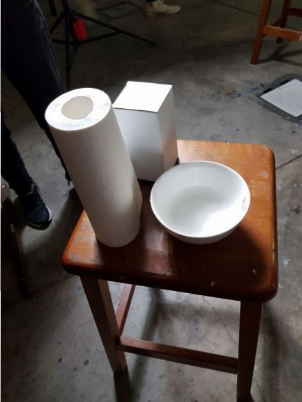
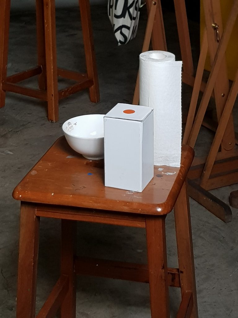
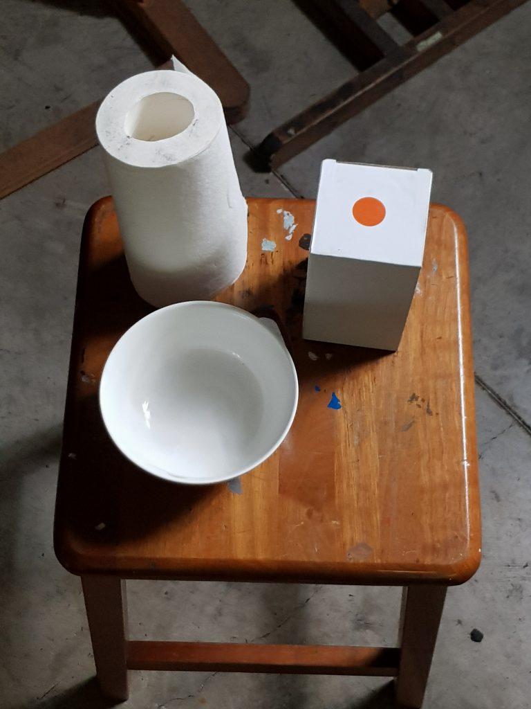
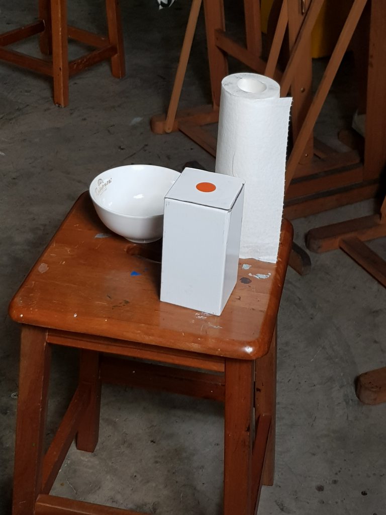
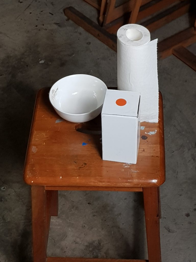
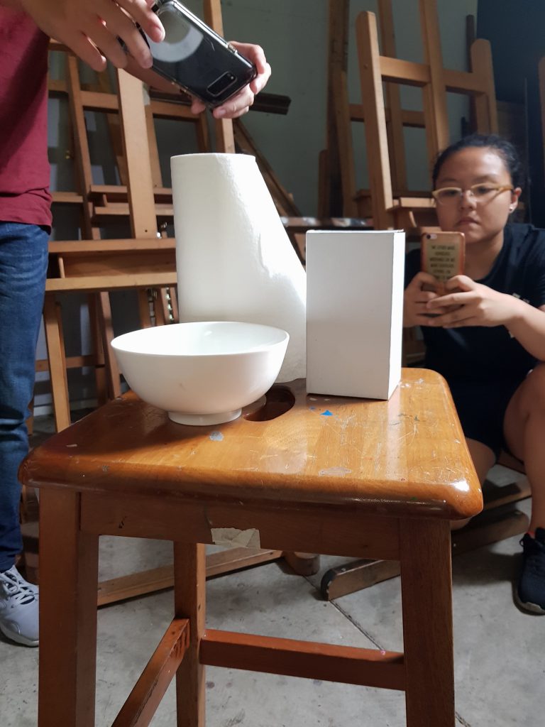
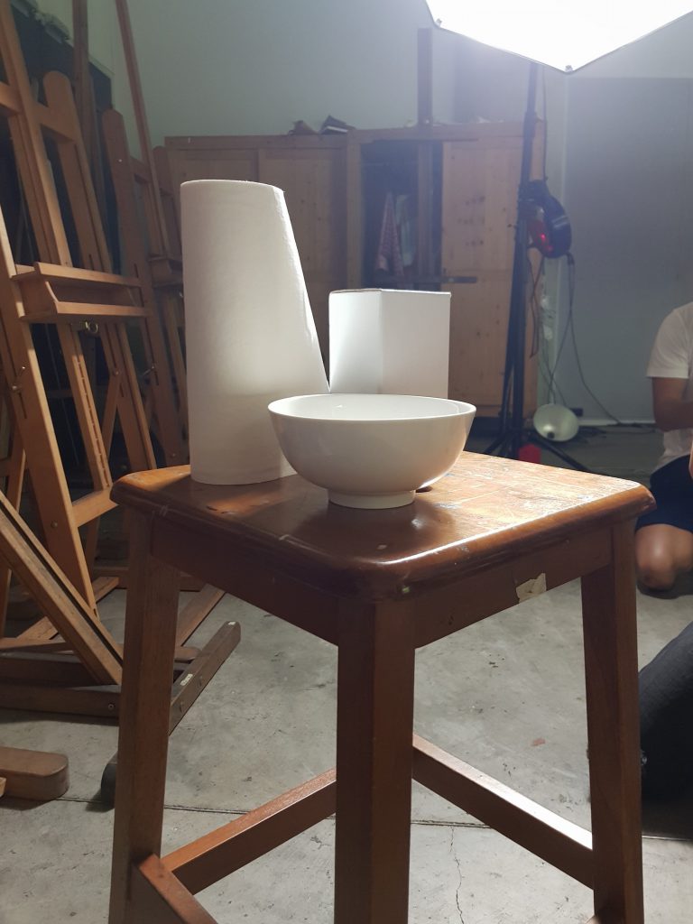
 No. 1
No. 1
This composition is my favourite because it has really good balance. The arrangement, though not symmetric, feels about right when balanced from the char at this angle. The focal point of the viewer is drawn to the objects in a clear manner.
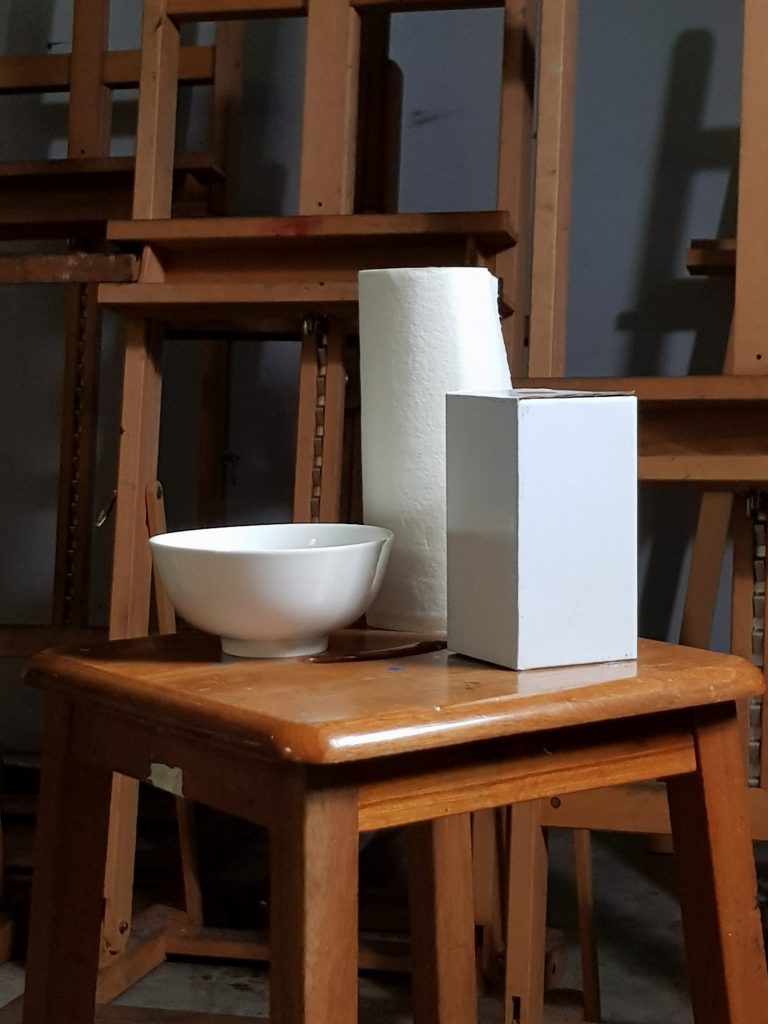
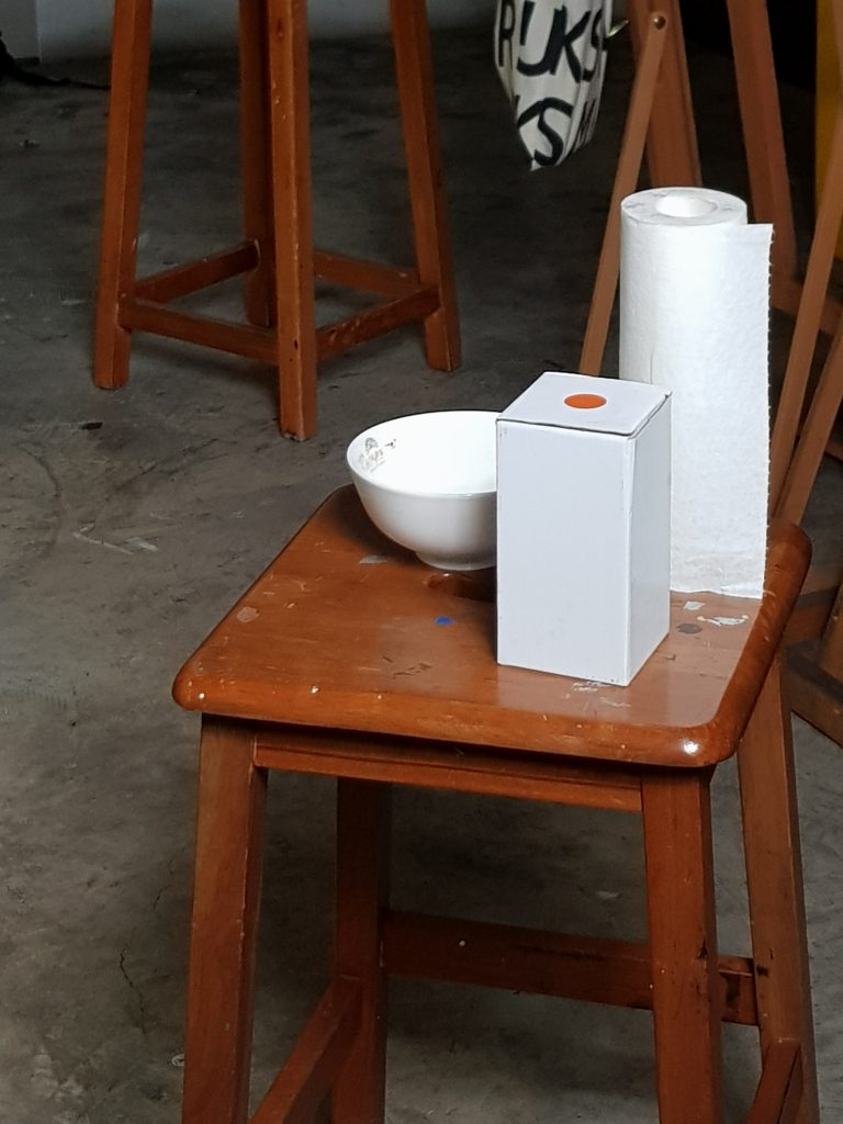
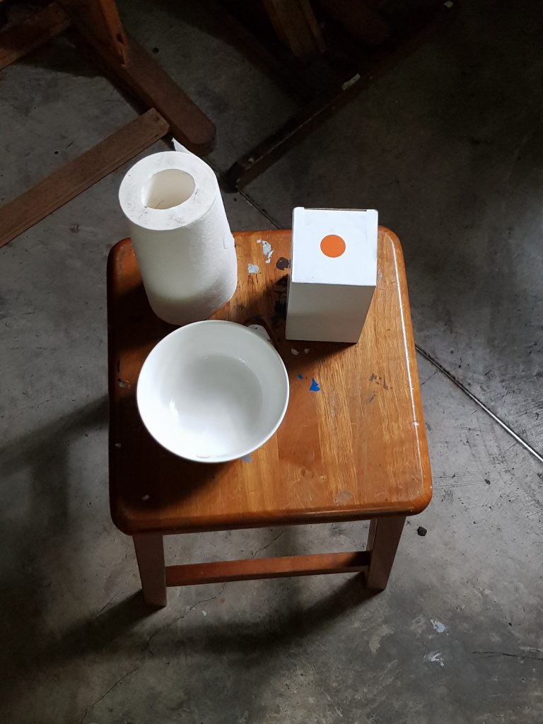
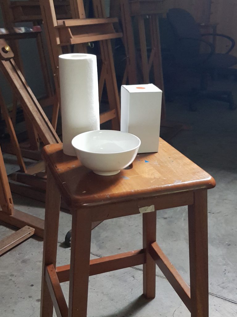
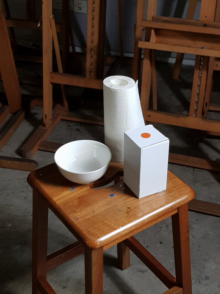
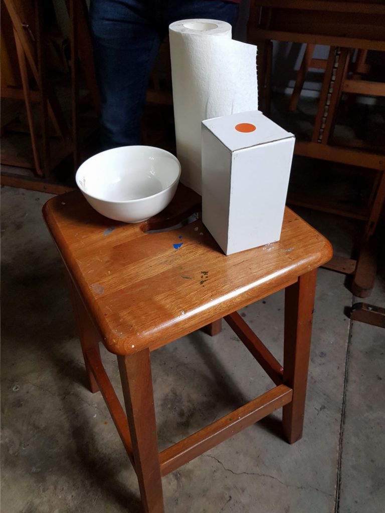
No. 2
This composition is second because although there is good ontrast, the focal point and rhythm are slightly affected by the presence of the chair legs. It still has really good balance.
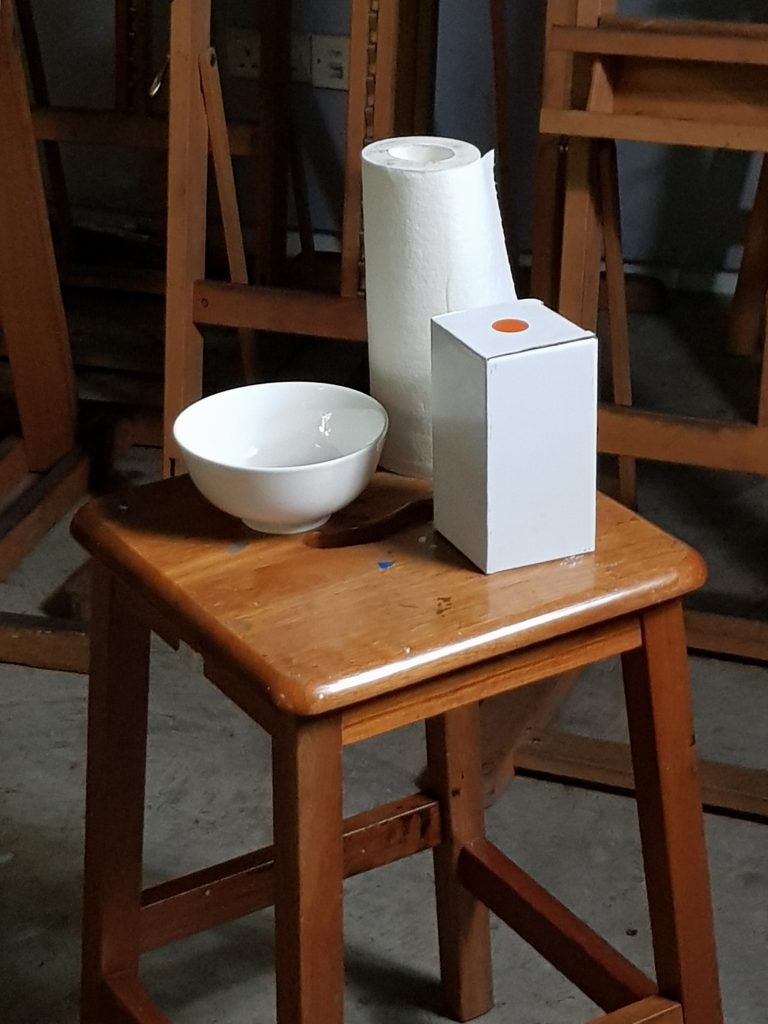
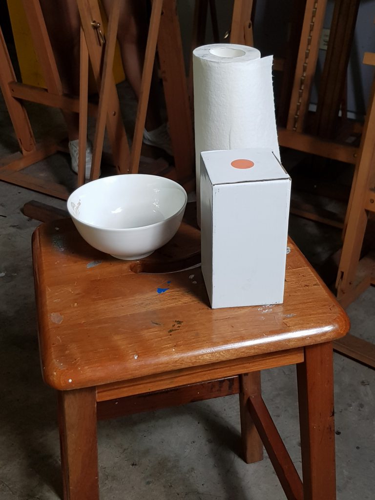
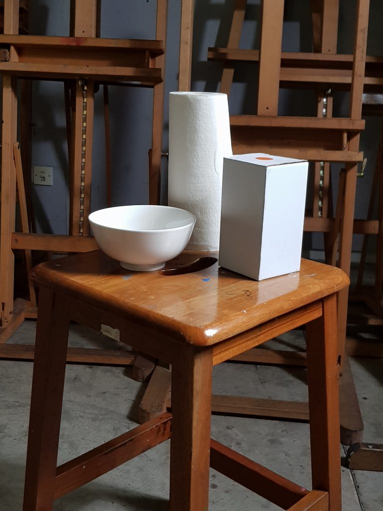
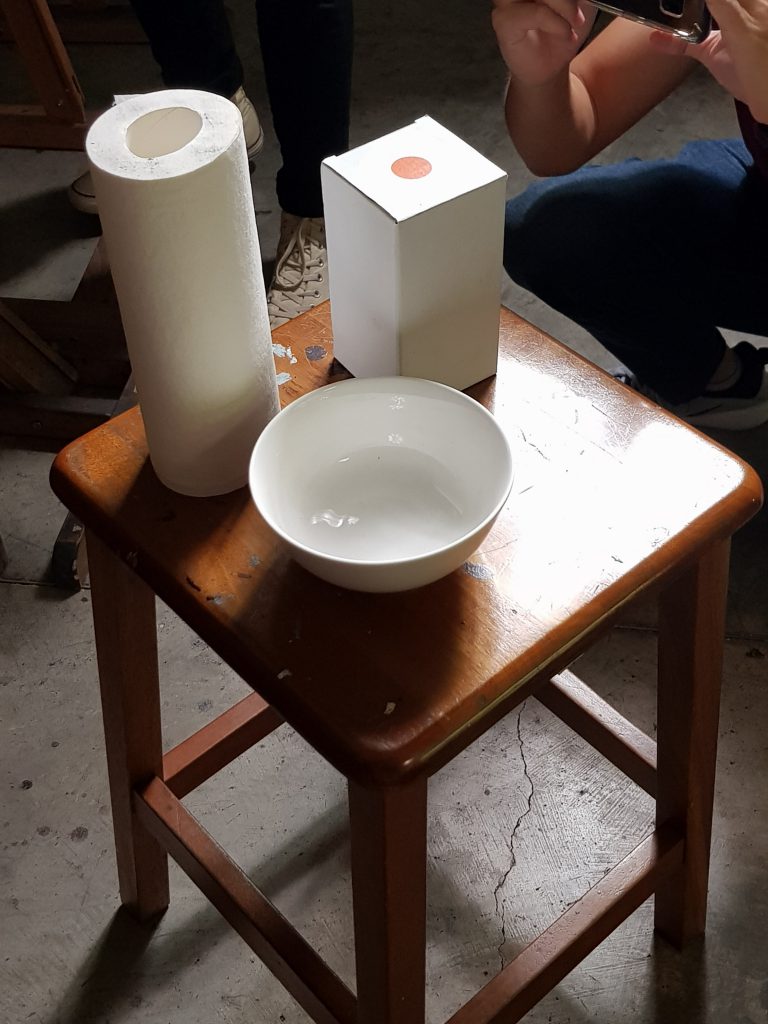
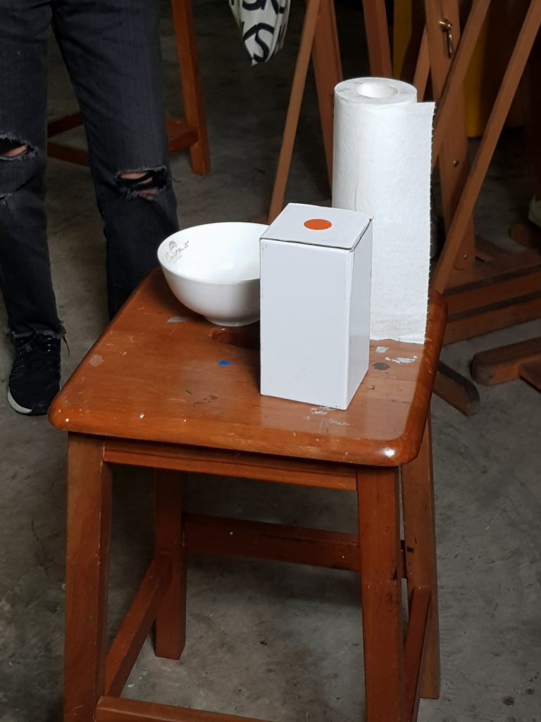
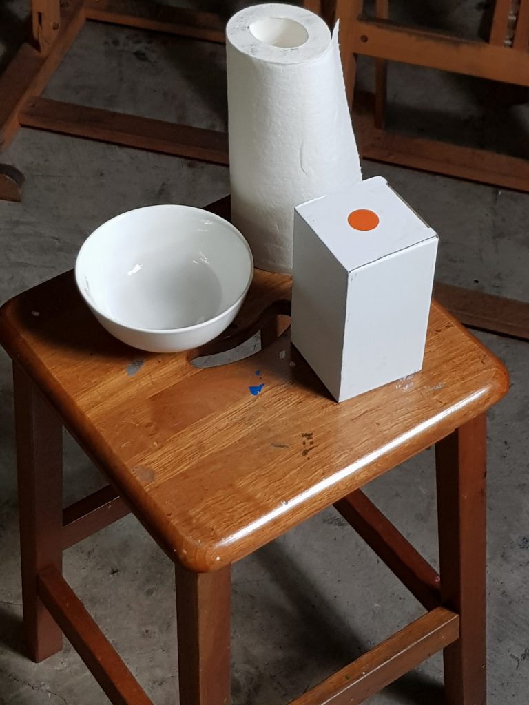
No. 3
This composition has good balance and unity. However, it is third because there is a lack of contrast by the shadows to provide good rhythm to the composition.
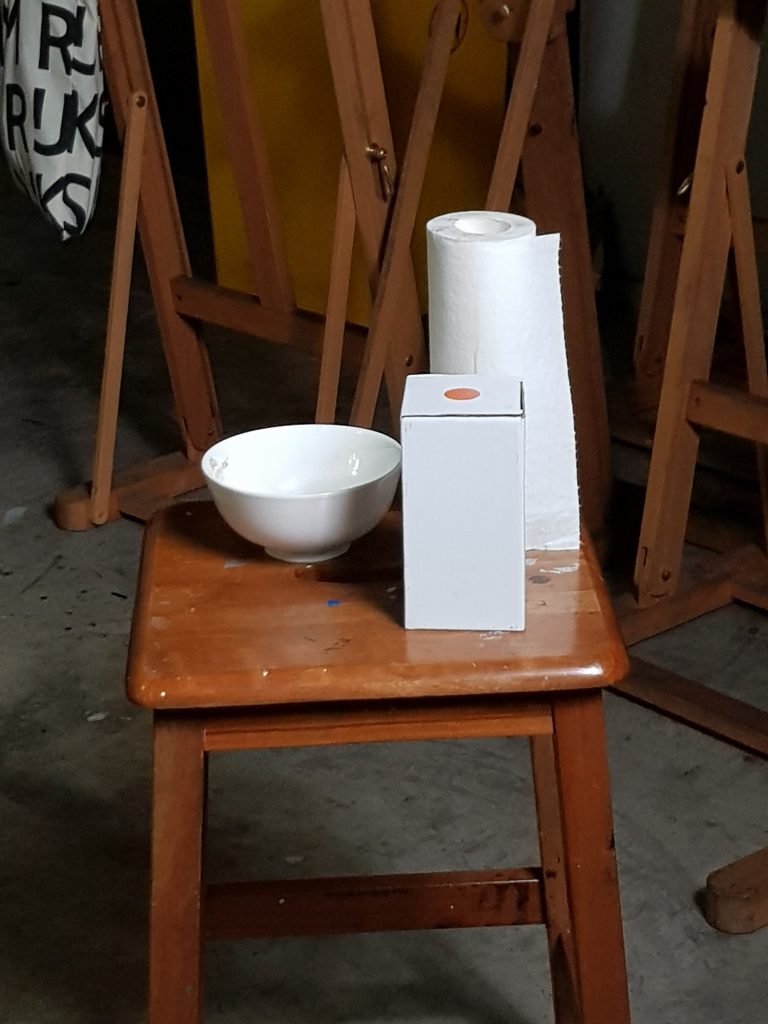
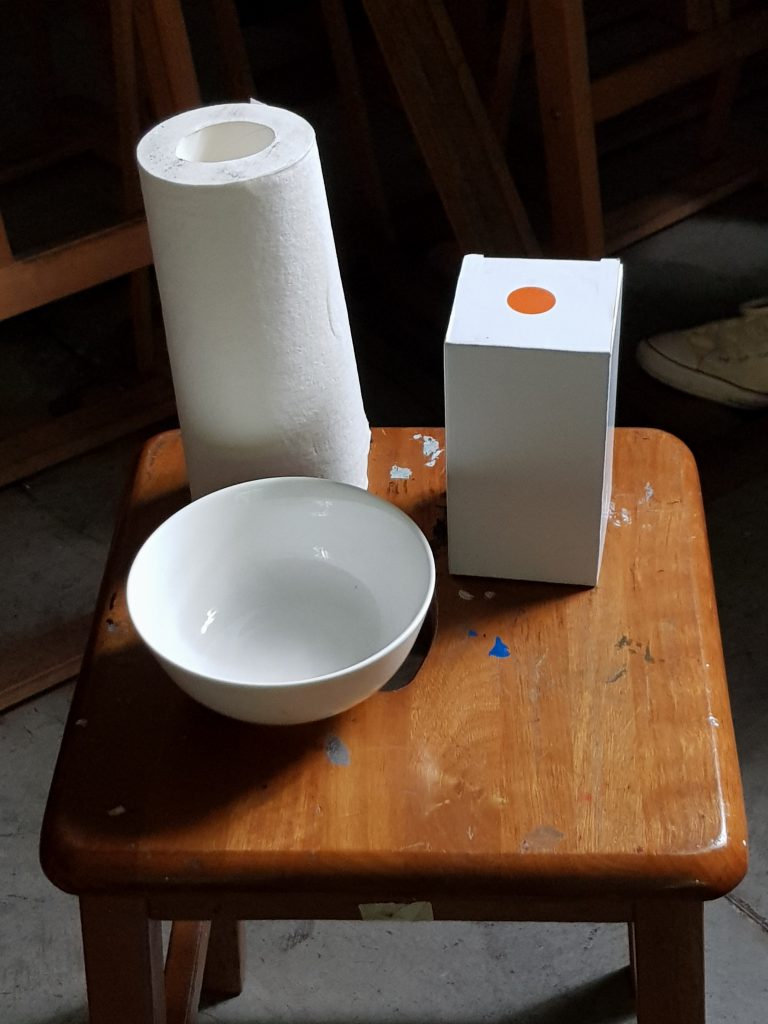
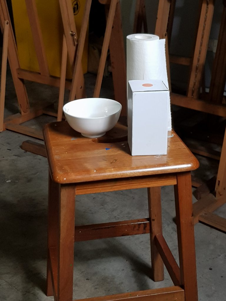
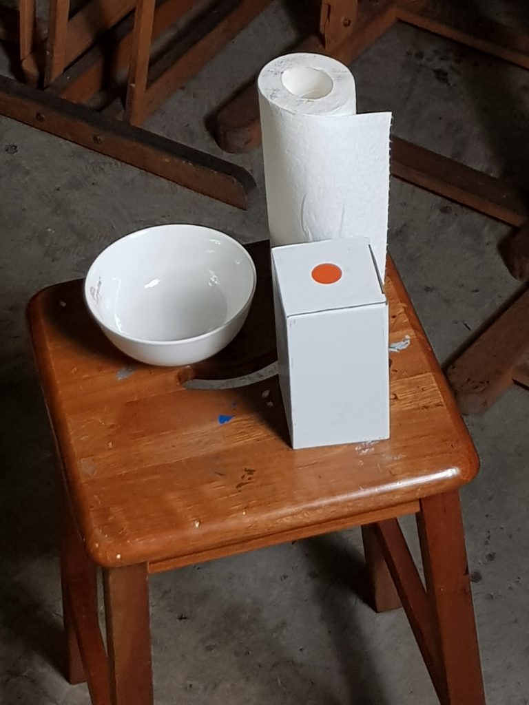
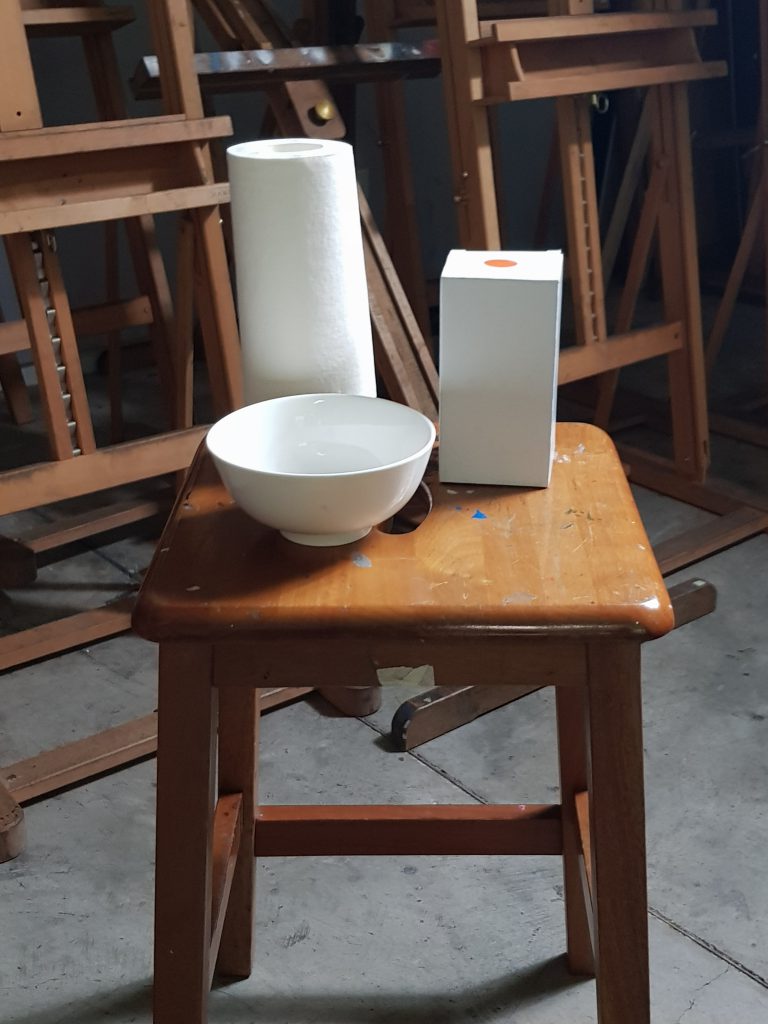
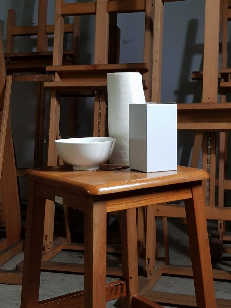
No. 4
Good unity, but perhaps lacking in contrast. Focus is affected by the chair. Overall, decent composition but it will not be ideal.
No. 5
Compared to No. 4, it lacks balance but has decent contrast. It is more dynamic than No. 4 and still provides good proportions
No. 6
Balanced composition, good contrast and focal point is clear due to the contrast. However, there is a lack of good proportion, thus it is placed no. 6 instead of no. 5
No. 7
Lovely contrast, good proportions. The chair is taken at the angle such that it does not interfere with the rhythm of the composition. It can have a better balance, thus it is placed no. 7.
No. 8
Good contrast, focal point is clear. Proportions are slightly distorted, can definitely have better balance. Good sense of unity.
No. 9
As compared to No. 8, poorer focus, contrast is still present, but proportions are poor such that it affects the rhythm of the composition.
No. 10
Distinctively lacking in focus, decent contrast helps the overall composition. The chair fights for attention in this composition. Rhythm is still good but overall an average composition.
Other decent compositions
No. 21
Decent balance in the composition. However, chair affected the focus and rhythm of the photo. Contrast could be better.
No. 22
Nice balance, good unity but lacking in contrast. Difficult to gauge the proper proportions. Focal point is not clear.
No. 23
Little contrast, especially between the two objects on the right. Balance can be better, rhythm can be improved by better framing.
No. 24
Chair helps with the focus of the subject matter (pulling out contrast to substantiate the focus). It can improve on unity as the subject matter is slightly out of frame.
No. 25
Contrast is ample, but chair is distracting and there is poor unity. Rhythm affected by the placement.
No. 26
Table occupies too much space in the photo, affecting the balance and focus of the picture. Contrast is lacking.
No. 27
Balance of the image is poor. Contrasts are vague, however rhythm is not affected as much.
No. 28
Contrast is ok, but the composition lacks clarity. Focal point is affected by the presence of majority of the chair.
No. 29
Poor angle. Despite subject matter occupying most of the space, contrast is unclear and there is poor balance.
No. 30
Poor balance. Lack of contrast. Unity is lacking, and focus is distorted by distracting objects such as the chair.
 Draw 3 compositions of the interior of your apartment on A2 paper. Set a timer to 35 minutes for all 3 drawings. Focus on the tightness and looseness of the space, ensure lines are not floating at the edge of the paper, difference between positive and negative space, cropping of objects, and the objects do not have to be detailed or rendered.